
UI Controls
UI Controls are user-interface components such as Button, TextArea, and CheckBox controls. Flex has two types of controls: basic and data provider. For information on data provider controls, see MX data-driven controls.
About UI controls
UI controls are user-interface components, such as Button, TextArea, and CheckBox controls. You place UI controls in containers, which are user-interface components that provide a hierarchical structure for controls and other containers. Typically, you define a container, and then insert UI controls or other containers in it.
At the root of your MXML application is the <s:Application> tag. This tag represents a base container that covers the entire Adobe® Flash® Player or Adobe AIR™ drawing surface. You can place controls or containers directly under the <s:Application> tag or in other containers. For more information on containers, see Introduction to containers.
Flex provides a set of UI controls built for the Spark architecture. To take advantage of the skinning architecture in Spark, use the Spark controls whenever possible. The MX controls are also supported. You can use a combination of MX and Spark controls in an application.
To use Spark controls, include the Spark namespace (default prefix: s) in your Application tag. To use MX controls, include the MX namespace (default prefix: mx) in your Application tag.
xmlns:s = "library://ns.adobe.com/flex/spark"
xmlns:mx = "library://ns.adobe.com/flex/mx"
Most controls have the following characteristics:
-
MXML API for declaring the control and the values of its properties and events
-
ActionScript API for calling the control's methods and setting its properties at run time
-
Customizable appearance by using styles, skins, and fonts
The MXML and ActionScript APIs let you create and configure a control. The following MXML code example creates a TextInput control in a Form container:
<?xml version="1.0" encoding="utf-8"?>
<!--controls\TextInputInForm.mxml-->
<s:Application xmlns:fx="http://ns.adobe.com/mxml/2009"
    xmlns:s="library://ns.adobe.com/flex/spark"
    xmlns:mx="library://ns.adobe.com/flex/mx">

    <s:Form width="400" height="100">
        <s:FormItem label="Card Name">
            <s:TextInput id="cardName"/>
        </s:FormItem>
    </s:Form>

</s:Application>
Although you commonly use MXML as the language for building applications in Flex, you can also use ActionScript to configure controls. For example, the following code example populates a Spark DataGrid control by providing an Array of items as the value of the DataGrid control's dataProvider property:
<?xml version="1.0" encoding="utf-8"?>
<!--controls\DataGridConfigAS.mxml-->
<s:Application xmlns:fx="http://ns.adobe.com/mxml/2009"
    xmlns:s="library://ns.adobe.com/flex/spark"
    xmlns:mx="library://ns.adobe.com/flex/mx">

    <fx:Script>
        <![CDATA[
            import mx.collections.ArrayCollection;

            private function myGrid_initialize():void {
              myGrid.dataProvider = new ArrayCollection([
                {Artist:'Steve Goodman', Album:'High and Outside', Price:8.99},
                {Artist:'Carole King', Album:'Tapestry', Price:11.99},
                {Artist:'The Beach Boys', Album:'Pet Sounds', Price:13.99},
                {Artist:'Original Cast', Album:'Camelot', Price:9.99} ]);
            }
        ]]>
    </fx:Script>

    <s:DataGrid id="myGrid"
        width="350" height="150"
        color="#7B0974"
        creationComplete="myGrid_initialize();"/>

</s:Application>
Text controls
Several Flex components display text or take text input, as the following table shows:
|
Type of text |
Spark control |
MX control |
|---|---|---|
|
Editable, single-line text |
TextInput |
TextInput |
|
Editable, multiline text |
TextArea |
TextArea |
|
Noneditable, single-line text |
Label |
Label |
|
Noneditable, multiline text |
Label |
Text |
|
Noneditable, richly formatted text |
RichText |
n/a |
|
Editable, richly formatted text |
RichEditableText |
n/a |
|
Compound control that contains a multiline text field and controls that let you format text by selecting such characteristics as font, size, weight, and alignment |
n/a |
RichTextEditor |
These controls can display plain text that all has the same appearance. The controls can also display rich text formatted by using a subset of the standard HTML formatting tags. For information on using text controls, see MX text controls.
Data provider controls
Several Flex components, such as the MX DataGrid and Tree controls, and the Spark ComboBox and List controls, take input data from a data provider. A data provider is a collection of objects, similar to an array. For example, a Tree control reads data from the data provider to define the structure of the tree and any associated data assigned to each tree node.
The data provider creates a level of abstraction between Flex components and the data that you use to populate them. You can populate multiple components from the same data provider, switch data providers for a component at runtime, and modify the data provider so that changes are reflected by all components that use the data provider.
Consider that the data provider is the model, and the components are the view onto the model. By separating the model from the view, you can change one without changing the other.
Menu controls
Several MX controls create or interact with menus, as the following table shows:
|
MX control (in mx.controls package) |
Description |
|---|---|
|
Menu |
A visual menu that can have cascading submenus |
|
MenuBar |
A horizontal bar with multiple submenus |
|
PopUpMenuButton |
A Menu control that opens when you click a button |
In Spark, you can create custom menu-type controls using the PopUpAnchor control.
For information on menu controls, see Menu-based controls.
Working with controls
Controls share a common class hierarchy. Therefore, you use a similar procedure to configure all controls.
Class hierarchy of controls
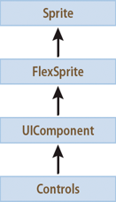
Controls are ActionScript objects derived from the flash.display.Sprite, mx.core.FlexSprite, and mx.core.UIComponent classes, as the following diagram shows. Controls inherit the properties, methods, events, styles, skin parts, skin states, and effects of these superclasses:
The Sprite, FlexSprite, and UIComponent classes are the base classes for all Flex components. Subclasses of the UIComponent class can have shape, draw themselves, and be invisible. Each subclass can participate in tabbing. Subclasses can accept low-level events like keyboard and mouse input. They can be disabled so that they do not receive mouse and keyboard input.
For information on the interfaces inherited by controls from the Sprite and UIComponent classes, see Visual components.
Sizing controls
All controls define rules for determining their size in an application. For example, a Button control sizes itself to fit its label text and optional icon image. An Image control sizes itself to the size of the imported image. Each control has a default height and a default width. The default size of each standard control is specified in the description of each control.
The default size of a control is not necessarily a fixed value. For example, for a Button control, the default size is large enough to fit its label text and optional icon image. At runtime, Flex calculates the default size of each control and, by default, does not resize a control from its default size.
Set the height and width attributes in MXML to percentages, such as 50%, or the percentHeight and percentWidth properties in ActionScript to percentage values, such as 50, to allow Flex to resize the control in the corresponding direction. Flex attempts to fit the control to the percentage of its parent container that you specify. If there isn't enough space available, the percentages are scaled, while retaining their relative values.
For example, you can set the width of a comments box to scale with its parent container as the parent container changes size:
<s:TextArea id="comments" width="100%" height ="20"/>
You can also specify explicit sizes for a control in MXML or ActionScript by setting the height and width properties to numeric pixel values. The following example sets the height and width of the addr2 TextInput control to 20 pixels and 100 pixels, respectively:
<s:TextInput id="addr2" width="100" height ="20"/>
To resize a control at runtime, use ActionScript to set its width and height properties. For example, the click event listener for the following Button control increases the value of the width property of the addr2 TextInput control by ten pixels:
 <s:Button id="button1" label="Slide" height="20"
 	click="addr2.width+=10;"/>
Many components have arbitrarily large maximum sizes, which means that Flex can make them as large as necessary to fit the requirements of your application. While some components have a defined nonzero minimum size, most have a minimum size of 0. You can use the maxHeight, maxWidth, minHeight, and minWidth properties to set explicit size ranges for each component.
For more information on sizing components, see Laying out components.
Positioning controls
You place controls inside containers. Most containers have predefined layout rules that automatically determine the position of their children. The Spark Group container positions children using BasicLayout, which is absolute positioning. The HGroup container positions children with a horizontal layout. The VGroup container positions children with a vertical layout. The MX Canvas container absolutely positions its children.
To absolutely position a control, you set its x and y properties to specific horizontal and vertical pixel coordinates within the container. These coordinates are relative to the upper-left corner of the container, where the upper-left corner is at coordinates (0,0). Values for x and y can be positive or negative integers. You can use negative values to place a control outside the visible area of the container. You can then use ActionScript to move the child to the visible area, possibly as a response to an event.
The following example places the TextInput control 150 pixels to the right and 150 pixels down from the upper-left corner of a Canvas container:
<s:TextInput id="addr2" width="100" height ="20" x="150" y="150"/>
To reposition a control within an absolutely-positioned container at runtime, you set its x and y properties. For example, the click event listener for the following Button control moves the TextInput control down ten pixels from its current position:
 <s:Button id="button1" label="Slide" height="20" x="0" y="250"
	click="addr2.y = addr2.y+10;"/>
For detailed information about control positioning, including container-relative positioning, see Laying out components.
Changing the appearance of controls
Styles, skins, and fonts let you customize the appearance of controls. They describe aspects of components that you want components to have in common. Each control defines a set of styles, skins, and fonts that you can set. Some of these characteristics are specific to a particular type of control, and others are more general. In Spark, the skin controls all visual elements of a component, including layout. See About Spark skins.
Flex provides several different ways for you to configure the appearance of your controls. For example, you can set styles for a specific control in the control's MXML tag, in CSS, or by using ActionScript. You can set styles globally for all instances of a specific control in an application by using the <fx:Style> tag.
A theme defines the appearance of an application. A theme can define something as simple as the color scheme or common font for an application. It can also be a complete reskinning of all the components. The current theme for your application defines the styles that you can set on the controls within it. That means some style properties might not always be settable. For more information, see Styles and themes.
Alert control
The Alert control is part of the MX component set. There is no Spark equivalent.
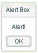
All Flex components can call the static show() method of the Alert class to open a modal dialog box that contains a message and an optional title, buttons, and icons. The following example shows an Alert control pop-up dialog box:
The Alert control closes when you select a button in the control, or press the Escape key.
The Alert.show() method has the following syntax:
 public static show(
 	text:String,
 	title:String=null,
 	flags:uint=mx.controls.Alert.OK,
 	parent:Sprite=null,
 	clickListener:Function=null,
 	iconClass:Class=null,
 	defaultButton:uint=mx.controls.Alert.OK
 ):Alert
This method returns an Alert control object.
The following table describes the arguments of the show() method:
|
Argument |
Description |
|---|---|
text |
(Required) Specifies the text message displayed in the dialog box. |
title |
Specifies the dialog box title. If omitted, displays a blank title bar. |
flags |
Specifies the buttons to display in the dialog box. The options are as follows: mx.controls.Alert.OK — OK button mx.controls.Alert.YES — Yes button mx.controls.Alert.NO — No button mx.controls.Alert.CANCEL — Cancel button Each option is a bit value and can be combined with other options by using the pipe '|' operator. The buttons appear in the order listed here regardless of the order specified in your code. The default value is mx.controls.Alert.OK. |
parent |
The parent object of the Alert control. |
clickListener |
Specifies the listener for click events from the buttons. The event object passed to this handler is an instance of the CloseEvent class. The event object contains the detail field, which is set to the button flag that was clicked (mx.controls.Alert.OK, mx.controls.Alert.CANCEL, mx.controls.Alert.YES, or mx.controls.Alert.NO). |
iconClass |
Specifies an icon to display to the left of the message text in the dialog box. |
defaultButton |
Specifies the default button by using one of the valid values for the flags argument. This is the button that is selected when the user presses the Enter key. The default value is Alert.OK. Pressing the Escape key triggers the Cancel or No button. |
To use the Alert control, you first import the Alert class into your application, then call the show() method, as the following example shows:
<?xml version="1.0"?>
<!-- controls\alert\AlertSimple.mxml -->
<s:Application xmlns:fx="http://ns.adobe.com/mxml/2009"
    xmlns:s="library://ns.adobe.com/flex/spark"
    xmlns:mx="library://ns.adobe.com/flex/mx">

    <fx:Script>
        <![CDATA[
            import mx.controls.Alert;
        ]]>
    </fx:Script>
    <s:VGroup>
        <s:TextInput id="myInput"
                      width="150"
                      text=""/>
        <s:Button id="myButton"
                   label="Copy Text"
                   click="myText.text = myInput.text;
            Alert.show('Text Copied!', 'Alert Box', mx.controls.Alert.OK);"/>
        <s:TextInput id="myText"/>
    </s:VGroup>

</s:Application>
In this example, selecting the Button control copies text from the TextInput control to the TextArea control, and displays the Alert control.
You can also define an event listener for the Button control, as the following example shows:
<?xml version="1.0"?>
<!-- controls\alert\AlertSimpleEvent.mxml -->
<s:Application xmlns:fx="http://ns.adobe.com/mxml/2009"
    xmlns:s="library://ns.adobe.com/flex/spark"
    xmlns:mx="library://ns.adobe.com/flex/mx">

    <fx:Script>
        <![CDATA[
            import mx.controls.Alert;

            private function alertListener():void {
                myText.text = myInput.text;
                Alert.show("Text Copied!", "Alert Box", Alert.OK);
            }
        ]]>
    </fx:Script>
    <s:VGroup>
        <s:TextInput id="myInput"
                      width="150"
                      text=""/>
        <s:Button id="myButton"
                   label="Copy Text"
                   click="alertListener();"/>
        <s:TextInput id="myText"/>
    </s:VGroup>

</s:Application>
Sizing the Alert control
The Alert control automatically sizes itself to fit its text, buttons, and icon. You can explicitly size an Alert control by using the Alert object returned from the show() method, as the following example shows:
<?xml version="1.0"?>
<!-- controls\alert\AlertSize.mxml -->
<s:Application xmlns:fx="http://ns.adobe.com/mxml/2009"
    xmlns:s="library://ns.adobe.com/flex/spark"
    xmlns:mx="library://ns.adobe.com/flex/mx">

    <fx:Script>
        <![CDATA[
            import mx.controls.Alert;
            import mx.events.CloseEvent;

            // Define variable to hold the Alert object.
            public var myAlert:Alert;

            private function openAlert():void {
                myAlert = Alert.show("Copy Text?", "Alert",
                    Alert.OK    | Alert.CANCEL);
                // Set the height and width of the Alert control.
                myAlert.height=250;
                myAlert.width=250;
            }
        ]]>
    </fx:Script>
    <s:VGroup>
        <s:TextInput id="myInput"
                      width="150"
                      text=""/>
        <s:Button id="myButton"
                   label="Copy Text"
                   click="openAlert();"/>
        <s:TextInput id="myText"/>
    </s:VGroup>

</s:Application>
In this example, you set the height and width properties of the Alert object to explicitly size the control.
Using event listeners with the Alert control
The next example adds an event listener to the Alert control dialog box. An event listener lets you perform processing when the user selects a button of the Alert control. The event object passed to the event listener is of type CloseEvent.
In the next example, you only copy the text when the user selects the OK button in the Alert control:
<?xml version="1.0"?>
<!-- controls\alert\AlertEvent.mxml -->
<s:Application xmlns:fx="http://ns.adobe.com/mxml/2009"
    xmlns:s="library://ns.adobe.com/flex/spark"
    xmlns:mx="library://ns.adobe.com/flex/mx">

    <fx:Script>
        <![CDATA[
            import mx.controls.Alert;
            import mx.events.CloseEvent;

            private function alertListener(eventObj:CloseEvent):void {
                // Check to see if the OK button was pressed.
                if (eventObj.detail==Alert.OK) {
                    myText.text = myInput.text;
                }
            }
        ]]>
    </fx:Script>

    <s:VGroup>
        <s:TextInput id="myInput"
            width="150"
            text="" />
        <s:Button id="myButton"
            label="Copy Text"
            click='Alert.show("Copy Text?", "Alert",
            Alert.OK | Alert.CANCEL, this,
            alertListener, null, Alert.OK);'/>
        <s:TextInput id="myText"/>
    </s:VGroup>
</s:Application>
In this example, you define an event listener for the Alert control. Within the body of the event listener, you determine which button was pressed by examining the detail property of the event object. The event object is an instance of the CloseEvent class. If the user pressed the OK button, copy the text. If the user pressed any other button, or pressed the Escape key, do not copy the text.
Specifying an Alert control icon
You can include an icon in the Alert control that appears to the left of the Alert control text. This example modifies the example from the previous section to add the Embed metadata tag to import the icon. For more information on importing resources, see Using ActionScript.
<?xml version="1.0"?>
<!-- controls\alert\AlertIcon.mxml -->
<s:Application xmlns:fx="http://ns.adobe.com/mxml/2009"
    xmlns:s="library://ns.adobe.com/flex/spark"
    xmlns:mx="library://ns.adobe.com/flex/mx">

    <fx:Script>
        <![CDATA[
            import mx.controls.Alert;
            import mx.events.CloseEvent;

            [Embed(source="assets/alertIcon.jpg")]
            [Bindable]
            public var iconSymbol:Class;
            private function alertListener(eventObj:CloseEvent):void {
                // Check to see if the OK button was pressed.
                if (eventObj.detail==Alert.OK) {
                    myText.text = myInput.text;
                }
            }
        ]]>
    </fx:Script>
    <s:VGroup>
        <s:TextInput id="myInput"
                      width="150"
                      text=""/>
        <s:Button id="myButton"
                   label="Copy Text"
                   click='Alert.show("Copy Text?", "Alert",
            Alert.OK | Alert.CANCEL, this,
                alertListener, iconSymbol,  Alert.OK );'/>
        <s:TextInput id="myText"/>
    </s:VGroup>

</s:Application>
Button and ToggleButton control
The Button and ToggleButton controls are part of both the MX and Spark component sets. While you can use the MX controls in your application, it's best to use the Spark controls instead.
The Button control is a commonly used rectangular button. Button controls look like they can be pressed, and have a text label, an icon, or both on their face. You can optionally specify graphic skins for each of several Button states.
You can create a normal Button control or a ToggleButton control. A normal Button control stays in its pressed state for as long as the mouse button is down after you select it. A ToggleButton stays in the pressed state until you select it a second time. The ToggleButton control is available in Spark. In MX, the Button control contains a toggle property that provides similar functionality.
Buttons typically use event listeners to perform an action when the user selects the control. When a user clicks the mouse on a Button control, and the Button control is enabled, it dispatches a click event and a buttonDown event. A button always dispatches events such as the mouseMove, mouseOver, mouseOut, rollOver, rollOut, mouseDown, and mouseUp events whether enabled or disabled.
You can use customized graphic skins to customize your buttons to match your application's look and functionality. You can give the Button and ToggleButton controls different skins. The control can change the image skins dynamically. The following table describes the skin states (Spark) and skin styles (MX) available for the Button and ToggleButton controls:
|
Spark Button skin states |
Spark ToggleButton skin states |
MX Button skin styles |
|---|---|---|
|
disabled |
disabled |
disabledSkin |
|
down |
disabledAndSelected |
downSkin |
|
over |
down |
overSkin |
|
up |
downAndSelected |
selectedDisabledSkin |
|
--- |
over |
selectedDownSkin |
|
--- |
overAndSelected |
selectedOverSkin |
|
--- |
up |
selectedUpSkin |
|
--- |
upAndSelected |
upSkin |
Creating a Button control
You define a Button control in MXML by using the <s:Button> tag, as the following example shows. Specify an id value if you intend to refer to the button elsewhere in your MXML, either in another tag or in an ActionScript block. The following code creates a Button control with the label "Hello world!":
<?xml version="1.0"?>
<!-- controls\button\ButtonLabel.mxml -->
<s:Application xmlns:fx="http://ns.adobe.com/mxml/2009"
    xmlns:s="library://ns.adobe.com/flex/spark"
    xmlns:mx="library://ns.adobe.com/flex/mx">

    <s:Button id="button1"
        label="Hello world!"
        width="100"/>
</s:Application>
In Spark, all visual elements of a component, including layout, are controlled by the skin. For more information on skinning, see About Spark skins.
In MX, a Button control's icon, if specified, and label are centered within the bounds of the Button control. You can position the text label in relation to the icon by using the labelPlacement property, which accepts the values right, left, bottom, and top.
Sizing a Button control
By default, Flex stretches the Button control width to fit the size of its label, any icon, plus six pixels of padding around the icon. You can override this default width by explicitly setting the width property of the Button control to a specific value or to a percentage of its parent container. If you specify a percentage value, the button resizes between its minimum and maximum widths as the size of its parent container changes.
If you explicitly size a Button control so that it is not large enough to accommodate its label, the label is truncated and terminated by an ellipsis (...). The full label displays as a tooltip when you move the mouse over the Button control. If you have also set a tooltip by using the toolTip property, the tooltip is displayed rather than the label text. Text that is vertically larger than the Button control is also clipped.
If you explicitly size a Button control so that it is not large enough to accommodate its icon, icons larger than the Button control extend outside the Button control's bounding box.
Button control user interaction
When a user clicks the mouse on a Button control, the Button control dispatches a click event, as the following example shows:
<?xml version="1.0" encoding="utf-8"?>
<!-- controls\button\ButtonClick.mxml -->
<s:Application xmlns:fx="http://ns.adobe.com/mxml/2009"
    xmlns:s="library://ns.adobe.com/flex/spark"
    xmlns:mx="library://ns.adobe.com/flex/mx">

    <fx:Script>
        <![CDATA[
            import mx.controls.Alert;
            protected function myBtn_clickHandler(event:MouseEvent):void {
                Alert.show("Goodbye!");
            }
        ]]>
    </fx:Script>

    <s:Button id="myBtn"
        x="83" y="92"
        label="Hello World!"
        click="myBtn_clickHandler(event)"/>

</s:Application>
In this example, clicking the Button triggers an Alert control to appear with a message to the user.
If a Button control is enabled, it behaves as follows:
-
When the user moves the pointer over the Button control, the Button control displays its rollover appearance.
-
When the user clicks the Button control, focus moves to the control and the Button control displays its pressed appearance. When the user releases the mouse button, the Button control returns to its rollover appearance.
-
If the user moves the pointer off the Button control while pressing the mouse button, the control's appearance returns to the rollover state and it retains focus.
-
For MX controls, if the toggle property is set to true, the state of the Button control does not change until the user releases the mouse button over the control. For the Spark ToggleButton, this statement applies to the selected property.
If a Button control is disabled, it displays its disabled appearance, regardless of user interaction. In the disabled state, all mouse or keyboard interaction is ignored.
Embedding an icon in a Button control
The Button controls define a style property, icon, that you use to add an icon to the button. A button icon can be a GIF, JPEG, PNG, SVG, or SWF file.
Use the @Embed syntax in the icon property value to embed an icon file. Or you can bind to an image that you defined within a script block by using [Embed] metadata. If you must reference your button graphic at runtime, you can use an Image control instead of a Button control.
For more information on embedding resources, see Embedding assets.
The following code example creates a Spark Button control with a label and icon.
<?xml version="1.0" encoding="utf-8"?>
<!-- controls\button\ButtonLabelIconSpark.mxml -->
<s:Application xmlns:fx="http://ns.adobe.com/mxml/2009"
               xmlns:s="library://ns.adobe.com/flex/spark"
               xmlns:mx="library://ns.adobe.com/flex/mx">

    <fx:Script>
        <![CDATA[
            import assets.*;
            import mx.controls.Alert;
            protected function myClickHandler():void{
                Alert.show("Thanks for submitting.")
            }
        ]]>
    </fx:Script>

    <s:Button id="iconButton"
              width="100" height="30"
              x="10" y="10"
              label="Submit to"
              icon="@Embed('assets/logo.jpg')"
              click="myClickHandler();"/>
</s:Application>
MX ButtonBar and MX ToggleButtonBar controls
The ButtonBar control is part of both the MX and Spark component sets. Spark does not define a separate ToggleButtonBar control. You can use the Spark ButtonBar control to replicate the functionality of the MX ToggleButtonBar control. While you can use the MX controls in your application, it's best to use the Spark controls instead. For information on Spark ButtonBar, see Spark ButtonBar and TabBar controls.
The MX ButtonBar and ToggleButtonBar controls define a horizontal or vertical row of related buttons with a common appearance. The controls define a single event, the itemClick event, that is dispatched when any button in the control is selected.
The ButtonBar control defines group of buttons that do not retain a selected state. When you select a button in a ButtonBar control, the button changes its appearance to the selected state. When you release the button, it returns to the deselected state.
The ToggleButtonBar control defines a group of buttons that maintain their state, either selected or deselected. Only one button in the ToggleButtonBar control can be in the selected state. That means when you select a button in a ToggleButtonBar control, the button stays in the selected state until you select a different button.
If you set the toggleOnClick property of the ToggleButtonBar control to true, selecting the currently selected button deselects it. By default the toggleOnClick property is false.
Creating an MX ButtonBar control
You create a ButtonBar control in MXML by using the <mx:ButtonBar> tag, as the following example shows:
<?xml version="1.0"?>
<!-- controls\bar\BBarSimple.mxml -->
<s:Application xmlns:fx="http://ns.adobe.com/mxml/2009"
    xmlns:s="library://ns.adobe.com/flex/spark"
    xmlns:mx="library://ns.adobe.com/flex/mx">

    <mx:ButtonBar horizontalGap="5">
        <mx:dataProvider>
            <fx:String>Flex</fx:String>
            <fx:String>Installer</fx:String>
            <fx:String>FlexJS</fx:String>
            <fx:String>TourDeFlex</fx:String>
        </mx:dataProvider>
    </mx:ButtonBar>
</s:Application>
This example creates a row of four Button controls.
To create a ToggleButtonBar control, replace the <mx:ButtonBar> tag with the <mx:ToggleButtonBar> tag. For the ToggleButtonBar control, the selectedIndex property determines which button is selected when the control is created. The default value for selectedIndex is 0 and selects the leftmost button in the bar. Setting the selectedIndex property to -1 deselects all buttons in the bar. Otherwise, the syntax is the same for both controls.
The dataProvider property specifies the labels of the four buttons. You can also populate the dataProvider property with an Array of Objects, where each object can have up to three fields: label, icon, and toolTip.
In the following example, an Array of Objects specifies a label and icon for each button:
<?xml version="1.0"?>
<!-- controls\bar\BBarLogo.mxml -->
<s:Application xmlns:fx="http://ns.adobe.com/mxml/2009"
    xmlns:s="library://ns.adobe.com/flex/spark"
    xmlns:mx="library://ns.adobe.com/flex/mx">

    <mx:ButtonBar horizontalGap="5">
        <mx:dataProvider>
            <fx:Object label="Flex"
                icon="@Embed(source='assets/Flexlogo.gif')"/>
            <fx:Object label="Installer"
                icon="@Embed(source='assets/Dirlogo.gif')"/>
            <fx:Object label="FlexJS"
                icon="@Embed(source='assets/Dlogo.gif')"/>
            <fx:Object label="TourDeFlex"
                icon="@Embed(source='assets/CFlogo.gif')"/>
        </mx:dataProvider>
    </mx:ButtonBar>
</s:Application>
A ButtonBar or ToggleButtonBar control creates Button controls based on the value of its dataProvider property. Even though ButtonBar and ToggleButtonBar are subclasses of Container, do not use the methods Container.addChild() and Container.removeChild() to add or remove Button controls. Instead, use methods addItem() and removeItem() to manipulate the dataProvider property. A ButtonBar or ToggleButtonBar control automatically adds or removes children based on changes to the dataProvider property.
Handling MX ButtonBar events
The MX ButtonBar and MX ToggleButtonBar controls dispatch an itemClick event when you select a button. The event object passed to the event listener is of type ItemClickEvent. From within the event listener, you access properties of the event object to determine the index of the selected button and other information. The index of the first button is 0. For more information about the event object, see the description of the ItemClickEvent class in the ActionScript 3.0 Reference for Apache Flex.
The ToggleButtonBar control in the following example defines an event listener, named clickHandler(), for the itemClick event.
<?xml version="1.0"?>
<!-- controls\bar\BBarEvent.mxml -->
<s:Application xmlns:fx="http://ns.adobe.com/mxml/2009"
    xmlns:s="library://ns.adobe.com/flex/spark"
    xmlns:mx="library://ns.adobe.com/flex/mx">


    <fx:Script>
        <![CDATA[
            import mx.events.ItemClickEvent;

            private var savedIndex:int = 99999;

            private function clickHandler(event:ItemClickEvent):void {
                if (event.index == savedIndex) {
                    myTA.text=""
                }
                else {
                    savedIndex = event.index;
                    myTA.text="Selected button index: " +
                    String(event.index) + "\n" +
                    "Selected button label: " +
                    event.label;
                }
            }
        ]]>
    </fx:Script>
    <s:VGroup>
        <mx:ToggleButtonBar
            horizontalGap="5"
            itemClick="clickHandler(event);"
            toggleOnClick="true"
            selectedIndex="-1">

        <mx:dataProvider>
            <fx:String>Flex</fx:String>
            <fx:String>Installer</fx:String>
            <fx:String>FlexJS</fx:String>
            <fx:String>TourDeFlex</fx:String>
        </mx:dataProvider>
        </mx:ToggleButtonBar>
        <s:TextArea id="myTA" width="250" height="100"/>
    </s:VGroup>

</s:Application>
In this example, the click handler displays the index and label of the selected button in a TextArea control in response to an itemClick event. If you press the selected button a second time, the button is deselected, and the sample click handler clears the text area.
CheckBox control
The CheckBox control is part of both the MX and Spark component sets. While you can use the MX CheckBox control in your application, it's best to use the Spark CheckBox control instead.
The CheckBox control is a commonly used graphical control that can contain a check mark or not. You can use CheckBox controls to gather a set of true or false values that aren't mutually exclusive.
You can add a text label to a CheckBox control and place it to the left, right, top, or bottom. Flex clips the label of a CheckBox control to fit the boundaries of the control.
When a user clicks a CheckBox control or its associated text, the CheckBox control changes its state from checked to unchecked, or from unchecked to checked.
A CheckBox control can have one of two disabled states, checked or unchecked. By default, a disabled CheckBox control displays a different background and check mark color than an enabled CheckBox control.
Creating a CheckBox control
You use the <s:CheckBox> tag to define a CheckBox control in MXML, as the following example shows. Specify an id value if you intend to refer to a component elsewhere in your MXML, either in another tag or in an ActionScript block:
<?xml version="1.0"?>
<!-- controls\checkbox\CBSimple.mxml -->
<s:Application xmlns:fx="http://ns.adobe.com/mxml/2009"
    xmlns:s="library://ns.adobe.com/flex/spark"
    xmlns:mx="library://ns.adobe.com/flex/mx">

    <s:VGroup>
        <s:CheckBox width="100" label="Employee?"/>
    </s:VGroup>
</s:Application>
You can also use the selected property to generate a checkbox that is checked by default:
<?xml version="1.0"?>
<!-- controls\checkbox\CBSelected.mxml -->
<s:Application xmlns:fx="http://ns.adobe.com/mxml/2009"
    xmlns:s="library://ns.adobe.com/flex/spark"
    xmlns:mx="library://ns.adobe.com/flex/mx">

    <s:VGroup>
        <s:CheckBox width="100" label="Employee?" selected="true"/>
    </s:VGroup>
</s:Application>
CheckBox control user interaction
When a CheckBox control is enabled and the user clicks it, the control receives focus. It displays its checked or unchecked appearance, depending on its initial state. The entire area of the CheckBox control is the click area. If the CheckBox control's text is larger than its icon, the clickable regions are above and below the icon.
If the user moves the pointer outside the area of the CheckBox control or its label while pressing the mouse button, the appearance of the CheckBox control returns to its original state and the control retains focus. The state of the CheckBox control does not change until the user releases the mouse button over the control.
Users cannot interact with a CheckBox control when it is disabled.
ColorPicker control
The ColorPicker control is part of the MX component set. There is no Spark equivalent.
The ColorPicker control lets users select a color from a drop-down swatch panel. It initially appears as a preview sample with the selected color. When a user selects the control, a color swatch panel appears. The panel includes a sample of the selected color and a color swatch panel. By default, the swatch panel displays the web-safe colors (216 colors, where each of the three primary colors has a value that is a multiple of 33, such as #CC0066).
For complete reference information, see ColorPicker in the ActionScript 3.0 Reference for Apache Flex.
About the ColorPicker control
When you open the ColorPicker control, the swatch panel expands over other controls on the application, and normally opens downwards. If the swatch panel would hit the lower boundary of the application, but could fit above color picker button, it opens upward.
If you set the showTextField property to true (the default), the panel includes a text box with a label for the selected color. If you display a text box and set the editable property to true (the default), the user can specify a color by entering a hexadecimal value.
Flex populates the color swatch panel and the text box from a data provider. By default, the control uses a data provider that includes all the web-safe colors. If you use your own data provider you can specify the following:
- The colors to display
-
You must specify the colors if you use your own dataProvider.
- Labels to display in the text box for the colors
-
If you do not specify text labels, Flex uses the hexadecimal color values.
- Additional information for each color
-
This information can include any information that is of use to your application, such as IDs or descriptive comments.
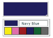
The following image shows an expanded ColorPicker control that uses a custom data provider that includes color label values. It also uses styles to set the sizes of the display elements:
Creating a ColorPicker control
You use the <mx:ColorPicker> tag to define a ColorPicker control in MXML. Specify an id value if you intend to refer to a component elsewhere in your MXML, either in another tag or in an ActionScript block.
The ColorPicker control uses a list-based data provider for the colors. For more information on this type of data provider, see Data providers and collections. If you omit the data provider, the control uses a default data provider with the web-safe colors. The data provider can be an array of colors or an array of objects. The following example populates a ColorPicker with a simple array of colors.
<?xml version="1.0"?>
<!-- controls\colorpicker\CPSimple.mxml -->
<s:Application xmlns:fx="http://ns.adobe.com/mxml/2009"
    xmlns:s="library://ns.adobe.com/flex/spark"
    xmlns:mx="library://ns.adobe.com/flex/mx">

    <fx:Script>
        <![CDATA[
            [Bindable]
            public var simpleDP:Array = ['0x000000', '0xFF0000', '0xFF8800',
                '0xFFFF00', '0x88FF00', '0x00FF00', '0x00FF88', '0x00FFFF',
                '0x0088FF', '0x0000FF', '0x8800FF', '0xFF00FF', '0xFFFFFF'];
        ]]>
    </fx:Script>

    <mx:ColorPicker id="cp" dataProvider="{simpleDP}"/>
</s:Application>
You typically use events to handle user interaction with a ColorPicker control. The following example adds an event listener for a change event and an open event to the previous example ColorPicker control:
<?xml version="1.0"?>
<!-- controls\colorpicker\CPEvents.mxml -->
<s:Application xmlns:fx="http://ns.adobe.com/mxml/2009"
    xmlns:s="library://ns.adobe.com/flex/spark"
    xmlns:mx="library://ns.adobe.com/flex/mx">

    <fx:Script>
        <![CDATA[
            //Import the event classes.
            import mx.events.DropdownEvent;
            import mx.events.ColorPickerEvent;

            [Bindable]
            public var simpleDP:Array = ['0x000000', '0xFF0000', '0xFF8800',
               '0xFFFF00', '0x88FF00', '0x00FF00', '0x00FF88', '0x00FFFF',
               '0x0088FF', '0x0000FF', '0x8800FF', '0xFF00FF', '0xFFFFFF'];

            public function openEvt(event:DropdownEvent):void {
                forChange.text="Opened";
            }
            public function changeEvt(event:ColorPickerEvent):void {
                forChange.text="Selected Item: "
                   + event.currentTarget.selectedItem + " Selected Index: "
                   + event.currentTarget.selectedIndex;
            }
        ]]>
    </fx:Script>

    <mx:VBox>
        <mx:TextArea id="forChange"
            width="150"/>
        <mx:ColorPicker id="cp"
            dataProvider="{simpleDP}"
            open="openEvt(event);"
            change="changeEvt(event);"/>
    </mx:VBox>
</s:Application>
The ColorPicker control dispatches open event when the swatch panel opens. It dispatches a change event when the value of the control changes due to user interaction. The currentTarget property of the object passed to the event listener contains a reference to the ColorPicker control. In this example, the event listeners use two properties of the ColorPicker control, selectedItem and selectedIndex. Every change event updates the TextArea control with the selected item and the item's index in the control, and an open event displays the word Opened.
If you populate the ColorPicker control from an array of color values, the target.selectedItem field contains the hexadecimal color value. If you populate it from an array of Objects, the target.selectedItem field contains a reference to the object that corresponds to the selected item.
The index of items in the ColorPicker control is zero-based, which means that values are 0, 1, 2, ... , n - 1, where n is the total number of items; therefore, the target.selectedIndex value is zero-based, and a value of 2 in the preceding example refers to the data provider entry with color 0xFF8800.
Using Objects to populate a ColorPicker control
You can populate a ColorPicker control with an Array of Objects. By default, the ColorPicker uses two fields in the Objects: one named color, and another named label. The label field value determines the text in the swatch panel's text field. If the Objects do not have a label field, the control uses the color field value in the text field. You can use the ColorPicker control's colorField and labelField properties to specify different names for the color and label fields. The Objects can have additional fields, such as a color description or an internal color ID, that you can use in ActionScript.
Example: ColorPicker control that uses Objects
The following example shows a ColorPicker that uses an Array of Objects with three fields: color, label, and descript:
<?xml version="1.0"?>
<!-- controls\colorpicker\CPObjects.mxml -->
<s:Application xmlns:fx="http://ns.adobe.com/mxml/2009"
    xmlns:s="library://ns.adobe.com/flex/spark"
    xmlns:mx="library://ns.adobe.com/flex/mx">

    <fx:Script>
        <![CDATA[
            import mx.events.ColorPickerEvent;
            import mx.events.DropdownEvent;

            [Bindable]
            public var complexDPArray:Array = [
                {label:"Yellow", color:"0xFFFF00",
                    descript:"A bright, light color."},
                {label:"Hot Pink", color:"0xFF66CC",
                    descript:"It's HOT!"},
                {label:"Brick Red", color:"0x990000",
                    descript:"Goes well with warm colors."},
                {label:"Navy Blue", color:"0x000066",
                    descript:"The conservative favorite."},
                {label:"Forest Green", color:"0x006600",
                    descript:"Great outdoorsy look."},
                {label:"Grey", color:"0x666666",
                    descript:"An old reliable."}]

            public function openEvt(event:DropdownEvent):void {
                descriptBox.text="";
            }

            public function changeEvt(event:ColorPickerEvent):void {
                descriptBox.text=event.currentTarget.selectedItem.label
                    + ": " + event.currentTarget.selectedItem.descript;
            }
        ]]>
    </fx:Script>

    <fx:Style>
        .myStyle {
            swatchWidth:25;
            swatchHeight:25;
            textFieldWidth:95;
        }
    </fx:Style>

    <!-- Convert the Array to an ArrayCollection. Do this if
    you might change the colors in the panel dynamically. -->
    <fx:Declarations>
        <mx:ArrayCollection id="complexDP" source="{complexDPArray}"/>
    </fx:Declarations>
    <mx:VBox>
        <mx:TextArea id="descriptBox"
            width="150" height="50"/>
        <mx:ColorPicker id="cp"
            height="50" width="150"
            dataProvider="{complexDP}"
            change="changeEvt(event);"
            open="openEvt(event);"
            editable="false"/>
    </mx:VBox>

</s:Application>
In this example, the selectedItem property contains a reference to the object defining the selected item. The example uses selectedItem.label to access the object's label property (the color name), and selectedItem.descript to access the object's descript property (the color description). Every change event updates the TextArea control with the label property of the selected item and the item's description. The open event clears the current text in the TextArea control each time the user opens up the ColorPicker to display the swatch panel.
This example also uses several of the ColorPicker properties and styles to specify the control's behavior and appearance. The editable property prevents users from entering a value in the color label box (so they can only select the colors from the dataProvider). The swatchWidth and swatchHeight styles control the size of the color samples in the swatch panel. The textFieldWidth style ensures that the text field is long enough to accommodate the longest color name.
Using custom field names
In some cases, you might want to use custom names for the color and label fields. For example, you would use a custom name if the data comes from an external data source with custom column names. The following code changes the previous example to use custom color and label fields called cName and cVal. It also shows how to use an <mx:dataProvider> tag to populate the data provider:
<?xml version="1.0"?>
<!-- controls\colorpicker\CPCustomFieldNames.mxml -->
<s:Application xmlns:fx="http://ns.adobe.com/mxml/2009"
    xmlns:s="library://ns.adobe.com/flex/spark"
    xmlns:mx="library://ns.adobe.com/flex/mx">

    <fx:Script>
        <![CDATA[
            import mx.events.ColorPickerEvent;
            import mx.events.DropdownEvent;

            public function openEvt(event:DropdownEvent):void {
                descriptBox.text="";
            }

            public function changeEvt(event:ColorPickerEvent):void {
                descriptBox.text=event.currentTarget.selectedItem.cName
                    + ": " + event.currentTarget.selectedItem.cDescript;
            }
        ]]>
    </fx:Script>

    <fx:Style>
        .myStyle {
            swatchWidth:25;
            swatchHeight:25;
            textFieldWidth:95;
        }
    </fx:Style>

    <mx:VBox>
        <mx:TextArea id="descriptBox"
            width="150" height="50"/>
        <mx:ColorPicker id="cp"
            height="50" width="150"
            labelField="cName"
            colorField="cVal"
            change="changeEvt(event)"
            open="openEvt(event)"
            swatchPanelStyleName="myStyle"
            editable="false">
            <mx:dataProvider>
                <mx:ArrayCollection>
                    <mx:source>
                        <fx:Object cName="Yellow" cVal="0xFFFF00"
                            cDescript="A bright, light color."/>
                        <fx:Object cName="Hot Pink" cVal="0xFF66CC"
                            cDescript="It's HOT!"/>
                        <fx:Object cName="Brick Red" cVal="0x990000"
                            cDescript="Goes well with warm colors."/>
                        <fx:Object cName="Navy Blue" cVal="0x000066"
                            cDescript="The conservative favorite."/>
                        <fx:Object cName="Forest Green" cVal="0x006600"
                            cDescript="Great outdoorsy look."/>
                        <fx:Object cName="Grey" cVal="0x666666"
                            cDescript="An old reliable."/>
                    </mx:source>
                </mx:ArrayCollection>
            </mx:dataProvider>
        </mx:ColorPicker>
    </mx:VBox>
</s:Application>
User interaction
A ColorPicker control can be editable or noneditable. In a noneditable ColorPicker control, the user must select a color from among the swatch panel options. In an editable ColorPicker control, a user can select swatch panel items or enter a hexadecimal color value directly into the label text field at the top of the swatch panel. Users can type numbers and uppercase or lowercase letters in the ranges a-f and A-F in the text box; it ignores all other non-numeric characters.
Mouse interaction
You can use the mouse to navigate and select from the control:
-
Click the collapsed control to display or hide the swatch panel.
-
Click any swatch in the swatch panel to select it and close the panel.
-
Click outside the panel area to close the panel without making a selection.
-
Click in the text field to move the text entry cursor.
Keyboard interaction
If the ColorPicker is editable and the swatch panel has the focus, alphabetic keys in the range A-F and a-f and numeric keys enter text in the color box. The Backspace and Delete keys remove text in the color text box. You can also use the following keystrokes to control the ColorPicker:
|
Key |
Description |
|---|---|
|
Control+Down Arrow |
Opens the swatch panel and puts the focus on the selected swatch. |
|
Control+Up Arrow |
Closes the swatch panel, if open. |
|
Home |
Moves the selection to the first color in a row of the swatch panel. Has no effect if there is a single column. |
|
End |
Moves the selection to the last color in a row of the swatch panel. Has no effect if there is a single column. |
|
Page Up |
Moves the selection to the top color in a column of the swatch panel. Has no effect if there is a single row. |
|
Page Down |
Moves the selection to the bottom color in a column of the swatch panel. Has no effect if there is a single row. |
|
Escape |
Closes the swatch panel without changing the color in the color picker. Most Web browsers do not support using this key. |
|
Enter |
Selects the current color from the swatch panel and closes the swatch panel; equivalent to clicking a color swatch. If the focus is on the text field of an editable ColorPicker, selects the color specified by the field text. |
|
Arrows |
When the swatch panel is open, moves the focus to the next color left, right, up, and down in the swatch grid. On a single-row swatch panel, Up and Right Arrow keys are equivalent, and Down and Left Arrow keys are equivalent. On a multirow swatch panel, the selection wraps to the beginning or end of the next or previous line. On a single-row swatch panel, pressing the key past the beginning or end of the row loops around on the row. When the swatch panel is closed, but has the focus, pressing the Up and Down arrow keys has no effect. The Left and Right Arrow keys change the color picker selection, moving through the colors as if the panel were open. |
DateChooser and DateField controls
The DateChooser and DateField controls are part of the MX component set. There is no Spark equivalent.
The DateChooser and DateField controls let users select dates from graphical calendars. The DateChooser control user interface is the calendar. The DateField control has a text field that uses a date chooser popup to select the date as a result. The DateField properties are a superset of the DateChooser properties.
For complete reference information, see DateChooser and DateField in the ActionScript 3.0 Reference for Apache Flex.
About the DateChooser control
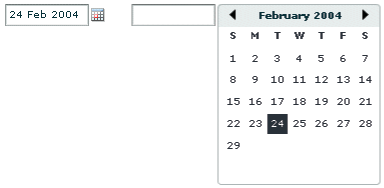
The DateChooser control displays the name of a month, the year, and a grid of the days of the month. It contains columns labeled for the days of the week. This control is useful in applications where you want a continually visible calendar. The user can select a single date from the grid. The control contains forward and back arrow buttons to let you change the month and year. You can disable the selection of certain dates, and limit the display to a range of dates.
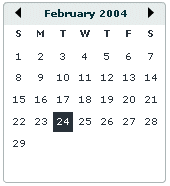
The following image shows a DateChooser control:
Changing the displayed month does not change the selected date. Therefore, the currently selected date is not always visible. The DateChooser control resizes as necessary to accommodate the width of the weekday headings. Therefore, if you use day names, instead of letters, as headings, the calendar is wide enough to show the full day names.
About the DateField control
The DateField control is a text field that displays the date with a calendar icon on its right side. When a user clicks anywhere inside the bounding box of the control, a date chooser that is identical to the DateChooser control pops up. If no date has been selected, the text field is blank and the current month is displayed in the date chooser.
When the date chooser is open, users can click the month scroll buttons to scroll through months and years, and select a date. When the user selects a date, the date chooser closes and the text field displays the selected date.
This control is useful in applications where you want a calendar selection tool, but want to minimize the space that the date information takes up.
The following example shows two images of a DateField control. On the left is the DateField control with the date chooser closed; the calendar icon appears on the right side of the text box. To the right is a DateField control with the date chooser open:
You can use the DateField control anywhere you want a user to select a date. For example, you can use a DateField control in a hotel reservation system, with certain dates selectable and others disabled. You can also use the DateField control in an application that displays current events, such as performances or meetings, when a user selects a date.
Creating a DateChooser or DateField control
You define a DateChooser control in MXML by using the <mx:DateChooser> tag. You define a DateField control in MXML by using the <mx:DateField> tag. Specify an id value if you intend to refer to a component elsewhere in your MXML, either in another tag or an ActionScript block.
The following example creates a DateChooser control; to create a DateField control, simply change <mx:DateChooser> to <mx:DateField>. The example uses the change event of the DateChooser control to display the selected date in several different formats.
<?xml version="1.0"?>
<!-- controls\date\DateChooserEvent.mxml -->
<s:Application xmlns:fx="http://ns.adobe.com/mxml/2009"
    xmlns:s="library://ns.adobe.com/flex/spark"
    xmlns:mx="library://ns.adobe.com/flex/mx">
    <fx:Script>
        <![CDATA[

        import mx.events.CalendarLayoutChangeEvent;

        private function useDate(eventObj:CalendarLayoutChangeEvent):void {
            // Make sure selectedDate is not null.
            if (eventObj.currentTarget.selectedDate == null) {
                return
            }

            //Access the Date object from the event object.
            day.text=eventObj.currentTarget.selectedDate.getDay();
            date.text=eventObj.currentTarget.selectedDate.getDate();
            month.text=eventObj.currentTarget.selectedDate.getMonth() + 1;
            year.text=eventObj.currentTarget.selectedDate.getFullYear();

            wholeDate.text= (eventObj.currentTarget.selectedDate.getMonth() + 1) +
                "/" + (eventObj.currentTarget.selectedDate.getDate() +
                "/" + eventObj.currentTarget.selectedDate.getFullYear());
        }
        ]]>
    </fx:Script>

    <mx:DateChooser id="date1" change="useDate(event)"/>

    <s:Form x="200">
        <s:FormItem label="Day of week">
            <s:TextInput id="day" width="100"/>
        </s:FormItem>
        <s:FormItem label="Day of month">
            <s:TextInput id="date" width="100"/>
        </s:FormItem>
        <s:FormItem label="Month">
            <s:TextInput id="month" width="100"/>
        </s:FormItem>
        <s:FormItem label="Year">
            <s:TextInput id="year" width="100"/>
        </s:FormItem>
        <s:FormItem label="Date">
            <s:TextInput id="wholeDate" width="100"/>
        </s:FormItem>
    </s:Form>
</s:Application>
Notice that the first line of the event listener determines if the selectedDate property is null. This check is necessary because selecting the currently selected date while holding down the Control key deselects it, sets the selectedDate property to null, then dispatches the change event.
Using the Date class
The DateChooser and DateField controls use the selectedDate property to store the currently selected date, as an object of type Date. You can create Date objects to represent date and time values, or access the Date in the selectedDate property.
The Date class has many methods that you can use to manipulate a date. For more information on the Date class, see the ActionScript 3.0 Reference for the Adobe Flash Platform .
In MXML, you can create and configure a Date object by using the <mx:Date> tag. This tag exposes the setter methods of the Date class as MXML properties so that you can initialize a Date object. For example, the following code creates a DateChooser control and sets the selected date to April 10, 2005. Notice that months are indexed starting at 0:
 <mx:DateChooser id="date1">
 		<mx:selectedDate>
 			<fx:Date month="3" date="10" fullYear="2005"/>
 		</mx:selectedDate>
 </mx:DateChooser>
The following example uses inline ActionScript to set the initial selected date for a DateField control:
<mx:DateField id="date3" selectedDate="{new Date (2005, 3, 10)}"/>
You can also set the selectedDate property in a function, as the following example shows:
 <fx:Script>
 	<![CDATA[
 		private function initDC():void {
 			date2.selectedDate=new Date (2005, 3, 10);
 		}
 	]]>
 </fx:Script>

 <mx:DateChooser id="date2" creationComplete="initDC();"/>
You can use property notation to access the ActionScript setter and getter methods of the selectedDate property Date object. For example, the following line displays the four-digit year of the selected date in a text box:
<s:TextInput text="{date1.selectedDate.fullYear}"/>
Specifying header, weekday, and today's day text styles
The following date chooser properties let you specify text styles for regions of the control:
-
headerStyleName
-
weekDayStyleName
-
todayStyleName
These properties let you specify styles for the text in the header, weekday list, and today's date. You cannot use these properties to set non-text styles such as todayColor.
The following example defines a DateChooser control that has bold, blue header text in a 16-pixel Times New Roman font. The day-of-week headers are in bold, italic, green, 15-pixel Courier text, and today's date is bold, orange, 12-pixel Times New Roman text. Today's date background color is gray, and is set directly in the <mx:DateChooser> tag.
<?xml version="1.0"?>
<!-- controls\date\DateChooserStyles.mxml -->
<s:Application xmlns:fx="http://ns.adobe.com/mxml/2009"
    xmlns:s="library://ns.adobe.com/flex/spark"
    xmlns:mx="library://ns.adobe.com/flex/mx">

    <fx:Style>
        .myHeaderStyle{
            color:#6666CC;
            font-family:Times New Roman, Times, serif;
            font-size:16px; font-weight:bold;}
        .myTodayStyle{
            color:#CC6633;
            font-family:Times New Roman, Times, serif;
            font-size:12px; font-weight:bold;}
        .myDayStyle{
            color:#006600;
            font-family:Courier New, Courier, mono;
            font-size:15px; font-style:italic; font-weight:bold;}
    </fx:Style>

    <mx:DateChooser
        headerStyleName="myHeaderStyle"
        todayStyleName="myTodayStyle"
        todayColor="#CCCCCC"
        weekDayStyleName="myDayStyle"/>
</s:Application>
Specifying selectable dates
The DateChooser control has the following properties that let you specify which dates a user can select:
|
Property |
Description |
|---|---|
disabledDays |
An array of days of the week that the user cannot select. Often used to disable weekend days. |
disabledRange |
An array of dates that the user cannot select. The array can contain individual Date objects, objects specifying date ranges, or both. |
selectableRange |
A single range of dates that the user can select. The user can navigate only among the months that include this range; in these months any dates outside the range are disabled. Use the disabledRange property to disable dates within the selectable range. |
The following example shows a DateChooser control that has the following characteristics:
-
The selectableRange property limits users to selecting dates in the range January 1 - March 15, 2006. Users can only navigate among the months of January through March 2006.
-
The disabledRanges property prevents users from selecting January 11 or any day in the range January 23 - February 10.
-
The disabledDays property prevents users from selecting Saturdays or Sundays.
<?xml version="1.0"?>
<!-- controls\date\DateChooserSelectable.mxml -->
<s:Application xmlns:fx="http://ns.adobe.com/mxml/2009"
    xmlns:s="library://ns.adobe.com/flex/spark"
    xmlns:mx="library://ns.adobe.com/flex/mx">

  <mx:DateChooser
    selectableRange="{{rangeStart: new Date(2006,0,1),
        rangeEnd: new Date(2006,2,15)}}"
    disabledRanges="{[new Date(2006,0,11),
        {rangeStart: new Date(2006,0,23), rangeEnd: new Date(2006,1,10)}]}"
    disabledDays="{[0,6]}"/>
</s:Application>
Setting DateChooser and DateField properties in ActionScript
Properties of the DateChooser and DateField controls take values that are scalars, Arrays, and Date objects. While you can set most of these properties in MXML, it can be easier to set some in ActionScript.
For example, the following code example uses an array to set the disabledDays property. Sunday (0) and Saturday (6) are disabled, which means that they cannot be selected in the calendar. This example sets the disabledDays property in two different ways, by using tags and by using tag attributes:
<?xml version="1.0"?>
<!-- controls\date\DateChooserDisabledOption.mxml -->
<s:Application xmlns:fx="http://ns.adobe.com/mxml/2009"
    xmlns:s="library://ns.adobe.com/flex/spark"
    xmlns:mx="library://ns.adobe.com/flex/mx">

    <!-- Use tags.-->
    <mx:DateField>
            <mx:disabledDays>
                <fx:Number>0</fx:Number>
                <fx:Number>6</fx:Number>
            </mx:disabledDays>
    </mx:DateField>
    <!-- Use tag attributes.-->
    <mx:DateField disabledDays="[0,6]"/>
</s:Application>
The following example sets the dayNames, firstDayOfWeek, headerColor, and selectableRange properties of a DateChooser control by using an initialize event:
<?xml version="1.0"?>
<!-- controls\date\DateChooserInitializeEvent.mxml -->
<s:Application xmlns:fx="http://ns.adobe.com/mxml/2009"
    xmlns:s="library://ns.adobe.com/flex/spark"
    xmlns:mx="library://ns.adobe.com/flex/mx">
    <fx:Script>
        <![CDATA[
            import mx.events.DateChooserEvent;

            private function dateChooser_init():void {
                myDC.dayNames=['Sun', 'Mon', 'Tue',
                    'Wed', 'Th', 'Fri', 'Sat'];
                myDC.firstDayOfWeek = 3;
                myDC.setStyle("headerColor", 0xff0000);
                myDC.selectableRange = {rangeStart: new Date(2009,0,1),
                    rangeEnd: new Date(2012,0,10)};
            }

            private function onScroll():void {
                myDC.setStyle("fontStyle", "italic");
            }
        ]]>
    </fx:Script>

    <mx:DateChooser id="myDC"
        width="200"
        creationComplete="dateChooser_init();"
        scroll="onScroll();"/>
</s:Application>
To set the selectableRange property, the code creates two Date objects that represent the first date and last date of the range. Users can only select dates within the specified range. This example also changes the fontStyle of the DateChooser control to italics after the first time the user scrolls it.
You can select multiple dates in a DateChooser control by using the selectedRanges property. This property contains an Array of objects. Each object in the Array contains two dates: a start date and an end date. By setting the dates within each object to the same date, you can select any number of individual dates in the DateChooser.
The following example uses an XML object to define the date for the DateChooser control. It then iterates over the XML object and creates an object for each date. These objects are then used to determine what dates to select in the DateChooser:
<?xml version="1.0" encoding="utf-8"?>
<!-- controls\date\ProgrammaticDateChooserSelector.mxml -->
<s:Application xmlns:fx="http://ns.adobe.com/mxml/2009"
    xmlns:s="library://ns.adobe.com/flex/spark"
    xmlns:mx="library://ns.adobe.com/flex/mx"
    creationComplete="init()">
    <fx:Script>
        <![CDATA[
            private function init():void {
                dc1.displayedMonth = 1;
                dc1.displayedYear = 2008;
            }

            public function displayDates():void {
                var dateRanges:Array = [];
                for (var i:int=0; i<shows.show.length(); i++) {
                    var cDate:Date =
                        new Date(shows.show[i].showDate.toString());
                    var cDateObject:Object =
                        {rangeStart:cDate, rangeEnd:cDate};
                    dateRanges.push(cDateObject);
                }
                dc1.selectedRanges = dateRanges;
            }
        ]]>
    </fx:Script>

    <!-- Define the data for the DateChooser -->
    <fx:Declarations>
    <fx:XML id="shows" format="e4x">
        <data>
            <show>
               <showID>1</showID>
                <showDate>02/28/2008</showDate>
                <showTime>10:45am/11:15am</showTime>
            </show>
            <show>
                <showID>2</showID>
                <showDate>02/23/2008</showDate>
                <showTime>7:00pm</showTime>
            </show>
        </data>
    </fx:XML>
    </fx:Declarations>

    <mx:DateChooser id="dc1"
        showToday="false"
        creationComplete="displayDates();"/>

</s:Application>
Formatting dates with the DateField control
You can use the formatString property of the DateField control to format the string in the control's text field. The formatString property can contain any combination of "MM", "DD", "YY", "YYYY", delimiter, and punctuation characters. The default value is "MM/DD/YYYY".
In the following example, you select a value for the formatString property from the drop-down list:
<?xml version="1.0"?>
<!-- controls\date\DateFieldFormat.mxml -->
<s:Application xmlns:fx="http://ns.adobe.com/mxml/2009"
    xmlns:s="library://ns.adobe.com/flex/spark"
    xmlns:mx="library://ns.adobe.com/flex/mx">

    <mx:HBox>
        <mx:ComboBox id="cb1">
            <mx:ArrayCollection>
                <fx:String>MM/DD/YY</fx:String>
                <fx:String>MM/DD/YYYY</fx:String>
                <fx:String>DD/MM/YY</fx:String>
                <fx:String>DD/MM/YYYY</fx:String>
                <fx:String>DD MM, YYYY</fx:String>
            </mx:ArrayCollection>
        </mx:ComboBox>

        <mx:DateField id="date2"
            editable="true"
            width="100"
            formatString="{cb1.selectedItem}"/>
    </mx:HBox>
</s:Application>
The DateField control also lets you specify a formatter function. A formatter function converts the date to a string in your preferred format for display in the control's text field. The DateField labelFunction property and the Spark DateTimeFormatter class help you format dates.
By default, the date in the DateField control text field is formatted in the form "MM/DD/YYYY". You use the labelFunction property of the DateField control to specify a function to format the date displayed in the text field and return a String containing the date. The function has the following signature:
 public function formatDate(currentDate:Date):String {
 	...
 	return dateString;
 }
You can choose a different name for the function, but it must take a single argument of type Date and return the date as a String for display in the text field. The following example defines the function formatDate() to display the date in the form dd-mm-yyyy, such as 03-12-2011. This function uses a Spark DateTimeFormatter object to do the formatting:
<?xml version="1.0"?>
<!-- controls\date\DateChooserFormatter.mxml -->
<s:Application xmlns:fx="http://ns.adobe.com/mxml/2009"
    xmlns:s="library://ns.adobe.com/flex/spark"
    xmlns:mx="library://ns.adobe.com/flex/mx">

    <fx:Script>
        <![CDATA[
            private function formatDateTime(date:Date):String {
                return dtf.format(date);
            }
        ]]>
    </fx:Script>

    <fx:Declarations>
        <s:DateTimeFormatter id="dtf" dateTimePattern="MM-dd-yyyy"/>
    </fx:Declarations>

    <mx:DateField id="df" labelFunction="formatDateTime" parseFunction="{null}"/>
</s:Application>
The parseFunction property specifies a function that parses the date entered as text in the text field of the DateField control and returns a Date object to the control. If you do not allow the user to enter a date in the text field, set the parseFunction property to null when you set the labelFunction property.
If you want to let the user enter a date in the control's text field, specify a function to the parseFunction property that converts the text string to a Date object for use by the DateField control. If you set the parseFunction property, it should typically perform the reverse of the function specified to the labelFunction property.
The function specified to the parseFunction property has the following signature:
 public function parseDate(valueString:String, inputFormat:String):Date {
 	...
 	return newDate
 }
Where the valueString argument contains the text string entered by the user in the text field, and the inputFormat argument contains the format of the string. For example, if you only allow the user to enter a text string by using two characters for month, day, and year, then pass "MM/DD/YY" to the inputFormat argument.
User interaction
The date chooser includes arrow buttons that let users move between months. Users can select a date with the mouse by clicking the desired date.
Clicking a forward month arrow advances a month; clicking the back arrow displays the previous month. Clicking forward a month on December, or back on January, moves to the next (or previous) year. Clicking a date selects it. By default, the selected date is indicated by a green background around the date and the current day is indicated by a black background with the date in white. Clicking the currently selected date deselects it.
The following keystrokes let users navigate DateChooser and DateField controls:
|
Key |
Use |
|---|---|
|
Left Arrow |
Moves the selected date to the previous enabled day in the month. Does not move to the previous month. Use the Shift key plus the Left Arrow key to access disabled days. |
|
Right Arrow |
Moves the selected date to the next enabled day in the month. Does not move to the next month. Use the Shift key plus the Right Arrow key to access disabled days. |
|
Up Arrow |
Moves the selected date up the current day of week column to the previous enabled day. Does not move to the previous month. Use the Shift key plus the Up Arrow key to access disabled days. |
|
Down Arrow |
Moves the selected date down the current day of week column to next enabled day. Does not move to the next month. Use the Shift key plus the Down Arrow key to access disabled days. |
|
Page Up |
Displays the calendar for the previous month. |
|
Page Down |
Displays the calendar for the next month. |
|
Home |
Moves the selection to the first enabled day of the month. |
|
End |
Moves the selection to the last enabled day of the month. |
|
+ |
Move to the next year. |
|
- |
Move to the previous year. |
|
Control+Down Arrow |
DateField only: open the DateChooser control. |
|
Control+Up Arrow |
DateField only: close the DateChooser control. |
|
Escape |
DateField only: cancel operation. |
|
Enter |
DateField only: selects the date and closes the DateChooser control. |
Image control
Flex supports several image formats, including GIF, JPEG, and PNG. You can import these images into your applications by using the Spark Image control or BitmapImage. To load SWF files, you use the SWFLoader control.
The Image control is part of both MX and Spark component sets. While you can use the MX Image control in your application, it's best to use the Spark Image control instead.
Flex provides the following image controls:
|
Image control |
Use |
|---|---|
|
BimapImage |
BitmapImage is a light-weight image control that can load both local and remote assets. You typically use the BitmapImage when you don't require a broken image icon or a preloader. The BitmapImage also supports runtime loading of images. However, when you load images at runtime, you should be aware of the security restrictions of Flash Player or AIR. For more information, see Security. |
|
Spark Image |
The Spark Image is a skinnable component that leverages a BitmapImage class as its main skin part. The Spark Image control provides a preloader as well as a broken image icon to indicate an invalid image state. The image loader and the broken-image icon are both customizable. For example, you can provide a broken image icon representing an invalid URL, or provide a progress bar as the image loads. The Spark Image control also provides customizable skinning for borders, frames, and loading states. For more information, see Skinning the Spark Image control. The Spark Image control lets you load local and trusted assets, as well as remote and untrusted assets. Security restrictions are applicable in case of untrusted assets. For more information, see Loading images using a customizable load interface. |
|
SWFLoader |
Flex also includes the SWFLoader control for loading applications built in Flex. You typically use the Image control for loading static graphic files, and use the SWFLoader control for loading SWF files and applications built in Flex. The Image control is also designed for use in custom item renderers and item editors. For more information on the SWFLoader control, see SWFLoader control. |
The following example shows a BitmapImage embedded at compile time and a BitmapImage loaded at runtime:
<?xml version="1.0"?>
<!-- controls\image\ImageBitmapImageExample.mxml -->
<s:Application xmlns:fx="http://ns.adobe.com/mxml/2009"
    xmlns:s="library://ns.adobe.com/flex/spark"
    xmlns:mx="library://ns.adobe.com/flex/mx"
    width="700">

    <s:Panel title="BitmapImage Examples" width="600">
        <s:layout>
            <s:HorizontalLayout horizontalAlign="center"/>
        </s:layout>
        <s:BorderContainer width="50%" height="100%">
            <s:layout>
                <s:VerticalLayout
                   verticalAlign="middle"
                   horizontalAlign="center"/>
            </s:layout>
            <s:Label text="BitmapImage embedded at compile time"/>
            <s:BitmapImage id="embimg" source="@Embed(source='fblogo.jpg')"
               height="50" width="50"/>
        </s:BorderContainer>
        <s:BorderContainer width="50%" height="100%">
            <s:layout>
                <s:VerticalLayout
                   verticalAlign="middle"
                   horizontalAlign="center"/>
            </s:layout>
            <s:Label text="BitmapImage loaded at runtime"/>
            <s:BitmapImage id="runtimeimg" source="../assets/flexlogo.jpg"
               height="50" width="50"/>
        </s:BorderContainer>
    </s:Panel>
</s:Application>
About loading images
Flex supports loading GIF, JPEG, and PNG files at runtime, and also embedding GIF, JPEG, and PNG files at compile time. The method you choose depends on the file types of your images and your application parameters.
Embedded images load immediately, because they are already part of the Flex SWF file. However, they add to the size of your application and slow down the application initialization process. Embedded images also require you to recompile your applications whenever your image files change. For an overview of resource embedding, see Embedding assets.
The alternative to embedding a resource is to load the resource at runtime. You can load a resource from the local file system in which the SWF file runs. You can also access a remote resource, typically though an HTTP request over a network. These images are independent of your application built with Flex, so you can change them without causing a recompile operation as long as the names of the modified images remain the same. The referenced images add no additional overhead to an application's initial loading time. However, you can sometimes experience a delay when you use the images and load them into Adobe Flash Player or AIR.
A SWF file can access one type of external resource only, either local or over a network; it cannot access both types. You determine the type of access allowed by the SWF file by using the use-network flag when you compile your application. When use-network flag is set to false, you can access resources in the local file system, but not over the network. The default value is true, which allows you to access resources over the network, but not in the local file system.
For more information on the use-network flag, see Flex compilers.
When you load images at runtime, you should be aware of the security restrictions of Flash Player or AIR. For example, you can reference an image by using a URL, but the default security settings only permit applications built in Flex to access resources stored on the same domain as your application. To access images on other servers, ensure that the domain that you are loading from uses a crossdomain.xml file.
For more information on application security, see Security.
Loading and embedding images with Spark Image and BitmapImage controls
The Spark Image control and BitmapImage support the following actions when you load an image:
Specifying the image path
The value of the source property of a Spark Image control or BitmapImage specifies a relative or absolute path, or URL to the imported image file. If the value is relative, it is relative to the directory that contains the file that uses the tag.
The source property has the following forms:
-
source="@Embed(source='relativeOrAbsolutePath')"
The referenced image is packaged within the generated SWF file at compile time when Flex creates the SWF file for your application. You can embed GIF, JPEG, and PNG files. When embedding an image, the value of the source property must be a relative or absolute path to a file on the Flex developer's local file system; it cannot be a URL.
The following example embeds a JPEG image into an application that is built in Flex:
<?xml version="1.0"?>
<!-- controls\image\ImageSimpleEmbed.mxml -->
<s:Application xmlns:fx="http://ns.adobe.com/mxml/2009"
    xmlns:s="library://ns.adobe.com/flex/spark"
    xmlns:mx="library://ns.adobe.com/flex/mx">

    <s:Image id="loader1" source="@Embed(source='logo.jpg')"/>
</s:Application>
In this example, the size of the image is the default size of the image file.
-
source="relativeOrAbsolutePathOrURL"
Flex loads the referenced image file at runtime, typically from a location that is deployed on a web server; the image is not packaged as part of the generated SWF file. You can only reference GIF, JPEG, and PNG files.
The following example accesses a JPEG image at runtime:
<?xml version="1.0"?>
<!-- controls\image\ImageSimple.mxml -->
<s:Application xmlns:fx="http://ns.adobe.com/mxml/2009"
    xmlns:s="library://ns.adobe.com/flex/spark"
    xmlns:mx="library://ns.adobe.com/flex/mx">

    <s:Image id="loader1" source="assets/flexlogo.jpg"/>
</s:Application>
Because you did not use @Embed in the source property, Flex loads the image at runtime. In this case, the location is the same directory as the page that embedded the SWF file.
When the use-network flag is set to false, you can access resources in the local file system, but not over the network. The default value is true, which allows you to access resources over the network, but not in the local file system.
In many applications, you create a directory to hold your application images. Commonly, that directory is a subdirectory of your main application directory. The source property supports relative paths to images, which let you specify the location of an image file relative to your application directory.
The following example stores all images in an assets subdirectory of the application directory:
<?xml version="1.0"?>
<!-- controls\image\ImageSimpleAssetsDir.mxml -->
<s:Application xmlns:fx="http://ns.adobe.com/mxml/2009"
    xmlns:s="library://ns.adobe.com/flex/spark"
    xmlns:mx="library://ns.adobe.com/flex/mx">

    <s:Image id="loader1" source="@Embed(source='assets/logo.jpg')"/>
</s:Application>
The following example uses a relative path to reference an image in an assets directory at the same level as the application's root directory:
<?xml version="1.0"?>
<!-- controls\image\ImageSimpleAssetsDirTop.mxml -->
<s:Application xmlns:fx="http://ns.adobe.com/mxml/2009"
    xmlns:s="library://ns.adobe.com/flex/spark"
    xmlns:mx="library://ns.adobe.com/flex/mx">

    <s:Image id="loader1" source="@Embed(source='../assets/logo.jpg')"/>
</s:Application>
You can also reference an image by using a URL, but the default security settings only permit applications to access resources stored on the same domain as your application. To access images on other servers, make sure that the domain that you are loading the image from uses a crossdomain.xml file that allows cross-domain access.
Cross-domain image loading is supported with restrictions. You can load local and trusted assets, as well as remote and untrusted assets. When you use untrusted assets, security restrictions are applicable. When a cross-domain image is loaded from an untrusted source, the security policy does not allow access to the image content. Then, the trustedSource property of the BimapImage and Spark Image is set to false, and the following image properties do not function:
-
BitmapFillMode.REPEAT
-
scaleGrid
-
smooth
-
smoothingQuality
Any advanced operations on the image data, such as, high-quality scaling or tiling, are not supported.
For more information, see Security.
The following example shows how to reference an image by using a URL:
<?xml version="1.0"?>
<!-- controls\image\ImageSimpleAssetsURL.mxml -->
<s:Application xmlns:fx="http://ns.adobe.com/mxml/2009"
    xmlns:s="library://ns.adobe.com/flex/spark"
    xmlns:mx="library://ns.adobe.com/flex/mx">

    <s:Image id="image1"
        source="http://localhost:8100/flex/assets/logo.jpg"/>
</s:Application>
Using an image multiple times
You can use the same image multiple times in your application by using the normal image import syntax each time. Flex only loads the image once, and then references the loaded image as many times as necessary.
Sizing and scaling an image
You can size and scale images using both the Spark Image and BimapImage controls.
Sizing an image
Flex sets the height and width of an imported image to the height and width settings in the image file. By default, Flex does not resize the image.
To set an explicit height or width for an imported image, set its height and width properties of the image control. Setting the height or width property prevents the parent from resizing it. The scaleContent property has a default value of true; therefore, Flex scales the image as it resizes it to fit the specified height and width. The aspect ratio is maintained by default for a Spark Image, so the image may not completely fill the designated space. Set the scaleContent property to false to disable scaling.
When you resize a BitmapImage, the aspect ratio is not maintained, by default. To ensure that you maintain the aspect ratio, change the value of the scaleMode property from stretch to letterbox or zoom. For more information about image aspect ratios, see below.
One common use for resizing an image is to create image thumbnails. In the following example, the image has an original height and width of 100 by 100 pixels. By specifying a height and width of 20 by 20 pixels, you create a thumbnail of the image.
<?xml version="1.0"?>
<!-- controls\image\ImageSimpleThumbnail.mxml -->
<s:Application xmlns:fx="http://ns.adobe.com/mxml/2009"
    xmlns:s="library://ns.adobe.com/flex/spark"
    xmlns:mx="library://ns.adobe.com/flex/mx">

    <s:BitmapImage id="image1"
        source="@Embed(source='logo.jpg')"
        width="20" height="20"
        smooth="true" smoothingQuality="high"/>
    <s:BitmapImage id="image2"
        source="@Embed(source='logo.jpg')"/>
</s:Application>
When you downscale a BimapImage, the default quality for scaled bitmaps, BitmapSmoothingQuality.DEFAULT, is used.
If you want to preserve the aspect ratio when creating image thumbnails, and achieve the best quality result when downscaling a BitmapImage, set the smoothingQuality property to BitmapSmoothingQuality.HIGH. The smoothingQuality property is applicable only when you set the smooth property of the BitmaImage to true. When you do so, a multi-bit-rate step algorithm is applied to the image, resulting in a much higher quality downscale than the default. This option is useful in creating high-quality image thumbnails.
To let Flex resize the image as part of laying out your application, set the height and width properties to a percentage value. Flex attempts to resize components with percentage values for these properties to the specified percentage of their parent container. You can also use the maxHeight and maxWidth and minHeight and minWidth properties to limit resizing. For more information on resizing, see Introduction to containers.
Maintaining aspect ratio when sizing
The aspect ratio of an image is the ratio of its width to its height. For example, a standard NTSC television set uses an aspect ratio of 4:3, and an HDTV set uses an aspect ratio of 16:9. A computer monitor with a resolution of 640 by 480 pixels also has an aspect ratio of 4:3. A square has an aspect ratio of 1:1.
All images have an inherent aspect ratio. When you use the height and width properties of the Image control to resize an image, Flex preserves the aspect ratio of the image, by default, so that it does not appear distorted.
By preserving the aspect ratio of the image, Flex might not draw the image to fill the entire height and width specified for the <s:Image> tag. For example, if your original image is a square 100 by 100 pixels, which means it has an aspect ratio of 1:1, and you use the following statement to load the image:
<s:Image source="myImage.jpg" height="200" width="200"/>
The image increases to four times its original size and fills the entire 200 x 200 pixel area.
The following example sets the height and width of the same image to 150 by 200 pixels, an aspect ratio of 3:4:
<s:Image source="myImage.jpg" height="150" width="200"/>
In this example, you do not specify a square area for the resized image. Flex maintains the aspect ratio of a Spark Image by default because the scaleMode property is set to letterbox. Therefore, Flex sizes the image to 150 by 150 pixels, the largest possible image that maintains the aspect ratio and conforms to the size constraints. The other 50 by 150 pixels remain empty. However, the <s:Image> tag reserves the empty pixels and makes them unavailable to other controls and layout elements.
To ensure that you maintain the aspect ratio when you resize a BitmapImage, change the value of the scaleMode property from stretch to letterbox or zoom.
When you resize an image, you can apply the required alignment properties. The Spark Image and BitmapImage both have horizontalAlign and verticalAlign properties that you can specify, as required.
By default, the horizontalAlign and verticalAlign properties are set to center. For example, when you resize an image that has an original height and width of 1024 by 768 to a height and width of 100 by 100, there is extra space at the top and bottom of the image. You can set the the horizontalAlign and verticalAlign properties as required to overcome the extra space.
You can also use a Resize effect to change the width and height of an image in response to a trigger. As part of configuring the Resize effect, you specify a new height and width for the image. Flex maintains the aspect ratio of the image by default, so it resizes the image as much as possible to conform to the new size, while maintaining the aspect ratio. For example, place your pointer over the image in this example to enlarge it, and then move the mouse off the image to shrink it to its original size:
<?xml version="1.0"?>
<!-- controls\image\ImageResize.mxml -->
<s:Application xmlns:fx="http://ns.adobe.com/mxml/2009"
    xmlns:s="library://ns.adobe.com/flex/spark"
    xmlns:mx="library://ns.adobe.com/flex/mx">
    <fx:Script>
        <![CDATA[
            import mx.effects.Resize;
        ]]>
    </fx:Script>
    <fx:Declarations>
        <s:Resize id="resizeBig"
            widthFrom="22" widthTo="44"
            heightFrom="27" heightTo="54"/>
        <s:Resize id="resizeSmall"
            widthFrom="44" widthTo="22"
            heightFrom="54" heightTo="27"/>
    </fx:Declarations>

    <s:Image width="22" height="27"
        source="@Embed('logo.jpg')"
        rollOverEffect="{resizeBig}"
        rollOutEffect="{resizeSmall}"/>

</s:Application>
For more information on the Resize effect, see Introduction to effects.
Scaling images using fillMode and scaleMode properties
You use the fillMode image property to determine how an image fills into a region.
You can use the fillMode property in a tag or in ActionScript, and set one of the following values:
-
scale: scales the image to fill the bounding region.
-
clip: displays the image in its original size. If the image is larger than the bounding region, the image is clipped to the size of the bounding region. If the image is smaller than the bounding region, an empty space is left.
-
repeat: repeats or tiles the image and fills into the dimensions of the bounding region.
When you set the fillMode property to scale , you can set the scaleMode property to stretch, letterbox, or zoom.
When you use the fillMode property in ActionScript, you use BitmapFillMode.CLIP, BitmapFillMode.REPEAT, or BitmapFillMode.SCALE.
To stretch the image content to fit the bounding region, set the attribute value to BitmapScaleMode.STRETCH. If you set the value to BitmapScaleMode.LETTERBOX, the image content is sized to fit the region boundaries while maintaining the same aspect ratio as the original unscaled image. For BitmapScaleMode.ZOOM, the image content is scaled to fit with respect to the original unscaled image's aspect ratio. This results in cropping along one axis.
The following example shows the Flex logo scaled in the letterbox-mode and stretch-mode using the fillMode and scaleMode properties:
<?xml version="1.0"?>
<!-- controls\image\ImageScaling.mxml -->
<s:Application xmlns:fx="http://ns.adobe.com/mxml/2009"
               xmlns:s="library://ns.adobe.com/flex/spark"
               xmlns:mx="library://ns.adobe.com/flex/mx">

    <s:controlBarContent>
        <s:Form>
            <s:FormItem label="scaleMode:">
                <s:DropDownList id="ddl" selectedItem="letterbox">
                    <s:dataProvider>
                        <s:ArrayList source="[letterbox,scale]" />
                    </s:dataProvider>
                </s:DropDownList>
            </s:FormItem>
        </s:Form>
    </s:controlBarContent>

    <s:Image id="image"
       source="assets/flexlogo.jpg"
       height="20" width="20"
       fillMode="scale"
       scaleMode="{ddl.selectedItem}"
       left="20" right="20" top="20" bottom="20" />
</s:Application>
Skinning the Spark Image control
The Spark Image control lets you customize the appearance of you image through skinning.
When you use the <s:Image> tag to import an image, a default skin class, ImageSkin, is created. The default skin provides a simple image skin that has a content loader with a generic progress bar and a broken image icon to reflect invalid content.
The ImageSkin class provides Spark and wireframe-themed skins that let you customize the content loader and the icon to identify images that failed to load. You also have customizable skinning for borders, frames, and loading states.
The ImageSkin class defines the following optional skin parts:
-
imageDisplay:BitmapImage: Lets you specify the image to display for invalid content or loading error.
-
ProgressIndicator:Range: Lets you specify the range, maximum, and minimum values of the progress bar. Use the stepSize property to specify the amount by which the value changes when the changeValueByStep() method is called.
For information about the different skin states, see the source code for the ImageSkin class.
Caching and queuing of images
The ContentCache class supports caching and queuing of remote image assets, and can be associated with the BitmapImage or Spark Image controls.
You set the caching and queuing properties for the image content loader as follows:
<fx:Declarations>
	<s:ContentCache id="imgcache" enableCaching="true" enableQueueing="true"
	maxActiveRequests="1" maxCacheEntries="10"/>
</fx:Declarations>
To have a content loader with only queuing capabilities and no caching capabilities, set enableCaching to false.
The difference that you notice in image-loading when you use the caching-queuing mechanism can be significant, especially with large images. Without caching, large images can take several seconds to load. For example, you can use caching and queuing to prevent image-flickering in a scrolling list.
The ContentCache class provides the following methods and properties to manage caching and queuing:
Caching properties
|
Property name |
Description |
|---|---|
|
maxCacheEntries |
Specifies the number of cache entries that can be stored at a given time. When the cache entries exceed the specified number, the least recent cache entries are automatically removed. The default value is 100. |
|
enableQueuing |
Enables queuing of images. The default value is false. |
|
enableCaching |
Enables caching of images. The default value is true. |
|
maxActiveRequests |
Specifies the number of pending load requests that can be active at a given time when image-queuing is enabled. The default value is 2. |
Caching methods
|
Method name |
Description |
|---|---|
|
load() |
Returns the requested image using the ContentRequest instance. If the image is still loading, ContentRequest returns a value of false. If the requested image is found in the cache, ContentRequest returns a value of complete. |
|
removeAllCacheEntries() removeCacheEntry() |
Removes cache entries. Use removeCacheEntry() to remove a single cache entry that's no longer needed. Use removeAllCacheEntries() to remove all the cached content. |
|
getCacheEntry() |
Checks for a pre-existing cache entry, and if found, obtains a reference to the cache entry. |
|
addCacheEntry() |
Adds a new cache entry. Use addCacheEntry to manually add a cache entry. |
Queuing methods
|
Method |
Description |
|---|---|
|
prioritize() |
Forces all pending requests of the specified contentLoaderGrouping to be moved to the top of the request list, when image-queuing is enabled. Any active URL requests at that time are canceled and requeued if their contentLoaderGrouping does not match the prioritized content grouping. |
|
removeAllQueueEntries() |
Cancels all the queued requests. |
Example on caching and queuing images
The following example shows loading of images using the contentLoader. Caching and queuing are enabled and custom item renderers are used.
<?xml version="1.0"?>
<!-- controls\image\ImageCaching.mxml -->
<s:Application xmlns:fx="http://ns.adobe.com/mxml/2009"
    xmlns:s="library://ns.adobe.com/flex/spark"
    xmlns:mx="library://ns.adobe.com/flex/mx">

    <fx:Style>
        @namespace s "library://ns.adobe.com/flex/spark";
        @namespace mx "library://ns.adobe.com/flex/mx";

        s|Image {
            enableLoadingState: true;
        }
    </fx:Style>

    <fx:Script>
        <![CDATA[
            import mx.collections.ArrayList;

            protected var arrList:ArrayList = new ArrayList();

            protected function init():void {
                var rand:String = new Date().time.toString()
                var arr:Array = [];
                arr.push({src:"http://localhost:8100/flex/assets/fblogo.jpg?" + rand, cache:ldr});
                arr.push({src:"http://localhost:8100/flex/assets/flexlogo.jpg?" + rand, cache:ldr});

                arrList = new ArrayList(arr);
                dataGrp.dataProvider = arrList;
            }
        ]]>
    </fx:Script>

    <fx:Declarations>
        <s:ContentCache id="ldr" enableQueueing="true"
           maxActiveRequests="1" maxCacheEntries="10"/>
    </fx:Declarations>

    <s:Panel title="Loading images using the caching-queuing mechanism" x="20" y="20">
        <s:controlBarContent>
            <s:Button label="Load Images" click="init();"/>
        </s:controlBarContent>
        <s:DataGroup id="dataGrp">
            <s:layout>
                <s:TileLayout />
            </s:layout>
            <s:itemRenderer>
                <fx:Component>
                    <s:ItemRenderer dataChange="imageDisplay.source = data.src;">
                        <s:Image id="imageDisplay" contentLoaderGrouping="gr1"
                           contentLoader="{data.cache}" width="200" height="200" />
                    </s:ItemRenderer>
                </fx:Component>
            </s:itemRenderer>
        </s:DataGroup>
    </s:Panel>
</s:Application>
Loading images using a customizable load interface
Flex provides a customizable content loader, IContentLoader, to load images. The IContentLoader has a simple interface that contains a load method to manage the load requests. For a given source, which is usually a URL, the load method returns the requested resources using the ContentRequestinstance. The ContentRequest instance provides the load progress information and also notifies any content validation errors.
The load method also provides a contentLoaderGrouping instance to manage multiple load requests as a group. For example, the ContentCache's queuing methods allows requests to be prioritized by contentLoaderGrouping.
HRule and VRule controls
The HRule and VRule controls are part of the MX component set. There is no Spark equivalent.
The HRule (Horizontal Rule) control creates a single horizontal line and the VRule (Vertical Rule) control creates a single vertical line. You typically use these controls to create dividing lines within a container.
Creating HRule and VRule controls
You define HRule and VRule controls in MXML by using the <mx:HRule> and <mx:VRule> tags, as the following example shows. Specify an id value if you intend to refer to a component elsewhere in your MXML, either in another tag or an ActionScript block.
<?xml version="1.0"?>
<!-- controls\rule\RuleSimple.mxml -->
<s:Application xmlns:fx="http://ns.adobe.com/mxml/2009"
               xmlns:s="library://ns.adobe.com/flex/spark"
               xmlns:mx="library://ns.adobe.com/flex/mx">

    <s:VGroup>
        <mx:Label text="Above"/>
        <mx:HRule/>
        <mx:Label text="Below"/>
        <s:HGroup>
            <mx:Label text="Left"/>
            <mx:VRule/>
            <mx:Label text="Right"/>
        </s:HGroup>
    </s:VGroup>

</s:Application>
You can also use properties of the HRule and VRule controls to specify line width, stroke color, and shadow color, as the following example shows:
<?xml version="1.0"?>
<!-- controls\rule\RuleProps.mxml -->
<s:Application xmlns:fx="http://ns.adobe.com/mxml/2009"
    xmlns:s="library://ns.adobe.com/flex/spark"
    xmlns:mx="library://ns.adobe.com/flex/mx">

    <s:VGroup>
        <mx:Label text="Above"/>
        <mx:HRule shadowColor="0xff0000"/>
        <mx:Label text="Below"/>
        <s:HGroup>
            <mx:Label text="Left"/>
            <mx:VRule strokeWidth="10" strokeColor="0x00ff00"/>
            <mx:Label text="Right"/>
        </s:HGroup>
    </s:VGroup>
</s:Application>
Sizing HRule and VRule controls
For the HRule and VRule controls, the strokeWidth property determines how Flex draws the line, as follows:
-
If you set the strokeWidth property to 1, Flex draws a 1-pixel-wide line.
-
If you set the strokeWidth property to 2, Flex draws the rule as two adjacent 1-pixel-wide lines, horizontal for an HRule control or vertical for a VRule control. This is the default value.
-
If you set the strokeWidth property to a value greater than 2, Flex draws the rule as a hollow rectangle with 1-pixel-wide edges.
The following example shows all three options:
- A.
- strokeWidth = 1
- B.
- default strokeWidth = 2
- C.
- strokeWidth = 10
If you set the height property of an HRule control to a value greater than the strokeWidth property, Flex draws the rule within a rectangle of the specified height, and centers the rule vertically within the rectangle. The height of the rule is the height specified by the strokeWidth property.
If you set the width property of a VRule control to a value greater than the strokeWidth property, Flex draws the rule within a rectangle of the specified width, and centers the rule horizontally within the rectangle. The width of the rule is the width specified by the strokeWidth property.
If you set the height property of an HRule control or the width property of a VRule control to a value smaller than the strokeWidth property, the rule is drawn as if it had a strokeWidth property equal to the height or width property.
The strokeColor and shadowColor properties determine the colors of the HRule and VRule controls. The strokeColor property specifies the color of the line as follows:
-
If you set the strokeWidth property to 1, specifies the color of the entire line.
-
If you set the strokeWidth property to 2, specifies the color of the top line for an HRule control, or the left line for a VRule control.
-
If you set the strokeWidth property to a value greater than 2, specifies the color of the top and left edges of the rectangle.
The shadowColor property specifies the shadow color of the line as follows:
-
If you set the strokeWidth property to 1, does nothing.
-
If you set the strokeWidth property to 2, specifies the color of the bottom line for an HRule control, or the right line for a VRule control.
-
If you set the strokeWidth property to a value greater than 2, specifies the color of the bottom and right edges of the rectangle.
Setting style properties
The strokeWidth, strokeColor, and shadowColor properties are style properties. Therefore, you can set them in MXML as part of the tag definition, set them by using the <fx:Style> tag in MXML, or set them by using the setStyle() method in ActionScript.
The following example uses the <fx:Style> tag to set the default value of the strokeColor property of all HRule controls to #00FF00 (lime green), and the default value of the shadowColor property to #0000FF (blue). This example also defines a class selector, called thickRule, with a strokeWidth of 5 that you can use with any instance of an HRule control or VRule control:
<?xml version="1.0"?>
<!-- controls\rule\RuleStyles.mxml -->
<s:Application xmlns:fx="http://ns.adobe.com/mxml/2009"
    xmlns:s="library://ns.adobe.com/flex/spark"
    xmlns:mx="library://ns.adobe.com/flex/mx">

    <fx:Style>
        @namespace mx "library://ns.adobe.com/flex/mx";

        .thickRule {strokeWidth:5}
        mx|HRule {strokeColor:#00FF00; shadowColor:#0000FF}
    </fx:Style>

    <mx:HRule styleName="thickRule"/>
</s:Application>
HSlider and VSlider controls
The HSlider and VSlider controls are part of both the MX and Spark component sets. While you can use the MX HSlider and VSlider controls in your application, it's best to use the Spark controls instead.
You can use the slider controls to select a value by moving a slider thumb between the end points of the slider track. The current value of the slider is determined by the relative location of the thumb between the end points of the slider. The slider end points correspond to the slider's minimum and maximum values.
By default, the minimum value of a slider is 0 and the maximum value is 10. The current value of the slider can be any value in a continuous range between the minimum and maximum values. It can also be one of a set of discrete values, depending on how you configure the control.
About slider controls
Flex provides two slider controls: the HSlider (Horizontal Slider) control, which creates a horizontal slider, and the VSlider (Vertical Slider) control, which creates a vertical slider. The slider controls contain a track and a slider thumb. You can optionally show or hide tooltips and data tips, which show the data value as the user drags the slider thumb. The slider controls do not contain a label property, but you can add labels to the component skin.
The following code example shows a horizontal slider and a vertical slider with different properties set. In the horizontal slider, the values increment and decrement by a value of 0.25. In the vertical slider, the data tip is hidden but a tool tip is visible.
<?xml version="1.0"?>
<!-- controls\slider\HSliderSimple.mxml -->
<s:Application xmlns:fx="http://ns.adobe.com/mxml/2009"
    xmlns:s="library://ns.adobe.com/flex/spark"
    xmlns:mx="library://ns.adobe.com/flex/mx">

    <s:Group>
        <s:layout>
            <s:HorizontalLayout paddingTop="10"
                paddingLeft="10"/>
            </s:layout>
        <s:HSlider id="horizontalBar"
            snapInterval=".25"/>
        <s:VSlider id="volumeBar"
            showDataTip="false"
            toolTip="Volume"/>
    </s:Group>
</s:Application>
Creating a slider control
You define an HSlider control in MXML by using the <s:HSlider> tag. Define a VSlider control by using the <s:VSlider> tag. Specify an id value if you intend to refer to a component elsewhere, either in another tag or in an ActionScript block.
You can bind the value property of a slider to another control to display the current value of the slider. The following example binds the value property to a Label box. Because the liveDragging style property is set to true, the value in the text box updates as the slider moves. The dataTipPrecision property is set to 0 to show whole numbers.
<?xml version="1.0"?>
<!-- controls\slider\HSliderBinding.mxml -->
<s:Application xmlns:fx="http://ns.adobe.com/mxml/2009"
    xmlns:s="library://ns.adobe.com/flex/spark"
    xmlns:mx="library://ns.adobe.com/flex/mx">

    <s:Group>
        <s:layout>
            <s:HorizontalLayout paddingTop="10"
                paddingLeft="10"/>
            </s:layout>
        <s:HSlider id="mySlider"
            liveDragging="true"
            dataTipPrecision="0"/>
        <s:Label text="The slider value is: {Math.round(mySlider.value)}"/>
    </s:Group>

</s:Application>
Using slider events
The slider controls let the user select a value by moving the slider thumb between the minimum and maximum values of the slider. You typically use events with the slider to recognize when the user has moved the thumb and to determine the current value associated with the slider.
The slider controls can dispatch the events described in the following table:
|
Event |
Description |
|---|---|
change |
Dispatches when the user moves the thumb. If the liveDragging property is true, the event is dispatched continuously as the user moves the thumb. If liveDragging is false, the event is dispatched when the user releases the slider thumb. |
thumbDrag |
Dispatches when the user moves a thumb. |
thumbPress |
Dispatches when the user selects a thumb by using the pointer. |
thumbRelease |
Dispatches when the user releases the pointer after a thumbPress event occurs. |
The following code example uses a change event to enable a Submit button when the user releases the slider thumb:
<?xml version="1.0"?>
<!-- controls\slider\HSliderEvent.mxml -->
<s:Application xmlns:fx="http://ns.adobe.com/mxml/2009"
    xmlns:s="library://ns.adobe.com/flex/spark"
    xmlns:mx="library://ns.adobe.com/flex/mx">

    <fx:Script>
        <![CDATA[
            public function changeRB():void {
            myButton.enabled=true;
            }
        ]]>
    </fx:Script>
    <s:Group>
        <s:layout>
            <s:VerticalLayout paddingTop="10"
            paddingLeft="10"/>
        </s:layout>
        <s:HSlider id="mySlider"
            thumbRelease="changeRB()"/>
        <s:Button id="myButton" enabled="false" label="Submit"/>

    </s:Group>
</s:Application>
By default, the liveDragging property of the slider control is set to false. A value of false means that the control dispatches the change event when the user releases the slider thumb. If you set liveDragging to true, the control dispatches the change event continuously as the user moves the thumb, as shown in Creating a slider control.
Using data tips
By default, when you select a slider thumb, a data tip appears, showing the current value of the slider. As you move the selected thumb, the data tip shows the new slider value. You can disable data tips by setting the showDataTip property to false.
You can use the dataTipFormatFunction property to specify a callback function to format the data tip text. This function takes a single String argument containing the data tip text. It returns a String containing the new data tip text, as the following example shows:
<?xml version="1.0"?>
<!-- controls\slider\HSliderDataTip -->
<s:Application xmlns:fx="http://ns.adobe.com/mxml/2009"
    xmlns:s="library://ns.adobe.com/flex/spark"
    xmlns:mx="library://ns.adobe.com/flex/mx">

    <fx:Script>
        <![CDATA[
            private function myDataTipFunc(val:String):String {
                return "Current value: " + String(val);
            }
        ]]>
    </fx:Script>
    <s:layout>
        <s:HorizontalLayout paddingTop="10"
            paddingLeft="10"/>
    </s:layout>
    <s:HSlider
        height="80"
        dataTipFormatFunction="myDataTipFunc"/>
</s:Application>
In this example, the data tip function prefixes the data tip text with the String "Current value:". You can modify this example to insert other characters, such as a dollar sign ($), on the data tip.
Keyboard navigation
The HSlider and VSlider controls have the following keyboard navigation features when the slider control has focus:
|
Key |
Description |
|---|---|
|
Left Arrow |
Decrement the value of an HSlider control by one value interval or, if you do not specify a value interval, by one pixel. |
|
Right Arrow |
Increment the value of a HSlider control by one value interval or, if you do not specify a value interval, by one pixel. |
|
Home |
Moves the thumb of an HSlider control to its minimum value. |
|
End |
Moves the thumb of an HSlider control to its maximum value. |
|
Up Arrow |
Increment the value of an VSlider control by one value interval or, if you do not specify a value interval, by one pixel. |
|
Down Arrow |
Decrement the value of a VSlider control by one value interval or, if you do not specify a value interval, by one pixel. |
LinkBar control
The LinkBar control is part of the MX component set. There is no Spark equivalent.
A LinkBar control defines a horizontal or vertical row of LinkButton controls that designate a series of link destinations. You typically use a LinkBar control to control the active child container of a ViewStack container, or to create a standalone set of links.
Creating a LinkBar control
One of the most common uses of a LinkBar control is to control the active child of a ViewStack container. For an example, see MX ViewStack navigator container.
You can also use a LinkBar control on its own to create a set of links in your application. In the following example, you define an itemClick handler for the LinkBar control to respond to user input, and use the dataProvider property of the LinkBar to specify its label text:
<?xml version="1.0"?>
<!-- controls\bar\LBarSimple.mxml -->
<s:Application xmlns:fx="http://ns.adobe.com/mxml/2009"
    xmlns:s="library://ns.adobe.com/flex/spark"
    xmlns:mx="library://ns.adobe.com/flex/mx">

    <mx:LinkBar borderStyle="solid"
        itemClick="navigateToURL(new URLRequest('http://www.adobe.com/' +
            String(event.label).toLowerCase()), '_blank');">
        <mx:dataProvider>
            <fx:String>Flex</fx:String>
            <fx:String>Installer</fx:String>
            <fx:String>FlexJS</fx:String>
            <fx:String>TourDeFlex</fx:String>
        </mx:dataProvider>
    </mx:LinkBar>
</s:Application>
In this example, you use the <mx:dataProvider> tag to define the label text. The event object passed to the itemClick handler contains the label selected by the user. The handler for the itemClick event constructs an HTTP request to the website based on the label, and opens that page in a new browser window.
You can also bind data to the dataProvider property to populate the LinkBar control, as the following example shows:
<?xml version="1.0"?>
<!-- controls\bar\LBarBinding.mxml -->
<s:Application xmlns:fx="http://ns.adobe.com/mxml/2009"
    xmlns:s="library://ns.adobe.com/flex/spark"
    xmlns:mx="library://ns.adobe.com/flex/mx">

    <fx:Script>
        <![CDATA[
            import mx.collections.ArrayCollection;

            [Bindable]
            private var linkData:ArrayCollection = new ArrayCollection([
                {label:'Flex', url:'http://flex.apache.org/products/Flex/'},
                {label:'Installer', url:'http://flex.apache.org/products/Installer/'},
                {label:'FlexJS', url:'http://flex.apache.org/products/FlexJS/'},
                {label:'TourDeFlex', url:'http://flex.apache.org/products/TourDeFlex/'}]);
        ]]>
    </fx:Script>

    <mx:LinkBar
        dataProvider="{linkData}"
        horizontalAlign="right"
        borderStyle="solid"
        itemClick="navigateToURL(new URLRequest(event.item.url), '_blank');">
    </mx:LinkBar>
</s:Application>
A LinkBar control creates LinkButton controls based on the value of its dataProvider property. Even though LinkBar is a subclass of Container, do not use methods such as Container.addChild() and Container.removeChild() to add or remove LinkButton controls. Instead, use methods such as addItem() and removeItem() to manipulate the dataProvider property. A LinkBar control automatically adds or removes the necessary children based on changes to the dataProvider property.
LinkButton control
The LinkButton control is part of the MX component set. There is no Spark equivalent.
The LinkButton control creates a single-line hypertext link that supports an optional icon. You can use a LinkButton control to open a URL in a web browser.
Creating a LinkButton control
You define a LinkButton control in MXML by using the <mx:LinkButton> tag, as the following example shows. Specify an id value if you intend to refer to a component elsewhere in your MXML, either in another tag or in an ActionScript block:
<?xml version="1.0"?>
<!-- controls\button\LBSimple.mxml -->
<s:Application xmlns:fx="http://ns.adobe.com/mxml/2009"
    xmlns:s="library://ns.adobe.com/flex/spark"
    xmlns:mx="library://ns.adobe.com/flex/mx">

    <mx:HBox>
        <mx:LinkButton label="link1"/>
        <mx:LinkButton label="link2"/>
        <mx:LinkButton label="link3"/>
    </mx:HBox>
</s:Application>
The following code contains a single LinkButton control that opens a URL in a web browser window:
<?xml version="1.0"?>
<!-- controls\button\LBURL.mxml -->
<s:Application xmlns:fx="http://ns.adobe.com/mxml/2009"
    xmlns:s="library://ns.adobe.com/flex/spark"
    xmlns:mx="library://ns.adobe.com/flex/mx">

    <mx:LinkButton label="ADBE"
        width="100"
        click="navigateToURL(new URLRequest('http://quote.yahoo.com/q?s=ADBE'), 'quote')"/>
</s:Application>
This example uses the navigateToURL() method to open the URL.
The LinkButton control automatically provides visual cues when you move your mouse pointer over or click the control. The previous code example contains no link handling logic but does change color when you move your mouse pointer over or click a link.
The following code example contains LinkButton controls for navigating in a ViewStack navigator container:
<?xml version="1.0"?>
<!-- controls\button\LBViewStack.mxml -->
<s:Application xmlns:fx="http://ns.adobe.com/mxml/2009"
    xmlns:s="library://ns.adobe.com/flex/spark"
    xmlns:mx="library://ns.adobe.com/flex/mx">

    <mx:VBox>

        <!-- Put the links in an HBox container across the top. -->
        <mx:HBox>
            <mx:LinkButton label="Link1"
                click="viewStack.selectedIndex=0;"/>
            <mx:LinkButton label="Link2"
                click="viewStack.selectedIndex=1;"/>
            <mx:LinkButton label="Link3"
                click="viewStack.selectedIndex=2;"/>
        </mx:HBox>

        <!-- This ViewStack container has three children. -->
        <mx:ViewStack id="viewStack">
            <mx:VBox width="150">
                <mx:Label text="One"/>
            </mx:VBox>
            <mx:VBox width="150">
                <mx:Label text="Two"/>
            </mx:VBox>
            <mx:VBox width="150">
                <mx:Label text="Three"/>
            </mx:VBox>
        </mx:ViewStack>
    </mx:VBox>
</s:Application>
A LinkButton control's label is centered within the bounds of the LinkButton control. You can position the text label in relation to the icon by using the labelPlacement property, which accepts the values right, left, bottom, and top.
LinkButton control user interaction
When a user clicks a LinkButton control, the LinkButton control dispatches a click event. If a LinkButton control is enabled, the following happens:
-
When the user moves the mouse pointer over the LinkButton control, the LinkButton control changes its rollover appearance.
-
When the user clicks the LinkButton control, the input focus moves to the control and the LinkButton control displays its pressed appearance. When the user releases the mouse button, the LinkButton control returns to its rollover appearance.
-
If the user moves the mouse pointer off the LinkButton control while pressing the mouse button, the control's appearance returns to its original state and the control retains input focus.
-
If the toggle property is set to true, the state of the LinkButton control does not change until the mouse button is released over the control.
If a LinkButton control is disabled, it appears as disabled, regardless of user interaction. In the disabled state, the control ignores all mouse or keyboard interaction.
NumericStepper control
The NumericStepper control is part of both the MX and Spark component sets. While you can use the MX NumericStepper control in your application, it's best to use the Spark control instead.
You can use the NumericStepper control to select a number from an ordered set. The NumericStepper control consists of a single-line input text field and a pair of arrow buttons for stepping through the valid values. You can use the Up Arrow and Down arrow keys to cycle through the values.
If the user clicks the up arrow, the value displayed increases by one unit of change. If the user holds down the arrow, the value increases or decreases until the user releases the mouse button. When the user clicks the arrow, it is highlighted to provide feedback to the user.
Users can also type a legal value directly into the text field. Although editable ComboBox controls provide similar functionality, NumericStepper controls are sometimes preferred because they do not require a drop-down list that can obscure important data.
NumericStepper control arrows always appear to the right of the text field.
Creating a NumericStepper control
You define a NumericStepper control in MXML by using the <s:NumericStepper> tag, as the following example shows. Specify an id value if you intend to refer to a component elsewhere in your MXML, either in another tag or in an ActionScript block:
<?xml version="1.0"?>
<!-- controls\numericstepper\NumStepSimple.mxml -->
<s:Application xmlns:fx="http://ns.adobe.com/mxml/2009"
    xmlns:s="library://ns.adobe.com/flex/spark"
    xmlns:mx="library://ns.adobe.com/flex/mx">

    <s:NumericStepper id="nstepper1"
        value="6"
        stepSize="2"
        maximum="100"/>

</s:Application>
Sizing a NumericStepper control
When the control is resized, the width of the Up and Down arrow buttons in the NumericStepper control do not change size. If the NumericStepper control is sized greater than the default height, the associated stepper buttons appear pinned to the top and the bottom of the control.
User interaction
If the user clicks the Up or Down arrow button, the value displayed increases by one unit of change. If the user presses either of the arrow buttons for more than 200 milliseconds, the value in the input field increases or decreases, based on step size, until the user releases the mouse button or the maximum or minimum value is reached.
Keyboard navigation
The NumericStepper control has the following keyboard navigation features:
|
Key |
Description |
|---|---|
|
Down Arrow |
Value decreases by one unit. |
|
Up Arrow |
Value increases by one unit. |
|
Left Arrow |
Moves the insertion point to the left within the NumericStepper control's text field. |
|
Right Arrow |
Moves the insertion point to the right within the Numeric Stepper control's text field. |
To use the keyboard to navigate through the stepper, it must have focus.
PopUpAnchor control
The PopUpAnchor control is part of the Spark component set. There is no MX equivalent.
The PopUpAnchor control displays a pop-up component in a layout. It has no visual appearance, but it has dimensions. The PopUpAnchor control is used in the DropDownList control. The PopUpAnchor displays the pop-up component by adding it to the PopUpManager, and then sizes and positions the pop-up component relative to itself. Because the pop-up component is managed by the PopUpManager, it appears above all other controls.
With the PopUpAnchor control, you can create various kinds of popup functionality, such as the following:
-
Click a button and a form to submit feedback pops up
-
Click a button, and a search field pops up
-
Mouse over the top of an application and a menu drops down
-
In a calendar tool, double-click an appointment block to open an Edit dialog
Creating a pop-up component with PopUpAnchor
Define a PopUpAnchor control in MXML by using the <s:PopUpAnchor> tag. as the following example shows. Specify an id value if you intend to refer to a component elsewhere in your MXML, either in another tag or in an ActionScript block.
Use the PopUpAnchor with two other components: the control that opens the popup, and the component that pops up (referred to as the pop-up component). The value of the popUp property is the pop-up component.
The following example creates an application with a button labeled Show slider. Click the button, and a VSlider component pops up. When you select a value using the slider, the thumbRelease event is triggered and the popup closes.
<?xml version="1.0" encoding="utf-8"?>
<!-- controls\popup\PopUpSimple.mxml -->
<s:Application xmlns:fx="http://ns.adobe.com/mxml/2009"
    xmlns:s="library://ns.adobe.com/flex/spark"
    xmlns:mx="library://ns.adobe.com/flex/mx">

    <s:HGroup>
        <s:Button label="Show slider"
            click="slide.displayPopUp = true"/>
        <s:PopUpAnchor id="slide">
            <s:VSlider
                maxHeight="40"
                thumbRelease="slide.displayPopUp = false"/>
        </s:PopUpAnchor>
    </s:HGroup>

</s:Application>
Sizing and positioning a popup component
The PopUpAnchor control sizes and positions the component that pops up (the pop-up component) relative to itself. If the pop-up doesn't fit, it will flip the position. ABOVE -> BELOW, RIGHT -> LEFT, etc. If it still doesn't fit, it will go back to the original position and call the pop-up until it is fully on screen.
The width of the pop-up component is determined in the following order:
-
If popUpWidthMatchesAnchorWidth is true, use the actual width of the PopUpAnchor
-
Use the pop-up component's explicitWidth value, if specified
-
Use the pop-up component's measuredWidth value
The height of the pop-up component is determined in the following order:
-
If popUpHeightMatchesAnchorHeight is true, use the actual height of the PopUpAnchor control
-
Use the popup's explicitHeight value, if specified
-
Use the pop-up component's measuredHeight value
The popUpPosition property controls the position of the pop-up component. Valid values are static properties of the PopUpPosition class and are as follows:
|
Value |
Description |
|---|---|
|
above |
The bottom of the popup is adjacent to the top of the PopUpAnchor control. The left edge of the popup is vertically aligned with the left edge of the PopUpAnchor control. |
|
below |
The top of the popup is adjacent to the bottom of the PopUpAnchor control. The left edge of the pop-up is vertically aligned with the left edge of the PopUpAnchor control. |
|
left |
The right edge of the popup is adjacent to the left edge of the PopUpAnchor control. The top edge of the popup is horizontally aligned with the top edge of the PopUpAnchor control. |
|
right |
The left edge of the popup is adjacent to the right edge of the PopUpAnchor control. The top edge of the popup is horizontally aligned with the top edge of the PopUpAnchor control. |
|
center |
The horizontal and vertical center of the popup is positioned at the horizontal and vertical center of the PopUpAnchor control. |
|
topLeft |
The popup is positioned at the same default top-left position as the PopUpAnchor control. |
Transforming and animating a popup component
Transformations include scaling, rotation, and skewing. Transformations that are applied to the PopUpAnchor control or its ancestors before the pop-up component opens are always applied to the pop-up component when it opens. However, if such changes are applied while the pop-up is open, the changes are not applied to the pop-up until the next time the pop-up opens. To apply transformations to the pop-up while it is open, call the updatePopUpTransform() method.
You can apply effects to animate the showing and hiding of the pop-up. Because transformations made on the PopUpAnchor control apply to its pop-up, you can apply effects to either the PopUpAnchor control or its pop-up component.
Consider the following when deciding whether to apply an effect on the PopUpAnchor control or its pop-up component:
-
Apply Move, Fade, Resize, and Zoom effects to the PopUpAnchor control. Applying these effects to the PopUpAnchor control allows the effect to respect some of the PopUpAnchor control's layout constraints.
-
Apply Mask and Shader effects on the pop-up component directly. These effects require applying a mask to the target or taking a bitmap snapshot of the target.
-
If the effect is applied to the PopUpAnchor or its ancestors while the pop-up component is open, call updatePopUpTransform(). Calling this method reapplies the effect to the popup while the effect plays.
The following example uses states to control the display of the popup component. It uses transitions to play animations between states. When you click the Email button, an e-mail form fades into the application. Click Send or Cancel, and the e-mail form fades out. By only including the PopUpAnchor in the emailOpen state (includeIn="emailOpen"), the form is only instantiated when it is displayed.
<?xml version="1.0" encoding="utf-8"?>
<s:Application xmlns:fx="http://ns.adobe.com/mxml/2009"
    xmlns:s="library://ns.adobe.com/flex/spark"
    xmlns:mx="library://ns.adobe.com/flex/mx" >

    <s:layout>
        <s:HorizontalLayout/>
    </s:layout>

    <fx:Style>
    .popUpBox
    {
        backgroundColor : #e9e9e9;
        borderStyle : "solid";
        paddingTop : 2;
        paddingBottom : 2;
        paddingLeft : 2;
        paddingRight : 2;
    }
    </fx:Style>

    <s:states>
        <s:State name="normal" />
        <s:State name="emailOpen" />
    </s:states>

    <s:transitions>
        <mx:Transition fromState="*" toState="*">
            <mx:Sequence>
                <s:Fade target="{emailPopUp.popUp}"
                    duration="250"/>
            </mx:Sequence>
        </mx:Transition>
    </s:transitions>

    <s:Group x="60">
        <s:Button label="Send email"
            click="currentState = 'emailOpen'"/>
        <s:PopUpAnchor id="emailPopUp"
            left="0" bottom="0"
            popUpPosition="below"
            styleName="popUpBox"
            includeIn="emailOpen"
            displayPopUp.normal="false"
            displayPopUp.emailOpen="true">
            <mx:Form>
                <mx:FormItem label="From :">
                    <s:TextInput/>
                </mx:FormItem>
                <mx:FormItem label="To :">
                    <s:TextInput/>
                </mx:FormItem>
                <mx:FormItem label="Subject :">
                    <s:TextInput/>
                </mx:FormItem>
                <mx:FormItem label="Message :">
                    <s:TextArea width="100%"
                        height="100"
                        maxChars="120"/>
                </mx:FormItem>
                <mx:FormItem direction="horizontal">
                    <s:Button label="Send"
                        click="currentState = 'normal'"/>
                    <s:Button label="Cancel"
                        click="currentState = 'normal'" />
                </mx:FormItem>
            </mx:Form>
        </s:PopUpAnchor>
    </s:Group>
</s:Application>
You can also control when the PopUpAnchor is destroyed. See Create and apply view states, particularly the sections on Controlling when to create added children and Controlling caching of objects created in a view state. These sections discuss the itemCreationPolicy and itemDestructionPolicy properties.
The following example displays a Search button with an animated popup. Click the button, and a text input field and a Find now button pops up on the right. Click the Find button, and the text input field and Find now button are hidden. The animation plays directly on the popup components.
<?xml version="1.0" encoding="utf-8"?>
<s:Application xmlns:fx="http://ns.adobe.com/mxml/2009"
               xmlns:s="library://ns.adobe.com/flex/spark"
               xmlns:mx="library://ns.adobe.com/flex/mx">
    <fx:Style>
        .popUpBox
        {
            backgroundColor : #e9e9e9;
            borderStyle : "solid";
            paddingTop : 2;
            paddingBottom : 2;
            paddingLeft : 2;
            paddingRight : 2;
        }
    </fx:Style>

    <fx:Declarations>
        <mx:Sequence id="hideSearch">
            <s:Scale target="{searchPopUp.popUp}"
                     scaleXFrom="1"
                     scaleXTo=".1"
                     duration="250"/>
            <mx:SetPropertyAction target="{searchPopUp}"
                                  name="displayPopUp"
                                  value="false"/>
        </mx:Sequence>

        <mx:Sequence id="showSearch">
            <mx:SetPropertyAction target="{searchPopUp}"
                                  name="displayPopUp"
                                  value="true"/>
            <s:Scale target="{searchPopUp.popUp}"
                     scaleXFrom=".1"
                     scaleXTo="1"
                     duration="200"/>
        </mx:Sequence>
    </fx:Declarations>

    <s:HGroup>
        <s:Button label="Search database" click="showSearch.play() "/>
        <s:PopUpAnchor id="searchPopUp"
                       left="0" right="0"
                       popUpPosition="right"
                       styleName="popUpBox">
            <s:HGroup>
                <s:TextInput id="searchField"
                             width="80" />
                <s:Button label="Find now"
                          click="hideSearch.play();"/>
            </s:HGroup>
        </s:PopUpAnchor>
    </s:HGroup>
</s:Application>
PopUpButton control
The PopUpButton control is part of the MX component set. There is no Spark equivalent.
The PopUpButton control consists of two horizontal buttons: a main button, and a smaller button called the pop-up button, which only has an icon. The main button is a Button control.
The pop-up button, when clicked, opens a second control called the pop-up control. Clicking anywhere outside the PopUpButton control, or in the pop-up control, closes the pop-up control
The PopUpButton control adds a flexible pop-up control interface to a Button control. One common use for the PopUpButton control is to have the pop-up button open a List control or a Menu control that changes the function and label of the main button.
The PopUpButton control is not limited to displaying menus; it can display any control as the pop-up control. A workflow application that lets users send a document for review, for example, could use a Tree control as a visual indication of departmental structure. The PopUpButton control's pop-up button would display the tree, from which the user could pick the message recipients.
The control that pops up does not have to affect the main button's appearance or action; it can have an independent action instead. You could create an undo PopUpButton control, for example, where the main button undoes only the last action, and the pop-up control is a List control that lets users undo multiple actions by selecting them.
The PopUpButton control is a subclass of the Button control and inherits all of its properties, styles, events, and methods, with the exception of the toggle property and the styles used for a selected button.
The control has the following characteristics:
-
The popUp property specifies the pop-up control (for example, List or Menu).
-
The open() and close() methods lets you open and close the pop-up control programmatically, rather than by using the pop-up button.
-
The open and close events are dispatched when the pop-up control opens and closes.
-
You use the popUpSkin and arrowButtonWidth style properties to define the PopUpButton control's appearance.
For detailed descriptions, see PopUpButton in ActionScript 3.0 Reference for Apache Flex.
Creating a PopUpButton control
You use the <mx:PopUpButton> tag to define a PopUpButton control in MXML. Specify an id value if you intend to refer to a component elsewhere in your MXML, either in another tag or in an ActionScript block.
In the following example, you use the PopUpButton control to open a Menu control. Once opened, the Menu control, or any pop-up control, functions just as it would normally. You define an event listener for the Menu control's change event to recognize when the user selects a menu item, as the following example shows:
<?xml version="1.0"?>
<!-- controls\button\PopUpButtonMenu.mxml -->
<s:Application xmlns:fx="http://ns.adobe.com/mxml/2009"
    xmlns:s="library://ns.adobe.com/flex/spark"
    xmlns:mx="library://ns.adobe.com/flex/mx"
    height="600" width="600">

    <fx:Script>
        <![CDATA[
            import mx.controls.*;
            import mx.events.*;

            private var myMenu:Menu;

            // Initialize the Menu control,
            // and specify it as the pop up object
            // of the PopUpButton control.
            private function initMenu():void {
                myMenu = new Menu();
                var dp:Object = [
                  {label: "New Folder"},
                  {label: "Sent Items"},
                  {label: "Inbox"}
                ];
                myMenu.dataProvider = dp;
                myMenu.addEventListener("itemClick", changeHandler);
                popB.popUp = myMenu;
            }

            // Define the event listener for the Menu control's change event.
            private function changeHandler(event:MenuEvent):void {
                var label:String = event.label;
                popTypeB.text=String("Moved to " + label);
                popB.label = "Put in: " + label;
                popB.close();
            }
        ]]>
    </fx:Script>

    <mx:VBox>
        <mx:Label text="Main button mimics the last selected menuItem."/>
        <mx:PopUpButton id="popB"
            label="Edit"
            width="135"
            creationComplete="initMenu();"/>

        <mx:Spacer height="50"/>
        <mx:TextInput id="popTypeB"/>
    </mx:VBox>
</s:Application>
User interaction
You navigate the PopUpButton control in the following ways:
-
Moving the mouse over any part of the PopUpButton control highlights the button border and the main button or the pop-up button.
-
Clicking the button dispatches the click event.
-
Clicking the pop-up button pops up the pop-up control and dispatches an open event.
-
Clicking anywhere outside the PopUpButton control, or in the pop-up control, closes the pop-up control and dispatches a close event.
The following keystrokes let users navigate the PopUpButton control:
|
Key |
Use |
|---|---|
|
Spacebar |
Behaves like clicking the main button. |
|
Control+Down Arrow |
Opens the pop-up control and initiates an open event. The pop-up control's keyboard handling takes effect. |
|
Control+Up Arrow |
Closes the pop-up control and initiates a close event. |
ProgressBar control
The ProgressBar control is part of the MX component set. There is no Spark equivalent.
The ProgressBar control provides a visual representation of the progress of a task over time. There are two types of ProgressBar controls: determinate and indeterminate. A determinate ProgressBar control is a linear representation of the progress of a task over time. You can use this when the user is required to wait for an extended period of time, and the scope of the task is known.
An indeterminate ProgressBar control represents time-based processes for which the scope is not yet known. As soon as you can determine the scope, you should use a determinate ProgressBar control.
The following example shows both types of ProgressBar controls:
- Top.
- Determinate ProgressBar control
- Bottom.
- Indeterminate ProgressBar control
Use the ProgressBar control when the user is required to wait for completion of a process over an extended period of time. You can attach the ProgressBar control to any kind of loading content. A label can display the extent of loaded contents when enabled.
ProgressBar control modes
You use the mode property to specify the operating mode of the ProgressBar control. The ProgressBar control supports the following modes of operation:
- event
-
Use the source property to specify a loading process that emits progress and complete events. For example, the SWFLoader and Image controls emit these events as part of loading a file. You typically use a determinate ProgressBar in this mode. The ProgressBar control only updates if the value of the source property extends the EventDispatcher class. This is the default mode.
You also use this mode if you want to measure progress on multiple loads; for example, if you reload an image, or use the SWFLoader and Image controls to load multiple images.
- polled
-
Use the source property to specify a loading process that exposes the bytesLoaded and bytesTotal properties. For example, the SWFLoader and Image controls expose these properties. You typically use a determinate ProgressBar in this mode.
- manual
-
Set the maximum, minimum, and indeterminate properties along with calls to the setProgress() method. You typically use an indeterminate ProgressBar in this mode.
Creating a ProgressBar control
You use the <mx:ProgressBar> tag to define a ProgressBar control in MXML, as the following example shows. Specify an id value if you intend to refer to a component elsewhere in your MXML, either in another tag or in an ActionScript block.
The following example uses the default event mode to track the progress of loading an image by using the Image control:
<?xml version="1.0"?>
<!-- controls\pbar\PBarSimple.mxml -->
<s:Application xmlns:fx="http://ns.adobe.com/mxml/2009"
    xmlns:s="library://ns.adobe.com/flex/spark"
    xmlns:mx="library://ns.adobe.com/flex/mx">


    <fx:Script>
        <![CDATA[
            public function initImage():void {
              image1.load('../assets/DSC00034.JPG');
            }
        ]]>
    </fx:Script>

    <mx:VBox id="vbox0"
        width="600" height="600">
        <mx:Canvas>
            <mx:ProgressBar width="200" source="image1"/>
        </mx:Canvas>
        <s:Button id="myButton"
            label="Show"
            click="initImage();"/>
        <mx:Image id="image1"
            height="500" width="600"
            autoLoad="false"
            visible="true"/>
    </mx:VBox>
</s:Application>
After you run this example the first time, the large image will typically be stored in your browser's cache. Before running this example a second time, clear your browser's cache so that you can see the ProgressBar control complete. If you do not clear your browser's cache, Flash Player loads the image from the cache and the ProgressBar control might go from 0% to 100% too quickly to see it tracking any progress in between.
In this mode, the Image control issues progress events during the load, and a complete event when the load completes.
The <mx:Image> tag exposes the bytesLoaded and bytesTotal properties, so you could also use polled mode, as the following example shows:
<mx:ProgressBar width="200" source="image1" mode="polled"/>
In manual mode, mode="manual", you use an indeterminate ProgressBar control with the maximum and minimum properties and the setProgress() method. The setProgress() method has the following method signature:
setProgress(Number completed, Number total)
- completed
-
Specifies the progress made in the task, and must be between the maximum and minimum values. For example, if you were tracking the number of bytes to load, this would be the number of bytes already loaded.
- total
-
Specifies the total task. For example, if you were tracking bytes loaded, this would be the total number of bytes to load. Typically, this is the same value as maximum.
To measure progress, you make explicit calls to the setProgress() method to update the ProgressBar control.
To measure progress, you make explicit calls to the setProgress() method to update the ProgressBar control.
Defining the label of a ProgressBar control
By default, the ProgressBar displays the label LOADING xx%, where xx is the percent of the image loaded. You use the label property to specify a different text string to display.
The label property lets you include the following special characters in the label text string:
- %1
-
Corresponds to the current number of bytes loaded.
- %2
-
Corresponds to the total number of bytes.
- %3
-
Corresponds to the percent loaded.
- %%
-
Corresponds to the % sign.
For example, to define a label that displays as:
Loading Image 1500 out of 78000 bytes, 2%
use the following code:
<?xml version="1.0"?>
<!-- controls\pbar\PBarLabel.mxml -->
<s:Application xmlns:fx="http://ns.adobe.com/mxml/2009"
    xmlns:s="library://ns.adobe.com/flex/spark"
    xmlns:mx="library://ns.adobe.com/flex/mx">


    <fx:Script>
        <![CDATA[
            public function initImage():void {
              image1.load('../assets/DSC00034.JPG');
            }
        ]]>
    </fx:Script>

    <mx:VBox id="vbox0"
        width="600" height="600">
        <mx:Canvas>
            <mx:ProgressBar
                width="300"
                source="image1"
                mode="polled"
                label="Loading Image %1 out of %2 bytes, %3%%"
                labelWidth="400"
            />
        </mx:Canvas>
        <s:Button id="myButton"
            label="Show"
            click="initImage();"
        />
        <mx:Image id="image1"
            height="500" width="600"
            autoLoad="false"
            visible="true"
        />
    </mx:VBox>
</s:Application>
As with the previous example, be sure to clear your browser's cache before running this example a second time.
RadioButton control
The RadioButton and RadioButtonGroup controls are part of both the MX and Spark component sets. While you can use the MX controls in your application, it's best to use the Spark controls instead.
The RadioButton control is a single choice in a set of mutually exclusive choices. A RadioButton group is composed of two or more RadioButton controls with the same group name. Only one member of the group can be selected at any given time. Selecting an deselected group member deselects the currently selected RadioButton control in the group.
While grouping RadioButton instances in a RadioButtonGroup is optional, a group lets you do things like set a single event handler on a group of buttons, rather than on each individual button. The RadioButtonGroup tag goes in the <fx:Declarations> tag.
Creating a RadioButton control
You define a RadioButton control in MXML by using the <s:RadioButton> tag, as the following example shows. Specify an id value if you intend to refer to a component elsewhere in your MXML, either in another tag or in an ActionScript block.
<?xml version="1.0"?>
<!-- controls\button\RBSimple.mxml -->
<s:Application xmlns:fx="http://ns.adobe.com/mxml/2009"
    xmlns:s="library://ns.adobe.com/flex/spark"
    xmlns:mx="library://ns.adobe.com/flex/mx">
    <s:VGroup>
        <s:RadioButton groupName="cardtype"
            id="americanExpress"
            label="American Express"
            width="150"/>
        <s:RadioButton groupName="cardtype"
            id="masterCard"
            label="MasterCard"
            width="150"/>
        <s:RadioButton groupName="cardtype"
            id="visa"
            label="Visa"
            width="150"/>
    </s:VGroup>
</s:Application>
For each RadioButton control in the group, you can optionally define an event listener for each button's click event. When a user selects a RadioButton control, Flex calls the event handler associated with that button's click event, as the following code example shows:
<?xml version="1.0"?>
<!-- controls\button\RBEvent.mxml -->
<s:Application xmlns:fx="http://ns.adobe.com/mxml/2009"
    xmlns:s="library://ns.adobe.com/flex/spark"
    xmlns:mx="library://ns.adobe.com/flex/mx">

    <fx:Script>
        <![CDATA[
            import flash.events.Event;

            private function handleAmEx(event:Event):void {
                // Handle event.
                myTA.text="Got Amex";
            }

            private function handleMC(event:Event):void {
                // Handle event.
                myTA.text="Got MasterCard";
            }

            private function handleVisa(event:Event):void {
                // Handle event.
                myTA.text="Got Visa";
            }
        ]]>
    </fx:Script>

    <s:VGroup>
        <s:RadioButton groupName="cardtype"
            id="americanExpress"
            label="American Express"
            width="150"
            click="handleAmEx(event);"/>
        <s:RadioButton groupName="cardtype"
            id="masterCard"
            label="MasterCard"
            width="150"
            click="handleMC(event);"/>
        <s:RadioButton groupName="cardtype"
            id="visa"
            label="Visa"
            width="150"
            click="handleVisa(event);"/>
        <s:TextArea id="myTA"/>
    </s:VGroup>
</s:Application>
Creating a group by using the <s:RadioButtonGroup> tag
The previous example created a RadioButton group by using the groupName property of each RadioButton control. To set functionality such as a single event handler on the group, use the <s:RadioButtonGroup> tag, as the following example shows:
<?xml version="1.0"?>
<!-- controls\button\RBGroupSimple.mxml -->
<s:Application xmlns:fx="http://ns.adobe.com/mxml/2009"
    xmlns:s="library://ns.adobe.com/flex/spark"
    xmlns:mx="library://ns.adobe.com/flex/mx">

    <fx:Script>
        <![CDATA[
            import mx.events.ItemClickEvent;

            private function handleCard(event:ItemClickEvent):void {
                //Print the value of the selected RadioButton in the Text Area
                var cardValue:Object = cardtype.selectedValue;
                myTA.text="You selected " + cardValue;
            }
        ]]>
    </fx:Script>

    <fx:Declarations>
        <s:RadioButtonGroup id="cardtype"
            itemClick="handleCard(event);"/>
    </fx:Declarations>

    <s:VGroup>
        <s:RadioButton group="{cardtype}"
            id="americanExpress"
            label="American Express"
            width="150"/>
        <s:RadioButton group="{cardtype}"
            id="masterCard"
            label="MasterCard"
            width="150"/>
        <s:RadioButton group="{cardtype}"
            id="visa"
            label="Visa"
            width="150"/>
        <s:TextArea id="myTA"/>
    </s:VGroup>
</s:Application>
In this example, the id property of the <s:RadioButtonGroup> tag defines the group name. use data binding to associate the group name with the group property of each RadioButton control.
The single itemClick event listener is defined for all buttons in the group. The id property is required when you use the <s:RadioButtonGroup> tag. The RadioButtonGroup is declared using the <fx:Declarations> tag.
The itemClick event listener for the group can take a different action depending on which button was selected, as the following example shows:
<?xml version="1.0"?>
<!-- controls\button\RBGroupEvent.mxml -->
<s:Application xmlns:fx="http://ns.adobe.com/mxml/2009"
    xmlns:s="library://ns.adobe.com/flex/spark"
    xmlns:mx="library://ns.adobe.com/flex/mx">

    <fx:Script>
        <![CDATA[
            import mx.controls.Alert;
            import mx.events.ItemClickEvent;

            private function handleCard(event:ItemClickEvent):void {
                if (event.currentTarget.selectedValue == "AmEx") {
                    Alert.show("You selected American Express.");
                } else if (event.currentTarget.selectedValue == "MC") {
                        Alert.show("You selected MasterCard.");
                } else {
                    Alert.show("You selected Visa.");
                }
            }
        ]]>
    </fx:Script>

    <fx:Declarations>
        <s:RadioButtonGroup id="cardtype"
            itemClick="handleCard(event);"/>
    </fx:Declarations>

    <s:VGroup>
        <s:RadioButton group="{cardtype}"
            id="americanExpress"
            value="AmEx"
            label="American Express"
            width="150"/>
        <s:RadioButton group="{cardtype}"
            id="masterCard"
            value="MC"
            label="MasterCard"
            width="150"/>
        <s:RadioButton group="{cardtype}"
            id="visa"
            value="Visa"
            label="Visa"
            width="150"/>
    </s:VGroup>
</s:Application>
In the itemClick event listener, the selectedValue property of the RadioButtonGroup control in the event object is set to the value of the value property of the selected RadioButton control. If you omit the value property, Flex sets the selectedValue property to the value of the label property.
You can still define a click event listener for the individual buttons, even though you also define one for the group.
RadioButton user interaction
If a RadioButton control is enabled, when the user moves the pointer over an deselected RadioButton control, the button displays its rollover appearance. When the user clicks an deselected RadioButton control, the input focus moves to the control and the button displays its false pressed appearance. When the mouse button is released, the button displays the true state appearance. The previously selected RadioButton control in the group returns to its false state appearance.
If the user moves the pointer off the RadioButton control while pressing the mouse button, the control's appearance returns to the false pressed state. The control retains input focus.
If a RadioButton control is not enabled, the RadioButton control and RadioButton group display the disabled appearance, regardless of user interaction. In the disabled state, all mouse or keyboard interaction is ignored.
The RadioButton and RadioButtonGroup controls have the following keyboard navigation features:
|
Key |
Action |
|---|---|
|
Control+arrow keys |
Move focus among the buttons without selecting a button. |
|
Spacebar |
Select a button. |
HScrollBar and VScrollBar controls
The HScrollBar and VScrollBar controls are part of both the MX and Spark component sets. While you can use the MX controls in your application, it's best to use the Spark controls instead.
The VScrollBar (vertical ScrollBar) control and HScrollBar (horizontal ScrollBar) controls let the user control the portion of data that is displayed when there is too much data to fit in the display area.
Although you can use the VScrollBar control and HScrollBar control as stand-alone controls, they are usually combined with other components as part of a custom component to provide scrolling functionality.
Scrollbar controls consists of four parts: two arrow buttons, a track, and a thumb. The position of the thumb and display of the buttons depends on the current state of the control. The width of the control is equal to the largest width of its subcomponents (arrow buttons, track, and thumb). Every subcomponent is centered in the scroll bar.
The ScrollBarBase control uses four parameters to calculate its display state:
-
Minimum range value
-
Maximum range value
-
Current position value; must be within the minimum and maximum range values
-
Viewport size; represents the number of items in the range that can be displayed at once and must be equal to or less than the range
For more information on using these controls with Spark containers, see Scrolling Spark containers.
Creating a scrollbar control
Define a scrollbar control in MXML by using the <s:VScrollBar> tag for a vertical scrollbar or the <s:HScrollBar> tag for a horizontal scrollbar, as the following example shows. Specify an id value if you intend to refer to a component elsewhere in your MXML, either in another tag or in an ActionScript block.
<?xml version="1.0"?>
<!-- controls\bar\SBarSimple.mxml -->
<s:Application xmlns:fx="http://ns.adobe.com/mxml/2009"
    xmlns:s="library://ns.adobe.com/flex/spark"
    xmlns:mx="library://ns.adobe.com/flex/mx">

     <fx:Script>
        <![CDATA[

            import mx.events.ScrollEvent;

            // Event handler function to display the scroll location.
            private function myScroll():void {
                showPosition.text = "VScrollBar properties summary:" + '\n' +
                    "------------------------------------" + '\n' +
                    "Current scroll position: " +
                    bar.value  + '\n' +
                    "The maximum scroll position: " +
                    bar.maximum + '\n' +
                    "The minimum scroll position: " +
                    bar.minimum;
            }
        ]]>
    </fx:Script>
    <s:VGroup>
        <s:Label
            width="100%"
            text="Click on the ScrollBar control to view its properties."/>

    <s:VScrollBar id="bar"
                   height="100%"
                   minimum="0"
                   maximum="{this.width - 20}"
                   stepSize="50"
                   pageSize="100"
                   repeatDelay="1000"
                   repeatInterval="500"
                   change="myScroll();"/>

    <s:TextArea id="showPosition"
                 height="100%"
                 width="100%" />
    </s:VGroup>
</s:Application>
Sizing a scrollbar control
The scrollbar control does not display correctly if it is sized smaller than the height of the Up arrow and Down arrow buttons. There is no error checking for this condition. It's best to hide the scrollbar control in such a condition. If there is not enough room for the thumb, the thumb is made invisible.
User interaction
Use the mouse to click the various portions of the scrollbar control, which dispatches events to listeners. The object listening to the scrollbar control is responsible for updating the portion of data displayed. The scrollbar control updates itself to represent the new state after the action has taken place.
Scroller control
The Scroller control is part of the Spark component set. There is no MX equivalent.
The Scroller control contains a pair of scroll bars and a viewport. A viewport displays a rectangular subset of the area of a component, rather than displaying the entire component. You can use the Scroller control to make any container that implements the IViewport interface, such as Group, scrollable.
The scroll bars control the viewport's vertical and horizontal scroll position. They reflect the viewport's actual size and content size. Scroll bars are displayed according to the Scroller's vertical and horizontal scroll policy properties. By default, the policy is set to "auto". This value indicates that scroll bars are displayed when the content within a viewport is larger than the actual size of the viewport.
For more information on using this control with Spark containers, see Scrolling Spark containers.
Creating a Scroller control
You define a Scroller control in MXML by using the <s:Scroller> tag. Specify an id value if you intend to refer to a component elsewhere in your MXML, either in another tag or in an ActionScript block.
In the following example, the Group container myGroup is the viewport for this scroller. The content in the viewport is the loaded image. The layout of the application is controlled by the VGroup container.
<?xml version="1.0" encoding="utf-8"?>
<!-- controls\Scroller\ScrollerImage.mxml -->
<s:Application xmlns:fx="http://ns.adobe.com/mxml/2009"
    xmlns:s="library://ns.adobe.com/flex/spark"
    xmlns:mx="library://ns.adobe.com/flex/mx"
    width="450" height="450">
    <s:VGroup paddingLeft="10" paddingTop="10">
        <s:Scroller width="400" height="400">
            <s:Group id="myGroup" >
                <s:Image id="loader1"
                          source="@Embed(source='../assets/strawberries.jpg')"/>
            </s:Group>
        </s:Scroller>
        <s:Label
            fontSize="14" fontFamily="Arial"
            text= "Scroll to see fresh summer strawberries"/>
    </s:VGroup>
</s:Application>
Sizing a Scroller control
You can size the width and height of the Scroller control directly or size the viewport container. The VScrollBar and HScrollBar classes bind to the viewport's scroll position and actual and content sizes.
Skinning a Scroller control
The Scroller skin provides scroll bars and manages layout according to the verticalScrollPolicy and horizontalScrollPolicy properties in the Scroller class.
The Scroller skin layout cannot be changed because it must handle the vertical and horizontal scroll policies. Scroller skins can only provide replacement scroll bars.
Spinner control
The Spinner control is part of the Spark component set. There is no MX equivalent.
The Spinner control lets users step through an allowed set of values and select a value by clicking up or down buttons. It is a base class for the NumericStepper control. You could use Spinner to create controls with a different input or display than the standard text input field used in NumericStepper. Another possibility is to use a Spinner control to control tabs or a menu by assigning different values to tabs or menu items.
Creating a Spinner control
You define a Spinner control in MXML by using the <s:Spinner> tag. Specify an id value if you intend to refer to a component elsewhere in your MXML, either in another tag or in an ActionScript block.
The following example shows a Spinner control that allows wrapping back to the minimum value once the maximum value is reached. The allowValueWrap property is false by default. The snapInterval property is set to 2. When you click the up (or increment) button for the first time, the value of the Spinner control is set to 4.
<?xml version="1.0" encoding="utf-8"?>
<!-- \controls\spinner\SpinnerSimple.mxml-->
<s:Application xmlns:fx="http://ns.adobe.com/mxml/2009"
               xmlns:s="library://ns.adobe.com/flex/spark"
               xmlns:mx="library://ns.adobe.com/flex/mx">
    <fx:Script>
        <![CDATA[
            private function onClickHandler(event:Event):void {
                message.text += "You selected "+ mySpinner.value + "\n";
                }
        ]]>
    </fx:Script>

    <s:VGroup paddingTop="10" paddingLeft="10">
        <s:HGroup>
            <s:Label text="Use the arrows to change value"/>
            <s:Spinner id="mySpinner"
                       click="onClickHandler(event);"
                       minimum="2"
                       maximum="20"
                       snapInterval="2"
                       allowValueWrap="true"/>
        </s:HGroup>
        <s:TextArea id="message"/>
    </s:VGroup>
</s:Application>
SWFLoader control
The SWFLoader control is part of the MX component set. There is no Spark equivalent of this control.
The SWFLoader control lets you load one Flex application into another Flex application as a SWF file. It has properties that let you scale its contents. It can also resize itself to fit the size of its contents. By default, content is scaled to fit the size of the SWFLoader control. The SWFLoader control can also load content on demand programmatically, and monitor the progress of a load operation.
When loading an applications into a main application, you should be aware of the following factors:
- Versioning
-
SWF files produced with earlier versions of Flex or ActionScript may not work properly when loaded with the SWFLoader control. You can use the loadForCompatibility property of the SWFLoader control to ensure that applications loaded into a main application works, even if the applications were compiled with a different version of the compiler.
- Security
-
When loading applications, especially ones that were created by a third-party, you should consider loading them into their own SecurityDomain. While this places additional limitations on the level of interoperability between the main application and the application, it ensures that the content is safe from attack.
For more information about creating and loading applications, see Developing and loading sub-applications.
The SWFLoader control also lets you load the contents of a GIF, JPEG, PNG, SVG, or SWF file into your application, where the SWF file does not contain a Flex application, or a ByteArray representing a SWF, GIF, JPEG, or PNG.
For more information, see Image control. For more information on using the SWFLoader control to load a Flex application, see Externalizing application classes .
A SWFLoader control cannot receive focus. However, content loaded into the SWFLoader control can accept focus and have its own focus interactions.
Creating a SWFLoader control
You define a SWFLoader control in MXML by using the <mx:SWFLoader> tag, as the following example shows. Specify an id value if you intend to refer to a component elsewhere in your MXML, either in another tag or in an ActionScript block:
<?xml version="1.0"?>
<!-- controls\swfloader\SWFLoaderSimple.mxml-->
<s:Application xmlns:fx="http://ns.adobe.com/mxml/2009"
    xmlns:s="library://ns.adobe.com/flex/spark"
    xmlns:mx="library://ns.adobe.com/flex/mx">
    <s:VGroup>
        <mx:SWFLoader id="loader1" source="FlexApp.swf"/>
    </s:VGroup>

</s:Application>
Like the Image control, you can also use the Embed statement with the SWFLoader control to embed the image in your application, as the following example shows:
<?xml version="1.0"?>
<!-- controls\swfloader\SWFLoaderSimpleEmbed.mxml-->
<s:Application xmlns:fx="http://ns.adobe.com/mxml/2009"
    xmlns:s="library://ns.adobe.com/flex/spark"
    xmlns:mx="library://ns.adobe.com/flex/mx">

    <mx:SWFLoader id="loader1" source="@Embed(source='FlexApp.swf')"/>

</s:Application>
When using the SWFLoader control with an SVG file, you can only load it by using an Embed statement; you cannot load an SVG file at run time. For more information about embedding resources, see the description for the Image control at Image control, and Embedding assets.
This technique works well with SWF files that add graphics or animations to an application but are not intended to have a large amount of user interaction. If you import SWF files that require a large amount of user interaction, you should build them as custom components.
Interacting with a loaded Flex application
The following example, in the file FlexApp.mxml, shows a simple Flex application that defines two Label controls, a variable, and a method to modify the variable:
<?xml version="1.0"?>
<!-- controls\swfloader\FlexApp.mxml -->
<s:Application xmlns:fx="http://ns.adobe.com/mxml/2009"
    xmlns:s="library://ns.adobe.com/flex/spark"
    xmlns:mx="library://ns.adobe.com/flex/mx"
    height="100" width="200">

    <fx:Script>
        <![CDATA[
            [Bindable]
            public var varOne:String = "This is a public variable.";

            public function setVarOne(newText:String):void {
                varOne=newText;
            }
        ]]>
    </fx:Script>
    <s:VGroup>
        <s:Label id="lblOne" text="I am here."/>
        <s:Label text="{varOne}"/>
        <s:Button label="Nested Button" click="setVarOne('Nested button pressed.');"/>
    </s:VGroup>
</s:Application>
You compile this example into the file FlexApp.SWF, and then use the SWFLoader control to load it into another Flex application, as the following example shows:
<?xml version="1.0"?>
<!-- controls\swfloader\SWFLoaderInteract.mxml -->
<s:Application xmlns:fx="http://ns.adobe.com/mxml/2009"
    xmlns:s="library://ns.adobe.com/flex/spark"
    xmlns:mx="library://ns.adobe.com/flex/mx"
    backgroundColor="gray"
    height="200">

    <fx:Script>
        <![CDATA[
            import mx.managers.SystemManager;

            [Bindable]
            public var loadedSM:SystemManager;

            // Initialize variables with information from
            // the loaded application.
            private function initNestedAppProps():void {
                loadedSM = SystemManager(myLoader.content);

                // Enable the buttons after the application loads.
                b1.enabled = true;
                b2.enabled = true;
                b3.enabled = true;
            }

            // Update the Label control in the outer application
            // from the Label control in the loaded application.
            public function updateLabel():void {
                lbl.text=loadedSM.application["lblOne"].text;
            }

            // Write to the Label control in the loaded application.
            public function updateNestedLabels():void {
                loadedSM.application["lblOne"].text = "I was just updated.";
                loadedSM.application["varOne"] = "I was just updated.";
            }

            // Write to the varOne variable in the loaded application
            // using the setVarOne() method of the loaded application.
            public function updateNestedVarOne():void {
                loadedSM.application["setVarOne"]("Updated varOne!");
            }
        ]]>
    </fx:Script>
    <s:VGroup>
        <s:Label id="lbl"/>
        <mx:SWFLoader id="myLoader" width="300"
            source="FlexApp.swf"
            complete="initNestedAppProps();"/>
        <s:Button id="b1" label="Update Label Control in Outer Application"
            click="updateLabel();"
            enabled="false"/>
        <s:Button id="b2" label="Update Nested Controls"
            click="updateNestedLabels();"
            enabled="false"/>
        <s:Button id="b3" label="Update Nested varOne"
            click="updateNestedVarOne();"
            enabled="false"/>
    </s:VGroup>
</s:Application>
In this example, the FlexApp.swf file is in the same directory as the main application. Modify the path to the file appropriately for your application.
Notice that this application loads the SWF file at run time; it does not embed it. For information on embedding a Flex application by using the SWFLoader tag, see Embedding assets.
You use the complete event of the SWFLoader control to initialize a variable with a reference to the SystemManager object for the loaded Flex application.
When a user clicks the first Button control in the outer application, Flex copies the text from the Label control in the loaded application to the Label control in the outer application.
When a user clicks the second Button control, Flex writes the text to the Label control and to the varOne variable defined in the loaded application.
When a user clicks the third Button control, the setVarOne() method of the loaded application writes to the varOne variable defined in the loaded application.
The level of interoperability between a main application and a loaded application depends on the type of loaded application:
- Sandboxed
-
Sandboxed applications are loaded into their own security domains, and can be multi-versioned. Using sandboxed applications is the recommended practice for third-party applications. In addition, if your loaded applications use RPC or DataServices-related functionality, you should load them as sandboxed. For more information, see Developing sandboxed applications.
- Multi-versioned
-
Multi-versioned applications are those that can be compiled with different versions of the Flex framework than the main application that loads them. Their interoperability with the main application and other loaded applications is more limited than single-versioned applications. For more information, see Developing multi-versioned applications.
- Single-versioned
-
Single-versioned applications are applications that are guaranteed to have been compiled with the same version of the compiler as the main application. They have the greatest level of interoperability with the main application, but they also require that you have complete control over the source of the loaded applications. For more information, see Creating and loading sub-applications.
Externalizing application classes
To reduce the size of the applications that you load by using the SWFLoader control, you can instruct the loaded application to externalize framework classes that are also included by the loading application. The result is that the loaded application is smaller because it only includes the classes it requires, while the framework code and other dependencies are included in the loading application.
To externalize framework classes, you generate a linker report from the loading application by using link-report option to the mxmlc command. You then use the load-externs option to the mxmlc compiler to specify this report when you compile the loaded application.
Externalize framework classes
-
Generate the linker report for the loading application:
mxmlc -link-report=report.xml MyApplication.mxml
-
Compile the loaded application by using the link report:
mxmlc -load-externs=report.xml MyLoadedApplication.mxml
-
Compile the loading application:
mxmlc MyApplication.mxml
For more information, see Flex compilers.
Sizing a SWFLoader control
You use the SWFLoader control's scaleContent property to control the sizing behavior of the SWFLoader control. When the scaleContent property is set to true, Flex scales the content to fit within the bounds of the control. However, images will still retain their aspect ratio by default.
Styling loaded applications
When you use the SWFLoader control to load a loaded application, the loaded application uses the same rules for applying styles as modules.
For more information, see Using styles with modules.
MX TabBar control
The TabBar control is part of both the MX and Spark component sets. While you can still use the MX control in your application, it's best to use the Spark control instead. For information on Spark TabBar, see Spark ButtonBar and TabBar controls.
A TabBar control defines a horizontal or vertical row of tabs. The following shows an example of a TabBar control:
As with the LinkBar control, you can use a TabBar control to control the active child container of a ViewStack container. The syntax for using a TabBar control to control the active child of a ViewStack container is the same as for a LinkBar control. For an example, see MX ViewStack navigator container.
While a TabBar control is similar to a TabNavigator container, it does not have any children. For example, you use the tabs of a TabNavigator container to select its visible child container. You can use a TabBar control to set the visible contents of a single container to make that container's children visible or invisible based on the selected tab.
Creating an MX TabBar control
You use the <mx:TabBar> tag to define a TabBar control in MXML. Specify an id value if you intend to refer to a component elsewhere in your MXML, either in another tag or in an ActionScript block.
You specify the data for the TabBar control by using the <mx:dataProvider> child tag of the <mx:TabBar> tag. The <mx:dataProvider> tag lets you specify data in several different ways. In the simplest case for creating a TabBar control, you use the <mx:dataProvider> and <fx:String> tags to specify the text for each tab, as the following example shows:
<?xml version="1.0"?>
<!-- controls\bar\TBarSimple.mxml -->
<s:Application xmlns:fx="http://ns.adobe.com/mxml/2009"
    xmlns:s="library://ns.adobe.com/flex/spark"
    xmlns:mx="library://ns.adobe.com/flex/mx">

    <mx:TabBar>
        <mx:dataProvider>
            <fx:String>Alabama</fx:String>
            <fx:String>Alaska</fx:String>
            <fx:String>Arkansas</fx:String>
        </mx:dataProvider>
    </mx:TabBar>
</s:Application>
The <fx:String> tags define the text for each tab in the TabBar control.
You can also use the <fx:Object> tag to define the entries as an array of objects, where each object contains a label property and an associated data value, as the following example shows:
<?xml version="1.0"?>
<!-- controls\bar\TBarObject.mxml -->
<s:Application xmlns:fx="http://ns.adobe.com/mxml/2009"
    xmlns:s="library://ns.adobe.com/flex/spark"
    xmlns:mx="library://ns.adobe.com/flex/mx">

    <mx:TabBar>
        <mx:dataProvider>
            <fx:Object label="Alabama" data="Montgomery"/>
            <fx:Object label="Alaska" data="Juneau"/>
            <fx:Object label="Arkansas" data="Little Rock"/>
        </mx:dataProvider>
    </mx:TabBar>
</s:Application>
The label property contains the state name and the data property contains the name of its capital. The data property lets you associate a data value with the text label. For example, the label text could be the name of a color, and the associated data value could be the numeric representation of that color.
By default, Flex uses the value of the label property to define the tab text. If the object does not contain a label property, you can use the labelField property of the TabBar control to specify the property name containing the tab text, as the following example shows:
<?xml version="1.0"?>
<!-- controls\bar\TBarLabel.mxml -->
<s:Application xmlns:fx="http://ns.adobe.com/mxml/2009"
    xmlns:s="library://ns.adobe.com/flex/spark"
    xmlns:mx="library://ns.adobe.com/flex/mx">

    <mx:TabBar labelField="state">
        <mx:dataProvider>
            <fx:Object state="Alabama" data="Montgomery"/>
            <fx:Object state="Alaska" data="Juneau"/>
            <fx:Object state="Arkansas" data="Little Rock"/>
        </mx:dataProvider>
    </mx:TabBar>
</s:Application>
Passing data to an MX TabBar control
Flex lets you populate a TabBar control from an ActionScript variable definition or from a Flex data model. When you use a variable, you can define it to contain one of the following:
-
A label (string)
-
A label (string) paired with data (scalar value or object)
The following example populates a TabBar control from a variable:
<?xml version="1.0"?>
<!-- controls\bar\TBarVar.mxml -->
<s:Application xmlns:fx="http://ns.adobe.com/mxml/2009"
    xmlns:s="library://ns.adobe.com/flex/spark"
    xmlns:mx="library://ns.adobe.com/flex/mx">

    <fx:Script>
        <![CDATA[
            import mx.collections.ArrayCollection;

            [Bindable]
            private var STATE_ARRAY:ArrayCollection = new ArrayCollection([
                {label:"Alabama", data:"Montgomery"},
                {label:"Alaska", data:"Juneau"},
                {label:"Arkansas", data:"LittleRock"}
            ]);
        ]]>
    </fx:Script>

    <mx:TabBar >
        <mx:dataProvider>
            {STATE_ARRAY}
        </mx:dataProvider>
    </mx:TabBar>
</s:Application>
You can also bind a Flex data model to the dataProvider property. For more information on using data models, see Storing data.
Handling MX TabBar control events
The TabBar control defines an itemClick event that is broadcast when a user selects a tab. The event object contains the following properties:
-
label String containing the label of the selected tab.
-
index Number containing the index of the selected tab. Indexes are numbered from 0 to n - 1, where n is the total number of tabs. The default value is 0, corresponding to the first tab.
The following example code shows a handler for the itemClick event for this TabBar control:
<?xml version="1.0"?>
<!-- controls\bar\TBarEvent.mxml -->
<s:Application xmlns:fx="http://ns.adobe.com/mxml/2009"
    xmlns:s="library://ns.adobe.com/flex/spark"
    xmlns:mx="library://ns.adobe.com/flex/mx">

    <fx:Script>
        <![CDATA[

            import mx.events.ItemClickEvent;
            import mx.controls.TabBar;
            import mx.collections.ArrayCollection;

            [Bindable]
            private var STATE_ARRAY:ArrayCollection = new ArrayCollection([
                {label:"Alabama", data:"Montgomery"},
                {label:"Alaska", data:"Juneau"},
                {label:"Arkansas", data:"LittleRock"}
            ]);

            private function clickEvt(event:ItemClickEvent):void {
                // Access target TabBar control.
                var targetComp:TabBar = TabBar(event.currentTarget);
                forClick.text="label is: " + event.label + "\nindex is: " +
                    event.index + "\ncapital is: " +
                    targetComp.dataProvider[event.index].data;
            }
        ]]>
    </fx:Script>
    <s:VGroup>
        <mx:TabBar id="myTB" itemClick="clickEvt(event);">
            <mx:dataProvider>
                {STATE_ARRAY}
            </mx:dataProvider>
        </mx:TabBar>

        <s:TextArea id="forClick" width="250" height="100"/>
    </s:VGroup>
</s:Application>
In this example, every itemClick event updates the TextArea control with the tab label, selected index, and the selected data from the TabBar control's dataProvider Array.
MX VideoDisplay control
The VideoDisplay control is part of both the MX and Spark component sets. While you can still use the MX control in your application, it's best to use the Spark control instead. Continue to use the MX VideoDisplay control to work with cue points or stream live video from a local camera using the attachCamera() method of the Camera class.
Flex supports the VideoDisplay control to incorporate streaming media into Flex applications. Flex supports the Flash Video File (FLV) file format with this control.
Using media in Flex
Media, such as movie and audio clips, are used more and more to provide information to web users. As a result, you need to provide users with a way to stream the media, and then control it. The following examples are usage scenarios for media controls:
-
Showing a video message from the CEO of your company
-
Streaming movies or movie previews
-
Streaming songs or song snippets
-
Providing learning material in the form of media
The streaming VideoDisplay control makes it easy to incorporate streaming media into Flash presentations. Flex supports the Flash Video File (FLV) file format with this control. You can use this control with video and audio data. When you use the VideoDisplay control by itself, your application provides no mechanism for its users to control the media files.
About the MX VideoDisplay control
Flex creates an MX VideoDisplay control with no visible user interface. It is simply a control to hold and play media.
The playheadTime property of the control holds the current position of the playhead in the video file, measured in seconds. Most events dispatched by the control include the playhead position in the associated event object. One use of the playhead position is to dispatch an event when the video file reaches a specific position. For more information, see Adding a cue point to the MX VideoDisplay control.
The VideoDisplay control also supports the volume property. This property takes a value from 0.0 to 1.00; 0.0 is mute and 1.00 is the maximum volume. The default value is 0.75.
Setting the size of the MX VideoDisplay control
The appearance of any video media playing in a VideoDisplay control is affected by the following properties:
-
maintainAspectRatio
-
height
-
width
When you set maintainAspectRatio to true (the default), the control adjusts the size of the playing media after the control size has been set. The size of the media is set to maintain its aspect ratio.
If you omit both width and height properties for the control, Flex makes the control the size of the playing media. If you specify only one property, and the maintainAspectRatio property is false, the size of the playing media determines the value of the other property. If the maintainAspectRatio property is true, the media retains its aspect ratio when resizing.
The following example creates a VideoDisplay control:
<?xml version="1.0"?>
<!-- controls\videodisplay\VideoDisplaySimple.mxml -->
<s:Application xmlns:fx="http://ns.adobe.com/mxml/2009"
    xmlns:s="library://ns.adobe.com/flex/spark"
    xmlns:mx="library://ns.adobe.com/flex/mx">

    <mx:VBox>
        <mx:VideoDisplay
            source="../assets/MyVideo.flv"
            height="250"
            width="250"
        />
    </mx:VBox>
</s:Application>
By default, Flex sizes the VideoDisplay control to the size of the media. If you specify the width or height property of the control, and either is smaller than the media's dimensions, Flex does not change the size of the component. Instead, Flex sizes the media to fit within the component. If the control's playback area is smaller than the default size of the media, Flex shrinks the media to fit inside the control.
Using methods of the MX VideoDisplay control
You can use the following methods of the VideoDisplay control in your application: close(), load(), pause(), play(), and stop(). The following example uses the pause() and play() methods in event listener for two Button controls to pause or play an FLV file:
<?xml version="1.0"?>
<!-- controls\videodisplay\VideoDisplayStopPlay.mxml -->
<s:Application xmlns:fx="http://ns.adobe.com/mxml/2009"
xmlns:s="library://ns.adobe.com/flex/spark"
xmlns:mx="library://ns.adobe.com/flex/mx"
creationComplete="myVid.pause();">
<mx:VBox>
<mx:VideoDisplay id="myVid"
source="../assets/MyVideo.flv"
height="250"
width="250"
/>
<mx:HBox>
<mx:Button label="||" click="myVid.pause();"/>
<mx:Button label=">" click="myVid.play();"/>
</mx:HBox>
</mx:VBox>
</s:Application>
Adding a cue point to the MX VideoDisplay control
You can use cue points to trigger events when the playback of your media reaches a specified location. To use cue points, you set the cuePointManagerClass property to mx.controls.videoClasses.CuePointManager to enable cue point management, and then pass an Array of cue points to the cuePoints property of the VideoDisplay control. Each element of the Array contains two fields. The name field contains an arbitrary name of the cue point. The time field contains the playhead location, in seconds, of the VideoDisplay control with which the cue point is associated.
When the playhead of the VideoDisplay control reaches a cue point, it dispatches a cuePoint event, as the following example shows:
<?xml version="1.0"?>
<!-- controls\videodisplay\VideoDisplayCP.mxml -->
<s:Application xmlns:fx="http://ns.adobe.com/mxml/2009"
xmlns:s="library://ns.adobe.com/flex/spark"
xmlns:mx="library://ns.adobe.com/flex/mx"
height="450"
creationComplete="myVid.pause();">
<s:layout>
<s:VerticalLayout/>
</s:layout>
<fx:Script>
<![CDATA[
import mx.events.CuePointEvent;
import mx.controls.videoClasses.CuePointManager;
private function cpHandler(event:CuePointEvent):void {
cp.text+="Got to " + event.cuePointName + " cuepoint @ " +
String(event.cuePointTime) + " seconds in.\n";
}
]]>
</fx:Script>
<mx:VBox>
<mx:VideoDisplay id="myVid"
source="../assets/MyVideo.flv"
cuePointManagerClass="mx.controls.videoClasses.CuePointManager"
cuePoint="cpHandler(event);"
height="250"
width="250"
>
<mx:cuePoints>
<fx:Object name="first" time="5"/>
<fx:Object name="second" time="10"/>
</mx:cuePoints>
</mx:VideoDisplay>
<mx:Label text="{myVid.playheadTime}"/>
<mx:TextArea id="cp" height="100" width="250"/>
</mx:VBox>
<mx:HBox>
<mx:Button label="||" click="myVid.pause();"/>
<mx:Button label=">" click="myVid.play();"/>
</mx:HBox>
</s:Application>
In this example, the event listener writes a String to the TextArea control when the control reaches a cue point. The String contains the name and time of the cue point.
Adding a cue point by using the CuePointManager class
You can set cue points for the VideoDisplay control by using the cuePointManager property. This property is of type CuePointManager, where the CuePointManager class defines methods that you use to programmatically manipulate cue points, as the following example shows:
<?xml version="1.0"?>
<!-- controls\videodisplay\VideoDisplayCPManager.mxml -->
<s:Application xmlns:fx="http://ns.adobe.com/mxml/2009"
xmlns:s="library://ns.adobe.com/flex/spark"
xmlns:mx="library://ns.adobe.com/flex/mx"
height="450"
creationComplete="myVid.pause();">
<s:layout>
<s:VerticalLayout/>
</s:layout>
<fx:Script>
<![CDATA[
import mx.events.CuePointEvent;
[Bindable]
private var myCuePoints:Array = [
{ name: "first", time: 5},
{ name: "second", time: 10}
];
// Set cue points using methods of the CuePointManager class.
private function initCP():void {
myVid.cuePointManager.setCuePoints(myCuePoints);
}
private var currentCP:Object=new Object();
private function cpHandler(event:CuePointEvent):void {
cp.text += "Got to " + event.cuePointName + " cuepoint @ " +
String(event.cuePointTime) + " seconds in.\n";
// Remove cue point.
currentCP.name=event.cuePointName;
currentCP.time=event.cuePointTime;
myVid.cuePointManager.removeCuePoint(currentCP);
// Display the number of remaining cue points.
cp.text += "# cue points remaining: " +
String(myVid.cuePointManager.getCuePoints().length) + ".\n";
}
]]>
</fx:Script>
<mx:VBox>
<mx:VideoDisplay id="myVid"
cuePointManagerClass="mx.controls.videoClasses.CuePointManager"
source="../assets/MyVideo.flv"
cuePoint="cpHandler(event);"
height="250"
width="250"
/>
<mx:Label text="{myVid.playheadTime}"/>
<mx:TextArea id="cp" height="100" width="250"/>
</mx:VBox>
<mx:HBox>
<mx:Button label=">" click="cp.text='';initCP();myVid.play();"/>
</mx:HBox>
</s:Application>
Streaming video from a camera to the MX VideoDisplay control
You can use the VideoDisplay.attachCamera() method to configure the control to display a video stream from a camera, as the following example shows:
<?xml version="1.0"?>
<!-- controls\videodisplay\VideoDisplayCamera.mxml -->
<s:Application xmlns:fx="http://ns.adobe.com/mxml/2009"
    xmlns:s="library://ns.adobe.com/flex/spark"
    xmlns:mx="library://ns.adobe.com/flex/mx">


    <fx:Script>
        <![CDATA[

            // Define a variable of type Camera.
            import flash.media.Camera;
            public var cam:Camera;

            public function initCamera():void {
                // Initialize the variable.
                cam = Camera.getCamera();
                myVid.attachCamera(cam)
            }
        ]]>
    </fx:Script>

    <mx:VideoDisplay id="myVid"
        width="320" height="240"
        creationComplete="initCamera();"/>
</s:Application>
In this example, you create a Camera object in the event handler for the creationComplete event of the VideoDisplay control, then pass the Camera object as the argument to the attachCamera() method.
Using the MX VideoDisplay control with Flash Media Server
You can use the VideoDisplay control to play a media stream from Adobe® Flash® Media Server, without needing to register the Flex application with the server. The following code shows a simple example that uses the video-on-demand (vod) service that is available in Flash Media Server 3.5 and later:
<?xml version="1.0"?>
<!-- controls\videodisplay\VideoDisplayFMS.mxml -->
<s:Application xmlns:fx="http://ns.adobe.com/mxml/2009"
    xmlns:s="library://ns.adobe.com/flex/spark"
    xmlns:mx="library://ns.adobe.com/flex/mx">

    <s:layout>
        <s:HorizontalLayout/>
    </s:layout>

    <s:Label text="RTMP FMS 3.5"/>
    <mx:VideoDisplay
            source="rtmp://examplesserver/vod/edge_codeJam.flv"/>

</s:Application>
Spark VideoPlayer and VideoDisplay controls
The VideoPlayer control lets you play progressively downloaded or streaming video. It supports multi-bit rate streaming and live video when used with a server that supports these features, such as Flash Media Server 3.5 or later.
The VideoPlayer control contains a full UI to let users control playback of video. It contains a play/pause toggle button; a scrub bar to let users seek through video; a volume bar; a timer; and a button to toggle in and out of fullscreen mode.
Flex also offers the Spark VideoDisplay control, which plays video without any chrome, skin, or UI. The Spark VideoDisplay has the same methods and properties as the Spark VideoPlayer control. It is useful when you do not want the user to interact with the control, or when you want to fully customize the interactivity but not reskin the VideoPlayer control.
Both VideoPlayer and VideoDisplay support playback of FLV and F4V file formats, as well as MP4-based container formats.
About OSMF
The underlying implementation of the Spark VideoDisplay and VideoPlayer classes rely on the Open Source Media Framework (OSMF) classes.
You can use the OSMF classes to extend the VideoPlayer and VideoDisplay classes. For example, you can use OSMF to incorporate advertising, reporting, cue points, and DVR functionality.
Spark VideoPlayer events
The VideoPlayer control dispatches several different types of events that you can use to monitor and control playback. The event objects associated with each event dispatched by the VideoPlayer control is defined by a class in the org.osmf.events.* package.
<?xml version="1.0" encoding="utf-8"?>
<!-- controls\videoplayer\VideoPlayerEvent.mxml-->
<s:Application xmlns:fx="http://ns.adobe.com/mxml/2009"
    xmlns:s="library://ns.adobe.com/flex/spark"
    xmlns:mx="library://ns.adobe.com/flex/mx">
    <s:layout>
        <s:VerticalLayout/>
    </s:layout>

    <fx:Script>
        <![CDATA[
            import org.osmf.events.MediaPlayerStateChangeEvent;
            import org.osmf.events.TimeEvent;

            protected function vpCompleteHandler(event:TimeEvent):void {
                myTA.text = "Video complete - restarting."
            }

            protected function vpMediaPlayerStateChangeHandler(event:MediaPlayerStateChangeEvent):void {
                if (event.state == "loading")
                    myTA.text = "loading ...";
                if (event.state == "playing")
                    myTA.text = "playing ...";
            }

        ]]>
    </fx:Script>

    <s:VideoPlayer
        source="rtmp://examplesserver/vod/mp4:_cs4promo_1000.f4v"
        width="350" height="250"
        loop="true"
        complete="vpCompleteHandler(event);"
        mediaPlayerStateChange="vpMediaPlayerStateChangeHandler(event);"/>
    <s:TextArea id="myTA" width="350" height="25"/>
</s:Application>
The VideoPlayer control dispatches the complete event when the video completes. The event object for the complete event is of type org.osmf.events.TimeEvent.
The VideoPlayer control dispatches the mediaPlayerStateChange event when the state of the control changes. The control has several states, including the buffering, loading, playing, and ready states. The event object for the mediaPlayerStateChange event is of org.osmf.events.MediaPlayerStateChangeEvent. The event handler for the mediaPlayerStateChange event uses the state property of the event object to determine the new state of the control.
Setting the video source for the Spark VideoPlayer control
The VideoPlayer component supports playback of local media, streaming media, and progressively downloaded media. You can play back both live and recorded media.
To play back a single media file, use the source attribute. The correct value for the source attribute is the path to the file. Use the correct syntax in the URL: HTTP for progressive download and RTMP for streaming from Flash Media Server. If using Flash Media Server, use the correct prefixes or extensions.
The following code plays a local FLV file, phone.flv, that resides in the assets folder in the same project folder as the SWF file:
<s:VideoPlayer source="assets/phone.flv"/>
The following code plays a single F4V file from Flash Media Server, using the video-on-demand service that Flash Media Server 3.5 and later provides. The use of the MP4 prefix and the F4V file extension are required. The MP4 prefix is always required; the F4V file extension is required when the name of the file to be loaded contains a file extension.
<?xml version="1.0" encoding="utf-8"?>
<!-- controls\videoplayer\VideoPlayerSimple.mxml-->
<s:Application xmlns:fx="http://ns.adobe.com/mxml/2009"
    xmlns:s="library://ns.adobe.com/flex/spark"
    xmlns:mx="library://ns.adobe.com/flex/mx">

    <s:VideoPlayer
        source="rtmp://examplesserver/vod/mp4:_cs4promo_1000.f4v"
        width="350" height="250"
        loop="true"/>
</s:Application>
Using dynamic streaming
The Spark VideoPlayer and VideoDisplay components support dynamic streaming (also known as multi-bitrate streaming or adaptive streaming) for on-demand and live content. To use dynamic streaming, you encode a stream at several different bit rates. During playback, Flash Player dynamically switches among the streams based on connection quality and other metrics to provide the best experience.
-
RTMPe for lightweight content protection
-
RTMP quality of service
-
Absolute timecodes
-
Enhanced buffering
Live HTTP Dynamic Streaming requires Flash Media Server. On-demand HTTP Dynamic Streaming requires an Apache HTTP Server Origin Module and a File Packager tool.
Dynamic streaming over HTTP
<s:VideoPlayer source="http://mysite.com/dynamic_Streaming.f4m" autoPlay="false"/>
HTTP Dynamic Streaming is not designed to be used with the DynamicStreamingVideoSource or the DynamicStreamingVideoItem classes. Use those classes to stream media over RTMP with Flash Media Server.
Before your can dynamically stream your video content over HTTP, use the File Packager to package the file. The File Packager converts the media file to fragments and creates an F4M manifest file to point to the pieces of the package. You must also install the Apache HTTP Origin Module on your web server to serve the streams.
Dynamic streaming over RTMP
Flash Media Server 3.5 and later supports live and on-demand dynamic streaming over RTMP. To perform dynamic streaming with Flash Media Server, use the DynamicStreamingVideoSource class.
The DynamicStreamingVideoSource object contains multiple stream items, each of which represents the same video stream encoded at a different bitrate.
The following example uses the DynamicStreamingVideoSource object to define streams of different qualities:
<?xml version="1.0" encoding="utf-8"?>
<!-- controls\VideoPlayer\VideoPlayerFMS.mxml -->
<s:Application xmlns:fx="http://ns.adobe.com/mxml/2009"
    xmlns:s="library://ns.adobe.com/flex/spark"
    xmlns:mx="library://ns.adobe.com/flex/mx" >
    <s:layout>
        <s:VerticalLayout/>
    </s:layout>

    <s:VideoPlayer id="myPlayer"
        width="500" height="300">
        <s:source>
            <s:DynamicStreamingVideoSource id="mySVS"
                host="rtmp://examplesserver/vod/">
                <s:DynamicStreamingVideoItem id="needs_replacing150"
                    streamName="MP4:_PS_needs_replacing_150.f4v"
                    bitrate="150" />
                <s:DynamicStreamingVideoItem id="needs_replacing500"
                    streamName="MP4:_PS_needs_replacing_500.f4v"
                    bitrate="500" />
                <s:DynamicStreamingVideoItem id="needs_replacing1000"
                    streamName="MP4:_PS_needs_replacing_1000.f4v"
                    bitrate="1000" />
            </s:DynamicStreamingVideoSource>
        </s:source>
    </s:VideoPlayer>

    <s:TextArea width="500" height="50"
        text="Please wait while the video loads..."/>
</s:Application>
Playing back live video with the Spark VideoPlayer control
To play back live video, use a DynamicStreamingVideoSource object and set the streamType attribute to live:
<s:VideoPlayer>
	<s:DynamicStreamingVideoSource host="rtmp://localhost/live/" streamType="live">
		<s:DynamicStreamingVideoItem streamName="myStream.flv"/>
	</s:DynamicStreamingVideoSource>
</s:VideoPlayer>
The VideoPlayer is the client application that plays back video. To capture and stream the live video, you can use a tool like Flash Media Live Encoder, which captures and streams live video to Flash Media Server. If you don't use Flash Media Live Encoder, you'll need to create a custom publishing application.
Setting the size of the Spark VideoPlayer control
The appearance of any video media playing in a VideoPlayer control is affected by the following properties:
-
scaleMode
-
height
-
width
The scaleMode property only works when you set the height or width property. It adjusts the size of the playing media after the control size has been set. Possible values are none, stretch, letterbox, and zoom.
If you omit both width and height properties for the control, Flex sizes the control to fit the size of the playing media. If you specify only one property, and set the scaleMode property, the size of the playing media determines the value of the other property. If you do not set the scaleMode property, the media retains its aspect ratio when resizing.
If you explicitly set the width and height properties, be sure the values are appropriate for the size of video that plays.
By default, Flex sizes the VideoPlayer control to the size of the media. If you specify the width or height property of the control, and either is smaller than the media's dimensions, Flex does not change the size of the component. Instead, Flex sizes the media to fit within the component. If the control's playback area is smaller than the default size of the media, Flex shrinks the media to fit inside the control.
The sample video used here is larger than the specified component size, but the width and height ratio are still appropriate to the video size. If you were to remove the width and height properties from the code, however, you would see that the VideoPlayer component is automatically sized to the size of the video.
Using the Spark VideoDisplay control
The Spark VideoDisplay control is the same as the Spark VideoPlayer control, except that it does not have a UI associated with it. You must manually create controls that perform functions such as play, stop, and pause.
<?xml version="1.0"?>
<!-- controls\videodisplay\SparkVideoDisplayStopPlay.mxml -->
<s:Application xmlns:fx="http://ns.adobe.com/mxml/2009"
xmlns:s="library://ns.adobe.com/flex/spark"
xmlns:mx="library://ns.adobe.com/flex/mx"
creationComplete="myVid.pause();">
<s:VGroup>
<s:VideoDisplay id="myVid"
source="../assets/MyVideo.flv"
height="250"
width="250"
/>
<s:HGroup>
<s:Button label="||" click="myVid.pause();"/>
<s:Button label=">" click="myVid.play();"/>
</s:HGroup>
</s:VGroup>
</s:Application>
Navigation
Adobe, Adobe AIR, Adobe Flash, Adobe Flash Media Live Encoder, Adobe Flash Media Server, Adobe Flash Platform and Adobe Flash Player are either registered trademarks or trademarks of Adobe Systems Incorporated in the United States and/or other countries and are used by permission from Adobe. No other license to the Adobe trademarks are granted.