
Laying out components
Flex lays out components by determining their sizes and positions; it provides you with multiple options for controlling both size and position.
About sizing and positioning
Component layout has two parts: component sizing and component positioning. Flex controls the layout of components by using a set of rules. These layout rules are a combination of sizing rules for individual components, and sizing and positioning rules for containers.
Because Flex defines default layout rules, you often do not have to set the size or position of components. Instead, you can concentrate on building the logic of your application and let Flex control the layout.
While Flex has default layout rules, you can use the component's properties and methods to customize the layout. For example, all components have several properties, including height and width, for specifying the component's size in absolute or container-relative terms.
Each container also has properties and styles that you can use to configure aspects of layout. You can also use different positioning techniques for laying out components in a container. For example, some containers support absolute x- and y-coordinate–based positioning.
About layout with Spark and MX containers
While the sizing and layout rules for Spark and MX containers are almost identical, there are a few differences between the two types of containers:
-
Spark containers let you specify the layout class assigned to the container, such as BasicLayout, HorizontalLayout, VerticalLayout, and TileLayout.
MX containers have a predefined layout built in to the class. Therefore, the MX VBox container always lays out its children in a vertical column, and the MX Tile container always lays out its children in rows and columns. The only exceptions to this rule are the MX Application and MX Panel containers. These containers let you switch among absolute, vertical, and horizontal layout.
-
Spark containers use properties on the layout class to control the layout of the container. For example, use the TileLayout.verticalGap and TileLayout.horizontalGap properties to set the gaps between children of a Spark container that uses the TileLayout class.
MX containers use properties and styles of the container class. Therefore, to set the gaps for a MX container, set the verticalGap and horizontalGap styles on the container.
About the Layout Manager
The Layout Manager controls layout in Flex. The manager uses the following three-stage process to determine the size and position of each component in an application:
- Stage 1 - Commitment pass
-
Determines the property settings of the application's components. This pass allows components whose contents depend on property settings to configure themselves before Flex determines their sizes and positions.
During the commitment pass, the Layout Manager causes each component to run its commitProperties() method, which determines the property values.
- Stage 2 - Measurement pass
-
Calculates the default size of every component in the application. This pass starts from the most deeply nested components and works out toward the application container.
The measurement pass determines the measured, or default, size of each component. The default size of each container is based on the default or explicit (if specified) sizes of its children. For example, an SkinnableContainer that uses the HorizontalLayout class has a default width equal to the sum of the default or explicit widths of all its children, plus the thickness of the borders, any padding, and the gaps between the children.
During the measurement pass, the Layout Manager causes each component to call its measure() method to determine the component's default size. All sizing properties are calculated before Flex applies any transform to the component, such as a rotation, skew, or other transform.
- Stage 3 - Layout pass
-
Lays out your application, including moving and resizing any components. This pass starts from the outermost container and works in toward the innermost component. The layout pass determines the actual size and placement of each component. It also does any programmatic drawing, such as calls to the lineTo() or drawRect() methods.
The Layout Manager causes each component to run its updateDisplayList() method to lay out the component's children; for this reason, this pass is also referred to as the update pass.
When lay out occurs
Flex lays out components when your application initializes. Flex also performs a layout pass when the application or a user does something that affects the sizes or positions of visual elements, including the following:
-
The application changes properties that specify sizing or positioning, such as x, y, width, height, scaleX, scaleY, rotationX, rotationY, and the transform matrix.
-
A change affects the calculated width or height of a component, such as when the label text for a Button control changes, or the user resizes a component.
-
A child is added or removed from a container, a child is resized, or a child is moved. For example, if your application can change the size of a component, Flex updates the layout of the container to reposition its children, based on the new size of the child.
-
A property or style that requires measurement and drawing, such as the fontFamily, changes.
Manually forcing layout
Sometimes, you might have to programmatically cause Flex to update application layout. Situations where you must force a layout include the following:
-
When printing multiple page data grids by using the PrintDataGrid class.
-
Before playing an effect, if the start values have just been set on the target.
-
When capturing bitmap data after making property changes.
To force a layout, call the validateNow() method of the component to lay out. This method causes Flex to validate and update the properties, sizes, and layout of the object and all its children, and to redraw them, if necessary. Because this method is computation-intensive, be careful to call it only when it is necessary.
About component sizing
Flex provides several ways for you to control the size of controls and containers:
- Default sizing
-
Flex automatically determines the sizes of controls and containers.
- Explicit sizing
-
You set the height and width properties of the component to absolute values.
- Percentage-based sizing
-
You specify the component size as a percentage of its parent container's size.
- Constraint-based layout
-
You control size and position by anchoring component's sides to locations in their container.
For details on controlling component sizes, see Sizing components.
About component positioning
Flex provides two mechanisms for positioning controls:
- Automatic positioning
-
Flex automatically positions a container's children according to a set of container- and component-specific rules. Most containers use automatic positioning. Automatic positioning is sometimes referred to as automatic layout. One of the differences between Spark and MX containers is that the layout algorithm for MX containers is fixed, but for Spark containers it is selectable by changing the container's layout property.
- Absolute positioning
-
You specify each child's x and y properties, or use a constraint-based layout that specifies the distance between one or more of the container's sides and the child's sides, baseline, or center. Absolute positioning is sometimes referred to as absolute layout. Spark containers with a layout of BasicLayout and the MX Canvas container use absolute layout. You can also choose absolute layout for the MX Application and Panel containers.
For details on controlling the positions of controls, see Positioning components.
About basic layout properties and methods
While Flex provides many properties that you can use to control and monitor component layout, there are a few that you use frequently. The following figure shows these properties and methods:
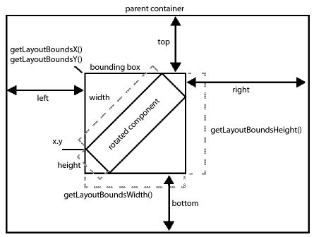
This figure shows how Flex lays out a component in its parent container. The x, y, height, and width properties of the component determine its size before any skins or transformations are applied to it. These are properties that you can set when defining your application.
After Flex applies any skins or transformations to the component, Flex uses the rectangular area, called the bounding box, to position the component in its parent container. The bounding box defines the rectangular are taken up by the component in its parent container. In the absence of any skin or transformation, the size of the bounding box is the same as the height and width of the component.
A graphical component, such as Ellipse and Rect, can define a stroke for their border. If the component defines a stroke, the center of the stroke runs along the outer edge of the component. For example, if you define a two-pixels wide border, the border appears in the area one-pixel outside the component to one-pixel inside the component. The border has to fit completely within the bounding box. Therefore, the upper-left corner of the component might be offset from the edge of the bounding box to accommodate the border.
The following table describes the basic component layout properties and methods:
|
Property or method |
Description |
|---|---|
|
x, y |
The x and y coordinate of the upper-left corner of the component in the parent container. You can set these properties for the children of a container that use absolute layout. Otherwise, Flex calculates these values for you. |
|
height, width |
The height and width of the component. You can set these properties as a pixel value or as a percent of the size of the parent container. Otherwise, Flex calculates these values for you. |
|
top, bottom, left, right |
The distances between the sides of the component and sides of the parent container. Use these properties when performing constraint-based layout. Only containers that use absolute layout support constraint-based layout. For more information, see Using constraints to control component layout. |
|
getLayoutBoundsX(), getLayoutBoundsY() |
The x and y coordinates of the bounding box of the component in the parent container after any skins and transformations have been applied to the component. |
|
getlayoutBoundsHeight(), getLayoutBoundsWidth() |
The height hand width of the bounding box of the component in the parent container after any skins and transformations have been applied to the component. \ |
Basic layout rules and considerations
Flex performs layout according to the following basic rules. If you remember these rules, you should be able to easily understand the details of Flex layout. These rules help you determine why Flex lays out your application as it does and to determine how to modify your application appearance.
For a detailed description of how Flex sizes components, see Determining and controlling component sizes. For detailed information on component positioning, see Positioning components.
-
Flex first determines all components' measured (default) or explicitly set sizes up, from the innermost child components to the outermost (Application) component. This is done in the measurement pass.
-
After the measurement pass, Flex determines all percentage-based sizes and constraints applied to the components. Flex then lays out components down, from the outermost container to the innermost components. This is done in the layout pass.
-
Sizes that you set to a pixel value are mandatory and fixed, and override any maximum or minimum size specifications that you set for the component.
-
The default sizes determined in the measurement pass specify the sizes of components that do not have explicit or percentage-based sizes (or use constraint-based layout), and are fixed.
-
Percentage-based size specifications are advisory, and are relative to the size of the parent container. The layout algorithms satisfy the request if possible, and use the percentage values to determine proportional sizes, but the actual sizes can be less than the requested sizes. Percentage-based sizes are always within the component's maximum and minimum sizes, and, subject to those bounds, don't cause a container's children to exceed the container size.
Component layout patterns
Flex uses different patterns to lay out different containers and their children. These patterns generally fit in the type categories listed in the following table. The table describes the general layout behavior for each type, how the default size of the container is determined, and how Flex sizes percentage-based children.
|
Pattern |
Container type |
Default layout behavior |
|---|---|---|
|
Absolute positioning |
Spark container using BasicLayout MX Canvas container or Application or Panel container with layout="absolute" |
General layout: Children of the container do not interact. That is, children can overlap and the position of one child does not affect the position of any other child. You specify the child positions explicitly or use constraints to anchor the sides, baselines, or centers of the children relative to the parent container. Default sizing: The measurement pass finds the child with the lowest bottom edge and the child with the rightmost edge, and uses these values to determine the container size. Percentage-based children: Sizing uses different rules depending on whether you use constraint-based layout or x- and y- coordinate positioning. See Flex component sizing techniques. |
|
Containers that arrange children linearly |
Spark containers using HorizontalLayout or VerticalLayout MX Box, DividedBox, Form, Panel, TitleWindow containers |
General layout: All children of the container are arranged in a single row or column. Each child's height and width can differ from all other children's heights or widths. Default sizing: The container fits the default or explicit sizes of all children and all gaps, borders, and padding. Percentage-based children: If children with percentage-based sizing request more than the available space, the actual sizes are set to fit in the space, proportionate to the requested percentages. |
|
Grid |
MX Grid container |
General layout: A container with a vertical layout of rows. Each row is a container with a horizontal layout of child controls, where all items are constrained to align with each other. The heights of all the cells in a single row are the same, but each row can have a different height. The widths of all cells in a single column are the same, but each column can have a different width. You can define a different number of cells for each row or each column of the Grid container, and individual cells can span columns or rows. Default sizing: The grid fits the individual rows and children at their default sizes. Percentage-based children: If children use percentage-based sizing, the sizing rules fit the children GridItem components within their rows, and GridRow components within the grid size according to linear container sizing rules. |
|
Tile |
Spark container using TileLayout MX Tile container |
General layout: The container is a grid of equal-sized cells. The cells can be in row-first or column-first order. For MX, if you do not specify explicit or percentage-based dimensions, the container has as close as possible to an equal number of rows and columns, with the direction property determining the orientation with the larger number of items, if necessary. For Spark, if you do not specify explicit or percentage-based dimensions, the container arranges the rows and columns so that the container has an equal height and width. The orientation property determining the orientation with the larger number of items, if necessary. Default sizing: If you do not specify tileWidth and tileHeight properties (MX Tile container) or columnWidth and rowHeight (Spark Tile layout), the container uses the measured or explicit size of the largest child cell for the size of each child cell. Percentage-based children: The percentage-based sizes of a child component specify a percentage of the individual cell, not of the Tile container. |
|
Navigators |
MX ViewStack, Accordion, and TabNavigator containers |
General layout: The container displays one child at a time. Default sizing: The container size is determined by the measured or explicit dimensions of the initially selected child, and thereafter, all children are forced to be that initial size. If you set the resizeToChild property to true the container resizes to accommodate the measured or explicit size of each child, as that child appears. Percentage-based children: As a general rule, you either use 100% for both height and width, which causes the children to fill the navigator bounds, or do not use percentage-based sizing. |
Sizing components
Flex provides several ways for controlling the size of components. You can do the following tasks:
-
Let Flex automatically determine component sizes.
-
Specify pixel sizes.
-
Specify component size as a percentage of the parent container.
-
Combine layout and sizing by specifying a constraint-based layout.
Several Flex properties affect the size of components. As a rule, you use only a few properties for most applications, but a more complete understanding of these properties can help you understand the underlying Flex sizing mechanism and how Flex sizing properties interrelate. For information on the rules that Flex applies to determine the sizes of components based on the properties, see Determining and controlling component sizes.
For information on constraint-based layout, see Using constraints to control component layout.
Commonly used sizing properties
You typically use the following properties to specify how a component is sized:
-
The height, width, percentHeight, and percentWidth properties specify the height and width of a component. In MXML tags, you use the height and width properties to specify the dimensions in pixels or as percentages of the parent container size. In ActionScript, you use the height and width properties to specify the dimensions in pixels, and use the percentHeight and percentWidth properties to specify the dimensions as a percentage of the parent container.
-
The minHeight, minWidth, maxHeight, and maxWidth properties specify the minimum and maximum dimensions that a component can have if Flex determines the component size. These properties have no effect if you explicitly set the width or height in pixels.
The following characteristics and their associated properties determine the size of the component:
|
Characteristic |
Associated properties |
Description |
|---|---|---|
|
Actual dimensions |
height, width |
The height and width of the displayed control, in pixels, as determined by the layout pass. If you set any explicit values, they determine the corresponding actual values. |
|
Explicit dimensions |
explicitHeight, explicitWidth Setting the height and width properties to integer values also sets the explicitHeight and explicitWidth properties. |
A dimension that you set as a number of pixels. These dimensions cannot be overridden. Application developers typically use the height and width properties to set explicit dimensions. You cannot have both an explicit dimension and a percentage-based dimension; setting one unsets the other. |
|
Percentage-based dimensions |
percentHeight, percentWidth In MXML tags only, setting the height and width properties to percentage string values, such as "50%", also sets the percentHeight and percentWidth properties. |
A dimension that you set as a number in the range 0-100, as a percentage of the viewable area of the parent container. If you set a percentage-based dimension, the component is resizable, and grows or shrinks if the parent dimension changes. |
|
Default dimensions |
measuredHeight, measuredWidth |
Not used directly by application developers. The dimensions of the component, as determined by the measure() method of the component. These values cannot be outside the range determined by the component's maximum and minimum height and width values. |
The following characteristics determine the minimum and maximum default and percentage-based dimensions that a component can have. They do not affect values that you set explicitly or, for MX containers only, dimensions determined by using constraint-based layout.
|
Characteristic |
Associated Properties |
Description |
|---|---|---|
|
Minimum dimensions |
minHeight, minWidth Setting the explicit minimum dimensions also sets the minHeight and minWidth properties. |
The minimum dimensions a component can have. By default, Flex sets these dimensions to the values of the minimum default dimensions. |
|
Maximum dimensions |
maxHeight, maxWidth Setting the explicit maximum dimensions also sets the maxHeight and maxWidth properties. |
The maximum dimensions a component can have. The default values of these properties are component-specific, but often are 10000 pixels. |
|
Minimum default dimensions |
measuredMinHeight, measuredMinWidth |
Not used by application developers. The minimum valid dimensions, as determined by the measure() method. The default values for these properties are component-specific; for many controls, the default values are 0. |
Basic sizing rules
The following rules describe how you can use Flex sizing properties to specify the size of a component:
-
Any dimension property that you set overrides the corresponding default value; for example, an explicitly set height property overrides any default height.
-
Setting the width, height, maxWidth, maxHeight, minWidth, or minHeight property to a pixel value in MXML or ActionScript also sets the corresponding explicit property, such as explicitHeight or explicitMinHeight.
-
The explicit height and width and the percentage-based height and width are mutually exclusive. Setting one value sets the other to NaN; for example, if you set height or explicitHeight to 50 and then set percentHeight to 33, the value of the explicitHeight property is NaN, not 50, and the height property returns a value that is determined by the percentHeight setting.
-
If you set the height or width property to a percentage value in an MXML tag, you actually set the percentage-based value, that is, the percentHeight or percentWidth property, not the explicit value. In ActionScript, you cannot set the height or width property to a percentage value; instead, set the percentHeight or percentWidth property.
-
When you read the height and width properties at run time, the value is always the actual height or width of the control.
Determining and controlling component sizes
Flex determines the sizes of controls and containers based on the components and their properties and how you can use Flex properties to control the sizes.
Determining component size
During the measurement pass, Flex determines the components' default (also called measured) sizes. During the layout pass, Flex determines the actual sizes of the components, based on the explicit or default sizes and any percentage-based size specifications.
The following list describes sizing rules and behaviors that apply to all components, including both controls and containers. For container-specific sizing rules, see below. For detailed information on percentage-based sizing, see Using percentage-based sizing.
-
If you specify an explicit size for any component (that is not outside the component's minimum or maximum bounds), Flex always uses that size.
-
If you specify a percentage-based size for any component, Flex determines the component's actual size as part of the parent container's sizing procedure, based on the parent's size, the component's requested percentage, and the container-specific sizing and layout rules.
-
The default and percentage-based sizes are always at least as large as any minimum size specifications.
-
If you specify a child component size by using a percentage value and do not specify an explicit or percentage-based size for its container, the child component and the container use their default size.
-
A child might require more space than is available in the parent container. The container can either let the component extend past its boundaries, or the container can clip the component to its boundaries.
For Spark containers, the default is to let the child component extend past its boundaries. Set the clipAndEnableScrolling property to true to configure a parent to clip the child at the parent's boundaries. If you clip the children to the container boundaries, you can use the Scroller component with the container to display scroll bars. For more information, see Scrolling Spark containers.
For a MX container, if a child requires more space than is available in the parent container, the parent clips the children at the parent's boundaries, and, by default, displays scroll bars on the container. Set the clipContent property to false to configure a parent to let the child extend past the parent's boundaries. Use the scrollPolicy property to control the display of the scroll bars. For more information, see Scrolling MX containers.
-
If you specify a percentage-based size for a component, Flex uses the viewable area of the container in determining the sizes.
-
When sizing and positioning components, Flex does not distinguish between visible and invisible components. By default, an invisible component is sized and positioned as if it were visible. To prevent Flex from considering an invisible component when it sizes and positions other components, set the component's includeInLayout property to false. This property affects the layout of the children of all containers except Accordion, FormItem, or ViewStack. For more information, see Preventing layout of hidden controls.
Note: Setting a component's includeInLayout property to false does not prevent Flex from displaying the component; it only prevents Flex from considering the component when it lays out other components. To prevent Flex from displaying the component, also set the visible property to false.
Determining container size
Flex uses the following basic rules, in addition to the basic component sizing rules, to determine the size of a container:
-
A percentage-based container size is advisory. Flex makes the container large enough to fit its children at their minimum sizes. For more information on percentage-based sizing, see Using percentage-based sizing.
-
If you do not specify an explicit or percentage-based size for a container, Flex determines the container size by using explicit sizes that you specify for any of its children, and the default sizes for all other children.
-
Flex does not consider any percentage-based settings of a container's children when sizing the container; instead, it uses the child's default size.
-
If a MX container uses automatic scroll bars, Flex does not consider the size of the scroll bars when it determines the container's default size in its measurement pass. Thus, if a scroll bar is required, a default-sized container might be too small for proper appearance. For more information, see Scrolling MX containers.
For a Spark container, the Scroller component adds the scroll bars and are therefore separate from the container.
Each MX container and each Spark layout class for a Spark container has a set of rules that determines the container's default size. For information on default sizes of each container and layout, see the specific container sections in the ActionScript 3.0 Reference for Apache Flex , and in Application containers; Spark containers; MX layout containers; and MX navigator containers.
Example: Determining a container and child sizes
The following example code shows how Flex determines the sizes of an SkinnableContainer container and its children. In this example, the SkinnableContainer uses a HorizontalLayout with three Button controls:
<?xml version="1.0"?>
<!-- components\HBoxSizeSpark.mxml -->
<s:Application xmlns:fx="http://ns.adobe.com/mxml/2009"
    xmlns:mx="library://ns.adobe.com/flex/mx"
    xmlns:s="library://ns.adobe.com/flex/spark">
    <s:layout>
        <s:VerticalLayout/>
    </s:layout>

    <s:SkinnableContainer id="hb1">
        <s:layout>
            <s:HorizontalLayout/>
        </s:layout>
        <s:Button id="b1"
            label="Label 1"/>
        <s:Button id="b2"
            label="Label 2"
            minWidth="80"/>
        <s:Button id="b3"
            label="Label 3"/>
    </s:SkinnableContainer>

    <s:Form>
        <s:FormItem label="SkinnableContainer:">
            <s:Label text="{hb1.width}"/>
        </s:FormItem>
        <s:FormItem label="Button #1:">
            <s:Label text="{b1.width}"/>
        </s:FormItem>
        <s:FormItem label="Button #2:">
            <s:Label text="{b2.width}"/>
        </s:FormItem>
        <s:FormItem label="Button #3:">
            <s:Label text="{b3.width}"/>
        </s:FormItem>
    </s:Form>
</s:Application>
By default, the SkinnableContainer with a HorizontalLayout uses a 6 pixel gap between children. Since the Application container specifies no sizing properties, the Application container sizes itself large enough to hold the SkinnableContainer container and the Form container.
The default width for buttons is based on the label text width; in this example it is 70 pixels for all three buttons. However, the second button sets its minWidth property to 80 pixels. Therefore, the SkinnableContainer width is 70 + 80 + 70 + 12 = 232 pixels.
If you change the minWidth property of the second button to 65 pixels, the calculation uses the button's minimum width, 70 pixels, so the SkinnableContainer width is 222 pixels.
In the following example, you explicitly set the width of the Application container to 600 pixels. The Application container defines no left or right padding so the content area of its children is the entire area of the Application container. The SkinnableContainer width is now 450 pixels, 75% of 600 pixels.
The button sizes are 92, 276, and 70 pixels, respectively. The third button uses the default size. The first and second buttons use 25% and 75% of the remaining available space in the container after deducting the default-width button and the gaps.
<?xml version="1.0"?>
<!-- components\HBoxSizePercentSpark.mxml -->
<s:Application xmlns:fx="http://ns.adobe.com/mxml/2009"
    xmlns:mx="library://ns.adobe.com/flex/mx"
    xmlns:s="library://ns.adobe.com/flex/spark"
    width="600">
    <s:layout>
        <s:VerticalLayout/>
    </s:layout>

    <s:SkinnableContainer id="hb1" width="75%">
        <s:layout>
            <s:HorizontalLayout/>
        </s:layout>
        <s:Button id="b1"
            label="Label 1"
            width="25%"/>
        <s:Button id="b2"
            label="Label 2"
            width="75%"
            minWidth="80"/>
        <s:Button id="b3"
            label="Label 3"/>
    </s:SkinnableContainer>

    <s:Form>
        <s:FormItem label="SkinnableContainer:">
            <s:Label text="{hb1.width}"/>
        </s:FormItem>
        <s:FormItem label="Button #1:">
            <s:Label text="{b1.width}"/>
        </s:FormItem>
        <s:FormItem label="Button #2:">
            <s:Label text="{b2.width}"/>
        </s:FormItem>
        <s:FormItem label="Button #3:">
            <s:Label text="{b3.width}"/>
        </s:FormItem>
    </s:Form>
</s:Application>
If you set the SkinnableContainer width property to 20%, however, the SkinnableContainer width is not 120 pixels, 20% of the Application container width. This is because 120 pixels is too small to fit the container's children. Remember that percentage-based size specifications are advisory. The layout algorithms satisfy the request if possible, but the actual sizes can be different from the requested sizes.
Instead it is 183 pixels, the sum of 21 pixels for button 1 (the default minimum size), 80 pixels for button 2 (the specified minimum size), and 70 pixels (the specified minimum size) for button 2, 16 pixels for the gaps between buttons. The buttons are 21, 80, and 70 pixels wide, respectively.
For more information and examples showing sizing of containers and children, see Flex component sizing techniques. For detailed information on percentage-based sizing, see Using percentage-based sizing.
Flex component sizing techniques
You can use default sizing, explicit sizing, and percentage-based sizing techniques to control the size of components. For information on using constraint-based layout for component sizing, see Using constraints to control component layout.
Using default sizing
If you do not otherwise specify sizes, Flex calculates a size based on the default sizing characteristics of the particular component and the default or explicit sizes of the component's child controls.
As a rule, determine whether a component's default size (as listed for the component in the ActionScript 3.0 Reference for Apache Flex) is appropriate for your application. If it is, you do not have to specify an explicit or percentage-based size.
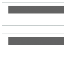
The following example shows how you can use default sizing for Button children of an BorderContainer container. In this example, none of the children of the container specify a width property:
<?xml version="1.0"?>
<!-- components\DefaultButtonSizeSpark.mxml -->
<s:Application xmlns:fx="http://ns.adobe.com/mxml/2009"
    xmlns:mx="library://ns.adobe.com/flex/mx"
    xmlns:s="library://ns.adobe.com/flex/spark"
    xmlns:MyComps="myComponents.*">

    <s:BorderContainer width="400" height="25">
        <s:layout>
            <s:HorizontalLayout/>
        </s:layout>
        <s:Button label="Label 1"/>
        <s:Button label="Label 2"/>
        <s:Button label="Label 3"/>
    </s:BorderContainer>
</s:Application>
Flex, therefore, uses the default sizes of the buttons, which accommodate the button label and default padding, and draws this application as the following image shows:

Notice the empty space to the right of the third button, because the sum of the default sizes is less than the available space.
Specifying an explicit size
Use the width and height properties of a component to explicitly set its size. In this example, Flex sets the component sizes to 300 by 40 pixels.
<?xml version="1.0"?>
<!-- components\ExplicitTextSize.mxml -->
<s:Application xmlns:fx="http://ns.adobe.com/mxml/2009"
    xmlns:mx="library://ns.adobe.com/flex/mx"
    xmlns:s="library://ns.adobe.com/flex/spark">

    <s:Group>
        <s:TextInput id="myInput"
            text="This TextInput control is 200 by 40 pixels."
            width="300"
            height="40"/>
    </s:Group>
</s:Application>
The following example shows setting the sizes of a container and its child:
<?xml version="1.0"?>
<!-- components\ExplicitHBoxSize.mxml -->
<s:Application xmlns:fx="http://ns.adobe.com/mxml/2009"
    xmlns:mx="library://ns.adobe.com/flex/mx"
    xmlns:s="library://ns.adobe.com/flex/spark">

    <s:Group width="150" height="50">
        <s:TextInput id="myInput"
            text="Enter the zip code"
            width="200" height="40"/>
    </s:Group>
</s:Application>
Because the specified TextInput control size is larger than that of its parent container, it extends beyond the boundaries of the container. If you set the clipAndEnableScrolling property of the container to true, the child is clipped at the container boundaries.
<?xml version="1.0"?>
<!-- components\ExplicitHBoxSizeScroll.mxml -->
<s:Application xmlns:fx="http://ns.adobe.com/mxml/2009"
    xmlns:mx="library://ns.adobe.com/flex/mx"
    xmlns:s="library://ns.adobe.com/flex/spark">

    <s:Scroller>
        <s:Group width="150" height="50">
            <s:TextInput id="myInput"
                text="Enter the zip code"
                width="200" height="40"/>
        </s:Group>
    </s:Scroller>
</s:Application>
For more information on using scroll bars with Spark containers, see Scrolling Spark containers.
Note that for MX containers, the clipContent property of the container defaults to true. Therefore, MX containers clip the control at the container boundary and displays scroll bars. For more information on using scroll bars with MX containers, see Scrolling MX containers.
Using percentage-based sizing
Percentage-based sizing dynamically determines and maintains a component's size relative to its container; for example, you can specify that the component's width is 75% of the container. This sizing technique has several advantages over default or explicit fixed sizing:
-
You only have to specify a size relative to the container; you don't have to determine exact measurements.
-
The component size changes dynamically when the container size changes.
-
The sizing mechanism automatically takes into account the remaining available space and fits components even if their requested size exceeds the space.
To specify a percentage value, use one of the following coding techniques:
-
In an MXML tag, set the height or width property to a percentage value; for example:
<s:TextArea id="ta1" width="70%" height="40%"/>
-
In an MXML tag or an ActionScript statement, set the percentHeight or percentWidth property to a numeric value; for example:
ta1.percentWidth=70;
The exact techniques Flex uses to determine the dimensions of a component that uses percentage-based sizing depend on the type of container. For example, a MX Tile container, or a Spark container using the TileLayout class, has cells that are all the largest default or explicit dimensions of the largest child. Child control percentage values specify a percentage of the tile cell size, not of the container size. The percentage sizes of most other containers is relative to the overall container size.
Sizing percentage-based children of a linear container with automatic positioning
When Flex sizes children of a container that uses automatic positioning to lay out children in a single direction, Flex does the following:
-
Determines the size of the viewable area of the parent container, and uses those dimensions for sizing calculations. The viewable area is the part of the container that is being displayed and can contain child components, text, images, or other content. For more information on calculating the size of containers, see Determining component size.
-
Determines the desired sizes of container children with percentage-based sizes as a percentage of the viewable area of the container, minus any padding and gaps between the children.
-
Reserves space for all children with explicit or default sizes.
-
If available space (parent container size minus all reserved space, including borders, padding, and gaps) cannot accommodate the percentage requests, divides the available space in proportion to the specified percentages.
-
If a minimum or maximum height or width specification conflicts with a calculated value, uses the minimum or maximum value, and recalculates all other percentage-based components based on the reduced available space.
-
Rounds the size down to the next integer.
The following examples show how the requested percentage can differ from the size when the component is laid out:
-
Suppose that 50% of a SkinnableContainer is available after reserving space for all explicit-sized and default-sized children, and for all gaps and padding. If one component requests 20% of the parent, and another component requests 60%, the first component is sized to 12.5% (20 /(20+ 60) * 50%) of the parent container and the second component is sized to 37.5% of the parent container.
-
If any component requests 100% of its parent application container's space, it occupies all the container except for the application's padding.
Example: Using percentage-based children
The following example specifies percentage-based sizes for the first two of three buttons in a BorderContainer container:
<?xml version="1.0"?>
<!-- components\PercentHBoxChildren.mxml -->
<s:Application xmlns:fx="http://ns.adobe.com/mxml/2009"
    xmlns:mx="library://ns.adobe.com/flex/mx"
    xmlns:s="library://ns.adobe.com/flex/spark">

    <s:BorderContainer width="400" height="25">
        <s:layout>
            <s:HorizontalLayout/>
        </s:layout>
        <s:Button id="b1" label="Label 1" width="25%"/>
        <s:Button id="b2" label="Label 2" width="40%"/>
        <s:Button id="b3" label="Label 3"/>
    </s:BorderContainer>
</s:Application>
In this example, the default width of the third button is 70 pixels. The BorderContainer container has no padding by default, but has a one-pixel wide border on both sides. Therefore, of the 400 pixel width, only 398 are available for laying out children. The HorizontalLayout class uses a 6-pixel horizontal gap between each component.
The first button requests 25% of the available 398 pixels of space, or 100 pixels (All calculated values are to the nearest pixel). The second button requests 40%, or 159 pixels. There is still unused space to the right of the third button.
Flex draws the following application:

Now change the percentage values requested to 50% and 40%, respectively:
<?xml version="1.0"?>
<!-- components\PercentHBoxChildren5040.mxml -->
<s:Application xmlns:fx="http://ns.adobe.com/mxml/2009"
    xmlns:mx="library://ns.adobe.com/flex/mx"
    xmlns:s="library://ns.adobe.com/flex/spark">

    <s:BorderContainer width="400" height="25">
        <s:layout>
            <s:HorizontalLayout/>
        </s:layout>
        <s:Button id="b1" label="Label 1" width="50%"/>
        <s:Button id="b2" label="Label 2" width="40%"/>
        <s:Button id="b3" label="Label 3"/>
    </s:BorderContainer>
</s:Application>
In this example, the first button requests 50% of the available space, or 200 pixels. The second button still requests 40%, or 160 pixels, for a total of 360 pixels. However, the BorderContainer container only has 318 pixels free after reserving 70 pixels for the default-width button, 2 pixels for the borders, and 12 pixels for the gaps between components.
Flex divides the available space proportionally between the two buttons, giving .5/(.5 + .4) * 318 = 176 pixels, to the first button and .4/(.5 + .4) * 318 = 140 pixels, to the second button.
Flex draws the following application:

Sizing percentage-based children of a container with absolute positioning
Spark containers with a layout of BasicLayout, or MX Canvas, MX Panel, and MX Application containers can use absolute positioning. When Flex sizes children of a container that uses absolute positioning, it does the following:
-
Determines the viewable area of the parent container, and uses the corresponding dimensions as the container dimensions for sizing calculations. For more information on calculating the size of containers, see Determining component size.
-
Determines the sizes of children with percentage-based sizes by multiplying the decimal value by the container dimension minus the position of the control in the dimension's direction. For example, if you specify x="10" and width="100%" for a child, the child size extends only to the edge of the viewable area, not beyond.
Note: The Spark BasicLayout class always calculates the percentage based on the size of the container, regardless of the position of the child component in the container.Because controls can overlay other controls or padding, the sizing calculations do not consider padding or any other children when determining the size of a child.
-
If a minimum or maximum height or width specification conflicts with a calculated value, uses the minimum or maximum value.
-
For MX containers, round the size down to the closest integer.
For Spark containers, round the size up or down to the closest integer.
Example: Using percentage-based children with absolute positioning
The following code shows the percentage-based sizing behavior with absolute positioning:
<?xml version="1.0"?>
<!-- components\PercentSizeAbsPosit.mxml -->
<s:Application xmlns:fx="http://ns.adobe.com/mxml/2009"
    xmlns:mx="library://ns.adobe.com/flex/mx"
    xmlns:s="library://ns.adobe.com/flex/spark">
    <s:layout>
        <s:VerticalLayout gap="25"/>
    </s:layout>
    <s:BorderContainer
        width="200" height="75">
        <s:layout>
            <s:BasicLayout/>
        </s:layout>
        <s:BorderContainer
            x="20" y="10"
            width="100%" height="25"
            backgroundColor="#666666"/>
    </s:BorderContainer>

    <s:BorderContainer
        width="200" height="75">
        <s:layout>
            <s:BasicLayout/>
        </s:layout>
        <s:BorderContainer
            left="20" top="10"
            width="100%" height="25"
            backgroundColor="#666666"/>
    </s:BorderContainer>
</s:Application>
Flex draws the following application:
Using minimum or maximum dimensions
You can also use the minWidth, minHeight, maxWidth, and maxHeight properties with a percentage-based component to constrain its size. Consider the following example:
<?xml version="1.0"?>
<!-- components\PercentChildrenMin.mxml -->
<s:Application xmlns:fx="http://ns.adobe.com/mxml/2009"
    xmlns:mx="library://ns.adobe.com/flex/mx"
    xmlns:s="library://ns.adobe.com/flex/spark">
    <s:layout>
        <s:VerticalLayout/>
    </s:layout>

    <s:BorderContainer id="bc" width="400" height="25">
        <s:layout>
            <s:HorizontalLayout/>
        </s:layout>
        <s:Button id="b1" label="Label 1" width="50%"/>
        <s:Button id="b2" label="Label 2" width="40%" minWidth="150"/>
        <s:Button id="b3" label="Label 3"/>
    </s:BorderContainer>

    <s:Form>
        <s:FormItem label="Container:">
            <s:Label text="{bc.width}"/>
        </s:FormItem>
        <s:FormItem label="Button #1:">
            <s:Label text="{b1.width}"/>
        </s:FormItem>
        <s:FormItem label="Button #2:">
            <s:Label text="{b2.width}"/>
        </s:FormItem>
        <s:FormItem label="Button #3:">
            <s:Label text="{b3.width}"/>
        </s:FormItem>
    </s:Form>
</s:Application>
To determine the widths of the percentage-based button sizes, Flex first determines the sizes as described in the second example in Example: Using percentage-based children, which results in requested values of 176 for the first button and 140 for the second button. However, the minimum width of the second button is 150, so Flex sets its size to 150 pixels, and reduces the size of the first button to occupy the remaining available space, which results in a width of 166 pixels.
Flex draws the following application:

Setting the application container size
When you size an application, you often start by setting the size of the Application or Application container. The application containers determine the boundaries of your application in the Adobe® Flash® Player or Adobe® AIR™.
The width and height properties specified by the application container are used to set the width and height of the <object> and <embed> tags in the HTML wrapper page. Those numbers determine the portion of the HTML page that is allocated to the Flash Player plug-in.
If you are not autogenerating the HTML wrapper, set the application containers width and height properties to 100%. That way, the application scales to fit the space that is allocated to the Flash plug-in.
Set the application container size as the following example shows:
<?xml version="1.0"?>
<!-- components\AppExplicit.mxml -->
<s:Application xmlns:fx="http://ns.adobe.com/mxml/2009"
    xmlns:mx="library://ns.adobe.com/flex/mx"
    xmlns:s="library://ns.adobe.com/flex/spark"
    height="100"
    width="150">

        <!-- Application children go here. -->
</s:Application>
In this example, you set the application container size to 100 by 150 pixels. Anything in the application larger than this window is clipped at the window boundaries. Therefore, if you define a 200 pixel by 200 pixel DataGrid control, it is clipped.
If you are using the Spark Application container, you can modify the container's skin to add scroll bars. For more information, see Using scroll bars with the application container. If you are using the MX Application container, it automatically displays scroll bars.
For more information on sizing the Application container, see Application containers.
Using padding and custom gaps
There may be situations where you want your containers to have padding around the edges. Some containers, such as the MX Application container, have padding by default; others, such as the Spark Application container, have padding values of 0 by default.
Use the paddingTop, paddingBottom, paddingRight,and paddingLeft style properties to set the padding around the content area of a MX container. To set the padding for a Spark container, you can either use the padding properties of the layout classes, such as HorizontalLayout or VerticalLayout, or define a container skin.
Also, MX containers and Spark layouts define gaps between children, which you might want to change from the default values. If your application has nonzero padding and gaps, Flex reserves the necessary pixels before it sizes any percentage-based components.
Consider the following example:
<?xml version="1.0"?>
<!-- components\PadContainer.mxml -->
<s:Application xmlns:fx="http://ns.adobe.com/mxml/2009"
    xmlns:mx="library://ns.adobe.com/flex/mx"
    xmlns:s="library://ns.adobe.com/flex/spark">
    <s:layout>
        <s:VerticalLayout/>
    </s:layout>

    <s:BorderContainer width="400" height="25">
        <s:layout>
            <s:HorizontalLayout
                paddingLeft="5"
                paddingRight="5"
                gap="15"/>
        </s:layout>

        <s:Button id="b1"
            label="Label 1"
            width="75%"/>
        <s:Button id="b2"
            label="Label 2"
            minWidth="120"/>
        <s:Button id="b3"
            label="Label 3"/>
    </s:BorderContainer>

    <s:Form>
        <s:FormItem label="Button #1:">
            <s:Label text="{b1.width}"/>
        </s:FormItem>
        <s:FormItem label="Button #2:">
            <s:Label text="{b2.width}"/>
        </s:FormItem>
        <s:FormItem label="Button #3:">
            <s:Label text="{b3.width}"/>
        </s:FormItem>
    </s:Form>
</s:Application>
The left and right padding of the container is set to 5 pixels, and the gap between children is 15 pixels. The default width of the third button is 70 pixels. That leaves 288 pixels for the two percentage-based components. The second button requires its minimum size of 120 pixels, leaving 168 pixels available for the first button.
Positioning components
The position of a component is defined by the x and y coordinates of its top, left corner in its parent container. For most containers, Flex automatically determines the location of the component in its parent container. This is called automatic positioning.
Some containers let you explicitly specify the x and y coordinates of the component in it parent container. This is called absolute positioning. These containers include the following:
-
A Spark container using the BasicLayout class
-
The MX Canvas container
-
The MX Application and Panel containers with the layout property set to absolute
Automatic positioning
With automatic positioning, Flex positions the container children according to the container's layout rules, such as the layout direction, the container padding, and the gaps between children of that container.
For containers that use automatic positioning, setting the x or y property directly on a child or calling the child's move() method has no effect, or only a temporary effect. This is because the container recalculates the child's position and does not use the specified value. You can, however, specify absolute positions for the children of these containers under some circumstances; for more information, see below.
You can control aspects of the layout by specifying container properties; for details on the properties, see the property descriptions for the container in the ActionScript 3.0 Reference for Apache Flex. You also control the layout by controlling component sizes and by using techniques such as adding spacers.
Using the Spacer control to control layout
Flex includes a Spacer control that helps you lay out children within a parent container. The Spacer control is invisible, but it does allocate space within its parent.
In the following example, you use a percentage-based Spacer control to push the Button control to the right so that it is aligned with the right edge of the HBox container:
<?xml version="1.0"?>
<!-- components\SpacerHBox.mxml -->
<s:Application xmlns:fx="http://ns.adobe.com/mxml/2009"
    xmlns:mx="library://ns.adobe.com/flex/mx"
    xmlns:s="library://ns.adobe.com/flex/spark">
    <s:layout>
        <s:VerticalLayout/>
    </s:layout>

    <fx:Script>
        <![CDATA[
            [Embed(source="assets/flexlogo.jpg")]
            [Bindable]
            public var imgCls:Class;
        ]]>
    </fx:Script>

    <s:SkinnableContainer width="400">
        <s:layout>
            <s:HorizontalLayout/>
        </s:layout>
        <mx:Image source="{imgCls}"/>
        <s:Label  text="Company XYZ"/>
        <mx:Spacer width="100%"/>
        <s:Button label="Close"/>
    </s:SkinnableContainer>
</s:Application>
In this example, the Spacer control is the only percentage-based component in the parent container. Flex sizes the Spacer control to occupy all available space in the container that is not required for other components. By expanding the Spacer control, Flex pushes the Button control to the right edge of the container.
You can use all sizing and positioning properties with the Spacer control, such as width, height, maxWidth, maxHeight, minWidth, and minHeight.
Disabling automatic positioning temporarily
You can use effects, such as the Move and Zoom effects, to modify the size or position of a child in response to a user action. For example, you might define a child so that when the user selects it, the child moves to the top of the container and doubles in size. These effects modify the x and y properties of the child as part of the effect. Similarly, you might want to change the position of a control by changing its x or y coordinate value, for example, in response to a button click.
Containers that use automatic positioning ignore the values of the x and y properties of their children during a layout update. Therefore, the layout update cancels any modifications to the x and y properties performed by the effect, and the child does not remain in its new location.
You can prevent Flex from performing automatic positioning updates that conflict with the requested action of your application by setting the autoLayout property of a container to false. Setting this property to false prevents Flex from laying out the container's contents when a child moves or resizes. The default value is true, which enables Flex to update layouts.
For MX containers only, even when you set the autoLayout property of a container to false, Flex updates the layout when you add or remove a child. Application initialization, deferred instantiation, and the <mx:Repeater> tag add or remove children, so layout updates always occur during these processes, regardless of the value of the autoLayout property. Therefore, during container initialization, Flex defines the initial layout of the container children regardless of the value of the autoLayout property.
The following example disables layout updates for a VBox container:
<?xml version="1.0"?>
<!-- components\DisableVBoxLayout.mxml -->
<s:Application xmlns:fx="http://ns.adobe.com/mxml/2009"
    xmlns:mx="library://ns.adobe.com/flex/mx"
    xmlns:s="library://ns.adobe.com/flex/spark">
    <s:layout>
        <s:VerticalLayout/>
    </s:layout>

    <mx:VBox id="vb1" autoLayout="false"
        width="200"
        height="200">
        <s:Button id="b1"
            label="Button 1"/>
        <s:Button id="b2"
            label="Button 2"
            click="{b2.x += 10; vb1.invalidateDisplayList();}"/>
        <s:Button id="b3"
            label="Button 3"
            creationComplete="b3.x = 100; b3.y = 75;"/>
    </mx:VBox>
</s:Application>
In this example, Flex initially lays out all three Button controls according to the rules of the VBox container. The creationComplete event listener for the third button is dispatched after the VBox control has laid out its children, but before Flex displays the buttons. Therefore, when the third button appears, it is at the x and y positions specified by the creationComplete listener.
After the buttons appear, Flex shifts the second button 10 pixels to the right each time a user clicks it. The button click also triggers the container to update its layout by calling the updateDisplay() method.
Setting the autoLayout property of a container to false prohibits Flex from updating a container's layout after a child moves or resizes, so you should set it to false only when necessary. You should always test your application with the autoLayout property set to the default value of true, and set it to false only as necessary for the specific container and specific actions of the children in that container.
For more information on effects, see Introduction to effects.
Preventing layout of hidden controls
By default, Flex lays out and reserves space for all components, including hidden components, but it does not display the hidden controls. A hidden component is one with its visible property set to false. You see blank spots where the hidden controls should appear when you make them visible. In place of the hidden controls, you see their container's background.
However, you can prevent Flex from considering the child component when it lays out the container's other children by setting the child component's includeInLayout property of the component to false.
When a component's includeInLayout property is false, Flex does not include it in the layout calculations for other components. In other words, Flex does not reserve space for the component, but still draws it. As a result, the component can appear underneath the components that follow it in the layout order. To prevent Flex from drawing the component, you must also set its visible property to false.
The following example shows the effects of the includeInLayout and visible properties. It lets you toggle each of these properties independently on the middle of three Panel controls in a SkinnableContainer:
<?xml version="1.0"?>
<!-- components\HiddenBoxLayout.mxml -->
<s:Application xmlns:fx="http://ns.adobe.com/mxml/2009"
    xmlns:mx="library://ns.adobe.com/flex/mx"
    xmlns:s="library://ns.adobe.com/flex/spark"
    height="500">
    <s:layout>
        <s:VerticalLayout/>
    </s:layout>

    <s:SkinnableContainer>
        <s:layout>
            <s:VerticalLayout/>
        </s:layout>
        <s:Panel id="p1"
            title="Panel 1"/>
        <s:Panel id="p2"
            title="Panel 2"/>
        <s:Panel id="p3"
            title="Panel 3"/>
    </s:SkinnableContainer>

    <s:SkinnableContainer>
        <s:layout>
            <s:HorizontalLayout/>
        </s:layout>
        <s:Button label="Toggle Panel 2 Visible"
            click="{p2.visible=!p2.visible;}"/>
        <s:Button label="Toggle Panel 2 in Layout"
            click="{p2.includeInLayout=!p2.includeInLayout;}"/>
    </s:SkinnableContainer>
</s:Application>
Run this application and click the buttons to see the results of different combinations of visible and includeInLayout properties. The example shows the following behaviors:
-
If you include the second Panel container in the layout but make it invisible, Flex reserves space for it.
-
If you exclude the second Panel container from the layout, the SkinnableContainer resizes and the third Panel container moves up. If you then include the second Panel container in the layout, the SkinnableContainer resizes again, and the third Panel container moves down.
-
If you exclude the second Panel container from the layout but make it visible, Flex still draws it, but does not consider it in laying out the third Panel container, so the two panels overlap.
Absolute positioning
With absolute positioning, you specify the position of the child by setting its x and y properties, or you specify a constraint-based layout; otherwise, Flex places the child at position 0,0 of the parent container. When you specify the x and y coordinates, Flex repositions the controls only when you change the property values.
The following example uses absolute positioning to place two Spark BorderContainer containers inside a SkinnableContainer. Absolute positioning is the default layout of a SkinnableContainer:
<?xml version="1.0"?>
<!-- components\AbsoluteLayout.mxml -->
<s:Application xmlns:fx="http://ns.adobe.com/mxml/2009"
    xmlns:mx="library://ns.adobe.com/flex/mx"
    xmlns:s="library://ns.adobe.com/flex/spark">
    <s:layout>
        <s:VerticalLayout/>
    </s:layout>

    <s:SkinnableContainer
        width="100" height="100">
        <s:BorderContainer id="b1"
            width="80" height="80"
            x="20" y="20"
            backgroundColor="#A9C0E7">
        </s:BorderContainer>

        <s:BorderContainer id="b2"
            width="50" height="50"
            x="120" y="50"
            backgroundColor="#FF0000">
        </s:BorderContainer>
    </s:SkinnableContainer>
</s:Application>

When you use absolute positioning, you have full control over the locations of the container's children. This lets you overlap components. The following example moves the second BorderContainer container so that it partially overlaps the first.
<?xml version="1.0"?>
<!-- components\AbsoluteLayoutOverlap.mxml -->
<s:Application xmlns:fx="http://ns.adobe.com/mxml/2009"
    xmlns:mx="library://ns.adobe.com/flex/mx"
    xmlns:s="library://ns.adobe.com/flex/spark">
    <s:layout>
        <s:VerticalLayout/>
    </s:layout>

    <s:SkinnableContainer
        width="100" height="100">
        <s:BorderContainer id="b1"
            width="80" height="80"
            x="20" y="20"
            backgroundColor="#A9C0E7">
        </s:BorderContainer>

        <s:BorderContainer id="b2"
            width="50" height="50"
            x="0" y="50"
            backgroundColor="#FF0000">
        </s:BorderContainer>
    </s:SkinnableContainer >
</s:Application>
This example produces the following image:

Using constraints to control component layout
You can manage a child component's size and position simultaneously by using constraint-based layout, or by using constraint rows and columns. Constraint-based layout lets you anchor the sides or center of a component to positions relative to the viewable region of the component's container. The viewable region is the part of the component that is being displayed, and it can contain child controls, text, images, or other contents.
Constraint rows and columns let you subdivide a container into vertical and horizontal constraint regions to control the size and positioning of child components with respect to each other and within the parent container.
Creating a constraint-based layout
You can use constraint-based layout to determine the position and size of the immediate children of any container that supports absolute positioning. With constraint-based layout, you can do the following:
-
Anchor one or more edges of a component at a pixel offset from the corresponding edge of its container's viewable region. The anchored child edge stays at the same distance from the parent edge when the container resizes. If you anchor both edges in a dimension, such as top and bottom, the component resizes if the container resizes.
-
Anchor the child's horizontal or vertical center (or both) at a pixel offset from the center of the container's viewable region. The child does not resize in the specified dimension unless you also use percentage-based sizing.
-
Anchor the baseline of a component at a pixel offset from the top edge of its parent container.
You can specify a constraint-based layout for any Flex framework component (that is, any component that extends the UIComponent class). The following rules specify how to position and size components by using constraint-based layout:
-
Place the component in any Spark container that uses BasicLayout, in a MX Canvas container, or in a MX Application or MX Panel container with the layout property set to absolute.
-
Specify the constraints by using the baseline, top, bottom, left, right, horizontalCenter, or verticalCenter properties of UIComponent and GraphicElement.Note: In previous releases of Flex, the baseline, top, bottom, left, right, horizontalCenter, or verticalCenter properties were implemented as styles. You can still use them as styles in this release.
The top, bottom, left, and right properties specify the distances between the component sides and the corresponding container sides.
The baseline constraint specifies the distance between the baseline position of a component and the upper edge of its parent container. Every component calculates its baseline position as the y-coordinate of the baseline of the first line of text of the component. The baseline of a UIComponent object that does not contain any text is calculated as if the UIComponent object contained a UITextField object that uses the component's styles, and the top of the UITextField object coincides with the component's top.
The horizontalCenter and verticalCenter properties specify distance between the component's center point and the container's center, in the specified direction; a negative number moves the component left or up from the center.
The following example anchors the Form control's left and right sides 20 pixels from its container's sides:
<mx:Form id="myForm" left="20" right="20"/>
-
Do not specify a top or bottom property with a verticalCenter property; the verticalCenter value overrides the other properties. Similarly, do not specify a left or right property with a horizontalCenter property.
-
A size determined by constraint-based layout overrides any explicit or percentage-based size specifications. If you specify left and right constraints, for example, the resulting constraint-based width overrides any width set by a width or percentWidth property.
Precedence rules for constraint-based components
-
If you specify a single edge constraint (left, right, top, or bottom) without any other sizing or positioning parameter, the component size is the default size and its position is determined by the constraint value. If you specify a size parameter (width or height), the size is determined by that parameter.
-
If you specify a pair of constraints (left-right or top-bottom), the size and position of the component is determined by those constraint values. If you also specify a center constraint (horizontalCenter or verticalCenter), the size of the component is calculated from the edge constraints and its position is determined by the center constraint value.
-
Component size determined by a pair of constraint-based layout properties (left-right or top-bottom) overrides any explicit or percentage-based size specifications. For example, if you specify both left and right constraints, the calculated constraint-based width overrides the width set by a width or percentWidth property.
-
Edge constraints override baseline constraints.
Example: Using constraint-based layout for a form
The following example code shows how you can use constraint-based layout for a form. In this example, the Form control uses a constraint-based layout to position its top just inside the canvas padding. The form left and right edges are 20 pixels from the outer SkinnableContainer container's left and right edges. The second, inner, SkinnableContainer that contains the buttons uses a constraint-based layout to place itself 20 pixels from the right edge and 10 pixels from the bottom edge of the outer SkinnableContainer container.
If you change the size of your browser, stand-alone Flash Player, or AIR application, you can see the effects of dynamically resizing the application container on the Form layout. The form and the buttons overlap as the application grows smaller, for example.
<?xml version="1.0"?>
<!-- components\ConstraintLayout.mxml -->
<s:Application xmlns:fx="http://ns.adobe.com/mxml/2009"
    xmlns:mx="library://ns.adobe.com/flex/mx"
    xmlns:s="library://ns.adobe.com/flex/spark">
    <s:layout>
        <s:VerticalLayout/>
    </s:layout>

    <s:SkinnableContainer width="100%" height="100%">
         <!-- Anchor the top of the form at the top of the canvas.
            Anchor the form sides 20 pixels from the canvas sides. -->
        <s:Form id="myForm"
                backgroundColor="#DDDDDD"
                top="0"
                left="20"
                right="20">

            <s:FormItem label="Product:" width="100%">
                <!-- Specify a fixed width to keep the ComboBox control from
                    resizing as you change the application size. -->
                <s:ComboBox width="200"/>
            </s:FormItem>

            <s:FormItem label="User" width="100%">
                <s:ComboBox width="200"/>
            </s:FormItem>

            <s:FormItem label="Date">
                <mx:DateField/>
            </s:FormItem>

            <s:FormItem width="100%"
                    label="Hours:">
                <s:TextInput width="75"/>
            </s:FormItem>

            <s:FormItem width="100%"
                    label="Minutes:">
                <s:TextInput width="75"/>
            </s:FormItem>
        </s:Form>

        <!-- Anchor the box with the buttons 20 pixels from the canvas
            right edge and 10 pixels from the bottom. -->
        <s:SkinnableContainer id="okCancelBox"
                right="20"
                bottom="10">
            <s:layout>
                <s:HorizontalLayout/>
            </s:layout>
            <s:Button label="OK"/>
            <s:Button label="Cancel"/>
        </s:SkinnableContainer>
    </s:SkinnableContainer>
</s:Application>
Using constraint rows and columns with MX containers and the Spark FormLayout class
You can subdivide a container that supports absolute positioning into vertical and horizontal constraint regions to control the size and positioning of child components with respect to each other, or with respect to the parent container.
You define the horizontal and vertical constraint regions of a container by using the constraintRows and constraintColumns properties. These properties contain Arrays of constraint objects that partition the container horizontally (ConstraintColumn objects) and vertically (ConstraintRow objects). ConstraintRow objects are laid out in the order they are defined, from top to bottom in their container; ConstraintColumn objects are laid out from left to right in the order they are defined.
The following example shows a Canvas container partitioned into two vertical regions and two horizontal regions. The first constraint column occupies 212 pixels from the leftmost edge of the Canvas. The second constraint column occupies 100% of the remaining Canvas width. The rows in this example occupy 80% and 20% of the Canvas container's height from top to bottom, respectively.
<?xml version="1.0"?>
<!-- constraints\BasicRowColumn.mxml -->
<s:Application xmlns:fx="http://ns.adobe.com/mxml/2009"
    xmlns:mx="library://ns.adobe.com/flex/mx"
    xmlns:s="library://ns.adobe.com/flex/spark">
    <s:layout>
        <s:VerticalLayout/>
    </s:layout>
    <mx:Canvas>
        <mx:constraintColumns>
            <mx:ConstraintColumn id="col1" width="212"/>
            <mx:ConstraintColumn id="col2" width="100%"/>
        </mx:constraintColumns>
        <mx:constraintRows>
            <mx:ConstraintRow id="row1" height="80%"/>
            <mx:ConstraintRow id="row2" height="20%"/>
        </mx:constraintRows>

    <!-- Position child components based on
        the constraint columns and rows. -->
    </mx:Canvas>
</s:Application>
Constraint rows and columns do not have to occupy 100% of the available area in a container. The following example shows a single constraint column that occupies 20% of the Canvas width; 80% of the container is unallocated:
<?xml version="1.0"?>
<!-- constraints\BasicColumn_20Percent.mxml -->
<s:Application xmlns:fx="http://ns.adobe.com/mxml/2009"
    xmlns:mx="library://ns.adobe.com/flex/mx"
    xmlns:s="library://ns.adobe.com/flex/spark">
    <s:layout>
        <s:VerticalLayout/>
    </s:layout>

    <mx:Canvas>
        <mx:constraintColumns>
            <mx:ConstraintColumn id="col1" width="20%"/>
        </mx:constraintColumns>
    </mx:Canvas>

    <!-- Position child components based on
        the constraint column. -->

</s:Application>
Creating constraint rows and columns
Constraint columns and rows have three sizing options: fixed, percent, and content. These options dictate the amount of space that the constraint region occupies in the container. As child components are added to or removed from the parent container, the space allocated to each ConstraintColumn and ConstraintRow instance is computed according to its sizing option.
-
Fixed size means the space allocated to the constraint region is a fixed pixel size. In the following example, you set the fixed with of a ConstraintColumn instance to 100 pixels:
<mx:ConstraintColumn id="col1" width="100"/>
As the parent container grows or shrinks, the ConstraintColumn instance remains 100 pixels wide.
-
Percent size means that the space allocated to the constraint row or column is calculated as a percentage of the space remaining in the parent container after the space allocated to fixed and content size child objects has been deducted from the available space.
In the following example, you set the width of a ConstraintColumn instance to 80%:
<mx:ConstraintColumn id="col1" width="80%"/>
As the parent container grows or shrinks, the ConstraintColumn always takes up 80% of the available width.
A best practice in specifying percent constraints is to ensure that the sum of all percent constraints is less than or equal to 100%. However, if the total value of percent specifications is greater than 100%, the actual allocated percentages are calculated so that the proportional values for all constraints total 100%. For example, if the percentages for two constraint objects are specified as 100% and 50%, the values are adjusted to 66.6% and 33.3% (two-thirds for the first value and one-third for the second).
-
Content size (default) means that the space allocated to the region is dictated by the size of the child objects in that space. As the size of the content changes, so does the size of the region. Content sizing is the default when you do not specify either fixed or percentage sizing parameters.
In the following example, you specify content size by omitting any explicit width setting:
<mx:ConstraintColumn id="col1"/>
The width of this ConstraintColumn is determined by the width of its largest child. When children span multiple content sized constraint rows or constraint columns, Flex divides the space consumed by the children among the rows and columns.
For the ConstraintColumn class, you can also use the maxWidth and minWidth properties to limit the width of the column. For the ConstraintRow class, you can use the maxHeight and minHeight properties to limit the height of the row. Minimum and maximum sizes for constraint columns and rows limit how much the constraint regions grow or shrink when you resize their parent containers. If the parent container with a constraint region shrinks to less than the minimum size for that region when you resize the container, scroll bars appear to show clipped content.
Positioning child components based on constraint rows and constraint columns
Anchor a child component to a constraint row or constraint column by prepending the constraint region's ID to any of the child's constraint parameters. For example, if the ID of a ConstraintColumn is "col1", you can specify a set of child constraints as left="col1:10", right="col1:30", horizontalCenter="col1:0".
If you do not qualify constraint parameters (left, right, top, and bottom) a constraint region ID, the component is constrained relative to the edges of its parent container. Components can occupy a single constraint region (row or column) or can span multiple regions.
The following example uses constraint rows and constraint columns to position three Button controls in a Canvas container:
<?xml version="1.0"?>
<!-- constraints\ConstrainButtons.mxml -->
<s:Application xmlns:fx="http://ns.adobe.com/mxml/2009"
    xmlns:mx="library://ns.adobe.com/flex/mx"
    xmlns:s="library://ns.adobe.com/flex/spark">
    <s:layout>
        <s:VerticalLayout/>
    </s:layout>

    <mx:Canvas id="myCanvas" backgroundColor="0x6699FF">
        <mx:constraintColumns>
            <mx:ConstraintColumn id="col1" width="100"/>
            <mx:ConstraintColumn id="col2" width="100"/>
        </mx:constraintColumns>
        <mx:constraintRows>
            <mx:ConstraintRow id="row1" height="100"/>
            <mx:ConstraintRow id="row2" height="100"/>
        </mx:constraintRows>

        <s:Button label="Button 1"
            top="row1:10" bottom="row1:10"
            left="10"/>
        <s:Button label="Button 2"
            left="col2:10" right="col2:10"/>
        <s:Button label="Button 3"
            top="row2:10" bottom="row2:10"
            left="col1:10" right="10"/>
    </mx:Canvas>

    <s:Label text="canvas width:{myCanvas.width}"/>
    <s:Label text="canvas height:{myCanvas.height}"/>
</s:Application>
The next example defines the constraint rows and columns by using percentages. As you resize the application, the Button controls resize accordingly.
<?xml version="1.0"?>
<!-- constraints\ConstrainButtonsPercent.mxml -->
<s:Application xmlns:fx="http://ns.adobe.com/mxml/2009"
    xmlns:mx="library://ns.adobe.com/flex/mx"
    xmlns:s="library://ns.adobe.com/flex/spark">
    <s:layout>
        <s:VerticalLayout/>
    </s:layout>

    <mx:Canvas id="myCanvas"
        backgroundColor="0x6699FF"
        width="100%" height="100%">

        <mx:constraintColumns>
            <mx:ConstraintColumn id="col1" width="30%"/>
            <mx:ConstraintColumn id="col2" width="40%"/>
            <mx:ConstraintColumn id="col3" width="30%"/>
        </mx:constraintColumns>
        <mx:constraintRows>
            <mx:ConstraintRow id="row1" height="35%"/>
            <mx:ConstraintRow id="row2" height="55%"/>
        </mx:constraintRows>

        <s:Button label="Button 1"
            top="row1:10" bottom="row2:10"
            left="10"/>
        <s:Button label="Button 2"
            left="col2:10" right="col3:10"/>
        <s:Button label="Button 3"
            top="row2:10" bottom="row2:10"
            left="col3:10" right="col3:10"/>
    </mx:Canvas>

    <s:Label text="canvas width:{myCanvas.width}"/>
    <s:Label text="canvas height:{myCanvas.height}"/>
</s:Application>
While you can specify any combination of qualified and unqualified constraints, some constraint properties may be overridden. The priority of sizing and positioning constraints are as follows:
-
Center constraint specifications override all other constraint values when determining the position of a control.
-
Next, left edge and top positions are determined.
-
Finally, right edge and bottom positions are calculated to best fit the component.
The following table defines the behavior of constrained components when they are contained in a single constraint region. Edge 1 is the first specified edge constraint for a child component (left, right, top, or bottom). Edge 2 is the second specified edge constraint of a pair (left and right, top and bottom). Size is an explicit size for a child component (width, height). Center is the positioning constraint to center the child object (horizontalCenter or verticalCenter).
|
Constraint Parameters |
|
|
|
Behavior |
|
|---|---|---|---|---|---|
|
Edge 1 |
Edge 2 |
Size |
Center |
Size |
Position |
|
x |
|
|
|
Default component size |
Relative to specified edge constraint |
|
x |
x |
|
|
Calculated from specified edge constraints |
Relative to specified edge constraints |
|
x |
x |
x |
|
Determined from specified edge constraints. Explicit size is overridden |
Relative to specified edge constraints |
|
x |
|
x |
|
Specified size |
Relative to specified edge |
|
x |
|
|
x |
Default component size |
Centered in constraint region; edge constraint is ignored |
|
x |
x |
|
x |
Calculated from edge constraints |
Centered in constraint region |
|
x |
|
x |
x |
Explicit size |
Centered in constraint region; single edge constraint is ignored |
|
|
|
|
x |
Default size of component |
Centered in constraint region |
Using Baseline property
The baseline property can be specified as a number or can be specified with respect to the max ascent of the row.
If the baseline value on a row is only a number, the elements contained by the row are positioned that many pixels below the top of the container. If the baseline value is defined with respect to the max ascent of the row, then it is defined in the format: "maxAscent:x". The default value is "maxAscent:0".
The following code example defines four labels in a group, where each label is constrained with a baseline alignment to row1 and maxAscent:5.
<?xml version="1.0" encoding="utf-8"?>
<!-- containers\layouts\spark\SparkFormItemLayoutBaselineAlignment.mxml -->
<s:Application xmlns:fx="http://ns.adobe.com/mxml/2009"
               xmlns:mx="library://ns.adobe.com/flex/mx"
               xmlns:s="library://ns.adobe.com/flex/spark">

    <s:Group y="200" x="30">
        <s:layout>
            <s:FormItemLayout>
                <s:constraintRows>
                    <s:ConstraintRow id="row1" />
                    <s:ConstraintRow id="row2" baseline="maxAscent:5"/>
                    <s:ConstraintRow id="row3" baseline="30"/>
                </s:constraintRows>
            </s:FormItemLayout>
        </s:layout>
        <s:Label fontSize="20" text="hello!" baseline="row1:10" x="38" color="blue"/>
        <s:Label fontSize="25" text="hello!" baseline="row1:0" x="89" color="#FF9933"/>
        <s:Label fontSize="35" text="hello!" baseline="row1:0" x="149" color="green"/>
        <s:Label fontSize="50" text="hello!" baseline="row1:0" x="234" />
    </s:Group>
</s:Application>
Navigation
Adobe, Adobe AIR, Adobe Flash and Adobe Flash Player are either registered trademarks or trademarks of Adobe Systems Incorporated in the United States and/or other countries and are used by permission from Adobe. No other license to the Adobe trademarks are granted.