
Application containers
Flex defines the Spark Application and MX Application containers that let you start adding content to your application without having to explicitly define another container.
The application containers support an application preloader that uses a progress bar to show the download progress of an application SWF file. You can override the default progress bar to define your own custom progress bar. For more information, see Showing the download progress of an application.
About the Application container
The first tag in an MXML application is either the <s:Application> tag for the Spark application container, or the <mx:Application> tag for an MX application container. The application container then becomes the default container for any content that you add to your application.
The application object, of type spark.components.Application or mx.core.Application, is the default scope for any ActionScript code in the file. Therefore, the ActionScript keyword this refers to the application object.
You also use the application container to define the initial size of the application. By default, the application sets its height to 375 pixels and its width to 500 pixels.
Although you might find it convenient to use an application container as the only container in your application, usually you explicitly define at least one more container before you add any controls to your application. For example, you might use a Panel container as the first child container of the application.
The application containers have the following default layout characteristics:
|
Characteristic |
Spark Application container |
MX Application container |
|---|---|---|
|
Default size |
375 pixels high and 500 pixels wide in the Standalone Flash Player, and all available space in a browser. |
375 pixels high and 500 pixels wide in the Standalone Flash Player, and all available space in a browser. |
|
Child layout |
BasicLayout, meaning that you have to explicitly size and position all children. |
Vertical column arrangement of children centered in the Application container. |
|
Default padding |
0 pixels. |
24 pixels for the paddingTop, paddingBottom, paddingLeft, and paddingRight properties. |
|
Scroll bars |
Added by skinning the container. |
Built into the container. |
Sizing an application container and its children
You can set the height and width of an application container by using explicit pixel values or by using percentage values, where the percentage values are relative to the size of the browser window. By default, the application container sets its height to 375 pixels and its width to 500 pixels in the Standalone Flash Player, and sizes itself to use all available space in a browser.
The following example sets the size of the Application container to one-half of the width and height of the browser window:
 <?xml version="1.0"?>
<s:Application xmlns:fx="http://ns.adobe.com/mxml/2009"
	xmlns:mx="library://ns.adobe.com/flex/mx"
	xmlns:s="library://ns.adobe.com/flex/spark"
	height="50%" width="50%">
 	...
 </Application>
The advantage of using percentages to specify the size is that Flex can resize your application as the user resizes the browser window. Flex maintains the application container size as a percentage of the browser window as the user resizes it.
If you set the width and height properties of the child components to percentage values, your components can also resize as your application resizes, as the following example shows:
<?xml version="1.0"?>
<!-- containers\application\AppSizePercent.mxml -->
<s:Application xmlns:fx="http://ns.adobe.com/mxml/2009"
    xmlns:mx="library://ns.adobe.com/flex/mx"
    xmlns:s="library://ns.adobe.com/flex/spark"
    width="100%" height="100%">
    <s:layout>
        <s:VerticalLayout/>
    </s:layout>
    <s:Panel title="Main Application" width="100%" height="100%">
        <mx:HDividedBox width="100%" height="100%">
            <s:TextArea text="TA1" width="50%" height="100%"/>
            <mx:VDividedBox width="50%" height="100%">
                <s:TextArea text="TA2" width="100%" height="75%"/>
                <s:TextArea text="TA3" width="100%" height="75%"/>
            </mx:VDividedBox>
        </mx:HDividedBox>
    </s:Panel>
</s:Application>
The following example uses explicit pixel values to size the application container:
<?xml version="1.0"?>
<!-- containers\application\AppSizePixel.mxml -->
<s:Application xmlns:fx="http://ns.adobe.com/mxml/2009"
    xmlns:mx="library://ns.adobe.com/flex/mx"
    xmlns:s="library://ns.adobe.com/flex/spark"
    width="200" height="150">
    <s:layout>
        <s:VerticalLayout/>
    </s:layout>

    <mx:Panel title="Main Application">
        <mx:TextInput id="mytext" text="Hello"/>
        <mx:Button id="mybutton" label="Get Weather"/>
    </mx:Panel>
</s:Application>
If you want to set a child container to fill the entire application container, the easiest method is to set the child's width and height properties to 100% in MXML. In ActionScript, set the percentWidth and percentHeight properties to 100.
Because the Spark Application container defines 0 pixels of padding around its content area, a child sized to 100% fills the entire area of the container. In the following example, the child VBox container fills the entire application container:
<?xml version="1.0"?>
<!-- containers\application\AppNoPadding.mxml -->
<s:Application xmlns:fx="http://ns.adobe.com/mxml/2009"
    xmlns:mx="library://ns.adobe.com/flex/mx"
    xmlns:s="library://ns.adobe.com/flex/spark"
    width="100%" height="100%">
    <s:layout>
        <s:VerticalLayout/>
    </s:layout>

    <mx:VBox width="100%" height="100%" backgroundColor="#A9C0E7">
        <!-- ... -->
    </mx:VBox>
</s:Application>
The MX Application container defines 24 pixels of padding around all four sides of its content area. Therefore, if you want a child to occupy the entire area of the Application container, set the container's padding properties (paddingTop, paddingBottom, paddingLeft, paddingRight) to 0.
Using scroll bars with the application container
The MX Application container has built in support for scroll bars. Therefore, if the children of the MX Application container are sized or positioned such that some or all the component is outside the visible area of the MX Application container, Flex adds scroll bars to the container.
In the following example, the VBox container in the MX Application container is larger than the available space within the Application container, which results in scroll bars:
<?xml version="1.0"?>
<!-- containers\application\AppVBoxSizeScroll.mxml -->
<mx:Application xmlns:fx="http://ns.adobe.com/mxml/2009"
    xmlns:mx="library://ns.adobe.com/flex/mx"
    xmlns:s="library://ns.adobe.com/flex/spark"
    width="100" height="100">

    <mx:VBox width="200" height="200" backgroundColor="#A9C0E7">
        <!-- ... -->
    </mx:VBox>
</mx:Application>
<?xml version="1.0" encoding="utf-8"?>
<!-- containers\application\mySkins\MyAppSkin.mxml -->
<s:Skin xmlns:fx="http://ns.adobe.com/mxml/2009"
    xmlns:mx="library://ns.adobe.com/flex/mx"
    xmlns:s="library://ns.adobe.com/flex/spark">

    <fx:Metadata>
        [HostComponent("spark.components.Application")]
    </fx:Metadata>

    <s:states>
        <s:State name="normal" />
        <s:State name="disabled" />
    </s:states>

    <!-- fill -->
    <s:Rect id="backgroundRect" left="0" right="0" top="0" bottom="0">
        <s:fill>
            <s:SolidColor color="0xFFFFFF" />
        </s:fill>
    </s:Rect>

    <s:Scroller height="100%" width="100%">
        <s:Group id="contentGroup" left="0" right="0" top="0" bottom="0" />
    </s:Scroller>
</s:Skin>
<?xml version="1.0"?>
<!-- containers\application\AppSparkScroll.mxml -->
<s:Application xmlns:fx="http://ns.adobe.com/mxml/2009"
    xmlns:mx="library://ns.adobe.com/flex/mx"
    xmlns:s="library://ns.adobe.com/flex/spark"
    width="150" height="150"
    skinClass="mySkins.MyAppSkin">
    <s:layout>
        <s:VerticalLayout/>
    </s:layout>

    <mx:VBox width="200" height="200" backgroundColor="#A9C0E7">
        <!-- ... -->
    </mx:VBox>

    <mx:VBox width="200" height="200" backgroundColor="#000000">
        <!-- ... -->
    </mx:VBox>
</s:Application>
For more information, see Adding scroll bars to Spark containers.
Overriding the default Application container styles
By default, the application containers have the following properties and style properties that define the visual aspects of the application and differ from the default container values:
|
Property |
Spark Application default value |
MX Application default value |
|---|---|---|
backgroundColor |
The color of the Stage area of Adobe® Flash® Player or Adobe® AIR™, which is visible during application loading and initialization. This color is also visible if the application skin does not define any other background color or image. The default value is 0xFFFFFF (white). |
The color of the Stage area of Adobe® Flash® Player or Adobe® AIR™, which is visible during application loading and initialization. This color is also visible if the application background is transparent. The default value is 0xFFFFFF (white). |
backgroundGradientAlphas |
Not implemented; define in the container skin. |
[1.0, 1.0], a fully opaque background. |
backgroundGradientColors |
Not implemented; define in the container skin. |
undefined, which means background gradient is generated based on the backgroundColor property. By default, the backgroundColor property defines a white background. |
backgroundImage |
Not implemented; define in the container skin. |
A gradient controlled by the backgroundGradientAlphas and backgroundGradientColors styles. The default value is mx.skins.halo.ApplicationBackground. |
backgroundSize |
Not implemented; define in the container skin. |
100%. When you set this property at 100%, the background image takes up the entire Application container. |
horizontalAlign |
Not implemented; set in the layout class associated with the Application container. |
Centered. |
paddingBottom |
0 pixels. |
24 pixels. |
paddingLeft |
0 pixels. |
24 pixels. |
paddingRight |
0 pixels. |
24 pixels. |
paddingTop |
0 pixels. |
24 pixels. |
Changing the Spark Application container background
The Spark Application.backgroundColor style defines the default background color of the Application container during application loading and initialization. If the Application skin does not set a different color, the backgroundColor style also defines the background color of the application when it is running. The default value is 0xFFFFFF (white).
To set the background color of the Spark Application container to something other than a solid color, or to set a background image, you define a skin for the container. For example, the following skin defines a gradient fill for the background of the Application container that goes from blue to gray:
<?xml version="1.0" encoding="utf-8"?>
<!-- containers\application\mySkins\MyAppBackgroundSkin.mxml -->
<s:Skin xmlns:fx="http://ns.adobe.com/mxml/2009"
    xmlns:mx="library://ns.adobe.com/flex/mx"
    xmlns:s="library://ns.adobe.com/flex/spark">

    <fx:Metadata>
        [HostComponent("spark.components.Application")]
    </fx:Metadata>

    <s:states>
        <s:State name="normal" />
        <s:State name="disabled" />
    </s:states>

    <!-- Define a gradient fill for the background of the Application container. -->
    <s:Rect id="backgroundRect" left="0" right="0" top="0" bottom="0">
        <s:fill>
            <s:LinearGradient>
                <s:entries>
                    <s:GradientEntry color="0x0000FF" ratio="0.00" alpha="0.5"/>
                    <s:GradientEntry color="0xCCCCCC" ratio="0.5" alpha="0.5"/>
                </s:entries>
            </s:LinearGradient>
        </s:fill>
    </s:Rect>

    <s:Group id="contentGroup" left="0" right="0" top="0" bottom="0" />
</s:Skin>
You then use the skinClass style property to apply the skin to the Application, as the following example shows:
<?xml version="1.0"?>
<!-- containers\application\AppSparkBackground.mxml -->
<s:Application xmlns:fx="http://ns.adobe.com/mxml/2009"
    xmlns:mx="library://ns.adobe.com/flex/mx"
    xmlns:s="library://ns.adobe.com/flex/spark"
    skinClass="mySkins.MyAppBackgroundSkin">
    <s:layout>
        <s:VerticalLayout/>
    </s:layout>

</s:Application>
The next skin example uses the Image control to embed an image for the background of the Application container:
<?xml version="1.0" encoding="utf-8"?>
<!-- containers\application\mySkins\MyAppBackgroundImageSkin.mxml -->
<s:Skin xmlns:fx="http://ns.adobe.com/mxml/2009"
    xmlns:mx="library://ns.adobe.com/flex/mx"
    xmlns:s="library://ns.adobe.com/flex/spark">

    <fx:Metadata>
        [HostComponent("spark.components.Application")]
    </fx:Metadata>

    <s:states>
        <s:State name="normal" />
        <s:State name="disabled" />
    </s:states>

    <!-- Use an Image control to embed an image for the
            background of the Application container. -->
    <mx:Image source="@Embed(source='logo.jpg')"
        left="0" right="0" top="0" bottom="0"
        maintainAspectRatio="false" />

    <s:Group id="contentGroup" left="0" right="0" top="0" bottom="0" />
</s:Skin>
For more information on skinning, see Spark Skinning.
Changing the MX Application container background
The Application container backgroundGradientAlphas, backgroundGradientColors, and backgroundImage styles control the container background. By default, these properties define an opaque gray gradient background.
You specify an image for the application background by using the backgroundImage property. If you set both the backgroundImage property and the backgroundGradientColors property, Flex ignores backgroundGradientColors.
You can specify a gradient background for the application in two ways:
-
Set the backgroundGradientColors property to two values, as in the following example:
 <mx:Application xmlns="http://ns.adobe.com/mxml/2009"
	backgroundGradientColors="[0x0000FF, 0xCCCCCC]">
Flex calculates the gradient pattern between the two specified values.
-
Set the backgroundColor property to the desired value, as in the following example:
 <mx:Application xmlns="http://ns.adobe.com/mxml/2009"
	backgroundColor="red">
Flex sets the gradient background to solid red.
To set a solid background to the application by using the backgroundGradientColors property, specify the same two values to the backgroundGradientColors property, as the following example shows:
 <mx:Application xmlns="http://ns.adobe.com/mxml/2009"
	backgroundGradientColors="[#FFFFFF, #FFFFFF]">
This example defines a solid white background.
The backgroundColor property specifies the background color of the Stage area in Flash Player, which is visible during application loading and initialization, and a background gradient while the application is running. By default, the backgroundColor property is set to 0xFFFFFF (white).
If you use the backgroundGradientColors property to set the application background, set the backgroundColor property to compliment the backgroundGradientColors property, as the following example shows:
 <mx:Application xmlns="http://ns.adobe.com/mxml/2009"
 	backgroundGradientColors="[0x0000FF, 0xCCCCCC]"
 	backgroundColor="0x0000FF">
In this example, you use the backgroundGradientColors property to set a gradient pattern from a dark blue to gray, and the backgroundColor property to set the Stage area in Flash Player to dark blue, which is visible during application loading and initialization.
Adding a control bar area to the application container
An application control bar contains a group of controls outside of the main content area of an application container. The control bar is always visible, and cannot be scrolled like other container children.
For the MX Application container, create a control bar area by adding the ApplicationControlBar container as a child of the MX Application container. For more information and examples, see MX ApplicationControlBar layout container.
For the Spark Application container, use the controlBarContent property to define the controls that appear in the control bar area, as the following example shows:
<?xml version="1.0" encoding="utf-8"?>
<!-- containers\application\AppSparkCB.mxml -->
<s:Application xmlns:fx="http://ns.adobe.com/mxml/2009"
    xmlns:mx="library://ns.adobe.com/flex/mx"
    xmlns:s="library://ns.adobe.com/flex/spark"
    width="600">
    <s:layout>
        <s:VerticalLayout/>
    </s:layout>
    <s:controlBarContent>
        <mx:MenuBar height="100%"
            dataProvider="{menuXML}"
            labelField="@label"
            showRoot="true"/>
        <mx:HBox paddingBottom="5"
            paddingTop="5">
            <mx:ComboBox dataProvider="{cmbDP}"/>
            <mx:Spacer width="100%"/>
            <mx:TextInput id="myTI" text=""/>
            <mx:Button id="srch1"
                label="Search"
                click="Alert.show('Searching');"/>
        </mx:HBox>
    </s:controlBarContent>

    <fx:Script>
        <![CDATA[
            import mx.controls.Alert;
        ]]>
    </fx:Script>

    <fx:Declarations>
        <fx:XMLList id="menuXML">
            <fx:menuitem label="File">
                <fx:menuitem label="New" data="New"/>
                <fx:menuitem label="Open" data="Open"/>
                <fx:menuitem label="Save" data="Save"/>
                <fx:menuitem label="Exit" data="Exit"/>
            </fx:menuitem>
            <fx:menuitem label="Edit">
                <fx:menuitem label="Cut" data="Cut"/>
                <fx:menuitem label="Copy" data="Copy"/>
                <fx:menuitem label="Paste" data="Paste"/>
            </fx:menuitem>
            <fx:menuitem label="View"/>
        </fx:XMLList>

        <fx:Array id="cmbDP">
            <fx:String>Item 1</fx:String>
            <fx:String>Item 2</fx:String>
            <fx:String>Item 3</fx:String>
        </fx:Array>
    </fx:Declarations>

    <s:Button label="Button"/>
    <mx:TextArea width="300" height="200"/>
</s:Application>
The location and appearance of the control bar area of the Spark Application container is determined by the spark.skins.spark.ApplicationSkin class, the skin class for the Spark Application container. By default, the ApplicationSkin class defines the control bar area to appear at the top of the content area of the Application container with a grey background. Create a custom skin to change the default appearance of the control bar.
By default, the controls in the control bar area use horizontal layout. Use the Application.controlBarLayout property to specify a different layout, as the following example shows:
<s:controlBarLayout>
	<s:HorizontalLayout paddingLeft="12" gap="5"/>
</s:controlBarLayout>
Application events
-
applicationComplete Dispatched after the application has been initialized, processed by the LayoutManager, and attached to the display list. This is the last event dispatched during an application's startup sequence. It is later than the application's creationComplete event, which gets dispatched before the preloader has been removed and the application has been attached to the display list.
-
error Dispatched when an HTTPService call fails.
Viewing the application source code
You can use the viewSourceURL property of the application containers to specify a URL to the application's source code. If you set this property, Flex adds a View Source menu item to the application's context menu, which you open by right-clicking anywhere in your application. Select the View Source menu item to open the URL specified by the viewSourceURL property in a new browser window.
Set the viewSourceURL property by using MXML, not ActionScript, as the following example shows:
<?xml version="1.0"?>
<!-- containers\application\AppSourceURL.mxml -->
<s:Application xmlns:fx="http://ns.adobe.com/mxml/2009"
    xmlns:mx="library://ns.adobe.com/flex/mx"
    xmlns:s="library://ns.adobe.com/flex/spark"
    viewSourceURL="assets/AppSourceURL.txt">
    <s:layout>
        <s:VerticalLayout/>
    </s:layout>

    <s:Button label="Click Me"/>
</s:Application>
You typically deploy your source code not as an MXML file, but as a text or HTML file. In this example, the source code is in the file AppSourceURL.txt. If you use an HTML file to represent your source code, you can add formatting and coloring to make it easier to read.
Specifying options of the Application container
You can specify several options of the application container to control your application. The following table describes these options:
|
Option |
Type |
Description |
|---|---|---|
frameRate |
Number |
Specifies the frame rate of the application, in frames per second. The default value is 24. |
pageTitle |
String |
Specifies a String that appears in the title bar of the browser. This property provides the same functionality as the HTML <title> tag. |
preloader |
String |
Specifies the path of a SWC component class or ActionScript component class that defines a custom progress bar. A SWC component must be in the same directory as the MXML file or in the WEB-INF/flex/user_classes directory of your Flex web application. For more information, see Showing the download progress of an application. |
scriptRecursionLimit |
Number |
Specifies the maximum depth of Flash Player or AIR call stack before Flash Player or AIR stops. This is essentially the stack overflow limit. The default value is 1000. |
scriptTimeLimit |
Number |
Specifies the maximum duration, in seconds, that an ActionScript event listener can execute before Flash Player or AIR assumes that it has stopped processing and aborts it. The default value is 60 seconds, which is also the maximum allowable value that you can set. |
|
useDirectBlit |
Boolean |
Specifies whether hardware acceleration is used to copy graphics to the screen (if such acceleration is available). This option only applies to applications running in the standalone Flash Player. For applications running in a browser, setting useDirectBlit to true is equivalent to setting wmode to "direct" in the HTML wrapper. For AIR applications, use the renderMode application descriptor tag. The default value is false. |
|
useGPU |
Boolean |
Specifies whether GPU (Graphics Processing Unit) acceleration is used when drawing graphics (if such acceleration is available). This option only applies to applications running in the standalone Flash Player. For applications running in a browser, setting useGPU to true is equivalent to setting wmode to "gpu" in the HTML wrapper. For AIR applications, use the renderMode application descriptor tag. The default value is false. |
usePreloader |
Boolean |
Specifies whether to disable the application preloader (false) or not (true). The default value is true. To use the default preloader, your application must be at least 160 pixels wide. For more information, see Showing the download progress of an application. |
About the application object
Flex compiles your application into a SWF file that contains a single application object, of type spark.components.Application or mx.core.Application. In most cases, your application has one application object. Some applications use the SWFLoader control to add more applications.
An application object has the following characteristics:
-
The file defining the application object is the first file loaded by the application.
-
You can refer to the application object as mx.core.FlexGlobals.topLevelApplication from anywhere in the application.
-
If you load multiple nested applications by using the SWFLoader control, you can access the scope of each higher application in the nesting hierarchy by using parentApplication, parentApplication.parentApplication, and so on.
About documents
<?xml version="1.0"?>
<mx:Form xmlns:mx="library://ns.adobe.com/flex/mx">
	…
</mx:Form>
MyForm.mxml is the document class and instances of MyForm.mxml are referred to as documents. An MXML file that includes the <s:Application> or <mx:Application> tag is the document class that defines the application object. MXML files that omit the <s:Application> or <mx:Application> tag are custom controls.
A document has the following characteristics:
-
All MXML files that an application uses are document classes, including the MXML file that includes the <s:Application> or <mx:Application> tag.
-
Custom ActionScript component files are document classes.
-
The Flex compiler cannot compile a SWF file from a file that does not contain the <s:Application> or <mx:Application> tag.
-
You can access the scope of a document's parent document by using parentDocument, parentDocument.parentDocument, and so on.
-
Flex provides a UIComponent.isDocument property so that you can detect if any given object is a document.
Accessing document and application scopes
In your application's main MXML file, the file that contains the <s:Application> or <mx:Application> tag, you can access the methods and properties of the application object by using the this keyword. However, in custom ActionScript and MXML components, event listeners, or external ActionScript class files, Flex executes in the context of those components and classes, and the this keyword refers to the current document and not to the application object. You cannot refer to a control or method in the application from one of these child documents without specifying the location of the parent document.
Flex provides the following properties that you can use to access parent documents:
- mx.core.FlexGlobals.topLevelApplication
-
The top-level application object, regardless of where in the document tree your object executes. This object is of type spark.components.Application or mx.core.Application.
- mx.core.UIComponent.parentDocument
-
The parent document of the current document. You can use parentDocument.parentDocument to walk up the tree of multiple documents.
- mx.core.UIComponent.parentApplication
-
The Application object in which the current object exists. Applications can load other applications, therefore, you can access the immediate parent application by using this property. You can use parentApplication.parentApplication to walk up the tree of multiple applications.
Using the mx.core.FlexGlobals.topLevelApplication property
To access properties and methods of the top-level application object from anywhere in your application, you can use the topLevelApplication property of the FlexGlobals class. For example, you define an application that contains the method, as the following code shows:
<?xml version="1.0"?>
<!-- containers\application\AppDoSomething.mxml -->
<s:Application xmlns:fx="http://ns.adobe.com/mxml/2009"
    xmlns:mx="library://ns.adobe.com/flex/mx"
    xmlns:s="library://ns.adobe.com/flex/spark"
    xmlns:MyComps="myComponents.*">
    <s:layout>
        <s:VerticalLayout/>
    </s:layout>

    <fx:Script>
        <![CDATA[
            import mx.controls.Alert;

            // Open an Alert control.
            public function doSomething():void {
                Alert.show("The doSomething() method was called.");
            }
        ]]>
    </fx:Script>

    <!-- Include the ButtonMXML.mxml component. -->
    <MyComps:ButtonMXML/>
</s:Application>
You can then use the FlexGlobals.topLevelApplication property in the ButtonMXML.mxml component to reference the doSomething() method, as the following example shows:
<?xml version="1.0"?>
<!-- containers\application\myComponents\ButtonMXML.mxml -->
<s:SkinnableContainer xmlns:fx="http://ns.adobe.com/mxml/2009"
    xmlns:mx="library://ns.adobe.com/flex/mx"
    xmlns:s="library://ns.adobe.com/flex/spark">
    <s:layout>
        <s:HorizontalLayout/>
    </s:layout>

    <fx:Script>
        <![CDATA[
            // To refer to the members of the Application class,
            // you must import mx.core.Application.
            import mx.core.FlexGlobals;
        ]]>
    </fx:Script>

    <s:Button  label="MXML Button"
        click="FlexGlobals.topLevelApplication.doSomething();"/>
</s:SkinnableContainer>
The topLevelApplication property is especially useful in applications that have one or more custom MXML or ActionScript components that each use a shared set of data. At the application level, you often store shared information and provide utility functions that any of the components can access.
For example, suppose that you store the user's name at the application level and implement a utility function, getSalutation(), which returns the string "Hi, userName". The following example MyApplication.mxml file shows the application source that defines the getSalutation() method:
<?xml version="1.0"?>
<!-- containers\application\AppSalutation.mxml -->
<s:Application xmlns:fx="http://ns.adobe.com/mxml/2009"
    xmlns:mx="library://ns.adobe.com/flex/mx"
    xmlns:s="library://ns.adobe.com/flex/spark"
    xmlns:MyComps="myComponents.*">
    <s:layout>
        <s:VerticalLayout/>
    </s:layout>

    <fx:Script>
        <![CDATA[
            public var userName:String="SMG";

            public function getSalutation():String {
                return "Hi, " + userName;
            }
        ]]>
    </fx:Script>

    <!-- Include the ButtonGetSalutation.mxml component. -->
    <MyComps:ButtonGetSalutation/>

</s:Application>
To access the userName and call the getSalutation() method in your MXML components, you can use the topLevelApplication property, as the following example from the MyComponent.mxml component shows:
<?xml version="1.0"?>
<!-- containers\application\myComponents\ButtonGetSalutation.mxml -->
<s:SkinnableContainer xmlns:fx="http://ns.adobe.com/mxml/2009"
    xmlns:mx="library://ns.adobe.com/flex/mx"
    xmlns:s="library://ns.adobe.com/flex/spark"
    width="100%" height="100%">
    <s:layout>
        <s:VerticalLayout/>
    </s:layout>

    <fx:Script>
        <![CDATA[
            /* To refer to the members of the Application class,
               you must import mx.core.Application. */
            import mx.core.FlexGlobals;
        ]]>
    </fx:Script>

    <mx:Label id="myL"/>
    <s:Button label="Click Me"
        click="myL.text=FlexGlobals.topLevelApplication.getSalutation();"/>
</s:SkinnableContainer>
In this example, clicking the Button control executes the getSalutation() function to populate the Label control.
Using the parentDocument property
To access the parent document of an object, you can use the parentDocument property. The parent document is the object that contains the current object. All classes that inherit from the UIComponent class have a parentDocument property.
In the following example, the application references the custom AccChildObject.mxml component:
<?xml version="1.0"?>
<!-- containers\application\AppParentDocument.mxml -->
<s:Application xmlns:fx="http://ns.adobe.com/mxml/2009"
    xmlns:mx="library://ns.adobe.com/flex/mx"
    xmlns:s="library://ns.adobe.com/flex/spark"
    xmlns:MyComps="myComponents.*"
    width="100%" height="100%">
    <s:layout>
        <s:VerticalLayout/>
    </s:layout>

    <!-- Include the AccChildObject.mxml component. -->
    <MyComps:AccChildObject/>

</s:Application>
In this example, the application is the parent document of the AccChildObject.mxml component. The following code from the AccChildObject.mxml component uses the parentDocument property to define an Accordion container that is slightly smaller than the Application container:
<?xml version="1.0"?>
<!-- containers\application\myComponents\AccChildObject.mxml -->
<mx:Accordion xmlns:fx="http://ns.adobe.com/mxml/2009"
    xmlns:mx="library://ns.adobe.com/flex/mx"
    xmlns:s="library://ns.adobe.com/flex/spark"
    width="{parentDocument.width*.80}"
    height="{parentDocument.height*.50}">

    <mx:HBox label="Child HBox"/>

</mx:Accordion>
You use the parentDocument property in MXML scripts to go up a level in the chain of parent documents. You can use the parentDocument to walk this chain by using multiple parentDocument properties, as the following example shows:
parentDocument.parentDocument.doSomething();
The parentDocument property of the application object is a reference to the application.
The parentDocument is typed as Object so that you can access properties and methods on ancestor document objects without casting.
Every UIComponent class has an isDocument property that is set to true if that UIComponent class is a document object, and false if it is not.
If a UIComponent class is a document object, it has a documentDescriptor property. This is a reference to the descriptor at the top of the generated descriptor tree in the generated document class.
For example, suppose that AddressForm.mxml component creates a subclass of the Form container to define an address form, and the MyApp.mxml component creates two instances of it: <AddressForm id="shipping"> and <AddressForm id="billing">.
In this example, the shipping object is a document object. Its documentDescriptor property corresponds to the <mx:Form> tag at the top of the AddressForm.mxml file (the definition of the component), while its descriptor corresponds to the <AddressForm id="shipping"> tag in MyApp.mxml file (an instance of the component).
Walking the document chain by using the parentDocument property is similar to walking the application chain by using the parentApplication property.
Using the parentApplication property
Applications can load other applications; therefore, you can have a hierarchy of applications, similar to the hierarchy of documents within each application. Every UIComponent class has a parentApplication read-only property that references the application object in which the object exists. The parentApplication property of an application object is never itself; it is either the application object into which it was loaded, or it is null (for the application object).
Walking the application chain by using the parentApplication property is similar to walking the document chain by using the parentDocument property.
Showing the download progress of an application
The application containers support an application preloader that uses a download progress bar to show the download and initialization progress of an application SWF file. By default, the application preloader is enabled. The preloader tracks how many bytes have been downloaded and continually updates the progress bar.
The download progress bar displays information about two different phases of the application: the download phase and the initialization phase. The application container's creationComplete event dismisses the preloader.
When the SWF file is downloading, download progress track expands. When the application is initializing, the initilization progress track expands. The SparkDownloadProgressBar class does not contain text.
The following example shows the MX download progress bar during the initialization phase:
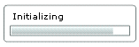
The MX download progress bar supports text. The bar displays the text "Downloading app" during the SWF download. It displays the text "Initializing app" during application initialization.
The download progress bar is not displayed if the SWF file is on your local host or if it is already cached. If the SWF file is not on your local host and is not cached, the progress bar is displayed if less than half of the application is downloaded after 700 milliseconds of downloading.
Adding a splash screen
As an alternative to the preloader, you can display a splash screen instead. The splash screen appears during the time of application startup.
Setting the download progress bar class
By default, an Application container uses the SparkDownloadProgressBar class. To configure the Application container to use the MX class, DownloadProgressBar, use the preloader property as the following example shows:
<s:Application ... preloader="mx.preloaders.DownloadProgressBar">
Disabling the download progress bar
To disable the download progress bar, set the usePreloader property of the Application container to false, as the following example shows:
<s:Application ... usePreloader="false">
Creating a custom progress bar
To create a custom download progress bar, you can create a subclass of the SparkDownloadProgressBar or DownloadProgressBar class, or create a subclass of the flash.display.Sprite class that implements the mx.preloaders.IPreloaderDisplay interface.
You can implement a download progress bar component as a SWC component or an ActionScript component. A custom download progress bar component that extends the Sprite class should not use any of the standard Flex components because it would load too slowly to be effective. Do not implement a download progress bar as an MXML component because it also would load too slowly.
To use a custom download progress bar class, you set the preloader property of the application container to the path of a SWC component class or ActionScript component class. A SWC component must be in the same directory as the MXML file or in a directory on the classpath of your application. An ActionScript component can be in one of those directories or in a subdirectory of one of those directories. When a class is in a subdirectory, you specify the subdirectory location as the package name in the preloader value; otherwise, you specify the class name.
The code in the following example specifies a custom download progress bar called CustomBar that is located in the myComponents/mybars directory below the application's root directory:
<s:Application ... preloader="myComponents.mybars.CustomBar">
Download progress bar events
The operation of the download progress bar is defined by a set of events. These events are dispatched by the Preloader class. The SparkDownloadProgressBar and DownloadProgressBar classes defines an event listener for all these events.
Within your custom class, you can optionally override the default behavior of the event listener. If you create a custom download progress bar as a subclass of the Sprite class, define an event listener for each of these events.
The following table describes the download progress bar events:
|
Event |
Description |
|---|---|
ProgressEvent.PROGRESS |
Dispatched when the application SWF file is being downloaded. The first PROGRESS event signifies the beginning of the download process. |
Event.COMPLETE |
Dispatched when the SWF file has finished downloading. Either zero or one COMPLETE event is dispatched. |
FlexEvent.INIT_COMPLETE |
Dispatched when the application finishes initialization. This event is always dispatched once, and is the last event that the Preloader dispatches. The download progress bar must dispatch a COMPLETE event after it has received an INIT_COMPLETE event. The COMPLETE event informs the Preloader that the download progress bar has completed all operations and can be dismissed. The download progress bar can perform additional tasks, such as playing an animation, after receiving an INIT_COMPLETE event, and before dispatching the COMPLETE event. Dispatching the COMPLETE event should be the last action of the download progress bar. |
FlexEvent.INIT_PROGRESS |
Dispatched when the application completes an initialization phase, as defined by calls to the measure(), commitProperties(), or updateDisplayList() methods. This event describes the progress of the application in the initialization phase. |
RSLEvent.RSL_ERROR |
Dispatched when a Runtime Shared Library (RSL) fails to load. |
RSLEvent.RSL_LOADED |
Dispatched when an RSL finishes loading. The total bytes and total loaded bytes are included in the event object. This event is dispatched for every RSL that is successfully loaded. |
RSLEvent.RSL_PROGRESS |
Dispatched when an RSL is being downloaded. The first progress event signifies the beginning of the RSL download. The event object for this event is of type RSLEvent. |
Creating a simple download progress bar class
The easiest way to create your own download progress bar is to create a subclass of the SparkDownloadProgressBar or DownloadProgressBar class, and then modify it for your application requirements.
package myComponents
{
    import mx.preloaders.*;
    import flash.events.ProgressEvent;

    public class SparkDownloadProgressBarSubClassMin extends SparkDownloadProgressBar
    {
        public function SparkDownloadProgressBarSubClassMin() {
            super();
        }

        // Embed the background image.
        [Embed(source="logo.jpg")]
        [Bindable]
        public var imgCls:Class;

        // Override to set a background image.
        override public function get backgroundImage():Object{
            return imgCls;
        }

        // Override to set the size of the background image to 100%.
        override public function get backgroundSize():String{
            return "100%";
        }

        // Override to return true so progress bar appears
        // during initialization.
        override protected function showDisplayForInit(elapsedTime:int,
            count:int):Boolean {
                return true;
        }

        // Override to return true so progress bar appears during download.
        override protected function showDisplayForDownloading(
            elapsedTime:int, event:ProgressEvent):Boolean {
                return true;
        }
    }

}
<?xml version="1.0"?>
<!-- containers\application\SparkMainDPBMin.mxml -->
<s:Application xmlns:fx="http://ns.adobe.com/mxml/2009"
    xmlns:mx="library://ns.adobe.com/flex/mx"
    xmlns:s="library://ns.adobe.com/flex/spark"
    preloader="myComponents.SparkDownloadProgressBarSubClassMin">
    <s:layout>
        <s:VerticalLayout/>
    </s:layout>

    <!-- Add a couple of controls that don't do anything. -->
    <s:Button label="Click Me"/>
    <s:TextInput text="This is a TextInput control."/>
</s:Application>
The Spark download progress bar does not support text, but the MX one does. The next example creates a subclass of the MX DownloadProgressBar class to define custom strings for the download progress bar, and set the minimum time that it appears, as the following example shows:
package myComponents
{
    import mx.preloaders.*;
    import flash.events.ProgressEvent;

    public class DownloadProgressBarSubClassMin extends DownloadProgressBar
    {
        public function DownloadProgressBarSubClassMin()
        {
            super();
            // Set the download label.
            downloadingLabel="Downloading app..."
            // Set the initialization label.
            initializingLabel="Initializing app..."
            // Set the minimum display time to 2 seconds.
            MINIMUM_DISPLAY_TIME=2000;
        }

        // Override to return true so progress bar appears
        // during initialization.
        override protected function showDisplayForInit(elapsedTime:int,
            count:int):Boolean {
                return true;
        }

        // Override to return true so progress bar appears during download.
        override protected function showDisplayForDownloading(
            elapsedTime:int, event:ProgressEvent):Boolean {
                return true;
        }
    }

}
You can use your custom class in an application, as the following example shows:
<?xml version="1.0"?>
<!-- containers\application\MainDPBMin.mxml -->
<s:Application xmlns:fx="http://ns.adobe.com/mxml/2009"
    xmlns:mx="library://ns.adobe.com/flex/mx"
    xmlns:s="library://ns.adobe.com/flex/spark"
    preloader="myComponents.DownloadProgressBarSubClassMin">
    <s:layout>
        <s:VerticalLayout/>
    </s:layout>
    <!-- Add a couple of controls that don't do anything. -->
    <s:Button label="Click Me"/>
    <s:TextInput text="This is a TextInput control."/>
</s:Application>
Creating an advanced subclass of the DownloadProgressBar class
In the following example, you create a subclass of the DownloadProgressBar class to display text messages that describe the status of the downloading and initialization of the application. This example defines event listeners for the events dispatched by the download progress bar to write the messages to flash.text.TextField objects.
package myComponents
{

    import flash.display.*;
    import flash.text.*;
    import flash.utils.*;
    import flash.events.*;
    import mx.preloaders.*;
    import mx.events.*;

    public class MyDownloadProgressBar extends DownloadProgressBar
    {
        // Define a TextField control for text messages
        // describing the download progress of the application.
        private var progressText:TextField;

        // Define a TextField control for the final text message.
        // after the application initializes.
        private var msgText:TextField;

        public function MyDownloadProgressBar()
        {
            super();

            // Configure the TextField for progress messages.
            progressText = new TextField();
            progressText.x = 10;
            progressText.y = 90;
            progressText.width = 400;
            progressText.height = 400;

            addChild(progressText);

            // Configure the TextField for the final message.
            msgText = new TextField();
            msgText.x = 10;
            msgText.y = 10;
            msgText.width = 400;
            msgText.height = 75;

            addChild(msgText);
        }

        // Define the event listeners for the preloader events.
        override public function set preloader(preloader:Sprite):void {
            // Listen for the relevant events
            preloader.addEventListener(
                ProgressEvent.PROGRESS, myHandleProgress);
            preloader.addEventListener(
                Event.COMPLETE, myHandleComplete);

            preloader.addEventListener(
                FlexEvent.INIT_PROGRESS, myHandleInitProgress);
            preloader.addEventListener(
                FlexEvent.INIT_COMPLETE, myHandleInitEnd);
        }

        // Event listeners for the ProgressEvent.PROGRESS event.
        private function myHandleProgress(event:ProgressEvent):void {
            progressText.appendText("\n" + "Progress l: " +
                event.bytesLoaded + " t: " + event.bytesTotal);
        }

        // Event listeners for the Event.COMPLETE event.
        private function myHandleComplete(event:Event):void {
            progressText.appendText("\n" + "Completed");
        }

        // Event listeners for the FlexEvent.INIT_PROGRESS event.
        private function myHandleInitProgress(event:Event):void {
            progressText.appendText("\n" + "App Init Start");
        }

        // Event listeners for the FlexEvent.INIT_COMPLETE event.
        private function myHandleInitEnd(event:Event):void {
            msgText.appendText("\n" + "App Init End");

            var timer:Timer = new Timer(2000,1);
            timer.addEventListener(TimerEvent.TIMER, dispatchComplete);
            timer.start();
        }

        // Event listener for the Timer to pause long enough to
        // read the text in the download progress bar.
        private function dispatchComplete(event:TimerEvent):void {
            dispatchEvent(new Event(Event.COMPLETE));
        }
    }
}
You can use your custom class in a application, as the following example shows:
<?xml version="1.0"?>
<!-- containers\application\MainDPB.mxml -->
<s:Application xmlns:fx="http://ns.adobe.com/mxml/2009"
    xmlns:mx="library://ns.adobe.com/flex/mx"
    xmlns:s="library://ns.adobe.com/flex/spark"
    preloader="myComponents.MyDownloadProgressBar">
    <s:layout>
        <s:VerticalLayout/>
    </s:layout>

    <!-- Add a couple of controls that don't do anything. -->
    <s:Button label="Click Me"/>
    <s:TextInput text="This is a TextInput control."/>
</s:Application>
Creating a subclass of Sprite as a download progress bar
You can define a custom download progress bar as a subclass of the Sprite class. By implementing your download progress bar as a subclass of Sprite, you can create a custom look and feel to it, rather than overriding the behavior built into the DownloadProgressBar class.
One common use for this type of download progress bar is to have it display a SWF file during application initialization. For example, you could display a SWF file that shows a running clock, or other type of image.
The following example displays a SWF file as the download progress bar. This class must implement the IPreloaderDisplay interface.
package myComponents
{
    import flash.display.*;
    import flash.utils.*;
    import flash.events.*;
    import flash.net.*;
    import mx.preloaders.*;
    import mx.events.*;

    public class MyDownloadProgressBarSWF extends Sprite
        implements IPreloaderDisplay
    {
        // Define a Loader control to load the SWF file.
        private var dpbImageControl:flash.display.Loader;

        public function MyDownloadProgressBarSWF() {
            super();
        }

        // Specify the event listeners.
        public function set preloader(preloader:Sprite):void {
            // Listen for the relevant events
            preloader.addEventListener(
                ProgressEvent.PROGRESS, handleProgress);
            preloader.addEventListener(
                Event.COMPLETE, handleComplete);

            preloader.addEventListener(
                FlexEvent.INIT_PROGRESS, handleInitProgress);
            preloader.addEventListener(
                FlexEvent.INIT_COMPLETE, handleInitComplete);
        }

        // Initialize the Loader control in the override
        // of IPreloaderDisplay.initialize().
        public function initialize():void {
            dpbImageControl = new flash.display.Loader();
            dpbImageControl.contentLoaderInfo.addEventListener(
                Event.COMPLETE, loader_completeHandler);
            dpbImageControl.load(new URLRequest("assets/dpbSWF.swf"));
        }

        // After the SWF file loads, set the size of the Loader control.
        private function loader_completeHandler(event:Event):void
        {
            addChild(dpbImageControl);
            dpbImageControl.width = 50;
            dpbImageControl.height= 50;
            dpbImageControl.x = 100;
            dpbImageControl.y = 100;
        }

        // Define empty event listeners.
        private function handleProgress(event:ProgressEvent):void {
        }

        private function handleComplete(event:Event):void {
        }

        private function handleInitProgress(event:Event):void {
        }

        private function handleInitComplete(event:Event):void {
            var timer:Timer = new Timer(2000,1);
            timer.addEventListener(TimerEvent.TIMER, dispatchComplete);
            timer.start();
        }

        private function dispatchComplete(event:TimerEvent):void {
            dispatchEvent(new Event(Event.COMPLETE));
        }

        // Implement IPreloaderDisplay interface

        public function get backgroundColor():uint {
            return 0;
        }

        public function set backgroundColor(value:uint):void {
        }

        public function get backgroundAlpha():Number {
            return 0;
        }

        public function set backgroundAlpha(value:Number):void {
        }

        public function get backgroundImage():Object {
            return undefined;
        }

        public function set backgroundImage(value:Object):void {
        }

        public function get backgroundSize():String {
            return "";
        }

        public function set backgroundSize(value:String):void {
        }

        public function get stageWidth():Number {
            return 200;
        }

        public function set stageWidth(value:Number):void {
        }

        public function get stageHeight():Number {
            return 200;
        }

        public function set stageHeight(value:Number):void {
        }
    }
}
Navigation
Adobe and Adobe Flash Player are either registered trademarks or trademarks of Adobe Systems Incorporated in the United States and/or other countries and are used by permission from Adobe. No other license to the Adobe trademarks are granted.