
MX layout containers
In Flex, MX layout containers provide a hierarchical structure to arrange and configure the components, such as Button and ComboBox controls, of a Flex application.
For detailed information on how Flex lays out containers and their children, see Laying out components.
Flex also provides a set of Spark containers. These containers are designed to simplify skinning and optimize performance. It's best to use the Spark containers when possible. For more information, see Spark containers.
About layout containers
A layout container defines a rectangular region of the Adobe® Flash® Player drawing surface and controls the sizing and positioning of the child controls and child containers defined within it. For example, a Form layout container sizes and positions its children in a layout similar to an HTML form.
To use a layout container, you create the container, and then add the components that define your application.
MX Canvas layout container
For complete reference information, see the ActionScript 3.0 Reference for Apache Flex.
Creating and using a Canvas control
You define a canvas control in MXML by using the <mx:Canvas> tag. Specify an id value if you intend to refer to a component elsewhere in your MXML, either in another tag or an ActionScript block.
Creating a Canvas Control by using absolute positioning
You can use the x and y properties of each child to specify the child's location in the Canvas container. These properties specify the x and y coordinates of a child relative to the upper-left corner of the Canvas container, where the upper-left corner is at coordinates (0,0). Values for the x and y coordinates can be positive or negative integers. You can use negative values to place a child outside the visible area of the container, and then use ActionScript to move the child to the visible area, possibly as a response to an event.
The following example shows a Canvas container with three LinkButton controls and three Image controls:
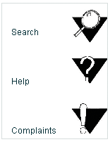
The following MXML code creates this Canvas container:
<?xml version="1.0"?>
<!-- containers\layouts\CanvasSimple.mxml -->
<s:Application xmlns:fx="http://ns.adobe.com/mxml/2009"
    xmlns:mx="library://ns.adobe.com/flex/mx"
    xmlns:s="library://ns.adobe.com/flex/spark">

    <mx:Canvas id="myCanvas"
      height="200" width="200"
      borderStyle="solid"
      backgroundColor="white">

      <mx:LinkButton label="Search"
        x="10" y="30"
        click="navigateToURL(new URLRequest('http://www.adobe.com/cfusion/search/index.cfm'))"/>
      <mx:Image
        height="50" width="50"
        x="100" y="10"
        source="@Embed(source='assets/search.jpg')"
        click="navigateToURL(new URLRequest('http://www.example.com/cfusion/search/index.cfm'))"/>

      <mx:LinkButton label="Help"
        x="10" y="100"
        click="navigateToURL(new URLRequest('http://www.example.com/go/gn_supp'))"/>
      <mx:Image
        height="50" width="50"
        x="100" y="75"
        source="@Embed(source='assets/help.jpg')"
        click="navigateToURL(new URLRequest('http://www.example.com/go/gn_supp'))"/>

      <mx:LinkButton label="Complaints"
        x="10" y="170"
        click="navigateToURL(
            new URLRequest('http://www.example.com/go/gn_contact'))"/>
      <mx:Image
        height="50" width="50"
        x="100" y="140"
        source="@Embed(source='assets/complaint.jpg')"
        click="navigateToURL(
            new URLRequest('http://www.example.com/go/gn_contact'))"/>
    </mx:Canvas>
</s:Application>
Creating a Canvas container by using constraint-based layout
You can also use constraint-based layout to anchor any combination of the top, left, right, bottom sides, and baseline of a child at a specific distance from the Canvas edges, or to anchor the horizontal or vertical center of the child at a specific (positive or negative) pixel distance from the Canvas center. To specify a constraint-based layout, use the top, bottom, left, right, baseline, horizontalCenter, and verticalCenter styles. When you anchor the top and bottom, or the left and right sides of the child container to the Canvas sides, if the Canvas control resizes, the children also resize. The following example uses constraint-based layout to position an HBox horizontally, and uses absolute values to specify the vertical width and position:
<?xml version="1.0"?>
<!-- containers\layouts\CanvasConstraint.mxml -->
<s:Application xmlns:fx="http://ns.adobe.com/mxml/2009"
    xmlns:mx="library://ns.adobe.com/flex/mx"
    xmlns:s="library://ns.adobe.com/flex/spark"
    backgroundColor="gray"
    height="200" width="200">

    <mx:Canvas
        width="150" height="150"
        horizontalCenter="0" verticalCenter="0"
        backgroundColor="#FFFFFF">

        <mx:HBox id="hBox2"
            left="30"
            right="30"
            y="50"
            height="50"
            backgroundColor="#A9C0E7">
        </mx:HBox>
    </mx:Canvas>
</s:Application>
The example produces the following image:

Preventing overlapping children
When you use a Canvas container, some of your components may overlap, because the Canvas container ignores its children's sizes when it positions them. Similarly, children components may overlap any borders or padding, because the Canvas container does not adjust the coordinate system to account for them.
In the following example, the size and position of each component is carefully calculated to ensure that none of the components overlap:
<?xml version="1.0"?>
<!-- containers\layouts\CanvasOverlap.mxml -->
<s:Application xmlns:fx="http://ns.adobe.com/mxml/2009"
    xmlns:mx="library://ns.adobe.com/flex/mx"
    xmlns:s="library://ns.adobe.com/flex/spark"
    width="100" height="100">

    <fx:Script>
        <![CDATA[
            [Embed(source="assets/BlackBox.jpg")]
            [Bindable]
            public var imgCls:Class;
        ]]>
    </fx:Script>

    <mx:Canvas id="chboard" backgroundColor="#FFFFFF">
        <mx:Image source="{imgCls}"
            width="10" height="10" x="0" y="0"/>
        <mx:Image source="{imgCls}"
            width="10" height="10" x="20" y="0"/>
        <mx:Image source="{imgCls}"
            width="10" height="10" x="40" y="0"/>
        <mx:Image source="{imgCls}"
            width="10" height="10" x="10" y="10"/>
        <mx:Image source="{imgCls}"
            width="10" height="10" x="30" y="10"/>
        <mx:Image source="{imgCls}"
            width="10" height="10" x="0" y="20"/>
        <mx:Image source="{imgCls}"
            width="10" height="10" x="20" y="20"/>
        <mx:Image source="{imgCls}"
            width="10" height="10" x="40" y="20"/>
        <mx:Image source="{imgCls}"
            width="10" height="10" x="10" y="30"/>
        <mx:Image source="{imgCls}"
            width="10" height="10" x="30" y="30"/>
        <mx:Image source="{imgCls}"
            width="10" height="10" x="0" y="40"/>
        <mx:Image source="{imgCls}"
            width="10" height="10" x="20" y="40"/>
        <mx:Image source="{imgCls}"
            width="10" height="10" x="40" y="40"/>
    </mx:Canvas>
</s:Application>
This example produces the following image:

If you set the width and height properties of one of the images to 20 pixels but don't change the positions accordingly, that image overlaps other images in the checkerboard. For example, if you replace the seventh <mx:Image> tag in the preceding example with the following line, the resulting image looks like the following image:
<mx:Image source="{imgCls}" width="20" height="20" x="20" y="20"/>

Repositioning children at run time
You can build logic into your application to reposition a child of a Canvas container at run time. For example, in response to a button click, the following code repositions an input text box that has the id value text1 to the position x=110, y=110:
<?xml version="1.0"?>
<!-- containers\layouts\CanvasRepos.mxml -->
<s:Application xmlns:fx="http://ns.adobe.com/mxml/2009"
    xmlns:mx="library://ns.adobe.com/flex/mx"
    xmlns:s="library://ns.adobe.com/flex/spark">

    <mx:Canvas
        width="300" height="185"
        backgroundColor="#FFFFFF">

        <mx:TextInput id="text1"
            text="Move me"
            x="10" y="10"
        />
        <mx:Button id="button1"
            label="Move text1"
            x="10" y="150"
            click="text1.x=110; text1.y=110;"
        />
        <mx:Button label="Reset"
            click="text1.x=10; text1.y=10;" x="111" y="150"/>
    </mx:Canvas>
</s:Application>
MX Box, HBox, and VBox layout containers
To lay out children in multiple rows or columns, use a Tile or Grid container. For more information, see MX Tile layout container and MX Grid layout container.
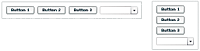
The following example shows one Box container with a horizontal layout and one with a vertical layout:
For complete reference information, see the ActionScript 3.0 Reference for Apache Flex.
Creating a Box, HBox, or VBox container
You use the <mx:Box>, <mx:VBox>, and <mx:HBox> tags to define Box containers. Use the VBox (vertical box) and HBox (horizontal box) containers as shortcuts so you do not have to specify the direction property in the Box container. Specify an id value if you intend to refer to a component elsewhere in your MXML, either in another tag or in an ActionScript block.
The following example creates a Box container with a vertical layout:
<?xml version="1.0"?>
<!-- containers\layouts\BoxSimple.mxml -->
<s:Application xmlns:fx="http://ns.adobe.com/mxml/2009"
    xmlns:mx="library://ns.adobe.com/flex/mx"
    xmlns:s="library://ns.adobe.com/flex/spark">

    <mx:Box direction="vertical"
        borderStyle="solid"
        paddingTop="10"
        paddingBottom="10"
        paddingLeft="10"
        paddingRight="10">

        <mx:Button id="fname" label="Button 1"/>
        <mx:Button id="lname" label="Button 2"/>
        <mx:Button id="addr1" label="Button 3"/>
        <mx:ComboBox id="state">
              <mx:ArrayList>
                 <fx:String>ComboBox 1</fx:String>
              </mx:ArrayList>
        </mx:ComboBox>
    </mx:Box>
</s:Application>
The following code example is equivalent to the previous example, except that this example defines a vertical Box container by using the <mx:VBox> tag:
<?xml version="1.0"?>
<!-- containers\layouts\VBoxSimple.mxml -->
<s:Application xmlns:fx="http://ns.adobe.com/mxml/2009"
    xmlns:mx="library://ns.adobe.com/flex/mx"
    xmlns:s="library://ns.adobe.com/flex/spark">

    <mx:VBox borderStyle="solid"
        paddingTop="10"
        paddingBottom="10"
        paddingLeft="10"
        paddingRight="10">

        <mx:Button id="fname" label="Button 1"/>
        <mx:Button id="lname" label="Button 2"/>
        <mx:Button id="addr1" label="Button 3"/>
        <mx:ComboBox id="state">
              <mx:ArrayList>
                 <fx:String>ComboBox 1</fx:String>
              </mx:ArrayList>
        </mx:ComboBox>
    </mx:VBox>
</s:Application>
MX ControlBar layout container
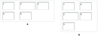
You use the MX ControlBar container with a MX Panel or MX TitleWindow container to hold components that can be shared by the other children in the Panel or TitleWindow container. For a product catalog, the ControlBar container can hold the Flex controls to specify quantity and to add an item to a shopping cart, as the following example shows:

- A.
- Panel container
- B.
- ControlBar container
For complete reference information, see the ActionScript 3.0 Reference for Apache Flex.
Creating an MX ControlBar container
You use the <mx:ControlBar> tag to define a ControlBar control in MXML. Specify an id value if you intend to refer to a component elsewhere in your MXML code, either in another tag or in an ActionScript block. You specify the <mx:ControlBar> tag as the last child tag of an <mx:Panel> tag, as the following example shows:
<?xml version="1.0"?>
<!-- containers\layouts\CBarSimple.mxml -->
<s:Application xmlns:fx="http://ns.adobe.com/mxml/2009"
    xmlns:mx="library://ns.adobe.com/flex/mx"
    xmlns:s="library://ns.adobe.com/flex/spark">

    <fx:Script>
        <![CDATA[
            private function addToCart():void {
                // Handle event.
            }
        ]]>
    </fx:Script>

    <mx:Panel title="My Application"
        paddingTop="10" paddingBottom="10"
        paddingLeft="10" paddingRight="10">

        <mx:HBox width="250" height="200">
            <!-- Area for your catalog. -->
        </mx:HBox>

        <mx:ControlBar width="250">
            <mx:Label text="Quantity"/>
            <mx:NumericStepper/>
            <!-- Use Spacer to push Button control to the right. -->
            <mx:Spacer width="100%"/>
            <mx:Button label="Add to Cart"
                click="addToCart();"/>
        </mx:ControlBar>
    </mx:Panel>
</s:Application>
MX ApplicationControlBar layout container
You use the MX ApplicationControlBar container to hold components that provide access to application navigation elements and commands. An ApplicationControlBar container for an editor, for example, could include Button controls for setting the font weight, a ComboBox to select the font, and a MenuBar control to select the edit mode. The ApplicationControlBar is a subclass of the ControlBar class; however, it has a different look and feel.
Typically, you place an ApplicationControlBar container at the top of the application, as the following example shows:

If you dock the ApplicationControlBar container at the top of an application, it does not scroll with the application contents.
For complete reference information, see the ActionScript 3.0 Reference for Apache Flex.
Creating an ApplicationControlBar container
You use the <mx:ApplicationControlBar> tag to define a ControlBar control in MXML. Specify an id value if you intend to refer to a component elsewhere in your MXML code, either in another tag or in an ActionScript block.
The ApplicationControlBar container can be in either of the following modes:
- Docked mode
-
The bar is always at the top of the application's drawing area. Any application-level scroll bars don't apply to the container, so it always remains at the top of the visible area, and the bar expands to fill the width of the application. To created a docked ApplicationControlBar container, set its dock property to true.
- Normal mode
-
The bar can be placed anywhere in the application, is sized and positioned just like any other component, and scrolls with the application. The ApplicationControlBar floats if its dock property is false. The default value is false.
Note: In contrast to the ControlBar container, it is possible to set the backgroundColor style for an instance of the ApplicationControlBar. The ApplicationControlBar container has two styles, fillColors and fillAlpha, that are not supported by the ControlBar container.The following example shows an application with a simple docked ApplicationControlBar that includes a MenuBar. The Application also includes an HBox control that exceeds the application size; when you scroll the application to view the bottom of the HBox control, the ApplicationControlBar control does not scroll.
<?xml version="1.0"?>
<!-- containers\layouts\AppCBarSimple.mxml -->
<s:Application xmlns:fx="http://ns.adobe.com/mxml/2009"
    xmlns:mx="library://ns.adobe.com/flex/mx"
    xmlns:s="library://ns.adobe.com/flex/spark"
    width="550">
    <s:layout>
        <s:VerticalLayout/>
    </s:layout>

    <fx:Script>
        <![CDATA[
            import mx.controls.Alert;
        ]]>
    </fx:Script>

    <fx:Declarations>
        <fx:XMLList id="menuXML">
            <fx:menuitem label="File">
                <fx:menuitem label="New" data="New"/>
                <fx:menuitem label="Open" data="Open"/>
                <fx:menuitem label="Save" data="Save"/>
                <fx:menuitem label="Exit" data="Exit"/>
            </fx:menuitem>
            <fx:menuitem label="Edit">
                <fx:menuitem label="Cut" data="Cut"/>
                <fx:menuitem label="Copy" data="Copy"/>
                <fx:menuitem label="Paste" data="Paste"/>
            </fx:menuitem>
            <fx:menuitem label="View"/>
        </fx:XMLList>

        <fx:Array id="cmbDP">
            <fx:String>Item 1</fx:String>
            <fx:String>Item 2</fx:String>
            <fx:String>Item 3</fx:String>
        </fx:Array>
    </fx:Declarations>

    <mx:ApplicationControlBar id="dockedBar"
        dock="true">
        <mx:MenuBar height="100%"
            dataProvider="{menuXML}"
            labelField="@label"
            showRoot="true"/>
        <mx:HBox paddingBottom="5"
            paddingTop="5">
            <mx:ComboBox dataProvider="{cmbDP}"/>
            <mx:Spacer width="100%"/>
            <mx:TextInput id="myTI" text=""/>
            <mx:Button id="srch1"
                label="Search"
                click="Alert.show('Searching')"/>
        </mx:HBox>
    </mx:ApplicationControlBar>

    <mx:TextArea width="300" height="200"/>
</s:Application>
MX DividedBox, HDividedBox, and VDividedBox layout containers
The DividedBox layout container lays out its children horizontally or vertically, similar to a Box container, except that it inserts a divider between each child. You can use a mouse pointer to move the dividers in order to resize the area of the container allocated to each child. The DividedBox container can use MX and Spark components as children.
Use the direction property of a DividedBox container to determine vertical (default) or horizontal layout. The HDividedBox and VDividedBox containers are DividedBox containers with horizontal and vertical direction property values.
The following example shows a DividedBox container:
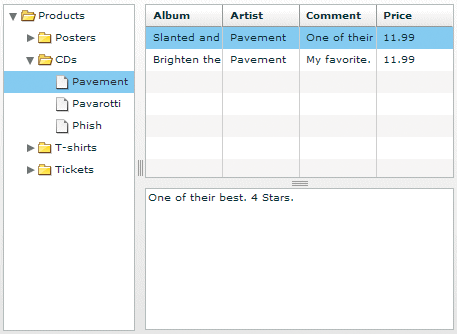
In this example, the outermost container is a horizontal DividedBox container. The horizontal divider marks the border between a Tree control and a vertical DividedBox container.
The vertical DividedBox container holds a DataGrid control (top) and a TextArea control (bottom). The vertical divider marks the border between these two controls.
For complete reference information, see the ActionScript 3.0 Reference for Apache Flex.
Creating a DividedBox, HDividedBox, or VDividedBox container
You use the <mx:DividedBox>, <mx:VDividedBox>, and <mx:HDividedBox> tags to define DividedBox containers. Specify an id value if you intend to refer to a component elsewhere in your MXML, either in another tag or in an ActionScript block. Typically, you use the VDividedBox (vertical DividedBox) and HDividedBox (horizontal DividedBox) containers as shortcuts so that you do not have to specify the direction property.
The following code example creates the image shown in MX DividedBox, HDividedBox, and VDividedBox layout containers:
<?xml version="1.0"?>
<!-- containers\layouts\HDivBoxSimple.mxml -->
<s:Application xmlns:fx="http://ns.adobe.com/mxml/2009"
    xmlns:mx="library://ns.adobe.com/flex/mx"
    xmlns:s="library://ns.adobe.com/flex/spark"
    backgroundColor="white">

    <fx:Script>
      <![CDATA[
        private function myGrid_initialize():void {
          myGrid.dataProvider = [
            {Artist:'Pavement', Album:'Slanted and Enchanted',
                Price:11.99, Comment:'One of their best. 4 Stars.'},
            {Artist:'Pavement', Album:'Brighten the Corners',
                Price:11.99, Comment:'My favorite.'}
          ];
        }
      ]]>
    </fx:Script>

    <mx:HDividedBox width="100%" height="100%">
        <mx:Tree id="tree1"
            width="30%" height="100%"
            labelField="@label"
            showRoot="true">
            <fx:XMLList>
                <fx:menuitem label="Products">
                    <fx:menuitem label="Posters" isBranch="true"/>
                    <fx:menuitem label="CDs">
                        <fx:menuitem label="Pavement"/>
                        <fx:menuitem label="Pavarotti"/>
                        <fx:menuitem label="Phish"/>
                    </fx:menuitem>
                    <fx:menuitem label="T-shirts" isBranch="true"/>
                    <fx:menuitem label="Tickets" isBranch="true"/>
                </fx:menuitem>
            </fx:XMLList>
        </mx:Tree>

        <mx:VDividedBox width="70%" height="100%">
            <mx:DataGrid id="myGrid"
                width="100%" height="100%"
                initialize="myGrid_initialize();"
                change="currentMessage.text=
                    event.currentTarget.selectedItem.Comment;"/>
            <mx:TextArea id="currentMessage"
                width="100%"
                height="60"
                text="One of their best. 4 Stars."/>
        </mx:VDividedBox>
    </mx:HDividedBox>
</s:Application>
Notice that this example does not implement the logic to change the top area of the VDividedBox container when you select a node in the Tree control.
Using the dividers
The dividers of a DividedBox container let you resize the area of the container allocated for a child. However, for the dividers to function, the child has to be resizable; that is, it must specify a percentage-based size. So, a child with an explicit or default height or width cannot be resized in the corresponding direction by using a divider. Therefore, when you use the DividedBox container, you typically use percentage sizing for its children to make them resizable.
When you specify a percentage value for the height or width properties of a child to make it resizable, Flex initially sizes the child to the specified percentage, if possible. Then Flex can resize the child to take up all available space.
You can use the dividers to resize a percentage-sized child up to its maximum size, or down to its minimum size. To constrain the minimum size or maximum size of an area of the DividedBox, set an explicit value for the minWidth and minHeight properties or the maxWidth and maxHeight properties of the children in that area.
Using live dragging
By default, the DividedBox container disables live dragging. This means that the DividedBox container does not update the layout of its children until the user finishes dragging the divider, when the user releases the mouse button on a selected divider.
You can configure the DividedBox container to use live dragging by setting the liveDragging property to true. With live dragging enabled, the DividedBox container updates its layout as the user moves a divider. In some cases, you may encounter decreased performance if you enable live dragging.
MX Form, FormHeading, and FormItem layout containers
Forms are one of the most common methods that web applications use to collect information from users. Forms are used for collecting registration, purchase, and billing information, and for many other data collection tasks.
About forms
Flex supports form development by using the Form layout container and several child components of the Form container. The Form container lets you control the layout of a form, mark form fields as required or optional, handle error messages, and bind your form data to the Flex data model to perform data checking and validation. Also, you can apply style sheets to configure the appearance of your forms.
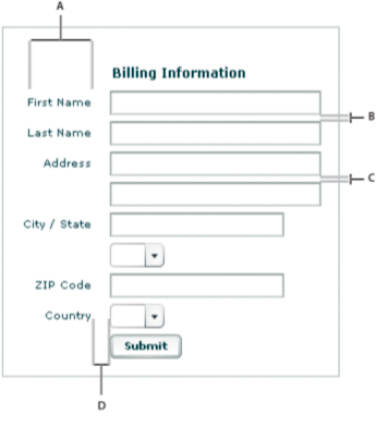
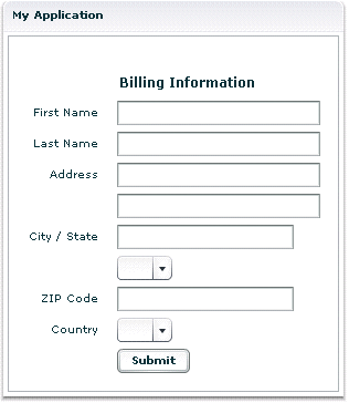
You use three different components to create your forms, as the following example shows:
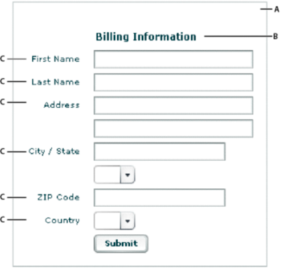
- A.
- Form container
- B.
- FormHeading control
- C.
- FormItem containers
For complete reference information, see Form, FormHeading, and FormItem in the ActionScript 3.0 Reference for Apache Flex.
Creating forms
You typically create a form by defining the following elements:
-
The Form control
-
FormHeading components, nested inside the Form control
-
FormItem containers, nested inside the Form control
-
Form fields, such as ComboBox and TextInput controls, nested inside the FormItem containers
You can also include other components inside a form, such as HRule controls, as needed.
Creating the Form container
The Form container is the outermost container of a Flex form. The primary use of the Form container is to control the sizing and layout of the contents of the form, including the size of labels and the gap between items. The Form container always arranges its children vertically and left-aligns them in the form. The form container contains one or more FormHeading and FormItem containers.
You use the <mx:Form> tag to define the Form container. Specify an id value if you intend to refer to the entire form elsewhere in your MXML, either in another tag or in an ActionScript block.
The following code example shows the Form container definition for the form shown in the previous image in About forms:
<?xml version="1.0"?>
<!-- containers\layouts\FormSimple.mxml -->
<s:Application xmlns:fx="http://ns.adobe.com/mxml/2009"
    xmlns:mx="library://ns.adobe.com/flex/mx"
    xmlns:s="library://ns.adobe.com/flex/spark">

    <mx:Form id="myForm" width="400" height="100">

        <!-- Define FormHeading and FormItem components here -->

    </mx:Form>
</s:Application>
For complete reference information, see the ActionScript 3.0 Reference for Apache Flex.
Creating a FormHeading control
A FormHeading control specifies an optional label for a group of FormItem containers. The left side of the label is aligned with the left side of the controls in the form. You can have multiple FormHeading controls in your form to designate multiple content areas. You can also use FormHeading controls with a blank label to create vertical space in your form.
You use the <mx:FormHeading> tag to define a FormHeading container. Specify an id value if you intend to refer to the heading elsewhere in your MXML, either in another tag or in an ActionScript block.
The following code example defines the FormHeading control for the image shown in About forms:
<?xml version="1.0"?>
<!-- containers\layouts\FormHeadingSimple.mxml -->
<s:Application xmlns:fx="http://ns.adobe.com/mxml/2009"
    xmlns:mx="library://ns.adobe.com/flex/mx"
    xmlns:s="library://ns.adobe.com/flex/spark">

    <mx:Form id="myForm" width="400" height="100">

        <mx:FormHeading label="Billing Information"/>

        <!--Define FormItem containers here. -->

    </mx:Form>
</s:Application>
For complete reference information, see the ActionScript 3.0 Reference for Apache Flex.
Creating a FormItem container
A FormItem container specifies a form element consisting of the following parts:
-
A single label
-
One or more child controls or containers, such as input controls
The label is vertically aligned with the first child in the FormItem container and is right-aligned in the region to the left of the container.
You use the <mx:FormItem> tag to define a FormItem container. Specify an id value if you intend to refer to the item elsewhere in your MXML, either in another tag or in an ActionScript block.
Form containers typically contain multiple FormItem containers, as the following example shows:
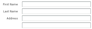
In this example, you define three FormItem containers: one with the label First Name, one with the label Last Name, and one with the label Address. The Address FormItem container holds two controls to let a user enter two lines of address information. Each of the other two FormItem containers includes a single control.
For complete reference information, see FormItem in the ActionScript 3.0 Reference for Apache Flex.
Specifying form item direction
When you create a FormItem container, you specify its direction by using the value vertical (default) or horizontal for the direction property:
- vertical
-
Flex positions children vertically to the right of the FormItem label.
- horizontal
-
Flex positions children horizontally to the right of the FormItem label. If all children do not fit on a single row, they are divided into multiple rows with equal-sized columns. You can ensure that all children fit on a single line by using percentage-based widths or by specifying explicit widths wide enough for all of the components.
Controlling form item label style
You control the style of a FormItem label by setting the labelStyleName style property. The following example sets the FormItem label color to dark blue and its font size to 20 pixels:
<?xml version="1.0"?>
<!-- containers\layouts\FormItemStyle.mxml -->
<s:Application xmlns:fx="http://ns.adobe.com/mxml/2009"
    xmlns:mx="library://ns.adobe.com/flex/mx"
    xmlns:s="library://ns.adobe.com/flex/spark">

    <fx:Style>
        .myFormItemLabelStyle {
            color: #333399;
            fontSize: 20;
         }

    </fx:Style>

    <fx:Script>
        <![CDATA[
            private function processValues(zip:String, pn:String):void {
                // Validate and process data.
            }
        ]]>
    </fx:Script>

    <mx:Form id="myForm" defaultButton="{mySubmitButton}">

        <mx:FormItem label="Zip Code"
            labelStyleName="myFormItemLabelStyle">
            <mx:TextInput id="zipCode"/>
        </mx:FormItem>
        <mx:FormItem label="Phone Number">
            <mx:TextInput id="phoneNumber"/>
        </mx:FormItem>

        <mx:FormItem>
            <mx:Button label="Submit" id="mySubmitButton"
                click="processValues(zipCode.text, phoneNumber.text);"/>
        </mx:FormItem>

    </mx:Form>
</s:Application>
Example: A simple form
The following example shows the FormItem container definitions for the example form:
<?xml version="1.0"?>
<!-- containers\layouts\FormComplete.mxml -->
<s:Application xmlns:fx="http://ns.adobe.com/mxml/2009"
    xmlns:mx="library://ns.adobe.com/flex/mx"
    xmlns:s="library://ns.adobe.com/flex/spark">

    <fx:Script>
        <![CDATA[
            private function submitForm():void {
                // Handle the form submission.
            }
        ]]>
    </fx:Script>

    <mx:Form id="myForm" width="400">

        <mx:FormHeading label="Billing Information"/>

        <mx:FormItem label="First Name">
            <mx:TextInput id="fname" width="100%"/>
        </mx:FormItem>

        <mx:FormItem label="Last Name">
            <mx:TextInput id="lname" width="100%"/>
        </mx:FormItem>

        <mx:FormItem label="Address">
            <mx:TextInput id="addr1" width="100%"/>
            <mx:TextInput id="addr2" width="100%"/>
        </mx:FormItem>

        <mx:FormItem label="City / State" direction="vertical">
            <mx:TextInput id="city"/>
            <mx:ComboBox id="st" width="75">
              <mx:ArrayList>
                 <fx:String>MA</fx:String>
                 <fx:String>NH</fx:String>
                 <fx:String>RI</fx:String>
              </mx:ArrayList>
            </mx:ComboBox>
        </mx:FormItem>

        <mx:FormItem label="ZIP Code">
            <mx:TextInput id="zip" width="100"/>
        </mx:FormItem>

        <mx:FormItem label="Country">
            <mx:ComboBox id="cntry">
              <mx:ArrayList>
                 <fx:String>USA</fx:String>
                 <fx:String>UAE</fx:String>
                 <fx:String>UAW</fx:String>
              </mx:ArrayList>
            </mx:ComboBox>
        </mx:FormItem>

        <mx:FormItem>
            <mx:HRule width="200" height="1"/>
            <mx:Button label="Submit Form" click="submitForm();"/>
        </mx:FormItem>
    </mx:Form>
</s:Application>
Laying out forms
Flex determines the default size of a form in the following ways:
-
The default height is large enough to hold the default or explicit heights of all the container children, plus the Form container top and bottom padding and the gaps between children.
-
The default width is large enough to accommodate the widest FormItem label, plus the indicatorGap between the labels and the child controls, plus the widest default or explicit width among the child controls in the FormItems.
Aligning and spacing Form container children
All Form container labels are right-aligned, and all children are left-aligned in the container. You cannot override this alignment.
The following example shows the spacing of Form container children that you can control:
- A.
- Form container: labelWidth
- B.
- Form container: verticalGap = 6
- C.
- FormItem container: verticalGap = 6
- D.
- Form container: indicatorGap = 14
The following table describes the style properties that you use to control spacing and their default values:
|
Component |
Style |
Description |
Default value |
|---|---|---|---|
verticalGap |
Vertical space between Form container children |
6 pixels |
|
horizontalGap |
Horizontal space between Form container children |
8 pixels |
|
labelWidth |
Width of labels |
Calculated by the container based on the child labels |
|
paddingTop paddingBottom paddingLeft paddingRight |
Border spacing around children |
16 pixels on all sides |
|
indicatorGap |
Gap between the end of the area in the form reserved for labels and the FormItem children or FormHeading heading |
14 pixels |
|
indicatorGap |
Overrides the indicator gap set by the <mx:Form> tag |
14 pixels |
|
paddingTop |
Gap between the top of the component and the label text |
16 pixels |
|
direction |
Direction of FormItem children: vertical or horizontal |
vertical |
|
horizontalGap |
Horizontal spacing between children in a FormItem container |
8 pixels |
|
labelWidth |
The width for the FormItem heading |
The width of the label text |
|
paddingTop paddingBottom paddingLeft paddingRight |
Border spacing around the FormItem |
0 pixels on all sides |
|
verticalGap |
Vertical spacing between children in a FormItem container |
6 pixels |
|
indicatorGap |
Overrides the indicator gap set by the <mx:Form> tag |
Determined by the <mx:Form> tag |
Sizing and positioning Form container children
The Form layout container arranges children in a vertical column. The area of the Form container that is designated for children does not encompass the entire Form container. Instead, it starts at the right of the area defined by any labels and the gap defined by the indicatorGap property. For example, if the width of the Form container is 500 pixels, and the labels and indicatorGap property allocate 100 pixels of that width, the width of the child area is 400 pixels.
By default, Flex sizes the Form layout children vertically to their default height. Flex then determines the default width of each child, and stretches the child's width to the next highest quarter of the child area—that is, to one-quarter, one-half, three-quarters, or full width of the child area.
For example, if a container has a child area 400 pixels wide, and the default width of a TextArea control is 125 pixels, Flex stretches the TextArea control horizontally to the next higher quarter of the child area, the 200-pixel boundary, which is one-half of the child area. This sizing algorithm applies only to components without an explicitly specified width. It prevents your containers from having ragged right edges caused by controls with different widths.
You can also explicitly set the height or width of any control in the form to either a pixel value or a percentage of the Form size by using the height and width properties of the child.
Defining a default button
You use the defaultButton property of a container to define a default Button control. Pressing the Enter key while the focus is on any form control activates the Button control just as if it was explicitly selected.
For example, a login form displays user name and password inputs and a submit Button control. Typically, the user types a user name, tabs to the password field, types the password, and presses the Enter key to submit the login information without explicitly selecting the Button control. To define this type of interaction, set the defaultButton to the id of the submit Button control. In the following example, the event listener for the click event of submit button displays an Alert control, to show that Flex triggers this event if the user presses the Enter key when any form field has the focus. The commented-out line in the example would perform the more realistic action of invoking a web service to let the user log in.
<?xml version="1.0"?>
<!-- containers\layouts\FormDefButton.mxml -->
<s:Application xmlns:fx="http://ns.adobe.com/mxml/2009"
    xmlns:mx="library://ns.adobe.com/flex/mx"
    xmlns:s="library://ns.adobe.com/flex/spark">

    <fx:Script>
        <![CDATA[
            import flash.events.MouseEvent;
            import mx.controls.Alert;

            private function submitLogin(eventObj:MouseEvent):void {
                // Display an Alert to show the event happened.
                Alert.show("Login Requested");
                // Commented out to work without a web service.
                //myWebService.Login.send();
            }
        ]]>
    </fx:Script>

    <mx:Form defaultButton="{mySubmitButton}">
        <mx:FormItem label="Username">
            <mx:TextInput id="username"
                width="100"/>
        </mx:FormItem>
        <mx:FormItem label="Password">
            <mx:TextInput id="password"
                width="100"
                displayAsPassword="true"/>
        </mx:FormItem>
        <mx:FormItem>
            <mx:Button id="mySubmitButton"
                label="Login"
                click="submitLogin(event);"/>
        </mx:FormItem>
    </mx:Form>
</s:Application>
Specifying required fields
Flex includes support for defining required input fields of a form. To define a required field, you specify the required property of the FormItem container. If this property is specified, all the children of the FormItem container are marked as required.
Flex inserts a red asterisk (*) character as a separator between the FormItem label and the FormItem child to indicate a required field. For example, the following example shows an optional ZIP code field and a required ZIP code field:
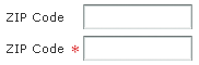
The following code example defines these fields:
<?xml version="1.0"?>
<!-- containers\layouts\FormReqField.mxml -->
<s:Application xmlns:fx="http://ns.adobe.com/mxml/2009"
    xmlns:mx="library://ns.adobe.com/flex/mx"
    xmlns:s="library://ns.adobe.com/flex/spark">

    <mx:Form>
        <mx:FormItem label="ZIP Code">
            <mx:TextInput id="zipOptional"
                width="100"/>
        </mx:FormItem>

        <mx:FormItem label="ZIP Code" required="true">
            <mx:TextInput id="zipRequired"
                width="100"/>
        </mx:FormItem>
    </mx:Form>
</s:Application>
You can enable the required indicator of a FormItem child at run time. This could be useful when the user input in one form field makes another field required. For example, you might have a form with a CheckBox control that the user selects to subscribe to a newsletter. Checking the box could make the user e-mail field required, as the following example shows:
<?xml version="1.0"?>
<!-- containers\layouts\FormReqFieldRuntime.mxml -->
<s:Application xmlns:fx="http://ns.adobe.com/mxml/2009"
    xmlns:mx="library://ns.adobe.com/flex/mx"
    xmlns:s="library://ns.adobe.com/flex/spark">

    <mx:Form>
        <mx:FormItem label="Subscribe">
            <mx:CheckBox label="Subscribe?"
                click="emAddr.required=!emAddr.required;"/>
        </mx:FormItem>

        <mx:FormItem id="emAddr" label="E-mail Address">
            <mx:TextInput id="emailAddr"/>
        </mx:FormItem>
    </mx:Form>
</s:Application>
Flex does not perform any automatic enforcement of a required field; it only marks fields as required. You must add validation logic to your form to enforce it. As part of your enforcement logic, you can use Flex validators. All Flex validators have a required property, which is true by default. You can use validators in several ways, depending on how you enforce required fields and validation. For details, see Validating Data.
Storing and validating form data
As part of designing your form, you must consider how you want to store your form data. In Flex, you have the following choices.
-
Store the data within the form controls.
-
Create a Flex data model to store your data.
Your decision about how to represent your data also affects how you perform input error detection or data validation, one of the primary tasks of a robust and stable form. You typically validate user input before you submit the data to the server. You can validate the user input within a submit function, or when a user enters data into the form.
Flex provides a set of data validators for the most common types of data collected by a form. You can use Flex validators with the following types of data:
-
Credit card information
-
Dates
-
E-mail addresses
-
Numbers
-
Phone numbers
-
Social Security Numbers
-
Strings
-
ZIP codes
As part of building your form, you can perform data validation by using your own custom logic, take advantage of the Flex data validation mechanism, or use a combination of custom logic and Flex data validation.
The following sections include information on how to initiate validation in a form; for detailed information on how to use Flex data validation, see Validating Data.
Using Form controls to hold your form data
The following example uses Form controls to store the form data:
<?xml version="1.0"?>
<!-- containers\layouts\FormData.mxml -->
<s:Application xmlns:fx="http://ns.adobe.com/mxml/2009"
    xmlns:mx="library://ns.adobe.com/flex/mx"
    xmlns:s="library://ns.adobe.com/flex/spark">

    <fx:Script>
        <![CDATA[
            private function processValues(zip:String, pn:String):void {
                // Validate and process data.
            }
        ]]>
    </fx:Script>

    <mx:Form id="myForm" defaultButton="{mySubmitButton}">

        <mx:FormItem label="ZIP Code">
            <mx:TextInput id="zipCode"/>
        </mx:FormItem>
        <mx:FormItem label="Phone Number">
            <mx:TextInput id="phoneNumber"/>
        </mx:FormItem>

        <mx:FormItem>
            <mx:Button label="Submit" id="mySubmitButton"
                click="processValues(zipCode.text, phoneNumber.text);"/>
        </mx:FormItem>

    </mx:Form>
</s:Application>
This example form defines two form controls: one for a ZIP code and one for a phone number. When you submit the form, you call a function that takes the two arguments that correspond to the data stored in each control. Your submit function can then perform any data validation on its inputs before processing the form data.
You don't have to pass the data to the submit function. The submit function can access the form control data directly, as the following example shows:
<?xml version="1.0"?>
<!-- containers\layouts\FormDataSubmitNoArg.mxml -->
<s:Application xmlns:fx="http://ns.adobe.com/mxml/2009"
    xmlns:mx="library://ns.adobe.com/flex/mx"
    xmlns:s="library://ns.adobe.com/flex/spark">

    <fx:Script>
        <![CDATA[
            private function processValues():void {
                var inputZip:String = zipCode.text;
                var inputPhone:String = phoneNumber.text;
                // Check to see if pn is a number.
                // Check to see if zip is less than 4 digits.
                // Process data.
            }
        ]]>
    </fx:Script>

    <mx:Form id="myForm" defaultButton="{mySubmitButton}">

        <mx:FormItem label="ZIP Code">
            <mx:TextInput id="zipCode"/>
        </mx:FormItem>
        <mx:FormItem label="Phone Number">
            <mx:TextInput id="phoneNumber"/>
        </mx:FormItem>

        <mx:FormItem>
            <mx:Button label="Submit" id="mySubmitButton"
                click="processValues();"/>
        </mx:FormItem>

    </mx:Form>
</s:Application>
The technique of using the form fields directly, however, has the problem that the function is specific to the form and cannot easily be used by other forms.
Validating form control contents data on user entry
To validate form data upon user input, you can add Flex data validators to your application. The following example uses the ZipCodeValidator and PhoneNumberValidator to perform validation.
<?xml version="1.0"?>
<!-- containers\layouts\FormDataValidate.mxml -->
<s:Application xmlns:fx="http://ns.adobe.com/mxml/2009"
    xmlns:mx="library://ns.adobe.com/flex/mx"
    xmlns:s="library://ns.adobe.com/flex/spark">

    <fx:Script>
        <![CDATA[
            private function processValues():void {
                var inputZip:String = zipCode.text;
                var inputPhone:String = phoneNumber.text;
                // Perform any additional validation.
                // Process data.
            }
        ]]>
    </fx:Script>

    <fx:Declarations>
        <mx:ZipCodeValidator id="zcVal"
            source="{zipCode}" property="text"
            domain="US or Canada"/>
        <mx:PhoneNumberValidator id="pnVal"
            source="{phoneNumber}" property="text"/>
    </fx:Declarations>

    <mx:Form id="myForm" defaultButton="{mySubmitButton}">
        <mx:FormItem label="ZIP Code">
            <mx:TextInput id="zipCode"/>
        </mx:FormItem>
        <mx:FormItem label="Phone Number">
            <mx:TextInput id="phoneNumber"/>
        </mx:FormItem>

        <mx:FormItem>
            <mx:Button label="Submit" id="mySubmitButton"
                click="processValues();"/>
        </mx:FormItem>
    </mx:Form>
</s:Application>
If you validate the input data every time the user enters it, you might not have to do so again in your submit function. However, some validation in your submit function might still be necessary, especially if you want to ensure that two fields are valid when compared with each other.
For example, you can use Flex validators to validate a ZIP code field and state field individually. But you might want to validate that the ZIP code is valid for the specified state before submitting the form data. To do so, you perform a second validation in the submit function.
For detailed information on using validators, see Validating Data.
Using a Flex data model to store form data
You can use a Flex data model to structure and store your form data and provide a framework for data validation. A data model stores data in fields that represent each part of a specific data set. For example, a person model might store information such as a person's name, age, and phone number. You can then validate the data in the model based on the type of data stored in each model field.
The following example defines a Flex data model that contains two values. The two values correspond to the two input fields of a form.
<?xml version="1.0"?>
<!-- containers\layouts\FormDataModel.mxml -->
<s:Application xmlns:fx="http://ns.adobe.com/mxml/2009"
    xmlns:mx="library://ns.adobe.com/flex/mx"
    xmlns:s="library://ns.adobe.com/flex/spark">

    <!-- Define the submit function that validates and
        processes the data. -->
    <fx:Script>
        <![CDATA[
            private function processValues():void {
                var inputZip:String = myFormModel.zipCodeModel;
                var inputPhone:String = myFormModel.phoneNumberModel;
                // Process data.
            }
        ]]>
    </fx:Script>

    <fx:Declarations>
        <!-- Define data model. -->
        <fx:Model id="myFormModel">
            <info>
                <zipCodeModel>{zipCode.text}</zipCodeModel>
                <phoneNumberModel>{phoneNumber.text}</phoneNumberModel>
            </info>
        </fx:Model>
    </fx:Declarations>

    <!-- Define the form. -->
    <mx:Form borderStyle="solid">
        <mx:FormItem label="ZIP Code">
            <mx:TextInput id="zipCode"/>
        </mx:FormItem>
        <mx:FormItem label="Phone Number">
            <mx:TextInput id="phoneNumber"/>
        </mx:FormItem>
        <mx:FormItem>
            <mx:Button id="b1"
                label="Submit"
                click="processValues();"/>
        </mx:FormItem>
    </mx:Form>
</s:Application>
You use the <fx:Model> tag to define the data model. Each child tag of the data model defines one field of the model. The tag body of each child tag in the model defines a binding to a form control. In this example, you bind the zipCodeModel model field to the text value of the zipCode TextInput control, and you bind the phoneNumberModel field to the text value of the phoneNumber TextInput control. For more information on data models, see Storing data.
When you bind a control to a data model, Flex automatically copies data from the control to the model upon user input. In this example, your submit function accesses the data from the model, not directly from the form controls.
Using Flex validators with form models
The following example modifies the example in the previous section by inserting two data validators—one for the ZIP code field and one for the phone number field:
<?xml version="1.0"?>
<!-- containers\layouts\FormDataModelVal.mxml -->
<s:Application xmlns:fx="http://ns.adobe.com/mxml/2009"
    xmlns:mx="library://ns.adobe.com/flex/mx"
    xmlns:s="library://ns.adobe.com/flex/spark">

    <!-- Define the submit function that validates and processes the data -->
    <fx:Script>
        <![CDATA[
            private function processValues():void {
                var inputZip:String = myFormModel.zipCodeModel;
                var inputPhone:String = myFormModel.phoneNumberModel;
                // Process data.
            }
        ]]>
    </fx:Script>

    <fx:Declarations>
        <!-- Define data model. -->
        <fx:Model id="myFormModel">
            <info>
                <zipCodeModel>{zipCode.text}</zipCodeModel>
                <phoneNumberModel>{phoneNumber.text}</phoneNumberModel>
            </info>
        </fx:Model>

        <!-- Define validators. -->
        <mx:ZipCodeValidator
            source="{myFormModel}" property="zipCodeModel"
            trigger="{zipCode}"
            listener="{zipCode}"/>
        <mx:PhoneNumberValidator
            source="{myFormModel}" property="phoneNumberModel"
            trigger="{b1}"
            listener="{phoneNumber}"
            triggerEvent="click"/>
    </fx:Declarations>

    <!-- Define the form. -->
    <mx:Form borderStyle="solid">
        <mx:FormItem label="ZIP Code">
            <mx:TextInput id="zipCode"/>
        </mx:FormItem>
        <mx:FormItem label="Phone Number">
            <mx:TextInput id="phoneNumber"/>
        </mx:FormItem>
        <mx:FormItem>
            <mx:Button id="b1"
                label="Submit"
                click="processValues();"/>
        </mx:FormItem>
    </mx:Form>
</s:Application>
When the user enters data into the zipCode form field, Flex automatically copies that data to the data model. The ZipCodeValidator validator gets invoked when the user exits the zipCode form field, as specified by the validator's trigger property and the default value of the triggerEvent property, valueCommit. Flex then draws a red box around the zipCode field, as specified by the listener property.
When the user enters data into the phoneNumber form field, Flex automatically copies that data to the data model. The PhoneNumberValidator validator gets invoked when the user clicks the Button control, as specified by the validator's trigger and triggerEvent properties. Flex then draws a red box around the phoneNumber field, as specified by the listener property.
For detailed information on using validators, see Validating Data.
Populating a Form control from a data model
Another use for data models is to include data in the model to populate form fields with values. The following example shows a form that reads static data from a data model to obtain the value for a form field:
<?xml version="1.0"?>
<!-- containers\layouts\FormDataFromModel.mxml -->
<s:Application xmlns:fx="http://ns.adobe.com/mxml/2009"
    xmlns:mx="library://ns.adobe.com/flex/mx"
    xmlns:s="library://ns.adobe.com/flex/spark">

    <fx:Declarations>
        <!-- Define data model. -->
        <fx:Model id="myFormModel">
            <info>
                <fName>{firstName.text}</fName>
                <lName>{lastName.text}</lName>
                <department>Accounting</department>
            </info>
        </fx:Model>
    </fx:Declarations>

    <mx:Form>
        <mx:FormItem label="First and Last Names">
            <mx:TextInput id="firstName"/>
            <mx:TextInput id="lastName"/>
        </mx:FormItem>
        <mx:FormItem label="Department">
            <mx:TextInput id="dept" text="{myFormModel.department}"/>
        </mx:FormItem>
    </mx:Form>
</s:Application>
This department data is considered static because the form always shows the same value in the field. You could also create a dynamic data model that takes the value of the department field from a web service, or calculates it based on user input.
For more information on data models, see Storing data.
Submitting data to a server
Form data is typically processed on a server, not locally on the client. Therefore, the submit event listener must have a mechanism for packing the form data for transfer to the server, and then handling any results returned from the server. In Flex, you typically use a web service, HTTP service, or remote Java object to pass data to the server.
You can also build logic into your submit function to control navigation of your application when the submit succeeds and when it fails. When the submit succeeds, you typically navigate to an area of your application that displays the results. If the submit fails, you can return control to the form so that the user can fix any errors.
The following example adds a web service to process form input data. In this example, the user enters a ZIP code, and then selects the Submit button. After performing any data validation, the submit event listener calls the web service to obtain the city name, current temperature, and forecast for the ZIP code.
<?xml version="1.0"?>
<!-- containers\layouts\FormDataSubmitServer.mxml -->
<s:Application xmlns:fx="http://ns.adobe.com/mxml/2009"
    xmlns:mx="library://ns.adobe.com/flex/mx"
    xmlns:s="library://ns.adobe.com/flex/spark">
    <s:layout>
        <s:VerticalLayout/>
    </s:layout>

    <fx:Script>
        <![CDATA[
            private function processValues():void {
                // Check to see if ZIP code is valid.
                WeatherService.GetWeather.send();
            }
        ]]>
    </fx:Script>

    <fx:Declarations>
        <!-- Define the web service connection.
            The specified WSDL URI is not functional. -->
        <mx:WebService id="WeatherService"
            wsdl="/ws/WeatherService?wsdl">
            <mx:operation name="GetWeather">
                <mx:request>
                    <ZipCode>{zipCode.text}</ZipCode>
                </mx:request>
            </mx:operation>
        </mx:WebService>
    </fx:Declarations>

    <mx:Form>
        <mx:FormItem label="ZIP Code">
            <mx:TextInput id="zipCode"
                width="200"
                text="ZIP code please."/>
            <mx:Button
                width="60"
                label="Submit"
                click="processValues();"/>
        </mx:FormItem>
    </mx:Form>

    <mx:VBox>
        <mx:TextArea
            text=
              "{WeatherService.GetWeather.lastResult.CityShortName}"/>
        <mx:TextArea
            text=
              "{WeatherService.GetWeather.lastResult.CurrentTemp}"/>
        <mx:TextArea
            text=
          "{WeatherService.GetWeather.lastResult.DayForecast}"/>
    </mx:VBox>
</s:Application>
This example binds the form's input zipCode field directly to the ZipCode field of the web service request. To display the results from the web service, you bind the results to controls in a VBox container.
You have a great deal of flexibility when passing data to a web service. For example, you might modify this example to bind the input form field to a data model, and then bind the data model to the web service request.
You can also add event listeners for the web service to handle both a successful call to the web service, by using the result event, and a call that generates an error, by using the fault event. An error condition might cause you to display a message to the user with a description of the error. For a successful result, you might navigate to another section of your application.
The following example adds a result event and a fault event to the form. In this example, the form is defined as one child of a ViewStack container, and the form results are defined as a second child of the ViewStack container:
<?xml version="1.0"?>
<!-- containers\layouts\FormDataSubmitServerEvents.mxml -->
<s:Application xmlns:fx="http://ns.adobe.com/mxml/2009"
    xmlns:mx="library://ns.adobe.com/flex/mx"
    xmlns:s="library://ns.adobe.com/flex/spark">

    <fx:Script>
        <![CDATA[
            import mx.controls.Alert;

            private function processValues():void {
                // Check to see if ZIP code is valid.
                WeatherService.GetWeather.send();
            }

            private function successfulCall():void {
                vs1.selectedIndex=1;
            }

            private function errorCall():void {
                Alert.show("Web service failed!", "Alert Box", Alert.OK);
            }
        ]]>
    </fx:Script>

    <fx:Declarations>
        <!-- Define the web service connection.
            The specified WSDL URI is not functional. -->
        <mx:WebService id="WeatherService"
            wsdl="/ws/WeatherService?wsdl"
            result="successfulCall();"
            fault="errorCall();">
            <mx:operation name="GetWeather">
                <mx:request>
                    <ZipCode>{zipCode.text}</ZipCode>
                </mx:request>
            </mx:operation>
        </mx:WebService>
    </fx:Declarations>

    <mx:ViewStack id="vs1">
        <mx:Form>
            <mx:FormItem label="ZIP Code">
                <mx:TextInput id="zipCode"
                    width="200"
                    text="ZIP code please."/>
                <mx:Button width="60"
                    label="Submit"
                    click="processValues();"/>
            </mx:FormItem>
        </mx:Form>

        <mx:VBox>
            <mx:TextArea
                text=
                    "{WeatherService.GetWeather.lastResult.CityShortName}"/>
            <mx:TextArea
                text=
                    "{WeatherService.GetWeather.lastResult.CurrentTemp}"/>
            <mx:TextArea
                text=
                    "{WeatherService.GetWeather.lastResult.DayForecast}"/>
        </mx:VBox>
    </mx:ViewStack>
</s:Application>
When a call to the web service succeeds, the successfulCall() function switches the current ViewStack child to the VBox container to show the returned results. An error from the web service displays an Alert box, but does not change the current child of the ViewStack container; the form remains visible, which lets the user fix any input errors.
You have many options for handling navigation in your application based on the results of the submit function. The previous example used a ViewStack container to handle navigation. You might also choose to use a TabNavigator container or Accordion container for this same purpose.
In some applications, you might choose to embed the form in a TitleWindow container. A TitleWindow container is a pop-up window that appears above the Adobe Flash Player drawing surface. In this scenario, users enter form data and submit the form from the TitleWindow container. If a submit succeeds, the TitleWindow container closes and displays the results in another area of your application. If a submit fails, Flex displays an error message and leaves the TitleWindow container visible.
Another type of application might use a dashboard layout, where you have multiple panels open on the dashboard. Submitting the form could cause another area of the dashboard to update with results, while a failure could display an error message.
For more information on the TabNavigator, Accordion, and TitleWindow containers, see MX navigator containers.
MX Grid layout container
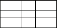
You use a Grid layout container to arrange children as rows and columns of cells, much like an HTML table. The following example shows a Grid container that consists of nine cells arranged in a three-by-three pattern:
You can put zero or one child in each cell of a Grid container. If you include multiple children in a cell, put a container in the cell, and then add children to the container. The height of all cells in a row is the same, but each row can have a different height. The width of all cells in a column is the same, but each column can have a different width.
You can define a different number of cells for each row or each column of the Grid container. In addition, a cell can span multiple columns and/or multiple rows of the container.
If the default or explicit size of the child is larger than the size of an explicitly sized cell, the child is clipped at the cell boundaries.
If the child's default width or default height is smaller than the cell, the default horizontal alignment of the child in the cell is left and the default vertical alignment is top. You can use the horizontalAlign and verticalAlign properties of the <mx:GridItem> tag to control positioning of the child.
For complete reference information, see the ActionScript 3.0 Reference for Apache Flex. For information on the Tile container, which creates a layout where all cells have the same size, see MX Tile layout container.
Creating a Grid layout container
You create a Grid layout container as follows:
-
You use the <mx:Grid> tag to define a Grid container; it can hold any number of <mx:GridRow> child tags.
-
You use the <mx:GridRow> tag to define each row. It must be a child of the <mx:Grid> tag and can hold any number of <mx:GridItem> child tags.
-
You use the <mx:GridItem> tag to define each row cell; it must be a child of the <mx:GridRow> tag.
The <mx:GridItem> tag takes the following optional properties that control how the item is laid out:
|
Property |
Type |
Use |
Descriptions |
|---|---|---|---|
rowSpan |
Number |
Property |
Specifies the number of rows of the Grid container spanned by the cell. The default value is 1. You cannot extend a cell past the number of rows in the Grid container. |
colSpan |
Number |
Property |
Specifies the number of columns of the Grid container spanned by the cell. The default value is 1. You cannot extend a cell past the number of columns in the Grid container. |
The following image shows a Grid container with three rows and three columns:
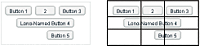
On the left, you see how the Grid container appears in Flash Player. On the right, you see the Grid container with borders overlaying it to illustrate the configuration of the rows and columns. In this example, the buttons in the first (top) row each occupy a single cell. The button in the second row spans three columns, and the button in the third row spans the second and third columns.
You do not have to define the same number of cells for every row of a Grid container, as the following image shows. The Grid container defines five cells in row one; row two has one item that spans three cells; and row 3 has one empty cell, followed by an item that spans two cells.
The following MXML code creates the Grid container with three rows and three columns shown in the first image in this section:
<?xml version="1.0"?>
<!-- containers\layouts\GridSimple.mxml -->
<s:Application xmlns:fx="http://ns.adobe.com/mxml/2009"
    xmlns:mx="library://ns.adobe.com/flex/mx"
    xmlns:s="library://ns.adobe.com/flex/spark">

    <mx:Grid id="myGrid">

        <!-- Define Row 1. -->
        <mx:GridRow id="row1">
            <!-- Define the first cell of Row 1. -->
            <mx:GridItem>
                <mx:Button label="Button 1"/>
            </mx:GridItem>
            <!-- Define the second cell of Row 1. -->
            <mx:GridItem>
                <mx:Button label="2"/>
            </mx:GridItem>
            <!-- Define the third cell of Row 1. -->
            <mx:GridItem>
                <mx:Button label="Button 3"/>
            </mx:GridItem>
        </mx:GridRow>

        <!-- Define Row 2. -->
        <mx:GridRow id="row2">
            <!-- Define a single cell to span three columns of Row 2. -->
            <mx:GridItem colSpan="3" horizontalAlign="center">
                <mx:Button label="Long-Named Button 4"/>
            </mx:GridItem>
        </mx:GridRow>

        <!-- Define Row 3. -->
        <mx:GridRow id="row3">
            <!-- Define an empty first cell of Row 3. -->
            <mx:GridItem/>
            <!-- Define a cell to span columns 2 and 3 of Row 3. -->
            <mx:GridItem colSpan="2" horizontalAlign="center">
                <mx:Button label="Button 5"/>
            </mx:GridItem>
        </mx:GridRow>

    </mx:Grid>
</s:Application>
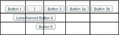
To modify the preceding example to include five buttons across the top row, you modify the first <mx:GridRow> tag as follows:
<?xml version="1.0"?>
<!-- containers\layouts\Grid5Button.mxml -->
<s:Application xmlns:fx="http://ns.adobe.com/mxml/2009"
    xmlns:mx="library://ns.adobe.com/flex/mx"
    xmlns:s="library://ns.adobe.com/flex/spark">

    <mx:Grid id="myGrid">
        <!-- Define Row 1. -->
        <mx:GridRow id="row1">
            <!-- Define the first cell of Row 1. -->
            <mx:GridItem>
                <mx:Button label="Button 1"/>
            </mx:GridItem>
            <mx:GridItem>
                <mx:Button label="2"/>
            </mx:GridItem>
            <mx:GridItem>
                <mx:Button label="Button 3"/>
            </mx:GridItem>
            <mx:GridItem>
                <mx:Button label="Button 3a"/>
            </mx:GridItem>
            <mx:GridItem>
                <mx:Button label="Button 3b"/>
            </mx:GridItem>
        </mx:GridRow>

        <!-- Define Row 2. -->
        <mx:GridRow id="row2">
            <!-- Define a single cell to span three columns of Row 2. -->
            <mx:GridItem colSpan="3" horizontalAlign="center">
                <mx:Button label="Long-Named Button 4"/>
            </mx:GridItem>
        </mx:GridRow>

        <!-- Define Row 3. -->
        <mx:GridRow id="row3">
            <!-- Define an empty first cell of Row 3. -->
            <mx:GridItem/>
            <!-- Define a cell to span columns 2 and 3 of Row 3. -->
            <mx:GridItem colSpan="2" horizontalAlign="center">
                <mx:Button label="Button 5"/>
            </mx:GridItem>
        </mx:GridRow>
    </mx:Grid>
</s:Application>
Setting the row and column span
The colSpan and rowSpan properties of the GridItem container let you create grid items that occupy multiple grid rows and columns. Making an item span multiple rows or columns does not necessarily make its child control or container larger; you must size the child so it fits the space appropriately, as the following example shows.
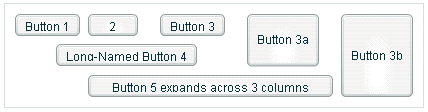
The following image shows a modification to the example in Creating a Grid layout container, where Button 3a now spans two rows, Button 3b spans three rows, and Button 5 spans three columns:
The following code shows the changes that were made to produce these results:
<?xml version="1.0"?>
<!-- containers\layouts\GridRowSpan.mxml -->
<s:Application xmlns:fx="http://ns.adobe.com/mxml/2009"
    xmlns:mx="library://ns.adobe.com/flex/mx"
    xmlns:s="library://ns.adobe.com/flex/spark">

    <mx:Grid id="myGrid">
        <!-- Define Row 1. -->
        <mx:GridRow id="row1" height="33%">
            <!-- Define the first cell of Row 1. -->
            <mx:GridItem>
                <mx:Button label="Button 1"/>
            </mx:GridItem>
            <mx:GridItem>
                <mx:Button label="2"/>
            </mx:GridItem>
            <mx:GridItem>
                <mx:Button label="Button 3"/>
            </mx:GridItem>
            <mx:GridItem rowSpan="2">
                <mx:Button label="Button 3a" height="100%"/>
            </mx:GridItem>
            <mx:GridItem rowSpan="3">
                <mx:Button label="Button 3b" height="100%"/>
            </mx:GridItem>
        </mx:GridRow>

        <!-- Define Row 2. -->
        <mx:GridRow id="row2" height="33%">
            <!-- Define a single cell to span three columns of Row 2. -->
            <mx:GridItem colSpan="3" horizontalAlign="center">
                <mx:Button label="Long-Named Button 4"/>
            </mx:GridItem>
        </mx:GridRow>

        <!-- Define Row 3. -->
        <mx:GridRow id="row3" height="33%">
            <!-- Define an empty first cell of Row 3. -->
            <mx:GridItem/>
            <!-- Define a cell to span columns 2 and 3 and 4 of Row 3. -->
            <mx:GridItem colSpan="3">
                <mx:Button
                    label="Button 5 expands across 3 columns"
                    width="75%"/>
            </mx:GridItem>
        </mx:GridRow>
    </mx:Grid>
</s:Application>
This example makes several changes with the following effects:
-
It sets the height of each row to 33% of the grid, ensuring that the rows have equal heights.
-
It sets the rowSpan properties of the items with Buttons 3a and 3b to make them span two and three rows, respectively.
-
It sets the height properties of Buttons 3a and 3b to 100% to make these buttons fill all rows that they span. If you omit this property on these buttons, Flex sets the buttons to their default height, so they do not appear to span the rows.
-
It sets Button 5 to span three rows and sets a percentage-based width of 75%. In this example, the text requires the button to fill the available width of the three columns, so Flex sizes the button to the default size that fits the text, not the requested 75%. If you omit the width property, the result is identical. To see the effect of the percentage width specification, keep the specification and shorten the label text; the button then spans three-quarters of the three columns, centered on the middle column.
The resulting grid has the several additional characteristics. Although the second row definition specifies only a single <mx:GridItem> tag that defines a cell spanning three columns, Flex automatically creates two additional cells to allow Buttons 3a and 3b to expand into the row. The third row also has five cells. The first cell is defined by the empty <mx:gridItem/> tag. The second through fourth cells are defined by the GridItem that contains Button 5, which spans three columns. The fifth column is created because the last item in the first row spans all three rows.
MX Panel layout container
A Panel layout container includes a title bar, a title, a status message area (in the title bar), a border, and a content area for its children. Typically, you use Panel containers to wrap self-contained application modules. For example, you could define several Panel containers in your application where one Panel container holds a form, a second holds a shopping cart, and a third holds a catalog.
The Panel container has a layout property that lets you specify one of three types of layout: horizontal, vertical (default), or absolute layout. Horizontal and vertical layout use the Flex automatic layout rules to lay out children horizontally or vertically. Absolute layout requires you to specify each child's x and y position relative to the panel contents area, or to use constraint-based layout styles to anchor one or more sides or the container horizontal or vertical center relative to the panel content area. For examples of using absolute and constraint-based layout in a container, see Creating and using a Canvas control. For detailed information on using these layout techniques, see Laying out components.
The following example shows a Panel container with a Form container as its child:
For complete reference information, see the ActionScript 3.0 Reference for Apache Flex.
Creating a Panel layout container
You define a Panel container in MXML by using the <mx:Panel> tag. Specify an id value if you intend to refer to a component elsewhere in your MXML, either in another tag or in an ActionScript block.
The following example defines a Panel container that contains a form as the top-level container in your application. In this example, the Panel container provides you with a mechanism for including a title bar, as in a standard GUI window.
<?xml version="1.0"?>
<!-- containers\layouts\PanelSimple.mxml -->
<s:Application xmlns:fx="http://ns.adobe.com/mxml/2009"
    xmlns:mx="library://ns.adobe.com/flex/mx"
    xmlns:s="library://ns.adobe.com/flex/spark">

    <mx:Panel id="myPanel" title="My Application">
        <mx:Form width="300">
            <mx:FormHeading label="Billing Information"/>
            <!-- Form contents goes here -->
        </mx:Form>
    </mx:Panel>
</s:Application>
Adding a ControlBar container to a Panel container
You can use the ControlBar container with a Panel container to hold components that can be shared by the other children in the Panel container. The RichTextEditor control, for example, consists of a Panel control with a TextArea control and a custom ControlBar for the text formatting controls. For a product catalog, the ControlBar container can hold the Flex controls to specify quantity and to add an item to a shopping cart, as the following example shows:
- A.
- Panel container
- B.
- ControlBar container
You specify the <mx:ControlBar> tag as the last child tag of an <mx:Panel> tag, as the following example shows:
<?xml version="1.0"?>
<!-- containers\layouts\PanelCBar.mxml -->
<s:Application xmlns:fx="http://ns.adobe.com/mxml/2009"
    xmlns:mx="library://ns.adobe.com/flex/mx"
    xmlns:s="library://ns.adobe.com/flex/spark">

    <mx:Panel title="My Application"
        paddingTop="10" paddingBottom="10"
        paddingLeft="10" paddingRight="10"
        width="300">

        <fx:Script>
            <![CDATA[
                private function addToCart():void {
                    // Handle event.
                }
            ]]>
        </fx:Script>

        <mx:HBox width="100%">
            <!-- Area for your catalog. -->
        </mx:HBox>

        <mx:ControlBar width="100%">
            <mx:Label text="Quantity"/>
            <mx:NumericStepper id="myNS"/>
            <!-- Use Spacer to push Button control to the right. -->
            <mx:Spacer width="100%"/>
            <mx:Button label="Add to Cart" click="addToCart();"/>
        </mx:ControlBar>
    </mx:Panel>
</s:Application>
For more information on the ControlBar container, see MX ControlBar layout container.
You can also add the ControlBar container dynamically to a Panel container, as the following example shows:
<?xml version="1.0"?>
<!-- containers\layouts\PanelCBarDynamicAdd.mxml -->
<s:Application xmlns:fx="http://ns.adobe.com/mxml/2009"
    xmlns:mx="library://ns.adobe.com/flex/mx"
    xmlns:s="library://ns.adobe.com/flex/spark">

    <fx:Script>
        <![CDATA[
            import mx.containers.ControlBar;
            import mx.controls.*;
            import flash.events.MouseEvent;

            private var myCB:ControlBar=new ControlBar();
            private var myLabel:Label=new Label();
            private var myNS:NumericStepper=new NumericStepper();
            private var mySpacer:Spacer=new Spacer();
            private var myButton:Button=new Button();

            private var canAddChild:Boolean = true;

            private function addCBHandler():void {
                if (canAddChild) {
                    /* Create Controlbar control. */
                    myLabel.text="Quantity";
                    mySpacer.percentWidth=100;
                    myButton.label="Add to Cart";
                    myButton.addEventListener('click', addToCart);

                    myCB.percentWidth=100;
                    myCB.addChild(myLabel);
                    myCB.addChild(myNS);
                    myCB.addChild(mySpacer);
                    myCB.addChild(myButton);

                    /* Add the ControlBar as the last child of the
                       Panel container.
                       The ControlBar appears in the normal content area
                       of the Panel container. */
                    myPanel.addChildAt(myCB, myPanel.numChildren);

                    /* Call createComponentsFromDescriptors() to make the
                       ControlBar appear in the bottom border area
                       of the Panel container. The ControlBar must be the
                       last child in the Panel container. */
                    myPanel.createComponentsFromDescriptors();

                    /* Prevents more than one ControlBar control from being added. */
                    canAddChild = false;
                }
            }

            private function addToCart(event:MouseEvent):void {
                Alert.show("ControlBar Button clicked.");
            }
        ]]>
    </fx:Script>

    <mx:Panel id="myPanel"
        title="My Application"
        paddingTop="10" paddingBottom="10"
        paddingLeft="10" paddingRight="10"
        width="300">

        <mx:HBox width="100%">
            <!-- Area for your catalog. -->
        </mx:HBox>

        <mx:Button label="Add ControlBar"
            click="addCBHandler();"/>
    </mx:Panel>
</s:Application>
MX Tile layout container
A Tile layout container lays out its children in one or more vertical columns or horizontal rows, starting new rows or columns as necessary. The direction property determines the layout. The valid values for the direction property are vertical for a column layout and horizontal (default) for a row layout.
All Tile container cells have the same size, unlike the cells of a Grid layout container (see MX Grid layout container). Flex arranges the cells of a Tile container in a square grid, where each cell holds a single child component. For example, if you define 16 children in a Tile layout container, Flex lays it out four cells wide and four cells high. If you define 13 children, Flex still lays it out four cells wide and four cells high, but leaves the last three cells in the fourth row empty.
The following image shows examples of horizontal and vertical Tile containers:
- A.
- Horizontal (default)
- B.
- Vertical
For complete reference information, see Tile in the ActionScript 3.0 Reference for Apache Flex.
Creating a Tile layout container
You define a Tile container in MXML by using the <mx:Tile> tag. Specify an id value if you intend to refer to a component elsewhere in your MXML, either in another tag or in an ActionScript block. You can use the tileHeight and tileWidth properties to specify explicit tile dimensions.
The following example creates the horizontal Tile container shown in the image in MX Tile layout container. All cells have the height and width of the largest child, 50 pixels high and 100 pixels wide.
<?xml version="1.0"?>
<!-- containers\layouts\TileSimple.mxml -->
<s:Application xmlns:fx="http://ns.adobe.com/mxml/2009"
    xmlns:mx="library://ns.adobe.com/flex/mx"
    xmlns:s="library://ns.adobe.com/flex/spark">

    <mx:Tile id="myFlow"
        direction="horizontal"
        borderStyle="solid"
        paddingTop="10" paddingBottom="10"
        paddingRight="10" paddingLeft="10"
        verticalGap="15" horizontalGap="10">

        <mx:TextInput id="text1" text="1" height="50" width="75"/>
        <mx:TextInput id="text2" text="2" height="50" width="100"/>
        <mx:TextInput id="text3" text="3" height="50" width="75"/>
        <mx:TextInput id="text4" text="4" height="50" width="75"/>
        <mx:TextInput id="text5" text="5" height="50" width="75"/>
    </mx:Tile>
</s:Application>
Sizing and positioning a child in a Tile container
Flex sets the default size of each Tile cell to the height of the tallest child and the width of the widest child. All cells have the same default size. If the default size of a child is larger than the cell because, for example, you used the tileHeight and tileWidth properties to explicitly size the cells, Flex automatically sizes the child to fit inside the cell boundaries. This, in turn, may clip the content inside the control; for instance, the label of a button might be clipped even though the button itself fits into the cell. If you specify an explicit child dimension that is greater than the tileHeight or tileWidth property, Flex clips the child.
If the child's default width or default height is smaller than the cell, the default horizontal alignment of the child in the cell is left and the default vertical alignment is top. You can use the horizontalAlign and verticalAlign properties of the <mx:Tile> tag to control the positioning of the child.
If the child uses percentage-based sizing, the child is enlarged or shrunk to the specified percentage of the cell. In the example in Creating a Tile layout container, the TextInput control named text2 has a width of 100 pixels; therefore, the default width of all Tile cells is 100 pixels, so most children are smaller than the cell size. If you want all child controls to increase in size to the full width of the cells, set the width property of each child to 100%, as the following example shows. The example also shows how to use the Tile control's tileWidth property to specify the width of the tiles:
<?xml version="1.0"?>
<!-- containers\layouts\TileSizing.mxml -->
<s:Application xmlns:fx="http://ns.adobe.com/mxml/2009"
    xmlns:mx="library://ns.adobe.com/flex/mx"
    xmlns:s="library://ns.adobe.com/flex/spark">

    <mx:Tile id="myFlow"
        direction="horizontal"
        borderStyle="solid"
        paddingTop="10" paddingBottom="10"
        paddingRight="10" paddingLeft="10"
        verticalGap="15" horizontalGap="10"
        tileWidth="100">

        <mx:TextInput id="fname" text="1" height="50" width="100%"/>
        <mx:TextInput id="lname" text="2" height="50" width="100%"/>
        <mx:TextInput id="addr1" text="3" height="50" width="100%"/>
        <mx:TextInput id="addr2" text="4" height="50" width="100%"/>
        <mx:TextInput id="addr3" text="5" height="50" width="100%"/>
    </mx:Tile>
</s:Application>
MX TitleWindow layout container
A TitleWindow layout container is a Panel container that is optimized for use as a pop-up window. The container consists of a title bar, a caption and status area in the title bar, a border, and a content area for its children. Unlike the Panel container, it can display a Close button, and is designed to work as a pop-up window that users can drag around the screen the application window.
A pop-up TitleWindow container can be modal, which means that it takes all keyboard and mouse input until it is closed, or nonmodal, which means other windows can accept input while the pop-up window is still open.
One typical use for a TitleWindow container is to hold a form. When the user completes the form, you can close the TitleWindow container programmatically, or let the user request the application to close it by using the close icon (a box with an x inside it) in the upper-right corner of the window.
Because you pop up a Title window, you do not create it directly in MXML, as you do most controls; instead you use the PopUpManager.
The following example shows a TitleWindow container with a Form container as its child:
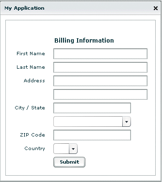
For complete reference information, see TitleWindow in the ActionScript 3.0 Reference for Apache Flex.
Using the PopUpManager to create a TitleWindow container
To create and remove a pop-up TitleWindow container, you use methods of the PopUpManager. The PopUpManager is in the mx.managers package.
Creating a pop-up window
To create a pop-up window, use the PopUpManager createPopUp() method. The createPopUp() method has the following signature:
 public static createPopUp(parent:DisplayObject, class:Class,
 	modal:Boolean = false):IFlexDisplayObject
The method has the following arguments.
|
Argument |
Description |
|---|---|
|
parent |
A reference to a window to pop-up over. |
|
class |
A reference to the class of object you want to create, typically a custom MXML component that implements a TitleWindow container. |
|
modal |
(Optional) A Boolean value that indicates whether the window is modal, and takes all mouse input until it is closed (true), or whether interaction is allowed with other controls while the window is displayed (false). The default value is false. |
You can also create a pop-up window by passing an instance of a TitleWindow class or custom component to the PopUpManager addPopUp() method. For more information, see Using the addPopUp() method.
Defining a custom TitleWindow component
One of the most common ways of creating a TitleWindow container is to define it as a custom MXML component.
-
You define the TitleWindow container, its event handlers, and all of its children in the custom component.
-
You use the PopUpManager createPopUp() and removePopUp() methods to create and remove the TitleWindow container.
The following example code defines a custom MyLoginForm TitleWindow component that is used as a pop-up window:
<?xml version="1.0"?>
<!-- containers\layouts\myComponents\MyLoginForm.mxml -->
<mx:TitleWindow xmlns:fx="http://ns.adobe.com/mxml/2009"
    xmlns:mx="library://ns.adobe.com/flex/mx"
    xmlns:s="library://ns.adobe.com/flex/spark">

    <fx:Script>
        <![CDATA[
            import mx.managers.PopUpManager;

            private function processLogin():void {
                // Check credentials (not shown) then remove pop up.
                PopUpManager.removePopUp(this);
            }
        ]]>
    </fx:Script>

    <mx:Form>
        <mx:FormItem label="User Name">
            <mx:TextInput id="username" width="100%"/>
        </mx:FormItem>
        <mx:FormItem label="Password">
            <mx:TextInput id="password"
                displayAsPassword="true"
                width="100%"/>
        </mx:FormItem>
    </mx:Form>
    <mx:HBox>
        <mx:Button click="processLogin();" label="OK"/>
        <mx:Button
            label="Cancel"
            click="PopUpManager.removePopUp(this);"/>
    </mx:HBox>
</mx:TitleWindow>
This file, named MyLoginForm.mxml, defines a TitleWindow container by using the <mx:TitleWindow> tag. The TitleWindow container defines two TextInput controls, for user name and password, and two Button controls, for submitting the form and for closing the TitleWindow container. This example does not include the code for verifying the user name and password in the submitForm() event listener.
In this example, you process the form data in an event listener of the MyLoginForm.mxml component. To make this component more reusable, you can define the event listeners in your main application. This lets you create a generic form that leaves the data handling to the application that uses the form. For an example that defines the event listeners in the main application, see Using TitleWindow and PopUpManager events.
Using the PopUpManager to create the pop-up TitleWindow
To create a pop-up window, you call the PopUpManager createPopUp() method and pass it the parent, the name of the class that creates the pop-up, and the modal Boolean value. The following main application code creates the TitleWindow container defined in Defining a custom TitleWindow component:
<?xml version="1.0"?>
<!-- containers\layouts\MainMyLoginForm.mxml -->
<s:Application xmlns:fx="http://ns.adobe.com/mxml/2009"
    xmlns:mx="library://ns.adobe.com/flex/mx"
    xmlns:s="library://ns.adobe.com/flex/spark">

    <fx:Script>
        <![CDATA[
            import mx.managers.PopUpManager;
            import mx.core.IFlexDisplayObject;
            import myComponents.MyLoginForm;

            private function showLogin():void {
                // Create a non-modal TitleWindow container.
                var helpWindow:IFlexDisplayObject =
                    PopUpManager.createPopUp(this, MyLoginForm, false);
            }
        ]]>
    </fx:Script>

    <mx:VBox width="300" height="300">
        <mx:Button click="showLogin();" label="Login"/>
    </mx:VBox>
</s:Application>
In this example, when the user selects the Login button, the event listener for the click event uses the createPopUp() method to create a TitleWindow container, passing to it the name of the MyLoginForm.mxml file as the class name.
Often, you cast the return value of the createPopUp() method to TitleWindow so that you can manipulate the properties of the pop-up TitleWindow container, as the following version of the showLogin() method from the preceding example shows:
<?xml version="1.0"?>
<!-- containers\layouts\MainMyLoginFormCast.mxml -->
<s:Application xmlns:fx="http://ns.adobe.com/mxml/2009"
    xmlns:mx="library://ns.adobe.com/flex/mx"
    xmlns:s="library://ns.adobe.com/flex/spark">

    <fx:Script>
        <![CDATA[
          import mx.managers.PopUpManager;
          import mx.core.IFlexDisplayObject;
          import myComponents.MyLoginForm;

          // Additional import statement to use the TitleWindow container.
          import mx.containers.TitleWindow;

          private function showLogin():void {
            // Create the TitleWindow container.
            var helpWindow:TitleWindow =
          TitleWindow(PopUpManager.createPopUp(this, MyLoginForm, false));

            // Add title to the title bar.
            helpWindow.title="Enter Login Information";

            // Make title bar slightly transparent.
            helpWindow.setStyle("borderAlpha", 0.9);

            // Add a close button.
            // To close the container, your must also handle the close event.
            helpWindow.showCloseButton=true;
          }
        ]]>
    </fx:Script>

    <mx:VBox width="300" height="300">
        <mx:Button click="showLogin();" label="Login"/>
    </mx:VBox>
</s:Application>
Removing a pop-up window
To remove a pop-up TitleWindow, use the PopUpManager removePopUp() method. You pass the object created with the PopUpManager.createPopUp() method to the removePopUp() method. The following modification to the example from Using the PopUpManager to create the pop-up TitleWindowremoves the pop-up when the user clicks the Done button:
<?xml version="1.0"?>
<!-- containers\layouts\MainMyLoginFormRemove.mxml -->
<s:Application xmlns:fx="http://ns.adobe.com/mxml/2009"
    xmlns:mx="library://ns.adobe.com/flex/mx"
    xmlns:s="library://ns.adobe.com/flex/spark">

    <fx:Script>
        <![CDATA[
          import mx.managers.PopUpManager;
          import myComponents.MyLoginForm;
          import mx.core.IFlexDisplayObject;

          private var helpWindow:IFlexDisplayObject;

          private function showLogin():void {
            // Create the TitleWindow container.
            helpWindow = PopUpManager.createPopUp(this, MyLoginForm, false);
          }

          private function removeForm():void {
            PopUpManager.removePopUp(helpWindow);
          }
        ]]>
    </fx:Script>

    <mx:VBox width="300" height="300">
        <mx:Button click="showLogin();" label="Login"/>
        <mx:Button id="b2" label="Remove Form" click="removeForm();"/>
    </mx:VBox>
</s:Application>
You commonly call the removePopUp() method from a TitleWindow close event and the PopUpManager mouseDownOutside event.
Centering a pop-up window
Call the centerPopUp() method of the PopUpManager to center the pop-up within another container. The following custom MXML component centers itself in its parent container:
<?xml version="1.0"?>
<!-- containers\layouts\myComponents\MyLoginFormCenter.mxml -->
<mx:TitleWindow xmlns:fx="http://ns.adobe.com/mxml/2009"
    xmlns:mx="library://ns.adobe.com/flex/mx"
    xmlns:s="library://ns.adobe.com/flex/spark"
    creationComplete="handleCreationComplete();">

    <fx:Script>
        <![CDATA[
            import mx.managers.PopUpManager;

            private function handleCreationComplete():void {
                // Center the TitleWindow container
                // over the control that created it.
                PopUpManager.centerPopUp(this);
            }

            private function processLogin():void {
                // Check credentials (not shown) then remove pop up.
                PopUpManager.removePopUp(this);
            }
        ]]>
    </fx:Script>
    <mx:Form>
        <mx:FormItem label="User Name">
            <mx:TextInput id="username" width="100%"/>
        </mx:FormItem>
        <mx:FormItem label="Password">
            <mx:TextInput id="password"
                width="100%"
                displayAsPassword="true"/>
        </mx:FormItem>
    </mx:Form>
    <mx:HBox>
        <mx:Button click="processLogin();" label="OK"/>
        <mx:Button
            label="Cancel"
            click="PopUpManager.removePopUp(this);"/>
    </mx:HBox>
</mx:TitleWindow>
Using TitleWindow and PopUpManager events
You can add a close icon (a small x in the upper-right corner of the TitleWindow title bar) to make it appear similar to dialog boxes in a GUI environment. You do this by setting the showCloseButton property to true, as the following example shows:
 <mx:TitleWindow xmlns:fx="http://ns.adobe.com/mxml/2009"
	xmlns:mx="library://ns.adobe.com/flex/mx"
	xmlns:s="library://ns.adobe.com/flex/spark"
	showCloseButton="true">
The default value for showCloseButton is false.
The TitleWindow broadcasts a close event when the user clicks the close icon. You must create a handler for that event and close the TitleWindow from within that event handler. Flex does not close the window automatically.
In the simplest case, you can call the PopUpManager removePopUp() method directly in the TitleWindow close event property specify, as the following line shows:
 <mx:TitleWindow xmlns:fx="http://ns.adobe.com/mxml/2009"
	xmlns:mx="library://ns.adobe.com/flex/mx"
	xmlns:s="library://ns.adobe.com/flex/spark"
	"showCloseButton="true"
 	close="PopUpManager.removePopUp(this);">
If you need to clean up, before closing the TitleWindow control, create an event listener function for the close event and close the TitleWindow from within that handler, as the following example shows:
<?xml version="1.0"?>
<!-- containers\layouts\myComponents\MyLoginFormRemoveMe.mxml -->
<mx:TitleWindow xmlns:fx="http://ns.adobe.com/mxml/2009"
    xmlns:s="library://ns.adobe.com/flex/spark"
    xmlns:mx="library://ns.adobe.com/flex/mx"
    showCloseButton="true"
    close="removeMe();">

    <fx:Script>
        <![CDATA[
            import mx.managers.PopUpManager;

            private function removeMe():void {
                // Put any clean-up code here.
                PopUpManager.removePopUp(this);
            }
        ]]>
    </fx:Script>

</mx:TitleWindow>
You can also use the PopUpManager mouseDownOutside event to close the pop-up window when a user clicks the mouse outside the TitleWindow. To do this, you add an event listener to the TitleWindow instance for the mouseDownOutside event, as the following example shows:
<?xml version="1.0"?>
<!-- containers\layouts\MainMyLoginFormMouseDown.mxml -->
<s:Application xmlns:fx="http://ns.adobe.com/mxml/2009"
    xmlns:mx="library://ns.adobe.com/flex/mx"
    xmlns:s="library://ns.adobe.com/flex/spark">

    <fx:Script>
        <![CDATA[
            import mx.managers.PopUpManager;
            import mx.containers.TitleWindow;
            import myComponents.MyLoginForm;
            import mx.events.FlexMouseEvent;

            private var helpWindow:TitleWindow;

            private function showLogin():void {
                // Create the TitleWindow container.
                helpWindow = TitleWindow(PopUpManager.createPopUp(this,
                    MyLoginForm, false));
                helpWindow.addEventListener("mouseDownOutside", removeForm);
            }

            private function removeForm(event:FlexMouseEvent):void {
                PopUpManager.removePopUp(helpWindow);
            }
        ]]>
    </fx:Script>

    <mx:VBox width="300" height="300">
        <mx:Button click="showLogin();" label="Login"/>
    </mx:VBox>
</s:Application>
You define the event listener in the main application, and then assign it to the pop-up window when you create it. This technique lets you use a generic pop-up window, defined by the component MyLoginForm.mxml, and then modify the behavior of the component by assigning event listeners to it from the main application.
Creating a modal pop-up window
The createPopUp() method takes an optional modal parameter. You can set this parameter to true to make the window modal. When a TitleWindow is modal, you cannot select any other component while the window is open. The default value of modal is false.
The following example creates a modal pop-up window:
 var pop1:IFlexDisplayObject = PopUpManager.createPopUp(this, MyLoginForm,
 	true);
Passing data to and from a pop-up window
To make your pop-up window more flexible, you might want to pass data to it or return data from it. To do this, use the following guidelines:
-
Create a custom component to be your pop-up. In most circumstances, this component is a TitleWindow container.
-
Declare variables in your pop-up that you will set in the application that creates the pop-up.
-
Cast the pop-up to be the same type as your custom component.
-
Pass a reference to that component to the pop-up window, if the pop-up window is to set a value on the application or one of the application's components.
For example, the following application populates a ComboBox in the pop-up window with an Array defined in the main application.
When creating the pop-up, the application casts the pop-up to be of type ArrayEntryForm, which is the name of the custom component that defines the pop-up window. If you do not do this, the application cannot access the properties that you create.
The application passes a reference to the TextInput component in the Application container to the pop-up window so that the pop-up can write its results back to the container. The application also passes the Array of file extensions for the pop-up ComboBox control's data provider, and sets the pop-up window's title. By setting these in the application, you can reuse the pop-up window in other parts of the application without modification, because it does not have to know the name of the component it is writing back to or the data that it is displaying, only that its data is in an Array and it is writing to a TextArea.
<?xml version="1.0"?>
<!-- containers\layouts\MainArrayEntryForm.mxml -->
<s:Application xmlns:fx="http://ns.adobe.com/mxml/2009"
    xmlns:mx="library://ns.adobe.com/flex/mx"
    xmlns:s="library://ns.adobe.com/flex/spark">
    <s:layout>
        <s:VerticalLayout/>
    </s:layout>

    <fx:Script>
        <![CDATA[
            import mx.managers.PopUpManager;
            import myComponents.ArrayEntryForm;

            public var helpWindow:Object;

            public function displayForm():void {
                /* Array with data for the custom control ComboBox control. */
                var doctypes:Array = ["*.as", "*.mxml", "*.swc"]

                /* Create the pop-up and cast the
                   return value of the createPopUp()
                   method to the ArrayEntryForm custom component. */
                var pop1:ArrayEntryForm = ArrayEntryForm(
                    PopUpManager.createPopUp(this, ArrayEntryForm, true));

                /* Set TitleWindow properties. */
                pop1.title="Select File Type";
                pop1.showCloseButton=true;

                /* Set properties of the ArrayEntryForm custom component. */
                pop1.targetComponent = ti1;
                pop1.myArray = doctypes;
                PopUpManager.centerPopUp(pop1);
            }
        ]]>
    </fx:Script>

    <mx:TextInput id="ti1" text=""/>
    <mx:Button id="b1" label="Select File Type"
        click="displayForm();"/>
</s:Application>
The following custom component, ArrayEntryForm.mxml, declares two variables. The first one is for the Array that the parent application passes to the pop-up window. The second holds a reference to the parent application's TextInput control. The component uses that reference to update the parent application:
<?xml version="1.0"?>
<!-- containers\layouts\myComponents\ArrayEntryForm.mxml -->
<mx:TitleWindow xmlns:fx="http://ns.adobe.com/mxml/2009"
    xmlns:mx="library://ns.adobe.com/flex/mx"
    xmlns:s="library://ns.adobe.com/flex/spark"
        showCloseButton="true"
        width="200" borderAlpha="1"
        close="removeMe();">

    <fx:Script>
        <![CDATA[
            import mx.controls.TextInput;
            import mx.managers.PopUpManager;

            // Variables whose values are set by the main application.
            // Data provider array for the component's ComboBox control.
            [Bindable]
            public var myArray:Array;
            // A reference to the TextInput control
            // in which to put the result.
            public var targetComponent:TextInput;

            // OK button click event listener.
            // Sets the target component in the application to the
            // selected ComboBox item value.
            private function submitData():void {
                targetComponent.text = String(cb1.selectedItem);
                removeMe();
            }

            // Cancel button click event listener.
            private function removeMe():void {
                PopUpManager.removePopUp(this);
            }
        ]]>
    </fx:Script>

    <mx:ComboBox id="cb1" dataProvider="{myArray}"/>
    <mx:HBox>
        <mx:Button label="OK" click="submitData();"/>
        <mx:Button label="Cancel" click="removeMe();"/>
    </mx:HBox>
</mx:TitleWindow>
From within a pop-up custom component, you can also access properties of the parent application by using the parentApplication property. For example, if the application has a Button control named b1, you can get the label of that Button control, as the following example shows:
myLabel = parentApplication.b1.label;
This technique, however, uses a hard-coded value in the pop-up component for both the target component id in the parent and the property in the component.
Passing data using events
The following example modifies the example from the previous section to use event listeners defined in the main application to handle the passing of data back from the pop-up window to the main application. This example shows the ArrayEntryFormEvents.mxml file with no event listeners defined within it.
<?xml version="1.0"?>
<!-- containers\layouts\myComponents\ArrayEntryFormEvents.mxml -->
<mx:TitleWindow xmlns:fx="http://ns.adobe.com/mxml/2009"
    xmlns:s="library://ns.adobe.com/flex/spark"
    xmlns:mx="library://ns.adobe.com/flex/mx"
    showCloseButton="true"
    width="200"
    borderAlpha="1">

    <fx:Script>
        <![CDATA[
            import mx.managers.PopUpManager;

            // Variables whose values are set by the main application.
            // Data provider array for the component's ComboBox control.
            [Bindable]
            public var myArray:Array;

        ]]>
    </fx:Script>

    <mx:ComboBox id="cb1" dataProvider="{myArray}"/>
    <mx:HBox>
        <mx:Button id="okButton" label="OK"/>
        <mx:Button id="cancelButton" label="Cancel"/>
    </mx:HBox>
</mx:TitleWindow>
The main application defines the event listeners and registers them with the controls defined within the pop-up window:
<?xml version="1.0"?>
<!-- containers\layouts\MainArrayEntryFormEvents.mxml -->
<s:Application xmlns:fx="http://ns.adobe.com/mxml/2009"
    xmlns:mx="library://ns.adobe.com/flex/mx"
    xmlns:s="library://ns.adobe.com/flex/spark">
    <s:layout>
        <s:VerticalLayout/>
    </s:layout>

    <fx:Script>
        <![CDATA[
            import mx.managers.PopUpManager;
            import flash.events.Event;
            import myComponents.ArrayEntryFormEvents;

            public var pop1:ArrayEntryFormEvents;

            public function displayForm():void {
                // Array with data for the custom control ComboBox control.
                var doctypes:Array = ["*.as", "*.mxml", "*.swc"]

                // Create the pop-up and cast the return value
                // of the createPopUp()
                // method to the ArrayEntryFormEvents custom component.
                pop1 = ArrayEntryFormEvents(
              PopUpManager.createPopUp(this, ArrayEntryFormEvents, true));
                // Set TitleWindow properties.
                pop1.title="Select File Type";
                pop1.showCloseButton=true;

                // Set the event listeners for
                // the ArrayEntryFormEvents component.
                pop1.addEventListener("close", removeMe);
                pop1["cancelButton"].addEventListener("click", removeMe);
                pop1["okButton"].addEventListener("click", submitData);

                // Set properties of the ArrayEntryFormEvents custom control.
                pop1.myArray = doctypes;
                PopUpManager.centerPopUp(pop1);
            }

            // OK button click event listener.
            // Sets the target component in the application to the
            // selected ComboBox item value.
            private function submitData(event:Event):void {
                ti1.text = String(pop1.cb1.selectedItem);
                removeMe(event);
            }

            // Cancel button click event listener.
            private function removeMe(event:Event):void {
                PopUpManager.removePopUp(pop1);
            }
        ]]>
    </fx:Script>

    <mx:VBox>
        <mx:TextInput id="ti1" text=""/>
    </mx:VBox>
    <mx:Button id="b1" label="Select File Type" click="displayForm();"/>
</s:Application>
Using the addPopUp() method
You can use the addPopUp() method of the PopUpManager to create a pop-up window without defining a custom component. This method takes an instance of any class that implements IFlexDisplayObject. Because it takes a class instance, not a class, you can use ActionScript code in an <fx:Script> block to create the component instance to pop up, rather than as a separate custom component.
Using the addPopUp() method may be preferable to using the createPopUp() method if you have to pop up a simple dialog box that is never reused elsewhere. However, it is not the best coding practice if the pop-up is complex or cannot be reused elsewhere.
The following example creates a pop-up with addPopUp() method and adds a Button control to that window that closes the window when you click it:
<?xml version="1.0"?>
<!-- containers\layouts\MyPopUpButton.mxml -->
<s:Application xmlns:fx="http://ns.adobe.com/mxml/2009"
    xmlns:mx="library://ns.adobe.com/flex/mx"
    xmlns:s="library://ns.adobe.com/flex/spark"
    height="600" width="600" >

    <fx:Script>
        <![CDATA[
            import mx.containers.TitleWindow;
            import flash.events.*;
            import mx.managers.PopUpManager;
            import mx.controls.Button;
            import mx.core.IFlexDisplayObject;

            // The variable for the TitleWindow container
            public var myTitleWindow:TitleWindow = new TitleWindow();

            // Method to instantiate and display a TitleWindow container.
            // This is the initial Button control's click event handler.
            public function openWindow(event:MouseEvent):void {
                // Set the TitleWindow container properties.
                myTitleWindow = new TitleWindow();
                myTitleWindow.title = "My Window Title";
                myTitleWindow.width= 220;
                myTitleWindow.height= 150;
                // Call the method to add the Button control to the
                // TitleWindow container.
                populateWindow();
                // Use the PopUpManager to display the TitleWindow container.
                PopUpManager.addPopUp(myTitleWindow, this, true);
            }

            // The method to create and add the Button child control to the
            // TitleWindow container.
            public function populateWindow():void {
                var btn1:Button = new Button();
                btn1.label="close";
                btn1.addEventListener(MouseEvent.CLICK, closeTitleWindow);
                myTitleWindow.addChild(btn1);
            }

            // The method to close the TitleWindow container.
            public function closeTitleWindow(event:MouseEvent):void {
                PopUpManager.removePopUp(event.currentTarget.parent);
            }
        ]]>
    </fx:Script>
    <mx:Button label="Open Window" click="openWindow(event);"/>
</s:Application>
You can make any component pop up. The following example pops up a TextArea control. The example resizes the control, and listens for a Shift-click to determine when to close the TextArea. Whatever text you type in the TextArea is stored in a Label control in the application when the pop-up window is removed.
<?xml version="1.0"?>
<!-- containers\layouts\MyPopUpTextArea.mxml -->
<s:Application xmlns:fx="http://ns.adobe.com/mxml/2009"
    xmlns:mx="library://ns.adobe.com/flex/mx"
    xmlns:s="library://ns.adobe.com/flex/spark">

    <fx:Script>
        <![CDATA[
            import mx.managers.PopUpManager;
            import mx.controls.TextArea;
            import mx.core.IFlexDisplayObject;

            public var myPopUp:TextArea

            public function openWindow(event:MouseEvent):void {
                myPopUp = new TextArea();
                myPopUp.width= 220;
                myPopUp.height= 150;
                myPopUp.text = "Hold down the Shift key, and " +
                    "click in the TextArea to close it.";
                myPopUp.addEventListener(MouseEvent.CLICK, closeWindow);
                PopUpManager.addPopUp(myPopUp, this, true);
                PopUpManager.centerPopUp(myPopUp);
            }

            public function closeWindow(event:MouseEvent):void {
                if (event.shiftKey) {
                    label1.text = myPopUp.text;
        PopUpManager.removePopUp(IFlexDisplayObject(event.currentTarget));
                }
            }
        ]]>
    </fx:Script>

    <mx:VBox>
        <mx:Button id="b1" label="Create TextArea Popup"
            click="openWindow(event);"/>
        <mx:Label id="label1"/>
    </mx:VBox>
</s:Application>
Navigation
Adobe, Adobe Flash Platform, and Adobe Flash Player are either registered trademarks or trademarks of Adobe Systems Incorporated in the United States and/or other countries and are used by permission from Adobe. No other license to the Adobe trademarks are granted.