
Spark containers
Spark containers provide a hierarchical structure to arrange and configure their children.
Flex also provides a set of MX layout and MX navigator containers, although it's best to use the Spark containers when possible. For more information on the MX layout and MX navigator containers, see MX layout containers and MX navigator containers.
For an introduction to containers, including Spark containers, see Introduction to containers.
About Spark containers
-
Group (including HGroup, VGroup, and TileGroup) and DataGroup
-
SkinnableContainer, SkinnableDataContainer, Panel, TitleWindow, NavigatorContent, BorderContainer, and Application
Note: The Panel and NavigatorContent classes are subclasses of the SkinnableContainer class. The information below for SkinnableContainer applies also to the Panel and NavigatorContent classes.
For more information on the Application container, see Application containers.
Interchangeable layouts
Most Spark containers support interchangeable layouts. That means you can set the layout of a container to any of the supported layout types, such as basic, horizontal, vertical, or tiled layout. You can also define a custom layout.
Skinning
To improve performance and minimize application size, some Spark containers do not support skinning. Use the Group and DataGroup containers to manage child layout. Use SkinnableContainer and SkinnableDataContainer to manage child layout and to support custom skins.
Visual child components
The Group and SkinnableContainer classes can take any visual components as children. Visual components implement the IVisualElement interface, and include subclasses of the UIComponent class and the GraphicElement class.
The UIComponent class is the base class of all Flex components. Therefore, you can use any Flex component as a child of the Group and SkinnableContainer class.
The GraphicElement class is the base class for the Flex drawing classes, such as the Ellipse, Line, and Rect classes. Therefore, you can use subclass of the GraphicElement class as a child of the Group and SkinnableContainer class.
The DataGroup and SkinnableDataContainer classes take as children visual components that implement the IVisualElement interface and are subclasses of DisplayObject. This includes subclasses of the UIComponent class.
Data items
However, the DataGroup and SkinnableDataContainer containers are optimized to hold data items. Data items can be simple data items such as String and Number objects, and more complicated data items such as Object and XMLNode objects. Therefore, while these containers can hold visual children, use Group and SkinnableContainer for children that are visual components.
Main characteristics of Spark containers
The following table lists the main characteristics of the Spark containers:
|
Container |
Children |
Skinnable |
Scrollable |
Creation policy |
Primary use |
|---|---|---|---|---|---|
|
Group (including HGroup, VGroup, and TileGroup) |
IVisualElement |
No |
As a child of Scroller |
All |
Lay out visual children. |
|
DataGroup |
Data Item IVisualElement and DisplayObject |
No |
As a child of Scroller |
All |
Render and lay out data items. |
|
SkinnableContainer |
IVisualElement |
Yes |
By skinning |
Selectable |
Lay out visual children in a skinnable container. |
|
SkinnablePopUpContainer |
IVisualElement |
Yes |
By skinning |
Selectable |
Lay out visual children in a skinnable container opened as a pop up window. |
|
SkinnableDataContainer |
Data item IVisualElement and DisplayObject |
Yes |
By skinning |
Selectable |
Render and lay out data items in a skinnable container. |
|
BorderContainer |
IVisualElement |
Yes |
No |
Selectable |
Lay out visual children in a basic container that includes a border. |
|
Form |
IVisualElement |
Yes |
Yes |
Selectable |
Lay out FormItem and FormHeading children similar to an HTML form. |
|
NavigatorContent |
IVisualElement |
Yes |
By skinning |
Inherited from parent container |
Subclass of SkinnableContainer that can be used as the child of an MX navigator container. |
|
Panel |
IVisualElement |
Yes |
By skinning |
Selectable |
Subclass of SkinnableContainer that adds a title bar and other visual elements to the container. |
|
TitleWindow |
IVisualElement |
Yes |
By skinning |
Selectable |
Subclass of Panel that is optimized for use as a pop-up window. |
For information on skinning, see Spark Skinning.
Creation policy
Container creation policy determines how and when children of containers are created. For information on creation policy, see About the creation policy.
About container children
All Spark containers can take as children visual components that implement the IVisualElement interface. All Spark and MX components implement the IVisualElement interface and can therefore be used as container children.
The following example uses the Spark SkinnableContainer to hold Spark Button components:
<?xml version="1.0" encoding="utf-8"?>
<!-- containers\spark\SparkContainerSimple.mxml -->
<s:Application xmlns:fx="http://ns.adobe.com/mxml/2009"
    xmlns:mx="library://ns.adobe.com/flex/mx"
    xmlns:s="library://ns.adobe.com/flex/spark">

    <s:SkinnableContainer>
        <s:layout>
            <s:HorizontalLayout/>
        </s:layout>
        <s:Button label="Button 1"/>
        <s:Button label="Button 2"/>
        <s:Button label="Button 3"/>
        <s:Button label="Button 4"/>
    </s:SkinnableContainer>
</s:Application>
The Spark Group, SkinnableContainer, and subclasses can take as children any subclass of the GraphicElement class. This lets you add graphical elements as children of the container. The following example shows a SkinnableContainer with a Line component between two Button components:
<?xml version="1.0" encoding="utf-8"?>
<!-- containers\spark\SparkContainerGraphic.mxml -->
<s:Application xmlns:fx="http://ns.adobe.com/mxml/2009"
    xmlns:mx="library://ns.adobe.com/flex/mx"
    xmlns:s="library://ns.adobe.com/flex/spark">

    <s:SkinnableContainer>
        <s:layout>
            <s:VerticalLayout/>
        </s:layout>
        <s:Button label="Button 1"/>
        <s:Line
            xFrom="0" xTo="100">
            <s:stroke>
                <s:LinearGradientStroke weight="2"/>
            </s:stroke>
        </s:Line>
        <s:Button label="Button 2"/>
    </s:SkinnableContainer>
</s:Application>
The DataGroup and SkinnableDataContainer classes are designed primarily to display data items as children. The following example shows a SkinnableDataContainer displaying an Array of Strings as children:
<?xml version="1.0" encoding="utf-8"?>
<!-- containers\spark\SparkDataContainerSimple.mxml -->
<s:Application xmlns:fx="http://ns.adobe.com/mxml/2009"
    xmlns:mx="library://ns.adobe.com/flex/mx"
    xmlns:s="library://ns.adobe.com/flex/spark">

    <s:SkinnableDataContainer itemRenderer="spark.skins.spark.DefaultItemRenderer">
        <mx:ArrayList>
            <fx:String>Dave Jones</fx:String>
            <fx:String>Mary Davis</fx:String>
            <fx:String>Debbie Cooper</fx:String>
        </mx:ArrayList>
    </s:SkinnableDataContainer>
</s:Application>
About Spark layouts
All Spark containers define a default layout, but let you switch the layout to suit your application requirements. To switch layout, assign a layout class to the layout property of the container.
-
BasicLayout Uses absolute positioning. You explicitly position all container children, or use constraints to position them.
-
HorizontalLayout Lays out children in a single horizontal row. The height of the row is fixed to the same height for all children and is typically the height of the tallest child. The width of each child is either fixed to the same value for all children, or each child can calculate its own width. By default, each child calculates its own width.
-
TileLayout Lays out children in one or more vertical columns or horizontal rows, starting new rows or columns as necessary. The orientation property determines the layout direction. The valid values for the orientation property are columns for a column layout and rows (default) for a row layout.
All cells of the tile layout have the same size, which is the height of the tallest child and the width of the widest child.
-
VerticalLayout Lays out children in a single vertical column. The width of the column is fixed to the same width for all children and is typically the width of the widest child. The height of each child is either fixed to the same value for all children, or each child can calculate its own height. By default, each child calculates its own height.
Set the layout of a Spark container
By default, the Group container uses the BasicLayout class. The following example uses the layout property of the container to set its layout to the HorizontalLayout class:
<?xml version="1.0" encoding="utf-8"?>
<!-- containers\spark\SparkGroupContainerHorizontal.mxml -->
<s:Application xmlns:fx="http://ns.adobe.com/mxml/2009"
    xmlns:mx="library://ns.adobe.com/flex/mx"
    xmlns:s="library://ns.adobe.com/flex/spark">

    <s:Group>
        <s:layout>
            <s:HorizontalLayout/>
        </s:layout>
        <s:Button label="Button 1"/>
        <s:Button label="Button 2"/>
        <s:Button label="Button 3"/>
        <s:Button label="Button 4"/>
    </s:Group>
</s:Application>
To simplify the use of layouts with the Group container, Flex defines subclasses of Group: HGroup with a horizontal layout, VGroup with a vertical layout, and TileGroup with a tile layout. Therefore, you can rewrite the previous example as shown below, replacing the HorizontalLayout definition inside Group with an HGroup container:
<?xml version="1.0" encoding="utf-8"?>
<!-- containers\spark\SparkHGroupContainer.mxml -->
<s:Application xmlns:fx="http://ns.adobe.com/mxml/2009"
    xmlns:mx="library://ns.adobe.com/flex/mx"
    xmlns:s="library://ns.adobe.com/flex/spark">

    <s:HGroup>
        <s:Button label="Button 1"/>
        <s:Button label="Button 2"/>
        <s:Button label="Button 3"/>
        <s:Button label="Button 4"/>
    </s:HGroup>
</s:Application>
Set the padding and gap of a layout
Most Spark layout classes support padding and gap properties. The padding properties define the space between the container boundaries and the children. The gap properties define the space between the children, either horizontally or vertically. The BasicLayout class does not support padding properties because this layout requires that you explicitly position each child.
<?xml version="1.0" encoding="utf-8"?>
<!-- containers\spark\SparkPanelPadding.mxml -->
<s:Application xmlns:fx="http://ns.adobe.com/mxml/2009"
    xmlns:mx="library://ns.adobe.com/flex/mx"
    xmlns:s="library://ns.adobe.com/flex/spark">

    <s:Panel>
        <s:layout>
            <s:HorizontalLayout
                paddingLeft="10" paddingRight="10"
                paddingTop="10" paddingBottom="10"
                gap="5"/>
        </s:layout>
        <s:Button label="Button 1"/>
        <s:Button label="Button 2"/>
        <s:Button label="Button 3"/>
        <s:Button label="Button 4"/>
    </s:Panel>
</s:Application>
For all Group containers, you set the padding with the paddingLeft, paddingTop, paddingRight, and paddingBottom properties. For VGroup and HGroup containers, you set the gap property. For the TileGroup container, you set the gap with the horizontalGap and verticalGap properties.
Set the alignment of a layout
The layout classes provide the horizontalAlign and verticalAlign properties for aligning the children of a container. For example, you can use these properties to align children to the top of a container using HorizontalLayout, or to the left side of a container using VerticalLayout.
horizontalAlign values
The horizontalAlign property takes the following values:
-
left Align children to the left side of the container. This is the default value for HorizontalLayout.
-
right Align children to the right side of the container.
-
center Align the children to the horizontal center of the container.
-
justify Set the width of all children to be the same width as the container.
-
contentJustify Set the width of all children to be the content width of the container. The content width of the container is the width of the largest child. If all children are smaller than the width of the container, then set the width of all the children to the width of the container.
Not supported by TileLayout. Use columnAlign and rowAlign instead.
verticalAlign values
The verticalAlign property takes the following values:
-
top Align children to the top of the container. This is the default value for VerticalLayout.
-
bottom Align children to the bottom of the container.
-
middle Align children to the vertical middle of the container.
-
baseline Align the elements such that their text is aligned to the maximum of the elements' text ascent.
-
justify Set the height of all children to be the same height as the container.
-
contentJustify Set the height of all children to be the content height of the container. The content height of the container is the height of the largest child. If all children are smaller than the height of the container, then set the height of all the children to the height of the container.
Not supported by TileLayout. Use columnAlign and rowAlign instead.
<?xml version="1.0" encoding="utf-8"?>
<!-- containers\spark\SparkContainerSimpleAlignment.mxml -->
<s:Application xmlns:fx="http://ns.adobe.com/mxml/2009"
    xmlns:mx="library://ns.adobe.com/flex/mx"
    xmlns:s="library://ns.adobe.com/flex/spark">

    <s:SkinnableContainer>
        <s:layout>
            <s:HorizontalLayout verticalAlign="bottom"/>
        </s:layout>
        <s:Button label="Button 1" fontSize="24"/>
        <s:Button label="Button 2"/>
        <s:Button label="Button 3" fontSize="36"/>
        <s:Button label="Button 4"/>
    </s:SkinnableContainer>
</s:Application>
<?xml version="1.0" encoding="utf-8"?>
<!-- containers\spark\SparkContainerSimpleAlignment.mxml -->
<s:Application xmlns:fx="http://ns.adobe.com/mxml/2009"
    xmlns:mx="library://ns.adobe.com/flex/mx"
    xmlns:s="library://ns.adobe.com/flex/spark">

    <s:SkinnableContainer>
        <s:layout>
            <s:HorizontalLayout verticalAlign="justify"/>
        </s:layout>
        <s:Button label="Button 1" fontSize="24"/>
        <s:Button label="Button 2"/>
        <s:Button label="Button 3" fontSize="36"/>
        <s:Button label="Button 4"/>
    </s:SkinnableContainer>
</s:Application>
Set the row height or column width of a layout
You control the way the container lays out children with different sizes by using the VerticalLayout.variableRowHeight and HorizontalLayout.variableColumnWidth properties. By default, these properties are set to true which lets each child determine its height (VerticalLayout) or width (HorizontalLayout).
In the following example, the Group container holds four buttons. By default, buttons use a 12 point font size. However, two of the buttons in this example define a larger font size. Because the variableRowHeight property is set to true by default, the container sets the height of each button appropriately for its font size:
<?xml version="1.0" encoding="utf-8"?>
<!-- containers\spark\SparkGroupContainerVarRowHeightTrue.mxml -->
<s:Application xmlns:fx="http://ns.adobe.com/mxml/2009"
    xmlns:mx="library://ns.adobe.com/flex/mx"
    xmlns:s="library://ns.adobe.com/flex/spark">

    <s:Group>
        <s:layout>
            <s:VerticalLayout />
        </s:layout>
        <s:Button label="Button 1"/>
        <s:Button label="Button 2"/>
        <s:Button label="Button 3" fontSize="36"/>
        <s:Button label="Button 4" fontSize="24"/>
    </s:Group>
</s:Application>
Variable row and column sizes
If your container has many children, setting the variableRowHeight or variableColumnWidth properties to true can affect application performance. The reason is because the container calculates the size of every child as it appears on the screen.
Rather than having each child calculate its size, you can set the variableRowHeight or variableColumnWidth property to false so that each child has the same size.
-
If specified, use the VerticalLayout.rowHeight property to specify an explicit height of all children. Make sure that the specified height is suitable for all children.
-
If specified, use the VerticalLayout.typicalLayoutElement property to define the height of all children. This property references a component that Flex uses to define the height of all container children.
-
Use the preferred height of the first container child as the height of all container children. This technique is useful if the children of the container are all similar.
In the following example, a group container uses the VerticalLayout class to lay out four Button controls. The variableRowHeight property is false so that every button has the same height:
<?xml version="1.0" encoding="utf-8"?>
<!-- containers\spark\SparkGroupContainerVarRowHeightFalse.mxml -->
<s:Application xmlns:fx="http://ns.adobe.com/mxml/2009"
    xmlns:mx="library://ns.adobe.com/flex/mx"
    xmlns:s="library://ns.adobe.com/flex/spark">

    <s:Group>
        <s:layout>
            <s:VerticalLayout variableRowHeight="false"/>
        </s:layout>
        <s:Button label="Button 1"/>
        <s:Button label="Button 2"/>
        <s:Button label="Button 3" fontSize="36"/>
        <s:Button label="Button 4" fontSize="24"/>
    </s:Group>
</s:Application>
Because you did not specify an explicit value for the VerticalLayout.rowHeight property or the VerticalLayout.typicalLayoutElement property, the VerticalLayout class uses the preferred height of the first button control as the height for all container children. However, because the third button and fourth button controls define a large font size, the text is truncated to the size of the button.
Alternatively, you can set the rowHeight property to a pixel value large enough for all the children, as the following example shows:
<?xml version="1.0" encoding="utf-8"?>
<!-- containers\spark\SparkGroupContainerVarRowHeightFalseRowHeight.mxml -->
<s:Application xmlns:fx="http://ns.adobe.com/mxml/2009"
    xmlns:mx="library://ns.adobe.com/flex/mx"
    xmlns:s="library://ns.adobe.com/flex/spark">

    <s:Group>
        <s:layout>
            <s:VerticalLayout variableRowHeight="false"
                rowHeight="40"/>
        </s:layout>
        <s:Button label="Button 1"/>
        <s:Button label="Button 2"/>
        <s:Button label="Button 3" fontSize="36"/>
        <s:Button label="Button 4" fontSize="24"/>
    </s:Group>
</s:Application>
In this example, all buttons are 40 pixels tall.
The following example uses the typicalLayoutElement property to specify to use the third button to determine the height of all container children:
<?xml version="1.0" encoding="utf-8"?>
<!-- containers\spark\SparkGroupContainerVarRowHeightFalseTypicalLE.mxml -->
<s:Application xmlns:fx="http://ns.adobe.com/mxml/2009"
    xmlns:mx="library://ns.adobe.com/flex/mx"
    xmlns:s="library://ns.adobe.com/flex/spark">

    <s:Group>
        <s:layout>
            <s:VerticalLayout variableRowHeight="false"
                typicalLayoutElement="{b3}"/>
        </s:layout>
        <s:Button id="b1" label="Button 1"/>
        <s:Button id="b2" label="Button 2"/>
        <s:Button id="b3" label="Button 3" fontSize="36"/>
        <s:Button id="b4" label="Button 4" fontSize="24"/>
    </s:Group>
</s:Application>
You can use two common strategies for determining the typical item. One option is to use the largest item as the typical item. Another option is to calculate the average size of all items, and use the data item closest to that average size.
The Spark Group and Spark SkinnableContainer containers
The Spark Group and Spark SkinnableContainer containers take as children any components that implement the IVisualElement interface. Use these containers when you want to manage visual children, both visual components and graphical components.
-
SkinnableContainer can be skinned. The Group container is designed for simplicity and minimal overhead, and cannot be skinned.
-
Group can be a child of the Scroller control to support scroll bars. Create a skin for the SkinnableContainer to add scroll bars.
One of the uses of the Group container is to import graphic elements from Adobe® design tools. For example, if you use a design tool to create graphics imported into Flex, the graphics are often represented using FXG statements in a Group container. For more information, see FXG and MXML graphics.
The default layout class of the Group and SkinnableContainer container is BasicLayout. The following example shows a Group container with a horizontal layout and one with a vertical layout:
For complete reference information, see the ActionScript 3.0 Reference for Apache Flex.
Creating a Spark Group container
You use the <s:Group> tag to define a Group container. Specify an id value if you intend to refer to a component elsewhere in your MXML, either in another tag or in an ActionScript block.
The following example shows a Group container with four Button controls as its children:
<?xml version="1.0" encoding="utf-8"?>
<!-- containers\spark\SparkGroupContainerSimple.mxml -->
<s:Application xmlns:fx="http://ns.adobe.com/mxml/2009"
    xmlns:mx="library://ns.adobe.com/flex/mx"
    xmlns:s="library://ns.adobe.com/flex/spark">

    <s:Group>
        <s:Button label="Button 1"
            left="10" top="13" bottom="10"/>
        <s:Button label="Button 2"
            left="110" top="13" bottom="10"/>
        <s:Button label="Button 3"
            left="210" top="13" bottom="10"/>
        <s:Button label="Button 4"
            left="310" top="13" bottom="10" right="10"/>
    </s:Group>
</s:Application>
In this example, the Group container uses its default layout specified by the BasicLayout class, which means it uses absolute layout. The four button controls then use constraints to set their positions in the container. For more information on constraints, see Using constraints to control component layout.
You can add a graphic element to the container to define a background for the buttons, as the following example shows:
<?xml version="1.0" encoding="utf-8"?>
<!-- containers\spark\SparkGroupContainerRect.mxml -->
<s:Application xmlns:fx="http://ns.adobe.com/mxml/2009"
    xmlns:mx="library://ns.adobe.com/flex/mx"
    xmlns:s="library://ns.adobe.com/flex/spark">

    <s:Group>
        <s:Rect x="0" y="0"
            radiusX="4" radiusY="4"
            height="100%" width="100%">
            <s:stroke>
                <s:LinearGradientStroke weight="1" scaleMode="normal"/>
            </s:stroke>
            <s:fill>
                <s:LinearGradient>
                    <s:entries>
                        <mx:GradientEntry color="0x999999"/>
                    </s:entries>
                </s:LinearGradient>
            </s:fill>
        </s:Rect>
        <s:Button label="Button 1"
            left="10" top="13" bottom="10"/>
        <s:Button label="Button 2"
            left="110" top="13" bottom="10"/>
        <s:Button label="Button 3"
            left="210" top="13" bottom="10"/>
        <s:Button label="Button 4"
            left="310" top="13" right="10" bottom="10"/>
    </s:Group>
</s:Application>
In this example, you add an instance of the Rect class, a subclass of GraphicElement, that defines a gray background and one pixel border around the container. In this example the Rect is located a coordinates 0,0 in the Group container, and sized to fill the entire container.
Creating a Spark SkinnableContainer container
You use the <s:SkinnableContainer> tag to define a SkinnableContainer container. Specify an id value if you intend to refer to a component elsewhere in your MXML, either in another tag or in an ActionScript block.
The following example shows a SkinnableContainer container with four Button controls as its children:
<?xml version="1.0" encoding="utf-8"?>
<!-- containers\spark\SparkContainerSimple.mxml -->
<s:Application xmlns:fx="http://ns.adobe.com/mxml/2009"
    xmlns:mx="library://ns.adobe.com/flex/mx"
    xmlns:s="library://ns.adobe.com/flex/spark">

    <s:SkinnableContainer>
        <s:layout>
            <s:HorizontalLayout/>
        </s:layout>
        <s:Button label="Button 1"/>
        <s:Button label="Button 2"/>
        <s:Button label="Button 3"/>
        <s:Button label="Button 4"/>
    </s:SkinnableContainer>
</s:Application>
The default layout class of the SkinnableContainer class is BasicLayout. In this example, the SkinnableContainer uses the HorizontalLayout class to arrange the buttons in a single row.
If the SkinnableContainer uses BasicLayout, you can use a Rect component as a child of the container to add a background color and border. For an example, see Creating a Spark Group container.
However, the SkinnableContainer class lets you apply a skin to define the visual characteristics of the container. For example, the following skin defines a gray background and a one pixel border for the container:
<?xml version="1.0" encoding="utf-8"?>
<!-- containers\spark\mySkins\MyBorderSkin.mxml -->
<s:Skin xmlns:fx="http://ns.adobe.com/mxml/2009"
    xmlns:mx="library://ns.adobe.com/flex/mx"
    xmlns:s="library://ns.adobe.com/flex/spark"
    alpha.disabled="0.5">

    <fx:Metadata>
        [HostComponent("spark.components.SkinnableContainer")]
    </fx:Metadata>

    <!-- Define the skin states. -->
    <s:states>
        <s:State name="normal" />
        <s:State name="disabled" />
    </s:states>

    <!-- Define a Rect to fill the area of the skin. -->
    <s:Rect x="0" y="0"
        radiusX="4" radiusY="4"
        height="100%" width="100%">
        <s:stroke>
            <s:LinearGradientStroke weight="1"/>
        </s:stroke>
        <s:fill>
            <s:LinearGradient>
                <s:entries>
                   <mx:GradientEntry color="0x999999"/>
                </s:entries>
            </s:LinearGradient>
        </s:fill>
    </s:Rect>

    <!-- Define the content area of the container. -->
    <s:Group id="contentGroup"
        left="5" right="5" top="5" bottom="5">
        <s:layout>
            <s:VerticalLayout/>
        </s:layout>
    </s:Group>
</s:Skin>
All SkinnableContainer skins must implement the view states defined by the SkinnableContainer. Because the SkinnableContainer class supports the normal and disabled view states, the skin must also support them.
The Rect component adds the border and gray background to the skin.
All the container's children are added to the contentGroup skin part of the skin. In this example, the contentGroup container is a Group container with a vertical layout. Setting the layout property of the SkinnableContainer overrides the layout specified in the skin.
The advantage to defining a skin for the SkinnableContainer, rather than adding the visual elements in the SkinnableContainer definition, is that the skin is reusable. For example, you typically define a consistent look for all SkinnableContainer containers in an application. By encapsulating that look in a reusable skin class, you can apply it to all containers in your application.
Use the skinClass property to apply the skin to the SkinnableContainer, as the following example shows:
<?xml version="1.0" encoding="utf-8"?>
<!-- containers\spark\SparkContainerSkin.mxml -->
<s:Application xmlns:fx="http://ns.adobe.com/mxml/2009"
    xmlns:mx="library://ns.adobe.com/flex/mx"
    xmlns:s="library://ns.adobe.com/flex/spark">

    <s:SkinnableContainer
        skinClass="mySkins.MyBorderSkin">
        <s:layout>
            <s:HorizontalLayout gap="10"/>
        </s:layout>
        <s:Button label="Button 1"/>
        <s:Button label="Button 2"/>
        <s:Button label="Button 3"/>
        <s:Button label="Button 4"/>
    </s:SkinnableContainer>
</s:Application>
For more information on skinning, see Spark Skinning.
The Spark BorderContainer container
To change the visible appearance of a SkinnableContainer, create a custom skin. However, to make it simple to add a border or change the background of a container, Flex defines the Spark BorderContainer container as a subclass of the SkinnableContainer. The BorderContainer container provides a set of CSS styles and class properties to control the border and background of the container.
<?xml version="1.0" encoding="utf-8"?>
<!-- containers\spark\SparkBorderSimple.mxml -->
<s:Application xmlns:fx="http://ns.adobe.com/mxml/2009"
    xmlns:mx="library://ns.adobe.com/flex/mx"
    xmlns:s="library://ns.adobe.com/flex/spark">

    <s:BorderContainer
        backgroundColor="red" cornerRadius="10"
        borderStyle="inset" borderWeight="4" >
        <s:layout>
            <s:HorizontalLayout
                paddingLeft="5" paddingRight="5"
                paddingTop="5" paddingBottom="5"/>
        </s:layout>
        <s:Button label="Button 1"/>
        <s:Button label="Button 2"/>
        <s:Button label="Button 3"/>
        <s:Button label="Button 4"/>
    </s:BorderContainer>
</s:Application>
<?xml version="1.0" encoding="utf-8"?>
<!-- containers\spark\SparkBorderImage.mxml -->
<s:Application xmlns:fx="http://ns.adobe.com/mxml/2009"
    xmlns:mx="library://ns.adobe.com/flex/mx"
    xmlns:s="library://ns.adobe.com/flex/spark">

    <fx:Script>
        <![CDATA[
            [Embed(source="/assets/logo.jpg")]
            [Bindable]
            public var imgCls:Class;
        ]]>
    </fx:Script>

    <s:BorderContainer
        backgroundImage="{imgCls}"
        borderStyle="inset" borderWeight="2"
        width="150" height="180">
    </s:BorderContainer>
</s:Application>
-
The backgroundFill property, of type IFill, defines the fill of the container. If you set the backgroundFill property, then the container ignores the backgroundAlpha, backgroundColor, backgroundImage, and backgroundImageResizeMode styles.
-
The borderStroke property, of type IStroke, defines the stroke of the border. If you set the borderStroke property, then the container ignores the borderAlpha, borderColor, borderStyle, borderVisible, and borderWeight styles.
<?xml version="1.0" encoding="utf-8"?>
<!-- containers\spark\SparkBorderFillStroke.mxml -->
<s:Application xmlns:fx="http://ns.adobe.com/mxml/2009"
    xmlns:mx="library://ns.adobe.com/flex/mx"
    xmlns:s="library://ns.adobe.com/flex/spark">

    <s:BorderContainer cornerRadius="10">
        <s:layout>
            <s:HorizontalLayout
                paddingLeft="5" paddingRight="5"
                paddingTop="5" paddingBottom="5"/>
        </s:layout>
        <s:backgroundFill>
            <s:SolidColor
                color="red"
                alpha="100"/>
        </s:backgroundFill>
        <s:borderStroke>
            <mx:SolidColorStroke
                color="black"
                weight="3"/>
        </s:borderStroke>

        <s:Button label="Button 1"/>
        <s:Button label="Button 2"/>
        <s:Button label="Button 3"/>
        <s:Button label="Button 4"/>
    </s:BorderContainer>
</s:Application>
Because the BorderContainer container does not implement the IViewport interface, it does not directly support scroll bars. However, you can wrap the Scroller control inside the BorderContainer container to add scroll bars, as the following example shows:
<?xml version="1.0" encoding="utf-8"?>
<!-- containers\spark\SparkScrollBorder.mxml -->
<s:Application xmlns:fx="http://ns.adobe.com/mxml/2009"
    xmlns:mx="library://ns.adobe.com/flex/mx"
    xmlns:s="library://ns.adobe.com/flex/spark" >

    <s:BorderContainer width="100" height="100"
        borderWeight="3" borderStyle="solid">
        <s:Scroller width="100%" height="100%">
            <s:Group
                horizontalScrollPosition="50"
                verticalScrollPosition="50">
                <s:Image width="300" height="400"
                    source="@Embed(source='/assets/logo.jpg')"/>
            </s:Group>
        </s:Scroller>
    </s:BorderContainer>
</s:Application>
The Spark NavigatorContent container
For more information on MX navigator containers, see MX navigator containers.
Do not use a NavigatorContent container outside an MX navigator container. A NavigatorContent must be the child of an MX navigator container, as the following example shows:
<?xml version="1.0" encoding="utf-8"?>
<!-- containers\spark\SparkNavContent.mxml -->
<s:Application xmlns:fx="http://ns.adobe.com/mxml/2009"
    xmlns:s="library://ns.adobe.com/flex/spark"
    xmlns:mx="library://ns.adobe.com/flex/mx">

    <mx:Accordion>
        <s:NavigatorContent label="Pane 1"
            width="100" height="100">
            <s:layout>
                <s:VerticalLayout paddingTop="10" paddingLeft="5"/>
            </s:layout>
            <s:Label text="Text for Pane 1"/>
            <s:Button label="Button 1"/>
        </s:NavigatorContent>
        <s:NavigatorContent label="Pane 2"
            width="100" height="100">
            <s:layout>
                <s:VerticalLayout paddingTop="10" paddingLeft="5"/>
            </s:layout>
            <s:Label text="Text for Pane 2"/>
            <s:Button label="Button 2"/>
        </s:NavigatorContent>
        <s:NavigatorContent label="Pane 3"
            width="100" height="100">
            <s:layout>
                <s:VerticalLayout paddingTop="10" paddingLeft="5"/>
            </s:layout>
            <s:Label text="Text for Pane 3"/>
            <s:Button label="Button 3"/>
        </s:NavigatorContent>
    </mx:Accordion>
</s:Application>
The value of the label property of each NavigatorContent child of the Accordion container defines the text that appears in the button area of the Accordion. You can use the NavigatorContent.icon property to specify an icon in the button area.
|
Creation policy of the parent navigator container |
Creation policy of the NavigatorContent container |
|---|---|
|
none |
none |
|
all |
all |
|
auto |
none |
For information on creation policy, see About the creation policy.
The Spark Panel container
A Panel container includes a title bar, a title, a border, and a content area for its children. Typically, you use Panel containers to wrap self-contained application modules. For example, you could define several Panel containers in your application where one Panel container holds a form, a second holds a shopping cart, and a third holds a catalog.
For complete reference information, see the ActionScript 3.0 Reference for Apache Flex.
Creating a Spark Panel container
You use the <s:Panel> tag to define a Panel container. Specify an id value if you intend to refer to a component elsewhere in your MXML, either in another tag or in an ActionScript block.
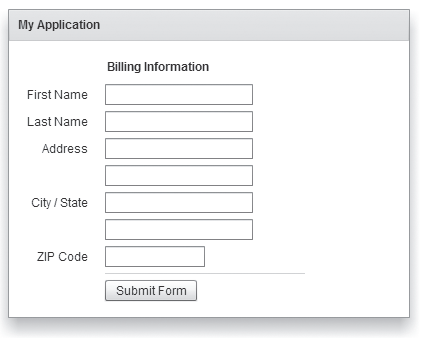
The following example defines a Panel container that contains a form as the top-level container in your application. In this example, the Panel container provides you with a mechanism for including a title bar, as in a standard GUI window.
<?xml version="1.0" encoding="utf-8"?>
<!-- containers\spark\SparkPanelSimple.mxml -->
<s:Application xmlns:fx="http://ns.adobe.com/mxml/2009"
    xmlns:mx="library://ns.adobe.com/flex/mx"
    xmlns:s="library://ns.adobe.com/flex/spark" >
    <s:Panel id="myPanel" title="My Application" x="20" y="20">
        <s:Form id="myForm" width="400">

            <s:FormHeading label="Billing Information"/>

            <s:FormItem label="First Name">
                <s:TextInput id="fname" width="100%"/>
            </s:FormItem>

            <s:FormItem label="Last Name">
                <s:TextInput id="lname" width="100%"/>
            </s:FormItem>

            <s:FormItem label="Address">
                <s:TextInput id="addr1" width="100%"/>
                <s:TextInput id="addr2" width="100%"/>
            </s:FormItem>
            <s:FormItem label="City">
                <s:TextInput id="city"/>
            </s:FormItem>

            <s:FormItem label="State">
                <s:TextInput id="state"/>
            </s:FormItem>

            <s:FormItem label="ZIP Code">
                <s:TextInput id="zip" width="100"/>
            </s:FormItem>

            <s:FormItem>
                <mx:HRule width="200" height="1"/>
                <s:Button label="Submit Form"/>
            </s:FormItem>
        </s:Form>
    </s:Panel>
</s:Application>
Adding a control bar to the Spark Panel container
A control bar contains a group of controls outside the main content area of a Spark Panel container. The control bar is always visible at the bottom of the Panel container. Therefore, if the Panel container uses scroll bars, the control bar is not scrolled along with the other container children.
<?xml version="1.0" encoding="utf-8"?>
<!-- containers\spark\SparkPanelCB.mxml -->
<s:Application xmlns:fx="http://ns.adobe.com/mxml/2009"
    xmlns:mx="library://ns.adobe.com/flex/mx"
    xmlns:s="library://ns.adobe.com/flex/spark"
    width="750">
    <s:layout>
        <s:VerticalLayout/>
    </s:layout>

    <fx:Script>
        <![CDATA[
            import mx.controls.Alert;
        ]]>
    </fx:Script>

    <fx:Declarations>
        <fx:XMLList id="menuXML">
            <fx:menuitem label="File">
                <fx:menuitem label="New" data="New"/>
                <fx:menuitem label="Open" data="Open"/>
                <fx:menuitem label="Save" data="Save"/>
                <fx:menuitem label="Exit" data="Exit"/>
            </fx:menuitem>
            <fx:menuitem label="Edit">
                <fx:menuitem label="Cut" data="Cut"/>
                <fx:menuitem label="Copy" data="Copy"/>
                <fx:menuitem label="Paste" data="Paste"/>
            </fx:menuitem>
            <fx:menuitem label="View"/>
        </fx:XMLList>

        <fx:Array id="cmbDP">
            <fx:String>Item 1</fx:String>
            <fx:String>Item 2</fx:String>
            <fx:String>Item 3</fx:String>
        </fx:Array>
    </fx:Declarations>

    <s:Panel title="Spark Panel">
        <s:layout>
            <s:VerticalLayout/>
        </s:layout>
        <s:controlBarContent>
            <mx:MenuBar height="100%"
                dataProvider="{menuXML}"
                labelField="@label"
                showRoot="true"/>
            <mx:HBox paddingBottom="5"
                 paddingTop="5">
                <mx:ComboBox dataProvider="{cmbDP}"/>
                <mx:Spacer width="100%"/>
                <mx:TextInput id="myTI" text=""/>
                <mx:Button id="srch1"
                    label="Search"
                    click="Alert.show('Searching');"/>
            </mx:HBox>
        </s:controlBarContent>
        <s:Button label="Button"/>
        <s:TextArea width="300" height="200"/>
    </s:Panel>
</s:Application>
By default, the controls in the control bar area use horizontal layout. Use the Panel.controlBarLayout property to specify a different layout, as the following example shows:
<s:controlBarLayout>
	<s:HorizontalLayout paddingLeft="12" gap="5"/>
</s:controlBarLayout>
The location and appearance of the control bar area of the Panel container is determined by the spark.skins.spark.PanelSkin class, the skin class for the Panel container. By default, the PanelSkin class defines the control bar area to appear at the bottom of the content area of the Panel container with a grey background. Create a custom skin to change the default appearance of the control bar.
The Spark SkinnablePopUpContainer container
You use the SkinnablePopUpContainer container as a pop-up in your application. One typical use for a SkinnablePopUpContainer container is to open a simple window in an application, such as an alert window, to indicate that the user must perform some action.
The SkinnablePopUpContainer container can be modal or nonmodal. A modal container takes all keyboard and mouse input until it is closed. A nonmodal container lets other components accept input while the pop-up window is open.
Flex also defines the Spark TitleWindow container that you can use as a pop-up. A TitleWindow container consists of a title bar, a caption and status area in the title bar, a border, content area, and optional close button. Users can drag the TitleWindow container to move it around the application window. For more information, see The Spark TitleWindow container.
Unlike the TitleWindow container, the SkinnablePopUpContainer does not support dragging. It is a light-weight container that you use for simple pop-ups. You can define a custom skin class to control the visual aspects of the SkinnablePopUpContainer, such as the transitions and effects that play when the container opens and closes.
Creating a simple Spark SkinnablePopUpContainer container
The SkinnablePopUpContainer container appears as a pop-up window on top of its parent container. Therefore, you do not create a SkinnablePopUpContainer container as part of the normal MXML layout code of its parent container.
<?xml version="1.0" encoding="utf-8"?>
<!-- containers\spark\myComponents\MyAlertPopUp.mxml -->
<s:SkinnablePopUpContainer xmlns:fx="http://ns.adobe.com/mxml/2009"
    xmlns:s="library://ns.adobe.com/flex/spark"
    xmlns:mx="library://ns.adobe.com/flex/mx" width="400" height="300">

    <s:Panel title="My Alert Panel">
        <s:VGroup width="100%" horizontalAlign="center"
            paddingTop="20" gap="20">
                <s:Label text="Your custom alert box"/>
                <s:Button label="OK" click="close();"/>
        </s:VGroup>
    </s:Panel>

</s:SkinnablePopUpContainer>
The MyAlertPopUp.mxml component creates a SkinnablePopUpContainer that contains a Panel container. Notice that the Button control calls the close() method to close the pop-up.
-
open()
Opens a SkinnablePopUpContainer container. The open() method takes two arguments: the first specifies the parent container of the SkinnablePopUpContainer container, and the second specifies if the container is modal.
Opening the SkinnablePopUpContainer container dispatches the open event.
-
close()
Closes a SkinnablePopUpContainer container. The close() method takes two arguments: the first specifies whether the container passes back any data to the main application, and the second specifies an object containing the returned data.
Closing the SkinnablePopUpContainer container dispatches the close event.
The following example shows the main application file that uses MyAlertPopUp.mxml:
<?xml version="1.0" encoding="utf-8"?>
<!-- containers\spark\SparkSkinnablePopUpContainerComponents.mxml -->
<s:Application xmlns:fx="http://ns.adobe.com/mxml/2009"
    xmlns:s="library://ns.adobe.com/flex/spark"
    xmlns:mx="library://ns.adobe.com/flex/mx">

    <fx:Script>
        <![CDATA[
            // Import the MyAlertPopUp class.
            import myComponents.MyAlertPopUp;

            // Create an instance of MyAlertPopUp.
            public var alertDB:MyAlertPopUp = new MyAlertPopUp();
        ]]>
    </fx:Script>

    <!-- Open the MyAlertPopUp instance. -->
    <s:Button label="Open Alert" click="alertDB.open(this, false);"/>
</s:Application>
In this application, you first import the MyAlertPopUp component, then create an instance of it. The Button control calls the open() method to open the pop-up in response to a click event.
The first argument to the open() method specifies this. Therefore, the parent container of the SkinnablePopUpContainer container is the Application container. The second argument is false to specify a nonmodal window.
In this example, the application creates a single instance of the MyAlertPopUp component. It then reuses that instance every time the user selects the Button control. Therefore, the pop-up component stays in memory between uses.
If the pop-up component is large, or you want to reduce the memory use of the application, create a new instance of the component for each pop-up. The component is then destroyed when it closes. However, make sure to remove all references to the components, especially event handlers, or else the component is not destroyed.
Creating an inline Spark SkinnablePopUpContainer container
<?xml version="1.0" encoding="utf-8"?>
<!-- containers\spark\SparkSkinnablePopUpContainerSimple.mxml -->
<s:Application xmlns:fx="http://ns.adobe.com/mxml/2009"
    xmlns:s="library://ns.adobe.com/flex/spark"
    xmlns:mx="library://ns.adobe.com/flex/mx">

    <fx:Declarations>
        <fx:Component className="MyAlert">
            <s:SkinnablePopUpContainer>
                <s:Panel title="My Alert Panel">
                    <s:VGroup width="100%" horizontalAlign="center"
                        paddingTop="20" gap="20">
                        <s:Label text="Your custom alert box"/>
                        <s:Button label="OK" click="close();"/>
                    </s:VGroup>
                </s:Panel>
            </s:SkinnablePopUpContainer>
        </fx:Component>
    </fx:Declarations>

    <s:Button label="Open Alert" click="(new MyAlert()).open(this, false);"/>
</s:Application>
The <fx:Component> tag defines a class named MyAlert. Notice that the click event handler for the Button control first creates a new instance of the MyAlert class, then opens the pop-up.
<?xml version="1.0" encoding="utf-8"?>
<!-- containers\spark\SparkSkinnablePopUpContainerInlineReuse.mxml -->
<s:Application xmlns:fx="http://ns.adobe.com/mxml/2009"
               xmlns:s="library://ns.adobe.com/flex/spark"
               xmlns:mx="library://ns.adobe.com/flex/mx">

    <fx:Declarations>
        <s:SkinnablePopUpContainer id="alert">
            <s:Panel title="My Alert Panel">
                <s:VGroup width="100%" horizontalAlign="center"
                          paddingTop="20" gap="20">
                    <s:Label text="Your custom alert box"/>
                    <s:Button label="OK" click="alert.close();"/>
                </s:VGroup>
            </s:Panel>
        </s:SkinnablePopUpContainer>
    </fx:Declarations>

    <s:Button label="Open Alert" click="alert.open(this, false);"/>
</s:Application>
Controlling the pop-up window
<?xml version="1.0" encoding="utf-8"?>
<!-- containers\spark\SparkSkinnablePopUpContainerMoveResize.mxml -->
<s:Application xmlns:fx="http://ns.adobe.com/mxml/2009"
    xmlns:s="library://ns.adobe.com/flex/spark"
    xmlns:mx="library://ns.adobe.com/flex/mx">

    <fx:Script>
        <![CDATA[
            import mx.collections.ArrayCollection;
            import mx.managers.PopUpManager;

            protected function button1_clickHandler(event:MouseEvent):void {

                // Create an instance of MyAlert.
                var alert:MyAlert = new MyAlert();
                alert.open(this, true);

                // Increase the width and height.
                alert.width += 100;
                alert.height += 100;

                // Center the pop-up in the parent container.
                PopUpManager.centerPopUp(alert);
            }
        ]]>
    </fx:Script>

    <fx:Declarations>
        <fx:Component className="MyAlert">
            <s:SkinnablePopUpContainer>
                <s:Panel title="My Alert Panel" width="100%" height="100%">
                    <s:VGroup width="100%" horizontalAlign="center"
                              paddingTop="20" gap="20">
                        <s:Label text="Your custom alert box"/>
                        <s:Button label="OK" click="close();"/>
                    </s:VGroup>
                </s:Panel>
            </s:SkinnablePopUpContainer>
        </fx:Component>
    </fx:Declarations>

    <s:Button label="Open Alert SMG" click="button1_clickHandler(event);"/>
</s:Application>
Passing data back from the Spark SkinnablePopUpContainer container
Use the close() method of the SkinnablePopUpContainer container to pass data back to the main application from the pop-up. The close() method has the following signature:
public function close(commit:Boolean = false, data:*):void
-
commit contains true if the returned data should be committed by the application.
-
data specifies the returned data.
The close() method dispatches the close event. The event object associated with the close event is an object of type spark.events.PopUpEvent.
The PopUpEvent class defines two properties, commit and data, that contain the values of the corresponding arguments to the close() method. In the event handler of the close event, you use these properties to inspect any data returned from the pop-up.
<?xml version="1.0" encoding="utf-8"?>
<!-- containers\spark\myComponents\MyAlertPopUpReturn.mxml -->
<s:SkinnablePopUpContainer xmlns:fx="http://ns.adobe.com/mxml/2009"
    xmlns:s="library://ns.adobe.com/flex/spark"
    xmlns:mx="library://ns.adobe.com/flex/mx">

    <fx:Script>
        <![CDATA[
            import spark.events.IndexChangeEvent;

            // Event handler for the change event of the List control.
            protected function list1_changeHandler(event:IndexChangeEvent):void {
                // Close the SkinnablePopUpContainer.
                // Set the commit argument to true to indicate that the
                // data argument contians a vaild value.
                close(true, list1.selectedItem);
            }
        ]]>
    </fx:Script>

    <s:Panel title="My Alert Panel">
        <s:VGroup width="100%" horizontalAlign="center"
                  paddingTop="20" gap="20">

            <s:List id="list1" width="100%" height="100%"
                    change="list1_changeHandler(event);">
                <s:layout>
                    <s:VerticalLayout/>
                </s:layout>
                <s:dataProvider>
                    <s:ArrayCollection source="{['Add', 'Delete', 'Post', 'Bookmark']}"/>
                </s:dataProvider>
            </s:List>

            <s:Button label="Cancel" click="close();"/>
        </s:VGroup>
    </s:Panel>

</s:SkinnablePopUpContainer>
<?xml version="1.0" encoding="utf-8"?>
<!-- containers\spark\SparkSkinnablePopUpContainerReturn.mxml -->
<s:Application xmlns:fx="http://ns.adobe.com/mxml/2009"
    xmlns:s="library://ns.adobe.com/flex/spark"
    xmlns:mx="library://ns.adobe.com/flex/mx">
    <s:layout>
        <s:VerticalLayout/>
    </s:layout>

    <fx:Script>
        <![CDATA[
            // Import the MyAlertPopUp class.
            import myComponents.MyAlertPopUpReturn;
            import spark.events.PopUpEvent;

            // Create and open the SkinnablePopUpContainer.
            protected function button1_clickHandler(event:MouseEvent):void {
                // Create an instance of MyAlertPopUp.
                var alertDB:MyAlertPopUpReturn = new MyAlertPopUpReturn();

                // Add an event handler for the close event to check for
                // any returned data.
                alertDB.addEventListener('close', alertDB_closeHandler);
                alertDB.open(this, true);
            }

            // Handle the close event from the SkinnablePopUpContainer.
            protected function alertDB_closeHandler(event:PopUpEvent):void {
                // If commit is false, do data is returned.
                if (!event.commit)
                    return;

                // Write the returned String to the TextArea control.
                myTA.text = event.data as String;
            }
        ]]>
    </fx:Script>

    <s:Button label="Open Alert" click="button1_clickHandler(event);"/>
    <s:TextArea id="myTA"/>
</s:Application>
This application uses the click event of the Button control to open the SkinnablePopUpContainer. The event handler for the click event creates an instance of the MyAlertPopUpReturn components, and then adds an event listener for the component's close event.
The event handler for the close event examines the commit property of the event object. If the commit property is true, the data returned from the MyAlertPopUpReturn component is written to the TextArea control.
The Spark TitleWindow container
A TitleWindow layout container is a Panel container that is optimized for use as a pop-up window. The container consists of a title bar, a caption and status area in the title bar, a border, and a content area for its children. Unlike the Panel container, it can display a close button. The TitleWindow container is designed to work as a pop-up window that users can drag around the screen the application window.
Modality
A pop-up TitleWindow container can be modal, which means that it takes all keyboard and mouse input until it is closed, or nonmodal, which means other windows can accept input while the pop-up window is still open.
Forms
One typical use for a TitleWindow container is to hold a form. When the user completes the form, you can close the TitleWindow container programmatically, or let the user request the application to close it by using the close icon (a box with an x inside it) in the upper-right corner of the window.
PopUpManager
Because you pop up a TitleWindow, you do not create it directly in MXML, as you do most controls. Instead you use the PopUpManager to open a TitleWindow container.
SkinnablePopUpContainer
Flex also defines the SkinnablePopUpContainer container. Unlike the TitleWindow container, the SkinnablePopUpContainer does not support dragging. It is a light-weight container that you use for simple pop ups. You can define a custom skin class to control the visual aspects of the SkinnablePopUpContainer, such as the transitions and effects that play when the container opens and closes. For more information, see The Spark SkinnablePopUpContainer container.
Using the PopUpManager to create a Spark TitleWindow container
To create and remove a pop-up TitleWindow container, you use methods of the PopUpManager. The PopUpManager is in the mx.managers package.
Creating and deleting Spark pop-up window
To create a pop-up window, use the PopUpManager createPopUp() method. The createPopUp() method has the following signature:
 public static createPopUp(parent:DisplayObject, class:Class,
 	modal:Boolean = false):IFlexDisplayObject
The method takes the following arguments.
|
Argument |
Description |
|---|---|
|
parent |
A reference to a window to pop-up over. |
|
class |
A reference to the class of object you want to create. This is typically a custom MXML component that implements a Spark or MX TitleWindow container. |
|
modal |
(Optional) A Boolean value that indicates whether the window is modal, and takes all keyboard and mouse input until it is closed (true), or whether interaction is allowed with other controls while the window is displayed (false). The default value is false. |
You use the createPopUp() method to create a pop-up window from a component definition. Typically, that means you have created an MXML component based on the TitleWindow container that defines your pop-up window. You can also create a pop-up window by passing an instance of a TitleWindow class or custom component to the PopUpManager addPopUp() method.
To remove a pop-up window, use the PopUpManager removePopUp() method. Pass the object created with the createPopUp() method or the addPopUp() method to the removePopUp() method.
Defining a custom Spark TitleWindow component
One of the most common ways of creating a TitleWindow container is to define it as a custom MXML component. Define the TitleWindow container, its event handlers, and all of its children in the custom component. Then, use the PopUpManager createPopUp() and removePopUp() methods to create and remove the TitleWindow container.
<?xml version="1.0"?>
<!-- containers\spark\myComponents\MyLoginForm.mxml -->
<s:TitleWindow xmlns:fx="http://ns.adobe.com/mxml/2009"
    xmlns:mx="library://ns.adobe.com/flex/mx"
    xmlns:s="library://ns.adobe.com/flex/spark"
    close="handleCloseEvent();">
    <s:layout>
        <s:VerticalLayout/>
    </s:layout>

    <fx:Script>
        <![CDATA[
            import mx.managers.PopUpManager;

            // Handle the close button and Cancel button.
            private function handleCloseEvent():void {
                PopUpManager.removePopUp(this);
            }

            // Handle the OK button.
            private function processLogin():void {
                // Check credentials (not shown) then remove pop up.
                PopUpManager.removePopUp(this);
            }
        ]]>
    </fx:Script>

    <s:Form>
        <s:FormItem label="User Name">
            <s:TextInput id="username" width="100%"/>
        </s:FormItem>
        <s:FormItem label="Password">
            <s:TextInput id="password"
                displayAsPassword="true"
                width="100%"/>
        </s:FormItem>
    </s:Form>
    <s:HGroup>
        <s:Button label="OK"
            click="processLogin();" />
        <s:Button label="Cancel"
            click="handleCloseEvent();"/>
    </s:HGroup>
</s:TitleWindow>
This file, named MyLoginForm.mxml, defines a TitleWindow container by using the <s:TitleWindow> tag. The TitleWindow container defines a Form container with two TextInput controls for user name and password. It also defines two Button controls for submitting the form and for closing the TitleWindow container. This example does not include the code for verifying the user name and password in the submitForm() event listener.
In this example, you process the form data in an event listener of the MyLoginForm.mxml component. To make this component more reusable, you can define the event listeners in your main application. This lets you create a generic form that leaves the data handling to the application that uses the form.
Close icon
By default, the TitleWindow container displays a close icon (a small x in the upper-right corner of the TitleWindow title bar) to make it appear similar to dialog boxes in a GUI environment.
Close event
The TitleWindow broadcasts a close event when the user clicks the close icon. Flex does not close the window automatically. Create a handler for that event and close the TitleWindow from within that event handler. In the MyLoginForm.mxml component, you use the same event handler for the close and Cancel buttons. You can create a skin file for the TitleWindow to hide the close button, or set the visible property of the close button to false.
Using the PopUpManager.createPopUp() method to create the pop-up Spark TitleWindow
<?xml version="1.0"?>
<!-- containers\spark\SparkMainMyLoginForm.mxml -->
<s:Application xmlns:fx="http://ns.adobe.com/mxml/2009"
    xmlns:mx="library://ns.adobe.com/flex/mx"
    xmlns:s="library://ns.adobe.com/flex/spark">

    <fx:Script>
        <![CDATA[
            import mx.managers.PopUpManager;
            import spark.components.TitleWindow;
            import myComponents.MyLoginForm;

            // Open the pop-up window.
            private function showLogin():void {
                // Create a non-modal TitleWindow container.
                var helpWindow:TitleWindow=
                    PopUpManager.createPopUp(this, MyLoginForm, false) as TitleWindow;
                PopUpManager.centerPopUp(helpWindow);
            }
        ]]>
    </fx:Script>

    <s:VGroup width="300" height="300">
        <s:Button label="Login"
            click="showLogin();"/>
    </s:VGroup>
</s:Application>
In this example, when the user selects the Login button, the event listener for the click event uses the createPopUp() method to create a TitleWindow container, passing to it the name of the MyLoginForm.mxml file as the class name.
<?xml version="1.0"?>
<!-- containers\spark\SparkMainMyLoginFormCast.mxml -->
<s:Application xmlns:fx="http://ns.adobe.com/mxml/2009"
    xmlns:mx="library://ns.adobe.com/flex/mx"
    xmlns:s="library://ns.adobe.com/flex/spark">

    <fx:Script>
        <![CDATA[
          import mx.managers.PopUpManager;
          import spark.components.TitleWindow;
          import myComponents.MyLoginForm;

          private function showLogin():void {
            // Create the TitleWindow container.
            var helpWindow:TitleWindow =
          PopUpManager.createPopUp(this, MyLoginForm, false) as TitleWindow;

            // Add title to the title bar.
            helpWindow.title="Enter Login Information";

            // Make title bar slightly transparent.
            helpWindow.setStyle("borderAlpha", 0.9);

            // Hide the close button.
            helpWindow.closeButton.visible = false;
          }
        ]]>
    </fx:Script>

    <s:VGroup width="300" height="300">
        <s:Button click="showLogin();" label="Login"/>
    </s:VGroup>
</s:Application>
Using the PopUpManager.addPopUp() method to create the pop-up Spark TitleWindow
You can use the addPopUp() method of the PopUpManager to create a pop-up window without defining a custom component. This method takes an instance of any class that implements IFlexDisplayObject. Because it takes a class instance, not a class, you can use ActionScript code in an <fx:Script> block to create the component instance to pop up, rather than as a separate custom component.
Using the addPopUp() method may be preferable to using the createPopUp() method if you have to pop up a simple dialog box that is not reused elsewhere in the application. However, it is not the best coding practice if the pop-up is complex, or if you want to create a component that can be used anywhere in the application.
<?xml version="1.0"?>
<!-- containers\spark\MyPopUpButton.mxml -->
<s:Application xmlns:fx="http://ns.adobe.com/mxml/2009"
    xmlns:mx="library://ns.adobe.com/flex/mx"
    xmlns:s="library://ns.adobe.com/flex/spark"
    height="600" width="600" >

    <fx:Script>
        <![CDATA[
            import spark.components.TitleWindow;
            import flash.events.*;
            import mx.managers.PopUpManager;
            import spark.components.Button;
            import mx.core.IFlexDisplayObject;

            // The variable for the TitleWindow container
            public var myTitleWindow:TitleWindow = new TitleWindow();

            // Method to instantiate and display a TitleWindow container.
            // This is the initial Button control's click event handler.
            public function openWindow(event:MouseEvent):void {
                // Set the TitleWindow container properties.
                myTitleWindow = new TitleWindow();
                myTitleWindow.title = "My Window Title";
                myTitleWindow.width= 220;
                myTitleWindow.height= 150;
                // Call the method to add the Button control to the
                // TitleWindow container.
                populateWindow();
                // Use the PopUpManager to display the TitleWindow container.
                PopUpManager.addPopUp(myTitleWindow, this, true);
            }

            // The method to create and add the Button child control to the
            // TitleWindow container.
            public function populateWindow():void {
                var btn1:Button = new Button();
                btn1.label="close";
                btn1.addEventListener(MouseEvent.CLICK, closeTitleWindow);
                myTitleWindow.addElement(btn1);
            }

            // The method to close the TitleWindow container.
            public function closeTitleWindow(event:MouseEvent):void {
                PopUpManager.removePopUp(myTitleWindow);
            }
        ]]>
    </fx:Script>
    <s:Button label="Open Window" click="openWindow(event);"/>
</s:Application>
Using the mouseDown event to close the Spark TitleWindow
<?xml version="1.0"?>
<!-- containers\spark\MainMyLoginFormMouseDown.mxml -->
<s:Application xmlns:fx="http://ns.adobe.com/mxml/2009"
    xmlns:mx="library://ns.adobe.com/flex/mx"
    xmlns:s="library://ns.adobe.com/flex/spark">

    <fx:Script>
        <![CDATA[
            import mx.managers.PopUpManager;
            import spark.components.TitleWindow;
            import myComponents.MyLoginForm;
            import mx.events.FlexMouseEvent;

            private var helpWindow:TitleWindow;

            private function showLogin():void {
                // Create the TitleWindow container.
                helpWindow = PopUpManager.createPopUp(this,
                    MyLoginForm, false) as TitleWindow;
                helpWindow.addEventListener("mouseDownOutside", removeForm);
            }

            private function removeForm(event:FlexMouseEvent):void {
                PopUpManager.removePopUp(helpWindow);
            }
        ]]>
    </fx:Script>

    <s:VGroup width="300" height="300">
        <s:Button click="showLogin();" label="Login"/>
    </s:VGroup>
</s:Application>
You define the event listener in the main application, and then assign it to the pop-up window when you create it. This technique lets you use a generic pop-up window, defined by the component MyLoginForm.mxml, and then modify the behavior of the component by assigning event listeners to it from the main application.
Creating a modal pop-up window
The createPopUp() method takes an optional modal parameter. You can set this parameter to true to make the window modal. When a TitleWindow is modal, you cannot select any other component while the window is open. The default value of modal is false.
The following example creates a modal pop-up window:
var pop1:IFlexDisplayObject = PopUpManager.createPopUp(this, MyLoginForm, true);
Dragging the popup Spark TitleWindow
After you pop up the Spark TitleWindow container, you can drag it around the application window. To drag the TitleWindow, click and hold the mouse in the title bar area of the window, then move the mouse.
By default, you click in the title bar area of the TitleWindow container to drag it. That area is defined by the moveArea skin part. You can create a custom skin class to modify the move area.
Events during a move operation
|
Event |
Descriptions |
|---|---|
|
windowMove |
Dispatched when you stop dragging the window. This event can be dispatched multiple times before the windowMoveEnd event if you stop dragging the window but do not release the mouse button. |
|
windowMoveEnd |
Dispatched when the user releases the mouse button to end the drag. |
|
windowMoveStart |
Dispatched when the user presses the mouse button while the pointer is in the move area to begin the drag. This event is cancelable. |
|
windowMoving |
Dispatched repeatedly as the user drags the window. This event is cancelable. |
|
Event |
beforeBounds |
afterBounds |
|---|---|---|
|
windowMove |
The previous bounds of the window. |
The current bounds of the window. |
|
windowMoveEnd |
The starting bounds of the window. |
The ending bounds of the window. |
|
windowMoveStart |
The starting bounds of the window. |
null |
|
windowMoving |
The current bounds of the window. |
The future bounds of the window if the window moves to the current cursor position. |
<?xml version="1.0"?>
<!-- containers\spark\myComponents\MyLoginFormMoveEvents.mxml -->
<s:TitleWindow xmlns:fx="http://ns.adobe.com/mxml/2009"
    xmlns:mx="library://ns.adobe.com/flex/mx"
    xmlns:s="library://ns.adobe.com/flex/spark"
    width="300" height="300"
    close="handleCloseEvent();"
    windowMove="windowMoveHandler(event);"
    windowMoveEnd="windowMoveEndHandler(event);"
    windowMoveStart="windowMoveStartHandler(event);"
    windowMoving="windowMovingHandler(event);">
    <s:layout>
        <s:VerticalLayout/>
    </s:layout>

    <fx:Script>
        <![CDATA[
            import spark.events.TitleWindowBoundsEvent;
            import mx.managers.PopUpManager;

            // Handle the close button and Cancel button.
            private function handleCloseEvent():void {
                PopUpManager.removePopUp(this);
            }
            protected function windowMoveHandler(event:TitleWindowBoundsEvent):void
            {
                myTA.text += "windowMove event occurred" + "\n"
            }

            protected function windowMoveEndHandler(event:TitleWindowBoundsEvent):void {
                myTA.text += "windowMoveEnd event occurred" + "\n"
            }

            protected function windowMoveStartHandler(event:TitleWindowBoundsEvent):void {
                myTA.text += "windowMoveStart event occurred" + "\n"
            }

            protected function windowMovingHandler(event:TitleWindowBoundsEvent):void {
                myTA.text += "windowMoving event occurred" + "\n"
            }
        ]]>
    </fx:Script>

    <s:TextArea id="myTA"
        width="100%" height="100%"/>

    <s:HGroup>
        <s:Button label="Cancel"
            click="handleCloseEvent();"/>
        <s:Button label="Clear"
                  click="myTA.text='';"/>
    </s:HGroup>
</s:TitleWindow>
<?xml version="1.0"?>
<!-- containers\spark\SparkMainMoveEvents.mxml -->
<s:Application xmlns:fx="http://ns.adobe.com/mxml/2009"
    xmlns:mx="library://ns.adobe.com/flex/mx"
    xmlns:s="library://ns.adobe.com/flex/spark">

    <fx:Script>
        <![CDATA[
            import mx.managers.PopUpManager;
            import spark.components.TitleWindow;
            import myComponents.MyLoginFormMoveEvents;

            // Open the pop-up window.
            private function showLogin():void {
                // Create a non-modal TitleWindow container.
                var helpWindow:TitleWindow =
            PopUpManager.createPopUp(this, MyLoginFormMoveEvents, false) as TitleWindow;
                PopUpManager.centerPopUp(helpWindow);
            }
        ]]>
    </fx:Script>

    <s:VGroup width="300" height="300">
        <s:Button label="Login"
            click="showLogin();"/>
    </s:VGroup>
</s:Application>
helpWindow.moveArea.visible = false;
Passing data to and from a Spark pop-up window
To make your pop-up window more flexible, you might want to pass data to it or return data from it. To do this, use the following guidelines:
-
Create a custom component to be your pop-up. In most circumstances, this component is a TitleWindow container.
-
Declare variables in your pop-up that you set in the application that creates the pop-up.
-
Cast the pop-up to be the same type as your custom component.
-
Pass a reference to that component to the pop-up window, if the pop-up window is to set a value on the application or one of the application's components.
For example, the following application populates a ComboBox in the pop-up window with an ArrayList defined in the main application.
<?xml version="1.0"?>
<!-- containers\spark\SparkMainArrayEntryForm.mxml -->
<s:Application xmlns:fx="http://ns.adobe.com/mxml/2009"
    xmlns:mx="library://ns.adobe.com/flex/mx"
    xmlns:s="library://ns.adobe.com/flex/spark">
    <s:layout>
        <s:VerticalLayout/>
    </s:layout>

    <fx:Script>
        <![CDATA[
            import mx.collections.ArrayList;
            import mx.managers.PopUpManager;
            import myComponents.ArrayEntryForm;

            public function displayForm():void {
                /* ArrayList with data for the custom control ComboBox control. */
                var doctypes:ArrayList = new ArrayList(["*.as", "*.mxml", "*.swc"]);

                /* Create the pop-up and cast the
                   return value of the createPopUp()
                   method to the ArrayEntryForm custom component. */
                var pop1:ArrayEntryForm = ArrayEntryForm(
                    PopUpManager.createPopUp(this, ArrayEntryForm, true));

                /* Set TitleWindow properties. */
                pop1.title="Select File Type";

                /* Set properties of the ArrayEntryForm custom component. */
                pop1.targetComponent = ti1;
                pop1.myArray = doctypes;
                PopUpManager.centerPopUp(pop1);
            }
        ]]>
    </fx:Script>

    <s:TextInput id="ti1" text=""/>
    <s:Button id="b1" label="Select File Type"
        click="displayForm();"/>
</s:Application>
When creating the pop-up, the application casts the pop-up to be of type ArrayEntryForm, which is the name of the custom component that defines the pop-up window. If you do not do this, the application cannot access the properties that you create.
The application passes a reference to the TextInput component in the Application container to the pop-up window so that the pop-up can write its results back to the container. The application also passes the ArrayList of filename extensions for the pop-up ComboBox control's data provider, and sets the pop-up window's title. By setting these in the application, you can reuse the pop-up window in other parts of the application without modification, because it does not have to know the name of the component it is writing back to or the data that it is displaying, only that its data is in an Array and it is writing to a TextArea.
<?xml version="1.0"?>
<!-- containers\spark\myComponents\ArrayEntryForm.mxml -->
<s:TitleWindow xmlns:fx="http://ns.adobe.com/mxml/2009"
    xmlns:mx="library://ns.adobe.com/flex/mx"
    xmlns:s="library://ns.adobe.com/flex/spark"
    width="200" borderAlpha="1"
    close="removeMe();">
    <s:layout>
        <s:VerticalLayout/>
    </s:layout>

    <fx:Script>
        <![CDATA[
            import spark.components.TextInput;
            import mx.managers.PopUpManager;
            import mx.collections.ArrayList;

            // Variables whose values are set by the main application.
            // Data provider array for the component's ComboBox control.
            [Bindable]
            public var myArray:ArrayList;
            // A reference to the TextInput control
            // in which to put the result.
            public var targetComponent:TextInput;

            // OK button click event listener.
            // Sets the target component in the application to the
            // selected ComboBox item value.
            private function submitData():void {
                targetComponent.text = String(cb1.selectedItem);
                removeMe();
            }

            // Cancel button click event listener.
            private function removeMe():void {
                PopUpManager.removePopUp(this);
            }
        ]]>
    </fx:Script>

    <s:ComboBox id="cb1" dataProvider="{myArray}"/>
    <s:HGroup>
        <s:Button label="OK" click="submitData();"/>
        <s:Button label="Cancel" click="removeMe();"/>
    </s:HGroup>
</s:TitleWindow>
From within a pop-up custom component, you can also access properties of the parent application by using the parentApplication property. For example, if the application has a Button control named b1, you can get the label of that Button control, as the following example shows:
myLabel = parentApplication.b1.label;
This technique, however, uses a hard-coded value in the pop-up component for both the target component id in the parent and the property in the component.
Passing data using events
<?xml version="1.0"?>
<!-- containers\spark\myComponents\ArrayEntryFormEvents.mxml -->
<s:TitleWindow xmlns:fx="http://ns.adobe.com/mxml/2009"
    xmlns:s="library://ns.adobe.com/flex/spark"
    xmlns:mx="library://ns.adobe.com/flex/mx"
    width="200"
    borderAlpha="1">
    <s:layout>
        <s:VerticalLayout/>
    </s:layout>

    <fx:Script>
        <![CDATA[
            import mx.managers.PopUpManager;
            import mx.collections.ArrayList;

            // Variables whose values are set by the main application.
            // Data provider array for the component's ComboBox control.
            [Bindable]
            public var myArray:ArrayList;

        ]]>
    </fx:Script>

    <s:ComboBox id="cb1" dataProvider="{myArray}"/>
    <s:HGroup>
        <s:Button id="okButton" label="OK"/>
        <s:Button id="cancelButton" label="Cancel"/>
    </s:HGroup>
</s:TitleWindow>
<?xml version="1.0"?>
<!-- containers\spark\SparkMainArrayEntryFormEvents.mxml -->
<s:Application xmlns:fx="http://ns.adobe.com/mxml/2009"
    xmlns:mx="library://ns.adobe.com/flex/mx"
    xmlns:s="library://ns.adobe.com/flex/spark">
    <s:layout>
        <s:VerticalLayout/>
    </s:layout>

    <fx:Script>
        <![CDATA[
            import mx.collections.ArrayList;
            import mx.managers.PopUpManager;
            import myComponents.ArrayEntryFormEvents;

            public var pop1:ArrayEntryFormEvents;

            public function displayForm():void {
                /* ArrayList with data for the custom control ComboBox control. */
                var doctypes:ArrayList = new ArrayList(["*.as", "*.mxml", "*.swc"]);

                /* Create the pop-up and cast the return value
                   of the createPopUp() method to the ArrayEntryFormEvents custom
                   component. */
                pop1 = ArrayEntryFormEvents(
                PopUpManager.createPopUp(this, ArrayEntryFormEvents, true));
                /* Set TitleWindow properties. */
                pop1.title="Select File Type";

                /* Set the event listeners for
                   the ArrayEntryFormEvents component. */
                pop1.addEventListener("close", removeMe);
                pop1.cancelButton.addEventListener("click", removeMe);
                pop1.okButton.addEventListener("click", submitData);

                /* Set properties of the ArrayEntryFormEvents custom control. */
                pop1.myArray = doctypes;
                PopUpManager.centerPopUp(pop1);
            }

            /* OK button click event listener.
               Sets the target component in the application to the
               selected ComboBox item value. */
            private function submitData(event:Event):void {
                ti1.text = String(pop1.cb1.selectedItem);
                removeMe(event);
            }

            /* Cancel button click event listener. */
            private function removeMe(event:Event):void {
                PopUpManager.removePopUp(pop1);
            }
        ]]>
    </fx:Script>

    <s:VGroup>
        <s:TextInput id="ti1" text=""/>
    </s:VGroup>
    <s:Button id="b1" label="Select File Type" click="displayForm();"/>
</s:Application>
The Spark Form, Spark FormHeading, and Spark FormItem containers
The Spark Form is a highly customizable container that supports multiple form designs and helps you create richer form experiences. When designing forms, you sometimes have limited space to display all the form elements. Spark forms help you solve this problem by providing horizontal and stacked layouts, as well as multiple customized columns.
Spark Forms let you customize the appearance of your form through skinning.
Creating a Spark Form
You use the <s:Form> tag to define a Spark Form. Specify an id value if you intend to refer to the entire form elsewhere in your MXML, either in another tag or in an ActionScript block.
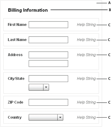
To create a Spark Form, you typically use three different components: the Form container, FormHeading controls, and FormItem containers, as the following example shows:
- A.
- Form container
- B.
- FormHeading control
- C.
- FormItem containers
For complete reference information, see Form, FormHeading, and FormItem in the ActionScript 3.0 Reference for Apache Flex.
Creating a Spark FormHeading control
A Spark FormHeading control specifies an optional label for a group of FormItem containers. The label is aligned with the start of the FormItem label controls in the form. You can have multiple FormHeading controls in your form to designate multiple content areas. You can also use FormHeading controls with a blank label property to create vertical space in your form.
You use the <s:FormHeading> tag to define a FormHeading container. Specify an id value if you intend to refer to the heading elsewhere in your MXML, either in another tag or in an ActionScript block.
The following code example defines the FormHeading control for the Spark Form:
<?xml version="1.0" encoding="utf-8"?>
<!-- containers\layouts\spark\SparkFormHeadingSimple.mxml -->
<s:Application xmlns:fx="http://ns.adobe.com/mxml/2009"
    xmlns:mx="library://ns.adobe.com/flex/mx"
    xmlns:s="library://ns.adobe.com/flex/spark">

    <s:Form id="myForm" width="400" height="100">
        <s:FormHeading label="Spark Form Heading" />
        <!--Define FormItem containers here. -->
    </s:Form>
</s:Application>
For complete reference information, see the ActionScript 3.0 Reference for Apache Flex.
Creating a Spark FormItem container
A Spark FormItem consists of the following parts:
-
A single label
-
A sequence label
-
One or more child controls or containers, such as text input or button control
-
Help content that provides a description of the form item or instructions for filling it out
-
Required indicator to indicate if a form item has to be filled
By default, all the FormItem elements are arranged in a horizontal layout with the label placed on the left and the Help content on the right.
The following code example defines the Spark FormItem container for the Spark Form:
<?xml version="1.0" encoding="utf-8"?>
<!-- containers\layouts\spark\SparkFormItemSimple.mxml -->
<s:Application xmlns:fx="http://ns.adobe.com/mxml/2009"
    xmlns:mx="library://ns.adobe.com/flex/mx"
    xmlns:s="library://ns.adobe.com/flex/spark">

    <s:Form id="myForm" width="450" height="125">
        <s:FormHeading label="Spark Form Heading" />
        <s:FormItem label="Username:">
            <s:TextInput id="username" />
            <s:helpContent>
                <s:Label text="Enter your LDAP username" />
            </s:helpContent>
        </s:FormItem>
    </s:Form>
</s:Application>
For complete reference information, see Spark FormItem in the ActionScript 3.0 Reference for Apache Flex.
Using sequence labels in a Spark FormItem control
You sometimes need to fill the form in a sequential order. Sequential labels help you design forms that define a visual order to the form items. When laying out form items in a Spark Form, you can define sequence labels using the sequenceLabel property.
<?xml version="1.0" encoding="utf-8"?>
<!-- containers\layouts\spark\SparkFormItemSequenceLabels.mxml -->
<s:Application xmlns:fx="http://ns.adobe.com/mxml/2009"
    xmlns:mx="library://ns.adobe.com/flex/mx"
    xmlns:s="library://ns.adobe.com/flex/spark">

    <s:Form id="myForm" width="350" height="325">
        <!-- Reduce gap between form items. -->
        <s:layout>
            <s:FormLayout gap="-14"/>
        </s:layout>
        <s:Label fontSize="16" text="My Spark Form"/>
        <s:FormItem label="Address" sequenceLabel="1.">
            <s:TextInput width="100%"/>
            <s:TextInput width="100%"/>
            <s:TextInput width="100%"/>
        </s:FormItem>
        <s:FormItem label="City" sequenceLabel="2.">
            <s:TextInput width="100%"/>
        </s:FormItem>
        <s:FormItem label="State" sequenceLabel="3.">
            <s:TextInput width="100%"/>
        </s:FormItem>
        <s:FormItem label="ZipCode" sequenceLabel="4.">
            <s:TextInput width="100%"/>
        </s:FormItem>
    </s:Form>
</s:Application>
You can customize the appearance of sequence labels by styling the FormItem container's sequenceLabelDisplay skin part. Properties like label color and fontWeight are explicitly set in the default FormItemSkin. To change these properties, you can create a custom skin using MXML or ActionScript and override the default styles.
Defining Help content in a Spark FormItem control
Help content provides a description for the form item or instructions for filling out the form item. When you create a FormItem, you use the helpContent property to define the Help content for the FormItem.
In a BasicLayout Group container, the Help content is placed next to the FormItem input control, by default. If you have multiple items in your helpContent group, you can place the Help content in an HGroup container or a VGroup container. The HGroup container lays out Help content horizontally and the VGroup container lays out Help content vertically.
The following code example defines Help content for FormItems in a Spark Form:
<?xml version="1.0" encoding="utf-8"?>
<!-- containers\layouts\spark\SparkFormItemHelpContent.mxml -->
<s:Application xmlns:fx="http://ns.adobe.com/mxml/2009"
    xmlns:mx="library://ns.adobe.com/flex/mx"
    xmlns:s="library://ns.adobe.com/flex/spark"
    width="600">

    <s:Form id="form1" x="164" y="38">
        <!-- Reduce space between form items. -->
        <s:layout>
            <s:FormLayout gap="-14"/>
        </s:layout>
        <s:FormHeading label="Mailing Information"/>
        <s:FormItem label="Address">
            <s:helpContent>
                <s:Label text="(eg. 123 Main Street)"/>
            </s:helpContent>
            <s:TextInput/>
            <s:TextInput/>
        </s:FormItem>
        <s:FormItem label="City/State">
            <s:TextInput/>
        </s:FormItem>
        <s:FormItem label="Phone" fontFamily="Verdana" required="true">
            <s:helpContent>
                <s:VGroup>
                    <s:Label text="(xxx)-xxx-xxxx"/>
                    <s:Label text="Will appear in your profile"/>
                </s:VGroup>
            </s:helpContent>
            <s:TextInput/>
        </s:FormItem>
    </s:Form>
</s:Application>
You can customize the appearance of the Help content by styling the FormItem container's helpContentGroup skin part. Properties like fontStyle and color are explicitly set in the default FormItem skin. To change these properties, you can create a custom skin using MXML or ActionScript and override the default styles.
Spark Form and Spark FormItem skin classes
The Flex framework provides two sets of skin classes for the Spark Form and Spark FormItem controls:
The default skin classes define a horizontal layout of form items. The default skin classes include the following:
-
FormHeadingSkin: A horizontal layout for a FormHeading.
-
FormItemSkin: A horizontal layout for a FormItem with four columns and five skin parts. For more information, see Using the required indicator for form items.
-
FormSkin: A four-column skin for the Form, where the columns are arranged horizontally in a single row.
The stacked skin classes define each form item with the label above the form control to use less horizontal space. The stacked skin classes include the following:
-
StackedFormHeadingSkin: A stacked layout for a FormHeading
-
StackedFormItemSkin: A stacked layout for a FormItem with four columns and five skin parts.
-
StackedFormSkin: A three-column skin with two rows per item, and the label placed in the top row.
<?xml version="1.0" encoding="utf-8"?>
<!-- containers\spark\SparkFormStackedSkinClasses.mxml -->
<s:Application xmlns:fx="http://ns.adobe.com/mxml/2009"
    xmlns:mx="library://ns.adobe.com/flex/mx"
    xmlns:s="library://ns.adobe.com/flex/spark"
    width="300">

    <fx:Style>
       @namespace s "library://ns.adobe.com/flex/spark";

       s|Form
           {
               skinClass: ClassReference("spark.skins.spark.StackedFormSkin");
           }
       s|FormHeading
           {
               skinClass: ClassReference("spark.skins.spark.StackedFormHeadingSkin");
           }
       s|FormItem
           {
               skinClass: ClassReference("spark.skins.spark.StackedFormItemSkin");
           }
    </fx:Style>

    <s:Form id="frm" width="300">
        <!-- Reduce gap between form items. -->
        <s:layout>
            <s:FormLayout gap="-14"/>
        </s:layout>
        <s:FormHeading label="STACKED SPARK FORM" backgroundColor="Gray" color="#FFFFFF" width="300"/>
        <s:FormItem sequenceLabel="1." label="First name" required="true">
            <s:TextInput id="fName" maxChars="64" />
        </s:FormItem>
        <s:FormItem sequenceLabel="2." label="Last name">
            <s:TextInput id="lName" maxChars="64" />
        </s:FormItem>
        <s:FormItem sequenceLabel="3." label="Address">
            <s:TextInput id="AddressLine1" maxChars="32"/>
            <s:TextInput id="AddressLine2" maxChars="32"/>
            <s:TextInput id="AddressLine3" maxChars="32"/>
        </s:FormItem>
        <s:FormItem sequenceLabel="4." label="City">
            <s:TextInput id="City" maxChars="64" />
        </s:FormItem>
        <s:FormItem sequenceLabel="5." label="State">
            <s:TextInput id="State" maxChars="64" />
        </s:FormItem>
        <s:FormItem sequenceLabel="6." label="ZipCode" required="true">
            <s:TextInput id="ZipCode" maxChars="64" />
        </s:FormItem>
    </s:Form>
</s:Application>
Using the required indicator for form items
The required state indicates that you must enter the FormItem's content before submitting the form. The required state occurs when you set the FormItem's required property to true as follows:
<s:FormItem label="Username:" required="true">
	<s:TextInput id="username" />
</s:FormItem>
When you set the required property to true, an asterisk (*) is used to denote the field. A Spark FormItem lets you customize the appearance of the required fields through skinning. For example, a required field can have a light green background, a bold label, or a "(required)" text.
An error state highlights the input error in the form item. The error state occurs when the FormItem's content fails validation. For example, you can define a red border or a light red background to indicate an error state. For more information on including form validation in your Spark Form, see Validating data in a Spark Form.
Validating data in a Spark Form
You can include form validation in your Spark Form. You can add custom logic to validate the input controls to ensure that the required data is entered in a proper format. To do so, you create the proper validator or formatter controls, and associate them with their Form Item controls. When a user enters incorrect data in the Form Item, the Form Item skin uses a different state to represent the erroneous state of the Form Item.
The following code example shows a Spark Form where the phone entry TextInput control is bound to a PhoneFormatter. The TextInput control is bound to the PhoneFormatter such that the data entered is formatted to display, as required. The ZIP code text input is bound to a ZipCodeValidator for data validation, such that, on entering incorrect data, an appropriate error message appears.
<?xml version="1.0" encoding="utf-8"?>
<!-- containers\spark\SparkFormValidation.mxml -->
<s:Application xmlns:fx="http://ns.adobe.com/mxml/2009"
    xmlns:s="library://ns.adobe.com/flex/spark"
    xmlns:mx="library://ns.adobe.com/flex/mx">

    <fx:Declarations>
        <mx:PhoneFormatter
            id="pnf"
            areaCode="-1"
            areaCodeFormat="(###)"
            formatString="(###) ###-####"
            validPatternChars="+()#-. "/>
        <mx:ZipCodeValidator
            id="zcv"
            source="{ti_zip}"
            property="text"/>
    </fx:Declarations>

    <fx:Script>
        <![CDATA[
            import mx.collections.ArrayCollection;
            [Bindable]
            public var statesDP:ArrayCollection = new ArrayCollection
                    (["Arizona","California","Kansas","New Mexico","Texas","Wyoming"]);

            import mx.events.ValidationResultEvent;
            private var vResult:ValidationResultEvent;
            // Event handler to validate and format input.
            private function format():void {
                ti_phone.text = pnf.format(ti_phone.text);
            }
        ]]>
    </fx:Script>

    <s:Form width="500" height="600" backgroundColor="0xeeeeee">
        <s:Label fontSize="16" text="My Spark Form"/>
        <s:FormItem label="Address" sequenceLabel="1.">
            <s:TextInput width="100%"/>
            <s:TextInput width="100%"/>
            <s:TextInput width="100%"/>
            <s:helpContent>
                <s:Label text="(ex. 123 Main Street)" baseline="24" />
                <s:Button label="?" width="30" baseline="24" x="120"/>
            </s:helpContent>
        </s:FormItem>
        <s:FormItem label="City" sequenceLabel="2.">
            <s:TextInput width="100%"/>
        </s:FormItem>
        <s:FormItem label="State" sequenceLabel="3.">
            <s:ComboBox dataProvider="{statesDP}" width="100%"/>
        </s:FormItem>
        <s:FormItem label="ZipCode" sequenceLabel="4." required="true">
            <s:TextInput widthInChars="4" restrict="0123456789"/>
            <s:helpContent>
                <s:Label text="Will appear in your profile" left="0" right="0" baseline="24" />
            </s:helpContent>
        </s:FormItem>
        <s:FormItem id="phoneZipItem" label="Phone and Zip" sequenceLabel="5.">
            <s:TextInput id="ti_phone" width="100%" focusOut="format()"/>
            <s:TextInput id="ti_zip" widthInChars="4" restrict="0123456789"/>
            <s:helpContent>
                <s:Label text="(xxx)-xxx-xxxx" left="0" right="0" baseline="24" />
            </s:helpContent>
        </s:FormItem>
        <s:Label text="PhoneZip ErrorString : {phoneZipItem.elementErrorStrings}"/>
    </s:Form>
</s:Application>
Scrolling a Spark Form
The simplest way to add scrolling to a Spark Form is to wrap the Form in a Group container. Then wrap the Group container in a Scroller, as the following example shows:
<?xml version="1.0" encoding="utf-8"?>
<!-- containers\layouts\spark\SparkFormScroll.mxml -->
<s:Application xmlns:fx="http://ns.adobe.com/mxml/2009"
    xmlns:s="library://ns.adobe.com/flex/spark"
    xmlns:mx="library://ns.adobe.com/flex/mx">

    <s:Scroller width="300" height="200">
        <s:Group>
            <s:Form>
                <s:FormItem label="Label 1:" textAlign="right">
                    <s:layout>
                        <s:HorizontalLayout/>
                    </s:layout>
                    <s:TextInput width="30"/>
                    <s:TextInput width="30"/>
                    <s:TextInput width="30"/>
                    <s:TextInput width="30"/>
                </s:FormItem>

                <s:FormItem label="Longer Label 2:" textAlign="right">
                    <s:layout>
                        <s:HorizontalLayout/>
                    </s:layout>
                    <s:TextInput width="30"/>
                    <s:TextInput width="30"/>
                    <s:TextInput width="30"/>
                    <s:TextInput width="30"/>
                </s:FormItem>

                <s:FormItem label="Label 3:" textAlign="right">
                    <s:TextInput width="200"/>
                </s:FormItem>
                <s:FormItem label="Label 4:" textAlign="right">
                    <s:TextInput width="200"/>
                </s:FormItem>
            </s:Form>
        </s:Group>
    </s:Scroller>
</s:Application>
Use a Group container because the Form container does not implements the spark.core.IViewport interface that is required by all children of Scroller.
Changing the layout of FormItems in a Spark Form
FormLayout is the layout class for the FormSkin class and StackedFormSkin class. FormLayout provides a vertical layout for its child FormItem containers in the Form. Elements using FormItemLayout within a FormLayout are aligned along columns.
<?xml version="1.0" encoding="utf-8"?>
<!-- containers\layouts\spark\SparkFormLayout.mxml -->
<s:Application xmlns:fx="http://ns.adobe.com/mxml/2009"
    xmlns:mx="library://ns.adobe.com/flex/mx"
    xmlns:s="library://ns.adobe.com/flex/spark"
    width="600">
    <s:layout>
        <s:VerticalLayout/>
    </s:layout>

    <s:Form id="form1" x="164" y="38">
        <!-- Reduce space between form items and indent form 25 pixels. -->
        <s:layout>
            <s:FormLayout gap="-14" paddingLeft="25"/>
        </s:layout>
        <s:FormHeading label="Mailing Information (Custom spacing)"/>
        <s:FormItem label="Address">
            <s:TextInput prompt="Enter your address"/>
        </s:FormItem>
        <s:FormItem label="City/State">
            <s:TextInput prompt="Enter your city and state"/>
        </s:FormItem>
        <s:FormItem label="Phone" fontFamily="Verdana" required="true">
            <s:TextInput prompt="Enter your phone number"/>
        </s:FormItem>
    </s:Form>

    <s:Form id="form2" x="164" y="38">
        <!-- Reduce space between form items. -->
        <s:layout>
            <s:FormLayout gap="0" paddingLeft="0"/>
        </s:layout>
        <s:FormHeading label="Mailing Information (Default properties)"/>
        <s:FormItem label="Address">
            <s:TextInput prompt="Enter your address"/>
        </s:FormItem>
        <s:FormItem label="City/State">
            <s:TextInput prompt="Enter your city and state"/>
        </s:FormItem>
        <s:FormItem label="Phone" fontFamily="Verdana" required="true">
            <s:TextInput prompt="Enter your phone number"/>
        </s:FormItem>
    </s:Form>

</s:Application>
Using the FormItemLayout layout class
FormItemLayout is a grid layout for the FormItemSkin and StackedFormItemSkin classes. The FormItemLayout has a set of columns and rows, where each layout element can position its edges relative to each column and row.
The FormItemLayout class is necessary for the Form container to align the columns. Layout elements align to the specified columns and rows using constraints. For more information, see Using constraint rows and columns with MX containers and the Spark FormLayout class.
The Spark DataGroup and Spark SkinnableDataContainer containers
The Spark DataGroup and Spark SkinnableDataContainer containers take as children any components that implement the IVisualElement interface and are subclasses of DisplayObject. However, these containers are primarily used to take data items as children. Data items can be simple data items such String and Number objects, and more complicated data items such as Object and XMLNode objects.
An item renderer defines the visual representation of the data item in the container. The item renderer converts the data item into a format that can be displayed by the container. You must pass an item renderer to a DataGroup or SkinnableDataContainer container.
-
SkinnableDataContainer can be skinned. The DataGroup container is designed for simplicity and minimal overhead, and cannot be skinned.
-
DataGroup can be a child of the Scroller control to support scroll bars. Create a skin for the SkinnableDataContainer to add scroll bars.
The default layout class of the DataGroup container is BasicLayout. The default layout class of the SkinnableDataContainer class is VerticalLayout. For complete reference information, see the ActionScript 3.0 Reference for Apache Flex.
Creating a Spark DataGroup and Spark SkinnableDataContainer container
You use the <s:DataGroup> and <s:SkinnableDataContainer> tags to define a DataGroup and SkinnableDataContainer container. Specify an id value if you intend to refer to a component elsewhere in your MXML, either in another tag or in an ActionScript block.
The DataGroup and SkinnableDataContainer container are examples of data provider components. Data provider components require data for display or user interaction. To provide data, assign a collection which implements the IList interface, such as an ArrayList, ArrayCollection, or XMLListCollection object, to the container's dataProvider property. For more information on using data providers, see Data providers and collections.
The dataProvider property takes an array of children, as the following example shows:
<s:DataGroup itemRenderer=...>
	<s:dataProvider>
		<mx:ArrayList>
			<fx:String>Dave Jones</fx:String>
			<fx:String>Mary Davis</fx:String>
			<fx:String>Debbie Cooper</fx:String>
		</mx:ArrayList>
	</s:dataProvider>
</s:DataGroup>
If you are using Flex Components as children of the container, you can specify them as the following example shows:
<s:DataGroup itemRenderer=...>
	<s:dataProvider>
		<mx:ArrayList>
			<s:Button/>
			<s:Button/>
			<s:Button/>
		</mx:ArrayList>
	</s:dataProvider>
</s:DataGroup>
<s:DataGroup itemRenderer=...>
	<mx:ArrayList>
		<fx:String>Dave Jones</fx:String>
		<fx:String>Mary Davis</fx:String>
		<fx:String>Debbie Cooper</fx:String>
	</mx:ArrayList>
</s:DataGroup>
You can mix different types of data items in a container, or mix data items and Flex components. For example, you might mix String, Object, and XML data in the same container. However, you must define an item renderer function to apply the correct item renderer to the child. For more information, see Using an item renderer function with a Spark container.
You can skin the SkinnableDataContainer in the same way that you skin the container. For an example of a skin, see Creating a Spark SkinnableContainer container.
Using a default item renderer with a Spark container
The DataGroup and SkinnableDataContainer containers require an item renderer to draw each container child on the screen. By default, the DataGroup and SkinnableDataContainer containers do not define an item renderer. You can configure the containers to use the item renderers provided by Flex, or define your own custom item renderer.
-
spark.skins.spark.DefaultItemRenderer Converts its data item to a single String for display in a Spark Label control. It is useful when displaying a scalar data item, such as a String or a Number, that can be easily converted to a String.
-
spark.skins.spark.DefaultComplexItemRenderer Displays a Flex component in a Group container. Each component is wrapped in its own Group container. Therefore, it is useful when the children of the container are visual elements, such as Flex components.
The following example uses the DefaultItemRenderer with a DataGroup container:
<?xml version="1.0" encoding="utf-8"?>
<!-- containers\spark\SparkDataGroupContainerDefaultRenderer.mxml -->
<s:Application xmlns:fx="http://ns.adobe.com/mxml/2009"
    xmlns:mx="library://ns.adobe.com/flex/mx"
    xmlns:s="library://ns.adobe.com/flex/spark">

    <s:DataGroup itemRenderer="spark.skins.spark.DefaultItemRenderer">
        <s:layout>
            <s:VerticalLayout/>
        </s:layout>
        <mx:ArrayList>
            <fx:String>Dave Jones</fx:String>
            <fx:String>Mary Davis</fx:String>
            <fx:String>Debbie Cooper</fx:String>
        </mx:ArrayList>
    </s:DataGroup>
</s:Application>
Each data item of the container is a String. Because you use the DefaultItemRenderer with the container, each String appears in the container in a Label control.
If the data item is of type Object or is a data type that is not easily converted to a String, then you either have to convert it to a String, or define a custom item renderer to display it. For more information, see Passing data to a Spark item renderer.
The following example shows a DataGroup container where all its children are Flex components. The DataGroup class uses the DefaultComplexItemRenderer to display each child:
<?xml version="1.0" encoding="utf-8"?>
<!-- containers\spark\SparkDataGroupContainerSimpleVisual.mxml -->
<s:Application xmlns:fx="http://ns.adobe.com/mxml/2009"
    xmlns:mx="library://ns.adobe.com/flex/mx"
    xmlns:s="library://ns.adobe.com/flex/spark">

    <s:DataGroup itemRenderer="spark.skins.spark.DefaultComplexItemRenderer">
        <s:layout>
            <s:VerticalLayout/>
        </s:layout>
        <mx:ArrayList>
            <s:Button/>
            <s:Button/>
            <s:Button/>
            <s:Button/>
        </mx:ArrayList>
    </s:DataGroup>
</s:Application>
Because you use the DefaultComplexItemRenderer with the container, each Button control appears in the container nested in its own Group container. By wrapping each control in a Group container, the item renderer can support selection highlighting for the individual children. However, if you do not want each control to appear in its own Group container, set the item renderer to null, as shown below:
<s:DataGroup itemRenderer="{null}">
You might be able to create your application by using just the DefaultItemRenderer and DefaultComplexItemRenderer classes. However, you typically define a custom item renderer if your data items are not simple values, or if you want more control over the appearance of your container children. For more information on creating a custom item renderer, see Define a custom Spark item renderer.
Adding and removing children at runtime
<?xml version="1.0" encoding="utf-8"?>
<!-- containers\spark\SparkDataGroupContainerAddRemoveChild.mxml -->
<s:Application xmlns:fx="http://ns.adobe.com/mxml/2009"
    xmlns:mx="library://ns.adobe.com/flex/mx"
    xmlns:s="library://ns.adobe.com/flex/spark">
    <s:layout>
        <s:VerticalLayout/>
    </s:layout>

    <fx:Script>
        <![CDATA[

            private function addDGChild():void {
                var newChild:String = "new child";
                myDG.dataProvider.addItem(newChild);

                addDG.enabled = false;
                removeDG.enabled = true;
            }

            private function removeDGChild():void {
                myDG.dataProvider.removeItemAt(3);

                addDG.enabled = true;
                removeDG.enabled = false;
            }
        ]]>
    </fx:Script>

    <s:DataGroup id="myDG"
        itemRenderer="spark.skins.spark.DefaultItemRenderer">
        <s:layout>
            <s:VerticalLayout/>
        </s:layout>
        <mx:ArrayList>
            <fx:String>Dave Jones</fx:String>
            <fx:String>Mary Davis</fx:String>
            <fx:String>Debbie Cooper</fx:String>
        </mx:ArrayList>
    </s:DataGroup>

    <s:Button id="addDG" label="Add Child"
        click="addDGChild();"/>
    <s:Button id="removeDG" label="Remove Child"
        enabled="false"
        click="removeDGChild();"/>
</s:Application>
For more information on using data providers, see Data providers and collections.
Using virtualization with Spark DataGroup and SkinnableDataContainer
A DataGroup or SkinnableDataContainer container can represent any number of children. However, each child requires an instance of an item renderer. If the container has many children, you might notice performance degradation as you add more children to the container.
Instead of creating an item renderer for each child, you can configure the container to use a virtual layout. With virtual layout, the container reuses item renderers so that it only creates item renderers for the currently visible children of the container. As a child is moved off the screen, possible by scrolling the container, a new child being scrolled onto the screen can reuse its item renderer.
To configure a container to use virtual layout, set the useVirtualLayout property to true for the layout associated with the container. Only the DataGroup or SkinnableDataContainer with the VerticalLayout, HorizontalLayout, and TileLayout supports virtual layout.
There are a few differences between the way a layout class works when virtual layout is enabled and when it is disabled:
-
A layout with virtual layout enabled does not support the layout's major axis percent size property. This axis corresponds to the percentHeight property for the VerticalLayout class, and the percentWidth property for the HorizontalLayout class.
-
A container using a virtual layout that contains few children whose sizes vary widely can respond poorly to interactive scrolling using the scroll thumb. No performance degradation occurs when scrolling using the scroll arrows or by clicking in the scroll track. Responsiveness improves as the variation in size decreases or the number of children increases.
Use virtual layout when the cost of creating or measuring a DataGroup is prohibitive because of the number of data elements or the complexity of the item renderers.
For more information on creating item renderers, see Define a custom Spark item renderer.
Navigation
Adobe and Adobe Flash Platform are either registered trademarks or trademarks of Adobe Systems Incorporated in the United States and/or other countries and are used by permission from Adobe. No other license to the Adobe trademarks are granted.