
MX navigator containers
MX navigator containers control user movement, or navigation, among multiple children where the children are other MX containers. The individual child containers of the navigator container oversee the layout and positioning of their children; the navigator container does not oversee layout and positioning.
About MX navigator containers
An MX navigator container controls user movement through a group of child MX containers. For example, a TabNavigator container lets you select the visible child container by using a set of tabs.
Flex provides the following navigator containers:
-
ViewStack
-
TabNavigator
-
Accordion
Using Spark containers in an MX navigator container
<?xml version="1.0" encoding="utf-8"?>
<!-- containers\spark\SparkNavContent.mxml -->
<s:Application xmlns:fx="http://ns.adobe.com/mxml/2009"
    xmlns:s="library://ns.adobe.com/flex/spark"
    xmlns:mx="library://ns.adobe.com/flex/mx">

    <mx:Accordion>
        <s:NavigatorContent label="Pane 1"
            width="100" height="100">
            <s:layout>
                <s:VerticalLayout paddingTop="10" paddingLeft="5"/>
            </s:layout>
            <s:Label text="Text for Pane 1"/>
            <s:Button label="Button 1"/>
        </s:NavigatorContent>
        <s:NavigatorContent label="Pane 2"
            width="100" height="100">
            <s:layout>
                <s:VerticalLayout paddingTop="10" paddingLeft="5"/>
            </s:layout>
            <s:Label text="Text for Pane 2"/>
            <s:Button label="Button 2"/>
        </s:NavigatorContent>
        <s:NavigatorContent label="Pane 3"
            width="100" height="100">
            <s:layout>
                <s:VerticalLayout paddingTop="10" paddingLeft="5"/>
            </s:layout>
            <s:Label text="Text for Pane 3"/>
            <s:Button label="Button 3"/>
        </s:NavigatorContent>
    </mx:Accordion>
</s:Application>
For more information on the NavigatorContent container, see The Spark NavigatorContent container.
To use a Spark container other than the Spark NavigatorContent container as the child of a navigator, wrap it in an MX container or in the Spark NavigatorContent container. The following wraps a Spark SkinnableContainer container in an MX Box container:
<?xml version="1.0"?>
<!-- containers\navigators\AccordionSimpleSpark.mxml -->
<s:Application xmlns:fx="http://ns.adobe.com/mxml/2009"
    xmlns:mx="library://ns.adobe.com/flex/mx"
    xmlns:s="library://ns.adobe.com/flex/spark">

    <mx:Accordion id="accordion1" height="250">
        <mx:Box label="Accordion Panel 1">
            <s:SkinnableContainer>
                <s:TextInput text="Text 1"/>
            </s:SkinnableContainer>
        </mx:Box>
        <mx:Box label="Accordion Panel 2">
            <s:SkinnableContainer>
                <s:Button label="Button 2"/>
            </s:SkinnableContainer>
        </mx:Box>
        <mx:Box label="Accordion Panel 3">
            <s:SkinnableContainer>
                <s:CheckBox label="CheckBox 3"/>
            </s:SkinnableContainer>
        </mx:Box>
    </mx:Accordion>
</s:Application>
This scenario lets you take advantage of the new features of the Spark containers, such as skinning and styling, which still being able to use them in MX navigators.
MX ViewStack navigator container
A ViewStack navigator container is made up of a collection of child containers that are stacked on top of each other, with only one container visible, or active, at a time. The ViewStack container does not define a built-in mechanism for users to switch the currently active container; you must use a LinkBar, TabBar, ButtonBar, or ToggleButtonBar control or build the logic yourself in ActionScript to let users change the currently active child. For example, you can define a set of Button controls that switch among the child containers.
The following image shows the stacked child containers in a ViewStack container:
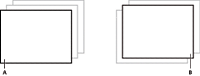
- A.
- Child container 1 active
- B.
- Child container 0 active
On the left, you see a ViewStack container with the first child active. The index of a child in a ViewStack container is numbered from 0 to n - 1, where n is the number of child containers. The container on the right is a ViewStack container with the second child container active.
For complete reference information, see ViewStack in the ActionScript 3.0 Reference for Apache Flex.
Creating a ViewStack container
You use the < mx:ViewStack > tag to define a ViewStack container, and you define the child containers in the tag body. You use the following properties of the ViewStack container to control the active child container:
- selectedIndex
-
The index of the currently active container if one or more child containers are defined. The value of this property is -1 if no child containers are defined. The index is numbered from 0 to numChildren ‑ 1, where numChildren is the number of child containers in the ViewStack container. Set this property to the index of the container that you want active.
You can use the selectedIndex property of the <mx:ViewStack> tag to set the default active container when your application starts. The following example sets the index of the default active container to 1:
<mx:ViewStack id="myViewStack" selectedIndex="1">
The following example uses ActionScript to set the selectedIndex property so that the active child container is the second container in the stack:
myViewStack.selectedIndex=1;
- selectedChild
-
The currently active container if one or more child containers are defined. The value of this property is null if no child containers are defined. Set this property in ActionScript to the identifier of the container that you want active.
You can set this property only in an ActionScript statement, not in MXML.
The following example uses ActionScript to set the selectedChild property so that the active child container is the child container with an identifier of search:
myViewStack.selectedChild=search;
- numChildren
-
Contains the number of child containers in the ViewStack container.
The following example uses the numChildren property in an ActionScript statement to set the active child container to the last container in the stack:
myViewStack.selectedIndex=myViewStack.numChildren-1;
Note: The default creation policy for all containers, except the Application container, is the policy of the parent container. The default policy for the Application container is auto. In most cases, therefore, the View Stack control's children are not created until they are selected. You cannot set the selectedChild property to a child that is not yet created.The following example creates a ViewStack container with three child containers. The example also defines three Button controls that when clicked, select the active child container:
<?xml version="1.0"?>
<!-- containers\navigators\VSSimple.mxml  -->
<s:Application xmlns:fx="http://ns.adobe.com/mxml/2009"
    xmlns:mx="library://ns.adobe.com/flex/mx"
    xmlns:s="library://ns.adobe.com/flex/spark">

    <!-- Create a VGroup container so the container for
        the buttons appears above the ViewStack container. -->
    <s:VGroup>
        <!-- Create an HBox container to hold the three buttons. -->
        <mx:HBox borderStyle="solid">

            <!-- Define the three buttons.
                Each uses the child container identifier
                to set the active child container. -->
            <s:Button id="searchButton"
                label="Search Screen"
                click="myViewStack.selectedChild=search;"/>

            <s:Button id="cInfoButton"
                label="Customer Info Screen"
                click="myViewStack.selectedChild=custInfo;"/>

            <s:Button id="aInfoButton"
                label="Account Info Screen"
                click="myViewStack.selectedChild=accountInfo;"/>
        </mx:HBox>

        <!-- Define the ViewStack and the three child containers and have it
            resize up to the size of the container for the buttons. -->
        <mx:ViewStack id="myViewStack"
            borderStyle="solid" width="100%">

            <mx:Canvas id="search" label="Search">
                <mx:Label text="Search Screen"/>
            </mx:Canvas>

            <mx:Canvas id="custInfo" label="Customer Info">
                <mx:Label text="Customer Info"/>
            </mx:Canvas>

            <mx:Canvas id="accountInfo" label="Account Info">
                <mx:Label text="Account Info"/>
            </mx:Canvas>
        </mx:ViewStack>
    </s:VGroup>
</s:Application>
When this example loads, the three Button controls appear, and the first child container defined in the ViewStack container is active. Select a Button control to change the active container.
You can also use an MX LinkBar, TabBar, ButtonBar, or ToggleButtonBar control or the Spark ButtonBar or TabBar control to set the active child of a ViewStack container. These controls can determine the number of child containers in a ViewStack container, and then create a horizontal or vertical set of links, tabs, or buttons that let the user select the active child, as the following image shows:
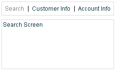
The items in the LinkBar control correspond to the values of the label property of each child of the ViewStack container, as the following example shows:
<?xml version="1.0"?>
<!-- containers\navigators\VSLinkBar.mxml -->
<s:Application xmlns:fx="http://ns.adobe.com/mxml/2009"
    xmlns:mx="library://ns.adobe.com/flex/mx"
    xmlns:s="library://ns.adobe.com/flex/spark">

    <s:VGroup>
        <!-- Create a LinkBar control to navigate
            the ViewStack container. -->
        <mx:LinkBar dataProvider="{myViewStack}" borderStyle="solid"/>

        <!-- Define the ViewStack and the three child containers. -->
        <mx:ViewStack id="myViewStack"
            borderStyle="solid"
            width="100%">

            <mx:Canvas id="search" label="Search">
                <mx:Label text="Search Screen"/>
            </mx:Canvas>

            <mx:Canvas id="custInfo" label="Customer Info">
                <mx:Label text="Customer Info"/>
            </mx:Canvas>

            <mx:Canvas id="accountInfo" label="Account Info">
                <mx:Label text="Account Info"/>
            </mx:Canvas>
        </mx:ViewStack>
    </s:VGroup>
</s:Application>
You provide only a single property to the navigator bar control, dataProvider, to specify the name of the ViewStack container associated with it. For more information on the LinkBar control, see LinkBar control. For more information on the TabBar control, see MX TabBar control. For more information on the ButtonBar and ToggleButtonBar controls, see MX ButtonBar and MX ToggleButtonBar controls.
You can also use the Spark ButtonBar control to set the active child of a ViewStack container, as the following example shows:<?xml version="1.0"?> <!-- containers\navigators\VSSparkButtonBar.mxml --> <s:Application xmlns:fx="http://ns.adobe.com/mxml/2009" xmlns:mx="library://ns.adobe.com/flex/mx" xmlns:s="library://ns.adobe.com/flex/spark"> <s:VGroup> <!-- Create a Spark ButtonBar control to navigate the ViewStack container. --> <s:ButtonBar dataProvider="{myViewStack}"/> <!-- Define the ViewStack and the three child containers. --> <mx:ViewStack id="myViewStack" borderStyle="solid" width="100%"> <s:NavigatorContent id="search" label="Search"> <s:Label text="Search Screen"/> </s:NavigatorContent> <s:NavigatorContent id="custInfo" label="Customer Info"> <s:Label text="Customer Info"/> </s:NavigatorContent> <s:NavigatorContent id="accountInfo" label="Account Info"> <s:Label text="Account Info"/> </s:NavigatorContent> </mx:ViewStack> </s:VGroup> </s:Application>For more information on the Spark ButtonBar control, see the Spark ButtonBar and TabBar controls.
Sizing the children of a ViewStack container
The default width and height of a ViewStack container is the width and height of the first child. A ViewStack container does not change size every time you change the active child.
You can use the following techniques to control the size of a ViewStack container so that it displays all the components inside its children:
-
Set explicit width and height properties for all children to the same fixed values.
-
Set percentage-based width and height properties for all children to the same fixed values.
-
Set width and height properties for the ViewStack container to a fixed or percentage-based value.
The technique that you use is based on your application and the content of your ViewStack container.
Applying effects to a ViewStack container
You can assign effects to the ViewStack container or to its children. For example, if you assign the WipeRight effect to the creationCompleteEffect property of the ViewStack control, Flex plays the effect once when the ViewStack first appears.
To specify the effects that run when the ViewStack changes children, use the children's hideEffect and showEffect properties. The effect specified by the hideEffect property plays as a container is being hidden, and the effect specified by the showEffect property plays as the newly visible child appears. The ViewStack container waits for the completion of the effect specified by the hideEffect property for the container that is being hidden before it reveals the new child container.
The following example runs a WipeRight effect when the ViewStack container is first created, and runs a WipeDown effect when each child is hidden and a WipeUp effect when a new child appears.
<?xml version="1.0"?>
<!-- containers\navigators\VSLinkEffects.mxml -->
<s:Application xmlns:fx="http://ns.adobe.com/mxml/2009"
    xmlns:mx="library://ns.adobe.com/flex/mx"
    xmlns:s="library://ns.adobe.com/flex/spark">

    <fx:Declarations>
        <mx:WipeUp id="myWU" duration="300"/>
        <mx:WipeDown id="myWD" duration="300"/>
        <mx:WipeRight id="myWR" duration="300"/>
    </fx:Declarations>

    <s:VGroup>
        <mx:LinkBar dataProvider="{myViewStack}"
            borderStyle="solid"
            backgroundColor="#EEEEFF"/>

        <mx:ViewStack id="myViewStack"
            borderStyle="solid"
            width="100%"
            creationCompleteEffect="{myWR}">

            <mx:Canvas id="search"
                label="Search"
                hideEffect="{myWD}"
                showEffect="{myWU}">
                <mx:Label text="Search Screen"/>
            </mx:Canvas>

            <mx:Canvas id="custInfo"
                label="Customer Info"
                hideEffect="{myWD}"
                showEffect="{myWU}">
                <mx:Label text="Customer Info"/>
            </mx:Canvas>

            <mx:Canvas id="accountInfo"
                label="Account Info"
                hideEffect="{myWD}"
                showEffect="{myWU}">
                <mx:Label text="Account Info"/>
            </mx:Canvas>
        </mx:ViewStack>
    </s:VGroup>
</s:Application>
Notice that the showEffect property of a container is only triggered when the container's visibility changes from false to true. Therefore, you use the creationCompleteEffect property to trigger the effect when Flex first creates the component.
MX TabNavigator container
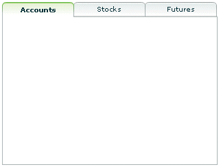
A TabNavigator container creates and manages a set of tabs, which you use to navigate among its children. The children of a TabNavigator container are other containers. The TabNavigator container creates one tab for each child. When the user selects a tab, the TabNavigator container displays the associated child, as the following image shows:
The TabNavigator container is a child class of the ViewStack container and inherits much of its functionality. For complete reference information, see the ActionScript 3.0 Reference for Apache Flex.
Creating a TabNavigator container
You use the < mx:TabNavigator tag to define a TabNavigator container. Only one child of the TabNavigator container is visible at a time. Users can make any child the selected child by selecting its associated tab or by using keyboard navigation controls. Whenever the user changes the current child, the TabNavigator container broadcasts a change event.
The TabNavigator container automatically creates a tab for each of its children and determines the tab text from the label property of the child, and the tab icon from the icon property of the child. The tabs are arranged left to right in the order determined by the child indexes. All tabs are visible, unless they do not fit within the width of the TabNavigator container.
If you disable a child of a TabNavigator container by setting its enabled property to false, you also disable the associated tab.
The following code creates the TabNavigator container in the image in MX TabNavigator container:
<?xml version="1.0"?>
<!-- containers\navigators\TNSimple.mxml -->
<s:Application xmlns:fx="http://ns.adobe.com/mxml/2009"
    xmlns:mx="library://ns.adobe.com/flex/mx"
    xmlns:s="library://ns.adobe.com/flex/spark">

    <mx:TabNavigator borderStyle="solid" >
        <mx:VBox label="Accounts"
            width="300"
            height="150">
            <!-- Accounts view goes here. -->
        </mx:VBox>

        <mx:VBox label="Stocks"
            width="300"
            height="150">
            <!-- Stocks view goes here. -->
        </mx:VBox>

        <mx:VBox label="Futures"
            width="300"
            height="150">
            <!-- Futures view goes here. -->
        </mx:VBox>
    </mx:TabNavigator>
</s:Application>
You can also set the currently active child by using the selectedChild and selectedIndex properties inherited from the ViewStack container as follows:
-
numChildren The index of the currently active container if one or more child containers are defined. The index is numbered from 0 to numChildren ‑ 1, where numChildren is the number of child containers in the TabNavigator container. Set this property to the index of the container that you want active.
-
selectedChild The currently active container, if one or more child containers are defined. This property is null if no child containers are defined. Set this property to the identifier of the container that you want active. You can set this property only in an ActionScript statement, not in MXML.
For more information on the selectedChild and selectedIndex properties, including examples, see MX ViewStack navigator container.
You use the showEffect and hideEffect properties of the children of a TabNavigator container to specify an effect to play when the user changes the currently active child. The following example plays the WipeRight effect each time the selected tab changes:
<?xml version="1.0"?>
<!-- containers\navigators\TNEffect.mxml -->
<s:Application xmlns:fx="http://ns.adobe.com/mxml/2009"
    xmlns:mx="library://ns.adobe.com/flex/mx"
    xmlns:s="library://ns.adobe.com/flex/spark">

    <fx:Declarations>
        <mx:WipeRight id="myWR"/>
    </fx:Declarations>

    <mx:TabNavigator>
        <mx:VBox label="Accounts"
            width="300"
            height="150"
            showEffect="{myWR}">
            <!-- Accounts view goes here. -->
            <mx:Text text="This is a text control."/>
        </mx:VBox>

        <mx:VBox label="Stocks"
            width="300"
            height="150"
            showEffect="{myWR}">
            <!-- Stocks view goes here. -->
            <mx:Text text="This is a text control."/>
        </mx:VBox>

        <mx:VBox label="Futures"
            width="300"
            height="150"
            showEffect="{myWR}">
            <!-- Futures view goes here. -->
            <mx:Text text="This is a text control."/>
        </mx:VBox>
    </mx:TabNavigator>
</s:Application>
Sizing the children of a TabNavigator container
The default width and height of a TabNavigator container is the width and height of the first child. A TabNavigator container does not change size every time you change the active child.
You can use the following techniques to control the size of a TabNavigator container so that it displays all the components inside its children:
-
Set explicit width and height properties for all children to the same fixed values.
-
Set percentage-based width and height properties for all children to the same fixed values.
-
Set explicit or percentage-based width and height properties for the TabNavigator container.
The method that you use is based on your application and the content of your TabNavigator container.
TabNavigator container Keyboard navigation
When a TabNavigator container has focus, Flex processes keystrokes as the following table describes:
|
Key |
Action |
|---|---|
|
Down Arrow Right Arrow |
Gives focus to the next tab, wrapping from last to first, without changing the selected child. |
|
Up Arrow Left Arrow |
Gives focus to the previous tab, wrapping from first to last, without changing the selected child. |
|
Page Down |
Selects the next child, wrapping from last to first. |
|
Page Up |
Selects the previous child, wrapping from first to last. |
|
Home |
Selects the first child. |
|
End |
Selects the last child. |
|
Enter Spacebar |
Selects the child associated with the tab displaying focus. |
MX Accordion navigator container
Forms are a basic component of many applications. However, users have difficulty navigating through complex forms, or moving back and forth through multipage forms. Sometimes, forms can be so large that they do not fit onto a single screen.
Flex includes the Accordion navigator container, which can greatly improve the look and navigation of a form. The Accordion container defines a sequence of child panels, but displays only one panel at a time. The following image shows an example of an Accordion container:
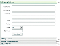
- A.
- Accordion container navigation button
- A.
- Accordion container navigation button
To navigate a container, the user clicks the navigation button that corresponds to the child panel that they want to access. Accordion containers let users access the child panels in any order to move back and forth through the form. For example, when the user is in the Credit Card Information panel, they might decide to change the information in the Billing Address panel. To do so, they navigate to the Billing Address panel, edit the information, and then navigate back to the Credit Card Information panel.
In HTML, a form that contains shipping address, billing address, and credit card information is often implemented as three separate pages, which requires the user to submit each page to the server before moving on to the next. An Accordion container can organize the information on three child panels with a single Submit button. This architecture minimizes server traffic and lets the user maintain a better sense of progress and context.
Although Accordion containers are useful for working with forms and Form containers, you can use any Flex component within a child panel of an Accordion container. For example, you could create a catalog of products in an Accordion container, where each panel contains a group of similar products.
For complete reference information, see Accordion in the ActionScript 3.0 Reference for Apache Flex.
Creating an Accordion container
You use the <mx:Accordion> tag to define an Accordion container. In the Accordion container, you define one container for each child panel. For example, if the Accordion container has four child panels that the correspond to four parts of a form, you define each child panel by using the Form container, as the following example shows:
<?xml version="1.0"?>
<!-- containers\navigators\AccordionSimple.mxml -->
<s:Application xmlns:fx="http://ns.adobe.com/mxml/2009"
    xmlns:mx="library://ns.adobe.com/flex/mx"
    xmlns:s="library://ns.adobe.com/flex/spark">

    <mx:Accordion id="accordion1" height="250">
        <mx:Form id="shippingAddress" label="1. Shipping Address">

            <mx:FormItem id="sfirstNameItem" label="First Name">
                <mx:TextInput id="sfirstName"/>
            </mx:FormItem>

            <!-- Additional contents goes here. -->

        </mx:Form>

        <mx:Form id="billingAddress" label="2. Billing Address">
            <!-- Form contents goes here. -->
        </mx:Form>

        <mx:Form id="creditCardInfo" label="3. Credit Card Information">
            <!-- Form contents goes here. -->
        </mx:Form>

        <mx:Form id="submitOrder"   label="4. Submit Order">
            <!-- Form contents goes here. -->
        </mx:Form>
    </mx:Accordion>
</s:Application>
This example defines each child panel by using a Form container. However, you can use any container to define a child panel.
Accordion container Keyboard navigation
When an Accordion container has focus, Flex processes keystrokes as the following table describes:
|
Key |
Action |
|---|---|
|
Down Arrow Right Arrow |
Gives focus to the next button, wrapping from last to first, without changing the selected child. |
|
Up Arrow Left Arrow |
Gives focus to the previous button, wrapping from first to last, without changing the selected child. |
|
Page Up |
Moves to the previous child panel, wrapping from first to last. |
|
Page Down |
Moves to the next child panel, wrapping from last to first. |
|
Home |
Moves to the first child panel. |
|
End |
Moves to the last child panel. |
|
Enter Spacebar |
Selects the child associated with the tab displaying focus. |
Using Button controls to navigate an Accordion container
The simplest way for users to navigate the panels of an Accordion container is to click the navigator button for the desired panel. However, you can create additional navigation Button controls, such as Back and Next, to make it easier for users to navigate.
Navigation Button controls use the following properties of the Accordion container to move among the child panels:
|
Property |
Description |
|---|---|
numChildren |
Contains the total number of child panels defined in an Accordion container. |
selectedIndex |
The index of the currently active child panel. Child panels are numbered from 0 to numChildren ‑ 1. Setting the selectedIndex property changes the currently active panel. |
selectedChild |
The currently active child container if one or more child containers are defined. This property is null if no child containers are defined. Set this property to the identifier of the container that you want active. You can set this property only in an ActionScript statement, not in MXML. |
For more information on these properties, see MX ViewStack navigator container.
You can use the following two Button controls, for example, in the second panel of an Accordion container, panel number 1, to move back to panel number 0 or ahead to panel number 2:
<?xml version="1.0"?>
<!-- containers\navigators\AccordionButtonNav.mxml -->
<s:Application xmlns:fx="http://ns.adobe.com/mxml/2009"
    xmlns:mx="library://ns.adobe.com/flex/mx"
    xmlns:s="library://ns.adobe.com/flex/spark">

    <mx:Accordion id="accordion1" height="250">
        <mx:Form id="shippingAddress" label="1. Shipping Address">
            <mx:FormItem id="sfirstNameItem" label="First Name">
                <s:TextInput id="sfirstName"/>
            </mx:FormItem>
        </mx:Form>

        <mx:Form id="billingAddress" label="2. Billing Address">
            <s:Button id="backButton"
                label="Back"
                click="accordion1.selectedIndex=0;"/>
            <s:Button id="nextButton"
                label="Next"
                click="accordion1.selectedIndex=2;"/>
        </mx:Form>

        <mx:Form id="creditCardInfo" label="3. Credit Card Information">
        </mx:Form>
    </mx:Accordion>
</s:Application>
You can also use relative location with navigation buttons. The following Button controls move forward and backward through Accordion container panels based on the current panel number:
 <s:Button id="backButton" label="Back"
	click="accordion1.selectedIndex = accordion1.selectedIndex - 1;"/>
 <s:Button id="nextButton" label="Next"
	click="accordion1.selectedIndex = accordion1.selectedIndex + 1;"/>
For the Next Button control, you also can use the selectedChild property to move to the next panel based on the value of the id property of the panel's container, as the following code shows:
 <s:Button id="nextButton" label="Next"
	click="accordion1.selectedChild=creditCardInfo;"/>
The following Button control opens the last panel in the Accordion container:
 <s:Button id="lastButton" label="Last"
	click="accordion1.selectedIndex = accordion1.numChildren - 1;"/>
Handling child button events
The Accordion container can recognize an event when the user changes the current panel. The Accordion container broadcasts a change event when the user changes the child panel, either by clicking a button or pressing a key, such as the Page Down key.
You can register an event handler for the change event by using the change property of the <mx:Accordion> tag, or by registering the handler in ActionScript. The following example logs the change event to flashlog.txt each time the user changes panels:
<mx:Accordion id="accordion1" height="450" change="trace('change');">
Controlling the appearance of accordion buttons
The buttons on an Accordion container are rendered by the AccordionHeader class, which is a subclass of Button, and has the same style properties as the Button class.
To change the style of an Accordion button, call the Accordion class getHeaderAt() method to get a reference to a child container's button, and then call the button's setStyle() method to set the style. The following example uses this technique to set a different text color for each of the Accordion buttons:
<?xml version="1.0"?>
<!-- containers\navigators\AccordionStyling.mxml -->
<s:Application xmlns:fx="http://ns.adobe.com/mxml/2009"
    xmlns:mx="library://ns.adobe.com/flex/mx"
    xmlns:s="library://ns.adobe.com/flex/spark"
    width="600"
    height="600"
    creationComplete="setButtonStyles();">

    <fx:Script>
        <![CDATA[
            public function setButtonStyles():void {
                comp.getHeaderAt(0).setStyle('color', 0xAA0000);
                comp.getHeaderAt(1).setStyle('color', 0x00AA00);
            }
        ]]>
    </fx:Script>

    <mx:Accordion id="comp">
        <mx:VBox label="First VBox">
            <mx:TextInput/>
            <mx:Button label="Button 1"/>
        </mx:VBox>
        <mx:VBox label="Second VBox">
            <mx:TextInput/>
            <mx:Button label="Button 2"/>
        </mx:VBox>
    </mx:Accordion>
</s:Application>
You can also control the appearance of the buttons by using the headerStyleName style property of the Accordion class. For more information, see Accordion in the ActionScript 3.0 Reference for Apache Flex.
Navigation
Adobe and Adobe Flash Platform are either registered trademarks or trademarks of Adobe Systems Incorporated in the United States and/or other countries and are used by permission from Adobe. No other license to the Adobe trademarks are granted.