
Spark list-based controls
The Spark list-based controls are designed to display data items in different visual formats and layouts.
Using Spark list-based controls
The Spark list-based controls include the following:
The ListBase class is a subclass of the SkinnableDataContainer class. The ListBase class adds support for item selection in the list of data items, and for controlling the text displayed in the list. The ButtonBar, ComboBox, DropDownList, List, and TabBar controls add additional functionality to the ListBase class.
For more information on SkinnableDataContainer, and on creating item renderers, see The Spark DataGroup and Spark SkinnableDataContainer containers.
Defining the children of a list-based control
The list-based controls are examples of data provider components. Data provider components require data for display or user interaction. To provide data, assign a collection which implements the IList interface, such as an ArrayList, ArrayCollection, or XMLListCollection object, to the control's dataProvider property. For more information on using data providers, see Data providers and collections.
Data items can be simple data items such as String and Number objects, and more complicated data items such as Object and XMLNode objects. The following example shows a List control that displays data items represented by String data:
<?xml version="1.0" encoding="utf-8"?>
<!-- dpcontrols\sparkdpcontrols\SparkListSimple.mxml -->
<s:Application xmlns:fx="http://ns.adobe.com/mxml/2009"
    xmlns:s="library://ns.adobe.com/flex/spark"
    xmlns:mx="library://ns.adobe.com/flex/mx">
    <s:layout>
        <s:VerticalLayout/>
    </s:layout>

    <s:List>
        <s:dataProvider>
            <mx:ArrayCollection>
                <fx:String>Falcon</fx:String>
                <fx:String>AntOnAIR</fx:String>
                <fx:String>FlexJS</fx:String>
                <fx:String>Flex</fx:String>
            </mx:ArrayCollection>
         </s:dataProvider>
    </s:List>
</s:Application>
For simple data items, such as Strings and Numbers, the controls display the entire data item as a String. For more complicated data items, such as Objects, you can control the text displayed in the control based on the data item. For more information, see Controlling the text displayed for each data item.
<?xml version="1.0" encoding="utf-8"?>
<!-- dpcontrols\sparkdpcontrols\SparkListSimpleNoDP.mxml -->
<s:Application xmlns:fx="http://ns.adobe.com/mxml/2009"
    xmlns:s="library://ns.adobe.com/flex/spark"
    xmlns:mx="library://ns.adobe.com/flex/mx">
    <s:layout>
        <s:VerticalLayout/>
    </s:layout>

    <s:List>
        <mx:ArrayCollection>
            <fx:String>Falcon</fx:String>
            <fx:String>AntOnAIR</fx:String>
            <fx:String>FlexJS</fx:String>
            <fx:String>Flex</fx:String>
        </mx:ArrayCollection>
    </s:List>
</s:Application>
Controlling the text displayed for each data item
<?xml version="1.0" encoding="utf-8"?>
<!-- dpcontrols\sparkdpcontrols\SparkListSimpleObjects.mxml -->
<s:Application xmlns:fx="http://ns.adobe.com/mxml/2009"
    xmlns:s="library://ns.adobe.com/flex/spark"
    xmlns:mx="library://ns.adobe.com/flex/mx">
    <s:layout>
        <s:VerticalLayout/>
    </s:layout>

    <s:List id="myList"
        labelField="firstName">
        <mx:ArrayCollection>
            <fx:Object firstName="Bill" lastName="Smith" companyID="11233"/>
            <fx:Object firstName="Dave" lastName="Jones" companyID="13455"/>
            <fx:Object firstName="Mary" lastName="Davis" companyID="11543"/>
            <fx:Object firstName="Debbie" lastName="Cooper" companyID="14266"/>
        </mx:ArrayCollection>
    </s:List>
</s:Application>
When the data items contains multiple fields, you must configure the control to display the correct String. In the previous example, you use the labelField property to specify to display the firstName field in the control.
-
Use the labelFunction property
The labelFunction property lets you define a function that returns a String for display by the control. By default, the labelFunction property takes precedence over the labelField property.
-
Use the labelField property
The labelField property specifies the field of the data item to display in the control.
-
Override the itemToLabel() method
Override the itemToLabel() method to convert the data item to a String that is then passed to an item renderer. This method is defined on the SkinnableDataContainer class.
By default, itemToLabel() prioritizes labelFunction over labelField. If you override itemToLabel(), you can implement it however you like. Your implementation can then choose to use or ignore labelField and labelFunction. For an example that overrides this method, see Passing data using the IItemRenderer.label property.
When you use the labelFunction property, you define a function that calculates the String to display. Typically, the String is derived from the fields of the data item. The label function must have the following signature:
labelFunction(item:Object):String
The item parameter contains the data item. The function must return a String.
<?xml version="1.0" encoding="utf-8"?>
<!-- dpcontrols\sparkdpcontrols\SparkListSimpleObjectsLF.mxml -->
<s:Application xmlns:fx="http://ns.adobe.com/mxml/2009"
    xmlns:s="library://ns.adobe.com/flex/spark"
    xmlns:mx="library://ns.adobe.com/flex/mx">
    <s:layout>
        <s:VerticalLayout/>
    </s:layout>

    <fx:Script>
        <![CDATA[
            public function myLabelFunc(item:Object):String {
                return item.firstName + " " + item.lastName;
            }
        ]]>
    </fx:Script>

    <s:List id="myList"
        labelFunction="myLabelFunc">
        <mx:ArrayCollection>
            <fx:Object firstName="Bill" lastName="Smith" companyID="11233"/>
            <fx:Object firstName="Dave" lastName="Jones" companyID="13455"/>
            <fx:Object firstName="Mary" lastName="Davis" companyID="11543"/>
            <fx:Object firstName="Debbie" lastName="Cooper" companyID="14266"/>
        </mx:ArrayCollection>
    </s:List>
</s:Application>
Modifying the children of a list-based control
A list-based control creates list items based on the value of its dataProvider property. Typically, the control creates one list item for each data item. For example, the List control creates one list item for each data item, and the ButtonBar control creates one button for each data item.
<?xml version="1.0" encoding="utf-8"?>
<!-- dpcontrols\sparkdpcontrols\SparkBBarSimpleModDP.mxml -->
<s:Application xmlns:fx="http://ns.adobe.com/mxml/2009"
    xmlns:s="library://ns.adobe.com/flex/spark"
    xmlns:mx="library://ns.adobe.com/flex/mx">
    <s:layout>
        <s:VerticalLayout/>
    </s:layout>

    <fx:Script>
        <![CDATA[
            // Add data item, and button, to the ButtonBar.
            private function addFlexToDP():void {
                myBB.dataProvider.addItem("Flex");
                addFlex.enabled=false;
                removeFlex.enabled=true;
            }

            // Remove data item, and button, from the ButtonBar.
            private function removeFlexToDP():void {
                myBB.dataProvider.removeItemAt(4);
                addFlex.enabled=true;
                removeFlex.enabled=false;
            }
        ]]>
    </fx:Script>

    <s:ButtonBar id="myBB">
        <mx:ArrayCollection>
            <fx:String>Falcon</fx:String>
            <fx:String>AntOnAIR</fx:String>
            <fx:String>FlexJS</fx:String>
            <fx:String>Flex</fx:String>
        </mx:ArrayCollection>
    </s:ButtonBar>

    <s:Button id="addFlex" label="Add Flex"
        click="addFlexToDP();"/>
    <s:Button id="removeFlex" label="Remove Flex"
        enabled="false"
        click="removeFlexToDP();"/>
</s:Application>
Setting the layout
The following example overrides that layout to use TileLayout:
<?xml version="1.0" encoding="utf-8"?>
<!-- dpcontrols\sparkdpcontrols\SparkListLayout.mxml -->
<s:Application xmlns:fx="http://ns.adobe.com/mxml/2009"
    xmlns:s="library://ns.adobe.com/flex/spark"
    xmlns:mx="library://ns.adobe.com/flex/mx">

    <s:List width="200">
        <s:layout>
            <s:TileLayout/>
        </s:layout>
        <mx:ArrayCollection>
            <fx:String>Flex</fx:String>
            <fx:String>Installer</fx:String>
            <fx:String>Falcon</fx:String>
            <fx:String>AntOnAIR</fx:String>
            <fx:String>FlexJS</fx:String>
            <fx:String>Flex</fx:String>
            <fx:String>TourDeFlex</fx:String>
        </mx:ArrayCollection>
    </s:List>
</s:Application>
For more information on Spark layouts, see About Spark layouts.
Working with list events
-
caretChange Dispatched after the focus has changed from one data item to another. For more information, see Working with the caret item.
-
change Dispatched after the currently selected data item changes to another data item. This event is dispatched when the user interacts with the control.
When you change the value of the selectedIndex or selectedItem properties programmatically, the control does not dispatch the change event. It dispatches the valueCommit event instead.
For more information, see Working with the selected item.
-
changing Dispatched before the currently selected data item changes. This event is dispatched when the user interacts with the control.
Calling the preventDefault() method in the event handler prevents the selection from changing. This event is useful when you want to perform processing on the currently selected item before selection moves to a new data item, or to prevent an item from being selected.
When you change the value of the selectedIndex or selectedItem properties programmatically, it does not dispatch the changing event. It dispatches the valueCommit event instead.
The event object for all events is spark.events.IndexChangeEvent.
Working with the selected item
The ListBase class adds support for item selection in the list of data items, and for controlling the text displayed in the list. Several properties of the ListBase class handle the selection of a data item in the control. These properties include the following:
-
requireSelection Specifies that a data item must always be selected. The default is false. If true, then the first data item is selected by default until the user selects a list item, or until you set the selectedIndex property.
-
selectedIndex The index of the currently selected data item. The index of items in the list-based controls is zero-based, which means that values are 0, 1, 2, ... , n - 1, where n is the total number of items. If requireSelection is false, you can also set selectedIndex to -1 to deselect all data items.
-
selectedItem The object from the data provider corresponding to the currently selected data item.
You often use these properties in event handlers, as the following example shows for the change event. In this example, the List control displays the firstName field of each data item. When you select a data item in the control, the event handler for the change event displays the index and the lastName field of the data item in TextArea controls.
<?xml version="1.0" encoding="utf-8"?>
<!-- dpcontrols\sparkdpcontrols\SparkListSelected.mxml -->
<s:Application xmlns:fx="http://ns.adobe.com/mxml/2009"
    xmlns:s="library://ns.adobe.com/flex/spark"
    xmlns:mx="library://ns.adobe.com/flex/mx"
    height="450">
    <s:layout>
        <s:VerticalLayout/>
    </s:layout>

    <fx:Script>
        <![CDATA[
            import spark.events.IndexChangeEvent;

            protected function selectionChangedHandler(event:IndexChangeEvent):void
            {
                var currentIndx:int = event.currentTarget.selectedIndex;
                var currentDataItem:Object = event.currentTarget.selectedItem;
                selIndex.text = String(currentIndx);
                selLName.text = String(currentDataItem.lastName);
            }

        ]]>
    </fx:Script>

    <s:List id="myList"
        labelField="firstName"
        change="selectionChangedHandler(event)">
        <mx:ArrayCollection>
            <fx:Object firstName="Bill" lastName="Smith" companyID="11233"/>
            <fx:Object firstName="Dave" lastName="Jones" companyID="13455"/>
            <fx:Object firstName="Mary" lastName="Davis" companyID="11543"/>
            <fx:Object firstName="Debbie" lastName="Cooper" companyID="14266"/>
        </mx:ArrayCollection>
    </s:List>

    <s:Label text="Selected index:"/>
    <s:TextArea id="selIndex" height="50"/>

    <s:Label text="Selected Last Name:"/>
    <s:TextArea id="selLName" height="50"/>

</s:Application>
The currentTarget property of the object passed to the event handler contains a reference to the List control. Therefore, the currentTarget.selectedIndex field contains the index of the selected item, and the currentTarget.selectedItem field contains a copy of the selected item.
Working with the caret item
The selected item is the item in the control selected by clicking on the item, or by using the arrow keys. For more information about determining the selected item, see Working with the selected item.
The caret item is the data item that currently has focus. The caret item can be the currently selected data item, or it can be a different item.
You use the caretIndex property to determine the index of the data item that currently has focus. The index is zero-based, which means that values are 0, 1, 2, ... , n - 1, where n is the total number of items.
<?xml version="1.0" encoding="utf-8"?>
<!-- dpcontrols\sparkdpcontrols\SparkListCaret.mxml -->
<s:Application xmlns:fx="http://ns.adobe.com/mxml/2009"
    xmlns:s="library://ns.adobe.com/flex/spark"
    xmlns:mx="library://ns.adobe.com/flex/mx">
    <s:layout>
        <s:VerticalLayout paddingTop="5" paddingLeft="5"/>
    </s:layout>
    <s:Label text="The selected item is: {myList.selectedIndex}" />
    <s:Label text="The caret item is: {myList.caretIndex}" />

    <s:List id="myList">
        <s:dataProvider>
            <s:ArrayCollection>
                <fx:String>One</fx:String>
                <fx:String>Two</fx:String>
                <fx:String>Three</fx:String>
                <fx:String>Four</fx:String>
                <fx:String>Five</fx:String>
                <fx:String>Six</fx:String>
                <fx:String>Seven</fx:String>
                <fx:String>Eight</fx:String>
                <fx:String>Nine</fx:String>
                <fx:String>Ten</fx:String>
            </s:ArrayCollection>
        </s:dataProvider>
    </s:List>
</s:Application>
To see the difference between the selectedIndex and the caretIndex properties:
-
Select an item in the List control by clicking on it. Notice that because the item is both selected and in focus that the selectedIndex and the caretIndex properties have the same value.
-
Use the Up Arrow and Down Arrow keys to move the selected item. Notice that because the item is both selected and in focus that the selectedIndex and the caretIndex properties have the same value.
-
With an item selected:
-
(On Windows) Hold down the Control key, and then use the Up Arrow and Down Arrow keys to move the caret index.
-
(On OSX) Hold down the Command key, and then use the Up Arrow and Down Arrow keys to move the caret index.
Notice that the List control displays a blue box around the data item at the caret index, but the index of the selected item does not change. The data item at the caret index has focus, but is not selected. Press the Space key to select the data item at the caret index.
-
The list-based controls dispatch the caretChange event when the caret item changes.
Working with item renderers
|
Control |
Default item renderer |
|---|---|
|
ButtonBar |
ButtonBarButton |
|
ComboBox |
DefaultItemRenderer |
|
DropDownList |
DefaultItemRenderer |
|
List |
DefaultItemRenderer |
|
TabBar |
ButtonBarButton with TabBarButtonSkin as the skin |
You can override the default item renderer. For more information, see Using an item renderer function with a Spark container.
Using virtualization with list-based controls
A list-based control can represent any number of children. However, each child requires an instance of an item renderer. If the container has many children, you can notice performance degradation as you add more children to the container.
Instead of creating an item renderer for each child, you can use the useVirtualLayout property to configure the control to use a virtual layout. With virtual layout enabled, the control reuses item renderers so that it only creates item renderers for the currently visible children of the container. As a child is moved off the screen, possible by scrolling the container, a new child being scrolled onto the screen can reuse its item renderer.
The layout class associated with a component determines if the component supports virtual layout. Typically, you use the component's skin class to specify the layout class. By default, the skins for the Spark list-based classes have the useVirtualLayout property to true to enable virtual layout.
However, the default skins of some components use layouts that do not support the useVirtualLayout property. The TabBar and ButtonBar components use the ButtonBarHorizontalLayout which does not support the useVirtualLayout property or virtual layout.
For more information on virtualization, see Using virtualization with Spark DataGroup and SkinnableDataContainer.
Supporting view states in an item renderer for a list-based control
The Spark list-based controls support view states that you can use in a custom item renderer. Support for these view states is not required. If the host component attempts to set the item renderer to a view state that is not defined in the renderer, then the item renderer uses the normal view state.
-
normal The data item has no user interaction.
-
hovered The mouse is over the data item.
-
selected The data item is selected.
-
dragging The data item is being dragged.
-
normalAndShowCaret The data item is in the normal state, and it has focus in the item list.
-
hoveredAndShowCaret The data item is in the hovered state, and it has focus in the item list.
-
selectedAndShowCaret The data item is in the selected state, and it has focus in the item list.
The default item renderers, including DefaultItemRenderer and DefaultComplexItemRenderer, support all of these view states.
The list-based controls add the ability to select a data item. Therefore, one of the view states corresponds to the data item being selected. The item renderer can use the selected view state to modify the appearance of the item when selected.
Several view states are associated with the caret index. The caret index identifies the data item that has focus. That item does not have to be the selected item,
<?xml version="1.0" encoding="utf-8"?>
<s:ItemRenderer xmlns:fx="http://ns.adobe.com/mxml/2009"
    xmlns:s="library://ns.adobe.com/flex/spark"
    xmlns:mx="library://ns.adobe.com/flex/mx">

    <fx:Script>
        <![CDATA[

            override public function set label(value:String):void {
                super.label = value;
                labelDisplay.text = label;
            }
        ]]>
    </fx:Script>

    <s:states>
        <s:State name="normal"/>
        <s:State name="hovered"/>
        <s:State name="selected"/>
    </s:states>

    <s:Rect left="0" right="0" top="0" bottom="0">
        <s:stroke.selected>
            <s:SolidColorStroke
                color="0x000000"
                weight="1"/>
        </s:stroke.selected>
        <s:fill>
            <s:SolidColor
                color.normal="0xFFFFFF"
                color.hovered="0xCEDBEF"
                color.selected="0x00FF00"/>
        </s:fill>
    </s:Rect>
    <s:Label id="labelDisplay"
        fontWeight.selected="bold"
        verticalCenter="0"
        left="3" right="3"
        top="6" bottom="4"/>
</s:ItemRenderer>
This item renderer does not define all possible view states. If the host component attempts to set it to any undefined view state, the item renderer uses the normal state.
<?xml version="1.0" encoding="utf-8"?>
<!-- dpcontrols\sparkdpcontrols\SparkListIR.mxml -->
<s:Application xmlns:fx="http://ns.adobe.com/mxml/2009"
    xmlns:s="library://ns.adobe.com/flex/spark"
    xmlns:mx="library://ns.adobe.com/flex/mx">
    <s:layout>
        <s:VerticalLayout/>
    </s:layout>

    <s:List itemRenderer="myComponents.ListSelectedIR">
        <s:dataProvider>
            <mx:ArrayCollection>
                <fx:String>Falcon</fx:String>
                <fx:String>AntOnAIR</fx:String>
                <fx:String>FlexJS</fx:String>
                <fx:String>Flex</fx:String>
            </mx:ArrayCollection>
         </s:dataProvider>
    </s:List>
</s:Application>
Using a mobile item renderer with a Spark list-based control
Flex provides two item renderers that you can use with Spark list-based controls in mobile applications. These item renderers, spark.components.LabelItemRenderer and spark.components.IconItemRenderer, are written in ActionScript to provide the highest level of performance required by mobile applications.
The default theme for mobile applications built in Flex is the Mobile theme. When you use the Mobile theme, Flex automatically uses the LabelItemRenderer for the Flex list-based controls. Like the DefaultItemRenderer, the LabelItemRenderer displays a single text field for each data item.
You can use the IconItemRenderer in a mobile application. The IconItemRenderer displays two text fields, one above the other, and two icons for every data item.
<?xml version="1.0" encoding="utf-8"?>
<!-- containers\mobile\views\ContactsMobileIconIR.mxml -->
<s:View xmlns:fx="http://ns.adobe.com/mxml/2009"
    xmlns:s="library://ns.adobe.com/flex/spark"
    title="Contacts View Main">
    <s:layout>
        <s:VerticalLayout paddingTop="10"/>
    </s:layout>

    <fx:Style>
        @namespace s "library://ns.adobe.com/flex/spark";
        .myFontStyle {
            fontSize: 15;
            color: #9933FF;
        }

    </fx:Style>

    <s:Label text="Select a contact name"/>
    <s:List id="myList"
        width="100%" height="100%"
        labelField="firstName">
        <s:itemRenderer>
            <fx:Component>
                <s:IconItemRenderer messageStyleName="myFontStyle" fontSize="25"
                    labelField="firstName"
                    messageField="lastName"
                    decorator="@Embed(source='assets/logo_small.jpg')"/>
            </fx:Component>
        </s:itemRenderer>
        <s:ArrayCollection>
            <fx:Object firstName="Dave" lastName="Duncam" company="Adobe" phone="413-555-1212"/>
            <fx:Object firstName="Sally" lastName="Smith" company="Acme" phone="617-555-1491"/>
            <fx:Object firstName="Jim" lastName="Jackson" company="Beta" phone="413-555-2345"/>
            <fx:Object firstName="Mary" lastName="Moore" company="Gamma" phone="617-555-1899"/>
        </s:ArrayCollection>
    </s:List>
</s:View>
Spark List control
The Spark List control displays a list of data items. Its functionality is very similar to that of the SELECT form element in HTML. The user can select one or more items from the list. The List control automatically displays horizontal and vertical scroll bar when the list items do not fit the size of the control.
The List control is a subclass of the SkinnableDataContainer container. Therefore, you can set the layout of the List control, apply a skin to it, and define a custom item renderer. For more information on the SkinnableDataContainer container, see The Spark DataGroup and Spark SkinnableDataContainer containers. To define a look and feel of items displayed in the List control, read more about Define a custom Spark item renderer.
Creating a Spark List control
You use the <s:List> tag to define a Spark List control. Specify an id value if you intend to refer to a component elsewhere in your MXML, either in another tag or in an ActionScript block.
<?xml version="1.0" encoding="utf-8"?>
<!-- dpcontrols\sparkdpcontrols\SparkListSimpleNoDP.mxml -->
<s:Application xmlns:fx="http://ns.adobe.com/mxml/2009"
    xmlns:s="library://ns.adobe.com/flex/spark"
    xmlns:mx="library://ns.adobe.com/flex/mx">
    <s:layout>
        <s:VerticalLayout/>
    </s:layout>

    <s:List>
        <mx:ArrayCollection>
            <fx:String>Falcon</fx:String>
            <fx:String>AntOnAIR</fx:String>
            <fx:String>FlexJS</fx:String>
            <fx:String>Flex</fx:String>
        </mx:ArrayCollection>
    </s:List>
</s:Application>
<?xml version="1.0" encoding="utf-8"?>
<!-- dpcontrols\sparkdpcontrols\SparkListSimpleScroll.mxml -->
<s:Application xmlns:fx="http://ns.adobe.com/mxml/2009"
    xmlns:s="library://ns.adobe.com/flex/spark"
    xmlns:mx="library://ns.adobe.com/flex/mx">
    <s:layout>
        <s:VerticalLayout/>
    </s:layout>

    <s:List height="100">
        <s:dataProvider>
            <mx:ArrayCollection>
                <fx:String>Flex</fx:String>
                <fx:String>Installer</fx:String>
                <fx:String>Falcon</fx:String>
                <fx:String>AntOnAIR</fx:String>
                <fx:String>FlexJS</fx:String>
                <fx:String>Mobile Trader</fx:String>
                <fx:String>TourDeFlex</fx:String>
                <fx:String>Squiggly</fx:String>
            </mx:ArrayCollection>
        </s:dataProvider>
    </s:List>
</s:Application>
Using the styles of the Spark List control
The List control defines several styles that you can use to modify the appearance of the control. You can use styles to make some visual changes to the control, but you create a skin for total control over the display.
<?xml version="1.0" encoding="utf-8"?>
<!-- dpcontrols\spark\SparkListSimpleStyles.mxml -->
<s:Application xmlns:fx="http://ns.adobe.com/mxml/2009"
    xmlns:s="library://ns.adobe.com/flex/spark"
    xmlns:mx="library://ns.adobe.com/flex/mx">
    <s:layout>
        <s:VerticalLayout/>
    </s:layout>

    <s:List
        alternatingItemColors="[#66FFFF, #33CCCC]"
        rollOverColor="#CC6600">
        <s:dataProvider>
            <mx:ArrayCollection>
                <fx:String>Flex</fx:String>
                <fx:String>Installer</fx:String>
                <fx:String>Falcon</fx:String>
                <fx:String>AntOnAIR</fx:String>
                <fx:String>FlexJS</fx:String>
                <fx:String>Mobile Trader</fx:String>
            </mx:ArrayCollection>
         </s:dataProvider>
    </s:List>
</s:Application>
Handling multiple selection in the Spark List control
The List control lets you select multiple items in the control. To enable multiple selection, set the allowMultipleSelection property to true. The default value is false.
After enabling multiple selection, select the first data item in the List by clicking on it. Then hold down the Control key to select additional items. If the item is currently deselected, clicking on it while holding down the Control key selects it. If the item is already selected, clicking on it while holding down the Control key deselects it.
You can also use the Shift key to select a range of data items. To select a range, select the first data item in the List by clicking on it. Then hold down the Shift key to select one additional item. The List control selects all data items between the two data items.
The List control defines two Vector properties that you use with multiple selection: selectedIndices and selectedItems. The selectedIndices Vector is of type int, and the selectedItems Vector is of type Object. These Vectors contain a list of the selected indices and selected data items in the reverse order in which they were selected. That means the first element in each Vector corresponds to the last item selected. The length of each Vector is the same as the number of selected items in the control. If your list contains 100 data items, these Vectors can be up to 100 elements long.
<?xml version="1.0" encoding="utf-8"?>
<!-- dpcontrols\sparkdpcontrols\SparkListSimpleMultipleSelection.mxml -->
<s:Application xmlns:fx="http://ns.adobe.com/mxml/2009"
    xmlns:s="library://ns.adobe.com/flex/spark"
    xmlns:mx="library://ns.adobe.com/flex/mx"
    height="450">
    <s:layout>
        <s:VerticalLayout/>
    </s:layout>

    <fx:Script>
        <![CDATA[
            import spark.events.IndexChangeEvent;

            private function myChangedHandler(event:IndexChangeEvent):void {

                var selIndices:Vector.<int> = event.currentTarget.selectedIndices;
                var selItems:Vector.<Object> = event.currentTarget.selectedItems;
                var numItems:Number = selIndices.length;

                selIndicesTA.text = "";
                selItemsTA.text = "";

                for (var i:Number = 0; i<numItems; i++)
                {
                    selIndicesTA.text = selIndicesTA.text + selIndices[i] + "\n";
                    selItemsTA.text = selItemsTA.text + selItems[i] + "\n";
                }
            }
        ]]>
    </fx:Script>

    <s:List allowMultipleSelection="true"
        change="myChangedHandler(event);">
        <mx:ArrayCollection>
            <fx:String>Flex</fx:String>
            <fx:String>Installer</fx:String>
            <fx:String>Falcon</fx:String>
            <fx:String>AntOnAIR</fx:String>
            <fx:String>FlexJS</fx:String>
            <fx:String>Mobile Trader</fx:String>
        </mx:ArrayCollection>
    </s:List>

    <s:Label text="Selected indices"/>
    <s:TextArea id="selIndicesTA" height="75"/>
    <s:Label text="Selected items"/>
    <s:TextArea id="selItemsTA" height="75"/>
</s:Application>
Selecting multiple items does not dispatch the changing event. It only dispatches the change event.
Spark List control user interaction
The user clicks individual data items to select them, and holds down the Control and Shift keys while clicking to select multiple items. You must set the allowMultipleSelection property to true to allow multiple selection.
A List control shows the number of data items that fit in the display. Paging down through the data items displayed by a 10-line List control shows records 0-9, 10-19, 20-29, and so on.
The List control has the following default keyboard navigation features:
|
Key |
Action |
|---|---|
|
Up Arrow |
Moves selection up one item. Hold down the Control key (Windows) or Command key (OSX) to only move focus, but not change the selected item. |
|
Down Arrow |
Moves selection down one item. Hold down the Control key (Windows) or Command key (OSX) to only move focus, but not change the selected item. |
|
Left Arrow |
Moves selection one column to the left, if you are using HorizontalLayout or TileLayout only. Hold down the Control key (Windows) or Command key (OSX) to only move focus, but not change the selected item. |
|
Right Arrow |
Moves selection one column to the right, if you are using HorizontalLayout or TileLayout only. Hold down the Control key (Windows) or Command key (OSX) to only move focus, but not change the selected item. |
|
Page Up |
Moves selection up one page. |
|
Page Down |
Moves selection down one page. |
|
Home |
Moves selection to the top of the list. |
|
End |
Moves selection to the bottom of the list. |
|
Alphanumeric keys |
Jumps to the next item with a label that begins with the character typed. |
|
Control |
Toggle key. Allows for multiple (noncontiguous) selection and deselection. Works with key presses, click selection, and drag selection. |
|
Shift |
Contiguous selection key. Allows for contiguous selections. Works with key presses, click selection, and drag selection. |
Spark ButtonBar and TabBar controls
The Spark ButtonBar control defines a horizontal row of related buttons with a common appearance. The controls define a single event, the itemClick event, that is dispatched when any button in the control is selected.
The buttons maintain their state, either selected or deselected. Only one button in the ButtonBar control can be in the selected state. That means when you select a button in a ButtonBar control, the button stays in the selected state until you select a different button.
The TabBar control is similar to the ButtonBar control, except that is displays a horizontal row of tabs instead of buttons.
Creating a Spark ButtonBar control
You create a Spark ButtonBar control in MXML by using the <s:ButtonBar> tag. Specify an id value if you intend to refer to a component elsewhere in your MXML, either in another tag or in an ActionScript block.
<?xml version="1.0" encoding="utf-8"?>
<!-- dpcontrols\sparkdpcontrols\SparkBBarSimple.mxml -->
<s:Application xmlns:fx="http://ns.adobe.com/mxml/2009"
    xmlns:s="library://ns.adobe.com/flex/spark"
    xmlns:mx="library://ns.adobe.com/flex/mx">
    <s:layout>
        <s:VerticalLayout paddingLeft="20" paddingTop="20"/>
    </s:layout>

    <s:ButtonBar>
        <mx:ArrayCollection>
            <fx:String>Falcon</fx:String>
            <fx:String>AntOnAIR</fx:String>
            <fx:String>FlexJS</fx:String>
            <fx:String>Mobile Trader</fx:String>
        </mx:ArrayCollection>
    </s:ButtonBar>
</s:Application>
This example creates a row of four Button controls.
Creating a Spark TabBar control
You create a Spark TabBar control in MXML by using the <s:TabBar> tag. Specify an id value if you intend to refer to a component elsewhere in your MXML, either in another tag or in an ActionScript block.
<?xml version="1.0" encoding="utf-8"?>
<!-- dpcontrols\sparkdpcontrols\SparkTabBarSimple.mxml -->
<s:Application xmlns:fx="http://ns.adobe.com/mxml/2009"
    xmlns:s="library://ns.adobe.com/flex/spark"
    xmlns:mx="library://ns.adobe.com/flex/mx">
    <s:layout>
        <s:VerticalLayout paddingLeft="20" paddingTop="20"/>
    </s:layout>

    <s:TabBar>
        <mx:ArrayCollection>
            <fx:String>Falcon</fx:String>
            <fx:String>AntOnAIR</fx:String>
            <fx:String>FlexJS</fx:String>
            <fx:String>Mobile Trader</fx:String>
        </mx:ArrayCollection>
    </s:TabBar>
</s:Application>
This example creates a row of four tabs.
Using the Spark ButtonBar and TabBar controls with an MX ViewStack container
<?xml version="1.0"?>
<!-- containers\navigators\VSSparkButtonBar.mxml -->
<s:Application xmlns:fx="http://ns.adobe.com/mxml/2009"
    xmlns:mx="library://ns.adobe.com/flex/mx"
    xmlns:s="library://ns.adobe.com/flex/spark">

    <s:VGroup>
        <!-- Create a Spark ButtonBar control to navigate
            the ViewStack container. -->
        <s:ButtonBar dataProvider="{myViewStack}"/>

        <!-- Define the ViewStack and the three child containers. -->
        <mx:ViewStack id="myViewStack"
            borderStyle="solid"
            width="100%">

            <s:NavigatorContent id="search" label="Search">
                <s:Label text="Search Screen"/>
            </s:NavigatorContent>

            <s:NavigatorContent id="custInfo" label="Customer Info">
                <s:Label text="Customer Info"/>
            </s:NavigatorContent>

            <s:NavigatorContent id="accountInfo" label="Account Info">
                <s:Label text="Account Info"/>
            </s:NavigatorContent>
        </mx:ViewStack>
    </s:VGroup>
</s:Application>
For more information on the ViewStack control, see the MX ViewStack navigator container.
Using skins and styles with the Spark ButtonBar and TabBar controls
-
spark.skins.spark.ButtonBarFirstButtonSkin The skin for the first button.
-
spark.skins.spark.ButtonBarMiddleButtonSkin The skin for the middle buttons.
-
spark.skins.spark.ButtonBarLastButtonSkin The skin for the last button.
The individual button skins define the buttons to be instances of the ButtonBarButton control. You can define custom skin classes for the ButtonBar control. Your custom skin classes can then use any control to represent each data item, not just the ButtonBarButton control.
The tabs on a TabBar control are all drawn in the same way. Therefore, the default skin class for the TabBar control, spark.skins.spark.TabBarSkin, references only a single skin class to draw the tabs: spark.skins.spark.TabBarButtonSkin.
You can also set styles to control the appearance of the buttons and tabs. The following example uses styles on the ButtonBar and ButtonBarButton controls to define the appearance of the individual buttons:
<?xml version="1.0" encoding="utf-8"?>
<!-- dpcontrols\sparkdpcontrols\SparkBBStyled.mxml -->
<s:Application xmlns:fx="http://ns.adobe.com/mxml/2009"
    xmlns:s="library://ns.adobe.com/flex/spark"
    xmlns:mx="library://ns.adobe.com/flex/mx">
    <s:layout>
        <s:VerticalLayout paddingLeft="20" paddingTop="20"/>
    </s:layout>

    <fx:Style>
        @namespace s "library://ns.adobe.com/flex/spark";
        s|ButtonBar s|ButtonBarButton:upAndSelected,
        s|ButtonBar s|ButtonBarButton:overAndSelected,
        s|ButtonBar s|ButtonBarButton:downAndSelected,
        s|ButtonBar s|ButtonBarButton:disabledAndSelected {
            chromeColor: #663366;
            color: #9999CC;
        }
        s|ButtonBar {
            chromeColor: #9999CC;
            color: #663366;
        }
    </fx:Style>

    <s:ButtonBar
        requireSelection="true"
        width="320">
        <mx:ArrayCollection>
            <fx:String>Falcon</fx:String>
            <fx:String>AntOnAIR</fx:String>
            <fx:String>FlexJS</fx:String>
            <fx:String>Mobile Trader</fx:String>
        </mx:ArrayCollection>
    </s:ButtonBar>
</s:Application>
In this example, you use CSS descendant selectors to style the ButtonBarButton controls of the ButtonBar, and to set styles directly on the ButtonBar control. The styles of the ButtonBarButton controls define the appearance of the controls for different view states of the ButtonBarButton control.
For more information on using descendant selectors, see Using Cascading Style Sheets.
Handling Spark ButtonBar and TabBar events
The ButtonBar and TabBar controls dispatches a change event when you select a button or tab. The event object passed to the event listener is of type IndexChangeEvent. Access properties of the event object to determine the index of the selected button or tab, and other information. The index of the first button or tab is 0. For more information about the event object, see the description of the ItemClickEvent class in the ActionScript 3.0 Reference for Apache Flex.
The ButtonBar control in the following example defines an event listener, named changeHandler(), for the change event:
<?xml version="1.0" encoding="utf-8"?>
<!-- dpcontrols\sparkdpcontrols\SparkBBarEvent.mxml -->
<s:Application xmlns:fx="http://ns.adobe.com/mxml/2009"
    xmlns:s="library://ns.adobe.com/flex/spark"
    xmlns:mx="library://ns.adobe.com/flex/mx">
    <s:layout>
        <s:VerticalLayout/>
    </s:layout>

    <fx:Script>
        <![CDATA[
            import spark.events.IndexChangeEvent;

            private function changeHandler(event:IndexChangeEvent):void {
                myTA.text="Selected button index: " +
                String(event.newIndex) + "\n" +
                "Selected button label: " +
                event.target.selectedItem;
            }
        ]]>
    </fx:Script>

    <s:ButtonBar
        change="changeHandler(event);">
        <mx:ArrayCollection>
            <fx:String>Falcon</fx:String>
            <fx:String>AntOnAIR</fx:String>
            <fx:String>FlexJS</fx:String>
            <fx:String>Mobile Trader</fx:String>
        </mx:ArrayCollection>
    </s:ButtonBar>

    <s:TextArea id="myTA" width="250" height="100"/>
</s:Application>
In this example, the click handler displays the index and label of the selected button in a TextArea control in response to an change event.
Spark DropDownList control
The DropDownList control pops up a list when the user selects the anchor. When the user selects an item from the drop-down list, the data item appears in the prompt area of the control.
The following image shows the DropDownList control:
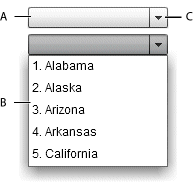
- A.
- Prompt in a closed DropDownList
- B.
- Drop-down list in an open DropDownList
- C.
- Anchor in a closed DropDownList
Unlike the ComboBox control, the DropDownList control is not editable.
When the drop-down list is closed, clicking the anchor button opens it.
-
Clicking the anchor button closes the drop-down list and commits the currently selected data item.
-
Clicking outside the drop-down list closes the drop-down list and commits the currently selected data item.
-
Clicking on a data item selects that item and closes the drop-down list.
-
If the requireSelection property is false, clicking on a data item while pressing the Control key deselects the item and closes the drop-down list.
For a complete list of keyboard command for the DropDownList control, see Spark DropDownList control user interaction.
For complete reference information, see the ActionScript 3.0 Reference for Apache Flex.
Create a Spark DropDownList control
You define a DropDownList control in MXML by using the <s:DropDownList> tag. Specify an id value if you intend to refer to a component elsewhere in your MXML application, either in another tag or in an ActionScript block.
<?xml version="1.0" encoding="utf-8"?>
<!-- dpcontrols\sparkdpcontrols\SparkDDSimple.mxml -->
<s:Application xmlns:fx="http://ns.adobe.com/mxml/2009"
    xmlns:s="library://ns.adobe.com/flex/spark"
    xmlns:mx="library://ns.adobe.com/flex/mx">

    <s:DropDownList width="140">
        <mx:ArrayCollection>
            <fx:String>Alabama</fx:String>
            <fx:String>Alaska</fx:String>
            <fx:String>Arizona</fx:String>
            <fx:String>Arkansas</fx:String>
            <fx:String>California</fx:String>
        </mx:ArrayCollection>
    </s:DropDownList>
</s:Application>
Set the prompt in the Spark DropDownList control
By default, the prompt area is empty when the control first loads. Selecting a data item in the drop-down list sets the prompt to the data item.
Use the prompt property to define the text to display when the DropDownList loads, as the following example shows:
<?xml version="1.0" encoding="utf-8"?>
<!-- dpcontrols\sparkdpcontrols\SparkDDSimplePrompt.mxml -->
<s:Application xmlns:fx="http://ns.adobe.com/mxml/2009"
    xmlns:s="library://ns.adobe.com/flex/spark"
    xmlns:mx="library://ns.adobe.com/flex/mx">
    <s:layout>
        <s:VerticalLayout paddingLeft="10"
            paddingTop="10"/>
    </s:layout>

    <s:DropDownList width="140"
        prompt="Select a state">
        <mx:ArrayCollection>
            <fx:String>Alabama</fx:String>
            <fx:String>Alaska</fx:String>
            <fx:String>Arizona</fx:String>
            <fx:String>Arkansas</fx:String>
            <fx:String>California</fx:String>
        </mx:ArrayCollection>
    </s:DropDownList>
</s:Application>
If you set the requireSelection property to true, the control ignores the prompt property. Instead, it sets the prompt area and the selectedIndex property to the first data item in the control.
<?xml version="1.0" encoding="utf-8"?>
<!-- dpcontrols\sparkdpcontrols\SparkDDSimpleSetSelectedIndex.mxml -->
<s:Application xmlns:fx="http://ns.adobe.com/mxml/2009"
    xmlns:s="library://ns.adobe.com/flex/spark"
    xmlns:mx="library://ns.adobe.com/flex/mx">
    <s:layout>
        <s:VerticalLayout paddingLeft="10"
            paddingTop="10"/>
    </s:layout>

    <s:DropDownList width="140"
        selectedIndex="4">
        <mx:ArrayCollection>
            <fx:String>Alabama</fx:String>
            <fx:String>Alaska</fx:String>
            <fx:String>Arizona</fx:String>
            <fx:String>Arkansas</fx:String>
            <fx:String>California</fx:String>
        </mx:ArrayCollection>
    </s:DropDownList>
</s:Application>
Handle Spark DropDownList events
The DropDownList control inherits the events of the ListBase class, and adds the following events:
-
close Dispatched when the drop-down list closes for any reason.
-
open Dispatched when the drop-down list opens for any reason.
Spark DropDownList control user interaction
A page in the DropDownList control is defined as the number of data items that fit in the drop-down list. Paging down through the data displayed by a six-line control shows records 0-5, 6-11, 12-17, and so on.
Keyboard navigation when DropDownList is closed
The DropDownList control has the following keyboard navigation features when the drop-down list is closed:
|
Key |
Action |
|---|---|
|
Alphanumeric keys |
Displays the closest match in the item list. The DropDownList does not open. |
|
Up Arrow |
Moves selection up one item. |
|
Down Arrow |
Moves selection down one item. |
|
Control + Down Arrow |
Opens the drop-down list. |
|
Page Up |
Moves the selection up one page. If the selectedIndex is currently -1, do nothing. |
|
Page Down |
Moves the selection down one page. If you are at the end of the list, do nothing. |
|
Home |
Moves selection to the top of the drop-down list. |
|
End |
Moves selection to the bottom of the drop-down list. |
Keyboard navigation when DropDownList is open
The DropDownList control has the following keyboard navigation features when the drop-down list is open:
|
Key |
Action |
|---|---|
|
Alphanumeric keys |
Scrolls to and highlights the closest match in the item list. |
|
Up Arrow |
Moves selection up one item but does not commit the selection until the drop-down list closes. |
|
Down Arrow |
Moves selection down one item but does not commit the selection until the drop-down list closes. |
|
Control + Up Arrow |
Closes the drop-down list and commits the selection. |
|
Escape |
Closes the drop-down list but do not commit the selection. |
|
Page Up |
Moves the selection to the top of the data items currently displayed but does not commit the selection until the drop-down list closes. |
|
Page Down |
Moves the selection to the bottom of the data items currently displayed but does not commit the selection until the drop-down list closes. |
|
Home |
If selectedIndex = -1, do not change the currently selected data item. Otherwise, moves selection to the first data item in the drop-down list. Does not commit the selection until the drop-down list closes. |
|
End |
Moves selection to the last data item in the drop-down list. Does not commit the selection until the drop-down list closes. |
Spark ComboBox control
The ComboBox control is a child class of the DropDownListBase control. Like the DropDownList control, when the user selects an item from the drop-down list in the ComboBox control, the data item appears in the prompt area of the control.
Differences between ComboBox and DropDownList
One difference between the controls is that the prompt area of the ComboBox control is implemented by using the TextInput control, instead of the Label control for the DropDownList control. Therefore, a user can edit the prompt area of the ComboBox control to enter a value that is not one of the predefined options; the values in the DropDownList cannot be edited.
For example, the DropDownList control only lets the user select from a list of predefined items in the control. The ComboBox control lets the user either select a predefined item, or enter a new item into the prompt area. When the user enters a new item, the selectedIndex property is set to -3. Your application can recognize that a new item has been entered and, optionally, add it to the list of items in the control.
Searching
The ComboBox control also searches the item list as the user enters characters into the prompt area. As the user enters characters, the drop-down area of the control opens. It then and scrolls to and highlights the closest match in the item list.
Create a Spark ComboBox control
You define a ComboBox control in MXML by using the <s:ComboBox> tag. Specify an id value if you intend to refer to a component elsewhere in your MXML application, either in another tag or in an ActionScript block.
<?xml version="1.0" encoding="utf-8"?>
<!-- dpcontrols\sparkdpcontrols\SparkCBSimple.mxml -->
<s:Application xmlns:fx="http://ns.adobe.com/mxml/2009"
    xmlns:s="library://ns.adobe.com/flex/spark"
    xmlns:mx="library://ns.adobe.com/flex/mx">
    <s:layout>
        <s:VerticalLayout paddingTop="5" paddingLeft="5"/>
    </s:layout>
    <s:Label text="The selected index is: {myCB.selectedIndex}"/>
    <s:Label text="The selected item is: {myCB.selectedItem}"/>

    <s:ComboBox id="myCB" width="140" prompt="Select a Color">
        <s:dataProvider>
            <mx:ArrayList>
                <fx:String>Red</fx:String>
                <fx:String>Orange</fx:String>
                <fx:String>Yellow</fx:String>
                <fx:String>Blue</fx:String>
                <fx:String>Green</fx:String>
            </mx:ArrayList>
        </s:dataProvider>
    </s:ComboBox>
</s:Application>
-
When you select an item in the drop-don list, the item appears in the prompt area of the control. The ComboBox.selectedIndex property contains the index of the selected item in the data provider of the control. The ComboBox.selectedItem property contains the selected data item.
-
As you enter characters in the prompt area, it scrolls to and highlights the closest match in the item list.
You can control the matching algorithm by creating a custom callback function. You then specify that function as the value of the ComboBox.itemMatchingFunction property. The callback function returns a Vector.<int> that contains the index of each item in the data provider that matches the input. To disable matching, create a callback function that returns an empty Vector.<int>.
-
If you enter a value in the prompt area that does not match an item in the list, and commit the item, the index of the selected item is -3. This value is determined by the ComboBox.CUSTOM_SELECTED_ITEM constant.
Commit a new item by pressing the Enter or Tab key while the cursor is in the prompt area.
Handle events for the Spark ComboBox control
You commonly use the following events with the ComboBox control:
-
The ComboBox control dispatches the changing event after each character is entered in the prompt area.
-
The ComboBox control dispatches the change event when the user selects an existing item in the drop-down list, or enters a new item in the prompt area.
myCB.textInput.addEventListener('change', myChangeHandler);
Process new data items entered into the Spark ComboBox control
When using the ComboBox control, you must decide on how your application handles new values entered into the prompt are of the control. For example, your application can recognize the new value and perform some action, it can provide user feedback with a list of allowed values, and it can add the item to the current list of data items.
The following actions occur when the user enters a value into the prompt area of the control, and the value is not found in the current list of data items:
-
The ComboBox control dispatches the change event when the user commits the change, typically by pressing the Enter or Tab key.
-
The ComboBox.selectedIndex property is set to ComboBox.CUSTOM_SELECTED_ITEM. The default value of this constant is -3.
-
The ComboBox control calls the function defined by the ComboBox.labelToItemFunction property to convert the new value to the same data type as the data items in the data provider.
If your data items are simple data types, such as String or int, then you can use the default function defined by the labelToItemFunction property. If your data items are Objects, then you typically have to write your own function.
-
The converted value returned by the function specified by the ComboBox.labelToItemFunction property is written to the ComboBox.selectedItem property.
<?xml version="1.0" encoding="utf-8"?>
<!-- dpcontrols\sparkdpcontrols\SparkCBAddItem.mxml -->
<s:Application xmlns:fx="http://ns.adobe.com/mxml/2009"
    xmlns:s="library://ns.adobe.com/flex/spark"
    xmlns:mx="library://ns.adobe.com/flex/mx">
    <s:layout>
        <s:VerticalLayout paddingTop="5" paddingLeft="5"/>
    </s:layout>
    <fx:Script>
        <![CDATA[
            import spark.events.IndexChangeEvent;

            // Event handler to determine if the selected item is new.
            protected function myCB_changeHandler(event:IndexChangeEvent):void
            {
                // Determine if the index specifies a new data item.
                if(myCB.selectedIndex == spark.components.ComboBox.CUSTOM_SELECTED_ITEM)
                    // Add the new item to the data provider.
                    myCB.dataProvider.addItem(myCB.selectedItem);
            }
        ]]>
    </fx:Script>

    <s:Label text="The selected index is: {myCB.selectedIndex}"/>
    <s:Label text="The selected item is: {myCB.selectedItem}"/>

    <s:ComboBox id="myCB" width="140" change="myCB_changeHandler(event);">
        <s:dataProvider>
            <mx:ArrayList>
                <fx:String>Red</fx:String>
                <fx:String>Orange</fx:String>
                <fx:String>Yellow</fx:String>
                <fx:String>Blue</fx:String>
                <fx:String>Green</fx:String>
            </mx:ArrayList>
        </s:dataProvider>
    </s:ComboBox>
</s:Application>
In this example, the ComboBox control initially defines five colors. The user can either select one of the predefined colors, or enter a new one in the prompt area. When the user commits the new item, by pressing the Enter or Tab key, the application uses the change even to add the new item to the data provider.
The ComboBox in the previous example used simple String data for its data items. That means the application can use the default function defined by the ComboBox.labelToItemFunction property to convert new values to the same data type as the data items in the data provider.
<?xml version="1.0" encoding="utf-8"?>
<!-- dpcontrols\sparkdpcontrols\SparkCBAddItemObj.mxml -->
<s:Application xmlns:fx="http://ns.adobe.com/mxml/2009"
    xmlns:s="library://ns.adobe.com/flex/spark"
    xmlns:mx="library://ns.adobe.com/flex/mx">
    <s:layout>
        <s:VerticalLayout paddingTop="5" paddingLeft="5"/>
    </s:layout>
    <fx:Script>
        <![CDATA[
            import spark.events.IndexChangeEvent;

            // Define a custom function for the labelFunction property
            // to display an Object in the ComboBox control.
            public function myLabelFunc(item:Object):String {
                return item.firstName + " " + item.lastName;
            }

            // Define a custom function for the labelToItemFunction property
            // to convert the new value to an Object of the correct format
            // for storage in the data provider of the control.
            public function myLabelToItemFunc(value:String):Object {
                var tempObj:Object = new Object();
                var spaceChar:int = value.indexOf(' ');
                tempObj.firstName = value.substr(0, spaceChar);
                tempObj.lastName = value.substr(spaceChar+1, value.length);
                return tempObj;
            }

            // Event handler to determine if the selected item is new.
            protected function myCB_changeHandler(event:IndexChangeEvent):void
            {
                // Determine if the index specifies a new data item.
                if(myCB.selectedIndex == spark.components.ComboBox.CUSTOM_SELECTED_ITEM)
                    // Add the new item to the data provider.
                    myCB.dataProvider.addItem(myCB.selectedItem);
            }
        ]]>
    </fx:Script>

    <s:Label text="The selected index is: {myCB.selectedIndex}"/>
    <s:Label text="The selected item is: {myCB.selectedItem.firstName + ' '
             + myCB.selectedItem.lastName}"/>

    <s:ComboBox id="myCB" width="140"
        labelFunction="myLabelFunc"
        labelToItemFunction="myLabelToItemFunc"
        change="myCB_changeHandler(event);">
        <s:dataProvider>
            <mx:ArrayList>
                <fx:Object firstName="Steve" lastName="Smith"/>
                <fx:Object firstName="John" lastName="Jones"/>
                <fx:Object firstName="Mary" lastName="Moore"/>
            </mx:ArrayList>
        </s:dataProvider>
    </s:ComboBox>
</s:Application>
In this example, the data items are represented by Objects. Each Object contains two fields: firstName and lastName.
This example adds two new functions. The first, myLabelFunction(), converts the Objects in the data provider of the control to a String for display by the ComboBox control. Use the labelFunction property to assign this function to the ComboBox control. For more information, see Controlling the text displayed for each data item.
The second function, myLabelToItemFunc(), converts a new data item into the format required by the data provider of the control. Use the labelToItemFunction property to assign this function to the ComboBox control. The ComboBox control writes the value returned by the function to the selectedItem property.
function funcName(value:String):Object {}
The value passed to the function is the String entered into the prompt area of the control. The function returns an Object written to the selectedItem property.
Spark ComboBox control user interaction
A page in the ComboBox control is defined as the number of data items that fit in the drop-down list. Paging down through the data displayed by a six-line control shows records 0-5, 6-11, 12-17, and so on.
Keyboard navigation when ComboBox is closed
The ComboBox control has the following keyboard navigation features when the drop-down list is closed:
|
Key |
Action |
|---|---|
|
Alphanumeric keys |
Opens the drop-down list. The drop-down list it scrolls to and highlights the closest match in the item list. |
|
Enter |
Commit the highlighted data item, if one is highlighted. If no data item is highlighted, commit the value of the prompt area. |
|
Up Arrow |
Moves selection up one item. |
|
Down Arrow |
Moves selection down one item. |
|
Control + Down Arrow |
Opens the drop-down list. |
|
Page Up |
Moves the selection up one page. If the selectedIndex is currently -1, do nothing. |
|
Page Down |
Moves the selection down one page. If you are at the end of the list, do nothing. |
|
Home |
Moves selection to the top of the drop-down list. |
|
End |
Moves selection to the bottom of the drop-down list. |
Keyboard navigation when ComboBox is open
The ComboBox control has the following keyboard navigation features when the drop-down list is open:
|
Key |
Action |
|---|---|
|
Alphanumeric keys |
Scrolls to and highlights the closest match in the item list. |
|
Enter |
Close the drop-down list. Commit the highlighted data item, if one is highlighted. If no data item is highlighted, commit the value of the prompt area. |
|
Up Arrow |
Moves selection up one item but does not commit the selection until the drop-down list closes. |
|
Down Arrow |
Moves selection down one item but does not commit the selection until the drop-down list closes. |
|
Control + Up Arrow |
Closes the drop-down list and commits the selection. |
|
Escape |
Closes the drop-down list but do not commit the selection. |
|
Page Up |
Moves the selection to the top of the data items currently displayed but does not commit the selection until the drop-down list closes. |
|
Page Down |
Moves the selection to the bottom of the data items currently displayed but does not commit the selection until the drop-down list closes. |
|
Home |
If selectedIndex = -1, do not change the currently selected data item. Otherwise, moves selection to the first data item in the drop-down list. Does not commit the selection until the drop-down list closes. |
|
End |
Moves selection to the last data item in the drop-down list. Does not commit the selection until the drop-down list closes. |
Mouse navigation when ComboBox is closed
The ComboBox control has the following mouse navigation features when the drop-down list is closed:
|
Mouse action |
Action |
|---|---|
|
Click in the prompt area |
Puts focus in the prompt area. If it was not previously in focus, then all of text in the prompt area is selected. |
|
Click in open button |
Opens the drop-down list, removes the focus ring from the ComboBox control, removes focus from the prompt area, and highlights the closest match to the input string. |
Mouse navigation when ComboBox is open
The ComboBox control has the following mouse navigation features when the drop-down list is open:
|
Mouse action |
Action |
|---|---|
|
Click in the prompt area |
Puts focus in the prompt area. If it was not previously in focus, then all of text in the prompt area is selected. |
|
Click in open button |
Closes the drop-down list and commit the selection. Removes focus from the ComboBox and control and from the prompt area. |
Use prompt text with the Spark ComboBox control
The Spark ComboBox control supports adding prompt text. Prompt text appears in the prompt area of the control when no item is selected. Prompt text disappears when you focus on the control. When you remove focus without selecting an item, the prompt text reappears.
You set prompt text on a ComboBox control by using the prompt property. This property can be bound to the value of another property or it can be static text.
<?xml version="1.0"?>
<!-- dpcontrols/sparkdpcontrols/SparkCBPrompt.mxml -->
<s:Application
    xmlns:fx="http://ns.adobe.com/mxml/2009"
    xmlns:mx="library://ns.adobe.com/flex/mx"
    xmlns:s="library://ns.adobe.com/flex/spark">

    <s:layout>
        <s:VerticalLayout/>
    </s:layout>

  <fx:Script>
    <![CDATA[
        [Bindable]
        private var promptText:String = "Choose Game";

        /* When you set selectedIndex to -1 and remove focus, the prompt text reappears. */
        private function resetCB():void {
            myComboBox.selectedIndex = -1;
        }
      ]]>
  </fx:Script>

    <s:VGroup>
        <s:ComboBox id="myComboBox" prompt="{promptText}">
            <s:dataProvider>
                <s:ArrayList>
                    <fx:String>Durche die Wuste</fx:String>
                    <fx:String>Samurai</fx:String>
                    <fx:String>Traumfabrik</fx:String>
                </s:ArrayList>
            </s:dataProvider>
        </s:ComboBox>
        <s:Button label="Reset" click="resetCB()"/>
    </s:VGroup>

</s:Application>
<?xml version="1.0"?>
<!-- dpcontrols/sparkdpcontrols/SparkCBPromptStyles.mxml -->
<s:Application
    xmlns:fx="http://ns.adobe.com/mxml/2009"
    xmlns:mx="library://ns.adobe.com/flex/mx"
    xmlns:s="library://ns.adobe.com/flex/spark">

    <s:layout>
        <s:VerticalLayout/>
    </s:layout>

    <fx:Style>
        @namespace s "library://ns.adobe.com/flex/spark";

        s|TextInput:normalWithPrompt {
            color: #FF3366;
            fontStyle: italic;
        }

        s|TextInput:disabledWithPrompt {
            color: #CCFFFF;
            fontStyle: italic;
        }
    </fx:Style>

  <fx:Script>
    <![CDATA[
        [Bindable]
        private var promptText:String = "Choose Game";

        /* When you set selectedIndex to -1 and remove focus, the prompt text reappears. */
        private function resetCB():void {
            myComboBox.selectedIndex = -1;
        }
      ]]>
  </fx:Script>

    <s:VGroup>
        <s:ComboBox id="myComboBox" prompt="{promptText}">
            <s:dataProvider>
                <s:ArrayList>
                    <fx:String>Durche die Wuste</fx:String>
                    <fx:String>Samurai</fx:String>
                    <fx:String>Traumfabrik</fx:String>
                </s:ArrayList>
            </s:dataProvider>
        </s:ComboBox>
        <s:Button label="Reset" click="resetCB()"/>
    </s:VGroup>

</s:Application>
Navigation
Adobe and Adobe Flash Platform are either registered trademarks or trademarks of Adobe Systems Incorporated in the United States and/or other countries and are used by permission from Adobe. No other license to the Adobe trademarks are granted.