
Styles and themes
Styles are useful for defining the look and feel of your applications built with Flex. You can use them to change the appearance of a single component, or apply them across all components.
Flex 4 deemphasizes the use of style properties for some tasks. Instead of styling individual components, or classes of components, you can use custom skins to perform most operations that change the look and feel of your applications. This includes adding background colors and images, borders, and other properties that were styleable in Flex 3 applications. For more information on skinning, see Spark Skinning.
About styles
You modify the appearance of components through style properties. In Flex, some styles are inherited by children from their parent containers, and across style types and classes. This means that you can define a style once, and then apply that style to all controls of a single type or to a set of controls. In addition, you can override individual properties for each control at a local, component, or global level, giving you great flexibility in controlling the appearance of your applications.
The style properties that you can set on a component depend on the component's architecture. For example, the components in the MX component set (mx.controls.* and mx.containers.* packages) take one set of styles. Components in the Spark component set (spark.components.* package) allow an entirely different set of styles.
This section introduces you to applying styles to controls. It also provides a primer for using Cascading Style Sheets (CSS), an overview of the style value formats (Length, Color, and Time), and describes style inheritance. Subsequent sections provide detailed information about different ways of applying styles in Flex.
Flex does not support controlling all aspects of component layout with CSS. Properties such as x, y, width, and height are properties, not styles, of the UIComponent class, and therefore cannot be set in CSS.
Using styles in Flex
There are many ways to apply styles in Flex. Some provide more granular control and can be approached programmatically. Others are not as flexible, but can require less computation and therefor be better for your application's performance.
For MX components, to determine if an object's properties can be styled by using CSS, check to see if the class or its parent implements the IStyleClient interface. If it does, you can set the values of the object's style properties with CSS. If it does not, the class does not participate in the styles subsystem and you therefore cannot set its properties with CSS. In that case, the properties are public properties of the class and not style properties.
For Spark components, many properties that were formerly available as styles are now properties that you set on the Spark component's skin. As a result, to do something like create a border around a container, you edit the container's skin class rather than add a style property. For more information about skinning Spark components, see Spark Skinning.
When applying styles, you must be aware of which properties your theme supports. The default theme in Flex does not support all style properties. To determine if a style property is supported by the theme you are using, view the style's entry in ActionScript 3.0 Reference for Apache Flex. If the style property is limited to a theme, the Theme property will appear in the style's description, with the name of the supported themes next to it. For more information, see About supported styles.
External style sheets
Use CSS to apply styles to a document or across entire applications. You can point to a style sheet without invoking ActionScript. This is the most concise method of applying styles, but can also be the least flexible. Style sheets can define global styles that are inherited by all controls, or individual classes of styles that only certain controls use.
The following example applies the external style sheet myStyle.css to the current document:
<fx:Style source="myStyle.css"/>
For more information, see Using external style sheets.
Flex includes global style sheets inside the spark.swc and framework.swc files. These files contain style definitions for the global class selector, and type selectors for most components. For more information about the defaults.css files, see About the default style sheets.
Flex also includes several other style sheets that each provide a unique look and feel. For more information, see About the included theme files.
Local style definitions
<?xml version="1.0"?>
<!-- styles/ClassSelectorAgain.mxml -->
<s:Application
    xmlns:fx="http://ns.adobe.com/mxml/2009"
    xmlns:mx="library://ns.adobe.com/flex/mx"
    xmlns:s="library://ns.adobe.com/flex/spark">

    <fx:Style>
        .myFontStyle {
            fontSize: 15;
            color: #9933FF;
        }
    </fx:Style>

    <s:VGroup>
        <!-- This button has the custom style applied to it. -->
        <s:Button id="myButton" styleName="myFontStyle" label="Click Me"/>

        <!-- This button uses default styles. -->
        <s:Button id="myButton2" label="Click Me"/>
    </s:VGroup>

</s:Application>
The following example defines a new style that applies to all instances of the Button class in the Spark namespace:
<?xml version="1.0"?>
<!-- styles/TypeSelector.mxml -->
<s:Application
    xmlns:fx="http://ns.adobe.com/mxml/2009"
    xmlns:mx="library://ns.adobe.com/flex/mx"
    xmlns:s="library://ns.adobe.com/flex/spark">

    <fx:Style>
        @namespace s "library://ns.adobe.com/flex/spark";

        s|Button {
            fontSize: 15;
            color: #9933FF;
        }
    </fx:Style>

    <s:VGroup>
        <s:Button id="myButton" label="Click Me"/>
        <s:Button id="myButton2" label="Click Me"/>
    </s:VGroup>

</s:Application>
For more information, see Using local style definitions.
StyleManager class
Use the StyleManager class to apply styles to all classes or all instances of specified classes. You can access the top-level StyleManager by using the styleManager property of the Application object.
The following example sets the fontSize style to 15 and the color to 0x9933FF on all Button controls in the Spark namespace:
<?xml version="1.0"?>
<!-- styles/StyleManagerExample.mxml -->
<s:Application
    xmlns:fx="http://ns.adobe.com/mxml/2009"
    xmlns:mx="library://ns.adobe.com/flex/mx"
    xmlns:s="library://ns.adobe.com/flex/spark"
    creationComplete="initApp()">

    <fx:Script><![CDATA[
        public function initApp():void {
            styleManager.getStyleDeclaration("spark.components.Button").setStyle("fontSize",15);
            styleManager.getStyleDeclaration("spark.components.Button").setStyle("color",0x9933FF);
        }
    ]]></fx:Script>

    <s:VGroup>
        <s:Button id="myButton" label="Click Me"/>
        <s:Button id="myButton2" label="Click Me"/>
    </s:VGroup>

</s:Application>
You can also use the CSSStyleDeclaration object to build run-time style sheets, and then apply them with the StyleManager's setStyleDeclaration() method.
For more information, see Using the StyleManager class.
getStyle() and setStyle() methods
Use the setStyle() and getStyle() methods to manipulate style properties on instances of controls. Using these methods to apply styles requires a greater amount of processing power on the client than using style sheets but provides more granular control over how styles are applied.
The following example sets the fontSize to 15 and the color to 0x9933FF on only the myButton instance:
<?xml version="1.0"?>
<!-- styles/SetStyleExample.mxml -->
<s:Application
    xmlns:fx="http://ns.adobe.com/mxml/2009"
    xmlns:mx="library://ns.adobe.com/flex/mx"
    xmlns:s="library://ns.adobe.com/flex/spark"
    creationComplete="initApp()">

    <fx:Script><![CDATA[
        public function initApp():void {
            myButton.setStyle("fontSize",15);
            myButton.setStyle("color",0x9933FF);
        }
    ]]></fx:Script>

    <s:VGroup>
        <s:Button id="myButton" label="Click Me"/>
        <s:Button id="myButton2" label="Click Me"/>
    </s:VGroup>
</s:Application>
For more information, see Using the setStyle() and getStyle() methods.
Inline styles
Use attributes of MXML tags to apply style properties. These properties apply only to the instance of the control. This is the most efficient method of applying instance properties because no ActionScript code blocks or method calls are required.
The following example sets the fontSize to 15 and the color to 0x9933FF on the myButton instance:
<?xml version="1.0"?>
<!-- styles/InlineExample.mxml -->
<s:Application
    xmlns:fx="http://ns.adobe.com/mxml/2009"
    xmlns:mx="library://ns.adobe.com/flex/mx"
    xmlns:s="library://ns.adobe.com/flex/spark">

    <s:VGroup>
        <!-- This button uses custom inline styles. -->
        <s:Button id="myButton" color="0x9933FF" fontSize="15" label="Click Me"/>

        <!-- This button uses default styles. -->
        <s:Button id="myOtherButton" label="Click Me"/>
    </s:VGroup>
</s:Application>
In an MXML tag, you must use the camel-case version of the style property. For example, you must use "fontSize" rather than "font-size" (the CSS convention) in the previous example. For more information on style property names, see About selector names.
As with other style properties, you can bind inline style properties to variables.
For more information, see Using inline styles.
Setting global styles
To set a global style that is inheritable, you set its value on the container. All children of that container, including other containers, inherit the value of that style property. For example, if you set the color of a Panel container to green, the labels for all buttons in the Panel container are also green, unless those buttons override that color.
To use CSS to apply a noninheritable style globally, you can use the global selector. For more information, see Using the global selector.
When using Spark components, the easiest way to set global styles is to set the value of the style property on the Application class, as long as that style is inheritable. To do this, you use the FlexGlobals.topLevelApplication.application property to reference the class, and then call the setStyle() method on it. For more information, see Using themes.
If you apply a noninheritable style to a parent container, only the container uses that style. Children of that container do not use the values of noninheritable styles.
By using global styles, you can apply noninheritable styles to all controls that do not explicitly override that style. Flex provides the following ways to apply styles globally:
-
StyleManager global style
-
CSS global selector
The StyleManager lets you apply styles to all controls using the global style. You can access the top-level StyleManager by using the styleManager property of the Application object. For more information, see Using the StyleManager class.
You can also apply global styles using the global selector in your CSS style definitions. These are located either in external CSS style sheets or in an <fx:Style> tag. For more information, see Using the global selector.
About style value formats
Style properties can be of types String or Number. They can also be Arrays of these types. In addition to a type, style properties also have a format (Length, Time, or Color) that describes the valid values of the property. Some properties appear to be of type Boolean (taking a value of true or false), but these are Strings that are interpreted as Boolean values. This section describes these formats.
Length format
The Length format applies to any style property that takes a size value, such as the size of a font (or fontSize). Length is of type Number.
The Length type has the following syntax:
length[length_unit]
The following example defines the fontSize property with a value of 20 pixels:
<?xml version="1.0"?>
<!-- styles/LengthFormat.mxml -->
<s:Application
    xmlns:fx="http://ns.adobe.com/mxml/2009"
    xmlns:mx="library://ns.adobe.com/flex/mx"
    xmlns:s="library://ns.adobe.com/flex/spark">
  <fx:Style>
     .myFontStyle {
        fontSize: 20px;
        color: #9933FF;
     }
  </fx:Style>
  <s:Button id="myButton" styleName="myFontStyle" label="Click Here"/>
</s:Application>
If you do not specify a unit, the unit is assumed to be pixels. The following example defines two styles with the same font size:
<?xml version="1.0"?>
<!-- styles/LengthFormat2.mxml -->
<s:Application
    xmlns:fx="http://ns.adobe.com/mxml/2009"
    xmlns:mx="library://ns.adobe.com/flex/mx"
    xmlns:s="library://ns.adobe.com/flex/spark">
  <fx:Style>
     .myFontStyle {
        fontSize: 20px;
        color: #9933FF;
     }
     .myOtherFontStyle {
        fontSize: 20;
        color: #9933FF;
     }
  </fx:Style>
  <s:Button id="myButton" styleName="myFontStyle" label="Click Here"/>
  <s:Button id="myButton2" styleName="myOtherFontStyle" label="Click Here"/>
</s:Application>
The following table describes the supported length units:
|
Unit |
Scale |
Description |
|---|---|---|
|
px |
Relative |
Pixels. |
|
in |
Absolute |
Inches. |
|
cm |
Absolute |
Centimeters. |
|
mm |
Absolute |
Millimeters. |
|
pt |
Absolute |
Points. |
|
pc |
Absolute |
Picas. |
Flex does not support the em and ex units. You can convert these to px units by using the following scales:
1em = 10.06667px
1ex = 6px
In Flex, all lengths are converted to pixels prior to being displayed. In this conversion, Flex assumes that an inch equals 72 pixels. All other lengths are based on that assumption. For example, 1 cm is equal to 1/2.54 of an inch. To get the number of pixels in 1 cm, multiply 1 by 72, and divide by 2.54.
When you use inline styles, Flex ignores units and uses pixels as the default.
The fontSize style property allows a set of keywords in addition to numbered units. You can use the following keywords when setting the fontSize style property. The exact sizes are defined by the client browser:
-
xx-small
-
x-small
-
small
-
medium
-
large
-
x-large
-
xx-large
The following example class selector defines the fontSize as x-small:
<?xml version="1.0"?>
<!-- styles/SmallFont.mxml -->
<s:Application
    xmlns:fx="http://ns.adobe.com/mxml/2009"
    xmlns:mx="library://ns.adobe.com/flex/mx"
    xmlns:s="library://ns.adobe.com/flex/spark">

  <fx:Style>
     .smallFont {
        fontFamily: Arial, Helvetica, "_sans";
        fontSize: x-small;
     }
  </fx:Style>

  <s:Button id="myButton" styleName="smallFont" label="Click Here"/>

</s:Application>
Time format
You use the Time format for component properties that move or have built-in effects, such as the ComboBox component when it drops down and pops up. The Time format is of type Number and is represented in milliseconds. Do not specify the units when entering a value in the Time format.
The following example sets the openDuration style property of the myTree control to 1000 milliseconds. The default value is 0, so this example opens the tree nodes considerably more slowly than normal.
<?xml version="1.0"?>
<!-- styles/TimeFormat.mxml -->
<s:Application
    xmlns:fx="http://ns.adobe.com/mxml/2009"
    xmlns:mx="library://ns.adobe.com/flex/mx"
    xmlns:s="library://ns.adobe.com/flex/spark"
    creationComplete="initApp()">
    <fx:Script><![CDATA[
        public function initApp():void {
            myTree.setStyle("openDuration", 1000);
            myTree.setStyle("paddingLeft", 50);
        }
    ]]></fx:Script>

    <fx:Declarations>
        <fx:XMLList id="treeData">
            <node label="Mail Box">
                <node label="Inbox">
                    <node label="Marketing"/>
                    <node label="Product Management"/>
                    <node label="Personal"/>
                </node>
                <node label="Outbox">
                    <node label="Professional"/>
                    <node label="Personal"/>
                </node>
                <node label="Spam"/>
                <node label="Sent"/>
            </node>
        </fx:XMLList>
    </fx:Declarations>

    <mx:Panel title="Tree Control Example" width="100%">
        <mx:Tree id="myTree" width="100%" labelField="@label" dataProvider="{treeData}"/>
    </mx:Panel>
</s:Application>
Color format
You define Color in several formats. You can use most of the formats only in the CSS style definitions. The following table describes the recognized Color formats for a style property:
|
Format |
Description |
|---|---|
|
hexadecimal |
Hexadecimal colors are represented by a six-digit code preceded by either a zero and small x (0x) or a pound sign (#). The range of valid values is 0x000000 to 0xFFFFFF (or #000000 to #FFFFFF). You use the 0x prefix when defining colors in calls to the setStyle() method and in MXML tags. You use the # prefix in CSS style sheets and in <fx:Style> tag blocks. |
|
RGB |
RGB colors are a mixture of the colors red, green, and blue, and are represented in percentages of the color's saturation. The format for setting RGB colors is color:rgb(x%, y%, z%), where the first value is the percentage of red saturation, the second value is the percentage of green saturation, and the third value is the percentage of blue saturation. You can use the RGB format only in style sheet definitions. |
|
8-bit octet RGB |
The 8-bit octet RGB colors are red, green, and blue values from 1 to 255. The format of 8-bit octet colors is [0-255],[0-255],[0-255]. You can use the 8-bit octet RGB format only in style sheet definitions. |
|
VGA color names |
VGA color names are a set of 16 basic colors supported by all browsers that support CSS. The available color names are Aqua, Black, Blue, Fuchsia, Gray, Green, Lime, Maroon, Navy, Olive, Purple, Red, Silver, Teal, White, Yellow. You can use the VGA color names format in style sheet definitions and inline style declarations. VGA color names are not case-sensitive. |
Color formats are of type Number. When you specify a format such as a VGA color name, Flex converts that String to a Number.
CSS style definitions and the <fx:Style> tag support the following color value formats:
<?xml version="1.0"?>
<!-- styles/ColorFormatCSS.mxml -->
<s:Application
    xmlns:fx="http://ns.adobe.com/mxml/2009"
    xmlns:mx="library://ns.adobe.com/flex/mx"
    xmlns:s="library://ns.adobe.com/flex/spark">

  <fx:Style>
     .myStyle {
        themeColor: #6666CC;    /* CSS hexadecimal format */
        color: Blue;        /* VGA color name */
     }
  </fx:Style>

  <s:Button id="myButton" styleName="myStyle" label="Click Here"/>

</s:Application>
You can use the following color value formats when setting the styles inline or using the setStyle() method:
<?xml version="1.0"?>
<!-- styles/ColorFormatStyleManager.mxml -->
<s:Application
    xmlns:fx="http://ns.adobe.com/mxml/2009"
    xmlns:mx="library://ns.adobe.com/flex/mx"
    xmlns:s="library://ns.adobe.com/flex/spark"
    creationComplete="initApp()">

  <fx:Script><![CDATA[
     public function initApp():void {
        styleManager.getStyleDeclaration("spark.components.Button").setStyle("color","Blue");
     }

     public function changeStyles(e:Event):void {
        // Check against "255" here, because that is the numeric value of "Blue".
        if (e.currentTarget.getStyle("color") == 255) {
            e.currentTarget.setStyle("color", "Red");
        } else {
            e.currentTarget.setStyle("color", "Blue");
        }
     }
  ]]></fx:Script>

  <s:Button id="myButton" label="Click Here"
        click="changeStyles(event)"/>
</s:Application>
Using Arrays for style properties
Some controls accept arrays of colors. For example, the Tree control's depthColors style property can use a different background color for each level in the tree. To assign colors to a property in an Array, add the items in a comma-separated list to the property's definition. The index is assigned to each entry in the order that it appears in the list.
The following example defines Arrays of colors for properties of the Tree type selector:
<?xml version="1.0"?>
<!-- styles/ArraysOfColors.mxml -->
<s:Application
    xmlns:fx="http://ns.adobe.com/mxml/2009"
    xmlns:mx="library://ns.adobe.com/flex/mx"
    xmlns:s="library://ns.adobe.com/flex/spark">

  <fx:Style>
     @namespace mx "library://ns.adobe.com/flex/mx";

     mx|Tree {
        depthColors: #FFCC33, #FFCC99, #CC9900;
        alternatingItemColors: red, green;
     }
  </fx:Style>

    <fx:Declarations>

      <fx:XMLList id="treeData">
         <node label="Mail Box">
            <node label="Inbox">
               <node label="Marketing"/>
               <node label="Product Management"/>
               <node label="Personal"/>
            </node>
            <node label="Outbox">
               <node label="Professional"/>
               <node label="Personal"/>
            </node>
            <node label="Spam"/>
            <node label="Sent"/>
         </node>
      </fx:XMLList>
    </fx:Declarations>

  <s:Panel title="Tree Control Example" width="100%">
        <mx:Tree id="myTree" width="100%" labelField="@label" dataProvider="{treeData}"/>
  </s:Panel>
</s:Application>
In this example, only depthColors will be seen. The alternatingItemColors property is visible only if depthColors is not set. Both are presented here for illustrative purposes only.
You can define the Array in ActionScript by using a comma-separated list of values surrounded by braces, as the following example shows:
<?xml version="1.0"?>
<!-- styles/SetStyleArray.mxml -->
<s:Application
    xmlns:fx="http://ns.adobe.com/mxml/2009"
    xmlns:mx="library://ns.adobe.com/flex/mx"
    xmlns:s="library://ns.adobe.com/flex/spark"
    creationComplete="initApp()"
    height="500">

  <fx:Script>
    <![CDATA[
     public function initApp():void {
        myTree.setStyle("depthColors",[0xFFCC33, 0xFFCC99, 0xCC9900]);
        myTree.setStyle("alternatingItemColors",["red", "green"]);
     }
    ]]>
  </fx:Script>

  <fx:Declarations>
      <fx:XMLList id="treeData">
         <node label="Mail Box">
            <node label="Inbox">
               <node label="Marketing"/>
               <node label="Product Management"/>
               <node label="Personal"/>
            </node>
            <node label="Outbox">
               <node label="Professional"/>
               <node label="Personal"/>
            </node>
            <node label="Spam"/>
            <node label="Sent"/>
         </node>
      </fx:XMLList>
  </fx:Declarations>

  <s:Panel title="Tree Control Example" width="100%">
        <s:layout>
            <s:VerticalLayout/>
        </s:layout>
        <mx:Tree id="myTree"
           width="100%"
           labelField="@label"
           dataProvider="{treeData}"/>

        <mx:Tree id="myOtherTree"
           width="100%"
           labelField="@label"
           dataProvider="{treeData}"
           depthColors="[0xFFCC33, 0xFFCC99, 0xCC9900]"
           alternatingItemColors="['red', 'green']"/>
  </s:Panel>
</s:Application>
This example also shows that you can set the properties that use Arrays inline.
Finally, you can set the values of the Array in MXML syntax and apply those values inline, as the following example shows:
<?xml version="1.0"?>
<!-- styles/ArrayOfColorsMXML.mxml -->
<s:Application
    xmlns:fx="http://ns.adobe.com/mxml/2009"
    xmlns:mx="library://ns.adobe.com/flex/mx"
    xmlns:s="library://ns.adobe.com/flex/spark">

    <fx:Declarations>
      <fx:Array id="myDepthColors">
         <fx:Object>0xFFCC33</fx:Object>
         <fx:Object>0xFFCC99</fx:Object>
         <fx:Object>0xCC9900</fx:Object>
      </fx:Array>

      <fx:Array id="myAlternatingRowColors">
         <fx:Object>red</fx:Object>
         <fx:Object>green</fx:Object>
      </fx:Array>

      <fx:XMLList id="treeData">
         <node label="Mail Box">
            <node label="Inbox">
               <node label="Marketing"/>
               <node label="Product Management"/>
               <node label="Personal"/>
            </node>
            <node label="Outbox">
               <node label="Professional"/>
               <node label="Personal"/>
            </node>
            <node label="Spam"/>
            <node label="Sent"/>
         </node>
      </fx:XMLList>
    </fx:Declarations>

  <s:Panel title="Tree Control Example" width="50%">
        <mx:Tree id="myTree"
           width="100%"
           labelField="@label"
           dataProvider="{treeData}"
           depthColors="{myDepthColors}"
           alternatingItemColors="{myAlternatingRowColors}"/>
  </s:Panel>
</s:Application>
Using Cascading Style Sheets
Cascading Style Sheets (CSS) are a standard mechanism for declaring text styles in HTML and most scripting languages. A style sheet is a collection of formatting rules for types of components or classes that include sets of components. Flex supports the use of CSS syntax and styles to apply styles to components.
In CSS syntax, each declaration associates a style name, or selector, with one or more style properties and their values. You define multiple style properties in each selector by separating each property with a semicolon. For example, the following style defines a selector named myFontStyle:
<?xml version="1.0"?>
<!-- styles/ClassSelector.mxml -->
<s:Application
    xmlns:fx="http://ns.adobe.com/mxml/2009"
    xmlns:mx="library://ns.adobe.com/flex/mx"
    xmlns:s="library://ns.adobe.com/flex/spark">

    <fx:Style>
        .myFontStyle {
            fontSize: 15;
            color: #9933FF;
        }
    </fx:Style>

    <s:VGroup>
        <!-- This button has the custom style applied to it. -->
        <s:Button id="myButton" styleName="myFontStyle" label="Click Me"/>

        <!-- This button uses default styles. -->
        <s:Button id="myButton2" label="Click Me"/>
    </s:VGroup>

</s:Application>
In this example, myFontStyle defines a new class of styles, so it is called a class selector. In the markup, you can explicitly apply the myFontStyle style to a control or class of controls.
A type selector implicitly applies itself to all components of a particular type, as well as all subclasses of that type. If you use type selectors, then you must be sure to define namespaces with the @namespace directive in the CSS so that Flex. This is because classes in different packages often share the same class name.
<?xml version="1.0"?>
<!-- styles/TypeSelectorAgain.mxml -->
<s:Application
    xmlns:fx="http://ns.adobe.com/mxml/2009"
    xmlns:mx="library://ns.adobe.com/flex/mx"
    xmlns:s="library://ns.adobe.com/flex/spark">

    <fx:Style>
        @namespace s "library://ns.adobe.com/flex/spark";

        s|Button {
            fontSize: 15;
            color: #9933FF;
        }
    </fx:Style>

    <s:VGroup>
        <s:Button id="myButton" label="Click Me"/>
        <s:Button id="myButton2" label="Click Me"/>
    </s:VGroup>

</s:Application>
Flex applies this style to all Button controls, and all subclasses of Button controls in the Spark namespace. If you define a type selector on a container, that style applies to all children of that container if the style is an inheriting style.
Flex also supports id, descendent, and pseudo selectors.
VBox Panel Button#button12 {
	color: #DDDDDD;
}
VBox.special Button {
	color: #CCCCCC;
}
Button.special {
	color: #BBBBBB;
}
When determining styles for a new component instance, Flex examines all the parent classes looking for type selectors. Flex applies settings in all type selectors, not just the exact match. For example, suppose that class MyButton extends Button. For an instance of MyButton, Flex first checks for a MyButton type selector. Flex applies styles in the MyButton type selector, and then checks for a Button type selector. Flex applies styles in the Button selector, and then checks for a UIComponent type selector. Flex stops at UIComponent. Flex does not continue up the parent chain past UIComponent because Flex does not support type selectors for Sprite (the parent of UIComponent) or any of Sprite's parent classes, up to the base Object class.
You can programmatically define new class and type selectors using the StyleManager class. You can access the top-level StyleManager by using the styleManager property of the Application object. For more information, see Using the StyleManager class.
About selector names
When applying style properties with CSS in a <fx:Style> block or in an external style sheet, the best practice is to use camel-case without hyphens for the style property, as in fontWeight and fontFamily (rather than font-weight and font-family). This matches the convention of using camel-case property names in MXML.
To make development easier, however, Flex supports both the camel-case and hyphenated syntax in style sheets, as the following example shows:
<?xml version="1.0"?>
<!-- styles/CamelCase.mxml -->
<s:Application
    xmlns:fx="http://ns.adobe.com/mxml/2009"
    xmlns:mx="library://ns.adobe.com/flex/mx"
    xmlns:s="library://ns.adobe.com/flex/spark">

     <s:layout>
        <s:VerticalLayout/>
     </s:layout>

    <fx:Style>
        .myFontStyle {
            fontSize: 15; /* Note the camelCase. */
        }

        .myOtherFontStyle {
            font-size: 15; /* Note the hyphen. */
        }
    </fx:Style>

    <s:Button id="myButton" styleName="myFontStyle" label="Click Me"/>
    <s:Button id="myButton2" styleName="myOtherFontStyle" label="Click Me"/>

</s:Application>
In ActionScript or an MXML tag, you cannot use hyphenated style property names, so you must use the camel-case version of the style property. For the style name in a style sheet, you cannot use a hyphenated name, as the following example shows:
 .myClass { ... } /* Valid style name */
 .my-class { ... } /* Not a valid style name */
About namespaces in CSS
Some Spark and MX components share the same local name. For example, there is a Spark Button component (in the spark.components.* package) and an MX Button component (in the mx.controls.* package). To distinguish between different components that share the same name, you specify namespaces in your CSS that apply to types.
@namespace s "library://ns.adobe.com/flex/spark";
-
library://ns.adobe.com/flex/spark
-
library://ns.adobe.com/flex/mx
If you do not use type selectors in your style sheets, then you are not required to use the @namespace rule.
<?xml version="1.0" encoding="utf-8"?>
<!-- styles/NamespaceIdentifierExample.mxml -->
<s:Application
    xmlns:fx="http://ns.adobe.com/mxml/2009"
    xmlns:mx="library://ns.adobe.com/flex/mx"
    xmlns:s="library://ns.adobe.com/flex/spark"
    xmlns:myComps="*"
    >
     <s:layout>
        <s:VerticalLayout/>
     </s:layout>

     <fx:Style>
          @namespace s "library://ns.adobe.com/flex/spark";
          @namespace mx "library://ns.adobe.com/flex/mx";

          s|Button {
               fontSize:16;
          }

          mx|VBox {
               color:red;
          }
     </fx:Style>

     <mx:VBox>
          <!-- This Spark button is red, and has a fontSize of 16. -->
          <s:Button label="Click Me, Too"/>
      </mx:VBox>

</s:Application>
<fx:Style>
	@namespace "library://ns.adobe.com/flex/spark";
	Button {
		color: #990000;
	}
</fx:Style>
<?xml version="1.0"?>
<!-- styles/CustomComponentsNamespace.mxml -->
<s:Application xmlns:fx="http://ns.adobe.com/mxml/2009"
    xmlns:s="library://ns.adobe.com/flex/spark"
    xmlns:mx="library://ns.adobe.com/flex/mx"
    xmlns:comps="myComponents.*">

    <fx:Style>
        @namespace comps "myComponents.*";

        comps|MyButton {
            color:green;
        }
    </fx:Style>
    <comps:MyButton label="Click Me"/>
</s:Application>
For custom components that are in the top level package, you can use an "*" for the namespace. However, you cannot use wildcard namespace prefixes, such as "*|" to match any namespace.
<?xml version="1.0"?>
<!-- charts/DataTipStyles.mxml -->
<s:Application
    xmlns:fx="http://ns.adobe.com/mxml/2009"
    xmlns:mx="library://ns.adobe.com/flex/mx"
    xmlns:s="library://ns.adobe.com/flex/spark"
    creationComplete="srv.send()"
    height="600">

    <fx:Declarations>
         <!-- View source of the following page to see the structure of the data that Flex uses in this example. -->
         <mx:HTTPService id="srv" url="http://aspexamples.adobe.com/chart_examples/expenses-xml.aspx"/>
         <!-- To see data in an HTML table, go to http://aspexamples.adobe.com/chart_examples/expenses.aspx -->
    </fx:Declarations>

    <fx:Style>
        @namespace chartClasses "mx.charts.chartClasses.*";
        chartClasses|DataTip {
            fontFamily: "Arial";
            fontSize: 12;
            fontWeight:bold;
            fontStyle:italic;
        }
    </fx:Style>

    <s:layout>
        <s:VerticalLayout/>
    </s:layout>

    <s:Panel title="Bar Chart">
        <s:layout>
            <s:VerticalLayout/>
        </s:layout>
        <mx:BarChart id="myChart"
            dataProvider="{srv.lastResult.data.result}"
            showDataTips="true">
            <mx:verticalAxis>
                <mx:CategoryAxis categoryField="month"/>
            </mx:verticalAxis>
            <mx:series>
                <mx:BarSeries
                    yField="month"
                    xField="profit"
                    displayName="Profit"/>
                <mx:BarSeries
                    yField="month"
                    xField="expenses"
                    displayName="Expenses"/>
            </mx:series>
        </mx:BarChart>
        <mx:Legend dataProvider="{myChart}"/>
    </s:Panel>
</s:Application>
About inheritance in CSS
If you set an inheritable style property on a parent container, its children inherit that style property. For example, if you define fontFamily as Times for a Panel container, all children of that container will also use Times for fontFamily, unless they override that property. If you set a noninheritable style on a parent container, only the parent container uses that style; the children do not use that style. For more information on inheritable style properties, see About style inheritance.
In general, color and text styles are inheritable, regardless of which theme they are in (Spark or Halo) or how they are set (by using style sheets or the setStyle() method).
The following are exceptions to the rules of inheritance:
-
If you use the global selector in a CSS style definition, Flex applies those style properties to all controls, regardless of whether the properties are inheritable. For more information, see Using the global selector.
-
The values set in type selectors apply to the target class as well as its subclasses, even if the style properties are not inheritable. For example, if you define a Group type selector, Flex applies all styles in that selector to Group and VGroup controls because VGroup is a subclass of Group.
In general, you should avoid using type selectors for commonly-used base classes like Group. Group is a class that Spark skins are based on. Setting styles on the Group type selector might cause unexpected results because the skins will have styles applied that you might not oridinarily expect to apply.
<?xml version="1.0" encoding="utf-8"?>
<!-- styles/TypeSelectorInheritance.mxml -->
<s:Application
    xmlns:fx="http://ns.adobe.com/mxml/2009"
    xmlns:mx="library://ns.adobe.com/flex/mx"
    xmlns:s="library://ns.adobe.com/flex/spark">
     <s:layout>
        <s:VerticalLayout/>
     </s:layout>

     <fx:Style>
          @namespace s "library://ns.adobe.com/flex/spark";
          @namespace mx "library://ns.adobe.com/flex/mx";

          s|Group {
               color:#FFCC33;
          }

     </fx:Style>

     <s:VGroup>
        <s:Button label="This Button is in a VGroup and its label is yellow."/>
        <s:Label text="This Label is in a VGroup and its text is yellow."/>
     </s:VGroup>

     <s:Button label="This Button is not in a Group, but it is still yellow."/>
     <s:Label text="This Label is not in a Group, but it is still yellow."/>

</s:Application>
CSS differences
There are some major differences in Flex between support of CSS and the CSS specification:
-
Flex supports subclassing selectors. For example, if you specify a Box type selector, Flex applies the styles to all subclasses of Box, including VBox and HBox. This applies to all classes in the Flex framework's class hierarchy below UIComponent. In this case, UIComponent is considered a "stop class."
-
Flex supports a subset of the style properties that are available in CSS. Flex controls also have unique style properties that are not defined by the CSS specification.
-
Flex controls only support styles that are defined by the current theme. If a theme does not use a particular style, applying that style to a control or group of controls has no effect. For more information, see About themes.
-
Flex style sheets can define skins for controls using the Embed keyword. For more information, see Skinning MX components.
-
The CSS 3 wildcard namespace prefix syntax of *| that matches any namespace (including no namespace) is not supported. For more information, see Using Cascading Style Sheets.
-
The universal selector scoped to a particular CSS namespace is not supported. Namespaces are not known at runtime in Flex and as such the universal selector remains universal no matter what namespace it is scoped to in CSS.
-
If you apply multiple class selectors to a component, the order of preference that the styles is applied is the order in which they appear in the styleName property's space-delimited list, not the order in which they are defined in the CSS block or external style sheet.
-
The implementation of the CSS Media Query feature in Flex supports only the "screen" type. No other media types are supported.
About class selectors
Class selectors define a set of styles (or a class) that you can apply to any component. You define the style class, and then point to the style class using the styleName property of the component's MXML tag. All components that are a subclass of the UIComponent class support the styleName property.
The following example defines a new style myFontStyle and applies that style to a Button component by assigning the Button to the myFontStyle style class:
<?xml version="1.0"?>
<!-- styles/ClassSelector.mxml -->
<s:Application
    xmlns:fx="http://ns.adobe.com/mxml/2009"
    xmlns:mx="library://ns.adobe.com/flex/mx"
    xmlns:s="library://ns.adobe.com/flex/spark">

    <fx:Style>
        .myFontStyle {
            fontSize: 15;
            color: #9933FF;
        }
    </fx:Style>

    <s:VGroup>
        <!-- This button has the custom style applied to it. -->
        <s:Button id="myButton" styleName="myFontStyle" label="Click Me"/>

        <!-- This button uses default styles. -->
        <s:Button id="myButton2" label="Click Me"/>
    </s:VGroup>

</s:Application>
<?xml version="1.0"?>
<!-- styles/MultipleStyleNames.mxml -->
<s:Application
    xmlns:fx="http://ns.adobe.com/mxml/2009"
    xmlns:mx="library://ns.adobe.com/flex/mx"
    xmlns:s="library://ns.adobe.com/flex/spark">

    <fx:Style>
        .myFontStyle {
            fontSize: 22;
        }
        .myOtherFontStyle {
            color: #9933FF;
        }
    </fx:Style>

    <s:VGroup>
        <!-- This button has the custom style applied to it. -->
        <s:Button id="myButton"
            styleName="myFontStyle myOtherFontStyle"
            label="Click Me"/>

        <!-- This button uses default styles. -->
        <s:Button id="myButton2" label="Click Me"/>
    </s:VGroup>

</s:Application>
Class selector names must start with a period when you access them with the getStyleDeclaration() method, as the following example shows:
<?xml version="1.0"?>
<!-- styles/ClassSelectorStyleManager.mxml -->
<s:Application
    xmlns:fx="http://ns.adobe.com/mxml/2009"
    xmlns:mx="library://ns.adobe.com/flex/mx"
    xmlns:s="library://ns.adobe.com/flex/spark">

    <fx:Style>
        .myFontStyle {
            fontSize: 15;
            color: #9933FF;
        }
    </fx:Style>

    <fx:Script>
        <![CDATA[
            public function changeStyles(e:Event):void {
                styleManager.getStyleDeclaration(".myFontStyle").setStyle("color",0x3399CC);
            }
        ]]>
    </fx:Script>

    <s:Button id="myButton" label="Click Here" styleName="myFontStyle" click="changeStyles(event)"/>

</s:Application>
You do not precede the class selector with a period when you use the styleName property for inline styles.
About type selectors
Type selectors assign styles to all components of a particular type. When you define a type selector, you are not required to explicitly apply that style. Instead, Flex applies the style to all classes of that type. Flex also applies the style properties defined by a type selector to all subclasses of that type.
When you use type selectors, you are required to specify which namespace each type appears in with the @namespace directive.
The following example shows a type selector for Button controls:
<?xml version="1.0"?>
<!-- styles/TypeSelector.mxml -->
<s:Application
    xmlns:fx="http://ns.adobe.com/mxml/2009"
    xmlns:mx="library://ns.adobe.com/flex/mx"
    xmlns:s="library://ns.adobe.com/flex/spark">

    <fx:Style>
        @namespace s "library://ns.adobe.com/flex/spark";

        s|Button {
            fontSize: 15;
            color: #9933FF;
        }
    </fx:Style>

    <s:VGroup>
        <s:Button id="myButton" label="Click Me"/>
        <s:Button id="myButton2" label="Click Me"/>
    </s:VGroup>

</s:Application>
In this example, Flex applies the color style to all Spark Button controls in the current document, and all Button controls in all the child documents. In addition, Flex applies the color style to all subclasses of the Spark Button class.
You can set the same style declaration for multiple component types by using a comma-separated list of components. The following example defines style information for all Spark Button, TextInput, and Label components:
<?xml version="1.0"?>
<!-- styles/MultipleTypeSelector.mxml -->
<s:Application
    xmlns:fx="http://ns.adobe.com/mxml/2009"
    xmlns:mx="library://ns.adobe.com/flex/mx"
    xmlns:s="library://ns.adobe.com/flex/spark">

     <s:layout>
        <s:VerticalLayout/>
     </s:layout>

    <fx:Style>
        @namespace s "library://ns.adobe.com/flex/spark";
        s|Button, s|TextInput, s|Label {
            fontStyle: italic;
            fontSize: 24;
        }
    </fx:Style>

    <s:Button id="myButton" label="Click Here"/>
    <s:Label id="l1" text="My Label"/>
    <s:TextInput id="ti1" text="Input text here"/>
</s:Application>
You can use multiple type selectors of the same name at different levels to set different style properties. In an external CSS file, you can set all Spark Button components to use the Blue color for the fonts, as the following example shows:
/* assets/SimpleTypeSelector.css */
@namespace s "library://ns.adobe.com/flex/spark";

s|Button {
    fontStyle: italic;
    color: #99FF00;
}
Then, in a local style declaration, you can set all Buttons to use the font size 10, as the following example shows:
<?xml version="1.0"?>
<!-- styles/TypeSelectorWithExternalCSS.mxml -->
<s:Application
    xmlns:fx="http://ns.adobe.com/mxml/2009"
    xmlns:mx="library://ns.adobe.com/flex/mx"
    xmlns:s="library://ns.adobe.com/flex/spark">

  <fx:Style source="../assets/SimpleTypeSelector.css"/>

  <fx:Style>
     @namespace s "library://ns.adobe.com/flex/spark";

     s|Button {
        fontSize: 15;
     }
  </fx:Style>

  <s:Button id="myButton" label="Click Here"/>

</s:Application>
The local style declaration does not interfere with external style declarations. Flex applies only the style properties that you specified. The result of this example is that Spark Label controls that are children of the current document use Blue for the color and 10 for the font size.
All styles are shared across all documents in an application and across all applications that are loaded inside the same application. For example, if you load two SWF files inside separate tabs in an MX TabNavigator container, both SWF files share the external style definitions.
When you assign styles to a type selector, all subclasses of that selector's type (the class) are affected by the styles. For example, if you create a type selector for Group, the styles are also applied to VGroup and HGroup instances because those classes are subclasses of Group.
Using compound selectors
You can mix class and type selectors to create compound style declarations. For example, you can define the color in a class selector and the font size in a type selector, and then apply both to a component:
<?xml version="1.0"?>
<!-- styles/CompoundSelectors.mxml -->
<s:Application
    xmlns:fx="http://ns.adobe.com/mxml/2009"
    xmlns:mx="library://ns.adobe.com/flex/mx"
    xmlns:s="library://ns.adobe.com/flex/spark">

  <fx:Style>
     @namespace s "library://ns.adobe.com/flex/spark";

     s|Label {
        fontSize: 10pt;
     }
     .myLabel {
        color: Blue;
     }
  </fx:Style>

  <s:Label styleName="myLabel" text="This Label is 10pt Blue"/>

</s:Application>
If you later remove one of the selectors (for example, call the StyleManager class' clearStyleDeclaration() method on the type or class selector), the other selector's style settings remain.
Using id selectors
Flex supports using an id selector. Flex applies styles to a component whose id matches the id selector in the CSS. To define an id selector, specify the id of the component with a pound sign (#) followed by the id string. The id selector can be qualified by the type or by itself.
<?xml version="1.0" encoding="utf-8"?>
<!-- styles/CSSIDSelectorExample.mxml -->
<s:Application
    xmlns:fx="http://ns.adobe.com/mxml/2009"
    xmlns:mx="library://ns.adobe.com/flex/mx"
    xmlns:s="library://ns.adobe.com/flex/spark">
     <s:layout>
        <s:HorizontalLayout/>
     </s:layout>

     <fx:Style>
          @namespace s "library://ns.adobe.com/flex/spark";
          @namespace mx "library://ns.adobe.com/flex/mx";

          s|Button {
               fontSize:16;
          }

          #myButton2 {
               color:red;
          }

          s|Button#myButton3 {
               color:blue;
          }
     </fx:Style>

     <s:Button id="myButton1" label="Click Me"/>
     <s:Button id="myButton2" label="Click Me, Too"/>
     <s:Button id="myButton3" label="Click Me, Three"/>
</s:Application>
Using descendant selectors
Descendant selectors are applied to components in a document, depending on their relationship to other components in the document. A descendant selector lets you apply styles to a component based on whether they descend (are children, grandchildren, or great grandchildren) from particular types of components.
When a component matches multiple descendant selectors, it adopts the style of the most closely-related ancestor. If there are nested descendant selectors, the component uses the styles defined by the selector that most closely matches its line of ancestors. For example, a Spark Button control within a VGroup within another VGroup matches a descendant selector for "s|VGroup s|VGroup s|Button" rather than a descendant selector for "s|VGroup s|Button".
<?xml version="1.0" encoding="utf-8"?>
<!-- styles/CSSDescendantSelectorExample.mxml -->
<s:Application
    xmlns:fx="http://ns.adobe.com/mxml/2009"
    xmlns:mx="library://ns.adobe.com/flex/mx"
    xmlns:s="library://ns.adobe.com/flex/spark">
     <s:layout>
        <s:VerticalLayout/>
     </s:layout>

     <fx:Style>
          @namespace s "library://ns.adobe.com/flex/spark";
          @namespace mx "library://ns.adobe.com/flex/mx";

          s|Button {
               fontSize:16;
          }

          s|VGroup s|Button {
               color:red;
          }

          s|VGroup s|HGroup s|Button {
               color: blue;
          }

          s|VGroup s|VGroup s|Button {
               color: green;
          }
     </fx:Style>
     <!-- This button has a fontSize of 16. -->
     <s:Button label="Click Me"/>

     <s:VGroup>
          <!-- This button is red, and has a fontSize of 16. -->
          <s:Button label="Click Me, Too"/>
      </s:VGroup>

     <s:VGroup>
          <s:HGroup>
               <!-- This button is blue, and has a fontSize of 16. -->
               <s:Button label="Click Me, Also"/>
          </s:HGroup>
     </s:VGroup>

     <s:VGroup>
          <s:VGroup>
               <!-- This button is green, and has a fontSize of 16. -->
               <s:Button label="Click Me, Click Me!"/>
          </s:VGroup>
     </s:VGroup>
</s:Application>
Styles are applied only to components that appear in the display list. Descendant selectors are only applied if the ancestors also appear in the display list.
Descendant selectors work with all classes that implement the IStyleClient interface.
<?xml version="1.0" encoding="utf-8"?>
<!-- styles/CSSDescendantSelectorExample2.mxml -->
<s:Application
    xmlns:fx="http://ns.adobe.com/mxml/2009"
    xmlns:mx="library://ns.adobe.com/flex/mx"
    xmlns:s="library://ns.adobe.com/flex/spark"
    xmlns:myComps="*">
     <s:layout>
        <s:VerticalLayout/>
     </s:layout>

     <fx:Style>
          @namespace s "library://ns.adobe.com/flex/spark";
          @namespace mx "library://ns.adobe.com/flex/mx";

          s|Group s|Button {
               color:red;
          }
     </fx:Style>
     <s:VGroup>
          <!-- This button is red, because VGroup is a subclass of Group. -->
          <s:Button label="Click Me"/>
     </s:VGroup>
     <s:HGroup>
          <!-- This button is also red, because HGroup is also a subclass of Group. -->
          <s:Button label="Click Me, Too"/>
     </s:HGroup>
</s:Application>
In general, you should avoid using the Group type selector in CSS. This is because all Spark skins use the SparkSkin class, which is a subclass of Group. As a result, Spark skins will inherit style properties from the Group type selectors, which might produce unexpected results.
Nested descendant selectors that set inheritable style properties also work for subcomponents. For example, a Label is a subcomponent of a Button control. It is responsible for rendering the text for the button's label text.
<?xml version="1.0" encoding="utf-8"?>
<!-- styles/SubComponentDescendantSelector.mxml -->
<s:Application
    xmlns:fx="http://ns.adobe.com/mxml/2009"
    xmlns:mx="library://ns.adobe.com/flex/mx"
    xmlns:s="library://ns.adobe.com/flex/spark">
     <s:layout>
        <s:VerticalLayout/>
     </s:layout>

     <fx:Style>
          @namespace s "library://ns.adobe.com/flex/spark";
          @namespace mx "library://ns.adobe.com/flex/mx";

          s|Button s|Label {
               backgroundColor:#FFCC33;
          }
     </fx:Style>

     <!-- This button has a fontSize of 16. -->
     <s:Button label="Click Me"/>

</s:Application>
Using pseudo selectors
Pseudo selectors let you apply styles to a component when that component is in a particular state. The following example uses a pseudo selector to change the appearance of the button when it is in the up, down, and over states:
<?xml version="1.0"?>
<!-- styles/PseudoSelectorExample.mxml -->
<s:Application
    xmlns:fx="http://ns.adobe.com/mxml/2009"
    xmlns:mx="library://ns.adobe.com/flex/mx"
    xmlns:s="library://ns.adobe.com/flex/spark"
    xmlns:custom="*">
    <fx:Style>
        @namespace s "library://ns.adobe.com/flex/spark";
        @namespace mx "library://ns.adobe.com/flex/mx";

        s|Button:up {
            chromeColor: black;
            color: #FFFFFF;
        }

        s|Button:over {
            chromeColor: gray;
            fontWeight: "bold";
            color: #FFFFFF;
        }

        s|Button:down {
            chromeColor: blue;
            fontWeight: "bold";
            color: #FFFF66;
        }
    </fx:Style>

    <s:Button label="Click Me" x="10" y="35"/>
</s:Application>
For more information about states, see View states.
About selector precedence
-
Local styles override global styles (a style set inline takes precedence over a selector)
-
When styles have equivalent precedence, the last one applied takes precedence
-
The more specific style takes precedence over the more general style
The rules for determining precedence are complicated. The Flex rules follow the CSS rules that are defined by the W3C.
For more information, see CSS3 Selectors W3C specification.
Class selectors take precedence over type selectors. In the following example, the text for the first Button control (with the class selector) is red, and the text of the second Button control (with the implicit type selector) is yellow:
<?xml version="1.0"?>
<!-- styles/SelectorPrecedence.mxml -->
<s:Application
    xmlns:fx="http://ns.adobe.com/mxml/2009"
    xmlns:mx="library://ns.adobe.com/flex/mx"
    xmlns:s="library://ns.adobe.com/flex/spark">

    <fx:Style>
        @namespace s "library://ns.adobe.com/flex/spark";

        .myclass {
            color: Red;
        }

        s|Button {
            fontSize: 10pt;
            color: Yellow;
        }
    </fx:Style>

    <s:VGroup width="500" height="200">
        <s:Button styleName="myclass" label="Red Button"/>
        <s:Button label="Yellow Button"/>
    </s:VGroup>

</s:Application>
The font size of both buttons is 10. When a class selector overrides a type selector, it does not override all values, just those that are explicitly defined.
Type selectors apply to a particular class, as well as its subclasses and child components. In the following example, the color property for a VGroup control is blue. This means that the color property for the Button and Label controls, which are direct children of the VGroup control, is blue.
<?xml version="1.0"?>
<!-- styles/BasicInheritance.mxml -->
<s:Application
    xmlns:fx="http://ns.adobe.com/mxml/2009"
    xmlns:mx="library://ns.adobe.com/flex/mx"
    xmlns:s="library://ns.adobe.com/flex/spark">

    <fx:Style>
        @namespace s "library://ns.adobe.com/flex/spark";

        s|VGroup {
            color:blue
        }
    </fx:Style>

    <s:VGroup width="500" height="200">
        <s:Label text="This is a Label control."/>
        <s:Button label="Click Me"/>
    </s:VGroup>

</s:Application>
If the same style property is applied in multiple type selectors that apply to a class, the closest type to that class takes precedence. For example, the MX VBox class is a subclass of Box, which is a subclass of Container. If there were Box and Container type selectors rather than a VBox type selector, then the value of the VBox control's color property would come from the Box type selector rather than the Container type selector, as the following example shows:
<?xml version="1.0"?>
<!-- styles/ContainerInheritance.mxml -->
<s:Application
    xmlns:fx="http://ns.adobe.com/mxml/2009"
    xmlns:mx="library://ns.adobe.com/flex/mx"
    xmlns:s="library://ns.adobe.com/flex/spark">

    <fx:Style>
        @namespace mx "library://ns.adobe.com/flex/mx";

        mx|Container {
            color:red
        }

        mx|Box {
            color:green
        }
    </fx:Style>

    <mx:VBox width="500" height="200">
        <mx:Label text="This is a green label."/>
        <mx:Button label="Click Me"/>
    </mx:VBox>

</s:Application>
Not all style properties are inheritable. For more information, see About style inheritance.
Embedding resources in style sheets
You can use embedded resources in your <fx:Style> blocks. This is useful for style properties such as backgroundImage, which you can apply to an embedded resource such as an image file. The following example embeds an image in CSS:
<?xml version="1.0"?>
<!-- styles/EmbedInCSS.mxml -->
<s:Application xmlns:fx="http://ns.adobe.com/mxml/2009"
    xmlns:mx="library://ns.adobe.com/flex/mx"
    xmlns:s="library://ns.adobe.com/flex/spark">

    <fx:Style>
        .style1 {
            backgroundImage: Embed("../assets/butterfly.gif");
            backgroundAlpha: .2;
        }
    </fx:Style>

    <s:Panel title="BorderContainer Component Example"
            width="75%" height="75%"
            horizontalCenter="0" verticalCenter="0">
        <s:BorderContainer
            left="10" right="10" top="10" bottom="10"
            styleName="style1">
            <s:layout>
                <s:VerticalLayout
                    paddingLeft="5" paddingRight="5"
                    paddingTop="5" paddingBottom="5"/>
            </s:layout>
            <s:HGroup>
                <s:Button label="Button 1"/>
                <s:Button label="Button 2"/>
                <s:Button label="Button 3"/>
                <s:Button label="Button 4"/>
            </s:HGroup>
            <s:HGroup>
                <s:Button label="Button 5"/>
                <s:Button label="Button 6"/>
                <s:Button label="Button 7"/>
                <s:Button label="Button 8"/>
            </s:HGroup>
            <s:HGroup>
                <s:Button label="Button 9"/>
                <s:Button label="Button 10"/>
                <s:Button label="Button 11"/>
                <s:Button label="Button 12"/>
            </s:HGroup>
        </s:BorderContainer>
    </s:Panel>
</s:Application>
For graphical Halo skins, you use the Embed statement directly in the style sheet, as the following example shows:
<?xml version="1.0"?>
<!-- skins/EmbedImagesTypeSelector.mxml -->
<s:Application xmlns:fx="http://ns.adobe.com/mxml/2009"
    xmlns:mx="library://ns.adobe.com/flex/mx"
    xmlns:s="library://ns.adobe.com/flex/spark">

    <fx:Style>
        @namespace mx "library://ns.adobe.com/flex/mx";

        mx|Button {
            overSkin: Embed("../assets/orb_over_skin.gif");
            upSkin: Embed("../assets/orb_up_skin.gif");
            downSkin: Embed("../assets/orb_down_skin.gif");
        }
    </fx:Style>

    <mx:Button id="b1" label="Click Me"/>

</s:Application>
For programmatic Halo skins, you use the ClassReference statement, as the following example shows:
<?xml version="1.0"?>
<!-- skins/ApplyButtonStatesSkin.mxml -->
<s:Application xmlns:fx="http://ns.adobe.com/mxml/2009"
    xmlns:mx="library://ns.adobe.com/flex/mx"
    xmlns:s="library://ns.adobe.com/flex/spark">

    <fx:Style>
        @namespace mx "library://ns.adobe.com/flex/mx";

        mx|Button {
            overSkin: ClassReference("ButtonStatesSkin");
            upSkin: ClassReference("ButtonStatesSkin");
            downSkin: ClassReference("ButtonStatesSkin");
        }
    </fx:Style>

    <mx:Button id="b1" label="Click Me"/>

</s:Application>
For more information about using the Embed keyword, see Embedding assets.
For Spark controls, you edit the skin class to add images and behaviors for certain states. For more information about skinning Spark components, see Spark Skinning.
For more information about skinning MX components, see Skinning MX components.
Using document properties in CSS
You can use document properties in your CSS with the PropertyReference keyword. The property must be public, or it must be defined in the same document as the CSS. For example, you can use a private variable in an imported CSS file, as long as you imported that CSS file in the same document in which the variable is declared.
If you change the value of the document property, the component's style property is not updated, even if the document property is bindable. Changing the value of the document property will not update the control's appearance because styles are not reapplied unless you explicitly call the setStyle() method or trigger a reapplication of the styles in some other way.
<?xml version="1.0"?>
<!-- styles/PropertyReferenceExample.mxml -->
<s:Application
    xmlns:fx="http://ns.adobe.com/mxml/2009"
    xmlns:mx="library://ns.adobe.com/flex/mx"
    xmlns:s="library://ns.adobe.com/flex/spark">

  <!-- You can declare a property using this method, too: -->
  <!--
  <fx:Declarations>
    <fx:Number id="mySize">20</fx:Number>
  </fx:Declarations>
  -->

  <fx:Script>
    [Bindable]
    private var mySize:Number = 20;
  </fx:Script>

  <fx:Style>
     @namespace s "library://ns.adobe.com/flex/spark";

     s|Button {
        fontSize: PropertyReference("mySize");
     }
  </fx:Style>

    <!--Notice that when you click the button, the value of mySize increases,
         but the size of the font on the button's label does not. Style properties
         must be explicitly set, even if the property is bindable. -->
  <s:Button id="myButton" label="{mySize.toString()}" click="mySize+=2"/>

</s:Application>
Using media queries
Flex includes partial support for CSS media queries. In Flex, media queries let you conditionally apply styles based on the DPI and OS of the target device. You typically use this feature if you are developing for mobile or tablet devices that have different target DPIs. For example, if a tablet has a DPI of 300, then you can set the font size to one value. If a tablet has a DPI of 200, then you can set the font size to a different value.
Media queries use the values of the application-dpi and os-platform CSS properties to determine which styles to apply.
@media [media_type] [application-dpi:180|240|320] [and|not|only]
	[os-platform:"Android"|"IOS"|"Macintosh"|"Windows"|"Linux"]
The only supported value for the media_type property is screen. As a result, you do not need to specify the media type.
If you do not specify a value for the application-dpi or os-platform properties, then all are assumed. You can specify one or more resolutions or platforms by comma-separating their values.
<?xml version="1.0" encoding="utf-8"?>
<!-- styles/MediaQueryExample.mxml -->
<s:Application xmlns:fx="http://ns.adobe.com/mxml/2009"
     xmlns:s="library://ns.adobe.com/flex/spark"
     applicationDPI="320"
     creationComplete="initApp()">

    <fx:Style>
        @namespace s "library://ns.adobe.com/flex/spark";
        @namespace mx "library://ns.adobe.com/flex/mx";

        s|TextArea {
            fontSize: 12;
        }

        @media (application-dpi: 160) and (os-platform: "Windows"), (os-platform: "Macintosh"), (os-platform: "Linux") {
            s|TextArea {
                fontSize: 12;
                color: red;
            }
        }
        @media (application-dpi: 240) and (os-platform: "Windows"), (os-platform: "Macintosh"), (os-platform: "Linux") {
            s|TextArea {
                fontSize: 18;
                color: green;
            }
        }
        @media (application-dpi: 320) and (os-platform: "Windows"), (os-platform: "Macintosh"), (os-platform: "Linux") {
            s|TextArea {
                fontSize: 24;
                color: blue;
            }
        }
    </fx:Style>

    <fx:Script>
        private function initApp():void {
            myTextArea.text = "OS: " + Capabilities.os + "\n"
                + "MFR: " + Capabilities.manufacturer + "\n"
                + "DPI: " + applicationDPI;
        }
    </fx:Script>

    <s:TextArea id="myTextArea" width="100%"/>

</s:Application>
About style inheritance
If you define a style in only one place in a document, Flex uses that definition to set a property's value. However, an application can have several style sheets, local style definitions, external style properties, and style properties set directly on component instances. In such a situation, Flex determines the value of a property by looking for its definition in all these places in a specific order.
Lower-level styles take precedence over higher-level or external styles. If you set a style on an instance, and then set the style globally, the global style does not override the local style, even if you set it after you set the local style.
Style inheritance order
The order in which Flex looks for styles is important to understand so that you know which style properties apply to which controls.
Flex looks for a style property that was set inline on the component instance. If no style was set on the instance using an inline style, Flex checks if a style was set using an instance's setStyle() method. If it did not directly set the style on the instance, Flex examines the styleName property of the instance to see if a style declaration is assigned to it.
If you did not assign the styleName property to a style declaration, Flex looks for the property on type selector style declarations. If there are no type selector declarations, Flex checks the global selector. If all of these checks fail, the property is undefined, and Flex applies the default style.
In the early stages of checking for a style, Flex also examines the control's parent container for style settings. If the style property is not defined and the property is inheritable, Flex looks for the property on the instance's parent container. If the property isn't defined on the parent container, Flex checks the parent's parent, and so on. If the property is not inheritable, Flex ignores parent container style settings.
The order of precedence for style properties, from first to last, is as follows:
-
Inline
-
Class selector
-
Type selectors (most immediate class takes precedence when multiple selectors apply the same style property)
-
Ancestor class's type selector
-
Parent chain (inheriting styles only)
-
Theme defaults.css file
-
global selector
If you later call the setStyle() method on a component instance, that method takes precedence over all style settings, including inline.
Style definitions in <fx:Style> tags, external style sheets, and the defaults.css style sheet follow an order of precedence. The same style definition in defaults.css is overridden by an external style sheet that is specified by an <fx:Style source=" stylesheet "/> tag, which is overridden by a style definition within an <fx:Style> tag.
The following example defines a type selector for Panel that sets the fontFamily property to Times and the fontSize property to 24. As a result, all controls inside the Panel container, as well as all subclasses such as Button and TextArea, inherit those styles. However, button2 overrides the inherited styles by defining them inline. When the application renders, button2 uses Arial for the font and 12 for the font size.
<?xml version="1.0"?>
<!-- skins/MoreContainerInheritance.mxml -->
<s:Application
    xmlns:fx="http://ns.adobe.com/mxml/2009"
    xmlns:mx="library://ns.adobe.com/flex/mx"
    xmlns:s="library://ns.adobe.com/flex/spark">

  <fx:Style>
        @namespace s "library://ns.adobe.com/flex/spark";

        s|Panel {
             fontFamily: Times, "_serif";
             fontSize: 24;
          }
  </fx:Style>
  <s:Panel title="My Panel">
     <s:Button id="button1" label="Button 1"/>
     <s:Button id="button2" label="Button 2" fontFamily="Arial" fontSize="12"/>
     <s:TextArea text="Flex has is own set of style properties which are
        extensible so you can add to that list when you create a custom
        component." width="425" height="400"/>
  </s:Panel>
</s:Application>
Subcomponent styles
Some Flex controls are made up of other components. For example, the DateField control includes a DateChooser subcomponent, the calendar that pops up when you click on the DateField's icon. The DateChooser subcomponent itself contains Button subcomponents for navigation and TextField subcomponents for labels.
|
Spark component |
Subcomponents |
|---|---|
|
Button |
Label |
|
ComboBox |
Button, Label |
|
HScrollBar/VScrollBar |
Button |
|
HSlider/VSlider |
Button, Label |
|
NumericStepper |
Button, TextInput |
|
RadioButton |
Label |
|
TextArea |
RichEditableText |
|
TextInput |
RichEditableText |
|
TitleWindow |
Button, Label |
|
VideoPlayer |
Button, Label |
Inheritable styles are passed from the parent control to the subcomponent. These include text styles like color and textDecoration. If you set the color style property on a DateField control, Flex applies that color to the text in the DateChooser subcomponent, too.
<!-- From HSliderSkin.mxml -->
<s:Label id="labelDisplay" text="{data}"
	horizontalCenter="0" verticalCenter="1"
	left="5" right="5" top="5" bottom="5"
	textAlign="center" verticalAlign="middle"
	fontWeight="normal" color="white" fontSize="11">
</s:Label>
If you define a Label type selector and specify the color, your CSS setting does not override the explicit setting in the HSlider control's skin class. In this case, you must create a custom skin class for the HSlider control to change the color of the label's text.
If you do not want an inheritable style property to be applied to the subcontrol, you can override the parent's style by defining a custom class selector. For example, to apply styles to the subcomponents of a ComboBox control, you can use the dropdownStyleName or textInputStyleName style properties to define custom selectors.
Most controls that have subcomponents have custom class selectors that apply styles to their subcomponents. In some cases, controls have multiple custom class selectors so that you can set style properties on more than one subcomponent.
The following example sets the color style property on the DateField control. To prevent this color from being applied to the DateChooser subcomponent, the DCStyle custom class selector overrides the value of the color style property. This custom class selector is applied to the DateField control with the dateChooserStyleName property.
<?xml version="1.0" encoding="utf-8"?>
<!-- styles/SubComponentStylesSelector.mxml -->
<s:Application
    xmlns:fx="http://ns.adobe.com/mxml/2009"
    xmlns:mx="library://ns.adobe.com/flex/mx"
    xmlns:s="library://ns.adobe.com/flex/spark">

     <s:layout>
        <s:VerticalLayout/>
     </s:layout>

    <fx:Style>
        .DCStyle {
            color:blue;
        }
    </fx:Style>
    <s:VGroup>
        <s:Label text="Overrides the color property of the subcontrol:"/>
        <mx:DateField
            id="dateField1"
            yearNavigationEnabled="true"
            color="red"
            dateChooserStyleName="DCStyle"/>
    </s:VGroup>

    <mx:HRule width="200" height="1"/>

    <s:VGroup>
        <s:Label text="Applies the color property to the subcontrol:"/>
        <mx:DateField
            id="dateField2"
            yearNavigationEnabled="true"
            color="red"/>
    </s:VGroup>
</s:Application>
Noninheritable style properties are not passed from the parent component to the subcomponent. In some cases, the parent control provides a property that lets you access the subcomponent. For example, to access the RichEditableText control that is a subcontrol of the Spark TextArea and TextInput controls, you use the textDisplay property.
There are some exceptions to noninheritable styles. For example, the verticalAlign, lineBreak, and paddingBottom/Left/Right/Top style properties are noninheritable. You can set these properties, which are defined on the RichEditableText control, directly on the TextArea control because the TextAreaSkin class passes them through to the subcomponent.
<?xml version="1.0"?>
<!-- styles/TextAreaStyles.mxml -->
<s:Application
    xmlns:fx="http://ns.adobe.com/mxml/2009"
    xmlns:s="library://ns.adobe.com/flex/spark"
    xmlns:mx="library://ns.adobe.com/flex/mx"
    creationComplete="initApp()">

    <s:layout>
        <s:VerticalLayout/>
    </s:layout>

    <fx:Script>
        <![CDATA[
            /*
            Non-inheriting styles you must set on textDisplay:
                columnCount
                columnGap
                columnWidth

            Non-inheriting styles that you can set on TextArea because
            they are passed to the subcomponent through the TextAreaSkin class:
                lineBreak
                paddingTop/Bottom/Left/Right
                verticalAlign
            */
            import spark.components.RichEditableText;

            private function initApp():void {
                RichEditableText(ta1.textDisplay).setStyle("columnCount", 3);
                RichEditableText(ta1.textDisplay).setStyle("columnWidth", 100);
                RichEditableText(ta1.textDisplay).setStyle("columnGap", 15);
            }
        ]]>
    </fx:Script>

    <s:TextArea id="ta1" height="100" width="400" verticalAlign="bottom" paddingBottom="20">
        This is a text area control. Because the text rendering is done by a RichEditableText subcontrol,
        you have to use the textDisplay property to set the values of some non-inheriting styles.
        Other non-inheriting styles are defined in the skin class and are passed through to the
        subcomponent.
        For inheriting styles, they are inherited by the RichEditableText subcontrol.
    </s:TextArea>

</s:Application>
Some controls use filters to determine which style properties are passed to subcontrols. For example, if you customize the value of the cornerRadius property on a MX DateChooser control, the property does not affect the buttons that are subcomponents of the calendar. To pass that value to the subcomponent in MX components, you can modify the control's filter. Filters specify which style properties to pass to their subcomponents. A filter is an Array of objects that define the style properties that the parent control passes through to the subcomponent. Inheritable style properties are always passed; they cannot be filtered.
Most MX components with subcomponents have at least one filter. For example, the ComboBox subcontrol has a dropDownStyleFilters property that defines which style properties the ComboBox passes through to the drop down List subcomponent.
Some MX controls with subcomponents have multiple filters. For example, the DateChooser control has separate filters for each of the buttons on the calendar: the previous month button (prevMonthStyleFilters), the next month button (nextMonthStyleFilters), the previous year button (prevYearStyleFilters), and the next year button (nextYearStyleFilters).
The filters properties are read-only, but you can customize them by subclassing the control and adding or removing objects in the filter Array.
The following example includes two DateField controls. The first DateField control does not use a custom filter. The second DateField control is a custom class that uses two custom filters (one for the properties of the next month button and one for the properties of the previous month button).
<?xml version="1.0" encoding="utf-8"?>
<!-- versioning/StyleFilterOverride.mxml -->
<!-- Compile this example by setting the theme argument to use the Halo theme. -->
<s:Application
    xmlns:fx="http://ns.adobe.com/mxml/2009"
    xmlns:mx="library://ns.adobe.com/flex/mx"
    xmlns:s="library://ns.adobe.com/flex/spark"
    xmlns:comps="*">

     <s:layout>
        <s:HorizontalLayout/>
     </s:layout>

    <s:VGroup>
        <s:Label width="200"
            text="Standard DateChooser control. Does not pass the cornerRadius property to the button subcomponents:"/>
        <mx:DateChooser cornerRadius="10"/>
    </s:VGroup>
    <s:VGroup>
        <s:Label width="200"
            text="Custom DateChooser control. Passes the cornerRadius property to the button subcomponents:"/>
        <comps:MyDateChooser cornerRadius="10"/>
    </s:VGroup>
</s:Application>
To compile this example, you cannot use the Spark theme. You must set theme compiler option to the Halo theme file. To use a background image on a container with the Spark theme, you must create a custom skin class.
The following class extends the DateChooser class and defines custom filters Arrays for two of the button subcomponents:
// styles/MyDateChooser.as
package {
    import mx.controls.DateChooser;

    public class MyDateChooser extends DateChooser {
        private static var myNextMonthStyleFilters:Object = {
             "highlightAlphas" : "highlightAlphas",
             "nextMonthUpSkin" : "nextMonthUpSkin",
             "nextMonthOverSkin" : "nextMonthOverSkin",
             "nextMonthDownSkin" : "nextMonthDownSkin",
             "nextMonthDisabledSkin" : "nextMonthDisabledSkin",
             "nextMonthSkin" : "nextMonthSkin",
             "repeatDelay" : "repeatDelay",
             "repeatInterval" : "repeatInterval",
             "cornerRadius" : "cornerRadius"  // This property is not normally included.
        }

       override protected function get nextMonthStyleFilters():Object {
            return myNextMonthStyleFilters;
       }

       private static var myPrevMonthStyleFilters:Object = {
            "highlightAlphas" : "highlightAlphas",
            "prevMonthUpSkin" : "prevMonthUpSkin",
            "prevMonthOverSkin" : "prevMonthOverSkin",
            "prevMonthDownSkin" : "prevMonthDownSkin",
            "prevMonthDisabledSkin" : "prevMonthDisabledSkin",
            "prevMonthSkin" : "prevMonthSkin",
            "repeatDelay" : "repeatDelay",
            "repeatInterval" : "repeatInterval",
            "cornerRadius" : "cornerRadius"
        }

        override protected function get prevMonthStyleFilters():Object {
            return myPrevMonthStyleFilters;
        }
    }
}
The custom filters each include the following additional entry in the Array:
"cornerRadius" : "cornerRadius"
The cornerRadius property is not normally listed in the nextMonthStyleFilters and myPrevMonthStyleFilters Arrays. By adding it to these filter Arrays, you ensure that the property is passed from the parent control to the subcontrol, and is applied to the previous month and next month buttons.
You can also use filters to exclude properties that are normally passed through the subcomponent. You do this by removing those properties from the filter Array in the subclass.
Inheritance exceptions for styles
Not all styles are inheritable, and not all styles are supported by all components and themes. In general, color and text styles are inheritable, regardless of how they are set (using CSS or style properties). All other styles are not inheritable unless otherwise noted.
A style is inherited only if it meets the following conditions:
-
The style is inheritable. You can see a list of inherited style for each control by viewing that control's entry in the ActionScript 3.0 Reference for Apache Flex. You can programmatically determine if a style is inheritable using the static isInheritingStyle() or isInheritingTextFormatStyle() methods on the StyleManager class. You can access the top-level StyleManager by using the styleManager property of the Application object.
-
The style is supported by the theme. To determine if a style property is supported by the theme you are using, view the style's entry in the ActionScript 3.0 Reference for Apache Flex. If the style property is limited to a theme, the Theme property will appear in the style's description, with the name of the supported theme next to it. If the style requires a different theme, you can use the theme compiler option to change the theme. If the ActionScript 3.0 Reference for Apache Flex does not specify a theme for a particular style property, then that property should work with all themes.
-
The style is supported by the control. For information about which controls support which styles, see the control's description in the ActionScript 3.0 Reference for Apache Flex .
-
The style is set on the control's parent container or the container's parent. A style is not inherited from another class, unless that class is a parent container of the control, or a parent container of the control's parent container. (The exception to this condition is if you use type selectors to apply the style property. In that case, Flex applies properties of the class's type selector, as well as any properties set in the base class's type selector.)
-
The style is not overridden at a lower level. For example, if you define a style type selector (such as Button { color:red }), but then set an instance property on a control (such as <mx:Button color="blue"/>), the type selector style will not override the style instance property even if the style is inheritable.
You can apply noninheritable styles to all controls by using the global selector. For more information, see Using the global selector.
About supported styles
All themes support the inheritable and noninheritable text styles, but not all styles are supported by all themes. If you try to set a style property on a control but the current theme does not support that style, Flex does not apply the style.
To determine if a style property is supported by the theme you are using, view the style's entry in the ActionScript 3.0 Reference for Apache Flex. If the style property is limited to a theme, the Theme property will appear in the style's description, with the name of the supported theme next to it. If there is no theme specified for a particular style property, then the style property should be supported by all themes.
Some styles are only used by skins in the theme, while others are used by the component code itself.
The display text of components is not skinnable, so support for text styles is theme‑independent.
For more information, About themes.
About the themeColor property
Many assets in the Halo theme support a property called themeColor. You can set this property on the MX Application tag, and the color is applied throughout the application on component assets, such as the MX Button control's border, the headers of an Accordion control, and the default shading of a ToolTip control's background.
In addition to color values such as 0xCCCCCC (for silver) or 0x0066FF (for blue), the following values for the themeColor property are valid:
-
haloOrange
-
haloBlue
-
haloSilver
-
haloGreen
The default value is haloBlue. The following example sets the value of themeColor to haloOrange:
<?xml version="1.0"?>
<!-- styles/ThemeColorExample.mxml -->
<!-- Compile this example by setting the theme compiler argument to Halo.swc. -->
<mx:Application
    xmlns:fx="http://ns.adobe.com/mxml/2009"
    xmlns:mx="library://ns.adobe.com/flex/mx"
    xmlns:s="library://ns.adobe.com/flex/spark"
    themeColor="haloOrange">

    <fx:Script>
        <![CDATA[
            import mx.core.FlexGlobals;
            import mx.collections.ArrayCollection;

            [Bindable]
            public var themes:ArrayCollection = new ArrayCollection(
                [ "haloOrange", "haloBlue", "haloSilver", "haloGreen"]);

            private function closeHandler(e:Event):void {
                FlexGlobals.topLevelApplication.setStyle("themeColor", ComboBox(e.target).selectedItem);
            }
        ]]>
    </fx:Script>

    <mx:ComboBox dataProvider="{themes}" width="150" close="closeHandler(event);"/>

    <mx:Button id="myButton" label="Click Me" toolTip="Click me"/>

</mx:Application>
To compile this example, you must use the Halo theme. For information on using themes, see Using themes.
To achieve functionality similar to the themeColor property in a Spark application, you can use the chromeColor style property. This property is supported only by the Spark theme.
Using external style sheets
Flex supports external CSS style sheets. You can declare the location of a local style sheet or use the external style sheet to define the styles that all applications use. To apply a style sheet to the current document and its child documents, use the source property of the <fx:Style> tag.
The following example points to the MyStyleSheet.css file in the flex_app_root/assets directory:
<?xml version="1.0"?>
<!-- styles/ExternalCSSExample.mxml -->
<s:Application
    xmlns:fx="http://ns.adobe.com/mxml/2009"
    xmlns:mx="library://ns.adobe.com/flex/mx"
    xmlns:s="library://ns.adobe.com/flex/spark">

    <fx:Style source="../assets/SimpleTypeSelector.css"/>

    <s:Button id="myButton" label="Click Me"/>

</s:Application>
The value of the source property is the URL of a file that contains style declarations. When you use the source property, the contents of that <fx:Style> tag must be empty. You can use additional <fx:Style> tags to define other styles. Do not add <fx:Style> tags to your included file; it should follow standard CSS file syntax.
The external style sheet file can contain both type and class selectors.
You can also compile CSS files into SWF files and load them at run time. For more information, see Loading style sheets at run time.
You can specify a CSS file as an argument to the source-path compiler argument. This lets you toggle among style sheets with that compiler argument.
About the default style sheets
-
spark.swc (Spark theme style sheet)
-
frameworks.swc (default framework style sheet)
All applications use the framework style sheet. All Spark applications use the Spark style sheet, as well, or another style sheet if a new theme is applied.
The defaults.css style sheet in the frameworks.swc file applies default styles to all components. It uses a combination of global CSS style settings and embedded symbols from the Assets.swf file to apply default styles to your applications.
The defaults.css style sheet in the spark.swc file applies default styles to the Spark components. It provides the look and feel of the Spark theme. The Spark default style sheet is much simpler than the framework style sheet. It applies skin classes to the Spark components, and sets a limited number of style properties on the global selector. For more information about themes, see About themes.
The framework style sheet is applied first, followed by the Spark style sheet. The result is that the Spark style sheet takes precedence where overlapping style definitions occur because the styles are applied after the framework styles.
Flex implicitly loads the default style sheet and Spark theme style sheet during compilation. You can explicitly point to other files by using the defaults-css-url compiler option. You can also rename the defaults.css files or remove them from the SWC files to disable them. You typically do not edit the default style sheets in the SWC files (and then recompile those SWC files) to change the default style values. Instead, you set new values on the global selector or create a new theme. For more information, see Using the global selector.
The default style sheets define the look and feel for all components. If you apply additional themes or CSS files to your application, Flex still uses the styles in default style sheets, but only for the properties that your custom styles do not override. To completely eliminate the default styles from Flex, you must remove or override all styles defined in default style sheets.
Flex also includes other style sheets that let you apply a theme quickly and easily. For more information, see About the included theme files.
Using local style definitions
The <fx:Style> tag contains style sheet definitions that adhere to the CSS syntax. These definitions apply to the current document and all children of the current document. You must also specify a namespace in the <fx:Style> tag if you use type selectors that might have ambiguous names.
The <fx:Style> tag uses the following syntax to define local styles:
 <fx:Style>
	@namespace namespace_identifier namespace_string;
 	selector_name {
 		style_property: value;
 		[...]
 	}
 </fx:Style>
The following example defines a class and a type selector in the <fx:Style> tag:
<?xml version="1.0"?>
<!-- styles/CompoundLocalStyle.mxml -->
<s:Application
    xmlns:fx="http://ns.adobe.com/mxml/2009"
    xmlns:mx="library://ns.adobe.com/flex/mx"
    xmlns:s="library://ns.adobe.com/flex/spark">

    <fx:Style>
        @namespace s "library://ns.adobe.com/flex/spark";

        .myFontStyle {
            fontSize: 15;
            color: #9933FF;
        }

        s|Button {
            fontStyle: italic;
        }
    </fx:Style>

    <s:Button id="myButton" styleName="myFontStyle" label="Click Me"/>

</s:Application>
Using the Application type selector
The Application container is the top-most container in an application. Styles defined on the Application type selector that are inheritable are inherited by all of the container's children as well as the container's subclasses. Styles that are not inheritable are only applied to the Application container itself and not its children.
Inheritable styles can be overriden at a lower level; for example, if you set the color style property on a container that has another container and a Button as children, but then set the color on the inner container, the Button control inherits the color from the inner container.
To use CSS to apply a noninheritable style globally, you can use the global selector. For more information, see Using the global selector.
Use the following syntax to define styles for the Application type selector:
 <fx:Style>
	@namespace_declaration
 	namespace|Application { style_definition }
 </fx:Style>
You can use the MX Application type selector to set the background image and other display settings that define the way the application appears in a browser. You can only do this if you apply the Halo theme to the application when you compile it. The following Halo example aligns the application to the left, removes margins, and sets the background image to be empty:
<?xml version="1.0"?>
<!-- styles/ApplicationTypeSelector.mxml -->
<!-- Compile this with theme=halo.swc -->
<mx:Application
    xmlns:fx="http://ns.adobe.com/mxml/2009"
    xmlns:mx="library://ns.adobe.com/flex/mx"
    xmlns:s="library://ns.adobe.com/flex/spark">

    <fx:Style>
        @namespace mx "library://ns.adobe.com/flex/mx";

        mx|Application {
            paddingLeft: 0px;
            paddingRight: 0px;
            paddingTop: 0px;
            paddingBottom: 0px;
            horizontalAlign: "left";
            backgroundColor: #FFFFFF; /* Change color of background to white. */
            backgroundImage: " "; /* The empty string sets the image to nothing. */
        }
    </fx:Style>

    <mx:Button id="myButton" styleName="myFontStyle" label="Click Me"/>

</mx:Application>
When the background image is set to the empty string, Flex does not draw the default gray gradient for an MX Application.
For the Spark Application class, you edit its skin class to set a background image and set padding properties. You can set the background color on the Spark Application class with the backgroundColor style property, just as you would set it on the MX Application class. For more information about skinning Spark components, see Spark Skinning.
You can programmatically define values in the Application type selector using the StyleManager class. You can access the top-level StyleManager by using the styleManager property of the Application object. For more information, see Using the StyleManager class.
Using the global selector
Flex includes a global selector that you can use to apply styles to all controls. Properties defined by a global selector apply to every control unless that control explicitly overrides it. Because the global selector is like a type selector, you do not preface its definition with a period in CSS.
The following example defines fontSize and textDecoration to the global selector:
<?xml version="1.0"?>
<!-- styles/GlobalTypeSelector.mxml -->
<s:Application
    xmlns:fx="http://ns.adobe.com/mxml/2009"
    xmlns:mx="library://ns.adobe.com/flex/mx"
    xmlns:s="library://ns.adobe.com/flex/spark">

    <fx:Style>
        global {
            fontSize:22;
            textDecoration: underline;
        }
    </fx:Style>

     <s:layout>
        <s:VerticalLayout/>
     </s:layout>

    <s:Button id="myButton" label="Click Me"/>
    <s:Label id="myLabel" text="This is a Label control."/>
</s:Application>
You can also use the getStyleDeclaration() method to apply the styles with the global selector, as the following example shows:
<?xml version="1.0"?>
<!-- styles/GlobalTypeSelectorAS.mxml -->
<s:Application
    xmlns:fx="http://ns.adobe.com/mxml/2009"
    xmlns:mx="library://ns.adobe.com/flex/mx"
    xmlns:s="library://ns.adobe.com/flex/spark"
    creationComplete="initApp(event)">

     <s:layout>
        <s:VerticalLayout/>
     </s:layout>

    <fx:Script><![CDATA[
        public function initApp(e:Event):void {
            styleManager.getStyleDeclaration("global").setStyle("fontSize", 22);
            styleManager.getStyleDeclaration("global").setStyle("textDecoration", "underline");
        }
    ]]></fx:Script>

    <s:Button id="myButton" label="Click Me"/>
    <s:Label id="myLabel" text="This is a Label control."/>
</s:Application>
Class selectors, type selectors, and inline styles all override the global selector.
Using the StyleManager class
The StyleManager class lets you access class selectors and type selectors in ActionScript. It also lets you apply inheritable and noninheritable properties globally. Using the StyleManager, you can define new CSS style declarations and apply them to controls in your applications.
You can access the top-level StyleManager by using the styleManager property of the Application object.
Setting styles with the StyleManager
To set a value using the StyleManager, use the following syntax:
styleManager.getStyleDeclaration(style_name).setStyle("property", value);
The styleManager property refers to the top level StyleManager object for the application.
The style_name can be the literal global, a type selector such as Button or TextArea, or a class selector that you define in either the <fx:Style> tag or an external style sheet. Global styles apply to every object that does not explicitly override them.
The getStyleDeclaration() method is useful if you apply a noninheritable style to many classes at one time. This property refers to an object of type CSSStyleDeclaration. Type selectors and external style sheets are assumed to already be of type CSSStyleDeclaration. Flex internally converts class selectors that you define to this type of object.
The following examples illustrate applying style properties to the Button, myStyle, and global style names:
<?xml version="1.0"?>
<!-- styles/UsingStyleManager.mxml -->
<s:Application
    xmlns:fx="http://ns.adobe.com/mxml/2009"
    xmlns:mx="library://ns.adobe.com/flex/mx"
    xmlns:s="library://ns.adobe.com/flex/spark"
    creationComplete="initApp(event)">

    <fx:Style>
        .myStyle {
            color: red;
        }
    </fx:Style>
     <s:layout>
        <s:VerticalLayout/>
     </s:layout>

    <fx:Script><![CDATA[
        /* To get a reference to the top-level StyleManager, use the Application object's
           styleManager property. */

        public function initApp(e:Event):void {
            /* Type selector; applies to all Buttons and subclasses of Button. */
            styleManager.getStyleDeclaration("spark.components.Button").setStyle("fontSize",24);
            /* Class selector; applies to controls using the style
               named myStyle. Note that class selectors must be prefixed
               with a period. */
            styleManager.getStyleDeclaration(".myStyle").setStyle("color",0xCC66CC);

            /* Global style: applies to all controls. */
            styleManager.getStyleDeclaration("global").setStyle("fontStyle","italic");
        }
    ]]></fx:Script>

    <s:Button id="myButton" label="Click Me" styleName="myStyle"/>

    <s:Label id="myLabel" text="This is a Label control." styleName="myStyle"/>

</s:Application>
Accessing selectors with the StyleManager
You can access a list of all the class and type selectors that are currently registered with the StyleManager by using the StyleManager's selectors property. You can access the top-level StyleManager by using the styleManager property of the Application object. The selectors listed include the global selector, default selectors, and all user-defined selectors. This property is a read-only property.
You can use the name of a selector as the argument to the StyleManager's getStyleDeclaration() method.
The following example stores the names of all the selectors that are registered with the StyleManager in an Array. It then iterates over that Array and displays values for another Array of style properties by passing the selector name to the getStyleDeclaration() method.
<?xml version="1.0" encoding="utf-8"?>
<!-- styles/SelectorsTest.mxml -->
<s:Application
    xmlns:fx="http://ns.adobe.com/mxml/2009"
    xmlns:mx="library://ns.adobe.com/flex/mx"
    xmlns:s="library://ns.adobe.com/flex/spark">
    <fx:Style>
        .unusedStyleTest {
            fontSize:17;
            color:green;
        }
    </fx:Style>

     <s:layout>
        <s:VerticalLayout/>
     </s:layout>

    <fx:Script>
        <![CDATA[
            private var stylesList:Array = [
                'fontSize', 'color', 'fontWeight', 'fontFamily', 'fontStyle'
            ];

            public function showSelectors():void {
                msg.text = "List all selectors, and show when they explicitly define the following:\n";
                msg.text += stylesList.toString();

                var selectors:Array = styleManager.selectors;
                for (var i:int = 0; i < selectors.length; i++) {
                    msg.text += "\n\n" + selectors[i] + " {"
                    for (var j:int = 0; j < stylesList.length; j++) {
                        var s:String = CSSStyleDeclaration(styleManager.getStyleDeclaration(selectors[i])).getStyle(stylesList[j]);
                        if (s != null) {
                            msg.text += "\n    " + stylesList[j] + ":" + s + ";";
                        }
                    }
                    msg.text += "\n}";
                }
            }
        ]]>
    </fx:Script>
    <s:Button label="Show Selectors" click="showSelectors()"/>
    <s:TextArea id="msg" width="100%" height="100%"/>
</s:Application>
Creating style declarations with the StyleManager
You can create CSS style declarations by using ActionScript with the CSSStyleDeclaration class. This lets you create and edit style sheets at run time and apply them to classes in your applications. To change the definition of the styles or to apply them during run time, you use the setStyle() method.
The following example creates a new CSSStyleDeclaration object for the Spark and MX Button controls:
<?xml version="1.0"?>
<!-- styles/StyleDeclarationTypeSelector.mxml -->
<s:Application
    xmlns:fx="http://ns.adobe.com/mxml/2009"
    xmlns:mx="library://ns.adobe.com/flex/mx"
    xmlns:s="library://ns.adobe.com/flex/spark"
    creationComplete="initApp()">

     <s:layout>
        <s:VerticalLayout/>
     </s:layout>

  <fx:Script><![CDATA[
     private var mySparkDynStyle:CSSStyleDeclaration;
     private var myHaloDynStyle:CSSStyleDeclaration;

     private function initApp():void {
        /* These CSSStyleDeclaration objects replace
           all style properties for their types, causing potentially unwanted
           results. */
        var mySparkDynStyle:CSSStyleDeclaration  = new CSSStyleDeclaration();
        var myMXDynStyle:CSSStyleDeclaration  = new CSSStyleDeclaration();

        myMXDynStyle.setStyle('color', 'blue');
        myMXDynStyle.setStyle('fontFamily', 'georgia');
        myMXDynStyle.setStyle('fontSize', 24);

        mySparkDynStyle.setStyle('color', 'blue');
        mySparkDynStyle.setStyle('fontFamily', 'georgia');
        mySparkDynStyle.setStyle('fontSize', 24);

        styleManager.setStyleDeclaration("mx.controls.Button", myMXDynStyle, true);
        styleManager.setStyleDeclaration("spark.components.Button", mySparkDynStyle, true);
    }
  ]]></fx:Script>

  <s:Button id="mySparkButton" label="Spark Button"/>
  <mx:Button id="myHaloButton" label="MX Button"/>

</s:Application>
When you set a new CSSStyleDeclaration on a type selector, you are replacing the entire existing type selector with your own selector. All style properties that you do not explicitly define in the new CSSStyleDeclaration are set to null. This can remove skins, borders, padding, and other properties that are defined in the default style sheet (defaults.css in the frameworks.swc file), default theme (defaults.css in the spark.swc file) or other style sheet that you may have applied already.
Using the setStyle() and getStyle() methods
You cannot get or set style properties directly on a component as you can with other properties. Instead, you set style properties at run time by using the getStyle() and setStyle() ActionScript methods. When you use the getStyle() and setStyle() methods, you can access the style properties of instances of objects or of style sheets.
Every component exposes these methods. When you are instantiating an object and setting the styles for the first time, you should try to apply style sheets rather than use the setStyle() method because it is computationally expensive. This method should be used only when you are changing an object's styles during run time. For more information, see Improving performance with the setStyle() method.
Setting styles
You use the getStyle() method in the following way:
var:return_type componentInstance.getStyle(property_name)
The return_type depends on the style that you access. Styles can be of type String, Number, Boolean, or, in the case of skins, Class. The property_name is a String that indicates the name of the style property—for example, fontSize.
The setStyle() method is used like this:
componentInstance.setStyle(property_name, property_value)
The property_value sets the new value of the specified property. To determine valid values for properties, see the ActionScript 3.0 Reference for Apache Flex .
The following example uses the getStyle() and setStyle() methods to change the Button's fontSize style and display the new size in the TextInput:
<?xml version="1.0"?>
<!-- styles/SetSizeGetSize.mxml -->
<s:Application
    xmlns:fx="http://ns.adobe.com/mxml/2009"
    xmlns:mx="library://ns.adobe.com/flex/mx"
    xmlns:s="library://ns.adobe.com/flex/spark"
    creationComplete="initApp();">

  <fx:Script><![CDATA[
    import mx.controls.Alert;

    [Bindable]
    private var curSize:int = 10;

    private function initApp():void {
        ip1.setStyle("fontSize", curSize);
        b1.setStyle("fontSize", curSize);
        b2.setStyle("fontSize", curSize);
    }

    public function showStyles():void {
        Alert.show("Font size is " + ip1.getStyle("fontSize") + ".");
     }

     public function setNewStyles():void {
        curSize = Number(ip2.text);

        ip1.setStyle("fontSize", curSize);
        b1.setStyle("fontSize", curSize);
        b2.setStyle("fontSize", curSize);
     }
  ]]></fx:Script>

  <s:VGroup id="vb">
     <s:TextInput id="ip1"
        styleName="myClass"
        text="This is a TextInput control."
        width="400"
     />

     <s:Label id="lb1" text="Current size: {curSize}" width="400"/>

     <s:Button id="b1" label="Get Style" click="showStyles();"/>

     <s:Form>
        <s:FormItem label="Enter new size:">
            <s:HGroup>
                <s:TextInput text="{curSize}" id="ip2" width="50"/>
                <s:Button id="b2" label="Set Style" click="setNewStyles();"/>
            </s:HGroup>
        </s:FormItem>
     </s:Form>

  </s:VGroup>
</s:Application>
You can use the getStyle() method to access style properties regardless of how they were set. If you defined a style property as a tag property inline rather than in an <fx:Style> tag, you can get and set this style. You can override style properties that were applied in any way, such as in an <fx:Style> tag or in an external style sheet.
The following example sets a style property inline, and then reads that property with the getStyle() method:
<?xml version="1.0"?>
<!-- styles/GetStyleInline.mxml -->
<s:Application
    xmlns:fx="http://ns.adobe.com/mxml/2009"
    xmlns:mx="library://ns.adobe.com/flex/mx"
    xmlns:s="library://ns.adobe.com/flex/spark">

    <fx:Script><![CDATA[
        private function readStyle():void {
            myLabel.text = "Label style is: " + myLabel.getStyle("fontStyle");
        }
    ]]></fx:Script>

    <s:VGroup width="500" height="200">
        <s:Button id="b1" click="readStyle()" label="Get Style"/>
        <s:Label id="myLabel" fontStyle="italic"/>
    </s:VGroup>

</s:Application>
When setting color style properties with the setStyle() method, you can use the hexadecimal format or the VGA color name, as the following example shows:
<?xml version="1.0"?>
<!-- styles/ColorFormatStyleManager.mxml -->
<s:Application
    xmlns:fx="http://ns.adobe.com/mxml/2009"
    xmlns:mx="library://ns.adobe.com/flex/mx"
    xmlns:s="library://ns.adobe.com/flex/spark"
    creationComplete="initApp()">

  <fx:Script><![CDATA[
     public function initApp():void {
        styleManager.getStyleDeclaration("spark.components.Button").setStyle("color","Blue");
     }

     public function changeStyles(e:Event):void {
        // Check against "255" here, because that is the numeric value of "Blue".
        if (e.currentTarget.getStyle("color") == 255) {
            e.currentTarget.setStyle("color", "Red");
        } else {
            e.currentTarget.setStyle("color", "Blue");
        }
     }
  ]]></fx:Script>

  <s:Button id="myButton" label="Click Here"
        click="changeStyles(event)"/>
</s:Application>
When you get a color style property with the getStyle() method, Flex returns an integer that represents the hexadecimal value of the style property. To convert this to its hexadecimal format, you use the color variable's toString() method and pass it the value 16 for the radix (or base):
<?xml version="1.0"?>
<!-- styles/ColorFormatNumericValue.mxml -->
<s:Application
    xmlns:fx="http://ns.adobe.com/mxml/2009"
    xmlns:mx="library://ns.adobe.com/flex/mx"
    xmlns:s="library://ns.adobe.com/flex/spark"
    creationComplete="initApp()">

  <fx:Style>
     @namespace s "library://ns.adobe.com/flex/spark";

     s|Button {
        color: #66CCFF;
     }
  </fx:Style>

  <fx:Script><![CDATA[
     [Bindable]
     private var n:Number;

     private function initApp():void {
        n = myButton.getStyle("color");
     }

     public function changeStyles(e:Event):void {
        if (myButton.getStyle("color").toString(16) == "ff0000") {
           myButton.setStyle("color", 0x66CCFF);
        } else {
           myButton.setStyle("color", "Red");
        }

        n = myButton.getStyle("color"); // Returns 16711680
     }
  ]]></fx:Script>

    <s:VGroup>
        <s:Button id="myButton" label="Click Me" click="changeStyles(event)"/>
        <s:Label id="myLabel" text="0x{n.toString(16).toUpperCase()}"/>
    </s:VGroup>

</s:Application>
When you use the setStyle() method to change an existing style (for example, to set the color property of a Button control to something other than 0x000000, the default), Flex does not overwrite the original style setting. You can return to the original setting by setting the style property to null. The following example toggles the color of the Button control between blue and the default by using this technique:
<?xml version="1.0"?>
<!-- styles/ResetStyles.mxml -->
<s:Application
    xmlns:fx="http://ns.adobe.com/mxml/2009"
    xmlns:mx="library://ns.adobe.com/flex/mx"
    xmlns:s="library://ns.adobe.com/flex/spark">

     <s:layout>
        <s:VerticalLayout/>
     </s:layout>

    <fx:Script>
        <![CDATA[
        public function toggleStyle():void {
            if (cb1.selected == true) {
                b1.setStyle("color","blue");
                b1.setStyle("fontSize", 8);
            } else {
                b1.setStyle("color", null);
                b1.setStyle("fontSize", null);
            }
        }
        ]]>
    </fx:Script>

    <fx:Style>
        @namespace s "library://ns.adobe.com/flex/spark";
        s|Button {
            color: red;
            fontSize: 25;
        }
    </fx:Style>

    <s:Button id="b1" label="Click Me"/>

    <s:CheckBox id="cb1" label="Set Style/Unset Style"
        click="toggleStyle()" selected="false" color="Black"/>
</s:Application>
Improving performance with the setStyle() method
Run-time cascading styles are very powerful, but you should use them sparingly and in the correct context. Dynamically setting styles on an instance of an object means accessing the UIComponent's setStyle() method. The setStyle() method is one of the most resource-intensive calls in the Flex framework because the call requires notifying all the children of the newly styled object to do another style lookup. The resulting tree of children that must be notified can be quite large.
A common mistake that impacts performance is overusing or unnecessarily using the setStyle() method. In general, you need the setStyle() method only when you want to change styles on existing objects. Do not use it when setting up styles for an object for the first time. Instead, set styles in an <fx:Style> block, through an external CSS style sheet, or as global styles. It is important to initialize your objects with the correct style information if you do not expect these styles to change while your program executes (whether it is your application, a new view in a navigator container, or a dynamically created component).
Some applications must call the setStyle() method during the application or object instantiation. If this is the case, call the setStyle() method early in the instantiation phase. Early in the instantiation phase means setting styles from the component or application's preinitialize event, instead of the creationComplete or other event. By setting the styles as early as possible during initialization, you avoid unnecessary style notification and lookup.
For more information about the component startup life cycle, see Improving startup performance.
Using inline styles
You can set style properties as properties of the component in the MXML tag. Inline style definitions take precedence over any other style definitions. The following example defines a type selector for Button components, but then overrides the color with an inline definition:
<?xml version="1.0"?>
<!-- styles/InlineOverride.mxml -->
<s:Application
    xmlns:fx="http://ns.adobe.com/mxml/2009"
    xmlns:mx="library://ns.adobe.com/flex/mx"
    xmlns:s="library://ns.adobe.com/flex/spark">

     <s:layout>
        <s:VerticalLayout/>
     </s:layout>

  <fx:Style>
     @namespace s "library://ns.adobe.com/flex/spark";

     s|Button {
        fontSize: 10pt;
        fontStyle: italic;
        color: #FF0000;
     }
  </fx:Style>

  <s:Button label="Button Type Selector Color"/>
  <s:Button color="0x999942" label="Inline Color"/>
</s:Application>
When setting style properties inline, you must adhere to the ActionScript style property naming syntax rather than the CSS naming syntax. For example, you can set a Button control's fontSize property as font-size or fontSize in an <fx:Style> declaration, but you must set it as fontSize in a tag definition:
<?xml version="1.0"?>
<!-- styles/CamelCase.mxml -->
<s:Application
    xmlns:fx="http://ns.adobe.com/mxml/2009"
    xmlns:mx="library://ns.adobe.com/flex/mx"
    xmlns:s="library://ns.adobe.com/flex/spark">

     <s:layout>
        <s:VerticalLayout/>
     </s:layout>

    <fx:Style>
        .myFontStyle {
            fontSize: 15; /* Note the camelCase. */
        }

        .myOtherFontStyle {
            font-size: 15; /* Note the hyphen. */
        }
    </fx:Style>

    <s:Button id="myButton" styleName="myFontStyle" label="Click Me"/>
    <s:Button id="myButton2" styleName="myOtherFontStyle" label="Click Me"/>

</s:Application>
When setting color style properties inline, you can use the hexadecimal format or the VGA color name, as the following example shows:
<?xml version="1.0"?>
<!-- styles/ColorFormatInline.mxml -->
<s:Application
    xmlns:fx="http://ns.adobe.com/mxml/2009"
    xmlns:mx="library://ns.adobe.com/flex/mx"
    xmlns:s="library://ns.adobe.com/flex/spark">

     <s:layout>
        <s:VerticalLayout/>
     </s:layout>

    <s:Button id="myButton" color="Blue" label="Click Here"/>
    <s:Button id="myButton2" color="0x6666CC" label="Click Here"/>

</s:Application>
You can remove an inline style definition by using the clearStyle() method.
You can bind inline style properties to variables, as long as you tag the variable as [Bindable]. The following example binds the value of the backgroundColor property of the HBox controls to the value of the colorValue variable:
<?xml version="1.0"?>
<!-- styles/PropertyBinding.mxml -->
<s:Application
    xmlns:fx="http://ns.adobe.com/mxml/2009"
    xmlns:mx="library://ns.adobe.com/flex/mx"
    xmlns:s="library://ns.adobe.com/flex/spark">

     <s:layout>
        <s:VerticalLayout/>
     </s:layout>

      <fx:Script><![CDATA[
         [Bindable]
         public var colorValue:int = 0x333999;

         public function changeHBoxStyle():void {
            colorValue = cp.selectedColor;
         }
      ]]></fx:Script>

      <mx:HBox width="100" height="100" backgroundColor="{colorValue}"/>
      <mx:ColorPicker id="cp" showTextField="true" change="changeHBoxStyle()" selectedColor="0x333999"/>

</s:Application>
Binding a style property can be a computationally expensive operation. You should use this method of applying style properties only when absolutely necessary. You can also use the getStyle() method in a data binding expression.
Loading style sheets at run time
You can load style sheets at run time by using the StyleManager. You can access the top-level StyleManager by using the styleManager property of the Application object. These style sheets take the form of SWF files that are dynamically loaded while your application runs.
By loading style sheets at run time, you can load images (for graphical skins), fonts, type and class selectors, and programmatic skins into your application without embedding them at compile time. This lets skins and fonts be partitioned into separate SWF files, away from the main application. As a result, the application's SWF file size is smaller, which reduces the initial download time.
However, the first time a run-time style sheet is used, it takes longer for the styles and skins to be applied than if you load styles by using the <fx:Style> tag or set the styles inline. This is because Flex must download the necessary CSS-based SWF file while the application is starting up or running.
Loading style sheets at run time is a three-step process:
-
Write a CSS file for your application.
-
Compile the CSS file into a SWF file.
-
Call the styleManager.loadStyleDeclarations() method in your application. This method loads the CSS-based SWF file into your application. When this method executes, Flex loads the new CSSStyleDeclarations into the top-level StyleManager.
You can load multiple style sheets that define the same styles in the same application. After you set a style, subsequent style sheets can overwrite previous ones if they have common selectors. Styles loaded with run-time style sheets do not completely replace compile-time styles, however. They just override them until the run-time style sheets are unloaded. At that point, Flex reverts to the compile-time style settings. Compile-time style settings include any default styles sheets that were loaded at compile time, theme files loaded by using the theme compiler option, and styles set by using the <fx:Style> block inside an MXML file.
You cannot load an uncompiled CSS file into your application at run time. You must compile it into a SWF file before loading it.
Creating a run-time style sheet
To load style sheets at run time, you must first create a style sheet that is compiled into a SWF file. A run-time style sheet is like any other style sheet. It can be a simple style sheet that sets basic style properties, as the following example shows:
/* ../assets/BasicStyles.css */

@namespace s "library://ns.adobe.com/flex/spark";

s|Button {
    fontSize:    24;
    color: #FF9933;
}

s|Label {
    fontSize:    24;
    color: #FF9933;
}
Or the style sheet can be a complex style sheet that embeds programmatic and graphical skins, fonts, and other style properties, and uses type and class selectors, as the following example shows:
/* assets/ComplexStyles.css */

@namespace mx "library://ns.adobe.com/flex/mx";

mx|Application {
    backgroundImage: "greenBackground.gif";
    theme-color: #9DBAEB;
}
mx|Button {
    fontFamily: Tahoma;
    color: #000000;
    fontSize: 11;
    fontWeight: normal;
    text-roll-over-color: #000000;
    upSkin: Embed(source="orb_up_skin.gif");
    overSkin: Embed(source="orb_over_skin.gif");
    downSkin: Embed(source="orb_down_skin.gif");
}

.noMargins {
    margin-right: 0;
    margin-left: 0;
    margin-top: 0;
    margin-bottom: 0;
    horizontal-gap: 0;
    vertical-gap: 0;
}
Compiling the CSS-based SWF file
Before you can load a style sheet at run time, you must compile the style sheet into a SWF file. The style sheet that you compile into a SWF file must use a .css filename extension.
To compile the CSS file into a SWF file, you use the mxmlc command-line compiler. The default result of the compilation is a SWF file with the same name as the CSS file, but with the .swf extension.
The following example produces the BasicStyles.swf file by using the mxmlc command-line compiler:
mxmlc BasicStyles.css
When you compile your application, the compiler does not perform any compile-time link checking against the CSS-based SWF files used by the application. This means that you are not required to create the SWF file before you compile your main application. This also means that if you mistype the name or location of the SWF file, or if the SWF file does not exist, the application will fail silently. The application will not throw an error at run time.
Loading the style sheets
You load a CSS-based SWF file at run time by using the StyleManager's loadStyleDeclarations() method. You can access the top-level StyleManager by using the styleManager property of the Application object.
The following example shows loading a style sheet SWF file:
styleManager.loadStyleDeclarations("../assets/MyStyles.swf");
The first parameter of the loadStyleDeclarations() method is the location of the style sheet SWF file to load. The location can be local or remote.
The second parameter is update. You set this to true or false, depending on whether you want the style sheets to immediately update in the application. For more information, see Updating CSS-based SWF files.
The next parameter, trustContent, is optional and obsolete. If you do specify a value, set this to false.
The final two parameters are applicationDomain and securityDomain. These parameters specify the domains into which the style sheet SWF file is loaded. In most cases, you should accept the default values (null) for these parameters. The result is that the style sheet's SWF file is loaded into child domains of the current domains. For information on when you might use something other than the default for these parameters, see Using run-time style sheets with modules and sub-applications.
The following example loads a style sheet when you click the button:
Ôªø<?xml version="1.0"?>
<!-- styles/BasicApp.mxml -->
<s:Application
    xmlns:fx="http://ns.adobe.com/mxml/2009"
    xmlns:mx="library://ns.adobe.com/flex/mx"
    xmlns:s="library://ns.adobe.com/flex/spark">

    <fx:Script>
        <![CDATA[
        public function applyRuntimeStyleSheet():void {
            styleManager.loadStyleDeclarations("assets/BasicStyles.swf")
        }
        ]]>
    </fx:Script>
    <s:VGroup>
        <s:Label text="Click the button to load a new CSS-based SWF file."/>
        <s:Button id="b1" label="Click Me" click="applyRuntimeStyleSheet()"/>
    </s:VGroup>

</s:Application>
Loading a remote style sheet typically requires a crossdomain.xml file that gives the loading application permission to load the SWF file. You can do without a crossdomain.xml file if your application is in the local-trusted sandbox, but this is usually restricted to SWF files that have been installed as applications on the local machine.
For more information about crossdomain.xml files, see Using cross-domain policy files.
Also, to use remote style sheets, you must compile the loading application with network access (have the use-network compiler property set to true, the default). If you compile and run the application on a local file system, you might not be able to load a remotely accessible SWF file.
The loadStyleDeclarations() method is asynchronous. It returns an instance of the IEventDispatcher class. You can use this object to trigger events based on the success of the style sheet's loading. You have access to the StyleEvent.PROGRESS, StyleEvent.COMPLETE, and StyleEvent.ERROR events of the loading process.
The following application calls a method when the style sheet finishes loading:
<?xml version="1.0"?>
<!-- styles/StylesEventApp.mxml -->
<s:Application
    xmlns:fx="http://ns.adobe.com/mxml/2009"
    xmlns:mx="library://ns.adobe.com/flex/mx"
    xmlns:s="library://ns.adobe.com/flex/spark"
    creationComplete="init()">

    <fx:Script>
        <![CDATA[
        import mx.events.StyleEvent;

        public function init():void {
            var myEvent:IEventDispatcher = styleManager.loadStyleDeclarations("../assets/ACBStyles.swf");
            myEvent.addEventListener(StyleEvent.COMPLETE, getImage);
        }

        private function getImage(event:StyleEvent):void {
            map1.source = acb.getStyle("dottedMap");
        }
        ]]>
    </fx:Script>

    <mx:ApplicationControlBar id="acb" width="100%">
        <s:Image id="map1"/>
    </mx:ApplicationControlBar>

</s:Application>
The style sheet used in this example embeds a PNG file:
/* assets/ACBStyles.css */

@namespace mx "library://ns.adobe.com/flex/mx";

mx|ApplicationControlBar {
    borderStyle:     "solid";
    cornerRadius:    10;
    backgroundColor: #FF9933;
    alpha:           1;
    dottedMap:       "beige_dotted_map.png";
}
Updating CSS-based SWF files
You can force an immediate update of all styles in the application when you load a new CSS-based SWF file. You can also delay the update if you want.
The second parameter of the loadStyleDeclarations() method is update. Set the update parameter to true to force an immediate update of the styles. Set it to false to avoid an immediate update of the styles in the application. The styles are updated the next time you call this method or the unloadStyleDeclarations() method with the update property set to true.
Each time you call the loadStyleDeclarations() method with the update parameter set to true, Adobe® Flash Player and Adobe AIR™ reapply all styles to the display list, which can degrade performance. If you load multiple CSS-based SWF files at the same time, you should set the update parameter to false for all but the last call to this method. As a result, Flash Player and AIR apply the styles only once for all new style SWF files rather than once for each new style SWF.
The following example loads three style SWF files, but does not apply them until the third one is loaded:
Ôªø<?xml version="1.0"?>
<!-- styles/DelayUpdates.mxml -->
<s:Application
    xmlns:fx="http://ns.adobe.com/mxml/2009"
    xmlns:mx="library://ns.adobe.com/flex/mx"
    xmlns:s="library://ns.adobe.com/flex/spark"
    creationComplete="init()">

     <s:layout>
        <s:VerticalLayout/>
     </s:layout>

    <fx:Script>
        <![CDATA[
        import mx.events.StyleEvent;

        public function init():void {
            styleManager.loadStyleDeclarations("assets/ButtonStyles.swf", false);
            var myEvent:IEventDispatcher =
                styleManager.loadStyleDeclarations("assets/LabelStyles.swf", false);
            myEvent.addEventListener(StyleEvent.COMPLETE, doUpdate);
        }

        public function doUpdate(event:StyleEvent):void {
            styleManager.loadStyleDeclarations("assets/ACBStyles.swf", true);
        }
        ]]>
    </fx:Script>

    <s:Label text="This is a Label control."/>

    <mx:ApplicationControlBar id="acb" width="100%">
        <s:Button label="Submit"/>
    </mx:ApplicationControlBar>

</s:Application>
Unloading style sheets at run time
You can unload a style sheet that you loaded at run time. You do this by using the StyleManager's unloadStyleDeclarations() method. You can access the top-level StyleManager by using the styleManager property of the Application object. The result of this method is that all style properties set by the specified style SWF files are returned to their defaults.
The following example loads and unloads a style SWF when you toggle the check box:
Ôªø<?xml version="1.0"?>
<!-- styles/UnloadStyleSheets.mxml -->
<s:Application
    xmlns:fx="http://ns.adobe.com/mxml/2009"
    xmlns:mx="library://ns.adobe.com/flex/mx"
    xmlns:s="library://ns.adobe.com/flex/spark">

  <s:layout>
     <s:VerticalLayout/>
  </s:layout>

    <fx:Script>
        <![CDATA[
        public function toggleStyleSheet():void {
            if (cb1.selected == true) {
                styleManager.loadStyleDeclarations("assets/ButtonStyles.swf", true);
                styleManager.loadStyleDeclarations("assets/LabelStyles.swf", true);
            } else {
                styleManager.unloadStyleDeclarations("assets/ButtonStyles.swf", true);
                styleManager.unloadStyleDeclarations("assets/LabelStyles.swf", true);
            }
        }
        ]]>
    </fx:Script>
    <s:Button id="b1" label="Submit"/>

    <s:Label id="l1" text="This is a Label control."/>

    <s:CheckBox id="cb1" label="Load style sheet"
        click="toggleStyleSheet()" selected="false"/>
</s:Application>
The unloadStyleDeclarations() method takes a second parameter, update. As with loading style sheets, Flash Player and AIR do not reapply the styles (in this case, reapply default styles when the loaded styles are unloaded) if you set the value of the update parameter to false. For more information about the update parameter, see Loading the style sheets.
Using run-time style sheets in custom components
You can use run-time style sheets in custom components. To do this, you generally call the loadStyleDeclaration() method after the component is initialized. If the style sheet contains class selectors, you then apply them by setting the styleName property.
The following example defines style properties and skins in a class selector named specialStyle:
/* ../assets/CustomComponentStyles.css */
.specialStyle {
    fontSize:    24;
    color: #FF9933;
    upSkin: Embed(source="SubmitButtonSkins.swf", symbol="MyUpSkin");
    overSkin: Embed(source="SubmitButtonSkins.swf", symbol="MyOverSkin");
    downSkin: Embed(source="SubmitButtonSkins.swf", symbol="MyDownSkin");
}
The following example custom component loads this style sheet and applies the specialStyle class selector to itself during initialization:
Ôªø// styles/MyButton.as -->
package {

    import mx.controls.Button;
    import mx.events.*;

    public class MyButton extends Button {

        public function MyButton() {
            addEventListener(FlexEvent.INITIALIZE, initializeHandler);
        }

         // Gets called when the component has been initialized
        private function initializeHandler(event:FlexEvent):void {
            styleManager.loadStyleDeclarations("assets/CustomComponentStyles.swf");
            this.styleName = "specialStyle";
        }
    }
}
The following sample application uses this custom button:
<?xml version="1.0"?>
<!-- styles/MyButtonApp.mxml -->
<s:Application
    xmlns:fx="http://ns.adobe.com/mxml/2009"
    xmlns:mx="library://ns.adobe.com/flex/mx"
    xmlns:s="library://ns.adobe.com/flex/spark"
    xmlns:custom="*">

    <custom:MyButton/>

</s:Application>
Using theme SWC files as run-time style sheets
If you have an existing theme SWC file, you can use it as a run-time style sheet. To do this, you must extract the CSS file from the theme SWC file. You then compile the style SWF file by passing the remaining SWC file as a library.
The following steps show this process using the command line:
-
Extract the CSS file from the SWC file using PKZip or similar archiving utility, as the following example shows:
$ unzip halo.swc defaults.css
-
(Optional) Rename the CSS file to a meaningful name. This is the name of your style SWF file. The following example renames the defaults.css file to halo.css:
$ mv defaults.css halo.css
-
Compile the style SWF file. Add the theme SWC file to the style SWF file by using the include-libraries option, as the following example shows:
$ mxmlc -include-libraries=halo.swc halo.css
If you have multiple CSS files inside a theme SWC file, you must extract all of them before compiling the style SWF file.
Using run-time style sheets with modules and sub-applications
-
The application domain into which you load the style SWF file
-
The StyleManager that loads the style SWF file
Selecting the application domain that you load the style SWF file into determines where the classes are loaded. You typically load a style SWF file into the module's current application domain. You do not typically load it into a child application domain of the current module or application.
The StyleManager that loads the style SWF file is equally important. Because each module and application has its own StyleManager, you can load a style SWF file with the root application's StyleManager or any module's StyleManager. Which StyleManager you choose determines which applications or modules in the chain use those styles.
To load the style sheet into the current application domain of the module, set the applicationDomain parameter to ApplicationDomain.currentDomain in the loadStyleDeclarations() method. The following example loads the Style.swf file in the module into the current application domain:
styleManager.loadStyleDeclaration("Style.swf",true,false, ApplicationDomain.currentDomain)
If you leave the applicationDomain parameter blank, then the default is to load the SWF file into a child domain of the main application. The result is a style SWF that is in a sibling application domain of modules and sub-applications.
Each module and the main application have their own instances of type IStyleManager2. If you want a style SWF file to be used by all modules, load it with the main application's StyleManager. If you want a style SWF file to be used by a module and its children, load the style SWF file with the module's StyleManager.
If you load the style SWF file into the main application's StyleManager, then all child modules and sub-applications will merge their styles with it when they are loaded. If you load the style SWF file into a module or sub-application's StyleManager, then only the children of that module or sub-application will merge their styles with it.
To load a style SWF file with the current module or application's StyleManager, use the styleManager property. In general, you should not load a style SWF file into a StyleManager of another module or application from one module or application.
Even when loading a style SWF file into the main application, you should specify the current application domain rather than a child application domain to avoid class conflicts. The following example illustrates loading the run-time style sheet into a child application domain and the current application domain of the main application:
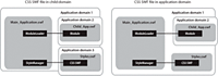
In the first approach, the module and the run-time style sheet are loaded into separate child application domains (application domains 2 and 3). Because the style SWF file and the module are in sibling application domains, the classes referenced in the style module (such as skins) might cause class conflicts with the classes in the module.
The second approach loads the module into a child application domain and the style SWF file into the same domain as the main application. In this case, no class conflicts should occur.
The disadvantage of loading a style SWF file into the current application domain is that you cannot unload it, even when the module is unloaded.
Using filters
You can use filters to apply style-like effects to MX and Spark components. You can apply filters to any visual component that is derived from UIComponent. Filters are not styles; you cannot apply them with a style sheet or the setStyle() method. The result of a filter, such as a drop shadow, is often thought of as a style.
Filters are in the spark.filters.* package, and include the DropShadowFilter, GlowFilter, and BlurFilter classes. There are equivalent filter classes in the mx.filters.* package. These filters are mapped to the spark.filters.* package by the compiler.
To apply a filter to a component with MXML, you add the filter class to the component's filters Array. The filters Array contains any number of filters you want to apply to the component.
You wrap the filter class in an <mx:filters> or <s:filters> tag to define the array of filters applied to that control. If the control is an MX control, you use the <mx:filters> tag. If the control is a Spark control, you use the <s:filters> tag.
The following example applies a drop shadow to Label controls by using expanded MXML syntax and inline syntax:
<?xml version="1.0"?>
<!-- styles/ApplyFilterInline.mxml -->
<s:Application
    xmlns:fx="http://ns.adobe.com/mxml/2009"
    xmlns:mx="library://ns.adobe.com/flex/mx"
    xmlns:s="library://ns.adobe.com/flex/spark">

    <s:VGroup>
        <!-- Apply filter using MXML syntax to set properties. -->
        <s:Label text="DropShadowFilter" fontSize="20">
            <s:filters>
                <s:DropShadowFilter distance="10" angle="45"/>
            </s:filters>
        </s:Label>

        <!-- Apply filter and set properties inline. -->
        <s:Label text="DropShadowFilter (inline)"
            fontSize="20"
            filters="{[new DropShadowFilter(10, 45)]}"/>
    </s:VGroup>
</s:Application>
You can apply filters in ActionScript. You do this by importing the spark.filters.* package, and then adding the new filter to the filters Array of the Flex control. The following example toggles a shadow filter on the Label control when the user clicks the button:
<?xml version="1.0"?>
<!-- styles/ApplyFilterAS.mxml -->
<s:Application
    xmlns:fx="http://ns.adobe.com/mxml/2009"
    xmlns:mx="library://ns.adobe.com/flex/mx"
    xmlns:s="library://ns.adobe.com/flex/spark">

    <fx:Script><![CDATA[
        import spark.filters.*;

        private var dsf:DropShadowFilter;

        public function toggleFilter():void {
            trace(label1.filters.length);
            if (label1.filters.length == 0) {
                /*
                    The first four properties of the DropShadowFilter constructor are
                    distance, angle, color, and alpha.
                */
                dsf = new DropShadowFilter(5,30,0x000000,.8);
                label1.filters = [dsf];
            } else {
                label1.filters = null;
            }
        }
    ]]></fx:Script>

    <s:VGroup>
        <s:Label id="label1" text="ActionScript-applied filter."/>
        <s:Button id="b1" label="Toggle Filter" click="toggleFilter()"/>
    </s:VGroup>

</s:Application>
You cannot bind the filter properties to other values.
If you change a filter, you must reassign it to the component so that the changes take effect. The following example changes the color of the filters when you click the button:
<?xml version="1.0"?>
<!-- styles/FilterChange.mxml -->
<s:Application
    xmlns:fx="http://ns.adobe.com/mxml/2009"
    xmlns:mx="library://ns.adobe.com/flex/mx"
    xmlns:s="library://ns.adobe.com/flex/spark"
    creationComplete="createFilters()"
    height="700">

  <fx:Script><![CDATA[
     import spark.filters.*;
     import flash.filters.BitmapFilterQuality;
     import flash.filters.BitmapFilterType;

     private var myBlurFilter:BlurFilter;
     private var myGlowFilter:GlowFilter;
     private var myBevelFilter:BevelFilter;
     private var myDropShadowFilter:DropShadowFilter;

     private var color:Number = 0xFF33FF;

     public function createFilters():void {

        myBlurFilter = new BlurFilter(4, 4, 1);

        myGlowFilter = new GlowFilter(color, .8, 6, 6, 2, 1,
            false, false);

        myDropShadowFilter = new DropShadowFilter(15, 45,
            color, 0.8, 8, 8, 0.65, 1, false, false);

        myBevelFilter = new BevelFilter(5, 45, color, 0.8, 0x333333,
            0.8, 5, 5, 1, BitmapFilterQuality.HIGH, BitmapFilterType.INNER,
            false);

        applyFilters();
     }

     public function applyFilters():void {
        rte1.filters = [myGlowFilter];
        b1.filters = [myDropShadowFilter];
        dc1.filters = [myBevelFilter];
        hs1.filters = [myBlurFilter];
     }

     public function changeFilters():void {
        color = 0x336633;
        createFilters();
     }
  ]]></fx:Script>

    <s:VGroup>
        <mx:RichTextEditor id="rte1"/>
        <mx:DateChooser id="dc1"/>
        <mx:HSlider id="hs1"/>
        <mx:Button id="b1" label="Click me" click="changeFilters()"/>
    </s:VGroup>
</s:Application>
Clearing filters
<s:filters>
	<fx:Array/>
</s:filters>
Using the dropShadowEnabled property
Some MX containers and controls have a dropShadowEnabled property. You can use this property instead of applying a filter if you are using the Halo theme. This property is more efficient than using a filter.
To use the dropShadowEnabled property, set it to true on the component. However, when you use this property, the component draws its own drop shadow by using the RectangularDropShadow class. It copies the edges of the target and then draws the shadow onto a bitmap, which is then attached the target. If the target component is rotated, the drop shadow might appear jagged because of the way rotated vectors are rendered.
To avoid this and have smooth drop shadow filters on rotated components, you use the DropShadowFilter class.
The following example shows the difference between drawing a filter with the dropShadowEnabled property and using the DropShadowFilter class. This example was compiled with the Halo theme:
<?xml version="1.0" encoding="utf-8"?>
<!-- styles/SmoothFilter.mxml -->
<!-- Compile this example by setting theme=halo.swc for a compiler argument. -->
<s:Application
    xmlns:fx="http://ns.adobe.com/mxml/2009"
    xmlns:mx="library://ns.adobe.com/flex/mx"
    xmlns:s="library://ns.adobe.com/flex/spark"
    backgroundColor="0xFFFFFF">
    <fx:Style>
        @namespace mx "library://ns.adobe.com/flex/mx";

        mx|Canvas {
            borderStyle:solid;
            cornerRadius:10;
            borderColor:#000000;
            backgroundColor:#FFFFFF;
        }
    </fx:Style>

    <fx:Script>
        <![CDATA[
            import spark.filters.*;
            import flash.filters.BitmapFilterQuality;

            private function getBitmapFilter():DropShadowFilter {
                var distance:Number = 3;
                var angle:Number = 90;
                var color:Number = 0x000000;
                var alpha:Number = 1;
                var blurX:Number = 8;
                var blurY:Number = 8;
                var strength:Number = 0.65;
                var quality:Number = BitmapFilterQuality.LOW;
                var inner:Boolean = false;
                var knockout:Boolean = false;

                return new DropShadowFilter(distance, angle, color, alpha,
                    blurX, blurY, strength, quality, inner, knockout);
            }
        ]]>
    </fx:Script>

    <s:HGroup>
        <!-- This rotated canvas applies a filter using the dropShadowEnabled
            property. As a result, the filter's edges are slightly jagged. -->
        <mx:Canvas id="canvas1"
            dropShadowEnabled="true"
            creationComplete="canvas1.rotation=-10"
            x="50" y="80"
            width="200"
            height="200"/>

        <!-- This rotated canvas applies a bitmap filter. As a result,
            the edges are smoother. -->
        <mx:Canvas id="canvas2"
            filters="{[getBitmapFilter()]}"
            creationComplete="canvas2.rotation=-10"
            x="50" y="450"
            width="200"
            height="200"/>
    </s:HGroup>
</s:Application>
Using Animated filters
The spark.effects.AnimateFilter class is a more generic version of what effects such as the BlurFilter and GlowFilter classes do. It lets you apply any filter and optionally animate the filter during the context of a Spark component's effect or transition.
The AnimateFilter class extends the Animate class, and provides an additional input property bitmapFilter, of type IBitmapFilter. It lets you animate an arbitrary set of properties of the filter between values, as specified by the propertyValuesList.
The AnimateFilter class applies the associated filter when the effect begins, and removes it when the effect finishes.
The primary difference between the Animate class and the AnimateFilter class, is that the properties that the effect is animating apply not to the target of the effect, but to the associated filter instead. As a result, for example, the extents of a drop shadow can be animated during an effect sequence.
<?xml version="1.0" encoding="utf-8"?>
<!-- styles/AnimateFilterExample.mxml -->
<s:Application backgroundColor="0xFFFFFF"
     xmlns:fx="http://ns.adobe.com/mxml/2009"
     xmlns:mx="library://ns.adobe.com/flex/mx"
     xmlns:s="library://ns.adobe.com/flex/spark"
     creationComplete="initApp();">
     <fx:Script>
          <![CDATA[
               import spark.effects.*;
               import spark.filters.BlurFilter;
               import spark.effects.animation.*;

               private var blurFilter:BlurFilter;
               private var blurAnim:AnimateFilter;
               private var smpX:SimpleMotionPath;
               private var smpY:SimpleMotionPath;

               private function initApp():void {
                    blurFilter = new BlurFilter();
                    blurAnim = new AnimateFilter(btn1, blurFilter);

                    smpX = new SimpleMotionPath("blurX",0,20);
                    smpY = new SimpleMotionPath("blurY",0,20);
                    blurAnim.motionPaths = Vector.<MotionPath>([smpX,smpY]);
               }

               private function doBlurSample():void {
                    blurAnim.repeatCount = 0;
                    blurAnim.repeatBehavior = RepeatBehavior.REVERSE;
                    blurAnim.play();
               }

               private function stopAnimation():void {
                    blurAnim.stop();
               }
          ]]>
     </fx:Script>

      <s:Button id="btn1" label="Blur"
           mouseOver="doBlurSample();"
           mouseOut="stopAnimation();"/>
</s:Application>
About themes
A theme defines the look and feel of an application's visual components. A theme can define something as simple as the color scheme or common font for an application, or it can be a complete reskinning of all the components used by the application.
The default theme for Flex 4 components is Spark. All controls in an application built with Flex 4 use the Spark theme. Even MX controls have a Spark look and feel in a Flex 4 application.
The Spark theme is a combination of styles and skin classes that define the appearance of the components in the spark.components package. This theme is defined in the defaults.css style sheet in the spark.swc file. Spark components use the skin classes in the spark.skins.spark.* package. MX components use the skin classes in the mx.skins.spark.* package.
For Flex 3, the default theme was called Halo. The components that used the Halo theme are in the mx.controls.* package. They are typically referred to as MX components. In Flex 4, however, the MX components use the Spark theme to define their appearance by default. This is set in the defaults.css file in the framework.swc file.
To use the Halo theme in a Flex 4 application, you can use the theme compiler option to point to the Halo theme SWC file, or you can set the compatibility-version compiler option to 3.0.0. If you use the Halo theme, then the Halo theme is applied only to MX components in your application. The Spark components continue to use the Spark theme unless you specifically override them.
Themes usually take the form of a SWC file. However, themes can also be a CSS file and embedded graphical resources, such as symbols from a SWF file. Theme SWC files can also be compiled into style SWF files so that they can be loaded at run time. For more information, see Using theme SWC files as run-time style sheets.
To apply a theme SWC file to your application, use the instructions in Using themes. To create your own theme, use the instructions in Creating a theme SWC file.
Flex also includes several other predefined themes that you can apply to your applications. For more information, see About the included theme files.
Using themes
Themes generally take the form of a theme SWC file. These SWC files contain style sheets and skinning assets. You use the assets inside theme SWC files for programmatic skins or graphical assets, such as SWF, GIF, or JPEG files. Themes can also contain just stand-alone CSS files.
Packaging a theme as a SWC file rather than as a loose collection of files has the following benefits:
-
SWC files are easier to distribute.
-
SWC files cannot be modified and reapplied to the application without recompiling.
-
SWC files are precompiled. This reduces application compile time, compared to compile time for skin classes that are not in a SWC file.
You apply a theme to your application by specifying the SWC or CSS file with the theme compiler option. The following example uses the mxmlc command-line compiler to compile an application that uses the BullyBuster theme SWC file:
mxmlc -theme theme/BullyBuster.swc MainApp.mxml
When compiling an application by using options in the flex-config.xml file, you specify the theme as follows:
 <compiler>
 	<theme>
 		<filename>c:/theme/BullyBuster.swc</filename>
 	</theme>
 </compiler>
When you add a SWC file to the list of themes, the compiler adds the classes in the SWC file to the application's library-path, and applies any CSS files contained in the SWC file to your application. The converse is not true, however. If you add a SWC file to the library-path, but do not specify that SWC file with the theme option, the compiler does not apply CSS files in that SWC file to the application.
For more information, see Flex compilers.
Themes are additive. You can specify more than one theme file to be applied to the application. If there are no overlapping styles, both themes are applied completely. The ordering of the theme files is important, though. If you specify the same style property in more than one theme file, Flex uses the property from the last theme in the list. In the following example, style properties in the Wooden.css file take precedence, but unique properties in the first two theme files are also applied:
 <compiler>
 	<theme>
 		<filename>../themes/Institutional.css</filename>
 		<filename>../themes/Ice.css</filename>
 		<filename>../themes/Wooden.css</filename>
 	</theme>
 </compiler>
mxmlc -theme+=themes/BullyBuster.swc MainApp.mxml
Creating color schemes
One common way to use themes is to create a color scheme for your application. This color scheme can be used to blend your application into its surrounding website, or define its overall look and feel.
In Spark applications, most styles are inheritable styles. This means that you can set any style on any level of the containment hierarchy. The inheritable styles will be inherited by all controls that are within the container that you set it on. One common use of this is to set styles on the Application tag so that the entire application uses those styles.
|
Property |
Description |
|---|---|
|
backgroundColor |
The background color of the application. |
|
chromeColor |
The base color of the component. The default skins are based on various shades of gray. The chromeColor style is applied as a color transformation (tinting), which preserves all of the visual fidelity of the default appearance. Items colorized by other color style values are not affected by chromeColor. |
|
color |
The color of text in a component. |
|
contentBackgroundColor |
The color of the content area of components that contain content. |
|
focusColor |
The color of the focus glow. |
|
rollOverColor |
The background color of items when the mouse is positioned over the item. |
|
selectionColor |
The background color of selected items in a drop down list. |
|
symbolColor |
The color of symbols or glyphs. For example, the arrows on a scroll bar or the check mark in a CheckBox control. |
<?xml version="1.0" encoding="utf-8"?>
<!-- styles/SparkThemeColorExample.mxml -->
<s:Application
    xmlns:fx="http://ns.adobe.com/mxml/2009"
    xmlns:mx="library://ns.adobe.com/flex/mx"
    xmlns:s="library://ns.adobe.com/flex/spark">
    <fx:Script>
        <![CDATA[
            import mx.core.FlexGlobals;
            import mx.events.IndexChangedEvent;

            private function changeStyleSettings(e:Event):void {
                if (e.currentTarget.selectedItem == "Gray") {
                    FlexGlobals.topLevelApplication.setStyle("backgroundColor", 0x333333);
                    FlexGlobals.topLevelApplication.setStyle("chromeColor", 0x4C4C4C);
                    FlexGlobals.topLevelApplication.setStyle("color", 0xCCCCCC);
                    FlexGlobals.topLevelApplication.setStyle("contentBackgroundColor", 0x555555);
                    FlexGlobals.topLevelApplication.setStyle("symbolColor", 0xFFFFFF);
                    FlexGlobals.topLevelApplication.setStyle("rollOverColor", 0x666666);
                    FlexGlobals.topLevelApplication.setStyle("selectionColor", 0x999999);
                    FlexGlobals.topLevelApplication.setStyle("focusColor", 0xEEEEEE);
                } else {
                    FlexGlobals.topLevelApplication.setStyle("backgroundColor", 0xCCCC99);
                    FlexGlobals.topLevelApplication.setStyle("chromeColor", 0x999966);
                    FlexGlobals.topLevelApplication.setStyle("color", 0x996600);
                    FlexGlobals.topLevelApplication.setStyle("contentBackgroundColor", 0xFFFFCC);
                    FlexGlobals.topLevelApplication.setStyle("symbolColor", 0x663300);
                    FlexGlobals.topLevelApplication.setStyle("rollOverColor", 0xFFEE88);
                    FlexGlobals.topLevelApplication.setStyle("selectionColor", 0xFFCC66);
                    FlexGlobals.topLevelApplication.setStyle("focusColor", 0xCC9900);
                }
            }
        ]]>
    </fx:Script>

    <s:layout>
        <s:VerticalLayout/>
    </s:layout>

    <s:Button label="Button"/>
    <s:ToggleButton label="Toggle Button"/>
    <s:CheckBox label="CheckBox" selected="true"/>
    <s:RadioButton label="RadioButton" selected="true"/>
    <s:NumericStepper/>
    <s:TextInput/>
    <s:TextArea/>
    <s:DropDownList id="myDropDown" selectedIndex="0"
        change="changeStyleSettings(event);">
        <s:dataProvider>
            <s:ArrayList source="[Gray,Brown]"/>
        </s:dataProvider>
    </s:DropDownList>
</s:Application>
You can affect the general coloring of MX components without creating a new theme or changing many of the style properties in the Halo theme. You do this with the themeColor property. For more information, see Creating a Halo theme.
About the included theme files
Flex includes several themes that you can use. Some are for version compatibility, some are for testing, and some are purely for visual appearance. Most themes are located in the sdk_install_dir/frameworks/themes directory for the SDK. Other themes are in the /sdk_version/samples/themes directory.
The following table describes these themes:
|
Theme |
Description |
|---|---|
|
Aeon Graphical |
Contains the AeonGraphical.css file and the AeonGraphical.swf file. This is the graphical version of the Halo theme, which is only used by MX components. The source FLA file for the graphical assets is in the AeonGraphical Source directory. You change the graphical assets in this file by using the Flash IDE. You must ensure that you export the SWF file, which is used by the theme in Flex. |
|
Halo |
The Halo theme uses the halo.swc theme file and the classes in the mx.skins.halo package. For more information about the default theme assets, see About the default style sheets. |
|
Ice |
Contains the Ice.css file. |
|
Institutional |
Contains the Institutional.css file. |
|
Mobile |
Contains the defaults.css file for mobile applications. |
|
Sample themes |
The themes in the samples/themes directory include arcade, cobalt, and graphite. These theme files should be considered sample quality. Before you use them in production applications, be sure to test them thoroughly. |
|
Smoke |
Contains the Smoke.css file and a background JPEG file. |
|
Wireframe |
An alternate theme for the Spark components. This theme gives a simple, wireframe appearance to an application. It might be appropriate to use it when developing a prototype or "proof of concept" application. This theme is also useful as a starting point to write custom skins, particularly if they are not styleable. This is because the skin classes in the Wireframe theme file are simpler than their Spark counterparts. |
|
Wooden |
Contains the Wooden.css file and a background JPEG file. |
mxmlc -theme=c:\Flex\frameworks\themes\Halo\halo.swc MyApp.mxml
In addition to the basic themes, Flex also includes the MXFTEText.css theme file. This file is located in the frameworks directory. You use this theme if you want to use embedded fonts with MX controls in your Flex 4 applications. For more information, see Embedding fonts with MX components.
Another theme file, MXCharts.css, is meant to be used with MX-only applications that contain charting components.
Creating a theme SWC file
To build a theme SWC file, you create a CSS file, and include that file plus the graphical and programmatic assets in the SWC file. To do this, you use the include-file option of the compc utility.
A good starting point for creating a new theme is to customize the default CSS files for the Spark and MX components. For Spark components, customize the defaults.css file in the spark.swc file. For MX components, customize the defaults.css file in the framework.swc file. The following sections describe these steps in detail.
Creating a theme style sheet
A theme typically consists of a style sheet and any assets that the style sheet uses. These assets can be graphic files or programmatic skin classes. For the Spark theme, the assets are skin classes that use a combination of MXML and FXG syntax to draw the skin. For the Halo theme, the assets are typically ActionScript class files that extend Halo skin classes.
@namespace s "library://ns.adobe.com/flex/spark";
s|Button {
	skinClass: ClassReference("ButtonTransitionSkin");
}
s|CheckBox {
	skinClass: ClassReference("CheckBoxTransitionSkin");
}
To add programmatic skin classes to a Halo theme's CSS file, you specify a class for each of the component's states, as the following example shows:
@namespace mx "library://ns.adobe.com/flex/mx";
 mx|Button {
 	upSkin:ClassReference('myskins.ButtonSkin');
 	downSkin:ClassReference('myskins.ButtonSkin');
 	overSkin:ClassReference('myskins.ButtonSkin');
 }
For information about creating custom Spark skins, see Spark Skinning. For information about creating custom Halo skins, see Creating programmatic skins for MX components.
To add graphic files to the theme's CSS file, which is a common task for the Halo theme, you use the Embed statement. The following example defines new graphical skins for the Button class:
@namespace mx "library://ns.adobe.com/flex/mx";
mx|Button {
 	upSkin: Embed("upIcon.jpg");
 	downSkin: Embed("downIcon.jpg");
 	overSkin: Embed("overIcon.jpg");
 }
The name you provide for the Embed keyword is the same name that you use for the skin asset when compiling the SWC file.
The CSS file can include any number of class selectors, as well as type selectors. Style definitions for your theme do not have to use skins. You can simply set style properties in the style sheet, as the following example shows:
@namespace mx "library://ns.adobe.com/flex/mx";
 mx|ControlBar {
	color:red;
  }
For more information about the default style sheets, see About the default style sheets.
Compiling a theme SWC file
You compile a theme SWC file by using the include-file and include-classes options of the component compiler. This is the same compiler that creates component libraries and Runtime Shared Libraries (RSLs).
You invoke the component compiler either with the compc command line utility.
You use the include-file option to add the CSS file and graphics files to the theme SWC file. You use the include-classes option to add programmatic skin classes to the theme SWC file.
To simplify the commands for compiling theme SWC files, you can use configuration files. For more information, see Using a configuration file to compile theme SWC files.
Using the include-file option to compile theme SWC files
The include-file option takes two arguments: a name and a path. The name is the name that you use to refer to that asset as in the CSS file. The path is the file system path to the asset. When using include-file, you are not required to add the resources to the source path. The following command line example includes the upIcon.jpg asset in the theme SWC file:
-include-file upIcon.jpg c:/myfiles/themes/assets/upIcon.jpg
You also specify the CSS file as a resource to include in the theme SWC file. You must include the .css extension when you provide the name of the CSS file; otherwise, Flex does not recognize it as a style sheet and does not apply it to your application.
You use the component compiler to compile theme assets, such as a style sheet and graphical skins, into a SWC file. The following example compiles a theme by using the compc command-line compiler:
 compc -include-file mycss.css c:/myfiles/themes/mycss.css
 	-include-file upIcon.jpg c:/myfiles/themes/assets/upIcon.jpg
 	-include-file downIcon.jpg c:/myfiles/themes/assets/downIcon.jpg
 	-include-file overIcon.jpg c:/myfiles/themes/assets/overIcon.jpg
 	-o c:/myfiles/themes/MyTheme.swc
You cannot pass a list of assets to the include-file option. Each pair of arguments must be preceded by ‑include-file. Most themes use many skin files and style sheets, which can be burdensome to enter each time you compile. To simplify this, you can use the load-config option to specify a file that contains configuration options, such as multiple include-file options. For more information, see Using a configuration file to compile theme SWC files.
Using the include-classes option to compile theme SWC files
The include-classes option takes a single argument: the name of the class to include in the SWC file. You pass the class name and not the class filename (for example, MyButtonSkin rather than MyButtonSkin.as). The class must be in your source path when you compile the SWC file.
The following command-line example compiles a theme SWC file that includes the CSS file and a single programmatic skin class, MyButtonSkin, which is in the themes directory:
 compc -source-path c:/myfiles/flex/themes
 	-include-file mycss.css c:/myfiles/flex/themes/mycss.css
 	-include-classes MyButtonSkin -o c:/myfiles/flex/themes/MyTheme.swc
You can pass a list of classes to the include-classes option by space-delimiting each class, as the following example shows:
-include-classes MyButtonSkin MyControlBarSkin MyAccordionHeaderSkin
For more information about creating skin classes, see Skinning MX components.
Using a configuration file to compile theme SWC files
Using a configuration file is generally more verbose than passing options on the command line, but it can make the component compiler options easier to read and maintain. For example, you could replace a command line with the following entries in a configuration file:
 <?xml version="1.0"?>
 <flex-config>
 	<output>MyTheme.swc</output>
 	<include-file>
 		<name>mycss.css</name>
 		<path>c:/myfiles/themes/mycss.css</path>
 	</include-file>
 	<include-file>
 		<name>upIcon.jpg</name>
 		<path>c:/myfiles/themes/assets/upIcon.jpg</path>
 	</include-file>
 	<include-file>
 		<name>downIcon.jpg</name>
 		<path>c:/myfiles/themes/assets/downIcon.jpg</path>
 	</include-file>
 	<include-file>
 		<name>overIcon.jpg</name>
 		<path>c:/myfiles/themes/assets/overIcon.jpg</path>
 	</include-file>
 	<include-classes>
 		<class>MyButtonSkin</class>
 		<class>MyAccordionHeaderSkin</class>
 		<class>MyControlBarSkin</class>
 	</include-classes>
 </flex-config>
You can use the configuration file with compc by using the load-config option, as the following example shows:
compc -load-config myconfig.xml
Navigation
Adobe, Adobe AIR, Adobe Flash, Adobe Flash Platform and Adobe Flash Player are either registered trademarks or trademarks of Adobe Systems Incorporated in the United States and/or other countries and are used by permission from Adobe. No other license to the Adobe trademarks are granted.