
Skinning MX components
You add skins to Flex components by using ActionScript classes, MXML components, and image files. Image files can contain JPEG, GIF, and PNG images or SWF files.
This topic describes the process for skinning MX components. These are typically components that use the Halo theme. For information about skinning Spark components, see Spark Skinning.
By default, MX components in a Flex 4 application use the Spark skin classes in the mx.skins.spark.* package. To use Halo skins, you can either apply the Halo theme to your application or set the compatibility-version compiler option to 3.0.0.
About MX component skinning
Skinning is the process of changing the appearance of a component by modifying or replacing its visual elements. These elements can be made up of bitmap images, SWF files, or class files that contain drawing methods that define vector images.
Skins can define the entire appearance, or only a part of the appearance, of a component in various states. For example, an MX Button control that uses the Halo theme has eight possible states, and eight associated skin properties, as the following example shows:
|
State |
Skin property |
Default skin class |
|---|---|---|
|
down |
downSkin |
mx.skins.halo.ButtonSkin |
|
over |
overSkin |
mx.skins.halo.ButtonSkin |
|
up |
upSkin |
mx.skins.halo.ButtonSkin |
|
disabled |
disabledSkin |
mx.skins.halo.ButtonSkin |
|
selectedDisabled |
selectedDisabledSkin |
mx.skins.halo.ButtonSkin |
|
selectedDown |
selectedDownSkin |
mx.skins.halo.ButtonSkin |
|
selectedOver |
selectedOverSkin |
mx.skins.halo.ButtonSkin |
|
selectedUp |
selectedUpSkin |
mx.skins.halo.ButtonSkin |
The default skins for the up, over, and down states appear as follows:
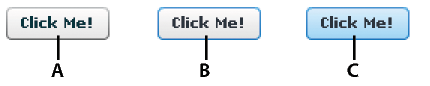
- A.
- up
- B.
- over
- C.
- down
Other controls have similar states with associated skins. For example, RadioButton controls, which are subclasses of Button, also have up, down, and over skins. The ComboBox control has skins the define the appearance of the control when it is in the disabled, down, and over states.
You create a skin by using a bitmap image, a SWF file, or a class defined in ActionScript or in MXML. All components have a default skin class that can represent more than one state of the component. As you can see in the previous table, the eight states of the Button control use the same default skin class, mx.skins.halo.ButtonSkin, to draw the skin. Logic within the class determines the appearance of the Button control based on its current state.
You assign a skin to a component by using style properties. You can set a style property by using MXML tag properties, the StyleManager class, <fx:Style> blocks, or style sheets. Most application use style sheets to organize and apply skins. Style sheets can be loaded at compile time or at run time. For information on loading style sheets at run time, see Loading style sheets at run time.
Types of MX component skins
You typically define a skin for the Halo theme as a bitmap graphic or as a vector graphic. Bitmap graphics, called graphical skins in Flex, are made up of individual pixels that together form an image. The downside of a bitmap graphic is that it is typically defined for a specific resolution and, if you scale or transform the image, you might notice a degradation in image quality.
A vector graphic, called a programmatic skin in Flex, consists of a set of line definitions that specify a line's starting and end point, thickness, color, and other information required by Adobe® Flash® Player to draw the line. When a vector graphic is scaled, rotated, or modified in some other way, it is relatively simple for Flash Player to calculate the new layout of the vector graphic by transforming the line definitions. Therefore, you can perform many types of modifications to vector graphics without noticing any degradation in quality.
One advantage of programmatic skins is you can create vector graphics that allow you a great deal of programmatic control over the skin. For example, you can control the radius of a Button control's corners by using programmatic skins, something you cannot do with graphical skins. You can develop programmatic skins directly in your Flex authoring environment or any text editor, without using a graphics tool such as Adobe Flash. Programmatic skins also tend to use less memory because they contain no external image files.
The following table describes the different types of skins:
|
Skin type |
Description |
|---|---|
|
Graphical skins |
Images that define the appearance of the skin. These images can JPEG, GIF, or PNG files, or they can be symbols embedded in SWF files. Typically you use drawing software such as Adobe® Photoshop® or Adobe® Illustrator® to create graphical skins. For more information, see Creating graphical skins for MX components. |
|
Programmatic skins |
ActionScript or MXML classes that define a skin. To change the appearance of controls that use programmatic skins, you edit an ActionScript or MXML file. You can use a single class to define multiple skins. For more information, see Creating programmatic skins for MX components. |
|
Stateful skins |
A type of programmatic skin that uses view states, where each view state corresponds to a state of the component. The definition of the view state controls the look of the skin. Since you can have multiple view states in a component, you can use a single component to define multiple skins. For more information, see Creating stateful skins for MX components. |
Creating graphical skins for MX components
When using graphical skins in the Halo theme, you must embed the image file for the skin in your application. To specify your skin, you can use the setStyle() method, set it inline, or use Cascading Style Sheets (CSS), as the following example shows:
<?xml version="1.0"?>
<!-- skins/SimpleButtonGraphicSkin.mxml -->
<s:Application xmlns:fx="http://ns.adobe.com/mxml/2009"
    xmlns:mx="library://ns.adobe.com/flex/mx"
    xmlns:s="library://ns.adobe.com/flex/spark">

    <fx:Style>
        @namespace mx "library://ns.adobe.com/flex/mx";

        mx|Button {
            upSkin: Embed("../assets/orb_up_skin.gif");
        }
    </fx:Style>

    <mx:Button id="b1" label="Click Me"/>
</s:Application>
For information on setting skins by using the setStyle() method or by setting them inline, see Applying MX component skins.
You can assign the same graphic or programmatic skin to two or more skins so that the skins display the same image, as the following example shows:
<?xml version="1.0"?>
<!-- skins/SimpleButtonGraphicSkinTwoSkins.mxml -->
<s:Application xmlns:fx="http://ns.adobe.com/mxml/2009"
    xmlns:mx="library://ns.adobe.com/flex/mx"
    xmlns:s="library://ns.adobe.com/flex/spark">

    <fx:Style>
        @namespace mx "library://ns.adobe.com/flex/mx";

        mx|Button {
            upSkin: Embed("../assets/orb_up_skin.gif");
            overSkin: Embed("../assets/orb_up_skin.gif");
        }
    </fx:Style>

    <mx:Button id="b1" label="Click Me"/>

</s:Application>
For more information, see Creating graphical skins for MX components.
Creating programmatic skins for MX components
You can define programmatic skins for the Halo theme in either MXML or ActionScript. When using programmatic skins, you can define a class for each state of the component, or define a single class for multiple skins. In the following example you create a custom ActionScript skin to define the skin for the up state of the Button control:
package {
  // skins\ButtonUpSkinAS.as

  import mx.skins.ProgrammaticSkin;

  public class ButtonUpSkinAS extends ProgrammaticSkin {

    // Constructor.
    public function ButtonUpSkinAS() {
      super();
    }

    override protected function updateDisplayList(unscaledWidth:Number,
      unscaledHeight:Number):void
    {
      graphics.lineStyle(1, 0x0066FF);
      graphics.beginFill(0x00FF00, 0.50);
      graphics.drawRoundRect(0, 0, unscaledWidth, unscaledHeight, 10, 10);
    }
  }
}
In ActionScript, you typically use the ProgrammaticSkin class as the base class for your skin. In the skin class, you must override the updateDisplayList() method to draw the skin. You then assign the skin component to the appropriate skin property of the Button control using a style sheet, as the following example shows:
<?xml version="1.0"?>
<!-- skins/ApplySimpleButtonSkinAS.mxml -->
<s:Application xmlns:fx="http://ns.adobe.com/mxml/2009"
    xmlns:mx="library://ns.adobe.com/flex/mx"
    xmlns:s="library://ns.adobe.com/flex/spark">

    <fx:Style>
        @namespace mx "library://ns.adobe.com/flex/mx";

        mx|Button {
            upSkin: ClassReference("ButtonUpSkinAS");
        }
    </fx:Style>

    <mx:Button id="b1" label="Click Me"/>
</s:Application>
For information on applying skins, see Applying MX component skins.
In the following example you create a custom MXML component to define the skin for the up state of the Button control. In MXML, you use ProgrammaticSkin as the base class of your skin. This is the same skin defined above in ActionScript:
<?xml version="1.0"?>
<!-- skins\ButtonUpMXMLSkin.mxml -->
<skins:ProgrammaticSkin
    xmlns:fx="http://ns.adobe.com/mxml/2009"
    xmlns:mx="library://ns.adobe.com/flex/mx"
    xmlns:s="library://ns.adobe.com/flex/spark"
    xmlns:skins="mx.skins.*">

  <fx:Script>
    <![CDATA[
      override protected function updateDisplayList(unscaledWidth:Number,
        unscaledHeight:Number):void
      {
        graphics.lineStyle(1, 0x0066FF);
        graphics.beginFill(0x00FF00, 0.50);
        graphics.drawRoundRect(0, 0, unscaledWidth, unscaledHeight, 10, 10);
      }
    ]]>
  </fx:Script>

</skins:ProgrammaticSkin>
Notice that you include the xmlns:skins="mx.skins.*" namespace declaration in MXML. This is necessary because by default you cannot use the ProgrammaticSkin class as the base class of an MXML component.
In the following example, you create a component that defines skins for multiple Button states. In this example, you use a case statement to determine the current state of the Button control based on the name property of the skin, where the name property contains the current name of the skin. For example, if you define a programmatic skin for a Button control, the name property could be any of the skin states: downSkin, upSkin, overSkin, disabledSkin, selectedDisabledSkin, selectedDownSkin, selectedOverSkin, or selectedUpSkin.
package {
  // skins\ButtonUpAndOverSkinAS.as

  import mx.skins.ProgrammaticSkin;

  public class ButtonUpAndOverSkinAS extends ProgrammaticSkin {

    // Constructor.
    public function ButtonUpAndOverSkinAS() {
      super();
    }

    override protected function updateDisplayList(unscaledWidth:Number,
      unscaledHeight:Number):void
    {
      switch (name)
      {
       case "upSkin": {
        graphics.lineStyle(1, 0x0066FF);
        graphics.beginFill(0x00FF00, 0.50);
        graphics.drawRoundRect(0, 0, unscaledWidth, unscaledHeight, 10, 10);
       }

       case "overSkin": {
        graphics.lineStyle(1, 0x0066FF);
        graphics.beginFill(0x00CCFF, 0.50);
        graphics.drawRoundRect(0, 0, unscaledWidth, unscaledHeight, 10, 10);
       }
      }
    }
  }
}
You then assign the ActionScript class to the appropriate skin properties:
<?xml version="1.0"?>
<!-- skins/ApplyButtonUpOverSkinAS.mxml -->
<s:Application
    xmlns:fx="http://ns.adobe.com/mxml/2009"
    xmlns:mx="library://ns.adobe.com/flex/mx"
    xmlns:s="library://ns.adobe.com/flex/spark">

    <fx:Style>
        @namespace mx "library://ns.adobe.com/flex/mx";

        mx|Button {
            upSkin: ClassReference("ButtonUpAndOverSkinAS");
            overSkin: ClassReference("ButtonUpAndOverSkinAS");
        }
  </fx:Style>

    <mx:Button id="b1" label="Click Me"/>
</s:Application>
For more information on creating programmatic skins, see Creating programmatic skins for MX components.
Creating stateful skins for MX components
When using a stateful skin with the Halo theme, you define a skin that defines a view state for each state of a component.
You typically define a stateful skin as a subclass of UIComponent, in ActionScript or in MXML, because the view state mechanism is built into the UIComponent class. For more information, see Creating stateful skins for MX components.
When using stateful skins, you must explicitly specify the default skin for all states not defined by the stateful skin component.
Sizing MX component skins
Before a component applies a skin, it first determines its size without the skin. The component then examines the skin to determine whether the skin defines a specific size. If not, the component scales the skin to fit. If the skin defines a size, the component sizes itself to the skin.
Most skins do not define any size constraints, which allows the component to scale the skin as necessary. For more information on writing skins that contain size information, see Implementing the measuredWidth and measuredHeight getters.
Skinning MX subcomponents
In some cases, you want to reskin subcomponents. The following example reskins the vertical MX ScrollBar control that appears in List controls:
<?xml version="1.0"?>
<!-- skins/SubComponentSkins.mxml -->
<s:Application xmlns:fx="http://ns.adobe.com/mxml/2009"
    xmlns:mx="library://ns.adobe.com/flex/mx"
    xmlns:s="library://ns.adobe.com/flex/spark">
  <fx:Script><![CDATA[
     [Bindable]
     private var theText:String = "Lorem ipsum dolor sit amet, consectetur " +
        "adipisicing elit, sed do eiusmod tempor incididunt ut labore et dolore " +
        "magna aliqua. Ut enim ad minim veniam, quis nostrud exercitation ullamco " +
        "laboris nisi ut aliquip ex ea commodo consequat. Duis aute irure dolor " +
        "in reprehenderit in voluptate velit esse cillum dolore eu fugiat " +
        "nulla pariatur. Excepteur sint occaecat cupidatat non proident, sunt " +
        "in culpa qui officia deserunt mollit anim id est laborum.";
  ]]></fx:Script>

  <fx:Style>
     .myScrollStyle {
        upArrowUpSkin: Embed("../assets/uparrow_up_skin.gif");
        downArrowUpSkin: Embed("../assets/downarrow_up_skin.gif");
     }
  </fx:Style>

  <mx:TextArea id="ta1"
     width="400"
     height="50"
     verticalScrollPolicy="on"
     verticalScrollBarStyleName="myScrollStyle"
     text="{theText}"
  />

</s:Application>
By setting the value of the verticalScrollBarStyleName property in the List type selector, all vertical ScrollBar controls in List components have a custom skin. The ScrollBar controls in other parts of the application do not have the custom skin.
As with all style sheets, you can define the skins in a separate CSS file and use the source property of the <fx:Style> tag to point to that file; for example:
<fx:Style source="../stylesheets/MySkins.css"/>
Creating a Halo theme
A theme is a collection of style definitions and skins that define the look and feel of an application built with Flex. Theme files can include both graphical and programmatic skins, as well as style sheets.
A theme takes the form of a SWC file that can be applied to an application. You compile a SWC file using the compc command-line compiler utility.
By compiling a SWC file and then using that SWC file as a theme in your application, you remove the burden of compiling all the skin files when you compile your main application. This can make compilation faster and make problems with the application code easier to debug. In addition, a SWC file is easier to transplant onto another application than are a set of classes and image files.
Halo, the default theme set that shipped with Flex 3, is almost entirely made up of programmatic skins, although there are some static graphic elements. Flex includes programmatic and graphical skins that use the Halo look and feel. You can edit the skins by using either the programmatic or graphical technique to reskin MX components for the Halo theme.
To use the Halo theme in a Flex 4 application, you can use the theme compiler option, or you can set the compatibility-version option to 3.0.0. If you use the Halo theme, then the Halo theme is applied to all MX components in your application. The Spark components continue to use the Spark theme unless you specifically override them.
For more information on creating and applying themes, see About themes.
MX component skin resources
Flex includes the following graphical and programmatic source files for MX component skins:
- Base skin classes in the mx.skins.* package
-
These abstract skin classes define the basic functionality of Halo skin classes for MX components in Flex. For more information, see Creating programmatic skins for MX components.
- Programmatic skins in the mx.skins.halo.* package
-
These concrete skin classes extend the base skin classes in the mx.skins.* package. They define the appearance of skins for MX components in the Halo theme. You can extend or edit these skins to create new programmatic skins based on the default Flex look and feel. For more information, see Creating programmatic skins for MX components.
- Spark skins in the mx.skins.spark.* package
-
These skin classes define the default appearance of MX components in a Flex 4 application. For more information, see Spark Skinning.
- Graphical Aeon theme
-
The Aeon theme for MX components includes the AeonGraphical.css file and the AeonGraphical.swf file that defines the skin symbols. These are in the framework/themes directory. In addition, Flex includes the FLA source file for the AeonGraphical.swf file. For more information, see About themes.
You use these files to create skins for MX components based on the Flex look and feel, or create your own.
Applying MX component skins
You apply skins by using CSS, by specifying them inline in MXML, by calling the setStyle() method, or by using the StyleManager class.
Applying graphical skins inline
When you apply a skin inline, you specify it as the value of a skin style in MXML.
To apply a graphical skin inline, you embed the skin by using the appropriate skin property of the control, as the following example shows:
<?xml version="1.0"?>
<!-- skins/EmbedImagesInline.mxml -->
<s:Application xmlns:fx="http://ns.adobe.com/mxml/2009"
    xmlns:mx="library://ns.adobe.com/flex/mx"
    xmlns:s="library://ns.adobe.com/flex/spark">

    <mx:Button id="b1"
        label="Click Me"
        overSkin="@Embed(source='../assets/orb_over_skin.gif')"
        upSkin="@Embed(source='../assets/orb_up_skin.gif')"
        downSkin="@Embed(source='../assets/orb_down_skin.gif')"/>

</s:Application>
The location of the skin asset is relative to the location of the MXML file that embeds it.
When embedding inline, you use @Embed (with an at [@] sign prefix) rather than Embed, which you use in CSS files.
Applying programmatic skins inline
For programmatic skins, you specify the class name for each state that you reskin and enclose the class name with curly braces { }. The skin's class definition must be in your source path when you compile the application. If the class file is in the same directory as the application, then you do not need to add it to your source path.
The following example applies the SampleButtonSkin.mxml programmatic skin to the Button control's upSkin, overSkin, downSkin, and disabledSkin states:
<?xml version="1.0"?>
<!-- skins/ApplyProgrammaticSkinsInline.mxml -->
<s:Application xmlns:fx="http://ns.adobe.com/mxml/2009"
    xmlns:mx="library://ns.adobe.com/flex/mx"
    xmlns:s="library://ns.adobe.com/flex/spark">

    <mx:Button id="b1"
        label="Click Me"
        overSkin="{ButtonStatesSkin}"
        upSkin="{ButtonStatesSkin}"
        downSkin="{ButtonStatesSkin}"
        disabledSkin="{ButtonStatesSkin}"/>
</s:Application>
In this example, the SampleButtonSkin.mxml file is in the same directory as the application. If the skin class is in another directory, you must import the class into the application so that the compiler can resolve the class name, as the following example shows:
<?xml version="1.0"?>
<!-- skins/ApplyProgrammaticSkinsInlinePackage.mxml -->
<s:Application xmlns:fx="http://ns.adobe.com/mxml/2009"
    xmlns:mx="library://ns.adobe.com/flex/mx"
    xmlns:s="library://ns.adobe.com/flex/spark">

    <fx:Script>
        import myComponents.*;
    </fx:Script>

    <mx:Button id="b1"
        label="Click Me"
        overSkin="{myComponents.ButtonStatesSkin}"
        upSkin="{myComponents.ButtonStatesSkin}"
        downSkin="{myComponents.ButtonStatesSkin}"
        disabledSkin="{myComponents.ButtonStatesSkin}"/>
</s:Application>
When you define stateful skin, you set the skin style property of the control to the class name of your skin component, as the following example shows:
<?xml version="1.0"?>
<!-- skins/ApplyButtonStatefulSkinInlineAll.mxml -->
<s:Application xmlns:fx="http://ns.adobe.com/mxml/2009"
    xmlns:mx="library://ns.adobe.com/flex/mx"
    xmlns:s="library://ns.adobe.com/flex/spark">

    <fx:Script>
        import myComponents.*;
    </fx:Script>

    <mx:Button id="b"
        label="Hello"
        skin="{myComponents.MyButtonStatefulSkinAll}"/>

</s:Application>
Applying MX component skins by using CSS
When applying skins with CSS, you can use type or class selectors so that you can apply skins to one component or to all components of the same type. You can define the style sheet in the body of the <fx:Style> tag or reference an external style sheet, as the following example shows:
<?xml version="1.0"?>
<!-- skins/UseHaloSkinsStyleSheet.mxml -->
<s:Application xmlns:fx="http://ns.adobe.com/mxml/2009"
    xmlns:mx="library://ns.adobe.com/flex/mx"
    xmlns:s="library://ns.adobe.com/flex/spark">

    <s:layout>
        <s:VerticalLayout/>
    </s:layout>

    <fx:Style source="../assets/UseHaloSkins.css"/>

    <mx:CheckBox id="cb1" label="Click Me"/>

    <mx:RadioButton id="rb1" label="Click Me"/>

</s:Application>
You can apply skins to a single instance of a component by defining a class selector. The following example applies the custom style to the second button only:
<?xml version="1.0"?>
<!-- skins/EmbedImagesClassSelector.mxml -->
<s:Application xmlns:fx="http://ns.adobe.com/mxml/2009"
    xmlns:mx="library://ns.adobe.com/flex/mx"
    xmlns:s="library://ns.adobe.com/flex/spark">

    <s:layout>
        <s:VerticalLayout/>
    </s:layout>

    <fx:Style>
        .myButtonStyle {
            overSkin: Embed("../assets/orb_over_skin.gif");
            upSkin: Embed("../assets/orb_up_skin.gif");
            downSkin: Embed("../assets/orb_down_skin.gif");
        }
    </fx:Style>

    <mx:Button id="b1" label="Click Me"/>
    <mx:Button id="b2" label="Click Me" styleName="myButtonStyle"/>
</s:Application>
You can load style sheets at run time by compiling them into a SWF file. You then use the top-level StyleManager class's loadStyleDeclarations() method to load the CSS-based SWF file at run time, as the following example shows:
Ôªø<?xml version="1.0"?>
<!-- styles/BasicApp.mxml -->
<s:Application
    xmlns:fx="http://ns.adobe.com/mxml/2009"
    xmlns:mx="library://ns.adobe.com/flex/mx"
    xmlns:s="library://ns.adobe.com/flex/spark">

    <fx:Script>
        <![CDATA[
        public function applyRuntimeStyleSheet():void {
            styleManager.loadStyleDeclarations("assets/BasicStyles.swf")
        }
        ]]>
    </fx:Script>
    <s:VGroup>
        <s:Label text="Click the button to load a new CSS-based SWF file."/>
        <s:Button id="b1" label="Click Me" click="applyRuntimeStyleSheet()"/>
    </s:VGroup>

</s:Application>
For more information, see Loading style sheets at run time.
Using CSS to apply graphical skins to MX components
You typically embed graphical skins as properties of a CSS file in the <fx:Style> tag or in an external style sheet, just as you would apply any style property, such as color or fontSize. The following example defines skins on the Button type selector. In this example, all Buttons controls get the new skin definitions.
<?xml version="1.0"?>
<!-- skins/EmbedImagesTypeSelector.mxml -->
<s:Application xmlns:fx="http://ns.adobe.com/mxml/2009"
    xmlns:mx="library://ns.adobe.com/flex/mx"
    xmlns:s="library://ns.adobe.com/flex/spark">

    <fx:Style>
        @namespace mx "library://ns.adobe.com/flex/mx";

        mx|Button {
            overSkin: Embed("../assets/orb_over_skin.gif");
            upSkin: Embed("../assets/orb_up_skin.gif");
            downSkin: Embed("../assets/orb_down_skin.gif");
        }
    </fx:Style>

    <mx:Button id="b1" label="Click Me"/>

</s:Application>
When you embed the graphical skin, you embed it into your application's SWF file. For more information on embedding assets, see Embedding assets.
Using CSS to apply programmatic skins to MX components
You apply programmatic skins in a CSS file by using the ClassReference directive. This directive takes a class name as the argument, where the class name corresponds to the ActionScript or MXML file containing your skin definition. The skin's class must be in your source path when you compile the application.
When using programmatic skins, you assign the component name to the associated skin property. In the following example, the skin is in the file myComponents/MyButtonSkin.as where myComponents is a subdirectory of the directory containing your application:
<?xml version="1.0"?>
<!-- skins/ApplyButtonSkin.mxml -->
<s:Application xmlns:fx="http://ns.adobe.com/mxml/2009"
    xmlns:mx="library://ns.adobe.com/flex/mx"
    xmlns:s="library://ns.adobe.com/flex/spark">

    <fx:Style>
        @namespace mx "library://ns.adobe.com/flex/mx";

        mx|Button {
            upSkin: ClassReference("myComponents.MyButtonSkin");
        }
    </fx:Style>
    <mx:Button label="Hello World" id="b" />
</s:Application>
When you define stateful skin, you set the skin style property of the control to the class name of your skin component, as the following example shows:
<?xml version="1.0"?>
<!-- skins/ApplyButtonStatefulSkinAll.mxml -->
<s:Application xmlns:fx="http://ns.adobe.com/mxml/2009"
    xmlns:mx="library://ns.adobe.com/flex/mx"
    xmlns:s="library://ns.adobe.com/flex/spark">

    <fx:Style>
        @namespace mx "library://ns.adobe.com/flex/mx";

        mx|Button {
            skin: ClassReference("myComponents.MyButtonStatefulSkinAll");
        }
    </fx:Style>
    <mx:Button label="Hello" id="b" />
</s:Application>
Applying MX component skins with the setStyle() method
Skins are defined as style properties, therefore, you can access them with the setStyle() and getStyle() methods. This lets you change skins during run time, or dynamically define them, as long as you embed the graphical asset at compile time.
For more information on using the setStyle() method, see Using the setStyle() and getStyle() methods.
Using the setStyle() method to apply graphical skins to MX components
To embed an image so that you can use it with the setStyle() method, you use the [Embed] metadata tag and assign a reference to a variable. You can then use the setStyle() method to apply that image as a skin to a component.
The following example embeds three images and applies those images as skins to an instance of a Button control:
<?xml version="1.0"?>
<!-- skins/EmbedWithSetStyle.mxml -->
<s:Application xmlns:fx="http://ns.adobe.com/mxml/2009"
    xmlns:mx="library://ns.adobe.com/flex/mx"
    xmlns:s="library://ns.adobe.com/flex/spark"
    initialize="init();">

    <fx:Script>
        <![CDATA[
            [Embed("../assets/orb_over_skin.gif")]
            public var os:Class;

            [Embed("../assets/orb_down_skin.gif")]
            public var ds:Class;

            [Embed("../assets/orb_up_skin.gif")]
            public var us:Class;

            private function init():void {
                b1.setStyle("upSkin", us);
                b1.setStyle("overSkin", os);
                b1.setStyle("downSkin", ds);
            }
        ]]>
    </fx:Script>

    <mx:Button label="Click Me" id="b1"/>
</s:Application>
Using the setStyle() method to apply programmatic skins to MX components
For programmatic skins, you apply a skin to a control by using the setStyle() method. The skin component must be in your source path when you compile the application. The following example applies the ButtonStatesSkin.as component to an MX Button by using the setStyle() method:
<?xml version="1.0"?>
<!-- skins/ApplyProgrammaticSkinsSetStyle.mxml -->
<s:Application xmlns:fx="http://ns.adobe.com/mxml/2009"
    xmlns:mx="library://ns.adobe.com/flex/mx"
    xmlns:s="library://ns.adobe.com/flex/spark">

    <s:layout>
        <s:VerticalLayout/>
    </s:layout>

    <fx:Script>
        <![CDATA[
            public function changeSkins():void {
                if (cb1.selected) {
                    b1.setStyle("upSkin", ButtonStatesSkin);
                    b1.setStyle("downSkin", ButtonStatesSkin);
                    b1.setStyle("overSkin", ButtonStatesSkin);
                    b1.setStyle("disabledSkin", ButtonStatesSkin);
                } else {
                    b1.setStyle("upSkin", null);
                    b1.setStyle("downSkin", null);
                    b1.setStyle("overSkin", null);
                    b1.setStyle("disabledSkin", null);
                }
            }

        ]]>
    </fx:Script>

    <mx:Button id="b1" label="Click Me"/>

    <mx:CheckBox id="cb1" label="Apply custom skin class" click="changeSkins();"/>

</s:Application>
The reference to the ButtonStatesSkin class in the setStyle() method causes the compiler to link in the entire ButtonStatesSkin class at compile time. The resulting SWF file will be larger than if there were no reference to this class, even if the changeSkins() method is never called.
In the previous example, the SampleButtonSkin.mxml file is in the same directory as the application. If the skin class is in another directory, you must import the class into the application so that the compiler can resolve the class name, as the following example shows:
<?xml version="1.0"?>
<!-- skins/ApplyProgrammaticSkinsSetStylePackage.mxml -->
<s:Application xmlns:fx="http://ns.adobe.com/mxml/2009"
    xmlns:mx="library://ns.adobe.com/flex/mx"
    xmlns:s="library://ns.adobe.com/flex/spark">

    <s:layout>
        <s:VerticalLayout/>
    </s:layout>

    <fx:Script>
        <![CDATA[
            import myComponents.*;

            public function changeSkins():void {
                if (cb1.selected) {
                    b1.setStyle("upSkin", myComponents.ButtonStatesSkin);
                    b1.setStyle("downSkin", myComponents.ButtonStatesSkin);
                    b1.setStyle("overSkin", myComponents.ButtonStatesSkin);
                    b1.setStyle("disabledSkin", myComponents.ButtonStatesSkin);
                } else {
                    b1.setStyle("upSkin", null);
                    b1.setStyle("downSkin", null);
                    b1.setStyle("overSkin", null);
                    b1.setStyle("disabledSkin", null);
                }
            }
        ]]>
    </fx:Script>

    <mx:Button id="b1" label="Click Me"/>

    <mx:CheckBox id="cb1" label="Apply custom skin class" click="changeSkins();"/>

</s:Application>
When you define stateful skin, you use the setStyle() method to set the skin style property of the control to the class name of your skin component. For more information on applying stateful skins, see Creating stateful skins for MX components.
Applying MX component skins with the StyleManager class
To apply skins to all instances of a control, you can use the StyleManager class, as the following example shows:
<?xml version="1.0"?>
<!-- skins/EmbedWithStyleManager.mxml -->
<s:Application xmlns:fx="http://ns.adobe.com/mxml/2009"
    xmlns:mx="library://ns.adobe.com/flex/mx"
    xmlns:s="library://ns.adobe.com/flex/spark" initialize="init()">

    <fx:Script>
        <![CDATA[
            [Embed("../assets/orb_over_skin.gif")]
            public var os:Class;

            [Embed("../assets/orb_down_skin.gif")]
            public var ds:Class;

            [Embed("../assets/orb_up_skin.gif")]
            public var us:Class;

            private function init():void {
                styleManager.getStyleDeclaration("mx.controls.Button").setStyle("upSkin", us);
                styleManager.getStyleDeclaration("mx.controls.Button").setStyle("overSkin", os);
                styleManager.getStyleDeclaration("mx.controls.Button").setStyle("downSkin", ds);
            }
        ]]>
    </fx:Script>

    <mx:Button label="Click Me" id="b1"/>

</s:Application>
For more information on using the StyleManager class, see Using the StyleManager class.
Creating graphical skins for MX components
To use graphical skins with MX components, you embed image files in your application. These images can be JPEG, GIF, or PNG files, or they can be symbols embedded in SWF files.
When using SWF files for skins, you can use static assets, which are SWF files that contain symbol definitions but no ActionScript 3.0 code, or use dynamic assets. Dynamic assets correspond to components and contain ActionScript 3.0 code. These components are designed to work with Flex features such as view states and transitions. To use dynamic assets in an application, you export the symbols in the SWF file to a SWC file, and then link the SWC file to your application.
For more information on embedding assets into an application, see Embedding assets.
Using JPEG, GIF, and PNG files as MX component skins
To use a JPEG, GIF, or PNG file as a skin, you must embed the file in your application. For example, to change the appearance of a Button control, you might create three image files called orb_up_skin.gif, orb_down_skin.gif, and orb_over_skin.gif:
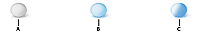
- A.
- orb_down_skin.gif
- B.
- orb_over_skin.gif
- C.
- orb_up_skin.gif
The following example uses graphical skins for the up, over, and down states of the Button control:
<?xml version="1.0"?>
<!-- skins/EmbedImagesTypeSelector.mxml -->
<s:Application xmlns:fx="http://ns.adobe.com/mxml/2009"
    xmlns:mx="library://ns.adobe.com/flex/mx"
    xmlns:s="library://ns.adobe.com/flex/spark">

    <fx:Style>
        @namespace mx "library://ns.adobe.com/flex/mx";

        mx|Button {
            overSkin: Embed("../assets/orb_over_skin.gif");
            upSkin: Embed("../assets/orb_up_skin.gif");
            downSkin: Embed("../assets/orb_down_skin.gif");
        }
    </fx:Style>

    <mx:Button id="b1" label="Click Me"/>

</s:Application>
The reason that you must embed the file is that in order to determine a component's minimum and preferred sizes, skin assets must be present as soon as the component is created. If you reference external assets at run time, Flex does not have the sizing information and, therefore, cannot render the skins properly.
Because skins are embedded, if you change the graphics files that comprise one or more skins, you must recompile your application for the changes to take effect. For more information on embedding assets, see Embedding assets.
One drawback to embedding images as skins is that they can become distorted if you resize the component that has a skin. You can use a technique called 9-slice scaling to create skins that do not become distorted when the component is resized. For information on the 9-slice scaling technique, see Using 9-slice scaling with embedded images.
Using static SWF assets as MX component skins
Static SWF files created in Flash 8 or Flash 9 contain artwork or skins, but do not contain any ActionScript 3.0 code. You can use the entire SWF file as a single skin, or you can use one or more symbols inside the SWF file as a skin. To embed an entire SWF file, you point to the location of the SWF file with the source property in the Embed statement, as follows:
<?xml version="1.0"?>
<!-- skins/EmbedSWFSource.mxml -->
<s:Application xmlns:fx="http://ns.adobe.com/mxml/2009"
    xmlns:mx="library://ns.adobe.com/flex/mx"
    xmlns:s="library://ns.adobe.com/flex/spark">

  <fx:Style>
     @namespace mx "library://ns.adobe.com/flex/mx";

     mx|Button {
        upSkin: Embed(source="../assets/SubmitButtonUpSkin.swf");
     }
  </fx:Style>

  <mx:Button id="b1"/>

</s:Application>
To import a symbol from a SWF file, you use the symbol property to specify the symbol name that you want to use in addition to pointing to the location of the SWF file with the source property. You must separate each property of the Embed statement with a comma. The following example replaces the MX Button control's up, over, and down skins with individual symbols from a SWF file:
<?xml version="1.0"?>
<!-- skins/EmbedSymbolsCSS.mxml -->
<s:Application xmlns:fx="http://ns.adobe.com/mxml/2009"
    xmlns:mx="library://ns.adobe.com/flex/mx"
    xmlns:s="library://ns.adobe.com/flex/spark">
  <fx:Style>

    @namespace mx "library://ns.adobe.com/flex/mx";

    mx|Button {
        upSkin: Embed(source='../assets/SubmitButtonSkins.swf',
            symbol='MyUpSkin');
        overSkin: Embed(source='../assets/SubmitButtonSkins.swf',
            symbol='MyOverSkin');
        downSkin: Embed(source='../assets/SubmitButtonSkins.swf',
            symbol='MyDownSkin');
    }
 </fx:Style>

  <mx:Button id="b1"/>
</s:Application>
You use the same syntax when embedding skin symbols inline, as follows:
<?xml version="1.0"?>
<!-- skins/EmbedSymbolsInline.mxml -->
<s:Application xmlns:fx="http://ns.adobe.com/mxml/2009"
    xmlns:mx="library://ns.adobe.com/flex/mx"
    xmlns:s="library://ns.adobe.com/flex/spark">

  <mx:Button id="b1"
     overSkin="@Embed(source='../assets/SubmitButtonSkins.swf',
        symbol='MyOverSkin')"
     upSkin="@Embed(source='../assets/SubmitButtonSkins.swf',
        symbol='MyUpSkin')"
     downSkin="@Embed(source='../assets/SubmitButtonSkins.swf',
        symbol='MyDownSkin')"/>
</s:Application>
In the source FLA file, all symbols that you use must meet the following conditions:
-
The symbol must be on the Stage. After you create an image file and convert it to a symbol, you must drag it from the library to the Stage. Flash does not export symbols that are not on the Stage. Alternatively, you can select the Export in First Frame option in the Linkage Properties dialog box.
-
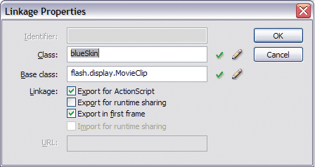
The symbol must have been exported for ActionScript with a linkage name. In Flash, you select the Export for ActionScript option in the symbol's Linkage Properties dialog box, as the following example shows:
The linkage name is the name used by Flex. Symbol names are ignored.
-
The FLA files cannot contain any ActionScript.
-
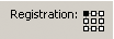
The symbol must have an upper-left registration point that you select in the Convert to Symbol dialog box. The following example shows an upper-left registration point:
You can use 9-slice scaling with image files (a grid with nine regions) so that the skin scales well when the component's size changes. You define the properties for 9-slice scaling of images when you apply the skin in CSS, as the following example shows:
@namespace mx "library://ns.adobe.com/flex/mx";
 mx|Button {
 	overSkin: Embed(
 		"../assets/orb_over_skin.gif",
 		scaleGridTop=6,
 		scaleGridLeft=12,
 		scaleGridBottom=44,
 		scaleGridRight=49
 	);
 }
For information on embedding assets that use the 9-slice scaling technique, see Using 9-slice scaling with embedded images.
Creating programmatic skins for MX components
You create programmatic skins as ActionScript classes or as MXML components for MX components. You use the basic drawing methods of the Flash Graphics (flash.display.Graphics) package, and apply those skins to your Flex controls.
You can modify programmatic skins that come with Flex or create your own. The programmatic skins used by components are in the mx.skins.halo.* package. All of the skins extend one of the following classes: UIComponent, ProgrammaticSkin, Border, or RectangularBorder.
For information on creating your own skins, see Programmatic skins recipe for MX components.
One type of programmatic skin, called a stateful skin, uses view states. For information on creating stateful skins, see Creating stateful skins for MX components.
Flex handles much of the overhead of class definition when you use an MXML component, so in some cases you might find it easier to define your skins as MXML components. The only restriction on MXML components is that you cannot define a constructor. Instead, you use an event handler for the preinitialize event to perform the work that you do in an ActionScript constructor.
For general information on creating ActionScript classes and MXML components, see Custom Flex components.
Programmatic skins recipe for MX components
At a minimum, a programmatic skin consists of a constructor (for an ActionScript class), an updateDisplayList() method, and a set of getters and setters for the skin's properties. Programmatic skins generally extend one of the classes in the mx.skins package or the UIComponent class.
To see examples of skins that follow the programmatic skin recipe, look at the concrete classes in the mx.skins.halo package. These are the skins that the components use. Those skins follow the same recipe presented here.
The following example is a typical outline of a programmatic skin:
package { // Use unnamed package if this skin is not in its own package.
  // skins/MySkinOutline.as

  // Import necessary classes here.
  import flash.display.Graphics;
  import mx.skins.Border;
  import mx.skins.ProgrammaticSkin;
  import mx.styles.StyleManager;

  // Extend ProgrammaticSkin.
  public class MySkinOutline extends ProgrammaticSkin {

     // Constructor.
     public function MySkinOutline() {
        // Set default values here.
     }

     // Override updateDisplayList().
     override protected function updateDisplayList(w:Number,
        h:Number):void {
        // Add styleable properties here.
        // Add logic to detect componentís state and set properties here.
        // Add drawing methods here.
     }
  }
} // Close unnamed package.
In your application, you can apply a programmatic skin using the ClassReference statement in CSS:
<?xml version="1.0"?>
<!-- skins/ApplyMySkinOutline.mxml -->
<s:Application xmlns:fx="http://ns.adobe.com/mxml/2009"
    xmlns:mx="library://ns.adobe.com/flex/mx"
    xmlns:s="library://ns.adobe.com/flex/spark">

  <fx:Style>
     @namespace mx "library://ns.adobe.com/flex/mx";

     mx|Button {
        overSkin: ClassReference("MySkinOutline");
        upSkin: ClassReference("MySkinOutline");
        downSkin: ClassReference("MySkinOutline");
     }
  </fx:Style>
  <mx:Button id="b1" label="Click Me"/>

</s:Application>
Selecting an interface or base class for your skin
Skin classes must implement one or more interfaces. When you create a programmatic skin, you can either create a class that implements the required interfaces, or you can create a subclass of a class that already implements the required interfaces.
Your decision on which interface to implement, or which class to use as the base class of your skin, might depend on the type of skin that you want to create. For example, if you want to create a skin that defines a border, you might create a subclass of Border. If you want to create a stateful skin, you can create subclass of UIComponent or create a class that implement the IStateClient interface.
You can extend the abstract base classes in the mx.skins package or the concrete classes in the mx.skins.halo package. Extending the former gives you greater control over the look and feel of your skins. Extending the latter is a good approach if you use the default behaviors of the components but also want to add extra styling to them.
Some rules to consider:
-
A stateful skin must implement either the IStateClient interface or the IProgrammaticSkin interface. The UIComponent class implements the IStateClient interface. The ProgrammaticSkin class implements the IProgrammaticSkin interface.
-
A skin passed to any skin property other than a stateful skin property, such as Button.upSkin or NumericStepper.upArrowOverSkin, must implement the IFlexDisplayObject interface. The UIComponent class and the ProgrammaticSkin class implement the IFlexDisplayObject interface.
Most Halo skins for MX components extend the mx.skins.ProgrammaticSkin class, but you can select any one of the following as a superclass for your skin:
-
The ProgrammaticSkin class implements the IFlexDisplayObject, ILayoutManagerClient, IInvalidating, and ISimpleStyleClient interfaces, so it is the easiest and most common superclass to use.
-
The Border class extends the ProgrammaticSkin class and adds support for the borderMetrics property. Use this class or the RectangularBorder class if your skin defines the component's border.
-
The RectangularBorder class extends the Border class and adds support for the backgroundImage style.
-
The UIComponent class implements the IStateClient interface, making it easy to use for stateful skins. It is also the component that you use when implementing skins in MXML.
Use the following list of steps to create programmatic skins for your Flex controls. Each step is explained in more detail in the following sections.
Create programmatic skins for MX components
-
Select one of the following base classes as a superclass for your programmatic skin:
-
Border or a subclass of Border
-
ProgrammaticSkin or a subclass of ProgrammaticSkin
-
RectangularBorder or a subclass of RectangularBorder
-
UIComponent or a subclass of UIComponent
You can also extend one of the concrete classes in the mx.skins.Halo package.
-
-
Implement the updateDisplayList() method. Put all the drawing and styling calls in this method.
For more information, see Implementing the updateDisplayList() method.
-
For an ActionScript class, implement the constructor.
-
(Optional) Implement getters for the measuredWidth and measuredHeight properties.
For more information, see Implementing the measuredWidth and measuredHeight getters.
-
If the skin is a subclass of Border or RectangularBorder, implement a getter for the borderMetrics property.
For more information, see Implementing a getter for the borderMetrics property.
-
(Optional) Make properties styleable.
If you create a skin that has properties that you want users to be able to set with CSS or with calls to the setStyle() method, you must add code to your skin class. For more information, see Making properties styleable.
Compiling programmatic skins for MX components
When you compile an application that uses programmatic skins, you treat programmatic skins as you would treat any ActionScript class or MXML component, which means that you must add the skins to the source-path argument of the compiler. If the skins are in the same directory as the MXML file that you are compiling, you set the source-path to a period. The following example shows this with the mxmlc command-line compiler:
$ ./mxmlc -source-path=. c:/flex/MyApp.mxml
If the programmatic skins are not in a package, you must add them to the unnamed package to make them externally visible. Otherwise, mxmlc throws a compiler error. To do this, you surround the class with a package statement, as the following example shows:
  package { // Open unnamed package.
 	import flash.display.*;
 	import mx.skins.ProgrammaticSkin;

 	public class MySkin extends ProgrammaticSkin {
 		...
 	}
 } // Close unnamed package.
Implementing the updateDisplayList() method
The updateDisplayList() method defines the look of the skin. It is called after the skin's construction to initially draw the skin, and then is subsequently called whenever the component is resized, restyled, moved, or is interacted with in some way.
You use the Flash Player drawing methods to draw the programmatic skin in the updateDisplayList() method. For more information on the drawing methods, see Drawing programmatically.
When you implement the updateDisplayList() method, you must do the following:
-
Use the override keyword to override the superclass's implementation.
-
Set the return type to void.
-
Declare the method as protected.
The updateDisplayList() method takes the height and width of the component as arguments. You use the values of these arguments as the boundaries for the region in which you can draw. The method returns void.
You use methods of theGraphics class (such as the lineTo() and drawRect() methods) to render the skin. To ensure that the area is clear before adding the component's shapes, you should call the clear() method before drawing. This method erases the results of previous calls to the updateDisplayList() method and removes all the images that were created by using previous draw methods. It also resets any line style that was specified with the lineStyle() method.
To use the methods of the Graphics package, you must import the flash.display.Graphics class, and any other classes in the flash.display package that you use, such as GradientType or Font. The following example imports all classes in the flash.display package:
import flash.display.*;
The following example draws a rectangle as a border around the component with the drawRect() method:
g.drawRect(0, 0, width, height);
The following example skin class draws an X with a border around it:
package { // Use unnamed package if this skin is not in its own package.
  // skins/CheckboxSkin.as

  // Import necessary classes here.
  import flash.display.Graphics;
  import mx.skins.Border;
  import mx.skins.ProgrammaticSkin;
  import mx.styles.StyleManager;

  public class CheckboxSkin extends ProgrammaticSkin {

     // Constructor.
     public function CheckboxSkin() {
        // Set default values here.
     }

  override protected function updateDisplayList(w:Number, h:Number):void {
     var g:Graphics = graphics;
     g.clear();
     g.beginFill(0xFFFFFF,1.0);
     g.lineStyle(2, 0xFF0000);
     g.drawRect(0, 0, w, h);
     g.endFill();
     g.moveTo(0, 0);
     g.lineTo(w, h);
     g.moveTo(0, h);
     g.lineTo(w, 0);
  }
  }
} // Close unnamed package.
For a description of common methods of the Graphics package, see Drawing programmatically. For details about these methods, see the ActionScript 3.0 Reference for Apache Flex.
One common task performed in the updateDisplayList() method is to change properties of the skin, depending on the current state of the control. For example, if you define a programmatic skin for a Button control, you can change the border thickness or color of the background when the user moves the mouse over or clicks the Button control.
You check the state by using the name property of the skin. The name is the current name of the skin. For example, if you define a programmatic skin for a Button control, the name property could be any of the skin states: downSkin, upSkin, overSkin, disabledSkin, selectedDisabledSkin, selectedDownSkin, selectedOverSkin, or selectedUpSkin.
The following example checks which state the Button control is in and adjusts the line thickness and background fill color appropriately. The result is that when the user clicks the Button control, Flex redraws the skin to change the line thickness to 2 points. When the user releases the mouse button, the skin redraws again and the line thickness returns to its default value of 4. The background fill color also changes depending on the Button control's state.
package { // Use unnamed package if this skin is not in its own package.
  // skins/ButtonStatesSkin.as

  // Import necessary classes here.
  import flash.display.Graphics;
  import mx.skins.Border;
  import mx.skins.ProgrammaticSkin;
  import mx.styles.StyleManager;

  public class ButtonStatesSkin extends ProgrammaticSkin {

     public var backgroundFillColor:Number;
     public var lineThickness:Number;

     // Constructor.
     public function ButtonStatesSkin() {
        // Set default values.
        backgroundFillColor = 0xFFFFFF;
        lineThickness = 4;
     }

     override protected function updateDisplayList(w:Number, h:Number):void {
        // Depending on the skin's current name, set values for this skin.
        switch (name) {
           case "upSkin":
            lineThickness = 4;
            backgroundFillColor = 0xFFFFFF;
            break;
           case "overSkin":
            lineThickness = 4;
            backgroundFillColor = 0xCCCCCC;
            break;
           case "downSkin":
            lineThickness = 2;
            backgroundFillColor = 0xFFFFFF;
            break;
           case "disabledSkin":
            lineThickness = 2;
            backgroundFillColor = 0xCCCCCC;
            break;
        }

        // Draw the box using the new values.
        var g:Graphics = graphics;
        g.clear();
        g.beginFill(backgroundFillColor,1.0);
        g.lineStyle(lineThickness, 0xFF0000);
        g.drawRect(0, 0, w, h);
        g.endFill();
        g.moveTo(0, 0);
        g.lineTo(w, h);
        g.moveTo(0, h);
        g.lineTo(w, 0);
     }
  }
} // Close unnamed package.
If you use a single programmatic skin class to define multiple states of a control, you must apply the skin to all appropriate states of that control in your application; for example:
<?xml version="1.0"?>
<!-- skins/ApplyButtonStatesSkin.mxml -->
<s:Application xmlns:fx="http://ns.adobe.com/mxml/2009"
    xmlns:mx="library://ns.adobe.com/flex/mx"
    xmlns:s="library://ns.adobe.com/flex/spark">

    <fx:Style>
        @namespace mx "library://ns.adobe.com/flex/mx";

        mx|Button {
            overSkin: ClassReference("ButtonStatesSkin");
            upSkin: ClassReference("ButtonStatesSkin");
            downSkin: ClassReference("ButtonStatesSkin");
        }
    </fx:Style>

    <mx:Button id="b1" label="Click Me"/>

</s:Application>
If the skin is a subclass of RectangularBorder, you must also call super.updateDisplayList() from within the body of the updateDisplayList() method.
Drawing programmatically
You use the drawing methods of the Graphics class to draw the parts of a programmatic skin. These methods let you describe fills or gradient fills, define line sizes and shapes, and draw lines. By combining these very simple drawing methods, you can create complex shapes that make up your component skins.
The following table briefly describes the most commonly used drawing methods in the Graphics package:
|
Method |
Summary |
|---|---|
|
beginFill() |
Begins drawing a fill; for example: beginFill(0xCCCCFF,1); If an open path exists (that is, if the current drawing position does not equal the previous position that you specified in a moveTo() method) and it has a fill associated with it, that path is closed with a line, and then filled. |
|
beginGradientFill() |
Begins drawing a gradient fill. If an open path exists (that is, if the current drawing position does not equal the previous position that you specified in a moveTo() method), and it has a fill associated with it, that path is closed with a line, and then filled. |
|
clear() |
Removes all the drawing output associated with the current object. The clear() method takes no arguments. |
|
curveTo() |
Draws a curve using the current line style; for example: moveTo(500, 500); curveTo(600, 500, 600, 400); curveTo(600, 300, 500, 300); curveTo(400, 300, 400, 400); curveTo(400, 500, 500, 500); |
|
drawCircle() |
Draws a circle after you set the line style and fill. You pass the method the x and y positions of the circle, as well as the radius, as the following example shows: drawCircle(10,10,50); |
|
drawRect() |
Draws a rectangle once you set the line style and fill. You pass the method the x and y positions of the rectangle, as well as the length and width of the rectangle, as the following example shows: drawRect(10,10,100,20); |
|
drawRoundRect() |
Draws a rectangle with rounded corners, after you set the line and fill. You pass the method the x and y position of the rectangle, length and height of the rectangle, and the width and height of the ellipse that is used to draw the rounded corners, as the following example shows: drawRoundRect(10,10,100,20,9,5) |
|
endFill() |
Ends the fill specified by the beginFill() or beginGradientFill() methods. The endFill() method takes no arguments. If the current drawing position does not equal the previous position that you specified in a moveTo() method and a fill is defined, the path is closed with a line, and then filled. |
|
lineStyle() |
Defines the stroke of lines created with subsequent calls to the lineTo() and curveTo() methods. The following example sets the line style to a 2-point gray line with 100% opacity: lineStyle(2,0xCCCCCC,1) You can call the lineStyle() method in the middle of drawing a path to specify different styles for different line segments within a path. Calls to the clear() method reset line styles back to undefined. |
|
lineTo() |
Draws a line using the current line style. The following example draws a triangle: moveTo (200, 200); lineTo (300, 300); lineTo (100, 300); lineTo (200, 200); If you call the lineTo() method before any calls to the moveTo() method, the current drawing position returns to the default value of (0, 0). |
|
moveTo() |
Moves the current drawing position to the specified coordinates; for example: moveTo(100,10); |
The following example draws a triangle:
package { // Use unnamed package if this skin is not in its own package.
  // skins/CheckBoxAsArrowSkin.as

  // Import necessary classes here.
  import flash.display.Graphics;
  import mx.skins.Border;
  import mx.skins.ProgrammaticSkin;
  import mx.styles.StyleManager;

  public class CheckBoxAsArrowSkin extends ProgrammaticSkin {

     // Constructor.
     public function CheckBoxAsArrowSkin() {
        // Set default values.
     }

     override protected function updateDisplayList(w:Number, h:Number):void {
        var unscaledHeight:Number = 2;
        var unscaledWidth:Number = 2;

        var arrowColor:Number;

        var g:Graphics = graphics;
        g.clear();

        switch (name) {
           case "upIcon":
           case "selectedUpIcon": {
            arrowColor = 0x666666;
            break;
           }
           case "overIcon":
           case "downIcon":
           case "selectedOverIcon":
           case "selectedDownIcon": {
            arrowColor = 0xCCCCCC;
            break;
           }
        }

        // Draw an arrow.
        graphics.lineStyle(1, 1, 1);
        graphics.beginFill(arrowColor);
        graphics.moveTo(unscaledWidth, unscaledHeight-20);
        graphics.lineTo(unscaledWidth-30, unscaledHeight+20);
        graphics.lineTo(unscaledWidth+30, unscaledHeight+20);
        graphics.lineTo(unscaledWidth, unscaledHeight-20);
        graphics.endFill();
     }
  }
} // Close unnamed package.
The ProgrammaticSkin class also defines drawing methods, the most common of which is the drawRoundRect() method. This method programmatically draws a rectangle and lets you set the corner radius, gradients, and other properties. You can use this method to customize borders of containers so that they might appear as the following example shows:
The following code uses the drawRoundRect() method to draw this custom VBox border:
package { // Use unnamed package if this skin is not in its own package.
  // skins/CustomContainerBorderSkin.as

  // Import necessary classes here.
  import flash.display.Graphics;
  import mx.graphics.RectangularDropShadow;
  import mx.skins.RectangularBorder;

  public class CustomContainerBorderSkin extends RectangularBorder {

    private var dropShadow:RectangularDropShadow;

    // Constructor.
    public function CustomContainerBorderSkin() {
    }

    override protected function updateDisplayList(unscaledWidth:Number,
       unscaledHeight:Number):void
    {

       super.updateDisplayList(unscaledWidth, unscaledHeight);

       var cornerRadius:Number = getStyle("cornerRadius");
       var backgroundColor:int = getStyle("backgroundColor");
       var backgroundAlpha:Number = getStyle("backgroundAlpha");
       graphics.clear();

       // Background
       drawRoundRect(0, 0, unscaledWidth, unscaledHeight,
           {tl: 0, tr:cornerRadius, bl: cornerRadius, br: 0},
           backgroundColor, backgroundAlpha);

       // Shadow
       if (!dropShadow)
          dropShadow = new RectangularDropShadow();

       dropShadow.distance = 8;
       dropShadow.angle = 45;
       dropShadow.color = 0;
       dropShadow.alpha = 0.4;
       dropShadow.tlRadius = 0;
       dropShadow.trRadius = cornerRadius;
       dropShadow.blRadius = cornerRadius;
       dropShadow.brRadius = 0;
       dropShadow.drawShadow(graphics, 0, 0, unscaledWidth, unscaledHeight);
    }
  }
}
In your application, you apply this skin as the following example shows:
<?xml version="1.0"?>
<!-- skins/ApplyContainerBorderSkin.mxml -->
<s:Application xmlns:fx="http://ns.adobe.com/mxml/2009"
    xmlns:mx="library://ns.adobe.com/flex/mx"
    xmlns:s="library://ns.adobe.com/flex/spark">

  <mx:VBox id="vb1"
     borderSkin="CustomContainerBorderSkin"
     backgroundColor="0xCCCC99"
     backgroundAlpha="0.8"
     cornerRadius="14"
     paddingLeft="20"
     paddingTop="20"
     paddingRight="20"
     paddingBottom="20">

     <mx:Label text="This is a VBox with a custom skin."/>

  </mx:VBox>

</s:Application>
The unscaledWidth and unscaledHeight properties in the previous examples refer to the measurements of the skin as the skin itself understands them. These measurements ignore the fact that external components might have changed the dimensions of the skin. When working inside the component, it is best to use the unscaled measurements.
Implementing the measuredWidth and measuredHeight getters
The measuredWidth and measuredHeight properties define the default width and height of a component. You can implement getter methods for the measuredWidth and measuredHeight properties of your skin, but it is not required by most skins. Some skins such as the skins that define the ScrollBar arrows do require that you implement these getters. If you do implement these getters, you must specify the override keyword when implementing the superclass's getter methods, and you must make the getters public.
The measuredWidth and measuredHeight getters typically return a constant number. The application usually honors the measured sizes, but not always. If these getters are omitted, the values of measuredWidth and measuredHeight are set to the default value of 0.
The following example sets the measuredWidth and measuredHeight properties to 10, and then overrides the getters:
package { // Use unnamed package if this skin is not in its own package.
  // skins/ButtonStatesWithMeasuredSizesSkin.as

  // Import necessary classes here.
  import flash.display.Graphics;
  import mx.skins.Border;
  import mx.skins.ProgrammaticSkin;
  import mx.styles.StyleManager;

  public class ButtonStatesWithMeasuredSizesSkin extends ProgrammaticSkin {

     public var backgroundFillColor:Number;
     public var lineThickness:Number;

     private var _measuredWidth:Number;
     private var _measuredHeight:Number;

     // Constructor.
     public function ButtonStatesWithMeasuredSizesSkin() {
        // Set default values.
        backgroundFillColor = 0xFFFFFF;
        lineThickness = 4;

        _measuredHeight = 100;
        _measuredWidth = 150;
     }

     override public function get measuredWidth():Number {
        return _measuredWidth;
     }

     override public function get measuredHeight():Number {
        return _measuredHeight;
     }

     override protected function updateDisplayList(w:Number, h:Number):void {
        // Depending on the skin's current name, set values for this skin.
        switch (name) {
           case "upSkin":
            lineThickness = 4;
            backgroundFillColor = 0xFFFFFF;
            break;
           case "overSkin":
            lineThickness = 4;
            backgroundFillColor = 0xCCCCCC;
            break;
           case "downSkin":
            lineThickness = 2;
            backgroundFillColor = 0xFFFFFF;
            break;
           case "disabledSkin":
            lineThickness = 2;
            backgroundFillColor = 0xCCCCCC;
            break;
        }

        // Draw the box using the new values.
        var g:Graphics = graphics;
        g.clear();
        g.beginFill(backgroundFillColor,1.0);
        g.lineStyle(lineThickness, 0xFF0000);
        g.drawRect(0, 0, w, h);
        g.endFill();
        g.moveTo(0, 0);
        g.lineTo(w, h);
        g.moveTo(0, h);
        g.lineTo(w, 0);
     }
  }
} // Close unnamed package.
Implementing a getter for the borderMetrics property
The borderMetrics property defines the thickness of the border on all four sides of a programmatic skin. If the programmatic skin is a subclass of Border or RectangularBorder, you must implement a getter for the borderMetrics property. Otherwise, this step is optional. This property is of type EdgeMetrics, so your getter must set EdgeMetrics as the return type.
The following example gets the borderThickness style and uses that value to define the width of the four sides of the border, as defined in the EdgeMetrics constructor:
package { // Use unnamed package if this skin is not in its own package.
  // skins/ButtonStatesWithBorderMetricsSkin.as

  // Import necessary classes here.
  import flash.display.Graphics;
  import mx.skins.Border;
  import mx.skins.ProgrammaticSkin;
  import mx.styles.StyleManager;
  import mx.core.EdgeMetrics;

  public class ButtonStatesWithBorderMetricsSkin extends ProgrammaticSkin {

     public var backgroundFillColor:Number;
     public var lineThickness:Number;

     private var _borderMetrics:EdgeMetrics;

     // Constructor.
     public function ButtonStatesWithBorderMetricsSkin() {
        // Set default values.
        backgroundFillColor = 0xFFFFFF;
        lineThickness = 4;
     }

     public function get borderMetrics():EdgeMetrics {
        if (_borderMetrics) {
           return _borderMetrics;
        }
        var borderThickness:Number = getStyle("borderThickness");
        _borderMetrics = new EdgeMetrics(borderThickness,
            borderThickness, borderThickness, borderThickness);
        return _borderMetrics;
     }

     override protected function updateDisplayList(w:Number, h:Number):void
     {
        // Depending on the skin's current name, set values for this skin.
        switch (name) {
           case "upSkin":
            lineThickness = 4;
            backgroundFillColor = 0xFFFFFF;
            break;
           case "overSkin":
            lineThickness = 4;
            backgroundFillColor = 0xCCCCCC;
            break;
           case "downSkin":
            lineThickness = 2;
            backgroundFillColor = 0xFFFFFF;
            break;
           case "disabledSkin":
            lineThickness = 2;
            backgroundFillColor = 0xCCCCCC;
            break;
        }

        // Draw the box using the new values.
        var g:Graphics = graphics;
        g.clear();
        g.beginFill(backgroundFillColor,1.0);
        g.lineStyle(lineThickness, 0xFF0000);
        g.drawRect(0, 0, w, h);
        g.endFill();
        g.moveTo(0, 0);
        g.lineTo(w, h);
        g.moveTo(0, h);
        g.lineTo(w, 0);
     }
  }
} // Close unnamed package.
Creating stateful skins for MX components
Many MX components that use the Halo theme, such as Button, Slider, and NumericStepper, support stateful skins. A stateful skin uses view states to specify the skins for the different states of the component. For more information on view states, see View states.
You can determine whether a skin property supports stateful skins from its description in the ActionScript 3.0 Reference for Apache Flex . For example, all stateful skin properties contain a sentence in the form shown below for the TitleWindow.closeButtonSkin property:
"You can use the closeButtonSkin style to assign the skin for the following skin states: disabled, down, over, up."
To function as a stateful skin, the skin must implement the IStateClient interface. Because that interface is implemented by the UIComponent class, you can use any subclass of UIComponent to define a stateful skin. You then assign the stateful skin class to a stateful skin property of the component.
For example, an MX Button control has eight possible states, and eight associated skins. To create a single skin class that defines the skins for all eight states, you create a skin based on the UIComponent control. You then define eight view states within your skin where the name of each view state corresponds to a state of the Button control, as the following example shows:
  <?xml version="1.0"?>
 <mx:UIComponent xmlns:mx="http://www.adobe.com/2006/mxml">
 	<mx:states>
 		<mx:State name="down">
 		</mx:State>

 		<mx:State name="over">
 		</mx:State>

 		...

 		<mx:State name="selectedUp">
 		</mx:State>
 	</mx:states>

 	<fx:Script>
 		<![CDATA[
 			<!-- Define the skin by using the Flash drawing API. -->
 		]]>
 	</fx:Script>
 </mx:UIComponent>
After defining your stateful skin, you assign it to the skin style property of the control. You can assign the stateful control by using CSS, the setStyle() method, by using inline styles, or by using the StyleManager class. The following example sets it by using CSS:
<?xml version="1.0"?>
<!-- skins/ApplyButtonStatefulSkinAll.mxml -->
<s:Application xmlns:fx="http://ns.adobe.com/mxml/2009"
    xmlns:mx="library://ns.adobe.com/flex/mx"
    xmlns:s="library://ns.adobe.com/flex/spark">

    <fx:Style>
        @namespace mx "library://ns.adobe.com/flex/mx";

        mx|Button {
            skin: ClassReference("myComponents.MyButtonStatefulSkinAll");
        }
    </fx:Style>
    <mx:Button label="Hello" id="b" />
</s:Application>
You do not have to define all eight skins; you only define the skins that you want to create. For all others, you use the default skins supplied with the theme.
For more information, see Applying MX component skins.
Example: Creating a stateful Halo skin
A stateful skin is a programmatic skin, so you have to define it using the rules defined in the section Programmatic skins recipe for MX components. That means you have to define an override of the updateDisplayList() method, and for an ActionScript class, you also define a constructor.
To create a view state, you define a base view state, and then define a set of changes, or overrides, that modify the base view state to define each new view state. Each new view state can modify the base state by adding or removing child components, by setting style and property values, or by defining state-specific event handlers.
One of the most common ways to define stateful skins is to define the skin with several properties or styles that can be modified by each view state. For example, the following stateful skin defines a property to control the line weight, fill color, and drop shadow for a skin used by the Button control:
<?xml version="1.0"?>
<!-- skins/myComponents/MyButtonStatefulSkin.mxml -->
<mx:UIComponent xmlns:mx="http://www.adobe.com/2006/mxml">

  <mx:Script>
    <![CDATA[
      import flash.filters.DropShadowFilter;

      // Define a drop shadow for the over and down states.
      [Bindable]
      private var myFilter:DropShadowFilter = new DropShadowFilter(0);

      // Define a private var for line weight.
      private var _lineWeight:Number = 1;

      // Define public setter and getter for line weight.
      public function get lineWeight():Number
      {
        return _lineWeight;
      }

      public function set lineWeight(value:Number):void
      {
        _lineWeight = value;
        invalidateDisplayList();
      }

      // Define a private var for the fill color.
      private var _rectFill:uint = 0x00FF00;

      // Define public setter and getter for fill color.
      public function get rectFill():uint
      {
        return _rectFill;
      }

      public function set rectFill(value:uint):void
      {
        _rectFill = value;
        invalidateDisplayList();
      }

      override protected function updateDisplayList(unscaledWidth:Number,
          unscaledHeight:Number):void
      {
        graphics.lineStyle(lineWeight, 0x0066FF);
        graphics.beginFill(rectFill, 0.50);
        graphics.drawRoundRect(0, 0, unscaledWidth, unscaledHeight, 10, 10);
        filters = [myFilter];
      }
    ]]>
  </mx:Script>

    <mx:states>
        <mx:State name="up">
        </mx:State>
        <mx:State name="over">
            <mx:SetProperty target="{this}"
                name="rectFill" value="0x00CC33"/>
            <mx:SetProperty target="{myFilter}"
                name="distance" value="4"/>
        </mx:State>
        <mx:State name="down">
            <mx:SetProperty target="{this}"
                name="rectFill" value="0x00CC33"/>
            <mx:SetProperty target="{myFilter}"
                name="inner" value="true"/>
            <mx:SetProperty target="{myFilter}"
                name="distance" value="2"/>
        </mx:State>
    </mx:states>
</mx:UIComponent>
This examples defines skins the for following states:
- up
-
Does not define any changes; therefore, the base view state defines the skin for the up state.
- over
-
Changes the fill color to 0x00CC33, sets the line width to 2 pixels, and creates a 2-pixel wide drop shadow.
- down
-
Changes the fill color to 0x00CC33, sets the drop shadow type to inner, and creates a 2-pixel wide drop shadow.
The following application uses this skin:
<?xml version="1.0"?>
<!-- skins/ApplyButtonStatefulSkin.mxml -->
<s:Application xmlns:fx="http://ns.adobe.com/mxml/2009"
    xmlns:mx="library://ns.adobe.com/flex/mx"
    xmlns:s="library://ns.adobe.com/flex/spark">

    <fx:Style>
        @namespace mx "library://ns.adobe.com/flex/mx";

        mx|Button {
          skin: ClassReference("myComponents.MyButtonStatefulSkin");
          disabledSkin: ClassReference("mx.skins.halo.ButtonSkin");
          selectedUpSkin: ClassReference("mx.skins.halo.ButtonSkin");
          selectedOverSkin: ClassReference("mx.skins.halo.ButtonSkin");
          selectedDownSkin: ClassReference("mx.skins.halo.ButtonSkin");
          selectedDisabledSkin: ClassReference("mx.skins.halo.ButtonSkin");
        }
    </fx:Style>
    <mx:Button label="Hello" id="b" />
</s:Application>
Creating a stateful Halo skin using images
You can use images in a stateful skin where a change of state causes the skin to display a different image. One issue when using images is that the base view state must contain the image so that when the skin is first created it has values for the measuredWidth and measuredHeight properties, otherwise Flex sets the height and width of the skin to 0.
In the following example, you embed images for the up, over, down, and disabled states of the Button control:
<?xml version="1.0" encoding="utf-8"?>
<!-- skins/myComponents/MyButtonStatefulSkinImages.mxml -->
<mx:Canvas xmlns:mx="http://www.adobe.com/2006/mxml">

    <mx:Script>
        <![CDATA[
            // Embed the skin images.
            [Bindable]
            [Embed(source="../../assets/orb_up_skin.gif")]
            private var buttonUp:Class;

            [Bindable]
            [Embed(source="../../assets/orb_over_skin.gif")]
            private var buttonOver:Class;

            [Bindable]
            [Embed(source="../../assets/orb_down_skin.gif")]
            private var buttonDown:Class;

            [Bindable]
            [Embed(source="../../assets/orb_disabled_skin.gif")]
            private var buttonDisabled:Class;
        ]]>
    </mx:Script>

    <mx:states>
        <mx:State name="up"/>
        <mx:State name="notBase">
            <mx:RemoveChild target="{baseButton}"/>
        </mx:State>
        <mx:State name="over" basedOn="notBase">
            <mx:AddChild creationPolicy="all">
                <mx:Image source="{buttonOver}"
                    maintainAspectRatio="false"
                    width="100%" height="100%"/>
            </mx:AddChild>
        </mx:State>
        <mx:State name="down" basedOn="notBase">
            <mx:AddChild creationPolicy="all">
                <mx:Image source="{buttonDown}"
                    maintainAspectRatio="false"
                    width="100%" height="100%"/>
            </mx:AddChild>
        </mx:State>
        <mx:State name="disabled" basedOn="notBase">
            <mx:AddChild creationPolicy="all">
                <mx:Image source="{buttonDisabled}"
                    maintainAspectRatio="false"
                    width="100%" height="100%"/>
            </mx:AddChild>
        </mx:State>
    </mx:states>

    <mx:Image id="baseButton"
        width="100%" height="100%"
        source="{buttonUp}"
        maintainAspectRatio="false"/>
</mx:Canvas>
In this example the skin performs the following actions:
-
Defines no changes from the base view state to create the up view state.
-
Defines the notBase view state to remove the image defined by the base view state. All other view states, except for the up view state, are based on the notBase view state.
-
Sets the creationPolicy property to all for each AddChild tag. This property specifies to create the child instance at application startup, rather than on the first change to the view state. This prevents flickering when viewing a view state for the first time. For more information, see View states.
-
Sets the width and height properties to 100% for the Image tags because the Canvas container is what is being resized by the skin parent, not the individual Image controls. This setting configures the Image control to size itself to its parent.
-
Sets the maintainAspectRatio property to false on each Image tag so that the image stretches to fill the full size of the Canvas container.
Using transitions with a stateful Halo skin
View states let you change appearance of a component, typically in response to a user action. Transitions define how a change of view state looks as it occurs on the screen. You define a transition by using the effect classes, in combination with several effects designed explicitly for handling transitions. For more information on transitions, see Transitions.
In the following example, you add a transition to the stateful skin definition from the previous section. In this example, the transition defines a 100 ms animation to occur when changing the fill color of the skin:
<?xml version="1.0"?>
<!-- skins/myComponents/MyButtonStatefulSkinTrans.mxml -->
<mx:UIComponent xmlns:mx="http://www.adobe.com/2006/mxml">

  <mx:Script>
    <![CDATA[
      import flash.filters.DropShadowFilter;

      // Define a drop shadow for the over and down states.
      [Bindable]
      private var myFilter:DropShadowFilter = new DropShadowFilter(0);

      // Define a private var for line weight.
      private var _lineWeight:Number = 1;

      // Define public setter and getter for line weight.
      public function get lineWeight():Number
      {
        return _lineWeight;
      }

      public function set lineWeight(value:Number):void
      {
        _lineWeight = value;
        invalidateDisplayList();
      }

      // Define a private var for the fill color.
      private var _rectFill:uint = 0x00FF00;

      // Define public setter and getter for fill color.
      public function get rectFill():uint
      {
        return _rectFill;
      }

      public function set rectFill(value:uint):void
      {
        _rectFill = value;
        invalidateDisplayList();
      }

      override protected function updateDisplayList(unscaledWidth:Number,
          unscaledHeight:Number):void
      {
        graphics.lineStyle(lineWeight, 0x0066FF);
        graphics.beginFill(rectFill, 0.50);
        graphics.drawRoundRect(0, 0, unscaledWidth, unscaledHeight, 10, 10);
        filters = [myFilter];
      }
    ]]>
  </mx:Script>

    <mx:states>
        <mx:State name="up">
        </mx:State>
        <mx:State name="over">
            <mx:SetProperty target="{this}"
                name="rectFill" value="0x00CC33"/>
            <mx:SetProperty target="{myFilter}"
                name="distance" value="4"/>
        </mx:State>
        <mx:State name="down">
            <mx:SetProperty target="{this}"
                name="rectFill" value="0x00CC33"/>
            <mx:SetProperty target="{myFilter}"
                name="inner" value="true"/>
            <mx:SetProperty target="{myFilter}"
                name="distance" value="2"/>
        </mx:State>
    </mx:states>
    <mx:transitions>
        <mx:Transition>
            <mx:AnimateProperty target="{this}"
                property="rectFill" duration="100"/>
        </mx:Transition>
    </mx:transitions>
</mx:UIComponent>
Creating advanced programmatic skins for MX components
Accessing the parent component
It is possible to get a reference to the parent of the programmatic skin from within the programmatic skin class. You can use this reference to access properties of the parent component or call methods on it.
You can access the parent from the updateDisplayList() method by using the skin's parent property. You cannot access the parent in the skin's constructor because the skin has not yet been added to the parent control. The value of the skin's parent property is set when the parent MX container calls the addChild() method to add the skin as a child.
When instantiating components with programmatic skins, the order of events is as follows:
-
Create an instance of the parent component.
-
Create an instance of the skin class.
-
Call the addChild() method on the parent MX container to add the skin class.
To get a reference to the skin's parent, you must cast the skin's parent property to a UIComponent. The skin inherits this read-only property from the IFlexDisplayObject interface. You should also confirm that the parent is a UIComponent by using the is operator, because Flex throws a run-time error if the cast cannot be made.
The following example gets the class name of the parent control and draws the border and fill, depending on the type of component the parent is:
package {

import flash.display.GradientType;
import flash.display.Graphics;
import mx.skins.Border;
import mx.styles.StyleManager;
import mx.utils.ColorUtil;
import mx.skins.halo.HaloColors;
import mx.core.UIComponent;

public class IconSkin extends Border {

  public function IconSkin() {
     //super();
  }

  override public function get measuredWidth():Number {
     return 14;
  }

  override public function get measuredHeight():Number {
     return 14;
  }

  override protected function updateDisplayList(w:Number, h:Number):void {
     super.updateDisplayList(w, h);

     // User-defined styles
     var borderColor:uint = getStyle("borderColor");
     var fillAlphas:Array = getStyle("fillAlphas");
     var fillColors:Array = getStyle("fillColors");
     styleManager.getColorNames(fillColors);
     var highlightAlphas:Array = getStyle("highlightAlphas");
     var themeColor:uint = getStyle("themeColor");

     var r:Number = width / 2;

     var upFillColors:Array;
     var upFillAlphas:Array;

     var disFillColors:Array;
     var disFillAlphas:Array;

     var g:Graphics = graphics;
     g.clear();

     var myParent:String;

     switch (name) {
        case "upIcon": {
           upFillColors = [ fillColors[0], fillColors[1] ];
           upFillAlphas = [ fillAlphas[0], fillAlphas[1] ];

           if (parent is UIComponent) {
            myParent = String(UIComponent(parent).className);
           }
           if (myParent=="RadioButton") {
            // RadioButton border
            g.beginGradientFill(GradientType.LINEAR,
                [ borderColor, 0x000000 ],
                [100,100], [0,0xFF],
                verticalGradientMatrix(0,0,w,h));
            g.drawCircle(r,r,r);
            g.drawCircle(r,r,(r-1));
            g.endFill();

            // RadioButton fill
            g.beginGradientFill(GradientType.LINEAR,
                upFillColors,
                upFillAlphas,
                [0,0xFF],
                verticalGradientMatrix(1,1,w-2,h-2));
            g.drawCircle(r,r,(r-1));
            g.endFill();
           } else if (myParent=="CheckBox") {
            // CheckBox border
            drawRoundRect(0,0,w,h,0,
                [borderColor, 0x000000], 1,
                verticalGradientMatrix(0,0,w,h),
                GradientType.LINEAR,
                null, {x: 1,y:1,w:w-2,h:h-2,r:0});

            // CheckBox fill
            drawRoundRect(1, 1, w-2, h-2, 0,
                upFillColors, upFillAlphas,
                verticalGradientMatrix(1,1,w-2,h-2));
           }

           // top highlight
           drawRoundRect(1, 1, w-2,
                (h-2)/2, {tl:r,tr:r,bl:0,br:0},
                [0xFFFFFF, 0xFFFFFF],
                highlightAlphas,
                verticalGradientMatrix(0,0,w-2,(h-2)/2));
        }

        // Insert other cases such as downIcon and overIcon here.

     }
  }
}

}
Making properties styleable
In many cases, you define a programmatic skin that defines style properties, such as the background color of the skin, the border thickness, or the roundness of the corners. You can make these properties styleable so that your users can change their values in a CSS file or with the setStyle() method from inside their applications. You cannot set styles that are defined in programmatic skins by using inline syntax.
To make a custom property styleable, add a call to the getStyle() method in the updateDisplayList() method and specify that property as the method's argument. When Flex renders the skin, it calls getStyle() on that property to find a setting in CSS or on the display list. You can then use the value of the style property when drawing the skin.
You should wrap this call to the getStyle() method in a check to see if the style exists. If the property was not set, the result of the getStyle() method can be unpredictable.
The following example verifies if the property is defined before assigning it a value:
  if (getStyle("lineThickness")) {
 	_lineThickness = getStyle("lineThickness");
 }
You must define a default value for the skin's styleable properties. You usually do this in the skin's constructor function. If you do not define a default value, the style property is set to NaN or undefined if the application does not define that style. This can cause a run-time error.
The following example of the MyButtonSkin programmatic skin class defines default values for the _lineThickness and _backgroundFillColor styleable properties in the skin's constructor. It then adds calls to the getStyle() method in the updateDisplayList() method to make these properties styleable:
package { // Use unnamed package if this skin is not in its own package.
  // skins/ButtonStylesSkin.as

  // Import necessary classes here.
  import flash.display.Graphics;
  import mx.skins.Border;
  import mx.skins.ProgrammaticSkin;
  import mx.styles.StyleManager;

  public class ButtonStylesSkin extends ProgrammaticSkin {

     public var _backgroundFillColor:Number;
     public var _lineThickness:Number;

     // Constructor.
     public function ButtonStylesSkin() {
        // Set default values.
        _backgroundFillColor = 0xFFFFFF;
        _lineThickness=2;
     }

     override protected function updateDisplayList(w:Number, h:Number):void {
        if (getStyle("lineThickness")) {
           // Get value of lineThickness style property.
           _lineThickness = getStyle("lineThickness");
        }
        if (getStyle("backgroundFillColor")) {
           // Get value of backgroundFillColor style property.
           _backgroundFillColor = getStyle("backgroundFillColor");
        }

        // Draw the box using the new values.
        var g:Graphics = graphics;
        g.clear();
        g.beginFill(_backgroundFillColor,1.0);
        g.lineStyle(_lineThickness, 0xFF0000);
        g.drawRect(0, 0, w, h);
        g.endFill();
        g.moveTo(0, 0);
        g.lineTo(w, h);
        g.moveTo(0, h);
        g.lineTo(w, 0);
     }
  }
} // Close unnamed package.
In your application, you can set the values of styleable properties by using CSS or the setStyle() method.
The following example sets the value of styleable properties on all Button controls with CSS:
<?xml version="1.0"?>
<!-- skins/ApplyButtonStylesSkin.mxml -->
<s:Application xmlns:fx="http://ns.adobe.com/mxml/2009"
    xmlns:mx="library://ns.adobe.com/flex/mx"
    xmlns:s="library://ns.adobe.com/flex/spark"
    width="600" height="600">

    <s:layout>
        <s:VerticalLayout/>
    </s:layout>

  <fx:Style>
     @namespace mx "library://ns.adobe.com/flex/mx";

     mx|Button {
        upSkin:ClassReference('ButtonStylesSkin');
        downSkin:ClassReference('ButtonStylesSkin');
        overSkin:ClassReference('ButtonStylesSkin');
        disabledSkin:ClassReference('ButtonStylesSkin');
        lineThickness:4;
        backgroundFillColor:#CCCCCC;
     }
  </fx:Style>

  <fx:Script><![CDATA[
     public function changeLineThickness(e:Event):void {
        var t:int = Number(b1.getStyle("lineThickness"));
        if (t == 4) {
           b1.setStyle("lineThickness",1);
        } else {
           b1.setStyle("lineThickness",4);
        }
     }
  ]]></fx:Script>

  <mx:Button id="b1" label="Change Line Thickness" click="changeLineThickness(event)"/>

</s:Application>
When using the setStyle() method to set the value of a style property in your application, you can set the value of a styleable property on a single component instance (as in the previous example) or on all instances of a component.
The following example uses the setStyle() method to set the value of a styleable property on all instances of the control (in this case, all MX Button controls):
<?xml version="1.0"?>
<!-- skins/ApplyGlobalButtonStylesSkin.mxml -->
<s:Application xmlns:fx="http://ns.adobe.com/mxml/2009"
    xmlns:mx="library://ns.adobe.com/flex/mx"
    xmlns:s="library://ns.adobe.com/flex/spark"
    width="600" height="600">

  <fx:Style>
     @namespace mx "library://ns.adobe.com/flex/mx";

     mx|Button {
        upSkin:ClassReference('ButtonStylesSkin');
        downSkin:ClassReference('ButtonStylesSkin');
        overSkin:ClassReference('ButtonStylesSkin');
        disabledSkin:ClassReference('ButtonStylesSkin');
        lineThickness:4;
        backgroundFillColor:#CCCCCC;
     }
  </fx:Style>

  <fx:Script><![CDATA[
     public function changeLineThickness(e:Event):void {
        var t:int = Number(b1.getStyle("lineThickness"));
        if (t == 4) {
           styleManager.getStyleDeclaration("mx.controls.Button").setStyle("lineThickness", 1);
        } else {
           styleManager.getStyleDeclaration("mx.controls.Button").setStyle("lineThickness", 4);
        }
     }
  ]]></fx:Script>

  <mx:Button id="b1" label="Change Line Thickness" click="changeLineThickness(event)"/>

</s:Application>
If you do not set the values of these properties using either CSS or the setStyle() method, Flex uses the default values of the properties that you set in the skin's constructor.
To get the value of an existing style property, such as color or fontSize, you do not have to wrap the call to the getStyle() method in a check for the property's existence. This is because Flex creates a CSSStyleDeclaration that defines the default values of all of a component's styles. Preexisting style properties are never undefined. Style properties that you add to a custom skin are not added to this CSSStyleDeclaration because the component does not know that the property is a style property.
Custom skin properties that you define as styleable are noninheritable. So, subclasses or children of that component do not inherit the value of that property.
Navigation
Adobe, Adobe Illustrator, Adobe Photoshop, Adobe Flash, Adobe Flash Platform and Adobe Flash Player are either registered trademarks or trademarks of Adobe Systems Incorporated in the United States and/or other countries and are used by permission from Adobe. No other license to the Adobe trademarks are granted.