
View states
View states let you vary the content and appearance of a component or application, typically in response to a user action. When changing the view state, you can change the value of a property or style, change an event handler, or change the parent of a component.
Transitions define how a change of view state looks as it occurs on the screen. For information on transitions, see Transitions.
About view states
In many rich Internet applications, the interface changes based on the task the user is performing. A simple example is an image that changes when the user rolls the mouse over it. More complex examples include user interfaces whose contents change depending on the user's progress through a task, such as changing from a browse view to a detail view. View states let you easily implement such applications.
At its simplest, a view state defines a particular view of a component. For example, a product thumbnail could have two view states; a default view state with minimal information, and a "rich" state with links for more information. The following figure shows two view states for a component:

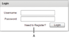
- A.
- Default view state
- B.
- Rich view state
To create a view state, you define a default view state, and then define a set of changes, or overrides, that modify the default view state to define the new view state. Each additional view state can modify the default view state by adding or removing child components, by setting style and property values, or by defining state-specific event handlers.
For example, the default view state of the application could be the home page and include a logo, a sidebar, and some welcome content. When the user clicks a button in the sidebar, the application dynamically changes its appearance, meaning its view state, by replacing the main content area with a purchase order form but leaving the logo and sidebar in place.
Two places in your application where you must use view states is when defining skins and item renderers for Spark components. For more information, see Spark Skinning and Custom Spark item renderers.
Defining a login interface by using view states
One use of view states is to implement a login and registration form. In this example, the default view state prompts the user to log in, and includes a LinkButton control that lets the user register, if necessary, as the following image shows:
If the user selects the Need to Register link, the form changes view state to display registration information, as the following image shows:
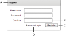
- A.
- Modified title of Panel container
- B.
- New form item
- C.
- Modified label of Button control
- D.
- New LinkButton control
Notice the following changes to the default view state to create this view state:
-
The title of the Panel container is set to Register
-
The Form container has a new TextInput control for confirming the password
-
The label of the Button control is set to Register
-
The LinkButton control has been replaced with a new LinkButton control that lets the user change state back to the default view state
When the user clicks the Return to Login link, the view state changes back to the default view state to display the Login form. This change reverses all the changes made when changing to the register view state.
To see the code that creates this example, see Example: Login form application.
Comparing view states to MX navigator containers
View states give you one way to change the appearance of an application or component in response to a user action. You can also use MX navigator containers, such as the Accordion, Tab Navigator, and ViewStack containers when you perform changes that affect several components.
Your choice of using navigator containers or states depends on your application requirements and user-interface design. For example, if you want to use a tabbed interface, use a TabNavigator container. You might decide to use the Accordion container to let the user navigate through a complex form, rather than using view states to perform this action.
When comparing view states to ViewStack containers, one thing to consider is that you cannot easily share components between the different views of a ViewStack container. That means you have to recreate a component each time you change views. For example, if you want to show a search component in all views of a View Stack container, you must define it in each view.
When using view states, you can easily share components across multiple view states by defining the component once, and then including it in each view state. For more information about sharing components among view states, see Controlling when to create added children. For more information on navigator containers, see MX navigator containers.
Example: Creating a simple view state
The following example shows an application with a default view state, and one additional view state named "NewButton". In this example, changing to the NewButton view state adds button b2 to the Group container, and disables button b1. Switching back to the default view state removes b2 and enables b1:
<?xml version="1.0"?>
<!-- states\StatesSimple.mxml -->
<s:Application xmlns:fx="http://ns.adobe.com/mxml/2009"
    xmlns:mx="library://ns.adobe.com/flex/mx"
    xmlns:s="library://ns.adobe.com/flex/spark">

    <s:states>
        <!-- Define the new view states. -->
        <s:State name="default"/>
        <s:State name="NewButton"/>
    </s:states>
    <s:VGroup id="g1">

        <s:HGroup>
            <!-- Disable Button in the NewButton view state. -->
            <s:Button id="b1" label="Click Me"
                enabled.NewButton="false"/>

            <!-- Add a new child control to the VBox. -->
            <s:Button id="b2" label="New Button"
                includeIn="NewButton"/>
        </s:HGroup>

        <!-- Define Button control to switch to NewButton view state. -->
        <s:Button label="Change to NewButton state"
            click="currentState='NewButton';"/>
        <!-- Define Button control to switch to default view state. -->
        <s:Button label="Change to default view state"
            click="currentState='default';"/>
    </s:VGroup>
</s:Application>
Create and apply view states
The properties, styles, event handlers, and components that you define for an application or custom component specify its default view state. Any additional view state specify changes to the default view state.
For each additional view state, define overrides of the default view state. Overrides modify the properties, styles, and event handlers for a component, add a component to a view state, remove a component from a view state, or change the parent container of a component in a view state.
Creating view states
Consider the following when you define a view state.
-
Define view states at the root of an application or at the root of a custom component; that is, as a property of the Application container of an application file, or of the root tag of an MXML component.
-
Define states by using a component's states property, normally by using the <s:states> tag in MXML.
-
Populate the states property with an Array of one or more State objects, where each State object corresponds to a view state.
-
Use the name property of the State object to specify its identifier. To change to that view state, you set a component's currentState property to the value of the name property.
Note: View state definitions are processed at compile time. Therefore, you cannot use data binding to set the State.name property because data binding occurs at run time.
The following MXML code shows this structure:
 <s:Application>
 	<!-- Define the view states.
 		The <s:states> tag can also be a child tag of
 		the root tag of a custom component.
 	-->
 	<s:states>
 		<s:State name="State1"/>
		<s:State name="State2"/>
		<s:State name="State3"/>
		.
 		.
 	</s:states>
 	<!-- Application definition. -->
 	.
 	.
 </s:Application>
The default view state is defined as the first view state in the <s:states> Array. An application uses the default view state when it loads. The name of the default view state is not reserved, so it is not required to be "default".
Changing view state
The UIComponent class defines the currentState property that you use to set the current view state. When the application starts, the default value of the currentState property is the name of the first view state defined by the <s:states> tag.
In the next example, you use a Button control to set the currentState property of the Application object to "State1" or "State2", the names of a view state specified by the <s:State> tag:
 <s:Button id="b1" label="Change to State 1" click="currentState='State2';"/>
 <s:Button id="b2" label="Change to the default" click="currentState='State1';"/>
The second button in the previous example sets the current state to "State1" so that you can switch back to the default view state from "State2".
You can also set the currentState property to an empty String to set it to the default state, as the following example shows:
<s:Button id="b2" label="Change to the default" click="currentState='';"/>
You can change a component's view state by calling the setCurrentState() method of the UIComponent class. Use this method when you do not want to apply a transition that you have defined between two view states. For more information on transitions, see Transitions.
Setting properties, styles, and events for a view state
propertyOrStyleName.stateName
<s:Button label="Default State" label.State2="New State"/>
The value of the label property qualified by "State2" specifies the value for the property in that view state. The unqualified property definition, the one that omits the dot notation, defines the value of the property for all view states where you do not explicitly define an override.
Do not define an override for every property, style, and event for all view states. Only define the override for those view states where you want to change the value of the element.
You can also use child tags with the dot notation to define property overrides, as the following example shows for the b1 button control:
<?xml version="1.0"?>
<!-- states\StatesSimpleChildTags.mxml -->
<s:Application xmlns:fx="http://ns.adobe.com/mxml/2009"
    xmlns:mx="library://ns.adobe.com/flex/mx"
    xmlns:s="library://ns.adobe.com/flex/spark">

    <s:states>
        <!-- Define the new view states. -->
        <s:State name="default"/>
        <s:State name="NewButton"/>
    </s:states>

    <s:VGroup >
        <s:HGroup>
            <!-- Disable Button in the NewButton view state. -->
            <s:Button id="b1">
                <s:label>Click Me</s:label>
                <s:label.NewButton>Disabled</s:label.NewButton>
                <s:enabled.NewButton>false</s:enabled.NewButton>
            </s:Button>

            <!-- Add a new child control to the VBox. -->
            <s:Button id="b2" label="New Button"
                includeIn="NewButton"/>
        </s:HGroup>

        <!-- Define Button control to switch to NewButton view state. -->
        <s:Button label="Change to NewButton state"
            click="currentState='NewButton';"/>
        <!-- Define Button control to switch to default view state. -->
        <s:Button label="Change to default view state"
            click="currentState='default';"/>
    </s:VGroup>
</s:Application>
<s:Button color="0xFF0000" color.State1="@Clear()"/>
For a style property, setting the value to @Clear() corresponds to calling the clearStyle() method on the property.
Use the dot operator to change the event handler for a specific view state, as the following example shows. In this example, the handler for the click event for button b1 is set based on the view state:
<?xml version="1.0"?>
<!-- states\StatesEventHandlersSimple.mxml -->
<s:Application xmlns:fx="http://ns.adobe.com/mxml/2009"
    xmlns:mx="library://ns.adobe.com/flex/mx"
    xmlns:s="library://ns.adobe.com/flex/spark">

    <s:states>
        <s:State name="default"/>
        <s:State name="logout"/>
    </s:states>

    <s:VGroup >
        <s:Button id="b1" label="Click Me"
            click="ta1.text='hello';"
            click.logout="ta1.text='goodbye'"/>
        <s:TextArea id="ta1" height="100" width ="50%"/>

        <s:Button label="Default State"
            click="currentState='';"
            enabled="false"
            enabled.logout="true"/>
        <s:Button label="Logout State"
            click="currentState='logout';"
            enabled="true"
            enabled.logout="false"/>
    </s:VGroup>
</s:Application>
Adding or removing components for a view state
Use the includeIn and excludeFrom MXML attributes to specify the set of view states in which a component is included, where:
-
The includeIn attribute specifies the list of view states where the component appears. This attribute takes a comma delimited list of view state names, all which must have been previously declared in the <s:states> Array.
-
The excludeFrom attribute specifies the list of view states where the component is omitted. This attribute takes a comma delimited list of view state names.
-
The excludeFrom and includeIn attributes are mutually exclusive; it is an error to define both on a single MXML tag.
The following example uses view states to add components to the application based on the current state:
<?xml version="1.0"?>
<!-- states\StatesSimpleIncExc.mxml -->
<s:Application xmlns:fx="http://ns.adobe.com/mxml/2009"
    xmlns:mx="library://ns.adobe.com/flex/mx"
    xmlns:s="library://ns.adobe.com/flex/spark">
    <s:layout>
        <s:VerticalLayout/>
    </s:layout>

    <s:states>
        <s:State name="default"/>
        <s:State name="addCheckBox"/>
        <s:State name="addTextInput"/>
        <s:State name="addCheckBoxandButton"/>
    </s:states>

    <s:HGroup >
        <!-- Included in the addCheckBox and addCheckBoxandButton view states. -->
        <s:CheckBox id="myCB" label="Checkbox"
           includeIn="addCheckBox, addCheckBoxandButton"/>

        <!-- Included in the addTextInput view state. -->
        <s:TextInput id="myTI"
           includeIn="addTextInput"/>
        <!-- Included in the addCheckBoxandButton view state. -->
        <s:Button id="myB"
           includeIn="addCheckBoxandButton"/>

        <!-- Exclude from addTextInput view state. -->
        <s:TextArea text="Exclude from addTextInput"
            excludeFrom="addTextInput"/>
    </s:HGroup>

    <s:HGroup>
        <s:Button label="Add CheckBox"
            click="currentState='addCheckBox'"/>
        <s:Button label="Show Textinput Only"
            click="currentState='addTextInput'"/>
        <s:Button label="Add CheckBox and Button"
            click="currentState='addCheckBoxandButton'"/>
        <s:Button label="Default"
            click="currentState='default'"/>
    </s:HGroup>
</s:Application>
-
The root tag of an MXML document, such as the Application tag or the root tag in an MXML component.
-
Tags that represent properties of their parent tag. For example, the <s:label> tag of the <s:Button> tag.
-
Descendants of the <fx:XML>, <fx:XMLList>, or <fx:Model> tags.
-
Any language tags, such as the <fx:Binding>, <fx:Declarations>, <fx:Metadata>, <fx:Script>, and <fx:Style> tags.
Restriction on modifying container children when using view states
When you use view states to control the children of a container, do not add or remove container children, or change the order of children in the container, at runtime. For example, the following container defines a Button control that appear only in State2:
<s:Group id="myGroup">
	<s:Button/>
	<s:Button includeIn="State2"/>
	<s:Button/>
</s:Group>
The view states infrastructure relies on the structure of the container as defined by the MXML file. Changing the child order of the container at runtime can cause your application to fail. Therefore, do not call the addElement(), removeElement(), setElementIndex() method on the Group container at runtime, or any other method that changes the child order of the container.
Changing the parent of a component
A view state can change the parent container of a component. Changing the parent container of a component is called reparenting the component.
<fx:Reparent target="targetComp" includeIn="stateName">
The target property specifies the target component, and the includeIn property specifies a view state. When the current view state is set to stateName, the target component becomes a child of the parent component of the <fx:Reparent> tag. You can think of the <fx:Reparent> tag as a placeholder for the component for a specific view state.
You can use the <fx:Reparent> tag in any component that can hold a child component, and the child can use the includeIn or excludeFrom keywords.
<?xml version="1.0" encoding="utf-8"?>
<!-- states\NewStatesReparent.mxml -->
<s:Application xmlns:fx="http://ns.adobe.com/mxml/2009"
    xmlns:mx="library://ns.adobe.com/flex/mx"
    xmlns:s="library://ns.adobe.com/flex/spark">
    <s:layout>
        <s:VerticalLayout/>
    </s:layout>

    <s:states>
        <s:State name="Parent1"/>
        <s:State name="Parent2"/>
    </s:states>

    <s:HGroup>
        <s:Panel id="Panel1"
            height="100" width="100"
            title="Panel 1">
            <s:Button id="setCB" includeIn="Parent1"/>
        </s:Panel>
        <s:Panel id="Panel2"
            height="100" width="100"
            title="Panel 2">
            <fx:Reparent target="setCB" includeIn="Parent2"/>
        </s:Panel>
    </s:HGroup>

    <s:HGroup>
        <s:Button label="Parent 1"
            click="currentState='Parent1'"
            enabled.Parent1="false"/>
        <s:Button label="Parent 2"
            click="currentState='Parent2'"
            enabled.Parent2="false"/>
    </s:HGroup>
</s:Application>
Two <fx:Reparent> tags cannot target the same component for the same view state. That means a component can only have a single parent in each view state.
Controlling when to create added children
When you remove a component as part of a change of view state, you remove the component from the application's display list, which means that it no longer appears on the screen. Even though the component is no longer visible, the component still exists and you can access it from within your application.
When you add a component as part of a change of view state, you can either create the component before the first change to the view state, or create it at the time of the first change. If you create the component before the first change, you can access the component from within your application even though you have not yet changed view states. If you create the component when you perform the first change to the view state, you cannot access it until you perform that first change.
By default Flex creates container children when they are first required as part of a change of view state. However, if a child requires a long time to create, users might see a delay when the view state changes. Therefore, you can choose to create the child before the state changes to improve your application's apparent speed and responsiveness.
Regardless of when you create a component, the component remains in memory after you change out of the view state that creates it. Therefore, after the first change to a view state, you can always access the component even if that view state is no longer the current view state.
The specification of when the child is created is called its creation policy. For more general information on creation policies and controlling how children are created, see Improving startup performance.
Use the itemCreationPolicy property to specify the creation policy. The itemCreationPolicy property supports the following values:
- deferred
-
Creates the component instance when it is first added by a change to the view state. This is the default value.
- immediate
-
Creates the component instance at application startup.
The following example uses the Immediate view state to add a Button control named newButtonImmediate. You set the itemCreationPolicy property for this button to immediate to create the button at application startup. Therefore, the application can access it to set its label property before it switches to the Immediate view state.
The application also uses the Deferred view state to create the button named newButtonDeferred with the itemCreationPolicy property set to deferred. Therefore, this button is created when you first change to the Deferred view state, and you cannot access it until after the first switch to the Deferred view state:
<?xml version="1.0"?>
<!-- states\StatesCreationPolicy.mxml  -->
<s:Application xmlns:fx="http://ns.adobe.com/mxml/2009"
    xmlns:mx="library://ns.adobe.com/flex/mx"
    xmlns:s="library://ns.adobe.com/flex/spark"
    creationComplete="initButton();">

    <fx:Script>
        <![CDATA[

            // Because the Immediate view state creates the Button control
            // at application startup, you can access the control to
            // set the label before the first switch
            // to the Immediate view state.
            public function initButton():void {
                newButtonImmediate.label="Immediate Button";

                // Uncommenting this line to access the label causes a
                // Run Time Exception because newButtonDeferred does not exist yet.
                // newButtonDeferred.label="Deferred Button";
            }
        ]]>
    </fx:Script>

    <s:states>
        <s:State name="default"/>
        <s:State name="Immediate"/>
        <s:State name="Deferred"/>
    </s:states>

    <s:Panel id="myPanel"
        title="Static and dynamic states"
        width="300" height="150">
        <s:layout>
            <s:VerticalLayout/>
        </s:layout>
        <!-- Create the Button control at application startup. -->
        <s:Button id="newButtonImmediate"
            includeIn="Immediate"
            itemCreationPolicy="immediate"/>

        <!-- Create the Button control when you switch to this view state. -->
        <s:Button id="newButtonDeferred"
            label="Deferred button"
            includeIn="Deferred"
            itemCreationPolicy="deferred"/>

        <!-- Change to the Immediate view state. -->
        <s:Button label="Change to Immediate state"
            click="currentState='Immediate';"/>

        <!-- Change to the Deferred view state. -->
        <s:Button label="Change to Deferred state"
          click="currentState='Deferred';"/>

        <!-- Change to the default view state. -->
        <s:Button label="Change to default state"
          click="currentState='default';"/>
    </s:Panel>
</s:Application>
Controlling caching of objects created in a view state
A change to a view state can cause Flex to create an object. By default, after Flex creates the object, the object is cached indefinitely, even after you switch to another view state. The item is cached even if the destination view state excludes the object.
Use the itemDestructionPolicy attribute with the includeIn and excludeFrom attributes configure Flex to completely destroy the object when leaving a view state, including deleting it from the cache. Typically it is more efficient to allow items to be cached because it improves performance when switching back to the view state that created the object, or to a view state that uses the object. However your application might define a view state that is rarely used, and you do not want to allocate memory for caching the object.
You can use the itemDestructionPolicy attribute on any object in MXML that supports the includeIn and excludeFrom attributes. The possible values for itemDestructionPolicy are never (default) and auto.
The value of never specifies that the object is cached indefinitely. A value of auto means that the object is destroyed when leaving a view state where the object exists. The following example sets the attribute to auto:
<s:TextInput includeIn="newTextInput" itemDestructionPolicy="auto"/>
Defining view state groups
The stateGroups attribute of the <s:States> tag lets you group one or more states together. For example, if multiple components appear in the same set of view states, create a view state group that contains all these view states. Then, when you set the currentState property to any view state in the group, the components appears.
In the following example, the CheckBox control named myCB appears when you change to any view state in Group1:
<?xml version="1.0"?>
<!-- states\StatesSimpleGroups.mxml -->
<s:Application xmlns:fx="http://ns.adobe.com/mxml/2009"
    xmlns:mx="library://ns.adobe.com/flex/mx"
    xmlns:s="library://ns.adobe.com/flex/spark">
    <s:layout>
        <s:VerticalLayout/>
    </s:layout>

    <s:states>
        <s:State name="default"/>
        <s:State name="addCheckBox" stateGroups="Group1"/>
        <s:State name="addTextInput"/>
        <s:State name="addCheckBoxandButton" stateGroups="Group1"/>
    </s:states>

    <s:HGroup>
        <!-- Included in the addCheckBox and addCheckBoxandButton view states. -->
        <s:CheckBox id="myCB" label="Checkbox"
            includeIn="Group1"/>

       <!-- Included in the addTextInput view state. -->
       <s:TextInput id="myTI"
            includeIn="addTextInput"/>
        <!-- Included in the addCheckBoxandButton view state. -->
        <s:Button id="myB"
           includeIn="addCheckBoxandButton"/>

        <!-- Exclude from addTextInput view state. -->
        <s:TextArea text="Exclude from addTextInput"
           excludeFrom="addTextInput"/>
    </s:HGroup>

    <s:HGroup>
        <s:Button label="Add CheckBox"
            click="currentState='addCheckBox'"/>
        <s:Button label="Add Textinput"
            click="currentState='addTextInput'"/>
        <s:Button label="Add Group 1"
            click="currentState='addCheckBoxandButton'"/>
        <s:Button label="Default"
            click="currentState='default'"/>
    </s:HGroup>
</s:Application>
Example: Login form application
The following example creates the Login and Register forms shown in About view states. This application has the following features:
-
When the user clicks the Need to Register LinkButton control, the event handler for the click event sets the view state to Register.
-
The Register state code adds a TextInput control, changes properties of the Panel container and Button control, removes the existing LinkButton controls, and adds a new LinkButton control.
-
When the user clicks the Return to Login LinkButton control, the event handler for the click event resets the view state to the default view state.
<?xml version="1.0"?>
<!-- states\LoginExample.mxml -->
<s:Application xmlns:fx="http://ns.adobe.com/mxml/2009"
    xmlns:mx="library://ns.adobe.com/flex/mx"
    xmlns:s="library://ns.adobe.com/flex/spark">

    <!-- The Application class states property defines the view states.-->
    <s:states>
        <s:State name="default"/>
        <s:State name="Register"/>
    </s:states>

    <!-- Set title of the Panel container based on the view state.-->
    <s:Panel id="loginPanel"
        title="Login" title.Register="Register">
        <s:layout>
            <s:VerticalLayout/>
        </s:layout>
        <s:Form id="loginForm">
            <s:FormItem label="Username:">
                <s:TextInput/>
            </s:FormItem>

            <s:FormItem label="Password:">
                <s:TextInput/>
            </s:FormItem>

            <s:FormItem id="confirm" label="Confirm:" includeIn="Register">
                <!-- Add a TextInput control to the form for the Register view state. -->
                <s:TextInput/>
            </s:FormItem>

            <s:FormItem>
                <!-- Use the LinkButton to change view state.-->
                <s:HGroup>
                    <!-- Set label of the control based on the view state.-->
                    <mx:LinkButton id="registerLink"
                        label="Need to Register?"
                        label.Register="Return to Login"
                        click="currentState='Register'"
                        click.Register="currentState=''"/>
                    <s:Button id="loginButton"
                        label="Login" label.Register="Register"/>
                </s:HGroup>
            </s:FormItem>
        </s:Form>
    </s:Panel>
</s:Application>
Example: Controlling layout using view states groups
In this example, you define an application with three Panel containers and three view states, as the following example shows:
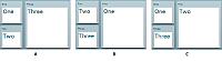
- A.
- Default view state
- B.
- One view state
- C.
- Two view state
To change view state, click the Panel container that you want to display in the expanded size. For a version of this example that adds a transition to animate the view state change, see Defining transitions.
<?xml version="1.0"?>
<!-- states/ThreePanel.mxml -->
<s:Application xmlns:fx="http://ns.adobe.com/mxml/2009"
    xmlns:mx="library://ns.adobe.com/flex/mx"
    xmlns:s="library://ns.adobe.com/flex/spark" width="400">

    <!-- Define the two view states, in addition to the default view state.-->
    <s:states>
        <s:State name="default"/>
        <s:State name="One"/>
        <s:State name="Two"/>
    </s:states>

    <!-- Define the Group container holding the three Panel containers.-->
    <s:Group width="100%" height="100%">
        <s:Panel id="p1" title="One"
                x="0" y="0"
                x.One="110" y.One="0"
                x.Two="0" y.Two="0"
                width="100" height="100"
                width.One="200" height.One="210"
                width.Two="100" height.Two="100"
                click="currentState='One'">
            <s:Label fontSize="24" text="One"/>
        </s:Panel>

        <s:Panel id="p2" title="Two"
                x="0" y="110"
                x.One="0" y.One="0"
                x.Two="110" y.Two="0"
                width="100" height="100"
                width.One="100" height.One="100"
                width.Two="200" height.Two="210"
                click="currentState='Two'">
            <s:Label fontSize="24" text="Two"/>
        </s:Panel>

        <s:Panel id="p3" title="Three"
                x="110" y="0"
                x.One="0" y.One="110"
                x.Two="0" y.Two="110"
                width="200" height="210"
                width.One="100" height.One="100"
                width.Two="100" height.Two="100"
                click="currentState='default'">
            <s:Label fontSize="24" text="Three"/>
        </s:Panel>
    </s:Group>
</s:Application>
You can optimize this application by using view state groups, as the following example shows:
<?xml version="1.0"?>
<!-- states/ThreePanelGroups.mxml -->
<s:Application xmlns:fx="http://ns.adobe.com/mxml/2009"
    xmlns:mx="library://ns.adobe.com/flex/mx"
    xmlns:s="library://ns.adobe.com/flex/spark" width="400">

    <!-- Define the two view states, in addition to the default state.-->
    <s:states>
        <s:State name="default" stateGroups="grpDefaultOne, grpDefaultTwo"/>
        <s:State name="One" stateGroups="grpDefaultOne, grpOneTwo "/>
        <s:State name="Two" stateGroups="grpDefaultTwo, grpOneTwo"/>
    </s:states>

    <!-- Define the Group container holding the three Panel containers.-->
    <s:Group width="100%" height="100%">
        <s:Panel id="p1" title="One"
                x.grpDefaultTwo="0" y.grpDefaultTwo="0"
                x.One="110" y.One="0"
                width.grpDefaultTwo="100" height.grpDefaultTwo="100"
                width.One="200" height.One="210"
                click="currentState='One'">
            <s:Label fontSize="24" text="One"/>
        </s:Panel>

        <s:Panel id="p2" title="Two"
                x="0" y="110"
                x.One="0" y.One="0"
                x.Two="110" y.Two="0"
                width.grpDefaultOne="100" height.grpDefaultOne="100"
                width.Two="200" height.Two="210"
                click="currentState='Two'">
            <s:Label fontSize="24" text="Two"/>
        </s:Panel>

        <s:Panel id="p3" title="Three"
                x="110" y="0"
                x.grpOneTwo="0" y.grpOneTwo="110"
                width="200" height="210"
                width.grpOneTwo="100" height.grpOneTwo="100"
                click="currentState='default'">
            <s:Label fontSize="24" text="Three"/>
        </s:Panel>
    </s:Group>
</s:Application>
Using view state events
When a component's currentState property changes, the State object for the states being exited and entered dispatch the following events:
- enterState
-
Dispatched after a view state is entered. Dispatched by a State object and by a component.
- exitState
-
Dispatched when a view state is about to be exited. Dispatched by a State object before it is exited, and by a component before it exits the current view state.
The component on which you modify the currentState property to cause the state change dispatches the following events:
- currentStateChanging
-
Dispatched when the view state is about to change. It is dispatched by a component after its currentState property changes, but before the view state changes. You can use this event to request any data from the server required by the new view state.
- currentStateChange
-
Dispatched after the view state has completed changing. It is dispatched by a component after its currentState property changes. You can use this event to send data back to a server indicating the user's current view state.
<?xml version="1.0"?>
<!-- states\StatesSimpleEvent.mxml -->
<s:Application xmlns:fx="http://ns.adobe.com/mxml/2009"
    xmlns:mx="library://ns.adobe.com/flex/mx"
    xmlns:s="library://ns.adobe.com/flex/spark"
    height="450">

    <s:states>
        <!-- Define the new view states. -->
        <s:State name="default"
            enterState="MyEnterTA.text = 'Enter state: default';"
            exitState="MyExitTA.text = 'Exit state: default';"/>
        <s:State name="NewButton"
            enterState="MyEnterTA.text = 'Enter state: NewButton';"
            exitState="MyExitTA.text = 'Exit state: NewButton';"/>
    </s:states>
    <s:VGroup id="g1">
        <s:HGroup>
            <s:Button id="b1" label="Click Me"
                enabled.NewButton="false"/>
            <s:Button id="b2" label="New Button"
                includeIn="NewButton"/>
        </s:HGroup>

        <s:Button label="Change to NewButton state"
            click="currentState='NewButton';"/>
        <s:Button label="Change to default view state"
            click="currentState='default';"/>

        <s:TextArea id="MyEnterTA"/>
        <s:TextArea id="MyExitTA"/>

    </s:VGroup>
</s:Application>
Defining view states in custom components
If a custom component has multiple view states, define the view states in the component code, not in the main application. You can then set the view state of the component independently of the view state of the enclosing application.
<?xml version="1.0"?>
<!-- states\myComponents\LoginComponent.mxml -->
<!-- Set title of the Panel container based on the view state.-->
<s:Panel xmlns:fx="http://ns.adobe.com/mxml/2009"
    xmlns:mx="library://ns.adobe.com/flex/mx"
    xmlns:s="library://ns.adobe.com/flex/spark"
    title="Login" title.Register="Register">

    <!-- The states property defines the view states.-->
    <s:states>
        <s:State name="Login"/>
        <s:State name="Register"/>
    </s:states>

    <s:Form id="loginForm">
        <s:FormItem label="Username:">
            <s:TextInput/>
        </s:FormItem>
        <s:FormItem label="Password:">
            <s:TextInput/>
        </s:FormItem>
        <!-- Add a TextInput control to the form for the Register view state. -->
        <s:FormItem id="confirm" label="Confirm:" includeIn="Register">
            <s:TextInput/>
        </s:FormItem>
        <s:FormItem>
            <s:HGroup>
                <!-- Use the LinkButton to change to the Register view state.-->
                <!-- Exclude the LinkButton from the Register view state.-->
                <mx:LinkButton id="registerLink"
                    includeIn="Login"
                    label="Need to Register?"
                    click="currentState='Register'"/>
                <!-- Add a LinkButton to the form for the Register view state. -->
                <mx:LinkButton label="Return to Login"
                    includeIn="Register"
                    click="currentState=''"/>
                <mx:Spacer width="100%" id="spacer1"/>
                <!-- Set label of the control based on the view state.-->
                <s:Button id="loginButton"
                    label="Login" label.Register="Register" />
            </s:HGroup>
        </s:FormItem>
    </s:Form>
</s:Panel>
<?xml version="1.0" encoding="utf-8"?>
<!-- states\LoginMain.mxml -->
<s:Application xmlns:fx="http://ns.adobe.com/mxml/2009"
    xmlns:mx="library://ns.adobe.com/flex/mx"
    xmlns:s="library://ns.adobe.com/flex/spark"
    xmlns:MyComp="myComponents.*">
    <s:layout>
        <s:VerticalLayout/>
    </s:layout>
    <s:Label text="Login or Register"
        fontSize="14" fontWeight="bold"/>

    <MyComp:LoginComponent currentState="Login"/>
</s:Application>
Using view states with a custom item renderer
A shopping application that displays multiple items on a page might have a custom thumbnail item renderer with two view states. In one view state, the item cell might look the following image:

When the user rolls the mouse over the item, the view state changes: the thumbnail no longer has the availability and rating information, but now has buttons that let the user get more information or add the item to the wish list or cart. In the new state, the cell also has a border and a drop shadow, as the following image shows:

In this example, the application item renderer's two view states have different child components and have different component styles. The summary state, for example, includes an availability label and a star rating image, and has no border. The rolled-over state replaces the label and rating components with three buttons, and has an outset border.
For information on item renderers, see MX item renderers and item editors.
Example: Using view states with a custom item renderer
The following code shows an application that uses a custom item renderer to display catalog items. When the user moves the mouse over an item, the item renderer changes to a state where the picture is slightly enlarged, the price appears in the cell, and a text box shows a message about the item. All changes are made by the item renderer's state, including the change in the parent application.
<?xml version="1.0"?>
<!-- states\StatesRendererMain.mxml -->
<s:Application xmlns:fx="http://ns.adobe.com/mxml/2009"
    xmlns:mx="library://ns.adobe.com/flex/mx"
    xmlns:s="library://ns.adobe.com/flex/spark">
    <s:layout>
        <s:VerticalLayout horizontalAlign="center"/>
    </s:layout>

    <s:DataGroup itemRenderer="myComponents.ImageComp"
        width="300" height="400">
        <s:layout>
            <s:TileLayout columnWidth="150" rowHeight="175"
                requestedColumnCount="2" requestedRowCount="2" />
        </s:layout>
        <mx:ArrayCollection>
            <fx:Object
                name="Flex 3595"
                data="1"
                price="129.99"
                image="assets/Flex_3595.gif"
                description="Kids love it."/>
            <fx:Object
                name= "Flex 3650"
                data="1"
                price="99.99"
                image="assets/Flex_3650.gif"
                description="Impress your friends."/>
            <fx:Object
                name="Flex 6010"
                data="1"
                price="49.99"
                image="assets/Flex_6010.gif"
                description="Good for everyone."/>
            <fx:Object
                name="Flex 6360"
                data="1"
                price="19.99"
                image="assets/Flex_6360.gif"
                description="Great deal!"/>
        </mx:ArrayCollection>
    </s:DataGroup>
</s:Application>
The following code defines the item renderer, in the file ImageComp.mxml:
<?xml version="1.0" encoding="utf-8"?>
<s:ItemRenderer xmlns:fx="http://ns.adobe.com/mxml/2009"
    xmlns:mx="library://ns.adobe.com/flex/mx"
    xmlns:s="library://ns.adobe.com/flex/spark">
    <s:layout>
        <s:VerticalLayout/>
    </s:layout>

    <s:states>
        <s:State name="normal"/>
        <s:State name="hovered"/>
        <s:State name="selected"/>
    </s:states>
    <s:Image id="img1"
        source="{data.image}"
        width="75" width.hovered="85"
        height="75" height.hovered="85"/>
    <s:Label text="{data.name}"
        color="blue"
        fontSize.hovered="16"/>
    <s:Label text.hovered="{data.price}"/>
    <s:TextArea id="t1"
        visible="false" visible.hovered="true"
        height="30" width="125"
        text.hovered="{data.description}"/>
</s:ItemRenderer>
Using view states with the browser manager
The Flex browser manager lets users navigate through an application by using the web browser's back and forward navigation commands. The browser manager can track when the application enters a state so that users can use the browser to navigate between states, such as states that correspond to different stages in an application process.
To use the browser manager, you first obtain a reference to the BrowserManager object by calling the BrowserManager.getInstance() method. This method returns the current instance of the manager, which implements IBrowserManager interface. You can then call methods on the browser manager such as setTitle() and setFragment().
To save the current state of an application, you write the state name as a name-value pair to the application URL in the browser's address bar. When the user clicks the browser's Forward or Back button, extract the state from the browser's URL and set the currentState value appropriately. For more information the browser manager, see Using the BrowserManager.
The following code shows how you can code a search interface so that the browser manager tracks the state of the application:
<?xml version="1.0"?>
<!-- states\StatesBrowserManager.mxml -->
<s:Application xmlns:fx="http://ns.adobe.com/mxml/2009"
    xmlns:mx="library://ns.adobe.com/flex/mx"
    xmlns:s="library://ns.adobe.com/flex/spark"
    creationComplete="initApp();">

    <fx:Script>
        <![CDATA[
            import mx.managers.BrowserManager;
            import mx.managers.IBrowserManager;
            import mx.events.BrowserChangeEvent;
            import mx.utils.URLUtil;

            // The search string value.
            [Bindable]
            public var searchString:String;

            // The BrowserManager instance.
            private var browserManager:IBrowserManager;

            // Initialize the BrowserManager when the application is created.
            public function initApp():void {
                browserManager = BrowserManager.getInstance();
                browserManager.addEventListener(BrowserChangeEvent.BROWSER_URL_CHANGE, parseURL);
                browserManager.init("", "Browser Manager for View States");
                // Set the default state as a name/value pair in the URL.
                updateURL('default');
            }

            // Handle the event when the user clicks the Forward or Back button
            // in the browser. This event handler retrieves the value of the
            // state property from the new URL, and uses it to set currentState property.
            private var stateFromURL:String;
            private function parseURL(e:Event):void {
                var o:Object = URLUtil.stringToObject(browserManager.fragment);
                stateFromURL = o.state;
                currentState=stateFromURL;
            }
            // On a state change, save the value of the new
            // currentState property as name/value pair of the URL.
            private function updateURL(myCurrentState:String):void {
                var s:String = "state=" + myCurrentState;
                browserManager.setFragment(s);
            }

            // The method for doing the search.
            // For the sake of simplicity it doesn't do any searching.
            // It does change the state to display the results box,
            // and save the new state in the URL.
            public function doSearch():void {
                currentState = "results";
                updateURL('results');
                searchString = searchInput.text;
            }

            // Method to revert the state to the default state.
            // Saves the new state in in the URL.
            public function reset():void {
                currentState = '';
                searchInput.text = "";
                searchString = "";
                updateURL('default');
            }
        ]]>
    </fx:Script>

    <s:states>
        <!-- The state for displaying the search results -->
        <s:State name="default"/>
        <s:State name="results"/>
    </s:states>

    <!-- In the default state, just show a panel
        with a search text input and button. -->
    <s:Panel id="panel1"
        title="Search" title.results="Results"
        resizeEffect="Resize"
        width="10%" height="10%"
        width.results="100%" height.results="100%">
        <s:layout>
            <s:VerticalLayout/>
        </s:layout>
        <s:SkinnableContainer id="searchFields" defaultButton="{b}">
            <s:layout>
                <s:HorizontalLayout/>
            </s:layout>
            <s:TextInput id="searchInput"/>
            <s:Button id="b"
                label="Go"
                click="doSearch();"/>
            <s:Button includeIn="results"
                label="Reset"
                click="reset();"/>
        </s:SkinnableContainer>
        <s:Label includeIn="results"
            text="Search results for {searchString}"/>
    </s:Panel>
</s:Application>
In this example, when the user changes state, the updateURL() method writes the current state to the browser's URL as a name/value pair. When the user clicks the browser's Forward or Back button, the parseURL() method extracts the state from the browser's URL and set the currentState value.
You can modify the updateURL() method to write more than just the current state to the URL. For example, you can write the search string to the URL. You then use the parseURL() method to extract it and update the TextInput control named searchInput.
Navigation
Adobe and Adobe Flash Platform are either registered trademarks or trademarks of Adobe Systems Incorporated in the United States and/or other countries and are used by permission from Adobe. No other license to the Adobe trademarks are granted.