
MX item renderers and item editors
You can customize the appearance and behavior of cells in MX list-based data provider controls that you use in applications built with Flex, including the DataGrid, HorizontalList, List, Menu, MenuBar, TileList, and Tree controls. To control the appearance of cells in list controls, you create custom item renderers and item editors.
For more information about creating more advanced item editors, see Advanced data display with MX item editors.
For information on using item renderers with Spark components, see Custom Spark item renderers.
About MX item renderers
MX supports several controls that you can use to represent lists of items. These controls let the application user scroll through the item list and select one or more items from the list. All MX list components are derived from the ListBase class, and include the following controls:
A list control gets its data from a data provider. A data provider is a collection that contains a data object such as an Array or XMLList object. For example, a Tree control reads data from a data provider to define the structure of the tree and any associated data that is assigned to each tree node. Collections are objects that contain a set of methods that let you access, sort, filter, and modify the data items in a data object. The standard collection types are the ArrayCollection and XMLListCollection classes, for working with Array-based and XMLList-based data, respectively.
Collections provide a level of abstraction between Flex components and the data that you use to populate them. You can populate multiple components from the same collection, switch the collection that a component uses as a data provider at run time, or modify a collection so that changes are reflected by all components that use it as a data provider.
You can think of the data provider as the model, and the Flex components as the view of the model. By separating the model from the view, you can change one without changing the other. Each list control has a default mechanism for controlling the display of data, or view, and lets you override that default. To override the default view, you create a custom item renderer.
In addition to controlling the display of data using an item renderer, the DataGrid, List, and Tree controls let users edit the data. For example, you could let users update the Quantity column of a DataGrid control if you are using it for a shopping cart. As with the display of data, the list controls have a default mechanism for letting users edit data that you can override by creating a custom item editor.
Default item rendering and cell editing in MX
Each MX list-based control has a default item renderer defined for it. The simplest item renderer is the DataGridItemRenderer class, which defines the item renderer for the DataGrid control. This item renderer assumes that each element in a data provider is a text string.
Other item renderers include the ListItemRenderer, MenuItemRenderer, MenuBarItem, TileListItemRenderer, and TreeItemRenderer. By default, these item renderers combine an image with text.
For example, the following image shows a List control that displays three items using its default item renderer:

In this example, the List control uses the default item renderer to display each of the three strings that represent postal codes for Alaska, Alabama, and Arkansas. You use the following code to create this List control:
<?xml version="1.0"?>
<!-- itemRenderers\list\ListDefaultRenderer.mxml -->
<s:Application xmlns:fx="http://ns.adobe.com/mxml/2009"
    xmlns:s="library://ns.adobe.com/flex/spark"
    xmlns:mx="library://ns.adobe.com/flex/mx">

    <mx:List width="50" height ="75">
        <mx:dataProvider>
            <fx:String>AK</fx:String>
            <fx:String>AL</fx:String>
            <fx:String>AR</fx:String>
        </mx:dataProvider>
    </mx:List>
</s:Application>
Because the data in this example is inline static data, it is not necessary to explicitly wrap it in an ArrayCollection instance. However, when you work with data that could change, it is always best to specify a collection explicitly; for more information, see Data providers and collections.
In the next example, the data provider for the DataGrid control contains fields for an artist, album name, and price. Each of these fields appears in the DataGrid control using the default item renderer, which displays data as text.
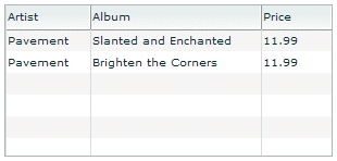
The following code creates the example shown in the previous image:
<?xml version="1.0"?>
<!-- itemRenderers\dataGrid\DGDefaultRenderer.mxml -->
<s:Application xmlns:fx="http://ns.adobe.com/mxml/2009"
    xmlns:s="library://ns.adobe.com/flex/spark"
    xmlns:mx="library://ns.adobe.com/flex/mx" >

    <fx:Script>
        <![CDATA[
          import mx.collections.ArrayCollection;

          [Bindable]
          private var initDG:ArrayCollection = new ArrayCollection([
            {Artist:'Pavement', Album:'Slanted and Enchanted', Price:11.99},
            {Artist:'Pavement', Album:'Brighten the Corners', Price:11.99}
          ]);
        ]]>
    </fx:Script>

    <mx:Panel paddingTop="10" paddingBottom="10"
        paddingLeft="10" paddingRight="10">

        <mx:DataGrid id="myGrid" dataProvider="{initDG}"
            width="100%" editable="true">
            <mx:columns>
                <mx:DataGridColumn dataField="Artist" resizable="true"/>
                <mx:DataGridColumn dataField="Album" resizable="true"/>
                <mx:DataGridColumn dataField="Price" resizable="true"/>
            </mx:columns>
        </mx:DataGrid>
    </mx:Panel>
</s:Application>
An editable component lets the user modify the data in the list control, and propagates the changes in the data back to the underlying data provider of the control. The DataGrid, List, and Tree controls have a property named editable that, if set to true, lets you edit the contents of a cell. By default, the list controls use a TextInput control as the item editor. That means when you select a cell in the list control, Flex opens a TextInput control that contains the current contents of the cell and lets you edit it, as the following image shows:
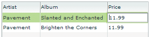
In this image, you use the default item editor to edit the price of the first album in the DataGrid control.
For more information on item editors, see Advanced data display with MX item editors.
Using custom MX item renderers and item editors
To control the display of a list component, you write a custom item renderer or custom item editor. Your custom item renderers and item editors still use the underlying functionality of the list control, but let you control the display and editing of the data. Custom item renderers and item editors provide you with several advantages:
-
You can create a more compelling user interface by replacing the display of text with a more user-intuitive appearance.
-
You can combine multiple elements in a single list item, such as a label and an image.
-
You can programmatically control the display of the data.
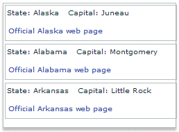
The following List control is a modification of the List control in the section Default item rendering and cell editing in MX. In this example, you use a custom item renderer to display the state name, capital, and a URL to the state's official web site in each list item:
For the code for this example, see Example: Using an item renderer with an MX List control.
In the next image, you use a default item renderer for the first and third columns of the DataGrid control. You use a custom item renderer for the second column to display the album cover along with the album title in the DataGrid control.

For the code for this example, see Creating a complex inline item renderer or item editor.
Just as you can define a custom item renderer to control the display of a cell, you can use a custom item editor to edit the contents of the cell. For example, if the custom item renderer displays an image, you could define a custom item editor that uses a ComboBox control that lets users select an image from a list of available images. Or you could use a CheckBox control to let the user set a true or false value for a cell, as the right side of the following example shows:
For the code for this example, see Creating a simple item editor component.
Using an item renderer does not imply that the control also has an item editor. Often, you do not allow your controls to be edited; that is, they are for display only.
You can also use an item editor without a corresponding item renderer. For example, you could display information such as a male/female or true/false as text using the default item renderer. But, you could then use a custom item editor with a ComboBox control that provides the user only a limited set of options to enter into the cell when changing the value.
MX item renderer and item editor architecture
In order for an item renderer or item editor to work with the contents of a list control, the list control must be able to pass information to the item renderer or item editor. An item editor must also be able to pass updated information back to the list control.
The following image shows the relationship of a list control to an item renderer or item editor:
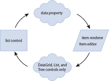
To pass information to an item renderer or item editor, Flex sets the data property of the item renderer or item editor to the cell data. In the previous image, you can see the data property that is used to pass the data to the item renderer or item editor.
By default, an item editor can pass back a single value to the list control that becomes the new value of the edited cell. To return more than one value, you must write additional code to return the data back to the list control.
Any Flex component that you want to use in an item renderer or item editor, and that requires access to the cell data of the list control, must implement the IDataRenderer interface to support the data property. You can use additional components in an item renderer that do not support the data property, if those components do not need to access data passed from the list control.
The contents of the data property depend on the type of control, as the following table shows:
|
Control |
Contents of the data property |
|---|---|
|
Contains the data provider element for the entire row of the DataGrid control. That means if you use a different item renderer for each cell of the DataGrid control, each cell in a row receives the same information in the data property. |
|
|
Contains the data provider element for the node of the List or Tree control. |
|
|
Contains the data provider element for the cell. |
|
|
Contains the data provider element for the menu item. |
|
|
Contains the data provider element for the menu bar item. |
For more information about item editors, see Advanced data display with MX item editors.
About MX item renderer and item editor interfaces
The Flex item renderer and item editor architecture is defined by several interfaces. Flex components that you can use as item renderers and item editors implement one or more of these interfaces. If you create your own custom component to use as an item renderer or item editor, your component must implement one or more of these interfaces, depending on how you intend to use it.
The following table describes the interfaces that you use with item renderers and item editors:
|
Interface |
Use |
|---|---|
|
Defines the data property used to pass information to an item renderer or item editor. All item renderers and item editors must implement this interface. Many Flex components implement this interface, such as the chart renderer classes and many Flex controls. |
|
|
Defines the listData property required by drop-in item renderers and item editors. All drop-in item renderers and item editors must implement this interface. For more information, see Creating MX drop-in item renderers and item editors. The listData property is of type BaseListData, where the BaseListData class has three subclasses: DataGridListData, ListData, TreeListData. The actual data type of the value of the listData property depends on the control using the drop-in item renderer or item editor. For a DataGrid control, the value is of type DataGridListData; for a List control, the value is of type ListData; and for a Tree control, the value is of type TreeListData. |
|
|
Defines the complete set of interfaces that an item renderer or item editor must implement to be used with any Flex control other than a Chart control. A renderer for a Chart control has to implement only the IDataRenderer interface. The set of interfaces includes the following: IDataRenderer, IFlexDisplayObject, ILayoutClient, IStyleable, and IUIComponent. The UIComponent class implements all of these interfaces, except the IDataRenderer interface. Therefore, if you create a custom item renderer or item editor as a subclass of the UIComponent class, you have to implement only the IDataRenderer interface. If you implement a drop-in item renderer or item editor as a subclass of the UIComponent class, you have to implement only the IDataRenderer and IDropInListItemRenderer interfaces. |
Application layout with item renderers and item editors
All list controls, with the exception of the TileList and HorizontalList controls, ignore item renderers when calculating the default height and width of their contents. By default, item renderers are sized to the full width of a control, or the width of the column for a DataGrid control. Therefore, if you define a custom item renderer that requires a size other than its default, you should explicitly size the control.
Vertical controls such as the List and Tree controls use the rowHeight property to determine the default cell height. You can also set the variableRowHeight property to true if each row has a different height. Otherwise, Flex sets the height of each cell to 20 pixels.
For the HorizontalList control, Flex can use the value of the columnWidth property, if specified. For the TileList control, Flex uses the values of the columnWidth and rowHeight properties. If you omit these properties, Flex examines the control's data provider to determine the default size of each cell, including an item renderer, if specified. Otherwise, Flex sets the height and width of each cell to 50 pixels.
Creating an MX item renderer and item editor
One of the first decisions that you must make when using custom item renderers and item editors is how to implement them. Flex lets you define item renderers and item editors in three different ways:
- Drop-in item renderers and item editors
-
Insert a single component to define an item renderer or item editor. For more information, see Using an MX drop-in item renderer or item editor.
- Inline item renderers and item editors
-
Define one or more components using child tags of the list control to define an item renderer or item editor. For more information, see Using an MX inline item renderer or item editor.
- Item renderer and item editor components
-
Define an item renderer or item editor as a reusable component. For more information, see Using a component as an MX item renderer or item editor.
The following sections describe each technique.
Using an MX drop-in item renderer or item editor
For simple item renderers and item editors, such as using a NumericStepper control to edit a field of a DataGrid control, you can use a drop-in item editor. A drop-in item renderer or drop-in item editor is a Flex component that you specify as the value of the itemRenderer or itemEditor property of a list control.
In the following example, you specify the NumericStepper control as the item editor for a column of the DataGrid control:
<?xml version="1.0"?>
<!-- itemRenderers\dropin\DropInNumStepper.mxml -->
<s:Application xmlns:fx="http://ns.adobe.com/mxml/2009"
    xmlns:s="library://ns.adobe.com/flex/spark"
    xmlns:mx="library://ns.adobe.com/flex/mx">

    <fx:Script>
        <![CDATA[
            import mx.collections.ArrayCollection;

            [Bindable]
            private var myDP:ArrayCollection = new ArrayCollection([
                {label1:"Order #2314", quant:3, Sent:true},
                {label1:"Order #2315", quant:3, Sent:false}
            ]);
        ]]>
    </fx:Script>

    <mx:DataGrid id="myDG" dataProvider="{myDP}"
        variableRowHeight="true"
        editable="true" >
        <mx:columns>
            <mx:DataGridColumn dataField="label1" headerText="Order #"/>
            <mx:DataGridColumn dataField="quant"
                headerText="Qty"
                itemEditor="mx.controls.NumericStepper"
                editorDataField="value"
            />
        </mx:columns >
    </mx:DataGrid>
</s:Application>
In this example, when the user selects a cell of the column to edit it, Flex displays the NumericStepper control in that cell. Flex automatically uses the data property to populate the NumericStepper control with the current value of the column.
You use the editorDataField property to specify the property of the item editor that returns the new data for the cell. By default, the list control uses the text field of the TextInput control to supply the new value; therefore, the default value of the editorDataField property is "text". In this example, you specify that the value field of the NumericStepper supplies the new value for the cell.
You can use only a subset of the Flex components as drop-in item renderers and item editors—those components that implement the IDropInListItemRenderer interface. For more information on using drop-in item renderers and item editors, and for a list of controls that support drop-in item renderers and item editors, see Creating MX drop-in item renderers and item editors.
Using an MX inline item renderer or item editor
In the section Using an MX drop-in item renderer or item editor, the example shows how easy it is to use drop-in item renderers and item editors. The only drawback to using them is that you cannot configure them. You can specify the drop-in item renderers and item editors only as the values of a list control property.
To create more flexible item renderers and item editors, you develop your item renderer or item editor as an inline component. In the next example, you modify the previous example to use a NumericStepper control as an inline item editor. With an inline item editor, you can configure the NumericStepper control just as if you used it as a stand-alone control.
<?xml version="1.0"?>
<!-- itemRenderers\inline\InlineNumStepper.mxml -->
<s:Application xmlns:fx="http://ns.adobe.com/mxml/2009"
    xmlns:s="library://ns.adobe.com/flex/spark"
    xmlns:mx="library://ns.adobe.com/flex/mx">

    <fx:Script>
        <![CDATA[
            import mx.collections.ArrayCollection;

            [Bindable]
            private var myDP:ArrayCollection = new ArrayCollection([
                {label1:"Order #2314", quant:3, Sent:true},
                {label1:"Order #2315", quant:3, Sent:false}
            ]);
        ]]>
    </fx:Script>

    <mx:DataGrid id="myDG" dataProvider="{myDP}"
        variableRowHeight="true"
        editable="true" >
        <mx:columns>
            <mx:DataGridColumn dataField="label1" headerText="Order #"/>
            <mx:DataGridColumn dataField="quant" editorDataField="value" headerText="Qty">
                <mx:itemEditor>
                    <fx:Component>
                        <mx:NumericStepper stepSize="1" maximum="50"/>
                    </fx:Component>
                </mx:itemEditor>
            </mx:DataGridColumn>
        </mx:columns>
    </mx:DataGrid>
</s:Application>
In this example, you define the NumericStepper control as the item editor for the column, and specify a maximum value of 50 and a step size of 1 for the NumericStepper control.
For more information on creating inline item renderers and item editors, see Creating MX inline item renderers and editors.
Using a component as an MX item renderer or item editor
One disadvantage of using drop-in and inline item renderers and editors is that you define the item renderer or editor in the application file; therefore, it is not reusable in another location in the application, or in another application. You can create a reusable item renderer or item editor as a Flex component, and then use that component anywhere in an application that requires the item renderer.
For example, the following code uses a NumericStepper control to define a custom item editor as an MXML component:
<?xml version="1.0"?>
<!-- itemRenderers\component\myComponents\NSEditor.mxml -->
<mx:NumericStepper xmlns:fx="http://ns.adobe.com/mxml/2009"
    xmlns:s="library://ns.adobe.com/flex/spark"
    xmlns:mx="library://ns.adobe.com/flex/mx"
    stepSize="1"
    maximum="50"/>
The custom MXML component defines the item editor as a NumericStepper control. In this example, the custom item editor is named NSEditor and is implemented as an MXML component in the NSEditor.mxml file. You place the file NSEditor.mxml in the myComponents directory beneath your main application directory.
You can then use this component anywhere in an application, as the following example shows:
<?xml version="1.0"?>
<!-- itemRenderers\component\MainNSEditor.mxml -->
<s:Application xmlns:fx="http://ns.adobe.com/mxml/2009"
    xmlns:s="library://ns.adobe.com/flex/spark"
    xmlns:mx="library://ns.adobe.com/flex/mx">

    <fx:Script>
        <![CDATA[
            import mx.collections.ArrayCollection;

            [Bindable]
            private var myDP:ArrayCollection = new ArrayCollection([
                {label1:"Order #2314", quant:3, Sent:true},
                {label1:"Order #2315", quant:3, Sent:false}
            ]);
        ]]>
    </fx:Script>

    <mx:DataGrid id="myDG" dataProvider="{myDP}"
            variableRowHeight="true"
            editable="true" >
        <mx:columns>
            <mx:DataGridColumn dataField="label1"
                headerText="Order #"/>
            <mx:DataGridColumn dataField="quant"
                itemEditor="myComponents.NSEditor"
                editorDataField="value"/>
        </mx:columns >
    </mx:DataGrid>
</s:Application>
When the user selects a cell in the quant column of the DataGrid control, Flex displays a NumericStepper control with the current cell value.
You might have several locations in your application where users can modify a numeric value. You defined this item editor as a custom component; therefore, you can reuse it anywhere in your application.
For more information on creating item renderers and item editors as components, see Creating MX item renderers and item editor components.
Using editable controls in an MX item renderer
Item renderers do not impose restrictions on the types of Flex components that you can use in them. For example, you can use controls, such as the Label, LinkButton, Button, and Text controls, to display data, but these controls do not let the user modify the contents of the control.
Or you can use controls such as the CheckBox, ComboBox, and TextInput controls that both display data and let users interact with the control to modify or change it. For example, you could use a CheckBox control to display a selected (true value) or unselected (false value) cell in a DataGrid control.
When the user selects the cell of the DataGrid control that contains the CheckBox control, the user can interact with the control to change its state. To the user, it appears that the DataGrid control is editable.
However, an item renderer by default is not connected to the editing mechanism of the list control; it does not propagate changes to the list control's data provider, nor does it dispatch an event when the user modifies the cell. Although the list control appears to the user to be editable, it really is not.
In another example, the user changes the value of the CheckBox control, and then sorts the DataGrid column. But the DataGrid sorts the cell by the value in the data provider, not the value in the CheckBox control, so the user perceives that the sort works incorrectly.
You can manage this situation in several ways, including the following:
-
In your item renderer, do not use controls that let users modify them (CheckBox, ComboBox, and others).
-
Create custom versions of these controls to prohibit user interaction with them.
-
Use the rendererIsEditor property of the list control to specify that the item renderer is also an item editor. For more information, see Example: Using an item renderer as an item editor.
-
Write your own code for the item renderer and hosting control to pass data back from the item renderer when you do let users interact with it.
Setting the itemRenderer or itemEditor property in ActionScript
The itemRenderer and itemEditor properties are of type IFactory. When you set these properties in MXML, the MXML compiler automatically casts the property value to the type ClassFactory, a class that implements the IFactory interface.
When you set these properties in ActionScript, you must explicitly cast the property value to ClassFactory, as the following example shows:
<?xml version="1.0"?>
<!-- itemRenderers\list\AppListStateRendererEditorAS.mxml -->
<s:Application xmlns:fx="http://ns.adobe.com/mxml/2009"
    xmlns:s="library://ns.adobe.com/flex/spark"
    xmlns:mx="library://ns.adobe.com/flex/mx">

    <fx:Script>
        <![CDATA[
            import mx.core.ClassFactory;

            // Cast the value of the itemRenderer property
            // to ClassFactory.
            public function initCellEditor():void {
                myList.itemRenderer=new ClassFactory(RendererState);
            }
        ]]>
    </fx:Script>

    <mx:List id="myList" variableRowHeight="true"
            height="180" width="250"
            initialize="initCellEditor();">
        <mx:dataProvider>
            <fx:Object label="Alaska"
                data="Juneau"
                webPage="http://www.state.ak.us/"/>
            <fx:Object label="Alabama"
                data="Montgomery"
                webPage="http://www.alabama.gov/" />
            <fx:Object label="Arkansas"
                data="Little Rock"
                webPage="http://www.state.ar.us/"/>
        </mx:dataProvider>
    </mx:List>
</s:Application>
Shown below is the code for the RenderState.mxml item renderer:
<?xml version="1.0"?>
<!-- itemRenderers\list\RendererState.mxml -->
<mx:VBox xmlns:fx="http://ns.adobe.com/mxml/2009"
    xmlns:s="library://ns.adobe.com/flex/spark"
    xmlns:mx="library://ns.adobe.com/flex/mx">
    <fx:Script>
        <![CDATA[
            // Import Event and URLRequest classes.
            import flash.events.Event;
            import flash.net.URLRequest;

            private var u:URLRequest;

            // Event handler to open URL using navigateToURL().
            private function handleClick(eventObj:Event):void {
                u = new URLRequest(data.webPage);
                navigateToURL(u);
            }
        ]]>
    </fx:Script>

    <mx:HBox >
        <!-- Use Label controls to display state and capital names. -->
        <mx:Label id="State" text="State: {data.label}"/>
        <mx:Label id="Statecapital" text="Capital: {data.data}" />
    </mx:HBox>

    <!-- Define the Link control to open a URL. -->
    <mx:LinkButton id="webPage" label="Official {data.label} web page"
        click="handleClick(event);" color="blue"  />
</mx:VBox>
About the MX item renderer and item editor life cycle
Flex creates instances of item renderers and item editors as needed by your application for display and measurement purposes. Therefore, the number of instances of an item renderer or item editor in your application is not necessarily directly related to the number of visible item renderers. Also, if the list control is scrolled or resized, a single item renderer instance may be reused to represent more than one data item. Thus, you should not make assumptions about how many instances of your item renderer and item editor are active at any time.
Because Flex can reuse an item renderer, ensure that you fully define its state. For example, you use a CheckBox control in an item renderer to display a true (checked) or false (unchecked) value based on the current value of the data property. A common mistake is to assume that the CheckBox control in the item renderer is always in its default state of unchecked. Developers then write an item renderer to inspect the data property for a value of true and set the CheckBox control to checked if found.
However, you must take into account that the CheckBox may already be checked. So, you must inspect the data property for a value of false, and explicitly uncheck the control if it is checked.
Accessing the listData property
If a component implements the IDropInListItemRenderer interface, you can use its listData property to obtain information about the data passed to the component when you use the component in an item renderer or item editor. The listData property is of type BaseListData, where the BaseListData class defines the following properties:
|
Property |
Description |
|---|---|
owner |
A reference to the list control that uses the item renderer or item editor. |
rowIndex |
The index of the row of the DataGrid, List, or Tree control relative to the currently visible rows of the control, where the first row is at an index of 1. |
label |
The text representation of the item data based on the List class's itemToLabel() method. |
The BaseListData class has three subclasses: DataGridListData, ListData, TreeListData that define additional properties. For example, the DataGridListData class adds the columnIndex and dataField properties that you can access from an item renderer or item editor.
The data type of the value of the listData property depends on the control that uses the item renderer or item editor. For a DataGrid control, the value is of type DataGridListData; for a List control, the value is of type ListData; and for a Tree control, the value is of type TreeListData.
The TextArea control is one of the Flex controls that implements the IDropInListItemRenderer interface The item renderer in the following example uses the listData property of the TextArea control to display the row and column of each item renderer in the DataGrid control:
<?xml version="1.0"?>
<!-- itemRenderers\dataGrid\myComponents\RendererDGListData.mxml -->
<mx:TextArea xmlns:fx="http://ns.adobe.com/mxml/2009"
    xmlns:s="library://ns.adobe.com/flex/spark"
    xmlns:mx="library://ns.adobe.com/flex/mx"
    preinitialize="initTA();">

    <fx:Script>
        <![CDATA[

            import mx.controls.dataGridClasses.DataGridListData;
            import flash.events.Event;

            public function initTA():void {
                addEventListener("dataChange", handleDataChanged);
            }
            public function handleDataChanged(event:Event):void {
                // Cast listData to DataGridListData.
                var myListData:DataGridListData =
                    DataGridListData(listData);

                // Access information about the data passed
                // to the cell renderer.
                text="row index: " + String(myListData.rowIndex) +
                    " column index: " + String(myListData.columnIndex);
            }
        ]]>
    </fx:Script>
</mx:TextArea>
Because you use this item renderer in a DataGrid control, the data type of the value of the listData property is DataGridListData. You use the dataChange event in this example to set the contents of the TextArea control every time the data property changes.
The DataGrid control in the following example uses this item renderer to display the column and row index of each cell of the DataGrid control:
<?xml version="1.0"?>
<!-- itemRenderers\dataGrid\MainDGListDataRenderer.mxml -->
<s:Application xmlns:fx="http://ns.adobe.com/mxml/2009"
    xmlns:s="library://ns.adobe.com/flex/spark"
    xmlns:mx="library://ns.adobe.com/flex/mx">

    <fx:Script>
        <![CDATA[
            import mx.collections.ArrayCollection;

            [Bindable]
            public var initDG:ArrayCollection = new ArrayCollection([
                { Company: 'Acme', Contact: 'Bob Jones',
                    Phone: '413-555-1212', Date: '5/5/05'},
                { Company: 'Allied', Contact: 'Jane Smith',
                    Phone: '617-555-3434', Date: '5/6/05'}
            ]);
        ]]>
    </fx:Script>

    <mx:Panel paddingTop="10" paddingBottom="10"
        paddingLeft="10" paddingRight="10" >

        <mx:DataGrid id="myGrid" dataProvider="{initDG}"
                variableRowHeight="true">
            <mx:columns>
                <mx:DataGridColumn dataField="Company"
                    itemRenderer="myComponents.RendererDGListData"/>
                <mx:DataGridColumn dataField="Contact"
                    itemRenderer="myComponents.RendererDGListData"/>
                <mx:DataGridColumn dataField="Phone"
                    itemRenderer="myComponents.RendererDGListData"/>
                <mx:DataGridColumn dataField="Date"
                    itemRenderer="myComponents.RendererDGListData"/>
            </mx:columns>
        </mx:DataGrid>
    </mx:Panel>
</s:Application>
Handling data binding warnings from the compiler
Many of the following examples, and those in Advanced data display with MX item editors, define the application data as an ArrayCollection of Objects. However, you might get compiler warning for these examples because the Object class does not support data binding. That does not matter with these examples because the data is static.
If your data is dynamic, and you want it to support data binding, you can instead define your own data class that supports binding. For example, you could create the following subclass of Object that supports data binding, and use it instead:
 package
 {
 	[Bindable]
 	public class MyBindableObj extends Object
 	{
 		public function MyBindableObj()  {
 			super();
 		}

 		public var Artist:String = new String();

 		public var Album:String = new String();

 		public var Price:Number = new Number();

 		public var Cover:String = new String();
 	}
 }
By inserting the [Bindable] metadata tag before the class definition, you specify that all public properties support data binding. For more information on data binding, see Data binding.
Creating MX drop-in item renderers and item editors
Several MX controls are designed to work as item renderers and item editors. This lets you specify these controls as values of the itemRenderer or itemEditor property. When you specify one of these controls as a property value, it is called a drop-in item renderer or drop-in item editor.
To use a component as a drop-in item renderer or drop-in item editor, a component must implement the IDropInListItemRenderer interface. The following controls implement the IDropInListItemRenderer interface, making them usable directly as a drop-in item renderer or drop-in item editor:
-
Button
-
CheckBox
-
DateField
-
Image
-
Label
-
NumericStepper
-
Text
-
TextArea
-
TextInput
You can define your own components for use as drop-in item renderers or drop-in item editors. The only requirement is that they, too, implement the IDropInListItemRenderer interface.
Using MX drop-in item renderers and item editors
When you use a control as a drop-in item renderer, Flex sets the control's default property to the current value of the cell. When you use a control as an item editor, the initial value of the cell becomes the current value of the control. Any edits made to the cell are copied back to the data provider of the list control.
The following table lists the MX components that you can use as drop-in item renderers and item editors, and the default property of the component:
|
Control |
Default property |
Notes |
|---|---|---|
selected |
Cannot specify a label for the Button control. |
|
selected |
If used as a drop-in item renderer in a Tree control, the Tree displays only check boxes with no text. |
|
selectedDate |
Requires that the data provider of the list control has a field of type Date. |
|
source |
Set an explicit row height by using the rowHeight property, or set the variableRowHeight property to true to size the row correctly. |
|
text |
|
|
value |
|
|
text |
|
|
text |
|
|
text |
|
In the following example, you use the NumericStepper, DateField, and CheckBox controls as the drop-in item renderers and item editors for a DataGrid control:
<?xml version="1.0"?>
<!-- itemRenderers\inline\CBInlineCellEditor.mxml -->
<s:Application xmlns:fx="http://ns.adobe.com/mxml/2009"
    xmlns:s="library://ns.adobe.com/flex/spark"
    xmlns:mx="library://ns.adobe.com/flex/mx">

    <fx:Script>
        <![CDATA[
            import mx.collections.ArrayCollection;

            [Bindable]
            private var myDP:ArrayCollection = new ArrayCollection([
                {label1:"Order #2314", contact:"John Doe",
                    quant:3, solddate:new Date(2005, 0, 1), Sent:true},
                {label1:"Order #2315", contact:"Jane Doe",
                    quant:3, solddate:new Date(2005, 0, 5), Sent:false}
            ]);
        ]]>
    </fx:Script>

    <mx:DataGrid id="myDG"
            dataProvider="{myDP}"
            variableRowHeight="true"
            width="500" height="250"
            editable="true">
        <mx:columns>
            <mx:DataGridColumn dataField="label1"
                headerText="Order #"
                editable="false"/>
            <mx:DataGridColumn dataField="quant"
                headerText="Quantity"
                itemEditor="mx.controls.NumericStepper"
                editorDataField="value"/>
            <mx:DataGridColumn dataField="solddate"
                headerText="Date"
                itemRenderer="mx.controls.DateField"
                rendererIsEditor="true"
                editorDataField="selectedDate"/>
            <mx:DataGridColumn dataField="Sent"
                itemRenderer="mx.controls.CheckBox"
                rendererIsEditor="true"
                editorDataField="selected"/>
        </mx:columns >
    </mx:DataGrid>
</s:Application>
To determine the field of the data provider used to populate the drop-in item renderer, Flex uses the value of the dataField property for the <mx:DataGridColumn> tag. In this example, you do the following:
-
You set the dataField property of the second column to quant, and define the NumericStepper control as the item editor. Therefore, the column displays the cell value as text, and opens the NumericStepper control when you select the cell to edit it. The NumericStepper control displays the current value of the cell, and any changes you make to it are copied back to the data provider of the DataGrid control.
-
You set the dataField property of the third column to solddate, and define the DateField control as the item renderer and item editor by setting the rendererIsEditor property to true. The data provider defines the data as an object of type Date, which is required to use the DateField control as the item renderer or item editor. Therefore, the column displays the date value using the DateField control, and also uses the DateField control to edit the cell value.
-
You set the dataField property of the fourth column to Sent, and define the CheckBox control as the item renderer and item editor. Typically, you use itemEditor property to specify a different class as the item editor, and specify to use the same control as both the item renderer and item editor by setting the rendererIsEditor property to true. The CheckBox control displays a check mark in the cell if the Sent field for the row is set to true, and an empty check box if the field is set to false.
For more information on using an item renderer as an item editor, see Creating an editable cell in MX.
When you use the Image control as a drop-in item renderer, you usually have to set the row height to accommodate the image, as the following example shows:
<?xml version="1.0"?>
<!-- itemRenderers\DGDropInImageRenderer.mxml -->
<s:Application xmlns:fx="http://ns.adobe.com/mxml/2009"
    xmlns:s="library://ns.adobe.com/flex/spark"
    xmlns:mx="library://ns.adobe.com/flex/mx" >

    <fx:Script>
        <![CDATA[
            import mx.collections.ArrayCollection;

            [Bindable]
            private var initDG:ArrayCollection = new ArrayCollection([
                {Artist:'Pavement', Album:'Slanted and Enchanted',
                    Price:11.99, Cover:'../assets/slanted.jpg'},
                {Artist:'Pavement', Album:'Brighten the Corners',
                    Price:11.99, Cover:'../assets/brighten.jpg'}
            ]);
        ]]>
    </fx:Script>

    <mx:DataGrid id="myGrid" dataProvider="{initDG}" rowHeight="50">
        <mx:columns>
            <mx:DataGridColumn dataField="Artist"/>
            <mx:DataGridColumn dataField="Album"/>
            <mx:DataGridColumn dataField="Cover"
                itemRenderer="mx.controls.Image"/>
            <mx:DataGridColumn dataField="Price"/>
        </mx:columns>
    </mx:DataGrid>
</s:Application>
In this example, you use the Image control to display the album cover in a cell of the DataGrid control.
Requirements of a drop-in item renderer in a List control
When you use the itemRenderer property of the List control to specify a drop-in item renderer, the data in the data provider must be of the type expected by the item renderer control. For example, if you use an Image control as a drop-in item renderer, the data provider for the List control must have String data in the field.
Creating MX inline item renderers and editors
You define inline item renderers and item editors in the MXML definition of a component. Inline item renderers and item editors give you complete control over item rendering and cell editing.
Creating a simple inline item renderer or item editor
A simple inline item renderer contains a single control that supports the data property. Flex automatically copies the current cell data to the item renderer, as the following example shows:
<?xml version="1.0"?>
<!-- itemRenderers\InlineImageRenderer.mxml -->
<s:Application xmlns:fx="http://ns.adobe.com/mxml/2009"
    xmlns:s="library://ns.adobe.com/flex/spark"
    xmlns:mx="library://ns.adobe.com/flex/mx" >

    <fx:Script>
        <![CDATA[
            import mx.collections.ArrayCollection;

            [Bindable]
            private var initDG:ArrayCollection = new ArrayCollection([
                {Artist:'Pavement', Album:'Slanted and Enchanted',
                    Price:11.99, Cover: '../assets/slanted.jpg'},
                {Artist:'Pavement', Album:'Brighten the Corners',
                    Price:11.99, Cover: '../assets/brighten.jpg'}
            ]);
        ]]>
    </fx:Script>

    <mx:DataGrid id="myGrid" dataProvider="{initDG}" rowHeight="50">
        <mx:columns>
            <mx:DataGridColumn dataField="Artist"/>
            <mx:DataGridColumn dataField="Album"/>
            <mx:DataGridColumn dataField="Cover">
                <mx:itemRenderer>
                    <fx:Component>
                        <mx:Image height="45"/>
                    </fx:Component>
                </mx:itemRenderer>
            </mx:DataGridColumn>
            <mx:DataGridColumn dataField="Price"/>
        </mx:columns>
    </mx:DataGrid>
</s:Application>
In this example, you use an Image control to display the album cover.
A simple inline item editor contains a single control that supports the data property. Flex automatically copies the current cell data to the item renderer or item editor, and copies the new cell data back to the list control based on the value of the editorDataField property, as the following example item editor shows:
<?xml version="1.0"?>
<!-- itemRenderers\inline\InlineNumStepper.mxml -->
<s:Application xmlns:fx="http://ns.adobe.com/mxml/2009"
    xmlns:s="library://ns.adobe.com/flex/spark"
    xmlns:mx="library://ns.adobe.com/flex/mx">

    <fx:Script>
        <![CDATA[
            import mx.collections.ArrayCollection;

            [Bindable]
            private var myDP:ArrayCollection = new ArrayCollection([
                {label1:"Order #2314", quant:3, Sent:true},
                {label1:"Order #2315", quant:3, Sent:false}
            ]);
        ]]>
    </fx:Script>

    <mx:DataGrid id="myDG" dataProvider="{myDP}"
        variableRowHeight="true"
        editable="true" >
        <mx:columns>
            <mx:DataGridColumn dataField="label1" headerText="Order #"/>
            <mx:DataGridColumn dataField="quant" editorDataField="value" headerText="Qty">
                <mx:itemEditor>
                    <fx:Component>
                        <mx:NumericStepper stepSize="1" maximum="50"/>
                    </fx:Component>
                </mx:itemEditor>
            </mx:DataGridColumn>
        </mx:columns>
    </mx:DataGrid>
</s:Application>
In this example, you return the new cell value by using the value property of the NumericStepper control.
Creating a complex inline item renderer or item editor
A complex item renderer or item editor defines multiple controls. For example, the section Default item rendering and cell editing in MX showed a DataGrid control that displayed information about albums by using three text fields. You could add a visual element to your DataGrid control to make it more compelling. To do that, you modify the data provider so that it contains a reference to a JPEG image of the album cover.
Rather than displaying the album name and album image in separate cells of the DataGrid control, you can use an inline item renderer to make them appear in a single cell, as the following example shows:
<?xml version="1.0"?>
<!-- itemRenderers\InlineDGRenderer.mxml -->
<s:Application xmlns:fx="http://ns.adobe.com/mxml/2009"
    xmlns:s="library://ns.adobe.com/flex/spark"
    xmlns:mx="library://ns.adobe.com/flex/mx">

    <fx:Script>
        <![CDATA[

            import mx.collections.ArrayCollection;

            // Variable in the Application scope.
            public var localVar:String="Application localVar";

            // Data includes URL to album cover.
            [Bindable]
            private var initDG:ArrayCollection = new ArrayCollection([
                {Artist:'Pavement', Album:'Slanted and Enchanted',
                    Price:11.99, Cover:'../assets/slanted.jpg'},
                {Artist:'Pavement', Album:'Brighten the Corners',
                    Price:11.99, Cover:'../assets/brighten.jpg'}
            ]);
        ]]>
    </fx:Script>

    <mx:DataGrid id="myGrid" dataProvider="{initDG}"
            variableRowHeight="true">
        <mx:columns>
                <mx:DataGridColumn dataField="Artist"/>
                <mx:DataGridColumn dataField="Album">
                    <mx:itemRenderer>
                        <fx:Component>
                            <mx:VBox>
                                <mx:Text id="albumName"
                                    width="100%" text="{data.Album}"/>
                                <mx:Image id="albumImage"
                                    height="45" source="{data.Cover}"/>
                            </mx:VBox>
                        </fx:Component>
                    </mx:itemRenderer>
                </mx:DataGridColumn>
                <mx:DataGridColumn dataField="Price"/>
        </mx:columns>
    </mx:DataGrid>
</s:Application>
In the preceding example, you define three columns in the DataGrid control, and assign your item renderer to the second column. For an image that shows the output of this application, see Using custom MX item renderers and item editors.
Notice that the Text and Image controls in the item renderer both use the data property to initialize their values. This is necessary because you defined multiple controls in the item renderer, and Flex cannot automatically determine which data element in the data provider is associated with each control of the item renderer.
Even if the top-level container of an inline item renderer has a single child control, you must use the data property to initialize the child control, as the following example shows:
 <mx:DataGridColumn dataField="Cover">
 	<mx:itemRenderer>
 		<fx:Component>
 			<mx:VBox horizontalAlign="center">
 				<mx:Image height="45" source="{data.Cover}"/>
 			</mx:VBox>
 		</fx:Component>
 	</mx:itemRenderer>
 </mx:DataGridColumn>
In the preceding example, you make the Image control a child of a VBox container so that you can align the image in the cell. Because the Image control is now a child of the VBox container, you must initialize it by using the data property.
You can define multiple controls in a complex inline item editor, which lets you edit multiple values of the data provider for the list control. Alternatively, you can define a complex inline item editor so it returns a value other than a String. For more information, see Advanced data display with MX item editors.
Items allowed in an inline component
The only restriction on what you can and cannot do in an inline item renderer or editor is that you cannot create an empty <fx:Component></fx:Component> tag. For example, you can combine effect and style definitions in an inline item renderer or editor along with your rendering and editing logic.
You can include the following items in an inline item renderer or editor:
-
Binding tags
-
Effect tags
-
Metadata tags
-
Model tags
-
Scripts tags
-
Service tags
-
State tags
-
Styles tags
-
XML tags
-
id attributes, except for the top-most component
Using the Component tag
You use the <fx:Component> tag to define an inline item renderer or item editor in an MXML file.
Defining the scope in an Component tag
The <fx:Component> tag defines a new scope in an MXML file, where the local scope of the item renderer or item editor is defined by the MXML code block delimited by the <fx:Component> and </fx:Component> tags. To access elements outside of the local scope of the item renderer or item editor, you prefix the element name with the outerDocument keyword.
For example, you define one variable named localVar in the scope of the main application, and another variable with the same name in the scope of the item renderer. From within the item renderer, you access the application's localVar by prefixing it with outerDocument keyword, as the following example shows:
<?xml version="1.0"?>
<!-- itemRenderers\InlineDGImageScope.mxml -->
<s:Application xmlns:fx="http://ns.adobe.com/mxml/2009"
    xmlns:s="library://ns.adobe.com/flex/spark"
    xmlns:mx="library://ns.adobe.com/flex/mx">

    <fx:Script>
        <![CDATA[
            import mx.collections.ArrayCollection;

            // Variable in the Application scope.
            [Bindable]
            public var localVar:String="Application localVar";

            // Data includes URL to album cover.
            [Bindable]
            private var initDG:ArrayCollection = new ArrayCollection([
                { Artist:'Pavement', Album:'Slanted and Enchanted',
                    Price:11.99, Cover:'../assets/slanted.jpg'},
                { Artist:'Pavement', Album:'Brighten the Corners',
                    Price:11.99, Cover:'../assets/brighten.jpg'}
            ]);
        ]]>
    </fx:Script>

    <mx:DataGrid id="myGrid" dataProvider="{initDG}" width="100%"
            variableRowHeight="true">
        <mx:columns>
            <mx:DataGridColumn dataField="Artist"/>
            <mx:DataGridColumn dataField="Album"/>
            <mx:DataGridColumn dataField="Cover">
                <mx:itemRenderer>
                  <fx:Component>
                    <mx:VBox>
                        <fx:Script>
                          <![CDATA[
                            // Variable in the renderer scope.
                            [Bindable]
                            public var localVar:String="Renderer localVar";
                          ]]>
                         </fx:Script>

                         <mx:Text id="albumName"
                            width="100%"
                            selectable="false"
                            text="{data.Album}"/>
                         <mx:Image id="albumImage"
                            height="45"
                            source="{data.Cover}"/>
                         <mx:TextArea
                            text="{'Renderer localVar= ' + localVar}"/>
                         <mx:TextArea
                            text="{'Application localVar= ' + outerDocument.localVar}"/>
                    </mx:VBox>
                  </fx:Component>
                </mx:itemRenderer>
            </mx:DataGridColumn>
            <mx:DataGridColumn dataField="Price"/>
        </mx:columns>
    </mx:DataGrid>
</s:Application>
One use of the outerDocument keyword is to initialize the data provider of a control in the inline item editor. For example, you can use a web service, or other mechanism, to pass data into the application, such as the list of U.S. states. You can then initialize all ComboBox controls that are used as item editors from a single property of the application that contains the list of U.S. states.
Specifying a class name to the inline component
You can optionally specify the className property of the <fx:Component> tag to explicitly name the class generated by Flex for the inline component. By naming the class, you define a way to reference the elements in the inline component.
Creating a reusable inline item renderer or item editor
Rather than defining an inline item renderer or item editor in the definition of a component, you can define a reusable inline item renderer or item editor for use in multiple locations in your application.
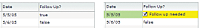
For example, you use the <fx:Component> tag to define an inline item editor that consists of a ComboBox control for selecting the state portion of an address. You then use that inline item editor in two different DataGrid controls, as the following example shows:
<?xml version="1.0"?>
<!-- itemRenderers\inline\InlineDGEditorCBReUse.mxml -->
<s:Application xmlns:fx="http://ns.adobe.com/mxml/2009"
    xmlns:s="library://ns.adobe.com/flex/spark"
    xmlns:mx="library://ns.adobe.com/flex/mx"
    width="700" >

    <fx:Script>
        <![CDATA[
            import mx.collections.ArrayCollection;

            [Bindable]
            public var initDG:ArrayCollection = new ArrayCollection([
                {Company: 'Acme', Contact: 'Bob Jones',
                    Phone: '413-555-1212', City: 'Boston', State: 'MA'},
                {Company: 'Allied', Contact: 'Jane Smith',
                    Phone: '617-555-3434', City: 'SanFrancisco', State: 'CA'}
            ]);

            [Bindable]
            public var initDG2:ArrayCollection = new ArrayCollection([
                {Company: 'MyCo', Contact: 'Stan Stanley',
                    Phone: '413-555-5555', City: 'Boston', State: 'MA'},
                {Company: 'YourCo', Contact: 'Dave Davis',
                    Phone: '617-555-1212', City: 'SanFrancisco', State: 'CA'}
            ]);
        ]]>
    </fx:Script>

    <fx:Declarations>
        <fx:Component id="inlineEditor">
            <mx:ComboBox >
                <mx:dataProvider>
                    <fx:String>AL</fx:String>
                    <fx:String>AK</fx:String>
                    <fx:String>AR</fx:String>
                    <fx:String>CA</fx:String>
                    <fx:String>MA</fx:String>
                </mx:dataProvider>
            </mx:ComboBox>
        </fx:Component>
    </fx:Declarations>

    <mx:DataGrid id="myGrid"
        variableRowHeight="true"
        dataProvider="{initDG}"
        editable="true" >
        <mx:columns>
            <mx:DataGridColumn dataField="Company" editable="false"/>
            <mx:DataGridColumn dataField="Contact"/>
            <mx:DataGridColumn dataField="Phone"/>
            <mx:DataGridColumn dataField="City"/>
            <mx:DataGridColumn dataField="State"
                width="150"
                editorDataField="selectedItem"
                itemEditor="{inlineEditor}"/>
        </mx:columns>
    </mx:DataGrid>

    <mx:DataGrid id="myGrid2"
        variableRowHeight="true"
        dataProvider="{initDG2}"
        editable="true">
        <mx:columns>
            <mx:DataGridColumn dataField="Company" editable="false"/>
            <mx:DataGridColumn dataField="Contact"/>
            <mx:DataGridColumn dataField="Phone"/>
            <mx:DataGridColumn dataField="City"/>
            <mx:DataGridColumn dataField="State"
                width="150"
                editorDataField="selectedItem"
                itemEditor="{inlineEditor}"/>
        </mx:columns>
    </mx:DataGrid>
</s:Application>
In this example, you specify the id property of the inline item editor defined by the <fx:Component> tag. You then use data binding to specify the editor as the value of the itemEditor property for the two DataGrid controls.
The inline item editor or item renderer defined in the <fx:Component> tag appears only where you use it in the DataGrid control; otherwise, Flex ignores it when laying out your application.
Creating MX item renderers and item editor components
Defining a custom item renderer or item editor by using an MXML component gives you greater flexibility and functionality than using a drop-in item renderer or item editor. Many of the rules for defining item renderers and item editors as custom components are the same as for using inline item renderers and editors. For more information, see Creating MX inline item renderers and editors.
For more information on working with custom components, see Custom Flex components.
Creating an item renderer component
The section Default item rendering and cell editing in MX shows a DataGrid control that displays information about albums by using three text fields. You could add a visual element to your DataGrid control to make it more compelling. To do that, you modify the data provider so that it contains a URL for a JPEG image of the album cover.
The default item renderer for a DataGrid control displays data as text. To get the DataGrid control to display the image of the album cover, you use the custom item renderer defined in the RendererDGImage.mxml file, as the following example shows:
<?xml version="1.0"?>
<!-- itemRenderers\myComponents\RendererDGImage.mxml -->
<mx:HBox xmlns:fx="http://ns.adobe.com/mxml/2009"
    xmlns:s="library://ns.adobe.com/flex/spark"
    xmlns:mx="library://ns.adobe.com/flex/mx"
    horizontalAlign="center" >

    <mx:Image id="albumImage" height="175" source="{data.Cover}"/>
</mx:HBox>
The item renderer contains an Image control in an HBox container. The HBox container specifies to center the image in the container; otherwise, the image appears flush left in the cell. The Image control specifies the height of the image as 75 pixels. By default, an image has a height of 0 pixels; therefore, if you omit the height, the image does not appear.
You use data binding to associate fields of a data property with the controls in an item renderer or item editor. In this example, the data property that is passed to the item renderer contains the element of the data provider for the entire row of the DataGrid control. You then bind the Cover field of the data property to the Image control.
The following example illustrates using a custom item renderer with the DataGrid control:
<?xml version="1.0"?>
<!-- itemRenderers\MainDGImageRenderer.mxml -->
<s:Application xmlns:fx="http://ns.adobe.com/mxml/2009"
    xmlns:s="library://ns.adobe.com/flex/spark"
    xmlns:mx="library://ns.adobe.com/flex/mx">

    <fx:Script>
        <![CDATA[
            import mx.collections.ArrayCollection;

            [Bindable]
            private var initDG:ArrayCollection = new ArrayCollection([
                {Artist:'Pavement', Album:'Slanted and Enchanted',
                    Price:11.99, Cover: '../assets/slanted.jpg'},
                {Artist:'Pavement', Album:'Brighten the Corners',
                    Price:11.99, Cover: '../assets/brighten.jpg'}
            ]);
        ]]>
    </fx:Script>

    <mx:DataGrid id="myGrid"
        dataProvider="{initDG}"
        variableRowHeight="true">
        <mx:columns>
            <mx:DataGridColumn dataField="Artist"/>
            <mx:DataGridColumn dataField="Album"/>
            <mx:DataGridColumn dataField="Cover"
                itemRenderer="myComponents.RendererDGImage"/>
            <mx:DataGridColumn dataField="Price"/>
        </mx:columns>
    </mx:DataGrid>
</s:Application>
The DataGrid control contains a column for the album cover that uses the itemRenderer property to specify the name of the MXML file that contains the item renderer for that column. Now, when you run this example, the DataGrid control uses your custom item renderer for the Cover column to display an image of the album cover.
Rather than having the album name and album image in separate cells of the DataGrid control, you can use an item renderer to make them appear in a single cell, as the following example shows:
<?xml version="1.0"?>
<!-- itemRenderers\myComponents\RendererDGTitleImage.mxml -->
<mx:VBox xmlns:fx="http://ns.adobe.com/mxml/2009"
    xmlns:s="library://ns.adobe.com/flex/spark"
    xmlns:mx="library://ns.adobe.com/flex/mx"
    horizontalAlign="center" height="75">

    <mx:Text id="albumName"
        width="100%"
        selectable="false"
        text="{data.Album}"/>
    <mx:Image id="albumImage"
        source="{data.Cover}"/>
</mx:VBox>
You save this item renderer to the RendererDGTitleImage.mxml file. The DataGrid control in the main application references the item renderer, as the following example shows:
<?xml version="1.0"?>
<!-- itemRenderers\MainDGTitleRenderer.mxml -->
<s:Application xmlns:fx="http://ns.adobe.com/mxml/2009"
    xmlns:s="library://ns.adobe.com/flex/spark"
    xmlns:mx="library://ns.adobe.com/flex/mx">

    <fx:Script>
        <![CDATA[
            import mx.collections.ArrayCollection;

            [Bindable]
            private var initDG:ArrayCollection = new ArrayCollection([
                {Artist:'Pavement', Album:'Slanted and Enchanted',
                    Price:11.99, Cover: '../assets/slanted.jpg'},
                {Artist:'Pavement', Album:'Brighten the Corners',
                    Price:11.99, Cover: '../assets/brighten.jpg'}
            ]);
        ]]>
    </fx:Script>

    <mx:DataGrid id="myGrid"
        dataProvider="{initDG}"
        variableRowHeight="true">
        <mx:columns>
            <mx:DataGridColumn dataField="Artist" />
            <mx:DataGridColumn dataField="Album"
                itemRenderer="myComponents.RendererDGTitleImage" />
            <mx:DataGridColumn dataField="Price"  />
        </mx:columns>
    </mx:DataGrid>
</s:Application>
In the preceding example, you define three columns in the DataGrid control, and assign your item renderer to the second column. For an image that shows the output of this application, see Using custom MX item renderers and item editors.
Creating a simple item editor component
A simple item editor component defines a single control that you use to edit a cell, and returns a single value to the list control. For an example of a simple item editor component, see Using a component as an MX item renderer or item editor.
A complex item editor can contain multiple components, or can return something other than a single value to the list control. For more information, see Advanced data display with MX item editors.
Overriding the data property
All components that you use in a custom item renderer or item editor that require access to the data passed to the renderer must implement the mx.core.IDataRenderer interface to define the data property. All Flex containers and many Flex components support this property.
Classes implement the mx.core.IDataRenderer interface by defining the data property as a setter and getter method, with the following signature:
 override public function set data(value:Object):void
 public function get data():Object
In the setter method, value is the data property passed to the item renderer.
If you define a custom component and you want to support the data property, your component must implement the mx.core.IDataRenderer interface. If your component is a subclass of a class that already implements the mx.core.IDataRenderer interface, you do not have to reimplement the interface.
To add programmatic logic to the controls in your item renderer or item editor that already implement the data property, you can override the setter or getter method for the data property. Typically, you override the setter method so that you can perform some operation based on the value that is passed to it.
For example, the following DataGrid control uses true and false for the values of the SalePrice field of the data provider. Although you could display these values in your DataGrid control, you can create a more compelling DataGrid control by displaying images instead, as the following item renderer shows:
<?xml version="1.0"?>
<!-- itemRenderers\component\myComponents\RendererDGImageSelect.mxml -->
<mx:HBox xmlns:fx="http://ns.adobe.com/mxml/2009"
    xmlns:s="library://ns.adobe.com/flex/spark"
    xmlns:mx="library://ns.adobe.com/flex/mx"
    horizontalAlign="center">

    <fx:Script>
        <![CDATA[

            import mx.events.FlexEvent;

            [Embed(source="saleIcon.jpg")]
            [Bindable]
            public var sale:Class;

            [Embed(source="noSaleIcon.jpg")]
            [Bindable]
            public var noSale:Class;
            override public function set data(value:Object):void {
                if(value != null)  {
                    super.data = value;
                    if (value.SalePrice == true) onSale.source=new sale();
                    else onSale.source=new noSale();
                }
                // Dispatch the dataChange event.
                dispatchEvent(new FlexEvent(FlexEvent.DATA_CHANGE));
            }
        ]]>
    </fx:Script>

    <mx:Image id="onSale" height="20"/>
</mx:HBox>
In this example, you override the setter method for the HBox container. In the override, use super.data to set the data property for the base class, and then set the source property of the Image control based on the value of the SalePrice field. If the field is true, which indicates that the item is on sale, you display one icon. If the item is not on sale, you display a different icon.
The override also dispatches the dataChange event to indicate that the data property has changed. You typically dispatch this event from the setter method.
About using the creationComplete and dataChange events
Flex dispatches the creationComplete event once for a component after the component is created and initialized. Many custom components define an event listener for the creationComplete event to handle any postprocessing tasks that must be performed after the component is completely created and initialized.
However, although for an item renderer or item editor, Flex might reuse an instance of the item renderer or item editor, a reused instance of an item renderer or item editor does not redispatch the creationComplete event. Instead, you can use the dataChange event with an item renderer or item editor. Flex dispatches the dataChange event every time the data property changes. The example in the section Accessing the listData property uses the dataChange event to update the TextArea in an item renderer for a DataGrid control.
Creating an MX item renderer in ActionScript
Although you commonly create item renderers and editors in MXML, you can also create them in ActionScript, as the following example item renderer shows:
package myComponents {
    // myComponents/CellField.as
    import mx.controls.*;
    import mx.controls.dataGridClasses.DataGridListData;
    import mx.core.*;

    public class CellField extends TextInput
    {
        // Get the initial background color.
        public var tempBGColor:Number;

        // Define the constructor and set properties.
        public function CellField() {
            super();
            height=60;
            width=80;
            tempBGColor = getStyle("contentBackgroundColor");
            editable=false;
        }

        // Override the set method for the data property.
        override public function set data(value:Object):void {
            super.data = value;
            // Since the item renderer can be recycled,
            // set the initial background color.
            setStyle("contentBackgroundColor", tempBGColor);

            if (value != null)
            {
                text = value[DataGridListData(listData).dataField];
                if(Number(text) > 100)
                {
                    setStyle("contentBackgroundColor", 0xFF0000);
                }
                else
                {
                    setStyle("contentBackgroundColor", 0xFFFFFF);
                }
            }

            else
            {
                // If value is null, clear text.
                text= "";
            }

            super.invalidateDisplayList();
        }
    }
}
In the preceding example, you create a subclass of the TextInput control as your item renderer. The class must be public to be used as an item renderer or editor. This item renderer displays a red background if the value of the DataGrid cell is greater than 100.
You can use this item renderer in a DataGrid control, as the following example shows:
<?xml version="1.0" encoding="iso-8859-1"?>
<!-- itemRenderers\asRenderer\MainASItemRenderer.mxml -->
<s:Application xmlns:fx="http://ns.adobe.com/mxml/2009"
    xmlns:s="library://ns.adobe.com/flex/spark"
    xmlns:mx="library://ns.adobe.com/flex/mx"
    width="600" height="600">

    <fx:Script>
        <![CDATA[
            import mx.collections.ArrayCollection;

            [Bindable]
            private var initDG:ArrayCollection = new ArrayCollection([
                {Monday: 12, Tuesday: 22, Wednesday: 452, Thursday: 90},
                {Monday: 258, Tuesday: 22, Wednesday: 45, Thursday: 46},
                {Monday: 4, Tuesday: 123, Wednesday: 50, Thursday: 95},
                {Monday: 12, Tuesday: 52, Wednesday: 111, Thursday: 20},
                {Monday: 22, Tuesday: 78, Wednesday: 4, Thursday: 51}
            ]);
        ]]>
    </fx:Script>

    <mx:Text text="All cells over 100 are red" />

    <mx:DataGrid id="myDataGrid"
        dataProvider="{initDG}"
        variableRowHeight="true">
        <mx:columns>
            <mx:DataGridColumn dataField="Monday"
                itemRenderer="myComponents.CellField" />
            <mx:DataGridColumn dataField="Tuesday"
                itemRenderer="myComponents.CellField" />
            <mx:DataGridColumn dataField="Wednesday"
                itemRenderer="myComponents.CellField" />
            <mx:DataGridColumn dataField="Thursday"
                itemRenderer="myComponents.CellField" />
        </mx:columns>
    </mx:DataGrid>
</s:Application>
Working with MX item renderers
Example: Using an item renderer with the MX TileList and HorizontalList controls
The TileList and HorizontalList controls display a tiled list of items. The TileList control displays items in vertical columns. The HorizontalList control displays items in horizontal rows. The TileList and HorizontalList controls are particularly useful in combination with a custom item renderer for displaying a list of images and other data.
The following image shows a HorizontalList control that is used to display a product catalog:

Each item in the HorizontalList control contains an image, a descriptive text string, and a price. The following code shows the application that displays the catalog. The item renderer for the HorizontalList control is an MXML component named Thumbnail.
<?xml version="1.0"?>
<!-- itemRenderers\MainTlistThumbnailRenderer.mxml -->
<s:Application xmlns:fx="http://ns.adobe.com/mxml/2009"
    xmlns:s="library://ns.adobe.com/flex/spark"
    xmlns:mx="library://ns.adobe.com/flex/mx">

    <fx:Declarations>
        <fx:Model id="catalog" source="catalog.xml"/>
    </fx:Declarations>

    <mx:HorizontalList id="myList"
        columnWidth="125"
        rowHeight="125"
        columnCount="4"
        dataProvider="{catalog.product}"
        itemRenderer="myComponents.Thumbnail"/>
</s:Application>
The file catalog.xml defines the data provider for the HorizontalList control:
<?xml version="1.0"?>
<catalog>
    <product id="1">
        <name>Flex Model 3595</name>
        <price>129.99</price>
        <image>../assets/products/Flex_3595.gif</image>
        <thumbnail>../assets/products/Flex_3595_sm.gif</thumbnail>
    </product>
    <product id="2">
        <name>Flex Model 3650</name>
        <price>99.99</price>
        <image>../assets/products/Flex_3650.gif</image>
        <thumbnail>../assets/products/Flex_3650_sm.gif</thumbnail>
    </product>
    <product id="3">
        <name>Flex Model 6010</name>
        <price>49.99</price>
        <image>../assets/products/Flex_6010.gif</image>
        <thumbnail>../assets/products/Flex_6010_sm.gif</thumbnail>
    </product>
    <product id="4">
        <name>Flex Model 6360</name>
        <price>19.99</price>
        <image>../assets/products/Flex_6360.gif</image>
        <thumbnail>../assets/products/Flex_6360_sm.gif</thumbnail>
    </product>
    <product id="5">
        <name>Flex Model 6680</name>
        <price>19.99</price>
        <image>../assets/products/Flex_6680.gif</image>
        <thumbnail>../assets/products/Flex_6680_sm.gif</thumbnail>
    </product>
    <product id="6">
        <name>Flex Model 6820</name>
        <price>49.99</price>
        <image>../assets/products/Flex_6820.gif</image>
        <thumbnail>../assets/products/Flex_6820_sm.gif</thumbnail>
    </product>
</catalog>
The following example shows the Thumbnail.mxml MXML component. In this example, you define the item renderer to contain three controls: an Image control and two Label controls. These controls examine the data property that is passed to the item renderer to determine the content to display.
<?xml version="1.0" ?>
<!-- itemRenderers\myComponents\Thumbnail.mxml -->
<mx:VBox xmlns:fx="http://ns.adobe.com/mxml/2009"
    xmlns:s="library://ns.adobe.com/flex/spark"
    xmlns:mx="library://ns.adobe.com/flex/mx"
    horizontalAlign="center"
    verticalGap="0" borderStyle="none" backgroundColor="white" >

    <mx:Image id="image" width="60" height="60" source="{data.image}"/>
    <mx:Label text="{data.name}" width="120" textAlign="center"/>
    <mx:Label text="${data.price}" fontWeight="bold"/>
</mx:VBox>
For more information on the TileList and HorizontalList controls, see MX data-driven controls.
Example: Using an item renderer with an MX DataGrid control
The DataGrid control works with the DataGridColumn class to configure the grid. For a DataGrid control, you can specify two types of renderers: one for the cells of each column, and one for the header cell at the top of each column. To specify an item renderer for a column of a DataGrid control, you use the DataGridColumn.itemRenderer property. To specify an item renderer for a column header cell, you use the DataGridColumn.headerRenderer property.
For example, to highlight a column in the DataGrid control, you can use using an icon in the column header cell to indicate a sale price, as the following item renderer shows:
<?xml version="1.0"?>
<!-- itemRenderers\dataGrid\myComponents\RendererDGHeader.mxml -->
<mx:HBox xmlns:fx="http://ns.adobe.com/mxml/2009"
    xmlns:s="library://ns.adobe.com/flex/spark"
    xmlns:mx="library://ns.adobe.com/flex/mx">
    <fx:Script>
        <![CDATA[

            [Embed(source="saleIcon.jpg")]
            [Bindable]
            public var sale:Class;
        ]]>
    </fx:Script>

    <mx:Label text="Sale Price!"/>
    <mx:Image height="20" source="{sale}"/>

</mx:HBox>
This item renderer uses a Label control to insert the text "Sale Price!" and an Image control to insert an icon in the column header.
The following example shows the main application:
<?xml version="1.0"?>
<!-- itemRenderers\dataGrid\MainDGHeaderRenderer.mxml -->
<s:Application xmlns:fx="http://ns.adobe.com/mxml/2009"
    xmlns:s="library://ns.adobe.com/flex/spark"
    xmlns:mx="library://ns.adobe.com/flex/mx">

    <fx:Script>
        <![CDATA[
          import mx.collections.ArrayCollection;

          [Bindable]
          private var initDG:ArrayCollection = new ArrayCollection([
            {Artist:'Pavement', Album:'Slanted and Enchanted',
                Price:11.99, SalePrice: true },
            {Artist:'Pavement', Album:'Brighten the Corners',
                Price:11.99, SalePrice: false }
          ]);
        ]]>
    </fx:Script>

    <mx:DataGrid id="myGrid"
        dataProvider="{initDG}"
        variableRowHeight="true">
        <mx:columns>
            <mx:DataGridColumn dataField="Artist"/>
            <mx:DataGridColumn dataField="Album"/>
            <mx:DataGridColumn dataField="Price"/>
            <mx:DataGridColumn width="150" dataField="SalePrice"
                headerRenderer="myComponents.RendererDGHeader"/>
        </mx:columns>
    </mx:DataGrid>
</s:Application>
In this example, the DataGrid control displays the String true or false in the column to indicate that the price is a sale price. You can also define an item renderer for that column to display a more compelling icon rather than text. For an example that uses an item renderer with a DataGrid control, see Using custom MX item renderers and item editors.
Example: Using an item renderer with an MX List control
When you use a custom item renderer with a List control, you specify it using the List.itemRenderer property, as the following example shows:
<?xml version="1.0"?>
<!-- itemRenderers\list\MainListStateRenderer.mxml -->
<s:Application xmlns:fx="http://ns.adobe.com/mxml/2009"
    xmlns:s="library://ns.adobe.com/flex/spark"
    xmlns:mx="library://ns.adobe.com/flex/mx"
    height="700" width="700">

    <mx:List id="myList"
        height="180" width="250"
        variableRowHeight="true"
        itemRenderer="myComponents.RendererState">
        <mx:dataProvider>
            <fx:Object label="Alaska"
                data="Juneau"
                webPage="http://www.state.ak.us/"/>
            <fx:Object label="Alabama"
                data="Montgomery"
                webPage="http://www.alabama.gov/" />
            <fx:Object label="Arkansas"
                data="Little Rock"
                webPage="http://www.state.ar.us/"/>
        </mx:dataProvider>
    </mx:List>
</s:Application>
The previous example sets the rowHeight property to 75 pixels because the item renderer displays content that exceeds the default row height of the List control. To see an image that shows this application, see Using custom MX item renderers and item editors.
The following item renderer, RendererState.mxml, displays the parts of each List item, and creates a LinkButton control which lets you open the state's web site:
<?xml version="1.0"?>
<!-- itemRenderers\list\myComponents\RendererState.mxml -->
<mx:VBox xmlns:fx="http://ns.adobe.com/mxml/2009"
    xmlns:s="library://ns.adobe.com/flex/spark"
    xmlns:mx="library://ns.adobe.com/flex/mx">
    <fx:Script>
        <![CDATA[
            // Import Event and URLRequest classes.
            import flash.events.Event;
            import flash.net.URLRequest;

            private var u:URLRequest;

            // Event handler to open URL using
            // the navigateToURL() method.
            private function handleClick(eventObj:Event):void {
                u = new URLRequest(data.webPage);
                navigateToURL(u);
            }
        ]]>
    </fx:Script>

    <mx:HBox >
        <!-- Use Label controls to display state and capital names. -->
        <mx:Label id="State" text="State: {data.label}"/>
        <mx:Label id="Statecapital" text="Capital: {data.data}" />
    </mx:HBox>

    <!-- Define the Link control to open a URL. -->
    <mx:LinkButton id="webPage" label="Official {data.label} web page"
        click="handleClick(event);" color="blue"  />
</mx:VBox>
Example: Using an item renderer with an MX Tree control
For the Tree control, you use the itemRenderer property to specify a single renderer for all nodes of the tree. If you define a custom item renderer, you are responsible for handling the display of the entire node, including the text and icon.
One option is to define an item renderer as a subclass of the default item renderer class, the TreeItemRenderer class. You can then modify the item renderer as required by your application without implementing the entire renderer, as the following example shows:
package myComponents
{
    // itemRenderers/tree/myComponents/MyTreeItemRenderer.as
    import mx.controls.treeClasses.*;
    import mx.collections.*;

    public class MyTreeItemRenderer extends TreeItemRenderer
    {

        // Define the constructor.
        public function MyTreeItemRenderer() {
            super();
        }

        // Override the set method for the data property
        // to set the font color and style of each node.
        override public function set data(value:Object):void {
            super.data = value;
            if(TreeListData(super.listData).hasChildren)
            {
                setStyle("color", 0xff0000);
                setStyle("fontWeight", 'bold');
            }
            else
            {
                setStyle("color", 0x000000);
                setStyle("fontWeight", 'normal');
            }
        }

        // Override the updateDisplayList() method
        // to set the text for each tree node.
        override protected function updateDisplayList(unscaledWidth:Number,
            unscaledHeight:Number):void {

            super.updateDisplayList(unscaledWidth, unscaledHeight);
            if(super.data)
            {
                if(TreeListData(super.listData).hasChildren)
                {
                    var tmp:XMLList =
                        new XMLList(TreeListData(super.listData).item);
                    var myStr:int = tmp[0].children().length();
                    super.label.text =  TreeListData(super.listData).label +
                        "(" + myStr + ")";
                }
            }
        }
    }
}
For each node that has a child node, this item renderer displays the node text in red and includes the count of the number of child nodes in parentheses. The following example uses this item renderer in an application:
<?xml version="1.0" encoding="iso-8859-1"?>
<!-- itemRenderers\tree\MainTreeItemRenderer.mxml -->
<s:Application xmlns:fx="http://ns.adobe.com/mxml/2009"
    xmlns:s="library://ns.adobe.com/flex/spark"
    xmlns:mx="library://ns.adobe.com/flex/mx"
    initialize="initCollections();">
    <s:layout>
        <s:VerticalLayout/>
    </s:layout>

    <fx:Script>
        <![CDATA[

            import mx.collections.*;

            public var xmlBalanced:XMLList =
                <>
                    <node label="Containers">
                        <node label="DividedBoxClasses">
                            <node label="BoxDivider" data="BoxDivider.as"/>
                        </node>
                        <node label="GridClasses">
                            <node label="GridRow" data="GridRow.as"/>
                            <node label="GridItem" data="GridItem.as"/>
                            <node label="Other File" data="Other.as"/>
                        </node>
                    </node>
                    <node label="Data">
                        <node label="Messages">
                            <node label="DataMessage"
                                data="DataMessage.as"/>
                            <node label="SequenceMessage"
                                data="SequenceMessage.as"/>
                        </node>
                        <node label="Events">
                            <node label="ConflictEvents"
                                data="ConflictEvent.as"/>
                            <node label="CommitFaultEvent"
                                data="CommitFaultEvent.as"/>
                        </node>
                    </node>
                </>;

            [Bindable]
            public var xlcBalanced:XMLListCollection;

            private function initCollections():void {
                xlcBalanced = new XMLListCollection(xmlBalanced);
            }
        ]]>
    </fx:Script>

    <mx:Text width="400"
        text="The nodes with children are in bold red text, with the number of children in parenthesis.)"/>

    <mx:Tree id="compBalanced"
        width="400" height="500"
        dataProvider="{xlcBalanced}"
        labelField="@label"
        itemRenderer="myComponents.MyTreeItemRenderer"/>
</s:Application>
Navigation
Adobe and Adobe Flash are either registered trademarks or trademarks of Adobe Systems Incorporated in the United States and/or other countries and are used by permission from Adobe. No other license to the Adobe trademarks are granted.