
MX data-driven controls
Several MX controls take input from a data provider, an object that contains data. For example, a Tree control reads data from a data provider to define the structure of the tree and any associated data assigned to each tree node.
Several of the controls that use a data provider let you visualize complex data, and there are different ways to populate these controls by using a data provider. The following topics also provide information on data providers and controls that use data providers:
-
Data providers and collections contains details on data providers and how to use collections as data providers.
-
Menu-based controls contains information on using Menu, MenuBar, and PopUpMenuButton controls.
-
AdvancedDataGrid control contains information on using the AdvancedDataGrid control, which expands on the functionality of the standard DataGrid control to add data visualization features to your Flex application.
-
OLAPDataGrid control contains information on using the OLAPDataGrid control, which lets you aggregate large amounts of data for easy display and interpretation.
MX List control
The List control displays a vertical list of items. Its functionality is very similar to that of the SELECT form element in HTML. It often contains a vertical scroll bar that lets users access the items in the list. An optional horizontal scroll bar lets users view items when the full width of the list items is unlikely to fit. The user can select one or more items from the list.
Flex also includes the Spark List control. When possible, it's best that you use the Spark List control. For more information, see Spark List control.
For complete reference information, see the ActionScript 3.0 Reference for Apache Flex.
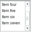
The following image shows a List control:
List control sizing
If you specify horizontalScrollPolicy="on", the default width of a List control does not change; it is still large enough to display the widest visible label. If you set horizontalScrollPolicy="on", and specify a List control pixel width, you can use the measureWidthOfItems() method to ensure that the scroll bar rightmost position corresponds to the right edge of the content, as the following example shows. Notice that the additional 5 pixels ensures that the rightmost character of the text displays properly.
 <mx:List id="li2"
	width="200" horizontalScrollPolicy="on"
	maxHorizontalScrollPosition="{li2.measureWidthOfItems() - li2.width +5}">
The preceding line ensures that the rightmost position of the scroll bar puts the end of the longest measured list item near the right edge of the List control. Using this technique, however, can reduce application efficiency, so you might consider using explicit sizes instead.
Lists, and all subclasses of the ListBase class, determine their sizes when a style changes or the data provider changes.
If you set a width property that is less than the width of the longest label and specify the horizontalScrollPolicy="off", labels that exceed the control width are clipped.
Creating a List control
You use the <mx:List> tag to define a List control. Specify an id value if you intend to refer to a component elsewhere in your MXML, either in another tag or in an ActionScript block.
The List control uses a list-based data provider. For more information, see Data providers and collections.
You specify the data for the List control by using the dataProvider property of the control. However, because dataProvider is the List control's default property, you do not have to specify a dataProvider child tag of the <mx:List> tag. In the simplest case for creating a static List control, you need only put <fx:String> tags in the control body, because Flex also automatically interprets the multiple tags as an Array of Strings, as the following example shows:
<?xml version="1.0"?>
<!-- dpcontrols/ListDataProvider.mxml -->
<s:Application xmlns:fx="http://ns.adobe.com/mxml/2009"
    xmlns:s="library://ns.adobe.com/flex/spark"
    xmlns:mx="library://ns.adobe.com/flex/mx">

    <mx:List>
        <mx:dataProvider>
            <fx:String>AK</fx:String>
            <fx:String>AL</fx:String>
            <fx:String>AR</fx:String>
        </mx:dataProvider>
    </mx:List>
</s:Application>
Because the data in this example is inline static data, it is not necessary to explicitly wrap it in an ArrayList or ArrayCollection object. However, when working with data that could change, it is always best to specify a list or collection explicitly; for more information, see Data providers and collections.
The index of items in the List control is zero-based, which means that values are 0, 1, 2, ... , n - 1, where n is the total number of items. The value of the item is its label text.
You typically use events to handle user interaction with a List control. The following example code adds a handler for a change event to the List control. Flex broadcasts a mx.ListEvent.CHANGE event when the value of the control changes due to user interaction.
<?xml version="1.0"?>
<!-- dpcontrols/ListChangeEvent.mxml -->
<s:Application xmlns:fx="http://ns.adobe.com/mxml/2009"
    xmlns:s="library://ns.adobe.com/flex/spark"
    xmlns:mx="library://ns.adobe.com/flex/mx">
    <s:layout>
        <s:VerticalLayout/>
    </s:layout>

    <fx:Script>
        <![CDATA[
            import flash.events.Event;

            public function changeEvt(event:Event):void {
                forChange.text=event.currentTarget.selectedItem.label + " " +
                event.currentTarget.selectedIndex;
            }
        ]]>
    </fx:Script>

    <mx:List width="35" change="changeEvt(event)">
        <fx:Object label="AL" data="Montgomery"/>
        <fx:Object label="AK" data="Juneau"/>
        <fx:Object label="AR" data="Little Rock"/>
    </mx:List>
    <mx:TextArea id="forChange" width="150"/>
</s:Application>
In this example, you use two properties of the List control, selectedItem and selectedIndex, in the event handler. Every change event updates the TextArea control with the label of the selected item and the item's index in the control.
The target property of the object passed to the event handler contains a reference to the List control. You can reference any control property by using the event's currentTarget property. The currentTarget.selectedItem field contains a copy of the selected item. If you populate the List control with an Array of Strings, the currentTarget.selectedItem field contains a String. If you populate it with an Array of Objects, the currentTarget.selectedItem field contains the Object that corresponds to the selected item, so, in this case, currentTarget.selectedItem.label refers to the selected item's label field.
Using a label function
You can pass a label function to the List control to provide logic that determines the text that appears in the control. The label function must have the following signature:
labelFunction(item:Object):String
The item parameter passed in by the Label control contains the list item object. The function must return the string to display in the List control.
The following example uses a function to combine the values of the label and data fields for each item for display in the List control:
<?xml version="1.0"?>
<!-- dpcontrols/ListLabelFunction.mxml -->
<s:Application xmlns:fx="http://ns.adobe.com/mxml/2009"
    xmlns:s="library://ns.adobe.com/flex/spark"
    xmlns:mx="library://ns.adobe.com/flex/mx" >

    <fx:Script>
        <![CDATA[
            public function myLabelFunc(item:Object):String {
                return item.data + ", " + item.label;
            }
        ]]>
    </fx:Script>

    <fx:Declarations>
        <mx:ArrayList id="myDP">
            <mx:source>
                <fx:Object label="AL" data="Montgomery"/>
                <fx:Object label="AK" data="Juneau"/>
                <fx:Object label="AR" data="Little Rock"/>
            </mx:source>
        </mx:ArrayList>
    </fx:Declarations>

    <mx:List dataProvider="{myDP}" labelFunction="myLabelFunc"/>
</s:Application>
Displaying DataTips
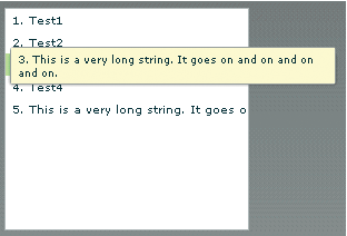
DataTips are similar to ToolTips, but display text when the mouse pointer hovers over a row in a List control. Text in a List control that is longer than the control width is clipped on the right side (or requires scrolling, if the control has scroll bars). DataTips can solve that problem by displaying all of the text, including the clipped text, when the mouse pointer hovers over a cell. If you enable data tips, they only appear for fields where the data is clipped. To display DataTips, set the showDataTips property of a List control to true.
The default behavior of the showDataTips property is to display the label text. However, you can use the dataTipField and dataTipFunction properties to determine what is displayed in the DataTip. The dataTipField property behaves like the labelField property; it specifies the name of the field in the data provider to use as the DataTip for cells in the column. The dataTipFunction property behaves like the labelFunction property; it specifies the DataTip string to display for list items.
The following example sets the showDataTips property for a List control:
<mx:List id="myList" dataProvider="{myDP}" width="220" height="200" showDataTips="true"/>
This example creates the following List control:
Displaying ScrollTips
You use ScrollTips to give users context about where they are in a list as they scroll through the list. The tips appear only when you scroll; they don't appear if you only hover the mouse over the scroll bar. ScrollTips are useful when live scrolling is disabled (the liveScrolling property is false) so scrolling does not occur until you release the scroll thumb. The default value of the showScrollTips property is false.
The default behavior of the showScrollTips property is to display the index number of the top visible item. You can use the scrollTipFunction property to determine what is displayed in the ScrollTip. The scrollTipFunction property behaves like the labelFunction property; it specifies the ScrollTip string to display for list items. You should avoid going to the server to fill in a ScrollTip.
The following example sets the showScrollTips and scrollTipFunction properties of a HorizontalList control, which shares many of the same properties and methods as the standard List control; for more information about the HorizontalList control, see MX HorizontalList control. The scrollTipFunction property specifies a function that gets the value of the description property of the current list item.
 <mx:HorizontalList id="list" dataProvider="{album.photo}" width="100%"
 	itemRenderer="Thumbnail" columnWidth="108" height="100"
 	selectionColor="#FFCC00" liveScrolling="false" showScrollTips="true"
 	scrollTipFunction="scrollTipFunc"
 	change="currentPhoto=album.photo[list.selectedIndex]"/>
This code produces the following HorizontalList control:

Vertically aligning text in List control rows
You can use the verticalAlign style to vertically align text at the top, middle, or bottom of a List row. The default value is top. You can also specify a value of middle or bottom.
The following example sets the verticalAlign property for a List control to bottom:
 <mx:List id="myList" dataProvider="{myDP}"
	width="220" height="200"
	verticalAlign="bottom"/>
Setting variable row height and wrapping List text
You can use the variableRowHeight property to make the height of List control rows variable based on their content. The default value is false. If you set the variableRowHeight property to true, the rowHeight property is ignored and the rowCount property is read-only.
The following example sets the variableRowHeight property for a List control to true:
 <mx:List id="myList" dataProvider="{myDP}"
	width="220" height="200"
	variableRowHeight="true"/>
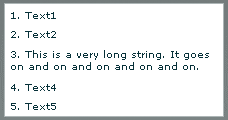
You can use the wordWrap property in combination with the variableRowHeight property to wrap text to multiple lines when it exceeds the width of a List row.
The following example sets the wordWrap and variableRowHeight properties to true:
 <mx:List id="myList" dataProvider="{myDP}"
	width="220" height="200"
	variableRowHeight="true" wordWrap="true"/>
This code produces the following List control:
Alternating row colors in a List control
You can use the alternatingItemColors style property to specify an Array that defines the color of each row in the List control. The Array must contain two or more colors. After using all the entries in the Array, the List control repeats the color scheme.
The following example defines an Array with two entries, #66FFFF for light blue and #33CCCC for a blue-gray. Therefore, the rows of the List control alternate between these two colors. If you specify a three-color array, the rows alternate among the three colors, and so on.
<mx:List alternatingItemColors="[#66FFFF, #33CCCC]".../>
Using a custom item renderer
An item renderer is the object that displays a List control's data items. The simplest way to use a custom item renderer is to specify an MXML component as the value of the itemRenderer property. When you use an MXML component as a item renderer, it can contain multiple levels of containers and controls. You can also use an ActionScript class as a custom item renderer. For detailed information on custom item renderers, see MX item renderers and item editors
The following example sets the itemRenderer property to an MXML component named FancyCellRenderer. It also sets the variableRowHeight property to true because the MXML component exceeds the default row height:
 <mx:List id="myList1" dataProvider="{myDP}"
	width="220" height="200"
	itemRenderer="FancyItemRenderer"
	variableRowHeight="true"/>
Specifying an icon to the List control
You can specify an icon to display with each List item, as the following example shows:
<?xml version="1.0"?>
<!-- dpcontrols/ListIcon.mxml -->
<s:Application xmlns:fx="http://ns.adobe.com/mxml/2009"
    xmlns:s="library://ns.adobe.com/flex/spark"
    xmlns:mx="library://ns.adobe.com/flex/mx">

    <fx:Script>
        <![CDATA[
            [Embed(source="assets/radioIcon.jpg")]
            public var iconSymbol1:Class;
            [Embed(source="assets/topIcon.jpg")]
            public var iconSymbol2:Class;
        ]]>
    </fx:Script>

   <mx:List iconField="myIcon">
      <mx:dataProvider>
         <fx:Array>
            <fx:Object label="AL" data="Montgomery" myIcon="iconSymbol1"/>
            <fx:Object label="AK" data="Juneau" myIcon="iconSymbol2"/>
            <fx:Object label="AR" data="Little Rock" myIcon="iconSymbol1"/>
         </fx:Array>
      </mx:dataProvider>
   </mx:List>
</s:Application>
In this example, you use the iconField property to specify the field of each item containing the icon. You use the Embed metadata to import the icons, and then reference them in the List control definition.
You can also use the iconFunction property to specify a function that determines the icon, similar to the way that you can use the labelFunction property to specify a function that determines the label text. The icon function must have the following signature:
iconFunction(item:Object):Class
The item parameter passed in by the List control contains the list item object. The function must return the icon class to display in the List control.
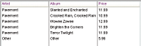
The following example shows a List control that uses the iconFunction property to determine the icon to display for each item in the list:
<?xml version="1.0"?>
<!-- dpcontrols/ListIconFunction.mxml -->
<s:Application xmlns:fx="http://ns.adobe.com/mxml/2009"
    xmlns:s="library://ns.adobe.com/flex/spark"
    xmlns:mx="library://ns.adobe.com/flex/mx">

    <fx:Script>
        <![CDATA[
            // Embed icons.
            [Embed(source="assets/radioIcon.jpg")]
            public var pavementSymbol:Class;
            [Embed(source="assets/topIcon.jpg")]
            public var normalSymbol:Class;

            // Define data provider.
            private var myDP: Array;
            private function initList():void {
                myDP = [
                    {Artist:'Pavement', Album:'Slanted and Enchanted', Price:11.99},
                    {Artist:'Pavarotti', Album:'Twilight', Price:11.99},
                    {Artist:'Other', Album:'Other', Price:5.99}];

                list1.dataProvider = myDP;
            }

            // Determine icon based on artist. Pavement gets a special icon.
            private function myiconfunction(item:Object):Class {
                var type:String = item.Artist;
                if (type == "Pavement") {
                    return pavementSymbol;
                }
                return normalSymbol;
            }
        ]]>
    </fx:Script>

    <mx:VBox >
        <mx:List id="list1"
            initialize="initList();"
            labelField="Artist"
            iconFunction="myiconfunction" />
    </mx:VBox>
</s:Application>
List control user interaction
The user clicks individual list items to select them, and holds down the Control and Shift keys while clicking to select multiple items. (You must set the allowMultipleSelection property to true to allow multiple selection.)
All mouse or keyboard selections broadcast a change event. For mouse interactions, the List control broadcasts this event when the mouse button is released.
If you set the allowDragSelection property to true, the control scrolls up or down when the user presses the mouse button over the one or more rows, holds the mouse button down, drags the mouse outside the control, and then moves the mouse up and down.
A List control shows the number of records that fit in the display. Paging down through the data displayed by a 10-line List control shows records 0-10, 9-18, 18-27, and so on, with one line overlapping from one page to the next.
The List control has the following keyboard navigation features:
|
Key |
Action |
|---|---|
|
Up Arrow |
Moves selection up one item. |
|
Down Arrow |
Moves selection down one item. |
|
Page Up |
Moves selection up one page. |
|
Page Down |
Moves selection down one page. |
|
Home |
Moves selection to the top of the list. |
|
End |
Moves selection to the bottom of the list. |
|
Alphanumeric keys |
Jumps to the next item with a label that begins with the character typed. |
|
Control |
Toggle key. Allows for multiple (noncontiguous) selection and deselection. Works with key presses, click selection, and drag selection. |
|
Shift |
Contiguous selection key. Allows for contiguous selections. Works with key presses, click selection, and drag selection. |
MX HorizontalList control
The HorizontalList control displays a horizontal list of items. The HorizontalList control is particularly useful in combination with a custom item renderer for displaying a list of images and other data. For more information about custom item renderers, see MX item renderers and item editors.
For complete reference information, see HorizontalList in the ActionScript 3.0 Reference for Apache Flex.
About HorizontaList controls
The contents of a HorizontalList control can look very similar to the contents of an HBox container in which a Repeater object repeats components. However, performance of a HorizontalList control can be better than the combination of an HBox container and a Repeater object because the HorizontalList control only instantiates the objects that fit in its display area. Scrolling in a HorizontalList can be slower than it is when using a Repeater object. For more information about the Repeater object, see Dynamically repeating controls and containers.
The HorizontalList control always displays items from left to right. The control usually contains a horizontal scroll bar, which lets users access all items in the list. An optional vertical scroll bar lets users view items when the full height of the list items is unlikely to fit. The user can select one or more items from the list, depending on the value of the allowMultipleSelection property.
The following image shows a HorizontalList control:

For complete reference information, see HorizontalList in the ActionScript 3.0 Reference for Apache Flex.
Creating a HorizontalList control
You use the <mx:HorizontalList> tag to define a HorizontalList control. Specify an id value if you intend to refer to a component elsewhere in your MXML, either in another tag or in an ActionScript block.
The HorizontalList control shares many properties and methods with the List control; see MX List control for information on how to use several of these shared properties. The HorizontalList control uses a list-based data provider. For more information, see Data providers and collections.
You specify the data for a HorizontalList control by using the dataProvider property of the <mx:HorizontalList> tag, as the following example shows:
<?xml version="1.0"?>
<!-- dpcontrols/HListDataProvider.mxml -->
<s:Application xmlns:fx="http://ns.adobe.com/mxml/2009"
    xmlns:s="library://ns.adobe.com/flex/spark"
    xmlns:mx="library://ns.adobe.com/flex/mx"
    width="450">

    <fx:Script>
        <![CDATA[
            import mx.collections.*;
            import mx.controls.Image;

            private var catalog:ArrayList;
            private static var cat:Array = [
                "../assets/Flex_6820.gif", "../assets/Flex_3595.gif",
                "../assets/Flex_3650.gif", "../assets/Flex_6010.gif"
            ];

            /* Initialize the HorizontalList control by setting its dataProvider
                property to an ArrayList containing the items parameter. */
            private function initCatalog(items:Array):void {
                catalog = new ArrayList(items);
                myList.dataProvider = catalog;
            }
        ]]>
    </fx:Script>

    <!-- A four-column HorizontalList. The itemRenderer is a Flex Image control.
       When the control is created, pass the cat array to the initialization routine. -->
    <mx:HorizontalList id="myList"
        columnWidth="100"
        rowHeight="100"
        columnCount="4"
        itemRenderer="mx.controls.Image"
        creationComplete="initCatalog(cat);"/>
</s:Application>
In this example, you use the creationComplete event to populate the data provider with an ArrayList of image files, and the itemRenderer property to specify the Image control as the item renderer. (Note that you use the full package name of the control in the assignment because the code does not import the mx.controls package.) The HorizontalList control then displays the four images specified by the data provider.
HorizontalList control user interaction
The user clicks individual list items to select them, and holds down the Control and Shift keys while clicking to select multiple items.
All mouse or keyboard selections broadcast a change event. For mouse interactions, the HorizontalList control broadcasts this event when the mouse button is released. When the user drags the mouse over the items and then outside the control, the control scrolls up or down.
A HorizontalList control shows the number of records that fit in the display. Paging through a four list shows records 0-4, 5-8, and so on, with no overlap from one page to the next.
Keyboard navigation
The HorizontalList control has the following keyboard navigation features:
|
Key |
Action |
|---|---|
|
Page Up |
Moves selection to the left one page. |
|
Left Arrow |
Moves selection to the left one item. |
|
Down Arrow |
Moves selection right one item. |
|
Page Down |
Moves selection to the right one page. |
|
Home |
Moves selection to the beginning of the list. |
|
End |
Moves selection to the end of the list. |
|
Control |
Toggle key. Allows for multiple (noncontiguous) selection and deselection when the allowMultipleSelection property is set to true. Works with key presses, click selection, and drag selection. |
|
Shift |
Contiguous selection key. Allows for contiguous selections when allowMultipleSelection is set to true. Works with key presses, click selection, and drag selection. |
MX TileList control
The TileList control displays a tiled list of items. The items are tiled in vertical columns or horizontal rows. The TileList control is particularly useful in combination with a custom item renderer for displaying a list of images and other data. The default item renderer for the TileList control is TileListItemRenderer, which, by default, displays text of the data provider's label field and any icon. For more information about custom item renderers, see MX item renderers and item editors.
Flex also includes the Spark Tile layout. When possible, it's best that you use the Spark Tile layout with the Spark List control. For more information, see Spark List control.
For complete reference information, see the ActionScript 3.0 Reference for Apache Flex.
About the TileList control
The contents of a TileList control can look very similar to the contents of a Tile container in which a Repeater object repeats components. However, performance of a TileList control can be better than the combination of a Tile container and a Repeater object because the TileList control only instantiates the objects that fit in its display area. Scrolling in a TileList can be slower than it is when using a Repeater object. For more information about the Repeater object, see Dynamically repeating controls and containers.
The TileList control displays a number of items laid out in equally sized tiles. It often contains a scroll bar on one of its axes to access all items in the list depending on the direction orientation of the list. The user can select one or more items from the list depending on the value of the allowMultipleSelection property.
The TileList control lays out its children in one or more vertical columns or horizontal rows, starting new rows or columns as necessary. The direction property determines the primary direction of the layout. The valid values for the direction property are and horizontal (default) and vertical for a layout. In a horizontal layout the tiles are filled in row by row with each row filling the available space in the control. If there are more tiles than fit in the display area, the horizontal control has a vertical scroll. In a vertical layout, the tiles are filled in column by column in the available vertical space, and the control may have a horizontal scroll bar.
The following image shows a TileList control:

Creating a TileList control
You use the <mx:TileList> tag to define a TileList control. Specify an id value if you intend to refer to a component elsewhere in your MXML, either in another tag or in an ActionScript block.
The TileList control shares many properties and methods with the List control; see MX List control for information on how to use several of these shared properties. The TileList control uses a list-based data provider. For more information, see Data providers and collections.
You specify the data for a TileList control by using the dataProvider property of the <mx:TileList> tag, as the following example shows:
<?xml version="1.0"?>
<!-- dpcontrols/TileListDataProvider.mxml -->
<s:Application xmlns:fx="http://ns.adobe.com/mxml/2009"
    xmlns:s="library://ns.adobe.com/flex/spark"
    xmlns:mx="library://ns.adobe.com/flex/mx"
    initialize="initData();" >

    <fx:Script>
        <![CDATA[
            import mx.controls.Button;
            import mx.collections.*;

            private var listArray:Array=[
                {label: "item0", data: 0},{label: "item1", data: 1},
                {label: "item2", data: 2},{label: "item3", data: 3},
                {label: "item4", data: 4},{label: "item5", data: 5},
                {label: "item6", data: 6},{label: "item7", data: 7},
                {label: "item8", data: 8}];

            [Bindable]
            public var TileListdp:ArrayList;

            private function initData():void {
                TileListdp = new ArrayList(listArray);
            }
        ]]>
    </fx:Script>

   <mx:TileList dataProvider="{TileListdp}"
      itemRenderer="mx.controls.Button"/>
</s:Application>
In this example, you populate the data provider with an ArrayList that contains an Array of strings defining labels and data values. You then use the itemRenderer property to specify a Button control as the item renderer. The Button controls display the data provider label values. The TileList control displays nine Button controls with the specified labels.
TileList control user interaction
The user clicks individual list items to select them, and holds down the Control and Shift keys while clicking to select multiple items.
All mouse or keyboard selections broadcast a change event. For mouse interactions, the TileList control broadcasts this event when the mouse button is released. When the user drags the mouse over the items and then outside the control, the control scrolls up or down.
Keyboard navigation
The TileList control has the following keyboard navigation features:
|
Key |
Action |
|---|---|
|
Up Arrow |
Moves selection up one item. If the control direction is vertical, and the current item is at the top of a column, moves to the last item in the previous column; motion stops at the first item in the first column. |
|
Down Arrow |
Moves selection down one item. If the control direction is vertical, and the current item is at the bottom of a column, moves to the first item in the next column; motion stops at the last item in the last column. |
|
Right Arrow |
Moves selection to the right one item. If the control direction is horizontal, and the current item is at the end of a row, moves to the first item in the next row; motion stops at the last item in the last column. |
|
Left Arrow |
Moves selection to the left one item. If the control direction is horizontal, and the current item is at the beginning of a row, moves to the last item in the previous row; motion stops at the first item in the first row. |
|
Page Up |
Moves selection up one page. For a single-page control, moves the selection to the beginning of the list. |
|
Page Down |
Moves selection down one page. For a single-page control, moves the selection to the end of the list. |
|
Home |
Moves selection to the beginning of the list. |
|
End |
Moves selection to the end of the list. |
|
Control |
Toggle key. Allows for multiple (noncontiguous) selection and deselection when allowMultipleSelection is set to true. Works with key presses, click selection, and drag selection. |
|
Shift |
Contiguous selection key. Allows for contiguous selections when allowMultipleSelection is set to true. Works with key presses, click selection, and drag selection. |
MX ComboBox control
The ComboBox control is a drop-down list from which the user can select a single value. Its functionality is very similar to that of the SELECT form element in HTML.
Flex also includes the Spark ComboBox control. When possible, it's best that you use the Spark ComboBox control. For more information, see Spark ComboBox control.
For complete reference information, see the ActionScript 3.0 Reference for Apache Flex.
About the ComboBox control
The following image shows a ComboBox control:

In its editable state, the user can type text directly into the top of the list, or select one of the preset values from the list. In its noneditable state, as the user types a letter, the drop-down list opens and scrolls to the value that most closely matches the one being entered; matching is only performed on the first letter that the user types.
If the drop-down list hits the lower boundary of the application, it opens upward. If a list item is too long to fit in the horizontal display area, it is truncated to fit. If there are too many items to display in the drop-down list, a vertical scroll bar appears.
Creating a ComboBox control
You use the <mx:ComboBox> tag to define a ComboBox control in MXML. Specify an id value if you intend to refer to a component elsewhere in your MXML, either in another tag or in an ActionScript block.
The ComboBox control uses a list-based data provider. For more information, see Data providers and collections.
You specify the data for the ComboBox control by using the dataProvider property of the <mx:ComboBox> tag. The data provider should be a list or collection; the standard list implementation is the ArrayList class. The standard collection implementations are the ArrayCollection and XMLListCollection classes, for working with Array-based and XML-based data, respectively. You can also use a raw data object, such as an Array object, as a data provider; however, it is always better to specify a list or collection explicitly for data that could change. For more information on data providers and collections see Data providers and collections.
In a simple case for creating a ComboBox control, you specify the property by using an dataProvider child tag, and use an <mx:ArrayList> tag to define the entries as an ArrayList whose source is an Array of Strings, as the following example shows:
<?xml version="1.0"?>
<!-- dpcontrols/ComboBoxSimple.mxml -->
<s:Application xmlns:fx="http://ns.adobe.com/mxml/2009"
    xmlns:s="library://ns.adobe.com/flex/spark"
    xmlns:mx="library://ns.adobe.com/flex/mx">

   <mx:ComboBox>
      <mx:ArrayList>
         <fx:String>AK</fx:String>
         <fx:String>AL</fx:String>
         <fx:String>AR</fx:String>
      </mx:ArrayList>
   </mx:ComboBox>
</s:Application>
This example shows how you can take advantages of MXML defaults. You do not have to use an dataProvider tag, because dataProvider is the default property of the ComboBox control. Similarly, you do not have to use an <mx:source> tag inside the <mx:ArrayList> tag because source is the default property of the ArrayList class. Finally, you do not have to specify an <fx:Array> tag for the source array.
The data provider can also contain objects with multiple fields, as in the following example:
<?xml version="1.0"?>
<!-- dpcontrols/ComboBoxMultiple.mxml -->
<s:Application xmlns:fx="http://ns.adobe.com/mxml/2009"
    xmlns:s="library://ns.adobe.com/flex/spark"
    xmlns:mx="library://ns.adobe.com/flex/mx">

   <mx:ComboBox>
      <mx:ArrayList>
         <fx:Object label="AL" data="Montgomery"/>
         <fx:Object label="AK" data="Juneau"/>
         <fx:Object label="AR" data="Little Rock"/>
      </mx:ArrayList>
   </mx:ComboBox>
</s:Application>
If the data source is an array of strings, as in the first example, the ComboBox displays strings as the items in the drop-down list. If the data source consists of objects, the ComboBox, by default, uses the contents of the label field. You can, however, override this behavior, as described in Specifying ComboBox labels.
The index of items in the ComboBox control is zero-based, which means that values are 0, 1, 2, ... , n - 1, where n is the total number of items. The value of the item is its label text.
Using events with ComboBox controls
You typically use events to handle user interaction with a ComboBox control.
The ComboBox control broadcasts a change event (flash.events.Event class with a type property value of flash.events.Event.CHANGE) when the value of the control's selectedIndex or selectedItem property changes due to the following user actions:
-
If the user closes the drop-down list by using a mouse click, Enter key, or Control+Up key, and the selected item is different from the previously selected item.
-
If the drop-down list is currently closed, and the user presses the Up, Down, Page Up, or Page Down key to select a new item.
-
If the ComboBox control is editable, and the user types into the control, Flex broadcasts a change event each time the text field of the control changes.
The ComboBox control broadcasts an mx.events.DropdownEvent with a type mx.events.DropdownEvent.OPEN (open) and mx.events.DropdownEvent.CLOSE (close) when the ComboBox control opens and closes. For detailed information on these and other ComboBox events, see ComboBox in the ActionScript 3.0 Reference for Apache Flex.
The following example displays information from ComboBox events:
<?xml version="1.0"?>
<!-- dpcontrols/ComboBoxEvent.mxml -->
<s:Application xmlns:fx="http://ns.adobe.com/mxml/2009"
    xmlns:s="library://ns.adobe.com/flex/spark"
    xmlns:mx="library://ns.adobe.com/flex/mx">
    <s:layout>
        <s:VerticalLayout/>
    </s:layout>

    <fx:Script>
        <![CDATA[
            import flash.events.Event;
            import mx.events.DropdownEvent;

            // Display the type of event for open and close events.
            private function dropEvt(event:DropdownEvent):void {
                forChange.text+=event.type + "\n";
            }

            // Display a selected item's label field and index for change events.
            private function changeEvt(event:Event):void {
                forChange.text+=event.currentTarget.selectedItem.label + " " +
                event.currentTarget.selectedIndex + "\n";
            }
        ]]>
    </fx:Script>

    <mx:ComboBox open="dropEvt(event)" close="dropEvt(event)"
        change="changeEvt(event)" >
        <mx:ArrayList>
            <fx:Object label="AL" data="Montgomery"/>
            <fx:Object label="AK" data="Juneau"/>
            <fx:Object label="AR" data="Little Rock"/>
        </mx:ArrayList>
    </mx:ComboBox>
    <mx:TextArea id="forChange" width="150" height="150"/>
</s:Application>
If you populate the ComboBox control with an Array of Strings, the currentTarget.selectedItem field contains a String. If you populate it with an Array of Objects, the currentTarget.selectedItem field contains the Object that corresponds to the selected item, so, in this case, currentTarget.selectedItem.label refers to the selected item object's label field.
In this example, you use two properties of the ComboBox control, selectedItem and selectedIndex, in the event handlers. Every change event updates the TextArea control with the label of the selected item and the item's index in the control, and every open or close event appends the event type.
Specifying ComboBox labels
If the ComboBox data source is an array of strings, the control displays the string for each item. If the data source is contains Objects, by default, the ComboBox control expects each object to contain a property named label that defines the text that appears in the ComboBox control for the item. If each Object does not contain a label property, you can use the labelField property of the ComboBox control to specify the property name, as the following example shows:
 	<mx:ComboBox open="dropEvt(event)" close="dropEvt(event)"
 			change="changeEvt(event)" labelField="state">
 		<mx:ArrayList>
 			<fx:Object state="AL" capital="Montgomery"/>
 			<fx:Object state="AK" capital="Juneau"/>
 			<fx:Object state="AR" capital="Little Rock"/>
 		</mx:ArrayList>
 	</mx:ComboBox>
To make the event handler in the section Using events with ComboBox controlsdisplay the state ID and capital, you would modify the change event handler to use a property named state, as the following example shows:
 		private function changeEvt(event) {
 			forChange.text=event.currentTarget.selectedItem.state + " " +
 			event.currentTarget.selectedItem.capital + " " +
 			event.currentTarget.selectedIndex;
 		}
You can also specify the ComboBox labels by using a label function, as described in Using a label function.
Populating a ComboBox control by using variables and models
Flex lets you populate the data provider of a ComboBox control from an ActionScript variable definition or from a Flex data model. Each element of the data provider must contain a string label, and can contain one or more fields with additional data. The following example populates two ComboBox controls; one from an ArrayList variable that it populates directly from an Array, the other from an ArrayList that it populates from an array of items in an <fx:Model> tag.
<?xml version="1.0"?>
<!-- dpcontrols/ComboBoxVariables.mxml -->
<s:Application xmlns:fx="http://ns.adobe.com/mxml/2009"
    xmlns:s="library://ns.adobe.com/flex/spark"
    xmlns:mx="library://ns.adobe.com/flex/mx"
    initialize="initData();">
    <s:layout>
        <s:VerticalLayout/>
    </s:layout>

    <fx:Script>
        <![CDATA[
            import mx.collections.*
            private var COLOR_ARRAY:Array=
                [{label:"Red", data:"#FF0000"},
                {label:"Green", data:"#00FF00"},
                {label:"Blue", data:"#0000FF"}];

            // Declare an ArrayList variable for the colors.
            // Make it Bindable so it can be used in bind
            // expressions ({colorAL}).
            [Bindable]
            public var colorAL:ArrayList;

            // Initialize colorAL ArrayList variable from the Array.
            // Use an initialize event handler to initialize data variables
            // that do not rely on components, so that the initial values are
            // available when the controls that use them are constructed.
            //See the mx:ArrayList tag, below, for a second way to
            //initialize an ArrayList.
            private function initData():void {
                colorAL=new ArrayList(COLOR_ARRAY);
            }
        ]]>
    </fx:Script>

    <fx:Declarations>
        <!-- This example shows two different ways to
            structure a Model. -->
        <fx:Model id="myDP">
            <obj>
                <item label="AL" data="Montgomery"/>
                <item>
                    <label>AK</label>
                    <data>Juneau</data>
                </item>
                <item>
                    <label>AR</label>
                    <data>Little Rock</data>
                </item>
            </obj>
        </fx:Model>

       <!-- Create a stateAL ArrayList that uses as its source an Array of
             the item elements from the myDP model.
             This technique and the declaration and initialization code used for
             the colorAL variable are alternative methods of creating and
             initializing the ArrayList. -->
       <mx:ArrayList id="stateAL" source="{myDP.item}"/>
    </fx:Declarations>

   <mx:ComboBox dataProvider="{colorAL}"/>
   <mx:ComboBox dataProvider="{stateAL}"/>
</s:Application>
This example uses a simple model. However, you can populate the model from an external data source or define a custom data model class in ActionScript. For more information on using data models, see Storing data.
You can use remote data providers to supply data to your ComboBox control. For example, when a web service operation returns an Array of strings, you can use the following format to display each string as a row of a ComboBox control:
 <mx:ArrayCollection id="resultAC"
 	source="mx.utils.ArrayUtil.toArray(service.operation.lastResult);"
 <mx:ComboBox dataProvider="{resultAC}" />
In general, you should use an ArrayCollection for web service operations. An ArrayList is not usually compatible with the results. For more information on using remote data providers, see Remote data in data provider components.
ComboBox control user interaction
A ComboBox control can be noneditable or editable, as specified by the Boolean editable property. In a noneditable ComboBox control, a user can make a single selection from a drop-down list. In an editable ComboBox control, the portion button of the control is a text field that the user can enter text directly into or can populate by selecting an item from the drop‑down list. When the user makes a selection in the ComboBox control list, the label of the selection is copied to the text field at the top of the ComboBox control.
When a ComboBox control (and not the drop-down box) has focus and is editable, all keystrokes go to the text field and are handled according to the rules of the TextInput control (see MX TextInput control), with the exception of the Control+Down key combination, which opens the drop-down list. When the drop-down list is open, you can use the Up and Down keys to navigate in the list and the Enter key to select an item from the list.
When a ComboBox control has focus and is noneditable, alphanumeric keystrokes move the selection up and down the data provider to the next item with the same first character and display the label in the text field. If the drop-down list is open, the visible selection moves to the selected item.
You can also use the following keys to control a noneditable ComboBox control when the drop-down list is not open:
|
Key |
Description |
|---|---|
|
Control+Down |
Opens the drop-down list and gives it focus. |
|
Down |
Moves the selection down one item. |
|
End |
Moves the selection to the bottom of the collection. |
|
Home |
Moves the selection to the top of the collection. |
|
Page Down |
Displays the item that would be at the end bottom of the drop-down list. If the current selection is a multiple of the rowCount value, displays the item that rowCount -1 down the list, or the last item. If the current selection is the last item in the data provider, does nothing. |
|
Page Up |
Displays the item that would be at the top of the drop-down. If the current selection is a multiple of the rowCount value, displays the item that rowCount -1 up the list, or the first item. If the current selection is the first item in the data provider, does nothing. |
|
Up |
Moves the selection up one item. |
When the drop-down list of a noneditable ComboBox control has focus, alphanumeric keystrokes move the selection up and down the drop-down list to the next item with the same first character. You can also use the following keys to control a drop-down list when it is open:
|
Key |
Description |
|---|---|
|
Control+Up |
Closes the drop-down list and returns focus to the ComboBox control. |
|
Down |
Moves the selection down one item. |
|
End |
Moves the selection to the bottom of the collection. |
|
Enter |
Closes the drop-down list and returns focus to the ComboBox control. |
|
Escape |
Closes the drop-down list and returns focus to the ComboBox control. |
|
Home |
Moves the selection to the top of the collection. |
|
Page Down |
Moves to the bottom of the visible list. If the current selection is at the bottom of the list, moves the current selection to the top of the displayed list and displays the next rowCount-1 items, if any. If there current selection is the last item in the data provider, does nothing. |
|
Page Up |
Moves to the top of the visible list. If the current selection is at the top of the list, moves the current selection to the bottom of the displayed list and displays the previous rowCount-1 items, if any. If the current selection is the first item in the data provider, does nothing. |
|
Shift+Tab |
Closes the drop-down list and moves the focus to the previous object in the DisplayList. |
|
Tab |
Closes the drop-down list and moves the focus to the next object in the DisplayList. |
|
Up |
Moves the selection up one item. |
MX DataGrid control
The DataGrid control is a list that can display more than one column of data. It is a formatted table of data that lets you set editable table cells, and is the foundation of many data-driven applications.
For information on the following topics, which are often important for creating advanced data grid controls, see:
-
How to format the information in each DataGrid cell and control how users enter data in the cells; see MX item renderers and item editors.
-
How to drag objects to and from the data grid; see Drag and drop.
Flex also includes the Spark DataGrid control. When possible, it's best that you use the Spark DataGrid control. For more information, see Spark DataGrid and Grid controls.
For complete reference information, see the ActionScript 3.0 Reference for Apache Flex.
About the MX DataGrid control
The DataGrid control provides the following features:
-
Resizable, sortable, and customizable column layouts, including hidable columns
-
Optional customizable column and row headers, including optionally wrapping header text
-
Columns that the user can resize and reorder at run time
-
Selection events
-
Ability to use a custom item renderer for any column
-
Support for paging through data
-
Locked rows and columns that do not scroll
The following image shows a DataGrid control:
Rows are responsible for rendering items. Each row is laid out vertically below the previous one. Columns are responsible for maintaining the state of each visual column; columns control width, color, and size.
Creating an MX DataGrid control
You use the <mx:DataGrid> tag to define a DataGrid control in MXML. Specify an id value if you intend to refer to a component elsewhere in your MXML, either in another tag or in an ActionScript block.
The DataGrid control uses a list-based data provider. For more information, see Data providers and collections.
You specify the data for the DataGrid control by using the dataProvider property. You can specify data in several different ways. In the simplest case for creating a DataGrid control, you use the dataProvider property subtag with <mx:ArrayList>, and <fx:Object> tags to define the entries as an ArrayList of Objects. Each Object defines a row of the DataGrid control, and properties of the Object define the column entries for the row, as the following example shows:
<?xml version="1.0"?>
<!-- dpcontrols/DataGridSimple.mxml -->
<s:Application xmlns:fx="http://ns.adobe.com/mxml/2009"
    xmlns:s="library://ns.adobe.com/flex/spark"
    xmlns:mx="library://ns.adobe.com/flex/mx">

   <mx:DataGrid>
      <mx:ArrayList>
         <fx:Object>
            <fx:Artist>Pavement</fx:Artist>
            <fx:Price>11.99</fx:Price>
            <fx:Album>Slanted and Enchanted</fx:Album>
         </fx:Object>
         <fx:Object>
            <fx:Artist>Pavement</fx:Artist>
            <fx:Album>Brighten the Corners</fx:Album>
            <fx:Price>11.99</fx:Price>
         </fx:Object>
      </mx:ArrayList>
   </mx:DataGrid>
</s:Application>
This example shows how you can take advantages of MXML defaults. You do not have to use an dataProvider tag, because dataProvider is the default property of the DataGrid control. Similarly, you do not have to use an <mx:source> tag inside the <mx:ArrayList> tag because source is the default property of the ArrayList class. Finally, you do not have to specify an <fx:Array> tag for the source array.
You can also define the objects by using properties directly in the Object tags, as the following example shows:
<?xml version="1.0"?>
<!-- dpcontrols/DataGridSimpleAttributes.mxml -->
<s:Application xmlns:fx="http://ns.adobe.com/mxml/2009"
    xmlns:s="library://ns.adobe.com/flex/spark"
    xmlns:mx="library://ns.adobe.com/flex/mx">

   <mx:DataGrid>
      <mx:ArrayList>
         <fx:Object Artist="Pavement"
            Album="Slanted and Enchanted" Price="11.99" />
         <fx:Object Artist="Pavement"
            Album="Brighten the Corners" Price="11.99" />
      </mx:ArrayList>
   </mx:DataGrid>
</s:Application>
The column names displayed in the DataGrid control are the property names of the Array Objects. By default, the columns are in alphabetical order by the property names. Different Objects can define their properties in differing orders. If an Array Object omits a property, the DataGrid control displays an empty cell in that row.
Specifying columns
Each column in a DataGrid control is represented by a DataGridColumn object. You use the columns property of the DataGrid control and the <mx:DataGridColumn> tag to select the DataGrid columns, specify the order in which to display them, and set additional properties. You can also use the DataGridColumn class visible property to hide and redisplay columns, as described in the next section.
For complete reference information for the <mx:DataGridColumn> tag, see DataGridColumn in the ActionScript 3.0 Reference for Apache Flex.
You specify an Array element to the <mx:columns> child tag of the <mx:DataGrid> tag, as the following example shows:
<?xml version="1.0"?>
<!-- dpcontrols/DataGridSpecifyColumns.mxml -->
<s:Application xmlns:fx="http://ns.adobe.com/mxml/2009"
    xmlns:s="library://ns.adobe.com/flex/spark"
    xmlns:mx="library://ns.adobe.com/flex/mx">

   <mx:DataGrid>
      <mx:ArrayList>
         <fx:Object Artist="Pavement" Price="11.99"
            Album="Slanted and Enchanted" />
         <fx:Object Artist="Pavement"
            Album="Brighten the Corners" Price="11.99" />
      </mx:ArrayList>
      <mx:columns>
         <mx:DataGridColumn dataField="Album" />
         <mx:DataGridColumn dataField="Price" />
      </mx:columns>
   </mx:DataGrid>
</s:Application>
In this example, you only display the Album and Price columns in the DataGrid control. You can reorder the columns as well, as the following example shows:
 <mx:columns>
 	<mx:DataGridColumn dataField="Price" />
 	<mx:DataGridColumn dataField="Album" />
 </mx:columns>
In this example, you specify that the Price column is the first column in the DataGrid control, and that the Album column is the second.
You can also use the <mx:DataGridColumn> tag to set other options. The following example uses the headerText property to set the name of the column to a value different than the default name of Album, and uses the width property to set the album name column wide enough to display the full album names:
 <mx:columns>
 	<mx:DataGridColumn dataField="Album" width="200" />
 	<mx:DataGridColumn dataField="Price" headerText="List Price" />
 </mx:columns>
Hiding and displaying columns
If you might display a column at some times, but not at others, you can specify the DataGridColumn class visible property to hide or show the column. The following example lets you hide or show the album price by clicking a button:
<?xml version="1.0"?>
<!-- dpcontrols/DataGridVisibleColumn.mxml -->
<s:Application xmlns:fx="http://ns.adobe.com/mxml/2009"
    xmlns:s="library://ns.adobe.com/flex/spark"
    xmlns:mx="library://ns.adobe.com/flex/mx">
    <s:layout>
        <s:VerticalLayout/>
    </s:layout>

   <mx:DataGrid id="myDG" width="350">
      <mx:ArrayList>
          <mx:source>
              <fx:Object Artist="Pavement" Price="11.99"
                  Album="Slanted and Enchanted" />
              <fx:Object Artist="Pavement"
                  Album="Brighten the Corners" Price="11.99" />
          </mx:source>
      </mx:ArrayList>
      <mx:columns>
         <mx:DataGridColumn dataField="Artist" />
         <mx:DataGridColumn dataField="Album" />
         <mx:DataGridColumn id="price" dataField="Price" visible="false"/>
      </mx:columns>
   </mx:DataGrid>

   <!-- The column id property specifies the column to show.-->
   <mx:Button label="Toggle Price Column"
      click="price.visible = !price.visible;" />
</s:Application>
Passing data to an MX DataGrid control
Flex lets you populate a DataGrid control from an ActionScript variable definition or from a Flex data model. The following example populates a DataGrid control by using a variable:
<?xml version="1.0"?>
<!-- dpcontrols/DataGridPassData.mxml -->
<s:Application xmlns:fx="http://ns.adobe.com/mxml/2009"
    xmlns:s="library://ns.adobe.com/flex/spark"
    xmlns:mx="library://ns.adobe.com/flex/mx"
   initialize="initData();">

    <fx:Script>
        <![CDATA[
            import mx.collections.*;
            private var DGArray:Array = [
                {Artist:'Pavement', Album:'Slanted and Enchanted', Price:11.99},
                {Artist:'Pavement', Album:'Brighten the Corners', Price:11.99}];

            [Bindable]
            public var initDG:ArrayList;

            //Initialize initDG ArrayList variable from the Array.
            //If you use this technique to process an HTTPService,
            //WebService, or RemoteObject result, use an ArrayCollection
            //rather than an ArrayList.
            public function initData():void {
                initDG=new ArrayList(DGArray);
            }
        ]]>
    </fx:Script>

    <mx:DataGrid id="myGrid" width="350" height="200"
        dataProvider="{initDG}" >
        <mx:columns>
            <mx:DataGridColumn dataField="Album" />
            <mx:DataGridColumn dataField="Price" />
        </mx:columns>
    </mx:DataGrid>
</s:Application>
In this example, you bind the variable initDG to the <mx:dataProvider> property. You can still specify a column definition event when using data binding. For a description of using a model as a data provider, see Populating a ComboBox control by using variables and models
Handling events in an MX DataGrid control
The DataGrid control and the DataGridEvent class define several event types that let you respond to user interaction. For example, Flex broadcasts mx.events.ListEvent class event with a type property value of mx.events.ListEvent.ITEM_CLICK ("itemClick") when a user clicks an item in a DataGrid control. You can handle this event as the following example shows:
<?xml version="1.0"?>
<!-- dpcontrols/DataGridEvents.mxml -->
<s:Application xmlns:fx="http://ns.adobe.com/mxml/2009"
    xmlns:s="library://ns.adobe.com/flex/spark"
    xmlns:mx="library://ns.adobe.com/flex/mx">
    <s:layout>
        <s:VerticalLayout/>
    </s:layout>

    <fx:Script>
        <![CDATA[
            import mx.events.ListEvent;
            private function itemClickEvent(event:ListEvent):void {
                clickColumn.text=String(event.columnIndex);
                clickRow.text=String(event.rowIndex);
                eventType.text=event.type;
            }
        ]]>
    </fx:Script>

    <mx:DataGrid id="myGrid" width="350" height="150"
        itemClick="itemClickEvent(event);">
        <mx:ArrayList>
            <fx:Object Artist="Pavement" Price="11.99"
                Album="Slanted and Enchanted" />
            <fx:Object Artist="Pavement" Album="Brighten the Corners"
                Price="11.99" />
        </mx:ArrayList>
    </mx:DataGrid>
    <s:Form>
        <s:FormItem label="Column Index:">
            <s:Label id="clickColumn"/>
        </s:FormItem>
        <s:FormItem label="Row Index:">
            <s:Label id="clickRow"/>
        </s:FormItem>
        <s:FormItem label="Type:">
            <s:Label id="eventType"/>
        </s:FormItem>
    </s:Form>
</s:Application>
In this example, you use the event handler to display the column index, row index, and event type in three TextArea controls.
The index of columns in the DataGrid control is zero-based, meaning values are 0, 1, 2, ... , n ‑ 1, where n is the total number of columns. Row items are also indexed starting at 0. Therefore, if you select the first item in the second row, this example displays 0 in the TextArea for the column index, and 1 in the TextArea for the row index.
To access the selected item in the event handler, you can use the currentTarget property of the event object, and the selectedItem property of the DataGrid control, as the following code shows:
var selectedArtist:String=event.currentTarget.selectedItem.Artist;
The currentTarget property of the object passed to the event handler contains a reference to the DataGrid control. You can reference any control property by using currentTarget followed by a period and the property name. The currentTarget.selectedItem field contains the selected item.
Sorting data in an MX DataGrid control
The DataGrid control supports displaying sorted data in two ways:
-
By default, the control displays data in the sorted order of its underlying data provider collection. Therefore you can use the collection Sort and SortField classes to control the order of the rows.
-
By default, users can sort the display by clicking the column headers. Clicking the column header initially sorts the display in descending order of the entries in the selected column, and clicking the header again reverses the sort order. You can disable sorting an entire DataGrid Control or individual columns.
For detailed information on using the Sort and SortField classes, see Sorting and filtering data for viewing.
Determining the initial DataGrid sort order
To specify the initial DataGrid sort order, you sort the data provider. While a number of approaches can work, the following technique takes best advantage of the built in features of Flex collections:
-
Use an object that implements the ICollectionView interface, such as an ArrayCollection, in the dataProvider property of your DataGrid. Specify a Sort object in the data provider object's the sort field. Note that you cannot use an ArrayList with a sort field.
-
Use the Sort object to control the order of the rows in the dataProvider object.
Controlling user sorting of DataGrid displays
The following DataGrid and DataGridColumn properties control how users can sort data:
-
The DataGrid sortableColumns property is a global switch that enables user sorting of the DataGrid display by clicking column headings. The default this property is true.
-
The DataGridColumn sortable property specifies whether users can sort an individual column. The default this property is true.
-
The DataGridColumn sortCompareFunction property lets you specify a custom comparison function. This property sets the compare property of the default SortField class object that the DataGrid uses to sort the grid when users click the headers. It lets you specify the function that compares two objects and determines which would be higher in the sort order, without requiring you to explicitly create a Sort object on your data provider. For detailed information on the comparison function signature and behavior, see sortCompareFunction in the ActionScript 3.0 Reference for Apache Flex.
By default, the DataGrid class uses its own sort code to control how the data gets sorted when the user clicks a column. To override this behavior, you create a headerRelease event handler to handle the DataGridEvent event that is generated when the user clicks the column header. This event handler must do the following:
-
Use the event object's columnIndex property to determine the clicked column.
-
Create an MX Sort object with a set of MX SortField objects based on the clicked column and any other rules that you need to control the sorting order. For more information on using Sort objects, see Sorting and filtering data for viewing.
-
Apply the Sort object to the collection assigned as the data provider.
-
Call the DataGridEvent class event object's preventDefault() method to prevent the DataGrid from doing a default column sort.
Note: If you specify a labelFunction property, you must also specify a sortCompareFunction function. The Computed Columns example in Flex Explorer shows this use.
-
The following example shows how to use the headerRelease event handler to do multi-column sorting when a user clicks a DataGrid column header.
Example: Sorting a DataGrid on multiple columns
The following example shows how you can use a collection with a Sort object to determine an initial multi-column sort and to control how the columns sort when you click the headers. The data grid is initially sorted by in-stock status first, artist second, and album name, third. If you click any heading, that column becomes the primary sort criterion, the previous primary criterion becomes the second criterion, and the previous secondary criterion becomes the third criterion.
<?xml version="1.0"?>
<!-- dpcontrols/DataGridSort.mxml -->
<s:Application xmlns:fx="http://ns.adobe.com/mxml/2009"
    xmlns:s="library://ns.adobe.com/flex/spark"
    xmlns:mx="library://ns.adobe.com/flex/mx"
    initialize="initDP();"
    width="550" height="400">
    <s:layout>
        <s:VerticalLayout/>
    </s:layout>

    <fx:Script>
        <![CDATA[
            import mx.events.DataGridEvent;
            import mx.collections.*;

            // Declare storage variables and initialize the simple variables.
            // The data provider collection.
            private var myDPColl:ArrayCollection;

            // The Sort object used to sort the collection.
            [Bindable]
            private var sortA:Sort;

            // The sort fields used to determine the sort.
            private var sortByInStock:SortField;
            private var sortByArtist:SortField;
            private var sortByAlbum:SortField;
            private var sortByPrice:SortField;

            // The data source that populates the collection.
            private var myDP:Array = [
                {Artist:'Pavement', Album:'Slanted and Enchanted',
                    Price:11.99, InStock: true},
                {Artist:'Pavement', Album:'Crooked Rain, Crooked Rain',
                    Price:10.99, InStock: false},
                {Artist:'Pavement', Album:'Wowee Zowee',
                    Price:12.99, InStock: true},
                {Artist:'Asphalt', Album:'Brighten the Corners',
                    Price:11.99, InStock: false},
                {Artist:'Asphalt', Album:'Terror Twilight',
                    Price:11.99, InStock: true},
                {Artist:'Asphalt', Album:'Buildings Meet the Sky',
                    Price:14.99, InStock: true},
                {Artist:'Other', Album:'Other',
                    Price:5.99, InStock: true}
            ];

            //Initialize the DataGrid control with sorted data.
            private function initDP():void {
                //Create an ArrayCollection backed by the myDP array of data.
                myDPColl = new ArrayCollection(myDP);
                //Create a Sort object to sort the ArrrayCollection.
                sortA = new Sort();
                //Initialize SortField objects for all valid sort fields:
                // A true second parameter specifies a case-insensitive sort.
                // A true third parameter specifies descending sort order.
                // A true fourth parameter specifies a numeric sort.
                sortByInStock = new SortField("InStock", true, true);
                sortByArtist = new SortField("Artist", true);
                sortByAlbum = new SortField("Album", true);
                sortByPrice = new SortField("Price", true, false, true);
                // Sort the grid using the InStock, Artist, and Album fields.
                sortA.fields=[sortByInStock, sortByArtist, sortByAlbum];
                myDPColl.sort=sortA;
                // Refresh the collection view to show the sort.
                myDPColl.refresh();
                // Initial display of sort fields
                tSort0.text = "First Sort Field: InStock";
                tSort1.text = "Second Sort Field: Artist";
                tSort2.text = "Third Sort Field: Album";

                // Set the ArrayCollection as the DataGrid data provider.
                myGrid.dataProvider=myDPColl;
                // Set the DataGrid row count to the array length,
                // plus one for the header.
                myGrid.rowCount=myDPColl.length +1;
            }

            // Re-sort the DataGrid control when the user clicks a header.
            private function headRelEvt(event:DataGridEvent):void {
                // The new third priority was the old second priority.
                sortA.fields[2] = sortA.fields[1];
                tSort2.text = "Third Sort Field: " + sortA.fields[2].name;
                // The new second priority was the old first priority.
                sortA.fields[1] = sortA.fields[0];
                tSort1.text = "Second Sort Field: " + sortA.fields[1].name;
                // The clicked column determines the new first priority.
                if (event.columnIndex==0) {
                    sortA.fields[0] = sortByArtist;
                } else if (event.columnIndex==1) {
                    sortA.fields[0] = sortByAlbum;
                } else if (event.columnIndex==2) {
                    sortA.fields[0] = sortByPrice;
                } else {
                    sortA.fields[0] = sortByInStock;}
                tSort0.text = "First Sort Field: " + sortA.fields[0].name;
                // Apply the updated sort fields and re-sort.
                myDPColl.sort=sortA;
                // Refresh the collection to show the sort in the grid.
                myDPColl.refresh();
                // Prevent the DataGrid from doing a default column sort.
                event.preventDefault();
            }
        ]]>
    </fx:Script>

    <!-- The Data Grid control.
         By default the grid and its columns can be sorted by clicking.
         The headerRelease event handler overrides the default sort
         behavior. -->
    <mx:DataGrid id="myGrid" width="100%" headerRelease="headRelEvt(event);">
        <mx:columns>
            <mx:DataGridColumn minWidth="120" dataField="Artist" />
            <mx:DataGridColumn minWidth="200" dataField="Album" />
            <mx:DataGridColumn width="75" dataField="Price" />
            <mx:DataGridColumn width="75" dataField="InStock"
               headerText="In Stock"/>
        </mx:columns>
    </mx:DataGrid>
    <mx:VBox>
        <mx:Label id="tSort0" text="First Sort Field: "/>
        <mx:Label id="tSort1" text="Second Sort Field: "/>
        <mx:Label id="tSort2" text="Third Sort Field: "/>
    </mx:VBox>
</s:Application>
MX DataGrid control user interaction
The DataGrid control responds to mouse and keyboard activity. The response to a mouse click or key press depends on whether a cell is editable. A cell is editable when the editable properties of the DataGrid control and the DataGridColumn containing the cell are both true. Clicking within an editable cell directs focus to that cell. Clicking a noneditable cell has no effect on the focus.
Users can modify the DataGrid control appearance in the following ways:
-
If the value of the sortableColumns property is true, the default value, clicking within a column header causes the DataGrid control to be sorted based on the column's cell values.
-
If the value of the draggableColumns property is true, the default value, clicking and holding the mouse button within a column header, dragging horizontally, and releasing the mouse button moves the column to new location.
-
If the value of the resizableColumns property is true, the default value, clicking in the area between columns permits column resizing.
Keyboard navigation
The DataGrid control has the following keyboard navigation features:
|
Key |
Action |
|---|---|
|
Enter Return Shift+Enter |
When a cell is in editing state, commits change, and moves editing to the cell on the same column, next row down or up, depending on whether Shift is pressed. |
|
Tab |
Moves focus to the next editable cell, traversing the cells in row order. If at the end of the last row, advances to the next element in the parent container that can receive focus. |
|
Shift+Tab |
Moves focus to the previous editable cell. If at the beginning of a row, advances to the end of the previous row. If at the beginning of the first row, advances to the previous element in the parent container that can receive focus. |
|
Up Arrow Home Page Up |
If editing a cell, shifts the cursor to the beginning of the cell's text. If the cell is not editable, moves selection up one item. |
|
Down Arrow End Page Down |
If editing a cell, shifts the cursor to the end of the cell's text. If the cell is not editable, moves selection down one item. |
|
Control |
Toggle key. If you set the DataGrid control allowMultipleSelection property to true, allows for multiple (noncontiguous) selection and deselection. Works with key presses, click selection, and drag selection. |
|
Shift |
Contiguous select key. If you set the DataGrid control allowMultipleSelection property to true, allows for contiguous selections. Works with key presses, click selection, and drag selection. |
MX Tree control
The Tree control lets a user view hierarchical data arranged as an expandable tree.
For complete reference information, see the ActionScript 3.0 Reference for Apache Flex. For information on hierarchical data providers, see Hierarchical data objects.
For information on the following topics, which are often important for using advanced Tree controls, see:
-
How to format the information in each Tree node and control how users enter data in the nodes; see MX item renderers and item editors.
-
How to drag objects to and from the Tree control; see Drag and drop.
About Tree controls
A Tree control is a hierarchical structure of branch and leaf nodes. Each item in a tree is called a node and can be either a leaf or a branch. A branch node can contain leaf or branch nodes, or can be empty (have no children). A leaf node is an end point in the tree.
By default, a leaf is represented by a text label beside a file icon and a branch is represented by a text label beside a folder icon with a disclosure triangle that a user can open to expose children.
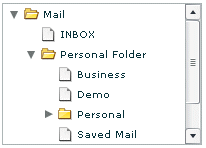
The following image shows a Tree control:
Creating a Tree control
You define a Tree control in MXML by using the <mx:Tree> tag. The Tree class extends the List class and Tree controls take all of the properties and methods of the List control. For more information about using the List control, see MX List control. Specify an id value if you intend to refer to a control elsewhere in your MXML, either in another tag or in an ActionScript block.
The Tree control normally gets its data from a hierarchical data provider, such as an XML structure. If the Tree represents dynamically changing data, you should use a list or collection, such as the standard ArrayCollection, or XMLListCollection object, as the data provider.
The Tree control uses a data descriptor to parse and manipulate the data provider content. By default, the Tree control uses a DefaultDataDescriptor instance, but you can create your own class and specify it in the Tree control's dataDescriptor property.
The DefaultDataDescriptor class supports the following types of data:
- Collections
-
A collection implementation, such as an XMLListCollection or ArrayCollection object. The DefaultDataDescriptor class includes code to handle collections efficiently. Always use a collection as the data provider if the data in the menu changes dynamically; otherwise the Tree control might display obsolete data.
- XML
-
A string containing valid XML text, or any of the following objects containing valid E4X format XML data: <fx:XML> or <fx:XMLList> compile-time tag, or an XML or XMLList object.
- Other objects
-
An array of items, or an object that contains an array of items, where a node's children are contained in an item named children.
The DefaultDataDescriptor class also supports using an <fx:Model> tag as a data provider for a menu, but all leaf nodes must have the name children; As a general rule, it is a better programming practice to use the <fx:XML> or <fx:XMLList> tags when you need a Tree data provider that uses binding.
For more information on hierarchical objects and data descriptors, including a detailed description of the formats supported by the DefaultDataDescriptor, see Data descriptors and hierarchical data structure.
The following code contains a single Tree control that defines the tree shown in the image in MX Tree control. This uses an XMLListCollection wrapper around an <fx:XMLList> tag. By using an XMLListCollection, you can modify the underlying XML data provider by changing the contents of the MailBox XMLListCollection, and the Tree control will represent the changes to the data. This example also does not use the <mx:dataProvider> tag because dataProvider is the default property of the Tree control.
<?xml version="1.0"?>
<!-- dpcontrols/TreeSimple.mxml -->
<s:Application xmlns:fx="http://ns.adobe.com/mxml/2009"
    xmlns:s="library://ns.adobe.com/flex/spark"
    xmlns:mx="library://ns.adobe.com/flex/mx">

   <mx:Tree id="tree1"
       labelField="@label"
       showRoot="true"
       width="160">
      <mx:XMLListCollection id="MailBox">
         <fx:XMLList>
            <folder label="Mail">
               <folder label="INBOX"/>
               <folder label="Personal Folder">
                  <Pfolder label="Business" />
                  <Pfolder label="Demo" />
                     <Pfolder label="Personal" isBranch="true" />
                     <Pfolder label="Saved Mail" />
                  </folder>
                  <folder label="Sent" />
                  <folder label="Trash" />
            </folder>
         </fx:XMLList>
      </mx:XMLListCollection>
   </mx:Tree>
</s:Application>
The tags that represent tree nodes in the XML data can have any name. The Tree control reads the XML and builds the display hierarchy based on the nested relationship of the nodes. For information on valid XML structure, see Hierarchical data objects.
Some data providers have a single top level node, called a root node. Other data providers are lists of nodes and do not have a root node. In some cases, you might not want to display the root node as the Tree root. To prevent the tree from displaying the root node, specify the showRoot property to false; doing this does not affect the data provider contents, only the Tree display. You can only specify a false showRoot property for data providers that have roots, that is, XML and Object-based data providers.
A branch node can contain multiple child nodes, and, by default, appears as a folder icon with a disclosure triangle that lets users open and close the folder. Leaf nodes appear by default as file icons and cannot contain child nodes.
When a Tree control displays a node of a non-XML data provider, by default, it displays the value of the label property of the node as the text label. When you use an E4X XML-based data provider, however, you must specify the label field, even if the label is identified by an attribute named "label". To specify the label field, use the labelField property; for example, if the label field is the label attribute, specify labelField="@label".
Handling Tree control events
You typically use events to respond to user interaction with a Tree control. Since the Tree control is derived from the List control, you can use all of the events defined for the List control. The Tree control also dispatches several Event and TreeEvent class events, including Event.change and TreeEvent.itemOpen. The following example defines event handlers for the change and itemOpen events:
Ôªø<?xml version="1.0"?>
<!-- dpcontrols/TreeEvents.mxml -->
<s:Application xmlns:fx="http://ns.adobe.com/mxml/2009"
    xmlns:s="library://ns.adobe.com/flex/spark"
    xmlns:mx="library://ns.adobe.com/flex/mx">
    <s:layout>
        <s:VerticalLayout/>
    </s:layout>

   <fx:Script>
      <![CDATA[
         import flash.events.*;
         import mx.events.*;
         import mx.controls.*;

         private function changeEvt(event:Event):void {
            var theData:String = ""
            if (event.currentTarget.selectedItem.@data) {
               theData = " Data: " + event.currentTarget.selectedItem.@data;
            }
            forChange.text = event.currentTarget.selectedItem.@label + theData;
         }

      private function itemOpenEvt(event:TreeEvent):void {
         forOpen.text = event.item.@label;
      }
   ]]>
   </fx:Script>

   <mx:Tree id="XMLTree1" width="150" height="170"
          labelField="@label" itemOpen="itemOpenEvt(event);"
          change="changeEvt(event);">
      <mx:XMLListCollection id="MailBox">
         <fx:XMLList>
            <node label="Mail" data="100">
               <node label="Inbox" data="70"/>
               <node label="Personal Folder" data="10">
                  <node label="Business" data="2"/>
                  <node label="Demo" data="3"/>
                  <node label="Personal" data="0" isBranch="true" />
                  <node label="Saved Mail" data="5" />
               </node>
               <node label="Sent" data="15"/>
               <node label="Trash" data="5"/>
            </node>
         </fx:XMLList>
      </mx:XMLListCollection>
   </mx:Tree>

    <s:Form>
        <s:FormItem label="Change Event:">
            <s:Label id="forChange" width="150"/>
        </s:FormItem>
        <s:FormItem label="Open Event:">
            <s:Label id="forOpen" width="150"/>
        </s:FormItem>
    </s:Form>
</s:Application>
In this example, you define event listeners for the change and itemOpen events. The Tree control broadcasts the change event when the user selects a tree item, and broadcasts the itemOpen event when a user opens a branch node. For each event, the event handler displays the label and the data property, if any, in a TextArea control.
Expanding a tree node
By default, the Tree control displays the root node or nodes of the tree when it first opens. If you want to expand a node of the tree when the tree opens, you can use the expandItem() method of the Tree control. The following change to the example in Handling Tree control events calls the expandItem() method as part of the Tree control's creationComplete event listener to expand the root node of the tree:
 <fx:Script>
 	<![CDATA[
 .
 .
 .
 		private function initTree():void {
 			XMLTree1.expandItem(MailBox.getItemAt(0), true);
 			forOpen.text=XMLTree1.openItems[0].@label;
 		}
 		]]>
 	</fx:Script>

 <mx:Tree id="tree1" ... creationComplete="initTree();" >
 	...
 </mx:Tree>
This example must use the Tree control's creationComplete event, not the initialize event, because the data provider is not fully initialized and available until the creationComplete event.
The Tree control openItems property is an Array containing all expanded tree nodes. The following line in the example code displays the label of the first (and only) open item in the tree:
forOpen.text=XMLTree1.openItems[0].@label;
In this example, however, you could also get the openItems box to indicate the initial open item by setting the expandItem() method to dispatch an itemOpen event. You can do this by specifying the fourth, optional parameter of the expandItem() method to true. The true fourth parameter causes the tree to dispatch an open event when the item opens. The following example shows the use of the fourth parameter:
XMLTree1.expandItem(MailBox.getItemAt(0), true, false, true);
You can programmatically walk down a Tree control's nodes and open a node without knowing what depth you are at in the Tree's data provider. One way to do this is by using the children() method of a node's XML object to test whether the node has any children; you can use the expandItem() method to open the node.
The following example opens nodes in the Tree control based on the values of query string parameters. For example, if you pass app_url?0=1&1=2&2=0 to the application, then Flex opens the second item at the top level of the tree, the third item at the next level, and the first item at the third level of the tree (nodes are zero-based).
<?xml version="1.0"?>
<!-- dpcontrols/DrillIntoTree.mxml -->
<s:Application xmlns:fx="http://ns.adobe.com/mxml/2009"
    xmlns:s="library://ns.adobe.com/flex/spark"
    xmlns:mx="library://ns.adobe.com/flex/mx"
    creationComplete="initApp();">

    <fx:Script>
      <![CDATA[
        import mx.collections.XMLListCollection;
        import mx.core.FlexGlobals;

        [Bindable]
        private var treeData:XML =
            <root>
                <node label="Monkeys">
                    <node label="South America">
                        <node label="Coastal"/>
                        <node label="Inland"/>
                    </node>
                    <node label="Africa" isBranch="true"/>
                    <node label="Asia" isBranch="true"/>
                </node>
                <node label="Sharks">
                    <node label="South America" isBranch="true"/>
                    <node label="Africa" isBranch="true"/>
                    <node label="Asia" >
                        <node label="Coastal"/>
                        <node label="Inland"/>
                    </node>
                </node>
            </root>;

        private var openSequence:Array = [];

        private function initApp():void {
            /*  Parse URL and place values into openSequence Array.
                This lets you pass any integers on the query string,
                in any order. So:
                http://localhost/flex/flex2/DrillIntoTree.swf?0=1&1=2&2=0
                results in an array of selections like this:
                0:1
                1:2
                2:0
                Non-ints are ignored.
                The Array is then used to drill down into the tree.
            */
           var paramLength:int = 0;
           for (var s:String in FlexGlobals.topLevelApplication.parameters) {
               if (!isNaN(Number(s))) {
                    openSequence[s] = FlexGlobals.topLevelApplication.parameters[s];
                    paramLength += 1;
               }
            }
            openTree();
        }

        private function openTree():void {
            var nodeList:XMLListCollection =
                myTree.dataProvider as XMLListCollection;
            var node:XMLList = nodeList.source;
            for(var i:int=0; i < openSequence.length; i++) {
                var j:int = openSequence[i];
                var n:XML = node[j];
                if( n.children() != null ) {
                    myTree.expandItem(n,true,false);
                    node = n.children();
                } else {
                    break;
                }
            }
            if( n != null ) myTree.selectedItem = n;
        }
      ]]>
    </fx:Script>

    <mx:Tree id="myTree"
        y="50"
        width="221"
        height="257"
        horizontalCenter="0"
        dataProvider="{treeData.node}"
        labelField="@label"/>
</s:Application>
Specifying Tree control icons
The Tree control provides four techniques for specifying node icons:
-
The folderOpenIcon, folderClosedIcon, and defaultLeafIcon properties
-
Data provider node icon fields
-
The setItemItcon() method
-
The iconFunction property
Using icon properties
You can use the folderOpenIcon, folderClosedIcon, and defaultLeafIcon properties to control the Tree control icons. For example, the following code specifies a default leaf icon, and icons for the open and closed states of branch nodes:
 <mx:Tree folderOpenIcon="@Embed(source='open.jpg')"
	folderClosedIcon="@Embed(source='closed.jpg')"
	defaultLeafIcon="@Embed(source='def.jpg')">
Using icon fields
You can specify an icon displayed with each Tree leaf when you populate it by using XML, as the following example shows:
<?xml version="1.0"?>
<!-- dpcontrols/TreeIconField.mxml -->
<s:Application xmlns:fx="http://ns.adobe.com/mxml/2009"
    xmlns:s="library://ns.adobe.com/flex/spark"
    xmlns:mx="library://ns.adobe.com/flex/mx">

    <fx:Script>
        <![CDATA[
            [Bindable]
            [Embed(source="assets/radioIcon.jpg")]
            public var iconSymbol1:Class;
            [Bindable]
            [Embed(source="assets/topIcon.jpg")]
            public var iconSymbol2:Class;
        ]]>
    </fx:Script>

   <mx:Tree iconField="@icon"
       labelField="@label"
       showRoot="false"
        width="160">
        <fx:XMLList>
            <node label="New">
                <node label="HTML Document" icon="iconSymbol2"/>
                <node label="Text Document" icon="iconSymbol2"/>
            </node>
            <node label="Close" icon="iconSymbol1"/>
        </fx:XMLList>
    </mx:Tree>
</s:Application>
In this example, you use the iconField property to specify the field of each item containing the icon. You use the Embed metadata to import the icons, then reference them in the XML definition. You cannot use icon fields to specify icons for individual branch nodes; instead you must use the Tree control's folderOpenIcon, folderClosedIcon properties, each of which specifies an icon to use for all open or closed branches, or use the setItemIcon() method to set individual node icons.
Using the setItemIcon() method
You can use the setItemIcon() method to specify the icon, or both the open and closed icons for a tree item. This method lets you dynamically specify and change icons for individual branches and nodes. For details on this function see setItemIcon() in ActionScript 3.0 Reference for Apache Flex. The following example sets the open and closed node icon for the first branch node and the icon for the second branch (which does not have any leaves):
<?xml version="1.0"?>
<!-- dpcontrols/TreeItemIcon.mxml -->
<s:Application xmlns:fx="http://ns.adobe.com/mxml/2009"
    xmlns:s="library://ns.adobe.com/flex/spark"
    xmlns:mx="library://ns.adobe.com/flex/mx">

   <fx:Script>
      <![CDATA[
         [Bindable]
         [Embed(source="assets/radioIcon.jpg")]
         public var iconSymbol1:Class;
         [Bindable]
         [Embed(source="assets/topIcon.jpg")]
         public var iconSymbol2:Class;

         private function setIcons():void {
            myTree.setItemIcon(myTree.dataProvider.getItemAt(0),
               iconSymbol1, iconSymbol2);
            myTree.setItemIcon(myTree.dataProvider.getItemAt(1),
               iconSymbol2, null);
         }
      ]]>
   </fx:Script>

   <mx:Tree id="myTree" labelField="@label"
      showRoot="false"
      width="160" initialize="setIcons();">
      <fx:XMLList>
         <node label="New">
            <node label="HTML Document"/>
            <node label="Text Document"/>
         </node>
         <node label="Close"/>
      </fx:XMLList>
   </mx:Tree>
</s:Application>
Using an icon function
You can use the Tree control iconFunction property to specify a function that dynamically sets all icons for the tree. For information on using the iconFunction property in Flex controls, see Specifying an icon to the List control.
Opening a Tree control to a specific node
By default, a Tree control is collapsed when it initializes, but you can initialize it so that it is expanded with a specific node selected, as the following example shows. In this application, the initTree() method is called after the Tree control is created. This method expands the root node of the Tree control and sets its selectedIndex property to the index number of a specific node.
<?xml version="1.0"?>
<!-- dpcontrols/TreeOpenNode.mxml -->
<s:Application xmlns:fx="http://ns.adobe.com/mxml/2009"
    xmlns:s="library://ns.adobe.com/flex/spark"
    xmlns:mx="library://ns.adobe.com/flex/mx">

    <fx:Script>
        <![CDATA[
            import flash.events.*;
            import mx.events.*;
            import mx.controls.*;
            private function initTree():void {

                XMLTree1.expandItem(MailBox.getItemAt(0), true);
                XMLTree1.selectedIndex = 2;
            }
        ]]>
    </fx:Script>

    <mx:Tree id="XMLTree1"
        width="150" height="170"
        labelField="@label"
        creationComplete="initTree();">
        <mx:XMLListCollection id="MailBox">
            <fx:XMLList>
                <node label="Mail" data="100">
                    <node label="Inbox" data="70"/>
                    <node label="Personal Folder" data="10">
                        <node label="Business" data="2"/>
                        <node label="Demo" data="3"/>
                        <node label="Saved Mail" data="5" />
                    </node>
                    <node label="Sent" data="15"/>
                    <node label="Trash" data="5"/>
                 </node>
            </fx:XMLList>
        </mx:XMLListCollection>
    </mx:Tree>
</s:Application>
Adding and removing leaf nodes at run time
You can add and remove leaf nodes from a Tree control at run time. The following example contains code for making these changes. The application initializes with predefined branches and leaf nodes that represent company departments and employees. You can dynamically add leaf (employee) nodes to the Operations department branch at run time. You can also remove any leaf node, including any you create at run time.
The XML in this example contains two different element names, department and employee. The Tree control's label function, treeLabel(), determines what text is displayed for these types of elements. It uses E4X syntax to return either the title of a department or the name of an employee. Those values are then used in the addEmployee()and removeEmployee()methods.
To add employees to the Operations department, the addEmployee() method uses E4X syntax to get the Operations department node based on the value of its title attribute, and stores it in the dept variable, which is of type XMLList. It then appends a child node to the Operations node by calling dept.appendChild().
The removeEmployee() method stores the currently selected item in the node variable, which is of type XML. The method calls the node.localName() method to determine if the selected item is an employee node. If the item is an employee node, it is deleted.
<?xml version="1.0"?>
<!-- dpcontrols/TreeAddRemoveNode.mxml -->
<s:Application xmlns:fx="http://ns.adobe.com/mxml/2009"
    xmlns:s="library://ns.adobe.com/flex/spark"
    xmlns:mx="library://ns.adobe.com/flex/mx">
    <s:layout>
        <s:VerticalLayout/>
    </s:layout>

    <fx:Script>
        <![CDATA[
            import mx.collections.XMLListCollection;

            [Bindable]
            private var company:XML =
              <list>
                <department title="Finance" code="200">
                    <employee name="John H"/>
                    <employee name="Sam K"/>
                </department>
                <department title="Operations" code="400">
                    <employee name="Bill C"/>
                    <employee name="Jill W"/>
                </department>
                <department title="Engineering" code="300">
                    <employee name="Erin M"/>
                    <employee name="Ann B"/>
                </department>
              </list>;

            [Bindable]
            private var companyData:XMLListCollection =
                new XMLListCollection(company.department);

            private function treeLabel(item:Object):String {
                var node:XML = XML(item);
                if( node.localName() == "department" )
                    return node.@title;
                else
                    return node.@name;
            }

            private function addEmployee():void {
                var newNode:XML = <employee/>;
                newNode.@name = empName.text;
                var dept:XMLList =company.department.(@title == "Operations");
                if( dept.length() > 0 ) {
                    dept[0].appendChild(newNode);
                    empName.text = "";
                }
            }

            private function removeEmployee():void {
                var node:XML = XML(tree.selectedItem);
                if( node == null ) return;
                if( node.localName() != "employee" ) return;

                var children:XMLList = XMLList(node.parent()).children();
                for(var i:Number=0; i < children.length(); i++) {
                    if( children[i].@name == node.@name ) {
                        delete children[i];
                    }
                }
            }
        ]]>
    </fx:Script>

    <mx:Tree id="tree"
        top="72" left="50"
        dataProvider="{companyData}"
        labelFunction="treeLabel"
        height="225" width="300"/>

    <mx:VBox>
        <mx:HBox>
            <mx:Button label="Add Operations Employee" click="addEmployee();"/>
            <mx:TextInput id="empName"/>
        </mx:HBox>
        <mx:Button label="Remove Selected Employee" click="removeEmployee();"/>
    </mx:VBox>
</s:Application>
Tree user interaction
You can let users edit tree control labels. The controls also support several keyboard navigation and editing keys.
Editing a node label at run time
Set the editable property of the Tree control to true to make node labels editable at run time. To edit a node label, the user selects the label, and then enters a new label or edits the existing label text.
To support label editing, the Tree control's List superclass uses the following events. These events belong to the ListEvent class:
|
Event |
Description |
|---|---|
|
itemEditBegin |
Dispatched when the editedItemPosition property has been set and the cell can be edited. |
|
itemEditEnd |
Dispatched when cell editing session ends for any reason. |
|
itemFocusIn |
Dispatched when tree node gets the focus: when a user selects the label or tabs to it. |
|
itemFocusOut |
Dispatched when a label loses focus. |
|
itemClick |
Dispatched when a user clicks on an item in the control. |
These events are commonly used in custom item editors. For more information see MX item renderers and item editors.
Using the keyboard to edit labels
If you set the Tree editable property to true, you can use the following keys to edit labels:
|
Key |
Description |
|---|---|
|
Down Arrow Page Down End |
Moves the caret to the end of the label. |
|
Up Arrow Page Up Home |
Moves the caret to the beginning of the label. |
|
Right Arrow |
Moves the caret forward one character. |
|
Left Arrow |
Moves the caret backward one character. |
|
Enter |
Ends editing and moves selection to the next visible node, which can then be edited. At the last node, selects the label. |
|
Shift Enter |
Ends editing and moves selection to the previous visible node, which can then be edited. At the first node, selects the label. |
|
Escape |
Cancels the edit, restores the text, and changes the row state from editing to selected. |
|
TAB |
When in editing mode, accepts the current changes, selects the row below, and goes into editing mode with the label text selected. If at the last element in the tree or not in editing mode, sends focus to the next control. |
|
Shift-TAB |
When in editing mode, accepts the current changes, selects the row above, and goes into editing mode. If at the first element in the tree or not in editing mode, sends focus to the previous control. |
Tree Navigation keys
When a Tree control is not editable and has focus from clicking or tabbing, you use the following keys to control it:
|
Key |
Description |
|---|---|
|
Down Arrow |
Moves the selection down one. When the Tree control gets focus, use the Down arrow to move focus to the first node. |
|
Up Arrow |
Moves the selection up one item. |
|
Right Arrow |
Opens a selected branch node. If a branch is already open, moves to the first child node. |
|
Left Arrow |
Closes a selected branch node. If a leaf node or a closed branch node is currently selected, selects the parent node. |
|
Spacebar or * (Asterisk on numeric keypad) |
Opens or closes a selected branch node (toggles the state). |
|
+ (Plus sign on numeric keypad) |
Opens a selected branch node. |
|
- (Minus sign on numeric keypad) |
Closes a selected branch node. |
|
Control + Arrow keys |
Moves the focus, but does not select a node. Use the Spacebar to select a node. |
|
End |
Moves the selection to the bottom of the list. |
|
Home |
Moves the selection to the top of the list. |
|
Page down |
Moves the selection down one page. |
|
Page up |
Moves the selection up one page. |
|
Control |
If the allowMultipleSelection property is true, allows multiple noncontiguous selections. |
|
Shift |
If the allowMultipleSelection property is true, allows multiple contiguous selections. |
Navigation
Adobe and Adobe Flash Platform are either registered trademarks or trademarks of Adobe Systems Incorporated in the United States and/or other countries and are used by permission from Adobe. No other license to the Adobe trademarks are granted.