
Drag and drop
The drag-and-drop operation lets you move data from one place in an application to another. It is especially useful in a visual application where you can drag data between two lists, drag controls in a container to reposition them, or drag Flex components between containers.
About drag and drop
Visual development environments typically let you manipulate objects in an application by selecting them with a mouse and moving them around the screen. Drag and drop lets you select an object, such as an item in a List control, or a Flex control such as an Image control, and then drag it over another component to add it to that component.
You can add support for drag and drop to all Flex components. Flex also includes built-in support for the drag-and-drop operation for certain controls such as the MX List, Tree, and DataGrid controls and the Spark List control, that automate much of the processing required to support drag and drop.
About the drag-and-drop operation
The drag-and-drop operation has three main stages: initiation, dragging, and dropping:
- Initiation
-
User initiates a drag-and-drop operation by using the mouse to select a Flex component, or an item in a Flex component, and then moving the component or item while holding down the mouse button. For example, a user selects an item in a List control with the mouse and, while holding down the mouse button, moves the mouse several pixels. The selected component, the List control in this example, is the drag initiator.
- Dragging
-
While still holding down the mouse button, the user moves the mouse around the application. Flex displays an image during the drag, called the drag indicator. A drag source object (an object of type DragSource) contains the data being dragged.
- Dropping
-
When the user moves the drag indicator over another Flex component, that component becomes a possible drop target. The drop target inspects the drag source object to determine whether the data is in a format that the target accepts and, if so, allows the user to drop the data onto it. If the drop target determines that the data is not in an acceptable format, the drop target disallows the drop.
A drag-and-drop operation either copies or moves data from the drag initiator to the drop target. Upon a successful drop, Flex adds the data to the drop target and, optionally, deletes it from the drag initiator in the case of a move.
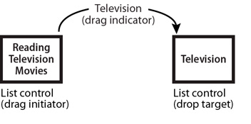
The following figure shows one List control functioning as the drag initiator and a second List control functioning as the drop target. In this example, you use drag and drop to move the 'Television' list item from the drag initiator to the drop target:
A single component can function as both the drag initiator and the drop target. This lets you move the data within the component. The following example shows a List control functioning as both the drag initiator and the drop target:
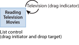
By specifying the List control as both the drag initiator and the drop target, you can use drag and drop to rearrange the items in the control. For example, if you use a Canvas container as the drag initiator and the drop target, you can then use drag and drop to move controls in the Canvas container to rearrange them.
Performing a drag and drop
Drag and drop is event driven. To configure a component as a drag initiator or as a drop target, you have to write event handlers for specific events, such as the dragDrop and dragEnter events. For more information, see Manually adding drag-and-drop support.
For some components that you often use with drag and drop, Flex provides built-in event handlers to automate much of the drag and drop operation. These controls are all subclasses of the MX mx.controls.listClasses.ListBase class and the Spark spark.components.supportClasses.ListBase class, and are referred to as list-based controls. For more information, see Using drag-and-drop with list-based controls.
For a move or copy operation, the list-based controls can handle all of the events required by a drag-and-drop operation. However, if you want to copy the drag data to the drop target, and the drop target uses a different data format, you have to write an event handler. For more information, see Moving and copying data.
Using drag-and-drop with list-based controls
The following MX list-based controls include built-in support for the drag-and-drop operation:
The Spark List control include built-in support for the drag-and-drop operation.
The built-in support for these controls lets you move and copy items by dragging them from a drag-enabled control to a drop-enabled control.
The following drag-and-drop example lets you move items from one Spark List control to another:
<?xml version="1.0"?>
<!-- dragdrop\SimpleListToListMove.mxml -->
<s:Application xmlns:fx="http://ns.adobe.com/mxml/2009"
    xmlns:s="library://ns.adobe.com/flex/spark"
    xmlns:mx="library://ns.adobe.com/flex/mx"
    creationComplete="initApp();">
    <s:layout>
        <s:VerticalLayout/>
    </s:layout>

    <fx:Script>
        <![CDATA[
            import mx.collections.ArrayCollection;

            private function initApp():void {
                srclist.dataProvider =
                    new ArrayCollection(['Reading', 'Television', 'Movies']);
                destlist.dataProvider = new ArrayCollection([]);
            }
        ]]>
    </fx:Script>

    <s:HGroup>
        <s:VGroup>
            <s:Label text="Available Activities"/>
            <s:List id="srclist"
                allowMultipleSelection="true"
                dragEnabled="true"
                dragMoveEnabled="true"/>
        </s:VGroup>

        <s:VGroup>
            <s:Label text="Activities I Like"/>
            <s:List id="destlist"
                dropEnabled="true"/>
        </s:VGroup>
    </s:HGroup>

    <s:Button id="b1"
        label="Reset"
        click="initApp();"/>
</s:Application>
By setting the dragEnabled property to true on the first List and the dropEnabled property to true on the second List control, you enabled users to drag items from the first list to the second without worrying about any of the underlying event processing.
For all list-based classes except the Tree control, the default value of the dragMoveEnabled property is false, so you can only copy elements from one control to the other. By setting the dragMoveEnabled to true in the first List control, you can move and copy data. For the Tree control, the default value of the dragMoveEnabled property is true.
When the dragMoveEnabled property is set to true, the default drag-and-drop action is to move the drag data. To perform a copy, hold down the Control key during the drag-and-drop operation.
The only requirement on the drag and drop operation is that the structure of the data providers must match for the two controls. In this example, the data provider for srclist is an Array of Strings, and the data provider for the destination List control is an empty Array. If the data provider for destlist is an Array of some other type of data, destlist might not display the dragged data correctly.
You can modify the dragged data as part of a drag-and-drop operation to make the dragged data compatible with the destination. For an example of dragging data from one control to another when the data formats do not match, see Example: Copying data from an MX List control to an MX DataGrid control.
You can allow two-way drag and drop by setting the dragEnabled, dropEnabled, and dragMoveEnabled properties to true for both list-based controls, as the following example shows for two MX DataGrid controls. In this example, you can drag and drop rows from either MX DataGrid control to the other:
<?xml version="1.0"?>
<!-- dragdrop\SimpleDGToDG.mxml -->
<s:Application xmlns:fx="http://ns.adobe.com/mxml/2009"
    xmlns:s="library://ns.adobe.com/flex/spark"
    xmlns:mx="library://ns.adobe.com/flex/mx"
    width="650"
    creationComplete="initApp();">
    <s:layout>
        <s:VerticalLayout/>
    </s:layout>

    <fx:Script>
      <![CDATA[
          import mx.collections.ArrayCollection;

          private function initApp():void {
            srcgrid.dataProvider = new ArrayCollection([
              {Artist:'Carole King', Album:'Tapestry', Price:11.99},
              {Artist:'Paul Simon', Album:'Graceland', Price:10.99},
              {Artist:'Original Cast', Album:'Camelot', Price:12.99},
              {Artist:'The Beatles', Album:'The White Album', Price:11.99}
            ]);

            destgrid.dataProvider = new ArrayCollection([]);
          }
      ]]>
    </fx:Script>

    <s:HGroup>
        <s:VGroup>
            <s:Label text="Available Albums"/>
            <mx:DataGrid id="srcgrid"
                allowMultipleSelection="true"
                dragEnabled="true"
                dropEnabled="true"
                dragMoveEnabled="true">
                <mx:columns>
                    <mx:DataGridColumn dataField="Artist"/>
                    <mx:DataGridColumn dataField="Album"/>
                    <mx:DataGridColumn dataField="Price"/>
                </mx:columns>
            </mx:DataGrid>
        </s:VGroup>

        <s:VGroup>
            <s:Label text="Buy These Albums"/>
            <mx:DataGrid id="destgrid"
                allowMultipleSelection="true"
                dragEnabled="true"
                dropEnabled="true"
                dragMoveEnabled="true">
                <mx:columns>
                    <mx:DataGridColumn dataField="Artist"/>
                    <mx:DataGridColumn dataField="Album"/>
                    <mx:DataGridColumn dataField="Price"/>
                </mx:columns>
            </mx:DataGrid>
        </s:VGroup>
    </s:HGroup>

    <s:Button id="b1"
        label="Reset"
        click="initApp()"
    />

</s:Application>
Dragging and dropping between different list-based controls
<?xml version="1.0"?>
<!-- dragdrop\SimpleListToListMoveSpark.mxml -->
<s:Application xmlns:fx="http://ns.adobe.com/mxml/2009"
    xmlns:s="library://ns.adobe.com/flex/spark"
    xmlns:mx="library://ns.adobe.com/flex/mx"
    creationComplete="initApp();">
    <s:layout>
        <s:VerticalLayout/>
    </s:layout>

    <fx:Script>
        <![CDATA[
            import mx.collections.ArrayList;

            private function initApp():void {
                srclist.dataProvider =
                    new ArrayList(['Reading', 'Television', 'Movies']);
                destlist.dataProvider = new ArrayList([]);
            }
        ]]>
    </fx:Script>

    <s:HGroup>
        <s:VGroup>
            <s:Label text="Available Activities"/>
            <s:List id="srclist"
                allowMultipleSelection="true"
                dragEnabled="true"
                dragMoveEnabled="true"/>
        </s:VGroup>

        <s:VGroup>
            <s:Label text="Activities I Like"/>
            <mx:List id="destlist"
                dropEnabled="true"/>
        </s:VGroup>
    </s:HGroup>

    <s:Button id="b1"
        label="Reset"
        click="initApp();"/>
</s:Application>
Dragging and dropping between two types of List controls is relatively simple because the control use the same data format. However, when you drag and drop between a List and a DataGrid, or a List and a Tree, the data formats might not match. In that case, you have to manipulate the data before dropping it onto the target. see Example: Copying data from an MX List control to an MX DataGrid control.
Dragging and dropping in the same control
One use of drag and drop is to let you reorganize the items in a list-based control by dragging the items and then dropping them in the same control. In the next example, you define an MX Tree control, and let the user reorganize the nodes of the Tree control by dragging and dropping them. In this example, you set the dragEnabled and dropEnabled to true for the Tree control (the dragMoveEnabled property defaults to true for the Tree control):
<?xml version="1.0"?>
<!-- dragdrop\SimpleTreeSelf.mxml -->
<s:Application xmlns:fx="http://ns.adobe.com/mxml/2009"
    xmlns:s="library://ns.adobe.com/flex/spark"
    xmlns:mx="library://ns.adobe.com/flex/mx">

    <fx:Script>
        <![CDATA[
            // Initialize the data provider for the Tree.
            private function initApp():void {
                firstList.dataProvider = treeDP;
            }
        ]]>
    </fx:Script>

    <fx:Declarations>
        <fx:XML id="treeDP">
            <node label="Mail">
                <node label="Inbox"/>
                <node label="Personal Folder">
                    <node label="Demo"/>
                    <node label="Personal"/>
                    <node label="Saved Mail"/>
                    <node label="bar"/>
                </node>
                <node label="Calendar"/>
                <node label="Sent"/>
                <node label="Trash"/>
            </node>
        </fx:XML>
    </fx:Declarations>

    <mx:Tree id="firstList"
        showRoot="false"
        labelField="@label"
        dragEnabled="true"
        dropEnabled="true"
        allowMultipleSelection="true"
        creationComplete="initApp();"/>
</s:Application>
Drag and drop properties for list-based controls
List-based controls provide properties and methods for managing the drag-and-drop operation. The following table lists these properties and methods:
|
Property/Method |
Description |
|---|---|
dragEnabled |
A Boolean value that specifies whether the control is a drag initiator. The default value is false. When true, users can drag selected items from the control. When a user drags items from the control, Flex creates a DragSource object that contains the following data objects:
|
dropEnabled |
A Boolean value that specifies whether the control can be a drop target. The default value is false, which means that you must write event handlers for the drag events. When the value is true, you can drop items onto the control by using the default drop behavior. |
dragMoveEnabled |
If the value is true, and the dragEnabled property is true, specifies that you can move or copy items from the drag initiator to the drop target. When you move an item, the item is deleted from the drag initiator when you add it to the drop target. If the value is false, you can only copy an item to the drop target. For a copy, the item in the drag initiator is not affected by the drop. When the dragMoveEnabled property is true, you must hold down the Control key during the drop operation to perform a copy. The default value is false for all list controls except the Tree control, and true for the Tree control. |
Maintaining type information during a copy
When you use the built-in support of the list-based controls to copy data from one list-based control to another list-based control, you might run into an occasion where you lose the data-type information of the copied data. The loss of data-type information can occur when:
-
You perform a copy operation between two list-based controls; it does not occur during a move operation
-
The data type of the copied item is not a basic ActionScript data type, such as Date, Number, Object, or String
-
The data type of the copied item is not DisplayObject, or a subclass of DisplayObject
For example, you define the following class, Car.as, that you use to populate the data provider of a List control:
package
{
    // dragdrop/Car.as

    [RemoteClass]
    public class Car extends Object
    {
        // Constructor.
        public function Car()
        {
            super();
        }

        // Class properties.
        public var numWheels:int;
        public var model:String;
        public var make:String;

        public function get label():String
        {
            return make + " " + model;
        }
    }
}
Notice that the Car.as file includes the [RemoteClass] metadata tag. This metadata tag is required to register the Car data type with Flex so that its type information is preserved during the copy operation. If you omit the [RemoteClass] metadata tag, type information is lost.
You then use that class in your application, as the following example shows:
<?xml version="1.0"?>
<!-- dragdrop\DandDRemoteClassListUpdated.mxml -->
<s:Application xmlns:fx="http://ns.adobe.com/mxml/2009"
    xmlns:s="library://ns.adobe.com/flex/spark"
    xmlns:mx="library://ns.adobe.com/flex/mx"
    xmlns="*">
    <s:layout>
        <s:BasicLayout/>
    </s:layout>

    <fx:Script>
        <![CDATA[

            public function changeit():void
            {
                if (list2.dataProvider != null)
                {
                    msg.text += list2.dataProvider[0]

                    if(list2.dataProvider[0] is Car)
                        msg.text += " Is Car\n";
                    else
                        msg.text += " Is NOT Car\n";
                }
            }
        ]]>
    </fx:Script>

    <s:List id="list1"
        x="10" y="45"
        width="160" height="120"
        dragEnabled="true"
        dragMoveEnabled="true">
        <s:dataProvider>
            <s:ArrayCollection>
                <Car model="Camry" make="Toyota" numWheels="4"/>
                <Car model="Prius" make="Toyota" numWheels="4"/>
            </s:ArrayCollection>
       </s:dataProvider>
    </s:List>

    <s:List  id="list2"
        x="200" y="45"
        width="160" height="120"
        dropEnabled="true"/>

    <s:Button label="Access it as button" click="changeit();"/>

    <s:TextArea id="msg"
        x="10" y="200"
        width="400" height="100"/>
</s:Application>
Manually adding drag-and-drop support
The list-based controls have built-in support for drag and drop, but you can use drag and drop with any Flex component. To support drag-and-drop operations with components other than MX list-based controls, or to explicitly control drag and drop with MX list-based controls, you must handle the drag and drop events.
Classes used in drag-and-drop operations
You use the following classes to implement the drag-and-drop operation:
|
Class |
Function |
|---|---|
|
Manages the drag-and-drop operations; for example, its doDrag() method starts the drag operation. |
|
|
Contains the data being dragged. It also provides additional drag management features, such as the ability to add a handler that is called when data is requested. |
|
|
Represents the event object for all drag-and-drop events. |
Drag-and-drop events for a drag initiator
A component that acts as a drag initiator handles the following events to manage the drag-and-drop operation:
|
Drag initiator event |
Description |
Handler required |
Implemented by list-based controls |
|---|---|---|---|
|
mouseDown and mouseMove |
The mouseDown event is dispatched when the user selects a control with the mouse and holds down the mouse button. The mouseMove event is dispatched when the mouse moves. For most controls, you initiate the drag-and-drop operation in response to one of these events. For an example, see Example: Handling the dragOver and dragExit events for the drop target. |
Yes, for nonlist controls |
No |
|
dragStart |
Dispatched by a list-based component when the user initiates a drag operation. This event is used internally by the list-based controls; you do not handle it when implementing drag and drop. If you want to control the start of a drag-and-drop operation, use the mouseDown or mouseMove event. |
Yes, for list controls |
Yes |
|
dragComplete |
Dispatched when a drag operation completes, either when the drag data drops onto a drop target, or when the drag-and-drop operation ends without performing a drop operation. You can use this event to perform any final cleanup of the drag-and-drop operation. For example, if a user moves data from one component to another, you can use this event to delete the item from the drag initiator. For an example, see Example: Moving and copying data for a nonlist-based control. |
No |
Yes |
When adding drag-and-drop support to a component, you must implement an event handler for either the mouseDown or mouseMove event, and optionally for the dragComplete event. When you set the dragEnabled property to true for a list-based control, Flex automatically adds event handlers for the dragStart and dragComplete events.
Drag-and-drop events for a drop target
To use a component as a drop target, you handle the following events:
|
Drop target event |
Description |
Handler required |
Implemented by list-based controls |
|---|---|---|---|
|
dragEnter |
Dispatched when a drag indicator moves over the drop target from outside the drop target. A component must define an event handler for this event to be a drop target. The event handler determines whether the data being dragged is in an accepted format. To accept the drop, the event handler calls the DragManager.acceptDragDrop() method. You must call the DragManager.acceptDragDrop() method for the drop target to receive the dragOver, dragExit, and dragDrop events. In the handler, you can change the appearance of the drop target to provide visual feedback to the user that the component can accept the drag operation. For example, you can draw a border around the drop target, or give focus to the drop target. For an example, see Example: Simple drag-and-drop operation for a nonlist-based control. |
Yes |
Yes |
|
dragOver |
Dispatched while the user moves the mouse over the target, after the dragEnter event. You can handle this event to perform additional logic before allowing the drop operation, such as adding the data to various locations within the drop target, reading keyboard input to determine if the drag-and-drop operation is a move or copy of the drag data, or providing different types of visual feedback based on the type of drag-and-drop operation. For an example, see Example: Handling the dragOver and dragExit events for the drop target. |
No |
Yes |
|
dragDrop |
Dispatched when the user releases the mouse over the drop target. Use this event handler to add the drag data to the drop target. For an example, see Example: Simple drag-and-drop operation for a nonlist-based control. |
Yes |
Yes |
|
dragExit |
Dispatched when the user moves the drag indicator off of the drop target, but does not drop the data onto the target. You can use this event to restore the drop target to its normal appearance if you modified its appearance in response to a dragEnter event or other event. For an example, see Example: Handling the dragOver and dragExit events for the drop target. |
No |
Yes |
When adding drag-and-drop support to a nonlist-based component, you must implement an event handler for the dragEnter and dragDrop events, and optionally for the other events. When you set the dropEnabled property to true for a list-based control, Flex automatically adds event handlers for all events.
The drag-and-drop operation
The following steps define the drag-and-drop operation.
-
A component becomes a drag-and-drop initiator in either of the following ways:
-
List-based components with dragEnabled=true
Flex automatically makes the component an initiator when the user clicks and moves the mouse on the component.
-
Nonlist-based components, or list-based components with dragEnabled=false
The component must detect the user's attempt to start a drag operation and explicitly become an initiator. Typically, you use the mouseMove or mouseDown event to start the drag-and-drop operation.
The component then creates an instance of the mx.core.DragSource class that contains the data to be dragged, and specifies the format for the data. The drop target can examine the format to determine if it is compatible with the drop target.
The component then calls the mx.managers.DragManager.doDrag() method, to initiate the drag-and-drop operation.
-
-
While the mouse button is still pressed, the user moves the mouse around the application. Flex displays the drag indicator image in your application.
Note: Releasing the mouse button when the drag indicator is not over a target ends the drag-and-drop operation. Flex generates a DragComplete event on the drag initiator, and the DragManager.getFeedback() method returns DragManager.NONE . -
If the user moves the drag indicator over a Flex component, Flex dispatches a dragEnter event for the component.
-
List-based components with dropEnabled=true
Flex checks to see if the component can be a drop target.
-
Nonlist-based components, or list-based components with dropEnabled=false
The component must define an event handler for the dragEnter event to be a drop target.
The dragEnter event handler can examine the DragSource object to determine whether the data being dragged is in an accepted format. To accept the drop, the event handler calls the DragManager.acceptDragDrop() method. You must call the DragManager.acceptDragDrop() method for the drop target to receive the dragOver, dragExit, and dragDrop events.
-
If the drop target does not accept the drop, Flex examines all DisplayObject components under the mouse. Flex examines the components in order of depth to determine if any component accepts the drop data.
-
If the drop target accepts the drop, Flex dispatches the dragOver event as the user moves the drag indicator over the target.
-
-
(Optional) The drop target can handle the dragOver event. For example, the drop target can use this event handler to set the focus on itself. Or, the target can display a visual indication showing where the drag data is to be inserted.
-
(Optional) If the user decides not to drop the data onto the drop target and moves the drag indicator outside of the drop target without releasing the mouse button, Flex dispatches a dragExit event for the drop target. The drop target can optionally handle this event; for example, to undo any actions made in the dragOver event handler.
-
If the user releases the mouse while over the drop target, Flex dispatches a dragDrop event on the drop target.
-
List-based components with dropEnabled=true
Flex automatically adds the drag data to the drop target.
-
Nonlist-based components, or list-based components with dropEnabled=false
The drop target must define an event listener for the dragDrop event handler to add the drag data to the drop target.
-
-
(Optional) When the drop operation completes, Flex dispatches a dragComplete event. The drag initiator can handle this event; for example, to delete the drag data from the drag initiator in the case of a move.
-
List-based components with dragEnabled=true
If this is a move operation, Flex automatically removes the drag data from the drag initiator.
-
Nonlist-based components, or list-based components with dragEnabled=false
The drag initiator completes any final processing required. If this was a move operation, the event handler must remove the drag data from the drag initiator. For an example of writing the event handler for the dragComplete event, see Example: Moving and copying data for a nonlist-based control.
-
Example: Simple drag-and-drop operation for a nonlist-based control
The following example lets you set the background color of a Canvas container by dropping either of two colors onto it. You are not copying or moving any data; instead, you are using the two drag initiators as a color palette. You then drag the color from one palette onto the drop target to set its background color.
The drag initiators, two Canvas containers, implement an event handler for the mouseDown event to initiate the drag and drop operation. This is the only event required to be handled by the drag initiator. The drop target is required to implement event handlers for the dragEnter and dragDrop events.
<?xml version="1.0"?>
<!-- dragdrop\DandDCanvas.mxml -->
<s:Application xmlns:fx="http://ns.adobe.com/mxml/2009"
    xmlns:s="library://ns.adobe.com/flex/spark"
    xmlns:mx="library://ns.adobe.com/flex/mx"
    backgroundColor="white">
    <s:layout>
        <s:VerticalLayout/>
    </s:layout>

    <fx:Script>
        <![CDATA[

        import mx.core.DragSource;
        import mx.managers.DragManager;
        import mx.events.*;
        import mx.containers.Canvas;

        // Initializes the drag and drop operation.
        private function mouseMoveHandler(event:MouseEvent):void {

            // Get the drag initiator component from the event object.
            var dragInitiator:Canvas=Canvas(event.currentTarget);

            // Get the color of the drag initiator component.
            var dragColor:int = dragInitiator.getStyle('backgroundColor');

            // Create a DragSource object.
            var ds:DragSource = new DragSource();

            // Add the data to the object.
            ds.addData(dragColor, 'color');

            // Call the DragManager doDrag() method to start the drag.
            DragManager.doDrag(dragInitiator, ds, event);
        }

        // Called when the user moves the drag indicator onto the drop target.
        private function dragEnterHandler(event:DragEvent):void {

            // Accept the drag only if the user is dragging data
            // identified by the 'color' format value.
            if (event.dragSource.hasFormat('color')) {

                // Get the drop target component from the event object.
                var dropTarget:Canvas=Canvas(event.currentTarget);
                // Accept the drop.
                DragManager.acceptDragDrop(dropTarget);
            }
        }

        // Called if the target accepts the dragged object and the user
        // releases the mouse button while over the Canvas container.
        private function dragDropHandler(event:DragEvent):void {

            // Get the data identified by the color format
            // from the drag source.
            var data:Object = event.dragSource.dataForFormat('color');
            // Set the canvas color.
            myCanvas.setStyle("backgroundColor", data);
        }
        ]]>
    </fx:Script>

    <!-- A horizontal box with red and green canvases that the user can drag. -->
    <mx:HBox>
        <mx:Canvas
            width="30" height="30"
            backgroundColor="red"
            borderStyle="solid"
            mouseMove="mouseMoveHandler(event);"/>
        <mx:Canvas
            width="30" height="30"
            backgroundColor="green"
            borderStyle="solid"
            mouseMove="mouseMoveHandler(event);"/>
    </mx:HBox>

    <mx:Label text="Drag a color onto the Canvas container."/>

    <!-- Handles dragEnter and dragDrop events to allow dropping. -->
    <mx:Canvas id="myCanvas"
        width="100" height="100"
        backgroundColor="#FFFFFF"
        borderStyle="solid"
        dragEnter="dragEnterHandler(event);"
        dragDrop="dragDropHandler(event);"/>

    <mx:Button id="b1"
        label="Clear Canvas"
        click="myCanvas.setStyle('backgroundColor', '0xFFFFFF');"/>
</s:Application>
The following sections describe the event handlers for the mouseDown, dragEnter, and dragDrop events.
Writing the mouseDown event handler
The event handler that initiates a drag-and-drop operation must do two things.
-
Create a DragSource object and initialize it with the drag data and the data format.
The DragSource object contains the drag data and a description of the drag data, called the data format. The event object for the dragEnter and dragDrop events contains a reference to this object in their dragSource property, which allows the event handlers to access the drag data.
You use the DragSource.addData() method to add the drag data and format to the DragSource object, where the addData() method has the following signature:
addData(data:Object, format:String):void
The format argument is a text string such as "color", "list data", or "employee record". In the event handler for the dragEnter event, the drop target examines this string to determine whether the data format matches the type of data that the drop target accepts. If the format matches, the drop target lets users drop the data on the target; if the format does not match, the target does not enable the drop operation.
One example of using the format string is when you have multiple components in your application that function as drop targets. Each drop target examines the DragSource object during its dragEnter event to determine if the drop target supports that format. For more information, see Handling the dragEnter event.
Note: List-based controls have predefined values for the format argument. For all list controls other than the Tree control, the format String is "itemsByIndex". For the Tree control, the format String is "treeItems". For previous versions of Flex, list-based controls used a format String of "items". For more information, see Using drag-and-drop with list-based controls .If you drag large or complex data items, consider creating a handler to copy the data, and specify it by calling the DragSource.addHandler() method instead of using the DragSource.addData() method. If you do this, the data does not get copied until the user drops it, which avoids the processing overhead of copying the data if a user starts dragging data but never drops it. The implementation of the list-based classes use this technique.
-
Call the DragManager.doDrag() method to start the drag-and-drop operation.
The doDrag() method has the following signature:
 doDrag(dragInitiator:IUIComponent, dragSource:DragSource, mouseEvent:MouseEvent,
	dragImage:IFlexDisplayObject = null, xOffset:Number = 0, yOffset:Number = 0,
	imageAlpha:Number = 0.5, allowMove:Boolean = true):void
The doDrag() method requires three arguments: a reference to the component that initiates the drag operation (identified by the event.currentTarget object); the DragSource object that you created in step 1, and the event object passed to the event handler.
Optional arguments specify the drag indicator image and the characteristics of the image. For an example that specifies a drag indicator, see Example: Specifying the drag indicator by using the DragManager.
Handling the dragEnter event
Flex generates a dragEnter event when the user moves the drag indicator over any component. A component must define a handler for a dragEnter event to be a drop target. The event handler typically performs the following actions:
-
Use the format property in the DragSource object to determine whether the drag data is in a format accepted by the drop target.
-
If the drag data is in a compatible format, the handler must call the DragManager.acceptDragDrop() method to enable the user to drop the data on the drop target.
-
If the drag data is not in a compatible format, do not call the DragManager.acceptDragDrop() method. If the event handler does not call this method, the user cannot drop the data and the drop target will not receive the dragOver, dragExit, and dragDrop events.
-
Optionally, perform any other actions necessary when the user first drags a drag indicator over a drop target.
The value of the action property of the event object for the dragEnter event is DragManager.MOVE, even if you are doing a copy. This is because the dragEnter event occurs before the drop target recognizes that the Control key is pressed to signal a copy.
The Flex default event handler for the dragOver event for a list-based control automatically sets the action property. For nonlist-based controls, or if you explicitly handle the dragOver event for a list-based control, use the DragManager.showFeedback() method to set the action property to a value that signifies the type of drag operation: DragManager.COPY, DragManager.LINK, DragManager.MOVE, or DragManager.NONE. For more information on the dragOver event, see Example: Handling the dragOver and dragExit events for the drop target.
Handling the dragDrop event
The dragDrop event occurs when the user releases the mouse to drop data on a target, and the dragEnter event handler has called the DragManager.acceptDragDrop() method to accept the drop. You must define a handler for the event to add the drag data to the drop target.
The event handler uses the DragSource.dataForFormat() method to retrieve the drag data. In the previous example, the drag data contains the new background color of the drop target. The event handler then calls setStyle() to set the background color of the drop target.
Example: Handling drag and drop events in a list-based control
Flex automatically defines default event handlers for the drag-and-drop events when you set dragEnabled or dropEnabled property to true for an MX list-based control. You can either use these default event handlers, which requires you to do no additional work in your application, or define your own event handlers.
There are three common scenarios for using event handlers with the list-based controls:
- Use the default event handlers
-
When you set dragEnabled to true for a drag initiator, or when you set dropEnabled to true for a drop target, Flex handles all drag-and-drop events for you. You only have to define your own dragDrop event handler when you want to copy data as part of the drag-and-drop operation and the drop target uses a different data format. For more information, see Moving and copying data.
- Define your own event handlers
-
If you want to control the drag-and-drop operation for a list-based control, you can explicitly handle the drag-and-drop events, just as you can for any component. In this scenario, set the dragEnabled property to false for a drag initiator, or set the dropEnabled property to false for a drop target. For more information on handling these events, see Example: Simple drag-and-drop operation for a nonlist-based control.
- Define your own event handlers and use the default event handlers
-
You might want to add your own event handler for a drag-and-drop event, and also use the build in drag-and-drop handlers. In this case, your event handler executes first, then the default event handler provided by Flex executes. If, for any reason, you want to explicitly prohibit the execution of the default event handler, call the Event.preventDefault() method from within your event handler.
Note: If you call Event.preventDefault() in the event handler for the dragComplete or dragDrop event for a Tree control when dragging data from one Tree control to another, it prevents the drop.Because of the way data to a Tree control is structured, the Tree control handles drag and drop differently from the other list-based controls. For the Tree control, the event handler for the dragDrop event only performs an action when you move or copy data in the same Tree control, or copy data to another Tree control. If you drag data from one Tree control and drop it onto another Tree control to move the data, the event handler for the dragComplete event actually performs the work to add the data to the destination Tree control, rather than the event handler for the dragDrop event, and also removes the data from the source Tree control. This is necessary because to reparent the data being moved, Flex must remove it first from the source Tree control.
Therefore, if you call Event.preventDefault() in the event handler for the dragDrop or dragComplete events, you implement the drop behavior yourself. For more information, see Example: Moving and copying data for a nonlist-based control.
The following example defines an event handler for the dragDrop event that accesses the data dragged from one DataGrid control to another. This event handler is executed before the default event handler for the dragDrop event to display in an Alert control the Artist field of each DataGrid row dragged from the drag initiator to the drop target:
<?xml version="1.0"?>
<!-- dragdrop\SimpleDGToDGAlert.mxml -->
<s:Application xmlns:fx="http://ns.adobe.com/mxml/2009"
    xmlns:s="library://ns.adobe.com/flex/spark"
    xmlns:mx="library://ns.adobe.com/flex/mx"
    width="650"
    creationComplete="initApp();">
    <s:layout>
        <s:VerticalLayout/>
    </s:layout>

    <fx:Script>
        <![CDATA[
            import mx.events.DragEvent;
            import mx.controls.Alert;
            import mx.collections.ArrayCollection;

            private function initApp():void {
              srcgrid.dataProvider =  new ArrayCollection([
                {Artist:'Carole King', Album:'Tapestry', Price:11.99},
                {Artist:'Paul Simon', Album:'Graceland', Price:10.99},
                {Artist:'Original Cast', Album:'Camelot', Price:12.99},
                {Artist:'The Beatles', Album:'The White Album', Price:11.99}
              ]);

                destgrid.dataProvider = new ArrayCollection([]);
            }

            // Define the event listener.
            public function dragDropHandler(event:DragEvent):void {
                // dataForFormat() always returns an Vector.<Object>
                // for the list-based controls
                // in case multiple items were selected.
                var dragObj:Vector.<Object>=
                    event.dragSource.dataForFormat("itemsByIndex") as Vector.<Object>;
                // Get the Artist for all dragged albums.
                var artistList:String='';
                for (var i:Number = 0; i < dragObj.length; i++) {
                    artistList+='Artist: ' + dragObj[i].Artist + '\n';
                }

                Alert.show(artistList);
            }
        ]]>
    </fx:Script>

    <s:HGroup>
        <s:VGroup>
            <s:Label text="Available Albums"/>
            <mx:DataGrid id="srcgrid"
                allowMultipleSelection="true"
                dragEnabled="true"
                dropEnabled="true"
                dragMoveEnabled="true">
                <mx:columns>
                    <mx:DataGridColumn dataField="Artist"/>
                    <mx:DataGridColumn dataField="Album"/>
                    <mx:DataGridColumn dataField="Price"/>
                </mx:columns>
            </mx:DataGrid>
        </s:VGroup>

        <s:VGroup>
            <s:Label text="Buy These Albums"/>
            <mx:DataGrid id="destgrid"
                allowMultipleSelection="true"
                dragEnabled="true"
                dropEnabled="true"
                dragMoveEnabled="true"
                dragDrop="dragDropHandler(event);">
                <mx:columns>
                    <mx:DataGridColumn dataField="Artist"/>
                    <mx:DataGridColumn dataField="Album"/>
                    <mx:DataGridColumn dataField="Price"/>
                </mx:columns>
            </mx:DataGrid>
        </s:VGroup>
    </s:HGroup>

    <s:Button id="b1"
        label="Reset"
        click="initApp();"/>
</s:Application>
Notice that the dataForFormat() method specifies an argument value of "itemsByIndex". This is because the list-based controls have predefined values for the data format of drag data. For all list controls other than the Tree control, the format String is "itemsByIndex". For the Tree control, the format String is "treeItems".
For Spark controls only, the DragSource object also contains the index of the item in the drag initiator that was clicked by the mouse. The format string of the index is "caretIndex". The index is relative to the items in the drag data. Therefore, if the drag data contains three items, the index is a value between 0 and 2.
Notice that the return value of the dataForFormat() method is a Vector of type Object. Because list-based controls let you select multiple items, the dataForFormat() method always returns a Vector for a list-based control, even if you are only dragging a single item.
Using drag and drop with Flex applications running in AIR
When a Flex application runs in Adobe® AIR™, you can control whether the application uses the Flex drag manager or the AIR drag manager. These drag managers are implemented by the classes mx.managers.DragManager (Flex drag manager) and flash.desktop.NativeDragManager (AIR drag manager).
Internally, the Flex mx.managers.DragManager class uses an implementation class to determine which drag manager to use. It uses either the Flex mx.managers.DragManagerImpl class, or the AIR mx.managers.NativeDragManagerImpl class.
By default, an application defined by the Spark <s:Application> or the MX <mx:Application> tag uses the Flex drag-and-drop manager, even when the Flex application runs in AIR. If you run your Flex application in AIR, and you want to take advantage of the AIR drag-and-drop manager to drag and drop items from outside of AIR, then you must configure the Flex mx.managers.DragManager class to use the AIR drag-and-drop manager.
There are three scenarios that determine which drag-and-drop manager your Flex application uses when running in AIR:
-
Your main application file uses the Spark <s:Application> or the MX <mx:Application> tag. In this scenario, you use the Flex drag-and-drop manager, and cannot drag and drop items from outside of AIR.
-
Your main application file uses the Spark <s:WindowedApplication> or the MX <mx:WindowedApplication> tag. In this scenario, you use the AIR drag-and-drop manager, and can drag and drop items from outside of AIR.
-
Your main application file uses the Spark <s:Application> or the MX <mx:Application> tag, but loads the AIR drag-and-drop manager as represented by the mx.managers.NativeDragManagerImpl class. In this scenario, you use the AIR drag-and-drop manager, and can drag and drop items from outside of AIR.
For the third scenario, to use the AIR drag-and-drop manager in your Flex application, you must write your application to link to mx.managers.NativeDragManagerImpl class, and to load it at runtime, as the following example shows:
 <s:Application xmlns:fx="http://ns.adobe.com/mxml/2009"
	xmlns:s="library://ns.adobe.com/flex/spark"
	xmlns:mx="library://ns.adobe.com/flex/mx"
 	initialize="initDandD();">

 	<fx:Script>
 		<![CDATA[
 			// Ensure that the NativeDragManagerImpl class is linked in to your application.
 			import mx.managers.NativeDragManagerImpl;
 			var placeholder:NativeDragManagerImpl;

 			// Handle the initialize event to load the DragManager.
 			public function initDandD():void
 			{
 				// Ensure the DragManager is loaded, so that dragging in an AIR works.
 				DragManager.isDragging;
 			}
 		]]>
 	</fx:Script>

 	...
 </s:Application>
Two drag-and-drop events work differently depending on whether your application runs in Adobe® Flash® Player or AIR, as the following table shows:
|
Event |
Flash Player |
AIR |
|---|---|---|
dragEnter |
Triggers when you move the mouse pointer over any component during a drag and drop operation. The default value of the DragEvent.action property is DragEvent.MOVE. |
Triggers when you move the mouse pointer over any component during a drag and drop operation. The default value of the DragEvent.action property is DragEvent.COPY. |
dragOver |
Triggers many times when you drag an item over a valid drop target. |
Triggers many times when you drag an item over any component, even if the component is not a valid drop target. |
There are several other differences between the Flex and AIR drag managers, as described below:
|
Characteristic |
Flash player |
AIR |
|---|---|---|
|
Cursors |
Flex draws the drag-and-drop cursors. |
The operating system draws the cursors. |
|
Styles |
Cursor styles and the mx.managers.DragManager.defaultDragImageSkin property are supported. |
Cursor styles and the mx.managers.DragManager.defaultDragImageSkin property are ignored. |
|
Drag indicator |
The drag image of the drag indicator can be an instance of the DisplayObject class, including an animated SWF file, an image, or a Flex component.
|
By default, the drag image is a bitmap created from the object being dragged. It does not change dynamically as the user drags it. If you pass a drag image to the doDrag() method, it must already be loaded by your application when you call doDrag(), otherwise it will be blank. For more information on the doDrag() method, see Example: Specifying the drag indicator by using the DragManager. |
|
Drop animation |
The DragProxy class animates the drag image based on the results of the drop, such as accepted or rejected. |
No custom animations can be used. The operating system handles the behavior of the cursor and the drag image. |
Drag and drop differences between Spark and MX
Much of the drag and drop functionality is the same for the Spark and MX list-based controls. However, there are a few differences, as the following table shows:
|
Topic |
Description |
Spark |
MX |
|---|---|---|---|
|
Set the drag indicator |
Specifies the appearance of the dragged data during the drag. |
Defined by the optional dragging view state in the item renderer. You can further customize it by creating a subclass of the spark.components.supportClasses.ListItemDragProxy class. |
Override the mx.controls.listClasses.ListBase.dragImage property. The default value is ListItemDragProxy. |
|
Set the drop indicator |
Specifies the appearance of the drop indicator which shows where the dragged data will be inserted into the drop target. |
Define a dropIndicator skin part in the skin class of the drop target. |
Use the mx.controls.listClasses.ListBase.dropIndicatorSkin property to set the skin class. The default value is ListDropIndicator. |
|
Calculate the drop index |
Returns the item index in the data provider of the drop target where the item will be dropped. Used by the dragDrop event handler to add the items in the correct location. Not available in the MX TileList or HorizontalList controls. |
Use the spark.layouts.supportClasses.LayoutBase.calculateDropLocation() method. Use the layout property of the list class to access this method in the layout class of the component. |
Use the mx.controls.listClasses.ListBase.calculateDropIndex() method. |
|
Show drop feedback |
Specifies to display the focus rectangle around the target control and positions the drop indicator where the drop operation should occur. If the control has active scroll bars, hovering the mouse pointer near the edges of the control scrolls the contents. You typically call this method from within the handler for the dragOver event. When you set dropEnabled to true, Flex automatically shows the drop indicator when necessary. |
Use the spark.layouts.supportClasses.LayoutBase.showDropIndicator() method. Use the layout property to access this method in the layout class of the control. If you override the dragEnter event handler, and call preventDefault() so that the default handler does not execute, call List.createDropIndicator() to create the drop indicator. |
Use the mx.controls.listClasses.ListBase.showDropFeedback() method. |
|
Hide drop feedback |
Hides drop target feedback and removes the focus rectangle from the target. You typically call this method from within the handler for the dragExit and dragDrop events. When you set dropEnabled to true, Flex automatically hides the drop indicator when necessary. |
Use the spark.layouts.supportClasses.LayoutBase.hideDropIndicator() method. Use the layout property to access this method in the layout class of the control. Focus not handled by hideDropIndicator(). If you override the dragExit event handler, and call preventDefault() so that the default handler does not execute, call List.destroyDropIndicator() to delete the drop indicator. |
Use the mx.controls.listClasses.ListBase.hideDropFeedback() method. |
Drag and drop examples
Example: Using a container as a drop target
To use a container as a drop target, you must use the backgroundColor property of the container to set a color. Otherwise, the background color of the container is transparent, and the Drag and Drop Manager is unable to detect that the mouse pointer is on a possible drop target.
In the following example, you use the Image control to load a draggable image into a Canvas container. You then add event handlers to let the user drag the Image control within the Canvas container to reposition it:
<?xml version="1.0"?>
<!-- dragdrop\DandDImage.mxml -->
<s:Application xmlns:fx="http://ns.adobe.com/mxml/2009"
    xmlns:s="library://ns.adobe.com/flex/spark"
    xmlns:mx="library://ns.adobe.com/flex/mx">

    <fx:Script>
        <![CDATA[
            //Import classes so you don't have to use full names.
            import mx.managers.DragManager;
            import mx.core.DragSource;
            import mx.events.DragEvent;
            import flash.events.MouseEvent;

            // Embed icon image.
            [Embed(source='assets/globe.jpg')]
            public var globeImage:Class;

            // The mouseMove event handler for the Image control
            // initiates the drag-and-drop operation.
            private function mouseMoveHandler(event:MouseEvent):void
            {
                var dragInitiator:Image=Image(event.currentTarget);
                var ds:DragSource = new DragSource();
                ds.addData(dragInitiator, "img");
                DragManager.doDrag(dragInitiator, ds, event);
            }

            // The dragEnter event handler for the Canvas container
            // enables dropping.
            private function dragEnterHandler(event:DragEvent):void {
                if (event.dragSource.hasFormat("img"))
                {
                    DragManager.acceptDragDrop(Canvas(event.currentTarget));
                }
            }

            // The dragDrop event handler for the Canvas container
            // sets the Image control's position by
            // "dropping" it in its new location.
            private function dragDropHandler(event:DragEvent):void {
                Image(event.dragInitiator).x =
                    Canvas(event.currentTarget).mouseX;
                Image(event.dragInitiator).y =
                    Canvas(event.currentTarget).mouseY;
            }
        ]]>
    </fx:Script>

    <!-- The Canvas is the drag target -->
    <mx:Canvas id="v1"
        width="500" height="500"
        borderStyle="solid"
        backgroundColor="#DDDDDD"
        dragEnter="dragEnterHandler(event);"
        dragDrop="dragDropHandler(event);">

        <!-- The image is the drag initiator. -->
        <s:Image id="myimg"
            source="@Embed(source='assets/globe.jpg')"
            mouseMove="mouseMoveHandler(event);"/>
    </mx:Canvas>
</s:Application>
Example: Setting the drag indicator for Spark controls
The drag indicator defines the appearance of the dragged data during drag-and-drop operations. The appearance of the dragged data is determined by the item renderer for the list-based control.
By default, Spark item renderers use the normal view state to display the dragged data. For more information on view states in Spark item renderers, see Defining item renderer view states for a Spark container.
<?xml version="1.0" encoding="utf-8"?>
<!-- dragdrop\myComponents\MyListItemRenderer.mxml -->
<s:ItemRenderer focusEnabled="false"
    xmlns:fx="http://ns.adobe.com/mxml/2009"
    xmlns:s="library://ns.adobe.com/flex/spark">

    <s:states>
        <s:State name="normal" />
        <s:State name="hovered" />
        <s:State name="selected" />
        <s:State name="normalAndShowsCaret"/>
        <s:State name="hoveredAndShowsCaret"/>
        <s:State name="selectedAndShowsCaret"/>
        <s:State name="dragging"/>
    </s:states>

    <s:Rect left="0" right="0" top="0" bottom="0">
        <s:stroke.normalAndShowsCaret>
            <s:SolidColorStroke
                color="{getStyle('selectionColor')}"
                weight="1"/>
        </s:stroke.normalAndShowsCaret>
        <s:stroke.hoveredAndShowsCaret>
            <s:SolidColorStroke
                color="{getStyle('selectionColor')}"
                weight="1"/>
        </s:stroke.hoveredAndShowsCaret>
        <s:stroke.selectedAndShowsCaret>
            <s:SolidColorStroke
                color="{getStyle('selectionColor')}"
                weight="1"/>
        </s:stroke.selectedAndShowsCaret>
        <s:fill>
            <s:SolidColor
                color.normal="0xFFFFFF"
                color.normalAndShowsCaret="0xFFFFFF"
                color.hovered="{getStyle('rollOverColor')}"

                color.hoveredAndShowsCaret="{getStyle('rollOverColor')}"
                color.selected="{getStyle('selectionColor')}"
                color.selectedAndShowsCaret="{getStyle('selectionColor')}"
                color.dragging="0xFFFFFF"/>
        </s:fill>
    </s:Rect>
    <s:Label id="labelDisplay" verticalCenter="0" left="3" right="3" top="6" bottom="4"
        fontStyle.dragging="italic" fontWeight.dragging="bold" color.dragging="blue"/>
</s:ItemRenderer>
<?xml version="1.0"?>
<!-- dragdrop\SimpleListToListMoveSparkDragIndicator.mxml -->
<s:Application xmlns:fx="http://ns.adobe.com/mxml/2009"
    xmlns:s="library://ns.adobe.com/flex/spark"
    xmlns:mx="library://ns.adobe.com/flex/mx"
    creationComplete="initApp();">
    <s:layout>
        <s:VerticalLayout/>
    </s:layout>

    <fx:Script>
        <![CDATA[
            import mx.collections.ArrayList;

            private function initApp():void {
                srclist.dataProvider =
                    new ArrayList(['Reading', 'Television', 'Movies']);
                destlist.dataProvider = new ArrayList([]);
            }
        ]]>
    </fx:Script>

    <s:HGroup>
        <s:VGroup>
            <s:Label text="Available Activities"/>
            <s:List id="srclist"
                allowMultipleSelection="true"
                dragEnabled="true"
                dragMoveEnabled="true"
                itemRenderer="myComponents.MyListItemRenderer"/>
        </s:VGroup>

        <s:VGroup>
            <s:Label text="Activities I Like"/>
            <s:List id="destlist"
                dropEnabled="true"/>
        </s:VGroup>
    </s:HGroup>

    <s:Button id="b1"
        label="Reset"
        click="initApp();"/>
</s:Application>
Example: Specifying the drag indicator by using the DragManager
In the event handler for the mouseDown or mouseUp event, you can optionally specify a drag indicator in the doDrag() method of the DragManager class. If you do not specify a drag indicator, Flex uses a default drag indicator. The doDrag() method takes the following optional arguments to specify the drag indicator and its properties.
|
Argument |
Description |
|---|---|
|
dragIndicator |
The image that defines the drag indicator. To specify a symbol, such as a JPEG image of a product that a user wants to order, use a string that specifies the symbol's name, such as myImage.jpg. To specify a component, such as a Flex container or control, create an instance of the control or container, configure and size it, and then pass it as an argument to the doDrag() method. |
|
xOffset |
Number that specifies the x offset, in pixels, for the dragImage. This argument is optional. If omitted, the drag indicator is shown at the upper-left corner of the drag initiator. The offset is expressed in pixels from the left edge of the drag indicator to the left edge of the drag initiator, and is usually a negative number. |
|
yOffset |
Number that specifies the y offset, in pixels, for the dragImage. This argument is optional. If omitted, the drag indicator is shown at the upper-left corner of the drag initiator. The offset is expressed in pixels from the top edge of the drag indicator to the top edge of the drag initiator, and is usually a negative number. |
|
imageAlpha |
A Number that specifies the alpha value used for the drag indicator image. If omitted, Flex uses an alpha value of 0.5. A value of 0 corresponds to transparent and a value of 1.0 corresponds to fully opaque. |
You must specify a size for the drag indicator, otherwise it does not appear. The following example modifies the example in Example: Using a container as a drop target to use a 15 pixel by 15 pixel Image control as the drag indicator:
<?xml version="1.0"?>
<!-- dragdrop\DandDImageProxy.mxml -->
<s:Application xmlns:fx="http://ns.adobe.com/mxml/2009"
    xmlns:s="library://ns.adobe.com/flex/spark"
    xmlns:mx="library://ns.adobe.com/flex/mx">

    <fx:Script>
        <![CDATA[
            //Import classes so you don't have to use full names.
            import mx.managers.DragManager;
            import mx.core.DragSource;
            import mx.events.DragEvent;
            import flash.events.MouseEvent;

            // Embed icon image.
            [Embed(source='assets/globe.jpg')]
            public var globeImage:Class;

            // The mouseMove event handler for the Image control
            // initiates the drag-and-drop operation.
            private function mouseOverHandler(event:MouseEvent):void
            {
                var dragInitiator:Image=Image(event.currentTarget);
                var ds:DragSource = new DragSource();
                ds.addData(dragInitiator, "img");
                // The drag manager uses the Image control
                // as the drag indicator and sets the alpha to 1.0 (opaque),
                // so it appears to be dragged across the Canvas.
                var imageProxy:Image = new Image();
                imageProxy.source = globeImage;
                imageProxy.height=15;
                imageProxy.width=15;
                DragManager.doDrag(dragInitiator, ds, event,
                    imageProxy, -15, -15, 1.00);
            }

            // The dragEnter event handler for the Canvas container
            // enables dropping.
            private function dragEnterHandler(event:DragEvent):void {
                if (event.dragSource.hasFormat("img"))
                {
                    DragManager.acceptDragDrop(Canvas(event.currentTarget));
                }
            }

            // The dragDrop event handler for the Canvas container
            // sets the Image control's position by
            // "dropping" it in its new location.
            private function dragDropHandler(event:DragEvent):void {
                Image(event.dragInitiator).x =
                    Canvas(event.currentTarget).mouseX;
                Image(event.dragInitiator).y =
                    Canvas(event.currentTarget).mouseY;
            }
        ]]>
    </fx:Script>

    <!-- The Canvas is the drag target -->
    <mx:Canvas id="v1"
        width="500" height="500"
        borderStyle="solid"
        backgroundColor="#DDDDDD"
        dragEnter="dragEnterHandler(event);"
        dragDrop="dragDropHandler(event);">

        <!-- The image is the drag initiator. -->
        <s:Image id="myimg"
            source="@Embed(source='assets/globe.jpg')"
            mouseMove="mouseOverHandler(event);"/>
    </mx:Canvas>
</s:Application>
To use a control with specific contents, such as a VBox control with a picture and label, you must create a custom component that contains the control or controls, and use an instance of the component as the dragIndicator argument.
Example: Setting the drop indicator for Spark controls
The drop indicator shows where the dragged data will be inserted into the drop target. The appearance of the drop indicator is controlled by the skin class of the drop target. By default, the drop indicator for a Spark control is a solid line that spans the width of the control.
You can create a custom drop indicator by creating a custom skin class for the drop target. In your skin class, create a skin part named dropIndicator in the <fx:Declarations> area of the skin class, as the following example shows:
<fx:Declarations>
	<fx:Component id="dropIndicator">
		<s:Group includeInLayout="false"
			minWidth="4" minHeight="4"
			maxWidth="4" maxHeight="4">
			<s:Line xFrom="0" xTo="10" yFrom="5" yTo="5">
				<s:stroke>
					<s:SolidColorStroke color="blue" weight="2"/>
				</s:stroke>
			</s:Line>
			<s:Line xFrom="5" xTo="10" yFrom="0" yTo="5">
				<s:stroke>
					<s:SolidColorStroke color="blue" weight="2"/>
				</s:stroke>
			</s:Line>
			<s:Line xFrom="5" xTo="10" yFrom="10" yTo="5">
				<s:stroke>
					<s:SolidColorStroke color="blue" weight="2"/>
				</s:stroke>
			</s:Line>
		</s:Group>
	</fx:Component>
</fx:Declarations>
This code shows an excerpt from the MyListSkin.mxml file, a custom skin class for the Spark List control. The lines define the drop indicator to be a blue arrow that appears in the drop target to indicate where the dragged data is added.
Note that the bounding Group container specifies the maxWidth and maxHeight properties. For the drop indicator, only the setting along the major axis of the control is applied. For example, for a List class using vertical layout, the x-axis is the major axis. Therefore, the maxHeight property is applied and the maxWidth property is ignored.
-
The drop indicator's size is calculated to be as big as the gap between the neighboring data items in the control.
Any minimum or maximum setting in the major axis of orientation is honored. Along the minor axis, minimum and maximum settings are ignored. The drop indicator is sized to be as wide as the respective column and as tall as the respective row.
-
After drop indicator is sized, it is centered within the gap between the data items.
<?xml version="1.0"?>
<!-- dragdrop\SimpleListToListMoveSparkDropIndicator.mxml -->
<s:Application xmlns:fx="http://ns.adobe.com/mxml/2009"
    xmlns:s="library://ns.adobe.com/flex/spark"
    xmlns:mx="library://ns.adobe.com/flex/mx"
    creationComplete="initApp();">
    <s:layout>
        <s:VerticalLayout/>
    </s:layout>

    <fx:Script>
        <![CDATA[
            import mx.collections.ArrayList;
            import myComponents.MyListSkin;

            private function initApp():void {
                srclist.dataProvider =
                    new ArrayList(['Reading', 'Television', 'Movies']);
                destlist.dataProvider = new ArrayList([]);
            }
        ]]>
    </fx:Script>

    <s:HGroup>
        <s:VGroup>
            <s:Label text="Available Activities"/>
            <s:List id="srclist"
                allowMultipleSelection="true"
                dragEnabled="true"
                dragMoveEnabled="true"/>
        </s:VGroup>

        <s:VGroup>
            <s:Label text="Activities I Like"/>
            <s:List id="destlist"
                dropEnabled="true"
                skinClass="myComponents.MyListSkin"/>
        </s:VGroup>
    </s:HGroup>

    <s:Button id="b1"
        label="Reset"
        click="initApp();"/>
</s:Application>
Example: Setting the cursor styles of the DragManager
The DragManager uses styles to control the display of the different cursors used during the drag and drop operation, such as the move and copy cursors. The cursors are defined as symbols in the Assets.swf file in the flexInstallDir\frameworks\projects\framework\assets directory.
By default, Flex defines the cursor styles as if you had used the following type selector in your application:
<fx:Style>
	@namespace mx "library://ns.adobe.com/flex/mx";

	mx|DragManager
	{
		copyCursor: Embed(source="Assets.swf",symbol="mx.skins.cursor.DragCopy");
		defaultDragImageSkin: ClassReference("mx.skins.halo.DefaultDragImage");
		linkCursor: Embed(source="Assets.swf",symbol="mx.skins.cursor.DragLink");
		moveCursor: Embed(source="Assets.swf",symbol="mx.skins.cursor.DragMove");
		rejectCursor: Embed(source="Assets.swf",symbol="mx.skins.cursor.DragReject");
	}
</fx:Style>
<?xml version="1.0"?>
<!-- dragdrop\SimpleListToListMoveStyles.mxml -->
<s:Application xmlns:fx="http://ns.adobe.com/mxml/2009"
    xmlns:s="library://ns.adobe.com/flex/spark"
    xmlns:mx="library://ns.adobe.com/flex/mx"
    creationComplete="initApp();">
    <s:layout>
        <s:VerticalLayout/>
    </s:layout>

    <fx:Style>
        @namespace mx "library://ns.adobe.com/flex/mx";

        mx|DragManager
        {
            copyCursor: Embed(source="assets/globe.jpg");
        }
    </fx:Style>

    <fx:Script>
        <![CDATA[
            import mx.collections.ArrayCollection;

            private function initApp():void {
                srclist.dataProvider =
                    new ArrayCollection(['Reading', 'Television', 'Movies']);
                destlist.dataProvider = new ArrayCollection([]);
            }
        ]]>
    </fx:Script>

    <s:HGroup>
        <s:VGroup>
            <s:Label text="Available Activities"/>
            <s:List id="srclist"
                allowMultipleSelection="true"
                dragEnabled="true"
                dragMoveEnabled="true"/>
        </s:VGroup>

        <s:VGroup>
            <s:Label text="Activities I Like"/>
            <s:List id="destlist"
                dropEnabled="true"/>
        </s:VGroup>
    </s:HGroup>

    <s:Button id="b1"
        label="Reset"
        click="initApp();"/>
</s:Application>
Example: Handling the dragOver and dragExit events for the drop target
The dragOver event occurs when the user moves the mouse over a drag-and-drop target whose dragEnter event handler has called the DragManager.acceptDragDrop() method. This event is dispatched continuously as the user drags the mouse over the target. The dragOver event handler is optional; you do not have to define it to perform a drag‑and-drop operation.
The dragOver event is useful for specifying the visual feedback that the user gets when the mouse is over a drop target. For example, you can use the DragManager.showFeedback() method to specify the drag-feedback indicator that appears along with the drag indicator. This method uses four constant values for the argument, as the following table shows:
|
Argument value |
Icon |
|---|---|
DragManager.COPY |
A green circle with a white plus sign indicating that you can perform the drop. |
DragManager.LINK |
A grey circle with a white arrow sign indicating that you can perform the drop. |
DragManager.MOVE |
A plain arrow indicating that you can perform the drop. |
DragManager.NONE |
A red circle with a white x appears indicating that a drop is prohibited. This is the same image that appears when the user drags over an object that is not a drag target. |
You typically show the feedback indicator based on the keys pressed by the user during the drag-and-drop operation. The DragEvent object for the dragOver event contains Boolean properties that indicate whether the Control or Shift keys are pressed at the time of the event: ctrlKey and shiftKey, respectively. No key pressed indicates a move, the Control key indicates a copy, and the Shift key indicates a link. You then call the showFeedback() method as appropriate for the key pressed.
Another use of the showFeedback() method is that it determines the value of the action property of the DragEvent object for the dragDrop, dragExit, and dragComplete events. If you do not call the showFeedback() method in the dragOver event handler, the action property of the DragEvent is always set to DragManager.MOVE.
The dragExit event is dispatched when the user drags the drag indicator off the drop target, but does not drop the data onto the target. You can use this event to restore any visual changes that you made to the drop target in the dragOver event handler.
In the following example, you set the dropEnabled property of a List control to true to configure it as a drop target and to use the default event handlers. However, you want to provide your own visual feedback, so you also define event handlers for the dragEnter, dragExit, and dragDrop events. The dragOver event handler completely overrides the default event handler, so you call the Event.preventDefault() method to prohibit the default event handler from execution.
The dragOver event handler determines whether the user is pressing a key while dragging the drag indicator over the target, and sets the feedback appearance based on the key that is pressed. The dragOver event handler also sets the border color of the drop target to green to indicate that it is a viable drop target, and uses the dragExit event handler to restore the original border color.
<?xml version="1.0"?>
<!-- dragdrop\DandDListToListShowFeedbackSpark.mxml -->
<s:Application xmlns:fx="http://ns.adobe.com/mxml/2009"
    xmlns:s="library://ns.adobe.com/flex/spark"
    xmlns:mx="library://ns.adobe.com/flex/mx"
    creationComplete="initApp();">
    <s:layout>
        <s:VerticalLayout/>
    </s:layout>

    <fx:Script>
        <![CDATA[
            import mx.collections.ArrayCollection;
            import mx.events.DragEvent;
            import mx.managers.DragManager;
            import spark.layouts.supportClasses.DropLocation;

            private function initApp():void {
                firstList.dataProvider = new ArrayCollection([
                    {label:"First", data:"1"},
                    {label:"Second", data:"2"},
                    {label:"Third", data:"3"},
                    {label:"Fourth", data:"4"}
                ]);
                secondList.dataProvider = new ArrayCollection([]);
            }

            // Variable to store original border color.
            private var tempBorderColor:uint;

            // Flag to indicate that tempBorderColor has been set.
            private var borderColorSet:Boolean = false;

            private function dragOverHandler(event:DragEvent):void {

                // Explpicitly handle the dragOver event.
                event.preventDefault();

                // Since you are explicitly handling the dragOver event,
                // call showDropIndicator() to have the drop target
                // display the drop indicator.
                // The drop indicator is removed
                // automatically for the list controls by the built-in
                // event handler for the dragDrop event.
                var dropLocal:DropLocation =
                    event.currentTarget.layout.calculateDropLocation(event);
                event.currentTarget.layout.showDropIndicator(dropLocal);

                if (event.dragSource.hasFormat("itemsByIndex"))
                {
                    // Set the border to green to indicate that
                    // this is a drop target.
                    // Since the dragOver event is dispatched continuosly
                    // as you move over the drop target, only set it once.
                    if (borderColorSet == false) {
                        tempBorderColor =
                            event.currentTarget.getStyle('borderColor');
                        borderColorSet = true;
                    }

                    // Set the drag-feedback indicator based on the
                    // type of drag-and-drop operation.
                    event.currentTarget.setStyle('borderColor', 'green');
                    if (event.ctrlKey) {
                        DragManager.showFeedback(DragManager.COPY);
                        return;
                    }
                    else if (event.shiftKey) {
                        DragManager.showFeedback(DragManager.LINK);
                        return;
                    }
                    else {
                        DragManager.showFeedback(DragManager.MOVE);
                        return;
                    }
                }

                // Drag not allowed.
                DragManager.showFeedback(DragManager.NONE);
            }

            private function dragDropHandler(event:DragEvent):void {
                dragExitHandler(event);
            }
            // Restore the border color.
            private function dragExitHandler(event:DragEvent):void {
              event.currentTarget.setStyle('borderColor', tempBorderColor);
              borderColorSet = true;
            }
        ]]>
    </fx:Script>

    <s:HGroup id="myHG">
        <s:List  id="firstList"
            dragEnabled="true"
            dragMoveEnabled="true"/>

        <s:List  id="secondList"
            dropEnabled="true"
            dragOver="dragOverHandler(event);"
            dragDrop="dragExitHandler(event);"
            dragExit="dragExitHandler(event);"/>
    </s:HGroup>

    <s:Button id="b1"
        label="Reset"
        click="initApp();"/>
</s:Application>
Moving and copying data
You implement a move and a copy as part of a drag-and-drop operation.
About moving data
When you move data, you add it to the drop target and delete it from the drag initiator. You use the dragDrop event for the drop target to add the data, and the dragComplete event for the drag initiator to remove the data.
How much work you have to do to implement the move depends on whether the drag initiator and drop target are list-based controls or nonlist-based controls:
- List-based control
-
You do not have to do any additional work; list-based controls handle all of the processing required to move data from one list-based control to another list-based control. For an example, see Performing a drag and drop.
- nonlist-based control
-
If the drag initiator is a nonlist-based control, you have to implement the event handler for the dragComplete event to delete the drag data from the drag initiator. If the drop target is a nonlist-based control, you have to implement the event handler for the dragDrop event to add the data to the drop target. For an example, see Example: Moving and copying data for a nonlist-based control.
About copying data
The list-based controls can automate all of the drag-and-drop operation except for when you copy the drag data to the drop target, and the drop target uses a different data format. If the drop target uses a different data format, you must explicitly handle the dragDrop event for the drop target.
When using a nonlist-based control as the drop target, you always have to write an event handler for the dragDrop event, regardless of whether you are performing a move or copy.
Copying data in an object-oriented environment is not a trivial task. An object may contain pointers to other objects that themselves contain pointers to even more objects. Rather than try to define a universal object copy as part of the drag-and-drop operation, Flex leaves it to you to implement object copying because you will have first-hand knowledge of your data format and requirements.
In some circumstances, you may have objects that implement a clone method that makes it easy to create a byte copy of the object. In other cases, you will have to perform the copy yourself by copying individual fields of the source object to the destination object.
Example: Copying data from an MX List control to an MX DataGrid control
You can use drag and drop to copy data between controls that use different data formats. To handle this situation, you write an event handler for the dragDrop event that converts the data from the format of the drag initiator to the format required by the drop target.
In the following example, you can move or copy data from a Spark List control to an MX DataGrid control. The event handler for the dragDrop event adds a new field to the dragged data that contains the date:
<?xml version="1.0"?>
<!-- dragdrop\DandDListToDGSpark.mxml -->
<s:Application xmlns:fx="http://ns.adobe.com/mxml/2009"
    xmlns:s="library://ns.adobe.com/flex/spark"
    xmlns:mx="library://ns.adobe.com/flex/mx"
    creationComplete="initApp();">
    <s:layout>
        <s:VerticalLayout/>
    </s:layout>

    <fx:Script>
        <![CDATA[
            import mx.events.DragEvent;
            import mx.managers.DragManager;
            import mx.core.DragSource;
            import mx.collections.IList;
            import mx.collections.ArrayCollection;

            private function initApp():void {
                srcList.dataProvider = new ArrayCollection([
                    {label:"First", data:"1"},
                    {label:"Second", data:"2"},
                    {label:"Third", data:"3"},
                    {label:"Fourth", data:"4"},
                ]);

                destDG.dataProvider = new ArrayCollection([]);
            }

            private function dragDropHandler(event:DragEvent):void {
                if (event.dragSource.hasFormat("itemsByIndex"))
                {
                    // Explicitly handle the dragDrop event.
                    event.preventDefault();

                    // Since you are explicitly handling the dragDrop event,
                    // call hideDropFeedback(event) to have the drop target
                    // hide the drop indicator.
                    // The drop indicator is created
                    // automatically for the list controls by the built-in
                    // event handler for the dragOver event.
                    event.currentTarget.hideDropFeedback(event);

                    // Get drop target.
                    var dropTarget:DataGrid =
                        DataGrid(event.currentTarget);

                    var itemsVector:Vector.<Object> =
                        event.dragSource.dataForFormat('itemsByIndex') as Vector.<Object>;
                    var tempItem:Object =
                        { label: itemsVector[0].label,
                            data: itemsVector[0].data,
                            date: new Date()
                        };

                    // Get the drop location in the destination.
                    var dropLoc:int = dropTarget.calculateDropIndex(event);

                    IList(dropTarget.dataProvider).addItemAt(tempItem, dropLoc);
                }
            }
        ]]>
    </fx:Script>

    <s:HGroup>
        <s:List  id="srcList"
            dragEnabled="true"
            dragMoveEnabled="true"/>

        <mx:DataGrid  id="destDG"
            dropEnabled="true"
            dragDrop="dragDropHandler(event);">
            <mx:columns>
                <mx:DataGridColumn dataField="label"/>
                <mx:DataGridColumn dataField="data"/>
                <mx:DataGridColumn dataField="date"/>
            </mx:columns>
        </mx:DataGrid>
    </s:HGroup>

    <s:Button id="b1"
        label="Reset"
        click="initApp();"/>
</s:Application>
Example: Moving and copying data for a nonlist-based control
The dragComplete event occurs on the drag initiator when a drag operation completes, either when the drag data drops onto a drop target, or when the drag-and-drop operation ends without performing a drop operation. The drag initiator can specify a handler to perform cleanup actions when the drag finishes, or when the target does not accept the drop.
One use of the dragComplete event handler is to remove from the drag initiator the objects that you move to the drop target. The items that you drag from a control are copies of the original items, not the items themselves. Therefore, when you drop items onto the drop target, you use the dragComplete event handler to delete them from the drag initiator.
To determine the type of drag operation (copy or move), you use the action property of the event object passed to the event handler. This method returns the drag feedback set by the dragOver event handler. For more information, see Example: Handling the dragOver and dragExit events for the drop target.
In the following example, you drag an Image control from one Canvas container to another. As part of the drag-and-drop operation, you can move the Image control, or copy it by holding down the Control key. If you perform a move, the dragComplete event handler removes the Image control from its original parent container:
<?xml version="1.0"?>
<!-- dragdrop\DandDImageCopyMove.mxml -->
<s:Application xmlns:fx="http://ns.adobe.com/mxml/2009"
    xmlns:s="library://ns.adobe.com/flex/spark"
    xmlns:mx="library://ns.adobe.com/flex/mx" >
    <s:layout>
        <s:HorizontalLayout/>
    </s:layout>

    <fx:Script>
        <![CDATA[
            import mx.managers.DragManager;
            import mx.core.DragSource;
            import mx.events.DragEvent;
            import flash.events.MouseEvent;

            // Embed icon image.
            [Embed(source='assets/globe.jpg')]
            public var globeImage:Class;

            // The mouseMove event handler for the Image control
            // functioning as the drag initiator.
            private function mouseOverHandler(event:MouseEvent):void
            {
                var dragInitiator:Image=Image(event.currentTarget);
                var ds:DragSource = new DragSource();
                ds.addData(dragInitiator, "img");
                // The drag manager uses the image as the drag indicator
                // and sets the alpha to 1.0 (opaque),
                // so it appears to be dragged across the canvas.
                var imageProxy:Image = new Image();
                imageProxy.source = globeImage;
                imageProxy.height=10;
                imageProxy.width=10;
                DragManager.doDrag(dragInitiator, ds, event,
                    imageProxy, -15, -15, 1.00);
            }

            // The dragEnter event handler for the Canvas container
            // functioning as the drop target.
            private function dragEnterHandler(event:DragEvent):void {
              if (event.dragSource.hasFormat("img"))
                DragManager.acceptDragDrop(Canvas(event.currentTarget));
            }

            // The dragOver event handler for the Canvas container
            // sets the type of drag-and-drop
            // operation as either copy or move.
            // This information is then used in the
            // dragComplete event handler for the source Canvas container.
            private function dragOverHandler(event:DragEvent):void
            {
                if (event.dragSource.hasFormat("img")) {
                    if (event.ctrlKey) {
                        DragManager.showFeedback(DragManager.COPY);
                        return;
                    }
                    else {
                        DragManager.showFeedback(DragManager.MOVE);
                        return;
                    }
                }

                DragManager.showFeedback(DragManager.NONE);
            }

            // The dragDrop event handler for the Canvas container
            // sets the Image control's position by
            // "dropping" it in its new location.
            private function dragDropHandler(event:DragEvent):void {
              if (event.dragSource.hasFormat("img")) {
                  var draggedImage:Image =
                    event.dragSource.dataForFormat('img') as Image;
                  var dropCanvas:Canvas = event.currentTarget as Canvas;

                  // Since this is a copy, create a new object to
                  // add to the drop target.
                  var newImage:Image=new Image();
                  newImage.source = draggedImage.source;
                  newImage.x = dropCanvas.mouseX;
                  newImage.y = dropCanvas.mouseY;
                  dropCanvas.addChild(newImage);
              }
            }

            // The dragComplete event handler for the source Canvas container
            // determines if this was a copy or move.
            // If a move, remove the dragged image from the Canvas.
            private function dragCompleteHandler(event:DragEvent):void {
                var draggedImage:Image =
                    event.dragInitiator as Image;
                var dragInitCanvas:Canvas =
                    event.dragInitiator.parent as Canvas;

                if (event.action == DragManager.MOVE)
                    dragInitCanvas.removeChild(draggedImage);
            }
        ]]>
    </fx:Script>

    <!-- Canvas holding the Image control that is the drag initiator. -->
    <mx:Canvas
        width="250" height="500"
        borderStyle="solid"
        backgroundColor="#DDDDDD">

    <!-- The Image control is the drag initiator and the drag indicator. -->
        <s:Image id="myimg"
            source="@Embed(source='assets/globe.jpg')"
            mouseMove="mouseOverHandler(event);"
            dragComplete="dragCompleteHandler(event);"/>
    </mx:Canvas>

    <!-- This Canvas is the drop target. -->
    <mx:Canvas
        width="250" height="500"
        borderStyle="solid"
        backgroundColor="#DDDDDD"
        dragEnter="dragEnterHandler(event);"
        dragOver="dragOverHandler(event);"
        dragDrop="dragDropHandler(event);">
    </mx:Canvas>
</s:Application>
Navigation
Adobe, Adobe AIR and Adobe Flash Player are either registered trademarks or trademarks of Adobe Systems Incorporated in the United States and/or other countries and are used by permission from Adobe. No other license to the Adobe trademarks are granted.