
MX text controls
MX text controls in an Flex application can display text, let the user enter text, or do both.
Flex defines two sets of components: Spark and MX. The Spark components are new for Flex 4 and are defined in the spark.* packages. The MX components shipped in previous releases of Flex and are defined in the mx.* packages.
Even though you can use both component sets in a single application, it's best to use the Spark component set where possible. For information about the Spark text controls, see Spark text controls.
About MX text controls
You use Flex text-based controls to display text and to let users enter text into your application. The following table lists the controls, and indicates whether the control can have multiple lines of input instead of a single line of text, and whether the control can accept user input:
|
MX Control |
Multiline |
Allows user Input |
|---|---|---|
|
No |
No |
|
|
No |
Yes |
|
|
Yes |
No |
|
|
Yes |
Yes |
|
|
Yes |
Yes |
All controls except the RichTextEditor control are single components with a simple text region. For example, the following code creates an MX TextInput control in a simple form:
<?xml version="1.0"?>
<!-- textcontrols/FormItemLabel.mxml -->
<s:Application
    xmlns:fx="http://ns.adobe.com/mxml/2009"
    xmlns:mx="library://ns.adobe.com/flex/mx"
    xmlns:s="library://ns.adobe.com/flex/spark">

  <s:Form id="myForm" width="500" backgroundColor="#909090">
     <!-- Use a FormItem to label the field. -->
     <s:FormItem label="First Name">
        <s:TextInput id="ti1" width="150"/>
     </s:FormItem>
  </s:Form>
</s:Application>
The RichTextEditor control is a compound control; it consists of a Panel control that contains an MX TextArea control and a ControlBar with several controls for specifying the text format and HTTP links. The following image shows a RichTextEditor control:
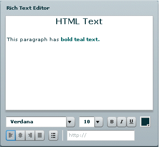
The following code produces the preceding image:
<?xml version="1.0"?>
<!-- textcontrols/RTECDATA.mxml -->
<s:Application
    xmlns:fx="http://ns.adobe.com/mxml/2009"
    xmlns:mx="library://ns.adobe.com/flex/mx"
    xmlns:s="library://ns.adobe.com/flex/spark">

  <mx:RichTextEditor id="rte1" title="Rich Text Editor">
     <mx:htmlText>
        <![CDATA[
           <p align='center'><b><font size='16'>HTML Text</font></b>
           This paragraph has <font color='#006666'><b>bold teal text.
           </b></font></p>
        ]]>
     </mx:htmlText>
  </mx:RichTextEditor>
</s:Application>
Flex text-based controls let you set and get text by using the following properties:
- text
-
Plain text without formatting information. For information on using the text property, see Using the text property.
- htmlText
-
Rich text that represents formatting by using a subset of HTML tags, and can include bulleted text and URL links. For information on using the htmlText property, see Using the htmlText property.
Both properties set the same underlying text, but you can use different formats. For example, you can do the following to set, modify, and get text:
-
You can set formatted text by using the htmlText property, and get it back as a plain text string by using the text property.
-
You can set formatted text in user-editable text controls (MX TextInput, TextArea, RichTextEditor) by setting the text string with the text property and formatting a section of this text by using the TextRange class. If you get the text back by using the htmlText property, the property string includes HTML tags for the formatting. For more information on using the TextRange class, see Selecting and modifying text.
-
Using the text property
You can use the text property to specify the text string that appears in a text control or to get the text in the control as a plain text String. When you set this property, any HTML tags in the text string appear in the control as literal text.
You cannot specify text formatting when you set the text property, but you can format the text in the control. You can use the text control styles to format all of the text in the control, and you can use the TextRange class to format ranges of text. (For more information on using the TextRange class, see Selecting and modifying text.)
The following code line uses a text property to specify label text:
<mx:Label text="This is a simple text label"/>
The way you specify special characters, including quotation marks, greater than and less than signs, and apostrophes, depends on whether you use them in MXML tags or in ActionScript. It also depends on whether you specify the text directly or wrap the text in a CDATA section.
Specifying special characters in the text property
The following rules specify how to include special characters in the text property of a text control MXML tag, either in a property assignment, such as text="the text", or in the body of an <mx:text> subtag.
- In standard text
-
The following rules determine how you use special characters if you do not use a CDATA section:
-
To use the special characters left angle bracket (<), right angle bracket (>), and ampersand (&), insert the XML character entity equivalents of <, >, and &, respectively. You can also use " and ' for double-quotation marks (") and single-quotation marks ('), and you can use numeric character references, such as ¥ for the Yen mark (¥). Do not use any other named character entities; Flex treats them as literal text.
-
You cannot use the character that encloses the property text string inside the string. If you surround the string in double-quotation marks ("), use the escape sequence \" for any double-quotation marks in the string. If you surround the string in single-quotation marks (') use the escape sequence \' for any single-quotation marks in the string. You can use single-quotation marks inside a string that is surrounded in double-quotation marks, and double-quotation marks inside a string that is surrounded in single-quotation marks.
-
Flex text controls ignore escape characters such as \t or \n in the text property. They ignore or convert to spaces, tabs and line breaks, depending on whether you are specifying a property assignment or an <mx:text> subtag. To include line breaks, put the text in a CDATA section. In the Text control text=" string " attribute specifications, you can also specify them as numeric character entities, such as 
 for a Return character or 	 for a Tab character, but you cannot do this in an <mx:text> subtag.
The following code example uses the text property with standard text:
<?xml version="1.0"?> <!-- textcontrols/StandardText.mxml --> <s:Application xmlns:fx="http://ns.adobe.com/mxml/2009" xmlns:mx="library://ns.adobe.com/flex/mx" xmlns:s="library://ns.adobe.com/flex/spark" height="400"> <s:layout> <s:VerticalLayout/> </s:layout> <mx:Text width="400" text="This string contains a less than, <, greater than, >, ampersand, &, apostrophe, ', and quotation mark "."/> <mx:Text width="400" text='This string contains a less than, <, greater than, >, ampersand, &, apostrophe, ', and quotation mark, ".'/> <mx:Text width="400"> <mx:text> This string contains a less than, <, greater than, >, ampersand, &, apostrophe, ', and quotation mark, ". </mx:text> </mx:Text> </s:Application>The resulting application contains three almost identical text controls, each with the following text. The first two controls, however, convert any tabs in the text to spaces.
This string contains a less than, <, greater than, >, ampersand, &,apostrophe, ', and quotation mark, ".
-
- In a CDATA section
-
If you wrap the text string in the CDATA tag, the following rules apply:
-
You cannot use a CDATA section in a property assignment statement in the text control opening tag; you must define the property in an <mx:text> child tag.
-
Text inside the CDATA section appears as it is entered, including white space characters. Use literal characters, such as " or < for special characters, and use standard return and tab characters. Character entities, such as >, and backslash-style escape characters, such as \n, appear as literal text.
The following code example follows these CDATA section rules. The second and third lines of text in the <mx:text> tag are not indented because any leading tab or space characters would appear in the displayed text.
<?xml version="1.0"?>
<!-- textcontrols/TextCDATA.mxml -->
<s:Application
    xmlns:fx="http://ns.adobe.com/mxml/2009"
    xmlns:mx="library://ns.adobe.com/flex/mx"
    xmlns:s="library://ns.adobe.com/flex/spark"
    width="500">

  <mx:Text width="100%">
     <mx:text>
        <![CDATA[This string contains a less than, <, greater than, >,
            ampersand, &, apostrophe, ', return,
            tab. and quotation mark, ".]]>
     </mx:text>
  </mx:Text>

</s:Application>
The displayed text appears on three lines, as follows:
 This string contains a less than, <, greater than, >,
 ampersand, &, apostrophe, ', return,
 tab. and quotation mark, ".
-
Specifying special characters in ActionScript
The following rules specify how to include special characters in a text control when you specify the control's text property value in ActionScript; for example, in an initialization function, or when assigning a string value to a variable that you use to populate the property:
-
You cannot use the character that encloses the text string inside the string. If you surround the string in double-quotation marks ("), use the escape sequence \" for any double-quotation marks in the string. If you surround the string in single-quotation marks ('), use the escape sequence \' for any single-quotation marks in the string.
-
Use backslash escape characters for special characters, including \t for the tab character, and \n or \r for a return/line feed character combination. You can use the escape character \" for the double-quotation mark and \' for the single-quotation mark.
-
In standard text, but not in CDATA sections, you can use the special characters left angle bracket (<), right angle bracket (>), and ampersand (&), by inserting the XML character entity equivalents of <, >, and &, respectively. You can also use " and ' for double-quotation marks ("), and single-quotation marks ('), and you can use numeric character references, such as ¥ for the Yen mark (¥). Do not use any other named character entities; Flex treats them as literal text.
-
In CDATA sections only, do not use character entities or references, such as < or ¥ because Flex treats them as literal text. Instead, use the actual character, such as <.
The following example uses an initialization function to set the text property to a string that contains these characters:
<?xml version="1.0"?>
<!-- textcontrols/InitText.mxml -->
<s:Application
xmlns:fx="http://ns.adobe.com/mxml/2009"
xmlns:mx="library://ns.adobe.com/flex/mx"
xmlns:s="library://ns.adobe.com/flex/spark"
initialize="initText()">
<fx:Script>
public function initText():void {
//The following is on one line.
myText.text="This string contains a return, \n, tab, \t, and quotation mark, \". " +
"This string also contains less than, <, greater than, >, " +
"ampersand, &, and apostrophe, ', characters.";
}
</fx:Script>
<mx:Text width="450" id="myText"/>
</s:Application>
The following example uses an <fx:Script> tag with a variable in a CDATA section to set the text property:
<?xml version="1.0"?>
<!-- textcontrols/VarText.mxml -->
<s:Application
    xmlns:fx="http://ns.adobe.com/mxml/2009"
    xmlns:mx="library://ns.adobe.com/flex/mx"
    xmlns:s="library://ns.adobe.com/flex/spark">

    <fx:Script>
        <![CDATA[
            [Bindable]
            // The following is on one line.
            public var myText:String ="This string contains a return, \n, tab, \t, and quotation mark, \". This string also contains less than, <, greater than, <, ampersand, <;, and apostrophe, ', characters.";
        ]]>
    </fx:Script>

    <mx:Text width="450" text="{myText}"/>

</s:Application>
The displayed text for each example appears on three lines. The first line ends at the return specified by the \n character. The remaining text wraps onto a third line because it is too long to fit on a single line. (Note: Although the tab character may be noticeable in the following output, it is included in the right location.)
 This string contains a return,
 , tab, 	, and quotation mark, ". This string also contains less than, <,
 greater than, >, ampersand, &, and apostrophe, ', characters.
Using the htmlText property
You use the htmlText property to set or get an HTML-formatted text string. You can also use one tag that is not part of standard HTML, the textFormat tag. For details of supported tags and attributes, see Using tags in HTML text.
You can also specify text formatting by using Flex styles. You can set a base style, such as the font characteristics or the text weight, by using a style, and override the base style in sections of your text by using tags, such as the <font> tag. In the following example, the <mx:Text> tag styles specify blue, italic, 14 point text, and the <mx:htmlText> tag includes HTML tags that override the color and point size.
<?xml version="1.0"?>
<!-- textcontrols/HTMLTags.mxml -->
<s:Application
    xmlns:fx="http://ns.adobe.com/mxml/2009"
    xmlns:mx="library://ns.adobe.com/flex/mx"
    xmlns:s="library://ns.adobe.com/flex/spark">

    <mx:Text width="100%" color="blue" fontStyle="italic" fontSize="14">
        <mx:htmlText>
            <![CDATA[
                This is 14 point blue italic text.<br>
                <b><font color="#000000" size="10">This text is 10 point black, italic, and bold.</font></b>
            ]]>
        </mx:htmlText>
    </mx:Text>
</s:Application>
Specifying HTML tags and text
To prevent the Flex compiler from generating errors when it encounters HTML tags in the text, use one of the following techniques:
-
Wrap your text in a CDATA tag.
-
Specify HTML markup by using the <, >, and & character entities in place of the left angle bracket (<), right angle bracket (>), and ampersand (&) HTML delimiters.
It' best to use CDATA sections for all but simple HTML markup, because the character entity technique has significant limitations:
-
Extensive HTML markup can be cumbersome to write and difficult to read.
-
You must use a complex escape sequence to include the less than and ampersand characters in your text.
For example, to display the following string:
A less than character < and bold text.
without using a CDATA section, you must use the following text:
A less than character &c#060; and <b>bold text</b>.
In a CDATA section, you use the following text:
A less than character < and <b>bold text</b>.
Specifying HTML text
When you specify HTML text for a text control, the following rules apply:
-
You cannot use a CDATA section directly in an inline htmlText property in an <mx:Text> tag. You must put the text in an <mx:htmlText> subtag, or in ActionScript code.
-
Flex collapses consecutive white space characters, including return, space, and tab characters, in text that you specify in MXML property assignments or ActionScript outside of a CDATA section.
-
If you specify the text in a CDATA section, you can use the text control's condenseWhite property to control whether Flex collapses white space. By default, the condenseWhite property is false, and Flex does not collapse white space.
-
Use HTML <p> and <br> tags for breaks and paragraphs. In ActionScript CDATA sections you can also use \n escape characters.
-
If your HTML text string is surrounded by single- or double-quotation marks because it is in an assignment statement (in other words, if it is not in an <mx:htmlText> tag), you must escape any uses of that quotation character in the string:
-
If you use double-quotation marks for the assignment delimiters, use " for the double-quotation mark (") character in your HTML. In ActionScript, you can also use the escape sequence \".
Note: You do not need to escape double-quotation marks if you're loading text from an external file; it is only necessary if you're assigning a string of text in ActionScript. -
If you use single-quotation marks for the assignment delimiters, use ' for the single-quotation mark character (') in your HTML. In ActionScript, you can also use the escape sequence \'.
-
-
When you enter HTML-formatted text, you must include attributes of HTML tags in double- or single-quotation marks. Attribute values without quotation marks can produce unexpected results, such as improper rendering of text. You must follow the escaping rules for quotation marks within quotation marks, as described in Escaping special characters in HTML text.
The following example shows some simple HTML formatted text, using MXML and ActionScript to specify the text:
<?xml version="1.0"?>
<!-- textcontrols/HTMLFormattedText.mxml -->
<s:Application
xmlns:fx="http://ns.adobe.com/mxml/2009"
xmlns:mx="library://ns.adobe.com/flex/mx"
xmlns:s="library://ns.adobe.com/flex/spark"
width="500">
<s:layout>
<s:VerticalLayout/>
</s:layout>
<fx:Script><![CDATA[
//The following is on one line.
[Bindable]
public var myHtmlText:String="This string contains <b>less than </b>, <, <b>greater than</b>, >, <b>ampersand</b>, &, and <b>double quotation mark</b>, ", characters.";
]]></fx:Script>
<mx:Text id="htmltext2" width="450" htmlText="{myHtmlText}" />
<mx:Text width="450">
<mx:htmlText>
<!-- The following is on one line. Line breaks would appear in the output. -->
<![CDATA[
This string contains <b>less than</b>, <, <b>greater than </b>, >, <b>ampersand</b>, &, and <b>double quotation mark</b>,", characters.
]]>
</mx:htmlText>
</mx:Text>
</s:Application>
Escaping special characters in HTML text
The rules for escaping special characters in HTML text differ between CDATA sections and standard text.
- In CDATA sections
-
When you specify the htmlText string, the following rules apply:
-
In ActionScript, but not in an <mx:htmlText> tag, you can use standard backslash escape sequences for special characters, such as \t for tab and \n for a newline character. You can also use the backslash character to escape many special characters, such as \\xd5 and \" for single- and double-quotation marks. You cannot use the combination \<, and a backslash before a return character has no effect on displayed text; it allows you to break the assignment statement across multiple text lines.
-
In both ActionScript and the <mx:htmlText> tag, you can use HTML tags and numeric character entities; for example in place of \n, you can use a <br> tag.
-
To include a left angle bracket (<), right angle bracket (>), or ampersand (&) character in displayed text, use the corresponding character entities: <, >, and &, respectively. You can also use the " and ' entities for single- and double-quotation marks. These are the only named character entities that Adobe® Flash® Player and Adobe® AIR™ recognize. They recognize numeric entities, such as ¥ for the Yen mark (¥),;however, they do not recognize the corresponding character entity, ¥.
The following code example uses the htmlText property to display formatted text:
<?xml version="1.0"?> <!-- textcontrols/HTMLTags2.mxml --> <s:Application xmlns:fx="http://ns.adobe.com/mxml/2009" xmlns:mx="library://ns.adobe.com/flex/mx" xmlns:s="library://ns.adobe.com/flex/spark" width="500"> <mx:Text width="100%"> <mx:htmlText><![CDATA[<p>This string contains a <b>less than</b>, <. </p><p>This text is in a new paragraph.<br>This is a new line.</p>]]> </mx:htmlText> </mx:Text> </s:Application>
-
- In standard text
-
The following rules apply:
-
You must use character entities, as described in Using the htmlText property, to use the left angle bracket (<), right angle bracket (>), or ampersand (&) character in HTML; for example, when you open a tag or start a character entity.
-
You must use the & named entity combined with an HTML numeric character entity to display the less than character (use &#060;) and ampersand character (use &#038;). You can use the standard character entities, >, ", and ', for the greater than, double-quotation mark and single-quotation mark characters, respectively. For all other character entities, use numeric entity combinations, such as &#165;, for the Yen mark (¥).
-
In ActionScript, but not in an <mx:htmlText> tag or inline htmlText property, you can use a backslash character to escape special characters, including the tab, newline, and quotation mark characters (but not the ampersand). In all cases, you can use (properly escaped) HTML tags and numeric character entities; for example in place of \n, you can use a <br> tag or &#013; entity.
-
Using tags in HTML text
When you use the htmlText property, you use a subset of HTML that is supported by Flash Player and AIR, which support the following tags:
Anchor tag (<a>)
The anchor <a> tag creates a hyperlink and supports the following attributes:
- href
-
Specifies the URL of the page to load in the browser. The URL can be absolute or relative to the location of the SWF file that is loading the page.
- target
-
Specifies the name of the target window to load the page into.
For example, the following HTML snippet creates the link "Go Home" to the Adobe Web site.
<a href='http://www.adobe.com' target='_blank'>Go Home</a>
The <a> tag does not make the link text blue or underline the text. You must apply formatting tags to change the text format. You can do this with the <font color=" color "> tag and the <u> tag.
You can also define a:link, a:hover, and a:active styles for anchor tags by using the StyleSheet class, if the component supports the styleSheet property. This property is defined on MX TextArea and TextField controls. The following example shows how to use it on text inside an MX TextArea control:
<?xml version="1.0"?>
<!-- textcontrols/StyleSheetExample.mxml -->
<s:Application
    xmlns:fx="http://ns.adobe.com/mxml/2009"
    xmlns:mx="library://ns.adobe.com/flex/mx"
    xmlns:s="library://ns.adobe.com/flex/spark"
    creationComplete="initApp()">

    <fx:Script>
        <![CDATA[
            import flash.text.StyleSheet;

            private function initApp():void {
                    var ss:StyleSheet = new StyleSheet;
                    // Define an object for the "hover" state of the "a" tag.
                    var hoverStyles:Object = new Object;
                    hoverStyles.textDecoration = "underline";
                    hoverStyles.color = "#FF00CC";

                    // Define an object for the non-hover state of the "a" tag.
                    var linkStyles:Object = new Object;
                    linkStyles.color = "#FF00CC";

                    // Apply the newly defined styles.
                    ss.setStyle("a:hover", hoverStyles);
                    ss.setStyle("a", linkStyles);

                    // Apply the StyleSheet to the TextArea control.
                    myTA.styleSheet = ss;
            }
        ]]>
    </fx:Script>

    <fx:Style>
        @namespace mx "library://ns.adobe.com/flex/mx";

        mx|TextArea {
            fontFamily:Courier;
            linkcolor:#CC3300;
        }
    </fx:Style>

    <mx:TextArea id="myTA" height="100" width="200">
        <mx:htmlText>
            <![CDATA[<a href="https://flex.apache.org">This</a> is a link.]]>
        </mx:htmlText>
    </mx:TextArea>
</s:Application>
The MX Label, Text, and TextArea controls can dispatch a link event when the user selects a hyperlink in the htmlText property. To generate the link event, prefix the hyperlink destination with event:, as the following example shows:
<?xml version="1.0"?>
<!-- textcontrols/LabelControlLinkEvent.mxml -->
<s:Application
    xmlns:fx="http://ns.adobe.com/mxml/2009"
    xmlns:mx="library://ns.adobe.com/flex/mx"
    xmlns:s="library://ns.adobe.com/flex/spark">

    <s:layout>
        <s:VerticalLayout/>
    </s:layout>

    <fx:Script>
        <![CDATA[
            import flash.events.TextEvent;
            public function linkHandler(event:TextEvent):void {
                myTA.text="The link was clicked.";

                // Open the link in a new browser window.
                navigateToURL(new URLRequest(event.text), '_blank')
            }
        ]]>
    </fx:Script>

    <mx:Label selectable="true" link="linkHandler(event);">
        <mx:htmlText>
            <![CDATA[This link lets you <a href='event:http://www.adobe.com'>Navigate to Adobe.com.</a>]]>
        </mx:htmlText>
    </mx:Label>
    <mx:TextArea id="myTA"/>

</s:Application>
The MX Label control must have the selectable property set to true to generate the link event.
When you use the link event, the event is generated and the text following event: in the hyperlink destination is included in the text property of the event object. However, the hyperlink is not automatically executed; you must execute the hyperlink from within your event handler. This allows you to modify the hyperlink, or even prohibit it from occurring, in your application.
Bold tag (<b>)
The bold <b> tag renders text as bold. If you use embedded fonts, a boldface font must be available for the font or no text appears. If you use fonts that you expect to reside on the local system of your users, their system may approximate a boldface font if none exists, or it may substitute the normal font face instead of boldface. In either case, the text inside the bold tags will appear.
The following snippet applies boldface to the word bold:
This word is <b>bold</b>.
You cannot use the </b> end tag to override bold formatting that you set for all text in a control by using the fontWeight style.
Break tag (<br>)
The break <br> tag creates a line break in the text. This tag has no effect in MX Label or MX TextInput controls.
The following snippet starts a new line after the word line:
The next sentence is on a new line.<br>Hello there.
Font tag (<font>)
The <font> tag specifies the following font characteristics: color, face, and size.
The font tag supports the following attributes:
- color
-
Specifies the text color. You must use hexadecimal (#FFFFFF) color values. Other formats are not supported.
- face
-
Specifies the name of the font to use. You can also specify a list of comma-separated font names, in which case Flash Player and AIR choose the first available font. If the specified font is not installed on the playback system, or isn't embedded in the SWF file, Flash Player and AIR choose a substitute font. The following example shows how to set the font face.
- size
-
Specifies the size of the font in points. You can also use relative sizes (for example, +2 or -4).
The following example shows the use of the <font> tag:
<?xml version="1.0"?>
<!-- textcontrols/FontTag.mxml -->
<s:Application
    xmlns:fx="http://ns.adobe.com/mxml/2009"
    xmlns:mx="library://ns.adobe.com/flex/mx"
    xmlns:s="library://ns.adobe.com/flex/spark">

  <mx:TextArea height="100" width="250">
     <mx:htmlText>
        <![CDATA[
           You can vary the <font size='20'>font size</font>,<br><font color="#0000FF">color</font>,<br><font face="CourierNew, Courier, Typewriter">face</font>, or<br><font size="18" color="#FF00FF"face="Times, Times New Roman, _serif">any combination of the three.</font>
        ]]>
     </mx:htmlText>
  </mx:TextArea>
</s:Application>
Image tag (<img>)
The image <img> tag lets you embed external JPEG, GIF, PNG, and SWF files inside text fields. Text automatically flows around images you embed in text fields. This tag is supported only in dynamic and input text fields that are multiline and wrap their text.
By default, Flash displays media embedded in a text field at full size. To specify dimensions for embedded media, use the <img> tag's height and width attributes.
In general, an image embedded in a text field appears on the line following the <img> tag. However, when the <img> tag is the first character in the text field, the image appears on the first line of the text field.
The <img> tag has one required attribute, src, which specifies the path to an image file. All other attributes are optional.
The <img> tag supports the following attributes:
- src
-
Specifies the URL to a GIF, JPEG, PNG, or SWF file. This attribute is required; all other attributes are optional. External files are not displayed until they have downloaded completely.
- align
-
Specifies the horizontal alignment of the embedded image within the text field. Valid values are left and right. The default value is left.
- height
-
Specifies the height of the image, in pixels.
- hspace
-
Specifies the amount of horizontal space that surrounds the image where no text appears. The default value is 8.
- id
-
Specifies the identifier for the imported image. This is useful if you want to control the embedded content with ActionScript.
- vspace
-
Specifies the amount of vertical space that surrounds the image where no text.
- width
-
Specifies the width of the image, in pixels. The default value is 8.
The following example shows the use of the <img> tag and how text can flow around the image:
<?xml version="1.0"?> <!-- textcontrols/ImgTag.mxml --> <s:Application xmlns:fx="http://ns.adobe.com/mxml/2009" xmlns:mx="library://ns.adobe.com/flex/mx" xmlns:s="library://ns.adobe.com/flex/spark" width="300" height="300"> <mx:Text height="100%" width="100%"> <mx:htmlText> <![CDATA[ <p>You can include an image in your HTML text with the <img> tag.</p> <p><img src='assets/butterfly.gif' width='30' height='30' align='left' hspace='10' vspace='10'> Here is text that follows the image. I'm extending the text by lengthening this sentence until it's long enough to show wrapping around the bottom of the image.</p> ]]> </mx:htmlText> </mx:Text> </s:Application>
Making hyperlinks out of embedded images
To make a hyperlink out of an embedded image, enclose the <img> tag in an <a> tag, as the following example shows:
<?xml version="1.0"?>
<!-- textcontrols/ImgTagWithHyperlink.mxml -->
<s:Application
    xmlns:fx="http://ns.adobe.com/mxml/2009"
    xmlns:mx="library://ns.adobe.com/flex/mx"
    xmlns:s="library://ns.adobe.com/flex/spark">

  <mx:TextArea width="100%" height="100%">
     <mx:htmlText>
        <![CDATA[
           <a href='http://www.adobe.com'><img src='assets/butterfly.gif'/></a>
           Click the image to go to the Adobe home page.
        ]]>
     </mx:htmlText>
  </mx:TextArea>
</s:Application>
When the user moves the mouse pointer over an image that is enclosed by <a> tags, the mouse pointer does not change automatically to a hand icon, as with standard hyperlinks. To display a hand icon, specify buttonMode="true" for the MX TextArea (or Text) control. Interactivity, such as mouse clicks and key presses, do not register in SWF files that are enclosed by <a> tags.
Italic tag (<i>)
The italic <i> tag displays the tagged text in italic font. If you're using embedded fonts, an italic font must be available or no text appears. If you use fonts that you expect to reside on the local system of your users, their system may approximate an italic font if none exists, or it may substitute the normal font face instead of italic. In either case, the text inside the italic tags appears.
The following snippet applies italic font to the word italic:
The next word is in <i>italic</i>.
You cannot use the </i> end tag to override italic formatting that you set for all text in a control by using the fontStyle style.
List item tag (<li>)
The list item <li> tag ensures that the text that it encloses starts on a new line with a bullet in front of it. You cannot use it for any other type of HTML list item. The ending </li> tag ensures a line break (but </li><li> generates a single line break). Unlike in HTML, you do not surround <li> tags in <ul> tags. For example, the following Flex code generates a bulleted list with two items:
<?xml version="1.0"?>
<!-- textcontrols/BulletedListExample.mxml -->
<s:Application
    xmlns:fx="http://ns.adobe.com/mxml/2009"
    xmlns:mx="library://ns.adobe.com/flex/mx"
    xmlns:s="library://ns.adobe.com/flex/spark">

  <mx:Text>
     <mx:htmlText >
        <![CDATA[
           <p>This is a bulleted list:<li>First Item</li><li>Second Item</li></p>
        ]]>
     </mx:htmlText>
  </mx:Text>
</s:Application>
Paragraph tag (<p>)
The paragraph <p> tag creates a new paragraph. The opening <p> tag does not force a line break, but the closing </p> tag does. Unlike in HTML, the <p> tag does not force a double space between paragraphs; the spacing is the same as that generated by the <br> tag.
The <p> tag supports the following attribute:
- align
-
Specifies alignment of text in the paragraph; valid values are left, right, center, and justify.
The following snippet generates two centered paragraphs:
 <p align="center">This is a first centered paragraph</p>
 <p align="center">This is a second centered paragraph</p>
Text format tag (<textformat>)
The text format <textformat> tag lets you use a subset of paragraph formatting properties of the TextFormat class in HTML text fields, including line leading, indentation, margins, and tab stops. You can combine text format tags with the built-in HTML tags. The text format tag supports the following attributes:
- blockindent
-
Specifies the indentation, in points, from the left margin to the text in the <textformat> tag body.
- indent
-
Specifies the indentation, in points, from the left margin or the block indent, if any, to the first character in the <textformat> tag body.
- leading
-
Specifies the amount of leading (vertical space) between lines.
- leftmargin
-
Specifies the left margin of the paragraph, in points.
- rightmargin
-
Specifies the right margin of the paragraph, in points.
- tabstops
-
Specifies custom tab stops as an array of nonnegative integers.
Selecting and modifying text
You can select and modify text in the MX TextArea, MX TextInput, and RichTextEditor controls. To change a MX Label or Text control's text, assign a new value to the control's text or HTMLtext property. For more information on the HTMLText property, see Using the htmlText property.
Selecting text
The Flex editable controls provide properties and methods to select text regions and get selections. You can modify the contents of the selection as described in Modifying text.
Creating a selection
The MX TextInput and TextArea controls, including the RichTextEditor control's TextArea subcontrol, provide the following text selection properties and method:
-
setSelection() method selects a range of text. You specify the zero-based indexes of the start character and the position immediately after the last character in the text.
-
selectionBeginIndex and selectionEndIndex set or return the zero-based location in the text of the start and position immediately after the end of a selection.
To select the first 10 characters of the myTextArea TextArea control, for example, use the following method:
myTextArea.setSelection(0, 10);
To change the last character of this selection to be the twenty-fifth character in the MX TextArea control, use the following statement:
myTextArea.endIndex=25;
To select text in a RichTextEditor control, use the control's TextArea subcontrol, which you access by using the textArea id. To select the first 10 characters in the myRTE RichTextEditor control, for example, use the following code:
myRTE.textArea.setSelection(0, 10);
Getting a selection
You get a text control's selection by getting a TextRange object with the selected text. You can then use the TextRange object to modify the selected text, as described in Modifying text. The technique you use to get the selection depends on the control type.
Get the selection in an MX TextArea or MX TextInput control
Use the TextRange class constructor to get a TextRange object with the currently selected text in an MX TextArea or MX TextInput control. For example, to get the current selection of the myTextArea control, use the following line:
var mySelectedTextRange:TextRange = new TextRange(myTextArea, true);
The second parameter, true, tells the constructor to return a TextRange object with the selected text.
Get the selection in a RichTextEditor control
Use the selection read-only property of the RichTextEditor to get a TextRange object with the currently selected text in its MX TextArea subcontrol. You can use the TextRange object to modify the selected text, as described in Modifying text. For example, to get the current selection of the MyRTE RichTextEditor control, us the following line:
public var mySelectedTextRange:TextRange = myRTE.selection;
Modifying text
You use the TextRange class to modify the text in an MX TextArea, MX TextInput, or RichTextEditor control. This class lets you affect the following text characteristics:
-
text or htmltext property contents
-
text color, decoration (underlining), and alignment
-
font family, size, style (italics), and weight (bold)
-
URL of an HTML <a> link
Getting a TextRange object
To get a TextRange object you use the following techniques:
-
Get a TextRange object that contains the current text selection.
-
Create a TextRange object that contains a specific range of text.
To create a TextRange object with a specific range of text, use a TextRange constructor with the following format:
new TextRange(control, modifiesSelection, beginIndex, endIndex)
Specify the control that contains the text, whether the TextRange object corresponds to a selection (that is, represents and modifies selected text), and the zero-based indexes in the text of the first and last character of the range. As a general rule, do not use the TextRange constructor to set a selection; use the setSelection() method, as described in Selecting text. For this reason, the second parameter should always be false when you specify the begin and end indexes.
To get a TextRange object with the fifth through twenty-fifth characters of an MX TextArea control named myTextArea, for example, use the following line:
var myTARange:TextRange = new TextRange(myTextArea, false, 4, 25);
Changing text
After you get a TextRange object, use its properties to modify the text in the range. The changes you make to the TextRange appear in the text control.
You can get or set the text in a TextRange object as HTML text or as a plain text, independent of any property that you might have used to initially set the text. If you created an MX TextArea control, for example, and set its text property, you can use the TextRange htmlText property to get and change the text. The following example shows this usage, and shows using the TextRange class to access a range of text and change its properties. It also shows using String properties and methods to get text indexes.
<?xml version="1.0"?>
<!-- textcontrols/TextRangeExample.mxml -->
<s:Application
    xmlns:fx="http://ns.adobe.com/mxml/2009"
    xmlns:mx="library://ns.adobe.com/flex/mx"
    xmlns:s="library://ns.adobe.com/flex/spark">

    <s:layout>
        <s:VerticalLayout/>
    </s:layout>

  <fx:Script><![CDATA[
     import mx.controls.textClasses.TextRange

    private function resetText():void {
        ta1.text = "This is a test of the emergency broadcast system. It is only a test.";
    }

     public function alterText():void {
        // Create a TextRange object starting with "the" and ending at the
        // first period. Replace it with new formatted HTML text.
        var tr1:TextRange = new TextRange(
            ta1, false, ta1.text.indexOf("the", 0), ta1.text.indexOf(".", 0)
        );
        tr1.htmlText="<i>italic HTML text</i>"

        // Create a TextRange object with the remaining text.
        // Select the text and change its formatting.
        var tr2:TextRange = new TextRange(
            ta1, true, ta1.text.indexOf("It", 0), ta1.text.length-1
        );
        tr2.color=0xFF00FF;
        tr2.fontSize=18;
        tr2.fontStyle = "italic"; // any other value turns italic off
        tr2.fontWeight = "bold"; // any other value turns bold off
        ta1.setSelection(0, 0);
     }
  ]]></fx:Script>

  <mx:TextArea id="ta1" fontSize="12" fontWeight="bold" width="100%" height="100">
     <mx:text>
        This is a test of the emergency broadcast system. It is only a test.
     </mx:text>
  </mx:TextArea>
  <s:HGroup>
    <mx:Button label="Alter Text" click="alterText();"/>
    <mx:Button label="Reset" click="resetText();"/>
  </s:HGroup>
</s:Application>
Example: Changing selected text in a RichTextEditor control
The following example shows how you can use the selectedText property of theRichTextEditor control to get a TextRange when a user selects some text, and use TextRange properties to get and change the characteristics of the selected text. To use the example, select a range of text with your mouse. When you release the mouse button, the string "This is replacement text. ", formatted in fuchsia Courier 20-point font replaces the selection and the text area reports on the original and replacement text.
<?xml version="1.0"?>
<!-- textcontrols/TextRangeSelectedText.mxml -->
<s:Application
    xmlns:fx="http://ns.adobe.com/mxml/2009"
    xmlns:mx="library://ns.adobe.com/flex/mx"
    xmlns:s="library://ns.adobe.com/flex/spark"
    width="600" height="500">

    <s:layout>
        <s:VerticalLayout/>
    </s:layout>

  <fx:Script><![CDATA[
     import mx.controls.textClasses.TextRange;

     //The following text must be on a single line.
     [Bindable]
     public var htmlData:String="<textformat leading='2'><p align='center'><b><font size='20'>HTML Formatted Text</font></b></p></textformat><br><textformat leading='2'><p align='left'><font face='_sans' size='12' color='#000000'>This paragraph contains <b>bold</b>, <i>italic</i>, <u>underlined</u>, and <b><i><u>bold italic underlined </u></i></b>text. </font></p></textformat><br><p><u><font face='arial' size='14' color='#ff0000'>This a red underlined 14-point arial font with no alignment set.</font></u></p><p align='right'><font face='verdana' size='12' color='#006666'><b>This a teal bold 12-pt. Verdana font with alignment set to right.</b></font></p>";

     public function changeSelectionText():void {
        //Get a TextRange with the selected text and find its length.
        var sel:TextRange = rte1.selection;
        var selLength:int = sel.endIndex - sel.beginIndex;
        //Do the following only if the user made a selection.
        if (selLength) {
           //Display the selection size and font color, size, and family.
           t1.text="Number of characters selected: " + String(selLength);
           t1.text+="\n\nOriginal Font Family: " + sel.fontFamily;
           t1.text+="\nOriginal Font Size: " + sel.fontSize;
           t1.text+="\nOriginal Font Color: " + sel.color;
           //Change font color, size, and family and replace selected text.
           sel.text="This is replacement text. "
           sel.color="fuchsia";
           sel.fontSize=20;
           sel.fontFamily="courier"
           //Show the new font color, size, and family.
           t1.text+="\n\nNew text length: " + String(sel.endIndex - sel.beginIndex);
           t1.text+="\nNew Font Family: " + sel.fontFamily;
           t1.text+="\nNew Font Size: " + sel.fontSize;
           t1.text+="\nNew Font Color: " + sel.color;
        }
     }
  ]]></fx:Script>

  <!-- The text area. When you release the mouse after selecting text,
     it calls the func1 function. -->
  <mx:RichTextEditor id="rte1"
    htmlText="{htmlData}"
    width="100%" height="100%"
    mouseUp="changeSelectionText()"/>

  <mx:TextArea id="t1"
    editable="false"
    fontSize="12"
    fontWeight="bold"
    width="300" height="180"/>

</s:Application>
MX Label control
The Label control is part of both the MX and Spark component sets. While you can use the MX controls in your application, it's best to use the Spark controls instead. For more information about using Spark text controls, see Spark text controls.
The MX Label control is a noneditable single-line text label. It has the following characteristics:
-
The user cannot change the text, but the application can modify it.
-
You can specify text formatting by using styles or HTML text.
-
You can control the alignment and sizing.
-
The control is transparent and does not have a backgroundColor property, so the background of the component's container shows through.
-
The control has no borders, so the label appears as text written directly on its background.
-
The control cannot take the focus.
To create a multiline, noneditable text field, use a Text control. For more information, see MX Text control. To create user-editable text fields, use MX TextInput or MX TextArea controls. For more information, see MX TextInput control and MX TextArea control.
The following image shows an MX Label control:
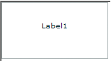
For the code used to create this sample, see Creating an MX Label control.
Creating an MX Label control
You define an MX Label control in MXML by using the <mx:Label> tag, as the following example shows. Specify an id value if you intend to refer to a component elsewhere in your MXML, either in another tag or an ActionScript block.
<?xml version="1.0"?>
<!-- textcontrols/LabelControl.mxml -->
<s:Application
    xmlns:fx="http://ns.adobe.com/mxml/2009"
    xmlns:mx="library://ns.adobe.com/flex/mx"
    xmlns:s="library://ns.adobe.com/flex/spark"
    width="150" height="80">

  <mx:Label text="Label1"/>

</s:Application>
You use the text property to specify a string of raw text, and the htmlText property to specify an HTML‑formatted string. For more information on using these properties, see Using the text property and Using the htmlText property.
Sizing an MX Label control
If you do not specify a width, the MX Label control automatically resizes when you change the value of the text or htmlText property.
If you explicitly size an MX Label control so that it is not large enough to accommodate its text, the text is truncated and terminated by an ellipsis (...). The full text displays as a tooltip when you move the mouse over the MX Label control. If you also set a tooltip by using the tooltip property, the tooltip is displayed rather than the text.
MX TextInput control
The TextInput control is part of both the MX and Spark component sets. While you can use the MX controls in your application, it's best to use the Spark controls instead. For more information about using Spark text controls, see Spark text controls.
The MX TextInput control is a single-line text field that is optionally editable. The MX TextInput control supports the HTML rendering capabilities of Adobe Flash Player.
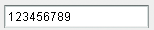
The following image shows an MX TextInput control:
To create a multiline, editable text field, use an MX TextArea control. For more information, see MX TextArea control. To create noneditable text fields, use MX Label and Text controls. For more information, see MX Label control and MX Text control.
The MX TextInput control does not include a label, but you can add one by using an MX Label control or by nesting the MX TextInput control in a FormItem container in a Form layout container, as shown in the example in About MX text controls. MX TextInput controls dispatch change, textInput, and enter events.
If you disable an MX TextInput control, it displays its contents in a different color, represented by the disabledColor style. You can set an MX TextInput control's editable property to false to prevent editing of the text. You can set an MX TextInput control's displayAsPassword property to conceal the input text by displaying characters as asterisks.
Creating an MX TextInput control
You define an MX TextInput control in MXML by using the <mx:TextInput> tag, as the following example shows. Specify an id value if you intend to refer to a control elsewhere in your MXML, either in another tag or in an ActionScript block.
<?xml version="1.0"?>
<!-- textcontrols/TextInputControl.mxml -->
<s:Application
    xmlns:fx="http://ns.adobe.com/mxml/2009"
    xmlns:mx="library://ns.adobe.com/flex/mx"
    xmlns:s="library://ns.adobe.com/flex/spark">

  <mx:TextInput id="text1" width="100"/>

</s:Application>
Just as you can for the MX Label control, you use the text property to specify a string of raw text, and the htmlText property to specify an HTML-formatted string. For more information, see Using the text property and Using the htmlText property.
Sizing an MX TextInput control
If you do not specify a width, the MX TextInput control automatically resizes when you change the value of the text or htmlText property. It does not resize in response to typed user input.
Binding to an MX TextInput control
In some cases, you might want to bind a variable to the text property of an MX TextInput control so that the control represents a variable value, as the following example shows:
<?xml version="1.0"?>
<!-- textcontrols/BoundTextInputControl.mxml -->
<s:Application
    xmlns:fx="http://ns.adobe.com/mxml/2009"
    xmlns:mx="library://ns.adobe.com/flex/mx"
    xmlns:s="library://ns.adobe.com/flex/spark">

  <fx:Script><![CDATA[
     [Bindable]
     public var myProp:String="This is the initial String myProp.";
  ]]></fx:Script>

  <mx:TextInput text="{myProp}" width="250"/>
</s:Application>
In this example, the MX TextInput control displays the value of the myProp variable. Remember that you must use the [Bindable] metadata tag if the variable changes value and the control must track the changed values; also, the compiler generates warnings if you do not use this metadata tag.
MX Text control
The MX Text control displays multiline, noneditable text. The control has the following characteristics:
-
The user cannot change the text, but the application can modify it.
-
The control does not support scroll bars. If the text exceeds the control size, users can use keys to scroll the text.
-
The control is transparent so that the background of the component's container shows through.
-
The control has no borders, so the label appears as text written directly on its background.
-
The control supports HTML text and a variety of text and font styles.
-
The text always word-wraps at the control boundaries, and is always aligned to the top of the control.
To create a single-line, noneditable text field, use the MX Label control. For more information, see MX Label control. To create user-editable text fields, use the MX TextInput or TextArea controls. For more information, see MX TextInput control and MX TextArea control.
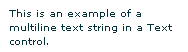
The following image shows an example of a Text control with a width of 175 pixels:
Creating a Text control
You define a Text control in MXML by using the <mx:Text> tag, as the following example shows. Specify an id value if you intend to refer to a component elsewhere in your MXML, either in another tag or in an ActionScript block.
<?xml version="1.0"?>
<!-- textcontrols/TextControl.mxml -->
<s:Application
    xmlns:fx="http://ns.adobe.com/mxml/2009"
    xmlns:mx="library://ns.adobe.com/flex/mx"
    xmlns:s="library://ns.adobe.com/flex/spark">

    <mx:Text width="175"
        text="This is an example of a multiline text string in a Text control."/>

</s:Application>
You use the text property to specify a string of raw text, and the htmlText property to specify an HTML-formatted string. For more information, see Using the text property and Using the htmlText property.
This control does not support a backgroundColor property; its background is always the background of the control's container.
Sizing a Text control
Flex sizes the Text control as follows:
-
If you specify a pixel value for both the height and width properties, any text that exceeds the size of the control is clipped at the border.
-
If you specify an explicit pixel width, but no height, Flex wraps the text to fit the width and calculates the height to fit the required number of lines.
-
If you specify a percentage-based width and no height, Flex does not wrap the text, and the height equals the number of lines as determined by the number of Return characters.
-
If you specify only a height and no width, the height value does not affect the width calculation, and Flex sizes the control to fit the width of the maximum line.
As a general rule, if you have long text, you should specify a pixel-based width property. If the text might change and you want to ensure that the Text control always takes up the same space in your application, set explicit height and width properties that fit the largest expected text.
MX TextArea control
The TextArea control is part of both the MX and Spark component sets. While you can use the MX controls in your application, it's best to use the Spark controls instead. For more information about using Spark text controls, see Spark text controls.
The MX TextArea control is a multiline, editable text field with a border and optional scroll bars. The MX TextArea control supports the HTML and rich text rendering capabilities of Flash Player and AIR. The MX TextArea control dispatches change and textInput events.
The following image shows an MX TextArea control:
To create a single-line, editable text field, use the MX TextInput control. For more information, see MX TextInput control. To create noneditable text fields, use the MX Label and Text controls. For more information, see MX Label control and MX Text control.
If you disable an MX TextArea control, it displays its contents in a different color, represented by the disabledColor style. You can set an MX TextArea control's editable property to false to prevent editing of the text. You can set an MX TextArea control's displayAsPassword property to conceal input text by displaying characters as asterisks.
Creating an MX TextArea control
You define an MX TextArea control in MXML by using the <mx:TextArea> tag, as the following example shows. Specify an id value if you intend to refer to a control elsewhere in your MXML, either in another tag or in an ActionScript block.
<?xml version="1.0"?>
<!-- textcontrols/TextAreaControl.mxml -->
<s:Application
    xmlns:fx="http://ns.adobe.com/mxml/2009"
    xmlns:mx="library://ns.adobe.com/flex/mx"
    xmlns:s="library://ns.adobe.com/flex/spark">

    <mx:TextArea id="textConfirm"
        width="300" height="100"
        text="Please enter your thoughts here."/>

</s:Application>
Just as you can for the Text control, you use the text property to specify a string of raw text, and the htmlText property to specify an HTML-formatted string. For more information, see Using the text property and Using the htmlText property.
MX RichTextEditor control
The MX RichTextEditor control lets users enter, edit, and format text. Users apply text formatting and URL links by using subcontrols that are located at the bottom of the RichTextEditor control.
There is no Spark equivalent of the RichTextEditor control.
For complete reference information, see the Adobe Flex Language Reference.
About the RichTextEditor control
The RichTextEditor control consists of a Panel control with two direct children:
-
An MX TextArea control in which users can enter text
-
A tool bar container with format controls that let a user specify the text characteristics. Users can use the tool bar subcontrols to apply the following text characteristics:
-
Font family
-
Font size
Note: When using the RichTextEditor control, you specify the actual pixel value for the font size. This size is not equivalent to the relative font sizes specified in HTML by using the size attribute of the HTML <font> tag. -
Any combination of bold, italic and underline font styles
-
Text color
-
Text alignment: left, center, right, or justified
-
Bullets
-
-
URL links
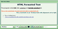
The following image shows a RichTextEditor control with some formatted text:
For the source for this example, see Creating a RichTextEditor control.
You use the RichTextEditor interactively as follows:
-
Text that you type is formatted as specified by the control settings.
-
To apply new formatting to existing text, select the text and set the controls to the required format.
-
To create a link, select a range of text, enter the link target in the text box on the right, and press Enter. You can only specify the URL; the link always opens in a _blank target. Also, creating the link does not change the appearance of the link text; you must separately apply any color and underlining.
-
You can cut, copy, and paste rich text within and between Flash HTML text fields, including the RichTextEditor control's TextArea subcontrol, by using the normal keyboard commands. You can copy and paste plain text between the TextArea and any other text application, such as your browser or a text editor.
Creating a RichTextEditor control
You define a RichTextEditor control in MXML by using the <mx:RichTextEditor> tag, as the following example shows. Specify an id value if you intend to refer to a control elsewhere in your MXML, either in another tag or in an ActionScript block.
<?xml version="1.0"?>
<!-- textcontrols/RichTextEditorControl.mxml -->
<s:Application
xmlns:fx="http://ns.adobe.com/mxml/2009"
xmlns:mx="library://ns.adobe.com/flex/mx"
xmlns:s="library://ns.adobe.com/flex/spark">
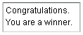
<mx:RichTextEditor id="myRTE" text="Congratulations, winner!" />
</s:Application>
You can use the text property to specify an unformatted text string, or the htmlText property to specify an HTML-formatted string. For more information on using these properties, see Using the text property, and Using the htmlText property. For information on selecting, replacing, and formatting text that is in the control, see Selecting and modifying text.
The following example shows the code used to create the image in About the RichTextEditor control:
<?xml version="1.0"?>
<!-- textcontrols/RichTextEditorControlWithFormattedText.mxml -->
<s:Application
    xmlns:fx="http://ns.adobe.com/mxml/2009"
    xmlns:mx="library://ns.adobe.com/flex/mx"
    xmlns:s="library://ns.adobe.com/flex/spark">

  <!-- The HTML text string used to populate the RichTextEditor control's
     TextArea subcomponent. The text is on a single line. -->
  <fx:Script><![CDATA[
     [Bindable]
     public var htmlData:String="<textformat leading='2'><p align='center'><b><font size='20'>HTML Formatted Text</font></b></p></textformat><br><textformat leading='2'><p align='left'><font face='_sans' size='12' color='#000000'>This paragraph contains<b>bold</b>, <i>italic</i>, <u>underlined</u>, and <b><i><u>bold italic underlined </u></i></b>text.</font></p></textformat><br><p><u><font face='arial' size='14' color='#ff0000'>This a red underlined 14-point arial font with no alignment set.</font></u></p><p align='right'><font face='verdana' size='12' color='#006666'><b>This a teal bold 12-pt.' Verdana font with alignment set to right.</b></font></p><br><li>This is bulleted text.</li><li><font face='arial' size='12' color='#0000ff'><u> <a href='http://www.adobe.com'>This is a bulleted link with underline and blue color set.</a></u></font></li>";
  ]]></fx:Script>

  <!-- The RichTextEditor control. To reference a subcomponent prefix its ID with the RichTextEditor control ID. -->
  <mx:RichTextEditor id="rte1"
     backgroundColor="#ccffcc"
     width="500"
     headerColors="[#88bb88, #bbeebb]"
     footerColors="[#bbeebb, #88bb88]"
     title="Rich Text Editor"
     htmlText="{htmlData}"
     initialize="rte1.textArea.setStyle('backgroundColor', '0xeeffee')"
  />
</s:Application>
Sizing the RichTextEditor control
The control does not resize in response to the size of the text in the MX TextArea control. If the text exceeds the viewable space, by default, the MX TextArea control adds scroll bars. If you specify a value for either the height or width property but not both, the control uses the default value for the property that you do not set.
If you set a width value that results in a width less than 605 pixels wide, the RichTextEditor control stacks the subcontrols in rows.
Programming RichTextEditor subcontrols
Your application can control the settings of any of the RichTextEditor subcontrols, such as the MX TextArea, the ColorPicker, or any of the MX ComboBox or MX Button controls that control text formatting. To refer to a RichTextEditor subcontrol, prefix the requested control's ID with the RichTextEditor control ID. For example, to refer to the ColorPicker control in a RichTextEditor control that has the ID rte1, use rte1.colorPicker.
Inheritable styles that you apply directly to a RichTextEditor control affect the underlying Panel control and the subcontrols. Properties that you apply directly to a RichTextEditor control affect the underlying Panel control only.
For more information, see the RichTextEditor in the Adobe Flex Language Reference.
Setting RichTextEditor subcontrol properties and styles
The following simple code example shows how you can set and change the properties and styles of the RichTextEditor control and its subcontrols. This example uses styles that the RichTextEditor control inherits from the Panel class to set the colors of the Panel control header and the tool bar container, and sets the MX TextArea control's background color in the RichTextEditor control's creationComplete event member. When users click the buttons, their click event listeners change the TextArea control's background color and the selected color of the ColorPicker control.
<?xml version="1.0"?>
<!-- textcontrols/RTESubcontrol.mxml -->
<s:Application
    xmlns:fx="http://ns.adobe.com/mxml/2009"
    xmlns:mx="library://ns.adobe.com/flex/mx"
    xmlns:s="library://ns.adobe.com/flex/spark"
    height="420">

    <s:layout>
        <s:VerticalLayout/>
    </s:layout>

  <!-- The RichTextEditor control. To set the a subcomponent's style or property,
  fully qualify the control ID. The footerColors style sets the ControlBar colors. -->
  <mx:RichTextEditor id="rte1"
     backgroundColor="#ccffcc"
     headerColors="[#88bb88, #bbeebb]"
     footerColors="[#bbeebb, #88bb88]"
     title="Rich Text Editor"
     creationComplete="rte1.textArea.setStyle('backgroundColor','0xeeffee')"
     text="Simple sample text"/>

  <!-- Button to set a white TextArea background. -->
  <s:Button
     label="Change appearance"
     click="rte1.textArea.setStyle('backgroundColor', '0xffffff');rte1.colorPicker.selectedIndex=27;"/>

  <!-- Button to reset the display to its original appearance. -->
  <s:Button
     label="Reset Appearance"
     click="rte1.textArea.setStyle('backgroundColor', '0xeeffee');rte1.colorPicker.selectedIndex=0;"/>
</s:Application>
Removing and adding RichTextEditor subcontrols
You can remove any of the standard RichTextEditor subcontrols, such as the alignment buttons. You can also add your own subcontrols, such as a button that pops up a find-and-replace dialog box.
Remove an existing subcontrol
-
Create a function that calls the removeChildAt method of the editor's tool bar Container subcontrol, specifying the control to remove.
-
Call the method in the RichTextEditor control's initialize event listener.
The following example removes the alignment buttons from a RichTextEditor control, and shows the default appearance of a second RichTextEditor control:
<?xml version="1.0"?>
<!-- textcontrols/RTERemoveAlignButtons.mxml -->
<s:Application
    xmlns:fx="http://ns.adobe.com/mxml/2009"
    xmlns:mx="library://ns.adobe.com/flex/mx"
    xmlns:s="library://ns.adobe.com/flex/spark"
    height="700">

    <fx:Script><![CDATA[
        public function removeAlignButtons():void {
            rt1.toolbar.removeChild(rt1.alignButtons);
        }
    ]]></fx:Script>

    <s:VGroup>
        <mx:RichTextEditor id="rt1"
            title="RichTextEditor With No Align Buttons"
            creationComplete="removeAlignButtons()"/>
        <mx:RichTextEditor id="rt2"
            title="Default RichTextEditor"/>
    </s:VGroup>

</s:Application>
Add a new subcontrol
-
Create an ActionScript function that defines the subcontrol. Also create any necessary methods to support the control's function.
-
Call the method in the RichTextEditor control's initialize event listener, as in the following tag:
<mx:RichTextEditor id="rt" initialize="addMyControl()"
The following example adds a find-and-replace dialog box to a RichTextEditor control. It consists of two files: the application, and a custom TitleWindow control that defines the find-and-replace dialog (which also performs the find-and-replace operation on the text). The application includes a function that adds a button to pop up the TitleWindow, as follows:
<?xml version="1.0"?>
<!-- textcontrols/CustomRTE.mxml -->
<s:Application
    xmlns:fx="http://ns.adobe.com/mxml/2009"
    xmlns:mx="library://ns.adobe.com/flex/mx"
    xmlns:s="library://ns.adobe.com/flex/spark">

    <fx:Script>
        <![CDATA[
            import mx.controls.*;
            import mx.containers.*;
            import flash.events.*;
            import mx.managers.PopUpManager;
            import mx.core.IFlexDisplayObject;

            /* The variable for the pop-up dialog box. */
            public var w:IFlexDisplayObject;

            /* Add the Find/Replace button to the Rich Text Editor control's
               tool bar container. */
            public function addFindReplaceButton():void {
                var but:Button = new mx.controls.Button();
                but.label = "Find/Replace";
                but.addEventListener("click",findReplaceDialog);
                rt.toolbar.addChild(but);
            }

            /* The event listener for the Find/Replace button's click event
               creates a pop-up with a MyTitleWindow custom control. */
            public function findReplaceDialog(event:Event):void {
                var w:MyTitleWindow = MyTitleWindow(PopUpManager.createPopUp(this, MyTitleWindow, true));
                w.height=200;
                w.width=340;

                /* Pass the a reference to the textArea subcomponent
                   so that the custom control can replace the text. */
                w.RTETextArea = rt.textArea;
                PopUpManager.centerPopUp(w);
            }
        ]]>
    </fx:Script>

    <mx:RichTextEditor id="rt" width="95%"
        title="RichTextEditor"
        text="This is a short sentence."
        initialize="addFindReplaceButton()"/>

</s:Application>
The following MyTitleWindow.mxml file defines the custom myTitleWindow control that contains the find-and-replace interface and logic:
<?xml version="1.0"?>
<!-- textcontrols/MyTitleWindow.mxml -->
<!-- A TitleWindow that displays the X close button. Clicking the close button
only generates a CloseEvent event, so it must handle the event to close the control. -->
<mx:TitleWindow
    xmlns:fx="http://ns.adobe.com/mxml/2009"
    xmlns:mx="library://ns.adobe.com/flex/mx"
    xmlns:s="library://ns.adobe.com/flex/spark"
    title="Find/Replace"
    showCloseButton="true"
    close="closeDialog();">

    <fx:Script>
        <![CDATA[
            import mx.controls.TextArea;
            import mx.managers.PopUpManager;

            /* Reference to the RichTextArea textArea subcomponent.
               It is set by the application findReplaceDialog method
               and used in the replaceAndClose method, below. */
            public var RTETextArea:TextArea;

            /* The event handler for the Replace button's click event.
               Replace the text in the RichTextEditor TextArea and
               close the dialog box. */
            public function replaceAndClose():void{
                RTETextArea.text = RTETextArea.text.replace(ti1.text, ti2.text);
                PopUpManager.removePopUp(this);
            }

            /* The event handler for the TitleWindow close button. */
            public function closeDialog():void {
                PopUpManager.removePopUp(this);
            }

        ]]>
    </fx:Script>

    <!-- The TitleWindow subcomponents: the find and replace inputs,
         their labels, and a button to initiate the operation. -->
    <mx:Label text="Find what:"/>
    <mx:TextInput id="ti1"/>

    <mx:Label text="Replace with:"/>
    <mx:TextInput id="ti2"/>

    <mx:Button label="Replace" click="replaceAndClose();"/>
</mx:TitleWindow>
Navigation
Adobe, Adobe AIR, Adobe Flash and Adobe Flash Player are either registered trademarks or trademarks of Adobe Systems Incorporated in the United States and/or other countries and are used by permission from Adobe. No other license to the Adobe trademarks are granted.