
Spark text controls
Text controls in a Flex application can display text, let the user enter text, or do both.
About the Spark text controls
You use Flex text-based controls to display text and to let users enter text into your application.
The following table lists the primary Flex text-based controls:
|
Control |
Component set |
Superclass |
Multi Line |
Editable |
textFlow/text/textDisplay |
|---|---|---|---|---|---|
|
Spark |
UIComponent |
Y |
N |
text |
|
|
Spark |
UIComponent |
Y |
Y |
textFlow/text |
|
|
Spark |
UIComponent |
Y |
N |
textFlow/text |
|
|
Spark |
UIComponent |
Y |
Y |
textFlow/text |
|
|
Spark |
UIComponent |
N |
Y |
text/textDisplay (textFlow) |
Comparing Spark and MX text controls
This section describes the Spark text controls. For information on the MX text controls, see MX text controls.
How much control you have over the formatting of the text in the control depends on the type of control. The MX controls support a small set of formatting options with their style properties and the htmlText property. The Spark controls support a richer set of formatting options because they are based on Flash Text Engine (FTE) and Text Layout Framework (TLF).
Some MX controls can also use limited functionality of FTE and TLF. For more information, see Using FTE in MX controls.
When building Flex 4 applications, you should use the Spark text controls where possible. This is especially true if you plan on using TLF or embedded fonts. In some cases, there are both MX and Spark versions of the same text-based control. For example, there are MX and Spark versions of the Label, TextArea, and TextInput controls. The MX versions are in the mx.controls package.*. The Spark versions are in the spark.components.* package.
Spark text control feature overview
The primary Spark controls for displaying text are Label, RichText, and RichEditableText. The Label control has the least amount of functionality, but is also the most lightweight. The RichEditableText control has the most functionality, but also uses the most system resources.
The following image shows the relationship among the Spark text controls and FTE/TLE:
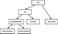
The following table shows more information about these Spark text primitives:
|
Feature |
Spark Label |
RichText |
RichEditableText |
|---|---|---|---|
|
Extends |
UIComponent |
UIComponent |
UIComponent |
|
Uses |
FTE |
TLF |
TLF |
|
Advanced typography |
Y |
Y |
Y |
|
Alpha |
Y |
Y |
Y |
|
Rotation |
Y |
Y |
Y |
|
Bi-directional text |
Y |
Y |
Y |
|
Default formatting with CSS styles |
Y |
Y |
Y |
|
Multiple lines |
Y |
Y |
Y |
|
Multiple formats |
N |
Y |
Y |
|
Multiple paragraphs |
N |
Y |
Y |
|
Text object model |
N |
Y |
Y |
|
Markup language |
N |
Y |
Y |
|
Clickable HTML links |
N |
N |
Y |
|
Inline graphics |
N |
Y |
Y |
|
Hyperlinks |
N |
N |
Y |
|
Scrolling |
N |
N |
Y |
|
Selection |
N |
N |
Y |
|
Editing |
N |
N |
Y |
Styling text controls
<?xml version="1.0"?>
<!-- sparktextcontrols/SimpleStyleExample.mxml -->
<s:Application
    xmlns:fx="http://ns.adobe.com/mxml/2009"
    xmlns:mx="library://ns.adobe.com/flex/mx"
    xmlns:s="library://ns.adobe.com/flex/spark">

    <s:layout>
        <s:VerticalLayout/>
    </s:layout>

    <fx:Style>
        @namespace s "library://ns.adobe.com/flex/spark";
        s|RichText {
            color: #33CC66;
            fontStyle: italic;
            fontSize: 24;
        }
    </fx:Style>

    <s:RichText id="myRET">
        This is the text.
    </s:RichText>

</s:Application>
CSS lets you adjust the styles of all controls of a certain type (using a type selector) or any controls that match a certain class (using a class selector).
<?xml version="1.0"?>
<!-- sparktextcontrols/AnotherStyleExample.mxml -->
<s:Application
    xmlns:fx="http://ns.adobe.com/mxml/2009"
    xmlns:mx="library://ns.adobe.com/flex/mx"
    xmlns:s="library://ns.adobe.com/flex/spark">

    <s:layout>
        <s:VerticalLayout/>
    </s:layout>

    <fx:Style>
        @namespace s "library://ns.adobe.com/flex/spark";
        s|RichText {
            fontSize: 18;
            lineHeight:16;
            paragraphSpaceAfter: 10;
        }
    </fx:Style>

    <s:RichText id="myRET" width="200">
        <s:p>This is my text. There are many others like it, but this one is mine.</s:p>
        <s:p>My text is my best friend.</s:p>
        <s:p>It is my life. I must master it as I must master my life.</s:p>
        <s:p>Without me, my text is useless.</s:p>
    </s:RichText>

</s:Application>
With TLF, you can also manipulate the appearance of text within the TextFlow at compile time or run-time. For more information, see Styling TLF-based text controls.
When styling the TextInput and TextArea controls, you should keep in mind that the text is rendered by a RichEditableText subcomponent. You access properties of this subcomponent with the textDisplay property. For more information, see Subcomponent styles.
Label control
The Label control displays noneditable text. It is the lightest weight of the text controls. The Label control has the following characteristics:
-
The user cannot change the text, but the application can modify it.
-
You can control the alignment and sizing.
-
The control's background is transparent, so the background of the component's container shows through.
-
The control has no borders, so the label appears as text written directly on its background.
-
The control cannot take the focus.
-
The control can display multiple lines.
-
The control cannot be made selectable.
For complete reference information, see the ActionScript 3.0 Reference for Apache Flex.
To create user-editable text fields, use the TextInput or TextArea controls. For more information, see TextInput control and TextArea control.
Creating a Label control
<?xml version="1.0"?>
<!-- sparktextcontrols/SparkLabelControl.mxml -->
<s:Application
    xmlns:fx="http://ns.adobe.com/mxml/2009"
    xmlns:mx="library://ns.adobe.com/flex/mx"
    xmlns:s="library://ns.adobe.com/flex/spark"
    width="150" height="80">

  <s:Label text="Label1"/>

</s:Application>
Sizing a Label control
If you do not specify a width, the Label control automatically resizes when you change the value of the text property.
If you explicitly size a Label control so that it is not large enough to accommodate its text, the text is truncated and terminated by an ellipsis (...). The full text displays as a tooltip when you move the mouse over the Label control. If you also set a tooltip by using the tooltip property, the tooltip is displayed rather than the text.
TextArea control
The TextArea control is a multiline, editable text field with a border and optional scroll bars. The TextArea control supports the rich text rendering capabilities of Flash Player and AIR. The TextArea control dispatches change and textInput events.
The TextArea control supports TLF. The text is rendered by a RichEditableText subcomponent that is defined in the TextArea control's skin class.
For complete reference information, see the ActionScript 3.0 Reference for Apache Flex.
To create a single-line, editable text field, use the TextInput control. For more information, see TextInput control. To create noneditable text fields, use the Label control. For more information, see Label control.
To change the disabled color for the TextArea control, you must edit the TextAreaSkin class.
You can set a TextArea control's editable property to false to prevent editing of the text. You can set a TextArea control's displayAsPassword property to conceal input text by displaying characters as asterisks.
Creating a TextArea control
<?xml version="1.0"?>
<!-- sparktextcontrols/SparkTextAreaControl.mxml -->
<s:Application
    xmlns:fx="http://ns.adobe.com/mxml/2009"
    xmlns:mx="library://ns.adobe.com/flex/mx"
    xmlns:s="library://ns.adobe.com/flex/spark">

    <s:TextArea id="textConfirm"
        width="300" height="100"
        text="Please enter your thoughts here."/>

</s:Application>
Using large amounts of text in the TLF-based TextArea control can cause a degradation in performance. As a result, in some cases, you should use the MX TextArea control. For more information, see MX TextArea control.
Sizing the TextArea control
The TextArea control does not resize to fit the text that it contains.
If the new text exceeds the capacity of a TextArea control and the horizontalScrollPolicy property is set to true (the default value), the control adds a scrollbar.
Using TLF with the TextArea control
The TextArea control supports the advanced text formatting and manipulation of TLF. You add TLF content to the TextArea control by using either the textFlow or content properties.
<?xml version="1.0" encoding="utf-8"?>
<!-- sparktextcontrols/TextAreaTLF.mxml -->
<s:Application name="RichEditableTextExample"
        xmlns:fx="http://ns.adobe.com/mxml/2009"
        xmlns:s="library://ns.adobe.com/flex/spark"
        xmlns:mx="library://ns.adobe.com/flex/mx">

    <s:Panel title="TextArea TLF"
            width="90%" height="90%"
            horizontalCenter="0" verticalCenter="0">
            <s:TextArea id="ta1" textAlign="left" percentWidth="90">
                <s:textFlow>
                    <s:TextFlow>
                        <s:p fontSize="24">TextArea with TLF block</s:p>
                        <s:p>1) Lorem ipsum dolor sit amet, consectetur adipiscing elit.</s:p>
                        <s:p>2) Cras posuere posuere sem, <s:span fontWeight="bold">eu congue orci mattis quis</s:span>.</s:p>
                        <s:p>3) Curabitur <s:span textDecoration="underline">pulvinar tellus</s:span> venenatis ipsum tempus lobortis.<s:br/>
                            <s:span color="0x6600CC">Vestibulum eros velit</s:span>, bibendum at aliquet ut.
                        </s:p>
                    </s:TextFlow>
                </s:textFlow>
            </s:TextArea>
    </s:Panel>

</s:Application>
For more information about using TLF with Spark text controls, see Using Text Layout Framework.
Styling the TextArea control
The TextArea control uses a RichEditableText control as a subcomponent to render the text. You can set the values of inheritable style properties on the TextArea contorl, and those properties are inherited by the RichEditableText subcomponent.
To access the RichEditableText control, you use the textDisplay property. You can access this property to set style properties that are noninheritable; for example, the columnCount and columnGap properties.
There are some exceptions to noninheritable styles. For example, the verticalAlign, lineBreak, and paddingBottom/Left/Right/Top style properties are noninheritable. You can set these properties, which are defined on the RichEditableText control, directly on the TextArea control because the TextAreaSkin class passes them through to the subcomponent.
<?xml version="1.0"?>
<!-- sparktextcontrols/SparkTextAreaStyles.mxml -->
<s:Application
    xmlns:fx="http://ns.adobe.com/mxml/2009"
    xmlns:s="library://ns.adobe.com/flex/spark"
    xmlns:mx="library://ns.adobe.com/flex/mx"
    creationComplete="initApp()">

    <s:layout>
        <s:VerticalLayout/>
    </s:layout>

    <fx:Script>
        <![CDATA[
            /*
            Non-inheriting styles you must set on textDisplay:
                columnCount
                columnGap
                columnWidth

            Non-inheriting styles that you can set on TextArea because
            they are passed to the subcomponent through the TextAreaSkin class:
                lineBreak
                paddingTop/Bottom/Left/Right
                verticalAlign
            */

            import spark.components.RichEditableText;

            private function initApp():void {
                RichEditableText(ta1.textDisplay).setStyle("columnCount", 3);
                RichEditableText(ta1.textDisplay).setStyle("columnWidth", 100);
                RichEditableText(ta1.textDisplay).setStyle("columnGap", 15);
            }
        ]]>
    </fx:Script>

    <s:TextArea id="ta1" height="100" width="400" verticalAlign="bottom" paddingBottom="20">
        This is a text area control. Because the text rendering is done by a RichEditableText subcontrol,
        you have to use the textDisplay property to set the values of some non-inheriting styles.
        Other non-inheriting styles are defined in the skin class and are passed through to the
        subcomponent.
        For inheriting styles, they are inherited by the RichEditableText subcontrol.
    </s:TextArea>

</s:Application>
TextInput control
The Spark TextInput control is a single-line text field that is optionally editable. This control supports TLF. The text is rendered by a RichEditableText subcomponent in its skin class.
For complete reference information, see the ActionScript 3.0 Reference for Apache Flex.
To create a multiline, editable text field, use a TextArea control. For more information, see TextArea control. To create noneditable text fields, use the Label or RichText controls. For more information, see Label control and RichText control.
The TextInput control does not include a label, but you can add one by using a Label control or by nesting the TextInput control in a FormItem container in a Form layout container.
<?xml version="1.0"?>
<!-- sparktextcontrols/TextInputDisabledColors.mxml -->
<s:Application
    xmlns:fx="http://ns.adobe.com/mxml/2009"
    xmlns:mx="library://ns.adobe.com/flex/mx"
    xmlns:s="library://ns.adobe.com/flex/spark">

    <s:VGroup>
        <mx:TextInput enabled="false" text="disabled MX"/>
        <mx:TextInput enabled="true" text="enabled MX"/>

        <s:TextInput enabled="false" text="disabled Spark"/>
        <s:TextInput enabled="true" text="enabled Spark"/>
    </s:VGroup>

</s:Application>
You can set a TextInput control's editable property to false to prevent users from editing the text. You can set a TextInput control's displayAsPassword property to conceal the input text by displaying characters as asterisks.
Creating a TextInput control
<?xml version="1.0"?>
<!-- sparktextcontrols/SparkTextInputControl.mxml -->
<s:Application
    xmlns:fx="http://ns.adobe.com/mxml/2009"
    xmlns:mx="library://ns.adobe.com/flex/mx"
    xmlns:s="library://ns.adobe.com/flex/spark">

  <s:TextInput id="text1" width="100"/>

</s:Application>
You can use the text property to specify a string of raw text in the TextInput control.
Sizing a TextInput control
If you do not specify a width, the TextInput control is automatically sized when the application first completes loading. The size of the TextInput control does not change in response to user input or programmatic text input.
The TextInput control determines the value of its measuredWidth property by using a widthInChars property rather than measuring the text assigned to it, because the text frequently starts out empty. This property is calculated based on the current font size and style.
The value of its measuredHeight property is determined by the height of the current font. If you change the font style or size, then the TextInput control resizes to accomodate the new settings, even if there is no text in the control at the time of the resizing.
Binding to a TextInput control
<?xml version="1.0"?>
<!-- sparktextcontrols/SparkBoundTextInputControl.mxml -->
<s:Application
    xmlns:fx="http://ns.adobe.com/mxml/2009"
    xmlns:mx="library://ns.adobe.com/flex/mx"
    xmlns:s="library://ns.adobe.com/flex/spark">

  <fx:Script><![CDATA[
     [Bindable]
     public var myProp:String="This is the initial String myProp.";
  ]]></fx:Script>

  <s:TextInput text="{myProp}"/>
</s:Application>
In this example, the TextInput control displays the value of the myProp variable. Remember that you must use the [Bindable] metadata tag if the variable changes value and the control must track the changed values; also, the compiler generates warnings if you do not use this metadata tag.
Using TLF with the TextInput control
You can use TLF with a TextInput control by accessing the textDisplay property and casting it as a RichEditableText object. This property points to the underlying RichEditableText object that renders the text in the TextInput control. The RichEditableText object is a subcomponent that is defined in the TextInput control's skin class.
<?xml version="1.0"?>
<!-- sparktextcontrols/TextInputTLF.mxml -->
<s:Application
    xmlns:fx="http://ns.adobe.com/mxml/2009"
    xmlns:mx="library://ns.adobe.com/flex/mx"
    xmlns:s="library://ns.adobe.com/flex/spark"
    creationComplete="initApp()">

    <fx:Declarations>
        <fx:XML id="myXML">
            <div>
                <p>Hello <span fontWeight='bold'>world</span>!</p>
            </div>
        </fx:XML>
    </fx:Declarations>

    <fx:Script>
        import spark.utils.TextFlowUtil;
        import spark.components.RichEditableText;

        private function initApp():void {
            RichEditableText(text1.textDisplay).textFlow = TextFlowUtil.importFromXML(myXML);
        }

    </fx:Script>

    <s:TextInput id="text1" width="100"/>

</s:Application>
For more information about using TLF with Spark text controls, see Using Text Layout Framework.
RichText control
The RichText control is a middleweight Spark text control. It can display richly-formatted text, with multiple character and paragraph formats. However, it is non-interactive: it does not support hyperlinks, scrolling, selection, or editing. If you want a control that supports formatted text plus scrolling, selection, and editing, you can use the RichEditableText control.
For specifying the text, the RichText control supports the textFlow, text, and content properties. If you set the text property, the contents are read in as a String; tags such as <p> and <img> are ignored. If you set the textFlow or content properties, then the contents are parsed by TLF and stored as a TextFlow object. Tags such as <p> and <img> are mapped to instances of the ParagraphElement and InlineGraphicElement classes.
<?xml version="1.0"?>
<!-- sparktextcontrols/RichTextExample.mxml -->
<s:Application
    xmlns:fx="http://ns.adobe.com/mxml/2009"
    xmlns:mx="library://ns.adobe.com/flex/mx"
    xmlns:s="library://ns.adobe.com/flex/spark">

    <s:layout>
        <s:VerticalLayout/>
    </s:layout>

    <!-- You can display simple text with the text property. -->
    <s:RichText text="Hello World!"/>

    <!-- Or the text child tag. -->
    <s:RichText>
        <s:text>
            Hello World!
        </s:text>
    </s:RichText>

    <!-- You can display formatted text with the default property. -->
    <s:RichText>
        Hello <s:span fontSize='16'>BIG NEW</s:span> World!
    </s:RichText>

    <!-- Or the TextFlow child tag. -->
    <s:RichText>
        <s:textFlow>
            <s:TextFlow>
                Hello <s:span fontSize='16'>BIG NEW</s:span> World!
            </s:TextFlow>
        </s:textFlow>
    </s:RichText>

</s:Application>
The text in a RichText control can be horizontally and vertically aligned but it cannot be scrolled. The contents of the control wraps at the right edge of the control's bounds. If the content extends below the bottom, it is clipped. It is also clipped if you turn off wrapping by setting the lineBreak style property to explicit and add content that extends past the right edge of the control.
The contents of a RichText control can be exported to XML using the export() method, which produces XML.
For more information about using TLF with Spark text controls, see Using Text Layout Framework.
RichEditableText control
The RichEditableText is similar to the RichText control in that it can display richly-formatted text, with multiple character and paragraph formats. In addition, the RichEditableText control is interactive: it supports hyperlinks, scrolling, selection, and editing.
The RichEditableText class is similar to the TextArea control, except that it does not have a border, scroll bars, or focus glow.
Creating a RichEditableText control
<?xml version="1.0"?>
<!-- sparktextcontrols/RichEditableTextExample.mxml -->
<s:Application
    xmlns:fx="http://ns.adobe.com/mxml/2009"
    xmlns:mx="library://ns.adobe.com/flex/mx"
    xmlns:s="library://ns.adobe.com/flex/spark">

    <s:layout>
        <s:VerticalLayout/>
    </s:layout>

    <s:RichEditableText height="100" width="200">
        <s:text>
            Hello World!
        </s:text>
    </s:RichEditableText>

</s:Application>
For specifying the text, the RichEditableText control supports the textFlow, text, and content properties. If you set the text property, the contents are read in as a String; tags such as <p> and <img> are ignored. If you set the textFlow or content properties, then the contents are parsed by TLF and stored in a TextFlow object. Tags such as <p> and <img> are mapped to instances of the ParagraphElement and InlineGraphicElement classes.
Inserting and appending text
The RichEditableText control also supports the insertText() and appendText() methods. These methods let you add text to the contents of the control as if you had typed it. The insertText() method either replaces a selection (if there is one) or adds the new text at the current insertion point. The appendText() adds the text to the end of the contents. New text added with these methods is not parsed by the TLF parser; it is read in as a literal string.
The insertText() method does not insert text unless the RichEditableText control has focus. The appendText() appends text even if the RichEditableText control does not have the focus. If the RichEditableText control gets focus by pressing the Tab key, the insertText() method inserts the text before any existing text. If the control gets focus by clicking within the control, the text is inserted at the insertion point.
<?xml version="1.0"?>
<!-- sparktextcontrols/AddTextExample.mxml -->
<s:Application
    xmlns:fx="http://ns.adobe.com/mxml/2009"
    xmlns:mx="library://ns.adobe.com/flex/mx"
    xmlns:s="library://ns.adobe.com/flex/spark">

    <s:layout>
        <s:VerticalLayout/>
    </s:layout>

  <fx:Script>
    <![CDATA[
        [Bindable]
        private var newText:String = "<p>This is the new text.</p>";

        private function insertNewText():void {
            myRET.insertText(newText);
        }

        private function appendNewText():void {
            myRET.appendText(newText);
        }
      ]]>
  </fx:Script>

    <s:RichEditableText id="myRET" height="100" width="200">
        <s:textFlow>
            <s:TextFlow>
                <s:p>This is paragraph 1.</s:p>
                <s:p>This is paragraph 2.</s:p>
            </s:TextFlow>
        </s:textFlow>
    </s:RichEditableText>

    <s:HGroup>
        <s:Button label="Insert New Text" click="insertNewText()"/>
        <s:Button label="Append New Text" click="appendNewText()"/>
    </s:HGroup>

    <s:Label text="New text to add: '{newText}'"/>

</s:Application>
The contents of a RichEditableText control can be exported to XML using the export() method, which produces XML.
Making content selectable and editable
You can make the content of the RichEditableText control selectable by setting the selectable property to true. You can make the content of the RichEditableText control editable by setting the editable property to true.
<?xml version="1.0"?>
<!-- sparktextcontrols/RETEditableAndSelectable.mxml -->
<s:Application
    xmlns:fx="http://ns.adobe.com/mxml/2009"
    xmlns:mx="library://ns.adobe.com/flex/mx"
    xmlns:s="library://ns.adobe.com/flex/spark">

    <s:layout>
        <s:VerticalLayout/>
    </s:layout>

    <s:RichEditableText height="100" width="200"
        editable="true"
        selectable="true">
        <s:text>
            This text is editable and selectable!
        </s:text>
    </s:RichEditableText>

</s:Application>
You can read the selection range with the read-only selectionAnchorPosition and selectionActivePosition properties. You can set the selection with the selectRange() method. For examples of using the selectRange() method, see Selecting text.
Using the getFormatOfRange() and setFormatOfRange() methods
To determine the text formatting on the selection, use the getFormatOfRange() method. This method returns a TextLayoutFormat object. This returns the computed value of every property on the control, including defaults.
var tf:TextLayoutFormat = myTextControl.getFormatOfRange(null,0,0);
tf.fontSize = 16;
tf.fontWeight = FontWeight.BOLD;
myTextControl.setFormatOfRange(tf,0,0);
var tf:TextLayoutFormat = new TextLayoutFormat();
tf.fontSize = 16;
tf.fontWeight = FontWeight.BOLD;
myTextControl.setFormatOfRange(tf,0,0);
Clipping content
<?xml version="1.0"?>
<!-- sparktextcontrols/RETClipAndScroll.mxml -->
<s:Application
    xmlns:fx="http://ns.adobe.com/mxml/2009"
    xmlns:mx="library://ns.adobe.com/flex/mx"
    xmlns:s="library://ns.adobe.com/flex/spark">

    <s:layout>
        <s:VerticalLayout/>
    </s:layout>

    <s:RichEditableText height="100" width="200" clipAndEnableScrolling="true">
        <s:text>
            Hello World!
            Hello World!
            Hello World!
            Hello World!
            Hello World!
            Hello World!
            Hello World!
            Hello World!
            Hello World!
            Hello World!
            Hello World!
            Hello World!
            Hello World!
            Hello World!
            Hello World!
            Hello World!
            Hello World!
            Hello World!
            Hello World!
            Hello World!
            Hello World!
        </s:text>
    </s:RichEditableText>

</s:Application>
Adding scrollbars
<?xml version="1.0"?>
<!-- sparktextcontrols/ScrollableRET.mxml -->
<s:Application
    xmlns:fx="http://ns.adobe.com/mxml/2009"
    xmlns:mx="library://ns.adobe.com/flex/mx"
    xmlns:s="library://ns.adobe.com/flex/spark">

    <s:layout>
        <s:VerticalLayout/>
    </s:layout>

    <s:Scroller>
        <s:RichEditableText height="100" width="200"
            editable="true"
            selectable="true">
            <s:text>
                This text scrolls vertically!
                This text scrolls vertically!
                This text scrolls vertically!
                This text scrolls vertically!
                This text scrolls vertically!
                This text scrolls vertically!
                This text scrolls vertically!
                This text scrolls vertically!
                This text scrolls vertically!
                This text scrolls vertically!
                This text scrolls vertically!
                This text scrolls vertically!
                This text scrolls vertically!
                This text scrolls vertically!
            </s:text>
        </s:RichEditableText>
    </s:Scroller>

    <s:Label text="To enable horizontal scrolling, set lineBreak to explicit:"/>

    <s:Scroller>
        <s:RichEditableText height="100" width="200"
            editable="true"
            selectable="true"
            lineBreak="explicit">
            <s:text>
                This text scrolls horizontally! This text scrolls horizontally! This text scrolls horizontally!
                This text scrolls horizontally! This text scrolls horizontally! This text scrolls horizontally!
            </s:text>
        </s:RichEditableText>
    </s:Scroller>

</s:Application>
The RichEditableText control supports programmatic scrolling with its IViewport interface; it scrolls in response to the mousewheel; and it automatically scrolls as you drag-select or type more text than fits in the control's bounds. The Scroller class lets you put anything that implements the IViewport interface, such as the RichEditableText control, in it to be scrolled.
Selecting ranges
<?xml version="1.0"?>
<!-- sparktextcontrols/SelectScrollableRET.mxml -->
<s:Application
    xmlns:fx="http://ns.adobe.com/mxml/2009"
    xmlns:mx="library://ns.adobe.com/flex/mx"
    xmlns:s="library://ns.adobe.com/flex/spark">

    <s:layout>
        <s:VerticalLayout/>
    </s:layout>

    <fx:Script>
        <![CDATA[
            private function scrollToLine():void {
                myRET.selectRange(440, 471);
                myRET.scrollToRange(440, 471);
            }
        ]]>
    </fx:Script>

    <s:Scroller>
        <s:RichEditableText id="myRET"
            selectionHighlighting="always"
            selectable="true"
            height="100" width="200">
            <s:text>
                This text scrolls vertically1!
                This text scrolls vertically2!
                This text scrolls vertically3!
                This text scrolls vertically4!
                This text scrolls vertically5!
                This text scrolls vertically6!
                This text scrolls vertically7!
                This text scrolls vertically8!
                This text scrolls vertically9!
                This text scrolls vertically10!
                This text scrolls vertically11!
                This text scrolls vertically12!
                This text scrolls vertically13!
                This text scrolls vertically14!
            </s:text>
        </s:RichEditableText>
    </s:Scroller>

    <s:Button label="Select and Scroll to Line 10" click="scrollToLine()"/>

</s:Application>
For more information about using TLF with Spark text controls, see Using Text Layout Framework.
Adding content to text controls
The Spark text-based controls let you set and get text by using the following properties:
- text
-
Plain text without formatting information. All text based controls support this property. For information on using the text property, see Using the text property.
- default
-
Setting the default property is the same as using the textFlow property, and is less verbose. Tags set in the default property are parsed at compile time, just as any other MXML tag.
- textFlow
-
A rich set of tags and TLF formatting. Most Spark text-based controls support this property. You typically use this property if you do not know the contents of the rich text at compile time. For information on using the textFlow property, see Creating TextFlow objects.
Typically, if your text does not contain any formatting, use the text property. If your text contains formatting, use the textFlow or default properties.
You can set formatted text by using the textFlow or default properties, and get it back as a plain text string by using the text property.
If you set more than one content-related property on a Spark text control in ActionScript (such as text and textFlow), the last one set wins. If you set more than one of these properties as an attribute on an MXML tag, however, the winning setter cannot be predicted. The compiler does not guarantee the order in which MXML attributes get applied to a component.
Using the default property
You can use the default property (content) to add text to TLF-based text controls. These controls include the RichText, RichEditableText, and TextArea controls. Text that is added with the default property is parsed by the TLF and stored as a TextFlow object.
The following example sets the default property:
<s:RichText id="myRT" width="450">
	This is text.
</s:RichText>
If you are using TLF with your text controls, then you should generally use the textFlow property to set the contents. The default property is set only, and it is less efficient than the textFlow property. If you set the contents of a text control with the default property, you can then get it with either the textFlow property (gets a TextFlow object) or the text property (gets a plain text String object). For more information about using the textFlow property, see Creating TextFlow objects.
<TextFlow>
	<p>
		<span>
			<contents ... >
When using the default property to add text to a control, you can use a subset of HTML in the content. This list matches the supported tags of the <s:textFlow> tag. For a list of supported tags, see Markup tags supported in TextFlow objects.
The content of the default property is typed as Object because you can set it to a String, a FlowElement, or an Array of Strings and FlowElement objects.
<s:RichText fontSize="12" xmlns="library://ns.adobe.com/flex/spark">
	<span fontWeight="bold">Hello</span>World
</s:RichText>
<s:RichText fontSize="12" xmlns="library://ns.adobe.com/flex/spark">
	<span fontWeight="bold">Hello World</span>
</s:RichText>
<s:RichText fontSize="12" fontWeight="bold">Hello World</s:RichText>
Note that if you use a tag for the default property (such as <span>), you must specify the namespace in the opening tag of the text control. Otherwise, the compiler will not recognize the tag in the text.
<s:RichText fontSize="12" fontWeight="bold" text="Hello World"/>
There is no getter for the default property. Instead, you access the host component's textFlow property to get the parsed contents or the component's text property to get a simple string.
You can add special characters such as ampersands and angle brackets in the default property. To do this, use the same rules as described in Specifying special characters in the text property.
Using the text property
You can use the text property to specify the text string that appears in a text control or to get the text in the control as a plain text String. All text-based Flex controls support a text property. When you set this property, any tags (such as HTML) in the text string appear in the control as literal text.
The interpretation of \r, \n and \r\n as paragraph separators is the only interpretation that occurs when setting the value of the text property.
<s:RichText fontSize="12" fontWeight="bold" text="Hello World"/>
For Spark controls that support TLF, you can set the text and then manipulate it with the TLF API. You can access nodes of the text object model and format parts of the content.
The following code line uses a text property to specify Label text:
<s:Label text="This is a simple text label"/>
<s:Label>
	<s:text>
	This is a simple text label.
	</s:text>
</s:Label>
The way you specify special characters, including quotation marks, greater than and less than signs, and apostrophes, depends on whether you use them in MXML tags or in ActionScript. It also depends on whether you specify the text directly or wrap the text in a CDATA section.
Specifying special characters in the text property
The following rules specify how to include special characters in the text property of a text control MXML tag, either in a property assignment, such as text="the text", or in the body of a <s:text> subtag.
- In standard text
-
The following rules determine how you use special characters if you do not use a CDATA section:
-
To use the special characters left angle bracket (<), right angle bracket (>), and ampersand (&), insert the XML character entity equivalents of <, >, and &, respectively. You can also use " and ' for double-quotation marks (") and single-quotation marks ('), and you can use numeric character references, such as ¥ for the Yen mark (¥). Do not use any other named character entities; Flex treats them as literal text.
-
You cannot use the character that encloses the property text string inside the string. If you surround the string in double-quotation marks ("), use the escape sequence \" for any double-quotation marks in the string. If you surround the string in single-quotation marks (') use the escape sequence \' for any single-quotation marks in the string. You can use single-quotation marks inside a string that is surrounded in double-quotation marks, and double-quotation marks inside a string that is surrounded in single-quotation marks.
-
Flex text controls ignore escape characters such as \t or \n in the text property. They ignore or convert to spaces, tabs and line breaks, depending on whether you are specifying a property assignment or a <s:text> subtag. To include line breaks, put the text in a CDATA section.
The following code example uses the text property with standard text:<?xml version="1.0"?> <!-- sparktextcontrols/SparkStandardText.mxml --> <s:Application xmlns:fx="http://ns.adobe.com/mxml/2009" xmlns:mx="library://ns.adobe.com/flex/mx" xmlns:s="library://ns.adobe.com/flex/spark" height="400"> <s:layout> <s:VerticalLayout/> </s:layout> <s:Label width="400" text="This string contains a less than, <, greater than, >, ampersand, &, apostrophe, ', and quotation mark "."/> <s:Label width="400" text='This string contains a less than, <, greater than, >, ampersand, &, apostrophe, ', and quotation mark, ".'/> <s:Label width="400"> <s:text> This string contains a less than, <, greater than, >, ampersand, &, apostrophe, ', and quotation mark, ". </s:text> </s:Label> </s:Application>The resulting application contains three almost identical text controls, each with the following text. The first two controls, however, convert any tabs in the text to spaces. The third one has leading and trailing newlines and converts any tabs to newlines.
This string contains a less than, <, greater than, >, ampersand, &,apostrophe, ', and quotation mark, ".
-
- In a CDATA section
-
If you wrap the text string in the CDATA tag, the following rules apply:
-
You cannot use a CDATA section in a property assignment statement in the text control opening tag; you must define the property in a <s:text> child tag.
-
Text inside the CDATA section appears as it is entered, including white space characters. Use literal characters, such as " or < for special characters, and use standard return and tab characters. Character entities, such as >, and backslash-style escape characters, such as \n, appear as literal text.
The following code example follows these CDATA section rules:<?xml version="1.0"?> <!-- sparktextcontrols/SparkTextCDATA.mxml --> <s:Application xmlns:fx="http://ns.adobe.com/mxml/2009" xmlns:mx="library://ns.adobe.com/flex/mx" xmlns:s="library://ns.adobe.com/flex/spark" width="500"> <s:Label width="100%"> <s:text> <![CDATA[ This string contains a less than, <, greater than, >, ampersand, &, apostrophe, ', return, tab. and quotation mark, ". ]]> </s:text> </s:Label> </s:Application>The displayed text appears on three lines, as follows:
	 This string contains a less than, <, greater than, >,
	 ampersand, &, apostrophe, ', return,
	 tab. and quotation mark, ".
-
Specifying special characters in ActionScript
The following rules specify how to include special characters in a text control when you specify the control's text property value in ActionScript; for example, in an initialization function, or when assigning a string value to a variable that you use to populate the property:
-
You cannot use the character that encloses the text string inside the string. If you surround the string in double-quotation marks ("), use the escape sequence \" for any double-quotation marks in the string. If you surround the string in single-quotation marks ('), use the escape sequence \' for any single-quotation marks in the string.
-
Use backslash escape characters for special characters, including \t for the tab character, and \n or \r for a return/line feed character combination. You can use the escape character \" for the double-quotation mark and \' for the single-quotation mark.
-
In standard text, but not in CDATA sections, you can use the special characters left angle bracket (<), right angle bracket (>), and ampersand (&), by inserting the XML character entity equivalents of <, >, and &, respectively. You can also use " and ' for double-quotation marks ("), and single-quotation marks ('), and you can use numeric character references, such as ¥ for the Yen mark (¥). Do not use any other named character entities; Flex treats them as literal text.
-
In CDATA sections only, do not use character entities or references, such as < or ¥ because Flex treats them as literal text. Instead, use the actual character, such as <.
<?xml version="1.0"?>
<!-- sparktextcontrols/SparkInitText.mxml -->
<s:Application
xmlns:fx="http://ns.adobe.com/mxml/2009"
xmlns:mx="library://ns.adobe.com/flex/mx"
xmlns:s="library://ns.adobe.com/flex/spark"
initialize="initText()">
<fx:Script>
public function initText():void {
//The following is on one line.
myText.text="This string contains a return, \n, tab, \t, and quotation mark, \". " +
"This string also contains less than, <, greater than, >, " +
"ampersand, &, and apostrophe, ', characters.";
}
</fx:Script>
<s:RichText width="450" id="myText" tabStops="100 200 300 400"/>
</s:Application>
<?xml version="1.0"?>
<!-- sparktextcontrols/SparkVarText.mxml -->
<s:Application
    xmlns:fx="http://ns.adobe.com/mxml/2009"
    xmlns:mx="library://ns.adobe.com/flex/mx"
    xmlns:s="library://ns.adobe.com/flex/spark">

    <fx:Script>
        <![CDATA[
            [Bindable]
            //The following is on one line.
            public var myText:String ="This string contains a return, \n, tab, \t, and quotation mark, \". This string also contains less than, <, greater than, <, ampersand, <;, and apostrophe, ', characters.";
        ]]>
    </fx:Script>

    <s:RichText width="450" text="{myText}" tabStops="100 200 300 400"/>

</s:Application>
The displayed text for each example appears on three lines. The first line ends at the return specified by the \n character. The remaining text wraps onto a third line because it is too long to fit on a single line. (Note: When you specify a tab character, you should be sure to create tab stops with the tabStops style property. Otherwise, the tab will instead be rendered as a carriage return. The RichText, RichEditableText, and Spark TextArea controls support the tabStops property, but the Label control does not.)
 This string contains a return,
 , tab,                   	, and quotation mark, ". This string also contains less than, <,
 greater than, >, ampersand, &, and apostrophe, ', characters.
Selecting text
The editable text controls provide properties and methods to select text regions and get the contents of the selections.
Creating a selection
-
RichEditableText
-
TextInput
-
TextArea
-
All controls that use these controls as a subcomponent
The selectable text controls provide the selectRange() method, which selects a range of text. You specify the zero-based indexes of the start character and the position immediately after the last character you want to select.
<?xml version="1.0"?>
<!-- sparktextcontrols/SetSelectionTest.mxml -->
<s:Application
    xmlns:fx="http://ns.adobe.com/mxml/2009"
    xmlns:mx="library://ns.adobe.com/flex/mx"
    xmlns:s="library://ns.adobe.com/flex/spark">

    <s:layout>
        <s:VerticalLayout/>
    </s:layout>

    <fx:Script>
        <![CDATA[
            private function selectText():void {
                sparkTextArea.selectRange(0, 10);
                sparkTextInput.selectRange(0, 10);
                sparkRET.selectRange(0, 10);
            }
        ]]>
    </fx:Script>

    <s:TextArea id="sparkTextArea"
        selectionHighlighting="always"
        selectable="true"
        text="Spark TextArea control."/>
    <s:TextInput id="sparkTextInput"
        selectionHighlighting="always"
        selectable="true"
        text="Spark TextInput control."/>
    <s:RichEditableText id="sparkRET"
        selectionHighlighting="always"
        selectable="true"
        text="Spark RichEditableText control."/>

    <s:Button click="selectText()" label="Select Text"/>

</s:Application>
To determine when the selection is highlighted, you can use the selectionHighlighting property. Possible values are always, whenFocused, and whenActive.
<?xml version="1.0"?>
<!-- sparktextcontrols/SelectAllExample.mxml -->
<s:Application
    xmlns:fx="http://ns.adobe.com/mxml/2009"
    xmlns:mx="library://ns.adobe.com/flex/mx"
    xmlns:s="library://ns.adobe.com/flex/spark">

    <s:layout>
        <s:VerticalLayout/>
    </s:layout>

    <fx:Script>
        <![CDATA[
            private function selectText(e:Event):void {
                e.currentTarget.selectAll();
            }
        ]]>
    </fx:Script>

    <s:TextArea id="sparkTextArea"
        text="Spark TextArea control." focusIn="selectText(event)"/>
    <s:TextInput id="sparkTextInput" text="Spark TextInput control." focusIn="selectText(event)"/>

</s:Application>
TLF-based text controls have additional APIs that let you select text in different ways. For example, you can programmatically select a particular SpanElement object within a TextFlow, depending on where the cursor is. To do this, you walk the text object model's tree of elements (or leaves) and compare the cursor's position against each leaf element's character range.
<?xml version="1.0"?>
<!-- sparktextcontrols/SparkSelectionExample.mxml -->
<s:Application
    xmlns:fx="http://ns.adobe.com/mxml/2009"
    xmlns:mx="library://ns.adobe.com/flex/mx"
    xmlns:s="library://ns.adobe.com/flex/spark">

    <s:layout>
        <s:VerticalLayout/>
    </s:layout>

    <fx:Script>
        <![CDATA[
            import flashx.textLayout.elements.TextRange;
            import flashx.textLayout.elements.*;

            private function selectSomeText(e:Event):void {
                /* Get the location of the cursor. This is the character position of the
                   cursor in the RichEditableText control after the user clicks on it. */
                var activePos:int = richTxt1.selectionActivePosition;

                /* Get the first SpanElement in the TextFlow. */
                var leaf:SpanElement = new SpanElement();
                leaf = SpanElement(richTxt1.textFlow.getFirstLeaf());

                /* Get the start and end index values for the first SpanElement. */
                var spanStart:int = leaf.getParagraph().parentRelativeStart;
                var spanEnd:int = leaf.getParagraph().parentRelativeEnd;

                /* For the first SpanElement, if the cursor position falls within the
                   SpanElement's character range, then select the entire SpanElement. */
                if (activePos >= spanStart && activePos <= spanEnd) {
                    selectSpan(spanStart, spanEnd);
                    return;
                }

                /* Perform the same operations for each leaf in the TextFlow. */
                while(leaf = SpanElement(leaf.getNextLeaf())) {
                    spanStart = leaf.getParagraph().parentRelativeStart;
                    spanEnd = leaf.getParagraph().parentRelativeEnd;
                    if (activePos >= spanStart && activePos <= spanEnd) {
                        selectSpan(spanStart, spanEnd);
                        return;
                    }
                }
            }

            private function selectSpan(i1:int, i2:int):void {
                richTxt1.selectRange(i1, i2);
            }

        ]]>
    </fx:Script>

    <s:Panel>
        <s:RichEditableText id="richTxt1" click="selectSomeText(event)" selectable="true" editable="true" textAlign="justify" percentWidth="100">
            <s:textFlow>
                <s:TextFlow>
                    <s:p><s:span>1) Lorem ipsum dolor sit amet, consectetur adipiscing elit.</s:span></s:p>
                    <s:p><s:span>2) Cras posuere posuere sem, eu congue orci mattis quis.</s:span></s:p>
                    <s:p><s:span>3) Curabitur pulvinar tellus venenatis ipsum tempus lobortis.</s:span></s:p>
                </s:TextFlow>
            </s:textFlow>
        </s:RichEditableText>
    </s:Panel>

</s:Application>
Rather than iterating over all the leaf elements in the TextFlow object, you can also use the TextFlow class's findLeaf() method. This method lets you find an element based on a relative position. For an example of using the findLeaf() method, see Navigating TextFlow objects.
Getting a selection
You get the anchor and active positions of the selected text to get a text control's current selection. You then get the value of the characters between those positions.
To get the selected text in a text control, you use the selectionAnchorPosition and selectionActivePosition properties of the text control. These properties define the position at the start of the selection and at the end of the selection, respectively. You use the substring() method on the contents of the control, and pass these positions to identify the range of characters to return.
<?xml version="1.0"?>
<!-- sparktextcontrols/SparkTraceSelectionRanges.mxml -->
<s:Application
    xmlns:fx="http://ns.adobe.com/mxml/2009"
    xmlns:mx="library://ns.adobe.com/flex/mx"
    xmlns:s="library://ns.adobe.com/flex/spark"
    creationComplete="initApp()">

    <s:layout>
        <s:VerticalLayout/>
    </s:layout>

    <fx:Script>
        <![CDATA[
            import mx.core.IUITextField;
            import flashx.textLayout.elements.TextRange;

            private function initApp():void {
                sparkRET.selectRange(0, 10);
            }

            private function getTextSelection():void {
                var anchorPos:int = sparkRET.selectionAnchorPosition;
                var activePos:int = sparkRET.selectionActivePosition;

                myLabel.text = "Current Selection: \"" + sparkRET.text.substring(anchorPos, activePos) + "\"";
            }
        ]]>
    </fx:Script>

    <s:RichEditableText id="sparkRET"
        selectionHighlighting="always"
        selectable="true"
        text="Spark RichEditableText control."/>

    <s:Button click="getTextSelection()" label="Show Current Selection"/>

    <s:Label id="myLabel"/>

</s:Application>
Using Text Layout Framework
The Text Layout Framework (TLF) is a class library built on top of the Flash Text Engine (FTE). The FTE, available in Flash Player 10 and Adobe AIR™ 1.5, adds advanced text capabilities to Flash Player. FTE provides a set of low-level APIs for libraries that leverage these capabilities. The FTE classes are in the flash.text.engine package. In most cases, you will not use these classes directly.
The TLF classes are in the flashx.textLayout.* package. You are likely to use the TLF classes when you apply styles with HTML markup to text in text controls that support TLF. These controls include the RichText and RichEditableText controls, as well as the Spark TextArea control.
The primary difference between most Spark and MX text-based controls is the control over the formatting. For Spark controls, the formatting is provided by either FTE or TLF. This gives you a great deal of control over the text formatting, including support for HTML tags, columns, and bi-directional text.
TLF is not used by Flex text controls in mobile applications. When you create a mobile application, the mobile theme is automatically applied. As a result, text-based controls use the mobile skins, which do not support TLF. You can still use some of the same text controls, but be aware that TLF is not used when the mobile theme is applied.
Features of TLF
Text Layout Framework (TLF) is a class library built on top of FTE. It provides high level text functionality, including:
-
Bi-directional text, vertical text, and over 30 writing systems, including Arabic, Hebrew, Chinese, Japanese, Korean, Thai, Lao, and the major writing systems of India
-
Selecting, editing, and flowing text across multiple columns and linked containers, as well as around inline images
-
Vertical text, Tate-Chu-Yoko (horizontal within vertical text), and justifiers for East Asian typography
-
Rich typographical controls, including kerning, ligatures, typographic case, digit case, digit width, and discretionary hyphens
-
Cut, copy, paste, undo, and standard keyboard and mouse controls for editing
-
Rich developer APIs to manipulate text content, layout, and markup and to create custom text components
-
Robust list support including custom markers and numbering formats
-
Inline images and positioning rules
When you add text to a control that uses TLF, the text is stored as a hierarchical tree of objects. The root element of this tree is the TextFlow class. Each node in the tree is an instance of a class defined in the flashx.textLayout.elements package. This tree is known as the text object model. The text object model is a subset of the FXG specification.
In the text object model, concepts such as paragraphs, spans, and hyperlinks are not represented as formats that affect the appearance of character runs in a single, central text string. Instead they are represented by runtime-accessible ActionScript objects, with their own properties, methods, and events (in some cases).
-
Paragraphs (ParagraphElement)
-
Images (InlineGraphicElement)
-
Hyperlinks (LinkElement)
-
Spans (SpanElement)
-
TCY blocks (TCYElement)
-
Tabs (TabElement) and line breaks (BreakElement)
-
Lists (ListElement)
If a Spark text control supports the textFlow property, then you can use TLF to format and programmatically interact with the contents of that text control. If the control supports only the text property for its content, then you can only use a simple string for the text. The text does not get parsed into the text object model. If an MX control supports the htmlText property, then you can use a subset of HTML tags to format the text, but its content is still a simple string that does not support the formal text object model.
You use the textFlow property when you set the value of the text at run time. The content of the textFlow property is strongly typed as a TextFlow object rather than an Object.
You use the default property when you set the value of the property at compile time. This property takes a generic Object and converts it to a TextFlow. In general, you should avoid using the default property when the textFlow property is available.
The Spark versions of the TextArea and TextInput classes support TLF, as do the RichText and RichEditableText controls. The Spark Label control supports FTE. The default MX controls do not support TLF. However, it is possible to use TLF with some MX controls. For more informations, see Using FTE in MX controls.
Creating TextFlow objects
The text object model is the tree that is created when you add content to a text-based control that supports TLF. This tree is defined by the TextFlow class.
When creating a TextFlow object, you can use the classes in the flashx.textLayout.elements.* package to provide formatting and additional functionality. These classes include DivElement, ParagraphElement, InlineGraphicElement, LinkElement, SpanElement, TabElement, BreakElement, and TCYElement.
-
Using the default property
-
Using the <s:textFlow> child tag
-
Importing content with the TextFlowUtil class
-
Using ActionScript
Using the default property
You can create a TextFlow object by adding content to a text-based's default property. When you do this, Flex creates a TextFlow object that defines the text object model for you. For more information, see Using the default property.
Creating a TextFlow object with child tags
You can also use the text control's <s:textFlow> child tag to explicitly create a TextFlow object. This lets you structure the contents of the text control by using the supported TLF tags such as <p>, <div> and <span>.
<s:text_control>
	<s:textFlow>
		<s:TextFlow>
			<.../>
		</s:TextFlow>
	</s:textFlow>
</s:text_control>
<s:text_control>
	<.../>
</s:text_control>
<?xml version="1.0"?>
<!-- sparktextcontrols/CreateTextFlowChildTags.mxml -->
<s:Application
    xmlns:fx="http://ns.adobe.com/mxml/2009"
    xmlns:mx="library://ns.adobe.com/flex/mx"
    xmlns:s="library://ns.adobe.com/flex/spark">

    <s:layout>
        <s:VerticalLayout/>
    </s:layout>

    <s:RichEditableText id="richTxt1" textAlign="justify" percentWidth="100">
        <s:textFlow>
            <s:TextFlow>
                <s:p fontSize="24">TextFlow Child Tag</s:p>
                <s:p>1) Lorem ipsum dolor sit amet, consectetur adipiscing elit.</s:p>
                <s:p>2) Cras posuere posuere sem, eu congue orci mattis quis.</s:p>
                <s:p>3) Curabitur pulvinar tellus venenatis ipsum tempus lobortis.</s:p>
            </s:TextFlow>
        </s:textFlow>
    </s:RichEditableText>

    <s:RichEditableText id="richTxt2" textAlign="justify" percentWidth="100">
        <s:p fontSize="24">Default Property</s:p>
        <s:p>1) Lorem ipsum dolor sit amet, consectetur adipiscing elit.</s:p>
        <s:p>2) Cras posuere posuere sem, eu congue orci mattis quis.</s:p>
        <s:p>3) Curabitur pulvinar tellus venenatis ipsum tempus lobortis.</s:p>
    </s:RichEditableText>

</s:Application>
<?xml version="1.0"?>
<!-- sparktextcontrols/TextFlowNamespace.mxml -->
<s:Application
    xmlns:fx="http://ns.adobe.com/mxml/2009"
    xmlns:mx="library://ns.adobe.com/flex/mx"
    xmlns:s="library://ns.adobe.com/flex/spark">

    <s:layout>
        <s:VerticalLayout/>
    </s:layout>

    <s:RichEditableText id="richTxt1" textAlign="justify" percentWidth="100"  xmlns="library://ns.adobe.com/flex/spark">
        <textFlow>
            <TextFlow>
                <p fontSize="24">TextFlow Child Tag</p>
                <p>1) Lorem ipsum dolor sit amet, consectetur adipiscing elit.</p>
                <p>2) Cras posuere posuere sem, eu congue orci mattis quis.</p>
                <p>3) Curabitur pulvinar tellus venenatis ipsum tempus lobortis.</p>
            </TextFlow>
        </textFlow>
    </s:RichEditableText>

</s:Application>
Creating a TextFlow object with the TextFlowUtil class
-
importFromString()
-
importFromXML()
<?xml version="1.0"?>
<!-- sparktextcontrols/TextFlowMarkup.mxml -->
<s:Application
    xmlns:fx="http://ns.adobe.com/mxml/2009"
    xmlns:mx="library://ns.adobe.com/flex/mx"
    xmlns:s="library://ns.adobe.com/flex/spark"
    creationComplete="doSomething()">
    <s:layout>
        <s:VerticalLayout/>
    </s:layout>

    <fx:Script><![CDATA[
        import flashx.textLayout.elements.TextFlow;
        import spark.utils.TextFlowUtil;

        private function doSomething():void {
            var markup:String = "<p>This is paragraph 1.</p><p>This is paragraph 2.</p>";
            var flow:TextFlow = TextFlowUtil.importFromString(markup);
            myST.textFlow = flow;
        }
    ]]></fx:Script>

    <s:RichText id="myST" width="175"/>

</s:Application>
You can add also import XML by
using the TextFlowUtil class's importFromXML() method.
Any XML that uses valid TLF markup can be passed into a TextFlow.
This includes content returned by an HTTPService call, XML defined
in the application file itself, or XML defined in an external file. <?xml version="1.0" encoding="utf-8"?>
<!-- sparktextcontrols/ExternalXMLFile.mxml -->
<s:Application name="Spark_RichText_text_test"
xmlns:fx="http://ns.adobe.com/mxml/2009"
xmlns:s="library://ns.adobe.com/flex/spark"
xmlns:mx="library://ns.adobe.com/flex/mx">
<fx:Script>
<![CDATA[
import spark.utils.TextFlowUtil;
XML.ignoreWhitespace = false;
]]>
</fx:Script>
<fx:Declarations>
<fx:XML id="textFlowAsXML" source="externalTextFlow1.xml" />
</fx:Declarations>
<s:RichText id="richTxt"
textFlow="{TextFlowUtil.importFromXML(textFlowAsXML)}"
horizontalCenter="0" verticalCenter="0" />
</s:Application>
<?xml version="1.0" encoding="utf-8"?>
<!-- http://blog.flexexamples.com/2009/08/11/setting-text-in-a-spark-richtext-control-in-flex-4/ -->
<TextFlow xmlns="http://ns.adobe.com/textLayout/2008" whiteSpaceCollapse="preserve">
    <p><span>The quick brown </span> <span fontWeight="bold">fox jumps over</span> <span> the lazy dogg.</span></p>
</TextFlow>
If the first tag in an imported XML object is not a <s:TextFlow> tag, then the parser inserts one for you. If the first tag is a <s:TextFlow> tag, then you must also define the "http://ns.adobe.com/textLayout/2008" namespace in that tag.
The parser converts the TLF tags to TLF classes (such as SpanElement or DivElement) in the new TextFlow object.
This example used with permission from Peter deHaan of the Flex Examples blog.
Creating a TextFlow object with the TextConverter class
You can use the TextConverter class to import content into a TextFlow. This is a little more advanced than using the TextFlowUtil methods to create a TextFlow object. Those methods act as wrappers around the TextConverter class. When you import text with the TextConverter class's importToFlow() method, however, you can specify the format of the text. This determines how the content is stored.
-
HTML
-
Plain text
-
TLF
If you specify the TLF format, then the imported text is used to generate a text object model. If you specify plain text, then the text is not interpreted, but instead stored as a simple text string. If you specify HTML format, then the HTML tags in the text are mapped to TLF classes (for example, <p> is mapped to a ParagraphElement object in the text object model).
<?xml version="1.0"?>
<!-- sparktextcontrols/AddingContentAsXML.mxml -->
<s:Application
    xmlns:fx="http://ns.adobe.com/mxml/2009"
    xmlns:mx="library://ns.adobe.com/flex/mx"
    xmlns:s="library://ns.adobe.com/flex/spark">

    <s:layout>
        <s:VerticalLayout/>
    </s:layout>

    <fx:Script>
        <![CDATA[
        import spark.utils.TextFlowUtil;
        import flashx.textLayout.elements.*;
        import flashx.textLayout.conversion.*;
        import mx.utils.*;

        private var xml:XML = <TextFlow xmlns='http://ns.adobe.com/textLayout/2008'><p><span>This is a span</span></p></TextFlow>;

        private function addContent():void {
            myRET.textFlow= TextConverter.importToFlow(xml, TextConverter.TEXT_LAYOUT_FORMAT);
        }
        ]]>
    </fx:Script>

    <s:RichEditableText id="myRET" height="100" width="200"/>

    <s:Button click="addContent()" label="Add Content"/>
</s:Application>
<?xml version="1.0" encoding="utf-8"?>
<!-- sparksparktextcontrols/ImportToFlowExample.mxml -->
<s:Application xmlns:fx="http://ns.adobe.com/mxml/2009"
        xmlns:s="library://ns.adobe.com/flex/spark"
        xmlns:mx="library://ns.adobe.com/flex/mx">

    <fx:Script>
        <![CDATA[
            import flashx.textLayout.conversion.TextConverter;

            XML.ignoreWhitespace = false;
        ]]>
    </fx:Script>

    <s:layout>
        <s:VerticalLayout/>
    </s:layout>

    <fx:Declarations>
        <!-- Define a String to use with HTML and plain text format. -->
        <fx:String id="htmlTextAsHTML"><![CDATA[<p>Hello <b>world!</b></p>]]></fx:String>

        <!-- Define an XML object to use with TLF format. -->
        <fx:XML id="tfTextAsTextFlow">
            <TextFlow xmlns="http://ns.adobe.com/textLayout/2008">
                <p>Hello <span fontWeight="bold">world!</span></p>
            </TextFlow>
        </fx:XML>
    </fx:Declarations>

    <s:RichText id="richTxt"
            textFlow="{TextConverter.importToFlow(htmlTextAsHTML, TextConverter.TEXT_FIELD_HTML_FORMAT)}"
            horizontalCenter="0" verticalCenter="0" />

     <s:RichText id="richTxt2"
             textFlow="{TextConverter.importToFlow(htmlTextAsHTML, TextConverter.PLAIN_TEXT_FORMAT)}"
             horizontalCenter="0" verticalCenter="0" />

     <s:RichText id="richTxt3"
             textFlow="{TextConverter.importToFlow(tfTextAsTextFlow, TextConverter.TEXT_LAYOUT_FORMAT)}"
             horizontalCenter="0" verticalCenter="0" />

</s:Application>
-
The first tag must be a <s:TextFlow> tag. The parser will not insert one for you as it does with the TextFlowUtil.importFromXML() or TextFlowUtil.importFromString() methods.
-
The first tag must specify a namespace for the imported text. The namespace is "http://ns.adobe.com/textLayout/2008".
-
Subsequent tags must be supported by the TextFlow class. For a list of supported tags, see Markup tags supported in TextFlow objects.
The TextConverter class also lets you export a TextFlow object's content in a variety of formats.
Creating a TextFlow object in ActionScript
You can create TextFlow objects that are used by TLF-based text controls in ActionScript.
<?xml version="1.0"?>
<!-- sparktextcontrols/SimpleTextModelExample.mxml -->
<s:Application
    xmlns:fx="http://ns.adobe.com/mxml/2009"
    xmlns:mx="library://ns.adobe.com/flex/mx"
    xmlns:s="library://ns.adobe.com/flex/spark"
    creationComplete="initApp()">

    <s:layout>
        <s:VerticalLayout/>
    </s:layout>

    <fx:Script>
        import flashx.textLayout.elements.*;

        private var textFlow:TextFlow = new TextFlow();
        private var paragraph1:ParagraphElement = new ParagraphElement();
        private var paragraph2:ParagraphElement = new ParagraphElement();
        private var span1:SpanElement = new SpanElement();
        private var span2:SpanElement = new SpanElement();

        private function initApp():void {
            span1.text = "This is paragraph one in myRET.";
            span2.text = "This is paragraph two in myRET.";

            paragraph1.addChild(span1);
            paragraph2.addChild(span2);

            textFlow.addChild(paragraph1);
            textFlow.addChild(paragraph2);

            myRET.textFlow = textFlow;
        }
    </fx:Script>

    <s:RichEditableText id="myRET" height="100" width="200"/>

</s:Application>
Markup tags supported in TextFlow objects
The TLF parser converts supported markup elements to TLF classes so that they can be used in the text object model. These markup elements are similar to the HTML tags of the same names. For example, if you specify a <p> tag in your text control's content, then the parser converts it to a ParagraphElement in the control's TextFlow.
|
Element |
Class |
Description |
|---|---|---|
|
div |
DivElement |
A division of text; can contain only div, list, or p elements. |
|
p |
ParagraphElement |
A paragraph; can contain any element except div, list, or li. |
|
a |
LinkElement |
A hypertext link, also known as an anchor; can contain the tcy, span, img, tab, g, and br elements. This is the only class in the text object model that supports Flex events. |
|
tcy |
TCYElement |
A run of horizontal text, used in vertical text such as Japanese; can contain the a, span, img, tab, g, or br elements. |
|
span |
SpanElement |
A run of text in a paragraph; cannot contain other elements. |
|
img |
InlineGraphicElement |
An image in a paragraph element. |
|
tab |
TabElement |
A tab character. |
|
br |
BreakElement |
A break character; text continues on the next line, but does not start a new paragraph. |
|
list |
ListElement |
An ordered or unordered list. Can be simple list or nested. You can customize the bullets. Can contain li elements (ListItemElement) or other list elements. |
|
li |
ListItemElement |
List items within a list element. Can be ordered or unordered, nested or flat lists. You can customize the markers as well as other settings of each list item. |
|
g |
SubParagraphGroupElement |
A group element. Used for grouping elements in a paragraph. This lets you nest elements below the paragraph level. |
Navigating TextFlow objects
The TLF API provides methods and properties that let you navigate the text object model after it is created. You can use this API to perform actions on a individual leaves or the entire tree.
<?xml version="1.0"?>
<!-- sparktextcontrols/IterateOverLeaves.mxml -->
<s:Application
    xmlns:fx="http://ns.adobe.com/mxml/2009"
    xmlns:mx="library://ns.adobe.com/flex/mx"
    xmlns:s="library://ns.adobe.com/flex/spark">

    <s:layout>
        <s:VerticalLayout/>
    </s:layout>

    <fx:Script>
        <![CDATA[
            import flashx.textLayout.elements.*;

            private function copyContents():void {
                /* Get the first leaf in the TextFlow. */
                var leaf:SpanElement = new SpanElement();
                leaf = SpanElement(richTxt1.textFlow.getFirstLeaf());

                /* Write the contents of the first leaf to the second RET control. */
                richTxt2.text = "LEAF:" + leaf.text + "\n";

                /* Iterate over the remaining leaves and write their contents
                   to the second RET control. */
                while(leaf = SpanElement(leaf.getNextLeaf())) {
                    richTxt2.text += "LEAF:" + leaf.text + "\n";
                }
            }

        ]]>
    </fx:Script>

    <s:Panel>
        <s:RichEditableText id="richTxt1" selectable="true" editable="true" textAlign="justify" percentWidth="100">
            <s:textFlow>
                <s:TextFlow>
                    <s:p><s:span>1) Lorem ipsum dolor sit amet, consectetur adipiscing elit.</s:span></s:p>
                    <s:p><s:span>2) Cras posuere posuere sem, eu congue orci mattis quis.</s:span></s:p>
                    <s:p><s:span>3) Curabitur pulvinar tellus venenatis ipsum tempus lobortis.</s:span></s:p>
                </s:TextFlow>
            </s:textFlow>
        </s:RichEditableText>
    </s:Panel>

    <s:HGroup>
        <s:Button label="Copy Contents" click="copyContents()"/>
        <s:Button label="Clear" click="richTxt2.text=''"/>
    </s:HGroup>

    <s:Panel>
        <s:RichEditableText id="richTxt2" textAlign="justify" percentWidth="100"/>
    </s:Panel>

</s:Application>
<?xml version="1.0"?>
<!-- sparktextcontrols/FindLeafExample.mxml -->
<s:Application
    xmlns:fx="http://ns.adobe.com/mxml/2009"
    xmlns:mx="library://ns.adobe.com/flex/mx"
    xmlns:s="library://ns.adobe.com/flex/spark">

    <s:layout>
        <s:VerticalLayout/>
    </s:layout>

    <fx:Script>
        <![CDATA[
            import flashx.textLayout.elements.TextRange;
            import flashx.textLayout.elements.*;

            private function selectEntireLeaf(e:Event):void {
                /* Get the location of the cursor. This is the character position of the
                   cursor in the RichEditableText control after the user clicks on it. */
                var activePos:int = richTxt1.selectionActivePosition;

                /* Change the color of the entire leaf under the cursor position. */
                var leaf:SpanElement = richTxt1.textFlow.findLeaf(activePos) as SpanElement;
                leaf.color = 0x00FF33;
            }
        ]]>
    </fx:Script>

    <s:Panel>
        <s:RichEditableText id="richTxt1" click="selectEntireLeaf(event)" selectable="true" editable="true" textAlign="justify" percentWidth="100">
            <s:textFlow>
                <s:TextFlow>
                    <s:p><s:span>1) Lorem ipsum dolor sit amet, consectetur adipiscing elit.</s:span></s:p>
                    <s:p><s:span>2) Cras posuere posuere sem, eu congue orci mattis quis.</s:span></s:p>
                    <s:p><s:span>3) Curabitur pulvinar tellus venenatis ipsum tempus lobortis.</s:span></s:p>
                </s:TextFlow>
            </s:textFlow>
        </s:RichEditableText>
    </s:Panel>

</s:Application>
<?xml version="1.0"?>
<!-- sparktextcontrols/ManipulateTextModelExample.mxml -->
<s:Application
    xmlns:fx="http://ns.adobe.com/mxml/2009"
    xmlns:mx="library://ns.adobe.com/flex/mx"
    xmlns:s="library://ns.adobe.com/flex/spark"
    creationComplete="initApp()">

    <s:layout>
        <s:VerticalLayout/>
    </s:layout>

    <fx:Script>
        import flashx.textLayout.elements.*;

        private var textFlow:TextFlow = new TextFlow();
        private var paragraph1:ParagraphElement = new ParagraphElement();
        private var paragraph2:ParagraphElement = new ParagraphElement();
        private var span1:SpanElement = new SpanElement();
        private var span2:SpanElement = new SpanElement();

        private function initApp():void {
            span1.text = "This is paragraph one.";
            span2.text = "This is paragraph two.";

            paragraph1.addChild(span1);
            paragraph2.addChild(span2);

            textFlow.addChild(paragraph1);
            textFlow.addChild(paragraph2);

            myRET.textFlow = textFlow;
        }

        private function changeColors():void {
            // Change color of first paragraph.
            paragraph1.color = 0xFF00FF;

            // Change color of second paragraph.
            paragraph2.setStyle("color", 0x00FF00);
        }
    </fx:Script>

    <s:RichEditableText id="myRET" height="100" width="200">
    </s:RichEditableText>

    <s:Button label="Change Colors" click="changeColors()"/>

</s:Application>
This example shows that you can set styles by using either the setStyle() method or the property accessors. For more information, see Styling TLF-based text controls.
<?xml version="1.0"?>
<!-- sparktextcontrols/AccessTextFlowMethods.mxml -->
<s:Application
    xmlns:fx="http://ns.adobe.com/mxml/2009"
    xmlns:mx="library://ns.adobe.com/flex/mx"
    xmlns:s="library://ns.adobe.com/flex/spark"
    creationComplete="initApp()">

    <s:layout>
        <s:VerticalLayout/>
    </s:layout>

    <fx:Script>
        import flashx.textLayout.elements.*;

        private var textFlow:TextFlow = new TextFlow();
        private var paragraph1:ParagraphElement = new ParagraphElement();
        private var paragraph2:ParagraphElement = new ParagraphElement();
        private var span1:SpanElement = new SpanElement();
        private var span2:SpanElement = new SpanElement();

        private function initApp():void {
            span1.id = "span1";
            span2.id = "span2";
            paragraph1.id = "paragraph1";
            paragraph2.id = "paragraph2";

            span1.text = "This is paragraph one.";
            span2.text = "This is paragraph two.";

            paragraph1.addChild(span1);
            paragraph2.addChild(span2);

            textFlow.addChild(paragraph1);
            textFlow.addChild(paragraph2);

            myRET.textFlow = textFlow;
        }

        private function changeColors():void {
            // Set color of paragraph one.
            textFlow.getElementByID("paragraph1").setStyle("color", 0xFF0000);
            // Set color of paragraph two.
            textFlow.getElementByID("paragraph2").setStyle("color", 0xFF0000);
        }
    </fx:Script>

    <s:RichEditableText id="myRET" height="100" width="200">
    </s:RichEditableText>

    <s:Button label="Change Colors" click="changeColors()"/>

</s:Application>
In the previous example, because the text flow elements are created programmatically, their id properties are also set explicitly on the objects that represent the span and paragraph elements. If you were creating the text flow with HTML markup, you would specify the value of the id property in the HTML tag (for example, <span id="span1">).
Another way to "walk the tree" of a TextFlow object is to use the methods of the ParagraphElement class. This class helps you access low-level items such as atoms and words. For example, you can use the findNextWordBoundary() and findPreviousWordBoundary() methods to navigate the word boundaries in the flow element's text.
<?xml version="1.0"?>
<!-- sparktextcontrols/FindWords.mxml -->
<s:Application
    xmlns:fx="http://ns.adobe.com/mxml/2009"
    xmlns:mx="library://ns.adobe.com/flex/mx"
    xmlns:s="library://ns.adobe.com/flex/spark">

    <s:layout>
        <s:VerticalLayout/>
    </s:layout>

    <fx:Script>
        <![CDATA[
            import flashx.textLayout.elements.*;

            private function countWords():void {
                var leaf:SpanElement = new SpanElement();
                leaf = SpanElement(richTxt1.textFlow.getFirstLeaf());

                var p:ParagraphElement = new ParagraphElement();
                p = leaf.getParagraph();

                doSomething(p);
                while (leaf = SpanElement(leaf.getNextLeaf())) {
                    p = leaf.getParagraph();
                    doSomething(p);
                }

                wcLabel.text += "# Words: " + wordCount;
                lenLabel.text += "Avg length of each word: " + lenTotal/wordCount + " chars";
            }

            private var wordCount:int = 0;
            private var lenTotal:int = 0;

            private function doSomething(p:ParagraphElement):void {
                var wordBoundary:int = 0;
                var prevBoundary:int = 0;

                // If these are equal, then there are no more words.
                while (wordBoundary != p.findNextWordBoundary(wordBoundary)) {
                    if (p.findNextWordBoundary(wordBoundary) - wordBoundary > 1) {
                        wordCount += 1;
                    }
                    prevBoundary = wordBoundary;
                    wordBoundary = p.findNextWordBoundary(wordBoundary);
                    // If the value is greater than 1, then it's a word, otherwise it's a space.
                    if (wordBoundary - prevBoundary > 1) {
                        var s:String = p.getText().substring(prevBoundary, wordBoundary);
                        lenTotal += s.length;
                    }
                }
            }
        ]]>
    </fx:Script>

    <s:Panel>
        <s:RichEditableText id="richTxt1" selectable="true" editable="true" textAlign="justify" percentWidth="100">
            <s:textFlow>
                <s:TextFlow>
                    <s:p><s:span>Lorem ipsum dolor sit amet, consectetur adipiscing elit.</s:span></s:p>
                    <s:p><s:span>Cras posuere posuere sem, eu congue orci mattis quis.</s:span></s:p>
                    <s:p><s:span>Curabitur pulvinar tellus venenatis ipsum tempus lobortis.</s:span></s:p>
                </s:TextFlow>
            </s:textFlow>
        </s:RichEditableText>
    </s:Panel>

    <s:VGroup>
        <s:Button label="Count" click="countWords()"/>
        <s:Label id="wcLabel"/>
        <s:Label id="lenLabel"/>
    </s:VGroup>

</s:Application>
Adding images with TLF
TLF supports embedding images in text controls by using the InlineGraphicElement class. To add an image to the text object model, use the <img> tag in a <s:textFlow> tag or the default property, or create an instance of the InlineGraphicElement class.
The InlineGraphicElement class can point to an image file, such as a GIF, JPG, or PNG file.
You specify the location of the image by using the source property. The location can be relative to the deployed location of the application (for example, "images/butterfly.gif") or it can be a full path to the image (for example, "http://yourserver.com/images/butterfly.gif").
<?xml version="1.0"?>
<!-- sparktextcontrols/SimpleInlineGraphic.mxml -->
<s:Application
    xmlns:fx="http://ns.adobe.com/mxml/2009"
    xmlns:mx="library://ns.adobe.com/flex/mx"
    xmlns:s="library://ns.adobe.com/flex/spark"
    creationComplete="doSomething()">

    <fx:Script>
        <![CDATA[
            import flashx.textLayout.elements.*;
            import flashx.textLayout.*;

            [Bindable]
            private var textFlow:TextFlow;

            private var img:InlineGraphicElement;

            private function doSomething():void {
                textFlow = new TextFlow();

                var p:ParagraphElement = new ParagraphElement();
                img = new InlineGraphicElement();
                img.source = "assets/butterfly.gif";
                img.height = 100;
                img.width = 100;
                p.addChild(img);
                textFlow.addChild(p);
            }
            ]]>
    </fx:Script>

    <s:layout>
        <s:VerticalLayout/>
    </s:layout>

    <s:Panel title="Simple Inline Graphic Image"
        width="90%" height="90%"
        horizontalCenter="0" verticalCenter="0">

        <s:RichEditableText id="richTxt" textAlign="justify" width="100%"
            textFlow="{textFlow}" />

    </s:Panel>

</s:Application>
<?xml version="1.0"?>
<!-- sparktextcontrols/SimpleInlineGraphicTags.mxml -->
<s:Application
    xmlns:fx="http://ns.adobe.com/mxml/2009"
    xmlns:mx="library://ns.adobe.com/flex/mx"
    xmlns:s="library://ns.adobe.com/flex/spark">

    <s:layout>
        <s:VerticalLayout/>
    </s:layout>

    <s:Panel title="Simple Inline Graphic Image"
        width="90%" height="90%"
        horizontalCenter="0" verticalCenter="0">

        <s:RichEditableText id="richTxt" textAlign="justify" width="100%">
            <s:textFlow>
                <s:TextFlow>
                    <s:p>
                        <s:img source="@Embed(source='../assets/butterfly.gif')" height="100" width="100"/>
                    </s:p>
                </s:TextFlow>
            </s:textFlow>
        </s:RichEditableText>
    </s:Panel>

</s:Application>
<?xml version="1.0"?>
<!-- sparktextcontrols/SimpleEmbed.mxml -->
<s:Application
    xmlns:fx="http://ns.adobe.com/mxml/2009"
    xmlns:mx="library://ns.adobe.com/flex/mx"
    xmlns:s="library://ns.adobe.com/flex/spark">

    <s:layout>
        <s:VerticalLayout/>
    </s:layout>

    <fx:Script>
        [Embed(source="../assets/butterfly.gif")]
        [Bindable]
        public var imgCls:Class;
    </fx:Script>

        <s:RichEditableText id="richTxt" textAlign="justify" width="100%">
            <s:textFlow>
                <s:TextFlow>
                    <s:p>
                        <s:img id="myImage" source="{imgCls}" height="100" width="100"/>
                    </s:p>
                </s:TextFlow>
            </s:textFlow>
        </s:RichEditableText>

</s:Application>
<?xml version="1.0"?>
<!-- sparktextcontrols/FXGInlineGraphic.mxml -->
<s:Application
    xmlns:fx="http://ns.adobe.com/mxml/2009"
    xmlns:mx="library://ns.adobe.com/flex/mx"
    xmlns:s="library://ns.adobe.com/flex/spark"
    xmlns:comps="comps.*"
    creationComplete="doSomething()">

    <fx:Script>
        <![CDATA[
            import flashx.textLayout.elements.*;
            import flashx.textLayout.*;
            import comps.*;

            [Bindable]
            private var textFlow:TextFlow;

            private var img:InlineGraphicElement;

            private function doSomething():void {
                textFlow = new TextFlow();

                var p:ParagraphElement = new ParagraphElement();
                img = new InlineGraphicElement();
                img.source = new ArrowAbsolute();
                img.height = 100;
                img.width = 100;
                p.addChild(img);
                textFlow.addChild(p);
            }
            ]]>
    </fx:Script>

    <s:layout>
        <s:VerticalLayout/>
    </s:layout>

    <s:Panel title="FXG Inline Graphic Image"
        width="90%" height="90%"
        horizontalCenter="0" verticalCenter="0">
        <s:RichEditableText id="richTxt" textAlign="justify" width="100%"
            textFlow="{textFlow}" />
    </s:Panel>
</s:Application>
<?xml version="1.0" encoding="utf-8"?>
<!-- textcontrols/comps/ArrowAbsolute.fxg -->
<fxg:Graphic xmlns:fxg="http://ns.adobe.com/fxg/2008" version="1">
    <!-- Use Use compact syntax with absolute coordinates. -->
    <fxg:Path data="
         M 20 0
         C 50 0 50 35 20 35
         L 15 35
         L 15 45
         L 0 32
         L 15 19
         L 15 29
         L 20 29
         C 44 29 44 6 20 6
    ">
         <!-- Define the border color of the arrow. -->
         <fxg:stroke>
              <fxg:SolidColorStroke color="#888888"/>
         </fxg:stroke>
         <!-- Define the fill for the arrow. -->
         <fxg:fill>
              <fxg:LinearGradient rotation="90">
                   <fxg:GradientEntry color="#000000" alpha="0.8"/>
                   <fxg:GradientEntry color="#FFFFFF" alpha="0.8"/>
              </fxg:LinearGradient>
         </fxg:fill>
    </fxg:Path>
</fxg:Graphic>
For more information about using FXG, see FXG and MXML graphics.
<?xml version="1.0"?>
<!-- sparktextcontrols/LoadImageEvent.mxml -->
<s:Application
    xmlns:fx="http://ns.adobe.com/mxml/2009"
    xmlns:mx="library://ns.adobe.com/flex/mx"
    xmlns:s="library://ns.adobe.com/flex/spark" creationComplete="initApp()">

    <fx:Script>
        <![CDATA[
            import flashx.textLayout.events.StatusChangeEvent;
            import flashx.textLayout.elements.*;
            import flashx.textLayout.*;

            [Bindable]
            private var textFlow:TextFlow;

            private var img:InlineGraphicElement;

            private function initApp():void {
                textFlow = new TextFlow();
                textFlow.addEventListener(StatusChangeEvent.INLINE_GRAPHIC_STATUS_CHANGE, sizeGraphic);

                var p:ParagraphElement = new ParagraphElement();
                img = new InlineGraphicElement();
                img.source = "assets/butterfly.gif";
                p.addChild(img);
                textFlow.addChild(p);
            }
            private function sizeGraphic(e:StatusChangeEvent):void {
                if (e.status == "ready" || e.status == "sizePending") {
                    img.height = img.measuredHeight;
                    img.width = img.measuredWidth;
                }
            }
            ]]>
    </fx:Script>

    <s:layout>
        <s:VerticalLayout/>
    </s:layout>

    <s:Panel title="Sizing Inline Graphic Image"
        width="90%" height="90%"
        horizontalCenter="0" verticalCenter="0">

        <s:RichEditableText id="richTxt" textAlign="justify" width="100%"
            textFlow="{textFlow}" />

    </s:Panel>

</s:Application>
You can get a reference to the InlineGraphicElement's graphic by using the graphic property. This property points to the embedded DisplayObject. This lets you interact with the InlineGraphicElement in the same ways that you can interact with any DisplayObject. For example, you can apply blend modes, change the alpha, rotate, and scale the image.
<?xml version="1.0"?>
<!-- sparktextcontrols/DisplayObjectImageElement.mxml -->
<s:Application
    xmlns:fx="http://ns.adobe.com/mxml/2009"
    xmlns:mx="library://ns.adobe.com/flex/mx"
    xmlns:s="library://ns.adobe.com/flex/spark">

    <s:layout>
        <s:VerticalLayout/>
    </s:layout>

    <fx:Script>
        private function changeAlpha():void {
            myImage.graphic.alpha = .5;
        }
    </fx:Script>

        <s:RichEditableText id="richTxt" textAlign="justify" width="100%">
            <s:textFlow>
                <s:TextFlow>
                    <s:p>
                        <s:img id="myImage"
                            source="@Embed(source='../assets/butterfly.gif')"
                            height="100" width="100"/>
                    </s:p>
                </s:TextFlow>
            </s:textFlow>
        </s:RichEditableText>

        <s:HSlider id="hSlider"
            minimum="0" maximum="1"
            value="1"
            stepSize="0.1"
            snapInterval="0.1"
            liveDragging="true"
            valueCommit="myImage.graphic.alpha=hSlider.value;"/>

</s:Application>
Note that the previous example uses a RichEditableText control and not a RichText control. The RichEditableText control supports user interaction, while the RichText control does not.
Positioning images inline
-
float property of the InlineGraphicElement class
-
clearFloats property of the FlowElement (or the clearFloats style property of the text container)
-
paddingTop/paddingBottom/paddingLeft/paddingRight properties on the FlowElement class
<?xml version="1.0"?>
<!-- sparktextcontrols/TLFFloat.mxml -->
<s:Application
    xmlns:fx="http://ns.adobe.com/mxml/2009"
    xmlns:mx="library://ns.adobe.com/flex/mx"
    xmlns:s="library://ns.adobe.com/flex/spark">

    <s:layout>
        <s:VerticalLayout/>
    </s:layout>

    <fx:Script>
        <![CDATA[
            private function changeSelection(event:Event):void {
                image1.float = event.currentTarget.selectedItem;
            }
        ]]>
    </fx:Script>

    <s:HGroup>
        <s:Label text="float for the image (default:none):"/>
        <s:ComboBox id="cb1"
            change="changeSelection(event)"
            creationComplete="cb1.selectedIndex=0">
            <s:ArrayCollection>
                <fx:String>none</fx:String>
                <fx:String>left</fx:String>
                <fx:String>right</fx:String>
                <fx:String>start</fx:String>
                <fx:String>end</fx:String>
            </s:ArrayCollection>
        </s:ComboBox>
    </s:HGroup>

    <s:RichEditableText id="myRET1" width="300">
        <s:textFlow>
            <s:TextFlow columnWidth="290">
                <s:p id="p1">Images in a flow are a good thing. For example, here is a float. <s:img id="image1" float="none" source="@Embed(source='../assets/bulldog.jpg')" paddingRight="10" paddingTop="10" paddingBottom="10" paddingLeft="10"></s:img>Don't you agree?
                It should show on the left. If it doesn't show up on the left, then it is a bug. You can submit bugs at http://bugs.adobe.com/jira/. You can set how the float is positioned within
                the paragraph by using the ComboBox below. You can select left, right, start, end, or none. This example does not use the clearFloats property. That is in a different example.</s:p>
            </s:TextFlow>
        </s:textFlow>
    </s:RichEditableText>

</s:Application>
You use the constants defined by the flashx.textLayout.formats.Float class to set the value of the float property. The values "left" and "right" indicate that the image should be left-aligned or right-aligned within the text. The values of "start" and "end" are similar, in that they left- and right-align the image, but the meanings of them depend on the direction of the text (RTL or LTR). For RTL text, for example, "end" means the end of the line, which is typically the left side and "start" means the start of the line, which is typically the right side. The value of "none" means that no text should flow around the image. The default value is "none".
<?xml version="1.0"?>
<!-- sparktextcontrols/TLFClearFloats.mxml -->
<s:Application
    xmlns:fx="http://ns.adobe.com/mxml/2009"
    xmlns:mx="library://ns.adobe.com/flex/mx"
    xmlns:s="library://ns.adobe.com/flex/spark">

    <s:layout>
        <s:VerticalLayout/>
    </s:layout>

    <s:HGroup>
        <s:Label text="clearFloats for second paragraph (default:none):"/>
        <s:ComboBox id="cb1"
            change="p2.clearFloats = cb1.selectedItem"
            creationComplete="cb1.selectedIndex=0">
            <s:ArrayCollection>
                <fx:String>none</fx:String>
                <fx:String>left</fx:String>
                <fx:String>right</fx:String>
                <fx:String>start</fx:String>
                <fx:String>end</fx:String>
                <fx:String>both</fx:String>
            </s:ArrayCollection>
        </s:ComboBox>
    </s:HGroup>

    <s:RichEditableText id="myRET1" width="300" height="400">
        <s:textFlow>
            <s:TextFlow columnWidth="275">
                <s:p id="p0" fontWeight="bold">Heading 1</s:p>
                <s:p id="p1">Images in a flow are a good thing. <s:img id="image1" float="left" source="@Embed(source='../assets/bulldog.jpg')" paddingRight="10" paddingTop="10" paddingBottom="10" paddingLeft="10"></s:img> You can use the ComboBox to change the clearFloats value on the second paragraph ("Heading 2"). This should ensure that Heading 2 starts on a new line after the image.</s:p>
                <s:p id="p2" fontWeight="bold">Heading 2</s:p>
            </s:TextFlow>
        </s:textFlow>
    </s:RichEditableText>

</s:Application>
You use the constants defined by the flashx.textLayout.formats.ClearFloats class to set the value of the clearFloats property. The values "left" and "right" indicate that the new paragraph should be placed after any float that appears on the left or right. As with the float property, the "start" and "end" values are dependent on the direction of the text in the paragraph. A value of "both" causes text to appear after all floats. A value of "none" lets the text appear next to the float. The default value is "none".
Note that you can also set the clearFloats property as a style on the TLF-based text controls such as RichEditableText and Spark TextArea. This style property is inheritable, which means that all child flow elements will inherit the value you set on the control.
To further customize the location of images within text blocks, you can apply the padding properties (paddingTop, paddingBottom, paddingRight, and paddingLeft) to any FlowElement object, including an InlineGraphicElement object such as an image. This lets you control the offset of the image from the margin as well as the offset between the image and the text that wraps around it.
Adding hyperlinks with TLF
TLF-based text controls support hyperlinks with the LinkElement class. To insert a hyperlink into the TextFlow, you use the <a> tag in a <s:textFlow> tag or the default property, or create an instance of the LinkElement class.
You can only use hyperlinks in a TextFlow object in the TextArea and RichEditableText controls. The Spark Label, TextInput, and RichText controls do not support hyperlinks.
<?xml version="1.0"?>
<!-- sparktextcontrols/SimpleLinkElement.mxml -->
<s:Application
    xmlns:fx="http://ns.adobe.com/mxml/2009"
    xmlns:mx="library://ns.adobe.com/flex/mx"
    xmlns:s="library://ns.adobe.com/flex/spark">

    <s:layout>
        <s:VerticalLayout/>
    </s:layout>

        <s:RichEditableText id="richTxt"
            editable="false"
            focusEnabled="false">
            <s:textFlow>
                <s:TextFlow>
                    <s:p>
                        The following link takes you to: <s:a href="https://flex.apache.org">Apache Flex</s:a>
                    </s:p>
                </s:TextFlow>
            </s:textFlow>
        </s:RichEditableText>

        <s:RichEditableText id="richTxt2"
            editable="true"
            focusEnabled="false">
            <s:textFlow>
                <s:TextFlow>
                    <s:p>
                        Hold CTRL key down when using the following link: <s:a href="https://flex.apache.org">Apache Flex</s:a>
                    </s:p>
                </s:TextFlow>
            </s:textFlow>
        </s:RichEditableText>

</s:Application>
To ensure that your links use the hand cursor when the user mouses over them, set the editable property to false on the RichEditableText object. If you do not, then your user must hold the Control key down while moving the cursor over the link to be able to click on that link.
The LinkElement is the only flow element that supports Flex events. Supported events include click, mouseDown, and rollOut.
While the default behavior of the LinkElement object is to launch a new browser window and open the specified link as a new page, you can also define a custom event handler for the click event. The easiest way to do this is to exclude the href attribute from the anchor tag.
<?xml version="1.0"?>
<!-- sparktextcontrols/CustomLinkElement.mxml -->
<s:Application
    xmlns:fx="http://ns.adobe.com/mxml/2009"
    xmlns:mx="library://ns.adobe.com/flex/mx"
    xmlns:s="library://ns.adobe.com/flex/spark">

    <s:layout>
        <s:VerticalLayout/>
    </s:layout>

    <fx:Script>
        <![CDATA[
            import flashx.textLayout.events.FlowElementMouseEvent;
            import mx.collections.ArrayCollection;

            [Bindable]
            public var myArray:ArrayCollection = new ArrayCollection(["Flex", "Flash", "ActionScript"]);

            private function handleClickEvent(e:FlowElementMouseEvent):void {
                var url:String = "http://www.google.com/search?q=" + productList.selectedItem;
                navigateToURL(new URLRequest(url), '_blank');
            }
        ]]>
    </fx:Script>

    <s:RichEditableText id="richTxt"
        editable="false"
        focusEnabled="false">
        <s:textFlow>
            <s:TextFlow>
                <s:p>
                    Search for product info on <s:a click="handleClickEvent(event)">Google</s:a>
                </s:p>
            </s:TextFlow>
        </s:textFlow>
    </s:RichEditableText>

    <s:ComboBox id="productList" dataProvider="{myArray}" prompt="Select one"/>

</s:Application>
You can also suppress the click event in the event handler by calling the stopPropagation() and preventDefault() methods in the click event's handler.
The stopPropagation() method prevents processing of any event listeners in nodes subsequent to the current node in the event flow. The preventDefault() method cancels the event's default behavior.
<?xml version="1.0"?>
<!-- sparktextcontrols/CustomLinkElementHandling.mxml -->
<s:Application
    xmlns:fx="http://ns.adobe.com/mxml/2009"
    xmlns:mx="library://ns.adobe.com/flex/mx"
    xmlns:s="library://ns.adobe.com/flex/spark">

    <s:layout>
        <s:VerticalLayout/>
    </s:layout>

    <fx:Script>
        import flashx.textLayout.events.FlowElementMouseEvent;
        import flashx.textLayout.elements.LinkElement;
        import mx.controls.Alert;
        import mx.events.CloseEvent;

        private var linkTarget:String;

        private function doSomething(e:FlowElementMouseEvent):void {
            e.stopImmediatePropagation();
            e.preventDefault();

            var le:LinkElement = e.flowElement as LinkElement;
            linkTarget = le.href;

            Alert.show("You are about to navigate away from this page.","Alert",Alert.OK | Alert.CANCEL, this, alertListener, null, Alert.OK);
        }

        private function alertListener(e:CloseEvent):void {
            if (e.detail == Alert.OK) {
                navigateToURL(new URLRequest(linkTarget), '_self')
            }
        }

    </fx:Script>

        <s:RichEditableText id="richTxt"
            editable="false"
            focusEnabled="false">
            <s:textFlow>
                <s:TextFlow>
                    <s:p>
                        The following link takes you to: <s:a href="https://flex.apache.org" target="_blank" click="doSomething(event)">Apache Flex</s:a>
                    </s:p>
                </s:TextFlow>
            </s:textFlow>
        </s:RichEditableText>

</s:Application>
<?xml version="1.0"?>
<!-- sparktextcontrols/StyledLinkElement.mxml -->
<s:Application
    xmlns:fx="http://ns.adobe.com/mxml/2009"
    xmlns:mx="library://ns.adobe.com/flex/mx"
    xmlns:s="library://ns.adobe.com/flex/spark">

    <s:layout>
        <s:VerticalLayout/>
    </s:layout>

        <s:RichEditableText id="richTxt"
            editable="false"
            focusEnabled="false">
            <s:textFlow>
                <s:TextFlow>
                    <s:p>
                        The following link takes you to: <s:a href="https://flex.apache.org"><s:span color="0xFF0066" textDecoration="none">Apache Flex</s:span></s:a>
                    </s:p>
                </s:TextFlow>
            </s:textFlow>
        </s:RichEditableText>

</s:Application>
You can also use the TextLayoutFormat class to style hyperlinks. For more information, see Applying styles with the TextLayoutFormat class.
Styling TLF-based text controls
The Spark text controls TextInput, TextArea, Label, RichText, and RichEditableText support specifying default text formatting with CSS styles. The complete set of styles supports all of TLF's formatting capabilities, including kerning and bidirectionality.
The names and descriptions of the styles supported by the TLF text controls are the described in the TextLayoutFormat and SelectionFormat classes.
<fx:Styles>
	global {
		fontFamily: "Verdana"
	}
</fx:Style>
TLF's FlowElement tags such as <p> and <span>, which are supported in the content of the RichText or RichEditableText controls, support formatting only with properties, not using CSS. As a result, to set styles on individual flow elements, you must set them as you would set a style property, but not in CSS.
<?xml version="1.0"?>
<!-- sparktextcontrols/TLFStylesProperties.mxml -->
<s:Application
    xmlns:fx="http://ns.adobe.com/mxml/2009"
    xmlns:mx="library://ns.adobe.com/flex/mx"
    xmlns:s="library://ns.adobe.com/flex/spark">

    <s:layout>
        <s:VerticalLayout/>
    </s:layout>

    <fx:Script>
        import flashx.textLayout.elements.*;

        private function initApp():void {
            // You cannot set these properties in CSS.

            // Set color of first paragraph to red with the setStyle() method.
            myRET.textFlow.getChildAt(0).setStyle("color", 0xFF0000);

            // Set color of second paragraph to green with a property assignment.
            myRET.textFlow.getChildAt(1).color = 0x00FF00;
        }
    </fx:Script>

    <s:RichEditableText id="myRET" height="100" width="200">
        <s:p id="p1">This is paragraph 1.</s:p>
        <s:p id="p2">This is paragraph 2.</s:p>
    </s:RichEditableText>

    <s:Button click="initApp()" label="Apply Styles"/>
</s:Application>
The RichText and RichEditableText controls support additional style properties that Label does not. These properties include properties related to columns and paragraphs, including columnCount, columnGap, paragraphSpaceAfter, paragraphStartIndent, and whiteSpaceCollapse.
The RichEditableText control supports style properties that are not supported by the Label and RichText controls. These properties include selectionColor, inactiveSelectionColor, and unfocusedSelectionColor.
Style inheritance
Some styles are inheriting, meaning that if you set them on a container they affect the children of that container. Generally, the choice of whether a CSS style is inheriting or non-inheriting is made based on whether the corresponding TLF format inherits from the parent FlowElement to the child FlowElement.
<?xml version="1.0"?>
<!-- sparktextcontrols/TLFStyles.mxml -->
<s:Application
    xmlns:fx="http://ns.adobe.com/mxml/2009"
    xmlns:mx="library://ns.adobe.com/flex/mx"
    xmlns:s="library://ns.adobe.com/flex/spark">

    <s:layout>
        <s:VerticalLayout/>
    </s:layout>

    <fx:Style>
        @namespace s "library://ns.adobe.com/flex/spark";

        s|Button {
            color: red;
            backgroundColor: #33CC99;
        }
    </fx:Style>

    <s:Button label="Click Me"/>

</s:Application>
Because a skinnable component is a type of Spark container, inheriting styles are inherited by children of the container. If you set an inheriting style such as fontSize on a Spark Button, for example, the style is applied to the Label class that renders the Button's label. The Label control is defined in the ButtonSkin class. The parts that make up a larger component are known as subcomponents. If you set a non-inheriting style such as backgroundColor it will not affect the Label subcomponent of a Button; instead you can create a custom type selector for Label, or you can reskin the Button and set the value of the backgroundColor property directly on the Label.
<?xml version="1.0"?>
<!-- sparktextcontrols/TLFStylesSubComps.mxml -->
<s:Application
    xmlns:fx="http://ns.adobe.com/mxml/2009"
    xmlns:mx="library://ns.adobe.com/flex/mx"
    xmlns:s="library://ns.adobe.com/flex/spark">

    <s:layout>
        <s:VerticalLayout/>
    </s:layout>

    <fx:Style>
        @namespace s "library://ns.adobe.com/flex/spark";

        s|Button {
            color: red;
        }

        s|Label {
            backgroundColor: #33CC99;
        }
    </fx:Style>

    <s:Button label="Click Me"/>

</s:Application>
For the TextArea and TextInput controls, the text is rendered by a RichEditableText subcomponent. You can access the RichEditableText subcomponent by casting the result of the textDisplay property to a type that supports the setStyle() method. You can then call the setStyle() method on this object, which applies non-inheritable style properties to the subcomponent.
Note that this technique does not work for mobile versions of the TextArea and TextInput controls because the mobile skins do not include support for the RichEditableText subcomponent.
<?xml version="1.0"?>
<!-- sparktextcontrols/TextAreaStyling.mxml -->
<s:Application
    xmlns:fx="http://ns.adobe.com/mxml/2009"
    xmlns:mx="library://ns.adobe.com/flex/mx"
    xmlns:s="library://ns.adobe.com/flex/spark" creationComplete="doSomething()">

    <fx:Script>
        import spark.components.RichEditableText;

        private function doSomething():void {
            /* To set a non-inheritable style on a TextArea, you must actually
               apply it to the underlying RichEditableText subcomponent, which is
               accessed through the textDisplay property: */
            RichEditableText(text1.textDisplay).setStyle("columnCount", 2);

            /* Setting a non-inheritable style directly on the TextArea does
               not apply the style properly. */
            text2.setStyle("columnCount", 2);
        }

    </fx:Script>

    <s:layout>
        <s:VerticalLayout/>
    </s:layout>

    <s:TextArea id="text1" width="200" height="100">
        <s:textFlow>
            <s:TextFlow>
                <s:p>This is TextArea #1. This is enough text to ensure that there will be more than one column if the columnCount property is properly applied.</s:p>
            </s:TextFlow>
        </s:textFlow>
    </s:TextArea>

    <s:TextArea id="text2" width="200" height="100">
        <s:textFlow>
            <s:TextFlow>
                <s:p>This is TextArea #2. This is enough text to ensure that there will be more than one column if the columnCount property is properly applied.</s:p>
            </s:TextFlow>
        </s:textFlow>
    </s:TextArea>

</s:Application>
<s:TextFlow columnCount="2">
Applying styles with the TextLayoutFormat class
To style TLF-based text controls, you can also use the TextLayoutFormat class. You begin by creating an instance of the TextLayoutFormat class. You can then set any formatting properties on that object, including paragraph indentation, leading, justification, and typographic case. Finally, you specify the custom TextLayoutFormat with the TextFlow object's hostFormat property.
<?xml version="1.0"?>
<!-- sparktextcontrols/TextLayoutFormatExample.mxml -->
<s:Application
    xmlns:fx="http://ns.adobe.com/mxml/2009"
    xmlns:mx="library://ns.adobe.com/flex/mx"
    xmlns:s="library://ns.adobe.com/flex/spark"
    creationComplete="initApp()">

    <s:layout>
        <s:VerticalLayout/>
    </s:layout>

    <fx:Script>
        import flashx.textLayout.formats.*;

        private function initApp():void {
            var textLayoutFormat:TextLayoutFormat = new TextLayoutFormat();
            textLayoutFormat.color = 0x336633;
            textLayoutFormat.fontFamily = "Arial, Helvetica, _sans";
            textLayoutFormat.fontSize = 14;
            textLayoutFormat.paragraphSpaceBefore = 15;
            textLayoutFormat.paragraphSpaceAfter = 15;
            textLayoutFormat.typographicCase = TLFTypographicCase.LOWERCASE_TO_SMALL_CAPS;

            textFlow.hostFormat = textLayoutFormat;

        }
    </fx:Script>

        <s:RichEditableText id="richTxt"
            editable="false"
            focusEnabled="false">
            <s:textFlow>
                <s:TextFlow id="textFlow">
                    <s:p>
                        The following link takes you to <s:a href="https://flex.apache.org">Apache Flex</s:a>
                    </s:p>
                    <s:p>
                        The following link takes you to <s:a href="https://www.apache.org">The ASF</s:a>
                    </s:p>
                </s:TextFlow>
            </s:textFlow>
        </s:RichEditableText>

</s:Application>
<?xml version="1.0"?>
<!-- sparktextcontrols/StyledLinkElement2.mxml -->
<s:Application
    xmlns:fx="http://ns.adobe.com/mxml/2009"
    xmlns:mx="library://ns.adobe.com/flex/mx"
    xmlns:s="library://ns.adobe.com/flex/spark">

    <s:layout>
        <s:VerticalLayout/>
    </s:layout>

    <s:RichEditableText id="richTxt"
        editable="false"
        focusEnabled="false">
        <s:textFlow>
            <s:TextFlow>
                <s:p>
                    <s:linkHoverFormat>
                        <s:TextLayoutFormat color="#33CC00" textDecoration="underline"/>
                    </s:linkHoverFormat>
                    <s:linkNormalFormat>
                        <s:TextLayoutFormat color="#009900"/>
                    </s:linkNormalFormat>
                    <s:a href="https://flex.apache.org">Apache Flex</s:a>
                </s:p>
            </s:TextFlow>
        </s:textFlow>
    </s:RichEditableText>

</s:Application>
Applying styles with the Configuration class
Another approach to styling TLF is to use the Configuration class. This class provides access to some properties of text, such as its state. For example, you can use this class to define the appearance of a hyperlink when it is active or when it is hovered over. You can also use this class to define the appearance of text when it is selected.
To use a Configuration object with TLF, you define the styles on the TextLayoutFormat or SelectionFormat objects and assign them to the Configuration object's format properties.
-
defaultLinkActiveFormat
-
defaultLinkHoverFormat
-
defaultLinkNormalFormat
-
focusedSelectionFormat
-
inactiveSelectionFormat
-
textFlowInitialFormat
-
unfocusedSelectionFormat
<?xml version="1.0" encoding="utf-8"?>
<!-- sparktextcontrols/StylingWithConfig.mxml -->
<s:Application xmlns:fx="http://ns.adobe.com/mxml/2009"
               xmlns:s="library://ns.adobe.com/flex/spark"
               creationComplete="initApp()">
    <fx:Script>
        <![CDATA[
            import flashx.textLayout.conversion.TextConverter;
            import flashx.textLayout.elements.Configuration;
            import flashx.textLayout.elements.IConfiguration;
            import flashx.textLayout.formats.ITextLayoutFormat;
            import flashx.textLayout.formats.TextDecoration;
            import flashx.textLayout.formats.TextLayoutFormat;

            private function initApp():void {
                var txt:String = "Check out our website at <a href='http://www.adobe.com/'>adobe.com</a>.";

                var cfg:Configuration = new Configuration(true);

                var normalFmt:TextLayoutFormat = new TextLayoutFormat(cfg.defaultLinkNormalFormat);
                normalFmt.color = 0xFF0000; // red
                normalFmt.textDecoration = TextDecoration.NONE;

                var hoverFmt:TextLayoutFormat = new TextLayoutFormat(cfg.defaultLinkHoverFormat);
                hoverFmt.color = 0xFF00FF; // purple
                hoverFmt.textDecoration = TextDecoration.UNDERLINE;

                cfg.defaultLinkNormalFormat = normalFmt;
                cfg.defaultLinkHoverFormat = hoverFmt;

                rt.textFlow = TextConverter.importToFlow(txt, TextConverter.TEXT_FIELD_HTML_FORMAT, cfg);
            }
        ]]>
    </fx:Script>

    <s:RichEditableText id="rt" x="20" y="20" editable="false"/>

</s:Application>
Skinning TLF-based text controls
You do not typically add skins or chrome to the Spark text controls.
The Label, RichText, and RichEditableText Spark text controls are used in the skins of skinnable components. Because each has a different set of features, you can use the lightest weight text control that meets your needs.
For example, the default skin of a Spark Button uses the Label class to render the label of the Button. If you have a Button that requires rich text, you can sometimes replace the Label control in its skin with a RichText control.
The default skins of the Spark TextInput and TextArea controls use a RichEditableText control to provide an area in which text can be edited. The border and background are provided by a Rect class, and the scrollbars by a Scroller class.
For more information on skinning Spark controls, see Spark Skinning.
Mirroring and bidirectional text
Some languages, such as Hebrew and Arabic, read from right to left. However, those languages often include text from other languages that read from left to right. Most of a sentence in Hebrew, for example, might read from right to left, but it might include English words that are read from left to right. This makes it necessary for Flex controls to support bidirectional text.
To use bidirectional text in a TLF text-based control, use the direction style.
Bidirectional text lets you render text from left-to-right (LTR) or right-to-left (RTL). You can embed RTL text inside an LTR block so that portions of a paragraph render LTR and portions render RTL. There is a dominant direction for the entire paragraph, but parts of the paragraph can be read in the opposite direction, and this can be nested.
<?xml version="1.0" encoding="utf-8"?>
<!-- sparktextcontrols/RTLHebrewExample.mxml -->
<s:Application xmlns:fx="http://ns.adobe.com/mxml/2009"
        xmlns:s="library://ns.adobe.com/flex/spark"
        xmlns:mx="library://ns.adobe.com/flex/mx">
        <s:layout><s:VerticalLayout/></s:layout>
    <s:Graphic>
        <s:Label direction="rtl" text="???? ??????? ????? ????? ??????  This is a Hebrew test" width="100" height="100"/>
    </s:Graphic>
</s:Application>
<?xml version="1.0"?>
<!-- sparktextcontrols/RTLTest.mxml -->
<s:Application
    xmlns:fx="http://ns.adobe.com/mxml/2009"
    xmlns:mx="library://ns.adobe.com/flex/mx"
    xmlns:s="library://ns.adobe.com/flex/spark"
    creationComplete="addText()">

    <s:layout>
        <s:VerticalLayout/>
    </s:layout>

  <fx:Style>
     @namespace s "library://ns.adobe.com/flex/spark";

     @font-face {
        src:url("../assets/MyriadWebPro.ttf");
        fontFamily: myFontFamily;
        advancedAntiAliasing: true;
        embedAsCFF: true;
        unicodeRange:
           U+0041-005A, /* Latin upper-case [A..Z] */
           U+0061-007A, /* Latin lower-case a-z */
           U+002E-002E, /* Latin period [.] */
           U+05E1,      /* The necessary Hebrew letters */
           U+05B5,
           U+05E4,
           U+05B6,
           U+05E8,
           U+0645,      /* The necessary Arabic letters */
           U+062F,
           U+0631,
           U+0633,
           U+0629;
     }

     s|RichText {
        fontFamily: myFontFamily;
        fontSize: 32;
        paddingTop: 10;
     }
  </fx:Style>

  <fx:Script>
  import flashx.textLayout.formats.*;
  import spark.utils.TextFlowUtil;
    private function addText():void {
        myRT.textFlow = TextFlowUtil.importFromString("school is written " +
            String.fromCharCode(0x0645, 0x062f, 0x0631, 0x0633, 0x0629) +
            " in Arabic and " + String.fromCharCode(0x05E1, 0x05B5, 0x05E4, 0x05B6, 0x05E8) +
            " in Hebrew.");
    }

    private function mirrorText():void {
        if (myRT.getStyle("direction")=="ltr") {
            myRT.setStyle("direction", flashx.textLayout.formats.Direction.RTL);
        } else {
            myRT.setStyle("direction", flashx.textLayout.formats.Direction.LTR);
        }
    }
  </fx:Script>

  <s:Panel title="RTL and LTR with embedded font">
        <s:RichText id="myRT" width="400" height="150"/>
  </s:Panel>

  <s:Button click="mirrorText()" label="Toggle Direction"/>

</s:Application>
Mirroring refers to laying the chrome of a component, or an entire application, out in one direction and then display in the opposite direction. For example, a mirrored TextArea would have its vertical scrollbar on the left. A mirrored Tree would have its disclosure triangles on the right. A mirrored HGroup would have its first child on the right, and a mirrored TabBar would have its first tab on the right. Mirroring can apply to subcomponents as well as chrome. For example, a mirrored RadioButton would have its label on the left side instead of the right side (the default).
Mirroring of components complement bidirectional text by having the application and components reflect the text direction.
Using numbered and bulleted lists with TLF-based text controls
You can use the ListElement and ListItemElement classes to add bulleted lists to your text controls. The bulleted lists can be nested and can be customized to use different bullets (or markers) and auto-numbering.
To create lists in your applications, use the <s:list> tag inside a text control that uses TLF. You then use <s:li> tags within the <s:list> tag for each list item in the list. You can customize the appearance of the bullets by using the ListMarkerFormat class.
<?xml version="1.0"?>
<!-- sparktextcontrols/TLFLists.mxml -->
<s:Application
    xmlns:fx="http://ns.adobe.com/mxml/2009"
    xmlns:mx="library://ns.adobe.com/flex/mx"
    xmlns:s="library://ns.adobe.com/flex/spark">

    <s:layout>
        <s:VerticalLayout/>
    </s:layout>

    <!-- Simple bulleted list. -->
    <s:RichEditableText id="myRET1" width="200">
        <s:p>Simple bulleted list:</s:p>
        <s:list id="list1" listStylePosition="outside">
            <s:li>Item 1</s:li>
            <s:li>Item 2</s:li>
            <s:li>Item 3</s:li>
        </s:list>
    </s:RichEditableText>
    <!-- Nested bulleted list. -->
    <s:RichEditableText id="myRET2" width="200">
        <s:p>Nested bulleted list:</s:p>
        <s:list id="list2">
            <s:li>Dry cleaning</s:li>
            <s:li>Groceries
                <s:list id="list1a">
                    <s:li>Quart of milk</s:li>
                    <s:li>Loaf of bread</s:li>
                    <s:li>Stick of butter</s:li>
                </s:list>
            </s:li>
            <s:li>Oil change
                <s:list id="list1b">
                    <s:li>Item 1b</s:li>
                </s:list>
            </s:li>
        </s:list>
    </s:RichEditableText>
    <!-- Custom spacing list. -->
    <s:RichEditableText id="myRET3" width="200">
        <s:p>List with custom indents:</s:p>
        <s:list id="list3" paddingLeft="20">
            <s:li>Dry cleaning</s:li>
            <s:li>Groceries
                <s:list id="list31" paddingLeft="20">
                    <s:li>Quart of milk</s:li>
                    <s:li>Loaf of bread</s:li>
                    <s:li>Stick of butter</s:li>
                </s:list>
            </s:li>
            <s:li>Item 3</s:li>
        </s:list>
    </s:RichEditableText>
    <!-- Custom styled list. -->
    <s:RichEditableText id="myRET4" width="200">
        <s:p>Styled bulleted list:</s:p>
        <s:list id="list4" listStylePosition="inside">
            <s:listMarkerFormat>
                <s:ListMarkerFormat fontSize="14" fontWeight="bold" color="0xFF0066" afterContent=" "/>
            </s:listMarkerFormat>
            <s:li>Quart of milk</s:li>
            <s:li>Loaf of bread</s:li>
            <s:li>Stick of butter</s:li>
        </s:list>
    </s:RichEditableText>
</s:Application>
<?xml version="1.0"?>
<!-- sparktextcontrols/TLFListsCustomBullets.mxml -->
<s:Application
    xmlns:fx="http://ns.adobe.com/mxml/2009"
    xmlns:mx="library://ns.adobe.com/flex/mx"
    xmlns:s="library://ns.adobe.com/flex/spark">

    <s:layout>
        <s:VerticalLayout/>
    </s:layout>

    <!-- Custom bullets lists. -->
    <s:RichEditableText id="myRET1" width="200">
        <s:p>Lists with custom bullets:</s:p>
        <s:p>Box:</s:p>
        <s:list id="list1" listStyleType="box">
            <s:li>Quart of milk</s:li>
            <s:li>Loaf of bread</s:li>
        </s:list>
        <s:p>Decimal:</s:p>
        <s:list id="list2" listStyleType="decimal">
            <s:li>Quart of milk</s:li>
            <s:li>Loaf of bread</s:li>
        </s:list>
        <s:p>Check:</s:p>
        <s:list id="list3" listStyleType="check">
            <s:li>Quart of milk</s:li>
            <s:li>Loaf of bread</s:li>
        </s:list>
        <s:p>Nested Roman:</s:p>
        <s:list id="list4" listStyleType="upperRoman">
            <s:li>Item 1
                <s:list id="list41" listStyleType="lowerRoman">
                    <s:li>Quart of milk</s:li>
                    <s:li>Loaf of bread</s:li>
                </s:list>
            </s:li>
            <s:li>Item 2</s:li>
        </s:list>
    </s:RichEditableText>

    <!-- List with custom increment. -->
    <s:RichEditableText id="myRET2" width="200">
        <s:p>List with countdown:</s:p>
        <s:list id="list5" listStyleType="decimal">
            <s:listMarkerFormat>
                <!-- Increments the list by 2s rather than 1s. -->
                <s:ListMarkerFormat counterIncrement="ordered 2"/>
            </s:listMarkerFormat>
            <s:li>Quart of milk
                <s:listMarkerFormat>
                    <!-- Causes counter to start at 10. -->
                    <s:ListMarkerFormat counterReset="ordered 9"/>
                </s:listMarkerFormat>
            </s:li>
            <s:li>Loaf of bread</s:li>
            <s:li>Stick of butter</s:li>
        </s:list>
    </s:RichEditableText>
</s:Application>
You can further customize the appearance of the markers in your lists by using the ListMarkerFormat class to define "before" and "after" content. This is content that appears before and after the content of the marker.
<?xml version="1.0"?>
<!-- sparktextcontrols/TLFListsBeforeAfter.mxml -->
<s:Application
xmlns:fx="http://ns.adobe.com/mxml/2009"
xmlns:mx="library://ns.adobe.com/flex/mx"
xmlns:s="library://ns.adobe.com/flex/spark">
<s:layout>
<s:VerticalLayout/>
</s:layout>
<!-- Before/After content. -->
<s:RichEditableText id="myRET" width="500">
<s:p>List with Before/After content:</s:p>
<s:list id="myList" paddingLeft="10" listStylePosition="inside">
<s:listMarkerFormat>
<!-- Note that this example inserts an empty string with "e; HTML entities. -->
<s:ListMarkerFormat
beforeContent="Chapter "
content="counters(ordered,"",upperRoman)"
afterContent=": "/>
</s:listMarkerFormat>
<s:li>Beginning</s:li>
<s:li>Middle</s:li>
<s:li>End</s:li>
</s:list>
<s:list id="myList2" paddingLeft="10" listStylePosition="inside">
<s:listMarkerFormat>
<s:ListMarkerFormat
beforeContent="*BEFORE*"
content="counters(ordered,"*SUFFIX*",upperRoman)"
afterContent="*AFTER*"/>
</s:listMarkerFormat>
<s:li>Beginning</s:li>
<s:li>Middle</s:li>
<s:li>End</s:li>
</s:list>
</s:RichEditableText>
</s:Application>
As the previous example shows, you can use the content property to insert a suffix: a string that appears after the marker, but before the afterContent. To insert this string when providing XML content to the flow, wrap the string in "e; HTML entities rather than quotation marks ("<string>"). The previous example inserted an empty string.
Using prompts with text controls
The Spark TextInput and TextArea controls support a prompt property that lets you specify text that helps users know what to enter. For example, an input field might include prompt text that says "Search".
Prompt text appears when the text control is first created. Prompt text disappears when the control gets focus or when the control's text property is non-null. Prompt text reappears when the control loses focus, but only if no text was entered (if the value of the text field is the empty string).
For text controls, if the user enters text, but later deletes it, the prompt text reappears when the control loses focus. You can also cause the prompt text to reappear programmatically by setting the text control's text property to null or the empty string.
<?xml version="1.0"?>
<!-- sparktextcontrols/BasicPromptExample.mxml -->
<s:Application
    xmlns:fx="http://ns.adobe.com/mxml/2009"
    xmlns:mx="library://ns.adobe.com/flex/mx"
    xmlns:s="library://ns.adobe.com/flex/spark">

    <s:layout>
        <s:VerticalLayout/>
    </s:layout>

  <fx:Script>
    <![CDATA[
        /* If you reset the text properties of the TextInput and TextArea controls to null
            or the empty string, the prompt text reappears. */
        private function resetPrompts():void {
            myTextInput.text = "";
            myTextArea.text = "";
        }
      ]]>
  </fx:Script>

    <s:TextInput id="myTextInput" prompt="Enter name..."/>
    <s:TextArea id="myTextArea" prompt="Enter details..."/>
    <s:Button label="Reset" click="resetPrompts()"/>

</s:Application>
The Spark ComboBox control also supports the prompt property because it uses the Spark TextInput control as a subcontrol. For more information, see Use prompt text with the Spark ComboBox control.
Text prompt styles
The default prompt styles are defined in the current theme's default style sheet. By default, the prompt text is gray and italicised. The style of the prompt text is defined by the text control's pseudo selectors.
Pseudo selectors let you apply styles to a component based on its current state. For example, if your TextInput control has prompt text and is not disabled, the style is defined by the normalWithPrompt pseudo selector because it is in the normalWithPrompt state. If the control is disabled, then the styles defined by the disabledWithPrompt pseudo selector are used.
<?xml version="1.0"?>
<!-- sparktextcontrols/StylingPrompts.mxml -->
<s:Application
    xmlns:fx="http://ns.adobe.com/mxml/2009"
    xmlns:mx="library://ns.adobe.com/flex/mx"
    xmlns:s="library://ns.adobe.com/flex/spark">

    <s:layout>
        <s:VerticalLayout/>
    </s:layout>

    <fx:Style>
        @namespace s "library://ns.adobe.com/flex/spark";

        s|TextInput:normalWithPrompt {
            color: #CCCCFF;
            fontStyle: italic;
        }

        s|TextArea:normalWithPrompt {
            color: #CCCCFF;
            fontStyle: italic;
        }

        s|TextInput:disabledWithPrompt {
            color: #CCFFFF;
            fontStyle: italic;
        }

        s|TextArea:disabledWithPrompt {
            color: #CCFFFF;
            fontStyle: italic;
        }

    </fx:Style>

  <fx:Script>
    <![CDATA[
        private function resetPrompts():void {
            myTextInput.text = "";
            myTextArea.text = "";
        }

        /* Disabling the controls causes the disabledWithPrompt pseudo selector to be used
            instead of the normalWithPrompt pseudo selector. */
        private function disableControls():void {
            if (myTextInput.enabled) {
                myTextInput.enabled = false;
                myTextArea.enabled = false;
            } else {
                myTextInput.enabled = true;
                myTextArea.enabled = true;
            }
        }
      ]]>
  </fx:Script>

    <s:TextInput id="myTextInput" prompt="Enter name..."/>
    <s:TextArea id="myTextArea" prompt="Enter details..."/>

    <s:HGroup>
        <s:Button label="Reset" click="resetPrompts()"/>
        <s:Button label="Toggle Enabled/Disabled" click="disableControls()"/>
    </s:HGroup>

</s:Application>
In general, you should avoid setting the prompt text to be larger or smaller than the regular text in the text control. Unless you explicitly define the height and width of the control, the text control's size will grow or shrink as the size of the text or prompt text grows and shrinks.
<?xml version="1.0"?>
<!-- sparktextcontrols/SimplerStylingPrompts.mxml -->
<s:Application
    xmlns:fx="http://ns.adobe.com/mxml/2009"
    xmlns:mx="library://ns.adobe.com/flex/mx"
    xmlns:s="library://ns.adobe.com/flex/spark">

    <s:layout>
        <s:VerticalLayout/>
    </s:layout>

    <fx:Style>
        @namespace s "library://ns.adobe.com/flex/spark";

        s|SkinnableTextBase:normalWithPrompt {
            color: #CCCCFF;
            fontStyle: italic;
        }
        s|SkinnableTextBase:disabledWithPrompt {
            color: #CCFFFF;
            fontStyle: italic;
        }
    </fx:Style>

  <fx:Script>
    <![CDATA[
        private function resetPrompts():void {
            myTextInput.text = "";
            myTextArea.text = "";
        }

        /* Disabling the controls causes the disabledWithPrompt pseudo selector to be used
            instead of the normalWithPrompt pseudo selector. */
        private function disableControls():void {
            if (myTextInput.enabled) {
                myTextInput.enabled = false;
                myTextArea.enabled = false;
            } else {
                myTextInput.enabled = true;
                myTextArea.enabled = true;
            }
        }
      ]]>
  </fx:Script>

    <s:TextInput id="myTextInput" prompt="Enter name..."/>
    <s:TextArea id="myTextArea" prompt="Enter details..."/>

    <s:HGroup>
        <s:Button label="Reset" click="resetPrompts()"/>
        <s:Button label="Toggle Enabled/Disabled" click="disableControls()"/>
    </s:HGroup>

</s:Application>
Text prompt skins and transitions
The prompt text of the TextArea and TextInput controls is implemented as a Label control on the skins. The prompt text is defined in the skin as a skin part named promptDisplay. You can change the behavior and appearance of the prompt text by creating custom skins for those controls.
Typically, you copy the text control's skin class (for example, the TextInputSkin class) and customize it. You then apply the new skin class by pointing the skinClass property on the text control to your new skin.
<?xml version="1.0"?>
<!-- sparktextcontrols/CustomPromptExample.mxml -->
<s:Application
    xmlns:fx="http://ns.adobe.com/mxml/2009"
    xmlns:mx="library://ns.adobe.com/flex/mx"
    xmlns:s="library://ns.adobe.com/flex/spark">

    <s:layout>
        <s:VerticalLayout/>
    </s:layout>

  <fx:Script>
    <![CDATA[
        private function resetPrompts():void {
            myTextInput.text = "";
        }
      ]]>
  </fx:Script>

    <s:TextInput id="myTextInput" prompt="Enter name..."
        skinClass="mySkins.CustomTextInputSkin"/>
    <s:Button label="Reset" click="resetPrompts()"/>

</s:Application>
<?xml version="1.0" encoding="utf-8"?>
<!-- sparktextcontrols\mySkins\CustomTextInputSkin.mxml -->
<s:SparkSkin xmlns:fx="http://ns.adobe.com/mxml/2009"
    xmlns:s="library://ns.adobe.com/flex/spark"
    xmlns:fb="http://ns.adobe.com/flashbuilder/2009"
    alpha.disabledStates="0.5" blendMode="normal">

    <fx:Metadata>
    <![CDATA[
        [HostComponent("spark.components.TextInput")]
    ]]>
    </fx:Metadata>

    <fx:Script fb:purpose="styling">
        <![CDATA[
        import mx.core.FlexVersion;

        private var paddingChanged:Boolean;

        static private const exclusions:Array = ["background", "textDisplay", "promptDisplay", "border"];
        static private const exclusions_4_0:Array = ["background", "textDisplay", "promptDisplay"];

        override public function get colorizeExclusions():Array  {
            if (FlexVersion.compatibilityVersion < FlexVersion.VERSION_4_5) {
                return exclusions_4_0;
            }
            return exclusions;
        }

        static private const contentFill:Array = ["bgFill"];
        override public function get contentItems():Array {return contentFill};

        override protected function commitProperties():void {
            super.commitProperties();

            if (paddingChanged) {
                updatePadding();
                paddingChanged = false;
            }
        }
        override protected function initializationComplete():void {
            useChromeColor = true;
            super.initializationComplete();
        }

        override protected function updateDisplayList(unscaledWidth:Number, unscaledHeight:Number):void {
            if (getStyle("borderVisible") == true) {
                border.visible = true;
                shadow.visible = true;
                background.left = background.top = background.right = background.bottom = 1;
                textDisplay.left = textDisplay.top = textDisplay.right = textDisplay.bottom = 1;
                if (promptDisplay)
                {
                    promptDisplay.setLayoutBoundsSize(unscaledWidth - 2, unscaledHeight - 2);
                    promptDisplay.setLayoutBoundsPosition(1, 1);
                }
            }
            else
            {
                border.visible = false;
                shadow.visible = false;
                background.left = background.top = background.right = background.bottom = 0;
                textDisplay.left = textDisplay.top = textDisplay.right = textDisplay.bottom = 0;
                if (promptDisplay)
                {
                    promptDisplay.setLayoutBoundsSize(unscaledWidth, unscaledHeight);
                    promptDisplay.setLayoutBoundsPosition(0, 0);
                }
            }

            borderStroke.color = getStyle("borderColor");
            borderStroke.alpha = getStyle("borderAlpha");

            super.updateDisplayList(unscaledWidth, unscaledHeight);
        }

        private function updatePadding():void {
            if (!textDisplay)
                return;

            var padding:Number;

            padding = getStyle("paddingLeft");
            if (textDisplay.getStyle("paddingLeft") != padding)
                textDisplay.setStyle("paddingLeft", padding);

            padding = getStyle("paddingTop");
            if (textDisplay.getStyle("paddingTop") != padding)
                textDisplay.setStyle("paddingTop", padding);

            padding = getStyle("paddingRight");
            if (textDisplay.getStyle("paddingRight") != padding)
                textDisplay.setStyle("paddingRight", padding);

            padding = getStyle("paddingBottom");
            if (textDisplay.getStyle("paddingBottom") != padding)
                textDisplay.setStyle("paddingBottom", padding);

            if (!promptDisplay)
                return;

            padding = getStyle("paddingLeft");
            if (promptDisplay.getStyle("paddingLeft") != padding)
                promptDisplay.setStyle("paddingLeft", padding);

            padding = getStyle("paddingTop");
            if (promptDisplay.getStyle("paddingTop") != padding)
                promptDisplay.setStyle("paddingTop", padding);

            padding = getStyle("paddingRight");
            if (promptDisplay.getStyle("paddingRight") != padding)
                promptDisplay.setStyle("paddingRight", padding);

            padding = getStyle("paddingBottom");
            if (promptDisplay.getStyle("paddingBottom") != padding)
                promptDisplay.setStyle("paddingBottom", padding);
        }

        override public function styleChanged(styleProp:String):void {
            var allStyles:Boolean = !styleProp || styleProp == "styleName";

            super.styleChanged(styleProp);

            if (allStyles || styleProp.indexOf("padding") == 0)
            {
                paddingChanged = true;
                invalidateProperties();
            }
        }
        ]]>
    </fx:Script>

    <fx:Script>
        <![CDATA[
        private static const focusExclusions:Array = ["textDisplay"];

        override public function get focusSkinExclusions():Array { return focusExclusions;};
        ]]>
    </fx:Script>

    <s:states>
        <s:State name="normal"/>
        <s:State name="disabled" stateGroups="disabledStates"/>
        <s:State name="normalWithPrompt"/>
        <s:State name="disabledWithPrompt" stateGroups="disabledStates"/>
    </s:states>

    <!-- border -->
    <s:Rect left="0" right="0" top="0" bottom="0" id="border">
        <s:stroke>
            <!--- @private -->
            <s:SolidColorStroke id="borderStroke" weight="1" />
        </s:stroke>
    </s:Rect>

    <!-- fill -->
    <s:Rect id="background" left="1" right="1" top="1" bottom="1">
        <s:fill>
            <!--- @private Defines the background fill color. -->
            <s:SolidColor id="bgFill" color="0xFFFFFF" />
        </s:fill>
    </s:Rect>

    <!-- shadow -->
    <s:Rect left="1" top="1" right="1" height="1" id="shadow">
        <s:fill>
            <s:SolidColor color="0x000000" alpha="0.12" />
        </s:fill>
    </s:Rect>

    <!-- text -->
    <s:RichEditableText id="textDisplay"
              verticalAlign="middle"
              widthInChars="10"
              left="1" right="1" top="1" bottom="1" />

    <s:Label id="promptDisplay" maxDisplayedLines="1"
                verticalAlign="middle"
                mouseEnabled="false" mouseChildren="false"
                includeIn="normalWithPrompt,disabledWithPrompt"
                includeInLayout="false"/>

    <!-- Added to custom skin to cause prompt text to fade in. -->
    <s:transitions>
        <s:Transition toState="normalWithPrompt">
            <s:Fade targets="{promptDisplay}" duration="500"/>
        </s:Transition>
    </s:transitions>

</s:SparkSkin>
Navigation
Adobe, Adobe AIR, Adobe Flash, Adobe Flash Platform and Adobe Flash Player are either registered trademarks or trademarks of Adobe Systems Incorporated in the United States and/or other countries and are used by permission from Adobe. No other license to the Adobe trademarks are granted.