
Menu-based controls
There are three Flex Framework controls that you can use to create or interact with menus.
About menu-based controls
Flex framework includes three controls that present hierarchical data in a cascading menu format. All menu controls can have icons and labels for each menu item, and dispatch events of the mx.events.MenuEvent class in response to user actions. You can use the following menu-based controls:
- Menu control
-
A visual menu that can have cascading submenus. You typically display a menu control in response to some user action, such as clicking a button. You cannot define a Menu control by using an MXML tag; you must define it, display it, and hide it by using ActionScript.
- MenuBar control
-
A horizontal bar of menu items. Each item in the menu bar can have a submenu that displays when you click the MenuBar item. The MenuBar control is effectively a static (non-pop-up) menu that displays the top level of the menu as the bar items.
- PopUpMenuButton control
-
A subclass of the PopUpButton control that displays a Menu control when you click the secondary button. The primary button label changes when you select an item from the pop-up menu.
Defining menu structure and data
All menu-based controls use data providers with the following characteristics to specify the structure and contents of the menus:
-
The data providers are often hierarchical, but you can also have a single-level menu.
-
Individual menu items include fields that determine the menu item appearance and behavior. Menu-based controls support fields that define the label text, an icon, the menu item type, and item status. For information on meaningful fields, see Specifying and using menu entry information.
About menu data providers
The dataProvider property of a menu-based control specifies an object that defines the structure and contents of the menu. If a menu's contents are dynamic, you change the menu by modifying its data provider.
Menu-based controls typically get their data from hierarchical data providers, such as nested arrays of objects or XML. If the menu represents dynamically changing data, you use an object that implements the ICollectionView interface, such as ArrayCollection or XMLListCollection.
Menu-based controls use a data descriptor to parse and manipulate the data provider contents. By default, menu-based controls use a DefaultDataDescriptor class descriptor, but you can create your own class and specify it in the Menu control's dataDescriptor property.
The DefaultDataDescriptor class supports the following types of data:
- XML
-
A string that contains valid XML text, or any of the following objects containing valid E4X format XML data: an <fx:XML> or <fx:XMLList> compile-time tag, or an XML or XMLList object.
- Other objects
-
An array of items, or an object that contains an array of items, where a node's children are contained in an item named children. You can also use the <fx:Model> compile-time tag to create nested objects that support data binding, but you must follow the structure defined in Using the <fx:Model> tag with Tree and menu-based controls.
- Collections
-
An object that implements the ICollectionView interface (such as the ArrayCollection or XMLListCollection classes) and whose data source conforms to the structure specified in either of the previous bullets. The DefaultDataDescriptor class includes code to handle collections efficiently. Always use a collection as the data provider if the data in the menu changes dynamically; otherwise, the Menu displays obsolete data.
For more information on hierarchical objects and data descriptors, including a detailed description of the formats supported by the DefaultDataDescriptor, see Data descriptors and hierarchical data structure.
As with all data-driven controls, if the data provider contents can change dynamically, and you want the Menu to update with the changes, ensure that the data source is a collection, such as an ArrayCollection or XMLListCollection object. To modify the menu, change the underlying collection, and the menu will update its appearance accordingly.
Node (menu item) tags in the XML data can have any name. Many examples in this topic use tags such as <node> for all menu items, or <menuItem> for top-level items and <subMenuItem> for submenu items, but it might be more realistic to use tag names that identify the data, such as <person>, <address>, and so on. The menu-handling code reads through the XML and builds the display hierarchy based on the nested relationship of the nodes. For more information, see Specifying and using menu entry information.
Most menus have multiple items at the top level, not a single root item. XML objects, such as the XML object created by the <fx:XML> tag, must have a single root node. To display a menu that uses a data provider that has a root that you do not want to display, set the Menu, PopUpMenuButton, or MenuBar showRoot property to false.
Specifying and using menu entry information
Information in menu-based control data providers determines how each menu entry appears and is used. To access or change the menu contents, you modify the contents of the data provider.
The menu-based classes use the methods of the IMenuDataDescriptor interface to access and manipulate information in the data provider that defines the menu behavior and contents. Flex provides a DefaultDataDescriptor class that implements this interface. The menu-based controls use the DefaultDataDescriptor class if you do not set the dataDescriptor property.
Menu entry types
Each data provider entry can specify an item type and type-specific information about the menu item. Menu-based classes support the following item types (type field values):
- normal
-
(the default) Selecting an item with the normal type triggers a change event, or, if the item has children, opens a submenu.
- check
-
Selecting an item with the check type toggles the menu item's toggled property between true and false values. When the menu item is in the true state, it displays a check mark in the menu next to the item's label.
- radio
-
Items with the radio type operate in groups, much like RadioButton controls; you can select only one radio menu item in each group at a time. The example in this section defines three submenu items as radio buttons within the group "one".
When a radio button is selected, the radio item's toggled property is set to true, and the toggled properties of all other radio items in the group are set to false. The Menu control displays a solid circle next to the radio button that is currently selected. The selection property of the radio group is set to the label of the selected menu item.
- separator
-
Items with the separator type provide a simple horizontal line that divides the items in a menu into different visual groups.
Menu attributes
Menu items can specify several attributes that determine how the item is displayed and behaves. The following table lists the attributes you can specify, their data types, their purposes, and how the data provider must represent them if the menu uses the DefaultDataDescriptor class to parse the data provider:
|
Attribute |
Type |
Description |
|---|---|---|
enabled |
Boolean |
Specifies whether the user can select the menu item (true), or not (false). If not specified, Flex treats the item as if the value were true. If you use the default data descriptor, data providers must use an enabled XML attribute or object field to specify this characteristic. |
groupName |
String |
(Required, and meaningful, for radio type only) The identifier that associates radio button items in a radio group. If you use the default data descriptor, data providers must use a groupName XML attribute or object field to specify this characteristic. |
icon |
Class |
Specifies the class identifier of an image asset. This item is not used for the check, radio, or separator types. You can use the checkIcon and radioIcon styles to specify the icons used for radio and check box items that are selected. The menu's iconField or iconFunction property determines the name of the field in the data that specifies the icon, or a function for determining the icons. |
label |
String |
Specifies the text that appears in the control. This item is used for all menu item types except separator . The menu's labelField or labelFunction property determines the name of the field in the data that specifies the label, or a function for determining the labels. (If the data provider is in E4X XML format, you must specify one of these properties to display a label.) If the data provider is an array of strings, Flex uses the string value as the label. |
toggled |
Boolean |
Specifies whether a check or radio item is selected. If not specified, Flex treats the item as if the value were false and the item is not selected. If you use the default data descriptor, data providers must use a toggled XML attribute or object field to specify this characteristic. |
type |
String |
Specifies the type of menu item. Meaningful values are separator, check, or radio. Flex treats all other values, or nodes with no type entry, as normal menu entries. If you use the default data descriptor, data providers must use a type XML attribute or object field to specify this characteristic. |
Menu-based controls ignore all other object fields or XML attributes, so you can use them for application-specific data.
Example: An Array menu data provider
The following example displays a Menu that uses an Array data provider and shows how you define the menu characteristics in the data provider. For an application that specifies an identical menu structure in XML, see Example: Creating a simple Menu control.
<?xml version="1.0"?>
<!-- menus/ArrayDataProvider.mxml -->
<s:Application xmlns:fx="http://ns.adobe.com/mxml/2009"
    xmlns:s="library://ns.adobe.com/flex/spark"
    xmlns:mx="library://ns.adobe.com/flex/mx">
    <s:layout>
        <s:VerticalLayout/>
    </s:layout>

    <fx:Script>
        <![CDATA[
            import mx.controls.Menu;

            // Method to create an Array-based menu.
            private function createAndShow():void {
                // The third parameter sets the showRoot property to false.
                // You must set this property in the createMenu method,
                // not later.
                var myMenu:Menu = Menu.createMenu(null, menuData, true);
                myMenu.show(10, 10);
            }

            // The Array data provider
            [Bindable]
            public var menuData:Array = [
                {label: "MenuItem A", children: [
                    {label: "SubMenuItem A-1", enabled: false},
                    {label: "SubMenuItem A-2", type: "normal"}
                    ]},
                {label: "MenuItem B", type: "check", toggled: true},
                {label: "MenuItem C", type: "check", toggled: false},
                {type: "separator"},
                {label: "MenuItem D", children: [
                    {label: "SubMenuItem D-1", type: "radio",
                        groupName: "g1"},
                    {label: "SubMenuItem D-2", type: "radio",
                        groupName: "g1", toggled: true},
                    {label: "SubMenuItem D-3", type: "radio",
                        groupName: "g1"}
                    ]}
                ];
        ]]>
    </fx:Script>

    <!-- Button control to create and open the menu. -->
    <mx:Button x="300" y="10"
        label="Open Menu"
        click="createAndShow();"/>
</s:Application>
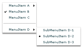
The following image shows the resulting control, with MenuItem D open; notice that check item B and radio item D-2 are selected:
Example: An XML menu data provider with icons
The following example displays a menu control that uses XML as the data provider, and specifies custom icons for the items in the control:
<?xml version="1.0"?>
<!-- SimpleMenuControlIcon.mxml -->
<s:Application xmlns:fx="http://ns.adobe.com/mxml/2009"
    xmlns:s="library://ns.adobe.com/flex/spark"
    xmlns:mx="library://ns.adobe.com/flex/mx">

    <fx:Script>
        <![CDATA[
            // Import the Menu control.
            import mx.controls.Menu;

            [Bindable]
            [Embed(source="assets/topIcon.jpg")]
            public var myTopIcon:Class;

            [Bindable]
            [Embed(source="assets/radioIcon.jpg")]
            public var myRadioIcon:Class;

            [Bindable]
            [Embed(source="assets/checkIcon.gif")]
            public var myCheckIcon:Class;

            // Create and display the Menu control.
            private function createAndShow():void {
                var myMenu:Menu = Menu.createMenu(null, myMenuData, false);
                myMenu.labelField="@label";

                // Specify the check icon.
                myMenu.setStyle('checkIcon', myCheckIcon);

                // Specify the radio button icon.
                myMenu.setStyle('radioIcon', myRadioIcon);

                // Specify the icon for the topmenu items.
                myMenu.iconField="@icon";
                myMenu.show(10, 10);
            }
        ]]>
    </fx:Script>

    <fx:Declarations>
        <!-- Define the menu data. -->
        <fx:XML format="e4x" id="myMenuData">
            <root>
                <menuitem label="MenuItem A" icon="myTopIcon">
                    <menuitem label="SubMenuItem A-1" enabled="false"/>
                    <menuitem label="SubMenuItem A-2"/>
                </menuitem>
                <menuitem label="MenuItem B" type="check" toggled="true"/>
                <menuitem label="MenuItem C" type="check" toggled="false"
                    icon="myTopIcon"/>
                <menuitem type="separator"/>
                <menuitem label="MenuItem D" icon="myTopIcon">
                    <menuitem label="SubMenuItem D-1" type="radio"
                        groupName="one"/>
                    <menuitem label="SubMenuItem D-2" type="radio"
                        groupName="one" toggled="true"/>
                    <menuitem label="SubMenuItem D-3" type="radio"
                        groupName="one"/>
                </menuitem>
            </root>
        </fx:XML>
    </fx:Declarations>

    <mx:VBox>
        <!-- Define a Button control to open the menu -->
        <mx:Button id="myButton"
            label="Open Menu"
            click="createAndShow();"/>
    </mx:VBox>
</s:Application>
Menu-based control events
User interaction with a Menu or menu-based control is event-driven; that is, applications typically handle events generated when the user opens, closes, or selects within a menu, or submenu or rolls over or out of menu items. For detailed information on events and how to use them, see Events.
The Menu and MenuBar controls dispatch an identical set of menu-specific events. Event handling with PopUpMenuButton controls differs from the other two controls, but shares many elements in common with the others.
Menu control events
The Menu control defines the following menu-specific event types, of the MenuEvent class:
- change
-
(MenuEvent.CHANGE) Dispatched when a user changes current menu selection by using the keyboard or mouse.
- itemClick
-
(MenuEvent.ITEM_CLICK) Dispatched when a user selects an enabled menu item of type normal, check, or radio. This event is not dispatched when a user selects a menu item of type separator, a menu item that opens a submenu, or a disabled menu item.
- itemRollOut
-
(MenuEvent.ITEM_ROLL_OUT) Dispatched when the mouse pointer rolls off of a Menu item.
- itemRollOver
-
(MenuEvent.ITEM_ROLL_OVER) Dispatched when the mouse pointer rolls onto a Menu item.
- menuHide
-
(MenuEvent.MENU_HIDE) Dispatched when the entire menu or a submenu closes.
- menuShow
-
(MenuEvent.MENU_SHOW) Dispatched when the entire menu or a submenu opens.
The event object passed to the event listener is of type MenuEvent and contains one or more of the following menu-specific properties:
Property
Description
item
The item in the data provider for the menu item associated with the event.
index
The index of the item in the menu or submenu that contains it.
label
The label of the item.
menu
A reference to the Menu control where the event occurred.
menuBar
The MenuBar control instance that is the parent of the menu, or undefined when the menu does not belong to a MenuBar. For more information, see MenuBar control.
To access properties and fields of an object-based menu item, you specify the menu item field name, as follows:
ta1.text = event.item.label
To access attributes of an E4X XML-based menu item, you specify the menu item attribute name in E4X syntax, as follows:
ta1.text = event.item.@label
Note: If you set an event listener on a submenu of a menu-based control, and the menu data provider's structure changes (for example, an element is removed), the event listener might no longer exist. To ensure that the event listener is available when the data provider structure changes, either listen on events of the menu-based control, not a submenu, or add the event listener each time an event occurs that changes the data provider's structure.The following example shows a menu with a simple event listener. For a more complex example, see Example: Using Menu control events.
<?xml version="1.0"?>
<!-- menus/EventListener.mxml -->
<s:Application xmlns:fx="http://ns.adobe.com/mxml/2009"
    xmlns:s="library://ns.adobe.com/flex/spark"
    xmlns:mx="library://ns.adobe.com/flex/mx">
    <s:layout>
        <s:VerticalLayout/>
    </s:layout>

    <fx:Script>
        <![CDATA[
            import mx.controls.Menu;
            import mx.events.MenuEvent;

            // Function to create and show a menu.
            private function createAndShow():void {
                var myMenu:Menu = Menu.createMenu(null, myMenuData, false);
                myMenu.labelField="@label"
                // Add an event listener for the itemClick event.
                myMenu.addEventListener(MenuEvent.ITEM_CLICK,
                    itemClickInfo);
                // Show the menu.
                myMenu.show(25, 10);
            }

            // The event listener for the itemClick event.
            private function itemClickInfo(event:MenuEvent):void {
                ta1.text="event.type: " + event.type;
                ta1.text+="\nevent.index: " + event.index;
                ta1.text+="\nItem label: " + event.item.@label
                ta1.text+="\nItem selected: " + event.item.@toggled;
                ta1.text+= "\nItem type: " + event.item.@type;
            }
        ]]>
    </fx:Script>

    <fx:Declarations>
        <!-- The XML-based menu data provider. -->
        <fx:XML id="myMenuData">
            <xmlRoot>
                <menuitem label="MenuItem A" >
                    <menuitem label="SubMenuItem A-1" enabled="false"/>
                    <menuitem label="SubMenuItem A-2"/>
                </menuitem>
                <menuitem label="MenuItem B" type="check" toggled="true"/>
                <menuitem label="MenuItem C" type="check" toggled="false"/>
                <menuitem type="separator"/>
                <menuitem label="MenuItem D" >
                    <menuitem label="SubMenuItem D-1" type="radio"
                        groupName="one"/>
                    <menuitem label="SubMenuItem D-2" type="radio"
                        groupName="one" toggled="true"/>
                    <menuitem label="SubMenuItem D-3" type="radio"
                        groupName="one"/>
                </menuitem>
            </xmlRoot>
        </fx:XML>
    </fx:Declarations>

    <!-- Button controls to open the menus. -->
    <mx:Button
        label="Open Menu"
        click="createAndShow();"/>
    <!-- Text area to display the event information -->
    <mx:TextArea
        width="200" height="100"
        id="ta1"/>
</s:Application>
MenuBar events
The following figure shows a MenuBar control:
For the menu bar, the following events occur:
- change
-
(MenuEvent.CHANGE) Dispatched when a user changes current menu bar selection by using the keyboard or mouse. This event is also dispatched when the user changes the current menu selection in a pop-up submenu. When the event occurs on the menu bar, the menu property of the MenuEvent object is null.
- itemRollOut
-
(MenuEvent.ITEM_ROLL_OUT) Dispatched when the mouse pointer rolls off of a menu bar item.
- itemRollOver
-
(MenuEvent.ITEM_ROLL_OVER) Dispatched when the mouse pointer rolls onto a menu bar item.
- menuHide
-
(MenuEvent.MENU_HIDE) Dispatched when a pop-up submenu closes.
- menuShow
-
(MenuEvent.MENU_SHOW) Dispatched when a pop-up submenu opens, or the user selects a menu bar item with no drop-down menu.
Note: The MenuBar control does not dispatch the itemClick event when you select an item on the menu bar; it only dispatches the itemClick event when you select an item on a pop-up submenu.For each pop-up submenu, the MenuBar dispatches the change, itemClick, itemRollOut, itemRollOver, menuShow, and menuHide events in the same way it does for the Menu control. Handle events triggered by the pop-up menus as you would handle events from Menu controls. For more information, see Menu control events.
The following example handles events for the menu bar and for the pop-up submenus.
<?xml version="1.0"?>
<!-- menus/MenuBarEventInfo.mxml -->
<s:Application xmlns:fx="http://ns.adobe.com/mxml/2009"
    xmlns:s="library://ns.adobe.com/flex/spark"
    xmlns:mx="library://ns.adobe.com/flex/mx"
    creationComplete="initCollections();">

    <fx:Script>
        <![CDATA[
            import mx.events.MenuEvent;
            import mx.controls.Alert;
            import mx.collections.*;

            [Bindable]
            public var menuBarCollection:XMLListCollection;

            private var menubarXML:XMLList =<>
                <menuitem label="Menu1">
                    <menuitem label="MenuItem 1-A" data="1A"/>
                    <menuitem label="MenuItem 1-B" data="1B"/>
                </menuitem>
                <menuitem label="Menu2">
                    <menuitem label="MenuItem 2-A" data="2A"/>
                    <menuitem label="MenuItem 2-B" data="2B"/>
                </menuitem>
                <menuitem label="Menu3" data="M3"/>
                </>

            // Event handler to initialize the MenuBar control.
            private function initCollections():void {
                menuBarCollection = new XMLListCollection(menubarXML);
            }

            // Event handler for the MenuBar control's change event.
            private function changeHandler(event:MenuEvent):void  {
                // Only open the Alert for a selection in a pop-up submenu.
                // The MenuEvent.menu property is null for a change event
                // dispatched by the menu bar.
                if (event.menu != null) {
                    Alert.show("Label: " + event.item.@label + "\n" +
                        "Data: " + event.item.@data, "Clicked menu item");
                }
            }

            // Event handler for the MenuBar control's itemRollOver event.
            private function rollOverHandler(event:MenuEvent):void {
                rollOverTextArea.text = "type: " + event.type + "\n";
                rollOverTextArea.text += "target menuBarIndex: " +
                    event.index + "\n";
            }
            // Event handler for the MenuBar control's itemClick event.
            private function itemClickHandler(event:MenuEvent):void {
                itemClickTextArea.text = "type: " + event.type + "\n";
                itemClickTextArea.text += "target menuBarIndex: " +
                    event.index + "\n";
            }
        ]]>
    </fx:Script>

    <mx:Panel title="MenuBar Control Example"
        height="75%" width="75%"
        paddingTop="10" paddingLeft="10">

        <mx:Label
            width="100%"
            color="blue"
            text="Select a menu item."/>
        <mx:MenuBar labelField="@label"
            dataProvider="{menuBarCollection}"
            change="changeHandler(event);"
            itemClick="itemClickHandler(event);"
            itemRollOver="rollOverHandler(event);"/>
        <mx:TextArea id="rollOverTextArea"
            width="200" height="100"/>
        <mx:TextArea id="itemClickTextArea"
            width="200" height="100"/>
    </mx:Panel>
</s:Application>
Example: Using Menu control events
The following example lets you experiment with Menu control events. It lets you display two menus, one with an XML data provider and one with an Array data provider. A TextArea control displays information about each event as a user opens the menus, moves the mouse, and selects menu items. It shows some of the differences in how you handle XML and object-based menus, and indicates some of the types of information that are available about each Menu event.
<?xml version="1.0"?>
<!-- menus/ExtendedMenuExample.mxml -->
<s:Application xmlns:fx="http://ns.adobe.com/mxml/2009"
    xmlns:s="library://ns.adobe.com/flex/spark"
    xmlns:mx="library://ns.adobe.com/flex/mx">

    <fx:Script>
        <![CDATA[
        /* Import the Menu control and MenuEvent class. */
        import mx.controls.Menu;
        import mx.events.MenuEvent;

        /* Define a variable for the Menu control. */
        private var myMenu:Menu;

        /* The event listener that creates menu with an XML data
           provider and adds event listeners for the menu. */
        private function createAndShow():void {
            /* Clear the event output display. */
            ta1.text="";
            /* Don't show the (single) XML root node in the menu. */
            myMenu = Menu.createMenu(null, myMenuData, false);
            /* Set the labelField explicitly for XML data providers. */
            myMenu.labelField="@label"
            myMenu.addEventListener(MenuEvent.ITEM_CLICK, menuShowInfo);
            myMenu.addEventListener(MenuEvent.MENU_SHOW, menuShowInfo);
            myMenu.addEventListener(MenuEvent.MENU_HIDE, menuShowInfo);
            myMenu.addEventListener(MenuEvent.ITEM_ROLL_OUT, menuShowInfo);
            myMenu.addEventListener(MenuEvent.ITEM_ROLL_OVER, menuShowInfo);
            myMenu.show(275, 10);
        }

        /* The event listener for the menu events.
           Retain information on all events for a menu instance. */
        private function menuShowInfo(event:MenuEvent):void {
            ta1.text="event.type: " + event.type;
            ta1.text+="\nevent.label: " + event.label;
            /* The index value is -1 for menuShow and menuHide events. */
            ta1.text+="\nevent.index: " + event.index;
            /* The item field is null for show and hide events. */
            if (event.item) {
                ta1.text+="\nItem label: " + event.item.@label
                ta1.text+="\nItem selected: " + event.item.@toggled;
                ta1.text+= "\nItem type: " + event.item.@type;
            }
        }

        /* The event listener that creates an object-based menu
           and adds event listeners for the menu. */
        private function createAndShow2():void {
            /* Show the top (root) level objects in the menu. */
            myMenu = Menu.createMenu(null, menuData, true);
            myMenu.addEventListener(MenuEvent.ITEM_CLICK, menuShowInfo2);
            myMenu.addEventListener(MenuEvent.MENU_SHOW, menuShowInfo2);
            /* The following line is commented out so that you can see the
               results of an ITEM_CLICK event.
               (The menu hides immediately after the click.)
               myMenu.addEventListener(MenuEvent.MENU_HIDE, menuShowInfo2); */
            myMenu.addEventListener(MenuEvent.ITEM_ROLL_OVER, menuShowInfo2);
            myMenu.addEventListener(MenuEvent.ITEM_ROLL_OUT, menuShowInfo2);
            myMenu.show(275, 10);
        }

        /* The event listener for the object-based Menu events. */
        private function menuShowInfo2(event:MenuEvent):void {
            ta1.text="event.type: " + event.type;
            ta1.text+="\nevent.label: " + event.label;
            /* The index value is -1 for menuShow and menuHide events. */
            ta1.text+="\nevent.index: " + event.index;
            /* The item field is null for show and hide events. */
            if (event.item) {
                ta1.text+="\nItem label: " + event.item.label
                ta1.text+="\nItem selected: " + event.item.toggled;
                ta1.text+= "\ntype: " + event.item.type;
            }
        }

        /* The object-based data provider, an Array of objects.
           Its contents is identical to that of the XML data provider. */
        [Bindable]
        public var menuData:Array = [
            {label: "MenuItem A", children: [
                {label: "SubMenuItem A-1", enabled: false},
                {label: "SubMenuItem A-2", type: "normal"}
            ]},
            {label: "MenuItem B", type: "check", toggled: true},
            {label: "MenuItem C", type: "check", toggled: false},
            {type: "separator"},
            {label: "MenuItem D", children: [
                {label: "SubMenuItem D-1", type: "radio", groupName: "g1"},
                {label: "SubMenuItem D-2", type: "radio", groupName: "g1", toggled: true},
                {label: "SubMenuItem D-3", type: "radio", groupName: "g1"}
            ]}
        ];
    ]]>
    </fx:Script>

    <fx:Declarations>
        <!-- The XML-based menu data provider. The XML tag requires a single root. -->
        <fx:XML id="myMenuData">
            <xmlRoot>
                <menuitem label="MenuItem A" >
                    <menuitem label="SubMenuItem A-1" enabled="false"/>
                    <menuitem label="SubMenuItem A-2"/>
                </menuitem>
                <menuitem label="MenuItem B" type="check" toggled="true"/>
                <menuitem label="MenuItem C" type="check" toggled="false"/>
                <menuitem type="separator"/>
                <menuitem label="MenuItem D" >
                    <menuitem label="SubMenuItem D-1" type="radio" groupName="one"/>
                    <menuitem label="SubMenuItem D-2" type="radio" groupName="one" toggled="true"/>
                    <menuitem label="SubMenuItem D-3" type="radio" groupName="one"/>
                </menuitem>
            </xmlRoot>
        </fx:XML>
    </fx:Declarations>

    <!-- Text area to display the event information. -->
    <mx:TextArea id="ta1" width="264" height="168" x="11" y="38"/>

    <!-- Button controls to open the menus. -->
    <mx:Button id="b1"
        label="Open XML Popup"
        click="createAndShow();" x="10" y="10"/>
    <mx:Button id="b2"
        label="Open Object Popup"
        click="createAndShow2();" x="139" y="10"/>
</s:Application>
PopUpMenuButton control events
Because the PopUpMenuButton is a subclass of the PopUpButton control, it supports all of that control's events. When the user clicks the main button, the PopUpMenuButton control dispatches a click (MouseEvent.CLICK) event.
When the user clicks the PopUpMenuButton main button, the control dispatches an itemClick (MenuEvent.ITEM_CLICK) event that contains information about the selected menu item. Therefore, the same itemClick event is dispatched when the user clicks the main button or selects the current item from the pop-up menu. Because the same event is dispatched in both cases, clicking on the main button produces the same behavior as clicking on the last selected menuItem, so the main button plays the role of a frequently used menu item.
The following example shows how the PopUpMenuButton generates events and how an application can handle them:
<?xml version="1.0"?>
<!-- menus/PopUpMenuButtonEvents.mxml -->
<s:Application xmlns:fx="http://ns.adobe.com/mxml/2009"
    xmlns:s="library://ns.adobe.com/flex/spark"
    xmlns:mx="library://ns.adobe.com/flex/mx"
    height="600" width="600"
    creationComplete="initData();">

    <fx:Script>
        <![CDATA[
        import mx.events.*;
        import mx.controls.*;

        // Set the Inbox (fourth) item in the menu as the button item.
        private function initData():void {
            Menu(p1.popUp).selectedIndex=3;
        }

        // itemClick event handler, invoked when you select from the menu.
        // Shows the event's label, index properties, and the values of the
        // label and data fields of the data provider entry specified by
        // the event's item property.
        public function itemClickHandler(event:MenuEvent):void {
            Alert.show("itemClick event label: " + event.label
                + "  \nindex: " + event.index
                + "  \nitem.label: " + event.item.label
                + "  \nitem.data: " + event.item.data);
        }

        //Click event handler for the main button.
        public function clickHandler(event:MouseEvent):void {
            Alert.show(" Click Event currentTarget.label: "
                + event.currentTarget.label);
        }

        //The menu data provider
        [Bindable]
        public var menuDP:Array = [
            {label: "Inbox", data: "inbox"},
            {label: "Calendar", data: "calendar"},
            {label: "Sent", data: "sent"},
            {label: "Deleted Items", data: "deleted"},
            {label: "Spam", data: "spam"}
        ];
    ]]></fx:Script>

    <mx:PopUpMenuButton  id="p1"
        showRoot="true"
        dataProvider="{menuDP}"
        click="clickHandler(event);"
        itemClick="itemClickHandler(event);"/>
</s:Application>
When the user selects an item from the pop-up menu, the following things occur:
-
The PopUpMenuButton dispatches an itemClick event.
-
The application's itemClickHandler() event listener function handles the itemClick event and displays the information about the event in an Alert control.
When the user clicks the main button, the following things occur:
-
The PopUpMenuButton control dispatches a click event.
-
The PopUpMenuButton control dispatches an itemClick event.
-
The application's itemClickHandler() event listener function handles the itemClick event and displays information about the selected Menu item in an Alert control.
-
The application's clickHandler() event listener function also handles the MouseEvent.CLICK event, and displays the Button label in an Alert control.
Menu control
The Menu control is a pop-up control that contains a menu of individually selectable choices. You use ActionScript to create a Menu control that pops up in response to a user action, typically as part of an event listener. Because you create a Menu control in response to an event, it does not have an MXML tag; you can create Menu controls in ActionScript only.
For complete reference information, see the ActionScript 3.0 Reference for Apache Flex.
About the Menu Control
The following example shows a Menu control:
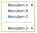
In this example, the MenuItem A and MenuItem D items open submenus. Submenus open when the user moves the mouse pointer over the parent item or accesses the parent item by using keyboard keys.
The default location of the Menu control is the upper-left corner of your application, at x, y coordinates 0,0. You can pass x and y arguments to the show() method to control the position relative to the application.
After a Menu opens, it remains visible until the user selects an enabled menu item, the user selects another component in the application, or a script closes the menu.
To create a static menu that stays visible all the time, use the MenuBar control or PopUpMenuButton control. For more information on the MenuBar control, see MenuBar control. For more information on the PopUpMenuButton control, see PopUpMenuButton control.
Create a Menu control
You cannot create a Menu control by using an MXML tag; you must create it in ActionScript.
-
Create an instance of the Menu control by calling the static ActionScript Menu.createMenu() method and passing the method an instance of the data provider that contains the information that populates the control as the second parameter; for example:
var myMenu:Menu = Menu.createMenu(null, myMenuData);
(The first parameter can optionally specify the parent container of the menu.)
If you do not display the root node of the data provider, for example, if the data provider is an XML document in E4X format, use a third parameter with the value false. This parameter sets the menu's showRoot property. The following example creates a menu that does not show the data provider root:
var myMenu:Menu = Menu.createMenu(null, myMenuData, false);
Note: To hide the root node, you must set the showRoot property in the createMenu method. Setting the property after you create the menu has no effect. -
Display the Menu instance by calling the ActionScript Menu.show() method; for example:
myMenu.show(10, 10);
Example: Creating a simple Menu control
The following example uses the <fx:XML> tag to define the data for the Menu control and a Button control to trigger the event that opens the Menu control:
<?xml version="1.0"?>
<!-- menus/SimpleMenuControl.mxml -->
<s:Application xmlns:fx="http://ns.adobe.com/mxml/2009"
    xmlns:s="library://ns.adobe.com/flex/spark"
    xmlns:mx="library://ns.adobe.com/flex/mx" >

    <fx:Script>
        <![CDATA[
            // Import the Menu control.
            import mx.controls.Menu;

            // Create and display the Menu control.
            private function createAndShow():void {
                var myMenu:Menu = Menu.createMenu(null, myMenuData, false);
                myMenu.labelField="@label";
                myMenu.show(10, 10);
            }
        ]]>
    </fx:Script>

    <fx:Declarations>
        <!-- Define the menu data. -->
        <fx:XML format="e4x" id="myMenuData">
            <root>
                <menuitem label="MenuItem A" >
                    <menuitem label="SubMenuItem A-1" enabled="false"/>
                    <menuitem label="SubMenuItem A-2"/>
                </menuitem>
                <menuitem label="MenuItem B" type="check" toggled="true"/>
                <menuitem label="MenuItem C" type="check" toggled="false"/>
                <menuitem type="separator"/>
                <menuitem label="MenuItem D" >
                    <menuitem label="SubMenuItem D-1" type="radio"
                        groupName="one"/>
                    <menuitem label="SubMenuItem D-2" type="radio"
                        groupName="one" toggled="true"/>
                    <menuitem label="SubMenuItem D-3" type="radio"
                        groupName="one"/>
                </menuitem>
            </root>
        </fx:XML>
    </fx:Declarations>

    <mx:VBox>
        <!-- Define a Button control to open the menu -->
        <mx:Button id="myButton"
            label="Open Menu"
            click="createAndShow();"/>
    </mx:VBox>
</s:Application>
You can assign any name to node tags in the XML data. In the previous sample, each node is named with the generic <menuitem> tag, but you can have used <node>, <subNode>, <person>, <address> and so on.
Because this example uses an E4X XML data source, you must specify the label field by using the E4X @ attribute specifier syntax, and you tell the control not to show the data provider root node.
Several attributes or fields, such as the type attribute, have meaning to the Menu control. For information on how Flex interprets and uses the data provider data, see Specifying and using menu entry information.
Menu control user interaction
You can use the mouse or the keyboard to interact with a Menu control. Clicking selects a menu item and closes the menu, except with the following types of menu items:
- Disabled items or separators
-
Rolling over or clicking menu items has no effect and the menu remains visible.
- Submenu anchors
-
Rolling over the items activates the submenu; clicking them has no effect; rolling onto any menu item other than one of the submenu items closes the submenu.
When a Menu control has focus, you can use the following keys to control it:
Key
Description
Down Arrow
Up Arrow
Moves the selection down and up the rows of the menu. The selection loops at the top or bottom row.
Right Arrow
Opens a submenu, or moves the selection to the next menu in a menu bar.
Left Arrow
Closes a submenu and returns focus to the parent menu (if a parent menu exists), or moves the selection to the previous menu in a menu bar (if the menu bar exists).
Enter
Opens a submenu, has the effect of clicking and releasing the mouse on a row if a submenu does not exist.
Escape
Closes a menu level.
MenuBar control
A MenuBar control displays the top level of a menu as a horizontal bar of menu items, where each item on the bar can pop up a submenu. The MenuBar control interprets the data provider in the same way as the Menu control, and supports the same events as the Menu control. Unlike the Menu control, a MenuBar control is static; that is, it does not function as a pop-up menu, but is always visible in your application. Because the MenuBar is static, you can define it directly in MXML.
For complete reference information, see the ActionScript 3.0 Reference for Apache Flex. For more information on the Menu control, see Menu control events.
About the MenuBar control
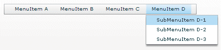
The following example shows a MenuBar control:

The control shows the labels of the top level of the data provider menu. When a user selects a top-level menu item, the MenuBar control opens a submenu. The submenu stays open until the user selects another top-level menu item, selects a submenu item, or clicks outside the MenuBar area.
Creating a MenuBar control
You define a MenuBar control in MXML by using the <mx:MenuBar> tag. Specify an id value if you intend to refer to a component elsewhere in your MXML application, either in another tag or in an ActionScript block.
You specify the data for the MenuBar control by using the dataProvider property. The MenuBar control uses the same types of data providers as does the Menu control. For more information on data providers for Menu and MenuBar controls, see Defining menu structure and data. For more information on hierarchical data providers, see Hierarchical data objects.
In a simple case for creating a MenuBar control, you might use an <fx:XML> or <fx:XMLList> tag and standard XML node syntax to define the menu data provider. When you used an XML-based data provider, you must keep the following rules in mind:
-
With the <fx:XML> tag you must have a single root node, and you set the showRoot property of the MenuBar control to false. (otherwise, your MenuBar would have only the root as a button). With the <fx:XMLList> tag you define a list of XML nodes, and the top level nodes define the bar buttons.
-
If your data provider has a label attribute (even if it is called "label"), you must set the MenuBar control's labelField property and use the E4X @ notation for the label; for example:
labelField="@label"
The dataProvider property is the default property of the MenuBar control, so you can define the XML or XMLList object as a direct child of the <mx:MenuBar> tag, as the following example shows:
<?xml version="1.0"?>
<!-- menus/MenuBarControl.mxml -->
<s:Application xmlns:fx="http://ns.adobe.com/mxml/2009"
    xmlns:s="library://ns.adobe.com/flex/spark"
    xmlns:mx="library://ns.adobe.com/flex/mx" >

    <!-- Define the menu; dataProvider is the default MenuBar property.
      Because this uses an XML data provider, specify the labelField and
      showRoot properties. -->
    <mx:MenuBar id="myMenuBar" labelField="@label">
        <fx:XMLList>
            <menuitem label="MenuItem A">
                <menuitem label="SubMenuItem A-1" enabled="false"/>
                <menuitem label="SubMenuItem A-2"/>
            </menuitem>
            <menuitem label="MenuItem B"/>
            <menuitem label="MenuItem C"/>
            <menuitem label="MenuItem D">
                <menuitem label="SubMenuItem D-1"
                    type="radio" groupName="one"/>
                <menuitem label="SubMenuItem D-2"
                    type="radio" groupName="one"
                    selected="true"/>
                <menuitem label="SubMenuItem D-3"
                    type="radio" groupName="one"/>
            </menuitem>
        </fx:XMLList>
    </mx:MenuBar>
</s:Application>
The top-level nodes in the MenuBar control correspond to the buttons on the bar. Therefore, in this example, the MenuBar control displays the four labels shown in the preceding image.
You can assign any name to node tags in the XML data. In the previous example, each node is named with the generic <menuitem> tag, but you can use <node>, <subNode>, <person>, <address>, and so on. Several attributes or fields, such as the type attribute, have meaning to the MenuBar control. For information on how Flex interprets and uses the data provider data, see Specifying and using menu entry information.
MenuBar control user interaction
The user interaction of the MenuBar is the same as for the Menu control, with the following difference: when the MenuBar control has the focus, the left arrow opens the previous menu. If the current menu bar item has a closed pop-up menu, the right arrow opens the current menu; if the pop-up menu is open, the right arrow opens the next menu. (The behavior wraps around the ends of the MenuBar control.)
For more information, see Menu control user interaction.
PopUpMenuButton control
The PopUpMenuButton is a PopUpButton control whose secondary button pops up a Menu control. When the user selects an item from the pop-up menu, the main button of the PopUpButton changes to show the icon and label of the selected menu item. Unlike the Menu and MenuBar controls, the PopUpMenuButton supports only a single-level menu.
For complete reference information, see the ActionScript 3.0 Reference for Apache Flex. For more information on the Menu control, see Menu control events. For more information on PopUpButton controls, see PopUpButton control.
About the PopUpMenuButton control
The following example shows a PopUpMenuButton control before and after clicking the secondary pop-up button:
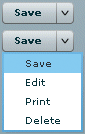
The PopUpMenuButton works as follows.
-
When you click the smaller button, which by default displays a v icon, the control displays a pop-up menu below the button.
-
When you select an item from the pop-up menu, the main PopUpMenuButton button label changes to show the selected item's label and the PopUpMenuButton control dispatches a MenuEvent.CHANGE event.
-
When you click the main button, the PopUpMenuButton control dispatches a MenuEvent.CHANGE event and a MouseEvent.ITEM_CLICK event.
For information on handling PopUpMenuButton events, see PopUpMenuButton control events.
The PopUpMenuButton control lets users change the function of the main button by selecting items from the pop-up menu. The most recently selected item becomes the main button item.
This behavior is useful for buttons when there are a number of user actions, users tend to select the same option frequently, and the application developer cannot assume which option should be the default. Text editors often use such controls in their control bar for options, such as spacing, for which a user is likely to have a preferred setting, but the developer cannot determine it in advance. Microsoft Word, for example, uses such controls for specifying line spacing, borders, and text and highlight color.
You can use the PopUpButton control to create pop-up menu buttons with behaviors that differ from those of the PopUpMenuButton; for example, buttons that do not change the default action of the main button when the user selects a menu item. For more information, see PopUpButton control.
Creating a PopUpMenuButton control
You define a PopUpMenuButton control in MXML by using the <mx:PopUpMenuButton> tag. Specify an id value if you intend to refer to a component elsewhere in your MXML application, either in another tag or in an ActionScript block.
You specify the data for the PopUpMenuButton control by using the dataProvider property. For information on valid data providers, including their structure and contents, see Defining menu structure and data.
By default, the initially selected item is the first item in the pop-up menu dataProvider, and the default main button label is the item's label, as determined by the labelField or labelFunction property. To set the initial main button label to a specific item's label and functionality, write a listener for the PopUpMenuButton control's creationComplete event that sets the selectedIndex property of the Menu subcontrol, as follows:
Menu(MyPopUpControl.popUp).selectedIndex=2;
You must cast the PopUpMenuButton control's popUp property to a Menu because the property type is IUIComponent, not Menu.
You can also use the label property of the PopUpMenuButton control to set the main button label.
When a popped up menu closes, it loses its selection and related properties.
Example: Creating a PopUpMenuButton control
The following example creates a PopUpMenuButton control by using an E4X XML data provider.
<?xml version="1.0"?>
<!-- menus/PopUpMenuButtonControl.mxml -->
<s:Application xmlns:fx="http://ns.adobe.com/mxml/2009"
    xmlns:s="library://ns.adobe.com/flex/spark"
    xmlns:mx="library://ns.adobe.com/flex/mx">

    <fx:Script>
        <![CDATA[
            import mx.controls.Menu

            // The initData function sets the initial value of the button
            // label by setting the Menu subcontrol's selectedIndex property.
            // You must cast the popUp property to a Menu.
            private function initData():void {
                Menu(pb2.popUp).selectedIndex=2;
            }
        ]]>
    </fx:Script>

    <fx:Declarations>
        <fx:XML format="e4x" id="dp2">
            <root>
                <editItem label="Cut"/>
                <editItem label="Copy"/>
                <editItem label="Paste"/>
                <separator type="separator"/>
                <editItem label="Delete"/>
            </root>
        </fx:XML>
    </fx:Declarations>

    <mx:PopUpMenuButton id="pb2"
        dataProvider="{dp2}"
        labelField="@label"
        showRoot="false"
        creationComplete="initData();"/>
</s:Application>
Because this example uses an E4X XML data source, you must specify the label field by using the E4X @ attribute specifier syntax, and you must tell the control not to show the data provider root node.
Using the label property
The label property of the PopUpMenuButton control specifies the contents of the label on the main button, and overrides any label from the pop-up menu that is determined by the labelField or labelFunction property. The label property is useful for creating a main button label with fixed and a variable parts; for example, a mail "Send to:" button where only the destination text is controlled by the pop-up menu, so the main button could say "Send to: Inbox" or "Send to: Trash" based on the selection from a menu that lists "Menu" and "Trash."
To use a dynamic label property, use a PopUpMenuButton control change event listener to set the label based on the event's label property, as in the following example:
<?xml version="1.0"?>
<!-- menus/PopUpMenuButtonLabel.mxml -->
<s:Application xmlns:fx="http://ns.adobe.com/mxml/2009"
    xmlns:s="library://ns.adobe.com/flex/spark"
    xmlns:mx="library://ns.adobe.com/flex/mx">

    <fx:Script>
        <![CDATA[
            import mx.events.MenuEvent;

            public function itemClickHandler(event:MenuEvent):void {
                event.currentTarget.label= "Send to: " + event.label;
            }

            [Bindable]
            public var menuData:Array = [
                {label: "Inbox", data: "inbox"},
                {label: "Calendar", data: "calendar"},
                {label: "Sent", data: "sent"},
                {label: "Deleted Items", data: "deleted"},
                {label: "Spam", data: "spam"}
            ];
        ]]>
    </fx:Script>

    <mx:PopUpMenuButton id="p1"
        showRoot="true"
        dataProvider="{menuData}"
        label="Send to: Inbox"
        itemClick="itemClickHandler(event);"/>
</s:Application>
PopUpMenuButton user interaction
The user interaction of the PopUpMenuButton control main button and secondary button is the same as for the PopUpButton control. The user interaction with the pop-up menu is the same as for the Menu control. For more information on the PopUpButton user interaction, see User interaction. For more information on Menu control user interaction, see Menu control user interaction.
Navigation
Adobe and Adobe Flash Platform are either registered trademarks or trademarks of Adobe Systems Incorporated in the United States and/or other countries and are used by permission from Adobe. No other license to the Adobe trademarks are granted.