
AdvancedDataGrid control
The AdvancedDataGrid control expands on the functionality of the standard MX DataGrid control to add data visualization capabilities to your applications built in Flex. These capabilities provide greater control of data display, data aggregation, and data formatting.
For more information on the DataGrid control, see MX DataGrid control.
There is also a Spark DataGrid control. For more information, see Spark DataGrid and Grid controls.
About the AdvancedDataGrid control
The AdvancedDataGrid control extends the capabilities of the standard DataGrid control to improve data visualization. The following table describes the main data visualization capabilities of the AdvancedDataGrid control:
|
Capability |
Description |
|---|---|
|
Sorting by multiple columns |
Sort by multiple columns when you click in the column header. For more information, see Sorting by multiple columns. |
|
Styling rows and columns |
Use the styleFunction property to specify a function to apply styles to rows and columns of the control. For more information, see Styling rows and columns. |
|
Displaying hierarchical and grouped data |
Use an expandable navigation tree in a column to control the visible rows of the control. For more information, see Hierarchical and grouped data display. |
|
Creating column groups |
Collect multiple columns under a single column heading. For more information, see Creating column groups. |
|
Using item renderers |
Span multiple columns with an item renderer and use multiple item renderers in the same column. For more information, see Using item renderers with the AdvancedDataGrid control. |
Displaying hierarchical and grouped data
One of the most important aspects of the AdvancedDataGrid control is its support for the display of hierarchical and grouped data. Hierarchical data is data already in a structure of parent and child data items. Grouped data is flat data with no inherent hierarchy. Before passing flat data to the AdvancedDataGrid control, you specify one or more data fields that are used to group the flat data into a hierarchy.
To support the display of hierarchical and grouped data, the AdvancedDataGrid control displays a navigation tree in a column that lets you navigate the data hierarchy. The following example shows an AdvancedDataGrid control with a navigation tree in the first column that controls the visible rows of the control, but it can be in any column:
Migrating from the DataGrid control
Besides the major new features added to the AdvancedDataGrid control described in the section About the AdvancedDataGrid control, the AdvancedDataGrid control adds the following property:
- firstVisibleItem
-
Specifies the item that is currently displayed in the top row of the AdvancedDataGrid control.
One consideration when migrating an existing application from the DataGrid control to the AdvancedDataGrid control is that the data type of many event objects dispatched by the AdvancedDataGrid control is of type AdvancedDataGridEvent, not of type DataGridEvent as it is for the DataGrid control. If your application references the event object by type, you must update your application so that it uses the correct data type.
To determine the type of the event object for any event, see the ActionScript 3.0 Reference for Apache Flex.
Example: Creating column groups
Column grouping lets you collect multiple columns under a single column heading. The following example shows the Actual and Estimate columns grouped under the Revenues column:
The AdvancedDataGrid control is defined by the mx.controls.AdvancedDataGrid class and additional classes in the package mx.controls.advancedDataGridClasses. This package includes the AdvancedDataGridColumn class that you use to define a column.
The following code creates the column grouping shown in the previous image:
<?xml version="1.0"?>
<!-- dpcontrols/adg/ColumnGroupADG.mxml -->
<s:Application xmlns:fx="http://ns.adobe.com/mxml/2009"
    xmlns:mx="library://ns.adobe.com/flex/mx"
    xmlns:s="library://ns.adobe.com/flex/spark">

    <fx:Script>
        <![CDATA[
            import mx.collections.ArrayCollection;

            // Import the data used by the AdvancedDataGrid control.
            include "SimpleFlatData.as";
        ]]>
    </fx:Script>

    <mx:AdvancedDataGrid id="myADG"
        dataProvider="{dpFlat}"
        width="100%" height="100%">
        <mx:groupedColumns>
            <mx:AdvancedDataGridColumn dataField="Region"/>
            <mx:AdvancedDataGridColumn dataField="Territory"/>
            <mx:AdvancedDataGridColumn dataField="Territory_Rep"
                headerText="Territory Rep"/>
            <mx:AdvancedDataGridColumnGroup headerText="Revenues">
                <mx:AdvancedDataGridColumn dataField="Actual"/>
                <mx:AdvancedDataGridColumn dataField="Estimate"/>
            </mx:AdvancedDataGridColumnGroup>
        </mx:groupedColumns>
   </mx:AdvancedDataGrid>
</s:Application>
This example imports the data used by the AdvancedDataGrid control from a file named SimpleFlatData.as. You can see the contents of that file in the topic Hierarchical and grouped data display.
Sorting by multiple columns
By default, the AdvancedDataGrid control displays data in the order specified in the data passed to its dataProvider property. The AdvancedDataGrid control also lets you sort data after the control displays it in a single column or multiple columns.
To disable sorting for an entire AdvancedDataGrid control, set the AdvancedDataGrid.sortableColumns property to false. To disable sorting for an individual column, set the AdvancedDataGridColumn.sortable property to false.
The way that you sort multiple columns is based on the setting of the sortExpertMode property. By default, the sortExpertMode property is set to false. This setting means that you click in the header area of a column to sort the rows of the AdvancedDataGrid control by that column. Then you click in the multiple column sort area of the header to sort by additional columns. To use the Control key to select every column after the first column to perform sort, set the sortExpertMode property to true.
The following example shows an AdvancedDataGrid control with three columns with the sortExpertMode property set to false:
- A.
- Column header area
- B
- . Multiple column sort area
Sort the columns with sortExpertMode set to false
-
Click in the column header area of any column in the AdvancedDataGrid control to sort by that column. For example, click in the column header for the Artist column to sort that column in ascending order. Click the Artist column header again to sort in descending order.
-
Click in the multiple column sort area of any other column header. For example, click in the multiple column sort area of the Price column to arrange it in ascending order while keeping the Artist column sorted in descending order. You can now find the least expensive album for each artist.
-
Click in the multiple column sort area for the Price column again to arrange it in descending order.
-
Click in the multiple column sort area for any other column header to include other columns in the sort.
Sort the columns with sortExpertMode set to true
-
Click in the column header area of any column in the AdvancedDataGrid control to sort by that column. For example, click in the column header for the Artist column to sort that column in ascending order. Click the Artist column header again to sort in descending order.
-
While holding down the Control key, click in any other column header. For example, click the column header for the Price column to arrange it in ascending order while keeping the Artist column sorted in descending order. You can now find the least expensive album for each artist.
-
While holding down the Control key, click the column header for the Price column again to arrange it in descending order.
-
While holding down the Control key, select any other column header to include other columns in the sort.
The following code implements multiple column sort when the sortExpertMode property is set to true:
<?xml version="1.0"?>
<!-- dpcontrols/adg/SimpleADG.mxml -->
<s:Application xmlns:fx="http://ns.adobe.com/mxml/2009"
    xmlns:mx="library://ns.adobe.com/flex/mx"
    xmlns:s="library://ns.adobe.com/flex/spark">

    <fx:Script>
      <![CDATA[
         import mx.collections.ArrayCollection;

         [Bindable]
         private var dpADG:ArrayCollection = new ArrayCollection([
           {Artist:'Pavement', Album:'Slanted and Enchanted', Price:11.99},
           {Artist:'Pavement', Album:'Brighten the Corners', Price:11.99},
           {Artist:'Saner', Album:'A Child Once', Price:11.99},
           {Artist:'Saner', Album:'Helium Wings', Price:12.99},
           {Artist:'The Doors', Album:'The Doors', Price:10.99},
           {Artist:'The Doors', Album:'Morrison Hotel', Price:12.99},
           {Artist:'Grateful Dead', Album:'American Beauty', Price:11.99},
           {Artist:'Grateful Dead', Album:'In the Dark', Price:11.99},
           {Artist:'Grateful Dead', Album:'Shakedown Street', Price:11.99},
           {Artist:'The Doors', Album:'Strange Days', Price:12.99},
           {Artist:'The Doors', Album:'The Best of the Doors', Price:10.99}
         ]);
      ]]>
    </fx:Script>

    <mx:AdvancedDataGrid
        width="100%" height="100%"
        sortExpertMode="true"
        dataProvider="{dpADG}">
        <mx:columns>
            <mx:AdvancedDataGridColumn dataField="Artist" />
            <mx:AdvancedDataGridColumn dataField="Album" />
            <mx:AdvancedDataGridColumn dataField="Price" />
        </mx:columns>
   </mx:AdvancedDataGrid>
</s:Application>
Styling rows and columns
You apply styles to the rows and columns of the AdvancedDataGrid control by using callback functions. To control the styling of a row, use the AdvancedDataGrid.styleFunction property to specify the callback function; to control the styling of a column, use the AdvancedDataGridColumn.styleFunction property to specify the callback function.
The callback function specified by the AdvancedDataGrid.styleFunction property is invoked first, followed by the function specified by the AdvancedDataGridColumn.styleFunction property. Therefore, the
AdvancedDataGrid control applies styles to rows first, and then to columns.
The callback function must have the following signature:
function_name(data:Object, column:AdvancedDataGridColumn):Object
The function returns an Object that contains one or more styleName:value pairs to specify a style setting, or null. The styleName field contains the name of a style property, such as color, and the value field contains the value for the style property, such as 0x00FF00. For example, you could return two styles using the following code:
{color:0xFF0000, fontWeight:"bold"}
The AdvancedDataGrid control invokes the callback function when it updates its display, such as when the control is first drawn on application start up, or when you call the invalidateList()method.
The examples in this section use callback functions to set the style of an AdvancedDataGrid control. All of the examples in this section use the following data from the StyleData.as file:
[Bindable]
private var dpADG:ArrayCollection = new ArrayCollection([
    {Artist:'Pavement', Album:'Slanted and Enchanted', Price:11.99},
    {Artist:'Pavement', Album:'Brighten the Corners', Price:11.99},
    {Artist:'Saner', Album:'A Child Once', Price:11.99},
    {Artist:'Saner', Album:'Helium Wings', Price:12.99},
    {Artist:'The Doors', Album:'The Doors', Price:10.99},
    {Artist:'The Doors', Album:'Morrison Hotel', Price:12.99},
    {Artist:'Grateful Dead', Album:'American Beauty', Price:11.99},
    {Artist:'Grateful Dead', Album:'In the Dark', Price:11.99},
    {Artist:'Grateful Dead', Album:'Shakedown Street', Price:11.99},
    {Artist:'The Doors', Album:'Strange Days', Price:12.99},
    {Artist:'The Doors', Album:'The Best of the Doors', Price:10.99}
]);
Styling rows
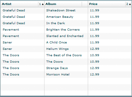
The following example uses the AdvancedDataGrid.styleFunction property to specify a callback function to apply styles to the rows of an AdvancedDataGrid control. In this example, you use Button controls to select an artist in the AdvancedDataGrid control. Then the callback function highlights in red all rows for the selected artist.
<?xml version="1.0"?>
<!-- dpcontrols/adg/SimpleADGRowStyleFunc.mxml -->
<s:Application xmlns:fx="http://ns.adobe.com/mxml/2009"
    xmlns:mx="library://ns.adobe.com/flex/mx"
    xmlns:s="library://ns.adobe.com/flex/spark">
    <s:layout>
        <s:VerticalLayout/>
    </s:layout>

    <fx:Script>
      <![CDATA[
          import mx.collections.ArrayCollection;
          import mx.controls.advancedDataGridClasses.AdvancedDataGridColumn;

          // Include the data for the AdvancedDataGrid control.
          include "StyleData.as"

          // Artist name to highlight.
          protected var artistName:String;

          // Event handler to set the selected artist's name
          // based on the selected Button control.
          public function setArtistName(event:Event):void {
             artistName=Button(event.currentTarget).label;
             // Refresh row display.
             myADG.invalidateList();
          }

          // Callback function that highlights in red
          // all rows for the selected artist.
          public function myStyleFunc(data:Object,
            col:AdvancedDataGridColumn):Object {
             if (data["Artist"] == artistName)
                return {color:0xFF0000};

             // Return null if the Artist name does not match.
             return null;
          }
      ]]>
    </fx:Script>

    <mx:AdvancedDataGrid id="myADG"
        width="100%" height="100%"
        dataProvider="{dpADG}"
        styleFunction="myStyleFunc">
        <mx:columns>
            <mx:AdvancedDataGridColumn dataField="Artist"/>
            <mx:AdvancedDataGridColumn dataField="Album"/>
            <mx:AdvancedDataGridColumn dataField="Price"/>
        </mx:columns>
    </mx:AdvancedDataGrid>

    <mx:HBox>
       <mx:Button label="Pavement" click="setArtistName(event);"/>
       <mx:Button label="Saner" click="setArtistName(event);"/>
       <mx:Button label="The Doors" click="setArtistName(event);"/>
    </mx:HBox>
</s:Application>
Styling columns
The following example modifies the example in the previous section to use a callback function to apply styles to the rows and one column of an AdvancedDataGrid control. In this example, the Price column displays all cells with a price less than $11.00 in green:
<?xml version="1.0"?>
<!-- dpcontrols/adg/SimpleADGColumnStyleFunc.mxml -->
<s:Application xmlns:fx="http://ns.adobe.com/mxml/2009"
    xmlns:mx="library://ns.adobe.com/flex/mx"
    xmlns:s="library://ns.adobe.com/flex/spark">
    <s:layout>
        <s:VerticalLayout/>
    </s:layout>

    <fx:Script>
      <![CDATA[
          import mx.collections.ArrayCollection;
          import mx.controls.advancedDataGridClasses.AdvancedDataGridColumn;

          // Include the data for the AdvancedDataGrid control.
          include "StyleData.as"

          // Artist name to highlight.
          protected var artistName:String;

          // Event handler to set the selected artist's name
          // based on the selected Button control.
          public function setArtistName(event:Event):void
          {
             artistName=Button(event.currentTarget).label;
             // Refresh row display.
             myADG.invalidateList();
          }

          // Callback function that highlights in red
          // all rows for the selected artist.
          public function myStyleFunc(data:Object,
            col:AdvancedDataGridColumn):Object
          {
             if (data["Artist"] == artistName)
                return {color:0xFF0000};

             // Return null if the Artist name does not match.
             return null;
          }

         // Callback function that hightlights in green
         // all entries in the Price column
         // with a value less than $11.00.
         public function myColStyleFunc(data:Object,
            col:AdvancedDataGridColumn):Object
         {
             if(data["Price"] <= 11.00)
                 return {color:0x00FF00};

             return null;
         }
      ]]>
    </fx:Script>

    <mx:AdvancedDataGrid id="myADG"
        width="100%" height="100%"
        dataProvider="{dpADG}"
        styleFunction="myStyleFunc">
        <mx:columns>
            <mx:AdvancedDataGridColumn dataField="Artist"/>
            <mx:AdvancedDataGridColumn dataField="Album"/>
            <mx:AdvancedDataGridColumn dataField="Price"
                styleFunction="myColStyleFunc"/>
        </mx:columns>
    </mx:AdvancedDataGrid>

    <mx:HBox>
       <mx:Button label="Pavement" click="setArtistName(event);"/>
       <mx:Button label="Saner" click="setArtistName(event);"/>
       <mx:Button label="The Doors" click="setArtistName(event);"/>
    </mx:HBox>
</s:Application>
Using a data formatter in a column
The AdvancedDataGridColumn class contains a formatter property that lets you pass a class that implements the IFormatter interface to the column. This includes the Spark formatters such as CurrencyFormatter, DateTimeFormatter, and NumberFormatter, as well as subclasses of the Formatter class, including the MX CurrencyFormatter, DateFormatter, and NumberFormatter.
The formatter classes convert data into customized strings. For example, you can use the Spark or MX CurrencyFormatter class to prefix the value in the Price column with a dollar ($) sign.
You use a formatter class with a callback function specified by the labelFunction property or the styleFunction property. If you specify a callback function, Flex invokes that formatter class after invoking the callback functions.
The following example modifies the example from the section Styling rows to add a CurrencyFormatter class to the Price column to prefix the price with the $ sign:
<?xml version="1.0"?>
<!-- dpcontrols/adg/SimpleADGRowFormatter.mxml -->
<s:Application xmlns:fx="http://ns.adobe.com/mxml/2009"
    xmlns:mx="library://ns.adobe.com/flex/mx"
    xmlns:s="library://ns.adobe.com/flex/spark">
    <s:layout>
        <s:VerticalLayout/>
    </s:layout>

    <fx:Script>
      <![CDATA[
          import mx.collections.ArrayCollection;
          import mx.controls.advancedDataGridClasses.AdvancedDataGridColumn;

          // Include the data for the AdvancedDataGrid control.
          include "StyleData.as"

          // Artist name to highlight.
          protected var artistName:String;

          // Event handler to set the selected artist's name
          // based on the selected Button control.
          public function setArtistName(event:Event):void
          {
             artistName=Button(event.currentTarget).label;
             // Refresh row display.
             myADG.invalidateList();
          }

          // Callback function that hightlights in red
          // all rows for the selected artist.
          public function myStyleFunc(data:Object,
            col:AdvancedDataGridColumn):Object
          {
             if (data["Artist"] == artistName)
                return {color:0xFF0000};

             // Return null if the Artist name does not match.
             return null;
          }
      ]]>
    </fx:Script>

    <mx:AdvancedDataGrid id="myADG"
        width="100%" height="100%"
        dataProvider="{dpADG}"
        styleFunction="myStyleFunc">
        <mx:columns>
            <mx:AdvancedDataGridColumn dataField="Artist"/>
            <mx:AdvancedDataGridColumn dataField="Album"/>
            <mx:AdvancedDataGridColumn width="75" dataField="Price">
                <mx:formatter>
                    <s:CurrencyFormatter useCurrencySymbol="true"/>
               </mx:formatter>
            </mx:AdvancedDataGridColumn>
        </mx:columns>
    </mx:AdvancedDataGrid>

    <s:HGroup>
       <s:Button label="Pavement" click="setArtistName(event);"/>
       <s:Button label="Saner" click="setArtistName(event);"/>
       <s:Button label="The Doors" click="setArtistName(event);"/>
    </s:HGroup>
</s:Application>
Selecting multiple cells and rows
All list-based controls support the allowMultipleSelection property. Setting the allowMultipleSelection property to true lets you select more than one item in the control at the same time. For example, the DataGrid control lets you select multiple rows so that you can drag and drop them to another DataGrid control.
The AdvancedDataGrid control adds the capability of letting you select multiple cells. You can drag the selected cells to another AdvancedDataGrid control, copy them to the clipboard, or perform some other action on the cell data.
You use the selectionMode property of the AdvancedDataGrid control, with the allowMultipleSelection property to configure multiple selection. The default value of the selectionMode property is singleRow, which means that you can select only a single row at a time. You can also set the selectionMode property to singleCell, multipleRows or to multipleCells.
Select contiguous items in the control
-
Click the first item, either a row or cell, to select it.
-
Hold down the Shift key as you select an additional item.
-
If the selectionMode property is set to multipleRows, click any cell in another row to select multiple, contiguous rows.
-
If the selectionMode property is set to multipleCells, click any cell to select multiple, contiguous cells.
-
Select discontiguous items in the control
-
Click the first item, either a row or cell, to select it.
-
Hold down the Control key as you select an additional item.
-
If the selectionMode property is set to multipleRows, click any cell in another row to select that single row.
-
If the selectionMode property is set to multipleCells, click any cell to select that single cell.
-
As you select cells or rows in the AdvancedDataGrid control, the control updates the selectedCells property with information about your selection. The selectedCells property is an Array of Objects where each Object contains a rowIndex and columnIndex property that represents the location of the selected row or cell in the control.
The value of the selectionMode property determines the data in the rowIndex and columnIndex properties, as the following tables describes:
|
Value of selectionMode property |
Value of rowIndex and columnIndex properties |
|---|---|
none |
No selection allowed in the control, and selectedCells is null. |
singleRow |
Click any cell in the row to select the row. After the selection, selectedCells contains a single Object: [{rowIndex:selectedRowIndex, columnIndex: -1}]
|
multipleRows |
Click any cell in the row to select the row.
After the selection, selectedCells contains one Object for each selected row: [{rowIndex: selectedRowIndex1, columnIndex: -1},
{rowIndex: selectedRowIndex2, columnIndex: -1}, ...
{rowIndex: selectedRowIndexN, columnIndex: -1} ]
|
singleCell |
Click any cell to select the cell. After the selection, selectedCells contains a single Object: [{rowIndex: selectedRowIndex, columnIndex:selectedColIndex}]
|
multipleCells |
Click any cell to select the cell.
After the selection, selectedCells contains one Object for each selected cell: [{rowIndex: selectedRowIndex1, columnIndex: selectedColIndex1},
{rowIndex: selectedRowIndex2, columnIndex: selectedColIndex2},
...
{rowIndex: selectedRowIndexN, columnIndex: selectedColIndexN} ]
|
The following example sets the selectionMode property to multipleCells to let you select multiple cells in the control. This application uses an event handler for the keyUp event to recognize the Control+C key combination and, if detected, copies the selected cells from the AdvancedDataGrid control to your system's clipboard.
After you copy the cells, you can paste the cells in another location in the Flex application, or paste them in another application, such as Microsoft Excel. In this example, you paste them to the TextArea control located at the bottom of the application:
<?xml version="1.0"?>
<!-- dpcontrols/adg/CellSelectADG.mxml -->
<s:Application xmlns:fx="http://ns.adobe.com/mxml/2009"
    xmlns:mx="library://ns.adobe.com/flex/mx"
    xmlns:s="library://ns.adobe.com/flex/spark">
    <s:layout>
        <s:VerticalLayout/>
    </s:layout>

    <fx:Script>
      <![CDATA[
        import mx.collections.ArrayCollection;
        import flash.events.KeyboardEvent;
        import flash.system.System;

        include "StyleData.as"

        // Event handler to recognize when Ctrl-C is pressed,
        // and copy the selected cells to the system clipboard.
        private function myKeyUpHandler(event:KeyboardEvent):void
        {
          var keycode_c:uint = 67;
          if (event.ctrlKey && event.keyCode == keycode_c)
          {
              // Separator used between Strings sent to clipboard
              // to separate selected cells.
              var separator:String = ",";
              // The String sent to the clipboard
              var dataString:String = "";

              // Loop over the selectedCells property.
              // Data in selectedCells is ordered so that
              // the last selected cell is at the head of the list.
              // Process the data in reverse so
              // that it appears in the correct order in the clipboard.
              var n:int = event.currentTarget.selectedCells.length;
              for (var i:int = 0; i < n; i++)
              {
                  var cell:Object = event.currentTarget.selectedCells[i];

                  // Get the row for the selected cell.
                  var data:Object =
                    event.currentTarget.dataProvider[cell.rowIndex];

                  // Get the name of the field for the selected cell.
                  var dataField:String =
                    event.currentTarget.columns[cell.columnIndex].dataField;

                  // Get the cell data using the field name.
                  dataString = data[dataField] + separator + dataString;
              }

              // Remove trailing separator.
              dataString =
                dataString.substr(0, dataString.length - separator.length);

              // Write dataString to the clipboard.
              System.setClipboard(dataString);
          }
        }
     ]]>
    </fx:Script>

    <mx:AdvancedDataGrid width="100%" height="100%"
        dataProvider="{dpADG}"
        selectionMode="multipleCells"
        allowMultipleSelection="true"
        keyUp="myKeyUpHandler(event);">
        <mx:columns>
            <mx:AdvancedDataGridColumn dataField="Artist"/>
            <mx:AdvancedDataGridColumn dataField="Album"/>
            <mx:AdvancedDataGridColumn dataField="Price"/>
        </mx:columns>
   </mx:AdvancedDataGrid>

   <mx:TextArea id="myTA"/>
</s:Application>
Hierarchical and grouped data display
The AdvancedDataGrid control supports the display of hierarchical and grouped data. To support this display, the AdvancedDataGrid control displays a navigation tree in a column that lets you navigate the data hierarchy.
Hierarchical data is data already in a structure of parent and child data items. You can pass hierarchical data directly to the AdvancedDataGrid control. Grouped data is data that starts out as flat data with no inherent hierarchy. Before passing the flat data to the AdvancedDataGrid control, you specify one or more data fields that are used to group the flat data into a hierarchy.
The following code shows hierarchical data in the SimpleHierarchicalData.as file:
[Bindable]
private var dpHierarchy:ArrayCollection = new ArrayCollection([
  {Region:"Southwest", children: [
     {Region:"Arizona", children: [
        {Territory_Rep:"Barbara Jennings", Actual:38865, Estimate:40000},
        {Territory_Rep:"Dana Binn", Actual:29885, Estimate:30000}]},
     {Region:"Central California", children: [
        {Territory_Rep:"Joe Smith", Actual:29134, Estimate:30000}]},
     {Region:"Nevada", children: [
        {Territory_Rep:"Bethany Pittman", Actual:52888, Estimate:45000}]},
     {Region:"Northern California", children: [
        {Territory_Rep:"Lauren Ipsum", Actual:38805, Estimate:40000},
        {Territory_Rep:"T.R. Smith", Actual:55498, Estimate:40000}]},
     {Region:"Southern California", children: [
        {Territory_Rep:"Alice Treu", Actual:44985, Estimate:45000},
        {Territory_Rep:"Jane Grove", Actual:44913, Estimate:45000}]}
  ]}
]);
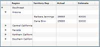
Notice that the data contains a top-level object that contains a Region field and multiple second-level children. Each second-level child also contains a Region field and one or more additional children. The following example shows the AdvancedDataGrid control displaying this data:
The code for this example is in the section Controlling the navigation tree of the AdvancedDataGrid control.
To display flat data as a hierarchy, you group the rows of the flat data before passing the data to the AdvancedDataGrid control. The following code contains a variation on the hierarchical data shown in the previous image, but arranges the data in a flat data structure:
[Bindable]
private var dpFlat:ArrayCollection = new ArrayCollection([
  {Region:"Southwest", Territory:"Arizona",
      Territory_Rep:"Barbara Jennings", Actual:38865, Estimate:40000},
  {Region:"Southwest", Territory:"Arizona",
      Territory_Rep:"Dana Binn", Actual:29885, Estimate:30000},
  {Region:"Southwest", Territory:"Central California",
      Territory_Rep:"Joe Smith", Actual:29134, Estimate:30000},
  {Region:"Southwest", Territory:"Nevada",
      Territory_Rep:"Bethany Pittman", Actual:52888, Estimate:45000},
  {Region:"Southwest", Territory:"Northern California",
      Territory_Rep:"Lauren Ipsum", Actual:38805, Estimate:40000},
  {Region:"Southwest", Territory:"Northern California",
      Territory_Rep:"T.R. Smith", Actual:55498, Estimate:40000},
  {Region:"Southwest", Territory:"Southern California",
      Territory_Rep:"Alice Treu", Actual:44985, Estimate:45000},
  {Region:"Southwest", Territory:"Southern California",
      Territory_Rep:"Jane Grove", Actual:44913, Estimate:45000}
]);
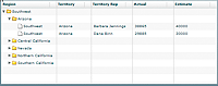
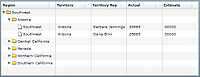
In this example, the data contains a single level of individual records with no inherent hierarchy. To group the data, you specify one or more data fields used to arrange the data in a hierarchy. The following example shows the AdvancedDataGrid control where the flat data has been grouped by the Region field of the data:
The code for this example is in the section Displaying grouped data.
Setting the data provider with hierarchical data
To configure the AdvancedDataGrid control to display hierarchical data and the navigation tree, you pass to the dataProvider property an instance of the HierarchicalData class or of the GroupingCollection2 class. Use the HierarchicalData class when your data is already arranged in a hierarchy. Use the GroupingCollection2 class when your data is in a flat structure. As part of configuring an instance of the GroupingCollection2 class, you specify one or more data fields that are used to arrange the flat data in a hierarchy.
When using the AdvancedDataGrid control with hierarchical data, you might have to free memory when you replace the data provider of the control.
For more information on displaying hierarchical data, see Displaying hierarchical data. For more information on displaying grouped data, see Displaying grouped data.
You can create an instance of the HierarchicalData class or an instance of the GroupingCollection2 class from any data that you can use as a data provider. However, the AdvancedDataGrid control modifies its internal representation of the data as follows:
-
An Array is represented internally by the AdvancedDataGrid control as an instance of the ArrayCollection class.
-
An ArrayCollection class is represented internally by the AdvancedDataGrid control as an instance of the ArrayCollection class.
-
A String that contains valid XML text is represented internally by the AdvancedDataGrid control as an instance of the XMLListCollection class.
-
An XMLNode class or an XMLList class is represented internally by the AdvancedDataGrid control as an instance of the XMLListCollection class.
-
Any object that implements the ICollectionView interface is represented internally by the AdvancedDataGrid control as an instance of the ICollectionView interface.
-
An object of any other data type is wrapped in an Array instance with the object as its sole entry.
For example, you use an Array to create an instance of the HierarchicalData class, and then pass that HierarchicalData instance to the AdvancedDataGrid.dataProvider property. If you read the data back from the AdvancedDataGrid.dataProvider property, it is returned as an ArrayCollection instance.
Calling validateNow() after setting the data provider
In some situations, you may set the data provider of the AdvancedDataGrid control to hierarchical or grouped data, and then immediately try to perform an action based on the new data provider. This typically occurs when you set the dataProvider property in ActionScript, as the following example shows:
 adg.dataProvider = groupedCollection;
 adg.expandAll();
In this example, the call to expandAll() fails because the AdvancedDataGrid control is in the process of setting the dataProvider property, and the expandAll() method either processes the old value of the dataProvider property, if one existed, or does nothing.
In this situation, you must insert the validateNow() method after setting the data provider. The validateNow() method validates and updates the properties and layout of the control, and then redraws it, if necessary. The following example inserts the validateNow() method before the expandAll() method:
 adg.dataProvider = groupedCollection;
 adg.validateNow();
 adg.expandAll();
Do not insert the validateNow() method every time you set the dataProvider property because it can affect the performance of your application; it is only required in some situations when you attempt to perform an operation on the control immediately after setting the dataProvider property.
Controlling the navigation tree of the AdvancedDataGrid control
The AdvancedDataGrid control is sometimes referred to as a tree datagrid because a column of the control uses an expandable tree to determine which rows are currently visible in the control. Often, the tree appears in the left-most column of the control, where the first column of the control is associated with a field of the control's data provider. That data field of the data provider provides the text for the labels of the tree nodes.
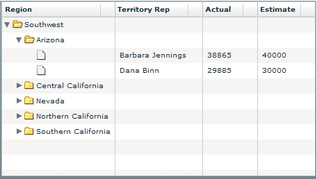
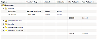
In the following example, you populate the AdvancedDataGrid control with the hierarchal data structure shown in Hierarchical and grouped data display. The data contains a top-level object that contains a Region field, and multiple second-level children. Each second-level child also contains a Region field and one or more children.
The AdvancedDataGrid control in this example defines four columns to display the data: Region, Territory Rep, Actual, and Estimate.
<?xml version="1.0"?>
<!-- dpcontrols/adg/SimpleHierarchicalADG.mxml -->
<s:Application xmlns:fx="http://ns.adobe.com/mxml/2009"
    xmlns:mx="library://ns.adobe.com/flex/mx"
    xmlns:s="library://ns.adobe.com/flex/spark">

  <fx:Script>
    <![CDATA[
          import mx.collections.ArrayCollection;

          include "SimpleHierarchicalData.as";
      ]]>
    </fx:Script>

    <mx:AdvancedDataGrid width="100%" height="100%">
        <mx:dataProvider>
            <mx:HierarchicalData source="{dpHierarchy}"/>
        </mx:dataProvider>
        <mx:columns>
            <mx:AdvancedDataGridColumn dataField="Region"/>
            <mx:AdvancedDataGridColumn dataField="Territory_Rep"
                headerText="Territory Rep"/>
            <mx:AdvancedDataGridColumn dataField="Actual"/>
            <mx:AdvancedDataGridColumn dataField="Estimate"/>
        </mx:columns>
    </mx:AdvancedDataGrid>
</s:Application>
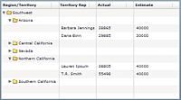
The following image shows the AdvancedDataGrid control created by this example. The control displays a folder icon to represent branch nodes of the tree, and a file icon to represent leaf nodes. The first column of the control is associated with the Region field of the data provider, so the tree labels display the value of the Region field.
Notice that the leaf icon for the tree does not show a label. This is because the individual records for each territory representative do not contain a Region field.
While the tree is often positioned in the left-most column of the control, you can use the treeColumn property to specify any column in the control, as the following example shows:
<?xml version="1.0"?>
<!-- dpcontrols/adg/HierarchicalADGCategoriesTreeColumn.mxml -->
<s:Application xmlns:fx="http://ns.adobe.com/mxml/2009"
    xmlns:mx="library://ns.adobe.com/flex/mx"
    xmlns:s="library://ns.adobe.com/flex/spark">

  <fx:Script>
    <![CDATA[
          import mx.collections.ArrayCollection;

          include "HierarchicalDataCategories.as";
      ]]>
    </fx:Script>

    <mx:AdvancedDataGrid
        width="100%" height="100%"
        treeColumn="{rep}">
        <mx:dataProvider>
            <mx:HierarchicalData source="{dpHierarchy}"
                childrenField="categories"/>
        </mx:dataProvider>
        <mx:columns>
            <mx:AdvancedDataGridColumn dataField="Region"/>
            <mx:AdvancedDataGridColumn id="rep"
                dataField="Territory_Rep"
                headerText="Territory Rep"/>
            <mx:AdvancedDataGridColumn dataField="Actual"/>
            <mx:AdvancedDataGridColumn dataField="Estimate"/>
        </mx:columns>
    </mx:AdvancedDataGrid>
</s:Application>
Setting navigation tree icons and labels
The navigation tree lets you control the icons and labels used for the branch and leaf nodes. For example, you can display a tree of labels with no icons, a tree with just folder icons, a tree with no labels at all, or a tree in its own column that is not associated with any data field.
The following table describes the style properties of the AdvancedDataGrid control that you use to set the tree icons:
|
Style property |
Description |
|---|---|
defaultLeafIcon |
Specifies the leaf icon. |
disclosureClosedIcon |
Specifies the icon that is displayed next to a closed branch node. The default icon is a black triangle. |
disclosureOpenIcon |
Specifies the icon that is displayed next to an open branch node. The default icon is a black triangle. |
folderClosedIcon |
Specifies the folder closed icon for a branch node. |
folderOpenIcon |
Specifies the folder open icon for a branch node. |
The following example sets the default leaf icon to null to hide it, and uses custom icons for the folder open and closed icons:
<?xml version="1.0"?>
<!-- dpcontrols/adg/SimpleHierarchicalADGTreeIcons.mxml -->
<s:Application xmlns:fx="http://ns.adobe.com/mxml/2009"
    xmlns:mx="library://ns.adobe.com/flex/mx"
    xmlns:s="library://ns.adobe.com/flex/spark">

  <fx:Script>
    <![CDATA[
          import mx.collections.ArrayCollection;

          include "SimpleHierarchicalData.as";
      ]]>
    </fx:Script>

    <mx:AdvancedDataGrid width="100%" height="100%"
        defaultLeafIcon="{null}"
        folderOpenIcon="@Embed(source='assets/folderOpenIcon.jpg')"
        folderClosedIcon="@Embed(source='assets/folderClosedIcon.jpg')">
        <mx:dataProvider>
            <mx:HierarchicalData source="{dpHierarchy}"/>
        </mx:dataProvider>
        <mx:columns>
            <mx:AdvancedDataGridColumn dataField="Region"/>
            <mx:AdvancedDataGridColumn dataField="Territory_Rep"
                headerText="Territory Rep"/>
            <mx:AdvancedDataGridColumn dataField="Actual"/>
            <mx:AdvancedDataGridColumn dataField="Estimate"/>
        </mx:columns>
    </mx:AdvancedDataGrid>
</s:Application>
You can also specify the styles by using the setStyle() method, and by using an <fx:Style> tag, as the following example shows:
 <fx:Style>
	@namespace s "library://ns.adobe.com/flex/spark";
 	s|AdvancedDataGrid {
 		defaultLeafIcon:ClassReference(null);
 		folderOpenIcon:Embed(source='assets/folderOpenIcon.jpg');
 		folderClosedIcon:Embed(source='assets/folderClosedIcon.jpg');
 	}
 </fx:Style>
Using the groupIconFunction and groupLabelFunction properties
Use the groupIconFunction and groupLabelFunction properties of the AdvancedDataGrid class to define callback functions to control the display of the leaf nodes of the navigation tree. The callback function specified by the groupIconFunction property controls the icon, and the callback function specified by the groupLabelFunction controls the label.
The following example uses the groupIconFunction property to display a custom icon for the top level node of the navigation tree, and display the default icon for all other leaf nodes of the tree:
<?xml version="1.0"?>
<!-- dpcontrols/adg/SimpleHierarchicalADGGroupIcon.mxml -->
<s:Application xmlns:fx="http://ns.adobe.com/mxml/2009"
    xmlns:mx="library://ns.adobe.com/flex/mx"
    xmlns:s="library://ns.adobe.com/flex/spark">

  <fx:Script>
    <![CDATA[
          import mx.collections.ArrayCollection;

          include "SimpleHierarchicalData.as";

         // Embed the icon for the groups.
         [Bindable]
         [Embed(source="assets/topTreeIcon.png")]
         public var icn:Class;

         // Define the groupIconFunction callback function.
         public function myIconFunc(item:Object, depth:int):Class {
             if(depth == 1)
                 // If this is the top-level of the tree, return the icon.
                 return icn;
             else
                 // If this is any other level, return null.
                 return null;
         }
      ]]>
    </fx:Script>

    <mx:AdvancedDataGrid
        width="100%" height="100%"
        groupIconFunction="myIconFunc">
        <mx:dataProvider>
            <mx:HierarchicalData source="{dpHierarchy}"/>
        </mx:dataProvider>
        <mx:columns>
            <mx:AdvancedDataGridColumn dataField="Region"/>
            <mx:AdvancedDataGridColumn dataField="Territory_Rep"
                headerText="Territory Rep"/>
            <mx:AdvancedDataGridColumn dataField="Actual"/>
            <mx:AdvancedDataGridColumn dataField="Estimate"/>
        </mx:columns>
    </mx:AdvancedDataGrid>
</s:Application>
Creating a separate column for the navigation tree
In the examples in Hierarchical and grouped data display, the first column also displays the Region field of the data. Therefore, as you expand the nodes of the navigation tree, the label of each tree node corresponds to the value of the Region field in the data provider for that row. For the leaf nodes of the tree, the data provider does not contain a value for the Region field, so the labels for the leaf nodes are blank.
You can also put the navigation tree in its own column, where the column is not associated with a data field, as the following example shows:
This example does not associate a data field with the column that contains the tree, so the tree icons appear with no label. This example also sets the folderClosedIcon, folderOpenIcon, and defaultLeafIcon properties of the AdvancedDataGrid control to null, but does display the disclosure icons so that the user can still open and close tree nodes.
The following code implements this example. Notice that the first column is not associated with a data field. Because it is the first column in the data grid, the AdvancedDataGrid control automatically uses it to display the navigation tree.
<?xml version="1.0"?>
<!-- dpcontrols/adg/SimpleHierarchicalADGTreeColumn.mxml -->
<s:Application xmlns:fx="http://ns.adobe.com/mxml/2009"
    xmlns:mx="library://ns.adobe.com/flex/mx"
    xmlns:s="library://ns.adobe.com/flex/spark">

  <fx:Script>
    <![CDATA[
          import mx.collections.ArrayCollection;

          include "SimpleHierarchicalData.as";
      ]]>
    </fx:Script>

    <mx:AdvancedDataGrid width="100%" height="100%"
        folderClosedIcon="{null}"
        folderOpenIcon="{null}"
        defaultLeafIcon="{null}">
        <mx:dataProvider>
            <mx:HierarchicalData source="{dpHierarchy}"/>
        </mx:dataProvider>
        <mx:columns>
            <mx:AdvancedDataGridColumn headerText="" width="50"/>
            <mx:AdvancedDataGridColumn dataField="Region"/>
            <mx:AdvancedDataGridColumn dataField="Territory_Rep"
                headerText="Territory Rep"/>
            <mx:AdvancedDataGridColumn dataField="Actual"/>
            <mx:AdvancedDataGridColumn dataField="Estimate"/>
        </mx:columns>
    </mx:AdvancedDataGrid>
</s:Application>
Displaying hierarchical data
Hierarchical data is data in a structured format where the data is already arranged in a hierarchy. To display hierarchical data in the AdvancedDataGrid control, you set the data provider of the control to an instance of the HierarchicalData class. The structure of the data in the data provider defines how the AdvancedDataGrid control displays the data.
Defining hierarchical data with an ArrayCollection
Using an ArrayCollection is a common way to create hierarchical data, as the following example shows in the SimpleHierarchicalData.as file. In this example, the data has three levels – a root level and two child levels:
[Bindable]
private var dpHierarchy:ArrayCollection = new ArrayCollection([
  {Region:"Southwest", children: [
     {Region:"Arizona", children: [
        {Territory_Rep:"Barbara Jennings", Actual:38865, Estimate:40000},
        {Territory_Rep:"Dana Binn", Actual:29885, Estimate:30000}]},
     {Region:"Central California", children: [
        {Territory_Rep:"Joe Smith", Actual:29134, Estimate:30000}]},
     {Region:"Nevada", children: [
        {Territory_Rep:"Bethany Pittman", Actual:52888, Estimate:45000}]},
     {Region:"Northern California", children: [
        {Territory_Rep:"Lauren Ipsum", Actual:38805, Estimate:40000},
        {Territory_Rep:"T.R. Smith", Actual:55498, Estimate:40000}]},
     {Region:"Southern California", children: [
        {Territory_Rep:"Alice Treu", Actual:44985, Estimate:45000},
        {Territory_Rep:"Jane Grove", Actual:44913, Estimate:45000}]}
  ]}
]);
This example uses the children keyword in the ArrayCollection definition to define the data hierarchy. The children keyword is the default keyword used by the HierarchicalData class to define the hierarchy.
You can use a different keyword to define the hierarchy. The following example shows the HierarchicalDataCategories.as file, which uses the categories keyword:
[Bindable]
private var dpHierarchy:ArrayCollection = new ArrayCollection([
  {Region:"Southwest", categories: [
     {Region:"Arizona", categories: [
        {Territory_Rep:"Barbara Jennings", Actual:38865, Estimate:40000},
        {Territory_Rep:"Dana Binn", Actual:29885, Estimate:30000}]},
     {Region:"Central California", categories: [
        {Territory_Rep:"Joe Smith", Actual:29134, Estimate:30000}]},
     {Region:"Nevada", categories: [
        {Territory_Rep:"Bethany Pittman", Actual:52888, Estimate:45000}]},
     {Region:"Northern California", categories: [
        {Territory_Rep:"Lauren Ipsum", Actual:38805, Estimate:40000},
        {Territory_Rep:"T.R. Smith", Actual:55498, Estimate:40000}]},
     {Region:"Southern California", categories: [
        {Territory_Rep:"Alice Treu", Actual:44985, Estimate:45000},
        {Territory_Rep:"Jane Grove", Actual:44913, Estimate:45000}]}
  ]}
]);
Use the HierarchicalData.childrenField property to specify the name of the field that defines the hierarchy, as the following example shows:
<?xml version="1.0"?>
<!-- dpcontrols/adg/HierarchicalADGCategories.mxml -->
<s:Application xmlns:fx="http://ns.adobe.com/mxml/2009"
    xmlns:mx="library://ns.adobe.com/flex/mx"
    xmlns:s="library://ns.adobe.com/flex/spark">

  <fx:Script>
    <![CDATA[
          import mx.collections.ArrayCollection;

          include "HierarchicalDataCategories.as";
      ]]>
    </fx:Script>

    <mx:AdvancedDataGrid width="100%" height="100%">
        <mx:dataProvider>
            <mx:HierarchicalData source="{dpHierarchy}"
                childrenField="categories"/>
        </mx:dataProvider>
        <mx:columns>
            <mx:AdvancedDataGridColumn dataField="Region"/>
            <mx:AdvancedDataGridColumn dataField="Territory_Rep"
                headerText="Territory Rep"/>
            <mx:AdvancedDataGridColumn dataField="Actual"/>
            <mx:AdvancedDataGridColumn dataField="Estimate"/>
        </mx:columns>
    </mx:AdvancedDataGrid>
</s:Application>
Displaying hierarchical XML data
The examples in the previous section use an ArrayCollection to populate the AdvancedDataGrid control. You can also populate the control with hierarchical XML data. The following example modifies the data from the previous section to format it as XML, and then passes that data to the AdvancedDataGrid control:
<?xml version="1.0"?>
<!-- dpcontrols/adg/SimpleHierarchicalADGXML.mxml -->
<s:Application xmlns:fx="http://ns.adobe.com/mxml/2009"
    xmlns:mx="library://ns.adobe.com/flex/mx"
    xmlns:s="library://ns.adobe.com/flex/spark">

    <fx:Script>
        <![CDATA[
            import mx.collections.HierarchicalData;
            import mx.collections.XMLListCollection;
        ]]>
    </fx:Script>

    <fx:Declarations>
        <fx:XMLList id="dpHierarchyXML" >
            <Region Region="Southwest">
                <Region Region="Arizona">
                    <Territory_Rep Territory_Rep="Barbara Jennings"
                        Actual="38865" Estimate="40000"/>
                    <Territory_Rep Territory_Rep="Dana Binn"
                        Actual="29885" Estimate="30000"/>
                </Region>
                <Region Region="Central California">
                    <Territory_Rep Territory_Rep="Joe Smith"
                        Actual="29134" Estimate="30000"/>
                </Region>
                <Region Region="Nevada">
                    <Territory_Rep Territory_Rep="Bethany Pittman"
                        Actual="52888" Estimate="45000"/>
                </Region>
                <Region Region="Northern California">
                    <Territory_Rep Territory_Rep="Lauren Ipsum"
                        Actual="38805" Estimate="40000"/>
                    <Territory_Rep Territory_Rep="T.R. Smith"
                        Actual="55498" Estimate="40000"/>
                </Region>
                <Region Region="Southern California">
                    <Territory_Rep Territory_Rep="Alice Treu"
                        Actual="44985" Estimate="45000"/>
                    <Territory_Rep Territory_Rep="Jane Grove"
                        Actual="44913" Estimate="45000"/>
                </Region>
            </Region>
        </fx:XMLList>
    </fx:Declarations>

    <mx:AdvancedDataGrid width="100%" height="100%"
        dataProvider="{new HierarchicalData(dpHierarchyXML)}">
        <mx:columns>
            <mx:AdvancedDataGridColumn dataField="@Region"
                headerText="Region"/>
            <mx:AdvancedDataGridColumn dataField="@Territory_Rep"
                headerText="Territory Rep"/>
            <mx:AdvancedDataGridColumn dataField="@Actual"
                headerText="Actual"/>
            <mx:AdvancedDataGridColumn dataField="@Estimate"
                headerText="Estimate"/>
        </mx:columns>
    </mx:AdvancedDataGrid>
</s:Application>
Displaying grouped data
Grouped data is flat data that you arrange in a hierarchy for display in the AdvancedDataGrid control. To group your data, you specify one or more data fields that collect the data into the hierarchy.
Most of the examples in this section use the following flat data to create an instance of the GroupingCollection2 class:
[Bindable]
private var dpFlat:ArrayCollection = new ArrayCollection([
  {Region:"Southwest", Territory:"Arizona",
      Territory_Rep:"Barbara Jennings", Actual:38865, Estimate:40000},
  {Region:"Southwest", Territory:"Arizona",
      Territory_Rep:"Dana Binn", Actual:29885, Estimate:30000},
  {Region:"Southwest", Territory:"Central California",
      Territory_Rep:"Joe Smith", Actual:29134, Estimate:30000},
  {Region:"Southwest", Territory:"Nevada",
      Territory_Rep:"Bethany Pittman", Actual:52888, Estimate:45000},
  {Region:"Southwest", Territory:"Northern California",
      Territory_Rep:"Lauren Ipsum", Actual:38805, Estimate:40000},
  {Region:"Southwest", Territory:"Northern California",
      Territory_Rep:"T.R. Smith", Actual:55498, Estimate:40000},
  {Region:"Southwest", Territory:"Southern California",
      Territory_Rep:"Alice Treu", Actual:44985, Estimate:45000},
  {Region:"Southwest", Territory:"Southern California",
      Territory_Rep:"Jane Grove", Actual:44913, Estimate:45000}
]);
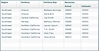
The following image shows an AdvancedDataGrid control that uses this data as input. This example specifies two fields that are used to group the data: Region and Territory. The first column of the AdvancedDataGrid control is associated with the Region field, so the navigation tree uses the Region field to define the labels for the leaf nodes of the tree.
The following code implements this example:
<?xml version="1.0"?>
<!-- dpcontrols/adg/SimpleGroupADGMXML.mxml -->
<s:Application xmlns:fx="http://ns.adobe.com/mxml/2009"
    xmlns:mx="library://ns.adobe.com/flex/mx"
    xmlns:s="library://ns.adobe.com/flex/spark">

    <fx:Script>
        <![CDATA[
            import mx.collections.ArrayCollection;

            include "SimpleFlatData.as"
        ]]>
    </fx:Script>

    <mx:AdvancedDataGrid id="myADG"
        width="100%" height="100%"
        initialize="gc.refresh();">
        <mx:dataProvider>
            <mx:GroupingCollection2 id="gc" source="{dpFlat}">
                <mx:grouping>
                    <mx:Grouping label="Region">
                        <mx:GroupingField name="Region"/>
                        <mx:GroupingField name="Territory"/>
                    </mx:Grouping>
                </mx:grouping>
            </mx:GroupingCollection2>
        </mx:dataProvider>

        <mx:columns>
            <mx:AdvancedDataGridColumn dataField="Region"/>
            <mx:AdvancedDataGridColumn dataField="Territory"/>
            <mx:AdvancedDataGridColumn dataField="Territory_Rep"
                headerText="Territory Rep"/>
            <mx:AdvancedDataGridColumn dataField="Actual"/>
            <mx:AdvancedDataGridColumn dataField="Estimate"/>
        </mx:columns>
   </mx:AdvancedDataGrid>
</s:Application>
The GroupingCollection2 instance reformats the data based on these fields so that internally it is represented by the GroupingCollection2 instance, as the following example shows:
[{GroupLabel:"Southwest", children:[
    {GroupLabel:"Arizona", children:[
      {Region:"Southwest", Territory:"Arizona",
        Territory_Rep:"Barbara Jennings", Actual:38865, Estimate:40000},
      {Region:"Southwest", Territory:"Arizona",
        Territory_Rep:"Dana Binn", Actual:29885, Estimate:30000}]}
    {GroupLabel:"Central California", children:[
      {Region:"Southwest", Territory:"Central California",
        Territory_Rep:"Joe Smith", Actual:29134, Estimate:30000}]}
    {GroupLabel:"Nevada", children:[
      {Region:"Southwest", Territory:"Nevada",
        Territory_Rep:"Bethany Pittman", Actual:52888, Estimate:45000}]}
    {GroupLabel:"Northern California", children:[
      {Region:"Southwest", Territory:"Northern California",
        Territory_Rep:"Lauren Ipsum", Actual:38805, Estimate:40000},
      {Region:"Southwest", Territory:"Northern California",
        Territory_Rep:"T.R. Smith", Actual:55498, Estimate:40000}]}
    {GroupLabel:"Southern California", children:[
      {Region:"Southwest", Territory:"Southern California",
        Territory_Rep:"Alice Treu", Actual:44985, Estimate:45000},
      {Region:"Southwest", Territory:"Southern California",
        Territory_Rep:"Jane Grove", Actual:44913, Estimate:45000}]}
]}]
Notice that the representation consists of a data hierarchy based on the Region and Territory fields of the flat data. The GroupingCollection2 instance still contains the original rows of the input flat data, but those rows are now arranged in a hierarchy based on the grouping fields.
Using synchronous or asynchronous refresh with the AdvancedDataGrid control
The GroupingCollection2.refresh() method applies the settings of the GroupingCollection2 class to the data. You must call this method any time you modify the GroupingCollection2 class, such as by setting the grouping, source, or summaries properties of the GroupingCollection2 class. You also call the GroupingCollection2.refresh() method when you modify a GroupingField of the GroupingCollection2 class, such as by changing the caseInsensitive, compareFunction, or groupingFunction properties.
Notice that in the previous example, the AdvancedDataGrid control calls the GroupingCollection2.refresh() method in response to the initialize event of the AdvancedDataGrid control.
public function refresh(async:Boolean = false, dispatchCollectionEvents:Boolean = false):Boolean
Set the async parameter to false, the default value, for synchronous refresh of the groups and any group summaries. Set it to true for asynchronous refresh.
For synchronous refresh, all groups and summaries are updated together before the method returns. That means your application cannot perform other processing operations for the duration of the call. It also prevents the user from interacting with the control until the refresh completes. Synchronous refresh is optimized for small data sets. Because a synchronous refresh updates all groups and summaries together, it has better performance than an asynchronous refresh. However, for large data sets, users might notice that the application pauses for the duration of the refresh.
In asynchronous refresh, all groups and summaries are updated individually. The refresh() method returns before the groups and summaries are updated so that your application can continue execution. Also, the control is updated during the refresh so that the user can continue to interact with it. For example, in asynchronous refresh, if the displayItemsExpanded property is true, the navigation tree is updated as new groups are created.
The overhead of updating groups and summaries individually, rather than all at once, makes an asynchronous refresh take longer than a synchronous one. However, for large data sets, your application continues to operate during the refresh.
The dispatchCollectionEvents parameter configures the dispatching of events in synchronous mode. If false, the default value, then no events are dispatched during the refresh. This setting provides the best performance for creating groups and summaries. If true, then events are dispatched as groups and summaries are calculated to update the control. However, the navigation tree is not updated as new groups are created.
For an asynchronous refresh, the dispatchCollectionEvents parameter is always set to true.
Using the default MXML property of the GroupingCollection2 class
The grouping property is the default MXML property of the GroupingCollection2 class, so you can rewrite the previous example as follows:
<?xml version="1.0"?>
<!-- dpcontrols/adg/SimpleGroupADGMXMLDefaultProp.mxml -->
<s:Application xmlns:fx="http://ns.adobe.com/mxml/2009"
    xmlns:mx="library://ns.adobe.com/flex/mx"
    xmlns:s="library://ns.adobe.com/flex/spark">

    <fx:Script>
        <![CDATA[
            import mx.collections.ArrayCollection;

            include "SimpleFlatData.as"
        ]]>
    </fx:Script>

    <mx:AdvancedDataGrid id="myADG"
        width="100%" height="100%"
        initialize="gc.refresh();">
        <mx:dataProvider>
            <mx:GroupingCollection2 id="gc" source="{dpFlat}">
                    <mx:Grouping label="Region">
                        <mx:GroupingField name="Region"/>
                        <mx:GroupingField name="Territory"/>
                    </mx:Grouping>
            </mx:GroupingCollection2>
        </mx:dataProvider>

        <mx:columns>
            <mx:AdvancedDataGridColumn dataField="Region"/>
            <mx:AdvancedDataGridColumn dataField="Territory"/>
            <mx:AdvancedDataGridColumn dataField="Territory_Rep"
                headerText="Territory Rep"/>
            <mx:AdvancedDataGridColumn dataField="Actual"/>
            <mx:AdvancedDataGridColumn dataField="Estimate"/>
        </mx:columns>
   </mx:AdvancedDataGrid>
</s:Application>
Setting the name of the GroupLabel field
By default, GroupLabel is the field name for the data items added to the flat data to create the hierarchy. For an example of the data structure created by the GroupingCollection2 class that uses the default field name, see Displaying grouped data.
Use the Grouping.label property to specify a different name so that you can create a different group label for each level of the generated hierarchy. You should always set the Grouping.label property for the top level in your hierarchy. That property is required to sort the nodes of the navigation tree.
Creating a column for the GroupLabel field
The AdvancedDataGrid control uses the GroupLabel field to define the labels for the branch nodes of the navigation tree. One option when displaying grouped data is to create a column for the top-level data items that the grouping fields create. For example, you group your flat data by the Region and Territory fields. These fields appear as the labels for the branch nodes of the navigation tree, so you omit separate columns for those fields, as the following example shows:
The following code creates this example. Notice that this example includes an AdvancedDataGridColumn instance for the GroupLabel field, and no column definitions for the Region and Territory fields.
<?xml version="1.0"?>
<!-- dpcontrols/adg/SimpleGroupADGGroupLabelMXML.mxml -->
<s:Application xmlns:fx="http://ns.adobe.com/mxml/2009"
    xmlns:mx="library://ns.adobe.com/flex/mx"
    xmlns:s="library://ns.adobe.com/flex/spark">

    <fx:Script>
        <![CDATA[
            import mx.collections.ArrayCollection;

            include "SimpleFlatData.as";
        ]]>
    </fx:Script>

    <mx:AdvancedDataGrid id="myADG"
        width="100%" height="100%"
        defaultLeafIcon="{null}"
        initialize="gc.refresh();">
        <mx:dataProvider>
            <mx:GroupingCollection2 id="gc" source="{dpFlat}">
                <mx:Grouping>
                    <mx:GroupingField name="Region"/>
                    <mx:GroupingField name="Territory"/>
                </mx:Grouping>
            </mx:GroupingCollection2>
        </mx:dataProvider>

        <mx:columns>
            <mx:AdvancedDataGridColumn dataField="GroupLabel"
                headerText="Region/Territory"/>
            <mx:AdvancedDataGridColumn dataField="Territory_Rep"
                headerText="Territory Rep"/>
            <mx:AdvancedDataGridColumn dataField="Actual"/>
            <mx:AdvancedDataGridColumn dataField="Estimate"/>
        </mx:columns>
   </mx:AdvancedDataGrid>
</s:Application>
Creating groups in ActionScript
The example in the previous section created the groups in MXML. However, you could let the user define the grouping at run time. The following example creates the groups in ActionScript by using an event handler:
<?xml version="1.0"?>
<!-- dpcontrols/adg/SimpleGroupADG.mxml -->
<s:Application xmlns:fx="http://ns.adobe.com/mxml/2009"
    xmlns:mx="library://ns.adobe.com/flex/mx"
    xmlns:s="library://ns.adobe.com/flex/spark">

    <fx:Script>
      <![CDATA[
        import mx.collections.GroupingField;
        import mx.collections.Grouping;
        import mx.collections.GroupingCollection2;
        import mx.collections.ArrayCollection;

        include "SimpleFlatData.as";

        [Bindable]
        public var myGColl:GroupingCollection2 = new GroupingCollection2();

        private var myGrp:Grouping = new Grouping();

        private function initDG():void {
            // Initialize the GroupingCollection2 instance.
            myGColl.source = dpFlat;

            // The Grouping instance defines the grouping fields
            // in the collection, and the order of the groups
            // in the hierarchy.
            myGrp.fields =
              [new GroupingField("Region"), new GroupingField("Territory")];
            myGrp.label = "Region";

            // The grouping property contains a Grouping instance.
            myGColl.grouping = myGrp;

            // Specify the GroupedCollection as the data provider for
            // the AdvancedDataGrid control.
            myADG.dataProvider=myGColl;

            // Refresh the display.
            myGColl.refresh();
        }
      ]]>
    </fx:Script>

    <mx:AdvancedDataGrid id="myADG"
        width="100%" height="100%"
        creationComplete="initDG();">
        <mx:columns>
            <mx:AdvancedDataGridColumn dataField="Region"/>
            <mx:AdvancedDataGridColumn dataField="Territory"/>
            <mx:AdvancedDataGridColumn dataField="Territory_Rep"
                headerText="Territory Rep"/>
            <mx:AdvancedDataGridColumn dataField="Actual"/>
            <mx:AdvancedDataGridColumn dataField="Estimate"/>
        </mx:columns>
   </mx:AdvancedDataGrid>
</s:Application>
Creating summary rows
Summary data provides a way for you to extract information from your data for display in the AdvancedDataGrid control. For example, you can add summary data that contains the average value of a field across all rows of your data, that contains the maximum field value, the minimum field value, or that contains other types of summaries.
You create summary data about your groups by using the summaries property of the GroupingField class. You can display the summary data in an existing row of the AdvancedDataGrid control, or display it in a separate row.
The following example shows an AdvancedDataGrid control that displays two summary fields, Min Actual and Max Actual:
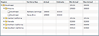
The Min Actual and Max Actual fields in the top row correspond to summaries for all rows in the group, and the Min Actual and Max Actual fields for each Territory correspond to summaries for all rows in the territory subgroup.
The following code creates this control:
<?xml version="1.0"?>
<!-- dpcontrols/adg/SummaryGroupADG.mxml -->
<s:Application xmlns:fx="http://ns.adobe.com/mxml/2009"
    xmlns:mx="library://ns.adobe.com/flex/mx"
    xmlns:s="library://ns.adobe.com/flex/spark">

    <fx:Script>
        <![CDATA[
            import mx.collections.ArrayCollection;

            include "SimpleFlatData.as"
      ]]>
    </fx:Script>

    <mx:AdvancedDataGrid id="myADG"
        width="100%" height="100%"
        initialize="gc.refresh();">
        <mx:dataProvider>
            <mx:GroupingCollection2 id="gc" source="{dpFlat}">
                <mx:Grouping label="Region">
                    <mx:GroupingField name="Region">
                        <mx:summaries>
                          <mx:SummaryRow summaryPlacement="group">
                            <mx:fields>
                                <mx:SummaryField2 dataField="Actual"
                                    label="Min Actual" summaryOperation="MIN"/>
                                <mx:SummaryField2 dataField="Actual"
                                    label="Max Actual" summaryOperation="MAX"/>
                            </mx:fields>
                          </mx:SummaryRow>
                        </mx:summaries>
                    </mx:GroupingField>
                    <mx:GroupingField name="Territory">
                        <mx:summaries>
                          <mx:SummaryRow summaryPlacement="group">
                            <mx:fields>
                                <mx:SummaryField2 dataField="Actual"
                                    label="Min Actual" summaryOperation="MIN"/>
                                <mx:SummaryField2 dataField="Actual"
                                    label="Max Actual" summaryOperation="MAX"/>
                            </mx:fields>
                          </mx:SummaryRow>
                        </mx:summaries>
                    </mx:GroupingField>
                </mx:Grouping>
            </mx:GroupingCollection2>
        </mx:dataProvider>

        <mx:columns>
            <mx:AdvancedDataGridColumn dataField="Region"/>
            <mx:AdvancedDataGridColumn dataField="Territory_Rep"
                headerText="Territory Rep"/>
            <mx:AdvancedDataGridColumn dataField="Actual"/>
            <mx:AdvancedDataGridColumn dataField="Estimate"/>
            <mx:AdvancedDataGridColumn dataField="Min Actual"/>
            <mx:AdvancedDataGridColumn dataField="Max Actual"/>
        </mx:columns>
   </mx:AdvancedDataGrid>
</s:Application>
Notice in this example that you use the GroupingField.summaries property to specify the SummaryRow instance. The SummaryRow instance contains all the information about a data summary. In this example, you use the summaryPlacement property to add the summary data to the grouped data. Optionally, you can add new rows to contain the summary data.
Internally, the GroupingCollection2 class represents the grouped data, with the new summary data fields, as the following example shows:
[{GroupLabel:"Southwest", Max Actual:55498, Min Actual:29134, children:[
  {GroupLabel:"Arizona", Max Actual:38865, Min Actual:29885, children:[
    {Region:"Southwest", Territory:"Arizona",
      Territory_Rep:"Barbara Jennings", Actual:38865, Estimate:40000},
    {Region:"Southwest", Territory:"Arizona",
      Territory_Rep:"Dana Binn", Actual:29885, Estimate:30000}]}
  {GroupLabel:"Central California", Max Actual:29134, Min Actual:29134, children:[
    {Region:"Southwest", Territory:"Central California",
      Territory_Rep:"Joe Smith", Actual:29134, Estimate:30000}]}
  {GroupLabel:"Nevada", Max Actual:52888, Min Actual:52888, children:[
    {Region:"Southwest", Territory:"Nevada",
      Territory_Rep:"Bethany Pittman", Actual:52888, Estimate:45000}]}
  {GroupLabel:"Northern California", Max Actual:55498, Min Actual:38805, children:[
    {Region:"Southwest", Territory:"Northern California",
      Territory_Rep:"Lauren Ipsum", Actual:38805, Estimate:40000},
    {Region:"Southwest", Territory:"Northern California",
      Territory_Rep:"T.R. Smith", Actual:55498, Estimate:40000}]}
  {GroupLabel:"Southern California", Max Actual:44985, Min Actual:44913, children:[
    {Region:"Southwest", Territory:"Southern California",
      Territory_Rep:"Alice Treu", Actual:44985, Estimate:45000},
    {Region:"Southwest", Territory:"Southern California",
      Territory_Rep:"Jane Grove", Actual:44913, Estimate:45000}]}
]}]
Using the default properties of the GroupingField and SummaryRow classes
The GroupingField.summaries property is the default property for the GroupingField class, and the SummaryRow.fields property is the default property for the SummaryRow class; therefore, you can omit those properties in your code and rewrite the previous example, as the following example shows:
<?xml version="1.0"?>
<!-- dpcontrols/adg/SummaryGroupADGDefProp.mxml -->
<s:Application xmlns:fx="http://ns.adobe.com/mxml/2009"
    xmlns:mx="library://ns.adobe.com/flex/mx"
    xmlns:s="library://ns.adobe.com/flex/spark">

    <fx:Script>
        <![CDATA[
            import mx.collections.ArrayCollection;

            include "SimpleFlatData.as"
      ]]>
    </fx:Script>

    <mx:AdvancedDataGrid id="myADG"
        width="100%" height="100%"
        initialize="gc.refresh();">
        <mx:dataProvider>
            <mx:GroupingCollection2 id="gc" source="{dpFlat}">
                <mx:Grouping label="Region">
                    <mx:GroupingField name="Region">
                          <mx:SummaryRow summaryPlacement="group">
                                <mx:SummaryField2 summaryOperation="MIN"
                                    dataField="Actual" label="Min Actual"/>
                                <mx:SummaryField2 summaryOperation="MAX"
                                    dataField="Actual" label="Max Actual"/>
                          </mx:SummaryRow>
                    </mx:GroupingField>
                    <mx:GroupingField name="Territory">
                          <mx:SummaryRow summaryPlacement="group">
                                <mx:SummaryField2 summaryOperation="MIN"
                                    dataField="Actual" label="Min Actual"/>
                                <mx:SummaryField2 summaryOperation="MAX"
                                    dataField="Actual" label="Max Actual"/>
                          </mx:SummaryRow>
                    </mx:GroupingField>
                </mx:Grouping>
            </mx:GroupingCollection2>
        </mx:dataProvider>

        <mx:columns>
            <mx:AdvancedDataGridColumn dataField="Region"/>
            <mx:AdvancedDataGridColumn dataField="Territory_Rep"
                headerText="Territory Rep"/>
            <mx:AdvancedDataGridColumn dataField="Actual"/>
            <mx:AdvancedDataGridColumn dataField="Estimate"/>
            <mx:AdvancedDataGridColumn dataField="Min Actual"/>
            <mx:AdvancedDataGridColumn dataField="Max Actual"/>
        </mx:columns>
   </mx:AdvancedDataGrid>
</s:Application>
Specifying the display location of the summary data in the AdvancedDataGrid control
The SummaryRow class contains the summaryPlacement property that determines where the summary data appears in the AdvancedDataGrid control. The following table describes the values of the summaryPlacement property:
|
Value of summaryPlacement property |
Description |
|---|---|
first |
Creates a summary row as the first row in the group. |
last |
Creates a summary row as the last row in the group. |
group |
Adds the summary data to the row corresponding to the group. |
The previous example named SummaryGroupADG.mxml shows an example of summary data added to the group by specifying group as the value of the summaryPlacement property. The following example shows the same grouped data but with the summaryPlacement property set to last:
You can specify multiple values to the summaryPlacement property, separated by a space; for example, a value of last group specifies to show the summary at the group level and as the last row of the group.
Internally, the GroupingCollection2 represents the grouped data, with the new summary data fields, as the following example shows:
[{GroupLabel:"Southwest", children:[
  {GroupLabel:"Arizona", children:[
    {Region:"Southwest", Territory:"Arizona",
      Territory_Rep:"Barbara Jennings", Actual:38865, Estimate:40000},
    {Region:"Southwest", Territory:"Arizona",
      Territory_Rep:"Dana Binn", Actual:29885, Estimate:30000},
    {Max Actual:38865, Min Actual:29885}]}
  {GroupLabel:"Central California", children:[
    {Region:"Southwest", Territory:"Central California",
      Territory_Rep:"Joe Smith", Actual:29134, Estimate:30000},
    {Max Actual:29134, Min Actual:29134}]}
  {GroupLabel:"Nevada", children:[
    {Region:"Southwest", Territory:"Nevada",
      Territory_Rep:"Bethany Pittman", Actual:52888, Estimate:45000},
    {Max Actual:52888, Min Actual:52888}]}
  {GroupLabel:"Northern California", children:[
    {Region:"Southwest", Territory:"Northern California",
      Territory_Rep:"Lauren Ipsum", Actual:38805, Estimate:40000},
    {Region:"Southwest", Territory:"Northern California",
      Territory_Rep:"T.R. Smith", Actual:55498, Estimate:40000},
    {Max Actual:55498, Min Actual:38805}]}
  {GroupLabel:"Southern California", children:[
    {Region:"Southwest", Territory:"Southern California",
      Territory_Rep:"Alice Treu", Actual:44985, Estimate:45000},
    {Region:"Southwest", Territory:"Southern California",
      Territory_Rep:"Jane Grove", Actual:44913, Estimate:45000},
    {Max Actual:44985, Min Actual:44913}]}
  {Max Actual:55498, Min Actual:29134}
]}]
Notice that a new row is added to the entire group to hold the summary data, and a new row is added to each subgroup to hold its summary data.
Creating multiple summaries
You can specify multiple SummaryRow instances in a single GroupingField instance. In the following example, you create summary data to define the following fields: Min Actual, Max Actual, Min Estimate, and Max Estimate for the Region group.
<?xml version="1.0"?>
<!-- dpcontrols/adg/SummaryGroupADGMultipleSummaries.mxml -->
<s:Application xmlns:fx="http://ns.adobe.com/mxml/2009"
    xmlns:mx="library://ns.adobe.com/flex/mx"
    xmlns:s="library://ns.adobe.com/flex/spark">

    <fx:Script>
        <![CDATA[
            import mx.collections.ArrayCollection;

            include "SimpleFlatData.as"
      ]]>
    </fx:Script>

    <mx:AdvancedDataGrid id="myADG"
        width="100%" height="100%"
        initialize="gc.refresh();">
        <mx:dataProvider>
            <mx:GroupingCollection2 id="gc" source="{dpFlat}">
                <mx:Grouping label="Region">
                    <mx:GroupingField name="Region">
                          <mx:SummaryRow summaryPlacement="group">
                                <mx:SummaryField2 summaryOperation="MIN"
                                   dataField="Actual" label="Min Actual"/>
                                <mx:SummaryField2 summaryOperation="MAX"
                                   dataField="Actual" label="Max Actual"/>
                          </mx:SummaryRow>
                          <mx:SummaryRow summaryPlacement="group">
                                <mx:SummaryField2 summaryOperation="MIN"
                                   dataField="Estimate" label="Min Estimate"/>
                                <mx:SummaryField2 summaryOperation="MAX"
                                   dataField="Estimate" label="Max Estimate"/>
                          </mx:SummaryRow>
                    </mx:GroupingField>
                    <mx:GroupingField name="Territory"/>
                </mx:Grouping>
            </mx:GroupingCollection2>
        </mx:dataProvider>

        <mx:columns>
            <mx:AdvancedDataGridColumn dataField="Region"/>
            <mx:AdvancedDataGridColumn dataField="Territory_Rep"
                headerText="Territory Rep"/>
            <mx:AdvancedDataGridColumn dataField="Actual"/>
            <mx:AdvancedDataGridColumn dataField="Estimate"/>
            <mx:AdvancedDataGridColumn dataField="Min Actual"/>
            <mx:AdvancedDataGridColumn dataField="Max Actual"/>
            <mx:AdvancedDataGridColumn dataField="Min Estimate"/>
            <mx:AdvancedDataGridColumn dataField="Max Estimate"/>
        </mx:columns>
   </mx:AdvancedDataGrid>
</s:Application>
Creating a custom summary function
Use the SummaryRow.summaryObjectFunction property and the SummaryField2.summaryOperation property to add custom summary logic to your application. Your custom summary can perform many types of actions, but the result of the summary calculation must be of type Number.
The SummaryRow.summaryObjectFunction property defines a callback function that defines an instance of the SummaryObject class that collects the summary data. The AdvancedDataGrid control adds the SummaryObject instance to the data provider to display the summary data in the control. Therefore, you define within the SummaryObject instance the properties to display. In the following example, the callback function adds a property named Territory_Rep. This field appears in the Territory Rep column of the control for the summary row.
-
Implement the summaryCalculationBegin(), calculateSummary(), and returnSummary() methods to compute a summary of the values.
-
Implement the summaryOfSummaryCalculationBegin(), calculateSummaryOfSummary(), and returnSummaryOfSummary() methods to compute a summary of summary values.
package myComponents
{
    // dpcontrols/adg/myComponents/MySummaryCalculator.as
    import mx.collections.ISummaryCalculator;
    import mx.collections.SummaryField2;

    public class MySummaryCalculator implements ISummaryCalculator
    {
        public function MySummaryCalculator() {
        }

        // Define the summary object.
        protected var summObj:Object = new Object();
        // Define a var to hold the record count.
        protected var count:int;

        public function summaryCalculationBegin(field:SummaryField2):Object {
            // Initialize the variables.
            summObj.oddCount = 0;
            count = 1;
            return summObj;
        }

        public function calculateSummary(data:Object, field:SummaryField2, rowData:Object):void {
            // Only add the current value for every other row.
            if (count % 2 != 0)
            {
                summObj.oddCount = summObj.oddCount + rowData[field.dataField];
            }
            count++;
        }

        public function returnSummary(data:Object, field:SummaryField2):Number {
            // Return the summary value.
            return summObj.oddCount;
        }

        // Implement these methods if you are creating a summary of summaries.
        public function summaryOfSummaryCalculationBegin(value:Object, field:SummaryField2):Object {
            return null;
        }

        public function calculateSummaryOfSummary(value:Object, newValue:Object, field:SummaryField2):void {
        }

        public function returnSummaryOfSummary(value:Object, field:SummaryField2):Number {
            return 0;
        }
    }
}
Notice that this class implements the summaryOfSummaryCalculationBegin(), calculateSummaryOfSummary(), and returnSummaryOfSummary() methods but leaves the implementation empty.
The following example implements callback functions for the summaryObjectFunction and use the MySummaryCalculator class to calculate a summary of the actual sales revenue for every other row of each territory:
<?xml version="1.0"?>
<!-- dpcontrols/adg/SummaryGroupADGCustomSummary.mxml -->
<s:Application xmlns:fx="http://ns.adobe.com/mxml/2009"
    xmlns:mx="library://ns.adobe.com/flex/mx"
    xmlns:s="library://ns.adobe.com/flex/spark">

    <fx:Script>
        <![CDATA[
            import mx.collections.IViewCursor;
            import mx.collections.SummaryObject;
            import mx.controls.advancedDataGridClasses.AdvancedDataGridColumn;
            import mx.collections.ArrayCollection;

            import myComponents.MySummaryCalculator;

            include "SimpleFlatData.as"

            // Callback function to create
            // the SummaryObject used to hold the summary data.
            private function summObjFunc():SummaryObject {

                // Define the object containing the summary data.
                var obj:SummaryObject = new SummaryObject();
                // Add a field containing a value for the Territory_Rep column.
                obj.Territory_Rep = "Alternating Reps";

                return obj;
            }
      ]]>
    </fx:Script>

    <mx:AdvancedDataGrid id="myADG"
        width="100%" height="100%"
        initialize="gc.refresh();">
        <mx:dataProvider>
            <mx:GroupingCollection2 id="gc" source="{dpFlat}">
                <mx:Grouping label="Region">
                   <mx:GroupingField name="Region"/>
                   <mx:GroupingField name="Territory">
                      <mx:summaries>
                         <mx:SummaryRow summaryObjectFunction="summObjFunc"
                            summaryPlacement="first">
                            <mx:fields>
                               <mx:SummaryField2 dataField="Actual"
                                    summaryOperation="{new myComponents.MySummaryCalculator()}"/>
                            </mx:fields>
                         </mx:SummaryRow>
                      </mx:summaries>
                   </mx:GroupingField>
                </mx:Grouping>
            </mx:GroupingCollection2>
        </mx:dataProvider>

        <mx:columns>
            <mx:AdvancedDataGridColumn dataField="Region"/>
            <mx:AdvancedDataGridColumn dataField="Territory_Rep"
                headerText="Territory Rep"/>
            <mx:AdvancedDataGridColumn dataField="Actual"/>
            <mx:AdvancedDataGridColumn dataField="Estimate"/>
        </mx:columns>
   </mx:AdvancedDataGrid>
</s:Application>
Creating column groups
You collect multiple columns under a single column heading by using column groups, as the following example shows:
In this example, you use flat data to populate the data grid, and group the Actual and Estimate columns under a single column named Revenues.
To group columns in an AdvancedDataGrid control, you must do the following:
-
Use the AdvancedDataGrid.groupedColumns property, rather than the AdvancedDataGrid.columns property, to specify the columns.
-
Use the AdvancedDataGridColumnGroup class to specify the column groups.
The following code implements the AdvancedDataGrid control shown in the previous figure:
<?xml version="1.0"?>
<!-- dpcontrols/adg/ColumnGroupADG.mxml -->
<s:Application xmlns:fx="http://ns.adobe.com/mxml/2009"
    xmlns:mx="library://ns.adobe.com/flex/mx"
    xmlns:s="library://ns.adobe.com/flex/spark">

    <fx:Script>
        <![CDATA[
            import mx.collections.ArrayCollection;

            // Import the data used by the AdvancedDataGrid control.
            include "SimpleFlatData.as";
        ]]>
    </fx:Script>

    <mx:AdvancedDataGrid id="myADG"
        dataProvider="{dpFlat}"
        width="100%" height="100%">
        <mx:groupedColumns>
            <mx:AdvancedDataGridColumn dataField="Region"/>
            <mx:AdvancedDataGridColumn dataField="Territory"/>
            <mx:AdvancedDataGridColumn dataField="Territory_Rep"
                headerText="Territory Rep"/>
            <mx:AdvancedDataGridColumnGroup headerText="Revenues">
                <mx:AdvancedDataGridColumn dataField="Actual"/>
                <mx:AdvancedDataGridColumn dataField="Estimate"/>
            </mx:AdvancedDataGridColumnGroup>
        </mx:groupedColumns>
   </mx:AdvancedDataGrid>
</s:Application>
The groupedColumns property contains instances of the AdvancedDataGridColumn class and of the AdvancedDataGridColumn class. Instances of the AdvancedDataGridColumn class appear in the control as stand-alone columns. All the columns specified in an AdvancedDataGridColumnGroup instance appear together as a grouped column.
You can add multiple groups to the control. The following example adds groups named Area and Revenues:
<?xml version="1.0"?>
<!-- dpcontrols/adg/ColumnGroupADG2Groups.mxml -->
<s:Application xmlns:fx="http://ns.adobe.com/mxml/2009"
    xmlns:mx="library://ns.adobe.com/flex/mx"
    xmlns:s="library://ns.adobe.com/flex/spark">

    <fx:Script>
        <![CDATA[
            import mx.collections.ArrayCollection;

            include "SimpleFlatData.as";
        ]]>
    </fx:Script>

    <mx:AdvancedDataGrid id="myADG"
        dataProvider="{dpFlat}"
        width="100%" height="100%">
        <mx:groupedColumns>
            <mx:AdvancedDataGridColumn dataField="Territory_Rep"
                headerText="Territory Rep"/>
            <mx:AdvancedDataGridColumnGroup headerText="Area">
                <mx:AdvancedDataGridColumn dataField="Region"/>
                <mx:AdvancedDataGridColumn dataField="Territory"/>
            </mx:AdvancedDataGridColumnGroup>
            <mx:AdvancedDataGridColumnGroup headerText="Revenues">
                <mx:AdvancedDataGridColumn dataField="Actual"/>
                <mx:AdvancedDataGridColumn dataField="Estimate"/>
            </mx:AdvancedDataGridColumnGroup>
        </mx:groupedColumns>
   </mx:AdvancedDataGrid>
</s:Application>
You can nest groups so that one column group contains multiple column groups, as the following example shows:
<?xml version="1.0"?>
<!-- dpcontrols/adg/ColumnGroupADG2NestedGroups.mxml -->
<s:Application xmlns:fx="http://ns.adobe.com/mxml/2009"
    xmlns:mx="library://ns.adobe.com/flex/mx"
    xmlns:s="library://ns.adobe.com/flex/spark">

    <fx:Script>
        <![CDATA[
            import mx.collections.ArrayCollection;

            include "SimpleFlatData.as";
        ]]>
    </fx:Script>

    <mx:AdvancedDataGrid id="myADG"
        dataProvider="{dpFlat}"
        width="100%" height="100%">
        <mx:groupedColumns>
            <mx:AdvancedDataGridColumn dataField="Territory_Rep"
                headerText="Territory Rep"/>
            <mx:AdvancedDataGridColumnGroup headerText="All Groups">
                <mx:AdvancedDataGridColumnGroup headerText="Area">
                    <mx:AdvancedDataGridColumn dataField="Region"/>
                    <mx:AdvancedDataGridColumn dataField="Territory"/>
                </mx:AdvancedDataGridColumnGroup>
                <mx:AdvancedDataGridColumnGroup headerText="Revenues">
                    <mx:AdvancedDataGridColumn dataField="Actual"/>
                    <mx:AdvancedDataGridColumn dataField="Estimate"/>
                </mx:AdvancedDataGridColumnGroup>
            </mx:AdvancedDataGridColumnGroup>
        </mx:groupedColumns>
   </mx:AdvancedDataGrid>
</s:Application>
Dragging and dropping columns in the group
By default, you can drag the columns in a group within the group to reposition them. You can also drag the entire group to reposition it in the AdvancedDataGrid control.
To disable dragging of all columns in a group, set the AdvancedDataGridColumnGroup.childrenDragEnabled property to false.
Using grouped columns with hierarchical data
You can use column groups with hierarchical data, as well as flat data. The following example modifies the example in the section Creating a separate column for the navigation tree to group the Actual and Estimates columns under the Revenues group column:
<?xml version="1.0"?>
<!-- dpcontrols/adg/SimpleHierarchicalADGGroupCol.mxml -->
<s:Application xmlns:fx="http://ns.adobe.com/mxml/2009"
    xmlns:mx="library://ns.adobe.com/flex/mx"
    xmlns:s="library://ns.adobe.com/flex/spark">

  <fx:Script>
    <![CDATA[
          import mx.collections.ArrayCollection;

          include "SimpleHierarchicalData.as";
      ]]>
    </fx:Script>

    <mx:AdvancedDataGrid width="100%" height="100%">
        <mx:dataProvider>
            <mx:HierarchicalData source="{dpHierarchy}"/>
        </mx:dataProvider>
        <mx:groupedColumns>
            <mx:AdvancedDataGridColumn dataField="Region"/>
            <mx:AdvancedDataGridColumn dataField="Territory_Rep"
                headerText="Territory Rep"/>
            <mx:AdvancedDataGridColumnGroup headerText="Revenues">
                <mx:AdvancedDataGridColumn dataField="Actual"/>
                <mx:AdvancedDataGridColumn dataField="Estimate"/>
            </mx:AdvancedDataGridColumnGroup>
        </mx:groupedColumns>
    </mx:AdvancedDataGrid>
</s:Application>
Specify a data field for the AdvancedDataGridColumnGroup class
The previous examples for column groups do not specify a data field for the AdvancedDataGridColumnGroup class. However, the AdvancedDataGridColumnGroup class is designed to work with hierarchical data. Therefore, if you specify a data field for the AdvancedDataGridColumnGroup class, it automatically creates a column group for the subfields of that data field.
In the following example, the HierarchicalDataForGroupedColumns.as file defines a hierarchical data set where the Revenues field contains two subfields, Actual and Estimate:
[Bindable]
private var dpHierarchy:ArrayCollection = new ArrayCollection([
  {Region:"Southwest", Territory:"Arizona",
      Territory_Rep:"Barbara Jennings",
      Revenues:{Actual:38865, Estimate:40000}},
  {Region:"Southwest", Territory:"Arizona",
      Territory_Rep:"Dana Binn",
      Revenues:{Actual:29885, Estimate:30000}},
  {Region:"Southwest", Territory:"Central California",
      Territory_Rep:"Joe Smith",
      Revenues:{Actual:29134, Estimate:30000}},
  {Region:"Southwest", Territory:"Nevada",
      Territory_Rep:"Bethany Pittman",
      Revenues:{Actual:52888, Estimate:45000}},
  {Region:"Southwest", Territory:"Northern California",
      Territory_Rep:"Lauren Ipsum",
      Revenues:{Actual:38805, Estimate:40000}},
  {Region:"Southwest", Territory:"Northern California",
      Territory_Rep:"T.R. Smith",
      Revenues:{Actual:55498, Estimate:40000}},
  {Region:"Southwest", Territory:"Southern California",
      Territory_Rep:"Alice Treu",
      Revenues:{Actual:44985, Estimate:45000}},
  {Region:"Southwest", Territory:"Southern California",
      Territory_Rep:"Jane Grove",
      Revenues:{Actual:44913, Estimate:45000}}
]);
The following example uses this data and specifies the Revenues field as the value of the AdvancedDataGridColumnGroup.dataField property, and creates the following output:
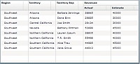
The following code implements this example:
<?xml version="1.0"?>
<!-- dpcontrols/adg/ColumnGroupHierarchData.mxml -->
<s:Application xmlns:fx="http://ns.adobe.com/mxml/2009"
    xmlns:mx="library://ns.adobe.com/flex/mx"
    xmlns:s="library://ns.adobe.com/flex/spark">

    <fx:Script>
        <![CDATA[
            import mx.collections.ArrayCollection;

            include "HierarchicalDataForGroupedColumns.as";
        ]]>
    </fx:Script>

    <mx:AdvancedDataGrid id="myADG"
        width="100%" height="100%"
        defaultLeafIcon="{null}">
        <mx:dataProvider>
            <mx:HierarchicalData source="{dpHierarchy}"/>
        </mx:dataProvider>
        <mx:groupedColumns>
            <mx:AdvancedDataGridColumn dataField="Region"/>
            <mx:AdvancedDataGridColumn dataField="Territory"/>
            <mx:AdvancedDataGridColumn dataField="Territory_Rep"
                headerText="Territory Rep"/>
            <mx:AdvancedDataGridColumnGroup dataField="Revenues">
                <mx:AdvancedDataGridColumn dataField="Actual"/>
                <mx:AdvancedDataGridColumn dataField="Estimate"/>
            </mx:AdvancedDataGridColumnGroup>
        </mx:groupedColumns>
   </mx:AdvancedDataGrid>
</s:Application>
Using item renderers with the AdvancedDataGrid control
You customize the appearance and behavior of cells in an AdvancedDataGrid control by creating custom item renderers and item editors. Use the same process for assigning item editors and item renderers to columns of the AdvancedDataGrid control as you do with the DataGrid control.
For an introduction to item renderers and item editors, see MX item renderers and item editors.
The AdvancedDataGrid control adds capabilities to support item renderers. These capabilities let you perform the following actions:
-
Create rows or columns not associated with data in the data provider. For example, you can create summary rows from the data provider.
-
Span multiple columns with a renderer.
-
Use multiple renderers in the same column. For example, when displaying hierarchical data, you can use a different renderer in the column based on the level of the row in the hierarchy.
Using an item renderer
To use the item renderer capabilities of the AdvancedDataGrid control, you assign the item renderer to the AdvancedDataGrid control itself, not to a specific column, by using the AdvancedDataGrid.rendererProviders property. The following example assigns an item renderer to the Estimate column:
 <mx:AdvancedDataGrid>
 	<mx:columns>
 		<mx:AdvancedDataGridColumn dataField="Region"/>
 		<mx:AdvancedDataGridColumn dataField="Territory_Rep" headerText="Territory Rep"/>
 		<mx:AdvancedDataGridColumn dataField="Actual"/>
 		<mx:AdvancedDataGridColumn dataField="Estimate"/>
 	</mx:columns>

 	<mx:rendererProviders>
 		<mx:AdvancedDataGridRendererProvider
 			columnIndex="3"
 			columnSpan="1"
 			renderer="myComponents.EstimateRenderer"/>
 	</mx:rendererProviders>
 </mx:AdvancedDataGrid>
The rendererProviders property contains an Array of AdvancedDataGridRendererProvider instances. Each AdvancedDataGridRendererProvider instance defines the characteristics for a single item renderer.
In the previous example, the AdvancedDataGridRendererProvider instance specifies to use the EstimateRenderer for column 3, where the first column in the control is column 0, and the renderer spans a single column. If you set the columnSpan property to 0, the renderer spans all columns in the row.
Rather than using the column index to assign the renderer, you specify an id property for the column, and then use the column property to associate the renderer with the column, as the following example shows:
 <mx:AdvancedDataGrid>
 	<mx:columns>
 		<mx:AdvancedDataGridColumn dataField="Region"/>
 		<mx:AdvancedDataGridColumn dataField="Territory_Rep" headerText="Territory Rep"/>
 		<mx:AdvancedDataGridColumn dataField="Actual"/>
 		<mx:AdvancedDataGridColumn id="estCol" dataField="Estimate"/>
 	</mx:columns>

 	<mx:rendererProviders>
 		<mx:AdvancedDataGridRendererProvider
 			column="{estCol}"
 			columnSpan="1"
 			renderer="myComponents.EstimateRenderer"/>
 	</mx:rendererProviders>
 </mx:AdvancedDataGrid>
The depth property lets you associate the renderer with a specific level in the hierarchy of the navigation tree of an AdvancedDataGrid control, where the depth of the top-most node in the navigation tree is 1. The following example associates the renderer with the third level of a navigation tree:
 	<mx:rendererProviders>
 		<mx:AdvancedDataGridRendererProvider
 			columnIndex="3"
 			depth="3"
 			columnSpan="1"
 			renderer="myComponents.EstimateRenderer"/>
 	</mx:rendererProviders>
In the previous example, the AdvancedDataGrid control uses the default renderer for the column until you expand it to the third level of the navigation tree, and then it uses EstimateRenderer component. You use the depth property to assign different renderers to the same column, where the depth property specifies the renderer to use for each level of the tree.
A renderer can span multiple columns. In the following example, you create a renderer that spans two columns:
 <mx:AdvancedDataGrid>
 	<mx:columns>
 		<mx:AdvancedDataGridColumn dataField="Region"/>
 		<mx:AdvancedDataGridColumn dataField="Territory_Rep" headerText="Territory Rep"/>
 		<mx:AdvancedDataGridColumn id="actCol" dataField="Actual"/>
 		<mx:AdvancedDataGridColumn dataField="Estimate"/>
 	</mx:columns>

 	<mx:rendererProviders>
 		<mx:AdvancedDataGridRendererProvider
 			column="{actCol}"
 			depth="3"
 			columnSpan="2"
 			renderer="myComponents.SummaryRenderer"/>
 	</mx:rendererProviders>
 </mx:AdvancedDataGrid>
The previous example uses a single renderer that spans the Actual and Estimate columns to display a combined view of the data for these columns. For an implementation of the SummaryRenderer component, see Using a renderer to generate column data.
The following table describes the properties of the AdvancedDataGridRendererProvider class that you use to configure the renderer:
|
Property |
Description |
|---|---|
column |
The ID of the column for which the renderer is used. If you omit this property, you can use the columnIndex property to specify the column. |
columnIndex |
The column index for which the renderer is used, where the first column has an index of 0. |
columnSpan |
The number of columns that the renderer spans. Set this property to 0 to span all columns. The default value is 1. |
dataField |
The data field in the data provider for the renderer. This property is optional. |
depth |
The depth in the tree at which the renderer is used, where the top-most node of the tree has a depth of 1. Use this property when the renderer should be used only when the tree is expanded to a certain depth, not for all nodes in the tree. By default, the control uses the renderer for all levels of the tree. |
renderer |
The renderer. |
rowSpan |
The number of rows that the renderer spans. The default value is 1. |
Using a renderer to generate column data
The following example shows the results when an item renderer is used to calculate the value of the Difference column of the AdvancedDataGrid control:
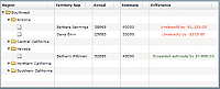
This example defines a column with the id of diffCol that is not associated with a data field in the data provider. Instead, you use the rendererProvider property to assign an item renderer to the column. The item renderer calculates the difference between the actual and estimate values, and then displays a message based on whether the representative exceeded or missed their estimate.
The following code implements this example:
<?xml version="1.0"?>
<!-- dpcontrols/adg/HierarchicalADGSimpleRenderer.mxml -->
<s:Application xmlns:fx="http://ns.adobe.com/mxml/2009"
    xmlns:mx="library://ns.adobe.com/flex/mx"
    xmlns:s="library://ns.adobe.com/flex/spark"
    width="750">

    <fx:Script>
        <![CDATA[
              import mx.collections.ArrayCollection;

              include "SimpleHierarchicalData.as";
        ]]>
    </fx:Script>

    <mx:AdvancedDataGrid width="100%" height="100%">
        <mx:dataProvider>
            <mx:HierarchicalData source="{dpHierarchy}"/>
        </mx:dataProvider>
        <mx:columns>
            <mx:AdvancedDataGridColumn dataField="Region"/>
            <mx:AdvancedDataGridColumn dataField="Territory_Rep"
                headerText="Territory Rep"/>
            <mx:AdvancedDataGridColumn dataField="Actual"/>
            <mx:AdvancedDataGridColumn dataField="Estimate"/>
            <mx:AdvancedDataGridColumn id="diffCol"
                headerText="Difference"/>
        </mx:columns>

        <mx:rendererProviders>
            <mx:AdvancedDataGridRendererProvider column="{diffCol}"
                depth="3" renderer="myComponents.SummaryRenderer"/>
        </mx:rendererProviders>
    </mx:AdvancedDataGrid>
</s:Application>
The following code shows the SummaryRenderer component:
<?xml version="1.0"?>
<!-- dpcontrols/adg/myComponents/SummaryRenderer.mxml -->
<mx:Label xmlns:fx="http://ns.adobe.com/mxml/2009"
    xmlns:mx="library://ns.adobe.com/flex/mx"
    xmlns:s="library://ns.adobe.com/flex/spark" textAlign="center">
    <fx:Script>
        <![CDATA[

        override public function set data(value:Object):void
        {
            // Calculate the difference.
            var diff:Number =
                Number(value["Actual"]) - Number(value["Estimate"]);
            if (diff < 0)
            {
                // If Estimate was greater than Actual,
                // display results in red.
                setStyle("color", "red");
                text = "Undersold by " + usdFormatter.format(diff);
            }
            else
            {
                // If Estimate was less than Actual,
                // display results in green.
                setStyle("color", "green");
                text = "Exceeded estimate by " + usdFormatter.format(diff);
            }
        }
        ]]>
    </fx:Script>

    <fx:Declarations>
        <s:CurrencyFormatter id="usdFormatter"
            useCurrencySymbol="true" negativeCurrencyFormat="1"/>
    </fx:Declarations>
</mx:Label>
Using an item renderer that spans an entire row
You can use an item renderer with a hierarchical data set to display an entire row of data. The following example shows a PieChart control that displays the data from the detail field of the hierarchical data set. Each row contains detailed information about sales revenues for the representative, which is rendered as a segment of the pie chart:
The following code implements this example:
<?xml version="1.0"?>
<!-- dpcontrols/adg/GroupADGChartRenderer.mxml -->
<s:Application xmlns:fx="http://ns.adobe.com/mxml/2009"
    xmlns:mx="library://ns.adobe.com/flex/mx"
    xmlns:s="library://ns.adobe.com/flex/spark">

  <fx:Script>
    <![CDATA[
      import mx.collections.ArrayCollection;

      [Bindable]
      private var dpHierarchy:ArrayCollection= new ArrayCollection([
        {name:"Barbara Jennings", region: "Arizona", total:70, children:[
          {detail:[{amount:5},{amount:10},{amount:20},{amount:45}]}]},
        {name:"Dana Binn", region: "Arizona", total:130,  children:[
          {detail:[{amount:15},{amount:25},{amount:35},{amount:55}]}]},
        {name:"Joe Smith", region: "California", total:229,  children:[
          {detail:[{amount:26},{amount:32},{amount:73},{amount:123}]}]},
        {name:"Alice Treu", region: "California", total:230, children:[
          {detail:[{amount:159},{amount:235},{amount:135},{amount:155}]}
        ]}
      ]);
    ]]>
  </fx:Script>

  <mx:AdvancedDataGrid id="myADG"
    width="100%" height="100%"
    variableRowHeight="true">
    <mx:dataProvider>
       <mx:HierarchicalData source="{dpHierarchy}"/>
    </mx:dataProvider>
    <mx:columns>
        <mx:AdvancedDataGridColumn dataField="name" headerText="Name"/>
        <mx:AdvancedDataGridColumn dataField="total" headerText="Total"/>
    </mx:columns>

    <mx:rendererProviders>
        <mx:AdvancedDataGridRendererProvider
            dataField="detail"
            renderer="myComponents.ChartRenderer"
            columnIndex="0"
            columnSpan="0"/>
    </mx:rendererProviders>
  </mx:AdvancedDataGrid>
</s:Application>
The following code renders the ChartRenderer.mxml component:
<?xml version="1.0"?>
<!-- dpcontrols/adg/myComponents/ChartRenderer.mxml -->
<mx:VBox height="200" width="100%" xmlns:fx="http://ns.adobe.com/mxml/2009"
    xmlns:mx="library://ns.adobe.com/flex/mx"
    xmlns:s="library://ns.adobe.com/flex/spark">
    <mx:PieChart dataProvider="{data.detail}"
        width="100%"
        height="100%"
        showDataTips="true">
        <mx:series>
            <mx:PieSeries labelPosition="callout" field="amount"/>
        </mx:series>
    </mx:PieChart>
</mx:VBox>
You can modify this example to display the PieChart control in a column. In the following example, you add a Detail column to the control, and then specify that the item renderer is for column 2 of the control:
<?xml version="1.0"?>
<!-- dpcontrols/adg/GroupADGChartRendererOneRow.mxml -->
<s:Application xmlns:fx="http://ns.adobe.com/mxml/2009"
    xmlns:mx="library://ns.adobe.com/flex/mx"
    xmlns:s="library://ns.adobe.com/flex/spark">

  <fx:Script>
    <![CDATA[
      import mx.collections.ArrayCollection;

      [Bindable]
      private var dpHierarchy:ArrayCollection= new ArrayCollection([
        {name:"Barbara Jennings", region: "Arizona", total:70, children:[
          {detail:[{amount:5},{amount:10},{amount:20},{amount:45}]}]},
        {name:"Dana Binn", region: "Arizona", total:130,  children:[
          {detail:[{amount:15},{amount:25},{amount:35},{amount:55}]}]},
        {name:"Joe Smith", region: "California", total:229,  children:[
          {detail:[{amount:26},{amount:32},{amount:73},{amount:123}]}]},
        {name:"Alice Treu", region: "California", total:230, children:[
          {detail:[{amount:159},{amount:235},{amount:135},{amount:155}]}
        ]}
      ]);
    ]]>
  </fx:Script>

  <mx:AdvancedDataGrid id="myADG"
    width="100%" height="100%"
    variableRowHeight="true">
    <mx:dataProvider>
       <mx:HierarchicalData source="{dpHierarchy}"/>
    </mx:dataProvider>
    <mx:columns>
        <mx:AdvancedDataGridColumn dataField="name" headerText="Name"/>
        <mx:AdvancedDataGridColumn dataField="total" headerText="Total"/>
        <mx:AdvancedDataGridColumn dataField="detail" headerText="Detail"/>
    </mx:columns>

    <mx:rendererProviders>
        <mx:AdvancedDataGridRendererProvider
            dataField="detail"
            renderer="myComponents.ChartRenderer"
            columnIndex="2"/>
    </mx:rendererProviders>
  </mx:AdvancedDataGrid>
</s:Application>
Keyboard navigation
The following keystrokes are built into the AdvancedDataGrid control to let users navigate the control:
|
Keyboard action |
Key assignments |
|---|---|
|
Standard |
|
|
In editable mode |
|
|
For the expandable tree |
|
|
For column headers |
|
|
To scroll vertically and horizontally in pages |
|
|
To move focus out of AdvancedDataGrid while editing is in progress |
When you set AdvancedDataGrid.editable=true or AdvancedDataGridColumn=true:
When focus is on the AdvancedDataGrid control:
When editing the cell:
When you set AdvancedDataGrid.editable=false or AdvancedDataGridColumn=false:
|
Navigation
Adobe and Adobe Flash Platform are either registered trademarks or trademarks of Adobe Systems Incorporated in the United States and/or other countries and are used by permission from Adobe. No other license to the Adobe trademarks are granted.