
Custom Flex components
Flex supports a component-based development model. You use the predefined components included with Flex to build your applications, and create components for your specific application requirements. You can create custom components by using MXML or ActionScript.
About custom components
Defining your own custom components has several benefits. One advantage is that components let you divide your applications into modules that you can develop and maintain separately. By implementing commonly used logic within custom components, you can also build a suite of reusable components that you can share among multiple Flex applications.
Also, you can extend the Flex class hierarchy to base your custom components on the set of predefined Flex components. You can create custom versions of Flex visual controls, as well as custom versions of nonvisual components, such as validators, formatters, and effects.
You can build an entire Flex application in a single MXML file that contains both your MXML code and any supporting ActionScript code. However, as your application gets larger, your single file also grows in size and complexity. This type of application would soon become difficult to understand and debug, and very difficult for multiple developers to work on simultaneously. By breaking it up into components, you can simplify the architecture and divide the application among multiple developers.
Using modules in application development
A common coding practice is to divide an application into functional units, or modules, where each module performs a discrete task. Dividing your application into modules provides you with many benefits, including the following:
- Ease of development
-
Different developers or development groups can develop and debug modules independently of each other.
- Reusability
-
You can reuse modules in different applications so that you do not have to duplicate your work.
- Maintainability
-
By developing your application in discrete modules, you can isolate and debug errors faster than you could if you developed your application in a single file.
In Flex, a module corresponds to a custom component, implemented either in MXML or in ActionScript. The following image shows an example of a Flex application divided into components:
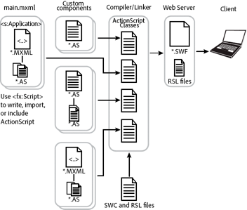
This example shows the following relationships among the components:
-
You define a main MXML file that contains the <s:Application> tag.
-
In your main MXML file, you define an ActionScript block that uses the <fx:Script> tag. Inside the ActionScript block, you write ActionScript code, or include external logic defined by an ActionScript file. Typically, you use this area to write small amounts of ActionScript code. If you must write large amounts of ActionScript code, you should include an external file.
-
The main MXML file uses MXML and ActionScript to reference components supplied with Flex, and to reference your custom components.
-
Custom components can reference other custom components.
-
The Flex class hierarchy
Flex is implemented as an ActionScript class hierarchy. That class hierarchy contains component classes, manager classes, data-service classes, and classes for all other Flex features. For a complete description of the class hierarchy, see the ActionScript 3.0 Reference for Apache Flex.
All visual components are derived from the UIComponent ActionScript class. Flex nonvisual components are also implemented as a class hierarchy in ActionScript. The most commonly used nonvisual classes are the Validator, Formatter, and Effect base classes.
You create custom components by extending the Flex class hierarchy using the MXML and ActionScript languages. Components inherit the properties, methods, events, styles, and effects of their superclasses.
Spark and MX components
Flex defines two sets of components: Spark and MX. The Spark components are new for Flex 4 and are defined in the spark.* packages. The MX components shipped in previous releases of Flex and are defined in the mx.* packages.
Spark and MX define some of the same components. For example, Spark defines a button control in the spark.components package, and MX defines a button control in the mx.controls package. When a component is available in both Spark and MX, it's best to use the Spark component.
Spark and MX also define components that are unique. For example, Spark defines components to perform three dimensional effects. MX defines charting controls not included in Spark. Your applications often contains a mixture of Spark and MX components.
Customizing existing components
One reason for you to create a component is to customize an existing component for your application requirements. This customization could be as simple as setting the label property of a Button control to Submit to create a custom button for all of your forms.
You might also want to modify the behavior of a Flex component. For example, a VBox container lays out its children from the top of the container to the bottom in the order in which you define the children within the container. Instead, you might want to customize the VBox container to lay out its children from bottom to top.
Another reason to customize a Flex component is to add logic or behavior to it. For example, you might want to modify the TextInput control so that it supports a key combination to delete all the text entered into the control. Or, you might want to modify a component so that it dispatches a new event type when a user carries out an action.
To create your own components, you create subclasses from the UIComponent class, or any other class in the Flex component hierarchy. For example, if you want to create a component that behaves almost the same as a Button component does, you can extend the Button class instead of recreating all the functionality of the Button class from the base classes.
Depending on the modifications that you want to make, you can create a subclass of a Flex component in MXML or ActionScript.
The relationship between MXML components and ActionScript components
To create a custom component in ActionScript, you create a subclass from a class in the Flex class hierarchy. The name of your class (for example, MyASButton), must correspond to the name of the ActionScript file; for example, MyASButton.as. The subclass inherits all of the properties and methods of the superclass. In this example, you use the <MyASButton> tag to reference it in MXML.
When you create a custom component in MXML, the Flex compiler automatically creates an ActionScript class. The name of the MXML file (for example, MyMXMLButton.mxml) corresponds to the ActionScript class name. In this example, the ActionScript class is named MyMXMLButton, and you use the <MyMXMLButton> tag to reference it in MXML.
The following example shows two components based on the Flex Button component, one defined in ActionScript and the other in MXML:
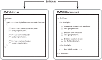
Both implementations create a component as a subclass of the Button class and, therefore, inherit all of the public and protected properties, methods, and other elements of the Button class. Within each implementation, you can override inherited items, define new items, and add your custom logic.
However, when you use MXML, the Flex compiler performs most of the overhead required to create a subclass of a component for you. This makes it much easier to create components in MXML than in ActionScript.
Deciding to create components in MXML or ActionScript
One of the first decisions that you must make when creating custom components is deciding whether to write them in MXML or in ActionScript. Ultimately, it is the requirements of your application that determine how you develop your custom component.
Some basic guidelines include the following:
-
MXML components and ActionScript components both define new ActionScript classes.
-
Almost anything that you can do in a custom ActionScript custom component, you can also do in a custom MXML component. However, for simple components, such as components that modify the behavior of an existing component or add a basic feature to an existing component, it is simpler and faster to create them in MXML.
-
When your new component is a composite component that contains other components, and you can express the positions and sizes of those other components using one of the Flex containers, you should use MXML to define your component.
-
To modify the behavior of the component, such as the way a container lays out its children, use ActionScript.
-
To create a visual component by creating a subclass from UIComponent, use ActionScript.
-
To create a nonvisual component, such as a formatter, validator, or effect, use ActionScript.
-
To add logging support to your control, use ActionScript. For more information, see Logging.
For more information on custom MXML components, see Simple MXML components. For more information on ActionScript components, see Create simple visual components in ActionScript.
Creating new components
Your application might require you to create new components, rather than modifying existing ones. To create components, you typically create them in ActionScript by creating a subclass from the UIComponent class. This class contains the generic functionality of all Flex components. You then add the required functionality to your new component to meet your application requirements.
For more information, see Create advanced MX visual components in ActionScript.
Creating custom components
You create custom components as either MXML or ActionScript files.
Creating MXML components
Flex supplies the Spark ComboBox control that you can use as part of a form that collects address information from a customer. In the form, you can include a ComboBox control to let the user select the state portion of the address from a list of the 50 states in the U.S. In an application that has multiple forms where a user can enter an address, it would be tedious to create and initialize multiple ComboBox controls with the same information about all 50 states.
Instead, you create an MXML component that contains a ComboBox control with all the 50 states defined within in it. Then, wherever you need to add a state selector to your application, you use your custom MXML component. The following example shows a possible definition for a custom ComboBox control:
<?xml version="1.0"?>
<!-- createcomps_intro\StateComboBox.mxml -->
<!-- Specify the root tag and namespace. -->
<s:ComboBox xmlns:fx="http://ns.adobe.com/mxml/2009"
    xmlns:s="library://ns.adobe.com/flex/spark"
    xmlns:mx="library://ns.adobe.com/flex/mx">
    <s:dataProvider>
        <s:ArrayList>
            <fx:String>AK</fx:String>
            <fx:String>AL</fx:String>
            <!-- Add all other states. -->
        </s:ArrayList>
    </s:dataProvider>
</s:ComboBox>
This example shows the following:
-
The first line of the custom MXML component definition specifies the declaration of the XML version.
-
The first MXML tag of the component, called its root tag, specifies a Flex component or a custom component. MXML components correspond to ActionScript classes, therefore, the root tag specifies the superclass of the MXML component. In this example, the MXML component specifies the Flex ComboBox control as its superclass.
-
The xmlns properties in the root tag specifies the Flex XML namespaces. In this example, the xmlns property indicates that tags in the MX namespace use the prefix mx:.
-
The remaining lines of the component specify its definition.
The main application, or any other MXML component file, references the StateComboBox component, as the following example shows:
<?xml version="1.0"?>
<!-- createcomps_intro/IntroMyApplication.mxml -->
<!-- Include the namespace definition for your custom components. -->
<s:Application xmlns:fx="http://ns.adobe.com/mxml/2009"
    xmlns:s="library://ns.adobe.com/flex/spark"
    xmlns:mx="library://ns.adobe.com/flex/mx"
    xmlns:MyComp="*">

    <!-- Use the filename as the MXML tag name. -->
    <MyComp:StateComboBox/>
</s:Application>
The MXML tag name for a custom component is composed of two parts: the namespace prefix, in this case MyComp, and the tag name. The namespace prefix tells Flex where to look for the file that implements the custom component. The tag name corresponds to the filename of the component, in this case StateComboBox.mxml. Therefore, a file named StateComboBox.mxml defines a component with the tag name of < namespace: StateComboBox>.
As part of the <s:Application> tag, the main application file includes the following namespace definition: xmlns:MyComp="*". This definition specifies that the component is in the same directory as the main application file, or in a directory included in the ActionScript source path. For more information on deploying MXML components, see Simple MXML components.
The best practice is to put your custom components in a subdirectory of your application. That practice helps to ensure that you do not have duplicate component names because they have a different namespace. If you stored your component in the myComponents subdirectory of your application, you would specify the namespace definition as xmlns:MyComp="myComponents.*".
The StateComboBox.mxml file specifies the ComboBox control as its root tag, so you can reference all of the properties of the ComboBox control in the MXML tag of your custom component, or in the ActionScript specified in an <fx:Script> tag. For example, the following example specifies the ComboBox.maxChars property and a listener for the ComboBox.close event for your custom control:
<?xml version="1.0"?>
<!-- createcomps_intro/MyApplicationProperties.mxml -->
<s:Application  xmlns:fx="http://ns.adobe.com/mxml/2009"
    xmlns:s="library://ns.adobe.com/flex/spark"
    xmlns:mx="library://ns.adobe.com/flex/mx"
    xmlns:MyComp="myComponents.*">

    <fx:Script>
        <![CDATA[
            import flash.events.Event;

            private function handleCloseEvent(eventObj:Event):void {
                // ...
            }
        ]]>
    </fx:Script>

    <MyComp:StateComboBox maxChars="25"
        close="handleCloseEvent(event);"/>
</s:Application>
For more information on MXML components, see Simple MXML components.
Creating ActionScript components
You create ActionScript components by defining ActionScript classes. You can create the following types of components in ActionScript:
- User-interface, or visual, components
-
User-interface components contain both processing logic and visual elements. You create custom user-interface components to modify existing behavior or add new functionality to the component. These components usually extend the Flex component hierarchy. You can extend from the UIComponent class, or any of the Flex components, such as Button, ComboBox, or DataGrid. Your custom ActionScript component inherits all of the methods, properties, events, styles, and effects of its superclass.
- Nonvisual components
-
Nonvisual components define nonvisual elements. Flex includes several types of nonvisual components that you can create, including formatters, validators, and effects. You create nonvisual components by creating a subclass from the Flex component hierarchy. For validators, you create subclasses of the Validator class; for formatters you create subclasses of the Formatter class; and for effects, you create subclasses of the Effect class.
For example, you can define a custom button component based on the Spark Button class, as the following example shows:
package myComponents
{
    // createcomps_intro/myComponents/MyButton.as
    import spark.components.Button;

    public class MyButton extends Button {

        // Define the constructor.
        public function MyButton() {
            // Call the constructor in the superclass.
            super();
            // Set the label property to "Submit".
            label="Submit";
        }
    }
}
In this example, you write your MyButton class to the MyButton.as file.
You must define your custom components within an ActionScript package. The package reflects the directory location of your component in the directory structure of your application. Typically, you put custom ActionScript components in directories that are in the ActionScript source path, subdirectories of your application, or for Adobe® LiveCycle™ Data Services ES, in the WEB-INF/flex/user_classes directory. In this example, the package statement specifies that the MyButton.as file is in the myComponents subdirectory of your Flex application.
In the MXML file that references the custom component, you define the namespace and reference it in an MXML file as the following example shows:
<?xml version="1.0"?>
<!-- createcomps_intro/MyApplicationASComponent.mxml -->
<!-- Include the namespace definition for your custom components. -->
<s:Application xmlns:fx="http://ns.adobe.com/mxml/2009"
    xmlns:s="library://ns.adobe.com/flex/spark"
    xmlns:mx="library://ns.adobe.com/flex/mx"
    xmlns:MyComp="myComponents.*">

    <!-- Use the filename as the MXML tag name. -->
    <MyComp:MyButton/>

</s:Application>
In this example, you first define the MyComp namespace that specifies the location of your custom component in the application's directory structure. You then reference the component as an MXML tag using the namespace prefix.
For more information, see Create simple visual components in ActionScript.
Deploying components
When you deploy your custom components as MXML or ActionScript files, you typically deploy them in the same directory structure as your application files, in a directory specified in the ActionScript source path, or for LiveCycle Data Services ES, in the WEB-INF/flex/user_classes directory.
For security reasons, you may decide not to deploy your custom components as source code files. Alternatively, you can deploy your components as SWC files or as part of a Runtime Shared Library (RSL).
A SWC file is an archive file for Flex components. SWC files make it easy to exchange components among Flex developers. You need only exchange a single file, rather than the MXML or ActionScript files and images and other resource files. In addition, the SWF file inside a SWC file is compiled, which means that the code is hidden from casual view.
SWC files can contain one or more components and are packaged and expanded with the PKZip archive format. You can open and examine a SWC file using WinZip, JAR, or another archiving tool. However, you should not manually change the contents of a SWC file, and you should not try to run the SWF file that is in a SWC file outside of a SWC file.
To create a SWC file, use the compc utility in the flex_install_dir/bin directory. The compc utility generates a SWC file from MXML component source files and/or ActionScript component source files. For more information on compc, see Flex compilers.
One way to reduce the size of your application's SWF file is by externalizing shared assets into stand-alone files that can be separately downloaded and cached on the client. These shared assets are loaded by any number of applications at run time, but only need to be transferred to the client once. These shared files are known as Runtime Shared Libraries or RSLs.
For more information, including information on how to create an RSL file, see Runtime Shared Libraries.
Navigation
Adobe, Adobe LiveCycle Data Services ES and Adobe Flash Platform are either registered trademarks or trademarks of Adobe Systems Incorporated in the United States and/or other countries and are used by permission from Adobe. No other license to the Adobe trademarks are granted.