
Formatting charts
You can customize the look and feel of youry Flex charting controls. You can format the appearance of almost all chart elements, from the font properties of an axis label to the width of the stroke in a legend.
To set style properties in your chart controls, you can use Cascading Style Sheets (CSS) syntax or set the style properties inline as tag attributes. As with all styles, you can call the setStyle() method to set any style on your chart elements.
For more information on using the setStyle() method, see Using the setStyle() and getStyle() methods.
Applying chart styles
You can apply style properties to charts by using CSS or inline syntax. You can also apply styles to chart elements by using binding.
Applying styles with CSS
You can apply styles to charting components with CSS definitions. You can set chart properties such as fonts and tick marks, or series properties, such as the fills of the boxes in a ColumnChart.
A limitation of using CSS to style your charts is that the styleable chart properties often use compound values, such as strokes and gradient fills, that cannot be expressed by using CSS. The result is that you cannot express all values of chart styles by using CSS syntax.
To determine if an object's properties can be styled by using CSS, check to see if the class or its parent implements the IStyleClient interface. If it does, then you can set the values of the object's style properties with CSS. If it does not, then the class does not participate in the styles subsystem and you therefore cannot set its properties with CSS. In that case, the properties are public properties of the class and not style properties. You can apply properties with CSS by using pre-defined styles for some classes, such as the verticalAxisStyleName and horizontalAxisStyleName. For more information, see Using predefined axis style properties.
Applying CSS to chart controls
You can use the control name in CSS to define styles for that control. This is referred to as a type selector, because the style you define is applied to all controls of that type. For example, the following style definition specifies the font for all BubbleChart controls:
<?xml version="1.0"?>
<!-- charts/BubbleStyles.mxml -->
<s:Application
    xmlns:fx="http://ns.adobe.com/mxml/2009"
    xmlns:mx="library://ns.adobe.com/flex/mx"
    xmlns:s="library://ns.adobe.com/flex/spark"
    creationComplete="srv.send()"
    height="600">

    <fx:Declarations>
        <!-- View source of the following page to see the structure of the data that Flex uses in this example. -->
        <mx:HTTPService id="srv" url="http://examplesserver/chart_examples/expenses-xml.aspx"/>
        <!-- To see data in an HTML table, go to http://examplesserver/chart_examples/expenses.aspx -->
    </fx:Declarations>

    <fx:Style>
     @namespace mx "library://ns.adobe.com/flex/mx";

     mx|BubbleChart {
         fontFamily:Arial;
         fontSize:15;
         color:#FF0033;
      }
    </fx:Style>

    <s:layout>
        <s:VerticalLayout/>
    </s:layout>

  <s:Panel title="Bubble Chart">
        <s:layout>
            <s:VerticalLayout/>
        </s:layout>
     <mx:BubbleChart id="myChart"
        minRadius="1"
        maxRadius="50"
        dataProvider="{srv.lastResult.data.result}"
        showDataTips="true">
        <mx:series>
           <mx:BubbleSeries
                xField="profit"
                yField="expenses"
                radiusField="amount"
                displayName="Profit"/>
        </mx:series>
     </mx:BubbleChart>
     <mx:Legend dataProvider="{myChart}"/>
  </s:Panel>
</s:Application>
Some styles, such as fontSize and fontFamily, are inheritable, which means that if you set them on the chart control, the axes labels, titles, and other text elements on the chart inherit those settings. To determine whether a style is inheritable, see that style's description in ActionScript 3.0 Reference for Apache Flex.
Axis labels appear next to the tick marks along the chart's axis. Titles appear parallel to the axis line. By default, the text on an axis uses the text styles of the chart control.
Axis elements use whatever styles are set on the chart control's type or class selector, but you can also specify different styles for each axis by using a class selector on the axis renderer or predefined axis style properties.
Applying different styles to each series
To apply different styles to each series in the charts with CSS, you use the chartSeriesStyles property. This property takes an Array of Strings. Each String specifies the name of a class selector in the style sheet. Flex applies each of these class selectors to a series.
To apply CSS to a series, you define a type or class selector for the chart that defines the chartSeriesStyles property. You then define each class selector named in the chartSeriesStyles property.
Essentially, you are defining a new style for each series in your chart. For example, if you have a ColumnChart control with two series, you can apply a different style to each series without having to explicitly set the styles on each series.
The following example defines the colors for two series in the ColumnChart control:
<?xml version="1.0"?>
<!-- charts/SeriesStyles.mxml -->
<s:Application
    xmlns:fx="http://ns.adobe.com/mxml/2009"
    xmlns:mx="library://ns.adobe.com/flex/mx"
    xmlns:s="library://ns.adobe.com/flex/spark"
    creationComplete="srv.send()"
    height="600">

    <fx:Declarations>
        <!-- View source of the following page to see the structure of the data that Flex uses in this example. -->
        <mx:HTTPService id="srv" url="http://examplesserver/chart_examples/expenses-xml.aspx"/>
        <!-- To see data in an HTML table, go to http://examplesserver/chart_examples/expenses.aspx -->
    </fx:Declarations>

  <fx:Style>
     @namespace mx "library://ns.adobe.com/flex/mx";

     mx|ColumnChart {
        chartSeriesStyles: PCCSeries1, PCCSeries2;
     }
     .PCCSeries1 {
        fill: #CCFF66;
     }
     .PCCSeries2 {
        fill: #CCFF99;
     }
  </fx:Style>

    <s:layout>
        <s:VerticalLayout/>
    </s:layout>

  <s:Panel title="Setting Styles on Series">
     <s:layout>
         <s:VerticalLayout/>
     </s:layout>
     <mx:ColumnChart id="column"
        dataProvider="{srv.lastResult.data.result}"
        showDataTips="true">
        <mx:horizontalAxis>
           <mx:CategoryAxis categoryField="month"/>
        </mx:horizontalAxis>
        <mx:series>
           <mx:ColumnSeries
                xField="month"
                yField="profit"
                displayName="Profit"/>
           <mx:ColumnSeries
                xField="month"
                yField="expenses"
                displayName="Expenses"/>
        </mx:series>
     </mx:ColumnChart>
     <mx:Legend dataProvider="{column}"/>
  </s:Panel>
</s:Application>
Flex sets the styleName property of each series to the corresponding selector in the chartSeriesStyles Array. You do not have to explicitly set styles for each series. If you have more series than available chartSeriesStyles selectors, the chart begins again with the first style.
If you manually set the value of the styleName property on a particular series, that style takes priority over the styles that the chartSeriesStyles property specifies.
For PieChart controls, you can define the fills property of the series. The PieChart applies the values in this Array to the pie wedges. It starts with the first value if there are more wedges than values defined in the Array. The following example creates a PieChart that uses a spectrum of reds for the wedges:
<?xml version="1.0"?>
<!-- charts/PieWedgeFills.mxml -->
<s:Application
    xmlns:fx="http://ns.adobe.com/mxml/2009"
    xmlns:mx="library://ns.adobe.com/flex/mx"
    xmlns:s="library://ns.adobe.com/flex/spark"
    creationComplete="srv.send()"
    height="600">

    <fx:Declarations>
        <!-- View source of the following page to see the structure of the data that Flex uses in this example. -->
        <mx:HTTPService id="srv" url="http://examplesserver/chart_examples/budget-xml.aspx"/>
        <!-- To see data in an HTML table, go to http://examplesserver/chart_examples/budget.aspx -->
    </fx:Declarations>

  <fx:Style>
     @namespace mx "library://ns.adobe.com/flex/mx";

     mx|PieSeries {
         fills:#FF0000, #FF3333, #FF6666, #FF9999, #FFAAAA, #FFCCCC;
      }
  </fx:Style>

    <s:layout>
        <s:VerticalLayout/>
    </s:layout>

  <s:Panel title="Setting Pie Wedge Fills with CSS">
     <s:layout>
         <s:VerticalLayout/>
     </s:layout>
     <mx:PieChart id="pie"
        dataProvider="{srv.lastResult.data.result}"
        showDataTips="true">
        <mx:series>
           <mx:PieSeries
                field="amount"
                nameField="item"
                labelPosition="callout"/>
        </mx:series>
     </mx:PieChart>
     <mx:Legend dataProvider="{pie}"/>
  </s:Panel>
</s:Application>
Using predefined axis style properties
The following predefined class selectors are available for axis styles:
-
horizontalAxisStyleName
-
verticalAxisStyleName
Flex applies each style to the corresponding axis.
In addition to these, the following two class selectors define an array of class selectors that define the style properties for the axes:
-
horizontalAxisStyleNames
-
verticalAxisStyleNames
In this case, Flex loops through the selectors and applies them to the axis renderers that correspond to their position in the Array.
In addition to these class selectors for the axis style properties, you can use the axisTitleStyleName and gridLinesStyleName class selectors to apply styles to axis titles and grid lines.
The following example removes tick marks from the horizontal axis:
<?xml version="1.0"?>
<!-- charts/PredefinedAxisStyles.mxml -->
<s:Application
    xmlns:fx="http://ns.adobe.com/mxml/2009"
    xmlns:mx="library://ns.adobe.com/flex/mx"
    xmlns:s="library://ns.adobe.com/flex/spark"
    creationComplete="srv.send()"
    height="600">

    <fx:Declarations>
        <!-- View source of the following page to see the structure of the data that Flex uses in this example. -->
        <mx:HTTPService id="srv" url="http://examplesserver/chart_examples/expenses-xml.aspx"/>
        <!-- To see data in an HTML table, go to http://examplesserver/chart_examples/expenses.aspx -->
    </fx:Declarations>

  <fx:Style>
     @namespace mx "library://ns.adobe.com/flex/mx";

     mx|ColumnChart {
        horizontalAxisStyleName:myAxisStyles;
        verticalAxisStyleName:myAxisStyles;
     }

     .myAxisStyles {
        tickPlacement:none;
     }
  </fx:Style>

    <s:layout>
        <s:VerticalLayout/>
    </s:layout>

    <s:Panel title="Using Predefined Axis Styles">
     <s:layout>
         <s:VerticalLayout/>
     </s:layout>
     <mx:ColumnChart id="column"
        dataProvider="{srv.lastResult.data.result}"
        showDataTips="true">
        <mx:horizontalAxis>
           <mx:CategoryAxis categoryField="month"/>
        </mx:horizontalAxis>
        <mx:series>
           <mx:ColumnSeries
                xField="month"
                yField="profit"
               displayName="Profit"/>
           <mx:ColumnSeries
                xField="month"
                yField="expenses"
                displayName="Expenses"/>
        </mx:series>
     </mx:ColumnChart>
     <mx:Legend dataProvider="{column}"/>
  </s:Panel>
</s:Application>
Using class selectors for axis styles
To use a class selector to define styles for axis elements, define the custom class selector in an <fx:Style> block or external style sheet, and then use the styleName property of the AxisRenderer class to point to that class selector. Note that any time you want to use an AxisRenderer, you must explicitly set the axis to which it is applied with the renderer's axis property.
The following example defines the MyStyle style and applies that style to the elements on the horizontal axis:
<?xml version="1.0"?>
<!-- charts/AxisClassSelectors.mxml -->
<s:Application
    xmlns:fx="http://ns.adobe.com/mxml/2009"
    xmlns:mx="library://ns.adobe.com/flex/mx"
    xmlns:s="library://ns.adobe.com/flex/spark"
    creationComplete="srv.send()"
    height="600">

  <fx:Declarations>
     <!-- View source of the following page to see the structure of the data that Flex uses in this example. -->
     <mx:HTTPService id="srv" url="http://examplesserver/chart_examples/expenses-xml.aspx"/>
     <!-- To see data in an HTML table, go to http://examplesserver/chart_examples/expenses.aspx -->
  </fx:Declarations>

    <fx:Style>
        .myStyle {
            fontSize:9;
            color:red;
        }
    </fx:Style>

    <s:layout>
        <s:VerticalLayout/>
    </s:layout>

  <s:Panel title="AxisRenderer Class Selectors example">
        <s:layout>
            <s:VerticalLayout/>
        </s:layout>
     <mx:ColumnChart id="column"
        dataProvider="{srv.lastResult.data.result}"
        showDataTips="true">
        <mx:horizontalAxisRenderers>
           <mx:AxisRenderer
                axis="{a1}"
                styleName="myStyle"/>
        </mx:horizontalAxisRenderers>

        <mx:horizontalAxis>
           <mx:CategoryAxis id="a1" categoryField="month"/>
        </mx:horizontalAxis>

        <mx:series>
           <mx:ColumnSeries
                xField="month"
                yField="profit"
                displayName="Profit"/>
           <mx:ColumnSeries
                xField="month"
                yField="expenses"
                displayName="Expenses"/>
        </mx:series>
     </mx:ColumnChart>
     <mx:Legend dataProvider="{column}"/>
  </s:Panel>
</s:Application>
Most charting-specific style properties are not inheritable, which means that if you set the property on a parent object, the child object does not inherit its value.
For more information on using CSS, see About styles.
Applying styles inline
You can set many styleable elements of a chart as attributes of the MXML tag. For example, to set the styleable properties of an axis, you can use the <mx:AxisRenderer> tag rather than define a new style in CSS.
The following example sets the fontSize property of the horizontal axis to 7:
 <mx:horizontalAxisRenderers>
 	<mx:AxisRenderer fontSize="7" axis="{h1}"/>
 </mx:horizontalAxisRenderers>
Notice that any time you want to use an AxisRenderer, you must explicitly set the axis to which it is applied with the renderer's axis property.
You can also access the properties of renderers in ActionScript so that you can change their appearance at run time. For additional information about axis renderers, see Working with axes.
Applying styles by binding tag definitions
You can define styles with MXML tags. You can then bind the values of the renderer properties to those tags. The following example defines the weight and color of the strokes, and then applies those strokes to the chart's AxisRenderer class:
<?xml version="1.0"?>
<!-- charts/BindStyleValues.mxml -->
<s:Application
    xmlns:fx="http://ns.adobe.com/mxml/2009"
    xmlns:mx="library://ns.adobe.com/flex/mx"
    xmlns:s="library://ns.adobe.com/flex/spark"
    creationComplete="srv.send()"
    height="600">

    <fx:Declarations>
      <!-- View source of the following page to see the structure of the data that Flex uses in this example. -->
      <mx:HTTPService id="srv" url="http://examplesserver/chart_examples/stocks-xml.aspx"/>
      <!-- To see data in an HTML table, go to http://examplesserver/chart_examples/stocks.aspx -->
      <mx:SolidColorStroke color="0x00FF00" weight="2" id="axis"/>
      <mx:SolidColorStroke color="0xFF0000" weight="1" id="ticks"/>
      <mx:SolidColorStroke color="0x0000FF" weight="1" id="mticks"/>
    </fx:Declarations>

    <s:layout>
        <s:VerticalLayout/>
    </s:layout>

  <s:Panel title="HLOC Chart">
        <s:layout>
            <s:VerticalLayout/>
        </s:layout>
      <mx:HLOCChart id="mychart"
        dataProvider="{srv.lastResult.data.result}"
        showDataTips="true">
         <mx:horizontalAxisRenderers>
            <mx:AxisRenderer
                axis="{a1}"
                axisStroke="{axis}"
                placement="bottom"
                minorTickPlacement="inside"
                minorTickLength="2"
                tickLength="5"
                tickPlacement="inside">
               <mx:tickStroke>{ticks}</mx:tickStroke>
               <mx:minorTickStroke>{mticks}</mx:minorTickStroke>
            </mx:AxisRenderer>
         </mx:horizontalAxisRenderers>

         <mx:verticalAxis>
            <mx:LinearAxis id="a1"
                minimum="30"
                maximum="50"/>
         </mx:verticalAxis>
         <mx:series>
            <mx:HLOCSeries
                openField="open"
                highField="high"
                lowField="low"
                closeField="close"
                displayName="FRED">
            </mx:HLOCSeries>
         </mx:series>
      </mx:HLOCChart>
      <mx:Legend dataProvider="{mychart}"/>
  </s:Panel>
</s:Application>
Using ChartElement objects
The ChartElement class is the base class for anything that appears in the data area of the chart. All series objects (such as GridLines objects) are ChartElement objects. You can add ChartElement objects (such as images, grid lines, and strokes) to your charts by using the backgroundElements and annotationElements properties of the chart classes.
The backgroundElements property specifies an Array of ChartElement objects that appear beneath any data series rendered by the chart. The annotationElements property specifies an Array of ChartElement objects that appears above any data series rendered by the chart.
The ChartElement objects that you can add to a chart include supported image files, such as GIF, PNG, and JPEG.
The following example adds new grid lines as annotation elements to the chart and an image as the background element. When the user clicks the button, the annotation elements change:
<?xml version="1.0"?>
<!-- charts/AnnotationElements.mxml -->
<s:Application
    xmlns:fx="http://ns.adobe.com/mxml/2009"
    xmlns:mx="library://ns.adobe.com/flex/mx"
    xmlns:s="library://ns.adobe.com/flex/spark"
    creationComplete="srv.send()"
    height="600">

    <fx:Declarations>
        <!-- View source of the following page to see the structure of the data that Flex uses in this example. -->
        <mx:HTTPService id="srv" url="http://examplesserver/chart_examples/expenses-xml.aspx"/>
        <!-- To see data in an HTML table, go to http://examplesserver/chart_examples/expenses.aspx -->
    </fx:Declarations>

    <s:layout>
        <s:VerticalLayout/>
    </s:layout>

  <fx:Script><![CDATA[
      import mx.graphics.SolidColor;
      import mx.charts.GridLines;

      [Embed(source="../assets/butterfly.gif")]
      public var butterfly:Class;

      public function updateGridLines():void {
         var bgi:GridLines = new GridLines();

         var s:SolidColorStroke = new SolidColorStroke(0xff00ff, 3);
         bgi.setStyle("horizontalStroke",s);

         var c:SolidColor = new SolidColor(0x990033, .2);
         bgi.setStyle("horizontalFill",c);

         var c2:SolidColor = new SolidColor(0x999933, .2);
         bgi.setStyle("horizontalAlternateFill",c2);

         myChart.annotationElements = [bgi]

         var b:Object = new butterfly();
         b.alpha = .2;
         b.height = 150;
         b.width = 150;

         myChart.backgroundElements = [ b ];
      }
  ]]></fx:Script>
  <s:Panel title="Annotation Elements Example">
        <s:layout>
            <s:VerticalLayout/>
        </s:layout>
     <mx:ColumnChart id="myChart"
        dataProvider="{srv.lastResult.data.result}"
        showDataTips="true">
        <mx:horizontalAxis>
           <mx:CategoryAxis categoryField="month"/>
        </mx:horizontalAxis>
        <mx:series>
           <mx:ColumnSeries
                xField="month"
                yField="profit"
                displayName="Profit"/>
           <mx:ColumnSeries
                xField="month"
                yField="expenses"
                displayName="Expenses"/>
        </mx:series>

        <mx:annotationElements>
           <mx:GridLines>
            <mx:horizontalStroke>
                <mx:SolidColorStroke
                    color="#191970"
                    weight="2"
                    alpha=".3"/>
            </mx:horizontalStroke>
           </mx:GridLines>
        </mx:annotationElements>

        <mx:backgroundElements>
           <s:Image
                source="@Embed('../assets/butterfly.gif')"
                alpha=".2"/>
        </mx:backgroundElements>

     </mx:ColumnChart>
     <!--
     <mx:Legend dataProvider="{myChart}"/>
     -->
  </s:Panel>
  <s:Button id="b1"
    click="updateGridLines()"
    label="Update Grid Lines"/>
</s:Application>
In ActionScript, you can add an image to the chart and manipulate its properties, as the following example shows:
<?xml version="1.0"?>
<!-- charts/BackgroundElementsWithActionScript.mxml -->
<s:Application
    xmlns:fx="http://ns.adobe.com/mxml/2009"
    xmlns:mx="library://ns.adobe.com/flex/mx"
    xmlns:s="library://ns.adobe.com/flex/spark"
    creationComplete="srv.send();addButterfly()"
    height="600">

  <fx:Declarations>
     <!-- View source of the following page to see the structure of the data that Flex uses in this example. -->
     <mx:HTTPService id="srv" url="http://examplesserver/chart_examples/expenses-xml.aspx"/>
     <!-- To see data in an HTML table, go to http://examplesserver/chart_examples/expenses.aspx -->
  </fx:Declarations>

  <fx:Script><![CDATA[
      import mx.collections.ArrayCollection;
      import mx.graphics.SolidColor;
      import mx.charts.GridLines;
      import mx.charts.ColumnChart;

      [Embed(source="../assets/butterfly.gif")]
      public var butterfly:Class;

      public function addButterfly():void {
         var b:Object = new butterfly();
         b.alpha = .2;
         myChart.backgroundElements = [ b ];
      }
  ]]></fx:Script>

    <s:layout>
        <s:VerticalLayout/>
    </s:layout>

  <s:Panel title="Background Elements with ActionScript">
        <s:layout>
            <s:VerticalLayout/>
        </s:layout>
     <mx:ColumnChart id="myChart" dataProvider="{srv.lastResult.data.result}" showDataTips="true">
        <mx:horizontalAxis>
           <mx:CategoryAxis categoryField="month"/>
        </mx:horizontalAxis>
        <mx:series>
           <mx:ColumnSeries
                xField="month"
                yField="profit"
                displayName="Profit"/>
           <mx:ColumnSeries
                xField="month"
                yField="expenses"
                displayName="Expenses"/>
        </mx:series>
     </mx:ColumnChart>
     <mx:Legend dataProvider="{myChart}"/>
  </s:Panel>
</s:Application>
For more information on working with grid lines, see Using chart grid lines.
You can also add data graphics to your charts by adding the CartesianDataCanvas and PolarDataCanvas controls to your background or annotation elements Arrays. For more information, see Drawing on chart controls.
Setting padding properties
The padding properties of a chart define an area between the outside bounds of the chart control and its content. Flex draws only the background fill in the padding area.
You can set the padding values for a chart control by using the paddingLeft and paddingRight properties that the chart control inherits from the UIComponent class. You can also use the paddingTop and paddingBottom properties that the chart control inherits from the ChartBase class.
Flex charting control elements also have gutters. The gutter is the area between the padding area and the actual axis line. Flex draws labels, titles, and tick marks for the axes in the gutter of the chart. Chart controls adjust the gutters to accommodate these enhancements to the axis, but you can specify explicit gutter values.
The following example shows the locations of the gutters and the padding area on a chart:
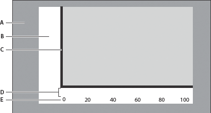
- A.
- Padding area
- B.
- Gutter
- C.
- Axis
- D.
- Label gap
- E.
- Axis label
The following style properties define the size of a chart's gutters:
-
gutterLeft
-
gutterRight
-
gutterTop
-
gutterBottom
The default value of the gutter styles is undefined, which means that the chart determines appropriate values. Overriding the default value and explicitly setting gutter values can improve the speed of rendering charts, because Flex does not have to dynamically calculate the gutter size. However, it can also cause clipping of axis labels or other undesirable effects.
You set gutter styles on the chart control. The following example creates a region that is 50 pixels wide for the axis labels, titles, and tick marks, by explicitly setting the values of the gutterLeft, gutterRight, and gutterBottom style properties. It also sets the paddingTop property to 20.
<?xml version="1.0"?>
<!-- charts/GutterStyles.mxml -->
<s:Application
    xmlns:fx="http://ns.adobe.com/mxml/2009"
    xmlns:mx="library://ns.adobe.com/flex/mx"
    xmlns:s="library://ns.adobe.com/flex/spark"
    creationComplete="srv.send()"
    height="600">

    <fx:Declarations>
        <!-- View source of the following page to see the structure of the data that Flex uses in this example. -->
        <mx:HTTPService id="srv" url="http://examplesserver/chart_examples/expenses-xml.aspx"/>
        <!-- To see data in an HTML table, go to http://examplesserver/chart_examples/expenses.aspx -->
    </fx:Declarations>

  <fx:Style>
     @namespace mx "library://ns.adobe.com/flex/mx";

     mx|ColumnChart {
        gutterLeft:50;
        gutterRight:50;
        gutterBottom:50;
        gutterTop:20;
     }
  </fx:Style>

    <s:layout>
        <s:VerticalLayout/>
    </s:layout>

  <s:Panel title="Setting Gutter Properties as Styles">
        <s:layout>
            <s:VerticalLayout/>
        </s:layout>
     <mx:ColumnChart id="column"
        dataProvider="{srv.lastResult.data.result}"
        showDataTips="true">
        <mx:horizontalAxis>
           <mx:CategoryAxis categoryField="month"/>
        </mx:horizontalAxis>
        <mx:series>
           <mx:ColumnSeries
                xField="month"
                yField="profit"
                displayName="Profit"/>
           <mx:ColumnSeries
                xField="month"
                yField="expenses"
                displayName="Expenses"/>
        </mx:series>
     </mx:ColumnChart>
     <mx:Legend dataProvider="{column}"/>
  </s:Panel>
</s:Application>
Alternatively, you can set the gutter properties inline, as the following example shows:
<?xml version="1.0"?>
<!-- charts/GutterProperties.mxml -->
<s:Application
    xmlns:fx="http://ns.adobe.com/mxml/2009"
    xmlns:mx="library://ns.adobe.com/flex/mx"
    xmlns:s="library://ns.adobe.com/flex/spark"
    creationComplete="srv.send()"
    height="600">

    <fx:Declarations>
        <!-- View source of the following page to see the structure of the data that Flex uses in this example. -->
        <mx:HTTPService id="srv" url="http://examplesserver/chart_examples/expenses-xml.aspx"/>
        <!-- To see data in an HTML table, go to http://examplesserver/chart_examples/expenses.aspx -->
    </fx:Declarations>

    <s:layout>
        <s:VerticalLayout/>
    </s:layout>

  <s:Panel title="Setting Gutter Properties">
        <s:layout>
            <s:VerticalLayout/>
        </s:layout>
          <mx:ColumnChart id="column"
             dataProvider="{srv.lastResult.data.result}"
             showDataTips="true"
             gutterLeft="50"
             gutterRight="50"
             gutterBottom="50"
             gutterTop="20">
        <mx:horizontalAxis>
           <mx:CategoryAxis categoryField="month"/>
        </mx:horizontalAxis>
        <mx:series>
           <mx:ColumnSeries
                xField="month"
                yField="profit"
                displayName="Profit"/>
           <mx:ColumnSeries
                xField="month"
                yField="expenses"
                displayName="Expenses"/>
        </mx:series>
     </mx:ColumnChart>
     <mx:Legend dataProvider="{column}"/>
  </s:Panel>
</s:Application>
In addition to the gutter and padding properties, you can set the labelGap property of a chart's axes. The labelGap property defines the distance, in pixels, between the tick marks and the axis labels. You set the labelGap property on the AxisRenderer tag, as the following example shows:
<?xml version="1.0"?>
<!-- charts/LabelGaps.mxml -->
<s:Application
    xmlns:fx="http://ns.adobe.com/mxml/2009"
    xmlns:mx="library://ns.adobe.com/flex/mx"
    xmlns:s="library://ns.adobe.com/flex/spark"
    creationComplete="srv.send()"
    height="600">

    <fx:Declarations>
        <!-- View source of the following page to see the structure of the data that Flex uses in this example. -->
        <mx:HTTPService id="srv" url="http://examplesserver/chart_examples/expenses-xml.aspx"/>
        <!-- To see data in an HTML table, go to http://examplesserver/chart_examples/expenses.aspx -->
    </fx:Declarations>

    <s:layout>
        <s:VerticalLayout/>
    </s:layout>

    <s:Panel title="Setting Label Gap Properties">
        <s:layout>
            <s:VerticalLayout/>
        </s:layout>
        <mx:ColumnChart id="myChart"
            dataProvider="{srv.lastResult.data.result}"
            gutterLeft="50"
            gutterRight="50"
            gutterBottom="50"
            gutterTop="20"
            showDataTips="true">
            <mx:horizontalAxis>
                <mx:CategoryAxis id="a1" categoryField="month"/>
            </mx:horizontalAxis>

            <mx:horizontalAxisRenderers>
                <mx:AxisRenderer axis="{a1}" labelGap="20"/>
            </mx:horizontalAxisRenderers>

            <mx:verticalAxisRenderers>
                <mx:AxisRenderer axis="{a1}" labelGap="20"/>
            </mx:verticalAxisRenderers>

            <mx:series>
                <mx:ColumnSeries
                    xField="month"
                    yField="profit"
                    displayName="Profit"/>
                <mx:ColumnSeries
                    xField="month"
                    yField="expenses"
                    displayName="Expenses"/>
            </mx:series>
        </mx:ColumnChart>
        <mx:Legend dataProvider="{myChart}"/>
    </s:Panel>
</s:Application>
You can specify the alignment of axis labels by using the labelAlign property on the AxisRenderer. For horizontal axis labels, you can specify center, left, and right. For example, in a ColumnChart control, if you set the value of the labelAlign property to left, Flex renders the labels at the left of the bottoms of the columns. For vertical axis labels, you can specify center, top, and bottom.
How different the locations of the labels are depends on the available space (for example, the width of the columns) and the font size of the labels.
The following example lets you change the label alignment for the vertical and horizontal axes.
<?xml version="1.0"?>
<!-- charts/ToggleLabelAlignment.mxml -->
<s:Application
    xmlns:fx="http://ns.adobe.com/mxml/2009"
    xmlns:mx="library://ns.adobe.com/flex/mx"
    xmlns:s="library://ns.adobe.com/flex/spark"
    creationComplete="srv.send()"
    height="600" width="750">

    <fx:Declarations>
        <!-- View source of the following page to see the structure of the data that Flex uses in this example. -->
        <mx:HTTPService id="srv" url="http://examplesserver/chart_examples/expenses-xml.aspx"/>
        <!-- To see data in an HTML table, go to http://examplesserver/chart_examples/expenses.aspx -->
    </fx:Declarations>

    <fx:Script><![CDATA[
    import mx.collections.ArrayCollection;

    [Bindable]
    private var aligns:ArrayCollection = new ArrayCollection(["center", "left", "right"]);
    [Bindable]
    private var aligns2:ArrayCollection = new ArrayCollection(["center", "top", "bottom"]);

    private function toggleLabelAlignment(s:String):void {
        if ( s == 'hor' ) {
            myHAR.setStyle("labelAlign", cb1.selectedItem);
        } else if ( s == 'ver' ) {
            myVAR.setStyle("labelAlign", cb2.selectedItem);
        }
    }
  ]]></fx:Script>

    <s:layout>
        <s:VerticalLayout/>
    </s:layout>

  <s:Panel title="Toggling Label Alignment">
     <s:layout>
         <s:HorizontalLayout/>
     </s:layout>
 <s:VGroup>


 <mx:ColumnChart id="myChart"
dataProvider="{srv.lastResult.data.result}"
showDataTips="true">


<mx:horizontalAxis>


   <mx:CategoryAxis id="haxis" categoryField="month"/>


</mx:horizontalAxis>


<mx:verticalAxis>


<mx:LinearAxis id="vaxis"/>


</mx:verticalAxis>


<mx:horizontalAxisRenderers>


<mx:AxisRenderer id="myHAR" axis="{haxis}"/>


</mx:horizontalAxisRenderers>


<mx:verticalAxisRenderers>


<mx:AxisRenderer id="myVAR" axis="{vaxis}"/>


</mx:verticalAxisRenderers>


<mx:series>


   <mx:ColumnSeries xField="month" yField="profit" displayName="Profit"/>


   <mx:ColumnSeries xField="month" yField="expenses" displayName="Expenses"/>


</mx:series>


 </mx:ColumnChart>


 <mx:Legend dataProvider="{myChart}"/>

 </s:VGroup>
     <s:Form>
        <s:FormItem label="Horizontal Labels">
            <s:ComboBox id="cb1" dataProvider="{aligns}"
                change="toggleLabelAlignment('hor')"/>
        </s:FormItem>
        <s:FormItem label="Vertical Labels">
            <s:ComboBox id="cb2" dataProvider="{aligns2}"
                change="toggleLabelAlignment('ver')"/>
        </s:FormItem>
     </s:Form>
  </s:Panel>
</s:Application>
Formatting tick marks
There are two types of tick marks on a Flex chart: major and minor. Major tick marks are the indications along an axis that correspond to an axis label. The text for the axis labels is often derived from the chart's data provider. Minor tick marks are those tick marks that appear between the major tick marks. Minor tick marks help the user to visualize the distance between the major tick marks.
You use the tickPlacement and minorTickPlacement properties of the AxisRenderer object to determine whether or not Flex displays tick marks and where Flex displays tick marks.
The following table describes valid values of the tickPlacement and minorTickPlacement properties:
|
Value |
Description |
|---|---|
cross |
Places tick marks across the axis. |
inside |
Places tick marks on the inside of the axis line. |
none |
Hides tick marks. |
outside |
Places tick marks on the outside of the axis line. |
Flex also lets you set the length of tick marks and the number of minor tick marks that appear along the axis. The following table describes the properties that define the length of tick marks on the chart's axes:
|
Property |
Description |
|---|---|
tickLength |
The length, in pixels, of the major tick mark from the axis. |
minorTickLength |
The length, in pixels, of the minor tick mark from the axis. |
The minor tick marks overlap the placement of major tick marks. So, if you hide major tick marks but still show minor tick marks, the minor tick marks appear at the regular tick-mark intervals.
The following example sets tick marks to the inside of the axis line, sets the tick mark's length to 12 pixels, and hides minor tick marks:
<?xml version="1.0"?>
<!-- charts/TickStyles.mxml -->
<s:Application
    xmlns:fx="http://ns.adobe.com/mxml/2009"
    xmlns:mx="library://ns.adobe.com/flex/mx"
    xmlns:s="library://ns.adobe.com/flex/spark"
    creationComplete="srv.send()"
    height="600" width="700">

    <fx:Declarations>
        <!-- View source of the following page to see the structure of the data that Flex uses in this example. -->
        <mx:HTTPService id="srv" url="http://examplesserver/chart_examples/stocks-xml.aspx"/>
        <!-- To see data in an HTML table, go to http://examplesserver/chart_examples/stocks.aspx -->
    </fx:Declarations>

  <fx:Style>
     .myAxisStyle {
        placement:bottom;
        minorTickPlacement:none;
        tickLength:12;
        tickPlacement:inside;
        tickStroke: myStroke;
     }
  </fx:Style>

    <s:layout>
        <s:VerticalLayout/>
    </s:layout>

  <s:Panel title="Tick Styles">
     <s:layout>
         <s:HorizontalLayout/>
     </s:layout>
    <mx:HLOCChart id="mychart"
        dataProvider="{srv.lastResult.data.result}"
        showDataTips="true">
    <mx:horizontalAxisRenderers>
        <mx:AxisRenderer axis="{a2}" styleName="myAxisStyle">
               <mx:tickStroke>
                    <mx:SolidColorStroke color="#999966" weight="1"/>
                </mx:tickStroke>
        </mx:AxisRenderer>
    </mx:horizontalAxisRenderers>

    <mx:verticalAxis>
        <mx:LinearAxis id="a1" minimum="30" maximum="50"/>
    </mx:verticalAxis>

    <mx:horizontalAxis>
        <mx:LinearAxis id="a2"/>
    </mx:horizontalAxis>

    <mx:series>
        <mx:HLOCSeries openField="open" highField="high"
            lowField="low" closeField="close"
            displayName="Ticker Symbol: FRED"/>
     </mx:series>
  </mx:HLOCChart>
  <mx:Legend dataProvider="{mychart}"/>
  </s:Panel>
</s:Application>
Formatting axis lines
Axes have lines to which the tick marks are attached. You can use style properties to hide these lines or change the width of the lines.
To hide the axis line, set the value of the showLine property on the AxisRenderer object to false. The default value is true. The following example sets showLine to false:
<?xml version="1.0"?>
<!-- charts/DisableAxisLines.mxml -->
<s:Application
    xmlns:fx="http://ns.adobe.com/mxml/2009"
    xmlns:mx="library://ns.adobe.com/flex/mx"
    xmlns:s="library://ns.adobe.com/flex/spark"
    creationComplete="srv.send()"
    height="600">

    <fx:Declarations>
         <!-- View source of the following page to see the structure of the data that Flex uses in this example. -->
         <mx:HTTPService id="srv" url="http://examplesserver/chart_examples/expenses-xml.aspx"/>
         <!-- To see data in an HTML table, go to http://examplesserver/chart_examples/expenses.aspx -->
    </fx:Declarations>

    <s:layout>
        <s:VerticalLayout/>
    </s:layout>

    <s:Panel title="Line Chart">
        <s:layout>
            <s:VerticalLayout/>
        </s:layout>
        <mx:LineChart id="myChart"
            dataProvider="{srv.lastResult.data.result}"
            showDataTips="true">
            <mx:horizontalAxis>
                <mx:CategoryAxis id="a1" categoryField="month"/>
            </mx:horizontalAxis>
               <mx:verticalAxis>
                    <mx:LinearAxis id="a2"/>
               </mx:verticalAxis>
            <mx:horizontalAxisRenderers>
                <mx:AxisRenderer
                    axis="{a1}"
                    showLine="false"/>
            </mx:horizontalAxisRenderers>
            <mx:verticalAxisRenderers>
                <mx:AxisRenderer axis="{a2}" showLine="false"/>
            </mx:verticalAxisRenderers>
            <mx:series>
                <mx:LineSeries yField="profit" displayName="Profit"/>
                <mx:LineSeries yField="expenses" displayName="Expenses"/>
            </mx:series>
        </mx:LineChart>
        <mx:Legend dataProvider="{myChart}"/>
    </s:Panel>
</s:Application>
You can also apply the showLine property as a CSS style property.
You can change the width, color, and alpha of the axis line with the <mx:axisStroke> tag. You use an <mx:SolidColorStroke> child tag to define these properties or define a stroke and then bind it to the axisStroke object, as the following example shows:
<?xml version="1.0"?>
<!-- charts/StyleAxisLines.mxml -->
<s:Application
    xmlns:fx="http://ns.adobe.com/mxml/2009"
    xmlns:mx="library://ns.adobe.com/flex/mx"
    xmlns:s="library://ns.adobe.com/flex/spark"
    creationComplete="srv.send()"
    height="600">

    <fx:Declarations>
         <!-- View source of the following page to see the structure of the data that Flex uses in this example. -->
         <mx:HTTPService id="srv" url="http://examplesserver/chart_examples/expenses-xml.aspx"/>
         <!-- To see data in an HTML table, go to http://examplesserver/chart_examples/expenses.aspx -->
        <mx:SolidColorStroke id="axisStroke" color="#884422"
            weight="8" alpha=".75" caps="square"/>
    </fx:Declarations>

    <s:layout>
        <s:VerticalLayout/>
    </s:layout>

    <s:Panel title="Line Chart">
         <s:layout>
             <s:HorizontalLayout/>
         </s:layout>
        <mx:LineChart id="myChart"
            dataProvider="{srv.lastResult.data.result}"
            showDataTips="true">
            <mx:horizontalAxis>
                <mx:CategoryAxis id="a1" categoryField="month"/>
            </mx:horizontalAxis>

            <mx:verticalAxis>
                <mx:LinearAxis id="a2"/>
            </mx:verticalAxis>

            <mx:horizontalAxisRenderers>
                <mx:AxisRenderer axis="{a1}">
                    <mx:axisStroke>{axisStroke}</mx:axisStroke>
                </mx:AxisRenderer>
            </mx:horizontalAxisRenderers>

            <mx:verticalAxisRenderers>
                <mx:AxisRenderer axis="{a2}">
                    <mx:axisStroke>
                        <mx:SolidColorStroke color="#884422"
                            weight="8" alpha=".75" caps="square"/>
                    </mx:axisStroke>
                </mx:AxisRenderer>
            </mx:verticalAxisRenderers>

            <mx:series>
                <mx:LineSeries yField="profit" displayName="Profit"/>
                <mx:LineSeries yField="expenses" displayName="Expenses"/>
            </mx:series>
        </mx:LineChart>
        <mx:Legend dataProvider="{myChart}"/>
    </s:Panel>
</s:Application>
For more information about strokes, see Using strokes with chart controls.
You can change the placement of the axis lines (for example, move the axis line from the bottom of the chart control to the top) by using the placement property of the AxisRenderer. For more information, see Positioning chart axes.
You can also apply filters to axis lines to further customize their appearance. For more information, see Using filters with chart controls.
Using strokes with chart controls
You use the SolidColorStroke class with the chart series and grid lines to control the properties of the lines that Flex uses to draw chart elements.
You can define strokes in MXML inside the <fx:Declarations> block so that you can reuse the stroke. You can also define an individual stroke inside an MXML tag.
The following table describes the properties that you use to control the appearance of strokes:
|
Property |
Description |
|---|---|
color |
Specifies the color of the line as a hexadecimal value. The default value is 0x000000, which corresponds to black. |
weight |
Specifies the width of the line, in pixels. The default value is 0, which corresponds to a hairline. |
alpha |
Specifies the transparency of a line. Valid values are 0 (invisible) through 100 (opaque). The default value is 100. |
The following example defines a line width of 2 pixels, one with a dark gray border (0x808080) and the other with a light gray border (0xC0C0C0) for the borders of chart items in a BarChart control's BarSeries:
<?xml version="1.0"?>
<!-- charts/BasicBarStroke.mxml -->
<s:Application
    xmlns:fx="http://ns.adobe.com/mxml/2009"
    xmlns:mx="library://ns.adobe.com/flex/mx"
    xmlns:s="library://ns.adobe.com/flex/spark"
    creationComplete="srv.send()"
    height="600">

    <fx:Declarations>
        <!-- View source of the following page to see the structure of the data that Flex uses in this example. -->
        <mx:HTTPService id="srv" url="http://examplesserver/chart_examples/expenses-xml.aspx"/>
        <!-- To see data in an HTML table, go to http://examplesserver/chart_examples/expenses.aspx -->
    </fx:Declarations>

    <s:layout>
        <s:VerticalLayout/>
    </s:layout>

  <s:Panel title="Bar Chart">
        <s:layout>
            <s:VerticalLayout/>
        </s:layout>
     <mx:BarChart id="myChart" dataProvider="{srv.lastResult.data.result}" showDataTips="true">
        <mx:verticalAxis>
           <mx:CategoryAxis categoryField="month"/>
        </mx:verticalAxis>
        <mx:series>
           <mx:BarSeries
                yField="month"
                xField="profit"
                displayName="Profit">
            <mx:stroke>
                <mx:SolidColorStroke
                    color="0x808080"
                    weight="2" alpha=".8"/>
            </mx:stroke>
           </mx:BarSeries>
           <mx:BarSeries
                yField="month"
                xField="expenses"
                displayName="Expenses">
            <mx:stroke>
                <mx:SolidColorStroke
                    color="0xC0C0C0"
                    weight="2" alpha=".8"/>
            </mx:stroke>
           </mx:BarSeries>
        </mx:series>
     </mx:BarChart>
     <mx:Legend dataProvider="{myChart}"/>
  </s:Panel>
</s:Application>
Defining AxisRenderer properties with strokes
You can use strokes to define tick marks and other properties of an AxisRenderer, as the following example shows:
<?xml version="1.0"?>
<!-- charts/AxisRendererStrokes.mxml -->
<s:Application
    xmlns:fx="http://ns.adobe.com/mxml/2009"
    xmlns:mx="library://ns.adobe.com/flex/mx"
    xmlns:s="library://ns.adobe.com/flex/spark"
    creationComplete="srv.send()"
    height="600">

  <fx:Declarations>
      <!-- View source of the following page to see the structure of the data that Flex uses in this example. -->
      <mx:HTTPService id="srv" url="http://examplesserver/chart_examples/stocks-xml.aspx"/>
      <!-- To see data in an HTML table, go to http://examplesserver/chart_examples/stocks.aspx -->
  </fx:Declarations>

    <s:layout>
        <s:VerticalLayout/>
    </s:layout>

  <s:Panel title="HighLowOpenClose Chart">
        <s:layout>
            <s:VerticalLayout/>
        </s:layout>
    <mx:HLOCChart id="myChart"
        dataProvider="{srv.lastResult.data.result}"
        showDataTips="true">
        <mx:horizontalAxisRenderers>
            <mx:AxisRenderer
                placement="bottom"
                canDropLabels="true"
                tickPlacement="inside"
                tickLength="10"
                minorTickPlacement="inside"
                minorTickLength="5"
                axis="{a1}">
                <mx:axisStroke>
                    <mx:SolidColorStroke color="#000080" weight="1"/>
                </mx:axisStroke>

                <mx:tickStroke>
                    <mx:SolidColorStroke color="#000060" weight="1"/>
                </mx:tickStroke>

                <mx:minorTickStroke>
                    <mx:SolidColorStroke color="#100040" weight="1"/>
                </mx:minorTickStroke>
            </mx:AxisRenderer>
        </mx:horizontalAxisRenderers>

        <mx:verticalAxis>
            <mx:LinearAxis id="a1" minimum="30"  maximum="50"/>
        </mx:verticalAxis>

        <mx:series>
            <mx:HLOCSeries
                openField="open"
                highField="high"
                lowField="low"
                closeField="close"
                displayName="FRED">
            </mx:HLOCSeries>
        </mx:series>
    </mx:HLOCChart>
    <mx:Legend dataProvider="{myChart}"/>
  </s:Panel>
</s:Application>
Notice that any time you use an AxisRenderer, you must explicitly set the axis to which it is applied with the renderer's axis property.
You can define a SolidColorStroke object using an MXML tag, and then bind that SolidColorStroke to the chart's renderer properties. For an example, see Applying styles by binding tag definitions.
Using strokes in ActionScript
You can instantiate and manipulate a SolidColorStroke object in ActionScript by using the mx.graphics.SolidColorStroke class. You can then use the setStyle() method to apply the SolidColorStroke object to the chart, as the following example shows:
<?xml version="1.0"?>
<!-- charts/ActionScriptStroke.mxml -->
<s:Application
    xmlns:fx="http://ns.adobe.com/mxml/2009"
    xmlns:mx="library://ns.adobe.com/flex/mx"
    xmlns:s="library://ns.adobe.com/flex/spark"
    xmlns="*"
    creationComplete="srv.send()"
    height="600">

    <s:layout>
        <s:VerticalLayout/>
    </s:layout>

  <fx:Script><![CDATA[
     import mx.graphics.SolidColorStroke;

     public function changeStroke(e:Event):void {
        var s:SolidColorStroke = new SolidColorStroke(0x001100,2);
        s.alpha = .5;
        s.color = 0x0000FF;
        har1.setStyle("axisStroke",s);
        var1.setStyle("axisStroke",s);
     }
  ]]></fx:Script>

    <fx:Declarations>
        <!-- View source of the following page to see the structure of the data that Flex uses in this example. -->
        <mx:HTTPService id="srv" url="http://examplesserver/chart_examples/expenses-xml.aspx"/>
        <!-- To see data in an HTML table, go to http://examplesserver/chart_examples/expenses.aspx -->
        <mx:SolidColorStroke id="baseAxisStroke"
            color="0x884422"
            weight="10"
            alpha=".25"
            caps="square"/>
    </fx:Declarations>

  <s:Panel title="Column Chart">
    <s:layout>
        <s:VerticalLayout/>
    </s:layout>
     <mx:ColumnChart id="myChart" dataProvider="{srv.lastResult.data.result}" showDataTips="true">
        <mx:horizontalAxis>
           <mx:CategoryAxis id="a1" categoryField="month"/>
        </mx:horizontalAxis>
        <mx:verticalAxis>
          <mx:LinearAxis id="a2"/>
        </mx:verticalAxis>

        <mx:horizontalAxisRenderers>
           <mx:AxisRenderer id="har1" axis="{a1}">
                <mx:axisStroke>{baseAxisStroke}</mx:axisStroke>
           </mx:AxisRenderer>
        </mx:horizontalAxisRenderers>

        <mx:verticalAxisRenderers>
           <mx:AxisRenderer id="var1" axis="{a2}">
                <mx:axisStroke>{baseAxisStroke}</mx:axisStroke>
           </mx:AxisRenderer>
        </mx:verticalAxisRenderers>

        <mx:series>
           <mx:ColumnSeries
                xField="month"
                yField="profit"
                displayName="Profit"/>
           <mx:ColumnSeries
                xField="month"
                yField="expenses"
                displayName="Expenses"/>
        </mx:series>
     </mx:ColumnChart>
     <mx:Legend dataProvider="{myChart}"/>
  </s:Panel>
  <s:Button id="b1"
    click="changeStroke(event)"
    label="Change SolidColorStroke"/>
</s:Application>
Defining strokes for LineSeries and AreaSeries
Some chart series have more than one stroke-related style property. For LineSeries, you use the stroke style property to define a style for the chart item's renderer. You use the lineStroke property to define the stroke of the actual line segments.
The following example creates a thick blue line for the LineChart control's line segments, with large red boxes at each data point, which use the CrossItemRenderer object as their renderer:
<?xml version="1.0"?>
<!-- charts/LineSeriesStrokes.mxml -->
<s:Application
    xmlns:fx="http://ns.adobe.com/mxml/2009"
    xmlns:mx="library://ns.adobe.com/flex/mx"
    xmlns:s="library://ns.adobe.com/flex/spark"
    creationComplete="srv.send()"
    height="600">

    <fx:Declarations>
        <!-- View source of the following page to see the structure of the data that Flex uses in this example. -->
        <mx:HTTPService id="srv" url="http://examplesserver/chart_examples/expenses-xml.aspx"/>
        <!-- To see data in an HTML table, go to http://examplesserver/chart_examples/expenses.aspx -->
    </fx:Declarations>

    <s:layout>
        <s:VerticalLayout/>
    </s:layout>

  <s:Panel title="Line Chart">
        <s:layout>
            <s:VerticalLayout/>
        </s:layout>
     <mx:LineChart id="myChart"
        dataProvider="{srv.lastResult.data.result}"
        showDataTips="true">
        <mx:horizontalAxis>
           <mx:CategoryAxis categoryField="month"/>
        </mx:horizontalAxis>
        <mx:series>
           <mx:LineSeries
            yField="profit"
            displayName="Profit">
            <mx:itemRenderer>
                <fx:Component>
                    <mx:CrossItemRenderer scaleX="1.5" scaleY="1.5"/>
                </fx:Component>
            </mx:itemRenderer>
            <mx:fill>
                <mx:SolidColor color="0x0000FF"/>
            </mx:fill>
            <mx:stroke>
                <mx:SolidColorStroke color="0xFF0066" alpha="1"/>
            </mx:stroke>
            <mx:lineStroke>
                <mx:SolidColorStroke color="0x33FFFF" weight="5" alpha=".8"/>
            </mx:lineStroke>
           </mx:LineSeries>
           <mx:LineSeries yField="expenses" displayName="Expenses"/>
        </mx:series>
     </mx:LineChart>
     <mx:Legend dataProvider="{myChart}"/>
  </s:Panel>
</s:Application>
Similarly, with the AreaSeries class, you use the stroke property to set a style for the chart item's renderer. You use the areaStroke style property to define the stroke of the line that defines the area.
Using fills with chart controls
When charting multiple data series, or just to improve the appearance of your charts, you can control the fill for each series in the chart or each item in a series. The fill lets you specify a pattern that defines how Flex draws the chart element. You also use fills to specify the background colors of the chart or bands of background colors defined by the grid lines. Fills can be solid or can use linear and radial gradients. A gradient specifies a gradual color transition in the fill color.
You use fills in the following ways:
-
fill Set the value of the fill property on a series to a single fill. This applies that fill to all chart items in that series. For example, all columns in a single series will have the same fill.
-
fills Set the value of the fills property on a series to an Array of fills. This applies a different fill from the Array to each chart item in the series. For example, each column in a series will have a different fill. The LineSeries and LineRenderer objects are not affected by the fill property's settings.
-
fillFunction Set the value of the fillFunction property on a series to point to a custom method. This method returns a fill based on the values of the chart item in the series. The return value of this function takes precedence over fills specified as styles. For information on using the fillFunction property, see Using per-item fills.
All series except the HLOCSeries class support setting the fill-related properties.
If you use the fills property or the fillFunction to define the fills of chart items, and you want a legend, you must manually create the Legend object for that chart. For more information on creating Legend objects, see Using Legend controls.
One of the most common uses of a fill is to control the color of the chart when you have multiple data series in a chart. The following example uses the fill property to set the color for each ColumnSeries object in a ColumnChart control:
<?xml version="1.0"?>
<!-- charts/ColumnFills.mxml -->
<s:Application
    xmlns:fx="http://ns.adobe.com/mxml/2009"
    xmlns:mx="library://ns.adobe.com/flex/mx"
    xmlns:s="library://ns.adobe.com/flex/spark"
    creationComplete="srv.send()"
    height="600">

    <fx:Declarations>
         <!-- View source of the following page to see the structure of the data that Flex uses in this example. -->
         <mx:HTTPService id="srv" url="http://examplesserver/chart_examples/expenses-xml.aspx"/>
         <!-- To see data in an HTML table, go to http://examplesserver/chart_examples/expenses.aspx -->
    </fx:Declarations>

    <s:layout>
        <s:VerticalLayout/>
    </s:layout>

  <s:Panel title="Column Chart">
        <s:layout>
            <s:VerticalLayout/>
        </s:layout>
     <mx:ColumnChart id="myChart" dataProvider="{srv.lastResult.data.result}" showDataTips="true">
        <mx:horizontalAxis>
           <mx:CategoryAxis categoryField="month"/>
        </mx:horizontalAxis>
        <mx:series>
           <mx:ColumnSeries
                xField="month"
                yField="profit"
                displayName="Profit">
               <mx:fill>
                    <mx:SolidColor color="0x336699"/>
               </mx:fill>
           </mx:ColumnSeries>

           <mx:ColumnSeries
                xField="month"
                yField="expenses"
                displayName="Expenses">
            <mx:fill>
                <mx:SolidColor color="0xFF99FF"/>
            </mx:fill>
           </mx:ColumnSeries>
        </mx:series>
     </mx:ColumnChart>
     <mx:Legend dataProvider="{myChart}"/>
  </s:Panel>
</s:Application>
If you do not explicitly define different fills for multiple data series, Flex chooses solid colors for you.
You can also specify an array of colors using the fills property of the series. This property takes an Array of objects that define the fills. You can use this property to define a different color for each item in the series. If you do not define as many colors in the Array as there are items in the series, the chart starts with the first item in the Array on the next item.
The following example defines two Arrays of SolidColor objects. The first Array defines the colors of the items in the first series in the chart and the second Array defines the colors of the items in the second series. All of the fills in this example are partially transparent (the alpha value in the SolidColor constructor is .5).
<?xml version="1.0"?>
<!-- charts/SimpleFillsExample.mxml -->
<s:Application
    xmlns:fx="http://ns.adobe.com/mxml/2009"
    xmlns:mx="library://ns.adobe.com/flex/mx"
    xmlns:s="library://ns.adobe.com/flex/spark"
    creationComplete="srv.send()"
    height="600">

    <fx:Declarations>
        <!-- View source of the following page to see the structure of the data that Flex uses in this example. -->
        <mx:HTTPService id="srv" url="http://examplesserver/chart_examples/expenses-xml.aspx"/>
        <!-- To see data in an HTML table, go to http://examplesserver/chart_examples/expenses.aspx -->
    </fx:Declarations>

  <fx:Script>
    <![CDATA[
     import mx.graphics.SolidColor;

     // Make all fills partially transparent by
     // setting the alpha to .5.
     [Bindable]
     private var warmColorsArray:Array = new Array(
        new SolidColor(0xFF0033, .5),
        new SolidColor(0xFF0066, .5),
        new SolidColor(0xFF0099, .5)
     );
     [Bindable]
     private var coolColorsArray:Array = new Array(
        new SolidColor(0x3333CC, .5),
        new SolidColor(0x3366CC, .5),
        new SolidColor(0x3399CC, .5)
     );

    ]]>
  </fx:Script>

    <s:layout>
        <s:VerticalLayout/>
    </s:layout>

  <s:Panel title="Column Chart">
     <s:layout>
         <s:VerticalLayout/>
     </s:layout>
     <mx:ColumnChart id="myChart"
        dataProvider="{srv.lastResult.data.result}"
        showDataTips="true">
        <mx:horizontalAxis>
           <mx:CategoryAxis categoryField="month"/>
        </mx:horizontalAxis>
        <mx:series>
           <mx:ColumnSeries
                xField="month"
                yField="profit"
                displayName="Profit"
                fills="{warmColorsArray}">
           </mx:ColumnSeries>

           <mx:ColumnSeries
                xField="month"
                yField="expenses"
                displayName="Expenses"
                fills="{coolColorsArray}">
           </mx:ColumnSeries>
        </mx:series>
     </mx:ColumnChart>
     <mx:Legend dataProvider="{myChart}"/>
  </s:Panel>
</s:Application>
This example does not have a legend. If you use the fills property or the fillFunction to define the fills of chart items, and you want a legend, you must manually create the Legend object for that chart. For more information on creating Legend objects, see Using Legend controls.
With the PieSeries, you typically use a single Array of fills to specify how Flex should draw the individual wedges. For example, you can give each wedge that represents a PieSeries its own color, as the following example shows:
<?xml version="1.0"?>
<!-- charts/PieFills.mxml -->
<s:Application
    xmlns:fx="http://ns.adobe.com/mxml/2009"
    xmlns:mx="library://ns.adobe.com/flex/mx"
    xmlns:s="library://ns.adobe.com/flex/spark"
    creationComplete="srv.send()"
    height="600">

    <fx:Declarations>
        <!-- View source of the following page to see the structure of the data that Flex uses in this example. -->
        <mx:HTTPService id="srv" url="http://examplesserver/chart_examples/budget-xml.aspx"/>
        <!-- To see data in an HTML table, go to http://examplesserver/chart_examples/budget.aspx -->
    </fx:Declarations>

    <s:layout>
        <s:VerticalLayout/>
    </s:layout>

  <s:Panel title="Pie Chart">
     <s:layout>
         <s:VerticalLayout/>
     </s:layout>
     <mx:PieChart id="myChart"
        dataProvider="{srv.lastResult.data.result}"
        showDataTips="true">
        <mx:series>
           <mx:PieSeries
                field="amount"
                nameField="item"
                labelPosition="callout">
                <mx:fills>
                    <mx:SolidColor color="0xCC66FF" alpha=".8"/>
                    <mx:SolidColor color="0x9966CC" alpha=".8"/>
                    <mx:SolidColor color="0x9999CC" alpha=".8"/>
                    <mx:SolidColor color="0x6699CC" alpha=".8"/>
                    <mx:SolidColor color="0x669999" alpha=".8"/>
                    <mx:SolidColor color="0x99CC99" alpha=".8"/>
                </mx:fills>
            </mx:PieSeries>
        </mx:series>
     </mx:PieChart>
     <mx:Legend dataProvider="{myChart}"/>
  </s:Panel>
</s:Application>
This example also shows how you use the <mx:fills> tag inside a series to define an Array of fills for that series.
You can also use fills to set the background of the charts. You do this by adding an <mx:fill> child tag to the chart tag, as the following example shows:
<?xml version="1.0"?>
<!-- charts/BackgroundFills.mxml -->
<s:Application
    xmlns:fx="http://ns.adobe.com/mxml/2009"
    xmlns:mx="library://ns.adobe.com/flex/mx"
    xmlns:s="library://ns.adobe.com/flex/spark"
    creationComplete="srv.send()"
    height="600">

  <fx:Declarations>
     <!-- View source of the following page to see the structure of the data that Flex uses in this example. -->
     <mx:HTTPService id="srv" url="http://examplesserver/chart_examples/expenses-xml.aspx"/>
     <!-- To see data in an HTML table, go to http://examplesserver/chart_examples/expenses.aspx -->
  </fx:Declarations>

    <s:layout>
        <s:VerticalLayout/>
    </s:layout>

  <s:Panel title="Background Fill">
        <s:layout>
            <s:VerticalLayout/>
        </s:layout>
     <mx:BarChart id="myChart"
        dataProvider="{srv.lastResult.data.result}"
        showDataTips="true">
        <mx:verticalAxis>
           <mx:CategoryAxis categoryField="month"/>
        </mx:verticalAxis>
        <mx:fill>
           <mx:SolidColor color="0x66CCFF" alpha=".5"/>
        </mx:fill>
        <mx:series>
           <mx:BarSeries xField="expenses" displayName="Expenses"/>
        </mx:series>
     </mx:BarChart>
     <mx:Legend dataProvider="{myChart}"/>
  </s:Panel>
</s:Application>
Setting fills with CSS
You can use the fill or fills style properties in an <fx:Style> declaration by using CSS syntax. You can use a type or a class selector. The following example sets the fill of the custom myBarChartStyle class selector to #FF0000:
<?xml version="1.0"?>
<!-- charts/BackgroundFillsCSS.mxml -->
<s:Application
    xmlns:fx="http://ns.adobe.com/mxml/2009"
    xmlns:mx="library://ns.adobe.com/flex/mx"
    xmlns:s="library://ns.adobe.com/flex/spark"
    creationComplete="srv.send()"
    height="600">

  <fx:Declarations>
     <!-- View source of the following page to see the structure of the data that Flex uses in this example. -->
     <mx:HTTPService id="srv" url="http://examplesserver/chart_examples/expenses-xml.aspx"/>
     <!-- To see data in an HTML table, go to http://examplesserver/chart_examples/expenses.aspx -->
  </fx:Declarations>

  <fx:Style>
     .myBarChartStyle {
        fill:#FF0000;
     }
  </fx:Style>

    <s:layout>
        <s:VerticalLayout/>
    </s:layout>

  <s:Panel title="Background Fill">
        <s:layout>
            <s:VerticalLayout/>
        </s:layout>
     <mx:BarChart id="myChart"
        dataProvider="{srv.lastResult.data.result}"
        showDataTips="true"
        styleName="myBarChartStyle">
        <mx:verticalAxis>
           <mx:CategoryAxis categoryField="month"/>
        </mx:verticalAxis>
        <mx:series>
           <mx:BarSeries xField="expenses" displayName="Expenses"/>
        </mx:series>
     </mx:BarChart>
     <mx:Legend dataProvider="{myChart}"/>
  </s:Panel>
</s:Application>
Flex converts the fill style in the class selector to a SolidColor object.
The following example defines colors for each of the series by setting the value of the fill style property in the custom class selectors:
<?xml version="1.0"?>
<!-- charts/SimpleCSSFillsExample.mxml -->
<s:Application
    xmlns:fx="http://ns.adobe.com/mxml/2009"
    xmlns:mx="library://ns.adobe.com/flex/mx"
    xmlns:s="library://ns.adobe.com/flex/spark"
    creationComplete="srv.send()"
    height="600">

    <fx:Declarations>
        <!-- View source of the following page to see the structure of the data that Flex uses in this example. -->
        <mx:HTTPService id="srv" url="http://examplesserver/chart_examples/expenses-xml.aspx"/>
        <!-- To see data in an HTML table, go to http://examplesserver/chart_examples/expenses.aspx -->
    </fx:Declarations>

  <fx:Style>
        .myRedColumnSeries {
            fill:#FF0033;
        }
        .myGreenColumnSeries {
            fill:#33FF00;
        }
  </fx:Style>

    <s:layout>
        <s:VerticalLayout/>
    </s:layout>

  <s:Panel title="Column Chart">
     <s:layout>
         <s:VerticalLayout/>
     </s:layout>
     <mx:ColumnChart id="myChart"
        dataProvider="{srv.lastResult.data.result}"
        showDataTips="true">
        <mx:horizontalAxis>
           <mx:CategoryAxis categoryField="month"/>
        </mx:horizontalAxis>
        <mx:series>
           <mx:ColumnSeries
                xField="month"
                yField="profit"
                displayName="Profit"
                styleName="myRedColumnSeries">
           </mx:ColumnSeries>

           <mx:ColumnSeries
                xField="month"
                yField="expenses"
                displayName="Expenses"
                styleName="myGreenColumnSeries">
           </mx:ColumnSeries>
        </mx:series>
     </mx:ColumnChart>
     <mx:Legend dataProvider="{myChart}"/>
  </s:Panel>
</s:Application>
To specify an Array for the fills property in CSS, you use a comma-separated list, as the following example shows:
<?xml version="1.0"?>
<!-- charts/CSSFillsArrayExample.mxml -->
<s:Application
    xmlns:fx="http://ns.adobe.com/mxml/2009"
    xmlns:mx="library://ns.adobe.com/flex/mx"
    xmlns:s="library://ns.adobe.com/flex/spark"
    creationComplete="srv.send()"
    height="600">

    <fx:Declarations>
         <!-- View source of the following page to see the structure of the data that Flex uses in this example. -->
         <mx:HTTPService id="srv" url="http://examplesserver/chart_examples/expenses-xml.aspx"/>
         <!-- To see data in an HTML table, go to http://examplesserver/chart_examples/expenses.aspx -->
    </fx:Declarations>

  <fx:Style>
        .myRedColumnSeries {
            fills: #FF0033, #FF3333, #FF6633;
        }
        .myGreenColumnSeries {
            fills: #33FF00, #33FF33, #33FF66;
        }
  </fx:Style>

    <s:layout>
        <s:VerticalLayout/>
    </s:layout>

  <s:Panel title="Column Chart">
        <s:layout>
            <s:VerticalLayout/>
        </s:layout>
     <mx:ColumnChart id="myChart"
        dataProvider="{srv.lastResult.data.result}"
        showDataTips="true">
        <mx:horizontalAxis>
           <mx:CategoryAxis categoryField="month"/>
        </mx:horizontalAxis>
        <mx:series>
           <mx:ColumnSeries
                xField="month"
                yField="profit"
                displayName="Profit"
                styleName="myRedColumnSeries">
           </mx:ColumnSeries>

           <mx:ColumnSeries
                xField="month"
                yField="expenses"
                displayName="Expenses"
                styleName="myGreenColumnSeries">
           </mx:ColumnSeries>
        </mx:series>
     </mx:ColumnChart>
     <mx:Legend dataProvider="{myChart}"/>
  </s:Panel>
</s:Application>
Using gradient fills with chart controls
Flex provides several classes that let you specify gradient fills. You use either the LinearGradient class or the RadialGradient class, along with the GradientEntry class to specify a gradient fill. The following table describes these classes:
|
Class |
Description |
|---|---|
|
LinearGradient |
Defines a gradient fill that starts at a boundary of the chart element. You specify an array of GradientEntry objects to control gradient transitions with the LinearGradient object. |
|
RadialGradient |
Defines a gradient fill that radiates from the center of a chart element. You specify an array of GradientEntry objects to control gradient transitions with the RadialGradient object. |
|
GradientEntry |
Defines the objects that control the gradient transition. Each GradientEntry object contains the following properties:
|
The following example uses a LinearGradient class with gradient fills for the chart's background:
<?xml version="1.0"?>
<!-- charts/GradientFills.mxml -->
<s:Application
    xmlns:fx="http://ns.adobe.com/mxml/2009"
    xmlns:mx="library://ns.adobe.com/flex/mx"
    xmlns:s="library://ns.adobe.com/flex/spark"
    creationComplete="srv.send()"
    height="600">

    <fx:Declarations>
         <!-- View source of the following page to see the structure of the data that Flex uses in this example. -->
         <mx:HTTPService id="srv" url="http://examplesserver/chart_examples/expenses-xml.aspx"/>
         <!-- To see data in an HTML table, go to http://examplesserver/chart_examples/expenses.aspx -->
    </fx:Declarations>

    <s:layout>
        <s:VerticalLayout/>
    </s:layout>

  <s:Panel title="Gradient Background Fill">
        <s:layout>
            <s:VerticalLayout/>
        </s:layout>
     <mx:BarChart id="myChart"
        dataProvider="{srv.lastResult.data.result}"
        showDataTips="true">
        <mx:verticalAxis>
           <mx:CategoryAxis categoryField="month"/>
        </mx:verticalAxis>
        <mx:fill>
           <mx:LinearGradient>
            <mx:entries>
                <mx:GradientEntry
                    color="0xC5C551"
                    ratio="0"
                    alpha="1"/>
                <mx:GradientEntry
                    color="0xFEFE24"
                    ratio=".33"
                    alpha="1"/>
                <mx:GradientEntry
                    color="0xECEC21"
                    ratio=".66"
                    alpha="1"/>
            </mx:entries>
           </mx:LinearGradient>
        </mx:fill>
        <mx:series>
           <mx:BarSeries xField="expenses"
                displayName="Expenses"/>
        </mx:series>
     </mx:BarChart>
     <mx:Legend dataProvider="{myChart}"/>
  </s:Panel>
</s:Application>
The LinearGradient object takes a single attribute, angle. By default, it defines a transition from left to right across the chart. Use the angle property to control the direction of the transition. For example, a value of 180 causes the transition to occur from right to left, rather than from left to right.
<?xml version="1.0"?>
<!-- charts/GradientFillsInActionScript.mxml -->
<s:Application
    xmlns:fx="http://ns.adobe.com/mxml/2009"
    xmlns:mx="library://ns.adobe.com/flex/mx"
    xmlns:s="library://ns.adobe.com/flex/spark"
    creationComplete="srv.send()"
    height="600">

    <fx:Declarations>
         <!-- View source of the following page to see the structure of the data that Flex uses in this example. -->
         <mx:HTTPService id="srv" url="http://examplesserver/chart_examples/expenses-xml.aspx"/>
         <!-- To see data in an HTML table, go to http://examplesserver/chart_examples/expenses.aspx -->
    </fx:Declarations>

  <fx:Script><![CDATA[
     import mx.graphics.LinearGradient;
     import mx.graphics.GradientEntry;
     import mx.collections.ArrayCollection;

     private function styleChart():void {
          var ge1:GradientEntry = new GradientEntry(0xCCFF99, 0);
          var ge2:GradientEntry = new GradientEntry(0x99FF00, .33);
          var ge3:GradientEntry = new GradientEntry(0x669900, .66);

          var lg1:LinearGradient = new LinearGradient();
          lg1.entries = [ge1, ge2, ge3];

          myChart.setStyle("fill", lg1);
     }
  ]]></fx:Script>

    <s:layout>
        <s:VerticalLayout/>
    </s:layout>

  <s:Panel title="Gradient Entries in ActionScript Fill">
        <s:layout>
            <s:VerticalLayout/>
        </s:layout>
     <mx:BarChart id="myChart"
        dataProvider="{srv.lastResult.data.result}"
        showDataTips="true"
        creationComplete="styleChart()">
        <mx:verticalAxis>
           <mx:CategoryAxis categoryField="month"/>
        </mx:verticalAxis>
        <mx:series>
           <mx:BarSeries xField="expenses"
                displayName="Expenses"/>
        </mx:series>
     </mx:BarChart>
  </s:Panel>
</s:Application>
You can set other properties on gradients, such as angle, to change the appearance of chart fills. The following example sets the angle property to 90, which specifies that the transition occurs from the top of the chart to the bottom.
<?xml version="1.0"?>
<!-- charts/GradientFillsAngled.mxml -->
<s:Application
    xmlns:fx="http://ns.adobe.com/mxml/2009"
    xmlns:mx="library://ns.adobe.com/flex/mx"
    xmlns:s="library://ns.adobe.com/flex/spark"
    creationComplete="srv.send()"
    height="600">

    <fx:Declarations>
         <!-- View source of the following page to see the structure of the data that Flex uses in this example. -->
         <mx:HTTPService id="srv" url="http://examplesserver/chart_examples/expenses-xml.aspx"/>
         <!-- To see data in an HTML table, go to http://examplesserver/chart_examples/expenses.aspx -->
    </fx:Declarations>

    <s:layout>
        <s:VerticalLayout/>
    </s:layout>

  <s:Panel title="Angled Gradient Background Fill">
        <s:layout>
            <s:VerticalLayout/>
        </s:layout>
     <mx:BarChart id="myChart"
          dataProvider="{srv.lastResult.data.result}"
          showDataTips="true">
        <mx:verticalAxis>
           <mx:CategoryAxis categoryField="month"/>
        </mx:verticalAxis>
        <mx:fill>
           <mx:LinearGradient rotation="90">
            <mx:entries>
                <mx:GradientEntry
                    color="0xC5C551"
                    ratio="0"
                    alpha="1"/>
                <mx:GradientEntry
                    color="0xFEFE24"
                    ratio=".33"
                    alpha="1"/>
                <mx:GradientEntry
                    color="0xECEC21"
                    ratio=".66"
                    alpha="1"/>
            </mx:entries>
           </mx:LinearGradient>
        </mx:fill>
        <mx:series>
           <mx:BarSeries xField="expenses"
                displayName="Expenses"/>
        </mx:series>
     </mx:BarChart>
     <mx:Legend dataProvider="{myChart}"/>
  </s:Panel>
</s:Application>
Using different alpha values with fills
When charting multiple data series, you can define the series to overlap. For example, the column chart lets you display the columns next to each other or overlap them for multiple data series. To overlap series, you set the type property of the chart to overlaid. The same is true for an area series.
When you have multiple data series that overlap, you can specify that the fill for each series has an alpha value less than 100%, so that the series have a level of transparency. The valid values for the alpha property are 0 (invisible) through 1 (opaque).
You cannot specify alpha values for fills if you apply the fills using CSS.
The following example defines an area chart in which each series in the chart uses a solid fill with the same level of transparency:
<?xml version="1.0"?>
<!-- charts/AlphaFills.mxml -->
<s:Application
    xmlns:fx="http://ns.adobe.com/mxml/2009"
    xmlns:mx="library://ns.adobe.com/flex/mx"
    xmlns:s="library://ns.adobe.com/flex/spark"
    creationComplete="srv.send()"
    height="600">

    <fx:Declarations>
        <!-- View source of the following page to see the structure of the data that Flex uses in this example. -->
        <mx:HTTPService id="srv" url="http://examplesserver/chart_examples/expenses-xml.aspx"/>
        <!-- To see data in an HTML table, go to http://examplesserver/chart_examples/expenses.aspx -->
    </fx:Declarations>

    <s:layout>
        <s:VerticalLayout/>
    </s:layout>

  <s:Panel title="Area Chart">
        <s:layout>
            <s:VerticalLayout/>
        </s:layout>
     <mx:AreaChart id="myChart"
        dataProvider="{srv.lastResult.data.result}"
        showDataTips="true">
        <mx:horizontalAxis>
           <mx:CategoryAxis categoryField="month"/>
        </mx:horizontalAxis>
        <mx:series>
           <mx:AreaSeries
                yField="profit"
                displayName="Profit">
                <mx:areaStroke>
                    <mx:SolidColorStroke
                        color="0x9A9A00"
                        weight="2"/>
                </mx:areaStroke>
                <mx:areaFill>
                    <mx:SolidColor
                        color="0x7EAEFF"
                        alpha=".3"/>
                </mx:areaFill>
           </mx:AreaSeries>
           <mx:AreaSeries
                yField="expenses"
                displayName="Expenses">
                <mx:areaStroke>
                    <mx:SolidColorStroke
                        color="0x9A9A00"
                        weight="2"/>
                </mx:areaStroke>
                <mx:areaFill>
                    <mx:SolidColor
                        color="0xAA0000"
                        alpha=".3"/>
                </mx:areaFill>
           </mx:AreaSeries>
        </mx:series>
     </mx:AreaChart>
     <mx:Legend dataProvider="{myChart}"/>
  </s:Panel>
</s:Application>
If you define a gradient fill, you can set the alpha property on each entry in the Array of <mx:GradientEntry> tags, as the following example shows:
<?xml version="1.0"?>
<!-- charts/GradientAlphaFills.mxml -->
<s:Application
    xmlns:fx="http://ns.adobe.com/mxml/2009"
    xmlns:mx="library://ns.adobe.com/flex/mx"
    xmlns:s="library://ns.adobe.com/flex/spark"
    creationComplete="srv.send()"
    height="600">

    <fx:Declarations>
         <!-- View source of the following page to see the structure of the data that Flex uses in this example. -->
         <mx:HTTPService id="srv" url="http://examplesserver/chart_examples/expenses-xml.aspx"/>
         <!-- To see data in an HTML table, go to http://examplesserver/chart_examples/expenses.aspx -->
    </fx:Declarations>

    <s:layout>
        <s:VerticalLayout/>
    </s:layout>

  <s:Panel title="Area Chart">
        <s:layout>
            <s:VerticalLayout/>
        </s:layout>
     <mx:AreaChart id="myChart"
        dataProvider="{srv.lastResult.data.result}"
        showDataTips="true">
        <mx:horizontalAxis>
           <mx:CategoryAxis categoryField="month"/>
        </mx:horizontalAxis>
        <mx:series>
            <mx:AreaSeries yField="profit" displayName="Profit">
                <mx:areaStroke>
                    <mx:SolidColorStroke color="0x9A9A00" weight="2"/>
                </mx:areaStroke>
                <mx:areaFill>
                    <mx:LinearGradient rotation="90">
                        <mx:entries>
                            <mx:GradientEntry
                                color="0xC5C551"
                                ratio="0"
                                alpha="1"/>
                            <mx:GradientEntry
                                color="0xFEFE24"
                                ratio=".33"
                                alpha="1"/>
                            <mx:GradientEntry
                                color="0xECEC21"
                                ratio=".66"
                                alpha=".2"/>
                        </mx:entries>
                    </mx:LinearGradient>
                </mx:areaFill>
           </mx:AreaSeries>
           <mx:AreaSeries
                yField="expenses"
                displayName="Expenses">
                <mx:areaStroke>
                    <mx:SolidColorStroke color="0x9A9A00" weight="2"/>
                </mx:areaStroke>
                <mx:areaFill>
                    <mx:LinearGradient rotation="90">
                        <mx:entries>
                            <mx:GradientEntry
                                color="0xAA0000"
                                ratio="0"
                                alpha="1"/>
                            <mx:GradientEntry
                                color="0xCC0000"
                                ratio=".33"
                                alpha="1"/>
                            <mx:GradientEntry
                                color="0xFF0000"
                                ratio=".66"
                                alpha=".2"/>
                        </mx:entries>
                    </mx:LinearGradient>
                </mx:areaFill>
           </mx:AreaSeries>
        </mx:series>
     </mx:AreaChart>
     <mx:Legend dataProvider="{myChart}"/>
  </s:Panel>
</s:Application>
In this example, you make the last gradient color in the series partially transparent by setting its alpha property to .2.
Using filters with chart controls
You can add filters such as drop shadows to your chart elements by using the classes in the spark.filters.* package. These filters include:
You can apply filters to the chart control itself, or to each chart series. When you apply a filter to a chart control, the filter is applied to all aspects of that chart control, including gridlines, axis labels, and each data point in the series. The following image shows a drop shadow filter applied to a ColumnChart control:
You wrap the filter class in an <mx:filters> or <s:filters> tag to define the array of filters applied to that control. If the control is an MX control, you use the <mx:filters> tag. If the control is a Spark control, you use the <s:filters> tag. In the case of charting components, you use the <mx:filters> tag because the charts are in the MX component set. At compile time, the MX filters are mapped to the Spark filters.
The following example applies a custom drop shadow filter to a ColumnChart control. The result is that every element, including the grid lines, axis labels, and columns, has a background shadow.
<?xml version="1.0"?>
<!-- charts/ColumnWithDropShadow.mxml -->
<s:Application
    xmlns:fx="http://ns.adobe.com/mxml/2009"
    xmlns:mx="library://ns.adobe.com/flex/mx"
    xmlns:s="library://ns.adobe.com/flex/spark"
    creationComplete="srv.send()"
    height="600">

    <fx:Declarations>
         <!-- View source of the following page to see the structure of the data that Flex uses in this example. -->
         <mx:HTTPService id="srv" url="http://examplesserver/chart_examples/expenses-xml.aspx"/>
         <!-- To see data in an HTML table, go to http://examplesserver/chart_examples/expenses.aspx -->
    </fx:Declarations>

    <s:layout>
        <s:VerticalLayout/>
    </s:layout>

  <s:Panel title="ColumnChart with drop shadow example">
        <s:layout>
            <s:VerticalLayout/>
        </s:layout>
     <mx:ColumnChart id="column" dataProvider="{srv.lastResult.data.result}" showDataTips="true">
        <!-- Add a custom drop shadow filter to the ColumnChart control. -->
        <mx:filters>
           <s:DropShadowFilter
                distance="10"
                color="0x666666"
                alpha=".8"/>
        </mx:filters>
        <mx:horizontalAxis>
           <mx:CategoryAxis categoryField="month"/>
        </mx:horizontalAxis>
        <mx:series>
           <mx:ColumnSeries
                xField="month"
                yField="profit"
                displayName="Profit"/>
           <mx:ColumnSeries
                xField="month"
                yField="expenses"
                displayName="Expenses"/>
        </mx:series>
     </mx:ColumnChart>
     <mx:Legend dataProvider="{column}"/>
  </s:Panel>
</s:Application>
For more information on filters, see Using filters.
Adding a drop shadow filter to some chart controls can have unexpected consequences. For example, if you add a drop shadow filter to a PieChart control, Flex renders that drop shadow filter in addition to the default drop shadow filter on the PieSeries.
You can remove filters by setting the filters Array to an empty Array, as the following example shows:
<?xml version="1.0"?>
<!-- charts/ClearFilters.mxml -->
<s:Application
    xmlns:fx="http://ns.adobe.com/mxml/2009"
    xmlns:mx="library://ns.adobe.com/flex/mx"
    xmlns:s="library://ns.adobe.com/flex/spark"
    height="600">

  <fx:Script><![CDATA[
      import mx.collections.ArrayCollection;
      [Bindable]
      public var expenses:ArrayCollection = new ArrayCollection([
         {Month:"Jan", Profit:2000, Expenses:1500, Amount:450},
         {Month:"Feb", Profit:1000, Expenses:200, Amount:600},
         {Month:"Mar", Profit:1500, Expenses:500, Amount:300}
      ]);
  ]]></fx:Script>

    <s:layout>
        <s:VerticalLayout/>
    </s:layout>

  <s:Panel id="p1" title="Line chart with no filters">
        <s:layout>
            <s:VerticalLayout/>
        </s:layout>
      <mx:LineChart id="myChart"
        dataProvider="{expenses}"
        showDataTips="true">

         <!-- Clear the filters array. -->
         <mx:seriesFilters>
            <fx:Array/>
         </mx:seriesFilters>

         <mx:horizontalAxis>
            <mx:CategoryAxis
                dataProvider="{expenses}"
                categoryField="Month"/>
         </mx:horizontalAxis>

         <mx:series>
            <mx:LineSeries
                yField="Profit"
                displayName="Profit"/>
            <mx:LineSeries
                yField="Expenses"
                displayName="Expenses"/>
            <mx:LineSeries
                yField="Amount"
                displayName="Amount"/>
         </mx:series>
      </mx:LineChart>
  </s:Panel>
</s:Application>
The following example creates a PieChart control and applies a drop shadow to it; it also removes the default drop shadow filter from the PieSeries so that there is a single drop shadow:
<?xml version="1.0"?>
<!-- charts/PieChartShadow.mxml -->
<s:Application
    xmlns:fx="http://ns.adobe.com/mxml/2009"
    xmlns:mx="library://ns.adobe.com/flex/mx"
    xmlns:s="library://ns.adobe.com/flex/spark"
    creationComplete="srv.send()"
    height="600">

    <fx:Declarations>
        <!-- View source of the following page to see the structure of the data that Flex uses in this example. -->
        <mx:HTTPService id="srv" url="http://examplesserver/chart_examples/budget-xml.aspx"/>
        <!-- To see data in an HTML table, go to http://examplesserver/chart_examples/budget.aspx -->
    </fx:Declarations>

    <s:layout>
        <s:VerticalLayout/>
    </s:layout>

  <s:Panel title="Pie Chart">
     <s:layout>
         <s:VerticalLayout/>
     </s:layout>
     <mx:PieChart id="pie"
        dataProvider="{srv.lastResult.data.result}"
        showDataTips="true">
        <!-- Add a custom drop shadow to the PieChart control -->
        <mx:filters>
           <s:DropShadowFilter
                distance="10"
                color="0x666666"
                alpha=".8"/>
        </mx:filters>
        <mx:series>
           <fx:Array>
                <mx:PieSeries field="amount" nameField="item"
                labelPosition="callout" explodeRadius=".2">
                    <!-- Clear default shadow on the PieSeries -->
                    <mx:filters>
                        <fx:Array/>
                    </mx:filters>
                </mx:PieSeries>
           </fx:Array>
        </mx:series>
     </mx:PieChart>
     <mx:Legend dataProvider="{pie}"/>
  </s:Panel>
</s:Application>
You can add filters to individual chart elements that are display objects, such as series, grid lines, legend items, and axes. The following example defines set of filters, and then applies them to various chart elements:
<?xml version="1.0"?>
<!-- charts/MultipleFilters.mxml -->
<s:Application
    xmlns:fx="http://ns.adobe.com/mxml/2009"
    xmlns:mx="library://ns.adobe.com/flex/mx"
    xmlns:s="library://ns.adobe.com/flex/spark"
    creationComplete="srv.send();createFilters();"
    height="600">

    <fx:Declarations>
         <!-- View source of the following page to see the structure of the data that Flex uses in this example. -->
         <mx:HTTPService id="srv" url="http://examplesserver/chart_examples/expenses-xml.aspx"/>
         <!-- To see data in an HTML table, go to http://examplesserver/chart_examples/expenses.aspx -->
    </fx:Declarations>

  <fx:Script><![CDATA[
     import spark.filters.*;
     import flash.filters.BitmapFilterType;
     import flash.filters.BitmapFilterQuality;

     private var myBlurFilter:BlurFilter;
     private var myGlowFilter:GlowFilter;
     private var myBevelFilter:BevelFilter;
     private var myDropShadowFilter:DropShadowFilter;

     private var color:Number = 0xFF33FF;

     public function applyFilters():void {
        // Apply filters to series, grid lines, legend, and axis.
        myGridlines.filters = [myBlurFilter];
        myLegend.filters = [myGlowFilter];
        myAxisRenderer.filters = [myBevelFilter];
        s1.filters = [myDropShadowFilter];
        s2.filters = [myDropShadowFilter];
     }

     public function createFilters():void {
        // Define filters.
        myBlurFilter = new BlurFilter(4,4,1);

        myGlowFilter = new GlowFilter(color, .8, 6, 6,
            2, 1, false, false);

        myDropShadowFilter = new DropShadowFilter(15, 45,
            color, 0.8, 8, 8, 0.65, 1, false, false);

        myBevelFilter = new BevelFilter(5, 45, color, 0.8,
            0x333333, 0.8, 5, 5, 1, BitmapFilterQuality.HIGH,
            BitmapFilterType.INNER, false);

        applyFilters();
     }
  ]]></fx:Script>

    <s:layout>
        <s:VerticalLayout/>
    </s:layout>

  <s:Panel title="Applying Multiple Filters">
     <s:layout>
         <s:VerticalLayout/>
     </s:layout>
     <mx:ColumnChart id="myChart"
        dataProvider="{srv.lastResult.data.result}"
        showDataTips="true">
        <mx:backgroundElements>
            <mx:GridLines id="myGridlines"
                horizontalChangeCount="1"
                verticalChangeCount="1"
                gridDirection="both"/>
        </mx:backgroundElements>

        <mx:horizontalAxis>
            <mx:CategoryAxis id="a1" categoryField="month"/>
        </mx:horizontalAxis>

        <mx:horizontalAxisRenderers>
            <mx:AxisRenderer
                id="myAxisRenderer"
                placement="bottom"
                canDropLabels="true"
                axis="{a1}">
                <mx:axisStroke>
                    <mx:SolidColorStroke color="#000080" weight="10"/>
                </mx:axisStroke>
                <mx:tickStroke>
                    <mx:SolidColorStroke color="#000060" weight="5"/>
                </mx:tickStroke>
                <mx:minorTickStroke>
                    <mx:SolidColorStroke color="#100040" weight="5"/>
                </mx:minorTickStroke>
            </mx:AxisRenderer>
        </mx:horizontalAxisRenderers>

        <mx:series>
           <mx:ColumnSeries id="s1"
                xField="month"
                yField="profit"
                displayName="Profit"/>
           <mx:ColumnSeries id="s2"
                xField="month"
                yField="expenses"
                displayName="Expenses"/>
        </mx:series>
     </mx:ColumnChart>
     <mx:Legend id="myLegend" dataProvider="{myChart}"/>
  </s:Panel>
</s:Application>
Using chart grid lines
All charts except the PieChart control have grid lines by default. You can control those grid lines with the CSS gridLinesStyleName property, and with the chart series' backgroundElements and annotationElements properties.
You can include horizontal, vertical, or both grid lines in your chart with the GridLines object. You can set these behind the data series by using the chart's backgroundElements property or in front of the data series by using the annotationElements property.
The following example turns on grid lines in both directions and applies them to the chart:
<?xml version="1.0"?>
<!-- charts/GridLinesBoth.mxml -->
<s:Application
    xmlns:fx="http://ns.adobe.com/mxml/2009"
    xmlns:mx="library://ns.adobe.com/flex/mx"
    xmlns:s="library://ns.adobe.com/flex/spark"
    creationComplete="srv.send()"
    height="600">

    <fx:Declarations>
         <!-- View source of the following page to see the structure of the data that Flex uses in this example. -->
         <mx:HTTPService id="srv" url="http://examplesserver/chart_examples/expenses-xml.aspx"/>
         <!-- To see data in an HTML table, go to http://examplesserver/chart_examples/expenses.aspx -->
        <fx:Array id="bge">
            <mx:GridLines gridDirection="both"/>
        </fx:Array>
    </fx:Declarations>

    <s:layout>
        <s:VerticalLayout/>
    </s:layout>

  <s:Panel title="Column Chart">
        <s:layout>
            <s:VerticalLayout/>
        </s:layout>
     <mx:ColumnChart id="myChart"
        showDataTips="true"
        dataProvider="{srv.lastResult.data.result}"
        backgroundElements="{bge}">
        <mx:horizontalAxis>
           <mx:CategoryAxis categoryField="month"/>
        </mx:horizontalAxis>
        <mx:series>
           <mx:ColumnSeries
                xField="month"
                yField="profit"
                displayName="Profit"/>
           <mx:ColumnSeries
                xField="month"
                yField="expenses"
                displayName="Expenses"/>
        </mx:series>
     </mx:ColumnChart>
     <mx:Legend dataProvider="{myChart}"/>
  </s:Panel>
</s:Application>
You can also define the grid lines inside each chart control's definition, as the following example shows:
<?xml version="1.0"?>
<!-- charts/GridLinesBothInternal.mxml -->
<s:Application
    xmlns:fx="http://ns.adobe.com/mxml/2009"
    xmlns:mx="library://ns.adobe.com/flex/mx"
    xmlns:s="library://ns.adobe.com/flex/spark"
    creationComplete="srv.send()"
    height="600">

    <fx:Declarations>
        <!-- View source of the following page to see the structure of the data that Flex uses in this example. -->
        <mx:HTTPService id="srv" url="http://examplesserver/chart_examples/expenses-xml.aspx"/>
        <!-- To see data in an HTML table, go to http://examplesserver/chart_examples/expenses.aspx -->
    </fx:Declarations>

    <s:layout>
        <s:VerticalLayout/>
    </s:layout>

  <s:Panel title="Column Chart">
        <s:layout>
            <s:VerticalLayout/>
        </s:layout>
     <mx:ColumnChart id="myChart"
            dataProvider="{srv.lastResult.data.result}"
            showDataTips="true">
        <mx:backgroundElements>
           <mx:GridLines gridDirection="both"/>
        </mx:backgroundElements>

        <mx:horizontalAxis>
           <mx:CategoryAxis categoryField="month"/>
        </mx:horizontalAxis>
        <mx:series>
           <mx:ColumnSeries
                xField="month"
                yField="profit"
                displayName="Profit"/>
           <mx:ColumnSeries
                xField="month"
                yField="expenses"
                displayName="Expenses"/>
        </mx:series>
     </mx:ColumnChart>
     <mx:Legend dataProvider="{myChart}"/>
  </s:Panel>
</s:Application>
To define the fills and strokes for grid lines, you use the horizontalStroke, verticalStroke, horizontalFill, and verticalFill properties. The following properties also define the appearance of grid lines:
-
horizontalAlternateFill
-
horizontalChangeCount
-
horizontalOriginCount
-
horizontalShowOrigin
-
horiztontalTickAligned
-
verticalAlternateFill
-
verticalChangeCount
-
verticalOriginCount
-
verticalShowOrigin
-
verticalTickAligned
For information on working with strokes, see Using strokes with chart controls. For more information on using the backgroundElements and annotationElements properties, see Using ChartElement objects.
You can manipulate the appearance of the grid lines directly in MXML, with ActionScript, or with CSS. The following sections describe techniques for formatting grid lines for chart objects.
Formatting chart grid lines with MXML
To control the appearance of the grid lines, you can specify an array of GridLines objects as MXML tags, as the following example shows:
<?xml version="1.0"?>
<!-- charts/GridLinesFormatMXML.mxml -->
<s:Application
    xmlns:fx="http://ns.adobe.com/mxml/2009"
    xmlns:mx="library://ns.adobe.com/flex/mx"
    xmlns:s="library://ns.adobe.com/flex/spark"
    creationComplete="srv.send()"
    height="600">

    <fx:Declarations>
        <!-- View source of the following page to see the structure of the data that Flex uses in this example. -->
        <mx:HTTPService id="srv" url="http://examplesserver/chart_examples/expenses-xml.aspx"/>
        <!-- To see data in an HTML table, go to http://examplesserver/chart_examples/expenses.aspx -->
        <fx:Array id="bge">
            <mx:GridLines
                horizontalChangeCount="1"
                verticalChangeCount="1"
                gridDirection="both"
            >
                <mx:horizontalStroke>
                    <mx:SolidColorStroke weight="3"/>
                </mx:horizontalStroke>
                <mx:verticalStroke>
                    <mx:SolidColorStroke weight="3"/>
                </mx:verticalStroke>
                <mx:horizontalFill>
                    <mx:SolidColor color="0x99033" alpha=".66"/>
                </mx:horizontalFill>
            </mx:GridLines>
        </fx:Array>
    </fx:Declarations>

    <s:layout>
        <s:VerticalLayout/>
    </s:layout>

  <s:Panel title="Column Chart">
        <s:layout>
            <s:VerticalLayout/>
        </s:layout>
     <mx:ColumnChart id="myChart"
        showDataTips="true"
        dataProvider="{srv.lastResult.data.result}"
        backgroundElements="{bge}">
        <mx:horizontalAxis>
           <mx:CategoryAxis categoryField="month"/>
        </mx:horizontalAxis>
        <mx:series>
           <mx:ColumnSeries
                xField="month"
                yField="profit"
                displayName="Profit"/>
           <mx:ColumnSeries
                xField="month"
                yField="expenses"
                displayName="Expenses"/>
        </mx:series>
     </mx:ColumnChart>
     <mx:Legend dataProvider="{myChart}"/>
  </s:Panel>
</s:Application>
This example uses the changeCount property to specify that Flex draws grid lines at every tick mark along the axis, and sets the gridDirection property to both. This causes Flex to draw grid lines both horizontally and vertically. You could also specify horizontal or vertical as values for the gridDirection property.
To remove grid lines entirely, you can set the backgroundElements property to an empty Array, as the following example shows:
<?xml version="1.0"?>
<!-- charts/NoGridLines.mxml -->
<s:Application
    xmlns:fx="http://ns.adobe.com/mxml/2009"
    xmlns:mx="library://ns.adobe.com/flex/mx"
    xmlns:s="library://ns.adobe.com/flex/spark"
    creationComplete="srv.send()"
    height="600">

    <fx:Declarations>
        <!-- View source of the following page to see the structure of the data that Flex uses in this example. -->
        <mx:HTTPService id="srv" url="http://examplesserver/chart_examples/expenses-xml.aspx"/>
        <!-- To see data in an HTML table, go to http://examplesserver/chart_examples/expenses.aspx -->
        <fx:Array id="bge">
        </fx:Array>

    </fx:Declarations>

    <s:layout>
        <s:VerticalLayout/>
    </s:layout>

  <s:Panel title="BubbleChart control with no grid lines">
     <s:layout>
         <s:VerticalLayout/>
     </s:layout>
    <mx:BubbleChart id="bc"
        dataProvider="{srv.lastResult.data.result}"
        showDataTips="true"
        backgroundElements="{bge}">
        <mx:series>
            <mx:BubbleSeries
                xField="profit"
                yField="expenses"
                radiusField="amount"
                displayName="Profit"/>
        </mx:series>
    </mx:BubbleChart>
    <mx:Legend dataProvider="{bc}"/>
  </s:Panel>
</s:Application>
You can also change the appearance of grid lines by using filters such as a drop shadow, glow, or bevel. For more information, see Using filters with chart controls.
Formatting chart grid lines with CSS
You can set the style of grid lines by applying a CSS style to the GridLines object. The following example applies the myStyle style to the grid lines:
<?xml version="1.0"?>
<!-- charts/GridLinesFormatCSS.mxml -->
<s:Application
    xmlns:fx="http://ns.adobe.com/mxml/2009"
    xmlns:mx="library://ns.adobe.com/flex/mx"
    xmlns:s="library://ns.adobe.com/flex/spark"
    creationComplete="srv.send()"
    height="600">

    <fx:Declarations>
        <!-- View source of the following page to see the structure of the data that Flex uses in this example. -->
        <mx:HTTPService id="srv" url="http://examplesserver/chart_examples/expenses-xml.aspx"/>
        <!-- To see data in an HTML table, go to http://examplesserver/chart_examples/expenses.aspx -->

        <!-- Background element array. -->
        <fx:Array id="bge">
            <mx:GridLines styleName="myStyle">
                <mx:horizontalStroke>
                    <mx:SolidColorStroke weight="3"/>
                </mx:horizontalStroke>
                <mx:verticalStroke>
                    <mx:SolidColorStroke weight="3"/>
                </mx:verticalStroke>
            </mx:GridLines>
        </fx:Array>
    </fx:Declarations>

  <fx:Style>
     .myStyle {
        gridDirection:"both";
        horizontalShowOrigin:true;
        horizontalTickAligned:false;
        horizontalChangeCount:1;
        verticalShowOrigin:false;
        verticalTickAligned:true;
        verticalChangeCount:1;
        horizontalFill:#990033;
        horizontalAlternateFill:#00CCFF;
     }
  </fx:Style>

    <s:layout>
        <s:VerticalLayout/>
    </s:layout>

  <s:Panel title="Column Chart">
        <s:layout>
            <s:VerticalLayout/>
        </s:layout>
     <mx:ColumnChart id="myChart"
        showDataTips="true"
        dataProvider="{srv.lastResult.data.result}"
        backgroundElements="{bge}">
        <mx:horizontalAxis>
           <mx:CategoryAxis categoryField="month"/>
        </mx:horizontalAxis>
        <mx:series>
           <mx:ColumnSeries
                xField="month"
                yField="profit"
                displayName="Profit"/>
           <mx:ColumnSeries
                xField="month"
                yField="expenses"
                displayName="Expenses"/>
        </mx:series>
     </mx:ColumnChart>
     <mx:Legend dataProvider="{myChart}"/>
  </s:Panel>
</s:Application>
Formatting chart grid lines with ActionScript
You can manipulate the GridLines at run time with ActionScript. The following example adds filled grid lines in front of and behind the chart's series:
<?xml version="1.0"?>
<!-- charts/GridLinesFormatActionScript.mxml -->
<s:Application
    xmlns:fx="http://ns.adobe.com/mxml/2009"
    xmlns:mx="library://ns.adobe.com/flex/mx"
    xmlns:s="library://ns.adobe.com/flex/spark"
    creationComplete="srv.send()"
    height="600">

    <fx:Declarations>
        <!-- View source of the following page to see the structure of the data that Flex uses in this example. -->
        <mx:HTTPService id="srv" url="http://examplesserver/chart_examples/expenses-xml.aspx"/>
        <!-- To see data in an HTML table, go to http://examplesserver/chart_examples/expenses.aspx -->
    </fx:Declarations>

  <fx:Script><![CDATA[
     import mx.graphics.SolidColor;
     import mx.graphics.SolidColorStroke;
     import mx.charts.GridLines;

     [Bindable]
     public var bge:GridLines;

     public function addGridLines():void {
        bge = new GridLines();

        var s:SolidColorStroke = new SolidColorStroke(0xff00ff, 2);
        bge.setStyle("horizontalStroke", s);

        var f:SolidColor = new SolidColor(0x990033, .3);
        bge.setStyle("horizontalFill",f);

        var f2:SolidColor = new SolidColor(0x336699, .3);
        bge.setStyle("horizontalAlternateFill",f2);

        myChart.backgroundElements = [bge];
     }
  ]]></fx:Script>

    <s:layout>
        <s:VerticalLayout/>
    </s:layout>

  <s:Panel title="Column Chart">
        <s:layout>
            <s:VerticalLayout/>
        </s:layout>
     <mx:ColumnChart id="myChart"
        showDataTips="true"
        dataProvider="{srv.lastResult.data.result}"
        creationComplete="addGridLines()">
        <mx:horizontalAxis>
           <mx:CategoryAxis categoryField="month"/>
        </mx:horizontalAxis>
        <mx:series>
           <mx:ColumnSeries
                xField="month"
                yField="profit"
                displayName="Profit"/>
           <mx:ColumnSeries
                xField="month"
                yField="expenses"
                displayName="Expenses"/>
        </mx:series>
     </mx:ColumnChart>
     <mx:Legend dataProvider="{myChart}"/>
  </s:Panel>
</s:Application>
Positioning chart axes
You can place axes on the left, right, top, or bottom of the chart control. This includes the axis line as well as labels and any tick marks you added. You can place horizontal axes at the top or bottom of the chart (or both, if you have multiple vertical axes). You can place vertical axes at the left or right of the chart (or both, if you have multiple horizontal axes).
To change the location of axes, you use the placement property of the AxisRenderer. Valid values for this property for a vertical axis are top and bottom. Valid values for this property for a horizontal axis are left and right.
The following example creates a ColumnChart control with the default axis locations (bottom and left). You can select new locations by using the ComboBox controls at the bottom of the panel.
<?xml version="1.0"?>
<!-- charts/AxisPlacementExample.mxml -->
<s:Application
    xmlns:fx="http://ns.adobe.com/mxml/2009"
    xmlns:mx="library://ns.adobe.com/flex/mx"
    xmlns:s="library://ns.adobe.com/flex/spark"
    creationComplete="srv.send()"
    height="700">

  <fx:Declarations>
     <!-- View source of the following page to see the structure of the data that Flex uses in this example. -->
     <mx:HTTPService id="srv" url="http://examplesserver/chart_examples/expenses-xml.aspx"/>
     <!-- To see data in an HTML table, go to http://examplesserver/chart_examples/expenses.aspx -->
  </fx:Declarations>

  <fx:Script><![CDATA[
      import mx.collections.ArrayCollection;

     [Bindable]
      private var horChoices:ArrayCollection = new ArrayCollection(["bottom","top"]);

     [Bindable]
      private var vertChoices:ArrayCollection = new ArrayCollection(["left","right"]);
  ]]></fx:Script>

    <s:layout>
        <s:VerticalLayout/>
    </s:layout>

  <s:Panel title="Variable Axis Placement">
        <s:layout>
            <s:VerticalLayout/>
        </s:layout>
     <mx:ColumnChart id="myChart"
        dataProvider="{srv.lastResult.data.result}"
        showDataTips="true">
        <mx:horizontalAxisRenderers>
            <mx:AxisRenderer id="horAxisRend"
                axis="{axis1}"
                placement="{myHorBox.selectedItem}"/>
        </mx:horizontalAxisRenderers>

        <mx:verticalAxisRenderers>
            <mx:AxisRenderer id="vertAxisRend"
                axis="{axis2}"
                placement="{myVertBox.selectedItem}"/>
        </mx:verticalAxisRenderers>

        <mx:horizontalAxis>
           <mx:CategoryAxis id="axis1"
                categoryField="month"/>
        </mx:horizontalAxis>

        <mx:verticalAxis>
            <mx:LinearAxis id="axis2"/>
        </mx:verticalAxis>

        <mx:series>
           <mx:ColumnSeries
                xField="month" yField="profit"
                displayName="Profit"/>
           <mx:ColumnSeries
                xField="month" yField="expenses"
                displayName="Expenses"/>
        </mx:series>
     </mx:ColumnChart>
     <mx:Legend dataProvider="{myChart}"/>

    <s:Form>
        <s:FormItem label="Horizontal Axis Location:">
            <s:ComboBox id="myHorBox" dataProvider="{horChoices}"/>
        </s:FormItem>
        <s:FormItem label="Vertical Axis Location:">
            <s:ComboBox id="myVertBox" dataProvider="{vertChoices}"/>
        </s:FormItem>
    </s:Form>

  </s:Panel>
</s:Application>
Formatting axis labels with the AxisRenderer class
The appearance of chart axis labels is defined by the AxisRenderer class.
Rotating chart axis labels
You can rotate axis labels by using the labelRotation property of the AxisRenderer object. You specify a number from ‑90 to 90, in degrees. If you set the labelRotation property to null, Flex determines an optimal angle and renders the axis labels.
The following example shows both sets of axis labels rotated 45 degrees:
To rotate axis labels, you must embed the font in the Flex application. If you rotate the the axis labels without embedding a font, they are rendered horizontally. You must also be sure to set the embedAsCFF CSS property to false because chart controls are MX controls and do not use the Spark text rendering engine. The default value of this property is true.
The following <fx:Style> block embeds a font in the Flex application, and then applies that font to the chart control that rotates its horizontal and vertical axis labels 45 degrees:
<?xml version="1.0"?>
<!-- charts/RotateAxisLabels.mxml -->
<s:Application
    xmlns:fx="http://ns.adobe.com/mxml/2009"
    xmlns:mx="library://ns.adobe.com/flex/mx"
    xmlns:s="library://ns.adobe.com/flex/spark"
    creationComplete="srv.send()"
    height="600">

    <fx:Declarations>
        <!-- View source of the following page to see the structure of the data that Flex uses in this example. -->
        <mx:HTTPService id="srv" url="http://examplesserver/chart_examples/expenses-xml.aspx"/>
        <!-- To see data in an HTML table, go to http://examplesserver/chart_examples/expenses.aspx -->
    </fx:Declarations>

  <fx:Style>
     @namespace mx "library://ns.adobe.com/flex/mx";

     @font-face{
        src: url("../assets/MyriadWebPro.ttf");
        fontFamily: myMyriad;
        embedAsCFF: false;
     }

     mx|ColumnChart {
        fontFamily: myMyriad;
        fontSize: 20;
     }
  </fx:Style>

    <s:layout>
        <s:VerticalLayout/>
    </s:layout>

  <s:Panel title="Rotated Axis Labels">
     <s:layout>
         <s:VerticalLayout/>
     </s:layout>
     <mx:ColumnChart id="column"
        dataProvider="{srv.lastResult.data.result}"
        showDataTips="true">
        <mx:horizontalAxis>
           <mx:CategoryAxis id="a1"
                categoryField="month"
                title="FY 2010"/>
        </mx:horizontalAxis>

        <mx:verticalAxis>
           <mx:LinearAxis id="a2"/>
        </mx:verticalAxis>

        <mx:horizontalAxisRenderers>
           <mx:AxisRenderer labelRotation="-90" axis="{a1}"/>
        </mx:horizontalAxisRenderers>

        <mx:verticalAxisRenderers>
           <mx:AxisRenderer labelRotation="45" axis="{a2}"/>
        </mx:verticalAxisRenderers>

        <mx:series>
           <mx:ColumnSeries displayName="Profit"
                xField="month"
                yField="profit"/>
           <mx:ColumnSeries displayName="Expenses"
                xField="month"
                yField="expenses"/>
        </mx:series>
     </mx:ColumnChart>
     <mx:Legend dataProvider="{column}"/>
  </s:Panel>
</s:Application>
Using a custom AxisRenderer object
To change the appearance of the axis labels, you can use the labelRenderer property of the AxisRenderer class. This lets you specify a class that defines the appearance of the label. The class must extend UIComponent and implement the IDataRenderer and IFlexDisplayObject interfaces. Its data property will be the label used in the chart. Typically, you write an ActionScript class that extends the ChartLabel class for the label renderer.
The following example defines a custom component inline by using the <fx:Component> tag. It adds ToolTip objects to the labels along the chart's horizontal axis so that the values of the longer labels are not truncated.
<?xml version="1.0"?>
<!-- charts/LabelRendererWithToolTips.mxml -->
<s:Application
    xmlns:fx="http://ns.adobe.com/mxml/2009"
    xmlns:mx="library://ns.adobe.com/flex/mx"
    xmlns:s="library://ns.adobe.com/flex/spark"
    initialize="setupDP()"
    width="550" height="600">

    <fx:Script>
     <![CDATA[
        import mx.collections.ArrayCollection;
        import mx.charts.ColumnChart;

        [Bindable]
        private var ac:ArrayCollection;

        public function setupDP():void{
            ac =  new ArrayCollection([
              [ "Label 1 is short.", 200000],
              [ "Label 2 is a fairly long label.", 150000],
              [ "Label 3 is an extremely long label. It contains 95 characters " +
                "and will likely be truncated.", 40000]
            ]);
        }
     ]]>
    </fx:Script>

    <s:layout>
        <s:VerticalLayout/>
    </s:layout>

    <s:Panel title="Column Chart">
        <s:layout>
            <s:VerticalLayout/>
        </s:layout>
        <mx:ColumnChart id="bc1"
            showDataTips="true"
            dataProvider="{ac}">
            <mx:series>
                <mx:ColumnSeries xField="0" yField="1"/>
            </mx:series>
            <mx:verticalAxis>
                <mx:LinearAxis id="va1"/>
            </mx:verticalAxis>
            <mx:horizontalAxis >
                <mx:CategoryAxis id="ha1"
                    dataProvider="{ac}"
                    categoryField="0"/>
            </mx:horizontalAxis>
            <mx:horizontalAxisRenderers>
                <mx:AxisRenderer axis="{ha1}" canDropLabels="false">
                    <mx:labelRenderer>
                        <fx:Component>
                            <mx:Label toolTip="{this.myTip}">
                                <fx:Script><![CDATA[
                                    [Bindable]
                                    private var myTip:String;

                                    override public function set data(value:Object):void{
                                        if(value == null)
                                            return;
                                        myTip = value.text;
                                        var length:int = value.text.toString().length;
                                        if (length > 20) {
                                            text = value.text.toString().substr(0, 20) + "...";
                                        } else {
                                            text = value.text;
                                        }
                                    }
                                ]]></fx:Script>
                            </mx:Label>
                        </fx:Component>
                    </mx:labelRenderer>
                </mx:AxisRenderer>
            </mx:horizontalAxisRenderers>
            <mx:verticalAxisRenderers>
                <mx:AxisRenderer axis="{va1}" canDropLabels="false"/>
            </mx:verticalAxisRenderers>
        </mx:ColumnChart>
        <s:Label id="l1"
            color="white"
            text="Hover over the horizontal axis's labels to see the entire title rendered as a ToolTip."/>
    </s:Panel>
</s:Application>
For an example of an ActionScript class that extends ChartLabel, see Adding axis titles.
Skinning ChartItem objects
A ChartItem object represents a data point in a series. There is one ChartItem instance for each item in the series' data provider. ChartItem objects contain details about the data for the data point as well as the renderer (or skin) to use when rendering that data point in the series. The ChartItem renderers define objects such as the icon that represents a data point in a PlotChart control or the box that makes up a bar in a BarChart control.
Each series has a default renderer that Flex uses to draw that series' ChartItem objects. You can specify a new renderer to use with the series' itemRenderer style property. This property points to a class that defines the appearance of the ChartItem object.
The following table lists the available renderer classes for the ChartItem objects of each chart type:
|
Chart type |
Available renderer classes |
|---|---|
The appearance of most renderers is self-explanatory. The BoxItemRenderer class draws ChartItem objects in the shape of boxes. The DiamondItemRenderer class draws ChartItem objects in the shape of diamonds. The ShadowBoxItemRenderer and ShadowLineRenderer classes add shadows to the ChartItem objects that they draw.
You can use existing classes to change the default renderers of chart items. The DiamondItemRenderer class is the default renderer for ChartItem objects in a data series in a PlotChart control. The following example uses the default DiamondItemRenderer class for the first data series. The second series uses the CircleItemRenderer class, which draws a circle to represent the data points in that series. The third series uses the CrossItemRenderer class, which draws a cross shape to represent the data points in that series.
<?xml version="1.0"?>
<!-- charts/PlotRenderers.mxml -->
<s:Application
    xmlns:fx="http://ns.adobe.com/mxml/2009"
    xmlns:mx="library://ns.adobe.com/flex/mx"
    xmlns:s="library://ns.adobe.com/flex/spark"
    creationComplete="srv.send()"
    height="600">

    <fx:Declarations>
        <!-- View source of the following page to see the structure of the data that Flex uses in this example. -->
        <mx:HTTPService id="srv" url="http://examplesserver/chart_examples/expenses-xml.aspx"/>
        <!-- To see data in an HTML table, go to http://examplesserver/chart_examples/expenses.aspx -->
    </fx:Declarations>

    <s:layout>
        <s:VerticalLayout/>
    </s:layout>

  <s:Panel title="Plot Chart">
     <s:layout>
         <s:VerticalLayout/>
     </s:layout>
     <mx:PlotChart id="myChart"
        dataProvider="{srv.lastResult.data.result}"
        showDataTips="true">
        <mx:series>
           <!-- First series uses default renderer. -->
           <mx:PlotSeries
                xField="expenses"
                yField="profit"
                displayName="Plot 1"/>

           <!-- Second series uses CircleItemRenderer. -->
           <mx:PlotSeries
                xField="amount"
                yField="expenses"
                displayName="Plot 2"
                itemRenderer="mx.charts.renderers.CircleItemRenderer"/>

           <!-- Third series uses CrossItemRenderer. -->
           <mx:PlotSeries
                xField="profit"
                yField="amount"
                displayName="Plot 3"
                itemRenderer="mx.charts.renderers.CrossItemRenderer"/>
        </mx:series>
     </mx:PlotChart>
     <mx:Legend dataProvider="{myChart}"/>
  </s:Panel>
</s:Application>
To apply a renderer to a series in ActionScript, you use the setStyle() method. In that method, you create a new ClassFactory and pass the renderer to its constructor. Flex generates an instance of this class to be the renderer. Be sure to import the appropriate classes when using renderer classes.
The following example sets the renderer for the second series to the CircleItemRenderer and the renderer for the third series to the CrossItemRenderer in ActionScript.
<?xml version="1.0"?>
<!-- charts/PlotRenderersAS.mxml -->
<s:Application
    xmlns:fx="http://ns.adobe.com/mxml/2009"
    xmlns:mx="library://ns.adobe.com/flex/mx"
    xmlns:s="library://ns.adobe.com/flex/spark"
    creationComplete="srv.send();initSeriesStyles();"
    height="600">

    <fx:Declarations>
        <!-- View source of the following page to see the structure of the data that Flex uses in this example. -->
        <mx:HTTPService id="srv" url="http://examplesserver/chart_examples/expenses-xml.aspx"/>
        <!-- To see data in an HTML table, go to http://examplesserver/chart_examples/expenses.aspx -->
    </fx:Declarations>

  <fx:Script><![CDATA[
     import mx.charts.renderers.*;

    private function initSeriesStyles():void {
        // Second series uses CircleItemRenderer.
        series2.setStyle("itemRenderer", new ClassFactory(mx.charts.renderers.CircleItemRenderer));

        // Third series uses CrossItemRenderer.
        series3.setStyle("itemRenderer", new ClassFactory(mx.charts.renderers.CrossItemRenderer));
    }

  ]]></fx:Script>

    <s:layout>
        <s:VerticalLayout/>
    </s:layout>

  <s:Panel title="Plot Chart">
     <s:layout>
         <s:VerticalLayout/>
     </s:layout>
     <mx:PlotChart id="myChart"
        dataProvider="{srv.lastResult.data.result}"
        showDataTips="true">
        <mx:series>
           <mx:PlotSeries
                id="series1"
                xField="expenses"
                yField="profit"
                displayName="Plot 1"/>

           <mx:PlotSeries
                id="series2"
                xField="amount"
                yField="expenses"
                displayName="Plot 2"/>

           <mx:PlotSeries
                id="series3"
                xField="profit"
                yField="amount"
                displayName="Plot 3"/>
        </mx:series>
     </mx:PlotChart>
     <mx:Legend dataProvider="{myChart}"/>
  </s:Panel>
</s:Application>
Using multiple renderer classes
You can sometimes choose from more than one renderer for a chart series, depending on the series. These renderers let you change the appearance of your charts by adding shadows or graphics to the chart items.
Some series types require multiple renderers to completely render their data. For example, a LineSeries object has both an itemRenderer style property and a lineSegmentRenderer style property. The itemRenderer property specifies the renderer for the data items. The lineSegmentRenderer specifies the appearance of the line segments between items.
The other series type that requires two renderers is the AreaSeries. The areaRenderer property specifies the appearance of the area, and the itemRenderer specifies the appearance of the data items.
You can also specify the renderer to use for legends. The default is the class that the series' itemRenderer property specifies. For more information, see Formatting Legend controls.
You can use multiple types of data series in a single chart. For example, you can use a ColumnSeries and a LineSeries to show something like a moving average over a stock price. In this case, you can use all the renderers supported by those series in the same chart. For more information on using multiple series, see Using multiple data series.
Creating custom renderers
You can replace the itemRenderer property of a chart series with a custom renderer. You define the renderer on the itemRenderer style property for the chart series. This renderer can be a graphical renderer or a class that programmatically defines the renderer.
Creating graphical renderers
You can use a graphic file such as a GIF or JPEG to be used as a renderer on the chart series. You do this by setting the value of the itemRenderer style property to be an embedded image. This method of graphically rendering chart items is similar to the graphical skimming method used for other components, as described in Creating graphical skins for MX components.
The following example uses the graphic file to represent data points on a PlotChart control:
<?xml version="1.0"?>
<!-- charts/CustomPlotRenderer.mxml -->
<s:Application
    xmlns:fx="http://ns.adobe.com/mxml/2009"
    xmlns:mx="library://ns.adobe.com/flex/mx"
    xmlns:s="library://ns.adobe.com/flex/spark"
    creationComplete="srv.send()"
    height="600">

    <fx:Declarations>
         <!-- View source of the following page to see the structure of the data that Flex uses in this example. -->
         <mx:HTTPService id="srv" url="http://examplesserver/chart_examples/expenses-xml.aspx"/>
         <!-- To see data in an HTML table, go to http://examplesserver/chart_examples/expenses.aspx -->
    </fx:Declarations>

    <s:layout>
        <s:VerticalLayout/>
    </s:layout>

  <s:Panel title="Plot Chart">
        <s:layout>
            <s:VerticalLayout/>
        </s:layout>
     <mx:PlotChart id="myChart"
        dataProvider="{srv.lastResult.data.result}"
        showDataTips="true">
        <mx:series>
           <!-- First series uses embedded image for renderer. -->
           <mx:PlotSeries
                xField="expenses"
                yField="profit"
                displayName="Plot 1"
                itemRenderer="@Embed(source='../assets/butterfly.gif')"
                radius="20"
                legendMarkerRenderer="@Embed(source='../assets/butterfly.gif')"/>

           <!-- Second series uses CircleItemRenderer. -->
           <mx:PlotSeries
                xField="amount"
                yField="expenses"
                displayName="Plot 2"
                itemRenderer="mx.charts.renderers.CircleItemRenderer"/>

           <!-- Third series uses CrossItemRenderer. -->
           <mx:PlotSeries
                xField="profit"
                yField="amount"
                displayName="Plot 3"
                itemRenderer="mx.charts.renderers.CrossItemRenderer"/>
        </mx:series>
     </mx:PlotChart>
     <mx:Legend dataProvider="{myChart}"/>
  </s:Panel>
</s:Application>
This example uses the butterfly.gif graphic to represent each data point on the plot chart. It controls the size of the embedded image by using the radius style property.
You are not required to set the value of the itemRenderer property inline. You can also embed a graphic file in ActionScript as a Class, pass it to the ClassFactory class's constructor, and then reference it inline, as the following example shows:
<?xml version="1.0"?>
<!-- charts/CustomPlotRendererAS.mxml -->
<s:Application
    xmlns:fx="http://ns.adobe.com/mxml/2009"
    xmlns:mx="library://ns.adobe.com/flex/mx"
    xmlns:s="library://ns.adobe.com/flex/spark"
    creationComplete="srv.send()"
    height="600">

    <fx:Declarations>
         <!-- View source of the following page to see the structure of the data that Flex uses in this example. -->
         <mx:HTTPService id="srv" url="http://examplesserver/chart_examples/expenses-xml.aspx"/>
         <!-- To see data in an HTML table, go to http://examplesserver/chart_examples/expenses.aspx -->
    </fx:Declarations>

  <fx:Script><![CDATA[
     import mx.core.BitmapAsset;

     [Bindable]
     [Embed(source="../assets/butterfly.gif")]
     public var myButterfly:Class;

     [Bindable]
     public var myButterflyFactory:ClassFactory = new ClassFactory(myButterfly);

  ]]></fx:Script>

    <s:layout>
        <s:VerticalLayout/>
    </s:layout>

  <s:Panel title="Plot Chart">
        <s:layout>
            <s:VerticalLayout/>
        </s:layout>
     <mx:PlotChart id="myChart"
        dataProvider="{srv.lastResult.data.result}"
        showDataTips="true">
        <mx:series>

           <!-- First series uses custom class renderer. -->
           <mx:PlotSeries
                id="series1"
                xField="expenses"
                yField="profit"
                displayName="Plot 1"
                itemRenderer="{myButterflyFactory}"
                legendMarkerRenderer="{myButterflyFactory}"
                radius="20"/>

           <!-- Second series uses CircleItemRenderer. -->
           <mx:PlotSeries
                id="series2"
                xField="amount"
                yField="expenses"
                displayName="Plot 2"
                itemRenderer="mx.charts.renderers.CircleItemRenderer"/>

           <!-- Third series uses CrossItemRenderer. -->
           <mx:PlotSeries
                id="series3"
                xField="profit"
                yField="amount"
                displayName="Plot 3"
                itemRenderer="mx.charts.renderers.CrossItemRenderer"/>
        </mx:series>
     </mx:PlotChart>
     <mx:Legend dataProvider="{myChart}"/>
  </s:Panel>
</s:Application>
You can also use the setStyle() method to apply the custom class to the item renderer. The following example sets the itemRenderer and legendMarkerRenderer style properties to the embedded image:
<?xml version="1.0"?>
<!-- charts/CustomPlotRendererStyles.mxml -->
<s:Application
    xmlns:fx="http://ns.adobe.com/mxml/2009"
    xmlns:mx="library://ns.adobe.com/flex/mx"
    xmlns:s="library://ns.adobe.com/flex/spark"
    creationComplete="srv.send();setStylesInit();"
    height="600">

    <fx:Declarations>
         <!-- View source of the following page to see the structure of the data that Flex uses in this example. -->
         <mx:HTTPService id="srv" url="http://examplesserver/chart_examples/expenses-xml.aspx"/>
         <!-- To see data in an HTML table, go to http://examplesserver/chart_examples/expenses.aspx -->
    </fx:Declarations>

  <fx:Script><![CDATA[
     import mx.core.BitmapAsset;

     [Bindable]
     [Embed(source="../assets/butterfly.gif")]
     public var myButterfly:Class;

    private function setStylesInit():void {
        series1.setStyle("itemRenderer", new ClassFactory(myButterfly));
        series1.setStyle("legendMarkerRenderer", new ClassFactory(myButterfly));
    }
  ]]></fx:Script>
    <s:layout>
        <s:VerticalLayout/>
    </s:layout>

  <s:Panel title="Plot Chart">
        <s:layout>
            <s:VerticalLayout/>
        </s:layout>
     <mx:PlotChart id="myChart"
        dataProvider="{srv.lastResult.data.result}"
        showDataTips="true">
        <mx:series>

           <!-- First series uses custom class renderer. -->
           <mx:PlotSeries
                id="series1"
                xField="expenses"
                yField="profit"
                displayName="Plot 1"
                radius="20"/>

           <!-- Second series uses CircleItemRenderer. -->
           <mx:PlotSeries
                id="series2"
                xField="amount"
                yField="expenses"
                displayName="Plot 2"
                itemRenderer="mx.charts.renderers.CircleItemRenderer"/>

           <!-- Third series uses CrossItemRenderer. -->
           <mx:PlotSeries
                id="series3"
                xField="profit"
                yField="amount"
                displayName="Plot 3"
                itemRenderer="mx.charts.renderers.CrossItemRenderer"/>
        </mx:series>
     </mx:PlotChart>
     <mx:Legend dataProvider="{myChart}"/>
  </s:Panel>
</s:Application>
Creating programmatic renderers
Creating a custom renderer class for your chart items can give you more control than creating simple graphical renderers. Using class-based renderers is very similar to using programmatic skins, as described in Creating programmatic skins for MX components.
One approach to is to extend the ProgrammaticSkin class and implement the IDataRenderer interface. In this approach, you can provide all of the logic for drawing chart items in your custom class, and maintain the greatest control over its appearance. For example, you use methods in the Graphics class to draw and fill the rectangles of the bars in a BarChart control.
When you implement the IDataRenderer interface, you must define a setter and getter method to implement the data property. This data property is of the type of the series item. In the case of a ColumnSeries, it is a ColumnSeriesItem. Other item types include BarSeriesItem, BubbleSeriesItem, LineSeriesItem, and PlotSeriesItem.
In your class, you override the updateDisplayList() method with the logic for drawing the chart item as well as setting any custom properties. You should also call the super.updateDisplayList() method.
The following example renders the chart items and uses an Array of colors to color each column in the ColumnChart control differently:
// charts/CycleColorRenderer.as

package { // Empty package.

  import mx.charts.series.items.ColumnSeriesItem;
  import mx.skins.ProgrammaticSkin;
  import mx.core.IDataRenderer;
  import flash.display.Graphics;

  public class CycleColorRenderer extends mx.skins.ProgrammaticSkin
     implements IDataRenderer {

     private var colors:Array = [0xCCCC99,0x999933,0x999966];
     private var _chartItem:ColumnSeriesItem;

     public function CycleColorRenderer() {
        // Empty constructor.
     }

     public function get data():Object {
        return _chartItem;
     }

     public function set data(value:Object):void {
        _chartItem = value as ColumnSeriesItem;
        invalidateDisplayList();
     }

     override protected function
        updateDisplayList(unscaledWidth:Number,unscaledHeight:Number):void {
           super.updateDisplayList(unscaledWidth, unscaledHeight);
           var g:Graphics = graphics;
           g.clear();
           g.beginFill(colors[(_chartItem == null)? 0:_chartItem.index]);
           g.drawRect(0, 0, unscaledWidth, unscaledHeight);
           g.endFill();
     }
  } // Close class.
} // Close package.
In your Flex application, you use this class as the renderer by using the itemRenderer property of the ColumnSeries, as the following example shows:
<?xml version="1.0"?>
<!-- charts/ProgrammaticRenderer.mxml -->
<s:Application
    xmlns:fx="http://ns.adobe.com/mxml/2009"
    xmlns:mx="library://ns.adobe.com/flex/mx"
    xmlns:s="library://ns.adobe.com/flex/spark"
    creationComplete="srv.send()"
    height="600">

    <fx:Declarations>
        <!-- View source of the following page to see the structure of the data that Flex uses in this example. -->
        <mx:HTTPService id="srv" url="http://examplesserver/chart_examples/expenses-xml.aspx"/>
        <!-- To see data in an HTML table, go to http://examplesserver/chart_examples/expenses.aspx -->
    </fx:Declarations>

    <s:layout>
        <s:VerticalLayout/>
    </s:layout>

  <s:Panel title="ColumnChart control with a programmatic ItemRenderer">
     <s:layout>
         <s:VerticalLayout/>
     </s:layout>
     <mx:ColumnChart id="myChart"
        dataProvider="{srv.lastResult.data.result}"
        showDataTips="true">
        <mx:horizontalAxis>
           <mx:CategoryAxis categoryField="month"/>
        </mx:horizontalAxis>
        <mx:series>
           <fx:Array>
            <mx:ColumnSeries
                xField="month"
                yField="expenses"
                displayName="Expenses"
                itemRenderer="CycleColorRenderer"/>
           </fx:Array>
        </mx:series>
     </mx:ColumnChart>
  </s:Panel>
</s:Application>
For more information on overriding the updateDisplayList() method, see Implementing the updateDisplayList() method.
Formatting Legend controls
The Legend control is a subclass of UIComponent. You can use all the standard style properties to format the Legend control. Also, the Legend control has properties (such as labelPlacement, markerHeight, and markerWidth) that you can use to format its appearance. For information on creating Legend controls, see Using Legend controls.
<?xml version="1.0"?>
<!-- charts/FormattedLegend.mxml -->
<s:Application
    xmlns:fx="http://ns.adobe.com/mxml/2009"
    xmlns:mx="library://ns.adobe.com/flex/mx"
    xmlns:s="library://ns.adobe.com/flex/spark"
    creationComplete="srv.send()"
    height="600">

  <fx:Style>
    @namespace mx "library://ns.adobe.com/flex/mx";

     mx|Legend {
        labelPlacement:left;
        markerHeight:30;
        markerWidth:30;
     }
  </fx:Style>

    <fx:Declarations>
        <!-- View source of the following page to see the structure of the data that Flex uses in this example. -->
        <mx:HTTPService id="srv" url="http://examplesserver/chart_examples/expenses-xml.aspx"/>
        <!-- To see data in an HTML table, go to http://examplesserver/chart_examples/expenses.aspx -->
    </fx:Declarations>

    <s:layout>
        <s:VerticalLayout/>
    </s:layout>

  <s:Panel title="Bar Chart with Legend">
        <s:layout>
            <s:VerticalLayout/>
        </s:layout>
     <mx:BarChart id="myChart"
        dataProvider="{srv.lastResult.data.result}"
        showDataTips="true">
        <mx:verticalAxis>
           <mx:CategoryAxis categoryField="month"/>
        </mx:verticalAxis>
        <mx:series>
           <mx:BarSeries
                yField="month"
                xField="profit"
                displayName="Profit"/>
           <mx:BarSeries
                yField="month"
                xField="expenses"
                displayName="Expenses"/>
        </mx:series>
     </mx:BarChart>
     <mx:Legend dataProvider="{myChart}"/>
  </s:Panel>
</s:Application>
You can also change the appearance of the lines on the LegendItem object's marker. You do this with the stroke property or the legendMarkerRenderer property. For more information, see Using strokes with chart controls.
You can place a Legend control anywhere in your application, as long as the control has access to the scope of the chart's data. You can place the Legend control in your application without a container, inside the same container as the chart, or in its own container, such as a Panel container. The latter technique gives the Legend control a border and title bar, and lets you use the title attribute of the Panel to create a title for the Legend control, as the following example shows:
<?xml version="1.0"?>
<!-- charts/LegendInPanel.mxml -->
<s:Application
    xmlns:fx="http://ns.adobe.com/mxml/2009"
    xmlns:mx="library://ns.adobe.com/flex/mx"
    xmlns:s="library://ns.adobe.com/flex/spark"
    creationComplete="srv.send()"
    height="600">

    <fx:Declarations>
        <!-- View source of the following page to see the structure of the data that Flex uses in this example. -->
        <mx:HTTPService id="srv" url="http://examplesserver/chart_examples/expenses-xml.aspx"/>
        <!-- To see data in an HTML table, go to http://examplesserver/chart_examples/expenses.aspx -->
    </fx:Declarations>

    <s:layout>
        <s:VerticalLayout/>
    </s:layout>

  <s:Panel title="Bar Chart with Legend in Panel">
        <s:layout>
            <s:VerticalLayout/>
        </s:layout>
     <mx:BarChart id="myChart"
        dataProvider="{srv.lastResult.data.result}"
        showDataTips="true">
        <mx:verticalAxis>
           <mx:CategoryAxis categoryField="month"/>
        </mx:verticalAxis>
        <mx:series>
           <mx:BarSeries
                xField="amount"
                displayName="Amount (in $USD)"/>
           <mx:BarSeries
                xField="expenses"
                displayName="Expenses (in $USD)"/>
           <mx:BarSeries
                xField="profit"
                displayName="Profit (in $USD)"/>
        </mx:series>
     </mx:BarChart>
     <s:Panel title="Legend">
        <mx:Legend dataProvider="{myChart}"/>
     </s:Panel>
  </s:Panel>

</s:Application>
Setting the direction of legends
The direction property is a commonly used property to set on the Legend Control. This property of the <mx:Legend> tag causes the LegendItem objects to line up horizontally or vertically. The default value of direction is vertical; when you use this value, Flex stacks the LegendItem objects one on top of the other.
The following example sets the direction property to horizontal:
<?xml version="1.0"?>
<!-- charts/HorizontalLegend.mxml -->
<s:Application
    xmlns:fx="http://ns.adobe.com/mxml/2009"
    xmlns:mx="library://ns.adobe.com/flex/mx"
    xmlns:s="library://ns.adobe.com/flex/spark"
    creationComplete="srv.send()"
    height="600">

    <fx:Declarations>
        <!-- View source of the following page to see the structure of the data that Flex uses in this example. -->
        <mx:HTTPService id="srv" url="http://examplesserver/chart_examples/expenses-xml.aspx"/>
        <!-- To see data in an HTML table, go to http://examplesserver/chart_examples/expenses.aspx -->
    </fx:Declarations>

    <s:layout>
        <s:VerticalLayout/>
    </s:layout>

  <s:Panel title="Bar Chart with Legend">
        <s:layout>
            <s:VerticalLayout/>
        </s:layout>
     <mx:BarChart id="myChart"
        dataProvider="{srv.lastResult.data.result}"
        showDataTips="true">
        <mx:verticalAxis>
           <mx:CategoryAxis categoryField="month"/>
        </mx:verticalAxis>
        <mx:series>
           <mx:BarSeries
                xField="amount"
                displayName="Amount (in $USD)"/>
           <mx:BarSeries
                xField="expenses"
                displayName="Expenses (in $USD)"/>
           <mx:BarSeries
                xField="profit"
                displayName="Profit (in $USD)"/>
        </mx:series>
     </mx:BarChart>
     <mx:Legend dataProvider="{myChart}" direction="horizontal"/>
  </s:Panel>
</s:Application>
The following example shows the Legend with the direction property set to horizontal:
Formatting the legend markers
You can define the appearance of the legend markers by using a programmatic renderer class. Flex includes several default renderer classes that you can use for legend markers.
You can change the renderer of the LegendItem object from the default to one of the ChartItem renderers by using the series' legendMarkerRenderer style property. This property specifies the class to use when rendering the marker in all associated legends.
The following example overrides the default renderers and sets the legend markers of all three series to the DiamondItemRenderer class:
<?xml version="1.0"?>
<!-- charts/CustomLegendRenderer.mxml -->
<s:Application
    xmlns:fx="http://ns.adobe.com/mxml/2009"
    xmlns:mx="library://ns.adobe.com/flex/mx"
    xmlns:s="library://ns.adobe.com/flex/spark"
    creationComplete="srv.send()"
    height="600">

    <fx:Declarations>
         <!-- View source of the following page to see the structure of the data that Flex uses in this example. -->
         <mx:HTTPService id="srv" url="http://examplesserver/chart_examples/expenses-xml.aspx"/>
         <!-- To see data in an HTML table, go to http://examplesserver/chart_examples/expenses.aspx -->
    </fx:Declarations>

    <s:layout>
        <s:VerticalLayout/>
    </s:layout>

  <s:Panel title="Plot Chart">
        <s:layout>
            <s:VerticalLayout/>
        </s:layout>
     <mx:PlotChart id="myChart"
          dataProvider="{srv.lastResult.data.result}"
          showDataTips="true">
        <mx:series>
           <!--
                Each series uses the default renderer for
                the ChartItems, but uses the DiamondItemRenderer
                for legend markers.
           -->
           <mx:PlotSeries
                xField="expenses"
                yField="profit"
                displayName="Plot 1"
                legendMarkerRenderer=
                "mx.charts.renderers.DiamondItemRenderer"/>

           <mx:PlotSeries
                xField="amount"
                yField="expenses"
                displayName="Plot 2"
                legendMarkerRenderer=
                "mx.charts.renderers.DiamondItemRenderer"/>

           <mx:PlotSeries
                xField="profit"
                yField="amount"
                displayName="Plot 3"
                legendMarkerRenderer=
                "mx.charts.renderers.DiamondItemRenderer"/>
        </mx:series>
     </mx:PlotChart>
     <mx:Legend dataProvider="{myChart}"/>
  </s:Panel>
</s:Application>
If you do not explicitly set the legendMarkerRenderer property, the property uses the default class that the series' itemRenderer style property specifies. Each series has a default renderer that is used if neither of these style properties is specified.
You can create your own custom legend marker class. Classes used as legend marker renderers must implement the IFlexDisplayObject interface and, optionally, the ISimpleStyleClient and IDataRenderer interfaces.
For more information on available renderer classes, see Skinning ChartItem objects.
Navigation
Adobe and Adobe Flash are either registered trademarks or trademarks of Adobe Systems Incorporated in the United States and/or other countries and are used by permission from Adobe. No other license to the Adobe trademarks are granted.