
Chart types
Flex provides different types of charting controls.
Using area charts
You use the AreaChart control to represent data as an area bounded by a line connecting the data values. The area underneath the line is filled in with a color or pattern. You can use an icon or symbol to represent each data point along the line, or you can show a simple line without icons.
The following example creates an AreaChart control:
<?xml version="1.0"?>
<!-- charts/BasicArea.mxml -->
<s:Application
    xmlns:fx="http://ns.adobe.com/mxml/2009"
    xmlns:mx="library://ns.adobe.com/flex/mx"
    xmlns:s="library://ns.adobe.com/flex/spark"
    creationComplete="srv.send()"
    height="600">

    <fx:Declarations>
        <!-- View source of the following page to see the structure of the data that Flex uses in this example. -->
        <mx:HTTPService id="srv" url="http://exampleserver/chart_examples/expenses-xml.aspx"/>
        <!-- To see data in an HTML table, go to http://exampleserver/chart_examples/expenses.aspx -->
    </fx:Declarations>

    <s:layout>
        <s:VerticalLayout/>
    </s:layout>

  <s:Panel title="Area Chart">
      <s:layout>
          <s:VerticalLayout/>
      </s:layout>
     <mx:AreaChart id="myChart"
        showDataTips="true"
        dataProvider="{srv.lastResult.data.result}">
        <mx:horizontalAxis>
           <mx:CategoryAxis
               categoryField="month"
               displayName="Month"/>
        </mx:horizontalAxis>
        <mx:series>
           <mx:AreaSeries yField="profit" displayName="Profit"/>
           <mx:AreaSeries yField="expenses" displayName="Expenses"/>
        </mx:series>
     </mx:AreaChart>
     <mx:Legend dataProvider="{myChart}"/>
  </s:Panel>
</s:Application>
An area chart is essentially a line chart with the area underneath the line filled in; therefore, area charts and line charts share many of the same characteristics. For more information, see Using line charts.
You use the AreaSeries chart series with the AreaChart control to define the data for the chart. The following table describes properties of the AreaSeries chart series that you commonly use to define your chart:
|
Property |
Description |
|---|---|
yField |
Specifies the field of the data provider that determines the y-axis location of each data point. |
xField |
Specifies the field of the data provider that determines the x-axis location of each data point. If you omit this field, Flex arranges the data points in the order of the data in the data provider. |
minField |
Specifies the field of the data provider that determines the y-axis location of the bottom of an area. This property is optional. If you omit it, the bottom of the area is aligned with the x-axis. This property has no effect on overlaid, stacked, or 100% stacked charts. For more information on using the minField property, see Using the minField property. |
form |
Specifies the way in which the data series is shown in the chart. The following values are valid:
|
The following example shows the available forms for an AreaChart control's series:
- A.
- Segment (default)
- B.
- Step
- C.
- Reverse Step
- D.
- Horizontal
- E.
- Vertical
- F.
- Curve
You can use the type property of the AreaChart control to represent a number of chart variations, including overlaid, stacked, 100% stacked, and high-low areas. For more information, see Stacking charts.
To customize the fills of the series in an AreaChart control, you use the areaFill and areaStroke properties. For each fill, you specify a SolidColor and a SolidColorStroke object. The following example defines three custom SolidColor objects and three custom SolidColorStroke objects, and applies them to the three AreaSeries objects in the AreaChart control.
<?xml version="1.0"?>
<!-- charts/AreaChartFills.mxml -->
<s:Application
    xmlns:fx="http://ns.adobe.com/mxml/2009"
    xmlns:mx="library://ns.adobe.com/flex/mx"
    xmlns:s="library://ns.adobe.com/flex/spark"
    creationComplete="srv.send()"
    height="600">

    <fx:Declarations>
        <!-- View source of the following page to see the structure of the data that Flex uses in this example. -->
        <mx:HTTPService id="srv" url="http://exampleserver/chart_examples/expenses-xml.aspx"/>
        <!-- To see data in an HTML table, go to http://exampleserver/chart_examples/expenses.aspx -->
        <!-- Define custom colors for use as fills in the AreaChart control. -->
        <mx:SolidColor id="sc1" color="blue" alpha=".3"/>
        <mx:SolidColor id="sc2" color="red" alpha=".3"/>
        <mx:SolidColor id="sc3" color="green" alpha=".3"/>

        <!-- Define custom SolidColorStrokes. -->
        <mx:SolidColorStroke id="s1" color="blue" weight="2"/>
        <mx:SolidColorStroke id="s2" color="red" weight="2"/>
        <mx:SolidColorStroke id="s3" color="green" weight="2"/>
    </fx:Declarations>

    <s:layout>
        <s:VerticalLayout/>
    </s:layout>

    <s:Panel title="AreaChart Control with Custom Fills Example"
        height="100%" width="100%">
        <s:layout>
            <s:HorizontalLayout/>
        </s:layout>
        <mx:AreaChart id="Areachart"
            height="100%" width="70%"
            paddingLeft="5" paddingRight="5"
            showDataTips="true"
            dataProvider="{srv.lastResult.data.result}">
            <mx:horizontalAxis>
                <mx:CategoryAxis categoryField="Month"/>
            </mx:horizontalAxis>

            <mx:series>
                <mx:AreaSeries
                    yField="profit"
                    displayName="Profit"
                    areaStroke="{s1}"
                    areaFill="{sc1}"/>
                <mx:AreaSeries
                    yField="expenses"
                    displayName="Expenses"
                    areaStroke="{s2}"
                    areaFill="{sc2}"/>
                <mx:AreaSeries
                    yField="amount"
                    displayName="Amount"
                    areaStroke="{s3}"
                    areaFill="{sc3}"/>
            </mx:series>
        </mx:AreaChart>
        <mx:Legend dataProvider="{Areachart}"/>
    </s:Panel>
</s:Application>
For more information on using fills, see Using fills with chart controls. For more information on using the SolidColorStroke class, see Using strokes with chart controls.
Using bar charts
You use the BarChart control to represent data as a series of horizontal bars whose length is determined by values in the data. You can use the BarChart control to represent a number of chart variations, including clustered bars, overlaid, stacked, 100% stacked, and high-low areas. For more information, see Stacking charts.
You use the BarSeries chart series with the BarChart control to define the data for the chart. The following table describes the properties of the BarSeries chart series that you use to define your chart:
|
Property |
Description |
|---|---|
yField |
Specifies the field of the data provider that determines the y-axis location of the base of each bar in the chart. If you omit this property, Flex arranges the bars in the order of the data in the data provider. |
xField |
Specifies the field of the data provider that determines the x-axis location of the end of each bar. |
minField |
Specifies the field of the data provider that determines the x-axis location of the base of a bar. This property has no effect in overlaid, stacked, or 100% stacked charts. For more information on using the minField property, see Using the minField property. |
The following example creates a simple BarChart control:
<?xml version="1.0"?>
<!-- charts/BasicBar.mxml -->
<s:Application
    xmlns:fx="http://ns.adobe.com/mxml/2009"
    xmlns:mx="library://ns.adobe.com/flex/mx"
    xmlns:s="library://ns.adobe.com/flex/spark"
    creationComplete="srv.send()"
    height="600">

    <fx:Declarations>
         <!-- View source of the following page to see the structure of the data that Flex uses in this example. -->
         <mx:HTTPService id="srv" url="http://exampleserver/chart_examples/expenses-xml.aspx"/>
         <!-- To see data in an HTML table, go to http://exampleserver/chart_examples/expenses.aspx -->
    </fx:Declarations>
    <s:layout>
        <s:VerticalLayout/>
    </s:layout>

  <s:Panel title="Bar Chart">
        <s:layout>
            <s:VerticalLayout/>
        </s:layout>
     <mx:BarChart id="myChart" dataProvider="{srv.lastResult.data.result}" showDataTips="true">
        <mx:verticalAxis>
           <mx:CategoryAxis categoryField="month"/>
        </mx:verticalAxis>
        <mx:series>
           <mx:BarSeries
                yField="month"
                xField="profit"
                displayName="Profit"/>
           <mx:BarSeries
                yField="month"
                xField="expenses"
                displayName="Expenses"/>
        </mx:series>
     </mx:BarChart>
     <mx:Legend dataProvider="{myChart}"/>
  </s:Panel>
</s:Application>
A bar chart is essentially a column chart rotated 90 degrees clockwise; therefore, bar charts and column charts share many of the same characteristics. For more information, see Using column charts.
Using bubble charts
You use the BubbleChart control to represent data with three values for each data point: a value that determines its position along the x-axis, a value that determines its position along the y-axis, and a value that determines the size of the chart symbol, relative to the other data points in the series.
The <mx:BubbleChart> tag takes additional properties, minRadius and maxRadius. These style properties specify the minimum and maximum radii of the chart elements, in pixels. The data point with the largest value will be less than the maxRadius and the data point with the smallest value will be larger than the minRadius property. For example, if you set the minRadius to 10 and the maxRadius to 50, all data points will have a radius between 10 and 50. The default value for maxRadius is 50 pixels. The default value for minRadius is 0 pixels. You can also control the minRadius and maxRadius properties by using properties of the same name on the BubbleSeries class.
You use the BubbleSeries chart series with the BubbleChart control to define the data for the chart. The following table describes the properties of the BubbleSeries chart series that you commonly use to define your chart:
|
Property |
Description |
|---|---|
yField |
Specifies the field of the data provider that determines the y-axis location of each data point. This property is required. |
xField |
Specifies the field of the data provider that determines the x-axis location of each data point. This property is required. |
radiusField |
Specifies the field of the data provider that determines the radius of each symbol, relative to the other data points in the series. This property is required. |
The following example draws a BubbleChart control and sets the maximum radius of bubble elements to 50:
<?xml version="1.0"?>
<!-- charts/BasicBubble.mxml -->
<s:Application
    xmlns:fx="http://ns.adobe.com/mxml/2009"
    xmlns:mx="library://ns.adobe.com/flex/mx"
    xmlns:s="library://ns.adobe.com/flex/spark"
    creationComplete="srv.send()"
    height="600">

    <fx:Declarations>
        <!-- View source of the following page to see the structure of the data that Flex uses in this example. -->
        <mx:HTTPService id="srv" url="http://exampleserver/chart_examples/expenses-xml.aspx"/>
        <!-- To see data in an HTML table, go to http://exampleserver/chart_examples/expenses.aspx -->
    </fx:Declarations>

    <s:layout>
        <s:VerticalLayout/>
    </s:layout>

  <s:Panel title="Bubble Chart">
        <s:layout>
            <s:VerticalLayout/>
        </s:layout>
     <mx:BubbleChart id="myChart"
        minRadius="1"
        maxRadius="50"
        dataProvider="{srv.lastResult.data.result}"
        showDataTips="true">
        <mx:series>
           <mx:BubbleSeries
                xField="profit"
                yField="expenses"
                radiusField="amount"
                displayName="Profit"/>
        </mx:series>
     </mx:BubbleChart>
     <mx:Legend dataProvider="{myChart}"/>
  </s:Panel>
</s:Application>
To customize the styles of the bubbles in a BubbleChart control, you use the fill and stroke properties. You pass these a SolidColor and a SolidColorStroke object, respectively. The following example defines a custom SolidColor object and a custom SolidColorStroke object, and applies them to the BubbleSeries object in the BubbleChart control.
<?xml version="1.0"?>
<!-- charts/BubbleFills.mxml -->
<s:Application
    xmlns:fx="http://ns.adobe.com/mxml/2009"
    xmlns:mx="library://ns.adobe.com/flex/mx"
    xmlns:s="library://ns.adobe.com/flex/spark"
    creationComplete="srv.send()"
    height="600">

    <fx:Declarations>
        <!-- View source of the following page to see the structure of the data that Flex uses in this example. -->
        <mx:HTTPService id="srv" url="http://exampleserver/chart_examples/expenses-xml.aspx"/>
        <!-- To see data in an HTML table, go to http://exampleserver/chart_examples/expenses.aspx -->
        <!-- Define custom color and line style for the bubbles. -->
        <mx:SolidColor id="sc1" color="blue" alpha=".3"/>
        <mx:SolidColorStroke id="stroke1" color="blue" weight="2"/>
    </fx:Declarations>

    <s:layout>
        <s:VerticalLayout/>
    </s:layout>

    <s:Panel title="BubbleChart Control with Custom Bubble Styles">
        <s:layout>
            <s:VerticalLayout/>
        </s:layout>
        <mx:BubbleChart id="myChart" showDataTips="true">
            <mx:series>
                <mx:BubbleSeries
                    dataProvider="{srv.lastResult.data.result}"
                    displayName="series1"
                    xField="profit"
                    yField="expenses"
                    radiusField="amount"
                    fill="{sc1}"
                    stroke="{stroke1}"/>
            </mx:series>
        </mx:BubbleChart>
        <mx:Legend dataProvider="{myChart}"/>
    </s:Panel>
</s:Application>
For more information on using fills, see Using fills with chart controls. For more information on using the SolidColorStroke class, see Using strokes with chart controls.
Using multiple series in BubbleChart controls
As with other chart controls, you can have multiple series in a BubbleChart control. There is an additional consideration when using multiple series in a BubbleChart control. You must decide whether you want the size of the bubbles in each series to be relative to bubbles in the other series or relative to only the other bubbles in their own series.
For example, you have two series, A and B. Series A has bubbles with radius values of 10, 20, and 30. Series B has bubbles with radius values of 2, 4, and 8. Your BubbleChart control can display bubbles in series A that are all larger than the bubbles in series B. You can also design a BubbleChart control so that the bubbles' sizes in series A are not relative to bubbles in series B. Flex renders the bubble with a radius 10 in series A and the bubble with a radius of 2 in series B the same size.
If you want the size of the bubbles to be relative to each other in the different series, add both series in the series array, as the following example shows:
<?xml version="1.0"?>
<!-- charts/BubbleRelativeSize.mxml -->
<s:Application
    xmlns:fx="http://ns.adobe.com/mxml/2009"
    xmlns:mx="library://ns.adobe.com/flex/mx"
    xmlns:s="library://ns.adobe.com/flex/spark"
    height="600">

    <fx:Script>
        <![CDATA[
            import mx.collections.ArrayCollection;
            [Bindable]
            private var s1:ArrayCollection = new ArrayCollection( [
                {"x": 20, "y": 10, "r":10 },
                {"x": 40, "y": 5, "r":20 } ,
                {"x": 60, "y": 0, "r":30 }]);

            [Bindable]
            private var s2:ArrayCollection = new ArrayCollection( [
                {"x": 20, "y": 50, "r":2 },
                {"x": 40, "y": 75, "r":4 },
                {"x": 60, "y": 100, "r":8 } ]);

    ]]>
    </fx:Script>

    <s:layout>
        <s:VerticalLayout/>
    </s:layout>

    <s:Panel title="Bubble Chart (Bubbles relative to other series)">
        <s:layout>
            <s:VerticalLayout/>
        </s:layout>
        <mx:BubbleChart id="myChart"
            showDataTips="true">
            <mx:series>
                <mx:BubbleSeries
                    dataProvider="{s1}"
                    displayName="series1"
                    xField="x" yField="y"
                    radiusField="r"/>
                <mx:BubbleSeries
                    dataProvider="{s2}"
                    displayName="series2"
                    xField="x" yField="y"
                    radiusField="r"/>
            </mx:series>
        </mx:BubbleChart>
        <mx:Legend dataProvider="{myChart}"/>
    </s:Panel>
</s:Application>
If you want the size of the bubbles to be relative to each other in their own series, but not to other series, use a different radial axis for each series. To do this, you add a <mx:radialAxis> child tag to the <mx:BubbleSeries> tag in the MXML. This creates two series in the BubbleChart control whose bubble sizes are independent of one another. The following example shows a BubbleChart control with two independant series:
<?xml version="1.0"?>
<!-- charts/BubbleNonRelativeSize.mxml -->
<s:Application
    xmlns:fx="http://ns.adobe.com/mxml/2009"
    xmlns:mx="library://ns.adobe.com/flex/mx"
    xmlns:s="library://ns.adobe.com/flex/spark"
    height="600">

    <fx:Script>
        <![CDATA[
            import mx.collections.ArrayCollection;
            [Bindable]
            private var s1:ArrayCollection = new ArrayCollection( [
                {"x": 20, "y": 10, "r":10 },
                {"x": 40, "y": 5, "r":20 } ,
                {"x": 60, "y": 0, "r":30 }]);

            [Bindable]
            private var s2:ArrayCollection = new ArrayCollection( [
                {"x": 20, "y": 50, "r":1 },
                {"x": 40, "y": 75, "r":2 },
                {"x": 60, "y": 100, "r":3 } ]);
    ]]>
    </fx:Script>

    <s:layout>
        <s:VerticalLayout/>
    </s:layout>

    <s:Panel title="Bubble Chart (Bubbles not relative across series)">
        <s:layout>
            <s:VerticalLayout/>
        </s:layout>
        <mx:BubbleChart id="myChart"
            showDataTips="true">
            <mx:series>
                <mx:BubbleSeries
                    dataProvider="{s1}"
                    displayName="series1"
                    xField="x"
                    yField="y"
                    radiusField="r">
                    <mx:radiusAxis>
                        <mx:LinearAxis/>
                    </mx:radiusAxis>
                </mx:BubbleSeries>
                <mx:BubbleSeries
                    dataProvider="{s2}"
                    displayName="series2"
                    xField="x"
                    yField="y"
                    radiusField="r">
                    <mx:radiusAxis>
                        <mx:LinearAxis/>
                    </mx:radiusAxis>
                </mx:BubbleSeries>
            </mx:series>
        </mx:BubbleChart>
        <mx:Legend dataProvider="{myChart}"/>
    </s:Panel>
</s:Application>
Using candlestick charts
The CandlestickChart control represents financial data as a series of candlesticks representing the high, low, opening, and closing values of a data series. The top and bottom of the vertical line in each candlestick represent the high and low values for the data point, while the top and bottom of the filled box represent the opening and closing values. Each candlestick is filled differently depending on whether the closing value for the data point is higher or lower than the opening value.
The CandlestickChart control's CandlestickSeries requires all four data points: high, low, open, and close. If you do not want to use opening value data points, you can use the HighLowOpenClose charts, which do not require a data point that represents the opening value. For more information, see Using HighLowOpenClose charts.
You use the CandlestickSeries chart series with the CandlestickChart control to define the data.
The following table describes the properties of the CandlestickSeries chart series that you commonly use to define your chart:
|
Property |
Description |
|---|---|
closeField |
Specifies the field of the data provider that determines the y-axis location of the closing value of the element. This property defines the top or bottom of the candlestick. |
highField |
Specifies the field of the data provider that determines the y-axis location of the high value of the element. This property defines the top of the line inside the candlestick. |
lowField |
Specifies the field of the data provider that determines the y-axis location of the low value of the element. This property defines the bottom of the line inside the candlestick. |
openField |
Specifies the field of the data provider that determines the y-axis location of the opening value of the element. This property defines the position of the top or bottom of the candlestick. |
xField |
Specifies the field of the data provider that determines the x-axis location of the element. If set to the empty string (""), Flex renders the columns in the order in which they appear in the data provider. The default value is the empty string. |
If the closeField is lower than the openField, Flex applies a solid fill to the candle. The color of this solid fill defaults to the color of the box's outline. It is defined by the declineFill style property. If the closeField is higher than the openField, Flex fills the candle with white by default.
The following image shows the properties that define the appearance of the candle. As you can see, the location of the closeField property can be either the top or the bottom of the candlestick, depending on whether it is higher or lower than the openField property:
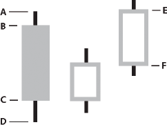
- A.
- highField
- B.
- openField
- C.
- closeField
- D.
- lowField
- E.
- closeField
- F.
- openField
The following example creates a CandlestickChart control:
<?xml version="1.0"?>
<!-- charts/BasicCandlestick.mxml -->
<s:Application
    xmlns:fx="http://ns.adobe.com/mxml/2009"
    xmlns:mx="library://ns.adobe.com/flex/mx"
    xmlns:s="library://ns.adobe.com/flex/spark"
    creationComplete="srv.send()"
    height="600">

    <fx:Declarations>
        <!-- View source of the following page to see the structure of the data that Flex uses in this example. -->
        <mx:HTTPService id="srv" url="http://exampleserver/chart_examples/stocks-xml.aspx"/>
        <!-- To see data in an HTML table, go to http://exampleserver/chart_examples/stocks.aspx -->
    </fx:Declarations>

    <s:layout>
        <s:VerticalLayout/>
    </s:layout>

  <s:Panel title="Candlestick Chart">
        <s:layout>
            <s:VerticalLayout/>
        </s:layout>
     <mx:CandlestickChart id="mychart"
        dataProvider="{srv.lastResult.data.result}"
        showDataTips="true"
        height="400"
        width="400">
        <mx:horizontalAxis>
           <mx:DateTimeAxis dataUnits="days"/>
        </mx:horizontalAxis>
        <mx:series>
           <mx:CandlestickSeries
                openField="open"
                highField="high"
                lowField="low"
                closeField="close"
                displayName="TICKER"
                xField="date"/>
        </mx:series>
     </mx:CandlestickChart>
     <mx:Legend dataProvider="{mychart}"/>
  </s:Panel>
</s:Application>
You can change the color of the candle's fill with the fill and declineFill properties of the series. The fill property defines the color of the candlestick when the closeField value is higher than the openField value. The declineFill property defines the color of the candlestick when the reverse is true. You can also define the properties of the high-low lines and candlestick borders by using the SolidColorStroke class, as the following example shows:
<?xml version="1.0"?>
<!-- charts/CandlestickStyles.mxml -->
<s:Application
    xmlns:fx="http://ns.adobe.com/mxml/2009"
    xmlns:mx="library://ns.adobe.com/flex/mx"
    xmlns:s="library://ns.adobe.com/flex/spark"
    creationComplete="srv.send()"
    height="600">

    <fx:Declarations>
        <!-- View source of the following page to see the structure of the data that Flex uses in this example. -->
        <mx:HTTPService id="srv" url="http://exampleserver/chart_examples/stocks-xml.aspx"/>
        <!-- To see data in an HTML table, go to http://exampleserver/chart_examples/stocks.aspx -->
    </fx:Declarations>

    <s:layout>
        <s:VerticalLayout/>
    </s:layout>

  <s:Panel title="Candlestick Chart">
        <s:layout>
            <s:VerticalLayout/>
        </s:layout>
     <mx:CandlestickChart id="mychart"
        dataProvider="{srv.lastResult.data.result}"
        showDataTips="true"
        height="400"
        width="400">
        <mx:verticalAxis>
           <mx:LinearAxis title="linear axis" minimum="40" maximum="50"/>
        </mx:verticalAxis>

        <mx:horizontalAxis>
           <mx:DateTimeAxis dataUnits="days"/>
        </mx:horizontalAxis>
        <mx:series>
           <mx:CandlestickSeries
                openField="open"
                highField="high"
                lowField="low"
                closeField="close"
                displayName="TICKER"
                xField="date">
            <mx:fill>
                <mx:SolidColor color="green"/>
            </mx:fill>
            <mx:declineFill>
                <mx:SolidColor color="red"/>
            </mx:declineFill>
            <mx:stroke>
                <mx:SolidColorStroke weight="1" color="black"/>
            </mx:stroke>
           </mx:CandlestickSeries>
        </mx:series>
     </mx:CandlestickChart>
     <mx:Legend dataProvider="{mychart}"/>
  </s:Panel>
</s:Application>
Using column charts
The ColumnChart control represents data as a series of vertical columns whose height is determined by values in the data. You can use the ColumnChart control to create several variations of column charts, including simple columns, clustered columns, overlaid, stacked, 100% stacked, and high-low. For more information, see Stacking charts.
You use the ColumnSeries chart series with the ColumnChart control to define the data for the chart. The following table describes the properties of the ColumnSeries chart series to define your chart:
|
Property |
Description |
|---|---|
yField |
Specifies the field of the data provider that determines the y-axis location of the top of a column. This field defines the height of the column. |
xField |
Specifies the field of the data provider that determines the x-axis location of the column. If you omit this property, Flex arranges the columns in the order of the data in the data provider. |
minField |
Specifies the field of the data provider that determines the y-axis location of the bottom of a column. This property has no effect on overlaid, stacked, or 100% stacked charts. For more information on using the minField property, see Using the minField property. |
The following example creates a ColumnChart control with two series:
<?xml version="1.0"?>
<!-- charts/BasicColumn.mxml -->
<s:Application
    xmlns:fx="http://ns.adobe.com/mxml/2009"
    xmlns:mx="library://ns.adobe.com/flex/mx"
    xmlns:s="library://ns.adobe.com/flex/spark"
    creationComplete="srv.send()"
    height="600">

    <fx:Declarations>
         <!-- View source of the following page to see the structure of the data that Flex uses in this example. -->
         <mx:HTTPService id="srv" url="http://exampleserver/chart_examples/expenses-xml.aspx"/>
         <!-- To see data in an HTML table, go to http://exampleserver/chart_examples/expenses.aspx -->
    </fx:Declarations>

    <s:layout>
        <s:VerticalLayout/>
    </s:layout>

  <s:Panel title="Column Chart">
        <s:layout>
            <s:VerticalLayout/>
        </s:layout>
     <mx:ColumnChart id="myChart" dataProvider="{srv.lastResult.data.result}" showDataTips="true">
        <mx:horizontalAxis>
           <mx:CategoryAxis categoryField="month"/>
        </mx:horizontalAxis>
        <mx:series>
           <mx:ColumnSeries
                xField="month"
                yField="profit"
                displayName="Profit"/>
           <mx:ColumnSeries
                xField="month"
                yField="expenses"
                displayName="Expenses"/>
        </mx:series>
     </mx:ColumnChart>
     <mx:Legend dataProvider="{myChart}"/>
  </s:Panel>
</s:Application>
To customize the styles of the columns in a ColumnChart control, you specify a SolidColor and a SolidColorStroke object for the fill and stroke properties, respectively. The following example defines a custom SolidColor object and a custom SolidColorStroke object, and applies them to the ColumnSeries object in the ColumnChart control.
<?xml version="1.0"?>
<!-- charts/BasicColumnFills.mxml -->
<s:Application
    xmlns:fx="http://ns.adobe.com/mxml/2009"
    xmlns:mx="library://ns.adobe.com/flex/mx"
    xmlns:s="library://ns.adobe.com/flex/spark"
    creationComplete="srv.send()"
    height="600">

    <fx:Declarations>
         <!-- View source of the following page to see the structure of the data that Flex uses in this example. -->
         <mx:HTTPService id="srv" url="http://exampleserver/chart_examples/expenses-xml.aspx"/>
         <!-- To see data in an HTML table, go to http://exampleserver/chart_examples/expenses.aspx -->
        <!-- Define custom colors for use as column fills. -->
        <mx:SolidColor id="sc1" color="blue" alpha=".3"/>
        <mx:SolidColor id="sc2" color="red" alpha=".3"/>

        <!-- Define custom SolidColorStrokes for the columns. -->
        <mx:SolidColorStroke id="s1" color="blue" weight="2"/>
        <mx:SolidColorStroke id="s2" color="red" weight="2"/>
    </fx:Declarations>

    <s:layout>
        <s:VerticalLayout/>
    </s:layout>

    <s:Panel title="ColumnChart Control with Custom Column Styles">
        <s:layout>
            <s:VerticalLayout/>
        </s:layout>
        <mx:ColumnChart id="myChart" dataProvider="{srv.lastResult.data.result}" showDataTips="true">
            <mx:horizontalAxis>
                <mx:CategoryAxis categoryField="month"/>
            </mx:horizontalAxis>
            <mx:series>
                <mx:ColumnSeries
                    xField="month"
                    yField="profit"
                    displayName="Profit"
                    fill="{sc1}"
                    stroke="{s1}"/>
                <mx:ColumnSeries
                    xField="month"
                    yField="expenses"
                    displayName="Expenses"
                    fill="{sc2}"
                    stroke="{s2}"/>
            </mx:series>
        </mx:ColumnChart>
        <mx:Legend dataProvider="{myChart}"/>
    </s:Panel>
</s:Application>
For more information on using fills, see Using fills with chart controls. For more information on using the SolidColorStroke class, see Using strokes with chart controls.
Creating floating column charts
You can also create floating column charts by using the minField property of the chart's data series. This property lets you set the lower level of a column.
The following code creates a floating ColumnChart control:
<?xml version="1.0"?>
<!-- charts/MinFieldColumn.mxml -->
<s:Application
    xmlns:fx="http://ns.adobe.com/mxml/2009"
    xmlns:mx="library://ns.adobe.com/flex/mx"
    xmlns:s="library://ns.adobe.com/flex/spark"
    height="600">

  <fx:Script><![CDATA[
     import mx.collections.ArrayCollection;
     [Bindable]
     public var expenses:ArrayCollection = new ArrayCollection([
        {Month:"Jan", Revenue:1200, Expenses:500},
        {Month:"Feb", Revenue:1200, Expenses:550},
        {Month:"Mar", Revenue:1240, Expenses:475},
        {Month:"Apr", Revenue:1300, Expenses:600},
        {Month:"May", Revenue:1420, Expenses:575},
        {Month:"Jun", Revenue:1400, Expenses:600},
        {Month:"Jul", Revenue:1500, Expenses:600},
        {Month:"Aug", Revenue:1600, Expenses:750},
        {Month:"Sep", Revenue:1600, Expenses:735},
        {Month:"Oct", Revenue:1750, Expenses:750},
        {Month:"Nov", Revenue:1800, Expenses:800},
        {Month:"Dec", Revenue:2000, Expenses:850}
     ]);
  ]]></fx:Script>

    <s:layout>
        <s:VerticalLayout/>
    </s:layout>

  <s:Panel title="Floating Column Chart">
    <s:layout>
        <s:VerticalLayout/>
    </s:layout>
     <mx:ColumnChart
        dataProvider="{expenses}"
        showDataTips="true">
        <mx:horizontalAxis>
           <mx:CategoryAxis
                dataProvider="{expenses}"
                categoryField="Month"/>
        </mx:horizontalAxis>
        <mx:series>
           <mx:ColumnSeries
                yField="Revenue"
                minField="Expenses"
                displayName="Revenue"/>
        </mx:series>
     </mx:ColumnChart>
  </s:Panel>
</s:Application>
For more information, see Using the minField property.
Using HighLowOpenClose charts
The HLOCChart control represents financial data as a series of lines representing the high, low, opening, and closing values of a data series. The top and bottom of the vertical line represent the high and low values for the data point, while the left tick mark represents the opening values and the right tick mark represents the closing values.
The HLOCChart control does not require a data point that represents the opening value. A related chart is the CandlestickChart control that represents similar data as candlesticks. For more information see Using candlestick charts.
You use the HLOCSeries with the HLOCChart control to define the data for HighLowOpenClose charts.
The following table describes the properties of the HLOCChart control's series that you commonly use to define your chart:
|
Property |
Description |
|---|---|
closeField |
Specifies the field of the data provider that determines the y-axis location of the closing value of the element. This property defines the position of the right tick mark on the vertical line. |
highField |
Specifies the field of the data provider that determines the y-axis location of the high value of the element. This property defines the top of the vertical line. |
lowField |
Specifies the field of the data provider that determines the y-axis location of the low value of the element. This property defines the bottom of the vertical line. |
openField |
Specifies the field of the data provider that determines the y-axis location of the opening value of the element. This property defines the position of the left tick mark on the vertical line. This property is optional. |
xField |
Specifies the field of the data provider that determines the x-axis location of the element. If set to the empty string (""), Flex renders the columns in the order in which they appear in the data provider. The default value is the empty string. |
Data points in an HLOCChart control do not require an openField property. If no openField property is specified, Flex renders the data point as a flat line with a single closing value indicator pointing to the right. If an openField property is specified, Flex renders the data point with another indicator pointing to the left, as the following image shows:
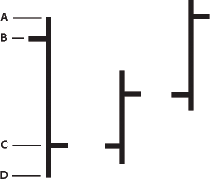
- A.
- highField
- B.
- openField
- C.
- closeField
- D.
- lowField
The following example creates an HLOCChart control:
<?xml version="1.0"?>
<!-- charts/BasicHLOC.mxml -->
<s:Application
    xmlns:fx="http://ns.adobe.com/mxml/2009"
    xmlns:mx="library://ns.adobe.com/flex/mx"
    xmlns:s="library://ns.adobe.com/flex/spark"
    creationComplete="srv.send()"
    height="600">

    <fx:Declarations>
        <!-- View source of the following page to see the structure of the data that Flex uses in this example. -->
        <mx:HTTPService id="srv" url="http://exampleserver/chart_examples/stocks-xml.aspx"/>
        <!-- To see data in an HTML table, go to http://exampleserver/chart_examples/stocks.aspx -->
    </fx:Declarations>

    <s:layout>
        <s:VerticalLayout/>
    </s:layout>

  <s:Panel title="HighLowOpenClose Chart">
        <s:layout>
            <s:VerticalLayout/>
        </s:layout>
     <mx:HLOCChart id="myChart"
        dataProvider="{srv.lastResult.data.result}"
        showDataTips="true">
        <mx:verticalAxis>
           <mx:LinearAxis minimum="30" maximum="50"/>
        </mx:verticalAxis>
        <mx:horizontalAxis>
           <mx:DateTimeAxis dataUnits="days"/>
        </mx:horizontalAxis>
        <mx:series>
           <mx:HLOCSeries
                openField="open"
                highField="high"
                lowField="low"
                closeField="close"
                displayName="TICKER"
                xField="date">
           </mx:HLOCSeries>
        </mx:series>
     </mx:HLOCChart>
     <mx:Legend dataProvider="{myChart}"/>
  </s:Panel>
</s:Application>
You can change the stroke of the vertical lines by using a SolidColorStroke object on the series. To change the appearance of the opening and closing value tick marks on the vertical line, you use the openTickStroke and closeTickStroke style properties. The following example changes the stroke of the vertical line to 2 (the default value is 1) and the color of all the lines to black:
<?xml version="1.0"?>
<!-- charts/HLOCStyled.mxml -->
<s:Application
    xmlns:fx="http://ns.adobe.com/mxml/2009"
    xmlns:mx="library://ns.adobe.com/flex/mx"
    xmlns:s="library://ns.adobe.com/flex/spark"
    creationComplete="srv.send()"
    height="600">

    <fx:Declarations>
        <!-- View source of the following page to see the structure of the data that Flex uses in this example. -->
        <mx:HTTPService id="srv" url="http://exampleserver/chart_examples/stocks-xml.aspx"/>
        <!-- To see data in an HTML table, go to http://exampleserver/chart_examples/stocks.aspx -->
    </fx:Declarations>

    <s:layout>
        <s:VerticalLayout/>
    </s:layout>

  <s:Panel title="HLOC Chart">
        <s:layout>
            <s:VerticalLayout/>
        </s:layout>
     <mx:HLOCChart id="myChart"
        dataProvider="{srv.lastResult.data.result}"
        showDataTips="true">
        <mx:verticalAxis>
           <mx:LinearAxis minimum="30" maximum="50"/>
        </mx:verticalAxis>
        <mx:horizontalAxis>
           <mx:DateTimeAxis dataUnits="days"/>
        </mx:horizontalAxis>
        <mx:series>
           <mx:HLOCSeries
                openField="open"
                highField="high"
                lowField="low"
                closeField="close"
                xField="date"
                displayName="TICKER">
            <mx:stroke>
                <mx:SolidColorStroke color="#000000" weight="2"/>
            </mx:stroke>
            <mx:closeTickStroke>
                <mx:SolidColorStroke color="#000000" weight="1"/>
            </mx:closeTickStroke>
            <mx:openTickStroke>
                <mx:SolidColorStroke color="#000000" weight="1"/>
            </mx:openTickStroke>
           </mx:HLOCSeries>
        </mx:series>
     </mx:HLOCChart>
     <mx:Legend dataProvider="{myChart}"/>
  </s:Panel>
</s:Application>
Using line charts
The LineChart control represents data as a series of points, in Cartesian coordinates, connected by a continuous line. You can use an icon or symbol to represent each data point along the line, or show a simple line without icons.
You use the LineSeries chart series with the LineChart control to define the data for the chart. The following table describes the properties of the LineSeries chart series that you commonly use to define your chart:
|
Property |
Description |
|---|---|
yField |
Specifies the field of the data provider that determines the y-axis location of each data point. This is the height of the line at that location along the axis. |
xField |
Specifies the field of the data provider that determines the x-axis location of each data point. If you omit this field, Flex arranges the data points in the order of the data in the data provider. |
interpolateValues |
Specifies how to represent missing data. If you set the value of this property to false, the chart breaks the line at the missing value. If you specify a value of true, Flex draws a continuous line by interpolating the missing value. The default value is false. |
form |
Specifies the way in which the data series is shown in the chart. The following values are valid:
|
The following example shows the available forms for a LineChart control's series:
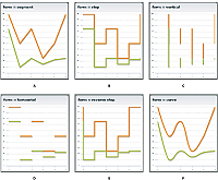
- A.
- segment (default)
- B.
- step
- C.
- vertical
- D.
- horizontal
- E.
- reverseStep
- F.
- curve
The following example creates a LineChart control:
<?xml version="1.0"?>
<!-- charts/BasicLine.mxml -->
<s:Application
    xmlns:fx="http://ns.adobe.com/mxml/2009"
    xmlns:mx="library://ns.adobe.com/flex/mx"
    xmlns:s="library://ns.adobe.com/flex/spark"
    creationComplete="srv.send()"
    height="600">

    <fx:Declarations>
         <!-- View source of the following page to see the structure of the data that Flex uses in this example. -->
         <mx:HTTPService id="srv" url="http://exampleserver/chart_examples/expenses-xml.aspx"/>
         <!-- To see data in an HTML table, go to http://exampleserver/chart_examples/expenses.aspx -->
    </fx:Declarations>

    <s:layout>
        <s:VerticalLayout/>
    </s:layout>

  <s:Panel title="Line Chart">
        <s:layout>
            <s:VerticalLayout/>
        </s:layout>
     <mx:LineChart id="myChart"
        dataProvider="{srv.lastResult.data.result}"
        showDataTips="true">
        <mx:horizontalAxis>
           <mx:CategoryAxis categoryField="month"/>
        </mx:horizontalAxis>
        <mx:series>
           <mx:LineSeries yField="profit" displayName="Profit"/>
           <mx:LineSeries yField="expenses" displayName="Expenses"/>
        </mx:series>
     </mx:LineChart>
     <mx:Legend dataProvider="{myChart}"/>
  </s:Panel>
</s:Application>
Formatting lines in a LineChart control
You can change the width and color of the lines for each series by using the <mx:lineStroke> tag. The default line is 3 pixels wide and has a shadow. The following example sets a custom color and width for the series SolidColorStroke object:
<?xml version="1.0"?>
<!-- charts/BasicLineStroke.mxml -->
<s:Application
    xmlns:fx="http://ns.adobe.com/mxml/2009"
    xmlns:mx="library://ns.adobe.com/flex/mx"
    xmlns:s="library://ns.adobe.com/flex/spark"
    creationComplete="srv.send()"
    height="600">

    <fx:Declarations>
        <!-- View source of the following page to see the structure of the data that Flex uses in this example. -->
        <mx:HTTPService id="srv" url="http://exampleserver/chart_examples/expenses-xml.aspx"/>
        <!-- To see data in an HTML table, go to http://exampleserver/chart_examples/expenses.aspx -->
    </fx:Declarations>

    <s:layout>
        <s:VerticalLayout/>
    </s:layout>

  <s:Panel title="Line Chart With SolidColorStrokes">
        <s:layout>
            <s:VerticalLayout/>
        </s:layout>
     <mx:LineChart id="myChart"
        dataProvider="{srv.lastResult.data.result}"
        showDataTips="true">
        <mx:horizontalAxis>
           <mx:CategoryAxis categoryField="month"/>
        </mx:horizontalAxis>
        <mx:series>
           <mx:LineSeries yField="profit" displayName="Profit">
            <mx:lineStroke>
                <mx:SolidColorStroke
                    color="0x0099FF"
                    weight="20"
                    alpha=".2"/>
            </mx:lineStroke>
           </mx:LineSeries>
           <mx:LineSeries yField="expenses" displayName="Expenses">
            <mx:lineStroke>
                <mx:SolidColorStroke
                    color="0x0044EB"
                    weight="20"
                    alpha=".8"/>
            </mx:lineStroke>
           </mx:LineSeries>
        </mx:series>
     </mx:LineChart>
     <mx:Legend dataProvider="{myChart}"/>
  </s:Panel>
</s:Application>
You can also modify lines in a LineChart with ActionScript. You define a new SolidColorStroke, and apply it to the LineSeries by setting the lineStroke style property with the setStyle() method. For example:
/* First 3 arguments are color, weight, and alpha. */
var s1:SolidColorStroke = new SolidColorStroke(0x0099FF,20,.2);
 series1.setStyle("lineStroke", s1);
For more information on using the SolidColorStroke class in charts, see Using strokes with chart controls.
The default appearance of the lines in a LineChart control is with drop shadows. You can remove these shadows by setting the chart control's seriesFilters property to an empty Array, as the following example shows:
<?xml version="1.0"?>
<!-- charts/LineChartNoShadows.mxml -->
<s:Application
    xmlns:fx="http://ns.adobe.com/mxml/2009"
    xmlns:mx="library://ns.adobe.com/flex/mx"
    xmlns:s="library://ns.adobe.com/flex/spark"
    creationComplete="srv.send()"
    height="600">

    <fx:Declarations>
        <!-- View source of the following page to see the structure of the data that Flex uses in this example. -->
        <mx:HTTPService id="srv" url="http://exampleserver/chart_examples/expenses-xml.aspx"/>
        <!-- To see data in an HTML table, go to http://exampleserver/chart_examples/expenses.aspx -->
    </fx:Declarations>

    <s:layout>
        <s:VerticalLayout/>
    </s:layout>

  <s:Panel title="Line Chart with No Shadows">
        <s:layout>
            <s:VerticalLayout/>
        </s:layout>
     <mx:LineChart id="myChart"
        dataProvider="{srv.lastResult.data.result}"
        showDataTips="true">
        <mx:seriesFilters>
           <fx:Array/>
        </mx:seriesFilters>
        <mx:horizontalAxis>
           <mx:CategoryAxis categoryField="month"/>
        </mx:horizontalAxis>
        <mx:series>
           <mx:LineSeries
                yField="profit"
                displayName="Profit"/>
           <mx:LineSeries
                yField="expenses"
                displayName="Expenses"/>
           <mx:LineSeries
                yField="amount"
                displayName="Amount"/>
        </mx:series>
     </mx:LineChart>
     <mx:Legend dataProvider="{myChart}"/>
  </s:Panel>
</s:Application>
You can also set the value of the seriesFilters property programmatically, as the following example shows:
myLineChart.seriesFilters = [];
You can also specify a programmatic renderer (or skin) class for each series by setting the lineSegmentRenderer property of the LineSeries. The default renderer is the LineRenderer, but Flex also applies a shadow filter on all series. If you remove the shadow filter, as the previous example shows, but want a line with a drop shadow in your chart, you can set the lineSegmentRenderer to the ShadowLineRenderer class, as the following example shows:
<?xml version="1.0"?>
<!-- charts/LineChartOneShadow.mxml -->
<s:Application
    xmlns:fx="http://ns.adobe.com/mxml/2009"
    xmlns:mx="library://ns.adobe.com/flex/mx"
    xmlns:s="library://ns.adobe.com/flex/spark"
    creationComplete="srv.send()"
    height="600">

    <fx:Declarations>
        <!-- View source of the following page to see the structure of the data that Flex uses in this example. -->
        <mx:HTTPService id="srv" url="http://exampleserver/chart_examples/expenses-xml.aspx"/>
        <!-- To see data in an HTML table, go to http://exampleserver/chart_examples/expenses.aspx -->
    </fx:Declarations>

    <s:layout>
        <s:VerticalLayout/>
    </s:layout>

  <s:Panel title="Line Chart with One Shadow">
        <s:layout>
            <s:VerticalLayout/>
        </s:layout>
     <mx:LineChart id="myChart"
        dataProvider="{srv.lastResult.data.result}"
        showDataTips="true">

        <mx:seriesFilters>
           <fx:Array/>
        </mx:seriesFilters>

        <mx:horizontalAxis>
           <mx:CategoryAxis categoryField="month"/>
        </mx:horizontalAxis>

        <mx:series>
           <mx:LineSeries yField="profit" displayName="Profit"/>
           <mx:LineSeries yField="expenses" displayName="Expenses"/>
           <mx:LineSeries yField="amount"
                displayName="Amount"
                lineSegmentRenderer="mx.charts.renderers.ShadowLineRenderer"/>
        </mx:series>
     </mx:LineChart>
     <mx:Legend dataProvider="{myChart}"/>
  </s:Panel>
</s:Application>
For more information on using renderer classes to change the appearance of ChartItem objects such as the LineChart control's line segments, see Skinning ChartItem objects.
Using vertical lines in a LineChart control
You can create LineChart controls that show vertical progression.
To make lines in a LineChart control display vertically rather than horizontally, you must do the following:
-
Explicitly define the xField and yField properties for the LineSeries object.
-
Set the sortOnXField property of the LineSeries object to false.
By default, data points in a series are sorted from left to right (on the x-axis) before rendering. This causes the LineSeries to draw horizontally. When you disable the xField sort and explicitly define a yField property, Flex draws the lines vertically rather than horizontally.
Flex does not sort any data vertically. As a result, you must ensure that your data is arranged correctly in the data provider. If it is not arranged correctly, Flex renders a zig-zagging line up and down the chart as it connects those dots according to position in the data provider.
The following example creates a LineChart control that displays vertical lines:
<?xml version="1.0"?>
<!-- charts/VerticalLineChart.mxml -->
<s:Application
    xmlns:fx="http://ns.adobe.com/mxml/2009"
    xmlns:mx="library://ns.adobe.com/flex/mx"
    xmlns:s="library://ns.adobe.com/flex/spark"
    creationComplete="srv.send()"
    height="600">

    <fx:Declarations>
        <!-- View source of the following page to see the structure of the data that Flex uses in this example. -->
        <mx:HTTPService id="srv" url="http://exampleserver/chart_examples/expenses-xml.aspx"/>
        <!-- To see data in an HTML table, go to http://exampleserver/chart_examples/expenses.aspx -->
    </fx:Declarations>

    <s:layout>
        <s:VerticalLayout/>
    </s:layout>

  <s:Panel title="Vertical Line Chart">
     <s:layout>
         <s:HorizontalLayout/>
     </s:layout>
     <mx:LineChart id="myChart"
        dataProvider="{srv.lastResult.data.result}"
        showDataTips="true">
        <mx:verticalAxis>
           <mx:CategoryAxis categoryField="month"/>
        </mx:verticalAxis>
        <mx:series>
           <mx:LineSeries
                xField="profit"
                yField="month"
                displayName="Profit"
                sortOnXField="false"/>
           <mx:LineSeries
                xField="expenses"
                yField="month"
                displayName="Expenses"
                sortOnXField="false"/>
        </mx:series>
     </mx:LineChart>
     <mx:Legend dataProvider="{myChart}"/>
  </s:Panel>
</s:Application>
Using pie charts
You use the PieChart control to define a standard pie chart. The data for the data provider determines the size of each wedge in the pie chart relative to the other wedges.
You use the PieSeries chart series with the PieChart control to define the data for the chart. The PieSeries can create standard pie charts or doughnut charts. PieChart controls also support labels that identify data points.
The following table describes the properties of the PieChart control's PieSeries chart series that you commonly use to define your chart:
|
Property |
Description |
|---|---|
field |
Specifies the field of the data provider that determines the data for each wedge of the pie chart. |
labelPosition |
Specifies how to render data labels for the wedges. |
nameField |
Specifies the field of the data provider to use as the name for the wedge in DataTip objects and legends. |
The following example defines a PieChart control:
<?xml version="1.0"?>
<!-- charts/BasicPie.mxml -->
<s:Application
    xmlns:fx="http://ns.adobe.com/mxml/2009"
    xmlns:mx="library://ns.adobe.com/flex/mx"
    xmlns:s="library://ns.adobe.com/flex/spark"
    creationComplete="srv.send()"
    height="600">

    <fx:Declarations>
         <!-- View source of the following page to see the structure of the data that Flex uses in this example. -->
         <mx:HTTPService id="srv" url="http://exampleserver/chart_examples/budget-xml.aspx"/>
         <!-- To see data in an HTML table, go to http://exampleserver/chart_examples/budget.aspx -->
    </fx:Declarations>

    <s:layout>
        <s:VerticalLayout/>
    </s:layout>

  <s:Panel title="Pie Chart">
        <s:layout>
            <s:VerticalLayout/>
        </s:layout>
     <mx:PieChart id="myChart"
        dataProvider="{srv.lastResult.data.result}"
        showDataTips="true">
        <mx:series>
           <mx:PieSeries
                field="amount"
                nameField="item"
                labelPosition="callout"/>
        </mx:series>
     </mx:PieChart>
     <mx:Legend dataProvider="{myChart}"/>
  </s:Panel>
</s:Application>
To customize the colors of the wedges in a PieChart control, you use the fills property. You pass this an Array of SolidColor objects. The following example defines an Array of custom SolidColor objects, and applies it to the PieSeries object in the PieChart control.
<?xml version="1.0"?>
<!-- charts/PieFilling.mxml -->
<s:Application
    xmlns:fx="http://ns.adobe.com/mxml/2009"
    xmlns:mx="library://ns.adobe.com/flex/mx"
    xmlns:s="library://ns.adobe.com/flex/spark"
    creationComplete="srv.send()"
    height="600">

    <fx:Declarations>
        <!-- View source of the following page to see the structure of the data that Flex uses in this example. -->
        <mx:HTTPService id="srv" url="http://exampleserver/chart_examples/budget-xml.aspx"/>
        <!-- To see data in an HTML table, go to http://exampleserver/chart_examples/budget.aspx -->
        <!-- Define custom colors for use as pie wedge fills. -->
        <mx:SolidColor id="sc1" color="blue" alpha=".3"/>
        <mx:SolidColor id="sc2" color="red" alpha=".3"/>
        <mx:SolidColor id="sc3" color="green" alpha=".3"/>
        <mx:SolidColor id="sc4" color="gray" alpha=".3"/>
        <mx:SolidColor id="sc5" color="black" alpha=".3"/>
        <mx:SolidColor id="sc6" color="yellow" alpha=".3"/>
    </fx:Declarations>

    <s:layout>
        <s:VerticalLayout/>
    </s:layout>

    <s:Panel title="PieChart control with custom fills">
         <s:layout>
             <s:VerticalLayout/>
         </s:layout>
        <mx:PieChart id="pie"
            dataProvider="{srv.lastResult.data.result}"
            showDataTips="true">
            <mx:series>
                <mx:PieSeries
                    field="amount"
                    nameField="item"
                    labelPosition="callout"
                    fills="{[sc1, sc2, sc3, sc4, sc5, sc6]}"/>
            </mx:series>
        </mx:PieChart>
        <mx:Legend dataProvider="{pie}"/>
    </s:Panel>
</s:Application>
For more information on using fills, see Using fills with chart controls.
You can also customize the lines that outline each wedge by using the stroke property of a PieSeries object. You set this property to an instance of the SolidColorStroke class. For more information on using the SolidColorStroke class, see Using strokes with chart controls.
Using data labels with PieChart controls
PieChart controls support data labels that display information about each data point. All charts support DataTip objects, which display the value of a data point when the user moves the mouse over it. Data labels, on the other hand, are only supported by PieSeries, ColumnSeries, and BarSeries objects. Data labels are different from DataTip objects in that they are always visible and do not react to mouse movements.
To add data labels to your PieChart control, set the labelPosition property on the series to a valid value other than none. To remove labels from your pie chart, set the labelPosition property to none. The default value is none.
The following table describes the valid values of the labelPosition property for a PieSeries object. The PieSeries class supports more values for this property than the BarSeries and ColumnSeries classes.
|
Value |
Description |
|---|---|
|
callout |
Draws labels in two vertical stacks on either side of the PieChart control. Shrinks the PieChart if necessary to make room for the labels. Draws key lines from each label to the associated wedge. Shrinks labels as necessary to fit the space provided. This property can only be used with a PieSeries object. You cannot use callouts with BarSeries and ColumnSeries objects. |
|
inside |
Draws labels inside the chart. Shrinks labels to ensure that they do not overlap each other. Any label that must be drawn too small, as defined by the insideLabelSizeLimit property, is hidden from view. |
|
insideWithCallout |
Draws labels inside the pie, but if labels are shrunk below a legible size, Flex converts them to callout labels. You commonly set the value of the labelPosition property to insideWithCallout when the actual size of your chart is flexible and users might resize it. This property can only be used with a PieSeries object. You cannot use callouts with BarSeries and ColumnSeries objects. |
|
none |
Does not draw labels. This is the default value. |
|
outside |
Draws labels around the boundary of the PieChart control. |
The following table describes the properties of the PieSeries object that you can use to manipulate the appearance of labels:
|
Property |
Description |
|---|---|
|
calloutGap |
Defines how much space, in pixels, to insert between the edge of the pie and the data labels when rendering callouts. The default value is 10 pixels. |
|
calloutStroke |
Defines the line style used to draw the lines to callouts. For more information on defining line data points, see Using strokes with chart controls. |
|
insideLabelSizeLimit |
Defines the size threshold, expressed in points, below which inside data labels are considered illegible. Below this threshold, data labels are either removed entirely or turned into callouts based on the setting of the series labelPosition property. |
You can change the value of the data labels by using the labelFunction property of the PieSeries object to specify a callback function. For more information, see Customizing data label values.
Creating doughnut charts
Flex lets you create doughnut charts out of PieChart controls. Doughnut charts are identical to pie charts, except that they have hollow centers and resemble wheels rather than filled circles.
To create a doughnut chart, specify the innerRadius property on the PieChart control, as the following example shows:
<?xml version="1.0"?>
<!-- charts/DoughnutPie.mxml -->
<s:Application
    xmlns:fx="http://ns.adobe.com/mxml/2009"
    xmlns:mx="library://ns.adobe.com/flex/mx"
    xmlns:s="library://ns.adobe.com/flex/spark"
    creationComplete="srv.send()"
    height="600">

    <fx:Declarations>
         <!-- View source of the following page to see the structure of the data that Flex uses in this example. -->
         <mx:HTTPService id="srv" url="http://exampleserver/chart_examples/budget-xml.aspx"/>
         <!-- To see data in an HTML table, go to http://exampleserver/chart_examples/budget.aspx -->
    </fx:Declarations>

    <s:layout>
        <s:VerticalLayout/>
    </s:layout>

  <s:Panel title="Pie Chart">
        <s:layout>
            <s:VerticalLayout/>
        </s:layout>
     <mx:PieChart id="myChart"
        dataProvider="{srv.lastResult.data.result}"
        showDataTips="true"
        innerRadius=".3">
        <mx:series>
           <mx:PieSeries
                field="amount"
                nameField="item"
                labelPosition="callout"/>
        </mx:series>
     </mx:PieChart>
     <mx:Legend dataProvider="{myChart}"/>
  </s:Panel>
</s:Application>
The value of the innerRadius property is a percentage value of the "hole" compared to the entire pie's radius. Valid values range from 0 to 1.
Creating exploding pie charts
The PieSeries chart series supports exploding wedges, both uniformly and on a per-wedge basis, so that you can achieve effects similar to the following:
The following table describes the properties that support exploding pie charts:
|
Property |
Description |
|---|---|
|
explodeRadius |
A value from 0 to 1, representing the percentage of the available pie radius to use when exploding the wedges of the pie. |
|
perWedgeExplodeRadius |
An array of values from 0 to 1. The Nth value in this array is added to the value of explodeRadius to determine the explode amount of each individual wedge of the pie. Individual values can be left undefined, in which case the wedge will only explode according to the explodeRadius property. |
|
reserveExplodeRadius |
A value from 0 to 1, representing an amount of the available pie radius to reserve for animating an exploding wedge. |
To explode all wedges of a pie chart evenly, you use the explodeRadius property on the PieSeries, as the following example shows:
<?xml version="1.0"?>
<!-- charts/ExplodingPie.mxml -->
<s:Application
    xmlns:fx="http://ns.adobe.com/mxml/2009"
    xmlns:mx="library://ns.adobe.com/flex/mx"
    xmlns:s="library://ns.adobe.com/flex/spark"
    creationComplete="srv.send()"
    height="600">

    <fx:Declarations>
         <!-- View source of the following page to see the structure of the data that Flex uses in this example. -->
         <mx:HTTPService id="srv" url="http://exampleserver/chart_examples/budget-xml.aspx"/>
         <!-- To see data in an HTML table, go to http://exampleserver/chart_examples/budget.aspx -->
    </fx:Declarations>

    <s:layout>
        <s:VerticalLayout/>
    </s:layout>

  <s:Panel title="Exploding Pie Chart">
        <s:layout>
            <s:VerticalLayout/>
        </s:layout>
     <mx:PieChart id="pie"
        dataProvider="{srv.lastResult.data.result}"
        showDataTips="true">
        <mx:series>
           <!--explodeRadius is a number between 0 and 1.-->
           <mx:PieSeries
                field="amount"
                nameField="item"
                explodeRadius=".12"/>
        </mx:series>
     </mx:PieChart>
     <mx:Legend dataProvider="{pie}"/>
  </s:Panel>
</s:Application>
To explode one or more wedges of the pie, you use an Array of explodeRadius values. Each value in the Array applies to the corresponding data point. In the following example, the fourth data point, the Car expense, is exploded:
<?xml version="1.0"?>
<!-- charts/ExplodingPiePerWedge.mxml -->
<s:Application
    xmlns:fx="http://ns.adobe.com/mxml/2009"
    xmlns:mx="library://ns.adobe.com/flex/mx"
    xmlns:s="library://ns.adobe.com/flex/spark"
    creationComplete="srv.send()"
    height="600">

    <fx:Declarations>
         <!-- View source of the following page to see the structure of the data that Flex uses in this example. -->
         <mx:HTTPService id="srv" url="http://exampleserver/chart_examples/budget-xml.aspx"/>
         <!-- To see data in an HTML table, go to http://exampleserver/chart_examples/budget.aspx -->
    </fx:Declarations>

  <fx:Script><![CDATA[
     // Create a bindable Array of explode radii.
     [Bindable]
     public var explodingArray:Array = [0,0,0,.2,0,0]
  ]]></fx:Script>

    <s:layout>
        <s:VerticalLayout/>
    </s:layout>

  <s:Panel title="Exploding Pie Chart Per Wedge">
        <s:layout>
            <s:VerticalLayout/>
        </s:layout>
     <mx:PieChart id="pie"
        dataProvider="{srv.lastResult.data.result}"
        showDataTips="true">
        <mx:series>
           <!--Apply the Array of radii to the PieSeries.-->
           <mx:PieSeries
                field="amount"
                nameField="item"
                perWedgeExplodeRadius="{explodingArray}"
                labelPosition="callout"/>
        </mx:series>
     </mx:PieChart>
     <mx:Legend dataProvider="{pie}"/>
  </s:Panel>
</s:Application>
Using plot charts
You use the PlotChart control to represent data in Cartesian coordinates where each data point has one value that determines its position along the x-axis, and one value that determines its position along the y-axis. You can define the shape that Flex displays at each data point with the renderer for the data series.
You use the PlotSeries class with the PlotChart control to define the data for the chart. The following table describes the properties of the PlotSeries chart series that you commonly use to define your chart:
|
Property |
Description |
|---|---|
yField |
Specifies the field of the data provider that determines the y-axis location of each data point. |
xField |
Specifies the field of the data provider that determines the x-axis location of each data point. |
radius |
Specifies the radius, in pixels, of the symbol at each data point. The default value is 5 pixels. |
The following example defines three data series in a PlotChart control:
<?xml version="1.0"?>
<!-- charts/BasicPlot.mxml -->
<s:Application
    xmlns:fx="http://ns.adobe.com/mxml/2009"
    xmlns:mx="library://ns.adobe.com/flex/mx"
    xmlns:s="library://ns.adobe.com/flex/spark"
    creationComplete="srv.send()"
    height="600">

    <fx:Declarations>
         <!-- View source of the following page to see the structure of the data that Flex uses in this example. -->
         <mx:HTTPService id="srv" url="http://exampleserver/chart_examples/expenses-xml.aspx"/>
         <!-- To see data in an HTML table, go to http://exampleserver/chart_examples/expenses.aspx -->
    </fx:Declarations>

    <s:layout>
        <s:VerticalLayout/>
    </s:layout>

  <s:Panel title="Plot Chart">
        <s:layout>
            <s:VerticalLayout/>
        </s:layout>
     <mx:PlotChart id="myChart" dataProvider="{srv.lastResult.data.result}"
     showDataTips="true">
        <mx:series>
           <mx:PlotSeries
                xField="expenses"
                yField="profit"
                displayName="Plot 1"/>
           <mx:PlotSeries
                xField="amount"
                yField="expenses"
                displayName="Plot 2"/>
           <mx:PlotSeries
                xField="profit"
                yField="amount"
                displayName="Plot 3"/>
        </mx:series>
     </mx:PlotChart>
     <mx:Legend dataProvider="{myChart}"/>
  </s:Panel>
</s:Application>
To customize the styles of the points in a PlotChart control, you define a SolidColor and a SolidColorStroke object for the fill and stroke properties, respectively. The following example defines three SolidColor objects and three custom SolidColorStroke objects, and applies them to the PlotSeries objects in the PlotChart control.
<?xml version="1.0"?>
<!-- charts/PlotFills.mxml -->
<s:Application
    xmlns:fx="http://ns.adobe.com/mxml/2009"
    xmlns:mx="library://ns.adobe.com/flex/mx"
    xmlns:s="library://ns.adobe.com/flex/spark"
    creationComplete="srv.send()"
    height="600">

    <fx:Declarations>
        <!-- View source of the following page to see the structure of the data that Flex uses in this example. -->
        <mx:HTTPService id="srv" url="http://exampleserver/chart_examples/expenses-xml.aspx"/>
        <!-- To see data in an HTML table, go to http://exampleserver/chart_examples/expenses.aspx -->
        <!-- Define custom colors for use as plot point fills. -->
        <mx:SolidColor id="sc1" color="blue" alpha=".3"/>
        <mx:SolidColor id="sc2" color="red" alpha=".3"/>
        <mx:SolidColor id="sc3" color="green" alpha=".3"/>

        <!-- Define custom SolidColorStrokes. -->
        <mx:SolidColorStroke id="s1" color="blue" weight="1"/>
        <mx:SolidColorStroke id="s2" color="red" weight="1"/>
        <mx:SolidColorStroke id="s3" color="green" weight="1"/>
    </fx:Declarations>

    <s:layout>
        <s:VerticalLayout/>
    </s:layout>

    <s:Panel title="Plot Chart with custom fills">
         <s:layout>
             <s:VerticalLayout/>
         </s:layout>
        <mx:PlotChart id="myChart"
            dataProvider="{srv.lastResult.data.result}"
            showDataTips="true">
            <mx:series>
                <mx:PlotSeries
                    xField="expenses"
                    yField="profit"
                    displayName="Plot 1"
                    fill="{sc1}"
                    stroke="{s1}"/>
                <mx:PlotSeries
                    xField="amount"
                    yField="expenses"
                    displayName="Plot 2"
                    fill="{sc2}"
                    stroke="{s2}"/>
                <mx:PlotSeries
                    xField="profit"
                    yField="amount"
                    displayName="Plot 3"
                    fill="{sc3}"
                    stroke="{s3}"/>
            </mx:series>
        </mx:PlotChart>
        <mx:Legend dataProvider="{myChart}"/>
    </s:Panel>
</s:Application>
For more information on using fills, see Using fills with chart controls. For more information on using the SolidColorStroke class, see Using strokes with chart controls.
By default, Flex displays the first data series in the chart as a diamond at each point. When you define multiple data series in a chart, Flex rotates the shape for the series (starting with a diamond, then a circle, then a square). If you have more series than there are default renderers, Flex begins again with the diamond.
The diamond shape, like the other shapes, is defined by a renderer class. The renderer classes that define these shapes are in the mx.charts.renderers package. The circle is defined by the CircleItemRenderer class. The following default renderer classes define the appearance of the data points:
You can control the image that is displayed by the chart for each data point by setting the itemRenderer style property of the series. The following example overrides the default renderers for the series:
<?xml version="1.0"?>
<!-- charts/PlotWithCustomRenderer.mxml -->
<s:Application
    xmlns:fx="http://ns.adobe.com/mxml/2009"
    xmlns:mx="library://ns.adobe.com/flex/mx"
    xmlns:s="library://ns.adobe.com/flex/spark"
    creationComplete="srv.send()"
    height="600">

    <fx:Declarations>
        <!-- View source of the following page to see the structure of the data that Flex uses in this example. -->
        <mx:HTTPService id="srv" url="http://exampleserver/chart_examples/expenses-xml.aspx"/>
        <!-- To see data in an HTML table, go to http://exampleserver/chart_examples/expenses.aspx -->
    </fx:Declarations>

    <s:layout>
        <s:VerticalLayout/>
    </s:layout>

  <s:Panel title="Plot Chart With Custom Item Renderer">
     <s:layout>
         <s:VerticalLayout/>
     </s:layout>
     <mx:PlotChart id="myChart"
        dataProvider="{srv.lastResult.data.result}"
        showDataTips="true">
        <mx:series>
           <mx:PlotSeries
                xField="expenses"
                yField="profit"
                displayName="Plot 1"
                itemRenderer="mx.charts.renderers.CrossItemRenderer"
                radius="10"/>
           <mx:PlotSeries
                xField="amount"
                yField="expenses"
                displayName="Plot 2"
                itemRenderer="mx.charts.renderers.DiamondItemRenderer"
                radius="10"/>
           <mx:PlotSeries
                xField="profit"
                yField="amount"
                displayName="Plot 3"
                itemRenderer=
                "mx.charts.renderers.TriangleItemRenderer"
                radius="10"/>
        </mx:series>
     </mx:PlotChart>
     <mx:Legend dataProvider="{myChart}"/>
  </s:Panel>
</s:Application>
You can also use graphics or custom classes to define each plot point. For more information, see Creating custom renderers.
Using multiple data series
Charts that are subclasses of the CartesianChart class let you mix different data series in the same chart control. You can create a column chart with a trend line running through it or mix any data series with any other similar series.
You can use any combination of the following series objects in a CartesianChart control:
The following example mixes a LineSeries and a ColumnSeries:
<?xml version="1.0"?>
<!-- charts/MultipleSeries.mxml -->
<s:Application
    xmlns:fx="http://ns.adobe.com/mxml/2009"
    xmlns:mx="library://ns.adobe.com/flex/mx"
    xmlns:s="library://ns.adobe.com/flex/spark"
    creationComplete="srv_fred.send();srv_strk.send();"
    height="600">

    <fx:Declarations>
        <!-- To see data in an HTML table, go to http://exampleserver/chart_examples/stocks.aspx -->
        <!-- View source of the following pages to see the structure of the data that Flex uses in this example. -->
        <mx:HTTPService id="srv_fred" url="http://exampleserver/chart_examples/stocks-xml.aspx?tickerSymbol=FRED"/>
        <mx:HTTPService id="srv_strk" url="http://exampleserver/chart_examples/stocks-xml.aspx?tickerSymbol=STRK"/>
    </fx:Declarations>

    <s:layout>
        <s:VerticalLayout/>
    </s:layout>

  <s:Panel title="Multiple Data Series" width="400" height="400">
     <s:layout>
         <s:VerticalLayout/>
     </s:layout>
     <mx:ColumnChart id="myChart"
        showDataTips="true"
        height="250"
        width="350">
        <mx:horizontalAxis>
           <mx:DateTimeAxis dataUnits="days"/>
        </mx:horizontalAxis>
        <mx:verticalAxis>
           <mx:LinearAxis minimum="40" maximum="50"/>
        </mx:verticalAxis>
        <mx:series>
           <mx:ColumnSeries
                dataProvider="{srv_fred.lastResult.data.result}"
                xField="date"
                yField="close"
                displayName="FRED">
           </mx:ColumnSeries>
           <mx:LineSeries
                dataProvider="{srv_strk.lastResult.data.result}"
                xField="date"
                yField="close"
                displayName="STRK">
           </mx:LineSeries>
        </mx:series>
     </mx:ColumnChart>
     <mx:Legend dataProvider="{myChart}"/>
  </s:Panel>
</s:Application>
Using multiple series in the same chart works best when the data points are in a similar range (such as a stock price and its moving average). When the data points are in numerically very different ranges, the chart can be difficult to understand because, by default, the data is shown on a single axis. The solution to this problem is to use multiple axes, each with its own range. You can plot each data series on its own axis within the same chart using the techniques described in Using multiple axes.
Using multiple axes
One potential problem when using more than one data series in a single chart is that if the scales of the data are very different, the data points might be plotted in very different areas on the chart's canvas. For example, one stock price could trade in the range of $100 to $150, while another stock price could fluctuate from $2 to $2.50. If you plot both stocks in the same chart, it would be difficult to see any correlation between the prices, even with a logarithmic axis.
To work around this problem, you can use multiple axes in your charts so that each data series is positioned relative to its own axis. All chart controls that are subclasses of CartesianChart support adding additional sets of data on a additional scales in the horizontal axis, vertical axis, or both. (This applies to all charts except the PieChart control.) You can use values on the additional axes to compare multiple sets of data that are on different scales, such as stock prices that trade in different ranges.
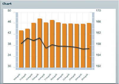
The following example shows a stock price that trades within a $40 to $45 range, and another stock price that trades within a $150 to $160 range. The values of the axis on the left show the range of values of the first stock, and the values of the axis on the right show the range of values of the second stock.
To use multiple axes in a chart, you first define the chart's series and their axes. For example, for a chart that mixes columns with a line, you would have a ColumnSeries and LineSeries. For each of these, you would likely also define the vertical axis, as the following example shows:
 <mx:series>
 	<mx:ColumnSeries id="cs1" dataProvider="{SMITH}" yField="close">
 		<mx:verticalAxis>
 			<mx:LinearAxis id="v1" minimum="40" maximum="50"/>
 		</mx:verticalAxis>
 	</mx:ColumnSeries>
 	<mx:LineSeries id="cs2" dataProvider="{DECKER}" yField="close">
 		<mx:verticalAxis>
 			<mx:LinearAxis id="v2" minimum="150" maximum="170"/>
 		</mx:verticalAxis>
 	</mx:LineSeries>
 </mx:series>
You then define the axis renderers, and bind their axis properties to the series' axes. In this case, you define two vertical axis renderers, and bind them to the LinearAxis objects.
 <mx:verticalAxisRenderers>
 	<mx:AxisRenderer placement="left" axis="{v1}"/>
 	<mx:AxisRenderer placement="left" axis="{v2}"/>
 </mx:verticalAxisRenderers>
Note that you control the location of the axis by using the placement property of the AxisRenderer. For vertical axis renderers, valid values are left and right. For horizontal axis renderers, valid values are top and bottom.
Axes can be independent of the series definition, too. For example, you can also point more than one series to the same axis. In this case, you could define a horizontal axis, as follows:
 <mx:horizontalAxis>
 	<mx:CategoryAxis id="h1" categoryField="date"/>
 <mx:horizontalAxis>
And then bind it to the series, like this:
 <mx:ColumnSeries id="cs1" horizontalAxis="{h1}" dataProvider="{SMITH}" yField="close">
 ...
 <mx:LineSeries id="cs2" horizontalAxis="{h1}" dataProvider="{DECKER}" yField="close">
And you can bind an axis renderer to that same axis:
 <mx:horizontalAxisRenderers>
 	<mx:AxisRenderer placement="bottom" axis="{h1}"/>
 </mx:horizontalAxisRenderers>
The final result is a chart with multiple axes, but whose series share some of the same properties defined by common axis renderers.
<?xml version="1.0"?>
<!-- charts/MultipleAxes.mxml -->
<s:Application
    xmlns:fx="http://ns.adobe.com/mxml/2009"
    xmlns:mx="library://ns.adobe.com/flex/mx"
    xmlns:s="library://ns.adobe.com/flex/spark"
    creationComplete="srv_fe.send();srv_strk.send()"
    height="600">

    <fx:Declarations>
        <!-- To see data in an HTML table, go to http://exampleserver/chart_examples/stocks.aspx -->
        <!-- View source of the following pages to see the structure of the data that Flex uses in this example. -->
        <mx:HTTPService id="srv_fe" url="http://exampleserver/chart_examples/stocks-xml.aspx?tickerSymbol=FE"/>
        <mx:HTTPService id="srv_strk" url="http://exampleserver/chart_examples/stocks-xml.aspx?tickerSymbol=STRK"/>
    </fx:Declarations>

    <s:layout>
        <s:VerticalLayout/>
    </s:layout>

  <s:Panel title="Multiple Axes with Multiple Data Series"
     width="400" height="400">
     <s:layout>
         <s:VerticalLayout/>
     </s:layout>
     <mx:ColumnChart id="myChart"
        showDataTips="true"
        height="250"
        width="350">
        <mx:horizontalAxis>
           <mx:DateTimeAxis id="h1" dataUnits="days"/>
        </mx:horizontalAxis>

          <mx:horizontalAxisRenderers>
            <mx:AxisRenderer placement="bottom" axis="{h1}"/>
        </mx:horizontalAxisRenderers>

        <mx:verticalAxisRenderers>
            <mx:AxisRenderer placement="left" axis="{v1}"/>
            <mx:AxisRenderer placement="right" axis="{v2}"/>
        </mx:verticalAxisRenderers>

        <mx:series>
           <mx:ColumnSeries
                dataProvider="{srv_fe.lastResult.data.result}"
                xField="date"
                yField="close"
                displayName="FE">
                  <mx:verticalAxis>
                     <mx:LinearAxis id="v1" minimum="2" maximum="5"/>
                  </mx:verticalAxis>
           </mx:ColumnSeries>
           <mx:LineSeries
                dataProvider="{srv_strk.lastResult.data.result}"
                xField="date"
                yField="close"
                displayName="STRK">
                  <mx:verticalAxis>
                     <mx:LinearAxis id="v2" minimum="40" maximum="50"/>
                  </mx:verticalAxis>
           </mx:LineSeries>
        </mx:series>
     </mx:ColumnChart>
     <mx:Legend dataProvider="{myChart}"/>
  </s:Panel>
</s:Application>
Even if the verticalAxisRenderers or horizontalAxisRenderers properties have not been specified, Cartesian charts will create default horizontal and vertical axis renderers based on the default axes of the chart.
When using multiple axes, it is important to recognize that it will not necessarily be immediately apparent which axis applies to which data set in the chart. As a result, you should try to style the axes so that they match the styles of the chart items.
The following example defines two colors and then uses those colors in the axis renderers and in the strokes and fills for the chart items:
<?xml version="1.0"?>
<!-- charts/StyledMultipleAxes.mxml -->
<s:Application
    xmlns:fx="http://ns.adobe.com/mxml/2009"
    xmlns:mx="library://ns.adobe.com/flex/mx"
    xmlns:s="library://ns.adobe.com/flex/spark"
    creationComplete="srv_fe.send();srv_strk.send()"
    height="600">

    <fx:Script>
        <![CDATA[
            [Bindable]
            public var c1:Number = 0x224488;

            [Bindable]
            public var c2:Number = 0x884422;
        ]]>
    </fx:Script>

    <fx:Declarations>
        <!-- To see data in an HTML table, go to http://exampleserver/chart_examples/stocks.aspx -->
        <!-- View source of the following pages to see the structure of the data that Flex uses in this example. -->
        <mx:HTTPService id="srv_fe" url="http://exampleserver/chart_examples/stocks-xml.aspx?tickerSymbol=FE"/>
        <mx:HTTPService id="srv_strk" url="http://exampleserver/chart_examples/stocks-xml.aspx?tickerSymbol=STRK"/>

        <mx:SolidColorStroke id="h1Stroke" color="{c1}"
            weight="8" alpha=".75" caps="square"/>

        <mx:SolidColorStroke id="h2Stroke"
            color="{c2}" weight="8" alpha=".75" caps="square"/>
    </fx:Declarations>

    <s:layout>
        <s:VerticalLayout/>
    </s:layout>

  <s:Panel title="Multiple Axes with Multiple Data Series"
    width="400" height="400">
     <s:layout>
         <s:VerticalLayout/>
     </s:layout>
     <mx:ColumnChart id="myChart"
        showDataTips="true"
        height="250" width="350">
        <mx:horizontalAxis>
           <mx:DateTimeAxis id="h1" dataUnits="days"/>
        </mx:horizontalAxis>

          <mx:horizontalAxisRenderers>
            <mx:AxisRenderer placement="bottom" axis="{h1}"/>
        </mx:horizontalAxisRenderers>

        <mx:verticalAxisRenderers>
            <mx:AxisRenderer placement="left" axis="{v1}">
                <mx:axisStroke>{h1Stroke}</mx:axisStroke>
               </mx:AxisRenderer>
            <mx:AxisRenderer placement="right" axis="{v2}">
                <mx:axisStroke>{h2Stroke}</mx:axisStroke>
               </mx:AxisRenderer>
        </mx:verticalAxisRenderers>

        <mx:series>
           <mx:ColumnSeries
                dataProvider="{srv_fe.lastResult.data.result}"
                xField="date" yField="close"
                displayName="FE">
                  <mx:verticalAxis>
                     <mx:LinearAxis id="v1" minimum="2" maximum="5"/>
                  </mx:verticalAxis>
                <mx:fill>
                    <mx:SolidColor color="{c1}"/>
                </mx:fill>
               </mx:ColumnSeries>
           <mx:LineSeries
                dataProvider="{srv_strk.lastResult.data.result}"
                xField="date" yField="close"
                displayName="STRK">
                  <mx:verticalAxis>
                     <mx:LinearAxis id="v2" minimum="40" maximum="50"/>
                  </mx:verticalAxis>
               <mx:lineStroke>
                    <mx:SolidColorStroke color="{c2}" weight="4" alpha="1"/>
                </mx:lineStroke>
               </mx:LineSeries>
        </mx:series>
     </mx:ColumnChart>
     <mx:Legend dataProvider="{myChart}"/>
  </s:Panel>
</s:Application>
You can customize labels by using the labelFunction property of the AxisRenderer class. This lets you control the labels if you use multiple axes. For more information, see Customizing axis labels.
For CartesianChart controls, there is no limit to the number of axes you can have.
For PolarChart controls, such as a PieChart, you generally do not use multiple axes because even though each series could have its own angular axis, the angular axis is always from 0 to 360 (the size of the wedge).
Navigation