
Displaying data and labels in charts
Flex provides techniques for displaying data and labels in your charts.
Working with axes
Each chart, except for a pie chart, has horizontal and vertical axes. There are two axis types: category and numeric. A category axis typically defines strings that represent groupings of items in the chart; for example, types of expenses (such as rent, utilities, and insurance) or names of employees. A numeric axis typically defines continuous data such as the amount of an expense or the productivity gains of the employee. These data define the height of a column, for example. Numeric axes include the LinearAxis, LogAxis, and DateTimeAxis.
You work with the axes objects to define their appearance, but also to define what data is displayed in the chart.
The following sections describe the CategoryAxis and NumericAxis classes.
About the CategoryAxis class
The CategoryAxis class maps discrete categorical data (such as states, product names, or department names) to an axis and spaces them evenly along it. This axis accepts any data type that can be represented by a String.
The dataProvider property of the CategoryAxis object defines the data provider that contains the text for the labels. In most cases, this can be the same data provider as the chart's data provider. A CategoryAxis object used in a chart inherits its dataProvider property from the containing chart, so you are not required to explicitly set the dataProvider property on a CategoryAxis object.
The dataProvider property of a CategoryAxis object can contain an Array of labels or an Array of objects. If the data provider contains objects, you use the categoryField property to point to the field in the data provider that contains the labels for the axis, as the following example shows:
<?xml version="1.0"?>
<!-- charts/BasicColumn.mxml -->
<s:Application
    xmlns:fx="http://ns.adobe.com/mxml/2009"
    xmlns:mx="library://ns.adobe.com/flex/mx"
    xmlns:s="library://ns.adobe.com/flex/spark"
    creationComplete="srv.send()"
    height="600">

    <fx:Declarations>
         <!-- View source of the following page to see the structure of the data that Flex uses in this example. -->
         <mx:HTTPService id="srv" url="http://examplesserver/chart_examples/expenses-xml.aspx"/>
         <!-- To see data in an HTML table, go to http://examplesserver/chart_examples/expenses.aspx -->
    </fx:Declarations>

    <s:layout>
        <s:VerticalLayout/>
    </s:layout>

  <s:Panel title="Column Chart">
        <s:layout>
            <s:VerticalLayout/>
        </s:layout>
     <mx:ColumnChart id="myChart" dataProvider="{srv.lastResult.data.result}" showDataTips="true">
        <mx:horizontalAxis>
           <mx:CategoryAxis categoryField="month"/>
        </mx:horizontalAxis>
        <mx:series>
           <mx:ColumnSeries
                xField="month"
                yField="profit"
                displayName="Profit"/>
           <mx:ColumnSeries
                xField="month"
                yField="expenses"
                displayName="Expenses"/>
        </mx:series>
     </mx:ColumnChart>
     <mx:Legend dataProvider="{myChart}"/>
  </s:Panel>
</s:Application>
If the data provider contains an Array of labels only, you do not specify the categoryField property.
You can customize the labels of the CategoryAxis object rather than use the axis labels in the data provider. You do this by providing a custom data provider. To provide a custom data provider, set the value of the CategoryAxis object's dataProvider property to a custom Array of labels, as the following example shows:
<?xml version="1.0"?>
<!-- charts/CategoryAxisLabels.mxml -->
<s:Application
    xmlns:fx="http://ns.adobe.com/mxml/2009"
    xmlns:mx="library://ns.adobe.com/flex/mx"
    xmlns:s="library://ns.adobe.com/flex/spark"
    creationComplete="srv.send()"
    height="600">

    <fx:Declarations>
        <!-- View source of the following page to see the structure of the data that Flex uses in this example. -->
        <mx:HTTPService id="srv" url="http://examplesserver/chart_examples/expenses-xml.aspx"/>
        <!-- To see data in an HTML table, go to http://examplesserver/chart_examples/expenses.aspx -->
    </fx:Declarations>

  <fx:Script><![CDATA[
     [Bindable]
     public var months:Array = [
        {Month:"January", monthAbbrev:"Jan"},
        {Month:"February", monthAbbrev:"Feb"},
        {Month:"March", monthAbbrev:"Mar"}
     ];
  ]]></fx:Script>

    <s:layout>
        <s:VerticalLayout/>
    </s:layout>

  <s:Panel title="Line Chart">
        <s:layout>
            <s:VerticalLayout/>
        </s:layout>
     <mx:AreaChart id="myChart"
        dataProvider="{srv.lastResult.data.result}"
        showDataTips="true">
        <mx:horizontalAxis>
           <mx:CategoryAxis
                dataProvider="{months}"
                categoryField="Month"/>
        </mx:horizontalAxis>
        <mx:series>
           <mx:AreaSeries
                yField="profit"
                displayName="Profit"/>
           <mx:AreaSeries
                yField="expenses"
                displayName="Expenses"/>
        </mx:series>
     </mx:AreaChart>
     <mx:Legend dataProvider="{myChart}"/>
  </s:Panel>
</s:Application>
For more information about chart data providers, see Defining chart data.
You can also customize the labels using the labelFunction property of the CategoryAxis and NumericAxis classes. This property points to a callback function that refines the labels based on the existing data provider. For more information, see Defining axis labels.
About the NumericAxis class
The NumericAxis class maps a set of continuous numerical values (such as sales volume, revenue, or profit) to coordinates on the screen. You do not typically use the NumericAxis base class directly. Instead, you use the following subclasses when you define your axis:
These classes give you significant control over how to set the appearance and values of elements such as labels and tick marks along the axis.
You can use the parseFunction property to specify a custom method that formats the data points in your chart. This property is supported by all subclasses of the NumericAxis class. For a detailed description of using this property with the DateTimeAxis, see Using the parseFunction property.
If you want to change the values of the labels, use the labelFunction property of the NumericAxis class. For more information, see Defining axis labels.
About the LinearAxis subclass
The LinearAxis subclass is the simplest of the three NumericAxis subclasses. It maps numeric values evenly between minimum and maximum values along a chart axis. By default, Flex determines the minimum, maximum, and interval values from the charting data to fit all of the chart elements on the screen. You can also explicitly set specific values for these properties. The following example sets the minimum and maximum values to 40 and 50, respectively:
<?xml version="1.0"?>
<!-- charts/LinearAxisSample.mxml -->
<s:Application
    xmlns:fx="http://ns.adobe.com/mxml/2009"
    xmlns:mx="library://ns.adobe.com/flex/mx"
    xmlns:s="library://ns.adobe.com/flex/spark"
    creationComplete="srv.send()"
    height="600">

    <fx:Declarations>
        <!-- View source of the following page to see the structure of the data that Flex uses in this example. -->
        <mx:HTTPService id="srv" url="http://examplesserver/chart_examples/stocks-xml.aspx"/>
        <!-- To see data in an HTML table, go to http://examplesserver/chart_examples/stocks.aspx -->
    </fx:Declarations>

    <s:layout>
        <s:VerticalLayout/>
    </s:layout>

    <s:Panel title="LineChart control with a linear axis">
        <s:layout>
            <s:VerticalLayout/>
        </s:layout>
        <mx:LineChart id="myChart"
            dataProvider="{srv.lastResult.data.result}"
            showDataTips="true"
            height="300" width="400">
            <mx:verticalAxis>
                <mx:LinearAxis
                    title="linear axis"
                    minimum="40"
                    maximum="50"
                    interval="1"/>
            </mx:verticalAxis>

            <mx:horizontalAxis>
                <mx:CategoryAxis categoryField="date"/>
            </mx:horizontalAxis>

            <mx:series>
                <mx:LineSeries
                    yField="close"
                    displayName="FRED close"/>
            </mx:series>
        </mx:LineChart>
        <mx:Legend dataProvider="{myChart}"/>
    </s:Panel>
</s:Application>
About the LogAxis subclass
The LogAxis subclass is similar to the LinearAxis subclass, but it maps values to the axis logarithmically rather than linearly. You use a LogAxis object when the data in your chart has such a wide range that clusters of data points are lost to scale. LogAxis data also cannot be rendered if it is negative. For example, if you track the stock price of a successful company since 1929, it is useful to represent the data logarithmically rather than linearly so that the chart is readable.
When you use a LogAxis object, you set a multiplier that defines the values of the labels along the axis. You set the multiplier with the interval property. Values must be even powers of 10, and must be greater than or equal to 0. A value of 10 generates labels at 1, 10, 100, and 1000. A value of 100 generates labels at 1, 100, and 10,000. The default value of the interval property is 10. The LogAxis object rounds the interval to an even power of 10, if necessary.
As with the vertical and horizontal axes, you can also set the minimum and maximum values of a LogAxis object, as the following example shows:
<?xml version="1.0"?>
<!-- charts/LogAxisSample.mxml -->
<s:Application
    xmlns:fx="http://ns.adobe.com/mxml/2009"
    xmlns:mx="library://ns.adobe.com/flex/mx"
    xmlns:s="library://ns.adobe.com/flex/spark"
    creationComplete="srv_fe.send();srv_big.send()"
    height="600">

     <!-- To see data in an HTML table, go to http://examplesserver/chart_examples/stocks.aspx -->
    <fx:Declarations>
        <!-- View source of the following pages to see the structure of the data that Flex uses in this example. -->
        <mx:HTTPService id="srv_fe" url="http://examplesserver/chart_examples/stocks-xml.aspx?tickerSymbol=FE"/>
        <mx:HTTPService id="srv_big" url="http://examplesserver/chart_examples/stocks-xml.aspx?tickerSymbol=BIG"/>
    </fx:Declarations>

    <s:layout>
        <s:VerticalLayout/>
    </s:layout>

    <s:Panel title="LineChart control with a logarithmic axis">
        <s:layout>
            <s:VerticalLayout/>
        </s:layout>
        <mx:LineChart id="myChart"
            showDataTips="true"
            height="300" width="400">
            <mx:verticalAxis>
                <mx:LogAxis title="Log axis"
                    interval="10"
                    minimum="1"
                    maximum="5000"/>
            </mx:verticalAxis>

            <mx:horizontalAxis>
               <mx:DateTimeAxis id="h1" dataUnits="days"/>
            </mx:horizontalAxis>

            <mx:series>
                <mx:LineSeries dataProvider="{srv_fe.lastResult.data.result}"
                    yField="close"
                    displayName="FE close"/>
                <mx:LineSeries dataProvider="{srv_big.lastResult.data.result}"
                    yField="close"
                    displayName="BIG close"/>
            </mx:series>
        </mx:LineChart>
        <mx:Legend dataProvider="{myChart}"/>
    </s:Panel>
</s:Application>
About the DateTimeAxis subclass
The DateTimeAxis subclass maps time-based values to a chart axis. The DateTimeAxis subclass calculates the minimum and maximum values to align with logical date and time units (for example, the nearest hour or the nearest week). The DateTimeAxis subclass also selects a time unit for the interval so that the chart renders a reasonable number of labels.
The dataUnits property of the DateTimeAxis subclass specifies how Flex should interpret the Date objects. Flex determines this property by default, but you can override it. To display data in terms of days, set the dataUnits property to days, as the following example shows:
<mx:DateTimeAxis dataUnits="days"/>
Valid values for the dataUnits property are milliseconds, seconds, minutes, hours, days, weeks, months, and years.
When assigning appropriate label units, a DateTimeAxis object does not assign any unit smaller than the units represented by the data. If the dataUnits property is set to days, the chart does not render labels for every hour, no matter what the minimum or maximum range is. To achieve this, you must set the value explicitly.
When using the DateTimeAxis class, you can filter out units when you set the dataUnits property to days. This lets you create a chart that shows a "work week" or some other configuration that omits certain days of the week. For more information, see Omitting days on a DateTimeAxis object.
Some series use the value of the dataUnits property to affect their rendering. Specifically, most columnar series (such as Column, Bar, Candlestick, and HLOC controls) use the value of dataUnits to determine how wide to render their columns. If, for example, the ColumnChart control's horizontal axis has its labels set to weeks and dataUnits set to days, the ColumnChart control renders each column at one-seventh the distance between labels.
About supported types
Data points on the DateTimeAxis object support the Date, String, and Number data types.
-
Date: If the value of the data point is an instance of a Date object, it already represents an absolute date-time value and needs no interpretation. To pass a Date object as a data value, use the parseFunction property of the DateTimeAxis subclass. The parseFunction property returns a Date object. For more information, see Using the parseFunction property.
-
String: You can use any format that the Date.parse() method supports. The supported formats are:
-
MM/YYYY (for example, 02/2005)
-
Day Month DD Hours:Minutes:Seconds GMT Year (for example, Tue Feb 1 12:00:00 GMT-0800 2005)
-
Day Month DD YYYY Hours:Minutes:Seconds AM|PM (for example, Tue Feb 1 2005 12:00:00 AM)
-
Day Month DD YYYY (for example, Tue Feb 1 2005)
-
MM/DD/YYYY (for example, 02/01/2005)
You can also write custom logic that uses the parseFunction property of the DateTimeAxis to take any data type and return a Date. For more information, see Using the parseFunction property.
-
-
Number: If you use a number, it is assumed to be the number of milliseconds since Midnight, 1/1/1970; for example, 543387600000. To get this value on an existing Date object, use the Date object's getTime() method.
The following example specifies that the dates are displayed in units of days:
<?xml version="1.0"?>
<!-- charts/DateTimeAxisSample.mxml -->
<s:Application
    xmlns:fx="http://ns.adobe.com/mxml/2009"
    xmlns:mx="library://ns.adobe.com/flex/mx"
    xmlns:s="library://ns.adobe.com/flex/spark"
    height="600">

  <fx:Script><![CDATA[
     import mx.collections.ArrayCollection
     [Bindable]
     public var deck:ArrayCollection = new ArrayCollection([
        {date:"08/01/2005", close:42.71},
        {date:"08/02/2005", close:42.99},
        {date:"08/03/2005", close:42.65}
     ]);
  ]]></fx:Script>

    <s:layout>
        <s:VerticalLayout/>
    </s:layout>

  <s:Panel title="Sample DateTimeAxis">
        <s:layout>
            <s:VerticalLayout/>
        </s:layout>
     <mx:LineChart id="myChart"
        dataProvider="{deck}"
        showDataTips="true">
        <mx:horizontalAxis>
           <mx:DateTimeAxis dataUnits="days"/>
        </mx:horizontalAxis>
        <mx:series>
           <mx:LineSeries
                yField="close"
                xField="date"
                displayName="DECK"/>
        </mx:series>
     </mx:LineChart>
     <mx:Legend dataProvider="{myChart}"/>
  </s:Panel>
</s:Application>
Using the parseFunction property
You use the parseFunction property of the DateTimeAxis object to specify a method that customizes the value of the data points. With this property, you specify a method that accepts a value and returns a Date object. The Date object is then used in the DateTimeAxis object of the chart. This lets you provide customizable input strings and convert them to Date objects, which Flex can then interpret for use in the DateTimeAxis.
The parsing method specified by the parseFunction property is called every time a value for the DateTimeAxis must be calculated. It is called each time a data point is encountered when the user interacts with the chart. Consequently, Flex might call the parsing method often, which can degrade an application's performance. Therefore, you should try to keep the amount of code in the parsing method to a minimum.
Flex passes only one parameter to the parsing method. This parameter is the value of the data point that you specified for the series. Typically, it is a String representing some form of a date. You cannot override this parameter or add additional parameters.
The following example shows a parsing method that creates a Date object from String values in the data provider that match the "YYYY, MM, DD" pattern:
<?xml version="1.0"?>
<!-- charts/DateTimeAxisParseFunction.mxml -->
<s:Application
    xmlns:fx="http://ns.adobe.com/mxml/2009"
    xmlns:mx="library://ns.adobe.com/flex/mx"
    xmlns:s="library://ns.adobe.com/flex/spark"
    height="600">

  <fx:Script>
    <![CDATA[
     import mx.collections.ArrayCollection;
     [Bindable]
     public var ABC:ArrayCollection = new ArrayCollection([
        {date:"2005, 8, 1", close:42.71},
        {date:"2005, 8, 2", close:42.99},
        {date:"2005, 8, 3", close:44}
     ]);

     public function myParseFunction(s:String):Date {
        // Get an array of Strings from the
        // comma-separated String passed in.
        var a:Array = s.split(",");

        // Trace out year, month, and day values.
        trace("y:" + a[0]);
        trace("m:" + a[1]);
        trace("d:" + a[2]);

        // To create a Date object, you pass "YYYY,MM,DD",
        // where MM is zero-based, to the Date() constructor.
        var newDate:Date = new Date(a[0],a[1]-1,a[2]);
        return newDate;
     }
    ]]>
  </fx:Script>

    <s:layout>
        <s:VerticalLayout/>
    </s:layout>

  <s:Panel title="DateTimeAxis with parseFunction">
        <s:layout>
            <s:VerticalLayout/>
        </s:layout>
    <mx:LineChart id="myChart"
        dataProvider="{ABC}"
        showDataTips="true">
     <mx:horizontalAxis>
        <mx:DateTimeAxis
            dataUnits="days"
            parseFunction="myParseFunction"/>
     </mx:horizontalAxis>
     <mx:series>
        <mx:LineSeries
            yField="close"
            xField="date"
            displayName="ABC"/>
     </mx:series>
    </mx:LineChart>
    <mx:Legend dataProvider="{myChart}"/>
  </s:Panel>
</s:Application>
Formatting DateTimeAxis labels
When assigning the units to display along the axis, the DateTimeAxis object uses the largest unit allowed to render a reasonable number of labels. The following table describes the default label format and the minimum range for each unit type:
|
Unit |
Label format |
Minimum range |
|---|---|---|
|
Years |
YYYY |
If the minimum and maximum values span at least 2 years. |
|
Months |
MM/YY |
Spans at least 2 months. |
|
Weeks |
DD/MM/YY |
Spans at least 2 weeks. |
|
Days |
DD/MM/YY |
Spans at least 1 day. |
|
Hours |
HH:MM |
Spans at least 1 hour. |
|
Minutes |
HH:MM |
Spans at least 1 minute. |
|
Seconds |
HH:MM:SS |
Spans at least 1 second. |
|
Milliseconds |
HH:MM:SS:mmmm |
Spans at least 1 millisecond. |
You can restrict the list of valid units for a particular chart instance to a subset that makes sense for the use case. As with a LinearAxis object, you can specify minimum, maximum, and interval values for a DateTimeAxis object.
When rounding off values, the DateTimeAxis object determines if values passed to it should be displayed in the local time zone or UTC. You can set the displayLocalTime property to true to instruct the DateTimeAxis object to treat values as local time values. The default value is false.
To change the values of the labels, use the labelFunction property of the DateTimeAxis object. This property is inherited from the NumericAxis class and is described in Defining axis labels.
Setting minimum and maximum values on a DateTimeAxis
You can define the range of values that any axis uses by setting the values of the minimum and maximum properties on that axis. For the DateTimeAxis class, however, you must use Date objects and not Numbers or Strings to define that range. To do this, you create bindable Date objects and bind the values of the minimum and maximum properties to those objects.
When creating Date objects, remember that the month parameter in the constructor is zero-based. The following example sets the minimum date for the axis to the first day of December 2006, and the maximum date for the axis to the first day of February 2007. The result is that Flex excludes the first and last data points in the ArrayCollection because those dates fall outside of the range set on the axis:
<?xml version="1.0"?>
<!-- charts/DateTimeAxisRange.mxml -->
<s:Application
    xmlns:fx="http://ns.adobe.com/mxml/2009"
    xmlns:mx="library://ns.adobe.com/flex/mx"
    xmlns:s="library://ns.adobe.com/flex/spark"
    height="600">

  <fx:Script><![CDATA[
     import mx.collections.ArrayCollection;

     // To create a Date object, you pass "YYYY,MM,DD",
     // where MM is zero-based, to the Date() constructor.
     [Bindable]
     public var minDate:Date = new Date(2006, 11, 1);
     [Bindable]
     public var maxDate:Date = new Date(2007, 1, 1);

     [Bindable] public var myData:ArrayCollection = new
     ArrayCollection([
        {date: "11/03/2006", amt: 12345},
        {date: "12/02/2006", amt: 54331},
        {date: "1/03/2007", amt: 34343},
        {date: "2/05/2007", amt: 40299}
     ]);

  ]]></fx:Script>

    <s:layout>
        <s:VerticalLayout/>
    </s:layout>

  <s:Panel title="DateTimeAxis with range">
        <s:layout>
            <s:VerticalLayout/>
        </s:layout>
     <mx:ColumnChart id="myChart"
        dataProvider="{myData}"
        showDataTips="true">
        <mx:horizontalAxis>
           <mx:DateTimeAxis
                dataUnits="months"
                minimum="{minDate}"
                maximum="{maxDate}"/>
        </mx:horizontalAxis>
        <mx:series>
           <mx:ColumnSeries
                yField="amt"
                xField="date"
                displayName="My Data"/>
        </mx:series>
     </mx:ColumnChart>
     <mx:Legend dataProvider="{myChart}"/>
  </s:Panel>
</s:Application>
You can also represent the range of dates in MXML by using the following syntax:
 <mx:horizontalAxis>
 	<mx:DateTimeAxis dataUnits="months">
 		<mx:minimum>
 			<mx:Date fullYear="2005" month="11" date="1"/>
 		</mx:minimum>
 		<mx:maximum>
 			<mx:Date fullYear="2007" month="1" date="1"/>
 		</mx:maximum>
 	</mx:DateTimeAxis>
 </mx:horizontalAxis>
Omitting days on a DateTimeAxis object
You can exclude particular days or ranges of days from a chart. This lets you create charts that show only the days of the work week or that exclude other days of the week for other reasons.
For example, if you create a LineChart control that shows a stock price over the course of an entire month, the source data typically includes pricing data only for Monday through Friday. Values for the weekend days are typically not in the data. So, the chart control extrapolates values by extending the line through the weekend days on the chart, which makes it appear as though there is data for those days. If you disable the weekend days, the chart control removes those days from the chart and the line draws only the days that are not disabled. There is no breakage or other indicator that there are omitted days.
To disable days of the week or ranges of days in your charts, you must set the dataUnits property of the DateTimeAxis object to days. You then use the disabledDays or disabledRanges properties of the DateTimeAxis object.
The value of the disabledDays property of DateTimeAxis is an Array of numbers. These numbers correspond to days of the week, with 0 being Sunday, 1 being Monday, and so on, up until 6 being Saturday.
The following example excludes Saturdays and Sundays from the chart by setting the value of the disabledDays property to an Array that contains 0 and 6:
<?xml version="1.0"?>
<!-- charts/WorkWeekAxis.mxml -->
<s:Application
    xmlns:fx="http://ns.adobe.com/mxml/2009"
    xmlns:mx="library://ns.adobe.com/flex/mx"
    xmlns:s="library://ns.adobe.com/flex/spark"
    creationComplete="srv.send()"
    height="600">

    <fx:Declarations>
        <!-- To see data in an HTML table, go to http://examplesserver/chart_examples/stocks.aspx -->
        <!-- View source of the following pages to see the structure of the data that Flex uses in this example. -->
        <mx:HTTPService id="srv" url="http://examplesserver/chart_examples/stocks-xml.aspx"/>
    </fx:Declarations>

  <fx:Script><![CDATA[
     /* Create an Array that specifies which days to exclude.
        0 is Sunday and 6 is Saturday. */
     [Bindable]
     private var offDays:Array = [0,6];

  ]]></fx:Script>

    <s:layout>
        <s:VerticalLayout/>
    </s:layout>

  <s:Panel title="WorkWeekAxis Example">
     <s:layout>
         <s:HorizontalLayout/>
     </s:layout>
     <mx:LineChart id="myChart"
        dataProvider="{srv.lastResult.data.result}"
        showDataTips="true">
        <mx:horizontalAxis>
           <mx:DateTimeAxis dataUnits="days"
            disabledDays="{offDays}"/>
        </mx:horizontalAxis>
        <mx:series>
           <mx:LineSeries
                yField="close" xField="date"
                displayName="FRED"/>
        </mx:series>
     </mx:LineChart>
     <mx:Legend dataProvider="{myChart}"/>
  </s:Panel>
</s:Application>
To exclude a range of dates from the DateTimeAxis object, you use the disabledRanges property. This property takes an of objects. Each object specifies two dates: a rangeStart and rangeEnd property. The following example excludes August 13, and then the range of days between August 27 and August 31:
<?xml version="1.0"?>
<!-- charts/DisabledDateRanges.mxml -->
<s:Application
    xmlns:fx="http://ns.adobe.com/mxml/2009"
    xmlns:mx="library://ns.adobe.com/flex/mx"
    xmlns:s="library://ns.adobe.com/flex/spark"
    creationComplete="init()"
    height="600">

  <fx:Script><![CDATA[
     import mx.collections.ArrayCollection
     [Bindable]
     public var deck:ArrayCollection = new ArrayCollection([
        {date:"08/01/2007", close:42},
        {date:"08/02/2007", close:43},
        {date:"08/03/2007", close:43},
        {date:"08/06/2007", close:42},
        {date:"08/07/2007", close:38},
        {date:"08/08/2007", close:37},
        {date:"08/09/2007", close:39},
        {date:"08/10/2007", close:41},
        {date:"08/13/2007", close:45},
        {date:"08/14/2007", close:47},
        {date:"08/15/2007", close:48},
        {date:"08/16/2007", close:42},
        {date:"08/17/2007", close:43},
        {date:"08/20/2007", close:45},
        {date:"08/21/2007", close:50},
        {date:"08/22/2007", close:51},
        {date:"08/23/2007", close:55},
        {date:"08/24/2007", close:51},
        {date:"08/27/2007", close:49},
        {date:"08/28/2007", close:51},
        {date:"08/29/2007", close:50},
        {date:"08/30/2007", close:49},
        {date:"08/31/2007", close:54}
     ]);

     private function myParseFunction(s:String):Date {
        var a:Array = s.split("/");
        var newDate:Date = new Date(a[2],a[0]-1,a[1]);
        return newDate;
     }
     private var d1:Date, d2:Date, d3:Date;

     [Bindable]
     private var offRanges:Array = new Array ([]);

     private function init():void {
        d1 = new Date("08/13/2007");
        d2 = new Date("08/27/2007");
        d3 = new Date("08/31/2007");
        offRanges = [ {rangeStart:d1, rangeEnd:d1},{rangeStart:d2, rangeEnd:d3} ];
     }

     private var series1:LineSeries;

  ]]></fx:Script>

    <s:layout>
        <s:VerticalLayout/>
    </s:layout>

  <s:Panel title="Disabled Date Ranges">
        <s:layout>
            <s:VerticalLayout/>
        </s:layout>
     <mx:LineChart id="myChart"
        dataProvider="{deck}"
        showDataTips="true">
        <mx:horizontalAxis>
           <mx:DateTimeAxis
            dataUnits="days"
            parseFunction="myParseFunction"
            disabledRanges="{offRanges}"/>
        </mx:horizontalAxis>

        <mx:series>
           <mx:LineSeries id="mySeries"
                yField="close"
                xField="date"
                displayName="DECK"/>
        </mx:series>
    </mx:LineChart>
    <mx:Legend dataProvider="{myChart}"/>
  </s:Panel>
</s:Application>
The following example expands on the previous example, except it adds a DateChooser control. You can select days on the DateChooser that are then removed from the chart.
<?xml version="1.0"?>
<!-- charts/DisabledDateRangesWithDateChooser.mxml -->
<s:Application
    xmlns:fx="http://ns.adobe.com/mxml/2009"
    xmlns:mx="library://ns.adobe.com/flex/mx"
    xmlns:s="library://ns.adobe.com/flex/spark"
    creationComplete="init()"
    height="600">

  <fx:Script><![CDATA[
     import mx.collections.ArrayCollection;

     [Bindable]
     public var deck:ArrayCollection = new ArrayCollection([
        {date:"08/01/2007", close:42},
        {date:"08/02/2007", close:43},
        {date:"08/03/2007", close:43},
        {date:"08/06/2007", close:42},
        {date:"08/07/2007", close:38},
        {date:"08/08/2007", close:37},
        {date:"08/09/2007", close:39},
        {date:"08/10/2007", close:41},
        {date:"08/13/2007", close:45},
        {date:"08/14/2007", close:47},
        {date:"08/15/2007", close:48},
        {date:"08/16/2007", close:42},
        {date:"08/17/2007", close:43},
        {date:"08/20/2007", close:45},
        {date:"08/21/2007", close:50},
        {date:"08/22/2007", close:51},
        {date:"08/23/2007", close:55},
        {date:"08/24/2007", close:51},
        {date:"08/27/2007", close:49},
        {date:"08/28/2007", close:51},
        {date:"08/29/2007", close:50},
        {date:"08/30/2007", close:49},
        {date:"08/31/2007", close:54}
     ]);

     // Define weekend days to be removed from chart.
     [Bindable]
     private var offDays:Array = [0,6];

     [Bindable]
     private var dateChooserDisabledRanges:Array = [];

     private function init():void {
        // Limit selectable range to August of 2007 on DateChooser.
        dateChooserDisabledRanges = [
            {rangeEnd: new Date(2007, 6, 31)},
            {rangeStart: new Date(2007, 8, 1)}
        ];
        // Disable weekend days on DateChooser.
        dc1.disabledDays = [0, 6];
     }

     [Bindable]
     private var offRanges:Array = new Array([]);

     private function onDateChange(e:Event):void {
        // Get the start and end date of the range.
        var startDate:Date = e.currentTarget.selectedRanges[0].rangeStart;
        var endDate:Date = e.currentTarget.selectedRanges[0].rangeEnd;
        var d:Object = {rangeStart:startDate, rangeEnd:endDate};

        // Add object to list of ranges to disable on chart.
        offRanges.push(d);

        // Refresh the chart series with the new offRanges.
        var mySeries:Array = [];
        mySeries.push(series1);
        myChart.series = mySeries;
        // Show the current ranges.
        ta1.text = "";
        for (var i:int = 0; i < offRanges.length; i++) {
            for (var s:String in offRanges[i]) {
                ta1.text += s + ":" + offRanges[i][s] + "\n";
            }
        }
     }
     private function clearAllDisabledDates():void {
        offRanges = [];
        dc1.selectedDate = null;
        ta1.text = "";
     }

  ]]></fx:Script>

    <s:layout>
        <s:VerticalLayout/>
    </s:layout>

  <s:Panel title="Disabled date ranges">
    <s:layout>
        <s:VerticalLayout/>
    </s:layout>
    <mx:LineChart id="myChart"
       dataProvider="{deck}"
       showDataTips="true">
       <mx:horizontalAxis>
          <mx:DateTimeAxis
             id="dtAxis"
             dataUnits="days"
             disabledDays="{offDays}"
             disabledRanges="{offRanges}"/>
       </mx:horizontalAxis>

       <mx:verticalAxis>
           <mx:LinearAxis minimum="30" maximum="60"/>
       </mx:verticalAxis>

       <mx:series>
          <mx:LineSeries id="series1"
               yField="close"
               xField="date"
               displayName="DECK"/>
       </mx:series>
    </mx:LineChart>
    <mx:DateChooser id="dc1"
        showToday="false"
        click="onDateChange(event)"
        displayedMonth="7"
        displayedYear="2007"
        disabledRanges="{dateChooserDisabledRanges}"/>
    <mx:Legend dataProvider="{myChart}"/>

    <s:Button id="b1" label="Refresh" click="clearAllDisabledDates()"/>
    <s:TextArea id="ta1" width="600" height="400"/>
  </s:Panel>
</s:Application>
Adding axis titles
Each axis in a chart control can include a title that describes the purpose of the axis to the users. Flex does not add titles to the chart's axes unless you explicitly set them. To add titles to the axes of a chart, you use the title property of the axis object. This is CategoryAxis or one of the NumericAxis subclasses such as DateTimeAxis, LinearAxis, or LogAxis. To set a style for the axis title, use the axisTitleStyleName property of the chart control.
The following example sets the titles of the horizontal and vertical axes (in MXML and ActionScript), and applies the styles to those titles:
<?xml version="1.0"?>
<!-- charts/AxisTitles.mxml -->
<s:Application
    xmlns:fx="http://ns.adobe.com/mxml/2009"
    xmlns:mx="library://ns.adobe.com/flex/mx"
    xmlns:s="library://ns.adobe.com/flex/spark"
    creationComplete="srv.send();setTitles();"
    height="600">

    <fx:Declarations>
        <!-- View source of the following page to see the structure of the data that Flex uses in this example. -->
        <mx:HTTPService id="srv" url="http://examplesserver/chart_examples/expenses-xml.aspx"/>
        <!-- To see data in an HTML table, go to http://examplesserver/chart_examples/expenses.aspx -->
    </fx:Declarations>

    <fx:Script><![CDATA[
        private function setTitles():void {
            la1.title="Dollars";
        }
    ]]></fx:Script>

    <s:layout>
        <s:VerticalLayout/>
    </s:layout>

    <fx:Style>
        .myStyle {
            fontFamily:Verdana;
            fontSize:12;
            color:#4691E1;
            fontWeight:bold;
            fontStyle:italic;
        }
    </fx:Style>

    <s:Panel title="Axis with title">
        <s:layout>
            <s:VerticalLayout/>
        </s:layout>
        <mx:ColumnChart id="myChart"
            showDataTips="true"
            axisTitleStyleName="myStyle"
            dataProvider="{srv.lastResult.data.result}">
            <mx:verticalAxis>
                <mx:LinearAxis id="la1"/>
            </mx:verticalAxis>
            <mx:horizontalAxis>
                <mx:CategoryAxis title="FY 2009" categoryField="month"/>
            </mx:horizontalAxis>
            <mx:series>
                <mx:ColumnSeries
                    xField="month"
                    yField="profit"
                    displayName="Profit"/>
                <mx:ColumnSeries
                    xField="month"
                    yField="expenses"
                    displayName="Expenses"/>
            </mx:series>
        </mx:ColumnChart>
        <mx:Legend dataProvider="{myChart}"/>
    </s:Panel>
</s:Application>
You can also use embedded fonts for your axis titles. The following example embeds the font and sets the style for the vertical axis title:
<?xml version="1.0"?>
<!-- charts/AxisTitleEmbedFont.mxml -->
<s:Application
    xmlns:fx="http://ns.adobe.com/mxml/2009"
    xmlns:mx="library://ns.adobe.com/flex/mx"
    xmlns:s="library://ns.adobe.com/flex/spark"
    creationComplete="srv.send()"
    height="600">

  <fx:Declarations>
     <!-- View source of the following page to see the structure of the data that Flex uses in this example. -->
     <mx:HTTPService id="srv" url="http://examplesserver/chart_examples/expenses-xml.aspx"/>
     <!-- To see data in an HTML table, go to http://examplesserver/chart_examples/expenses.aspx -->
  </fx:Declarations>

  <fx:Style>
     @font-face{
        src:url("../assets/MyriadWebPro.ttf");
        fontFamily:myMyriad;
     }

     .myEmbeddedStyle {
        fontFamily:myMyriad;
        fontSize:20;
     }
  </fx:Style>

    <s:layout>
        <s:VerticalLayout/>
    </s:layout>

  <s:Panel title="Axis title with embedded font">
        <s:layout>
            <s:VerticalLayout/>
        </s:layout>
     <mx:ColumnChart id="column"
        showDataTips="true"
        dataProvider="{srv.lastResult.data.result}"
        axisTitleStyleName="myEmbeddedStyle">
        <mx:horizontalAxis>
           <mx:CategoryAxis categoryField="month"
                title="FY 2009"/>
        </mx:horizontalAxis>
        <mx:series>
           <mx:ColumnSeries
                xField="month"
                yField="profit"
                displayName="Profit"/>
           <mx:ColumnSeries
                xField="month"
                yField="expenses"
                displayName="Expenses"/>
        </mx:series>
     </mx:ColumnChart>
     <mx:Legend dataProvider="{column}"/>
  </s:Panel>
</s:Application>
For information on embedding fonts, see Embed fonts.
You can take advantage of the fact that the chart applies the axisTitleStyleName property without explicitly specifying it, as the following example shows:
<?xml version="1.0"?>
<!-- charts/CSSAxisTitle.mxml -->
<s:Application
    xmlns:fx="http://ns.adobe.com/mxml/2009"
    xmlns:mx="library://ns.adobe.com/flex/mx"
    xmlns:s="library://ns.adobe.com/flex/spark"
    creationComplete="srv.send()"
    height="600">

    <fx:Declarations>
         <!-- View source of the following page to see the structure of the data that Flex uses in this example. -->
         <mx:HTTPService id="srv" url="http://examplesserver/chart_examples/expenses-xml.aspx"/>
         <!-- To see data in an HTML table, go to http://examplesserver/chart_examples/expenses.aspx -->
    </fx:Declarations>

  <fx:Style>
     @namespace mx "library://ns.adobe.com/flex/mx";

     .axisTitles {
        color:red;
        fontWeight:bold;
        fontFamily:Arial;
        fontSize:20;
     }

     mx|ColumnChart {
        axisTitleStyleName:axisTitles;
     }
  </fx:Style>

    <s:layout>
        <s:VerticalLayout/>
    </s:layout>

  <s:Panel title="Styling Axis Titles with CSS">
        <s:layout>
            <s:VerticalLayout/>
        </s:layout>
     <mx:ColumnChart id="column"
        dataProvider="{srv.lastResult.data.result}"
        showDataTips="true">
        <mx:horizontalAxis>
           <mx:CategoryAxis categoryField="month" title="FY 2009"/>
        </mx:horizontalAxis>
        <mx:series>
           <mx:ColumnSeries
                xField="month"
                yField="profit"
                displayName="Profit"/>
           <mx:ColumnSeries
                xField="month"
                yField="expenses"
                displayName="Expenses"/>
        </mx:series>
     </mx:ColumnChart>
     <mx:Legend dataProvider="{column}"/>
  </s:Panel>
</s:Application>
You can also apply the title style to the axis, as the following example shows:
<mx:CategoryAxis title="State" styleName="myEmbeddedStyle"/>
To change the appearance of the title on a chart, you can also use the titleRenderer property of the AxisRenderer class. This lets you specify a class that defines the appearance of the title. The class must extend UIComponent and implement the IDataRenderer and IFlexDisplayObject interfaces. Its data property will be the title used in the chart.
Typically, you extend the ChartLabel class to create a custom title renderer. In that class, you override the updateDisplayList() method. In the updateDisplayList() method, you define the appearance of the box surrounding the title as well as the appearance of the title's text.
The following example is a custom title renderer. It creates a gradient fill background for each of the axis titles.
// charts/MyTextRenderer.as
package {
    import mx.charts.chartClasses.ChartLabel;
    import mx.charts.*;
    import flash.display.*;
    import flash.geom.Matrix;

    public class MyTextRenderer extends ChartLabel {
        public function MyTextRenderer() {
            super();
        }

        override protected function updateDisplayList(w:Number, h:Number):void {
            super.updateDisplayList(w, h);

            this.setStyle("textAlign","center");
            var g:Graphics = graphics;
            g.clear();
            var m:Matrix = new Matrix();
            m.createGradientBox(w+100,h,0,0,0);
            g.beginGradientFill(GradientType.LINEAR,[0xFF0000,0xFFFFFF],
                [.1,1],[0,255],m,null,null,0);
            g.drawRect(-50,0,w+100,h);
            g.endFill();
        }
    }
}
To use this class in your application, you point the titleRenderer property to it. This assumes that the class is in your source path. In this case, store both the MyTextRenderer.as and RendererSample.mxml files in the same directory.
The following example applies the custom title renderer to all axis titles.
<?xml version="1.0"?>
<!-- charts/RendererSample.mxml -->
<s:Application
    xmlns:fx="http://ns.adobe.com/mxml/2009"
    xmlns:mx="library://ns.adobe.com/flex/mx"
    xmlns:s="library://ns.adobe.com/flex/spark"
    creationComplete="srv.send()"
    height="600">

    <fx:Declarations>
        <!-- View source of the following page to see the structure of the data that Flex uses in this example. -->
        <mx:HTTPService id="srv" url="http://examplesserver/chart_examples/expenses-xml.aspx"/>
        <!-- To see data in an HTML table, go to http://examplesserver/chart_examples/expenses.aspx -->
    </fx:Declarations>

    <s:layout>
        <s:VerticalLayout/>
    </s:layout>

     <s:Panel title="Axis titles with custom text renderers">
         <s:layout>
             <s:VerticalLayout/>
         </s:layout>
         <mx:ColumnChart id="bc1"
             showDataTips="true"
             dataProvider="{srv.lastResult.data.result}">
             <mx:series>
                 <mx:ColumnSeries xField="month" yField="profit"/>
             </mx:series>
             <mx:verticalAxis>
                 <mx:LinearAxis id="va1" title="Dollars"/>
             </mx:verticalAxis>
             <mx:horizontalAxis >
                 <mx:CategoryAxis id="ha1"
                     categoryField="month"
                     title="FY 2009"/>
             </mx:horizontalAxis>
             <mx:horizontalAxisRenderers>
                 <mx:AxisRenderer
                     axis="{ha1}"
                     canDropLabels="true"
                     titleRenderer="MyTextRenderer"/>
             </mx:horizontalAxisRenderers>
             <mx:verticalAxisRenderers>
                 <mx:AxisRenderer
                     axis="{va1}"
                     canDropLabels="true"
                     titleRenderer="MyTextRenderer"
                     verticalAxisTitleAlignment="vertical"/>
             </mx:verticalAxisRenderers>
         </mx:ColumnChart>
         <mx:Spacer width="50"/>

         <mx:BarChart id="bc2"
             showDataTips="true"
             dataProvider="{srv.lastResult.data.result}">
             <mx:series>
                 <mx:BarSeries xField="expenses" yField="month"/>
             </mx:series>
             <mx:horizontalAxis>
                 <mx:LinearAxis id="ha2" title="Dollars"/>
             </mx:horizontalAxis>
             <mx:verticalAxis>
                 <mx:CategoryAxis id="va2"
                     categoryField="month"
                     title="FY 2009"/>
             </mx:verticalAxis>
             <mx:horizontalAxisRenderers>
                 <mx:AxisRenderer
                     axis="{ha2}"
                     canDropLabels="false"
                     titleRenderer="MyTextRenderer"/>
             </mx:horizontalAxisRenderers>
             <mx:verticalAxisRenderers>
                 <mx:AxisRenderer
                     axis="{va2}"
                     canDropLabels="true"
                     titleRenderer="MyTextRenderer"/>
             </mx:verticalAxisRenderers>
         </mx:BarChart>
     </s:Panel>

</s:Application>
Defining axis labels
You define the values of axis labels on the horizontal axis or vertical axis. You can customize these values by using the available data in the series or you can disable these values altogether.
Disabling axis labels
You can disable labels by setting the value of the showLabels property to false on the AxisRenderer object, as the following example shows:
<?xml version="1.0"?>
<!-- charts/DisabledAxisLabels.mxml -->
<s:Application
    xmlns:fx="http://ns.adobe.com/mxml/2009"
    xmlns:mx="library://ns.adobe.com/flex/mx"
    xmlns:s="library://ns.adobe.com/flex/spark"
    creationComplete="srv.send()"
    height="600">

    <fx:Declarations>
         <!-- View source of the following page to see the structure of the data that Flex uses in this example. -->
         <mx:HTTPService id="srv" url="http://examplesserver/chart_examples/expenses-xml.aspx"/>
         <!-- To see data in an HTML table, go to http://examplesserver/chart_examples/expenses.aspx -->
    </fx:Declarations>

    <s:layout>
        <s:VerticalLayout/>
    </s:layout>

    <s:Panel title="Disabled Axis Labels">
        <s:layout>
            <s:VerticalLayout/>
        </s:layout>
        <mx:ColumnChart id="column"
            dataProvider="{srv.lastResult.data.result}"
            showDataTips="true">
            <mx:horizontalAxis>
                <mx:CategoryAxis id="a1" categoryField="month"/>
            </mx:horizontalAxis>

            <mx:horizontalAxisRenderers>
                <mx:AxisRenderer
                    axis="{a1}"
                    showLabels="false"/>
            </mx:horizontalAxisRenderers>

            <mx:verticalAxisRenderers>
                <mx:AxisRenderer axis="{a1}" showLabels="false"/>
            </mx:verticalAxisRenderers>

            <mx:series>
                <mx:ColumnSeries
                    xField="month"
                    yField="profit"
                    displayName="Profit"/>
                <mx:ColumnSeries
                    xField="month"
                    yField="expenses"
                    displayName="Expenses"/>
            </mx:series>
        </mx:ColumnChart>
        <mx:Legend dataProvider="{column}"/>
    </s:Panel>
</s:Application>
Note that any time you want to use an AxisRenderer, you must explicitly set the axis to which it is applied with the renderer's axis property.
Customizing axis labels
You can customize the value of axis labels by using the labelFunction callback function of the axis. The function specified in labelFunction returns a String, Number, or Date object that Flex displays as the axis label.
The callback function signature for a NumericAxis object (including the DateTimeAxis, LinearAxis, and LogAxis classes) is:
function_name(labelValue:Object, previousLabelValue:Object, axis:IAxis):return_type
The callback function signature for a CategoryAxis object is:
function_name(labelValue:Object, previousLabelValue:Object, axis:axis_type, labelItem:Object):return_type
The following table describes the parameters of the callback function:
|
Parameter |
Description |
|---|---|
|
labelValue |
The value of the current label. |
|
previousLabelValue |
The value of the label preceding this label. If this is the first label, the value of previousLabelValue is null. |
|
axis |
The axis object, such as CategoryAxis or NumericAxis. |
|
labelItem |
A reference to the label object. This argument is only passed in for a CategoryAxis object. For NumericAxis subclasses such as LogAxis, DateTimeAxis, and LinearAxis objects, you omit this argument. This object contains a name/value pair for the chart data. For example, if the data provider defines the Month, Profit, and Expenses fields, this object might look like the following: Profit:1500 Month:Mar Expenses:500 You can access the values in this object by using dot-notation for dynamic objects, as the following example shows: return "$" + labelItem.Profit; |
|
return_type |
The type of object that the callback function returns. This can be any object type, but is most commonly a String for CategoryAxis axes, a Number for NumericAxis objects, or a Date object for DateTimeAxis objects. |
When you use the labelFunction, you must be sure to import the class of the axis or the entire charts package; for example:
import mx.charts.*;
The following example defines a labelFunction for the horizontal CategoryAxis object. In that function, Flex appends '10 to the axis labels, and displays the labels as Jan '10, Feb '10, and Mar '10. For the vertical axis, this example specifies that it is a LinearAxis, and formats the values to include a dollar sign and a thousands separator (by setting the useGrouping property to true on the NumberFormatter). The NumberFormatter also removes decimal values by setting the fractionalDigits property to 0. The return types of the label formatting functions are Strings.
<?xml version="1.0"?>
<!-- charts/CustomLabelFunction.mxml -->
<s:Application
    xmlns:fx="http://ns.adobe.com/mxml/2009"
    xmlns:mx="library://ns.adobe.com/flex/mx"
    xmlns:s="library://ns.adobe.com/flex/spark"
    creationComplete="srv.send()"
    height="600">

    <fx:Declarations>
         <!-- View source of the following page to see the structure of the data that Flex uses in this example. -->
         <mx:HTTPService id="srv" url="http://examplesserver/chart_examples/expenses-xml.aspx"/>
         <!-- To see data in an HTML table, go to http://examplesserver/chart_examples/expenses.aspx -->
         <s:NumberFormatter id="numForm" useGrouping="true" fractionalDigits="0"/>
    </fx:Declarations>

  <fx:Script><![CDATA[
    import mx.charts.*;

    // This method customizes the values of the axis labels.
    // This signature (with 4 arguments) is for a CategoryAxis.
    public function defineLabel(cat:Object,
                                    pcat:Object,
                                    ax:CategoryAxis,
                                    labelItem:Object):String
    {
        // Show contents of the labelItem:
        for (var s:String in labelItem) {
            trace(s + ":" + labelItem[s]);
        }

        // Return the customized categoryField value:
        return cat + " '10";

        // Note that if you did not specify a categoryField,
        // cat would refer to the entire object and not the
        // value of a single field. You could then access
        // fields by using cat.field_name.
    }

    // For a NumericAxis, you do not use the labelItem argument.
    // This example uses a NumberFormatter to add a thousands
    // separator (by setting useGrouping to true) and removes decimal values
    // (by setting fractionalDigits to 0).
    public function defineVerticalLabel(
                                        cat:Object,
                                        pcat:Object,
                                        ax:LinearAxis):String
    {
        return "$" + numForm.format(cat);
    }

  ]]></fx:Script>

    <s:layout>
        <s:VerticalLayout/>
    </s:layout>

  <s:Panel title="Custom Label Function">
        <s:layout>
            <s:VerticalLayout/>
        </s:layout>
     <mx:ColumnChart id="column"
        dataProvider="{srv.lastResult.data.result}"
        showDataTips="true">
        <mx:horizontalAxis>
           <mx:CategoryAxis
                categoryField="month"
                title="Expenses"
                labelFunction="defineLabel"/>
        </mx:horizontalAxis>

        <mx:verticalAxis>
            <mx:LinearAxis title="Income"
                minimum="0" maximum="2500"
                labelFunction="defineVerticalLabel"/>
        </mx:verticalAxis>

        <mx:series>
           <mx:ColumnSeries
                xField="month"
                yField="profit"
                displayName="Profit"/>
           <mx:ColumnSeries
                xField="month"
                yField="expenses"
                displayName="Expenses"/>
        </mx:series>
     </mx:ColumnChart>
  </s:Panel>
</s:Application>
In the previous example, if you use a CategoryAxis but do not specify the value of the categoryField property on the axis, the label format function receives an object rather than a value for the first argument. In that case, you must drill down into the object to return a formatted String.
You can also customize labels by using the labelFunction property of the AxisRenderer class. This lets you control the labels if you use multiple axes. The callback function signature for the AxisRenderer's label function is:
function_name(axisRenderer:IAxisRenderer, label:String):String
Because this particular callback function takes an argument of type IAxisRenderer, you must import that class when you use this function:
import mx.charts.chartClasses.IAxisRenderer;
The following example specifies the value of the labelFunction property for one of the vertical axis renderers. The resulting function, CMstoInches(), converts centimeters to inches for the axis' labels.
<?xml version="1.0"?>
<!-- charts/CustomLabelsOnAxisRenderer.mxml -->
<s:Application
    xmlns:fx="http://ns.adobe.com/mxml/2009"
    xmlns:mx="library://ns.adobe.com/flex/mx"
    xmlns:s="library://ns.adobe.com/flex/spark"
    height="600">

    <fx:Script>
    <![CDATA[
        import spark.formatters.NumberFormatter;
        import mx.charts.chartClasses.IAxisRenderer;
        import mx.collections.ArrayCollection;

        private function CMstoInches(ar:IAxisRenderer, strCMs:String):String {
            var n:NumberFormatter = new NumberFormatter();
            // Set precision to 1 decimal place:
            n.fractionalDigits = 1;
            return n.format((Number(strCMs) * 0.393700787).toString());
        }

        [Bindable]
        private var SampleHeightData:ArrayCollection = new ArrayCollection([
            { Age: "Birth", height: 53},
            { Age: "3", height: 57 },
            { Age: "6", height: 64 },
            { Age: "9", height: 70 },
            { Age: "12", height: 82 },
            { Age: "15", height: 88 }
        ]);

        [Bindable]
        private var HeightData:ArrayCollection = new ArrayCollection([
            { Age: "Birth", 5: 52, 10: 53, 25:54, 50:58, 75:60, 90:62, 95:63 },
            { Age: "3", 5: 56, 10: 57, 25:58, 50:62, 75:64, 90:66, 95:67 },
            { Age: "6", 5: 62, 10: 63, 25:64, 50:68, 75:70, 90:72, 95:73 },
            { Age: "9", 5: 66, 10: 67, 25:68, 50:72, 75:74, 90:76, 95:77 },
            { Age: "12", 5: 70, 10: 71, 25:72, 50:76, 75:80, 90:82, 95:83 },
            { Age: "15", 5: 74, 10: 75, 25:76, 50:80, 75:84, 90:86, 95:87 }
        ]);
    ]]>
    </fx:Script>

    <fx:Declarations>
        <mx:SolidColorStroke id="s1" weight="1"  />
    </fx:Declarations>

    <s:layout>
        <s:VerticalLayout/>
    </s:layout>

    <s:Panel title="Multiple Axis Example, Boys: Age - Height percentiles"
        height="100%" width="100%">
        <s:layout>
            <s:HorizontalLayout/>
        </s:layout>
        <mx:ColumnChart id="linechart" height="100%" width="100%"
            paddingLeft="5"
            paddingRight="5"
            showDataTips="true"
            dataProvider="{HeightData}">

            <mx:seriesFilters>
                <fx:Array/>
            </mx:seriesFilters>
            <mx:backgroundElements>
                <mx:GridLines gridDirection="both"/>
            </mx:backgroundElements>
            <mx:horizontalAxis>
                <mx:CategoryAxis id="h1"
                    categoryField="Age"
                    title="Age in Months"
                    ticksBetweenLabels="false"/>
            </mx:horizontalAxis>

            <mx:verticalAxis>
                <mx:LinearAxis id="v1"
                    title="Height"
                    baseAtZero="false"/>
            </mx:verticalAxis>

            <mx:verticalAxisRenderers>
                <mx:AxisRenderer
                    axis="{v1}"
                    placement="right"/>
                <mx:AxisRenderer
                    axis="{v1}"
                    placement="right"
                    labelFunction="CMstoInches"
                    highlightElements="true"/>
            </mx:verticalAxisRenderers>

            <mx:horizontalAxisRenderers>
                <mx:AxisRenderer axis="{h1}" placement="bottom"/>
                <mx:AxisRenderer axis="{h1}" placement="top"/>
            </mx:horizontalAxisRenderers>

            <mx:series>
                <mx:LineSeries yField="5"  form="curve" displayName="5%"/>
                <mx:LineSeries yField="10" form="curve" displayName="10%"/>
                <mx:LineSeries yField="25" form="curve" displayName="25%"/>
                <mx:LineSeries yField="50" form="curve" displayName="50%"/>
                <mx:LineSeries yField="75" form="curve" displayName="75%"/>
                <mx:LineSeries yField="90" form="curve" displayName="90%"/>
                <mx:LineSeries yField="95" form="curve" displayName="95%"/>
                <mx:ColumnSeries displayName="Height of Child X"
                    dataProvider="{SampleHeightData}"
                    yField="height"
                    fills="{[0xCC6600]}"/>
            </mx:series>
        </mx:ColumnChart>
        <mx:Legend dataProvider="{linechart}"/>
    </s:Panel>
</s:Application>
Another way to customize the labels on an axis is to set a custom data provider for the labels. This can be done if you are using the CategoryAxis and not the NumericAxis class for the axis values. For more information, see About the CategoryAxis class.
For the PieChart control, you can customize labels with the label function defined on the PieSeries class. For more information, see Using data labels with PieChart controls.
Setting ranges on a NumericAxis
Flex determines the minimum and maximum values along an axis and sets the interval based on the settings of the NumericAxis object. You can override the values that Flex calculates. By changing the range of the data displayed in the chart, you also change the range of the tick marks.
The following table describes the properties of the axis that define the ranges along the axes:
|
Property |
Description |
|---|---|
|
minimum |
The lowest value of the axis. |
|
maximum |
The highest value of the axis. |
|
interval |
The number of units between values along the axis. |
The following example defines the range of the y-axis:
<?xml version="1.0"?>
<!-- charts/LinearAxisSample.mxml -->
<s:Application
    xmlns:fx="http://ns.adobe.com/mxml/2009"
    xmlns:mx="library://ns.adobe.com/flex/mx"
    xmlns:s="library://ns.adobe.com/flex/spark"
    creationComplete="srv.send()"
    height="600">

    <fx:Declarations>
        <!-- View source of the following page to see the structure of the data that Flex uses in this example. -->
        <mx:HTTPService id="srv" url="http://examplesserver/chart_examples/stocks-xml.aspx"/>
        <!-- To see data in an HTML table, go to http://examplesserver/chart_examples/stocks.aspx -->
    </fx:Declarations>

    <s:layout>
        <s:VerticalLayout/>
    </s:layout>

    <s:Panel title="LineChart control with a linear axis">
        <s:layout>
            <s:VerticalLayout/>
        </s:layout>
        <mx:LineChart id="myChart"
            dataProvider="{srv.lastResult.data.result}"
            showDataTips="true"
            height="300" width="400">
            <mx:verticalAxis>
                <mx:LinearAxis
                    title="linear axis"
                    minimum="40"
                    maximum="50"
                    interval="1"/>
            </mx:verticalAxis>

            <mx:horizontalAxis>
                <mx:CategoryAxis categoryField="date"/>
            </mx:horizontalAxis>

            <mx:series>
                <mx:LineSeries
                    yField="close"
                    displayName="FRED close"/>
            </mx:series>
        </mx:LineChart>
        <mx:Legend dataProvider="{myChart}"/>
    </s:Panel>
</s:Application>
In this example, the minimum value displayed along the y‑axis is 10, the maximum value is 100, and the interval is 10. Therefore, the label text is 10, 20, 30, 40, and so on.
To set the minimum and maximum values on a DateTimeAxis, you must use Date objects rather than Strings or Numbers in the axis's tag. For more information, see Setting minimum and maximum values on a DateTimeAxis.
For information about setting the length and location of tick marks, see Formatting tick marks.
Using data labels
Data labels show static data on the chart control. They typically appear on the chart for each chart element (such as all pie wedges or all bars) for the entire time the chart is active. They are different from DataTip objects in that they typically show only the simple value of a chart element in a series (for example, a column's height or a pie wedge's percentage) and do not include other information such as the series name or complex formatting. DataTip controls are more interactive, since they appear and disappear as the user moves the mouse over chart elements. For more information about DataTip objects, see Using DataTip objects.
The following example shows a column chart with an active DataTip object and visible data labels:
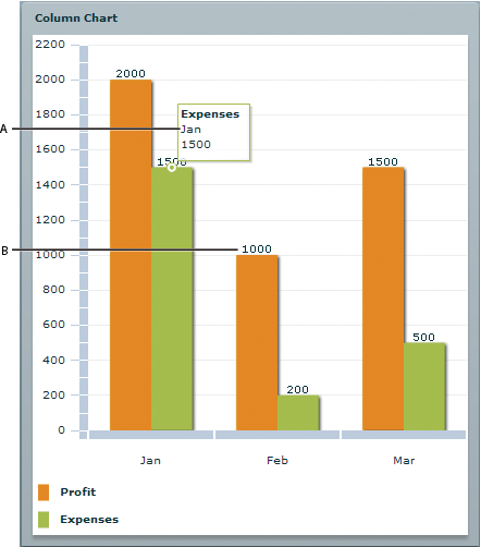
- A.
- DataTip
- B.
- Data label
The following chart series support data labels:
-
BarSeries
-
ColumnSeries
-
PieSeries
Just like DataTip controls, data labels are not enabled by default. You can add data labels by setting the value of the series' labelPosition property to inside or outside (for BarSeries and ColumnSeries) or inside, outside, callout, or insideWithCallout (for PieSeries). For more information, see Adding data labels. The default value of the series's labelPosition property is none.
The following example enables data labels on the columns by setting the value of the labelPosition style property to inside. You can click the button to change the position of the labels to outside.
<?xml version="1.0"?>
<!-- charts/BasicDataLabel.mxml -->
<s:Application
    xmlns:fx="http://ns.adobe.com/mxml/2009"
    xmlns:mx="library://ns.adobe.com/flex/mx"
    xmlns:s="library://ns.adobe.com/flex/spark"
    creationComplete="srv.send();setStartLabelLocation();"
    height="600">

    <fx:Declarations>
        <!-- View source of the following page to see the structure of the data that Flex uses in this example. -->
        <mx:HTTPService id="srv" url="http://examplesserver/chart_examples/expenses-xml.aspx"/>
        <!-- To see data in an HTML table, go to http://examplesserver/chart_examples/expenses.aspx -->
    </fx:Declarations>

  <fx:Script><![CDATA[
     private function setStartLabelLocation():void {
        cs1.setStyle("labelPosition", "inside");
        cs2.setStyle("labelPosition", "inside");
     }

     private function changeLabelLocation():void {
        var pos:String = cs1.getStyle("labelPosition");
        if (pos == "inside") {
            pos = "outside";
        } else {
            pos = "inside";
        }
        cs1.setStyle("labelPosition", pos);
        cs2.setStyle("labelPosition", pos);
     }

  ]]></fx:Script>

    <s:layout>
        <s:VerticalLayout/>
    </s:layout>

  <s:Panel title="Column Chart">
        <s:layout>
            <s:VerticalLayout/>
        </s:layout>
     <mx:ColumnChart id="myChart"
        dataProvider="{srv.lastResult.data.result}"
        showDataTips="true">
        <mx:horizontalAxis>
           <mx:CategoryAxis categoryField="month"/>
        </mx:horizontalAxis>

        <mx:verticalAxis>
            <mx:LinearAxis minimum="0" maximum="2500"/>
        </mx:verticalAxis>

        <mx:series>
           <mx:ColumnSeries id="cs1"
                xField="month"
                yField="profit"
                displayName="Profit"/>
           <mx:ColumnSeries id="cs2"
                xField="month"
                yField="expenses"
                displayName="Expenses"/>
        </mx:series>
     </mx:ColumnChart>
     <mx:Legend dataProvider="{myChart}"/>
  </s:Panel>

  <s:Button id="b1" label="Change Label Location"
    click="changeLabelLocation()"/>

</s:Application>
Adding data labels
By default, BarSeries, ColumnSeries, and PieSeries objects do not display data labels. To enable data labels on BarSeries and ColumnSeries objects, set the value of the labelPosition property to inside or outside. To enabled data labels on PieSeries, set the value of the labelPosition property to inside, outside, callout, or insideWithCallout.
The default value of the labelPosition property is none.
Because labelPosition property is a style property, you can set it either inline in the series' tag or by using the setStyle() method, as the following example shows:
mySeries.setStyle("labelPosition", "outside");
The contents of the data label are determined by several factors, in order of precedence:
-
labelField—Specifies a field in the data provider that sets the contents of the data label. This overrides any method specified by the labelFunction property.
-
labelFunction—Specifies a method that takes several arguments and returns a String that the chart series uses for the data label's contents. For more information, see Customizing data label values.
-
Default—If neither the labelField nor the labelFunction are specified, the default content of the data label is the value that the series uses to draw the chart element. This is the xField value for a ColumnSeries and the yField value for a BarSeries. For a PieSeries, the default content of the data labels is the value of the field property.
Setting the labelPosition property to inside restricts the amount of styling you can perform on the data labels. If the data labels are inside the chart elements (for example, inside the column in a ColumnSeries), their size is restricted by the available space within that element. A data label cannot be bigger than the chart element that contains it. If you try to set a data label to be larger than its underlying chart element, Flex scales and possibly truncates the contents of the data label. As a result, you should usually set the value of the labelPosition property to outside. For information about styling your data labels, see Styling data labels.
For 100%, stacked, and overlaid charts, the values of the series's labelPosition property can only be inside. If you set the labelPosition property to outside for these types of bar and column series, the value is ignored and the labels are rendered as if the labelPosition was inside.
If you set the labelPosition property to inside, you cannot rotate data labels.
Styling data labels
You can style the data labels so that their appearance fits into the style of your application. You can apply the following styles to data labels:
-
fontFamily
-
fontSize
-
fontStyle
-
fontWeight
-
labelAlign (when the labelPosition property is set to inside only)
-
labelPosition
-
labelSizeLimit
You can apply these styles by using type or class selectors in CSS or by using the setStyle() method. You can also set these properties inline in the series's MXML tag.
The following example shows how to use CSS class selectors to set the labelPosition and other properties that affect the appearance of data labels in a chart:
<?xml version="1.0"?>
<!-- charts/StylingDataLabels.mxml -->
<s:Application
    xmlns:fx="http://ns.adobe.com/mxml/2009"
    xmlns:mx="library://ns.adobe.com/flex/mx"
    xmlns:s="library://ns.adobe.com/flex/spark"
    creationComplete="srv.send()"
    height="600">

    <fx:Declarations>
        <!-- View source of the following page to see the structure of the data that Flex uses in this example. -->
        <mx:HTTPService id="srv" url="http://examplesserver/chart_examples/expenses-xml.aspx"/>
        <!-- To see data in an HTML table, go to http://examplesserver/chart_examples/expenses.aspx -->
    </fx:Declarations>

      <!-- Style properties on series that affect data labels:
        fontFamily; fontSize; fontStyle; fontWeight;
        labelPosition; labelRotation; labelSizeLimit -->
       <fx:Style>
         .incomeSeries {
             fontSize:9;
             fontWeight:bold;
             labelPosition:inside;
             labelAlign:top;
         }

         .expensesSeries {
             fontSize:8;
             labelPosition:inside;
             labelAlign:middle;
         }

       </fx:Style>

    <s:layout>
        <s:VerticalLayout/>
    </s:layout>

       <s:Panel title="Column Chart">
             <s:layout>
                 <s:HorizontalLayout/>
             </s:layout>
          <mx:ColumnChart id="myChart"
             dataProvider="{srv.lastResult.data.result}"
             showDataTips="true">
             <mx:horizontalAxis>
                <mx:CategoryAxis categoryField="month"/>
             </mx:horizontalAxis>

             <mx:verticalAxis>
                 <mx:LinearAxis minimum="0" maximum="2500"/>
             </mx:verticalAxis>

             <mx:series>
                <mx:ColumnSeries
                     xField="month"
                     yField="profit"
                     displayName="Profit"
                     styleName="incomeSeries"/>
                <mx:ColumnSeries xField="month" yField="expenses"
                     displayName="Expenses" styleName="expensesSeries"/>
             </mx:series>
          </mx:ColumnChart>
          <mx:Legend dataProvider="{myChart}"/>
       </s:Panel>
</s:Application>
Labels are scaled and possibly truncated if they are too big for the area. Labels will never overlap each other or other chart elements.
For PieSeries objects, you can also specify the gap and stroke of callout lines that associate a data label with a particular wedge in the pie. For more information, see Using data labels with PieChart controls.
Aligning data labels
You can align data labels so that they are positioned, either vertically or horizontally, relative to the underlying chart element. For example, you can center a data label over a column in a ColumnChart control, or align it to the left of all bars in a BarChart control.
To align data labels, you use the series' labelAlign style property. For ColumnSeries objects, valid values are middle, top, and bottom. For BarSeries objects, valid values are left, center, and right. The defaults are middle and center, respectively.
You can only set the labelAlign style if the labelPosition property is set to inside. Label alignment is ignored if the labelPosition is outside.
You cannot change the alignment of data labels on a PieSeries object.
ColumnChart controls have two additional properties that you can use to control the way data labels are rendered: showLabelVertically and extendLabelToEnd. These properties are important when the available space for labels is not sufficient to render the entire label. If you set showLabelVertically to true, Flex can render the label vertically rather than horizontally if the columns are not wide enough to render them normally. If you set extendLabelToEnd to true, then Flex can use the space between the data item's edge and the outer boundary of the chart to render the label in, rather than truncate the label at the end of the data item's column.
Rotating data labels
You can rotate data labels on a series by setting the value of the labelRotation style property on the data label's axis renderer. You must embed a font to rotate them. You must also set the embedAsCFF property in CSS to false because the chart is an MX control and not a Spark control. If you rotate the data labels without embedding a font, they are rendered horizontally.
<?xml version="1.0"?>
<!-- charts/RotatingDataLabels.mxml -->
<s:Application
    xmlns:fx="http://ns.adobe.com/mxml/2009"
    xmlns:mx="library://ns.adobe.com/flex/mx"
    xmlns:s="library://ns.adobe.com/flex/spark"
    creationComplete="srv.send()"
    height="600">

    <fx:Declarations>
        <!-- View source of the following page to see the structure of the data that Flex uses in this example. -->
        <mx:HTTPService id="srv" url="http://examplesserver/chart_examples/expenses-xml.aspx"/>
        <!-- To see data in an HTML table, go to http://examplesserver/chart_examples/expenses.aspx -->
    </fx:Declarations>

    <fx:Style>
        @font-face{
            src: url("../assets/MyriadWebPro.ttf");
            fontFamily: myMyriad;
            embedAsCFF: false;
        }

        @namespace mx "library://ns.adobe.com/flex/mx";

        mx|ColumnSeries {
            labelPosition:outside;
            labelRotation:45;
        }
        mx|ColumnChart {
            fontFamily: myMyriad;
        }
    </fx:Style>
    <s:layout>
        <s:VerticalLayout/>
    </s:layout>

    <s:Panel title="Rotating Data Labels in a Column Chart">
         <s:layout>
             <s:VerticalLayout/>
         </s:layout>
        <mx:ColumnChart id="myChart"
            dataProvider="{srv.lastResult.data.result}"
            showDataTips="true">

            <mx:horizontalAxis>
                <mx:CategoryAxis id="a1" categoryField="month"/>
            </mx:horizontalAxis>

            <mx:verticalAxis>
                <mx:LinearAxis id="a2" minimum="0" maximum="2500"/>
            </mx:verticalAxis>

            <mx:series>
                <mx:ColumnSeries displayName="Profit"
                    xField="month"
                    yField="profit"/>
                <mx:ColumnSeries displayName="Expenses"
                    xField="month"
                    yField="expenses"/>
            </mx:series>
        </mx:ColumnChart>
    </s:Panel>
</s:Application>
You can only rotate data labels if the series's labelPosition property is set to outside. You cannot rotate data labels if the labelPosition property of the series is set to inside.
If by rotating labels, you cause them to overlap each other or overlap chart elements, Flex repositions them. If there is not enough space to reposition the labels, Flex scales and ultimately truncates the labels. Data labels will never overlap each other or the underlying chart elements.
For more information on embedding fonts, see Embed fonts.
Customizing data label values
You can customize the value of your data labels. For example, you can prepend a dollar sign ($) or apply numeric formatters to the data labels to make your chart more readable. You can change the value of the data label altogther if you want.
To customize the contents of a data label, you use the labelFunction property of the series to specify a callback function. The function specified in labelFunction returns a String that Flex displays as the data label. Flex calls this callback function for each chart element in the series when the data labels are first rendered, and calls this method any time the labels are rendered again (for example, if the data changes).
The exact signature of the custom label callback function depends on the series that you are using it with. For BarSeries and ColumnSeries objects, the function takes two arguments (see Customizing data labels for ColumnSeries and BarSeries objects); for PieSeries objects, the function takes four arguments (see Customizing data labels for PieSeries objects).
Customizing data labels for ColumnSeries and BarSeries objects
For a ColumnSeries or BarSeries object, the signature for the custom label callback function is:
function_name(element:ChartItem, series:Series):String { ... }
The following table describes the parameters of the labelFunction callback function for a ColumnSeries or BarSeries object:
|
Parameter |
Description |
|---|---|
element |
A reference to the ChartItem that this data label applies to. The ChartItem represents a single data point in a series. |
series |
A reference to the series that this data label is used on. |
When you customize the value of the data label, you typically get a reference to the series item. You do this by casting the element argument to a specific chart item type (BarSeriesItem or ColumnSeriesItem). You then point to either the yNumber or xNumber property to get the underlying data.
You can also get a reference to the current series by casting the series argument to the specific series type (ColumnSeries or BarSeries). This lets you access properties such as the yField or xField.
The following example creates data labels for each of the columns in the ColumnChart control:
<?xml version="1.0"?>
<!-- charts/DataLabelFunctionColumn.mxml -->
<s:Application
    xmlns:fx="http://ns.adobe.com/mxml/2009"
    xmlns:mx="library://ns.adobe.com/flex/mx"
    xmlns:s="library://ns.adobe.com/flex/spark"
    creationComplete="srv.send()"
    height="600">

    <fx:Declarations>
         <!-- View source of the following page to see the structure of the data that Flex uses in this example. -->
         <mx:HTTPService id="srv" url="http://examplesserver/chart_examples/expenses-xml.aspx"/>
         <!-- To see data in an HTML table, go to http://examplesserver/chart_examples/expenses.aspx -->
         <s:NumberFormatter id="nf1" useGrouping="true" fractionalDigits="0"/>
    </fx:Declarations>

    <fx:Script><![CDATA[
        import mx.charts.ChartItem;
        import mx.charts.chartClasses.Series;
        import mx.charts.series.items.ColumnSeriesItem;

         private function setCustomLabel(element:ChartItem, series:Series):String {
            // Get a refereence to the current data element.
            var data:ColumnSeriesItem = ColumnSeriesItem(element);
            // Get a reference to the current series.
            var currentSeries:ColumnSeries = ColumnSeries(series);

            // Create a return String and format the number.
            return currentSeries.yField + ":" + " $" + nf1.format(data.yNumber);
         }
    ]]></fx:Script>

    <s:layout>
        <s:VerticalLayout/>
    </s:layout>

  <s:Panel title="Column Chart">
        <s:layout>
            <s:VerticalLayout/>
        </s:layout>
     <mx:ColumnChart id="myChart"
        dataProvider="{srv.lastResult.data.result}"
        showDataTips="true"
        extendLabelToEnd="true">
        <mx:horizontalAxis>
           <mx:CategoryAxis categoryField="month"/>
        </mx:horizontalAxis>

        <mx:verticalAxis>
            <mx:LinearAxis minimum="0" maximum="3000"/>
        </mx:verticalAxis>

        <mx:series>
           <mx:ColumnSeries
                labelPosition="outside"
                xField="month"
                yField="profit"
                displayName="Profit"
                labelFunction="setCustomLabel"/>
           <mx:ColumnSeries
                labelPosition="outside"
                xField="month"
                yField="expenses"
                displayName="Expenses"
                labelFunction="setCustomLabel"/>
        </mx:series>
     </mx:ColumnChart>
     <mx:Legend dataProvider="{myChart}"/>
  </s:Panel>
</s:Application>
You can also access the specific field in the data provider that provides the data. For example, in the previous example, you could get the value of the data item (in this case, the value of the Income field) by using code similar to the following:
 var item:ColumnSeriesItem = ColumnSeriesItem(element);
 var s:String = item.item.Income;
 return s;
This is not a recommended practice, however, because it makes the callback function less reusable and can force you to use additional code to detect which column you are providing data labels for.
Customizing data labels for PieSeries objects
For a PieSeries object, the signature for the custom label callback function is:
function_name(data:Object, field:String, index:Number, percentValue:Number):String { ... }
The following table describes the parameters of the labelFunction callback function for a PieSeries:
|
Parameter |
Description |
|---|---|
data |
A reference to the data point that chart element represents; type Object. |
field |
The field name from the data provider; type String. |
index |
The number of the data point in the data provider; type Number. |
percentValue |
The size of the pie wedge relative to the pie; type Number. If the pie wedge is a quarter of the size of the pie, this value is 25. |
The following example generates data labels for a PieSeries object that include data and formatting. It defines the display() method as the labelFunction callback function to handle formatting of the label text.
<?xml version="1.0"?>
<!-- charts/PieLabelFunction.mxml -->
<s:Application
    xmlns:fx="http://ns.adobe.com/mxml/2009"
    xmlns:mx="library://ns.adobe.com/flex/mx"
    xmlns:s="library://ns.adobe.com/flex/spark"
    creationComplete="srv.send()"
    height="600">

    <fx:Declarations>
        <!-- View source of the following page to see the structure of the data that Flex uses in this example. -->
        <mx:HTTPService id="srv" url="http://examplesserver/chart_examples/budget-xml.aspx"/>
        <!-- To see data in an HTML table, go to http://examplesserver/chart_examples/budget.aspx -->
    </fx:Declarations>

  <fx:Script><![CDATA[
     import spark.formatters.*;

     public function display(
        data:Object,
        field:String,
        index:Number,
        percentValue:Number):String
     {
            return data.item + "\n$" + data.amount +
            "\n(" + round(percentValue,2) + "%)";
     }
     // Rounds to 2 places:
     public function round(num:Number, precision:Number):Number {
        var result:String;
        var f:NumberFormatter = new NumberFormatter();
        f.fractionalDigits = precision;
        result = f.format(num);
        return Number(result);
     }
  ]]></fx:Script>

    <s:layout>
        <s:VerticalLayout/>
    </s:layout>

  <s:Panel title="Expenditures for FY '09">
     <s:layout>
         <s:VerticalLayout/>
     </s:layout>
     <mx:PieChart id="chart"
        dataProvider="{srv.lastResult.data.result}"
        showDataTips="false">
        <mx:series>
           <mx:PieSeries
                labelPosition="callout"
                field="amount"
                labelFunction="display"
                nameField="item"/>
        </mx:series>
     </mx:PieChart>
     <mx:Legend dataProvider="{chart}"/>
  </s:Panel>
</s:Application>
Using DataTip objects
The values displayed in the DataTip depends on the chart type, but typically it displays the names of the fields and the values of the data from the data provider.
The following image shows a simple DataTip:
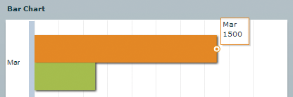
To enable DataTip objects, set the value of the chart control's showDataTips property to true, as the following example shows:
<?xml version="1.0"?>
<!-- charts/EnableDataTips.mxml -->
<s:Application
    xmlns:fx="http://ns.adobe.com/mxml/2009"
    xmlns:mx="library://ns.adobe.com/flex/mx"
    xmlns:s="library://ns.adobe.com/flex/spark"
    creationComplete="srv.send()"
    height="600">

    <fx:Declarations>
         <!-- View source of the following page to see the structure of the data that Flex uses in this example. -->
         <mx:HTTPService id="srv" url="http://examplesserver/chart_examples/expenses-xml.aspx"/>
         <!-- To see data in an HTML table, go to http://examplesserver/chart_examples/expenses.aspx -->
    </fx:Declarations>

    <s:layout>
        <s:VerticalLayout/>
    </s:layout>

  <s:Panel title="Bar Chart with DataTip objects enabled">
        <s:layout>
            <s:VerticalLayout/>
        </s:layout>
     <mx:BarChart id="myChart"
        dataProvider="{srv.lastResult.data.result}"
        showDataTips="true">
        <mx:verticalAxis>
           <mx:CategoryAxis categoryField="month"/>
        </mx:verticalAxis>
        <mx:series>
           <mx:BarSeries
                yField="month"
                xField="profit"
                displayName="Profit"/>
           <mx:BarSeries
                yField="month"
                xField="expenses"
                displayName="Expenses"/>
        </mx:series>
     </mx:BarChart>
      <mx:Legend dataProvider="{myChart}"/>
  </s:Panel>
</s:Application>
To change the styles of the DataTip, you can use the DataTip type selector in an <fx:Style> block or in an external CSS file. You must create a separate style namespace definition for the DataTip package. The following example applies new style properties to the text in the DataTip:
<?xml version="1.0"?>
<!-- charts/DataTipStyles.mxml -->
<s:Application
    xmlns:fx="http://ns.adobe.com/mxml/2009"
    xmlns:mx="library://ns.adobe.com/flex/mx"
    xmlns:s="library://ns.adobe.com/flex/spark"
    creationComplete="srv.send()"
    height="600">

    <fx:Declarations>
         <!-- View source of the following page to see the structure of the data that Flex uses in this example. -->
         <mx:HTTPService id="srv" url="http://examplesserver/chart_examples/expenses-xml.aspx"/>
         <!-- To see data in an HTML table, go to http://examplesserver/chart_examples/expenses.aspx -->
    </fx:Declarations>

    <fx:Style>
        @namespace chartClasses "mx.charts.chartClasses.*";
        chartClasses|DataTip {
            fontFamily: "Arial";
            fontSize: 12;
            fontWeight:bold;
            fontStyle:italic;
        }
    </fx:Style>

    <s:layout>
        <s:VerticalLayout/>
    </s:layout>

    <s:Panel title="Bar Chart">
        <s:layout>
            <s:VerticalLayout/>
        </s:layout>
        <mx:BarChart id="myChart"
            dataProvider="{srv.lastResult.data.result}"
            showDataTips="true">
            <mx:verticalAxis>
                <mx:CategoryAxis categoryField="month"/>
            </mx:verticalAxis>
            <mx:series>
                <mx:BarSeries
                    yField="month"
                    xField="profit"
                    displayName="Profit"/>
                <mx:BarSeries
                    yField="month"
                    xField="expenses"
                    displayName="Expenses"/>
            </mx:series>
        </mx:BarChart>
        <mx:Legend dataProvider="{myChart}"/>
    </s:Panel>
</s:Application>
Customizing the text inside a DataTip object
To make the information in the DataTip more understandable to users, you can define the series of your chart with names that are easily understood. Adobe® Flash® Player or Adobe® AIR™ displays this name in the DataTip, as the following image shows:
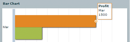
The following example names the data series by using the displayName property of the series:
<?xml version="1.0"?>
<!-- charts/DataTipsDisplayName.mxml -->
<s:Application
    xmlns:fx="http://ns.adobe.com/mxml/2009"
    xmlns:mx="library://ns.adobe.com/flex/mx"
    xmlns:s="library://ns.adobe.com/flex/spark"
    creationComplete="srv.send()"
    height="600">

    <fx:Declarations>
         <!-- View source of the following page to see the structure of the data that Flex uses in this example. -->
         <mx:HTTPService id="srv" url="http://examplesserver/chart_examples/expenses-xml.aspx"/>
         <!-- To see data in an HTML table, go to http://examplesserver/chart_examples/expenses.aspx -->
    </fx:Declarations>

    <s:layout>
        <s:VerticalLayout/>
    </s:layout>

  <s:Panel title="Bar Chart">
        <s:layout>
            <s:VerticalLayout/>
        </s:layout>
     <mx:BarChart id="myChart"
        dataProvider="{srv.lastResult.data.result}"
        showDataTips="true">
        <mx:verticalAxis>
           <mx:CategoryAxis categoryField="month"/>
        </mx:verticalAxis>
        <mx:series>
           <mx:BarSeries
                yField="month"
                xField="profit"
                displayName="--==Profit==--"/>
           <mx:BarSeries
                yField="month"
                xField="expenses"
                displayName="--==Expenses==--"/>
        </mx:series>
     </mx:BarChart>
     <mx:Legend dataProvider="{myChart}"/>
  </s:Panel>
</s:Application>
You can also name the axis to display labels in the DataTip by using the displayName property. When the axis has a name, this name appears in the DataTip in italic font before the label data, as the following image shows:
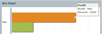
In some cases, you add an axis solely for the purpose of adding the label to the DataTip. The following example names both axes so that both data points are labeled in the DataTip:
<?xml version="1.0"?>
<!-- charts/DataTipsAxisNames.mxml -->
<s:Application
    xmlns:fx="http://ns.adobe.com/mxml/2009"
    xmlns:mx="library://ns.adobe.com/flex/mx"
    xmlns:s="library://ns.adobe.com/flex/spark"
    creationComplete="srv.send()"
    height="600">

    <fx:Declarations>
         <!-- View source of the following page to see the structure of the data that Flex uses in this example. -->
         <mx:HTTPService id="srv" url="http://examplesserver/chart_examples/expenses-xml.aspx"/>
         <!-- To see data in an HTML table, go to http://examplesserver/chart_examples/expenses.aspx -->
    </fx:Declarations>

    <s:layout>
        <s:VerticalLayout/>
    </s:layout>

     <s:Panel title="Bar Chart">
        <s:layout>
            <s:VerticalLayout/>
        </s:layout>
         <mx:BarChart id="myChart"
            dataProvider="{srv.lastResult.data.result}"
            showDataTips="true">
            <mx:verticalAxis>
               <mx:CategoryAxis categoryField="month"
                    displayName="Month"/>
            </mx:verticalAxis>

            <mx:horizontalAxis>
               <mx:LinearAxis displayName="Amount"/>
            </mx:horizontalAxis>

            <mx:series>
               <mx:BarSeries
                    yField="month"
                    xField="profit"
                    displayName="Profit"/>
               <mx:BarSeries
                    yField="month"
                    xField="expenses"
                    displayName="Expenses"/>
            </mx:series>
         </mx:BarChart>
         <mx:Legend dataProvider="{myChart}"/>
  </s:Panel>
</s:Application>
Showing multiple DataTip objects
You can display more than one DataTip by using the dataTipMode property on the chart control. The display options are single and multiple. When dataTipMode is set to multiple, the chart displays all DataTip objects within range of the cursor. The following example sets the value of a ColumnChart control's dataTipMode property to multiple:
<?xml version="1.0"?>
<!-- charts/DataTipsMultiple.mxml -->
<s:Application
    xmlns:fx="http://ns.adobe.com/mxml/2009"
    xmlns:mx="library://ns.adobe.com/flex/mx"
    xmlns:s="library://ns.adobe.com/flex/spark"
    creationComplete="srv.send()"
    height="600">

    <fx:Declarations>
         <!-- View source of the following page to see the structure of the data that Flex uses in this example. -->
         <mx:HTTPService id="srv" url="http://examplesserver/chart_examples/expenses-xml.aspx"/>
         <!-- To see data in an HTML table, go to http://examplesserver/chart_examples/expenses.aspx -->
    </fx:Declarations>

    <s:layout>
        <s:VerticalLayout/>
    </s:layout>

  <s:Panel title="Bar Chart">
        <s:layout>
            <s:VerticalLayout/>
        </s:layout>
     <mx:BarChart id="myChart"
        dataProvider="{srv.lastResult.data.result}"
        showDataTips="true"
        mouseSensitivity="50"
        dataTipMode="multiple">
        <mx:verticalAxis>
           <mx:CategoryAxis categoryField="month"/>
        </mx:verticalAxis>
        <mx:series>
           <mx:BarSeries
                yField="month"
                xField="profit"
                displayName="Profit"/>
           <mx:BarSeries
                yField="month"
                xField="expenses"
                displayName="Expenses"/>
        </mx:series>
     </mx:BarChart>
     <mx:Legend dataProvider="{myChart}"/>
  </s:Panel>
</s:Application>
The following example shows DataTip objects when the dataTipMode property is set to multiple:
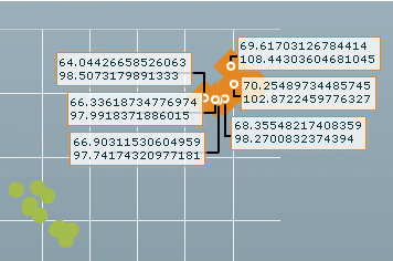
The default value of dataTipMode depends on the chart type. Its setting is based on the likelihood that there are overlapping DataTip objects in that chart type. The default value of the dataTipMode property for the following chart types is single:
The default value is multiple for the dataTipMode property for all other chart types.
To determine the size of the interactive area around a data point, you set the mouseSensitivity property. The mouseSensitivity property configures the distance, in pixels, around the data points where Flex reacts to mouse events such as click and mouseOver. With this property, you can trigger DataTip objects to appear when the user moves the mouse pointer near the data point rather than onto the data point. For more information, see Changing mouse sensitivity.
You can also show all the available data tips on a chart at one time by setting the value of the chart control's showAllDataTips property to true. The result is that all data tips are visible at all times. When you do this, you typically set the value of the showDataTips property to false so that a second data tip does not appear when you mouse over a chart item.
Customizing DataTip values
You can customize the text displayed in a DataTip by using the dataTipFunction callback function. When you specify a dataTipFunction callback function, you can access the data of the DataTip before Flex renders it and customizes the text.
The argument to the callback function is a HitData object. As a result, you must import mx.charts.HitData when using a DataTip callback function.
Flex displays whatever the callback function returns in the DataTip box. You must specify a String as the callback function's return type.
The following example defines a new callback function, dtFunc, that returns a formatted value for the DataTip:
<?xml version="1.0"?>
<!-- charts/CustomDataTips.mxml -->
<s:Application
    xmlns:fx="http://ns.adobe.com/mxml/2009"
    xmlns:mx="library://ns.adobe.com/flex/mx"
    xmlns:s="library://ns.adobe.com/flex/spark"
    creationComplete="srv.send()"
    height="600">

    <fx:Declarations>
         <!-- View source of the following page to see the structure of the data that Flex uses in this example. -->
         <mx:HTTPService id="srv" url="http://examplesserver/chart_examples/expenses-xml.aspx"/>
         <!-- To see data in an HTML table, go to http://examplesserver/chart_examples/expenses.aspx -->
    </fx:Declarations>

  <fx:Script><![CDATA[
     import mx.charts.HitData;

     public function dtFunc(hd:HitData):String {
        return hd.item.month + ": " +
        "<B>$" + hd.item.profit + "</B>";
     }
  ]]></fx:Script>

    <s:layout>
        <s:VerticalLayout/>
    </s:layout>

  <s:Panel title="Bar Chart">
        <s:layout>
            <s:VerticalLayout/>
        </s:layout>
     <mx:BarChart id="myChart"
        dataProvider="{srv.lastResult.data.result}"
        showDataTips="true"
        dataTipFunction="dtFunc">
        <mx:verticalAxis>
           <mx:CategoryAxis categoryField="month" displayName="Month"/>
        </mx:verticalAxis>

        <mx:horizontalAxis>
           <mx:LinearAxis displayName="Amount"/>
        </mx:horizontalAxis>

        <mx:series>
           <mx:BarSeries
                yField="month"
                xField="profit"
                displayName="Profit"/>
           <mx:BarSeries
                yField="month"
                xField="expenses"
                displayName="Expenses"/>
        </mx:series>
     </mx:BarChart>
     <mx:Legend dataProvider="{myChart}"/>
  </s:Panel>
</s:Application>
You can also use the HitData object to get information about the series in which that data item appears. To do this, you cast the HitData object to a Series class, as the following example shows:
<?xml version="1.0"?>
<!-- charts/HitDataCasting.mxml -->
<s:Application
    xmlns:fx="http://ns.adobe.com/mxml/2009"
    xmlns:mx="library://ns.adobe.com/flex/mx"
    xmlns:s="library://ns.adobe.com/flex/spark"
    creationComplete="srv.send()"
    height="600">

    <fx:Declarations>
        <!-- View source of the following page to see the structure of the data that Flex uses in this example. -->
        <mx:HTTPService id="srv" url="http://examplesserver/chart_examples/expenses-xml.aspx"/>
        <!-- To see data in an HTML table, go to http://examplesserver/chart_examples/expenses.aspx -->
    </fx:Declarations>

  <fx:Script><![CDATA[
     import mx.charts.HitData;
     import mx.charts.series.ColumnSeries;

     public var b:Boolean = true;

     public function myDataTipFunction(e:HitData):String {
        var s:String;
        s = ColumnSeries(e.element).displayName + "\n";
        s += "Profit: $" + (e.item.profit - e.item.expenses);
        return s;
     }

  ]]></fx:Script>

    <s:layout>
        <s:VerticalLayout/>
    </s:layout>

  <s:Panel title="Casting HitData Objects">
        <s:layout>
            <s:VerticalLayout/>
        </s:layout>
     <mx:ColumnChart id="myChart"
        dataProvider="{srv.lastResult.data.result}"
        showDataTips="true"
        dataTipFunction="myDataTipFunction">
        <mx:horizontalAxis>
           <mx:CategoryAxis categoryField="month"/>
        </mx:horizontalAxis>
        <mx:series>
           <mx:ColumnSeries
                yField="profit"
                displayName="Income '09"/>
           <mx:ColumnSeries
                yField="expenses"
                displayName="Expenses '09"/>
        </mx:series>
     </mx:ColumnChart>
     <mx:Legend dataProvider="{myChart}"/>
  </s:Panel>
</s:Application>
The series item is also accessible from the HitData object in a custom DataTip function. The chartItem property refers to an instance of a subclass of the ChartItem class. The type depends on the series type; for example, the chartItem for a ColumnSeries is an instance of the ColumnSeriesItem class.
In the following example, the yValue of the ColumnSeriesItem represents the percentage which a series takes up in a 100% chart:
<?xml version="1.0"?>
<!-- charts/HitDataCastingWithPercent.mxml -->
<s:Application
    xmlns:fx="http://ns.adobe.com/mxml/2009"
    xmlns:mx="library://ns.adobe.com/flex/mx"
    xmlns:s="library://ns.adobe.com/flex/spark"
    creationComplete="srv.send()"
    height="600">

    <fx:Declarations>
        <!-- View source of the following page to see the structure of the data that Flex uses in this example. -->
        <mx:HTTPService id="srv" url="http://examplesserver/chart_examples/expenses-xml.aspx"/>
        <!-- To see data in an HTML table, go to http://examplesserver/chart_examples/expenses.aspx -->
    </fx:Declarations>

  <fx:Script><![CDATA[
     import mx.charts.HitData;
     import mx.charts.series.ColumnSeries;
     import mx.charts.series.items.ColumnSeriesItem;

     public var b:Boolean = true;

     public function myDataTipFunction(e:HitData):String {

        var s:String;
        s = "<B>" + ColumnSeries(e.element).displayName + "</B>\n";

        s += "<I>Profit:</I> <FONT COLOR='#339966'>$" +
            e.item.profit + "</FONT>\n";
        s += "<I>Expenses:</I> <FONT COLOR='#FF0000'>$" +
            e.item.expenses + "</FONT>\n";
        s += "------------------------\n";
        s += "<I>Difference:</I> $" + (e.item.profit - e.item.expenses) + "\n";

        // The value of the Profit will always be 100%,
        // so exclude adding that to the DataTip. Only
        // add percent when the user gets the Amount DataTip.
        var percentValue:Number = Number(ColumnSeriesItem(e.chartItem).yValue);
        if (percentValue < 100) {
            s += "Profit was equal to about <B>" +
                Math.round(percentValue) + "</B>% of the total.\n";
        }
        return s;
     }
  ]]></fx:Script>

    <s:layout>
        <s:VerticalLayout/>
    </s:layout>

  <s:Panel title="Accessing ChartItems from HitData Objects">
        <s:layout>
            <s:VerticalLayout/>
        </s:layout>
     <mx:ColumnChart id="myChart"
        dataProvider="{srv.lastResult.data.result}"
        type="100%"
        dataTipFunction="myDataTipFunction"
        showDataTips="true">
        <mx:horizontalAxis>
           <mx:CategoryAxis categoryField="month"/>
        </mx:horizontalAxis>
        <mx:series>
           <mx:ColumnSeries
                yField="profit"
                displayName="Profit '09"/>
           <mx:ColumnSeries
                yField="expenses"
                displayName="Expenses '09"/>
        </mx:series>
     </mx:ColumnChart>
     <mx:Legend dataProvider="{myChart}"/>
  </s:Panel>
</s:Application>
For more information on using the HitData object of chart events, see Using the HitData object.
The DataTip callback function can render simple HTML for formatted DataTip objects. Flex supports a small subset of HTML tags including <FONT>, <B>, <I>, and <BR>.
Creating custom DataTip renderers
You can create a custom class that defines the appearance of the data tip. This class must implement the IFlexDisplayObject and IDataRenderer interfaces.
You typically create a custom ActionScript class that extends DataTip, and override the updateDisplayList() method. In the updateDisplayList() method, you define the appearance of the box for the data tip and apply styles that apply to the text for the data tip.
The following example class creates a custom data tip:
// charts/MyDataTip.as
package {
    import mx.charts.chartClasses.DataTip;
    import mx.charts.*;
    import flash.display.*;
    import flash.geom.Matrix;

    public class MyDataTip extends DataTip {

        public function MyDataTip() {
            super();
        }

        override protected function updateDisplayList(w:Number, h:Number):void {
            super.updateDisplayList(w, h);

            this.setStyle("textAlign","center");
            var g:Graphics = graphics;
            g.clear();
            var m:Matrix = new Matrix();
            m.createGradientBox(w+100,h,0,0,0);
            g.beginGradientFill(GradientType.LINEAR,[0xFF0000,0xFFFFFF],
                [.1,1],[0,255],m,null,null,0);
            g.drawRect(-50,0,w+100,h);
            g.endFill();
        }
    }
}
To use the custom data tip, you set the value of the dataTipRenderer style property of the chart control to the custom class. The following sample application applies the custom data tip to the chart control.
<?xml version="1.0"?>
<!-- charts/CustomDataTipRenderer.mxml -->
<s:Application
    xmlns:fx="http://ns.adobe.com/mxml/2009"
    xmlns:mx="library://ns.adobe.com/flex/mx"
    xmlns:s="library://ns.adobe.com/flex/spark"
    creationComplete="srv.send();applyCustomDataTips();"
    height="600">

    <fx:Declarations>
         <!-- View source of the following page to see the structure of the data that Flex uses in this example. -->
         <mx:HTTPService id="srv" url="http://examplesserver/chart_examples/expenses-xml.aspx"/>
         <!-- To see data in an HTML table, go to http://examplesserver/chart_examples/expenses.aspx -->
    </fx:Declarations>

  <fx:Script><![CDATA[
    private function applyCustomDataTips():void {
        myChart.setStyle("dataTipRenderer",MyDataTip);
    }
  ]]></fx:Script>

    <s:layout>
        <s:VerticalLayout/>
    </s:layout>

  <s:Panel title="Bar Chart">
        <s:layout>
            <s:VerticalLayout/>
        </s:layout>
     <mx:BarChart id="myChart"
        dataProvider="{srv.lastResult.data.result}"
        showDataTips="true">
        <mx:verticalAxis>
           <mx:CategoryAxis categoryField="month"/>
        </mx:verticalAxis>
        <mx:series>
           <mx:BarSeries
                yField="month"
                xField="profit"
                displayName="Profit"/>
           <mx:BarSeries
                yField="month"
                xField="expenses"
                displayName="Expenses"/>
        </mx:series>
     </mx:BarChart>
     <mx:Legend dataProvider="{myChart}"/>
  </s:Panel>
</s:Application>
If you want to prevent the data tip's box from displaying when you mouse over a chart item, you can set the dataTipRenderer style property to a dummy class, such as ProgrammaticSkin; for example:
myChart.setStyle("dataTipRenderer",mx.skins.ProgrammaticSkin);
If you want to change the text of the data tip, you use the dataTipFunction callback function on the chart control, as described in Customizing DataTip values.
Using per-item fills
You can customize the appearance of chart items in a series by using the fillFunction property to define the fill. This function takes the chart item and its index as arguments, so that you can examine the chart item's data values and return a fill based on whatever criteria you choose to use.
Programmatically assigning fills lets you set a threshold for color values, or conditionalize the colors of your chart items. For example, if the size of a pie wedge is greater than 25%, make it red, or if a column's value is greater than 100, make it green.
You set the value of the fillFunction property on each series, so if you have multiple series, you can have multiple fill functions, or all series can share the same fill function.
The signature of the fillFunction is as follows:
function_name(element:ChartItem, index:Number):IFill { ... }
The following table describes the arguments:
|
Argument |
Description |
|---|---|
element |
The chart item for which the fill is created; type ChartItem. |
index |
The index of the chart item in the RenderData object's cache. This is different from the index of the chart's data provider because it is sorted based on the x, y, and z values; type Number. |
The fillFunction property returns a Fill object (an object that implements the IFill interface). This object is typically an instance of the SolidColor class, but it can also be of type BitmapFill, LinearGradient, or RadialGradient. For information on working with gradients, see Using gradient fills with chart controls.
The returned fill from a fillFunction takes precedence over fills that are set with traditional style methods. For example, if you set the value of the fill or fills property of a series and also specify a fillFunction, the fills are ignored and the fill returned by the fillFunction is used when rendering the chart items in the series.
The following example compares the value of the yField in the data provider when it fills each chart item. If the yField value (corresponding to the CurrentAmount field) is greater than $50,000, the column is green. If it is less than $50,000, the column is red.
<?xml version="1.0"?>
<!-- charts/SimpleFillFunction.mxml -->
<s:Application
    xmlns:fx="http://ns.adobe.com/mxml/2009"
    xmlns:mx="library://ns.adobe.com/flex/mx"
    xmlns:s="library://ns.adobe.com/flex/spark"
    creationComplete="srv.send()"
    height="600">

    <fx:Declarations>
        <!-- View source of the following page to see the structure of the data that Flex uses in this example. -->
        <mx:HTTPService id="srv" url="http://examplesserver/chart_examples/expenses-xml.aspx"/>
        <!-- To see data in an HTML table, go to http://examplesserver/chart_examples/expenses.aspx -->
    </fx:Declarations>

  <fx:Script>
    <![CDATA[
     import mx.graphics.IFill;
     import mx.graphics.SolidColor;
     import mx.charts.ChartItem;
     import mx.charts.series.items.ColumnSeriesItem;

    private function myFillFunction(element:ChartItem, index:Number):IFill {
        var c:SolidColor = new SolidColor(0x00CC00);

        var item:ColumnSeriesItem = ColumnSeriesItem(element);
        var profit:Number = Number(item.yValue);
        if (profit >= 1250) {
            return c;
        } else {
            c.color = 0xFF0000;
        }
        return c;
    }
    ]]>
  </fx:Script>

    <s:layout>
        <s:VerticalLayout/>
    </s:layout>

  <s:Panel title="Using a custom fillFunction in a Column Chart">
     <s:layout>
         <s:VerticalLayout/>
     </s:layout>
     <mx:ColumnChart id="myChart"
        dataProvider="{srv.lastResult.data.result}"
        showDataTips="true">
        <mx:horizontalAxis>
           <mx:CategoryAxis title="Month" categoryField="month"/>
        </mx:horizontalAxis>
        <mx:verticalAxis>
            <mx:LinearAxis title="Profit (in $USD)"/>
        </mx:verticalAxis>

        <mx:series>
           <mx:ColumnSeries id="currSalesSeries"
                xField="month"
                yField="profit"
                fillFunction="myFillFunction"
                displayName="Profit"/>
        </mx:series>
     </mx:ColumnChart>
     <mx:Legend>
        <mx:LegendItem label="More than $1,250" fontWeight="bold">
           <mx:fill>
            <mx:SolidColor color="0x00FF00"/>
           </mx:fill>
           <mx:stroke>
            <mx:SolidColorStroke color="0x000000" weight="1"/>
           </mx:stroke>
        </mx:LegendItem>
        <mx:LegendItem label="Less than $1,250" fontWeight="bold">
           <mx:fill>
            <mx:SolidColor color="0xFF0000"/>
           </mx:fill>
           <mx:stroke>
            <mx:SolidColorStroke color="0x000000" weight="1"/>
           </mx:stroke>
         </mx:LegendItem>
     </mx:Legend>
  </s:Panel>
</s:Application>
This example defines custom entries in the Legend. If you use the fillFunction property to define the fills of chart items, and you want a Legend control in your chart, you must manually create the Legend object and its LegendItem objects. For more information on creating Legend and LegendItem objects, see Using Legend controls.
The color returned by the fill function is used by the itemRenderer for the series. In the case of the ColumnSeries and BarSeries classes, this is the column or bar in the chart. For LineSeries and AreaSeries classes, however, the renderer is used on the line itself. As a result, the color is applied only if you define a custom itemRenderer (such as a CircleItemRenderer or DiamondItemRenderer), and then it is applied only to the that renderer (such as the color inside the diamond) along the line of those series, not to the fill area below the line as you might expect.
By using the index argument that is passed to the fill function, you can also access other items inside the same series.
The following example sets the color of the fill to green for only the columns whose item value is greater than the previous item's value. Otherwise, it sets the color of the fill to red.
<?xml version="1.0"?>
<!-- charts/ComparativeFillFunction.mxml -->
<s:Application
    xmlns:fx="http://ns.adobe.com/mxml/2009"
    xmlns:mx="library://ns.adobe.com/flex/mx"
    xmlns:s="library://ns.adobe.com/flex/spark"
    creationComplete="srv.send()"
    height="600">

    <fx:Declarations>
         <!-- View source of the following page to see the structure of the data that Flex uses in this example. -->
         <mx:HTTPService id="srv" url="http://examplesserver/chart_examples/expenses-xml.aspx"/>
         <!-- To see data in an HTML table, go to http://examplesserver/chart_examples/expenses.aspx -->
    </fx:Declarations>

  <fx:Script>
    <![CDATA[
     import mx.graphics.IFill;
     import mx.graphics.SolidColor;
     import mx.charts.ChartItem;
     import mx.charts.series.items.ColumnSeriesItem;

    private function myFillFunction(element:ChartItem, index:Number):IFill {
        // Default to green.
        var c:SolidColor = new SolidColor(0x00FF00);

        var item:ColumnSeriesItem = ColumnSeriesItem(element);
        var profit:Number = Number(item.yValue);
        if (index == 0) {
            // The first column should be green, no matter the value.
            return c;
        } else {
            var prevVal:Number =
                Number(currSalesSeries.items[index - 1].yValue);
            var curVal:Number =
                Number(currSalesSeries.items[index].yValue);
            var diff:Number = curVal - prevVal;

            if (diff >= 0) {
                // Current column's value is greater than the previous.
                return c;
            } else {
                // Previous column's value is greater than the current.
                c.color = 0xFF0000;
            }
        }
        return c;
    }
    ]]>
  </fx:Script>

    <s:layout>
        <s:VerticalLayout/>
    </s:layout>

  <s:Panel title="Using a custom fillFunction in a Column Chart">
        <s:layout>
            <s:VerticalLayout/>
        </s:layout>
     <mx:ColumnChart id="myChart"
        dataProvider="{srv.lastResult.data.result}"
        showDataTips="true">
        <mx:horizontalAxis>
           <mx:CategoryAxis
                title="Month"
                categoryField="month"/>
        </mx:horizontalAxis>
        <mx:verticalAxis>
            <mx:LinearAxis title="Profit (in $USD)"/>
        </mx:verticalAxis>

        <mx:series>
           <mx:ColumnSeries id="currSalesSeries"
                xField="month"
                yField="profit"
                fillFunction="myFillFunction"
                displayName="Profit"/>
        </mx:series>
     </mx:ColumnChart>
     <mx:Legend>
        <mx:LegendItem label="More than Previous" fontWeight="bold">
           <mx:fill>
            <mx:SolidColor color="0x00FF00"/>
           </mx:fill>
           <mx:stroke>
            <mx:SolidColorStroke color="0x000000" weight="1"/>
           </mx:stroke>
        </mx:LegendItem>
        <mx:LegendItem label="Less than Previous" fontWeight="bold">
           <mx:fill>
            <mx:SolidColor color="0xFF0000"/>
           </mx:fill>
           <mx:stroke>
            <mx:SolidColorStroke color="0x000000" weight="1"/>
           </mx:stroke>
         </mx:LegendItem>
     </mx:Legend>
  </s:Panel>
</s:Application>
This example defines custom entries in the Legend because using a fillFunction prevents you from using an automatically generated Legend. For more information on creating Legend objects, see Using Legend controls.
You can compare the values of data in a chart item to other values in the same or different series. The following example compares the value of the current amount of sales in the currentSalesSeries series against the sales goal in the salesGoalSeries series. If the goal is met or exceeded, the column is green. If the goal is not yet met, the negative difference between the goal and the actual sales is red.
<?xml version="1.0"?>
<!-- charts/ComplexFillFunction.mxml -->
<s:Application
    xmlns:fx="http://ns.adobe.com/mxml/2009"
    xmlns:mx="library://ns.adobe.com/flex/mx"
    xmlns:s="library://ns.adobe.com/flex/spark"
    height="600">

  <fx:Script>
    <![CDATA[

     import mx.controls.Alert;
     import mx.graphics.IFill;
     import mx.graphics.SolidColor;
     import mx.collections.ArrayCollection;
     import mx.charts.ChartItem;
     import mx.charts.series.items.ColumnSeriesItem;

     [Bindable]
     public var sales:ArrayCollection = new ArrayCollection([
        { Name:"Reiner", SalesGoal:65000, CurrentAmount:69000 },
        { Name:"Alan", SalesGoal:40000, CurrentAmount:44000 },
        { Name:"Wolfgang", SalesGoal:48000, CurrentAmount:33000 },
        { Name:"Francis", SalesGoal:22000, CurrentAmount:20000 },
        { Name:"Klaus", SalesGoal:50000, CurrentAmount:55000 },
        { Name:"Martin", SalesGoal:44000, CurrentAmount:70000 },
        { Name:"Mac", SalesGoal:40000, CurrentAmount:35000 },
        { Name:"Friedemann", SalesGoal:38000, CurrentAmount:38000 },
        { Name:"Bruno", SalesGoal:42000, CurrentAmount:40000 }
     ]);

    private function myFillFunction(element:ChartItem, index:Number):IFill {
        var item:ColumnSeriesItem = ColumnSeriesItem(element);

        // Set default color.
        var c:SolidColor = new SolidColor(0xFF3366, 1);

        /* Use the yNumber properties rather than the yValue properties
           because the conversion to a Number is already done for
           you. As a result, you do not have to cast them to a Number,
           which would be less efficient. */

        var currentAmount:Number = currSalesSeries.items[index].yNumber;
        var goal:Number = item.yNumber;

        // Determine if the goal was met or not.
        var diff:Number = currentAmount - goal;

        if (diff >= 0) {
            // Sales person met their goal.
            return c;
        } else if (diff < 0) {
            // Sales person did not meet their goal.
            c.color = 0xFF0000;
            c.alpha = 1;
        }

        return c;

    }

    private function showDataPoints():void {
        var s:String = "";
        for (var i:int = 0; i<currSalesSeries.items.length; i++) {
            if (salesGoalSeries.items[i].yNumber != null && currSalesSeries.items[i].yNumber != null) {
                var currentAmount:Number = currSalesSeries.items[i].yNumber;
                var goal:Number = salesGoalSeries.items[i].yNumber;
                var diff:Number = currentAmount - goal;
                s += "c:" + currentAmount.toString() + ", g:" + goal.toString() + ", d:" + diff.toString() + "\n";
            }
        }
        Alert.show(s);
    }
    ]]>
  </fx:Script>

    <s:layout>
        <s:VerticalLayout/>
    </s:layout>

  <s:Panel title="Using a custom fillFunction in a Column Chart">
        <s:layout>
            <s:VerticalLayout/>
        </s:layout>
     <mx:ColumnChart id="myChart"
        dataProvider="{sales}"
        type="overlaid"
        showDataTips="true">
        <mx:horizontalAxis>
           <mx:CategoryAxis
                title="Sales Person"
                categoryField="Name"/>
        </mx:horizontalAxis>
        <mx:verticalAxis>
            <mx:LinearAxis title="Sales (in $USD)"/>
        </mx:verticalAxis>

        <mx:series>
           <mx:ColumnSeries id="salesGoalSeries"
                xField="Name"
                yField="SalesGoal"
                fillFunction="myFillFunction"
                displayName="Sales Goal">
           </mx:ColumnSeries>
           <mx:ColumnSeries id="currSalesSeries"
                xField="Name"
                yField="CurrentAmount"
                displayName="Current Sales">
                <mx:fill>
                    <mx:SolidColor color="0x00FF00"/>
                </mx:fill>
           </mx:ColumnSeries>
        </mx:series>
     </mx:ColumnChart>
     <mx:Legend>
        <mx:LegendItem label="Current Sales" fontWeight="bold">
           <mx:fill>
            <mx:SolidColor color="0x00FF00"/>
           </mx:fill>
           <mx:stroke>
            <mx:SolidColorStroke color="0x000000" weight="1"/>
           </mx:stroke>
        </mx:LegendItem>
        <mx:LegendItem label="Missed Goal" fontWeight="bold">
           <mx:fill>
            <mx:SolidColor color="0xFF0000"/>
           </mx:fill>
           <mx:stroke>
            <mx:SolidColorStroke color="0x000000" weight="1"/>
           </mx:stroke>
         </mx:LegendItem>
     </mx:Legend>
     <s:Button click="showDataPoints()" label="Show Data"/>
  </s:Panel>
</s:Application>
You can access data from other series inside a series's fill function, but only if the other series has been rendered. If you were to rearrange the order of the series in the previous example, Flash would throw an error because the second series has not yet been rendered when the fill function is called.
Using the minField property
Some series types let you specify a minimum value for the elements drawn on the screen. For example, in a ColumnChart control, you can specify the base value of the column. To specify a base value (or minimum) for the column, set the value of the series object's minField property to the data provider field.
You can specify the minField property for the following chart series types:
Setting a value for the minField property creates two values on the axis for each data point in an area; for example:
<?xml version="1.0"?>
<!-- charts/MinField.mxml -->
<s:Application
    xmlns:fx="http://ns.adobe.com/mxml/2009"
    xmlns:mx="library://ns.adobe.com/flex/mx"
    xmlns:s="library://ns.adobe.com/flex/spark"
    creationComplete="srv.send()"
    height="600">

    <fx:Declarations>
        <!-- View source of the following page to see the structure of the data that Flex uses in this example. -->
        <mx:HTTPService id="srv" url="http://examplesserver/chart_examples/expenses-xml.aspx"/>
        <!-- To see data in an HTML table, go to http://examplesserver/chart_examples/expenses.aspx -->
    </fx:Declarations>

    <s:layout>
        <s:VerticalLayout/>
    </s:layout>

  <s:Panel title="Area Chart">
    <s:layout>
        <s:VerticalLayout/>
    </s:layout>
     <mx:AreaChart id="myChart"
        dataProvider="{srv.lastResult.data.result}"
        showDataTips="true">
        <mx:horizontalAxis>
           <mx:CategoryAxis categoryField="month"/>
        </mx:horizontalAxis>
        <mx:series>
           <mx:AreaSeries
                yField="profit"
                minField="expenses"
                displayName="Profit"/>
        </mx:series>
     </mx:AreaChart>
     <mx:Legend dataProvider="{myChart}"/>
  </s:Panel>
</s:Application>
The resulting DataTip labels the current value "high" and the minField value "low." The following example shows an AreaChart that defines the base of each column:
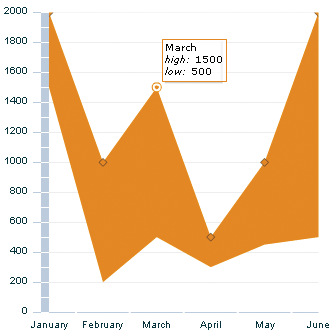
For an example of using the minField property to create a waterfall or cascading ColumnChart control, see Using column charts.
You can also use the baseAtZero property to determine whether or not the axis starts at zero. Set this property to true to start the axis at zero; set it to false to let Flex determine a reasonable starting value relative to the values along the axis.
Stacking charts
When you use multiple data series in the AreaChart, BarChart, and ColumnChart controls, you can control how Flex displays the series using the type property of the controls. The following table describes the values that the type property supports:
|
Property |
Description |
|---|---|
clustered |
Chart elements for each series are grouped by category. This is the default value for BarChart and ColumnChart controls. |
overlaid |
Chart elements for each series are rendered on top of each other, with the element corresponding to the last series on top. This is the default value for AreaChart controls. |
stacked |
Chart elements for each series are stacked on top of each other. Each element represents the cumulative value of the elements beneath it. |
100% |
Chart elements are stacked on top of each other, adding up to 100%. Each chart element represents the percentage that the value contributes to the sum of the values for that category. |
The following example creates an AreaChart control that has four data series, stacked on top of each other:
<?xml version="1.0"?>
<!-- charts/AreaStacked.mxml -->
<s:Application
    xmlns:fx="http://ns.adobe.com/mxml/2009"
    xmlns:mx="library://ns.adobe.com/flex/mx"
    xmlns:s="library://ns.adobe.com/flex/spark"
    creationComplete="srv.send()"
    height="600">

    <fx:Declarations>
        <!-- View source of the following page to see the structure of the data that Flex uses in this example. -->
        <mx:HTTPService id="srv" url="http://examplesserver/chart_examples/expenses-xml.aspx"/>
        <!-- To see data in an HTML table, go to http://examplesserver/chart_examples/expenses.aspx -->
    </fx:Declarations>

    <s:layout>
        <s:VerticalLayout/>
    </s:layout>

  <s:Panel title="Stacked AreaChart">
        <s:layout>
            <s:VerticalLayout/>
        </s:layout>
     <mx:AreaChart id="myChart"
        dataProvider="{srv.lastResult.data.result}"
        showDataTips="true"
        type="stacked">
        <mx:horizontalAxis>
           <mx:CategoryAxis categoryField="Month"/>
        </mx:horizontalAxis>
        <mx:series>
           <mx:AreaSeries yField="profit" displayName="Profit"/>
           <mx:AreaSeries yField="expenses" displayName="Expenses"/>
           <mx:AreaSeries yField="amount" displayName="Amount"/>
        </mx:series>
     </mx:AreaChart>
     <mx:Legend dataProvider="{myChart}"/>
  </s:Panel>
</s:Application>
The following example shows a stacked AreaChart control:
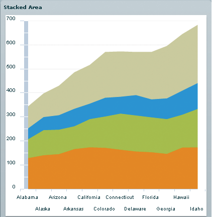
With an overlay, the last series appears on top, and can obscure the data series below it unless you use the alpha property of the fill to make it transparent. For more information, see Using fills with chart controls.
If you set the type property to 100%, the control draws each series stacked on top of each other, adding up to 100% of the area. Each column represents the percentage that the value contributes to the sum of the values for that category, as the following example shows:
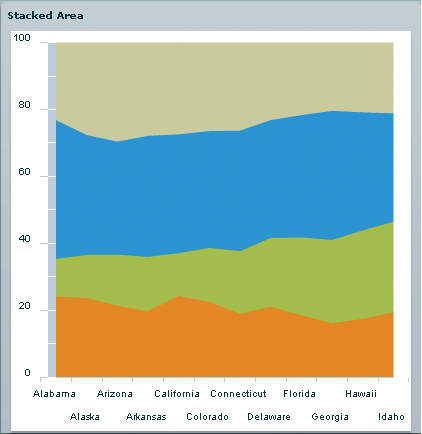
You can use the ColumnSet, BarSet, and AreaSet classes to combine groups of chart series, and thereby use different types of series within the same chart. The following example uses BarSet classes to combine clustered and stacked BarSeries in a single chart. The example shows how to do this in MXML and ActionScript:
<?xml version="1.0"?>
<!-- charts/UsingBarSets.mxml -->
<s:Application
    xmlns:fx="http://ns.adobe.com/mxml/2009"
    xmlns:mx="library://ns.adobe.com/flex/mx"
    xmlns:s="library://ns.adobe.com/flex/spark"
    creationComplete="initApp()"
    height="1050" width="600">

    <s:layout>
        <s:VerticalLayout/>
    </s:layout>

  <fx:Script><![CDATA[
     import mx.charts.Legend;
     import mx.charts.BarChart;
     import mx.charts.series.BarSet;
     import mx.charts.series.BarSeries;
     import mx.collections.ArrayCollection;

     [Bindable]
     private var yearlyData:ArrayCollection = new ArrayCollection([
        {month:"January", revenue:120, costs:45,
            overhead:102, oneTime:23},
        {month:"February", revenue:108, costs:42,
            overhead:87, oneTime:47},
        {month:"March", revenue:150, costs:82,
            overhead:32, oneTime:21},
        {month:"April", revenue:170, costs:44,
            overhead:68},
        {month:"May", revenue:250, costs:57,
            overhead:77, oneTime:17},
        {month:"June", revenue:200, costs:33,
            overhead:51, oneTime:30},
        {month:"July", revenue:145, costs:80,
            overhead:62, oneTime:18},
        {month:"August", revenue:166, costs:87,
            overhead:48},
        {month:"September", revenue:103, costs:56,
            overhead:42},
        {month:"October", revenue:140, costs:91,
            overhead:45, oneTime:60},
        {month:"November", revenue:100, costs:42,
            overhead:33, oneTime:67},
        {month:"December", revenue:182, costs:56,
            overhead:25, oneTime:48},
        {month:"May", revenue:120, costs:57,
            overhead:30}
     ]);

     private function initApp():void {
        var c:BarChart = new BarChart();
        c.dataProvider = yearlyData;
        c.showDataTips = true;

        var vAxis:CategoryAxis = new CategoryAxis();
        vAxis.categoryField = "month";
        c.verticalAxis = vAxis;

        var mySeries:Array = new Array();

        var outerSet:BarSet = new BarSet();
        outerSet.type = "clustered";
        var series1:BarSeries = new BarSeries();
        series1.xField = "revenue";
        series1.displayName = "Revenue";
        outerSet.series = [series1];

        var innerSet:BarSet = new BarSet();
        innerSet.type = "stacked";
        var series2:BarSeries = new BarSeries();
        var series3:BarSeries = new BarSeries();
        series2.xField = "costs";
        series2.displayName = "Recurring Costs";
        series3.xField = "oneTime";
        series3.displayName = "One-Time Costs";
        innerSet.series = [series2, series3];

        c.series = [outerSet, innerSet];

        var l:Legend = new Legend();
        l.dataProvider = c;

        panel2.addElement(c);
        panel2.addElement(l);
     }
  ]]></fx:Script>

  <s:Panel title="Mixed Sets Chart Created in MXML" id="panel1">
     <s:layout>
         <s:HorizontalLayout/>
     </s:layout>
     <mx:BarChart id="myChart"
        dataProvider="{yearlyData}" showDataTips="true">
        <mx:verticalAxis>
            <mx:CategoryAxis categoryField="month"/>
        </mx:verticalAxis>
        <mx:series>
            <mx:BarSet type="clustered">
                <mx:BarSeries xField="revenue"
                    displayName="Revenue"/>
                <mx:BarSet type="stacked">
                    <mx:BarSeries
                        xField="costs"
                        displayName="Recurring Costs"/>
                    <mx:BarSeries
                        xField="oneTime"
                        displayName="One-Time Costs"/>
                </mx:BarSet>
            </mx:BarSet>
        </mx:series>
     </mx:BarChart>
     <mx:Legend dataProvider="{myChart}"/>
  </s:Panel>
  <s:Panel title="Mixed Sets Chart Created in ActionScript" id="panel2">
    <s:layout>
        <s:VerticalLayout/>
    </s:layout>
  </s:Panel>
</s:Application>
The resulting chart shows two clustered series; one is a standalone series, and the other is a stacked series, as the following example shows:
Normally, the values in stacked series are additive, which means that they are all added to one another to create an ever larger data item (column or bar or area). When one or more values is negative, the rendering of the data items can be unpredictable because adding a negative value would normally take away from the data item. You can also use the allowNegativeForStacked property of the AreaSet, BarSet, and ColumnSet classes to let a stacked series include data with negative values, and thereby render negative data items that are properly stacked.
The following example stacks the Profit and Expenses fields, in which some of the values are negative.
<?xml version="1.0"?>
<!-- charts/StackedNegative.mxml -->
<s:Application
    xmlns:fx="http://ns.adobe.com/mxml/2009"
    xmlns:mx="library://ns.adobe.com/flex/mx"
    xmlns:s="library://ns.adobe.com/flex/spark"
    height="600">

  <fx:Script><![CDATA[
     import mx.collections.ArrayCollection;
     [Bindable]
     public var expenses:ArrayCollection = new ArrayCollection([
        {Month:"Jan", Profit:-2000, Expenses:-1500},
        {Month:"Feb", Profit:1000, Expenses:-200},
        {Month:"Mar", Profit:1500, Expenses:-500}
     ]);
  ]]></fx:Script>

    <s:layout>
        <s:VerticalLayout/>
    </s:layout>

  <s:Panel title="Column Chart">
     <s:layout>
         <s:HorizontalLayout/>
     </s:layout>
     <mx:ColumnChart id="myChart"
        dataProvider="{expenses}"
        showDataTips="true">
        <mx:horizontalAxis>
           <mx:CategoryAxis
                dataProvider="{expenses}"
                categoryField="Month"/>
        </mx:horizontalAxis>
        <mx:series>
            <mx:ColumnSet type="stacked"
                allowNegativeForStacked="true">
                <mx:series>
                    <mx:ColumnSeries
                        xField="Month"
                        yField="Profit"
                        displayName="Profit"/>
                    <mx:ColumnSeries
                        xField="Month"
                        yField="Expenses"
                        displayName="Expenses"/>
                </mx:series>
            </mx:ColumnSet>
        </mx:series>
     </mx:ColumnChart>
     <mx:Legend dataProvider="{myChart}"/>
  </s:Panel>
</s:Application>
The resulting chart shows three months of data, with all expenses and some income data rendering in negative values:
You can create cascading or waterfall column charts by using the ColumnChart control. One way to do this is to create an invisible series and to use that to set the variable height of the other columns, creating the waterfall effect. The following is an example of a waterfall chart:
The following code creates this chart:
<?xml version="1.0"?>
<!-- charts/WaterfallStacked.mxml -->
<s:Application
    xmlns:fx="http://ns.adobe.com/mxml/2009"
    xmlns:mx="library://ns.adobe.com/flex/mx"
    xmlns:s="library://ns.adobe.com/flex/spark"
    height="600">

  <fx:Script><![CDATA[
     import mx.collections.ArrayCollection;
     [Bindable]
     public var expenses:ArrayCollection = new ArrayCollection([
        {Month:"2005", top:25, middle:20, bottom:17, Invisible:0},
        {Month:"Jan", top:14, middle:12, bottom:10, Invisible:62},
        {Month:"Feb", top:8, middle:6, bottom:4, Invisible:98},
        {Month:"Mar", top:6, middle:5, bottom:5, Invisible:116},
        {Month:"Apr", top:5, middle:4, bottom:4, Invisible:132},
        {Month:"May", top:5, middle:3, bottom:5, Invisible:140},
        {Month:"Jun", top:4, middle:3, bottom:2, Invisible:155},
        {Month:"2006", top:68, middle:57, bottom:39, Invisible:0}
     ]);
  ]]></fx:Script>

    <s:layout>
        <s:VerticalLayout/>
    </s:layout>

  <s:Panel title="Stacked Waterfall">
     <s:layout>
         <s:HorizontalLayout/>
     </s:layout>
     <mx:ColumnChart id="myChart"
        dataProvider="{expenses}"
        columnWidthRatio=".9"
        showDataTips="true"
        type="stacked">
        <mx:horizontalAxis>
           <mx:CategoryAxis
                dataProvider="{expenses}"
                categoryField="Month"/>
        </mx:horizontalAxis>
        <mx:series>
           <mx:ColumnSeries yField="Invisible">
                <mx:fill>
                    <!--Set alpha to 0 to hide invisible column.-->
                    <mx:SolidColor color="0xFFFFFF" alpha="0"/>
                </mx:fill>
           </mx:ColumnSeries>
           <mx:ColumnSeries yField="bottom" displayName="Profit"/>
           <mx:ColumnSeries yField="middle" displayName="Expenses"/>
           <mx:ColumnSeries yField="top" displayName="Profit"/>
        </mx:series>
     </mx:ColumnChart>
     <mx:Legend dataProvider="{myChart}"/>
  </s:Panel>
</s:Application>
Using Legend controls
Legend controls match the fill patterns on your chart to labels that describe the data series shown with those fill patterns. Each entry in a Legend control is known as a legend item. A legend item contains two basic parts: the marker, and the label. Legend items are of type LegendItem. The following example shows the two parts of a legend item:
- A.
- Marker
- B.
- Label
In addition to matching fill patterns, legend markers also use the renderer classes of ChartItem objects, such as the points on a PlotChart control. The following example shows a Legend control for a PlotChart control with three series. Each series uses its own renderer class to draw a particular shape, and the Legend control reflects those shapes:

For information on styling Legend controls, see Formatting Legend controls.
Scrollbars are not supported on Legend controls. If you want to add scrollbars, wrap your Legend control in a container, and add scrollbars to the container.
Adding a Legend control to your chart
You use the Legend class to add a legend to your charts. The Legend control displays the label for each data series in the chart and a key that shows the chart element for the series.
The simplest way to create a Legend control is to bind a chart to it by using the dataProvider property, as the following example shows:
<?xml version="1.0"?>
<!-- charts/LegendNamedSeries.mxml -->
<s:Application
    xmlns:fx="http://ns.adobe.com/mxml/2009"
    xmlns:mx="library://ns.adobe.com/flex/mx"
    xmlns:s="library://ns.adobe.com/flex/spark"
    creationComplete="srv.send()"
    height="600">

    <fx:Declarations>
        <!-- View source of the following page to see the structure of the data that Flex uses in this example. -->
        <mx:HTTPService id="srv" url="http://examplesserver/chart_examples/expenses-xml.aspx"/>
        <!-- To see data in an HTML table, go to http://examplesserver/chart_examples/expenses.aspx -->
    </fx:Declarations>

    <s:layout>
        <s:VerticalLayout/>
    </s:layout>

  <s:Panel title="Bar Chart with Legend">
        <s:layout>
            <s:VerticalLayout/>
        </s:layout>
     <mx:BarChart id="myChart"
        dataProvider="{srv.lastResult.data.result}"
        showDataTips="true">
        <mx:verticalAxis>
           <mx:CategoryAxis categoryField="month"/>
        </mx:verticalAxis>
        <mx:series>
           <mx:BarSeries
                xField="amount"
                displayName="Amount (in $USD)"/>
           <mx:BarSeries
                xField="profit"
                displayName="Profit (in $USD)"/>
           <mx:BarSeries
                xField="expenses"
                displayName="Expense (in $USD)"/>
        </mx:series>
     </mx:BarChart>
     <mx:Legend dataProvider="{myChart}"/>
  </s:Panel>
</s:Application>
You add a Legend to a chart in ActionScript by instantiating a new object of type Legend, and then calling the container's addElement() method to add the Legend to the container, as the following example shows:
<?xml version="1.0"?>
<!-- charts/LegendInAS.mxml -->
<s:Application
    xmlns:fx="http://ns.adobe.com/mxml/2009"
    xmlns:mx="library://ns.adobe.com/flex/mx"
    xmlns:s="library://ns.adobe.com/flex/spark"
    creationComplete="srv.send()"
    height="600">

    <fx:Declarations>
        <!-- View source of the following page to see the structure of the data that Flex uses in this example. -->
        <mx:HTTPService id="srv" url="http://examplesserver/chart_examples/expenses-xml.aspx" result="createLegend()"/>
        <!-- To see data in an HTML table, go to http://examplesserver/chart_examples/expenses.aspx -->
    </fx:Declarations>

  <fx:Script><![CDATA[
     import mx.charts.Legend;

     private function createLegend():void {
        var myLegend:Legend = new Legend();
        myLegend.dataProvider = myChart;
        panel1.addElement(myLegend);
     }
  ]]></fx:Script>

    <s:layout>
        <s:VerticalLayout/>
    </s:layout>

  <s:Panel id="panel1" title="Bar Chart with Legend (Created in ActionScript)">
        <s:layout>
            <s:VerticalLayout/>
        </s:layout>
     <mx:BarChart id="myChart"
        dataProvider="{srv.lastResult.data.result}"
        showDataTips="true">
        <mx:verticalAxis>
           <mx:CategoryAxis categoryField="month"/>
        </mx:verticalAxis>
        <mx:series>
           <mx:BarSeries
                xField="amount"
                displayName="Amount (in $USD)"/>
           <mx:BarSeries
                xField="profit"
                displayName="Profit (in $USD)"/>
           <mx:BarSeries
                xField="expenses"
                displayName="Expense (in $USD)"/>
        </mx:series>
     </mx:BarChart>
  </s:Panel>
</s:Application>
The Legend control creates the legend using information from the chart control. It matches the colors and names of the LegendItem markers to the fills and labels of the chart's data series. In the previous example, Flex uses the BarSeries control's displayName property to define the LegendItem label.
Legend controls require that elements of the charts be named. If they are not named, the Legend markers appear, but without labels.
A Legend control for a PieChart control uses the nameField property of the data series to find values for the legend. The values that the nameField property point to must be Strings.
The following example sets the nameField property of a PieChart control's data series to item. Flex uses the value of the item field in the data provider in the Legend control.
<?xml version="1.0"?>
<!-- charts/LegendNameField.mxml -->
<s:Application
    xmlns:fx="http://ns.adobe.com/mxml/2009"
    xmlns:mx="library://ns.adobe.com/flex/mx"
    xmlns:s="library://ns.adobe.com/flex/spark"
    creationComplete="srv.send()"
    height="600">

    <fx:Declarations>
        <!-- View source of the following page to see the structure of the data that Flex uses in this example. -->
        <mx:HTTPService id="srv" url="http://examplesserver/chart_examples/budget-xml.aspx"/>
        <!-- To see data in an HTML table, go to http://examplesserver/chart_examples/budget.aspx -->
    </fx:Declarations>

    <s:layout>
        <s:VerticalLayout/>
    </s:layout>

  <s:Panel title="Pie Chart with Legend">
        <s:layout>
            <s:VerticalLayout/>
        </s:layout>
     <mx:PieChart id="myChart"
        dataProvider="{srv.lastResult.data.result}"
        showDataTips="true">
        <mx:series>
           <mx:PieSeries field="amount" nameField="item"/>
        </mx:series>
     </mx:PieChart>
     <mx:Legend dataProvider="{myChart}"/>
  </s:Panel>
</s:Application>
The nameField property also defines the series for the DataTip objects and labels.
Creating a custom Legend control
You can create a custom Legend control in MXML by defining the <mx:Legend> tag and populating it with <mx:LegendItem> tags. The following example creates a custom legend for the chart with multiple axes:
<?xml version="1.0"?>
<!-- charts/MultipleAxesWithCustomLegend.mxml -->
<s:Application
    xmlns:fx="http://ns.adobe.com/mxml/2009"
    xmlns:mx="library://ns.adobe.com/flex/mx"
    xmlns:s="library://ns.adobe.com/flex/spark"
    creationComplete="srv_fe.send();srv_strk.send();"
    height="600">

    <fx:Declarations>
        <!-- To see data in an HTML table, go to http://examplesserver/chart_examples/stocks.aspx -->
        <!-- View source of the following pages to see the structure of the data that Flex uses in this example. -->
        <mx:HTTPService id="srv_fe" url="http://examplesserver/chart_examples/stocks-xml.aspx?tickerSymbol=FE"/>
        <mx:HTTPService id="srv_strk" url="http://examplesserver/chart_examples/stocks-xml.aspx?tickerSymbol=STRK"/>

          <mx:SolidColorStroke id="h1Stroke"
                color="{feColor}"
                weight="8" alpha=".75"
                caps="square"/>

          <mx:SolidColorStroke id="h2Stroke"
                color="{strkColor}"
                weight="8" alpha=".75"
                caps="square"/>
    </fx:Declarations>

  <fx:Script><![CDATA[
    [Bindable]
    public var strkColor:Number = 0x224488;

    [Bindable]
    public var feColor:Number = 0x884422;
  ]]></fx:Script>

    <s:layout>
        <s:VerticalLayout/>
    </s:layout>

  <s:Panel title="Column Chart With Multiple Axes">
     <s:layout>
         <s:VerticalLayout/>
     </s:layout>
     <mx:ColumnChart id="myChart" showDataTips="true">
        <mx:horizontalAxis>
           <mx:DateTimeAxis id="h1" dataUnits="days"/>
        </mx:horizontalAxis>

        <mx:horizontalAxisRenderers>
            <mx:AxisRenderer placement="bottom" axis="{h1}"/>
        </mx:horizontalAxisRenderers>

        <mx:verticalAxisRenderers>
            <mx:AxisRenderer placement="left" axis="{v1}">
                <mx:axisStroke>{h1Stroke}</mx:axisStroke>
            </mx:AxisRenderer>
            <mx:AxisRenderer placement="left" axis="{v2}">
                <mx:axisStroke>{h2Stroke}</mx:axisStroke>
            </mx:AxisRenderer>
        </mx:verticalAxisRenderers>

        <mx:series>
           <mx:ColumnSeries id="cs1"
                horizontalAxis="{h1}"
                dataProvider="{srv_fe.lastResult.data.result}"
                yField="close"
                xField="date"
                displayName="FE">
                <mx:fill>
                    <mx:SolidColor color="{feColor}"/>
                </mx:fill>
                <mx:verticalAxis>
                   <mx:LinearAxis id="v1"/>
                </mx:verticalAxis>
           </mx:ColumnSeries>
           <mx:LineSeries id="cs2"
                horizontalAxis="{h1}"
                dataProvider="{srv_strk.lastResult.data.result}"
                yField="close"
                xField="date"
                displayName="STRK">
                <mx:verticalAxis>
                    <mx:LinearAxis id="v2"/>
                </mx:verticalAxis>

                <mx:lineStroke>
                    <mx:SolidColorStroke
                        color="{strkColor}"
                        weight="4"
                        alpha="1"/>
                </mx:lineStroke>
           </mx:LineSeries>
        </mx:series>
     </mx:ColumnChart>
     <mx:Legend>
        <mx:LegendItem label="FE" fontWeight="bold">
           <mx:fill>
            <mx:SolidColor color="{feColor}"/>
           </mx:fill>
           <mx:stroke>
            <mx:SolidColorStroke color="0xCCCCCC" weight="2"/>
           </mx:stroke>
        </mx:LegendItem>
        <mx:LegendItem label="STRK" fontWeight="bold">
           <mx:fill>
            <mx:SolidColor color="{strkColor}"/>
           </mx:fill>
           <mx:stroke>
            <mx:SolidColorStroke color="0xCCCCCC" weight="2"/>
           </mx:stroke>
         </mx:LegendItem>
     </mx:Legend>
  </s:Panel>
</s:Application>
To create a custom Legend control in ActionScript, you create a container and add LegendItem objects to it. You then apply the appropriate styles and properties to the LegendItem objects. You can get each LegendItem's label and fill color from the corresponding series in the chart's series array.
The following example creates a custom legend in ActionScript. It lays the LegendItem objects out in a grid, with GridRows and GridItems. This example lets the user customize the number of LegendItem objects in each GridRow. You can use any layout container you want to get the desired appearance of your custom legend.
<?xml version="1.0"?>
<!-- charts/CustomLegendInActionScript.mxml -->
<s:Application
    xmlns:fx="http://ns.adobe.com/mxml/2009"
    xmlns:mx="library://ns.adobe.com/flex/mx"
    xmlns:s="library://ns.adobe.com/flex/spark"
    creationComplete="drawLegend()"
    height="600">

  <fx:Script><![CDATA[
     import mx.containers.GridItem;
     import mx.containers.GridRow;
     import mx.graphics.SolidColor;
     import mx.charts.LegendItem;
     import mx.collections.ArrayCollection;

     [Bindable]
     public var expenses:ArrayCollection = new ArrayCollection([
        {Expense:"Taxes", April:2000, May:321, June:131, July:1100, August:200, September:1400, October:42},
        {Expense:"Rent", April:1000, May:95, June:313, July:600, August:400, September:200, October:52},
        {Expense:"Taxes", April:2000, May:321, June:131, July:90, August:500, September:900, October:300},
        {Expense:"Bills", April:100, May:478, June:841, July:400, August:600, September:1100, October:150}
     ]);

     [Bindable]
     private var rowSize:int = 5;

     [Bindable]
     private var rowSizes:ArrayCollection = new ArrayCollection(
          [ {label:"1 Per Row", data:1},
            {label:"2 Per Row", data:2},
            {label:"3 Per Row", data:3},
            {label:"4 Per Row", data:4},
            {label:"5 Per Row", data:5},
            {label:"6 Per Row", data:6},
            {label:"7 Per Row", data:7} ]);

     private function drawLegend():void {
          clearLegend();

          // Use a counter for the series.
          var z:int = 0;

          var numRows:int;
          if (myChart.series.length % rowSize == 0) {
               // The number of series is exactly divisible by the rowSize.
               numRows = Math.floor(myChart.series.length / rowSize);
          } else {
               // One extra row is needed if there is a remainder.
               numRows = Math.floor(myChart.series.length / rowSize) + 1;
          }

          for (var j:int = 0; j < numRows; j++) {
          var gr:GridRow = new GridRow();
          myGrid.addChild(gr);

          for (var k:int = 0; k < rowSize; k++) {
               // As long as the series counter is less than the number of series...
               if (z < myChart.series.length) {
                    var gi:GridItem = new GridItem();
                    gr.addChild(gi);

                    var li:LegendItem = new LegendItem();

                    // Apply the current series' displayName to the LegendItem's label.
                    li.label = myChart.series[z].displayName;

                    // Get the current series' fill.
                    var sc:SolidColor = myChart.series[z].getStyle("fill");

                    // Apply the current series' fill to the corresponding LegendItem.
                    li.setStyle("fill", sc);

                    // Apply other styles to make the LegendItems look uniform.
                    li.setStyle("textIndent", 5);
                    li.setStyle("labelPlacement", "left");
                    li.setStyle("fontSize", 9);

                    gi.setStyle("backgroundAlpha", "1");
                    gi.setStyle("backgroundColor", sc.color);
                    gi.width = 80;

                    // Add the LegendItem to the GridItem.
                    gi.addChild(li);

                    // Increment any time a LegendItem is added.
                    z++;
               }
          }
          }
     }

     private function clearLegend():void {
          myGrid.removeAllChildren();
     }

     private function changeRowSize(e:Event):void {
          rowSize = ComboBox(e.target).selectedItem.data;
          drawLegend();
     }
  ]]></fx:Script>

    <s:layout>
        <s:VerticalLayout/>
    </s:layout>

  <s:Panel title="Custom Legend in Grid" width="500" height="750">
        <s:layout>
            <s:VerticalLayout/>
        </s:layout>
     <mx:BarChart id="myChart" dataProvider="{expenses}" height="400" showDataTips="true">
        <mx:verticalAxis>
           <mx:CategoryAxis dataProvider="{expenses}" categoryField="Expense"/>
        </mx:verticalAxis>
        <mx:series>
           <mx:BarSeries xField="April" displayName="April"/>
           <mx:BarSeries xField="May" displayName="May"/>
           <mx:BarSeries xField="June" displayName="June"/>
           <mx:BarSeries xField="July" displayName="July"/>
           <mx:BarSeries xField="August" displayName="August"/>
           <mx:BarSeries xField="September" displayName="September"/>
           <mx:BarSeries xField="October" displayName="October"/>
        </mx:series>
     </mx:BarChart>

     <mx:HRule width="100%"/>
     <mx:Grid id="myGrid"/>
     <mx:HRule width="100%"/>

     <s:HGroup>
          <s:Label text="Select the number of rows in the Legend."/>
          <s:ComboBox id="cb1"
               dataProvider="{rowSizes}"
               close="changeRowSize(event)" selectedIndex="4"/>
     </s:HGroup>
  </s:Panel>
</s:Application>
Note that in this example, you use the addChild() method to add the Legend to the Grid container. MX containers use the addChild() method, while Spark containers use the addElement() method.
Navigation
Adobe, Adobe AIR, Adobe Flash and Adobe Flash Player are either registered trademarks or trademarks of Adobe Systems Incorporated in the United States and/or other countries and are used by permission from Adobe. No other license to the Adobe trademarks are granted.