
Introduction to containers
Containers provide a hierarchical structure that lets you control the layout characteristics of child components.
About containers
A container defines a rectangular region of the drawing surface of Adobe® Flash® Player. Within this region, you define the components, including controls and containers, that you want to appear. Components defined within a container are called children. Flex provides a wide variety of containers, ranging from simple boxes, panels, and forms to accordions that provide built-in navigation among its children.
At the root of an application written in Flex is a single container, called the application container, that represents the entire Flash Player drawing surface. The application container holds all other containers and controls. For more information, see Application containers.
A container uses a set of rules to control the layout of its children, including sizing and positioning. Flex defines layout rules to simplify the design and implementation of rich Internet applications, while also providing enough flexibility to let you create a diverse set of applications.
About layout containers and navigator containers
Flex defines two types of containers:
- Layout containers
-
Control the sizing and positioning of the children defined within them. Children can be controls or other containers. For more information on Spark layout containers, see Spark containers. For more information on MX layout containers, see MX layout containers.
- Navigator containers
-
Control user movement, or navigation, among multiple child containers. Navigators only take MX containers or the Spark NavigatorContent container as children. The individual child containers, not the navigator container itself, control the layout and positioning of their children. For more information, see MX navigator containers.
About Spark and MX containers
Flex defines two sets of containers: MX and Spark. The Spark containers are defined in the spark.components package. The MX containers are defined in the mx.core and mx.containers packages.
While you can use MX containers to perform most of the same layout that you can perform using the Spark containers, it's best to use the Spark containers when possible.
About container children
One of the main differences between Spark and MX containers is that an MX container can only use components that implement the IUIComponent interface as its children. The UIComponent class implements the IUIComponent interface, so you can use all Flex components and containers as children of an MX container.
The Spark Group and SkinnableContainer containers can hold children that implement the IVisualElement interface. These components include all subclasses of the UIComponent class, and any subclasses of the GraphicElement class. Many of the classes in the spark.primitives package, such as Rect and Ellipse, are subclasses of the GraphicElement class. Therefore, you can use those classes as children of a Spark container to add graphics to the container.
The Spark SkinnableDataContainer and Spark DataGroup containers can hold children that implement the IUIComponent interface, and hold data items such as a String, Number, or Object. You must define an item renderer to control the display of the data item. For more information, see The Spark DataGroup and Spark SkinnableDataContainer containers.
About layout
Containers implement a default layout algorithm so you do not have to spend time defining it. Instead, you concentrate on the information that you deliver, and the options that you provide for your users, and not worry about implementing all the details of user action and application response. In this way, Flex provides the structure that lets you quickly and easily develop an application with a rich set of features and interactions.
Layout rules also offer the advantage that your users soon grow accustomed to them. That is, by standardizing the rules of user interaction, your users do not have to think about how to navigate the application, but can instead concentrate on the content that the application offers.
One of the main differences between Spark and MX containers is that the layout algorithm for MX containers is fixed, but for Spark containers it is selectable. Therefore, MX defines a different container for each type of layout. Spark defines a smaller set of containers, but lets you switch the layout algorithm to make them more flexible.
The MX Canvas, MX Application, and MX Panel containers, and all Spark containers, can use absolute layout. With absolute layout, you explicitly specify the children's x and y positions in the container. Alternatively, you can use constraint-based layout to anchor the sides, baseline, or center of the children relative to the parent.
Absolute layout provides a greater level of control over sizing and positioning than does automatic layout. But absolute layout provides this control at the cost of making you explicitly specify the positions of all container children.
Spark and MX containers let you define custom layout rules. For Spark, you can define a custom layout class and apply it to a Spark container. For MX, create a subclass of one of the MX containers and override its layout mechanism.
For more information on layout, see Laying out components.
About skinning
Skinning is the process of changing the appearance of a component by modifying or replacing its visual elements. These elements can be made up of bitmap images, SWF files, or vector images. All MX containers are skinnable.
Most, but not all, Spark containers are skinnable. The Spark Group and DataGroup containers are not skinnable. These containers provide a lightweight mechanism that you use to perform layout. They do not support skinning to ensure that they add minimal overhead to your application. If you need to modify the visual appearance, use a skinnable Spark container instead.
For more information, see Spark Skinning Improving startup performance and Creating Halo Skins.
About the creation policy
Containers define a creation policy that specifies when its children are created. By default, a container delays creating its children until they are needed by the application. This process is called deferred instantiation. Since all children are not created at application start up, your application appears to run faster.
You can control the creation policy for a container. For example, you can create all children at startup, or you can explicitly determine when a child is created.
You can use the following creation policies:
-
ContainerCreationPolicy.AUTO The container delays creating children until they are needed.
For navigator containers such as the MX ViewStack, MX TabNavigator, and MX Accordion containers, the container creates its direct children immediately, but waits to create the descendants of each child until the child needs to be displayed. As a result, only the initially required child or children of a container get processed past the preinitialization stage. An auto creation policy produces the best startup time because fewer components are created initially.
-
ContainerCreationPolicy.ALL All container children are created and initialized before the container is initialized.
-
ContainerCreationPolicy.NONE Requires the container to explicitly create every child instance.
For detailed information on creation policies, see Improving Startup Performance.
Using containers
The rectangular region of a container encloses its content area, the area that contains its child components. The size of the region around the content area is defined by the container. That region can include extra space, or padding, around the content area and an optional border around the container.
The following image shows a container and its content area, padding, and borders:
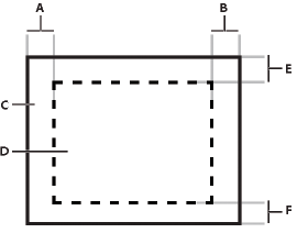
- A.
- Left padding
- B.
- Right padding
- C.
- Container
- D.
- Content area
- E.
- Top padding
- F.
- Bottom padding
Although you can create an entire application by using a single container, typical applications use multiple containers. For example, the following image shows an application that uses three containers:
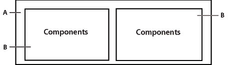
- A.
- Parent container
- B.
- Child containers
In this example, the two child containers are nested within a parent container and are referred to as children of the parent container. The child containers themselves contain child UI components.
The parent container in the previous figure arranges its children in a single horizontal row and oversees the sizing and positioning characteristics of the child containers. For example, you can control the distance, or gap, between children in a container by using the horizontalGap and verticalGap properties. The two child containers are responsible for laying out their own children.
The following image shows the preceding example with the parent container configured to use a vertical layout:
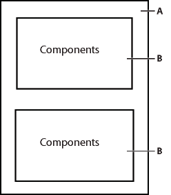
- A.
- Parent container
- B.
- Child containers
The primary use of a container is to arrange its children, where the children are either controls or other containers. The following image shows a Spark Panel container that has three child components:
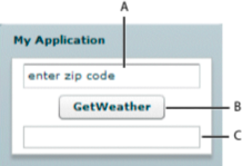
- A.
- TextInput control
- B.
- Button control
- C.
- TextArea control
In this example, a user enters a ZIP code into the TextInput control, and then clicks the Button control to see the current temperature for the specified ZIP code in the TextArea control.
Flex supports form-based applications through its MX Form layout container. In a Form container, Flex can automatically align labels, uniformly size text input controls, and display input error notifications. The following image shows a Form container:
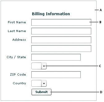
- A.
- Form container
- B.
- TextInput control
- C.
- ComboBox control
- D.
- Button control
Navigator containers, such as the MX TabNavigator and MX Accordion containers, have built-in navigation controls that let you organize information from multiple child containers in a way that makes it easy for a user to move through it. The following image shows an Accordion container:
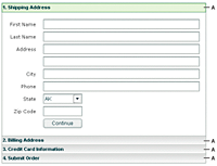
You use the Accordion buttons to move among the different child containers. The Accordion container defines a sequence of child panels, but displays only one panel at a time. To navigate a container, the user clicks the navigation button that corresponds to the child panel that they want to access.
Accordion containers support the creation of multistep procedures. The preceding image shows an Accordion container that defines four panels of a complex form. To complete the form, the user enters data into all four panels. Accordion containers let users enter information in the first panel, click the Accordion button to move to the second panel, and then move back to the first if they want to edit the information. For more information, see Accordion navigator container.
Spark containers
|
Container |
Type |
Description |
For more information |
|---|---|---|---|
|
Application |
Layout |
The first container in an application. The default layout is absolute. |
|
|
BorderContainer |
Layout |
Defines a set of CSS styles that control the appearance of the border and background fill of the container. |
|
|
DataGroup |
Layout |
Simple container that lays out it children, including data items, based on the specified layout. The default layout is absolute. |
The Spark DataGroup and Spark SkinnableDataContainer container |
|
Group |
Layout |
Simple container that lays out it children, including graphic children, based on the specified layout. The default layout is absolute. Flex defines subclasses of Group: HGroup with horizontal layout, VGroup with vertical layout, and TileGroup with tile layout. |
|
|
NavigatorContent |
Layout |
Simple container that can be used in an MX navigator container, such as the ViewStack, TabNavigator and Accordion containers. |
|
|
Panel |
Layout |
Displays a title bar, a caption, a border, and its children. The default layout is absolute. |
|
|
SkinnableContainer |
Layout |
Skinnable container that lays out it children, including graphic children, based on the specified layout. This container supports skinning. The default layout is vertical. |
|
|
SkinnableDataContainer |
Layout |
Skinnable container that lays out it children, including data items, based on the specified layout. This container supports skinning. The default layout is vertical. |
The Spark DataGroup and Spark SkinnableDataContainer container |
|
SkinnablePopUpContainer |
Layout |
Skinnable container that lays out its children in a skinnable container opened as a pop up window. |
|
|
TitleWindow |
Layout |
Skinnable Panel container that is optimized for use as a pop-up window. |
MX containers
The following table describes the MX containers defined in the mx.core and mx.components packages:
|
Container |
Type |
Description |
For more information |
|---|---|---|---|
|
Accordion |
Navigator |
Organizes information in a series of child panels, where one panel is active at any time. |
|
|
Application |
Layout |
The first container in an application. The default layout is absolute. |
|
|
ApplicationControlBar |
Layout |
Holds components that provide global navigation and application commands. Can be docked at the top of an Application container. |
|
|
Box (HBox and VBox) |
Layout |
Displays content in a uniformly spaced row or column. An HBox container horizontally aligns its children; a VBox container vertically aligns its children. It's best to use the Spark containers when possible, instead of the MX Box container. |
|
|
Canvas |
Layout |
Defines a container in which you must explicitly position its children. It's best to use the Spark containers with BasicLayout when possible, instead of the MX Canvas container. |
|
|
ControlBar |
Layout |
Places controls at the lower edge of a Panel or TitleWindow container. |
|
|
DividedBox (HDividedBox and VDividedBox) |
Layout |
Lays out its children horizontally or vertically, much like a Box container, except that it inserts an adjustable divider between the children. |
|
|
Form |
Layout |
Arranges its children in a standard form format. |
|
|
Grid |
Layout |
Arranges children as rows and columns of cells, much like an HTML table. |
|
|
Panel |
Layout |
Displays a title bar, a caption, a border, and its children. It's best to use the Spark Panel container when possible, instead of the MX Panel container. |
|
|
TabNavigator |
Navigator |
Displays a container with tabs to let users switch between different content areas. |
|
|
Tile |
Layout |
Defines a layout that arranges its children in multiple rows or columns. It's best to use the Spark containers with the TileLayout when possible, instead of the MX Tile container. |
|
|
TitleWindow |
Layout |
Displays a popup window that contains a title bar, a caption, border, a close button, and its children. The user can move the container. |
|
|
ViewStack |
Navigator |
Defines a stack of containers that displays a single container at a time. |
Container example
The following example creates an application that uses a Spark Group container with three child controls, where the Group container lays out its children vertically:
<?xml version="1.0"?>
<!-- containers\intro\Panel3Children.mxml -->
<s:Application xmlns:fx="http://ns.adobe.com/mxml/2009"
    xmlns:mx="library://ns.adobe.com/flex/mx"
    xmlns:s="library://ns.adobe.com/flex/spark">

    <s:Group>
        <s:layout>
            <s:VerticalLayout/>
        </s:layout>
        <s:TextInput id="myinput" text="enter zip code"/>
        <s:Button id="mybutton" label="GetWeather"/>
        <s:TextArea id="mytext" height="20"/>
    </s:Group>
</s:Application>
The Group container uses basic layout by default. Use the layout property of a Spark container to configure its layout. In the previous example, you set the layout of the Group container to vertical.
<?xml version="1.0"?>
<!-- containers\intro\Panel3Children.mxml -->
<s:Application xmlns:fx="http://ns.adobe.com/mxml/2009"
    xmlns:mx="library://ns.adobe.com/flex/mx"
    xmlns:s="library://ns.adobe.com/flex/spark">

    <s:VGroup>
        <s:TextInput id="myinput" text="enter zip code"/>
        <s:Button id="mybutton" label="GetWeather"/>
        <s:TextArea id="mytext" height="20"/>
    </s:VGroup>
</s:Application>
To actually retrieve weather information, you must set up a web service, pass it the entered ZIP code from a click event, and use the returned information to populate the TextArea control.
Using container events
|
Spark container |
MX container |
Description |
|---|---|---|
|
elementAdd |
childAdd |
Dispatched after a child is added to the container. |
|
elementRemove |
childRemove |
Dispatched before a child is removed from the container. |
|
childIndexChanged |
Dispatched after a child's index in the container has changed. Spark containers dispatch multiple itemAdd and itemRemove events. |
|
|
scroll |
Dispatched when the user manually scrolls the container. |
|
|
contentCreationComplete |
Dispatched after all container children are created, and before the children dispatch the creationComplete event. This event is not available for Group and DataGroup. |
|
Event |
Description |
|---|---|
|
add |
Dispatched by a component after the component has been added to its container and the parent and the child are in a consistent state. This event is dispatched after the container has dispatched the childAdd event and all changes that need to be made as a result of the addition have happened. |
|
remove |
Dispatched by a component after the component has been removed from its parent container. This event is dispatched after the container has dispatched the childRemove event and all changes that need to be made as a result of the removal have happened. |
|
Event |
Description |
|---|---|
|
preinitialize |
Dispatched when the component has been attached to its parent container, but before the component has been initialized, or any of its children have been created. In most cases, this event is dispatched too early for an application to use to configure a component. |
|
initialize |
Dispatched when a component has finished its construction and its initialization properties have been set. At this point, all the component's immediate children have been created (they have at least dispatched their preinitialize event), but they have not been laid out. Exactly when initialize events are dispatched depends on the container's creation policy. Flex dispatches the initialize event for a container after it attaches all the container's direct child controls and the container's initially required children have dispatched a preinitialize event. When a container or control dispatches the initialize event, its initial properties have been set, but its width and height have not yet been calculated, and its position has not been calculated. The initialize event is useful for configuring a container's children. For example, you can use the container's initialize event to programmatically add children or set a container scroll bar's styles. You can use a container or component's initialize event to initialize the data provider for a control. |
|
creationComplete |
Dispatched when the component, and all its child components, and all their children, and so on, have been created, laid out, and are visible. Flex dispatches the creationComplete event for a container when those children that are initially required are fully processed and drawn on the screen, including all required children of the children, and so on. Create a listener for the creationComplete event, for example, if you must have the children's dimensions and positions in your event handler. Do not use the creationComplete event for actions that set layout properties, as doing so results in excess processing time. |
<?xml version="1.0"?>
<!-- containers\intro\Panel3ChildrenEvent.mxml -->
<s:Application xmlns:fx="http://ns.adobe.com/mxml/2009"
    xmlns:mx="library://ns.adobe.com/flex/mx"
    xmlns:s="library://ns.adobe.com/flex/spark">

    <fx:Script>
        <![CDATA[
            import mx.controls.Alert;

            private function handleCreationComplete():void {
                Alert.show("MyHGroup created.");
            }
        ]]>
    </fx:Script>

    <s:HGroup id="MyHGroup"
        creationComplete="handleCreationComplete();">
        <s:TextInput id="myinput" text="enter zip code"/>
        <s:Button id="mybutton" label="GetWeather"/>
        <s:TextArea id="mytext" height="20"/>
    </s:HGroup>
</s:Application>
To better understand the order in which Flex dispatches events, consider the following application outline.
 OuterSkinnableContainer
 	InnerSkinnableContainer1
 		InnerLabel1
 	InnerSkinnableContainer2
 		InnerLabel2
The preinitialize, initialize, contentCreationComplete, and creationComplete events for the containers and controls are dispatched in the following order. The indentation corresponds to the indentation in the previous outline:
 OuterSkinnableContainer preinitialize
 	InnerSkinnableContainer1 preinitialize
 		InnerLabel1 preinitialize
 		InnerLabel1 initialize
	InnerSkinnableContainer1 contentCreationComplete
 	InnerSkinnableContainer1 initialize
 	InnerSkinnableContainer2 preinitialize
 		InnerLabel2 preinitialize
 		InnerLabel2 initialize
	InnerSkinnableContainer2 contentCreationComplete
  	InnerSkinnableContainer2 initialize
OuterSkinnableContainer contentCreationComplete
 OuterSkinnableContainer initialize
 		InnerLabel2 creationComplete
 		InnerLabel1 creationComplete
 	InnerSkinnableContainer2 creationComplete
 	InnerSkinnableContainer1 creationComplete
 OuterSkinnableContainer creationComplete
Notice that for the terminal controls, such as the Label controls, the controls are preinitialized and then immediately initialized. For containers, preinitialization starts with the outermost container and works inward on the first branch, and then initialization works outward on the same branch. This process continues until all initialization is completed.
Then, the creationComplete event is dispatched first by the leaf components, and then by their parents, and so on, until the application dispatches the creationComplete event. The order of the creationComplete event is the most deeply nested components dispatch the event first, then the next most deeply nested, up to the application container. For components at the same nesting level, the order of the creationComplete events is undefined.
The initialize event is useful with a container that is an immediate child of a navigator container with the ContainerCreationPolicy.AUTO creation policy. For example, by default, when an MX ViewStack is initialized, the first visible child container dispatches an initialize event. Then, as the user moves to each additional child of the container, the event gets dispatched for that child container.
The following example defines an event listener for the creationComplete event, which is dispatched when the user first navigates to Pane 2 of an MX Accordion navigator container:
<?xml version="1.0"?>
<!-- containers\intro\AccordionInitEvent.mxml -->
<s:Application xmlns:fx="http://ns.adobe.com/mxml/2009"
    xmlns:mx="library://ns.adobe.com/flex/mx"
    xmlns:s="library://ns.adobe.com/flex/spark">

    <fx:Script>
        <![CDATA[
            import mx.controls.Alert;

            public function pane2_initialize():void {
                Alert.show("Pane 2 has been created.");
            }
        ]]>
    </fx:Script>

    <mx:Accordion width="200" height="100" creationPolicy="auto">
        <mx:VBox id="pane1" label="Pane 1">
            <mx:Label text="This is pane 1."/>
        </mx:VBox>
        <mx:VBox id="pane2"
            label="Pane 2"
            creationComplete="pane2_initialize();">
            <mx:Label text="This is pane 2."/>
        </mx:VBox>
    </mx:Accordion>
</s:Application>
Disabling containers
All containers support the enabled property. By default, this property is set to true to enable user interaction with the container and with the container's children. If you set enabled to false, Flex dims the color of the container and of all its children, and blocks user input to the container and to all its children.
Defining a default button
You use the defaultButton property of a container to define a default Button control within a container. Pressing the Enter key while focus is on any control activates the Button control as if it was explicitly selected.
For example, a login form displays TextInput controls for a user name and password and a submit Button control. Typically, the user types a user name, tabs to the password field, types the password, and presses the Enter key to submit the login information without explicitly selecting the Button control. To define this type of interaction, set the defaultButton property of the Form control to the id of the submit Button control, as the following example shows:
<?xml version="1.0"?>
<!-- containers\intro\ContainerDefaultB.mxml -->
<s:Application xmlns:fx="http://ns.adobe.com/mxml/2009"
    xmlns:mx="library://ns.adobe.com/flex/mx"
    xmlns:s="library://ns.adobe.com/flex/spark">
    <s:layout>
        <s:VerticalLayout/>
    </s:layout>

    <fx:Script>
        <![CDATA[
            public function submitLogin():void {
                text1.text="You just tried to log in.";
            }
        ]]>
    </fx:Script>

    <s:Panel title="Default Button Example">
        <s:Form defaultButton="{mySubmitBtn}">
            <s:FormItem label="Username:">
                <s:TextInput id="username" width="100"/>
            </s:FormItem>
            <s:FormItem label="Password:">
                <s:TextInput id="password" width="100"
                    displayAsPassword="true"/>
            </s:FormItem>
            <s:FormItem>
                <s:Button id="mySubmitBtn" label="Login"
                    click="submitLogin();"/>
            </s:FormItem>
        </s:Form>
    </s:Panel>
    <s:Label id="text1" width="150"/>
</s:Application>
Spark containers
Spark containers provide a hierarchical structure to arrange and configure their children.
Layout with Spark containers
-
BasicLayout Use absolute positioning, or layout constraints.
-
HorizontalLayout Lay out children in a single horizontal row.
-
TileLayout Lay out children in multiple rows and columns.
-
VerticalLayout Lay out children in a single vertical column.
For example, the default layout of the Group container is BasicLayout, which means you must set the position of each container child. For the SkinnableContainer container, the default layout is BasicLayout. You can use any of the layout classes with the Spark containers.
For more information, see Using Spark Containers.
Skinning Spark containers
The Spark Group, DataGroup, and BorderContainer containers do not support skinning. All other Spark containers support skinning so that you can control the visual aspects of the container.
For more information, see Creating Spark Skins.
Scrolling Spark containers
<?xml version="1.0" encoding="utf-8"?>
<!-- containers\spark\SparkNoViewportNoSB.mxml -->
<s:Application xmlns:fx="http://ns.adobe.com/mxml/2009"
    xmlns:mx="library://ns.adobe.com/flex/mx"
    xmlns:s="library://ns.adobe.com/flex/spark">

    <s:Group width="100" height="100">
        <s:Image width="300" height="400"
            source="@Embed(source='/assets/logo.jpg')"/>
    </s:Group>
</s:Application>
The size of the Image control is larger than that of its parent Group container. By default, the child extends past the boundaries of the parent container.
Rather than allow the child to extend past the boundaries of the parent container, you can clip the child to the container boundaries. With clipping enabled, you can control the part of the underlying image to show in the container. To clip the children to the container boundaries, use a viewport and scroll bars.
Configuring a Spark viewport
A viewport is any class that implements the IViewport interface. The Spark Group and DataGroup containers implement this interface, so they can function as viewports. All subclasses of Group and DataGroup can also function as viewports.
A viewport defines a logical content area that encompasses all of the children of the container. It also defines a rectangular area, called the visible window, of the logical content area. The visible window is the subset of the logical area of a container that you want to display.
The following figure shows a Group container with a child Image control that is larger than the area of the Group container:
- A.
- Group container
- B.
- Area of the visible window
- C.
- Visible window of the Group container that appears in the application
The application user only sees that part of the container enclosed by the visible window.
You use the following properties of the Spark container to configure the viewport:
-
contentHeight and contentWidth specify the size of the logical content area of the container. This is the area occupied by all of the container's children.
-
height and width specify the size of the visible window of the container.
-
verticalScrollPosition and horizontalScrollPosition specify the origin of the visible window in the container's coordinate system. The default value is (0,0) corresponding to the upper-left corner of the container.
-
clipAndEnableScrolling, if true, specifies to clip the children to the boundaries of the container. If false, the container children extend past the container boundaries, regardless of the size specification of the container. The default value is false.
<?xml version="1.0" encoding="utf-8"?>
<!-- containers\spark\SparkViewport.mxml -->
<s:Application xmlns:fx="http://ns.adobe.com/mxml/2009"
    xmlns:mx="library://ns.adobe.com/flex/mx"
    xmlns:s="library://ns.adobe.com/flex/spark">

    <s:Group width="100" height="100"
        clipAndEnableScrolling="true">
        <s:Image width="300" height="400"
            source="@Embed(source='/assets/logo.jpg')"/>
    </s:Group>
</s:Application>
In this example, you set the width and height of the container, corresponding to the visible window, to 100 by 100 pixels.
By default, the visible window is located at the coordinates (0,0) in the container. Use the verticalScrollPosition and horizontalScrollPosition properties to set its location, as the following example shows:
<?xml version="1.0" encoding="utf-8"?>
<!-- containers\spark\SparkViewportSet.mxml -->
<s:Application xmlns:fx="http://ns.adobe.com/mxml/2009"
    xmlns:mx="library://ns.adobe.com/flex/mx"
    xmlns:s="library://ns.adobe.com/flex/spark" >

    <s:Group width="100" height="100"
        horizontalScrollPosition="50" verticalScrollPosition="50"
        clipAndEnableScrolling="true">
        <s:Image width="300" height="400"
            source="@Embed(source='/assets/logo.jpg')"/>
    </s:Group>
</s:Application>
Adding scroll bars to a Spark container

- A.
- Image at full size
- B.
- Image in a container with scroll bars
Add scroll bars to Spark containers in the following ways:
-
For viewport containers such as Group and DataGroup, add HScrollBar and VScrollBar components.
-
For viewport containers such as Group and DataGroup, wrap the container in a Scroller component. The Scroller component displays a single child component with horizontal and vertical scroll bars.
-
For any skinnable Spark container, create a skin for the container that uses the Scroller component. For information on creating a scrollable skin, see Add scroll bars to Spark containers.
<?xml version="1.0" encoding="utf-8"?>
<!-- containers\spark\SparkScrollViewportSetSB.mxml -->
<s:Application xmlns:fx="http://ns.adobe.com/mxml/2009"
    xmlns:mx="library://ns.adobe.com/flex/mx"
    xmlns:s="library://ns.adobe.com/flex/spark" >
    <s:layout>
        <s:HorizontalLayout/>
    </s:layout>

    <s:VGroup>
        <s:Group id="myGroup" width="100" height="100"
            clipAndEnableScrolling="true"
            horizontalScrollPosition="50" verticalScrollPosition="50">
            <s:Image width="300" height="400"
                source="@Embed(source='/assets/logo.jpg')"/>
        </s:Group>
        <s:HScrollBar viewport="{myGroup}" width="100"/>
    </s:VGroup>
    <s:VScrollBar viewport="{myGroup}" height="100"/>
</s:Application>
Use the viewport property of a scroll bar component to specify the viewport associated with it. In this example, you associate the myGroup container with the scoll bars. As you manipulate the HScrollBar component, it modifies the horizontalScrollPosition property of the group container. The VScrollBar component modifies the verticalScrollPosition property.
In the following example, you add scroll bars to the Spark Group container by wrapping the container in the Scroller component:
<?xml version="1.0" encoding="utf-8"?>
<!-- containers\spark\SparkScroll.mxml -->
<s:Application xmlns:fx="http://ns.adobe.com/mxml/2009"
    xmlns:mx="library://ns.adobe.com/flex/mx"
    xmlns:s="library://ns.adobe.com/flex/spark" >

    <s:Scroller width="100" height="100">
        <s:Group>
            <s:Image width="300" height="400"
                source="@Embed(source='/assets/logo.jpg')"/>
        </s:Group>
    </s:Scroller>
</s:Application>
The Scroller component can only wrap a single component. The child of a Scroller tag must implement the IViewport interface, which is implemented by the Spark Group and DataGroup containers.
The Scroller component sets the height and width properties, rather than its child. Alternatively, you can omit the size settings on the Scroller component and let the application determine its size.
To ensure that scroll bars appear, do not set explicit sizes on the child of the Scroller. If you set the size of the child explicitly, then that size becomes the size of the child and no scroll bars appear. Instead, use constraints to size the Scroller (such as setting the height property to 100%).
If the Scroller is unconstrained, it sizes itself to be as big as the viewport. When you constrain the size of the Scroller a size smaller than the child, the Scroller displays scroll bars so that you can view the entire child.
Notice that the Group container did not set the clipAndEnableScrolling property to true. The Scroller component automatically sets the clipAndEnableScrolling property to true for any viewport within it. Scroll bars only appear if required by the viewport.
Use the Scroller.ensureElementIsVisible() method to scroll a component into view. Simply pass the component as an argument to the ensureElementIsVisible() method.
The default skin for the scroll bars defines the minimum height of a vertical scroll bar and the minimum width of a vertical scroll bar as 35 pixels. If the size of the scroll bar is less than 35 pixels, the thumb is hidden.
The default property of the Scroller tag is viewport. The previous example omits this tag, but you can specify it explicitly, as the following example shows:
<?xml version="1.0" encoding="utf-8"?>
<!-- containers\spark\SparkScrollViewport.mxml -->
<s:Application xmlns:fx="http://ns.adobe.com/mxml/2009"
    xmlns:mx="library://ns.adobe.com/flex/mx"
    xmlns:s="library://ns.adobe.com/flex/spark">

    <s:Scroller width="100" height="100">
        <s:viewport>
            <s:Group>
                <s:Image width="300" height="400"
                    source="@Embed(source='/assets/logo.jpg')"/>
            </s:Group>
        </s:viewport>
    </s:Scroller>
</s:Application>
You can combine scroll bars with explicit settings for the container's viewport. The viewport settings determine the initial position of the viewport, and then you can use the scroll bars to move it, as the following example shows:
<?xml version="1.0" encoding="utf-8"?>
<!-- containers\spark\SparkScrollViewportSet.mxml -->
<s:Application xmlns:fx="http://ns.adobe.com/mxml/2009"
    xmlns:mx="library://ns.adobe.com/flex/mx"
    xmlns:s="library://ns.adobe.com/flex/spark" >

    <s:Scroller width="100" height="100">
        <s:Group
            horizontalScrollPosition="50"
            verticalScrollPosition="50">
            <s:Image width="300" height="400"
                source="@Embed(source='/assets/logo.jpg')"/>
        </s:Group>
    </s:Scroller>
</s:Application>
Not all Spark containers implement the IViewPort interface. Therefore, those containers, such as the BorderContainer and SkinnableContainer containers, cannot be used as the direct child of the Scroller component.
However, all Spark containers can have a Scroller component as a child component. For example, to use scroll bars on a child of the Spark BorderContainer container, wrap the child in a Scroller component, as the following example shows:
<?xml version="1.0" encoding="utf-8"?>
<!-- containers\spark\SparkScrollBorder.mxml -->
<s:Application xmlns:fx="http://ns.adobe.com/mxml/2009"
    xmlns:mx="library://ns.adobe.com/flex/mx"
    xmlns:s="library://ns.adobe.com/flex/spark" >

    <s:BorderContainer width="100" height="100"
        borderWeight="3" borderStyle="solid">
        <s:Scroller width="100%" height="100%">
            <s:Group
                horizontalScrollPosition="50"
                verticalScrollPosition="50">
                <s:Image width="300" height="400"
                    source="@Embed(source='/assets/logo.jpg')"/>
            </s:Group>
        </s:Scroller>
    </s:BorderContainer>
</s:Application>
<?xml version="1.0" encoding="utf-8"?>
<!-- containers\spark\SparkScrollBorderOuter.mxml -->
<s:Application xmlns:fx="http://ns.adobe.com/mxml/2009"
    xmlns:mx="library://ns.adobe.com/flex/mx"
    xmlns:s="library://ns.adobe.com/flex/spark" >

    <s:Scroller width="100" height="100">
        <s:Group>
            <s:BorderContainer
                borderWeight="3" borderStyle="solid">
                    <s:Image width="300" height="400"
                        source="@Embed(source='/assets/logo.jpg')"/>
            </s:BorderContainer>
        </s:Group>
    </s:Scroller>
</s:Application>
MX containers
MX containers include layout containers and navigators. MX navigators can only take MX components as children.
Layout with MX containers
All MX containers have a predefined layout. Some containers, such as Application and Panel do let you switch among several possible layouts, but most containers do not. For example, the VBox container always lays out its children in a vertical column, and the Tile container always lays out its children multiple rows and columns.
Skinning MX containers
MX containers support skinning so that you can control the visual aspects of the container. For more information on skinning MX containers, see Creating Skins.
Scrolling MX containers
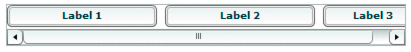
MX containers support automatic scroll bars, which let you display an object that is larger than the available screen space or display more objects than fit in the current size of the container, as the following image shows:
- A.
- Image at full size
- B.
- Image in an HBox container
Automatic scroll bars appear by default when the container children are larger than the container, and the clipContent property of the container is true. The default value of clipContent is true.
In the following example, you use an HBox container to let users scroll an image, rather than rendering the complete image at its full size. In this example, you explicitly set the size of the HBox container to 75 by 75 pixels, a size smaller than the imported image. If you omit the sizing restrictions on the HBox container, it attempts to use its default size, which is a size large enough to hold the image:
<?xml version="1.0"?>
<!-- containers\intro\HBoxScroll.mxml -->
<s:Application xmlns:fx="http://ns.adobe.com/mxml/2009"
    xmlns:mx="library://ns.adobe.com/flex/mx"
    xmlns:s="library://ns.adobe.com/flex/spark">

    <mx:HBox width="75" height="75">
        <mx:Image source="@Embed(source='assets/logo.jpg')"/>
    </mx:HBox>
</s:Application>
By default, Flex draws scroll bars only when the contents of a container are larger than that container. To force the container to draw scroll bars, you can set the horizontalScrollPolicy and verticalScrollPolicy properties to on.
Using container scroll properties
The following container properties and styles control scroll bar appearance and behavior:
-
The horizontalScrollPolicy and verticalScrollPolicy properties control the display of scroll bars. By default, both properties are set to auto, which configures Flex to include scroll bars only when necessary. You can set these properties to on to configure Flex to always include scroll bars, or set the properties to off to configure Flex to never include scroll bars. In ActionScript, you can use constants in the ScrollPolicy class, such as ScrollPolicy.ON, to represent these values.
-
The horizontalLineScrollSize and verticalLineScrollSize properties determine how many pixels to scroll when the user selects the scroll bar arrows. The verticalLineScrollSize property also controls the amount of scrolling when using the mouse wheel. The default value is five pixels.
-
The horizontalPageScrollSize and verticalPageScrollSize properties determine how many pixels to scroll when the user selects the scroll bar track. The default value is 20 pixels.
Note: If the clipContent property is false, a container lets its child extend past its boundaries. Therefore, no scroll bars are necessary, and Flex never displays them, even if you set horizontalScrollPolicy and verticalScrollPolicy to on.
Scroll bar layout considerations
Your configuration of scroll bars can affect the layout of your application. For example, if you set the horizontalScrollPolicy and verticalScrollPolicy properties to on, the container always includes scroll bars, even if they are not necessary. Each scroll bar is 16 pixels wide. Therefore, turning them on when they are not needed is similar to increasing the size of the right and bottom padding of the container by 16 pixels.
If you keep the default values of auto for the horizontalScrollPolicy and verticalScrollPolicy properties, Flex lays out the application as if the properties are set to off. That is, the scroll bars are not counted as part of the layout.
If you do not keep in mind this behavior, your application might have an inappropriate appearance. For example, if you have an HBox container that is 30 pixels high and 100 pixels wide and has two buttons that are each 22 pixels high and 40 pixels wide, the children are contained fully inside the HBox container, and no scroll bars appear. However, if you add a third button, the children exceed the width of the HBox container, and Flex adds a horizontal scroll bar at the bottom of the container. The scroll bar is 16 pixels high, which reduces the height of the content area of the container from 30 pixels to 14 pixels. This means that the Button controls, which are 22 pixels high, are too tall for the HBox, and Flex, by default, adds a vertical scroll bar.
Consider the following example:
<?xml version="1.0"?>
<!-- components\ScrollHBox.mxml -->
<s:Application xmlns:fx="http://ns.adobe.com/mxml/2009"
    xmlns:mx="library://ns.adobe.com/flex/mx"
    xmlns:s="library://ns.adobe.com/flex/spark">

    <mx:HBox width="400">
        <mx:Button label="Label 1"
            width="50%"
            minWidth="200"/>
        <mx:Button label="Label 2"
            width="40%"
            minWidth="150"/>
        <mx:Button label="Label 3"/>
    </mx:HBox>
</s:Application>
In this example, the default width of the fixed-size button is 66 pixels, so there are 324 pixels of space available for the percentage-based buttons after accounting for the gap between components. The minimum widths of the first and second buttons are greater than the percentage-based values, so Flex assigns those buttons the set widths of 200 and 150 pixels, even though the HBox container only has 324 pixels free. The HBox container uses scroll bars to provide access to its contents because they now consume more space than the container itself.

Notice that the addition of the scroll bar doesn't increase the height of the container from its initial value. Flex considers scroll bars in its sizing calculations only if you explicitly set the scroll policy to ScrollPolicy.ON. So, if you use an auto scroll policy (the default), the scroll bar overlaps the buttons. To prevent this behavior, you can set the height property for the HBox container or allow the HBox container to resize by setting a percentage-based width. Remember that changing the height of the HBox container causes other components in your application to move and resize according to their own sizing rules. The following example adds an explicit height and permits you to see the buttons and the scroll bar:
<?xml version="1.0"?>
<!-- components\ScrollHBoxExplicitHeight.mxml -->
<s:Application xmlns:fx="http://ns.adobe.com/mxml/2009"
    xmlns:mx="library://ns.adobe.com/flex/mx"
    xmlns:s="library://ns.adobe.com/flex/spark">

    <mx:HBox width="400" height="42">
        <mx:Button label="Label 1"
            width="50%"
            minWidth="200"/>
        <mx:Button label="Label 2"
            width="40%"
            minWidth="150"/>
        <mx:Button label="Label 3"/>
    </mx:HBox>
</s:Application>
Flex draws the following application:
Alternatively, you can set the HBox control's horizontalScrollPolicy property to ScrollPolicy.ON. This reserves space for the scroll bar during the initial layout pass, so it fits without overlapping the buttons or setting an explicit height. This also correctly handles the situation where the scroll bars change their size when you change skinning or styles. This technique places an empty scroll bar area on the container if it does not need scrolling, however.
Controlling scroll delay and interval
Scroll bars have two styles that affect how they scroll:
-
The repeatDelay style specifies the number of milliseconds to wait after the user selects a scroll button before repeating scrolling.
-
The repeatInterval style specifies the number of milliseconds to wait between each repeated scroll while the user keeps the scroll arrows selected.
These settings are styles of the scroll bar subcontrol, not of the container, and, therefore, require a different treatment than properties such as horizontalScrollPolicy. The following example sets the scroll policy consistently for all scroll bars in the application:
<?xml version="1.0"?>
<!-- containers\intro\HBoxScrollDelay.mxml -->
<s:Application xmlns:fx="http://ns.adobe.com/mxml/2009"
    xmlns:mx="library://ns.adobe.com/flex/mx"
    xmlns:s="library://ns.adobe.com/flex/spark">

    <fx:Style>
        @namespace s "library://ns.adobe.com/flex/spark";
        @namespace mx "library://ns.adobe.com/flex/mx";
        mx|HScrollBar, mx|VScrollBar {
            repeatDelay: 2000;
            repeatInterval:1000;
        }
    </fx:Style>

    <mx:HBox id="hb1" width="75" height="75">
        <mx:Image source="@Embed(source='assets/logo.jpg')"/>
    </mx:HBox>
</s:Application>
This example results in the same scrollable logo as shown in Using scroll bars, but the scroll bars behave differently. When the user clicks and holds the mouse button down over any of the scroll bar arrows or the scroll bar track, the image initially scrolls once, waits two seconds, and then scrolls at a rate of one line or page a second.
To set a style on a single scroll bar, use a line such as the following in the event listener for the initialize event for the application or the control with the scroll bar:
ScrollBar(hb1.horizontalScrollBar).setStyle("repeatDelay", 2000);In this case, hb1 is an HBox control. All containers have horizontalScrollBar and verticalScrollBar properties that represent the container's ScrollBar subcontrols, if they exist. Cast these properties to the ScrollBar class, because their type is the IScrollBar interface, not the ScrollBar class.
Creating and managing container children at run time
You typically use MXML to lay out the user interface of your application, and use ActionScript for event handling and run-time control of the application. You can also use ActionScript to create component instances at run time. For example, you could use MXML to define an empty Accordion container and use ActionScript to add panels to the container in response to user actions.
About the display list and container children
Flash Player maintains a tree of visible (or potentially visible) objects that make up your application. The root of the tree is the Spark Application or MX Application object, and child containers and components are branches and leaf nodes of the tree. That tree is known as the display list. When you add child components to a container or remove child components from a container, you are adding and removing them from the display list. You can also change their relative positions by changing their positions in the display list.
Although the display list is a tree rooted at the top of the application, when you manipulate a container's children by 's methods and properties, you only access the container's direct children. Treat the container's children as items in a list, where the first child has an index of 0.
Using the container API for managing container children
|
Spark container |
MX container |
Description |
|---|---|---|
|
numElements |
numChildren |
Number of children in the container. |
|
addElement() |
addChild() |
Adds a child to the container as the last child. |
|
addElementAt() |
addChildAt() |
Add a child at a specific index in the container. |
|
getChildren() |
Returns an Array containing all children. |
|
|
getElementAt() |
getChildAt() |
Return a child at the specified index. |
|
getChildByName() |
Return a child with the specified id. |
|
|
getElementIndex() |
getChildIndex() |
Returns the index of a child. |
|
removeAllElements() |
removeAllChildren() |
Removes all container children. |
|
removeElement() |
removeChild() |
Remove the first child. |
|
removeElementAt() |
removeChildAt() |
Remove the child at the specified index |
|
setElementIndex() |
setChildIndex() |
Set the index of a child. |
|
swapElements() |
swapChildren() |
Swap the indexes of two children |
|
swapElementsAt() |
swapChildrenAt() |
Swap the indexes of two children. |
Obtaining the number of child components in a container or application
Use the numElements or numChildren property to obtain a count of the number of direct child components that the container has in the display list. The following application gets the number of children in the application and a Group container. The Group control has five label controls, and therefore has five children. The Application container has the Group and Button controls as its children, and therefore has two children.
<?xml version="1.0"?>
<!-- containers\intro\VBoxNumChildren.mxml -->
<s:Application xmlns:fx="http://ns.adobe.com/mxml/2009"
    xmlns:mx="library://ns.adobe.com/flex/mx"
    xmlns:s="library://ns.adobe.com/flex/spark">
    <s:layout>
        <s:VerticalLayout/>
    </s:layout>

    <fx:Script>
      <![CDATA[
            // Import the Alert class.
            import mx.controls.Alert;

            public function calculateChildren():void {
                var myText:String = new String();
                myText="The Group container has " +
                    myGroup.numElements + " children.";
                myText+="\nThe application has " +
                    numElements + " children.";
                Alert.show(myText);
            }
        ]]>
    </fx:Script>

    <s:VGroup id="myGroup">
        <s:Label text="This is label 1."/>
        <s:Label text="This is label 2."/>
        <s:Label text="This is label 3."/>
        <s:Label text="This is label 4."/>
        <s:Label text="This is label 5."/>
    </s:VGroup>

    <s:Button label="Show Children" click="calculateChildren();"/>
</s:Application>
In the main MXML application file, the file that contains the <s:Application> tag, the current scope is always the Application object. Therefore, the reference to the numElements property without an object prefix refers to the numElements property of the Application object. For more information on accessing the root application, see About scope.
Accessing display-only children
The MX Container class defines the rawChildren property that contains the full display list of all the children of a container. This list includes all the container's children, plus the DisplayObjects that implement the container's chrome (display elements), such as its border and the background image.
The numChildren property and accessor methods let you count and access only child components. However, the container might contain style elements and skins, such as the border and background. The container's rawChildren property lets you access all children of a container, including the component "content children" and the skin and style "display children." The object returned by the rawChildren property implements the IChildList interface. You then use methods and properties of this interface, such as getChildAt(), to access and manipulate all the container's children.
Creating and removing components at run time
To create a component instance at run time, you define it, set any properties, and then add it as a child of a parent container by calling the addElement() or addChild() method on the parent container.
The addElement() method has the following signature:
addElement(element:IVisualElement):IVisualElement
The element argument specifies the component to add to the container.
The addChild() method has the following signature:
addChild(child:DisplayObject):DisplayObject
The child argument specifies the component to add to the container.
For example, the following application creates a Group container with an Button control called myButton:
<?xml version="1.0"?>
<!-- containers\intro\ContainerAddChild.mxml -->
<s:Application xmlns:fx="http://ns.adobe.com/mxml/2009"
    xmlns:mx="library://ns.adobe.com/flex/mx"
    xmlns:s="library://ns.adobe.com/flex/spark">

    <fx:Script>
        <![CDATA[
            import spark.components.Button;

            public function addButton():void {
                var myButton:Button = new Button();
                myButton.label = "New Button";
                myGroup.addElement(myButton);
            }
        ]]>
    </fx:Script>
    <s:Group id="myGroup" initialize="addButton();"/>
</s:Application>
This example creates the control when the application is loaded rather than in response to any user action. However, you could add a new button when the user presses an existing button, as the following example shows:
<?xml version="1.0"?>
<!-- containers\intro\ContainerAddChild2.mxml -->
<s:Application xmlns:fx="http://ns.adobe.com/mxml/2009"
    xmlns:mx="library://ns.adobe.com/flex/mx"
    xmlns:s="library://ns.adobe.com/flex/spark">

    <fx:Script>
        <![CDATA[
            import spark.components.Button;

            public function addButton():void {
                var myButton:Button = new Button();
                myButton.label = "New Button";
                myGroup.addElement(myButton);
            }
        ]]>
    </fx:Script>

    <s:HGroup id="myGroup">
        <s:Button label="Add Button" click="addButton();"/>
    </s:HGroup>
</s:Application>
You use the removeElement() or removeChild() method to remove a control from a container. If the child is no longer referenced anywhere else in your application after the call, it gets destroyed by a garbage collection process. The following example removes a button from the application when the user presses it:
<?xml version="1.0"?>
<!-- containers\intro\ContainerRemoveChild.mxml -->
<s:Application xmlns:fx="http://ns.adobe.com/mxml/2009"
    xmlns:mx="library://ns.adobe.com/flex/mx"
    xmlns:s="library://ns.adobe.com/flex/spark">
    <s:layout>
        <s:VerticalLayout/>
    </s:layout>
    <fx:Script>
        <![CDATA[
            public function removeButton():void {
                myGroup.removeElement(myButton);
            }

            private function resetApp():void {
                if (myGroup.numElements == 0) {
                    myGroup.addElement(myButton);
                }
            }
        ]]>
    </fx:Script>

    <s:Group id="myGroup">
        <s:Button id="myButton"
            label="Remove Me"
            click="removeButton();"/>
    </s:Group>
    <s:Button label="Reset" click="resetApp();"/>
</s:Application>
For additional methods that you can use with container children, see the ActionScript 3.0 Reference for Apache Flex.
Example: Creating and removing a child of a container
The following example uses MXML to define a container that contains two Button controls. You use one Button control to add an CheckBox control to the container, and one Button control to delete it.
<?xml version="1.0"?>
<!-- containers\intro\ContainerComponentsExample.mxml -->
<s:Application xmlns:fx="http://ns.adobe.com/mxml/2009"
    xmlns:mx="library://ns.adobe.com/flex/mx"
    xmlns:s="library://ns.adobe.com/flex/spark">

    <fx:Script>
      <![CDATA[

        // Import the CheckBox class.
        import spark.components.CheckBox;

        // Define a variable to hold the new CheckBox control.
        private var myCheckBox:CheckBox;

        // Define a variable to track if the CheckBox control
        // is in the display list.
        private var checkBoxDisplayed:Boolean = false;

        public function addCB():void {
            // Make sure the check box isn't being displayed.
            if(checkBoxDisplayed==false){
                // Create the check box if it does not exist.
                if (!myCheckBox) {
                    myCheckBox = new CheckBox();
                }

                // Add the check box.
                myCheckBox.label = "New CheckBox";
                myGroup.addElement(myCheckBox);
                checkBoxDisplayed=true;
            }
        }

        public function delCB():void {
            // Make sure a CheckBox control exists.
            if(checkBoxDisplayed){
                myGroup.removeElement(myCheckBox);
                checkBoxDisplayed=false;
            }
        }
      ]]>
    </fx:Script>

    <s:VGroup id="myGroup">
        <s:Button label="Add CheckBox"
            click="addCB();"/>
        <s:Button label="Remove CheckBox"
            click="delCB();"/>
    </s:VGroup>
</s:Application>
Example: Creating and removing children of an Accordion container
<?xml version="1.0"?>
<!-- containers\intro\ContainerComponentsExample2.mxml -->
<s:Application xmlns:fx="http://ns.adobe.com/mxml/2009"
    xmlns:mx="library://ns.adobe.com/flex/mx"
    xmlns:s="library://ns.adobe.com/flex/spark">

    <fx:Script>
        <![CDATA[

            /* Import HBox class. */
            import mx.containers.HBox;

            /* Array of created containers. */
            private var myHBoxes:Array = [];

            public function addHBox():void {
                /* Create new HBox container. */
                var newHBox:HBox = new HBox();
                newHBox.label="Label: " + String(myHBoxes.length);

                /* Add it to the Accordion container, and to the
                   Array of HBox containers. */
                myHBoxes.push(myAcc.addChild(newHBox));
            }

            public function delHBox():void {
                /* If there is at least one HBox container in the Array,
                   remove it. */
                if (myHBoxes.length>= 1) {
                    myAcc.removeChild(myHBoxes.pop());
                }
            }
      ]]>
    </fx:Script>

    <s:VGroup>
        <mx:Accordion id="myAcc" height="150" width="150">
            <mx:HBox/>
        </mx:Accordion>

        <s:Button label="Add HBox" click="addHBox();"/>
        <s:Button label="Remove HBox" click="delHBox();"/>
    </s:VGroup>
</s:Application>
Controlling child order
You can control the order of children by adding them in a specific order. You can also control them as follows:
-
By using the addElementAt() or addChildAt() method to specify where among the component's children to add a child
Note: As with the addChild() method, although the child argument of the addChildAt() method is specified as type DisplayObject, the argument must implement the IUIComponent interface to be added as a child of a container. All Flex components implement this interface. -
By using the setElementAt() or setChildIndex() method to specify the location of a specific child among a component's children in the display list
The following example modifies the previous example. It uses the addElementAt() method to add the CheckBox control as the first child (index 0) of the VGroup. It also has a Reorder children button that uses the setChildIndex() method to move a CheckBox control down the display list until it is the last child in the VGroup container.
<?xml version="1.0"?>
<!-- containers\intro\ContainerComponentsReorder.mxml -->
<s:Application xmlns:fx="http://ns.adobe.com/mxml/2009"
    xmlns:mx="library://ns.adobe.com/flex/mx"
    xmlns:s="library://ns.adobe.com/flex/spark">

    <fx:Script>
      <![CDATA[

        // Import the CheckBox and Alert classes.
        import spark.components.CheckBox;
        import mx.controls.Alert;

        // Define a variable to hold the new CheckBox control.
        private var myCheckBox:CheckBox;

        // Define a variable to track if the CheckBox control
        // is in the display list.
        private var checkBoxDisplayed:Boolean = false;

        public function addCB():void {
            // Make sure the check box isn't being displayed.
            if(checkBoxDisplayed==false){
                // Create the check box if it does not exist.
                if (!myCheckBox) {
                    myCheckBox = new CheckBox();
                }
                // Add the check box as the first child of the container.
                myCheckBox.label = "New CheckBox";
                myGroup.addElementAt(myCheckBox, 0);
                checkBoxDisplayed=true;
            }
        }

        public function delCB():void {
            // Make sure a CheckBox control exists.
            if(checkBoxDisplayed){
                myGroup.removeElement(myCheckBox);
                checkBoxDisplayed=false;
            }
        }

        public function reorder():void {
        // Make sure a CheckBox control exists.
            if(checkBoxDisplayed==true)
            {
                // Don't try to move the check box past the end
                // of the children. Because indexes are 0 based,
                // the last child index is one less
                // than the number of children.
                if (myGroup.getElementIndex(myCheckBox) < myGroup.numElements-1)
                {
                    // Increment the checkBoxIndex variable and use it to
                    // set the index of the check box among the VBox children.
                    myGroup.setElementIndex(myCheckBox,
                        myGroup.getElementIndex(myCheckBox) + 1);
                }
            }
            else {
                Alert.show("Add the check box before you can move it");
            }
        }
      ]]>
    </fx:Script>

    <s:VGroup id="myGroup">
        <s:Button label="Add CheckBox" click="addCB();"/>
        <s:Button label="Remove CheckBox" click="delCB();"/>
        <s:Button label="Reorder children" click="reorder();"/>
    </s:VGroup>
</s:Application>
Flex coordinate systems
In your application, you might have to determine the location of a component, or modify its location at run time. Adobe Flash and Flex support three coordinate systems for different purposes:
-
global
-
local
-
content
You can use Flex properties and methods to convert between coordinate systems.
About the coordinate systems
The following table describes the coordinate systems:
|
Coordinate system |
Description |
|---|---|
|
global |
Coordinates are relative to the upper-left corner of the Stage in Adobe Flash Player and Adobe® AIR™, that is, the outermost edge of the application. The global coordinate system provides a universal set of coordinates that are independent of the component context. Uses for this coordinate system include determining distances between objects and as an intermediate point in converting between coordinates relative to a subcontrol into coordinates relative to a parent control. The MouseEvent class includes stageX and stageY properties that are in the global coordinate system. |
|
local |
Coordinates are relative to the upper-left corner of the component. Flex uses the local coordinate system for mouse pointer locations; all components have mouseX and mouseY properties that use the local coordinate system. The MouseEvent class includes localX and localY properties that are in the local coordinate system. Also, the Drag Manager uses local coordinates in drag-and-drop operations. The doDrag() method's xOffset and yOffset properties, for example, are offsets relative to the local coordinates. |
|
content |
Coordinates are relative to the upper-left corner of the component's content. Unlike the local and global coordinates, the content coordinates include all the component's content area, including any regions that are currently clipped and must be accessed by scrolling the component. Thus, if you scrolled down a Canvas container by 100 pixels, the upper-left corner of the visible content is at position 0, 100 in the content coordinates. You use the content coordinate system to set and get the positions of children of a container that uses absolute positioning. (For more information on absolute positioning, see About component positioning.) The UIComponent contentMouseX and contentMouseY properties report the mouse pointer location in the content coordinate system. |
The following image shows these coordinate systems and how they relate to each other.
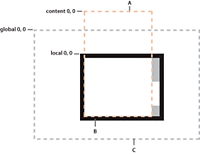
- A.
- Content bounds
- B.
- Component bounds
- C.
- Stage bounds
Using coordinate properties and methods
In some cases, you have to convert positions between coordinate systems. Examples where you convert between coordinates include the following:
-
The MouseEvent class has properties that provide the mouse position in the global coordinate system and the local coordinates of the event target. You use the content coordinates to specify the locations in any container that uses absolute positioning, such as an MX Canvas container or a Spark container that uses the BasicLayout class. To determine the location of the mouse event within the Canvas container contents, not just the visible region, determine the position in the content coordinate system.
-
Custom drag-and-drop handlers might have to convert between the local coordinate system and the content coordinate system when determining an object-specific drag action; for example, if you have a control with scroll bars and you want to know the drag (mouse) location over the component contents. The example in Example: Using the mouse position in a Canvas container shows this use.
-
Custom layout containers, where you include both visual elements, such as scroll bars or dividers, and content elements. For example, if you have a custom container that draws lines between its children, you have to know where each child is in the container's content coordinates to draw the lines.
Often, you use mouse coordinates in event handlers; when you do, you should keep in mind the following considerations:
-
When you handle mouse events, it is best to use the coordinates from the MouseEvent object whenever possible, because they represent the mouse coordinates at the time the event was generated. Although you can use the container's contentMouseX and contentMouseY properties to get the mouse pointer locations in the content coordinate system, you should, instead, get the local coordinate values from the event object and convert them to the content coordinate system.
-
When you use local coordinates that are reported in an event object, such as the MouseEvent localX and localY properties, remember that the event properties report the local coordinates of the mouse relative to the event target. The target component can be a subcomponent of the component in which you determine the position, such as a UITextField inside a Button component, not the component itself. In such cases, convert the local coordinates into the global coordinate system first, and then convert the global coordinates into the content coordinates container.
|
Property or method |
Description |
|---|---|
contentMouseX |
Returns the x position of the mouse, in the content coordinates of the component. |
contentMouseY |
Returns the y position of the mouse, in the content coordinates of the component. |
contentToGlobal (point:Point):Point |
Converts a Point object with x and y coordinates from the content coordinate system to the global coordinate system. |
contentToLocal (point:Point):Point |
Converts a Point object from the content coordinate system to the local coordinate system of the component. |
globalToContent (point:Point):Point |
Converts a Point object from the global coordinate system to the content coordinate system of the component. |
globalToLocal (point:Point):Point |
Converts a Point object from the global coordinate system to the local coordinate system of the component. |
localToContent (point:Point):Point |
Converts a Point object from the local coordinate system to the content coordinate system of the component. |
localToGlobal (point:Point):Point |
Converts a Point object from the local coordinate system to the global coordinate system. |
Example: Using the mouse position in a Canvas container
The following example shows the use of the localToGlobal() and globalToContent() methods to determine the location of a mouse pointer within a Canvas container that contains multiple child Canvas containers.
This example is artificial, in that production code would use the MouseEvent class stageX and stageY properties, which represent the mouse position in the global coordinate system. The example uses the localX and localY properties, instead, to show how you can convert between local and content coordinates, including how first converting to using the global coordinates ensures the correct coordinate frame of reference.
<?xml version="1.0"?>
<!-- containers\intro\MousePosition.mxml -->
<s:Application xmlns:fx="http://ns.adobe.com/mxml/2009"
    xmlns:mx="library://ns.adobe.com/flex/mx"
    xmlns:s="library://ns.adobe.com/flex/spark">

    <fx:Script>
        <![CDATA[
          import mx.controls.Alert;

          // Handle the mouseDown event generated
          // by clicking in the application.
          private function handleMouseDown(event:MouseEvent):void {

            // Convert the mouse position to global coordinates.
            // The localX and localY properties of the mouse event contain
            // the coordinates at which the event occurred relative to the
            // event target, typically one of the
            // colored internal Canvas containers.
            // A production version of this example could use the stageX
            // and stageY properties, which use the global coordinates,
            // and avoid this step.
            // This example uses the localX and localY properties only to
            // illustrate conversion between different frames of reference.
            var pt:Point = new Point(event.localX, event.localY);
            pt = event.target.localToGlobal(pt);

            // Convert the global coordinates to the content coordinates
            // inside the outer c1 Canvas container.
            pt = c1.globalToContent(pt);

            // Figure out which quadrant was clicked.
            var whichColor:String = "border area";

            if (pt.x < 150) {
                if (pt.y < 150)
                    whichColor = "red";
                else
                    whichColor = "blue";
            }
            else {
                if (pt.y < 150)
                    whichColor = "green";
                else
                    whichColor = "magenta";
            }

            Alert.show("You clicked on the " + whichColor);
          }
        ]]>
    </fx:Script>

    <!-- Canvas container with four child Canvas containers -->
    <mx:Canvas id="c1"
        borderStyle="none"
        width="300" height="300"
        mouseDown="handleMouseDown(event);">

        <mx:Canvas
            width="150" height="150"
            x="0" y="0"
            backgroundColor="red">
            <mx:Button label="I'm in Red"/>
        </mx:Canvas>
        <mx:Canvas
            width="150" height="150"
            x="150" y="0"
            backgroundColor="green">
            <mx:Button label="I'm in Green"/>
        </mx:Canvas>
        <mx:Canvas
            width="150" height="150"
            x="0" y="150"
            backgroundColor="blue">
            <mx:Button label="I'm in Blue"/>
        </mx:Canvas>
        <mx:Canvas
            width="150" height="150"
            x="150" y="150"
            backgroundColor="magenta">
            <mx:Button label="I'm in Magenta"/>
        </mx:Canvas>
    </mx:Canvas>
</s:Application>
Navigation
Adobe, Adobe AIR, Adobe Flash, Adobe Flash Platform and Adobe Flash Player are either registered trademarks or trademarks of Adobe Systems Incorporated in the United States and/or other countries and are used by permission from Adobe. No other license to the Adobe trademarks are granted.