
Visual components
You use visual components to build Flex applications. Visual components have a flexible set of characteristics that let you control and configure them as necessary to meet your application's requirements.
About visual components
Flex includes a component-based development model that you use to develop your application and its user interface. You can use the prebuilt visual components included with Flex, extend components to add new properties and methods, and create components as required by your application.
Visual components are extremely flexible and provide you with a great deal of control over the component's appearance, how the component responds to user interactions, the font and size of any text included in the component, the size of the component in the application, and many other characteristics.
The characteristics of visual components include the following:
- Size
-
Height and width of a component. All visual components have a default size. You can use the default size, specify your own size, or let Flex resize a component as part of laying out your application.
- Events
-
Application or user actions that require a component response. Events include component creation, mouse actions such as moving the mouse over a component, and button clicks.
- Styles
-
Characteristics such as font, font size, and text alignment. These are the same styles that you define and use with Cascading Style Sheets (CSS).
- Effects
-
Visible or audible changes to the component triggered by an application or user action. Examples of effects are moving or resizing a component based on a mouse click.
- Skins
-
Classes that control a visual component's appearance.
Spark and MX components
Flex defines two sets of components: Spark and MX. The Spark components are new for Flex 4 and are defined in the spark.* packages. The MX components shipped in previous releases of Flex and are defined in the mx.* packages.
The main differences between Spark and MX components are how you use CSS styles with the components and how you skin them. For the container components, there are additional differences about how the containers perform layout.
Spark and MX define some of the same components. For example, Spark defines a button control in the spark.components package, and MX defines a button control in the mx.controls package. When a component is available in both Spark and MX, it's best to use the Spark component.
Spark and MX also define components that are unique. For example, Spark defines components to perform three dimensional effects. MX defines data visualization components, such as the DataGrid and AdvancedDataGrid controls, not included in Spark. Your applications often contains a mixture of Spark and MX components.
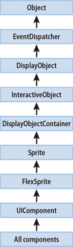
Class hierarchy for visual components
Flex visual components are implemented as a class hierarchy in ActionScript. Therefore, each visual component in your application is an instance of an ActionScript class. The following image shows this hierarchy in detail up to the Object class:
All visual components are derived from the UIComponent class and its superclasses, the Flex Sprite through Object classes, and inherit the properties and methods of their superclasses. In addition, visual components inherit other characteristics of the superclasses, including event, style, and effect definitions.
Using the UIComponent class
The UIComponent class is the base class for all Flex visual components. For detailed documentation, see UIComponent in the ActionScript 3.0 Reference for Apache Flex.
Commonly used UIComponent properties
The following table lists only the most commonly used properties of components that extend the UIComponent class:
|
Property |
Type |
Description |
|---|---|---|
doubleClickEnabled |
Boolean |
Setting to true lets the component dispatch a doubleClickEvent when a user presses and releases the mouse button twice in rapid succession over the component. |
enabled |
Boolean |
Setting to true lets the component accept keyboard focus and mouse input. The default value is true. If you set enabled to false for a container, Flex dims the color of the container and all of its children, and blocks user input to the container and to all its children. |
height |
Number |
The height of the component, in pixels. In MXML tags, but not in ActionScript, you can set this property as a percentage of available space by specifying a value such as 70%; in ActionScript, you must use the percentHeight property. The property always returns a number of pixels. In ActionScript, you use the perCent |
id |
String |
Specifies the component identifier. This value identifies the specific instance of the object and should not contain any white space or special characters. Each component in a Flex document must have a unique id value. For example, if you have two custom components, each component can include one, and only one Button control with the id "okButton". |
percentHeight |
Number |
The height of the component as a percentage of its parent container, or for the Application container, the full height of the browser. Returns NaN if a percent-based width has never been set or if a height property was set after the percentHeight was set. |
percentWidth |
Number |
The width of the component as a percentage of its parent container, or for the Application container, the full span of the browser. Returns NaN if a percent-based width has never been set or if a width property was set after the percentWidth was set. |
styleName |
String |
Specifies the style class selector to apply to the component. |
toolTip |
String |
Specifies the text string displayed when the mouse pointer hovers over that component. |
visible |
Boolean |
Specifies whether the container is visible or invisible. The default value is true, which specifies that the container is visible. |
width |
Number |
The width of the component, in pixels. In MXML tags, but not in ActionScript, you can set this property as a percentage of available space by specifying a value such as 70%; in ActionScript, you must use the percentWidth property. The property always returns a number of pixels. |
x |
Number |
The component's x position within its parent container. Setting this property directly has an effect only if the parent container uses absolute positioning. |
y |
Number |
The component's y position within its parent container. Setting this property directly has an effect only if the parent container uses absolute positioning. |
Using components in MXML and ActionScript
Every Flex component has an MXML API and an ActionScript API. A component's MXML tag attributes are equivalent to its ActionScript properties, styles, effects, and events. You can use both MXML and ActionScript when working with components.
Configure a component
-
Set the value of a component property, event, style, or effect declaratively in an MXML tag, or at run time in ActionScript code.
-
Call a component's methods at run time in ActionScript code. The methods of an ActionScript class are not exposed in the MXML API.
The following example creates a Spark Button control in MXML. When the user clicks the Button control, it updates the text of a Spark TextArea control by using an ActionScript function.
<?xml version="1.0"?>
<!-- components\ButtonApp.mxml -->
<s:Application xmlns:fx="http://ns.adobe.com/mxml/2009"
    xmlns:s="library://ns.adobe.com/flex/spark"
    xmlns:mx="library://ns.adobe.com/flex/mx">
    <s:layout>
        <s:VerticalLayout/>
    </s:layout>

    <fx:Script>
        <![CDATA[
            public function handleClick():void {
                text1.text="Thanks for the click!";
            }
        ]]>
    </fx:Script>

    <s:Button id="button1"
        label="Click here!"
        width="100"
        fontSize="12"
        click="handleClick();"/>
    <s:TextArea id="text1"/>
</s:Application>
This example has the following elements:
-
The id property is inherited by the Button control from the UIComponent class. You use it to specify an identifier for the component. This property is optional, but you must specify it if you want to access the component in ActionScript.
-
The label property is defined by the Button control. It specifies the text that appears in the button.
-
The width property is inherited from the UIComponent class. It optionally specifies the width of the button, in pixels.
-
The Button control dispatches a click event when a user presses and releases the main mouse button. The MXML click attribute specifies the ActionScript code to execute in response to the event.
-
The fontSize style is inherited from the UIComponent class. It specifies the font size of the label text, in pixels.
The click event attribute can also take ActionScript code directly as its value, without your having to specify it in a function. Therefore, you can rewrite this example as the following code shows:
<?xml version="1.0"?>
<!-- components\ButtonAppAS.mxml -->
<s:Application xmlns:fx="http://ns.adobe.com/mxml/2009"
    xmlns:s="library://ns.adobe.com/flex/spark"
    xmlns:mx="library://ns.adobe.com/flex/mx">
    <s:layout>
        <s:VerticalLayout/>
    </s:layout>

    <s:Button id="button1"
        label="Click here!"
        width="100"
        fontSize="12"
        click="text1.text='Thanks for the click!';"/>

    <s:TextArea id="text1"/>
</s:Application>
Initializing components at run time
Flex uses MXML property attributes to initialize your components. However, you might want to use some logic to determine initial values at run time. For example, you might want to initialize a component with the current date or time. Flex must calculate this type of information when the application executes.
Every component dispatches several events during its life cycle. In particular, all components dispatch the following events that let you specify ActionScript to initialize a component:
- preInitialize
-
Dispatched when a component has been created in a rough state, and no children have been created.
- initialize
-
Dispatched when a component and all its children have been created, but before the component size has been determined.
- creationComplete
-
Dispatched when the component has been laid out and the component is visible (if appropriate).
You can use the initialize event to configure most component characteristics; in particular, use it to configure any value that affects the component's size. Use the creationComplete event if your initialization code must get information about the component layout.
The following example configures Flex to call the initDate() function when it initializes the Label control. When Flex finishes initializing the Label control, and before the application appears, Flex calls the initDate() function.
<?xml version="1.0"?>
<!-- components\LabelInit.mxml -->
<s:Application xmlns:fx="http://ns.adobe.com/mxml/2009"
    xmlns:s="library://ns.adobe.com/flex/spark"
    xmlns:mx="library://ns.adobe.com/flex/mx">

    <fx:Script>
        <![CDATA[
            private function initDate():void {
                label1.text += new Date();
            }
        ]]>
    </fx:Script>

    <s:VGroup>
        <s:Label id="label1"
            text="Today's Date: "
            initialize="initDate();"/>
    </s:VGroup>
</s:Application>
You can also express the previous example without a function call by adding the ActionScript code in the component's definition. The following example does the same thing, but without an explicit function call:
<?xml version="1.0"?>
<!-- components\LabelInitAS.mxml -->
<s:Application xmlns:fx="http://ns.adobe.com/mxml/2009"
    xmlns:s="library://ns.adobe.com/flex/spark"
    xmlns:mx="library://ns.adobe.com/flex/mx">

    <s:VGroup>
        <s:Label id="label1"
            text="Today's Date:"
            initialize="label1.text += new Date();"/>
    </s:VGroup>
</s:Application>
As with other calls that are embedded within component definitions, you can add multiple ActionScript statements to the initialize MXML attribute by separating each function or method call with a semicolon. The following example calls the initDate() function and writes a message in the flexlog.txt file when the label1 component is instantiated:
<?xml version="1.0"?>
<!-- components\LabelInitASAndEvent.mxml -->
<s:Application xmlns:fx="http://ns.adobe.com/mxml/2009"
    xmlns:s="library://ns.adobe.com/flex/spark"
    xmlns:mx="library://ns.adobe.com/flex/mx">

    <fx:Script>
        <![CDATA[
            private function initDate():void {
                label1.text += new Date();
            }
        ]]>
    </fx:Script>

    <s:VGroup>
        <s:Label id="label1"
            text="Today's Date:"
            initialize="initDate(); trace('The label is initialized!');"/>
    </s:VGroup>
</s:Application>
By default, on Microsoft Windows, the flexlog.txt file is written to C:\Documents and Settings\USERNAME\Application Data\Macromedia\Flash Player\Logs. For the location of this file on other operating systems, see Editing the mm.cfg file.
Configuring components: syntax summary
The following table summarizes the MXML and ActionScript component APIs that you use to configure components:
|
|
MXML example |
ActionScript example |
|---|---|---|
|
Read-write property |
<s:Panel id="p1" title="My Title" visible="true"/> |
p1.title="My Title"; tile1.visible=true; |
|
Read-only property |
You cannot use a read-only property as an attribute in MXML. |
To get the value of a read-only property: var theClass:String=mp1.className; |
|
Method |
Methods are not available in MXML. |
myList.sortItemsBy("data", "DESC");
|
|
Event |
<mx:Accordion id="myAcc"
	change="changeHandler (event);"/>
You must also define a changeHandler() function as shown in the ActionScript example. |
private function changeHandler(event:MouseEvent):void
{...}
myButton.addEventListener("click", changeHandler);
|
|
Style |
<s:Panel id="p1" borderAlpha="0.5" borderColor="blue"/> |
To set the style: p1.setStyle("borderAlpha", 0.5);
p1.setStyle("borderColor", 'blue');
To get the style: var currentBorderAlpha:Number = p1.getStyle("borderAlpha");.
|
|
Effect |
<s:Panel id="p1" show="scale.end();scale.play();"/> |
Call the effect's end() and play() methods in an event handler:. |
Sizing visual components
The Flex sizing and layout mechanisms provide several ways for you to control the size of visual components:
- Default sizing
-
Automatically determines the sizes of controls and containers. To use default sizing, you do not specify the component's dimensions or layout constraints.
- Explicit sizing
-
You set the height and width properties to pixel values. When you do this, you set the component dimension to absolute sizes, and Flex does not override these values. The following <s:Application> tag, for example, sets explicit Application dimensions:
 <s:Application xmlns:fx="http://ns.adobe.com/mxml/2009"
	xmlns:s="library://ns.adobe.com/flex/spark"
	xmlns:mx="library://ns.adobe.com/flex/mx"
 	height="300"
 	width="600">
- Percentage-based sizing
-
You specify the component size as a percentage of its container size. To do this, you specify the percentHeight and percentWidth properties, or, in an MXML tag, set the height and width properties to percentage values such as 100%. The following code, for example, sets percentage-based dimensions for an HGroup container:
 <s:HGroup id="hGroup1"
 	height="30%" width="90%"/>
The following ActionScript line resets the HGroup width to a different percentage value:
hGroup1.percentWidth=40;
- Constraint-based layout
-
You can control size and position by anchoring components sides, centers, or baselines to locations in their container by specifying the top, bottom, left, right, baseline, horizontalCenter, and verticalCenter styles. You can use constraint-based layout only for the children of a container that uses absolute layout. That includes all Spark containers and the MX Application, Panel, and Canvas containers. The following example uses constraint-based layout to position an HGroup horizontally, and explicit sizing and positioning to determine the vertical width and position:
 <s:HGroup id="hGroup2"
 	left="30"right="30"
 	y="150"
 	height="100"/>
You can mix sizing techniques; however, you must ensure that the mix is appropriate. Do not specify more than one type of sizing for a component dimension; for example, do not specify a height and a percentHeight for a component. Also, ensure that the resulting sizes are appropriate; for example, if you do not want scroll bars or clipped components, ensure that the sizes of a container's children do not exceed the container size.
For detailed information on how Flex sizes components, and how you can specify sizing, see Laying out components.
Examples of component sizing
The following example shows sizing within an explicitly sized container when some of the container's child controls are specified with explicit widths and some with percentage-based widths. It shows the flexibility and the complexities involved in determining component sizes. The application logs the component sizes to flashlog.txt, so you can confirm the sizing effect.
<?xml version="1.0"?>
<!-- components\CompSizing.mxml -->
<s:Application xmlns:fx="http://ns.adobe.com/mxml/2009"
    xmlns:s="library://ns.adobe.com/flex/spark"
    xmlns:mx="library://ns.adobe.com/flex/mx"
    creationComplete="logSizes();">

    <fx:Script>
        <![CDATA[
            private function logSizes():void {
                trace("HGroup: "+ hb1.width);
                trace("Label: "+ lb1.width);
                trace("Image: "+ img1.width);
                trace("Button: "+ b1.width);
            }
        ]]>
    </fx:Script>

    <s:HGroup id="hb1" width="250">
        <s:Label id="lb1"
            text="Hello"
            width="50"/>
        <mx:Image id="img1"
            source="@Embed(source='assets/flexlogo.jpg')"
            width="75%"/>
        <s:Button id="b1"
            label="Button"
            width="25%"/>
    </s:HGroup>
</s:Application>
The application consists of a 250-pixel-wide HGroup container that contains a 50-pixel-wide label, an image that requests 75% of the container width, and a button that requests 25% of the container width. The component sizes are determined as follows:
-
Flex reserves 50 pixels for the explicitly sized Label control.
-
Flex puts an 6-pixel gap between components in an HGroup container by default, so it reserves 12 pixels for the gaps; this leaves 188 pixels available for the two percentage-based components.
-
The minimum width of the Button component, if you do not specify an explicit width, fits the label text plus padding around it. In this case, the minimum size is 70 pixels. However, since you specified the width as 25%, Flex reserves 25% of the available 188 pixels, or 47 pixels, for the Button control.
-
The percentage-based image requests 75% of 188 pixels, or 141 pixels.
If you change the button and image size properties to 50%, each get 50% of the available space, or 94 pixels.
The following example uses explicit sizing for the Image control and default sizing for the Button control:
<?xml version="1.0"?>
<!-- components\CompSizingExplicit.mxml -->
<s:Application xmlns:fx="http://ns.adobe.com/mxml/2009"
    xmlns:s="library://ns.adobe.com/flex/spark"
    xmlns:mx="library://ns.adobe.com/flex/mx"
    creationComplete="logSizes();">

    <fx:Script>
        <![CDATA[
            private function logSizes():void {
                trace("HGroup: "+ hb1.width);
                trace("Label: "+ lb1.width);
                trace("Image: "+ img1.width);
                trace("Button: "+ b1.width);
            }
        ]]>
    </fx:Script>

    <s:HGroup id="hb1" width="250">
        <s:Label id="lb1"
            text="Hello"
            width="50"/>
        <mx:Image id="img1"
            source="@Embed(source='assets/flexlogo.jpg')"
            width="119" />
        <s:Button id="b1"
            label="Button"/>
    </s:HGroup>
</s:Application>
Percentage-based sizing removes the need to explicitly consider the gaps and margins of a container in sizing calculations, but its greatest benefit applies when containers resize. Then, the percentage-based children resize automatically based on the available container size. In the following example, the series of controls on the left resize as you resize your browser, but the corresponding controls on the right remain a fixed size because their container is fixed. Click the first Button control to log the component sizes to flashlog.txt.
<?xml version="1.0"?>
<!-- components\CompSizingPercent.mxml -->
<s:Application xmlns:fx="http://ns.adobe.com/mxml/2009"
    xmlns:s="library://ns.adobe.com/flex/spark"
    xmlns:mx="library://ns.adobe.com/flex/mx">

    <fx:Script>
        <![CDATA[
            private function logSizes():void {
                trace("HGroup: "+ hb1.width);
                trace("Label: "+ lb1.width);
                trace("Image: "+ img1.width);
                trace("Button: "+ b1.width);
            }
        ]]>
    </fx:Script>

    <s:HGroup width="100%">
        <s:HGroup id="hb1" width="40%">
            <s:Label id="lb1"
                text="Hello"
                width="50"/>
            <mx:Image id="img1"
                source="@Embed(source='assets/flexlogo.jpg')"
                width="60%"/>
            <s:Button id="b1"
                label="Button"
                width="40%"
                click="logSizes();"/>
        </s:HGroup>

        <s:HGroup width="260">
            <s:Label
                text="Hello"
                width="50"/>
            <mx:Image
                source="@Embed(source='assets/flexlogo.jpg')"
                width="119" />
            <s:Button
                label="Button"/>
        </s:HGroup>
    </s:HGroup>
</s:Application>
For more information about sizing considerations, see Sizing components.
Handling events
Flex applications are event driven. Events let a programmer know when the user has interacted with an interface component, and also when important changes have happened in the appearance or life cycle of a component, such as the creation or destruction of a component or its resizing.
When an instance of a component dispatches an event, objects that have registered as listeners for that event are notified. You define event listeners, also called event handlers, in ActionScript to process events. You register event listeners for events either in the MXML declaration for the component or in ActionScript. For additional examples of the event handling, see Using components in MXML and ActionScript.
The following example registers an event listener in MXML that is processed when you change views in an Accordion container.
<?xml version="1.0"?>
<!-- components\CompIntroEvent.mxml -->
<s:Application xmlns:fx="http://ns.adobe.com/mxml/2009"
    xmlns:s="library://ns.adobe.com/flex/spark"
    xmlns:mx="library://ns.adobe.com/flex/mx"
    width="300"
    height="280">

    <fx:Script>
        <![CDATA[
            import mx.controls.Alert;
            private function handleAccChange():void {
                Alert.show("You just changed views.");
            }
        ]]>
    </fx:Script>

    <!-- The Accordion container dispatches a change event when the
            selected child container changes. -->
    <mx:Accordion id="myAcc"
        height="60"
        width="200"
        change="handleAccChange();">
        <s:NavigatorContent label="Box 1">
            <s:Label text="This is one view."/>
        </s:NavigatorContent>

        <s:NavigatorContent label="Box 2">
            <s:Label text="This is another view."/>
        </s:NavigatorContent>
    </mx:Accordion>
</s:Application>
You can pass an event object, which contains information about the event, from the component to the event listener.
For the Accordion container, the event object passed to the event listener for the change event is of class IndexChangedEvent. You can write your event listener to access the event object, as the following example shows:
<?xml version="1.0"?>
<!-- components\CompIntroEventAcc.mxml -->
<s:Application xmlns:fx="http://ns.adobe.com/mxml/2009"
    xmlns:s="library://ns.adobe.com/flex/spark"
    xmlns:mx="library://ns.adobe.com/flex/mx"
    width="300"
    height="280">

    <fx:Script>
        <![CDATA[
            // Import the class that defines the event object.
            import mx.events.IndexChangedEvent;
            import mx.controls.Alert;

            private function handleChange(event:IndexChangedEvent):void {
                var currentIndex:int=event.newIndex;
                Alert.show("You just changed views.\nThe new index is "
                    + event.newIndex + ".");
            }
        ]]>
    </fx:Script>

    <!-- The Accordion control dispatches a change event when the
            selected child container changes. -->
    <mx:Accordion id="myAcc"
        height="60"
        width="200"
        change="handleChange(event);">
        <s:NavigatorContent label="Box 1">
            <s:Label text="This is one view."/>
        </s:NavigatorContent>

        <s:NavigatorContent label="Box 2">
            <s:Label text="This is another view."/>
        </s:NavigatorContent>
    </mx:Accordion>
</s:Application>
In this example, you access the newIndex property of the IndexChangedEvent object to determine the index of the new child of the Accordion container. For more information on events, see Events.
About the component instantiation life cycle
The component instantiation life cycle describes the sequence of steps that occur when you create a component object from a component class. As part of that life cycle, Flex automatically calls component methods, dispatches events, and makes the component visible.
The following example creates a Button control in ActionScript and adds it to a Group container:
 // Create a Group container.
 var groupContainer:Group = new Group();
 // Configure the Group container.
groupContainer.x = 10;
groupContainer.y = 10;

 // Create a Button control.
 var b:Button = new Button()
 // Configure the button control.
 b.label = "Submit";
 ...
 // Add the Button control to the Box container.
 groupContainer.addElement(b);
The following steps show what occurs when you execute the code to create the Button control, and add the control to the container:
-
You call the component's constructor, as the following code shows:
 // Create a Button control.
 var b:Button = new Button()
-
You configure the component by setting its properties, as the following code shows:
 // Configure the button control.
 b.label = "Submit";
-
You call the addElement() method to add the component to its parent, as the following code shows:
 // Add the Button control to the Box container.
 groupContainer.addElement(b);
Flex then performs the following actions:
-
Sets the parent property for the component to reference its parent container.
-
Computes the style settings for the component.
-
Dispatches the preinitialize event on the component. The component is in a very raw state when this event is dispatched. Many components, such as the Button control, create internal child components to implement functionality. When Flex dispatches the preinitialize event, the children (including the internal children, of a component) have not yet been created.
-
Dispatches the initialize event on the component. At this time, all of the component's children are initialized, but the component has not been sized or processed for layout. You can use this event to perform additional processing of the component before it is laid out.
Because the initialize event is dispatched early in the component's startup sequence, make sure that none of your processing causes the component to invalidate itself. You typically perform any final processing during the creationComplete event.
-
Dispatches the childAdd event on the parent container.
-
Dispatches the initialize event on the parent container.
-
To display the application, a render event gets triggered, and Flex does the following:
-
Flex completes all processing required to display the component, including laying out the component.
-
Makes the component visible by setting the visible property to true.
-
Dispatches the creationComplete event on the component. The component is sized and processed for layout. This event is only dispatched once when the component is created.
-
Dispatches the updateComplete event on the component. Flex dispatches additional updateComplete events whenever the layout, position, size, or other visual characteristic of the component changes and the component is updated for display.
-
You can later remove a component from a container by using the removeElement() method. The removed child's parent property is set to null. If you add the removed child to another container, it retains its last known state. If there are no references to the component, it is eventually deleted from memory by the garbage collection mechanism of Adobe® Flash® Player.
Given this sequence of actions, you should use the events as follows:
-
The preinitialize event occurs too early in the component life cycle for most initialization activities. It is useful, however, in the rare situations where you must set the properties on a parent before the children are created.
-
To configure a component before Flex has determined its visual appearance, use the initialize event. For example, use this for setting properties that affect its appearance, height, or width.
-
Use the creationComplete event for actions that rely on accurate values for the component's size or position when the component is created. If you use this event to perform an action that changes the visual appearance of the component, Flex must recalculate its layout, which adds unnecessary processing overhead to your application.
-
Use the updateComplete event for actions that must be performed each time a component's characteristics change, not just when the component is created.
Applying styles
Flex defines styles for setting some of the characteristics of components, such as fonts, padding, and alignment. These are the same styles as those defined and used with Cascading Style Sheets (CSS). Each visual component inherits many of the styles of its superclasses, and can define its own styles. Some styles in a superclass might not be used in a subclass. To determine the styles that a visual component supports, see the styles section of the page for the component in the ActionScript 3.0 Reference for Apache Flex.
You can set all styles in MXML as tag attributes. Therefore, you can set the styles of a BorderContainer container and its contents by using the borderStyle and borderColor properties, as the following example shows:
<?xml version="1.0"?>
<!-- components\MXMLStyles.mxml -->
<s:Application xmlns:fx="http://ns.adobe.com/mxml/2009"
    xmlns:s="library://ns.adobe.com/flex/spark"
    xmlns:mx="library://ns.adobe.com/flex/mx">
    <s:layout>
        <s:VerticalLayout/>
    </s:layout>

    <s:BorderContainer id="myBC1"
        borderStyle="solid">
        <s:Button label="Submit"/>
    </s:BorderContainer>

    <s:BorderContainer id="myBC2"
        borderStyle="solid"
        borderColor="red">
        <s:Button label="Submit"/>
    </s:BorderContainer>
</s:Application>
You can also configure styles in ActionScript by using the setStyle() method, or in MXML by using the <fx:Style> tag. The setStyle() method takes two arguments: the style name and the value. The following example is functionally identical to the previous example:
<?xml version="1.0"?>
<!-- components\ComponentsASStyles.mxml -->
<s:Application xmlns:fx="http://ns.adobe.com/mxml/2009"
    xmlns:s="library://ns.adobe.com/flex/spark"
    xmlns:mx="library://ns.adobe.com/flex/mx">
    <s:layout>
        <s:VerticalLayout/>
    </s:layout>

    <fx:Script>
        <![CDATA[
            private function initBC():void {
                myBC2.setStyle("borderColor", "red");
            }
        ]]>
    </fx:Script>

    <s:BorderContainer id="myBC1"
        borderStyle="solid">
        <mx:Button label="Submit"/>
    </s:BorderContainer>

    <s:BorderContainer id="myBC2"
        borderStyle="solid"
        initialize="initBC();">
        <mx:Button label="Submit"/>
    </s:BorderContainer>
</s:Application>
When you use the <fx:Style> tag, you set the styles by using CSS syntax or a reference to an external file that contains style declarations, as the following example shows:
<?xml version="1.0"?>
<!-- components\TagStyles.mxml -->
<s:Application xmlns:fx="http://ns.adobe.com/mxml/2009"
    xmlns:s="library://ns.adobe.com/flex/spark"
    xmlns:mx="library://ns.adobe.com/flex/mx">
    <s:layout>
        <s:VerticalLayout/>
    </s:layout>

    <fx:Style>
        .myStyle {borderColor: red;}
    </fx:Style>

    <s:BorderContainer id="myBC1"
        borderStyle="solid">
        <mx:Button label="Submit"/>
    </s:BorderContainer>

    <s:BorderContainer id="myBC2"
        borderStyle="solid"
        styleName="myStyle">
        <mx:Button label="Submit"/>
    </s:BorderContainer>
</s:Application>
A class selector in a style definition, defined as a label preceded by a period, defines a new named style, such as myStyle in the preceding example. After you define it, you can apply the style to any component by using the styleName property. In the preceding example, you apply the style to the second BorderContainer container.
A type selector applies a style to all instances of a particular component type. The following example defines the top and bottom margins for all BorderContainer containers:
<?xml version="1.0"?>
<!-- components\TypeSelStyles.mxml -->
<s:Application xmlns:fx="http://ns.adobe.com/mxml/2009"
    xmlns:s="library://ns.adobe.com/flex/spark"
    xmlns:mx="library://ns.adobe.com/flex/mx">
    <s:layout>
        <s:VerticalLayout/>
    </s:layout>

    <fx:Style>
        @namespace s "library://ns.adobe.com/flex/spark";
        s|BorderContainer {borderColor: red;}
    </fx:Style>

    <s:BorderContainer id="myBC1"
        borderStyle="solid">
        <mx:Button label="Submit"/>
    </s:BorderContainer>

    <s:BorderContainer id="myBC2"
        borderStyle="solid">
        <mx:Button label="Submit"/>
    </s:BorderContainer>
</s:Application>
In Flex, some, but not all, styles are inherited from parent containers to their children and across style types and classes. Because the borderStyle style is not inherited, this example yields results that are identical to the previous examples.
Some Spark and MX components share the same local name. For example, there is a Spark Button component (in the spark.components.* package) and a MX Button component (in the mx.controls.* package). To distinguish between different components that share the same name, you specify namespaces in your CSS that apply to types. The preceding example defines the MX s namespace and uses "s" as an identifier:
For more information on styles, see Styles and themes.
Applying effects
An effect is a visible or audible change to the component that occurs over a period of time, measured in milliseconds. Examples of effects are fading, resizing, or moving a component.
Effects let you add animation, motion, and sound to your application in response to some user or programmatic action. For example, you can use effects to cause a dialog box to bounce slightly when it receives focus, or to play a sound when the user enters an invalid value.
To create the effect, you define a specific effect with a unique ID in an <fx:Declarations> tag. The following example uses two Resize effects for a Button control. One Resize effect expands the size of the button by 10 pixels when the user clicks down on the button, and the second resizes it back to its original size when the user releases the mouse button.
<?xml version="1.0"?>
<!-- components\CompIntroBehaviors.mxml -->
<s:Application xmlns:fx="http://ns.adobe.com/mxml/2009"
    xmlns:s="library://ns.adobe.com/flex/spark"
    xmlns:mx="library://ns.adobe.com/flex/mx">
    <s:layout>
        <s:VerticalLayout/>
    </s:layout>

    <fx:Declarations>
        <s:Resize id="myResizeEffectUp"
            target="{myImage}"
            widthBy="10" heightBy="10"/>
        <s:Resize id="myResizeEffectDown"
            target="{myImage}"
            widthBy="-10" heightBy="-10"/>
    </fx:Declarations>

    <mx:Image id="myImage"
        source="@Embed(source='assets/flexlogo.jpg')"/>

    <s:Button label="Resize Me Up"
        click="myResizeEffectUp.end();myResizeEffectUp.play();"/>

    <s:Button label="Resize Me Down"
        click="myResizeEffectDown.end();myResizeEffectDown.play();"/>
</s:Application>
For detailed information on using effects, see Introduction to effects.
Applying skins
Skins are classes that a component uses to control its appearance. These classes are typically written in MXML and are applied to a component by using the skinClass style property. Skin classes can include embedded images or other media, FXG, ActionScript, and any visual component in them.
When creating custom skins, you can use the component's default skin as a basis for writing your new skin, or the provided Wireframe skins that are simpler.
Skin classes have a contract with a component that enforces certain rules that the skin class and its host component must follow. For example, if a component uses states (such as "mouseOver" or "mouseDown"), the skin class must define the appearance of these states. If a component uses subcomponents (such as a down or up arrow on a slider), the skin class must define these as skin parts.
Typically, a skin class will define a hostComponent property so that is can get a reference to the component that uses it. This is not required by the skinning contract but is recommended. Skin classes can also share data with their host component by using data binding.
All components that are subclasses of SkinnableComponent class can have a skin class. Many containers cannot be skinned, however. Only containers that are subclasses of SkinnableContainer can be skinned.
Spark skins can be loaded and unloaded at run time, and their properties can be bound to the style properties of the host component.
For more information on skinning, see Skinning MX components.
Changing the appearance of a component at run time
You can modify the look, size, or position of a component at run time by using several component properties, styles, or ActionScript methods, including the following:
-
x and y
-
width and height
-
styles, by using setStyle(stylename, value)
You can set the x and y properties of a component only when the component is in a container that uses absolute positioning; that is, in a Canvas container, or in an Application or Panel container that has the layout property set to absolute. All other containers perform automatic layout to set the x and y properties of their children by using layout rules.
For example, you could use the x and y properties to reposition a Button control 15 pixels to the right and 15 pixels down in response to a Button control click, as the following example shows:
<?xml version="1.0"?>
<!-- components\ButtonMove.mxml -->
<s:Application xmlns:fx="http://ns.adobe.com/mxml/2009"
    xmlns:s="library://ns.adobe.com/flex/spark"
    xmlns:mx="library://ns.adobe.com/flex/mx"
    width="150"
    height="120">

    <fx:Script>
        <![CDATA[
            public function moveButton():void {
                myButton.x += 15;
                myButton.y += 15;
            }
        ]]>
    </fx:Script>

    <s:Button id="myButton"
        x="15"
        y="15"
        label="Move"
        click="moveButton();"/>
</s:Application>
In this application, you can move the Button control without concern for other components. However, moving a component in an application that contains multiple components, or modifying one child of a container that contains multiple children, can cause one component to overlap another, or in some other way affect the layout of the application. Therefore, you should be careful when you perform run-time modifications to container layout.
You can set the width and height properties for a component in any type of container. The following example increases the width and height of a Button control by 15 pixels each time the user selects it:
<?xml version="1.0"?>
<!-- components\ButtonSize.mxml -->
<s:Application xmlns:fx="http://ns.adobe.com/mxml/2009"
    xmlns:s="library://ns.adobe.com/flex/spark"
    xmlns:mx="library://ns.adobe.com/flex/mx"
    width="150"
    height="150">

    <fx:Script>
        <![CDATA[
            public function resizeButton():void {
                myButton.height = myButton.height + 15;
                myButton.width = myButton.width + 15;
            }
        ]]>
    </fx:Script>

    <s:BorderContainer
        height="80"
        width="100">

        <s:Button id="myButton"
            label="Resize"
            click="resizeButton();"/>
    </s:BorderContainer>
</s:Application>
If the container that holds the Button does not use absolute positioning, it repositions its children based on the new size of the Button control.
Extending components
Flex provides several ways for you to extend existing components or to create components. By extending a component, you can add new properties or methods to it.
For example, the following MXML component, defined in the file MyComboBox.mxml, extends the standard Spark ComboBox control to initialize it with the postal abbreviations of the states in New England:
<?xml version="1.0"?>
<!-- components\myComponents\MyComboBox.mxml -->
<s:ComboBox xmlns:fx="http://ns.adobe.com/mxml/2009"
    xmlns:s="library://ns.adobe.com/flex/spark"
    xmlns:mx="library://ns.adobe.com/flex/mx">
    <s:dataProvider>
        <mx:ArrayList>
            <fx:String>CT</fx:String>
            <fx:String>MA</fx:String>
            <fx:String>ME</fx:String>
            <fx:String>NH</fx:String>
            <fx:String>RI</fx:String>
            <fx:String>VT</fx:String>
        </mx:ArrayList>
    </s:dataProvider>
</s:ComboBox>
After you create it, you can use your new component anywhere in your application by specifying its filename as its MXML tag name, as the following example shows:
<?xml version="1.0"?>
<!-- components\MainMyComboBox.mxml -->
<s:Application xmlns:fx="http://ns.adobe.com/mxml/2009"
    xmlns:s="library://ns.adobe.com/flex/spark"
    xmlns:mx="library://ns.adobe.com/flex/mx"
    xmlns:MyComps="myComponents.*"
    width="150"
    height="150">

    <MyComps:MyComboBox id="stateNames"/>
</s:Application>
In this example, the new component is in the myComponents subdirectory. The myComponents.* namespace is mapped to the MyComps identifier.
Flex lets you create custom components by using either of the following methods. The method you choose depends on your application and the requirements of your component:
-
Create components as MXML files and use them as custom tags in other MXML files. MXML components provide an easy way to extend an existing component, particularly to modify the behavior of an existing component or add a basic feature to an existing component.
-
Create components as ActionScript files by subclassing the UIComponent class or any of its subclasses, and use the resulting classes as custom tags. ActionScript components provide a powerful tool for creating new visual or nonvisual components.
For detailed information on creating custom components, see Custom Flex components .
Navigation
Adobe, Adobe Flash Platform and Adobe Flash Player are either registered trademarks or trademarks of Adobe Systems Incorporated in the United States and/or other countries and are used by permission from Adobe. No other license to the Adobe trademarks are granted.