
Accessible applications
Accessibility overview
You create accessible content by using accessibility features included with Flex, by taking advantage of ActionScript designed to implement accessibility, and by following recommended design and development practices.
Visually impaired users, for example, might rely on assistive technology such as screen readers, which provide an audio version of screen content, or screen magnifiers, which display a small portion of the screen at a larger size, effectively reducing the visible screen area. Hearing-impaired users might read text and captions in the document in place of audio content. Other considerations arise for users with mobility or cognitive impairments.
The following list of recommended practices is not exhaustive, but suggests common issues to consider. Depending on your audience's needs, additional requirements may arise.
- Visually impaired users
-
For visually impaired users, keep in mind the following design recommendations:
-
Design and implement a logical tab order for the tabs.
-
Design the document so that constant changes in content do not unnecessarily cause screen readers to refresh. For example, you should group or hide looping elements.
-
Provide captions for narrative audio. Be aware of audio in your document that might interfere with a user being able to listen to the screen reader.
-
Use percentage sizing so that your applications scale properly at smaller screen sizes. This allows users of screen magnifiers to see more of your application at one time. Also take into account that many visually impaired users run applications with lower screen resolutions than other users.
-
Ensure that foreground and background colors contrast sufficiently to make text readable for people with low vision.
-
Ensure that controls don't depend on the use of a specific pointer device, such as a mouse or trackball.
-
Ensure that components are accessible by keyboard. All Flex components defined as accessible include keyboard navigation. For a list of these components and the available keyboard commands for each, see Accessible components and containers.
-
- Color-blind users
-
For color-blind users, ensure that color is not the only means of conveying information.
- Users with mobility impairment
-
For users with mobility impairment, keep in mind the following design recommendations:
-
Ensure that controls don't depend on the use of a specific pointer device.
-
Ensure that components are accessible by keyboard. All Flex components defined as accessible include keyboard navigation. For a list of these components and the available keyboard commands for each, see Accessible components and containers.
-
- Hearing-impaired users
-
For hearing-impaired users, ensure that you add captions to audio content.
- Users with cognitive impairment
-
For users with cognitive impairments, such as dyslexia, keep in mind the following design recommendations:
-
Ensure an uncluttered, easy-to-navigate design.
-
Provide graphical imagery that helps convey the purpose and message of the application. These graphics should enhance, not replace, textual or audio content.
-
Provide more than one method to accomplish common tasks.
-
About worldwide accessibility standards
Many countries, including the United States, Australia, Canada, Japan, and countries in the European Union, have adopted accessibility standards based on those developed by the World Wide Web Consortium (W3C). W3C publishes Web Content Accessibility Guidelines, a document that prioritizes actions that designers should take to make web content accessible. For information about the Web Accessibility Initiative, see the W3C website at www.w3.org/WAI.
In the United States, the law that governs accessibility is commonly known as Section 508, which is an amendment to the U.S. Rehabilitation Act. Section 508 prohibits federal agencies from buying, developing, maintaining, or using electronic technology that is not accessible to those with disabilities. In addition to mandating standards, Section 508 lets government employees and the public sue agencies in federal court for noncompliance.
For additional information about Section 508, see the U.S. government-sponsored website at www.section508.gov.
About screen reader technology
A screen reader is software designed to navigate through a website and read the web content aloud. Visually impaired users often rely on this technology. You can create content designed for use with screen readers for Microsoft® Windows® platforms only. Users who view your content must have Adobe® Flash® Player 9 or later, and Firefox or Internet Explorer on Windows 2000 or Windows XP or later.
JAWS, from Freedom Scientific, is one example of screen reader software. Another commonly used screen reader program is Window‑Eyes, from GW Micro.
Screen readers help users understand what is contained in a web page or Flex application. Based on the keyboard shortcuts that you define, you can let users easily navigate through your application by using the screen reader.
Because different screen reader applications use various methods to translate information into speech, your content will vary in how it's presented to each user. As you design accessible applications, keep in mind that you have no control over how a screen reader behaves. You can only mark up the content in your applications so that you expose the text and ensure that screen reader users can activate the controls. This means that you can decide which objects in the application are exposed to screen readers, provide descriptions for the objects, and decide the order in which the objects are exposed to screen readers. However, you cannot force screen readers to read specific text at specific times or control the manner in which that content is read.
To use a JAWS screen reader with a Flex application, users must download a set of scripts before invoking the Flex application. For more information, see Configuring a JAWS screen reader for Flex applications.
Flash Player and Microsoft Active Accessibility
Adobe Flash Player uses Microsoft Active Accessibility (MSAA), which provides a descriptive and standardized way for applications and screen readers to communicate. MSAA is available for Windows operating systems only. For more information on Microsoft accessibility technology, visit the Microsoft accessibility website at www.microsoft.com/enable/.
The Flash Player ActiveX control for Internet Explorer on Windows version 9 and later supports MSAA. The Flash Player plug‑in for Firefox on Windows version 9.0.115 and later also supports MSAA. All versions of Windows standalone players do not support MSAA.
Flex supports a debugger version of Flash Player that can display debugging information during run time and generate profiling information so that you can more easily develop applications. However, the debugger version of Flash Player does not support accessibility.
How MSAA works
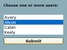
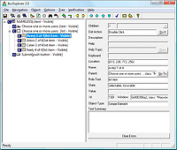
MSAA is essentially a middleware architecture that conveys an object model of an application. This is most easily explained by an example. The following screenshot shows an HTML form, as displayed in a browser:
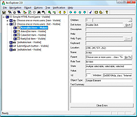
Here is a screen capture that shows the object tree exposed by the browser to assistive technology:
And finally, here is how JAWS for Windows 9.0, a popular screen reader for Windows, reads this form after loading the page in Internet Explorer:
Simple HTML Form.
Choose one or more children:
Extended select list box:
Avery, one of four.
Submit Button.
This example shows a simple, basic screen reader operation. A screen reader is a very complicated program that does much more than announce page contents; it speaks words under the mouse cursor, provides hundreds of keyboard shortcuts, and keeps track of user state in myriad ways.
MSAA under the surface
When Internet Explorer or Firefox loads a new page, it sends an event notification to the MSAA system. A screen reader, as an MSAA client, has registered with MSAA to receive event notifications, so the screen reader becomes aware that the browser has changed its object tree. The screen reader sends a special window message (WM_GETOBJECT) to the browser, asking for its root object.
The browser responds by sending back a pointer to a COM interface of type IAccessible. This interface has methods that allow the screen reader to ask for object properties, such as type, name, description, value, and visibility.
IAccessible also has methods for traversing the object tree in various ways—abstractly, in terms of tab order, in terms of geometric relationship, or in terms of pixel locations. Finally, IAccessible allows clients to manipulate UI objects programmatically, pressing buttons and altering selection and focus. The screen reader now traverses the tree of IAccessible objects, building up a tree of COM pointers.
For each object discovered, the screen reader determines the type of object (is it a container? button? textfield? and so on), the object's name, and possibly a few other properties. The screen reader now has enough information to construct its narrative text and feed it into the text-to-speech engine.
The browser, in order to be a proper MSAA server, has two main responsibilities. It must implement the IAccessible interface for every significant onscreen object that it displays, and it must notify the MSAA system whenever any part of the object tree changes. The Flash Player handles these two responsibilities for Flash content.
Accessible object model in Flash Player
The Flash Player's accessible object tree consists of a single top-level container (the root accessible object) containing a flat collection of the following types of objects:
-
Text: Regions of dynamic or static text in the movie. The principal property of a text object is its name, which, in keeping with MSAA convention, is equal to the contents of the text string being displayed. A text object may also have an associated description string. The Flash Player also makes an attempt to deduce labeling relationships between text and input text fields (text immediately above or to the left of an input text field is be taken as a label for that field), and between text and buttons (text entirely inside a button will be taken as a label for that button). Any text that is deduced to be a label will be omitted from the accessible object tree, and the content of that text will be used as the name of the object that it labels. Labels are never assigned to buttons or text fields that have author-supplied names.
-
Input text fields: An input text object has a value, and optionally a name, a description string and a keyboard shortcut string. As described above, an input text object's name may come from a text object that is deduced to label it.
-
Buttons: A button object has a state (pressed or not pressed), supports a programmatic default action that causes the button to depress momentarily, and may optionally have a name, a description string, and a keyboard shortcut string. As described above, a button object's name may come from a text object that is deduced to label it. Movie clips used as buttons in Flash Player are described by the player to MSAA as buttons, not as movie clips. The child objects inside buttons are note normally looked at by the player for accessibility purposes—buttons are "leaves" in the accessible object tree. There is one exception: for buttons that do not have author-supplied names, the player will look through the button's child elements (just one child-level deep) for a text element. If a text element is found, it is taken as a label for the button.
-
Simple movie clips: All non-scripted movie clips at all levels are classified into one of two categories: simple or non-simple. A movie clip is simple if it does not have any other accessible objects (text, input text, buttons, or components) as children at any level of depth. Non-simple clips are not given any representation in the object tree; instead, their accessible-object contents are promoted into the flat top-level list of accessible objects. Simple clips, on the other hand, do show up in the object tree, expressed to MSAA as an image or animation widget. If a simple clip contains other simple clips, only the topmost simple clip is included in the object tree. A simple clip has a state (animated or not animated), and may optionally have a name and a description string. Note that all video regions are also treated as simple movie clips.
-
Scripted movie clips: Flex (and Flash Professional) UI components present a special problem for the accessible object model in Flash Player. They are movie clips or sprites built from collections of text, input text, shapes, and buttons, but if Flash Player exposed those individual objects to MSAA, the meaning of the overall component would be lost. For this reason, a Flex UI (or Flash Professional) component may require a custom accessibility implementation. A movie clip or sprite that provides its own accessibility implementation is called a scripted movie clip, and it appears in the accessible object tree. The details of the accessibility implementation depend on the kind of component being implemented and are up to the component developer.
The Flash Player provides the flash.accessibility.AccessibilityImplementation class as a base class for creating custom accessibility implementations for Flex UI components in ActionScript 3. In Flex, this class is extended by mx.accessibility.AccImpl which serves as the base class for accessibility implementations in Flex components. A new accessibility implementation can be created by extending mx.accessibility.AccImpl for each new component.
When a Flex project is compiled with Generate accessible SWF file set to true, the Flex compiler automatically enables accessibility implementations for the components in the project that have them. At runtime, when Flash Player discovers a component that has a custom accessibility implementation, it will treat that component as a scripted movie clip.
The following example shows a screenshot of a simple Flex form:
When the project is compiled with Generate accessible SWF file set to false, the object tree exposed by the browser to assistive technology contains only text and simple movie clips, as shown in the following image:
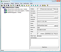
When the same project is compiled with Generate accessible SWF file set to true, the object tree exposed by the browser to assistive technology includes scripted movie clips with accessibility implementations that properly expose them as text, a list box, and a button component:
The methods of the flash.accessibility.AccessibilityImplementation class are a subset of the IAccessible interface, adapted slightly for ease of use. The Flash Player IAccessible interface for a scripted movie clip simply passes most calls from MSAA through to the flash.accessibility.AccessibilityImplementation subclass instance for that component. For example, when a screen reader needs to determine the default action of a mx.controls.Button component instance on the Stage in Flash Player, it calls the IAccessible method get_accDefaultAction() on the IAccessible interface exposed by the Flash Player for that component instance. The request is passed through to the get_accDefaultAction() method of the mx.accessibility.ButtonAccImpl accessibility implementation class instance, which returns the appropriate default action String for a button control, which is "Press." The article Custom Accessibility Implementations explains in more detail how to build custom accessibility implementations for Flex components.
Configuring Flex applications for accessibility
Enabling accessibility in Flex
By default, Flex accessibility features are disabled. When you enable accessibility, you enable the application to communicate with a screen reader.
You can use one of the following methods to enable accessibility:
-
Enable accessibility by default for all Flex applications so that all requests return accessible content.
To enable accessibility for all Flex applications, edit the flex-config.xml file to set the accessible property to true, the default value, as the following example shows:
 <compiler>
 	...
 	<accessible>true</accessible>
 	...
 <compiler>
-
Enable accessibility by using the mxmlc command-line compiler.
When you compile a file by using the mxmlc command-line compiler, you can use the ‑accessible option to enable accessibility, as the following example shows:
mxmlc -accessible c:/dev/myapps/mywar.war/app1.mxml
For more information on the command-line compiler, see Flex compilers.
When you compile a file by using the mxmlc command-line compiler, you can use a configuration variable to notify the compiler to generate the SWF file with accessibility enabled. The command-line syntax for the mxmlc.exe compiler allows the addition of –compiler.accessible (or just –accessible) to enable accessibility, as shown in the following examples:
mxmlc –compiler.accessible c:/dev/myapps/ appl.mxml
mxmlc -accessible c:/dev/myapps/appl.mxml
If you edited the flex-config.xml file to enable accessibility by default, you can disable it for an individual request by setting the accessible query parameter to false, as the following example shows:
http://www.mycompany.com/myflexapp/app1.mxml?accessible=false
For more information on the command-line compiler, see Flex compilers.
Configuring a JAWS screen reader for Flex applications
To use the JAWS screen reader with a Flex application, users must download scripts from the Adobe accessibility website before invoking a Flex application. Screen readers work best when in Forms mode, which lets users interact directly with the Flex application. These scripts let users switch between Virtual Cursor mode and Forms mode by using the Enter key from almost anywhere within a Flex application. If necessary, users can exit Forms mode by using the standard JAWS keystrokes.
To verify that the Flex scripts for JAWS are correctly installed, users can press the Insert+Q keys when JAWS is running. If the scripts are installed correctly, users hear "Updated for Adobe Flex 4" in the voice response to this keystroke.
It is important that you direct users with visual impairments to the script download page so that they have the necessary scripts to use JAWS effectively.
Accessible components and containers
To accelerate building accessible applications, there is support for accessibility into Flex MX components and containers. These components and containers automate many of the most common accessibility practices related to labeling, keyboard access, and testing. They also help ensure a consistent user experience across rich Internet applications.
Accessible Spark components
Flex comes with the following set of accessible components and containers in the Spark component set.
|
Component |
Screen reader behavior |
|---|---|
|
ButtonBar control |
Use the Tab key to move focus among the button of the ButtonBar control. Press the Spacebar to activate a button of the ButtonBar control. To cancel activating a button, press the Tab key to move the focus off the button control before releasing the Spacebar. |
|
Button control |
Press the Spacebar to activate the Button control. To cancel activating a button, press the Tab key to move the focus off the Button control before releasing the Spacebar. |
|
CheckBox control |
Press the Spacebar to activate the check box items. For more information on keyboard navigation, see CheckBox control user interaction. |
|
ComboBox control |
For more information on keyboard navigation, see Spark ComboBox control user interaction. |
|
DropDownList control |
For more information on keyboard navigation, see Spark DropDownList control user interaction. |
|
List control |
Screen reader navigation is the same as for keyboard navigation. For more information on keyboard navigation, see Keyboard navigation. For information on creating data tips (tool tips for individual list elements), see Displaying DataTips. For information on creating scroll tips (tool tips that provide information while the user scrolls through a list), see Displaying ScrollTips. |
|
NumericStepper control |
The name of a NumericStepper is, by default, an empty string. When wrapped in a FormItem element, the name is the FormItem's label. To override this behavior, set the Number ic Stepper control's accessibilityName property. The name of each child button is: "More" and "Less". For more information on keyboard navigation, see User interaction. |
|
Panel container |
Screen reader announces the panel title only when Forms mode is inactive. |
|
RadioButton control |
With one radio button selected within a group, press the Enter key to enter that group. Use the arrow keys to move between items in that group. Press the Down and Right Arrow keys to move to the next item in a group; press the Up and Left Arrow keys to move to a previous item in the group. When using a screen reader, select a radio button by using the Spacebar key. For more information on keyboard navigation, see RadioButton user interaction. |
|
RadioButtonGroup control |
Screen reader navigation is the same as for the RadioButton control. |
|
RichEdiableText control |
Use the Home key to move to the beginning of a line. Use the End key to move to the end of a line. Use the Control-Home to move to the beginning of the text. Use the Control-End key to move to the end of the text. |
|
Slider controls |
The name of a HSlider or VSlider is, by default, an empty string. When wrapped in a FormItem element, the name is the FormItem's label. To override this behavior, set the Slider's accessibilityName property. The
name of each child of the Slider control is:
For more information on keyboard navigation, see Keyboard navigation. |
|
Spinner control |
The name of a Spinner control is, by default, an empty string. When wrapped in a FormItem element, the name is the FormItem's label. To override this behavior, set the Spinner accessibilityName property. The name of each child button is: "More" and "Less". For more information on keyboard navigation, see User interaction. |
|
TabBar control |
The name of a TabBar is, by default, an empty string. When wrapped in a FormItem element, the name is the FormItem's label. To override this behavior, set the TabBar's accessibilityName property.The name of each tab in the TabBar is its label. The TabBar and its individual tabs accept focus. A tab is not automatically pressed when focus is changed by arrow keys. To select a focused tab, use the spacebar. |
|
TextArea control |
Use the Home key to move to the beginning of a line. Use the End key to move to the end of a line. Use the Control-Home to move to the beginning of the text. Use the Control-End key to move to the end of the text. |
|
TextInput control |
Use the Home key to move to the beginning of a line. Use the End Up key to move to the end of a line. |
|
TitleWindow container |
The name of a TitleWindow is, by default, the title that it displays. To override this behavior, set the TitleWindow's accessibilityName property. A TitleWindow does not accept focus. A screen reader announces the TitleWindow control only when Forms mode is inactive. |
|
ToggleButton control |
Press the Spacebar to activate the control. To cancel activating a button, press the Tab key to move the focus off the control before releasing the Spacebar. The name of a ToggleButton is, by default, the label that it displays. When wrapped in a FormItem element, this label will be combined with the FormItem's label. To override this behavior, set the ToggleButton's accessibilityName property. To provide two separate names for the different states of an icon based ToggleButton, separate both names by a comma in the accessibilityName property. For example, accessibilityProperty="Mute,Unmute" When using state specific names like this, the button does not expose the "pressed" state when pressed. |
|
VideoPlayer control |
The name of a VideoPlayer is, by default, "VideoPlayer". When wrapped in a FormItem element, the name is the FormItem's label. To override this behavior, set the controls accessibilityName property. The
name of each child control is:
To override the names of these child controls, reskin the VideoPlayer and set the accessibilityName of the controls. Use the Tab key to move focus among the child controls. Use the Spacebar to activate the Play/Pause control and the Full Screen control. Use the arrow keys to modify the Scrub Bar and Volume Bar controls. |
Accessible MX Components
Flex comes with the following set of accessible components and containers in the MX component set.
|
Component |
Screen reader behavior |
|---|---|
|
Accordion container |
Press the arrow keys to move the focus to a different panel, and then use the Spacebar or Enter key to select that panel. Use the Page Up and Page Down keys to move between individual panels of the container. When a screen reader encounters an Accordion container, it indicates each panel with the word tab. It indicates the current panel with the word active. For more information on keyboard navigation, see Accordion container Keyboard navigation. |
|
AdvancedDataGrid control |
The AdvancedDataGrid control supports the accessibility features in the DataGrid and Tree controls and provides additional features. For more information, see Accessibility for the AdvancedDataGrid control. For more information on standard keyboard navigation, see Keyboard navigation. |
|
Alert control |
In Forms mode, the text in the Alert control and the label of its default button are announced. When not in Forms mode, the text in the Alert control is announced twice when you press the Down Arrow. |
|
Button control |
Press the Spacebar to activate the Button control. To cancel activating a button, press the Tab key to move the focus off the Button control before releasing the Spacebar. When a screen reader encounters a Button control, activation varies, depending on the screen reader. In JAWS 6.10, the Spacebar activates Button controls when Forms mode is active. When Forms mode is inactive, the Spacebar or Enter key can be used to activate Button controls. |
|
CheckBox control |
Press the Spacebar to activate the check box items. For more information on keyboard navigation, see CheckBox control user interaction. |
|
ColorPicker control |
Announced as "colorpicker combo box." Open by using Control+Down Arrow, and close by using Control+Up Arrow. When open, you can use the four arrow keys to move among the colors. When open, the Enter key sets the color value to the currently selected color, as will Control+Up Arrow. When open, the Escape key closes the drop-down area and resets the color value to the previously selected color value. |
|
ComboBox control |
For more information on keyboard navigation, see ComboBox control user interaction. |
|
DataGrid control |
Press the arrow keys to highlight the contents, and then move between the individual characters within that field. When using a screen reader in forms mode, use the Tab key to move between editable TextInput fields in the DataGrid control. For more information on keyboard navigation, see MX DataGrid control user interaction. |
|
DateChooser control |
Press the Up, Down, Left, and Right Arrow keys to change the selected date. Use the Home key to reach the first enabled date in the month and the End key to reach the last enabled date in a month. Use the Page Up and Page Down keys to reach the previous and next months. For more information on keyboard navigation, see User interaction. |
|
DateField control |
Use the Control+Down Arrow keys to open the DateChooser control and select the appropriate date. When using a screen reader in Forms mode, use the same keystrokes as for keyboard navigation. When a screen reader encounters a DateChooser control in Forms mode, it announces the control as "DropDown Calendar currentDate, to open press Control Down, ComboBox," where currentDate is the currently selected date. For more information on keyboard navigation, see User interaction. |
|
Form container |
For information on keyboard navigation, see Defining a default button. |
|
Image control |
An Image control with a tool tip defined is read by a screen reader only when Forms mode is inactive. The Image control is not focusable in Forms mode, or by the keyboard. |
|
Label control |
A Label control is read by a screen reader when it is associated with other controls, or when the Forms mode is inactive. The Label control is not focusable in Forms mode, or by the keyboard. |
|
LinkButton control |
LinkButton control activation when using a screen reader varies, depending on the screen reader. In JAWS 6.10, press the Spacebar to activate a LinkButton control when in Forms mode. When Forms mode is inactive, use the Spacebar or Enter key to activate the control. For more information on keyboard navigation, see LinkButton control user interaction. |
|
List control |
Screen reader navigation is the same as for keyboard navigation. For more information on keyboard navigation, see List control user interaction. For information on creating data tips (tool tips for individual list elements), see Displaying DataTips. For information on creating scroll tips (tool tips that provide information while the user scrolls through a list), see Displaying ScrollTips. |
|
Menu control |
Screen reader navigation is the same as for keyboard navigation. For more information on keyboard navigation, see Menu control user interaction. |
|
MenuBar control |
Screen reader navigation is the same as for keyboard navigation. For more information on keyboard navigation, see Menu control user interaction. |
|
Panel container |
Screen reader announces the panel title only when Forms mode is inactive. |
|
RadioButton control |
With one radio button selected within a group, press the Enter key to enter that group. Use the arrow keys to move between items in that group. Press the Down and Right Arrow keys to move to the next item in a group; press the Up and Left Arrow keys to move to a previous item in the group. When using a screen reader, select a radio button by using the Spacebar key. For more information on keyboard navigation, see RadioButton user interaction. |
|
RadioButtonGroup control |
Screen reader navigation is the same as for the RadioButton control. |
|
Slider control |
In forms mode the control is announced along with the orientation of the control (left-right or up-down) and the current value. The control uses the following keys for a left-right slider:
The control uses the following keys for an up/down slider:
|
|
TabNavigator container |
When a screen reader encounters a TabNavigator container pane, it indicates each pane with the word tab. It indicates the current pane with the word active. When a pane is selected, the user moves to that panel by pressing the Enter key. Press the arrow keys to move the focus to a different panel, and then use the Spacebar or Enter key to select that panel. Use the Page Up and Page Down keys to move between individual panels of the container. For more information on keyboard navigation, see TabNavigator container Keyboard navigation. |
|
Text control |
A Text control is not focusable and is read by screen readers only when Forms mode is inactive. |
|
TextArea control |
Use the Home key to move to the beginning of a line. Use the End key to move to the end of a line. Use the PageUp key to move to the beginning of the text. Use the PageDown key to move to the end of the text. |
|
TextInput control |
Use the Home or Page Down key to move to the beginning of a line. Use the End or Page Up key to move to the end of a line. |
|
TitleWindow container |
A screen reader announces the TitleWindow control only when Forms mode is inactive. |
|
When a screen reader is used, the contents of a tool tip are read after the item to which the tool tip is attached gets focus. Tool tips attached to nonaccessible components (other than the Image control) are not read. |
|
|
Tree control |
Press the Up and Down Arrow keys to move between items in a Tree control. To open a group, press the Right Arrow key or Spacebar. To close a group, press the Left Arrow key or Spacebar. For more information on keyboard navigation, see Editing a node label at run timeand Tree user interaction. |
Accessibility for the AdvancedDataGrid control
The AdvancedDataGrid control supports the accessibility features in the DataGrid and Tree controls and adds additional features to support accessibility.
Cell and header navigation
For AdvancedDataGrid header cells, each header cell is selectable and reported individually. Pressing the Up Arrow key when in the first row of the control shifts the focus to the header cell.
When focus is moved to a header cell, the screen reader reports: "From: Column 1 press space to sort ascending on this field. Press Control+space to add this field to sort."
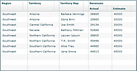
The following figure shows an AdvancedDataGrid control that uses a column group for the Revenues column. If the control defines a column group, then the screen reader reports the header information as: "Revenues: Column 1, spans 2 columns."
The data reported for body cells depends on the setting of the selectionMode property of the AdvancedDataGrid control, as described in the following table:
|
Selection mode |
Screen reader output |
|---|---|
singleRow |
Information corresponding to the entire row. |
singleCell |
Information corresponding to the selected cell only. |
Example navigation of flat data
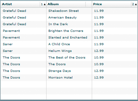
The following image shows an AdvancedDataGrid control displaying flat data:
In this example:
-
When you press the Tab key to move focus to the control, the screen reader reports: "ListBox."
-
Pressing the Down Arrow and Up Arrow keys navigates the rows of the control.
-
When the selectionMode property is set to singleRow, the screen reader reports all the data in the row, for example: "Artist: Grateful Dead, Album: Shakedown Street, Price: 11.99."
-
When the selectionMode property is set to singleCell, the screen reader reports only the selected cell's data. For the cell in the first column of the row, the screen reader reports: "Artist: Grateful Dead, Row 1." The row information is reported only when focus is on the first column, not for other columns in the row. Therefore, for the second cell, the screen reader reports: "Album: ShakeDown Street."
-
-
Pressing the Up Arrow key when the focus is on the first row of the control moves the focus to the header cell. The screen reader reports: "From: Column 1 press space to sort ascending on this field. Press control space to add this field to sort."
-
Pressing the Spacebar sorts the column.
-
Multicolumn sorting is supported. The sort order is reported in case of multicolumn sorting.
For example, if the Album column is sorted and the sort order is 2, the screen reader reports: "Album: Column 2 sorted ascending, sort order 2 Press space to sort descending on this field. Press Control+space to add this field to sort."
-
Example navigation of hierarchical data
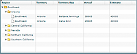
The following image shows an AdvancedDataGrid control displaying hierarchical data:
In this example:
-
When you press the Tab key to move focus to the control, the screen reader reports: "Treeview."
-
Pressing the Shift+Control+Right Arrow keys opens a node.
-
Pressing the Down Arrow key moves the focus to the next row.
If you move focus to the first row under Arizona, the screen reader reports: "Level2. Region: Southwest, Territory: Arizona, TerritoryRep: Barbara Jennings, Actual: 38865, Estimate: 40000, 1 of 2. Press Control+Shift+Right Arrow to open, Control+Shift+Left Arrow to close. Open."
Creating tab order and reading order
There are two aspects of tab indexing order—the tab order in which a user navigates through the web content, and the reading order in which things are read by the screen reader.
Flash Player uses a tab index order from left to right and top to bottom. However, if this is not the order you want to use, you can customize both the tab order and the reading order by using the InteractiveObject.tabIndex property. (In ActionScript, the tabIndex property is synonymous with the reading order.)
- Tab order
-
You can use the tabIndex property of every component to create a tab order that determines the order in which objects receive input focus when a user presses the Tab key.
- Reading order
-
You can use the tabIndex property to control the order in which the screen reader reads information about the object. To create a reading order, you assign a value to the tabIndex property for every component in your application. You should set the tabIndex property for every accessible object, not just the focusable objects. For example, you must set the tabIndex property for a Text control even though a user cannot tab to it. If you do not set the tabIndex property for every accessible object, Flash Player puts that object at the end of the tab order, rather than in its appropriate tab order location.
Scrolling to a component when tabbing
As a general rule, you should structure your application so that all components fit in the available screen area; otherwise you will have to adds vertical or horizontal scroll bars as necessary. Scroll bars let users move around the application to access components outside of the screen area.
If your application uses scroll bars, tabbing through the application components does not automatically scroll the application to make the currently selected component visible. You can add logic to your application to automatically scroll to the currently selected component, as the following example shows:
<?xml version="1.0"?>
<!-- accessibility\ScrollComp.mxml -->
<s:Application xmlns:fx="http://ns.adobe.com/mxml/2009"
    xmlns:s="library://ns.adobe.com/flex/spark"
    xmlns:mx="library://ns.adobe.com/flex/mx"
    creationComplete="setupFocusViewportWatcher();">

    <fx:Script>
        <![CDATA[

        import mx.core.Container;
        import mx.core.EdgeMetrics;

        [Bindable]
        public var cards: Array = [
            {label:"Visa", data:1},
            {label:"Master Card", data:2},
            {label:"American Express", data:3} ];

        [Bindable]
        public var selectedItem:Object;

        [Bindable]
        public var forListDP:Array = [
            {label:'Apple', data:10.00},
            {label:'Banana', data:15.00},
            {label:'Melon', data:3.50},
            {label:'Kiwi', data:7.65},
            {label:'123', data:12.35 },
            {label:'some', data:10.01 }];

        // Set up the event listener for the focusIn event.
        public function setupFocusViewportWatcher():void {
            addEventListener("focusIn", makeFocusedItemVisible);
        }

        public function makeFocusedItemVisible(event:FocusEvent):void {
            // Target is the actual object that has focus.
            var target:InteractiveObject = InteractiveObject(event.target);

            // OriginalTarget is the component that has focus as some
            // component actually delegate true focus to an internal object.
            var originalTarget:InteractiveObject =
        InteractiveObject(focusManager.findFocusManagerComponent(target));

            // The viewable portion of a container
            var viewport:Rectangle = new Rectangle();
            do {
                // Cycle through all parents looking for containers.
                if (target.parent is Container) {
                    var viewportChanged:Boolean = false;
                    var c:Container = target.parent as Container;

                    // Get the viewable area in the container.
                    var vm:EdgeMetrics = c.viewMetrics;
                    viewport.x = vm.left;
                    viewport.y = vm.top;
                    viewport.width =
                        c.width / c.scaleX - vm.left - vm.right;
                    viewport.height =
                        c.height / c.scaleY - vm.top - vm.bottom;

                    // Calculate the position of the target in the container.
                    var topLeft:Point = new Point(0, 0);
                    var bottomRight:Point =
                new Point(originalTarget.width, originalTarget.height);
                    topLeft = originalTarget.localToGlobal(topLeft);
                    topLeft = c.globalToLocal(topLeft);
                    bottomRight = originalTarget.localToGlobal(bottomRight);
                    bottomRight = c.globalToLocal(bottomRight);

                    // Figure out if we have to move the scroll bars.
                    // If the scroll bar moves, the position of the component
                    // moves as well. This algorithm makes sure the top
                    // left of the component is visible if the component is
                    // bigger than the viewport.
                    var delta:Number;

                    if (bottomRight.x > viewport.right) {
                        delta = bottomRight.x - viewport.right;
                        c.horizontalScrollPosition += delta;
                        topLeft.x -= delta;
                        viewportChanged = true;
                    }

                    if (topLeft.x < viewport.left) {
                        // leave it a few pixels in from the left
                        c.horizontalScrollPosition -=
                            viewport.left - topLeft.x + 2;
                        viewportChanged = true;
                    }

                    if (bottomRight.y > viewport.bottom) {
                        delta = bottomRight.y - viewport.bottom;
                        c.verticalScrollPosition += delta;
                        topLeft.y -= delta;
                        viewportChanged = true;
                    }

                    if (topLeft.y < viewport.top) {
                        // leave it a few pixels down from the top
                        c.verticalScrollPosition -=
                            viewport.top - topLeft.y + 2;
                        viewportChanged = true;
                    }

                    // You must the validateNow() method to get the
                    // container to move the component before working
                    // on the next parent.
                    // Otherwise, your calculations will be incorrect.
                    if (viewportChanged) {
                        c.validateNow();
                    }
                }

                target = target.parent;
            }

            while (target != this);
        }
        ]]>
    </fx:Script>

    <fx:Declarations>
        <fx:Model id="statesModel" source="assets/states.xml"/>
    </fx:Declarations>

    <mx:Panel
            x="58" y="48"
            width="442" height="201"
            layout="absolute"
            title="Tab through controls to see if focus stays in view">

        <mx:VBox x="10" y="10" verticalScrollPolicy="off">
            <mx:TextInput/>
            <mx:TextInput/>
            <mx:TextArea width="328" height="64"/>
            <mx:ComboBox dataProvider="{cards}" width="150"/>
            <mx:DataGrid dataProvider="{forListDP}" />
            <mx:DateChooser yearNavigationEnabled="true"/>
            <mx:List id="source"
                width="75"
                dataProvider="{statesModel.state}"/>
        </mx:VBox>
    </mx:Panel>
</s:Application>
Creating accessibility with ActionScript
For accessibility properties that apply to the entire document, use the flash.accessibility.AccessibilityProperties class. For more information on this class, see the ActionScript 3.0 Reference for the Adobe Flash Platform .
The following table lists some of the relevant properties of the AccessibilityProperties class.
|
Property |
Type |
Description |
|---|---|---|
|
description |
String |
Specifies a description for the component that is read by the screen reader. |
|
forceSimple |
Boolean |
Hides the children of a component from a screen reader when set to true. The default value is false. |
|
name |
String |
Specifies a description of the component that is read by the screen reader. When accessible objects do not have a specified name, a screen reader uses a generic word, such as Button. |
|
shortcut |
String |
Indicates a keyboard shortcut associated with this display object. |
|
silent |
Boolean |
Hides a component from a screen reader when set to true. The default value is false. |
Modifying these properties has no effect by itself. You must also use the Accessibility.updateProperties() method to inform screen reader users of Flash Player content changes. Calling this method causes Flash Player to reexamine all accessibility properties, update property descriptions for the screen reader, and, if necessary, send events to the screen reader that indicate changes occurred.
When updating the accessibility properties of multiple objects at once, you must include only a single call to the Accessiblity.updateProperties() method. (Excessive updates to the screen reader can cause some screen readers to become too verbose and can impact your application's performance.)
Implementing screen reader detection with the Accessibility.isActive() method
To create content that behaves in a specific way if a screen reader is active, you can use the ActionScript Accessibility.active property, which is set to a value of true if a screen reader is present, and false otherwise. You can then design your content to perform in a way that is compatible with screen reader use, such as by hiding child elements from the screen reader.
For example, you could use the Accessibility.active property to decide whether to include unsolicited animation. Unsolicited animation means animation that happens without the screen reader doing anything. This can be very confusing for screen readers.
For more information on the Accessibility class, see the ActionScript 3.0 Reference for the Adobe Flash Platform .
Creating a custom accessibility implementation
Flex component developers need to be able to provide their own accessibility implementations for custom components. Flash Player provides the flash.accessibility.AccessibilityImplementation class as a base class for creating custom accessibility implementations for Flex and Flash UI components in ActionScript 3. In Flex, this class is extended by mx.accessibility.AccImpl which serves as the base class for accessibility implementations in Flex components.
You create a new accessibility implementation by extending mx.accessibility.AccImpl for each new component. The methods of the flash.accessibility.AccessibilityImplementation class are a subset of the IAccessible interface, adapted slightly to make life easier. The Flash Player's IAccessible interface for a scripted movie clip passes most calls from MSAA through to the flash.accessibility.AccessibilityImplementation subclass instance for that component. Accessibility implementations must also send event notifications to MSAA in a variety of situations. Event notifications are sent by using the flash.accessibility.Accessibility.sendEvent() method.
The way in which an accessibility implementation implements the IAccessible interface and the events that it sends depend on the kind of component being implemented. Consider two primary forms of guidance: First, the MSAA documentation has a list of guidelines for accessible object implementations according to component type. Second, an accessibility implementations's behavior should match as closely as possible the behavior exhibited by the equivalent form element (if any such element exists) in an HTML page inside Internet Explorer or Firefox or in the Windows operating system. This behavior can be examined using the AccExplorer, Inspect32, and AccEvent tools, available in the Microsoft Active Accessibility 2.0 SDK.
Collectively, these two forms of guidance constitute an MSAA model for IAccessible implementations. This model is loosely specified. The only definitive test of an IAccessible implementation is to test it with the latest versions of screen readers.
This article explains how to define a custom accessibility implementation for a component. For this example, we'll add an accessibility implementation to the mx.controls.PopUpButton and, by extension, the mx.controls.PopUpMenuButton class. First, create a new Flex project named "PopUpMenuButton." Be sure to enable accessibility in the project using one of the methods explained in Configuring Flex applications for accessibility. Follow along with the article to create a new implementation.
For an overview of the PopUpButton and PopUpMenuButton controls, see PopUpButton control and PopUpMenuButton control. See also mx.controls.PopUpButton and mx.controls.PopUpMenuButton in the ActionScript 3.0 Reference for Apache Flex.
Add accessibility mix-ins to component class definition
Defining a custom accessiblity implementation for a component requires changes the component's class file. Copy the PopUpButton class file from its location in the Flex SDK source code, /sdks/4.6.0/frameworks/projects/framework/src/mx/controls/PopUpButton.as to a directory in the source folder for the project, /mx/controls/PopUpButton.as.
Next, copy the included files /sdks/4.6.0/frameworks/projects/framework/src/mx/core/Version.as to /mx/core/Version.as and /sdks/4.6.0/frameworks/projects/framework/src/mx/styles/metadata/IconColorStyles.as to /mx/styles/metadata/IconColorStyles.as so that the project compiles without errors. When the project is compiled, the Flex compiler will override the existing PopUpButton class contained within the Flex framework, with the modified class in project folder, which will support accessibility. Open the PopUpButton class file that you just copied over from the Flex SDK. At line 168 in the code, add the following meta tag:
[AccessibilityClass(implementation="mx.accessibility.PopUpButtonAccImpl")]
The [AccessibilityClass] meta tag lets the compiler know which class serves as the accessibility implementation for this component. Add the following code to create a placeholder for the static createAccessibilityImplementation() method at line 244, just before the PopUpButton constructor:
…
	//---------------------------------------------------------------------- ----
	//
	//  Class mixins
	//
	//----------------------------------------------------------------------           ----
	/**
	 *  Placeholder for mixin by PopUpButtonAccImpl.
	 */
	 mx_internal static var createAccessibilityImplementation:Function;
…
This createAccessibilityImplementation() method will be assigned by the PopUpButtonAccImpl accessibility implementation class we'll create. At line 469, among the overridden methods from UIComponent class, add the following initializeAccessibility() method:
/**
 *  @inheritDoc
 */
  override protected function initializeAccessibility():void
	{
		if (PopUpButton.createAccessibilityImplementation != null)
		PopUpButton.createAccessibilityImplementation(this);
	}
The initializeAccessibility() method is invoked by the UIComponent.initialize() method to initialize accessibility for a component instance at runtime.
Create the accessibility implementation class definition
To define the PopUpButtonAccImpl class, copy the ButtonAccImpl class file from its location in the Flex SDK source code, /sdks/4.6.0/frameworks/projects/framework/src/mx/accessibility/Button.as, to a directory in the source folder for the project. Save the file with a new file name, /mx/accessibility/PopUpButtonAccImpl.as.Open the PopUpButtonAccImpl class file that you copied over from ButtonAccImpl class in the Flex SDK. Update the import statement block to import the PopUpButton, Menu, AccessibilityProperties and Rectangle classes:
...
package mx.accessibility
{
import flash.accessibility.Accessibility;
import flash.accessibility.AccessibilityProperties;
import flash.events.Event;
import flash.events.KeyboardEvent;
import flash.geom.Rectangle;
import flash.ui.Keyboard;
import mx.controls.Menu;
import mx.controls.PopUpButton;
import mx.core.UIComponent;
import mx.core.mx_internal;
...
At line 61 in the code, update the class definition to read:
...
	public class PopUpButtonAccImpl extends AccImpl
...
At line 93 in the code update the hookAccessibility method to read:
...
	private static function hookAccessibility():Boolean
	{
		PopUpButton.createAccessibilityImplementation =
			createAccessibilityImplementation;
		return true;
	}
...
The hookAccessibility() method defines the PopUpButton class's static createAccessibilityImplementation() method to use the method of the same name defined in the PopUpButtonAccImpl class. It is called once at runtime when the PopUpButtonAccImpl class initializes and defines the static accessibilityHooked property.Replace the createAccessibilityImplementation() method at line 149 with the following:
...
	mx_internal static function createAccessibilityImplementation(
														component:UIComponent):void
	{
		component.accessibilityImplementation = new PopUpButtonAccImpl(component);
	}
...
The createAccessibilityImplementation() method assigns a new PopUpButtonAccImpl instance to the accessibilityImplementation property of a given component instance.Add the following four static state and role constants at line 122:
...
	/**
	 * The object is hot-tracked by the mouse, which means that its appearance
	 * has changed to indicate that the pointer is located over it.
	 */
	 private static const STATE_SYSTEM_HOTTRACKED:uint = 0x00000080;

	/**
	 *  Object displays a pop-up menu or window when invoked.
	 */
	 private static const STATE_SYSTEM_HASPOPUP:uint = 0x40000000;

	/**
	 * The role represents a button that has a drop-down list icon directly adjacent
	 * to the button.
	 */
	 private static const ROLE_SYSTEM_SPLITBUTTON:uint = 0x3e;

	/**
	 * The object represents a button that drops down a list of items.
	 */
	 private static const ROLE_SYSTEM_BUTTONDROPDOWN:uint = 0x38;
...
System roles and states are predefined for all components in MSAA. The hexidecimal values for the constants can be found in the ActionScript 3.0 Reference for the Adobe Flash Platform under AccessibilityImplementation Constants. The MSAA documentation has a list of guidelines for accessible object implementations that documents which constants are used by which component types. Unfortunately, the User Interface Element Reference for MSAA omits the pop‑up button. To figure out the appropriate role and state constants for the PopUpButton Accessibility Implementation, use the AccExplorer, Inspect32, and AccEvent tools that are available in the Microsoft Active Accessibility 2.0 SDK to examine a similar existing component in Windows.
How found:	Mouse move (199,85)
	hwnd=0x0006038A 32bit class="ToolbarWindow32" style=0x5601A945 ex=0x100000
Info:	IAcc = 0x001F7A6C VarChild:[VT_I4=0x0]
Interfaces:	IEnumVARIANT IOleWindow IAccIdentity
Impl:	Remote oleacc proxy
Annotation ID:	0100008000000000FCFFFFFF00000000
Name:	"Run PopUpMenuButton"
Value:	none [false]
Role:	split button
State:	hot tracked
Location:	{l:192, t:72, w:38, h:22}
Description:	none [false]
Kbshortcut:	none [false]
DefAction:	"Open"
Parent:	none [false]:tool bar
Help:	none [false]
Help Topic:	none [false]
ChildCount:	1
Window:	0x0006038A class="ToolbarWindow32" style=0x5601A945 ex=0x100000
Children:	"Open" : drop down button : hot tracked
Selection:	none [empty]
Ancestors:	none [false] : tool bar : normal
	none [false] : window : normal
	none [false] : client : default,focusable
	none [false] : window : normal
	none [false] : client : normal
	none [false] : window : normal
	none [false] : client : normal
	none [false] : window : normal
	"Flex Development - file:/C:/Program Files/Adobe/Flash Builder 4/plugins/com.adobe.flexbuilder.ui_4.0.nnnnnn/welcome/welcome.html - Adobe Flash Builder" : client : normal	"Flex Development - file:/C:/Program Files/Adobe/Flash Builder
4/plugins/com.adobe.flexbuilder.ui_4.0.nnnnnn/welcome/welcome.html - Adobe Flash Builder" : window : sizeable,moveable,focusable	"Desktop" : client : normal	"Desktop" : window : normal
	[ No Parent ]
The Inspect32 tool reveals that the pop‑up button should have the role split button and one child named Open with the role drop down button. When you mouse over the control or give it keyboard focus, the control's state is hot tracked. In Flash terminology, "hot tracked" is a mouseover, or the button "over" state. A search on https://msdn.microsoft.com/ for "SplitButton accessibility" returns a more detailed and useful description of the SplitButton control's accessibiliy implementation: Working with Active Accessibility in the 2007 Office Fluent User Interface: The SplitButton Control. This more detailed description states that we should also expose the state of the child drop‑down button that opens a popup menu as has popup.
Update the PopUpButtonAccImpl constructor function at line 199 to read:
...
	//---------------------------------------------------------------------- ---                                 -
	//
	//  Constructor
	//
	//--------------------------------------------------------------------- - ----
 	/**
	 * Creates a new PopUpButtonAccImpl instance for the specified PopUpButton component    .
	 *
	 * <p>Direct calls to the AccImpl subclass constructors are unneccessary.
	 * When a Flex project is compiled with Generate accessible SWF file set to
	 * <code>true</code>,
	 * the compiler instantiates the accessibility implementations for the components
	 * used in the project that have them by calling the static
	 * <code>enableAccessibility()</code> method. </p   >
	 *
	 * @param master The UIComponent instance that this PopUpButtonAccImpl instance
	 * is making accessible.
	 *
	 * @see ../../../html/help.html?content=accessible_4.html Configuring Flex
	 * applications for accessibility
	 */
	public function PopUpButtonAccImpl(master:UIComponent)
	{
		super(master);
		role = ROLE_SYSTEM_SPLITBUTTON;
	}
...
The constructor function defines the role property for the PopUpButtonAccImpl as ROLE_SYSTEM_SPLITBUTTON (0x3e). Update the eventsToHandle() method at line 237 to include any additional events to which the PopUpButtonAccImpl should listen from its master component. In this example, the events should be the same as for the ButtonAccImpl, "click" and "labelChanged".
...
	//----------------------------------
	//  eventsToHandle
	//----------------------------------
	/**
	 *	@inheritDoc
	 */
	override protected function get eventsToHandle():Array
	{
		return super.eventsToHandle.concat([ "click", "labelChanged" ]);
	}
...
Update the get_accRole() method at line 247 to read as follows:
...
	/**
	 * IAccessible method for returning system role for the component.
	 * System roles are predefined for all the components in MSAA.
	 * <p>A PopUpButton component, ( <code>childID == 0</code> ), reports
	 * the role <code>ROLE_SYSTEM_SPLITBUTTON</code> (0x3E).
	 * The PopUpButton's drop down arrow ( <code>childID == 1</code> )
	 * reports the role <code>ROLE_SYSTEM_BUTTONDROPDOWN</code> (0x3B).</p>
	 *
	 * @param childID An unsigned integer corresponding to one of the component's child
	 * elements as defined by
	 * <code><a href="#getChildIDArray()">getChildIDArray()</a></code>.
	 *
	 * @return Role associated with the component.
	 * @tiptext Returns the system role for the component
	 * @helpid 3009
	 *
	 * @see ../../flash/accessibility/constants.html#roles AccessibilityImplementation Constants: Object Roles
	 * @see https://msdn.microsoft.com/en-us/library/ms696113(VS.85).aspx Microsoft Accessibility Developer Center: IAccessible::get_accRole
	 */
	override public function get_accRole(childID:uint):uint
	{
		if (childID == 0)
			return role;

		return ROLE_SYSTEM_BUTTONDROPDOWN;
	}
...
The get_accRole() method should return the appropriate role constant for the master component or for one of its children. The PopUpButtonAccImpl returns ROLE_SYSTEM_SPLITBUTTON (0x3e), while its child drop-down button returns ROLE_SYSTEM_BUTTONDROPDOWN (0x38).Add the following get_accValue() method override at line 272:
...
	/**
	 * IAccessible method for returning the value of the PopUpButton
	 * which is spoken out by the screen reader.
	 * The PopUpButton should return value that would be applied when clicked.
	 * For example, the value of the PopUpButton's label property.
	 *
	 * @param childID An unsigned integer corresponding to one of the component's
	 * child elements as defined by
	 * <code><a href="#getChildIDArray()">getChildIDArray()</a></code>.
	 *
	 *  @return Value String
	 *
	 *  @see https://msdn.microsoft.com/en-us/library/ms697312(VS.85).aspx Microsoft Accessibility Developer Center: IAccessible::get_accValue
	 *  @see https://msdn.microsoft.com/en-us/library/bb404170.aspx#ActiveAccessibility2007OfficeFluentUI_TheSplitButtonControl Working with Active Accessibility in the 2007 Office Fluent User Interface: The SplitButton Control
	 */
	override public function get_accValue(childID:uint):String
	{
		var accValue:String;

		// local reference to the master component as a PopUpButton
		var popUpButton:PopUpButton = PopUpButton(master);

		if(childID == 0){
		// the PopUpButton component itself

			// local reference to the label
			var label:String = popUpButton.label;

			if(popUpButton.popUp
				&& popUpButton.popUp is Menu
				&& label != null
				&& label != ""){
				// If the popUp exists and is a Menu and
				// the label exists and is not an empty string...

				var popUpMenu:Menu = popUpButton.popUp as Menu;
				if(popUpMenu.itemToLabel(popUpMenu.selectedItem) == label){
				// If the label matches the popUp menu's selectedIndex,
				// return the label as the accValue.
					accValue = label;
					if(popUpButton.accessibilityProperties && popUpButton.accessibilityProperties.shortcut){
						// If a keyboard shortcut is defined in the
						// PopUpButton's .accessibilityProperties object,
						// append it to the returned accValue.
						accValue + = "("+popUpButton.accessibilityProperties.shortcut+")";
					}
				}

			}
		}

		return accValue;
	}
...
The get_accValue() method returns the appropriate value for the component or for one of its child elements. If the PopUpButton component's label property is equal to the label of the selectedItem in its popUp menu, the get_accValue() method should return the value of the label property. Update the get_accState() method at line 321 to read:
...
	/**
	 * IAccessible method for returning the state of the PopUpButton.
	 * States are predefined for all the components in MSAA.
	 * Values are assigned to each state.
	 * Depending upon the PopUpButton being pressed or released, its popUp being present
	 * and opened or closed, and the PopUpButton being hovered over or focused,
	 * a value is returned.
	 *
	 * @param childID An unsigned integer corresponding to one of the component's
	 * child elements as defined by
	 * <code><a href="#getChildIDArray()">getChildIDArray()</a></code>.
	 *
	 * @return State indicating whether the PopUpButton is pressed or released.
	 *
	 * @see #getChildIDArray()
	 * @see flash.accessibility.AccessibilityImplementation#get_accState()
	 * @see ../../flash/accessibility/constants.html#states AccessibilityImplementation Constants: Object State Constants
	 * @see https://msdn.microsoft.com/en-us/library/ms696191(VS.85).aspx Microsoft Accessibility Developer Center: IAccessible::get_accState
	 */
	 override public function get_accState(childID:uint):uint
	{
		// the normal default state
		var accState:uint = 0;

		// local reference to the master component as a PopUpButton
		var popUpButton:PopUpButton = PopUpButton(master);

		if(childID == 1){
		// the drop-down button

			if(popUpButton.popUp){
			// if the PopUpButton's popUp property is defined,
			// indicate that the drop-down button has a pop up.
				accState = STATE_SYSTEM_HASPOPUP;
			}


			if(popUpButton.mx_internal::isShowingPopUp == true){
			// if the popUp is showing,
			// indicate that the drop-down button is pressed
				accState |= STATE_SYSTEM_PRESSED;
			}

		} else {
		// the PopUpButton component itself

		 	// the component state inherited from AccImpl
		 	// unavailable, normal, focusable, or focused
		 	accState = getState(childID);

		 	if (popUpButton.selected) {		 	// if the popUpButton is selected,
		 	// indicate that popUpButton is pressed
		 		accState |= STATE_SYSTEM_PRESSED;
		 	}
		}

		var mouseX:Number = master.mouseX;
		var mouseY:Number = master.mouseY;
		var bounds:Rectangle = master.getBounds(master);
		if((mouseX >= bounds.x
			&& mouseX <= (bounds.x + bounds.width)
			&& mouseY >= bounds.y
			&& mouseY <= (bounds.y + bounds.height))
			|| (popUpButton.focusManager.getFocus() == popUpButton)){
			// if the parent popUpButton component or child drop-down button
			// has either mouse or keyboard focus,
			// indicate that it is hot-tracked.
			accState |= STATE_SYSTEM_HOTTRACKED;
		}
		return accState;
	}
...
The get_accState() method should return the appropriate state constant or state constants for the master component or for one of its children. If the PopUpButton has a popUp property, its child drop‑down button should have the state STATE_SYSTEM_HASPOPUP (0x40000000). If the popUp is showing, the drop‑down button should also have the state STATE_SYSTEM_PRESSED (0x00000008). If the PopUpButton itself is selected, it should have the state STATE_SYSTEM_PRESSED (0x00000008). Both the PopUpButton and its child drop‑down button should have the state STATE_SYSTEM_HOTTRACKED (0x00000080) when a user mouses over the PopUpButton or when it has keyboard focus.Add the following getChildIDArray() method override at line 398:
...
	/**
	 * Method to return an array of childIDs.
	 *
	 * @return An array of unsigned integer IDs with a length of one
	 * for the drop-down menu button.
	 */
	override public function getChildIDArray():Array
	{
		var childIDs:Array = [1];

		return childIDs;
	}
...
The getChildIDArray() method returns an array containing the unsigned integer IDs of all child elements in the accessibility implementation. The length of the array may be zero. The IDs in the array should appear in the same logical order as the child elements they represent. This method is mandatory for any accessibility implementation that can contain child elements; otherwise, do not implement it. For the PopUpButtonAccImpl, the getChildIDArray() method returns an array containing a single element with a value of 1, which represents the PopUpButton's child drop‑down button element.Update the get_accDefaultAction() method at line 410 to return the appropriate default action for the master component or for one of its children. For the PopUpButton component itself, the method returns "Press". For the component's child drop‑down button, the method returns "Open."
...
	/**
	 * IAccessible method for returning the default action of the PopUpButton,
	 * which is Press for the component itself and Open for its child drop-down
	 * menu button.
	 *
	 * @param childID An unsigned integer corresponding to one of the component's
	 * child elements as defined by
	 *  <code><a href="#getChildIDArray()">getChildIDArray()</a></code>.
	 *
	 *  @return DefaultAction String
	 *
	 *  @see https://msdn.microsoft.com/en-us/library/ms696144(VS.85).aspx Microsoft Accessibility Developer Center: IAccessible::get_accDefaultAction
	 */
	override public function get_accDefaultAction(childID:uint):String
	{
		if(childID == 0){
			return "Press";
		}
		return "Open";
	}
...
Update the addDoDefaultAction() method at line 439 to read as follows:
...
	/**
	 * IAccessible method for performing the default action of the PopUpButton, which is Press for the component itself and Open for its child drop-down menu button.
	 *
	 * @param childID An unsigned integer corresponding to one of the component's
	 * child elements as defined by
	 *  <code><a href="#getChildIDArray()">getChildIDArray()</a></code>.
	 *
	 *  @see https://msdn.microsoft.com/en-us/library/ms696119(VS.85).aspx Microsoft Accessibility Developer Center: IAccessible::accDoDefaultAction
	 */
	override public function accDoDefaultAction(childID:uint):void
	{
		var popUpButton:PopUpButton = master as PopUpButton;
		if (childID==0)
		{
			var event:KeyboardEvent = new KeyboardEvent(KeyboardEvent.KEY_DOWN);
			event.keyCode = Keyboard.SPACE;
			master.dispatchEvent(event);

			event = new KeyboardEvent(KeyboardEvent.KEY_UP);
			event.keyCode = Keyboard.SPACE;
			master.dispatchEvent(event);

		} else if(childID == 1){

			if(popUpButton.mx_internal::isShowingPopUp == true){
				popUpButton.close();
			} else {
				popUpButton.open();
			}
		}
	}
...
The accDoDefaultAction() method executes the default action for the master component or for one of its children. For the PopUpButton component itself, the method simulates a button click. For the child drop‑down button element, the method either opens or closes the popUp. Update the getName() method at line 463 to read as follows:
...
	/**
	 * Method for returning the name of the PopUpButton which is spoken out by
	 * the screen reader.
	 *  The PopUpButton should return the label inside as the name of the PopUpButton.
	 *  The child drop-down button should return "Open" or "Close".
	 *
	 * @param childID An unsigned integer corresponding to one of the component's
	 * child elements as defined by
	 *  <code><a href="#getChildIDArray()">getChildIDArray()</a></code>.
	 *
	 * @return Name string corresponding to the PopUpButton label.
	 * "Open" or "Close" for the child drop-down button.
	 */
	override protected function getName(childID:uint):String
	{
		var popUpButton:PopUpButton = master as PopUpButton;
		var popUp:UIComponent = popUpButton.popUp as UIComponent;

		if(popUp && popUp is Menu){
		// a tweak to add Context as the name of the popUp menu if no other name is defined
			if(!popUp.accessibilityProperties){
				popUp.accessibilityProperties = new AccessibilityProperties();
			}
			if(popUp is Menu && popUp.accessibilityProperties.name == ""){
				popUp.accessibilityProperties.name = "Context";
			}
		}
		if(childID == 1){
		// For the drop-down button, if the popUp is showing, return Close,
		// otherwise return Open.
			return (popUpButton.mx_internal::isShowingPopUp == true) ? "Close" : "Open";
		}

		// For the popUpButton component itself, return the label property.
		var label:String = popUpButton.label;
		return label != null && label != "" ? label : "";
	}
...
The getName() method returns the appropriate name for the master component or for one of its children. For the PopUpButton component itself, the method should return its label property as its name. The component's child drop‑down button returns either "Open" or "Close", depending on whether or not the popUp is showing. For the PopUpButton, this method also adds "Context" as the name of the popUp menu if no other name has been defined.Add the following accLocation() method at line 498:
...
	/**
	 * IAccessible method for returning the bounding box of a the PopUpButton
	 * or its child drop-down arrow.
	 *
	 * @param childID An unsigned integer corresponding to one of the component's
	 * child elements as defined by
	 *  <code><a href="#getChildIDArray()">getChildIDArray()</a></code>.
	 *
	 *  @return The PopUpButton or its drop-down button.
	 *
	 *  @see https://msdn.microsoft.com/en-us/library/ms696118(VS.85).aspx Microsoft Accessibility Developer Center: IAccessible::accLocation
	 */
	override public function accLocation(childID:uint):*
	{

		// the master component
		var location:* = master;

		if(childID == 1){
		// calculate the rectangle location of the child drop-down button
			var popUpButton:PopUpButton = master as PopUpButton;
			var popUpButtonRect:Rectangle = popUpButton.getRect(popUpButton);
			var arrowButtonsWidth:Number =
popUpButton.mx_internal::getArrowButtonsWidth();
			location = new Rectangle(
								popUpButtonRect.x + popUpButton.width -
arrowButtonsWidth,
								popUpButtonRect.y,
								arrowButtonsWidth,
								popUpButton.height
							);
		}

		return location;

	}
...
The accLocation() method returns the bounding box of the master component, or that of one of its children, relative to the master component's stage. The PopUpButton returns itself as the its bounding box location. Its child drop‑down button returns its bounding box as a Rectangle with its bounds determined programmatically.Update the eventHandler() method at line 535 to handle any events to which the PopUpButtonAccImpl should listen from its master component. In this example, the handled events should be the same as for the ButtonAccImpl, "click" and "labelChanged".
...
	/**
	 * Override the generic event handler.
	 * Each AccImpl subclass must implement this method
	 * to listen for events from its master component.
	 *
	 *  @param event The event object.
	 *
	 *  @see mx.accessibility.AccImpl#eventHandler()
	 */
	override protected function eventHandler(event:Event):void
	{
		switch (event.type)
		{
			case "click":
			{
				Accessibility.sendEvent(master, 0, EVENT_OBJECT_STATECHANGE);
				Accessibility.updateProperties();
				break;
			}

			case "labelChanged":
			{
				Accessibility.sendEvent(master, 0, EVENT_OBJECT_NAMECHANGE);
				Accessibility.updateProperties();
				break;
			}

		}
	}
...
The eventHandler() method handles events from the master component and sends the appropriate object or system event to MSAA using the flash.accessibility.Accessibility.sendEvent() method. Depending on the object or system event it receives, the MSAA system will call the IAccessible method to retrieve the appropriate value from the object that sent the event.
Testing the accessibility implementation
Once you've added the accessibility mix‑in methods to your component and have created the AccImpl subclass, you can test the accessibility implementation.Copy the following MXML code sample into the default MXML application for your PopUpMenuButton Flex project. The application is a slightly modified version of the PopUpMenuButton example described in the article PopUpMenuButton control. The modification adds event handlers to retain the selectedItem in the popUp menu when the menu is opened and closed, which allows you to test the PopUpButtonAccImpl.get_accValue() method.
<?xml version="1.0"?>
<!-- m  enus/Pop U pMenuButton Control.mxml     - - >
 <s:Application xm lns :fx = "http://ns.adobe.co m/mx ml/2009"
	xmlns:s="library: //ns. adobe.com/flex/spark"
 	xmlns:mx=" librar y:// n s.adob e .com/flex/mx"
	viewSourceURL="srcview/index.html">

	<fx:Script>
 	 	<![CDATA [
			import mx.events.DropdownEvent;
 			impor t  mx.events.MenuEvent;
			import mx.controls.Menu;

			private var selectedIndex:int = 2;

			// The initData function sets the initial value of the button
			// label by setting the Menu subcontrol's selectedIndex property.
			// You must cast the popUp property to a Menu.
			private function initData():void {
				var menu:Menu = Menu(pb2.popUp);
				menu.selectedIndex = selectedIndex;
				pb2.addEventListener(MenuEvent.ITEM_CLICK, itemClickHandler);
				pb2.addEventListener(DropdownEvent.OPEN, openHandler);
				pb2.addEventListener(DropdownEvent.CLOSE, closeHandler);
			}

			private function itemClickHandler(event:MenuEvent):void {
			var menu:Menu = Menu(event.currentTarget.popUp);
			selectedIndex=menu.selectedIndex;
			}

			private function openHandler(event:DropdownEvent):void {
				var menu:Menu = Menu(pb2.popUp);
				menu.selectedIndex = selectedIndex;
			}

			private function closeHandler(event:DropdownEvent):void {
				var menu:Menu = Menu(pb2.popUp);
				selectedIndex = (selectedIndex != menu.selectedIndex) ?
				menu.selectedIndex : selectedIndex;
				menu.selectedIndex = selectedIndex;
			}
		]]>
	</fx:Script>
	<fx:XML format="e4x" id="dp2">
		<root>
			<editItem label="Cut"/>
			<editItem label="Copy"/>
			<editItem label="Paste"/>
			<separator type="separator"/>
			<editItem label="Delete"/>
		</root>
	</fx:XML>
	<mx:PopUpMenuButton id="pb2"
		dataProvider="{dp2}"
		labelField="@label"
		showRoot="false"
		creationComplete="initData();" />
</s:Application>
Compile and debug the application in either Internet Explorer or Firefox. Open the MSAA SDK Tool Inspect32. Focus on the Flash movie in the browser window and navigate to focus on the PopUpMenu instance in your application using the the keyboard or the mouse. Inspect32 should track your focus and update its display window with information similar to the following:
How found:	Focus [o:0xFFFFFFFC,c:0x1]
	hwnd=0x000C0976 32bit class="MacromediaFlashPlayerActiveX" style=0x56000000 ex=0x0
Info:	IAcc = 0x001F1568 VarChild:[VT_I4=0x0]
Interfaces:	IEnumVARIANT
Impl:	Remote native IAccessible
Annotation ID:	[not supported]
Name:	"Paste"
Value:	"Paste"
Role:	split button
State:	focused,hot tracked,focusable
Location:	{l:802, t:147, w:63, h:22}
Description:	none [mnfd]
Kbshortcut:	none [mnfd]
DefAction:	"Press"
Parent:	none [mnfd]:client
Help:	none [mnfd]
Help Topic:	none [mnfd]
ChildCount:	1
Window:	0x000C0976 class="MacromediaFlashPlayerActiveX" style=0x56000000 ex=0x0
Children:	"Open" : drop down button : hot tracked,has popup
Selection:	none [mnfd]
Ancestors:	none [mnfd] : client : focusable
	[ No Parent ]
Inspect32 reveals how the PopUpButton Accessibility Implementation exposes itself to MSAA, as an object with the role "split button,", with name and value equal to "Paste," having the default action "Press."
The object's state includes "focused" and "hot tracked". It contains a single child with the role "drop down button," that has the name "Open." The child object's state includes "hot tracked" and "has popup." Inspect32 also allows you to test navigation and interaction programmatically.
For example, with the application in focus, type Ctrl+Shift+F12 to navigate to the next item or type Ctrl+Shift+F11 to navigate to the previous item in the MSAA hierarchy. Use Ctrl+Shift+F12 and/or Ctrl+Shift+F11 to set focus on the PopUpMenuButton instance's child drop down button. Type Ctrl+Shift+F2 to execute the default action for the drop down button. This action should open the popUp menu. The drop down button name should change to "Close," and its state should indicate "pressed." Type Ctrl+Shift+F2 again to close the menu.
Once you're fairly confident that your accessibility implementation is returning appropriate values for its IAccessible methods, you should test again using a screen reader that is capable of interpreting Flash applications, such as Freedom Scientific's JAWS or GW Micro's Window‑Eyes.
It is not uncommon for a component to behave unexpectedly when testing it with a screen reader. For example, the keyboard command Ctrl+Down arrow, which is used in the PopUpButton component to open the popUp menu, is also the standard keyboard command in JAWS to move one paragraph down in the text.
Using Ctrl+Shift+Down arrow instead of Ctrl+Down arrow will open the menu, but it's not obvious to the user. A better solution is to update the PopUpButton component, to allow it to open by pressing the Down arrow.Update the PopUpButton.keyDownHandler() method at line 907 in the PopUpButton class file for the PopUpMenuButton Flex project to read:
...
	override protected function keyDownHandler(event:KeyboardEvent):void
	{
		super.keyDownHandler(event);

		// listen for both Ctrl+Down Arrow and Down Arrow events
		// if the popUp menu is not already showing
		if ((event.ctrlKey && event.keyCode == Keyboard.DOWN)
		|| (event.keyCode == Keyboard.DOWN &&!showingPopUp))
		{
			openWithEvent(event);
			event.stopPropagation();
		}
		else if ((event.ctrlKey && event.keyCode == Keyboard.UP) ||
				(event.keyCode == Keyboard.ESCAPE))
		{
			closeWithEvent(event);
			event.stopPropagation();
		}
		else if (event.keyCode == Keyboard.ENTER &∓ showingPopUp)
		{
			// Redispatch the event to the popup
			// and let its keyDownHandler() handle it.
			_popUp.dispatchEvent(event);
			closeWithEvent(event);
			event.stopPropagation();
		}
		else if (showingPopUp &&
			(event.keyCode == Keyboard.UP ||
			event.keyCode == Keyboard.DOWN ||
			event.keyCode == Keyboard.LEFT ||
			event.keyCode == Keyboard.RIGHT ||
			event.keyCode == Keyboard.PAGE_UP ||
			event.keyCode == Keyboard.PAGE_DOWN))
		{
			// Redispatch the event to the popup
			// and let its keyDownHandler() handle it.
			_popUp.dispatchEvent(event);
			event.stopPropagation();
		}
	}
...
Another peculiarity of JAWS is that it announces the role of the PopUpMenuButton component as a "button" as opposed to a "split button." Even if you are providing a correct accessibility implementation to MSAA, if it is of a system role that does not have a precedent in Flex or Flash, like the PopUpButton, the screen reader may not have been scripted to understand how to interpret an object with that system role in a Flash application. The short term solution is to add the system role to the name returned by the PopUpButtonAccImpl.getName() method.
Update the getName() method at line 463 in the PopUpButtonAccImpl class definition to read:
...
	/**
	 * Method for returning the name of the PopUpButton that is spoken
	 * by the screen reader.
	 *  The PopUpButton should return the label inside as the name of the PopUpButton.
	 *  The child drop-down button should return "Open" or "Close".
	 *
	 *  @param childID An unsigned integer corresponding to one of the component's
	 * child elements as defined by
	 *  <code><a href="#getChildIDArray()">getChildIDArray()</a></code>.
	 *
	 *  @return Name string corresponding to the PopUpButton label.
	 * "Open" or "Close" for the child drop-down button.
	 */
	override protected function getName(childID:uint):String
	{
		var popUpButton:PopUpButton = master as PopUpButton;
		var popUp:UIComponent = popUpButton.popUp as UIComponent;

		if(popUp && popUp is Menu){
		// a tweak to add Context as the name of the popUp menu if no other name is defined
			if(!popUp.accessibilityProperties){
				popUp.accessibilityProperties = new AccessibilityProperties();
			}
			if(popUp is Menu && popUp.accessibilityProperties.name == ""){
				popUp.accessibilityProperties.name = "Context";
			}
		}
		if(childID == 1){
		// For the drop-down button, if the popUp is showing, return Close,
		// otherwise return Open.
			return (popUpButton.mx_internal::isShowingPopUp == true) ? "Close" : "Open";
		}

		// For the popUpButton component itself, return the label property.
		var label:String = popUpButton.label;
		return label != null && label != "" ? label + " Split Button" : "Split Button";

	}
...
Accessibility for hearing-impaired users
To provide accessibility for hearing-impaired users, you can include captions for audio content that is integral to the comprehension of the material presented. A video of a speech, for example, would probably require captions for accessibility, but a quick sound associated with a button probably would not require a caption.
Testing accessible content
When you test your accessible applications, follow these recommendations:
-
Ensure that you have enabled accessibility. For more information, see Configuring Flex applications for accessibility.
-
Test and verify that users can navigate your interactive content effectively by using only the keyboard. This can be an especially challenging requirement, because different screen readers work in different ways when processing input from the keyboard, which means that your content might not receive keystrokes as you intended. Ensure that you test all keyboard shortcuts.
-
Ensure that graphic content has alternative representation by checking for tool tips on every image.
-
Ensure that your content is resizable or sized to work with screen magnifiers. It should clearly present all material at smaller sizes.
-
Ensure that any substantive audio is captioned. To test for content loss, try using your application with your sound muted or wearing headphones that pipe in unrelated music.
-
Ensure that you use a clean and simple interface to help screen readers and users with cognitive impairments navigate through your application. Give your application to people who have never seen it before and watch while they try to perform key tasks without any assistance or documentation. If they fail, consider modifying your interface.
-
Test your application with a screen reader, or have it tested by users of screen readers.
Navigation
Adobe, Adobe Flash, Adobe Flash Builder, Adobe Flash Platform and Adobe Flash Player are either registered trademarks or trademarks of Adobe Systems Incorporated in the United States and/or other countries and are used by permission from Adobe. No other license to the Adobe trademarks are granted.