
ToolTip controls
Flex ToolTips are a flexible method of providing helpful information to your users. When a user moves the mouse pointer over graphical components, ToolTips pop up and text appears. You can use ToolTips to guide users through working with your application or customize them to provide additional functionality.
About ToolTip controls
ToolTips are a standard feature of many desktop applications. They make the application easier to use by displaying messages when the user moves the mouse pointer over an onscreen element, such as a Button control.
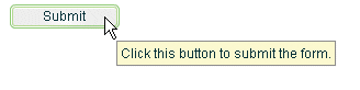
The following image shows ToolTip text that appears when the user hovers the mouse pointer over a button:
When the user moves the mouse pointer away from the component or clicks the mouse button, the ToolTip disappears. If the mouse pointer remains over the component, the ToolTip eventually disappears. The default behavior is to display only one ToolTip at a time.
You can set the time it takes for the ToolTip to appear when a user moves the mouse pointer over the component. You can also set the amount of time it takes for the ToolTip to disappear.
If you define a ToolTip on a container, the ToolTipManager displays the parent's ToolTip for the children if the child does not have one.
Flex ToolTips support style sheets and the dynamic loading of ToolTip text. ToolTip text does not support embedded HTML. For more information on using style sheets and dynamic loading of text, see Setting styles in ToolTips and Using dynamic ToolTip text.
Not all Spark text components support ToolTips. For example, you can add a ToolTip to the RichEditableText component, but not the RichText control.
Some components have their own ToolTip-like "data tips." These components include the List control, most chart controls, and DataGrid control. For more information, see that component's documentation.
ToolTips are the basis for the accessibility implementation within Flex. All controls that support accessibility do so by making their ToolTip text readable by screen readers such as JAWS. For more information on accessibility, see Accessible applications.
Creating ToolTips
Every visual component that extends the UIComponent, UITextField, or UIFTETextField classes (which implement the IToolTipManagerClient interface) supports a toolTip property. This property is inherited from those class that implement IToolTipManagerClient. You set the value of the toolTip property to a text string, and when the mouse pointer hovers over that component, the text string appears. The following example sets the toolTip property text for a Button control:
<?xml version="1.0"?>
<!-- tooltips/BasicToolTip.mxml -->
<s:Application
    xmlns:fx="http://ns.adobe.com/mxml/2009"
    xmlns:mx="library://ns.adobe.com/flex/mx"
    xmlns:s="library://ns.adobe.com/flex/spark">

    <s:layout>
        <s:VerticalLayout/>
    </s:layout>

  <s:Button id="b1" label="Click Me" toolTip="This Button does nothing."/>

</s:Application>
To set the value of a ToolTip in ActionScript, use the toolTip property of the component. The following example creates a new Button and sets the toolTip property of a Button control:
<?xml version="1.0"?>
<!-- tooltips/BasicToolTipActionScript.mxml -->
<s:Application
    xmlns:fx="http://ns.adobe.com/mxml/2009"
    xmlns:mx="library://ns.adobe.com/flex/mx"
    xmlns:s="library://ns.adobe.com/flex/spark">

    <s:layout>
        <s:VerticalLayout/>
    </s:layout>

  <fx:Script>
    <![CDATA[
     public function createNewButton(event:MouseEvent):void {
        var myButton:Button = new Button();
        myButton.label = "Create Another Button";
        myButton.toolTip = "Click this new button to create another button.";
        myButton.addEventListener(MouseEvent.CLICK, createNewButton);
        addElement(myButton);
     }
    ]]>
  </fx:Script>

  <s:Button id="b1" label="Create Another Button"
        toolTip="Click this button to create another button."
        click="createNewButton(event);"/>

</s:Application>
If you do not define a ToolTip on the child of a container, the ToolTipManager displays the parent's ToolTip. For example, if you add a Button control to a Panel container that has a ToolTip, the user sees the Panel container's ToolTip text when the user moves the mouse pointer over the Panel. When the user moves the mouse pointer over the Button control, the Panel's ToolTip continues to be displayed. You can override the container's ToolTip text by setting the value of the child's toolTip property.
The following example shows the inheritance of ToolTip text:
<?xml version="1.0"?>
<!-- tooltips/ToolTipInheritance.mxml -->
<s:Application
    xmlns:fx="http://ns.adobe.com/mxml/2009"
    xmlns:mx="library://ns.adobe.com/flex/mx"
    xmlns:s="library://ns.adobe.com/flex/spark">

    <s:VGroup toolTip="VGroup ToolTip">
        <s:Button id="b1" label="Button 1" toolTip="Button ToolTip"/>
        <s:Button id="b2" label="Button 2"/>
    </s:VGroup>

</s:Application>
When the mouse pointer is over button b1, the ToolTip displays "Button ToolTip". When the mouse pointer is over button b2 or anywhere in the VGroup container except over button b1, the ToolTip displays "VGroup ToolTip".
The TabNavigator container uses the ToolTips that are on its children. If you add a ToolTip to a child view of a TabNavigator container, the ToolTip appears when the mouse is over the tab for that view, but not when the mouse is over the view itself. If you add a ToolTip to the TabNavigator container, the ToolTip appears when the mouse is over either the tab or the view, unless the ToolTip is overridden by the tab or the view. ToolTips in the following controls also behave this way:
There is no limit to the size of the ToolTip text, although long messages can be difficult to read. When the ToolTip text reaches the width of the ToolTip box, the text wraps to the next line. You can add line breaks in ToolTip text. In ActionScript, you use the \n escaped newline character. In MXML tags, you use the XML entity.
The following examples show using the \n escaped newline character and the entity:
<?xml version="1.0"?>
<!-- tooltips/ToolTipNewlines.mxml -->
<s:Application
xmlns:fx="http://ns.adobe.com/mxml/2009"
xmlns:mx="library://ns.adobe.com/flex/mx"
xmlns:s="library://ns.adobe.com/flex/spark"
initialize="doSomething(event)">
<fx:Script>
<![CDATA[
public function doSomething(event:Event):void {
// Use the \n to force a line break in ActionScript.
b1.toolTip = "Click this button \nto clear the form.";
}
]]>
</fx:Script>
<s:Button id="b1" label="Clear" width="100"/>
<!-- Use to force a line break in MXML tags. -->
<s:Button id="b2" label="Submit" width="100"
toolTip="Click this button to submit the form."/>
</s:Application>
You also have some flexibility in formatting the text of the ToolTip. You can apply styles and change other settings for all ToolTips in your application by using the ToolTip Cascading Style Sheets (CSS) type selector. The following sections describe how to set styles on the ToolTip text and box.
Setting styles in ToolTips
You can change the appearance of ToolTip text and the ToolTip box by using CSS syntax or the mx.styles.StyleManager class. Changes to ToolTip styles apply to all ToolTips in the current application.
The default styles for ToolTips are defined by the ToolTip type selector in the defaults.css file in the framework.swc file. You can use a type selector in the <fx:Style> tag to override the default styles of your ToolTips. The following example sets the styles of the ToolTip type selector using CSS syntax:
<?xml version="1.0"?>
<!-- tooltips/ToolTipStyles.mxml -->
<s:Application
    xmlns:fx="http://ns.adobe.com/mxml/2009"
    xmlns:mx="library://ns.adobe.com/flex/mx"
    xmlns:s="library://ns.adobe.com/flex/spark">

    <fx:Style>
        @namespace mx "library://ns.adobe.com/flex/mx";

        mx|ToolTip {
            fontFamily: "Arial";
            fontSize: 19;
            fontStyle: "italic";
            color: #FF6699;
            backgroundColor: #33CC99;
        }
    </fx:Style>

    <s:Button id="b1" label="Click Me" toolTip="This Button does nothing."/>

</s:Application>
You can also use the StyleManager to apply styles to all ToolTips. You must first get a reference to the top-level StyleManager with the Application object's styleManager property. You then get the ToolTip style declaration with the getStyleDeclaration() method. Finally, you apply a style to the ToolTip type selector with the setStyle() method, as the following example shows:
<?xml version="1.0"?>
<!-- tooltips/ToolTipStyleManager.mxml -->
<s:Application
    xmlns:fx="http://ns.adobe.com/mxml/2009"
    xmlns:mx="library://ns.adobe.com/flex/mx"
    xmlns:s="library://ns.adobe.com/flex/spark"
    creationComplete="setToolTipStyle()">

    <fx:Script>
        <![CDATA[
            private function setToolTipStyle():void {
                styleManager.getStyleDeclaration("mx.controls.ToolTip").setStyle("fontStyle","italic");
                styleManager.getStyleDeclaration("mx.controls.ToolTip").setStyle("fontSize","19");
                styleManager.getStyleDeclaration("mx.controls.ToolTip").setStyle("fontFamily","Arial");
                styleManager.getStyleDeclaration("mx.controls.ToolTip").setStyle("color","#FF6699");
                styleManager.getStyleDeclaration("mx.controls.ToolTip").setStyle("backgroundColor","#33CC99");
            }
        ]]>
    </fx:Script>

  <s:Button id="b1" label="Click Me" toolTip="This Button does nothing."/>

</s:Application>
ToolTips use inheritable styles that you set globally. For example, you can set the fontWeight of ToolTips with the StyleManager by setting it on the global selector, as the following example shows:
<?xml version="1.0"?>
<!-- tooltips/ToolTipGlobalStyles.mxml -->
<s:Application
    xmlns:fx="http://ns.adobe.com/mxml/2009"
    xmlns:mx="library://ns.adobe.com/flex/mx"
    xmlns:s="library://ns.adobe.com/flex/spark"
    creationComplete="setToolTipStyle()">

    <fx:Script>
        <![CDATA[
            private function setToolTipStyle():void {
                styleManager.getStyleDeclaration("global").setStyle("fontWeight","bold");
                styleManager.getStyleDeclaration("global").setStyle("color","red");
            }
        ]]>
    </fx:Script>

  <s:Button id="b1" label="Click Me" toolTip="This Button does nothing, but the ToolTip is styled red and bold."/>

</s:Application>
Styles set on the Application object typically apply to all UI objects. However, ToolTips do not inherit styles set on the Application object.
If you set the fontWeight property on the global selector, your change affects the text of many controls in addition to ToolTips, so be careful when using the global selector.
For a complete list of styles supported by ToolTips, see the ActionScript 3.0 Reference for Apache Flex. For more information on using styles, see Styles and themes.
You can reskin ToolTip controls to give them an entirely new appearance. You can do this by using the ToolTipBorder programmatic skin or reskin them graphically. For an example of programmatically reskinning a ToolTip control, see Reskinning ToolTips.
Setting the width of ToolTips
You can set the width of the ToolTip box by changing the maxWidth property of the ToolTip class. This property is static so when you set it, you are setting it for all ToolTip objects. You cannot set it on an instance of a ToolTip class.
The maxWidth property specifies the maximum width in pixels for new ToolTips boxes. For example, the following line changes the maximum width of the ToolTip box to 100 pixels:
<?xml version="1.0"?>
<!-- tooltips/SetMaxWidth.mxml -->
<s:Application
    xmlns:fx="http://ns.adobe.com/mxml/2009"
    xmlns:mx="library://ns.adobe.com/flex/mx"
    xmlns:s="library://ns.adobe.com/flex/spark"
    creationComplete="initApp()">

    <s:layout>
        <s:VerticalLayout/>
    </s:layout>

  <fx:Script>
    <![CDATA[
     import mx.controls.ToolTip;

     public function initApp():void {
        ToolTip.maxWidth = 100;
     }
     public function createNewButton(event:MouseEvent):void {
        var myButton:Button = new Button();
        myButton.label = "Create Another Button";
        myButton.toolTip = "Click this new button to create another button.";
        myButton.addEventListener(MouseEvent.CLICK, createNewButton);
        addElement(myButton);
     }
    ]]>
  </fx:Script>

  <s:Button id="b1" label="Create Another Button"
    click="createNewButton(event);"
    toolTip="Click this button to create a new one."/>
</s:Application>
Flex wraps the text of a ToolTip onto multiple lines to ensure that the width does not exceed this value. If the text in the ToolTip box is not as wide as the maxWidth property, Flex creates a box only wide enough for the text to fit.
The default value of maxWidth is 300. If the value of maxWidth exceeds the width of the application, Flex clips the text in the ToolTip box.
Using ToolTip events
ToolTips trigger many events during their life cycle. These events are of type ToolTipEvent.
In addition to the type and target properties, the ToolTipEvent object references the ToolTip in its toolTip property. With a reference to the ToolTip, you can then access the ToolTip text with the text property.
To use events of type ToolTipEvent in your <fx:Script> blocks, you must import mx.events.ToolTipEvent class.
The following example plays a sound in response to the TOOL_TIP_SHOW event:
<?xml version="1.0"?>
<!-- tooltips/ToolTipsWithSoundEffects.mxml -->
<s:Application
    xmlns:fx="http://ns.adobe.com/mxml/2009"
    xmlns:mx="library://ns.adobe.com/flex/mx"
    xmlns:s="library://ns.adobe.com/flex/spark"
    initialize="initApp()">

  <fx:Script>
    <![CDATA[
     import mx.events.ToolTipEvent;
     import flash.media.Sound;

     [Embed(source="../assets/sound1.mp3")]
     private var beepSound:Class;
     private var myClip:Sound;

     public function playSound():void {
        myClip.play();
     }
     private function myListener(event:ToolTipEvent):void {
        playSound();
     }
     private function initApp():void {
        myRichEditableText.addEventListener(ToolTipEvent.TOOL_TIP_SHOW, myListener);
        myClip = new beepSound();
     }
    ]]>
  </fx:Script>

  <s:RichEditableText id="myRichEditableText" toolTip="ToolTip" text="Mouse Over Me"/>

</s:Application>
Using ToolTips with MX navigator containers
MX NavBar and TabBar subclasses (such as ButtonBar, LinkBar, and ToggleButtonBar) support ToolTips in their data providers. The data provider array can contain a toolTip field that specifies the toolTip for the navigation items.
The following example creates ToolTips for each of the navigation items:
<?xml version="1.0"?>
<!-- tooltips/NavItemToolTips.mxml -->
<s:Application
    xmlns:fx="http://ns.adobe.com/mxml/2009"
    xmlns:mx="library://ns.adobe.com/flex/mx"
    xmlns:s="library://ns.adobe.com/flex/spark">

    <s:layout>
        <s:VerticalLayout/>
    </s:layout>

    <s:ButtonBar>
        <s:dataProvider>
            <s:ArrayCollection>
                <fx:Object label="OK" toolTip="OK Button ToolTip"/>
                <fx:Object label="Cancel" toolTip="Cancel Button ToolTip"/>
            </s:ArrayCollection>
        </s:dataProvider>
    </s:ButtonBar>

    <mx:ButtonBar>
        <mx:dataProvider>
                <fx:Object label="OK" toolTip="OK Button ToolTip"/>
                <fx:Object label="Cancel" toolTip="Cancel Button ToolTip"/>
        </mx:dataProvider>
    </mx:ButtonBar>
</s:Application>
The Spark ButtonBar component does not by default support the use of a toolTip field in its data provider. To add ToolTips to a Spark ButtonBar in this way, you must create a custom item renderer. For more information, see Custom Spark item renderers.
You can use ToolTips on child elements in a navigator container's data provider. The component recognizes those ToolTips and displays them accordingly. In the following example, the ToolTips are propagated up to the LinkBar:
<?xml version="1.0"?>
<!-- tooltips/DataProviderToolTips.mxml -->
<s:Application
    xmlns:fx="http://ns.adobe.com/mxml/2009"
    xmlns:mx="library://ns.adobe.com/flex/mx"
    xmlns:s="library://ns.adobe.com/flex/spark">

  <mx:VBox>
     <!-- Create a LinkBar control to navigate the ViewStack. -->
     <mx:LinkBar dataProvider="{vs1}" borderStyle="solid"/>

     <!-- Define the ViewStack and the three child containers. -->
     <mx:ViewStack id="vs1" borderStyle="solid" width="100%" height="150">
        <mx:Canvas id="search" label="Search" toolTip="Search Screen">
           <mx:Label text="Search Screen"/>
        </mx:Canvas>
        <mx:Canvas id="custInfo" label="Customer"
           toolTip="Customer Info Screen">
           <mx:Label text="Customer Info"/>
        </mx:Canvas>
        <mx:Canvas id="accountInfo" label="Account"
           toolTip="Account Info Screen">
           <mx:Label text="Account Info"/>
        </mx:Canvas>
     </mx:ViewStack>
  </mx:VBox>

</s:Application>
You can also set the value of the NavBar's toolTipField property to point to the field in the data provider that provides a ToolTip. The data provider in the following example defines ToolTips in the myToolTip field:
<?xml version="1.0"?>
<!-- tooltips/ToolTipFieldExample.mxml -->
<s:Application
    xmlns:fx="http://ns.adobe.com/mxml/2009"
    xmlns:mx="library://ns.adobe.com/flex/mx"
    xmlns:s="library://ns.adobe.com/flex/spark">

  <mx:ButtonBar toolTipField="myToolTip">
    <mx:dataProvider>
     <fx:Object label="OK" myToolTip="OK Button TooTip"/>
     <fx:Object label="Cancel" myToolTip="Cancel Button ToolTip"/>
    </mx:dataProvider>
  </mx:ButtonBar>

</s:Application>
Using the ToolTip Manager
The ToolTipManager class lets you set basic ToolTip functionality, such as display delay and the disabling of ToolTips. It is located in the mx.managers package. You must import this class when using the ToolTipManager. The ToolTipManager class also contains a reference to the current ToolTip in its currentToolTip property.
Enabling and disabling ToolTips
You can enable and disable ToolTips in your applications. When you disable ToolTips, no ToolTip box appears when the user moves the mouse pointer over a visible component, regardless of whether that component's toolTip property is set.
You use the enabled property of the ToolTipManager to enable or disable ToolTips. You set this property to true to enable ToolTips or false to disable ToolTips. The default value is true.
The following example toggles ToolTips on and off when the user clicks the Toggle ToolTips button:
<?xml version="1.0"?>
<!-- tooltips/ToggleToolTips.mxml -->
<s:Application
    xmlns:fx="http://ns.adobe.com/mxml/2009"
    xmlns:mx="library://ns.adobe.com/flex/mx"
    xmlns:s="library://ns.adobe.com/flex/spark">

  <fx:Script>
    <![CDATA[
     import mx.managers.ToolTipManager;

     private function toggleToolTips():void {
        if (ToolTipManager.enabled) {
           ToolTipManager.enabled = false;
        } else {
           ToolTipManager.enabled = true;
        }
     }
    ]]>
  </fx:Script>

  <s:Button id="b1"
    label="Toggle ToolTips"
    width="150"
    click="toggleToolTips();"
    toolTip="Click me to enable/disable tooltips."
  />

</s:Application>
Setting delay times
A delay time is a measurement of time that passes before something takes place. For example, after the user moves the mouse pointer over a component, there is a brief delay before the ToolTip appears. This gives someone who is not looking for ToolTip text enough time to move the mouse pointer away before seeing the pop-up.
The ToolTipManager lets you set the length of time that passes before the ToolTip box appears, and the length of time that a ToolTip remains on the screen when a mouse pointer hovers over the component. You can also set the delay between ToolTips.
You set the value of the ToolTipManager's showDelay, hideDelay, and scrubDelay properties in ActionScript. The following table describes the time delay properties of the ToolTipManager:
|
Property |
Description |
|---|---|
showDelay |
The length of time, in milliseconds, that Flex waits before displaying the ToolTip box when a user moves the mouse pointer over a component that has a ToolTip. To make the ToolTip appear instantly, set the showDelay property to 0. The default value is 500 milliseconds, or half of a second. |
hideDelay |
The length of time, in milliseconds, that Flex waits to hide the ToolTip box after it appears. This amount of time only applies if the mouse pointer is over the target component. Otherwise the ToolTip disappears immediately when you move the mouse pointer away from the target component. After Flex hides a ToolTip box, the user must move the mouse pointer off the component and back onto it to see the ToolTip box again. If you set the hideDelay property to 0, Flex does not display the ToolTip. It's best to use the default value of 10,000 milliseconds, or 10 seconds. If you set the hideDelay property to Infinity, Flex does not hide the ToolTip until the user triggers an event (such as moving the mouse pointer off the component). The following example sets the hideDelay property to Infinity: ToolTipManager.hideDelay = Infinity; |
scrubDelay |
The length of time, in milliseconds, that a user can take when moving the mouse between controls before Flex again waits for the duration of showDelay to display a ToolTip box. This setting is useful if the user moves quickly from one control to another; after displaying the first ToolTip, Flex displays the others immediately rather than waiting for the duration of the showDelay setting. The shorter the setting for scrubDelay, the more likely that the user must wait for an amount of time specified by the showDelay property in order to see the next ToolTip. A good use of this property is if you have several buttons on a toolbar, and the user will quickly scan across them to see brief descriptions of their functionality. The default value is 100. |
The following example uses the Application control's initialize event to set the starting values for the ToolTipManager:
<?xml version="1.0"?>
<!-- tooltips/ToolTipTiming.mxml -->
<s:Application
    xmlns:fx="http://ns.adobe.com/mxml/2009"
    xmlns:mx="library://ns.adobe.com/flex/mx"
    xmlns:s="library://ns.adobe.com/flex/spark"
    creationComplete="initApp();">

    <s:layout>
        <s:VerticalLayout/>
    </s:layout>

    <fx:Script><![CDATA[
        import mx.managers.ToolTipManager;
        private function initApp():void {
            ToolTipManager.enabled = true;// Optional. Default value is true.
            ToolTipManager.showDelay = 0;// Display immediately.
            ToolTipManager.hideDelay = 3000; // Hide after 3 seconds of being viewed.
        }
    ]]></fx:Script>

    <s:Button label="Click Me" toolTip="Click this Button to do something."/>
    <s:Button label="Click Me" toolTip="Click this Button to do something else."/>
    <s:Button label="Click Me" toolTip="Click this Button to do a third thing."/>
    <s:Button label="Click Me" toolTip="Click this Button to do the same thing."/>

</s:Application>
Using effects with ToolTips
You can use a custom effect or one of the standard Flex effects with ToolTips. You set the showEffect or hideEffect property of the ToolTipManager to define the effect that is triggered whenever a ToolTip is displayed or is hidden.
The following example uses the Fade effect so that ToolTips fade in when the user moves the mouse pointer over a component with a ToolTip:
<?xml version="1.0"?>
<!-- tooltips/FadeInToolTips.mxml -->
<s:Application
    xmlns:fx="http://ns.adobe.com/mxml/2009"
    xmlns:mx="library://ns.adobe.com/flex/mx"
    xmlns:s="library://ns.adobe.com/flex/spark"
    width="600" height="600"
    initialize="app_init();">

    <s:layout>
        <s:VerticalLayout/>
    </s:layout>

    <fx:Declarations>
        <s:Fade id="fadeIn" alphaFrom="0" alphaTo="1" duration="1000"/>
    </fx:Declarations>

    <fx:Script>
        <![CDATA[
            import mx.managers.ToolTipManager;

            public function app_init():void {
                ToolTipManager.showEffect = fadeIn;
            }
        ]]>
    </fx:Script>

    <s:Button id="b1" label="Click Me"
        toolTip="This is a ToolTip that fades in."/>

</s:Application>
By default, the font used in this example does not fade. You must use an embedded font to achieve the effect. For more information on using embedded fonts, see Embed fonts.
If you set a fade out effect for the hideEffect event, the user must wait with the mouse hovering over the component to trigger that effect; the hideToolTip event is not triggered if the user moves the mouse pointer to a different component before the ToolTip object hides on its own.
For more information about using effects and defining custom effects, see Introduction to effects.
Using dynamic ToolTip text
You can use ToolTips for more than just displaying static help text to the user. You can also bind the ToolTip text to data or component text. This lets you use ToolTips as a part of the user interface, showing drill-down information, query results, or more helpful text that is customized to the user experience.
You bind the value of the ToolTip text to the value of another control's text using curly braces ({ }) syntax.
The following example inserts the value of the TextInput control into the Button control's ToolTip text when the user moves the mouse pointer over the Button control:
<?xml version="1.0"?>
<!-- tooltips/BoundToolTipText.mxml -->
<s:Application
    xmlns:fx="http://ns.adobe.com/mxml/2009"
    xmlns:mx="library://ns.adobe.com/flex/mx"
    xmlns:s="library://ns.adobe.com/flex/spark">

    <s:layout>
        <s:VerticalLayout/>
    </s:layout>

    <s:TextInput id="txtTo" width="300"/>
    <s:Button label="Send" toolTip="Send e-mail to {txtTo.text}"/>

</s:Application>
In this example, if the user enters fred@fred.com in the TextInput box, and then moves the mouse pointer over the button, Flex displays the message "Send e-mail to fred@fred.com" in the ToolTip box.
Another approach to creating dynamic text for ToolTips is to intercept the ToolTip in its toolTipShow event handler and change the value of its text property. The following example registers the myToolTipChanger() method as a listener for the Button control's toolTipShow event. The code in that method changes the value of the ToolTipManager.currentToolTip.text property to a value that is not known until run time.
<?xml version="1.0"?>
<!-- tooltips/DynamicToolTipText.mxml -->
<s:Application
    xmlns:fx="http://ns.adobe.com/mxml/2009"
    xmlns:mx="library://ns.adobe.com/flex/mx"
    xmlns:s="library://ns.adobe.com/flex/spark"
    initialize="initApp()">

  <fx:Script>
    <![CDATA[
     import mx.managers.ToolTipManager;
     import mx.controls.ToolTip;
     import mx.events.ToolTipEvent;
     import mx.core.FlexGlobals;

     public function initApp():void {
        b1.addEventListener(ToolTipEvent.TOOL_TIP_SHOW, myToolTipChanger)
     }

     public function myToolTipChanger(event:ToolTipEvent):void {
        /* Pass the value of myName in to your application as a flashVars variable.
           For example, on the query string. */
        ToolTipManager.currentToolTip.text = "Click the button, " +
           FlexGlobals.topLevelApplication.parameters.myName;
     }
    ]]>
  </fx:Script>

  <s:Button id="b1" label="Click Me" toolTip="Click the button."/>

</s:Application>
You can only create text for the current ToolTip in the toolTipShow event handler if the object had a ToolTip in the first place. For example, if the button in the previous example did not set a value for the toolTip property, no ToolTip would appear even after the myToolTipChanger() method was called.
For information about using the FlexGlobals.topLevelApplication.application object, see Passing request data with flashVars properties.
Creating custom ToolTips
The ToolTipManager has two methods that let you programmatically use ToolTips. These methods are createToolTip() and destroyToolTip(), which you use to create and destroy new ToolTip objects. When you create a ToolTip object, you can customize it as you would any object, with access to its properties, styles, events, and effects.
The createToolTip() method has the following signature:
 createToolTip(text:String, x:Number, y:Number, errorTipBorderStyle:String,
	context:IUIComponent):IToolTip
The text parameter defines the contents of the ToolTip.
The x and y parameters define the x and y coordinates of the ToolTip, relative to the application container.
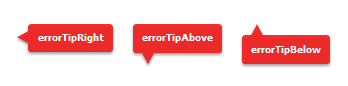
The errorTipBorderStyle parameter sets the location of the pointer on the error tip. This parameter is optional. If you specify the value of the errorTipBorderStyle parameter in the createToolTip() method, Flex styles the ToolTip as an error tip. Valid values are "errorTipRight", "errorTipAbove", or "errorTipBelow", and indicate the location of the error tip relative to the component. If you set the errorTipBorderStyle parameter to null, then the ToolTip is a normal ToolTip, not an error tip.
The following example shows the valid values and their resulting locations on the error tip:
The context parameter determines which StyleManager is used. Typically, you pass the object on which the ToolTip appears, so that the ToolTip's StyleManager is the same one use by that object. This object must be of type IUIComponent, so you might need to cast it in some cases, such as when you want to specify the context as the event.currentTarget in an event handler.
For more information about using error tips, see Using error tips.
The createToolTip() method returns a new ToolTip object that implements the IToolTip interface. You typically cast the return value of this method to a ToolTip, although it is more efficient if you do not do this. To cast, you can do one of the following:
-
Use the as keyword, as the following example shows:
myTip = ToolTipManager.createToolTip(s,10,10) as ToolTip;
-
Use the type ( object ) casting syntax, as the following example shows:
myTip = ToolTip(ToolTipManager.createToolTip(s,10,10));
These methods of casting differ only in the way that they behave when a cast fails.
Flex displays the ToolTip until you destroy it. In general, you should not display more than one ToolTip box at a time, because it is confusing to the user.
You can use the destroyToolTip() method to destroy the specified ToolTip object. The destroyToolTip() method has the following signature:
destroyToolTip(toolTip:IToolTip):void
The toolTip parameter is the ToolTip object that you want to destroy. This is the object returned by the createToolTip() method.
The following example creates a custom ToolTip when you move the mouse over a Panel container that contains three Button controls. Each Button control has its own ToolTip that appears when you mouse over that particular control. The big ToolTip disappears only when you move the mouse away from the Panel container.
Ôªø<?xml version="1.0"?>
<!-- tooltips/CreatingToolTips.mxml -->
<s:Application
    xmlns:fx="http://ns.adobe.com/mxml/2009"
    xmlns:mx="library://ns.adobe.com/flex/mx"
    xmlns:s="library://ns.adobe.com/flex/spark">

    <s:layout>
        <s:VerticalLayout/>
    </s:layout>

    <fx:Script>
        <![CDATA[
            import mx.managers.ToolTipManager;
            import mx.controls.ToolTip;
            import mx.core.IUIComponent;

            public var myTip:ToolTip;

            private function createBigTip(event:Event):void {
                var s:String = "These buttons let you save, exit, or continue with the current operation."
                myTip = ToolTipManager.createToolTip(s,75,75,null,IUIComponent(event.currentTarget)) as ToolTip;
                myTip.setStyle("backgroundColor",0xFFCC00);
                myTip.width = 125;
                myTip.height = 75;
            }

            private function destroyBigTip():void {
                ToolTipManager.destroyToolTip(myTip);
            }
        ]]>
    </fx:Script>

    <fx:Style>
        @namespace s "library://ns.adobe.com/flex/spark";

        s|Panel {
            paddingLeft: 5;
            paddingRight: 5;
            paddingTop: 5;
            paddingBottom: 5;
        }
    </fx:Style>

    <s:Panel title="ToolTips" height="200" width="200" rollOver="createBigTip(event)" rollOut="destroyBigTip()">
        <s:Button label="OK" y="20" toolTip="Save your changes and exit."/>
        <s:Button label="Apply" y="50" toolTip="Apply changes and continue."/>
        <s:Button label="Cancel" y="80" toolTip="Cancel and exit."/>
    </s:Panel>

</s:Application>
Customizing the current ToolTip
Another approach to customizing ToolTip objects is to intercept the current ToolTip and customize it rather than using the ToolTipManager to create a new ToolTip object.
You do this by customizing the ToolTip during one of the ToolTip-related events like toolTipHide, toolTipShow, and toolTipShown.
The following example triggers the customization on the ToolTip's toolTipShown event. This lets Flex handle all the logic for displaying and hiding the ToolTip, but lets you modify the current ToolTip's text, position, and other properties.
<?xml version="1.0" encoding="utf-8"?>
<!-- tooltips/CustomToolTipInActionScript.mxml -->
<s:Application
    xmlns:fx="http://ns.adobe.com/mxml/2009"
    xmlns:mx="library://ns.adobe.com/flex/mx"
    xmlns:s="library://ns.adobe.com/flex/spark"
    creationComplete="initApp();">

    <s:layout>
        <s:VerticalLayout/>
    </s:layout>

    <fx:Script>
        <![CDATA[
            import spark.components.Button;
            import mx.core.IToolTip;
            import mx.events.ToolTipEvent;
            import mx.managers.ToolTipManager;
            import mx.core.FlexGlobals;

            public var myTip:IToolTip;
            public var b:Button;

            private function initApp():void {
                b = new Button();
                b.addEventListener("toolTipShown", createCustomTip);
                b.label = "Click Me";

                /* You must create a blank ToolTip so that the control
                   can dispatch ToolTip-related events. The new ToolTip
                   will replace this empty ToolTip. */
                b.toolTip = " ";

                addElement(b);
            }

            private function createCustomTip(e:ToolTipEvent):void {
                var s:String = "This is a ToolTip for the button.";
                myTip = ToolTipManager.currentToolTip;

                // Customize the text of the ToolTip.
                myTip.text = s;

                // Customize the alpha of the ToolTip.
                myTip.alpha = .6;

                // Customize the position of the ToolTip.
                myTip.x = FlexGlobals.topLevelApplication.mouseX + 20;
                myTip.y = FlexGlobals.topLevelApplication.mouseY;
            }
        ]]>
    </fx:Script>
</s:Application>
Implementing the IToolTip interface
You can also create a custom ToolTip by extending an existing control, such as a Panel or other container, and implementing the IToolTip interface. The following example uses a Panel container as the base for a new implementation of the IToolTip interface:
<?xml version="1.0"?>
<!-- tooltips/ToolTipComponents/PanelToolTip.mxml -->
<s:Panel
    xmlns:fx="http://ns.adobe.com/mxml/2009"
    xmlns:mx="library://ns.adobe.com/flex/mx"
    xmlns:s="library://ns.adobe.com/flex/spark"
    implements="mx.core.IToolTip"
    width="200"
    alpha=".75">
    <fx:Script>
        <![CDATA[
            [Bindable]
            public var bodyText:String = "";

            //  Implement required methods of the IToolTip interface; these
            //  methods are not used in this example, though.
            public var _text:String;

            public function get text():String {
                return _text;
            }
            public function set text(value:String):void {
            }
        ]]>
    </fx:Script>

    <s:RichText text="{bodyText}" percentWidth="100"/>

</s:Panel>
In your application, you can create a custom ToolTip by intercepting the toolTipCreate event handler of the target component. In the event handler, you instantiate the new ToolTip and set its properties. You then point the toolTip property of the ToolTipEvent object to the new ToolTip.
In the following example, the first two buttons in the application use the custom PanelToolTip class in the ToolTipComponents package. The third button uses a default ToolTip to show you how the two are different. To run this example, store the PanelToolTip.mxml file in a subdirectory named ToolTipComponents.
<?xml version="1.0"?>
<!-- tooltips/MainCustomApp.mxml -->
<s:Application
    xmlns:fx="http://ns.adobe.com/mxml/2009"
    xmlns:mx="library://ns.adobe.com/flex/mx"
    xmlns:s="library://ns.adobe.com/flex/spark">

    <s:layout>
        <s:VerticalLayout/>
    </s:layout>

    <fx:Script>
        <![CDATA[
            import ToolTipComponents.PanelToolTip;
            import mx.events.ToolTipEvent;

            private function createCustomTip(title:String, body:String, event:ToolTipEvent):void {
               var ptt:PanelToolTip = new PanelToolTip();
               ptt.title = title;
               ptt.bodyText = body;
               event.toolTip = ptt;
            }
        ]]>
    </fx:Script>

    <s:Button id="b1"
        label="Delete"
        toolTip=" "
        toolTipCreate="createCustomTip('DELETE','Click this button to delete the report.', event)"
    />
    <s:Button id="b2"
        label="Generate"
        toolTip=" "
        toolTipCreate="createCustomTip('GENERATE','Click this button to generate the report.', event)"
    />

    <s:Button id="b3"
        label="Stop"
        toolTip="Click this button to stop the creation of the report. This button uses a standard ToolTip style."
    />

</s:Application>
Positioning custom ToolTips
When you use the ToolTipManager to create a custom ToolTip, you specify the coordinates of the ToolTip on the Stage. You do this by specifying the values of the x and y parameters of the new ToolTip in the createToolTip() method. These coordinates are relative to the Stage. For example, a value of 0,0 creates a ToolTip at the top-left corner of the application.
In some cases, you might not know the exact position that you want the ToolTip to be drawn in; instead, you want the location of the ToolTip to be relative to the target component (the component that has a ToolTip on it). In those cases, you can use the location of the target component to calculate the values of these coordinates. For example, if you want the ToolTip to appear to a component's right, you set the ToolTip's x position to be the x position of the component plus the component's width, plus some other value for an offset.
The following image shows the results of this formula:
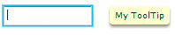
You also set the value of the ToolTip's y position to be the same as the target component's y position to line the ToolTip and the component up horizontally.
One way to get the values you need to calculate the x position of the ToolTip is to use an event handler. Event objects passed to an event handler can give you the x position and the width of the target component.
The following example gets the value of the current target's x, y, and width properties in the focusIn event handler, and uses them to position the ToolTip. In this case, the current target is the TextInput control, and the ToolTip appears to its right with a 10-pixel offset.
Ôªø<?xml version="1.0"?>
<!-- tooltips/PlacingToolTips.mxml -->
<s:Application
    xmlns:fx="http://ns.adobe.com/mxml/2009"
    xmlns:mx="library://ns.adobe.com/flex/mx"
    xmlns:s="library://ns.adobe.com/flex/spark"
    height="100" width="300">
    <s:layout>
        <s:VerticalLayout/>
    </s:layout>

    <fx:Script>
        <![CDATA[
             import mx.controls.ToolTip;
             import mx.managers.ToolTipManager;
             import mx.core.IUIComponent;

             private var tip:ToolTip;
             private var s:String;

             private function showTip(event:Object):void {
                s="My ToolTip";

                // Position the ToolTip to the right of the current target.
                tip = ToolTipManager.createToolTip(s,
                    event.currentTarget.x + event.currentTarget.width + 10,
                    event.currentTarget.y, null,IUIComponent(event.currentTarget))
                    as ToolTip;
            }

            private function destroyTip(event:Object):void {
                 ToolTipManager.destroyToolTip(tip);
            }
        ]]>
    </fx:Script>

    <s:TextInput id="a"
        width="100"
        focusIn="showTip(event)"
        focusOut="destroyTip(event)"/>

    <s:TextInput id="b"
        width="100"
        focusIn="showTip(event)"
        focusOut="destroyTip(event)"/>

</s:Application>
The previous example creates a ToolTip on a target component that is not inside any containers. However, in many cases, your components will be inside layout containers such as a VGroup or an HGroup. Under these circumstances, the coordinates you access in the event handler will be relative to the container and not the main application. But the ToolTipManager expects global coordinates when positioning the ToolTip. This will position ToolTips in unexpected locations.
To avoid this, you can use the contentToGlobal() method to convert the coordinates in the event handler from local to global. All components that subclass UIComponent have this method. It takes a single Point that is relative to the target's enclosing container as an argument and returns a Point that is relative to the Stage.
The following example calls the TextInput control's contentToGlobal() method to convert the control's coordinates from those that are relative to the VGroup container to global coordinates.
<?xml version="1.0"?>
<!-- tooltips/PlacingToolTipsInContainers.mxml -->
<s:Application
    xmlns:fx="http://ns.adobe.com/mxml/2009"
    xmlns:mx="library://ns.adobe.com/flex/mx"
    xmlns:s="library://ns.adobe.com/flex/spark"
    height="400" width="600">
    <s:layout>
        <s:VerticalLayout/>
    </s:layout>

    <fx:Script>
        <![CDATA[
            import mx.controls.ToolTip;
            import mx.managers.ToolTipManager;
            import mx.core.IUIComponent;

            private var tip:ToolTip;
            private var s:String;

            private function showTipA(event:Object):void {
                s="My Tip A";
                tip = ToolTipManager.createToolTip(s,
                    event.currentTarget.x + event.currentTarget.width + 10,
                    event.currentTarget.y) as ToolTip;
            }

            private function showTipB(event:Object):void {
                s="My Tip B";
                var pt:Point = new Point(0,0);

                /* Call this method to convert the object's
                   coordinates inside its container to the stage's
                   global coordinates. */
                pt = event.currentTarget.contentToGlobal(pt);

                tip = ToolTipManager.createToolTip(s,
                    pt.x + event.currentTarget.width + 10, pt.y, null,
                    IUIComponent(event.currentTarget)) as ToolTip;
            }

            private function destroyTip(event:Object):void {
                 ToolTipManager.destroyToolTip(tip);
            }
        ]]>
    </fx:Script>

    <!-- A ToolTip at the top level. -->
    <!-- The event handler for this ToolTip does not use any special
    logic to account for whether the ToolTip is inside a container.
    But this ToolTip is not inside a container so it positions itself
    normally. -->
    <s:TextInput id="a"
        text="Good ToolTip placement"
        width="175"
        focusIn="showTipA(event)"
        focusOut="destroyTip(event)"/>

    <s:VGroup>
        <!-- A ToolTip inside a container. -->
        <!-- The event handler for this ToolTip accounts for the control
        being inside a container and positions the ToolTip using the
        contentToGlobal() method. -->
        <s:TextInput id="b"
            text="Good ToolTip placement"
            width="175"
            focusIn="showTipB(event)"
            focusOut="destroyTip(event)"/>
        <!-- A ToolTip inside a container. -->
        <!-- The event handler for this ToolTip does not use any special
        logic to account for whether the ToolTip is inside a container.
        As a result, it positions itself using coordinates that are relative
        to the container, but that are not converted to global coordinates. -->

        <s:TextInput id="c"
            text="Bad ToolTip placement"
            width="175"
            focusIn="showTipA(event)"
            focusOut="destroyTip(event)"/>
    </s:VGroup>
</s:Application>
Using error tips
Error tips are instances of the ToolTip class that get their styles from the errorTip CSS class selector. They are most often seen when the Flex validation mechanism displays a warning when data is invalid. But you can use the definitions of the errorTip style and apply it to ToolTips to create a custom validation warning mechanism.
You can trigger an error tip to appear on any control when you set its errorString property to anything other than an empty String ("").
The styles of an error tip are defined in the defaults.css file, which is in the framework.swc file. It specifies the following default settings for errorTip (notice the period preceding errorTip, which indicates that it is a class selector):
 .errorTip {
 	color: #FFFFFF;
 	fontSize: 9;
 	fontWeight: "bold";
 	shadowColor: #000000;
 	borderColor: #CE2929;
 	borderStyle: "errorTipRight";
 	paddingBottom: 4;
 	paddingLeft: 4;
 	paddingRight: 4;
 	paddingTop: 4;
 }
You can customize the appearance of error tips by creating a new theme that overrides these styles, or by overriding the style properties in your application. For more information on creating themes, see About themes.
You can also set the errorColor property of any UIComponent. This defines the color of the "halo" around a component that has an error tip. The ErrorSkin class handles the logic that draws this glow around the target component.
You can create ToolTips that look like validation error tips by applying the errorTip style to the ToolTip. The following example does not contain any validation logic, but shows you how to use the errorTip style to create ToolTips that look like validation error tips. When you run the example, press the Enter key after entering text into the TextInput controls.
Ôªø<?xml version="1.0"?>
<!-- tooltips/ErrorTipStyle.mxml -->
<s:Application
    xmlns:fx="http://ns.adobe.com/mxml/2009"
    xmlns:mx="library://ns.adobe.com/flex/mx"
    xmlns:s="library://ns.adobe.com/flex/spark">

    <s:layout>
        <s:VerticalLayout/>
    </s:layout>

  <fx:Script>
    <![CDATA[
     import mx.controls.ToolTip;
     import mx.managers.ToolTipManager;
     import mx.core.IUIComponent;

     private var errorTip:ToolTip;
     private var myError:String;

     private function validateEntry(type:String, event:Object):void {
        if (errorTip) {
            resetApp();
        }

        // NOTE: Validation logic would go here.
        switch(type) {
           case "ssn":
            myError="Use SSN format (NNN-NN-NNNN)";
            break;
           case "phone":
            myError="Use phone format (NNN-NNN-NNNN)";
            break;
        }

        // Use the target's x and y positions to set position of error tip.
        trace("event.currentTarget.width" + event.currentTarget.width);
        trace("event.currentTarget.x" + event.currentTarget.x);

        errorTip = ToolTipManager.createToolTip(
            myError, event.currentTarget.x + event.currentTarget.width, event.currentTarget.y, null, IUIComponent(event.currentTarget)) as ToolTip;

        // Apply the errorTip class selector.
        errorTip.setStyle("styleName", "errorTip");
     }

     private function resetApp():void {
        if (errorTip) {
            ToolTipManager.destroyToolTip(errorTip);
            errorTip = null;
        }
     }
    ]]>
  </fx:Script>

    <s:TextInput id="ssn" enter="validateEntry('ssn',event)"/>
    <s:TextInput id="phone" enter="validateEntry('phone',event)"/>
    <s:Label text="Press the enter key after entering text in each text input."/>
    <s:Button id="b1" label="Reset" click="resetApp()"/>

</s:Application>
Another way to use error tips is to set the value of the errorString property of the component. This causes the ToolTipManager to create an instance of a ToolTip and apply the errorTip style to that ToolTip without requiring any coding on your part.
The following example shows how to set the value of the errorString property to create an error tip without performing any validation:
<?xml version="1.0"?>
<!-- tooltips/ErrorString.mxml -->
<s:Application
    xmlns:fx="http://ns.adobe.com/mxml/2009"
    xmlns:mx="library://ns.adobe.com/flex/mx"
    xmlns:s="library://ns.adobe.com/flex/spark">

    <s:layout>
        <s:VerticalLayout/>
    </s:layout>

  <fx:Script>
    <![CDATA[
     import mx.controls.ToolTip;
     import mx.managers.ToolTipManager;

     private var errorTip:ToolTip;
     private var myError:String;

     private function validateEntry(type:String, event:Object):void {
        // NOTE: Validation logic would go here.
        switch(type) {
           case "ssn":
            myError="Use SSN format";
            break;
           case "phone":
            myError="Use phone format";
            break;
        }

        event.currentTarget.errorString = myError;

     }
    ]]>
  </fx:Script>

  <s:TextInput id="ssn" enter="validateEntry('ssn',event)"/>
  <s:TextInput id="phone" enter="validateEntry('phone',event)"/>

</s:Application>
You can also specify that the ToolTipManager create an error tip when you call the createToolTip() method. You do this by specifying the value of the createToolTip() method's errorTipBorderStyle argument (the fourth argument), as the following example shows:
<?xml version="1.0"?>
<!-- tooltips/CreatingErrorTips.mxml -->
<s:Application
    xmlns:fx="http://ns.adobe.com/mxml/2009"
    xmlns:mx="library://ns.adobe.com/flex/mx"
    xmlns:s="library://ns.adobe.com/flex/spark">

    <s:layout>
        <s:VerticalLayout/>
    </s:layout>

    <fx:Script>
        <![CDATA[
            import mx.managers.ToolTipManager;
            import mx.controls.ToolTip;
            import mx.core.IUIComponent;

            public var myTip:ToolTip;

            private function createBigTip(event:Event):void {
                var myError:String = "These buttons let you save, exit, or continue with the current operation.";

                // By setting the fourth argument ('errorTipBorderStyle:String') to a non-null value,
                // this ToolTip is created as an error tip.
                myTip = ToolTipManager.createToolTip(myError,
                    event.currentTarget.x + event.currentTarget.width,
                    event.currentTarget.y, "errorTipRight",
                    IUIComponent(event.currentTarget)) as ToolTip;
            }

            private function destroyBigTip():void {
                ToolTipManager.destroyToolTip(myTip);
            }
        ]]>
    </fx:Script>

    <fx:Style>
        @namespace s "library://ns.adobe.com/flex/spark";

        s|Panel {
            paddingLeft: 5;
            paddingRight: 5;
            paddingTop: 5;
            paddingBottom: 5;
        }
    </fx:Style>

    <s:Panel id="myPanel" title="ToolTips" rollOver="createBigTip(event)" rollOut="destroyBigTip()">
        <s:Button label="OK" y="20" toolTip="Save your changes and exit."/>
        <s:Button label="Apply" y="50" toolTip="Apply changes and continue."/>
        <s:Button label="Cancel" y="80" toolTip="Cancel and exit."/>
    </s:Panel>
</s:Application>
Note that if you set the value of the errorTipBorderStyle parameter to null, then a regular ToolTip, and not an error tip, is created.
For more information on using validators, see Validating Data.
Reskinning ToolTips
You can apply a programmatic skin to ToolTip controls. This method of applying skins is consistent with the Halo component architecture. It does not use the rules that apply to the Spark component architecture.
ToolTip skins are defined by the ToolTipBorder programmatic skin. This file is located in the mx.skins.halo package.
To reskin ToolTips, you edit the ToolTipBorder class file, and then apply the new skin to the ToolTip by using CSS. For more information on skinning, see Skinning MX components.
Reskin ToolTips by using CSS
-
Open the mx.skins.halo.ToolTipBorder.as file. This file is included with the source files, as described in MX component skin resources.
-
Save the ToolTipBorder.as file under another name, and in a different location. The filename must be the same as the new class name.
-
Change the package from mx.skins.halo to your package name, or to the empty package, as the following example shows:
//package mx.skins.halo { // Old package name package { // New, empty package -
Change the class name in the file, as the following example shows:
 //public class ToolTipBorder extends RectangularBorder // Old name
 public class MyToolTipBorder extends RectangularBorder // New name
-
Change the constructor to reflect the new class name, as the following example shows:
 //public function ToolTipBorder() // Old constructor
 public function MyToolTipBorder() // New constructor
-
Comment out the versioning line, as the following example shows:
//include "../../core/Version.as";
-
Edit the class file to change the appearance of the ToolTip. You do this by editing the "toolTip" case in the updateDisplayList() method. That is the method that draws the ToolTip's border and sets the default styles. Most commonly, you change the arguments of the drawRoundRect() method to change the appearance of the ToolTip.
The following example adds a red tinge to the background of the ToolTip's box by replacing the default backgroundColor property with an array of colors:
 var highlightAlphas:Array = [0.3,0.0];
 drawRoundRect(3, 1, w-6, h-4, cornerRadius, [0xFF0000, 0xFFFFBB],
 	backgroundAlpha);
The values of the cornerRadius and backgroundAlpha properties that are shown in the previous code snippet are set earlier in the updateDisplayList() method.
-
Save the class file.
-
In your application, edit the ToolTip's borderSkin style property to point to the new skin. You can do this in an <fx:Style> tag inside your application, or by using external CSS file or a custom theme file. The following example sets the borderSkin property to the new skin class:
<?xml version="1.0"?>
<!-- skins/ApplyCustomToolTipSkin.mxml -->
<s:Application xmlns:fx="http://ns.adobe.com/mxml/2009"
    xmlns:mx="library://ns.adobe.com/flex/mx"
    xmlns:s="library://ns.adobe.com/flex/spark">

  <fx:Style>
     @namespace mx "library://ns.adobe.com/flex/mx";

     mx|ToolTip {
        borderSkin: ClassReference("MyToolTipBorder");
     }
  </fx:Style>

  <s:Button id="b1" label="Click Me" toolTip="Click this button"/>

</s:Application>
You must specify the full package name in the CSS reference. In this example, the file MyToolTipBorder.as is in an empty package and, therefore, has no package designation such as mx.skins.halo.
-
Compile and run the application with the new skin file in the source path. You do this by setting the value of the compiler's source-path option.
If the skin class is in the same directory as the application, you do not have to add its location to the source path. The current directory is assumed. For more information, see Flex compilers.
Navigation
Adobe and Adobe Flash Platform are either registered trademarks or trademarks of Adobe Systems Incorporated in the United States and/or other countries and are used by permission from Adobe. No other license to the Adobe trademarks are granted.