
Using MX effects
In MX, an effect defines the visual or audible change to the target component, and a trigger initiates the effect. A trigger is an action, such as a mouse click on a component, a component getting focus, or a component becoming visible. The MX effects are shipped in the mx.effects package.
While Flex ships with both Spark and MX effects, it's best to use the Spark effects when possible.
For an introduction to effects, see Introduction to effects.
Available MX triggers
You use a trigger name to assign an effect to a target component. You can reference a trigger name as a property of an MXML tag, in the <fx:Style> tag, or in an ActionScript setStyle() and getStyle() function. Trigger names use the following naming convention:
triggerEventEffect
where triggerEvent is the event that invokes the effect.
For example, the focusIn event occurs when a component gains focus; you use the focusInEffect trigger property to specify the effect to invoke for the focusIn event. The focusOut event occurs when a component loses focus; the corresponding trigger property is focusOutEffect.
The following table lists the effect name that corresponds to each trigger:
|
Trigger name |
Triggering event |
|---|---|
addedEffect |
Component is added as a child to a container. |
creationCompleteEffect |
Component is created. |
focusInEffect |
Component gains keyboard focus. |
focusOutEffect |
Component loses keyboard focus. |
hideEffect |
Component becomes invisible by changing the visible property of the component from true to false. |
mouseDownEffect |
User presses the mouse button while the mouse pointer is over the component. |
mouseUpEffect |
User releases the mouse button. |
moveEffect |
Component is moved. |
removedEffect |
Component is removed from a container. |
resizeEffect |
Component is resized. |
rollOutEffect |
User rolls the mouse pointer off the component. |
rollOverEffect |
User rolls the mouse pointer over the component. |
showEffect |
Component becomes visible by changing the visible property of the component from false to true. |
Applying MX effects in MXML
<?xml version="1.0"?>
<!-- behaviors\ButtonWL.mxml -->
<s:Application xmlns:fx="http://ns.adobe.com/mxml/2009"
    xmlns:mx="library://ns.adobe.com/flex/mx"
    xmlns:s="library://ns.adobe.com/flex/spark">
    <s:layout>
        <s:VerticalLayout/>
    </s:layout>

    <fx:Declarations>
        <!-- Define effect. -->
        <mx:WipeLeft id="myWL" duration="1000"/>
    </fx:Declarations>

    <!-- Assign effect to targets. -->
    <mx:Button id="myButton" label="Click Me"
        mouseDownEffect="{myWL}"/>
    <mx:Button id="myOtherButton" label="Click Me"
        mouseDownEffect="{myWL}"/>
</s:Application>
In this example, the effect is a WipeLeft effect with a duration of 1000 milliseconds (ms). That means it takes 1000 ms for the effect to play from start to finish.
You use data binding to assign the effect to the mouseDownEffect property of each Button control. The mouseDownEffect property is the effect trigger that specifies to play the effect when the user clicks the control using the mouse pointer. In the previous example, the effect makes the Button control appear as if it is being wiped onto the screen from right to left.
<?xml version="1.0"?>
<!-- behaviors\AsEffect.mxml -->
<s:Application xmlns:fx="http://ns.adobe.com/mxml/2009"
    xmlns:mx="library://ns.adobe.com/flex/mx"
    xmlns:s="library://ns.adobe.com/flex/spark"
    creationComplete="createEffect(event);" >
    <s:layout>
        <s:VerticalLayout/>
    </s:layout>

    <!-- Define effect. -->
    <fx:Script>
        <![CDATA[

            // Import the effect class.
            import mx.effects.*;

            // Define effect variable.
            private var myWL:WipeLeft;

            private function createEffect(eventObj:Event):void {
                // Create the WipeLeft effect object.
                myWL=new WipeLeft();

                // Set the effect duration.
                myWL.duration=1000;

                // Assign the effects to the targets.
                myButton.setStyle('mouseDownEffect', myWL);
                myOtherButton.setStyle('mouseDownEffect', myWL);
            }
        ]]>
    </fx:Script>

    <mx:Button id="myButton" label="Click Me"/>
    <mx:Button id="myOtherButton" label="Click Me"/>

</s:Application>
This example still uses an event to invoke the effect. To play an effect programmatically, you call the effect's play() method. For information on using ActionScript to configure and invoke effects, and for more information on using MXML, see "Applying behaviors in MXML" on page 130.
Applying MX effects in MXML using styles
All MXML properties corresponding to effect triggers are implemented as CSS styles. Therefore, you can also apply an effect using the <fx:Style> tag. For example, to set the mouseDownEffect property for all TextArea controls in an application, you can use a CSS type selector, as the following example shows:
<?xml version="1.0"?>
<!-- behaviors\MxmlTypeSel.mxml-->
<s:Application
    xmlns:fx="http://ns.adobe.com/mxml/2009"
    xmlns:mx="library://ns.adobe.com/flex/mx"
    xmlns:s="library://ns.adobe.com/flex/spark">
    <s:layout>
        <s:VerticalLayout/>
    </s:layout>

    <fx:Style>
        @namespace mx "library://ns.adobe.com/flex/mx";
        mx|TextArea {mouseDownEffect: slowWipe;}
    </fx:Style>

    <fx:Declarations>
        <mx:WipeLeft id="slowWipe" duration="5000"/>
    </fx:Declarations>

    <mx:TextArea id="myTA"
        text="This TextArea slowly wipes in on mouseDown."/>

    <mx:TextArea id="myTA2"
        text="This TextArea control has no effect."
        mouseDownEffect="none"/>
</s:Application>
Setting the mouseDownEffect property in a component tag overrides any settings that you make in an <fx:Style> tag. If you want to remove the associated effect defined in a type selector, you can explicitly set the value of any trigger to none, as the following example shows:
<mx:TextArea id="myTA" mouseDownEffect="none"/>
You can also use a class selector to apply effects, as the following example shows:
<?xml version="1.0"?>
<!-- behaviors\ButtonWLClassSel.mxml -->
<s:Application
    xmlns:fx="http://ns.adobe.com/mxml/2009"
    xmlns:mx="library://ns.adobe.com/flex/mx"
    xmlns:s="library://ns.adobe.com/flex/spark">

    <!-- Define a class selector for a TextArea control -->
    <fx:Style>
        .textAreaStyle { mouseDownEffect: WipeLeft; }
    </fx:Style>

    <fx:Declarations>
        <mx:WipeLeft id="slowWipe" duration="5000"/>
    </fx:Declarations>

    <mx:TextArea id="myTA"
        styleName="textAreaStyle"
        text="This TextArea control quickly wipes in."/>
</s:Application>
Using setStyle() and getStyle() with MX effects defined in MXML
Trigger properties are implemented as styles; therefore, you can use the setStyle() and getStyle() methods to manipulate triggers and their associated effects. The setStyle() method has the following signature:
setStyle("trigger_name", effect)
- trigger_name
-
String indicating the name of the trigger property; for example, mouseDownEffect or focusInEffect.
- effect
-
The effect associated with the trigger. The data type of effect is an Effect object, or an object of a subclass of the Effect class.
The getStyle() method has the following signature:
getStyle("trigger_name"):return_type - trigger_name
-
String indicating the name of the trigger property.
- return_type
-
An Effect object, or an object of a subclass of the Effect class.
The following scenarios show how to use getStyle() with effects defined in MXML:
When you use MXML tag properties or the <fx:Style> tag to apply effects to a target, getStyle() returns an Effect object. The type of the object depends on the type of the effect that you specified. In the following example, you use the setStyle() method to set the duration of an effect, and the getStyle() method to return the duration:
<?xml version="1.0"?>
<!-- behaviors\ButtonWLGetStyleMXML.mxml -->
<s:Application xmlns:fx="http://ns.adobe.com/mxml/2009"
    xmlns:mx="library://ns.adobe.com/flex/mx"
    xmlns:s="library://ns.adobe.com/flex/spark">
    <s:layout>
        <s:VerticalLayout/>
    </s:layout>

    <fx:Script>
        <![CDATA[
            private function displayStyle():void {
                var s:String = String(myB.getStyle('mouseDownEffect').duration)
                myTA.text = "mouseDownEffect duration: " + s;
            }

            private function changeStyle(n:Number):void {
                myB.getStyle('mouseDownEffect').duration = n;
            }
        ]]>
    </fx:Script>

    <fx:Declarations>
        <mx:WipeLeft id="slowWipe" duration="5000"/>
    </fx:Declarations>
    <!-- Set the behavior in MXML. -->
    <mx:Button id="myB" label="Click Me"
        mouseDownEffect="{slowWipe}"/>

    <mx:TextArea id="myTA" width="200"/>

    <!-- Call getStyle() to return an object of type WipeLeft. -->
    <mx:HBox>
        <mx:Button label="Get Style" click="displayStyle();"/>
        <mx:Button label="Set Duration" click="changeStyle(1000);"/>
        <mx:Button label="Reset Duration" click="changeStyle(5000);"/>
    </mx:HBox>

</s:Application>
For more information on working with styles, see Styles and themes.
Applying MX effects in ActionScript using styles
Because Flex implements the properties corresponding to effect triggers as styles, you can use style sheets and the setStyle() and getStyle() methods to apply effects. Therefore, you can create an effect in ActionScript, and then use the setStyle() method to associate it with a trigger, as the following example shows:
<?xml version="1.0"?>
<!-- behaviors\BehaviorsASStyles.mxml -->
<s:Application xmlns:fx="http://ns.adobe.com/mxml/2009"
    xmlns:mx="library://ns.adobe.com/flex/mx"
    xmlns:s="library://ns.adobe.com/flex/spark"
    creationComplete="initApp();">
    <s:layout>
        <s:VerticalLayout/>
    </s:layout>

    <fx:Script>
        <![CDATA[
            import mx.effects.Zoom;

            // Define a new Zoom effect.
            private var zEffect:Zoom = new Zoom();

            private function initApp():void {
                // Set duration of zoom effect.
                zEffect.duration = 1000;

                // Define zoom in ratio.
                zEffect.zoomHeightTo = 1.0;
                zEffect.zoomWidthTo = 1.0;
            }

            private function applyZoomEffect(newZoom:Number):void {
                zEffect.zoomHeightTo = newZoom;
                zEffect.zoomWidthTo = newZoom;
                // Apply or re-apply the Zoom effect to the Button control.
                b1.setStyle("mouseDownEffect", zEffect);
            }

            private function resizeButton():void {
                var newZoom:Number;
                var n:Number = zEffect.zoomHeightTo;
                if (n == 1.0) {
                    newZoom = 2.0;
                } else {
                    newZoom = 1.0;
                }
                applyZoomEffect(newZoom);
            }
        ]]>
    </fx:Script>

    <mx:HBox>
        <mx:Button id="b1" label="Click Me" click="resizeButton();"/>
    </mx:HBox>
</s:Application>
You can also define the effect in MXML, then use ActionScript to apply it, as the following example shows:
<?xml version="1.0"?>
<!-- behaviors\ASStylesMXML.mxml -->
<s:Application xmlns:fx="http://ns.adobe.com/mxml/2009"
    xmlns:mx="library://ns.adobe.com/flex/mx"
    xmlns:s="library://ns.adobe.com/flex/spark"
    creationComplete="initializeEffect(event);">
    <s:layout>
        <s:VerticalLayout/>
    </s:layout>

    <fx:Script>
        <![CDATA[
            import flash.events.Event;

            private function initializeEffect(eventObj:Event):void {
                myB.setStyle("mouseDownEffect", myWL);
            }
        ]]>
    </fx:Script>

    <fx:Declarations>
        <mx:WipeLeft id="myWL" duration="1000"/>
    </fx:Declarations>

    <mx:Button id="myB" label="Click Me"/>
</s:Application>
The code in the following example alternates the WipeRight and WipeLeft effects for the mouseDownEffect style of a Button control:
<?xml version="1.0"?>
<!-- behaviors\ASStyleGetStyleMXML.mxml -->
<s:Application xmlns:fx="http://ns.adobe.com/mxml/2009"
    xmlns:mx="library://ns.adobe.com/flex/mx"
    xmlns:s="library://ns.adobe.com/flex/spark">
    <s:layout>
        <s:VerticalLayout/>
    </s:layout>

    <fx:Script>
        <![CDATA[
            private function changeEffect():void {
                if (myButton.getStyle("mouseUpEffect") == myWR) {
                    myButton.setStyle("mouseUpEffect", myWL);
                }
                else if (myButton.getStyle("mouseUpEffect") == myWL) {
                    myButton.setStyle("mouseUpEffect", myWR);
                }
            }
        ]]>
    </fx:Script>

    <fx:Declarations>
        <mx:WipeRight id="myWR" duration="1000"/>
        <mx:WipeLeft id="myWL" duration="1000"/>
    </fx:Declarations>

    <mx:Button id="myButton"
        label="Click Me"
        click="changeEffect();"
        mouseUpEffect="{myWL}"/>
</s:Application>
Handling MX effect events
MX effects support all of the general events, such as effectStart, effectStop, and effectEnd. For more information on handling these events, see Handling effect events.
In addition, every MX effect that is a subclass of the TweenEffect class, such as the Fade and Move effects, supports the following events:
-
tweenStart Dispatched when the tween effect starts. The type property of the event object for this event is set to TweenEvent.TWEEN_START. The Effect.effectStart event is dispatched before the tweenStart event.
-
tweenUpdate Dispatched every time a TweenEffect class calculates a new value. The type property of the event object for this event is set to TweenEvent.TWEEN_UPDATE.
-
tweenEnd Dispatched when the tween effect ends. The type property of the event object for this event is set to TweenEvent.TWEEN_END.
The event object passed to the event listener for these events is of type TweenEvent. The TweenEvent class is a subclass of the Event class, and contains all of the properties inherited from Event, including target, and type, and defines the following new property:
- value
-
Contains the tween value calculated by the effect. For example, for the Fade effect, the value property contains a single Number between the values of the Fade.alphaFrom and Fade.alphaTo properties. For the Move effect, the value property contains a two item Array, where the first value is the current x value of the effect target and the second value is the current y value of the effect target. For more information on the value property, see the instance class for each effect that is a subclass of the TweenEffect class.
Using the MX AnimateProperty effect
You use the AnimateProperty effect to animate a numeric property of a component. For example, you can use this effect to animate the scaleX property of a control, as the following example shows:
<?xml version="1.0"?>
<!-- behaviors\AnimateHScrollPos.mxml -->
<s:Application xmlns:fx="http://ns.adobe.com/mxml/2009"
    xmlns:mx="library://ns.adobe.com/flex/mx"
    xmlns:s="library://ns.adobe.com/flex/spark">
    <s:layout>
        <s:VerticalLayout/>
    </s:layout>

    <fx:Declarations>
        <mx:Sequence id="animateScaleXUpDown" >
            <mx:AnimateProperty
                property="scaleX"
                fromValue="1.0"
                toValue="1.5"/>
            <mx:AnimateProperty
                property="scaleX"
                fromValue="1.5"
                toValue="1.0"/>
        </mx:Sequence>
    </fx:Declarations>

    <mx:Button label="Scale Button"
        mouseDownEffect="{animateScaleXUpDown}"/>
</s:Application>
In this example, clicking on the Button control starts the Sequence effect, which is made up of two AnimateProperty effects. The first AnimateProperty effect scales the control to 150% of its width, and the second scrolls it back to its original width.
Using the MX sound effect
You use the SoundEffect class to play a sound represented as an MP3 file. You specify the MP3 file using the source property. If you have already embedded the MP3 file, using the Embed keyword, you can pass the Class object of the MP3 file to the source property. Otherwise, specify the full URL to the MP3 file.
The following example shows both methods of specifying the MP3 file:
<?xml version="1.0"?>
<!-- behaviors\Sound.mxml -->
<s:Application xmlns:fx="http://ns.adobe.com/mxml/2009"
    xmlns:mx="library://ns.adobe.com/flex/mx"
    xmlns:s="library://ns.adobe.com/flex/spark">
    <s:layout>
        <s:VerticalLayout/>
    </s:layout>

    <fx:Script>
        <![CDATA[
            // Embed MP3 file.
            [Bindable]
            [Embed(source="../assets/sound1.mp3")]
            public var soundClass:Class;
        ]]>
    </fx:Script>

    <fx:Declarations>
        <mx:SoundEffect id="soundEmbed"
            useDuration="false"
            loops="0"
            source="{soundClass}"/>
    </fx:Declarations>

    <mx:Button id="myButton2"
        label="Sound Embed"
        mouseDownEffect="{soundEmbed}"/>
</s:Application>
In this example, you embed the sound1.mp3 file in your application. That means the file is compiled into the SWF file.
The SoundEffect class has several properties that you can use to control the playback of the MP3 file, including useDuration and loops. The useDuration property specifies whether to use the duration property to control the play time of the MP3 file. If the useDuration property is true, the MP3 file will play for as long as the time specified by the duration property, which defaults to 500 ms. If you set useDuration to false, the MP3 file plays to completion.
The loops property specifies the number of times to repeat the MP3 file, where a value of 0 means play the effect once, a value of 1 means play the effect twice, and so on. If you repeat the MP3 file, it still uses the setting of the useDuration property to determine the playback time.
The duration property takes precedence over the loops property. If the effect duration is not long enough to play the sound at least once, then the sound will not loop.
The SoundEffect class also defines the following events:
- complete
-
Dispatched when the sound file completes loading.
- id3
-
Dispatched when ID3 data is available for an MP3 sound file.
- ioError
-
Dispatched when an error occurs during the loading of the sound file.
- progress
-
Dispatched periodically as the sound file loads. Within the event object, you can access the number of bytes currently loaded and the total number of bytes to load. The event is not guaranteed to be dispatched, which means that the complete event might be dispatched without any progress events being dispatched.
For more information, see the ActionScript 3.0 Reference for the Adobe® Flash® Platform .
Using MX mask effects
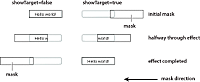
A mask effect is any effect that is a subclass of the MaskEffect class, which includes the wipe effects and the Iris effect. A mask effect uses an overlay, called a mask, to perform the effect. By default, for the wipe effects, the mask is a rectangle with the same size as the target component. For the Iris effect, the default mask is a rectangle centered on the component.
The before or after state of the target component of a mask effect must be invisible. That means a mask effect always makes a target component appear on the screen, or disappear from the screen.
To control the mask effect, you set the MaskEffect.showTarget property to correspond to the action of the component. If the target component is becoming visible, set showTarget to true. If the target is becoming invisible, set showTarget to false. The default value is true.
Often, you use these effects with the showEffect and hideEffect triggers. The showEffect trigger occurs when a component becomes visible by changing its visible property from false to true. The hideEffect trigger occurs when the component becomes invisible by changing its visible property from true to false. When using a mask effect with the showEffect or hideEffect triggers, you can ignore the showTarget property; Flex sets it for you automatically.
As the mask effect executes, the effect either covers the target component or uncovers it, based on the setting of the showTarget property. The following diagram shows the action of the WipeLeft effect for the two different settings of the showTarget property:
You can use several properties of the MaskEffect class to control the location and size of the mask, including the following:
- scaleXFrom, scaleYFrom, scaleXTo, and scaleX
-
Specify the initial and final scale of the mask where a value of 1.0 corresponds to scaling the mask to the size of the target component, 2.0 scales the mask to twice the size of the component, 0.5 scales the mask to half the size of the component, and so on. To use any one of these properties, you must specify all four.
- xFrom, yFrom, xTo, and yTo
-
Specify the coordinates of the initial position and final position of the mask relative to the target component, where (0, 0) corresponds to the upper-left corner of the target. To use any one of these properties, you must specify all four.
The coordinates of the initial and final position of the mask depend on the type of effect and whether the showTarget property is true or false. For example, for the WipeLeft effect with a showTarget value of false, the coordinates of the initial mask position are (0, 0), corresponding to the upper-left corner of the target, and the coordinates of the final position are the upper-right corner of the target (-width, 0), where width is the width of the target.
For a showTarget value of true for the WipeLeft effect, the coordinates of the initial mask position are (width, 0), and the coordinates of the final position are (0, 0).
Creating a custom mask function
You can supply a custom mask function to a mask effect using the createMaskFunction property. A custom mask function lets you create a mask with a custom shape, color, or other attributes for your application requirements.
The custom mask function has the following signature:
 public function funcName(targ:Object, bounds:Rectangle):Shape
 	var myMask:Shape = new Shape();
 	// Create mask.

 	return myMask;
 }
Your custom mask function takes an argument that corresponds to the target component of the effect, and a second argument that defines the dimensions of the target so that you can correctly size the mask. The function returns a single Shape object that defines the mask.
The following example uses a custom mask with a WipeLeft effect:
<?xml version="1.0"?>
<!-- behaviors\CustomMaskSimple.mxml -->
<s:Application xmlns:fx="http://ns.adobe.com/mxml/2009"
    xmlns:mx="library://ns.adobe.com/flex/mx"
    xmlns:s="library://ns.adobe.com/flex/spark">
    <s:layout>
        <s:VerticalLayout/>
    </s:layout>

    <fx:Script>
        <![CDATA[

            // Import the effect class.
            import mx.effects.*;

            public function createLargeMask(targ:Object,
                    bounds:Rectangle):Shape {
                // Create the Shape object.
                var largeMask:Shape = new Shape();

                // Access the Graphics object of the
                // Shape object to draw the mask.
                largeMask.graphics.beginFill(0x00FFFF, 0.5);
                largeMask.graphics.drawRoundRect(0, 0, bounds.width + 10,
                    bounds.height - 10, 3);
                largeMask.graphics.endFill();

                // Return the mask.
                return largeMask;
            }
        ]]>
    </fx:Script>

    <fx:Declarations>
        <mx:WipeLeft id="customWL"
            createMaskFunction="createLargeMask"
            showTarget="false"/>

        <mx:WipeLeft id="standardWL"
            showTarget="false"/>
    </fx:Declarations>

    <mx:HBox borderStyle="solid"
        paddingLeft="10" paddingRight="10"
        paddingTop="10" paddingBottom="10">

        <mx:Button label="Custom Mask"
            mouseDownEffect="{customWL}"
            height="100" width="150"/>
    </mx:HBox>
</s:Application>
Using MX data effects
The MX List and MX TileList controls take input from a data provider, an object that contains the data displayed by the control. To provide this data, you assign a collection, which is usually an ArrayCollection or XMLListCollection object, to the control's dataProvider property. Each item in the control is then displayed by using an item renderer.
MX data effects make it possible to apply effects to the item renderers in List and TileList controls when the data provider for the control changes. For example, when an item is deleted from the data provider of a List control, the item renderer for that item might fade out and shrink.
For more information about data providers and controls that use data providers, see Data providers and collections. For more information about item renderers, see MX item renderers and item editors.
By default, the List and TileList control do not use a data effect. To specify the effect to apply to the control, use the control's itemsChangeEffect style property. For the List control, use the DefaultListEffect class to configure the data effect. For the TileList control, use the DefaultTileListEffect class.
You can also create custom data effects. For more information, see Custom effects.
Example: Applying a MX data effect to a MX List or MX TileList control
The following example applies the MX DefaultListEffect effect to the MX List control when items are added to or removed from the control. When an item in the List control is removed, this effect first fades out the item, then collapses the size of the item to 0. When you add an item to the List control, this effect expands the slot for the item, then fades in the new item.
Because the DefaultListEffect effect grows and shrinks item renderers as it plays, you must set the List.variableRowHeight property to true to enable the List control to dynamically change its row height, as the following example shows:
<?xml version="1.0"?>
<!-- dataEffects\ListEffectCustomDefaultEffect.mxml -->
<s:Application xmlns:fx="http://ns.adobe.com/mxml/2009"
    xmlns:mx="library://ns.adobe.com/flex/mx"
    xmlns:s="library://ns.adobe.com/flex/spark">
    <s:layout>
        <s:VerticalLayout/>
    </s:layout>

    <fx:Script>
        <![CDATA[
            import mx.effects.DefaultListEffect;
            import mx.collections.ArrayCollection;

            [Bindable]
            private var myDP:ArrayCollection = new ArrayCollection(
                ['A','B','C','D','E']);

            private function deleteItem():void {
                // As each item is removed, the index of the other items changes.
                // So first get the items to delete, and then determine their indices
                // as you remove them.
                var toRemove:Array = [];
                for (var i:int = 0; i < list0.selectedItems.length; i++)
                    toRemove.push(list0.selectedItems[i]);
                for (i = 0; i < toRemove.length; i++)
                    myDP.removeItemAt(myDP.getItemIndex(toRemove[i]));
            }

            private var zcount:int = 0;
            private function addItem():void {
                // Always add the new item after the third item,
                // or after the last item if the length is less than 3.
                myDP.addItemAt("Z"+zcount++,Math.min(3,myDP.length));
            }
        ]]>
    </fx:Script>

    <fx:Declarations>
        <!-- Define an instance of the DefaultListEffect effect,
             and set its fadeOutDuration and color properties. -->
        <mx:DefaultListEffect id="myDLE"
            fadeOutDuration="1000"/>
    </fx:Declarations>

    <mx:List id="list0"
        width="150"
        dataProvider="{myDP}"
        variableRowHeight="true"
        fontSize="24"
        allowMultipleSelection="true"
        itemsChangeEffect="{myDLE}"/>

    <mx:Button
        label="Delete Item"
        click="deleteItem();"/>
    <mx:Button
        label="Add Item"
        click="addItem();"/>
</s:Application>
To use a MX data effect with the TileList class, apply the DefaultTileListEffect effect to the control. When an item in the TileList control is removed, this effect first fades out the item, and then moves the remaining items to their new position. When you add an item to the TileList control, this effect moves the existing items to their new position, and then fades in the new item.
You typically set the offscreenExtraRowsOrColumns property of the TileList control when you apply a data effect. This property specifies the number of extra rows or columns of offscreen item renderers used in the layout of the control. This property is useful because data effects work by first determining a before layout of the list-based control, then determining an after layout, and finally setting the properties of the effect to create an animation from the before layout to the after layout. Because many effects cause currently invisible items to become visible, or currently visible items to become invisible, this property configures the control to create the offscreen item renderers so that they already exist when the data effect plays.
You typically set the offscreenExtraRowsOrColumns property to a nonzero, even value, such as 2 or 4, for a TileList control, as the following example shows:
<?xml version="1.0"?>
<!-- dataEffects\TileListEffectCustomDefaultEffect.mxml -->
<s:Application xmlns:fx="http://ns.adobe.com/mxml/2009"
    xmlns:mx="library://ns.adobe.com/flex/mx"
    xmlns:s="library://ns.adobe.com/flex/spark"
    height="500">
    <s:layout>
        <s:VerticalLayout/>
    </s:layout>

    <fx:Script>
        <![CDATA[
            import mx.effects.DefaultTileListEffect;
            import mx.effects.easing.Elastic;
            import mx.collections.ArrayCollection;
            import mx.effects.Move;

            [Bindable]
            private var myDP:ArrayCollection = new ArrayCollection(
                ["A","B",'C','D','E','F','G','H','I','J','K','L','M','N','O','P']);

            private function deleteItems():void {
                // As each item is removed, the index of the other items changes.
                // So first get the items to delete, and then determine their indices
                // as you remove them.
                var toRemove:Array = [];
                for (var i:int = 0; i < tlist0.selectedItems.length; i++)
                    toRemove.push(tlist0.selectedItems[i]);
                for (i = 0; i < toRemove.length; i++)
                    myDP.removeItemAt(myDP.getItemIndex(toRemove[i]));
            }

            private var zcount:int = 0;
            private function addItems():void {
                myDP.addItemAt("Z"+zcount++,Math.min(2,myDP.length));
            }
        ]]>
    </fx:Script>

    <fx:Declarations>
        <!-- Define an instance of the DefaultTileListEffect effect,
             and set its moveDuration and color properties. -->
        <mx:DefaultTileListEffect id="myDTLE"
            moveDuration="100"/>
    </fx:Declarations>

    <mx:TileList id="tlist0"
        height="400" width="400"
        columnCount="4" rowCount="4"
        fontSize="30" fontWeight="bold"
        direction="horizontal"
        dataProvider="{myDP}"
        allowMultipleSelection="true"
        offscreenExtraRowsOrColumns="2"
        itemsChangeEffect="{myDTLE}" />

    <mx:Button
        label="Delete Selected Item(s)"
        click="deleteItems();"/>
    <mx:Button
        label="Add Item"
        click="addItems();"/>
</s:Application>
Improving performance when resizing Panel containers
When you apply a Resize effect to a MX Panel container, the measurement and layout algorithm for the effect executes repeatedly over the duration of the effect. When a Panel container has many children, the animation can be jerky because Flex cannot update the screen quickly enough.
To solve this problem, you can use the Resize effect's hideChildrenTargets property to hide the children of panel containers while the Resize effect is playing. The value of the hideChildrenTargets property is an Array of Panel containers that should include the Panel containers that resize during the animation. Before the Resize effect plays, Flex iterates through the Array and hides the children of each of the specified Panel containers.
In the following example, the children of the panelOne and panelTwo containers are hidden while the containers resize:
<?xml version="1.0"?>
<!-- behaviors\PanelResize.mxml -->
<s:Application xmlns:fx="http://ns.adobe.com/mxml/2009"
    xmlns:mx="library://ns.adobe.com/flex/mx"
    xmlns:s="library://ns.adobe.com/flex/spark">
    <s:layout>
        <s:HorizontalLayout/>
    </s:layout>

    <fx:Declarations>
        <mx:Resize id="myResizeOne" heightTo="300"
            target="{panelOne}"
            hideChildrenTargets="{[panelOne]}"/>
        <mx:Resize id="myResizeTwo" heightTo="300"
            target="{panelTwo}"/>
    </fx:Declarations>

    <s:Button id="b1"
        label="Reset"
        click="panelOne.height=200;panelTwo.height=200;"/>

    <mx:Panel id="panelOne" title="Panel 1" height="200"
        mouseDown="myResizeOne.end();myResizeOne.play();">
        <s:Button label="Click Me"/>
        <s:Button label="Click Me"/>
        <s:Button label="Click Me"/>
        <s:Button label="Click Me"/>
        <s:Button label="Click Me"/>
    </mx:Panel>

    <mx:Panel id="panelTwo" title="Panel 2" height="200"
        mouseDown="myResizeTwo.end();myResizeTwo.play();">
        <s:Button label="Click Me"/>
        <s:Button label="Click Me"/>
        <s:Button label="Click Me"/>
        <s:Button label="Click Me"/>
        <s:Button label="Click Me"/>
    </mx:Panel>
</s:Application>
For the MX Panel container, you can control the effect used to hide the container children. For each panel container in the hideChildrenTargets Array, the following effect triggers execute:
-
resizeStartEffect Delivered before the Resize effect begins playing.
-
resizeEndEffect Delivered after the Resize effect finishes playing.
If the resizeStartEffect trigger specifies an effect to play, the Resize effect is delayed until the effect finishes playing.
The default value for the MX Panel container's resizeStartEffect and resizeEndEffect triggers is Dissolve, which plays the Dissolve effect. To disable the Dissolve effect so that a Panel container's children are hidden immediately, you must set the value of the resizeStartEffect and resizeEndEffect triggers to none.
Using the MX Dissolve effect with the MX Panel, TitleWindow, and Accordion containers
The MX Dissolve effects is only applied to the content area of the Panel, TitleWindow, and Accordion containers. Therefore, the title bar of the Panel and TitleWindow containers, and the navigation buttons of the Accordion container are not modified by this effect.
To apply the Dissolve effect to the entire container, create a RoundedRectange instance that is the same size as the container, and then use the targetArea property of the effect to specify the area on which to apply the effect. In the following example, you apply a Dissolve effect to the first Panel container, and apply a Dissolve effect to a RoundedRectange instance overlaid on top of the second Panel container:
<?xml version="1.0" encoding="utf-8"?>
<!-- behaviors\PanelDissolve.mxml -->
<s:Application xmlns:fx="http://ns.adobe.com/mxml/2009"
    xmlns:mx="library://ns.adobe.com/flex/mx"
    xmlns:s="library://ns.adobe.com/flex/spark"
    creationComplete="init();">
    <s:layout>
        <s:VerticalLayout/>
    </s:layout>

    <fx:Script>
        <![CDATA[
           import mx.geom.*;

            // Define a bounding box for the target area of the effect.
           [Bindable]
           public var tArea:RoundedRectangle;

            // Size the bounding box to the size of Panel 2.
           private function init():void
           {
              tArea = new RoundedRectangle(0,0, panel2.width, panel2.height, 5);
           }
        ]]>
    </fx:Script>

    <fx:Declarations>
        <mx:Dissolve id="dissolveP1"
            duration="1000"
            target="{panel1}"
            alphaFrom="1.0" alphaTo="0.0"/>

        <!-- Apply the effect to the bounding box, not to Panel 2. -->
        <mx:Dissolve id="dissolveP2"
            duration="1000"
            target="{panel2}"
            alphaFrom="1.0" alphaTo="0.0"
            targetArea="{tArea}"/>
    </fx:Declarations>

    <mx:Panel id="panel1" title="Panel 1"
        width="100" height="140" >
       <mx:Button label="Orange" />
    </mx:Panel>

    <mx:Panel id="panel2" title="Panel 2"
        width="100" height="140" >
       <mx:Button label="Red" />
    </mx:Panel>

    <mx:Button label="Dissolve Panel 1"
        click="dissolveP1.end();dissolveP1.play();"/>
    <mx:Button label="Dissolve Panel 2"
        click="dissolveP2.end();dissolveP2.play();"/>
</s:Application>
Using MX easing functions
You can change the speed of an animation by defining an easing function for an effect. With easing, you can create a more realistic rate of acceleration and deceleration. You can also use an easing function to create a bounce effect or control other types of motion.
Flex supplies MX easing functions in the mx.effects.easing package. This package includes functions for the most common types of easing, including Bounce, Linear, and Sine easing. For more information on using these functions, see the ActionScript 3.0 Reference for Apache Flex.
The following code shows the basic format of an easing function:
 function myEasingFunction(t:Number, b:Number, c:Number, d:Number):Number {
 	...
 }
You specify the following arguments of an easing function:
-
t specifies time.
-
b specifies the initial position of a component.
-
c specifies the total change in position of the component.
-
d specifies the duration of the effect, in milliseconds.
Configuring a MX easing function
You specify an easing function to a component by passing a reference to the function to a component property. You pass only the name of the easing function; Flex automatically sets the values for the arguments of the easing function.
All tween effects, meaning effect classes that are child classes of the TweenEffect class, support the easingFunction property, which lets you specify an easing function to the effect. Mask effects, those effect classes that are child classes of the MaskEffect class, also support easing functions. Other components support easing functions as well. For example, the Accordion and Tree components let you use the openEasingFunction style property to specify an easing function, and the ComboBox component supports a closeEasingFunction style property.
For example, you can specify the mx.effects.easing.Bounce.easeOut() method to the Accordion container using the openEasingFunction property, as the following code shows.
<?xml version="1.0"?>
<!-- behaviors\EasingFuncExample.mxml -->
<s:Application xmlns:fx="http://ns.adobe.com/mxml/2009"
    xmlns:mx="library://ns.adobe.com/flex/mx"
    xmlns:s="library://ns.adobe.com/flex/spark"
    height="550">
    <s:layout>
        <s:VerticalLayout/>
    </s:layout>

    <fx:Script>
        import mx.effects.easing.*;
    </fx:Script>

    <mx:Accordion
        openEasingFunction="{Bounce.easeOut}"
        openDuration="2000">
        <mx:VBox label="Pane 1" width="400" height="400"/>
        <mx:VBox label="Pane 2" width="400" height="400"/>
    </mx:Accordion>
</s:Application>
Creating a custom easing function
In the following example, you create a custom easing function that creates a bounce motion when combined with the Flex Move effect:
<?xml version="1.0"?>
<!-- behaviors\Easing.mxml -->
<s:Application xmlns:fx="http://ns.adobe.com/mxml/2009"
    xmlns:mx="library://ns.adobe.com/flex/mx"
    xmlns:s="library://ns.adobe.com/flex/spark"
    width="650">
    <s:layout>
        <s:VerticalLayout/>
    </s:layout>

    <fx:Script>
        <![CDATA[
            private function myEasingFunction(t:Number, b:Number,
                    c:Number, d:Number):Number {
              if ((t /= d) < (1 / 2.75)) {
                  return c * (7.5625 * t * t) + b;
              }
              else if (t < (2 / 2.75)) {
                  return c * (7.5625 * (t-=(1.5/2.75)) * t + .75) + b;
              }
              else if (t < (2.5 / 2.75)) {
                  return c * (7.5625 * (t-=(2.25/2.75)) * t + .9375) + b;
              }
              else {
                  return c * (7.5625 * (t-=(2.625/2.75)) * t + .984375) + b;
              }
            };
        ]]>
    </fx:Script>

    <fx:Declarations>
        <mx:Move id="moveLeftShow"
            xFrom="600" xTo="0" yTo="0"
            duration="3000"
            easingFunction="myEasingFunction"/>
        <mx:Move id="moveRightHide"
            xFrom="0" xTo="600"
            duration="3000"
            easingFunction="myEasingFunction"/>
    </fx:Declarations>

    <mx:LinkBar dataProvider="myVS"/>
    <mx:ViewStack id="myVS" borderStyle="solid">
        <mx:Canvas id="Canvas0" label="Canvas0"
            creationCompleteEffect="{moveLeftShow}"
            showEffect="{moveLeftShow}"
            hideEffect="{moveRightHide}" >
                <mx:Box height="300" width="600" backgroundColor="#00FF00">
                    <mx:Label text="Screen 0" color="#FFFFFF" fontSize="40"/>
                </mx:Box>
        </mx:Canvas>
        <mx:Canvas id="Canvas1" label="Canvas1"
            showEffect="{moveLeftShow}" hideEffect="{moveRightHide}" >
                <mx:Box height="300" width="600" backgroundColor="#0033CC">
                    <mx:Label text="Screen 1" color="#FFFFFF" fontSize="40"/>
                </mx:Box>
            </mx:Canvas>
    </mx:ViewStack>
</s:Application>
In this example, you use the custom effects in the showEffect and hideEffect properties of the children of a ViewStack container. When you click a label in the LinkBar control, the corresponding child of the ViewStack container slides in from the right, and bounces to a stop against the left margin of the ViewStack container, while the previously visible child of the ViewStack container slides off to the right.
The custom effect for the showEffect property is only triggered when the child's visibility changes from false to true. Therefore, the first child of the ViewStack container also includes a creationCompleteEffect property. This is necessary to trigger the effect when Flex first creates the component. If you omit the creationCompleteEffect property, you do not see the moveLeftShow effect when the application starts.
Navigation
Adobe and Adobe Flash Platform are either registered trademarks or trademarks of Adobe Systems Incorporated in the United States and/or other countries and are used by permission from Adobe. No other license to the Adobe trademarks are granted.