
Using the Flex AIR components
When building an Adobe® AIR® application in Flex, you can use any of the controls and other components that are part of Flex. In addition, Flex includes a set of components that are specifically for AIR applications.
Flex AIR components overview
The Flex AIR components can be divided into the following groups:
File system controls
The file system controls are a set of user-interface controls that provide information about and tools to interact with the file system of the local computer on which the AIR application is running. These include controls for displaying lists of files in tree or grid format, controls for choosing directories or files from a list or combo box, and so on.
HTML control
The HTML control is used to display an HTML web page within a Flex application. For example, you could use it to combine HTML and Flex content in a single application. You cannot use the HTML control in a mobile Flex application.
FlexNativeMenu control
The FlexNativeMenu control provides the ability to use MXML to declaratively define the structure of a native menu. You can use it to define an application menu (on OS X), a window's menu (on Windows), a context menu, and so forth.
Window containers
The window containers are two components that can be used as containers for defining the layout of windows in applications. There are two window containers: the WindowedApplication, a substitute for the Application container to use as the main or initial window of an AIR application; and the Window, for application windows that are opened after the initial window of the application.
About file system controls
The Flex file system components combine the functionality of other Flex controls, such as Tree, DataGrid, ComboBox, and so forth, with pre-built awareness of the file system on the application user's computer. These controls duplicate the functionality of user interface controls that are commonly used in desktop applications for browsing and selecting files and directories. You can use one or two of them to directly include file-related functionality in a screen of your application. Or you can combine several of them together to create a full-featured file browsing or selection dialog box.
Each of the Flex file system controls, except the FileSystemHistoryButton control, displays a view of the contents of a particular directory in the computer's file system. For instance, the FileSystemTree displays the directory's contents in a hierarchical tree (using the Flex Tree control) and the FileSystemComboBox displays the directory and its parent directories in the menu of a ComboBox control.
For any of the Flex file system controls except the FileSystemHistoryButton control, you use the control's directory property to change the currently selected directory for a control. You can also use the directory property to retrieve the current directory, such as if the user selects a directory in the control.
FileSystemComboBox control
A FileSystemComboBox defines a combo box control for selecting a location in a file system. The control always displays the selected directory in the combo box's text field. When the combo box's drop-down list is displayed, it shows the hierarchy of directories that contain the selected directory, up to the computer root directory. The user can select a higher-level directory from the list. In this sense, the FileSystemComboBox control's behavior is different from the FileSystemTree, FileSystemList, and FileSystemDataGrid controls that display the directories and files that are contained by the current directory.
For more information on the FileSystemComboBox control, see the ActionScript 3.0 Reference for Apache Flex.
Creating a FileSystemComboBox control
You use the <mx:FileSystemComboBox> tag to define a FileSystemComboBox control in MXML. Specify an id value if you intend to refer to a component elsewhere in your MXML, either in another tag or in an ActionScript block.
You specify the currently displayed directory using the control's directory property. The directory property can be set in MXML by binding the value to a property or variable, or by setting the property in ActionScript. When you set the directory property, the data provider of the underlying combo box is automatically populated. By default the directory property is set to the root "Computer" directory, which has no ancestor directories and hence shows no selectable directories in the combo box's drop-down list.
The following example shows four variations on the basic FileSystemComboBox. Each combo box is initially set to the user's desktop directory, in the application's creationComplete handler. The distinct characteristics of the combo boxes are as follows:
-
The first combo box simply displays the selected directory.
-
The second combo box's showIcons property is set to false, so no icon appears next to the items in the combo box's list.
-
The third combo box's indent property is set to 20, which is larger than the default. As a result, the items in the combo box's list are more indented than normal.
-
The fourth combo box has an event handler defined for the directoryChange event. When the selected directory in the combo box changes, it calls the setOutput() method, which writes the selected directory's path to a TextArea control named output.
<?xml version="1.0" encoding="utf-8"?>
<!-- aircomponents/src/FSComboBoxSimple.mxml -->
<s:WindowedApplication xmlns:fx="http://ns.adobe.com/mxml/2009"
    xmlns:s="library://ns.adobe.com/flex/spark"
    xmlns:mx="library://ns.adobe.com/flex/mx"
    creationComplete="init();">
    <s:layout>
        <s:VerticalLayout/>
    </s:layout>

    <fx:Script>
        <![CDATA[
            import flash.filesystem.File;

            private function init():void {
                fcb.directory = File.desktopDirectory;
                fcbIndent.directory = File.desktopDirectory;
                fcbNoIcons.directory = File.desktopDirectory;
                fcbChange.directory = File.desktopDirectory;
            }

            private function setOutput():void {
                output.text = fcbChange.directory.nativePath;
            }
        ]]>
    </fx:Script>

    <mx:FileSystemComboBox id="fcb"/>
    <mx:FileSystemComboBox id="fcbNoIcons"
        showIcons="false"/>
    <mx:FileSystemComboBox id="fcbIndent"
        indent="20"/>
    <mx:FileSystemComboBox id="fcbChange"
        directoryChange="setOutput();"/>
    <s:TextArea id="output"
        width="200" height="50"/>
</s:WindowedApplication>
FileSystemComboBox user interaction
The FileSystemComboBox supports the same user interaction as a standard combo box control. The control displays a directory in its selection field. The user clicks the button (or uses the keyboard) to open a drop-down list containing the names of the hierarchy of directories that contain the selected directory. The user can then select one of the directories, which causes the drop-down list to close and the selected directory to become the current directory. When the user selects a directory, the control dispatches the directoryChange event, and its directory property changes to the newly selected directory.
FileSystemTree control
A FileSystemTree control displays the contents of a file system directory as a tree. The tree can display the directory's files, its subdirectories, or both. For files, file names can be displayed with or without extensions.
For more information on the FileSystemTree control, see the ActionScript 3.0 Reference for Apache Flex.
Creating a FileSystemTree control
You use the <mx:FileSystemTree> tag to define a FileSystemTree control in MXML. Specify an id value if you intend to refer to a component elsewhere in your MXML, either in another tag or in an ActionScript block.
You specify the currently displayed directory using the control's directory property. You can set the directory property in MXML by binding the value to a property or variable, or by setting the property in ActionScript. When you set the directory property, the data provider of the underlying tree control is automatically populated. The specified directory isn't displayed in the tree—its child files or directories are shown as the top-level nodes of the tree. By default the directory property is set to the root "Computer" directory. Consequently, its children (the drive or drives attached to the computer) are displayed as the top branches of the tree.
The following example demonstrates creating a FileSystemTree control that displays all files and folders, which is the default. In addition, hidden files are shown by setting the showHidden property to true.
<?xml version="1.0" encoding="utf-8"?>
<!-- aircomponents/src/FSTreeSimple.mxml -->
<s:WindowedApplication
    xmlns:fx="http://ns.adobe.com/mxml/2009"
    xmlns:s="library://ns.adobe.com/flex/spark"
    xmlns:mx="library://ns.adobe.com/flex/mx">

    <mx:FileSystemTree showHidden="true"/>
</s:WindowedApplication>
FileSystemTree user interaction
The FileSystemTree control supports the same types of user interaction as the standard Flex Tree control. In addition, the FileSystemTree control provides several additional events for file-related functionality. If the user double-clicks a closed directory node or clicks its disclosure icon, the control dispatches a directoryOpening event. If the user double-clicks an open directory node or clicks its disclosure icon, the control dispatches a directoryClosing event. If the user double-clicks a file node, the control dispatches a fileChoose event.
FileSystemList control
A FileSystemList control displays the contents of a file system directory as selectable items in a scrolling list (a Flex List control). The displayed contents can include subdirectories and files, with additional filtering options as well. A FileSystemList control can be linked to a FileSystemHistoryButton control, meaning that the button can be used to move to a previously displayed directory.
For more information on the FileSystemList control, see the ActionScript 3.0 Reference for Apache Flex.
Creating a FileSystemList control
You use the <mx:FileSystemList> tag to define a FileSystemList control in MXML, as the following example shows. Specify an id value if you intend to refer to a component elsewhere in your MXML, either in another tag or in an ActionScript block.
You specify the currently displayed directory using the control's directory property. The directory property can be set in MXML by binding the value to a property or variable, or by setting the property in ActionScript. When you set the directory property, the data provider of the underlying list control is automatically populated. The specified directory isn't displayed in the list—its child files or directories are shown as the items in the list. By default the directory property is set to the root "Computer" directory. In that case its children, which are the drive or drives attached to the computer, are displayed as the items in the list.
The following example demonstrates creating a FileSystemList control that displays all files and folders (the default). The sample also includes a button for navigating up one level in the directory hierarchy. The button is enabled if the currently displayed directory has a parent directory because the button's enabled property is bound to the FileSystemList control's canNavigateUp property. The button navigates up one level by calling the FileSystemList control's navigateUp() method when it is clicked.
<?xml version="1.0" encoding="utf-8"?>
<!-- aircomponents/src/FSListSimple.mxml -->
<s:WindowedApplication xmlns:fx="http://ns.adobe.com/mxml/2009"
    xmlns:s="library://ns.adobe.com/flex/spark"
    xmlns:mx="library://ns.adobe.com/flex/mx">
    <s:layout>
        <s:VerticalLayout/>
    </s:layout>

    <mx:FileSystemList id="fileList"/>
    <s:Button label="Up"
        click="fileList.navigateUp();"
        enabled="{fileList.canNavigateUp}"/>
</s:WindowedApplication>
FileSystemList user interaction
The FileSystemList control provides standard scrolling list functionality for files: a user can scroll through the list of files and select one or multiple files or directories. When the user double-clicks a directory, the FileSystemList control automatically sets that directory as the control's directory property. It then becomes the directory whose contents are displayed in the list.
FileSystemDataGrid control
A FileSystemDataGrid displays file information in a data-grid format. The file information displayed includes the file name, creation date, modification date, type, and size. Data grid columns displaying this information are automatically created in the underlying DataGrid control, and can be removed or customized in the same way that you customize DataGrid columns. The displayed contents can include subdirectories and files, with additional filtering options as well. A FileSystemList control can be linked to a FileSystemHistoryButton control, meaning that the button can be used to move to a previously displayed directory.
For more information on the FileSystemDataGrid control, see the ActionScript 3.0 Reference for Apache Flex.
Creating a FileSystemDataGrid control
You use the <mx:FileSystemDataGrid> tag to define a FileSystemDataGrid control in MXML, as the following example shows. Specify an id value if you intend to refer to a component elsewhere in your MXML, either in another tag or in an ActionScript block.
You specify the currently displayed directory using the control's directory property. You can set the directory property in MXML by binding the value to a property or variable, or by setting the property in ActionScript. When you set the directory property the data provider of the underlying data grid control is automatically populated. The specified directory isn't displayed in the grid—its child files or directories are shown as the rows in the grid. By default the directory property is set to the root "Computer" directory. In that case its children, the drive or drives attached to the computer, are displayed as the items in the grid.
The following example demonstrates creating a FileSystemDataGrid control that displays all files and folders (the default). The sample also includes a button for navigating up one level in the directory hierarchy. The button is enabled if the currently displayed directory has a parent directory because the button's enabled property is bound to the FileSystemDataGrid control's canNavigateUp property. The button navigates up one level by calling the FileSystemDataGrid control's navigateUp() method when it is clicked.
<?xml version="1.0" encoding="utf-8"?>
<!-- aircomponents/src/FSDataGridSimple.mxml -->
<s:WindowedApplication xmlns:fx="http://ns.adobe.com/mxml/2009"
    xmlns:s="library://ns.adobe.com/flex/spark"
    xmlns:mx="library://ns.adobe.com/flex/mx">
    <s:layout>
        <s:VerticalLayout/>
    </s:layout>

    <mx:FileSystemDataGrid id="fileGrid"/>
    <s:Button label="Up"
        click="fileGrid.navigateUp();"
        enabled="{fileGrid.canNavigateUp}"/>
</s:WindowedApplication>
FileSystemDataGrid user interaction
The FileSystemDataGrid control includes standard DataGrid functionality such as scrolling through the grid, selecting grid rows, reordering grid columns, and sorting grid data by clicking the grid headers.
In addition, the FileSystemDataGrid provides some file-specific functionality. A FileSystemDataGrid allows a user to navigate to other directories using the mouse or keyboard. The user can change the directory by double-clicking a subdirectory, by pressing Enter or Ctrl-Down when a subdirectory is selected, by pressing Ctrl-Up when the control isn't displaying the COMPUTER directory, by pressing Ctrl-Left when there is a "previous" directory to navigate back to, or by pressing Ctrl-Right when there is a "next" directory to navigate forward to.
If the user attempts to change the directory being displayed, the control dispatches a cancelable directoryChanging event. If the event isn't canceled, the control displays the contents of the new directory and its directory property changes. Whenever the directory property changes for any reason, the controls dispatches a directoryChange event.
FileSystemHistoryButton control
The FileSystemHistoryButton control lets the user move backwards or forwards through the navigation history of another control. It works in conjunction with a FileSystemList or FileSystemDataGrid control, or any similar control with a property containing an array of File objects. The FileSystemHistoryButton is a PopUpMenuButton. It has a button for navigating back or forward one step in the history. It also has a list of history steps from which one step can be chosen.
To link a FileSystemHistoryButton to a control, bind the button's dataProvider property to one of the control's properties. The property must contain an array of File objects representing a sequence of directories in a file system browsing history. For instance, you can bind the dataProvider property to the forwardHistory or backHistory property of a FileSystemList or FileSystemDataGrid control. The button can then be used to navigate the display history of that control if you set the click and itemClick event handlers of the button to call the navigateForward() or navigateBack() method of the control.
For more information on the FileSystemHistoryButton control, see the ActionScript 3.0 Reference for Apache Flex.
Creating a FileSystemHistoryButton control
You use the <mx:FileSystemHistoryButton> tag to define a FileSystemHistoryButton control in MXML. Specify an id value if you intend to refer to a component elsewhere in your MXML, either in another tag or in an ActionScript block.
You specify the property to which the button is bound by setting the dataProvider property.
The following example demonstrates creating two FileSystemHistoryButton controls that are linked to the display history of a FileSystemList control. Each button's enabled property is bound to the FileSystemList control's canNavigateBack or canNavigateForward property. As a result, the button is enabled if the currently displayed directory can navigate in the appropriate direction. When the user clicks a button, its event listener calls the FileSystemList control's navigateBack() or navigateForward() method. This causes the FileSystemList control to navigate to the previous or next directory.
<?xml version="1.0" encoding="utf-8"?>
<!-- aircomponents/src/FSHistoryBSimple.mxml -->
<s:WindowedApplication xmlns:fx="http://ns.adobe.com/mxml/2009"
    xmlns:s="library://ns.adobe.com/flex/spark"
    xmlns:mx="library://ns.adobe.com/flex/mx">
    <s:layout>
        <s:VerticalLayout/>
    </s:layout>

    <s:HGroup>
        <mx:FileSystemHistoryButton label="Back"
            dataProvider="{fileList.backHistory}"
            enabled="{fileList.canNavigateBack}"
            click="fileList.navigateBack();"
            itemClick="fileList.navigateBack(event.index)"/>
        <mx:FileSystemHistoryButton label="Forward"
            dataProvider="{fileList.forwardHistory}"
            enabled="{fileList.canNavigateForward}"
            click="fileList.navigateForward();"
            itemClick="fileList.navigateForward(event.index)"/>
    </s:HGroup>
    <mx:FileSystemList id="fileList"/>
</s:WindowedApplication>
FileSystemHistoryButton user interaction
The FileSystemHistoryButton is based on the Flex PopUpMenuButton, so their core functionality is the same. When the user clicks the main button the click event is dispatched (normally moving backward or forward one step in the history). In addition, by clicking the pull-down menu button, a list of the history steps is displayed. This allows the user to navigate directly to a specific step in the history.
Displaying a directory structure with Flex AIR
The following example uses the WindowedApplication container and the FileSystemTree and FileSystemDataGrid controls. In this example, the FileSystemTree control displays a directory structure. Clicking a directory name in the FileSystemTree control causes the FileSystemDataGrid control to display information about the files in the selected directory:
<?xml version="1.0" encoding="utf-8"?>
<!-- aircomponents/src/FSDirApp.mxml -->
<s:WindowedApplication xmlns:fx="http://ns.adobe.com/mxml/2009"
    xmlns:s="library://ns.adobe.com/flex/spark"
    xmlns:mx="library://ns.adobe.com/flex/mx"
    width="750" height="500">
    <s:layout>
        <s:VerticalLayout/>
    </s:layout>

    <mx:HDividedBox>
        <mx:FileSystemTree id="tree"
            width="200" height="100%"
            directory="{new File('C:\\')}"
            enumerationMode="directoriesOnly"
            change="dataGrid.directory = File(tree.selectedItem);"/>
        <mx:FileSystemDataGrid id="dataGrid"
            width="100%" height="100%"
            directory="{new File('C:\\')}"/>
    </mx:HDividedBox>
</s:WindowedApplication>
About the HTML control
An HTML control displays HTML web pages in your application. It is designed to be used to render specific external HTML content within your AIR application. It offers functionality like a lightweight web browser, including loading HTML pages, navigation history, and the ability to access the raw HTML content.
You cannot use the HTML control in a mobile Flex application. To show HTML in a mobile Flex application, use the StageWebView class instead.
The HTML control is not designed or intended to be used as a replacement for the Text or TextArea controls. Those controls are more appropriate for displaying formatted text or for use as an item renderer for displaying short runs of text.
Creating an HTML control
You use the <mx:HTML> tag to define an HTML control in MXML. Specify an id value if you intend to refer to a component elsewhere in your MXML, either in another tag or in an ActionScript block.
You specify the location of the HTML page to display by setting the location property.
The following example demonstrates the use of an HTML control in a simple application. The HTML control's location property is set to "http://labs.adobe.com/", so that URL is opened in the control when it loads. In addition, when the "back" and "forward" are clicked they call the control's historyBack() and historyForward() methods. A TextInput control allows the user to enter a URL location. When a third "go" button is clicked, the HTML control's location property is set to the text property of the input text field.
<?xml version="1.0" encoding="utf-8"?>
<!-- aircomponents/src/HTMLSimple.mxml -->
<s:WindowedApplication xmlns:fx="http://ns.adobe.com/mxml/2009"
xmlns:s="library://ns.adobe.com/flex/spark"
xmlns:mx="library://ns.adobe.com/flex/mx">
<s:layout>
<s:VerticalLayout/>
</s:layout>
<mx:ControlBar width="100%">
<s:Button label="< Back"
click="content.historyBack();"/>
<s:Button label="Forward >"
click="content.historyForward();"/>
<s:TextInput id="address"
text="{content.location}" width="100%"/>
<s:Button label="Go!"
click="content.location = address.text"/>
</mx:ControlBar>
<s:Group width="100%" height="100%">
<mx:HTML id="content" location="http://labs.adobe.com/"/>
</s:Group>
</s:WindowedApplication>
HTML control user interaction
For a user interacting with an HTML control, the experience is like using a web browser with only the content window and no menu bar or navigation buttons. The HTML page content displays in the control. The user can interact with the content through form fields and buttons and by clicking hyperlinks. Some of these interactions, such as clicking a link or submitting a form, would normally cause a browser to load a new page. These actions cause the HTML control to display the content of the new page and also change the value of the control's location property.
About the FlexNativeMenu control
A FlexNativeMenu component is a Flex wrapper for the NativeMenu class. The FlexNativeMenu allows you to use MXML and a data provider to define the structure of a menu. The FlexNativeMenu component does not have any visual representation that is rendered by Flex. Instead, a FlexNativeMenu instance defines a native operating system menu such as an application menu (OS X), a window menu (Windows), a context menu, or any other native menu that can be created in AIR.
The FlexNativeMenu component is designed to be like the Flex Menu and MenuBar components. Developers who have worked with those components should find the FlexNativeMenu familiar.
For more information on the FlexNativeMenu control, see the ActionScript 3.0 Reference for Apache Flex.
Creating a FlexNativeMenu control
You define a FlexNativeMenu control in MXML by using the <mx:FlexNativeMenu> tag. Specify an id value if you intend to refer to a component elsewhere in your MXML application, either in another tag or in an ActionScript block. Because the FlexNativeMenu control have any visual representation, if you want to use it as the direct child of a container in MXML, you must insert it in an <fx:Declaration> block.
You specify the data for the FlexNativeMenu control by using the dataProvider property. The FlexNativeMenu control uses the same types of data providers as does the MenuBar control and the Menu control. Several of the XML attributes or object property names have meaning to the FlexNativeMenu control. For more information on structuring FlexNativeMenu data providers, see Defining FlexNativeMenu menu structure and data.
You can assign any name to node tags in the XML data. In subsequent examples, each node is named with the generic <menuitem> tag, but you can use <node>, <subNode>, <person>, <address>, and so on.
Creating an application or window menu
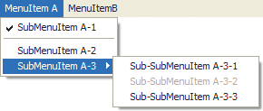
When you create an application or window menu using the FlexNativeMenu control, the top-level objects or nodes in the data provider correspond to the top-level menu items. In other words, they define the items that display in the menu bar itself. Items nested inside one of those top-level items define the items within the menu. Likewise, those menu items can contain items, in which case the menu item is a submenu. When the user selects the menu item it expands its own menu items. For example, the following image shows a window menu with three menu items (plus an additional separator menu item). The item with the label "SubMenuItem A-3" in turn contains three menu items, so SubMenuItem A-3 is treated as a submenu. (The code to create this menu is provided later.)
For an MXML application using the Flex WindowedApplication container as the root MXML node, you can assign a FlexNativeMenu to the WindowedApplication instance's menu property. The menu is used as the application menu on OS X and the window menu of the initial window on Windows. Likewise, to specify a window menu for an additional window defined using the Flex Window container, assign a FlexNativeMenu to the Window instance's menu property. In that case the menu displays on Windows only and is ignored on OS X.
The following application defines a FlexNativeMenu as the menu property of a WindowedApplication container. Consequently, the specified menu is used as the application menu on Mac OS and the window menu of the initial window on Windows. This code creates the menu shown in the previous image:
<?xml version="1.0" encoding="utf-8"?>
<!-- aircomponents/src/NativeMSimple.mxml -->
<s:WindowedApplication xmlns:fx="http://ns.adobe.com/mxml/2009"
    xmlns:s="library://ns.adobe.com/flex/spark"
    xmlns:mx="library://ns.adobe.com/flex/mx">
    <s:menu>
        <mx:FlexNativeMenu dataProvider="{myMenuData}"
            labelField="@label"
            showRoot="false"/>
    </s:menu>

    <fx:Declarations>
        <fx:XML format="e4x" id="myMenuData">
            <root>
                <menuitem label="MenuItem A">
                    <menuitem label="SubMenuItem A-1" type="check" toggled="true"/>
                    <menuitem type="separator"/>
                    <menuitem label="SubMenuItem A-2"/>
                    <menuitem label="SubMenuItem A-3">
                        <menuitem label="Sub-SubMenuItem A-3-1"/>
                        <menuitem label="Sub-SubMenuItem A-3-2" enabled="false"/>
                        <menuitem label="Sub-SubMenuItem A-3-3"/>
                    </menuitem>
                </menuitem>
                <menuitem label="MenuItemB">
                    <menuitem label="SubMenuItem B-1"/>
                    <menuitem label="SubMenuItem B-2"/>
                </menuitem>
            </root>
        </fx:XML>
    </fx:Declarations>
</s:WindowedApplication>
in this example, the FlexNativeMenu control is used as the value of the WindowedApplication.menu property, so it does not have to be in an <fx:Declaration> block. However, if it was the direct child of the WindowedApplication container, it must be in an <fx:Declaration> block. For an example defining the FlexNativeMenu control in an <fx:Declaration> block, see Handling FlexNativeMenu control events.
Creating a context menu
Creating a context menu in a Flex AIR application involves two steps. You create the FlexNativeMenu instance that defines the menu structure. You then assign that menu as the context menu for its associated control. Because a context menu consists of a single menu, the top-level menu items serve as the items in the single menu. Any menu item that contains child menu items defines a submenu within the single context menu.
The FlexNativeMenu is a replacement for the context menu that you use with browser-based Flex applications (the flash.ui.ContextMenu class). You can use one type of menu or the other, but you can't specify both types for a single component.
To assign a FlexNativeMenu component as the context menu for a visual Flex control, call the FlexNativeMenu instance's setContextMenu() method, passing the visual control as the component parameter (the only parameter):
menu.setContextMenu(someComponent);
The same FlexNativeMenu can be used as the context menu for more than one object, by calling setContextMenu() multiple times using different component parameter values. You can also reverse the process (that is, remove an assigned context menu) using the unsetContextMenu() method.
The following example demonstrates creating a FlexNativeMenu component and setting it as the context menu for a Label control:
<?xml version="1.0" encoding="utf-8"?>
<!-- aircomponents/src/NativeMList.mxml -->
<s:WindowedApplication xmlns:fx="http://ns.adobe.com/mxml/2009"
    xmlns:s="library://ns.adobe.com/flex/spark"
    xmlns:mx="library://ns.adobe.com/flex/mx"
    creationComplete="init();">

    <fx:Script>
        <![CDATA[
            import mx.controls.FlexNativeMenu;

            private var myMenu:FlexNativeMenu;

            private function init():void
            {
                myMenu = new FlexNativeMenu();
                myMenu.dataProvider = menuData;
                myMenu.labelField = "@label";
                myMenu.showRoot = false;
                myMenu.setContextMenu(lbl);
            }
        ]]>
    </fx:Script>

    <fx:Declarations>
        <!-- The XML data provider -->
        <fx:XML format="e4x" id="menuData">
            <root>
                <menuitem label="MenuItem A"/>
                <menuitem label="MenuItem B"/>
                <menuitem label="MenuItem C"/>
            </root>
        </fx:XML>
    </fx:Declarations>

    <mx:Label id="lbl" x="100" y="10"
        text="Right-click here to open menu"/>
</s:WindowedApplication>
In addition to context menus for visual components within an application window, an AIR application supports two other special context menus: dock icon menus (OS X) and system tray icon menus (Windows). To set either of these menus, you define the menu's structure using the FlexNativeMenu component, then you assign the FlexNativeMenu instance to the WindowedApplication container's dockIconMenu or systemTrayIconMenu property.
Before setting the dockIconMenu or systemTrayIconMenu property you may want to determine whether the user's operating system supports a dock icon or a system tray icon, using the NativeApplication class's static supportsDockIcon and supportsSystemTrayIcon properties. Doing so isn't necessary, but can be useful. For instance, you might want to customize a menu depending on whether it is used as the context menu for a dock icon or for a system tray icon.
Finally, while a dock icon exists automatically for an application, you must explicitly specify a system tray icon in order for the icon to appear. (Naturally, the icon must exist in order for the user to be able to right-click the icon to activate the context menu).
The following example defines a FlexNativeMenu that is used as a context menu. If the user's operating system supports a system tray icon, the code creates an icon and displays it in the system tray. The code then assigns the FlexNativeMenu instance as the context menu for the system tray and dock icon menus.
<?xml version="1.0" encoding="utf-8"?>
<!-- aircomponents/src/NativeMContextM.mxml -->
<s:WindowedApplication xmlns:fx="http://ns.adobe.com/mxml/2009"
    xmlns:s="library://ns.adobe.com/flex/spark"
    xmlns:mx="library://ns.adobe.com/flex/mx"
    creationComplete="init();">
    <s:layout>
        <s:VerticalLayout/>
    </s:layout>

    <fx:Script>
        <![CDATA[
            import flash.desktop.DockIcon;
            import flash.desktop.InteractiveIcon;
            import flash.desktop.NativeApplication;
            import flash.desktop.SystemTrayIcon;
            import flash.display.Shape;
            import mx.controls.FlexNativeMenu;

            private var myMenu:FlexNativeMenu;

            private function init():void {
                // Create the menu
                myMenu = new FlexNativeMenu();
                myMenu.dataProvider = menuData;
                myMenu.labelField = "@label";
                myMenu.showRoot = false;

                var icon:InteractiveIcon;
                icon = NativeApplication.nativeApplication.icon;

                // If we need a system tray icon, create one and display it
                if (NativeApplication.supportsSystemTrayIcon)
                {
                    var iconData:BitmapData = createSystemTrayIcon();
                    SystemTrayIcon(icon).bitmaps = new Array(iconData);
                }

                // Use this approach if you want to assign the same menu
                // to the dock icon and system tray icon
                this.systemTrayIconMenu = this.dockIconMenu = myMenu;

                // Use this approach if you want to assign separate menus
//              if (NativeApplication.supportsDockIcon)
//              {
//                  this.dockIconMenu = myMenu;
//              }
//              else if (NativeApplication.supportsSystemTrayIcon)
//              {
//                  this.systemTrayIconMenu = myMenu;
//              }
            }

            private function createSystemTrayIcon():BitmapData {
                // Draw the icon in a Graphic
                var canvas:Shape = new Shape();
                canvas.graphics.beginFill(0xffff00);
                canvas.graphics.drawCircle(24, 24, 24);
                canvas.graphics.endFill();
                canvas.graphics.beginFill(0x000000);
                canvas.graphics.drawEllipse(13, 13, 9, 12);
                canvas.graphics.drawEllipse(27, 13, 9, 12);
                canvas.graphics.endFill();
                canvas.graphics.lineStyle(3, 0x000000);
                canvas.graphics.moveTo(11, 32);
                canvas.graphics.curveTo(24, 46, 37, 32);

                var result:BitmapData = new BitmapData(48, 48, true, 0x00000000);
                result.draw(canvas);

                return result;
            }
        ]]>
    </fx:Script>

     <fx:Declarations>
        <!-- The XML data provider -->
        <fx:XML format="e4x" id="menuData">
            <root>
                <menuitem label="MenuItem A"/>
                <menuitem label="MenuItem B"/>
                <menuitem label="MenuItem C"/>
            </root>
        </fx:XML>
     </fx:Declarations>

    <s:Label text="Right-click on the dock icon (Mac OS X) or system tray icon (Windows)"/>
</s:WindowedApplication>
Creating a pop-up menu
A pop-up menu is like a context menu, but the pop-up menu isn't necessarily associated with a particular Flex component. To open a pop-up menu, create a FlexNativeMenu instance and set its dataProvider property to populate the menu. To open the menu on the screen, call its display() method:
myMenu.display(this.stage, 10, 10);
The display() method has three required parameters: the Stage instance that defines the coordinates within which the menu is placed, the x coordinate where the menu is placed, and the y coordinate for the menu. For an example of using the display() method to create a pop-up menu, see Example: An Array FlexNativeMenu data provider.
One important thing to keep in mind is that the display() method operates immediately when it's called. Several property changes cause the FlexNativeMenu's data provider to invalidate (such as changes to the data provider, changing the labelField, and so forth). When the display() method is called immediately after making such changes, those changes aren't reflected in the menu that appears on the screen. For example, in the following code listing when the button is clicked no menu appears because the menu is created and the data provider is specified in the same block of code in which the display() method is called:
<?xml version="1.0" encoding="utf-8"?>
<!-- aircomponents/src/NativeMDisplay.mxml -->
<s:WindowedApplication xmlns:fx="http://ns.adobe.com/mxml/2009"
    xmlns:s="library://ns.adobe.com/flex/spark"
    xmlns:mx="library://ns.adobe.com/flex/mx">

    <fx:Script>
        <![CDATA[
            import mx.controls.FlexNativeMenu;

            private function createAndShow():void
            {
                var myMenu:FlexNativeMenu = new FlexNativeMenu();
                myMenu.dataProvider = menuData;
                myMenu.labelField = "@label";
                myMenu.showRoot = false;
                // calling display() here has no result, because the data provider
                // has been set but the underlying NativeMenu hasn't been created yet.
                myMenu.display(this.stage, 10, 10);
            }
        ]]>
    </fx:Script>

     <fx:Declarations>
        <!-- The XML data provider -->
        <fx:XML format="e4x" id="menuData">
            <root>
                <menuitem label="MenuItem A"/>
                <menuitem label="MenuItem B"/>
                <menuitem label="MenuItem C"/>
            </root>
        </fx:XML>
     </fx:Declarations>

    <!-- Button control to create and open the menu. -->
    <s:Button x="300" y="10"
        label="Open Menu"
        click="createAndShow();"/>
</s:WindowedApplication>
Defining FlexNativeMenu menu structure and data
The techniques for defining structure and data for a FlexNativeMenu are like the techniques for structuring all Flex menu controls. Consequently, this section does not provide comprehensive information on structuring Flex menus, but instead focuses on differences between FlexNativeMenu structure versus other Flex menu components.
The dataProvider property of a FlexNativeMenu defines the structure of the menu. To change a menu's structure at runtime, change the data provider and the menu updates itself accordingly. Menus typically use a hierarchical data provider such as nested arrays or XML. However, a simple menu may consist of a single flat structure of menu items.
A FlexNativeMenu instance uses a data descriptor to parse and manipulate the data provider's contents. By default, a FlexNativeMenu control uses a DefaultDataDescriptor instance as its descriptor. However, you can customize menu data parsing by creating your own data descriptor class and setting it as the FlexNativeMenu control's dataDescriptor property. The DefaultDataDescriptor supports a data provider that is an XML object or XMLList object, an array of objects, an object with a children property containing an array of objects, or a collection that implements the ICollectionView interface such as an ArrayCollection or XMLListCollection instance.
Specifying and using menu entry information
Information in a FlexNativeMenu control's data provider determines how each menu entry appears and is used. To access or change the menu contents, you modify the contents of the data provider.
The FlexNativeMenu class uses the methods of the IMenuDataDescriptor interface to access and manipulate information in the data provider that defines the menu behavior and contents. Flex includes the DefaultDataDescriptor class that implements this interface. A FlexNativeMenu control uses the DefaultDataDescriptor class if you do not specify another class in the dataDescriptor property.
Menu entry types
Each data provider entry can specify an item type and type-specific information about the menu item. Menu-based classes support the following item types (type field values):
|
Menu item type |
Description |
|---|---|
|
normal |
The default type. Selecting an item with the normal type triggers an itemClick event. Alternatively, if the item has children, the menu dispatches a menuShow event and opens a submenu. |
|
check |
Selecting an item with the check type toggles the menu item's toggled property between true and false values and triggers an itemClick event. When the menu item is in the true state, it displays a check mark in the menu next to the item's label. |
|
separator |
Items with the separator type provide a simple horizontal line that divides the items in a menu into different visual groups. |
Unlike other Flex menu controls, the FlexNativeMenu component does not support radio-button menu items (type radio).
Menu attributes
Menu items can specify several attributes that determine how the item is displayed and behaves. The following table lists the attributes you can specify, their data types, their purposes, and how the data provider must represent them if the menu uses the DefaultDataDescriptor class to parse the data provider:
|
Attribute |
Type |
Description |
|---|---|---|
|
altKey |
Boolean |
Specifies whether the Alt key is required as part of the key equivalent for the item. |
|
commandKey |
Boolean |
Specifies whether the Command key is required as part of the key equivalent for the item. |
|
controlKey |
Boolean |
Specifies whether the Control key is required as part of the key equivalent for the item. |
|
enabled |
Boolean |
Specifies whether the user can select the menu item (true), or not (false). If not specified, Flex treats the item as if the value were true. If you use the default data descriptor, data providers must use an enabled XML attribute or object field to specify this characteristic. |
|
keyEquivalent |
String |
Specifies a keyboard character which, when pressed, triggers an event as though the menu item was selected. The menu's keyEquivalentField or keyEquivalentFunction property determines the name of the field in the data that specifies the key equivalent, or a function for determining the key equivalents. (If the data provider is in E4X XML format, you must specify one of these properties to assign a key equivalent.) |
|
label |
String |
Specifies the text that appears in the control. This item is used for all menu item types except separator . The menu's labelField or labelFunction property determines the name of the field in the data that specifies the label, or a function for determining the labels. (If the data provider is in E4X XML format, you must specify one of these properties to display a label.) If the data provider is an array of strings, Flex uses the string value as the label. |
|
mnemonicIndex |
Integer |
Specifies the index position of the character in the label that is used as the mnemonic for the menu item. The menu's mnemonicIndexField or mnemonicIndexFunction property determines the name of the field in the data that specifies the mnemonic index, or a function for determining mnemonic index. (If the data provider is in E4X XML format, you must specify one of these properties to specify a mnemonic index in the data.) Alternatively, you can indicate that a character in the label is the menu item's mnemonic by including an underscore immediately to the left of that character. |
|
shiftKey |
String |
Specifies whether the Shift key is required as part of the key equivalent for the item. |
|
toggled |
Boolean |
Specifies whether a check item is selected. If not specified, Flex treats the item as if the value were false and the item is not selected. If you use the default data descriptor, data providers must use a toggled XML attribute or object field to specify this characteristic. |
|
type |
String |
Specifies the type of menu item. Meaningful values are separator and check. Flex treats all other values, or nodes with no type entry, as normal menu entries. If you use the default data descriptor, data providers must use a type XML attribute or object field to specify this characteristic. |
Unlike other Flex menu controls, the FlexNativeMenu component does not support the groupName or icon attributes. In addition, it supports the additional attribute keyEquivalent and the key equivalent modifier attributes altKey, commandKey, controlKey, and shiftKey.
The FlexNativeMenu component ignores all other object fields or XML attributes, so you can use them for application-specific data.
Considerations for XML-based FlexNativeMenu data providers
In a simple case for creating a single menu or menu bar using the FlexNativeMenu control, you might use an <fx:XML> or <fx:XMLList> tag and standard XML node syntax to define the menu data provider. When you use an XML-based data provider, keep the following rules in mind:
-
With the <fx:XML> tag you must have a single root node, and you set the showRoot property of the FlexNativeMenu control to false. (Otherwise, your FlexNativeMenu would have only the root node as a menu item.) With the <fx:XMLList> tag you define a list of XML nodes, and the top-level nodes define the top-level menu items.
-
If your data provider has label, keyEquivalent, or mnemonicIndex attributes, the default attribute names are not recognized by the DefaultDataDescriptor class. Set the FlexNativeMenu control's labelField , keyEquivalentField, or mnemonicIndexField property and use the E4X @ notation to specify the attribute name, such as:
labelField="@label"
keyEquivalentField="@keyEquivalent"
mnemonicIndexField="@mnemonicIndex"
Example: An Array FlexNativeMenu data provider
The following example uses a FlexNativeMenu component to display a popup menu. It demonstrates how to define the menu structure using an Array of plain objects as a data provider. For an application that specifies an identical menu structure in XML, see Example: An XML FlexNativeMenu data provider.
<?xml version="1.0" encoding="utf-8"?>
<!-- aircomponents/src/NativeMArray.mxml -->
<s:WindowedApplication xmlns:fx="http://ns.adobe.com/mxml/2009"
    xmlns:s="library://ns.adobe.com/flex/spark"
    xmlns:mx="library://ns.adobe.com/flex/mx"
    creationComplete="init();">

    <fx:Script>
        <![CDATA[
            import mx.controls.FlexNativeMenu;

            private var myMenu:FlexNativeMenu;

            private function init():void {
                myMenu = new FlexNativeMenu();
                myMenu.dataProvider = menuData;
                myMenu.showRoot = false;
            }

            // Method to show the menu.
            private function show():void {
                myMenu.display(this.stage, 10, 10);
            }

            // The Array data provider
            [Bindable]
            public var menuData:Array = [
                {label: "MenuItem A"},
                {label: "MenuItem B", type: "check", toggled: true},
                {label: "MenuItem C", enabled: false},
                {type: "separator"},
                {label: "MenuItem D", children: [
                    {label: "SubMenuItem D-1"},
                    {label: "SubMenuItem D-2"},
                    {label: "SubMenuItem D-3"}
                    ]}
                ];
        ]]>
    </fx:Script>

    <!-- Button control to create and open the menu. -->
    <s:Button x="300" y="10"
        label="Open Menu"
        click="show();"/>
</s:WindowedApplication>
Example: An XML FlexNativeMenu data provider
The following example displays a popup menu using a FlexNativeMenu component. It shows how to define the menu structure using XML as a data provider. For an application that specifies an identical menu structure using an Array of objects as a data provider, see Example: An Array FlexNativeMenu data provider.
<?xml version="1.0" encoding="utf-8"?>
<!-- aircomponents/src/NativeMxml.mxml -->
<s:WindowedApplication xmlns:fx="http://ns.adobe.com/mxml/2009"
    xmlns:s="library://ns.adobe.com/flex/spark"
    xmlns:mx="library://ns.adobe.com/flex/mx"
    creationComplete="init();">

    <fx:Script>
        <![CDATA[
            import mx.controls.FlexNativeMenu;

            private var myMenu:FlexNativeMenu;

            private function init():void
            {
                myMenu = new FlexNativeMenu();
                myMenu.dataProvider = menuData;
                myMenu.labelField = "@label";
                myMenu.showRoot = false;
            }

            // Method to show the menu.
            private function show():void
            {
                myMenu.display(this.stage, 10, 10);
            }
        ]]>
    </fx:Script>

     <fx:Declarations>
        <!-- The XML data provider -->
        <fx:XML format="e4x" id="menuData">
            <root>
                <menuitem label="MenuItem A"/>
                <menuitem label="MenuItem B" type="check" toggled="true"/>
                <menuitem label="MenuItem C" enabled="false"/>
                <menuitem type="separator"/>
                <menuitem label="MenuItem D">
                    <menuitem label="SubMenuItem D-1"/>
                    <menuitem label="SubMenuItem D-2"/>
                    <menuitem label="SubMenuItem D-3"/>
                </menuitem>
            </root>
        </fx:XML>
     </fx:Declarations>

    <!-- Button control to create and open the menu. -->
    <s:Button x="300" y="10"
        label="Open Menu"
        click="show();"/>
</s:WindowedApplication>
Specifying menu item keyboard equivalents
You can specify a key equivalent (sometimes called an accelerator) for a menu command. When the key or key combination is pressed the FlexNativeMenu dispatches an itemClick event, as though the user had selected the menu item. The key equivalent string is automatically displayed beside the menu item name in the menu. The format depends on the user's operating system and system preferences. In order for the command to be invoked, the menu containing the command must be part of the application menu (OS X) or the window menu of the active window (Windows).
About key equivalents
A key equivalent consists of two parts:
- Primary key
-
A string containing the character that serves as the key equivalent. If a data provider object has a keyEquivalent field, the DefaultDataDescriptor automatically uses that value as the key equivalent. You can specify an alternative data provider field by setting the FlexNativeMenu component's keyEquivalentField property. You can specify a function to use to determine the key equivalent by setting the FlexNativeMenu component's keyEquivalentFunction property.
- Modifier keys
-
One or more modifier keys that are also part of the key equivalent combination, such as the control key, shift key, command key, and so forth. If a data provider item includes an altKey, commandKey, controlKey, or shiftKey object field or XML attribute set to true, the specified key or keys become part of the key equivalent combination, and the entire key combination must be pressed to trigger the command. Alternatively, you can specify a function for the FlexNativeMenu component's keyEquivalentModifiersFunction, and that function is called to determine the key equivalent modifiers for each data provider item.
If you specify more than one key equivalent modifier, all the specified modifiers must be pressed in order to trigger the command. For instance, for the menu item generated from the following XML the key equivalent combination is Control-Shift-A (rather than Control-A OR Shift-A):
<menuitem label="Select All" keyEquivalent="a" controlKey="true" shiftKey="true"/>
Note that this can result in impossible key combinations if the menu item specifies multiple modifiers that are only available on one operating system. For example, the following item results in a menu item with the key equivalent Command-Shift-G:
<menuitem label="Ungroup" keyEquivalent="g" commandKey="true" shiftKey="true"/>
On Mac OS X, this command works as expected. On Windows, the key equivalent Shift-G is displayed in the menu. However, pressing Shift-G does not trigger the command because the Command key is still considered a required part of the command, even though that key doesn't exist in Windows.
To use different key combinations for the same menu item on different platforms, you can specify a keyEquivalentModifiersFunction function for the FlexNativeMenu instance. This function can provide alternative logic for processing the menu item data. For an example using the keyEquivalentModifiersFunction, see Example: Using custom logic for multi-platform key equivalent menu commands.
Example: FlexNativeMenu key equivalent commands
The following example uses a FlexNativeMenu to define a menu that includes keyboard equivalents for the menu commands. Note that while this example only uses keys and modifier keys that are available on Windows and Mac OS X, it uses the Control key as a modifier on both platforms. However, the Command key would be more in line with the common convention on Mac OS X. For an example that uses the keyEquivalentModifiersFunction property to create menus that use the common cross-platform conventions, see Example: Using custom logic for multi-platform key equivalent menu commands.
<?xml version="1.0" encoding="utf-8"?>
<!-- aircomponents/src/NativeMKeyEquiv.mxml -->
<s:WindowedApplication xmlns:fx="http://ns.adobe.com/mxml/2009"
    xmlns:s="library://ns.adobe.com/flex/spark"
    xmlns:mx="library://ns.adobe.com/flex/mx">
    <s:menu>
        <mx:FlexNativeMenu dataProvider="{menuData}"
            labelField="@label"
            keyEquivalentField="@keyEquivalent"
            showRoot="false"
            itemClick="trace('click:', event.label);"/>
    </s:menu>
    <fx:Declarations>
        <fx:XML format="e4x" id="menuData">
            <root>
                <menuitem label="File">
                    <menuitem label="New" keyEquivalent="n" controlKey="true"/>
                    <menuitem label="Open" keyEquivalent="o" controlKey="true"/>
                    <menuitem label="Save" keyEquivalent="s" controlKey="true"/>
                    <menuitem label="Save As..." keyEquivalent="s" controlKey="true" shiftKey="true"/>
                    <menuitem label="Close" keyEquivalent="w" controlKey="true"/>
                </menuitem>
                <menuitem label="Edit">
                    <menuitem label="Cut" keyEquivalent="x" controlKey="true"/>
                    <menuitem label="Copy" keyEquivalent="c" controlKey="true"/>
                    <menuitem label="Paste" keyEquivalent="v" controlKey="true"/>
                </menuitem>
            </root>
        </fx:XML>
    </fx:Declarations>
</s:WindowedApplication>
Example: Using custom logic for multi-platform key equivalent menu commands
The following example creates the same menu structure as the previous example. However, instead of using the same keyboard combination (for example, Control-O) regardless of the user's operating system, in this example a keyEquivalentModifiersFunction function is defined for the FlexNativeMenu. The function is used to create keyboard equivalents that follow platform conventions by using the Control key on Windows but substituting the Command key on Mac OS X.
In the data provider data, the controlKey="true" attribute is still used. The function that determines the key equivalent modifiers uses the value of the controlKey field or XML attribute to specify the Control key on Windows and the Command key on OS X, and if the controlKey attribute is false (or not specified) then neither modifier is applied.
<?xml version="1.0" encoding="utf-8"?>
<!-- aircomponents/src/NativeMKeyEquivMultiP.mxml -->
<s:WindowedApplication xmlns:fx="http://ns.adobe.com/mxml/2009"
    xmlns:s="library://ns.adobe.com/flex/spark"
    xmlns:mx="library://ns.adobe.com/flex/mx"
    initialize="init();">
    <s:menu>
        <mx:FlexNativeMenu dataProvider="{menuData}"
            labelField="@label"
            keyEquivalentField="@keyEquivalent"
            keyEquivalentModifiersFunction="keyEquivalentModifiers"
            showRoot="false"
            itemClick="trace('click:', event.label);"/>
    </s:menu>

    <fx:Script>
        <![CDATA[
            import flash.system.Capabilities;
            import flash.ui.Keyboard;

            private var isWin:Boolean;
            private var isMac:Boolean;

            private function init():void {
                isWin = (Capabilities.os.indexOf("Windows") >= 0);
                isMac = (Capabilities.os.indexOf("Mac OS") >= 0);
            }

            private function keyEquivalentModifiers(item:Object):Array {
                var result:Array = new Array();

                var keyEquivField:String = menu.keyEquivalentField;
                var altKeyField:String;
                var controlKeyField:String;
                var shiftKeyField:String;
                if (item is XML)
                {
                    altKeyField = "@altKey";
                    controlKeyField = "@controlKey";
                    shiftKeyField = "@shiftKey";
                }
                else if (item is Object)
                {
                    altKeyField = "altKey";
                    controlKeyField = "controlKey";
                    shiftKeyField = "shiftKey";
                }

                if (item[keyEquivField] == null || item[keyEquivField].length == 0)
                {
                    return result;
                }

                if (item[altKeyField] != null && item[altKeyField] == true)
                {
                    if (isWin)
                    {
                        result.push(Keyboard.ALTERNATE);
                    }
                }

                if (item[controlKeyField] != null && item[controlKeyField] == true)
                {
                    if (isWin)
                    {
                        result.push(Keyboard.CONTROL);
                    }
                    else if (isMac)
                    {
                        result.push(Keyboard.COMMAND);
                    }
                }

                if (item[shiftKeyField] != null && item[shiftKeyField] == true)
                {
                    result.push(Keyboard.SHIFT);
                }

                return result;
            }
        ]]>
    </fx:Script>

    <fx:Declarations>
        <fx:XML format="e4x" id="menuData">
            <root>
                <menuitem label="File">
                    <menuitem label="New" keyEquivalent="n" controlKey="true"/>
                    <menuitem label="Open" keyEquivalent="o" controlKey="true"/>
                    <menuitem label="Save" keyEquivalent="s" controlKey="true"/>
                    <menuitem label="Save As..."
                        keyEquivalent="s"
                        controlKey="true"
                        shiftKey="true"/>
                    <menuitem label="Close" keyEquivalent="w" controlKey="true"/>
                </menuitem>
                <menuitem label="Edit">
                    <menuitem label="Cut" keyEquivalent="x" controlKey="true"/>
                    <menuitem label="Copy" keyEquivalent="c" controlKey="true"/>
                    <menuitem label="Paste" keyEquivalent="v" controlKey="true"/>
                </menuitem>
            </root>
        </fx:XML>
    </fx:Declarations>
</s:WindowedApplication>
Specifying menu item mnemonics
A menu item mnemonic is a key associated with a menu item which, when pressed while the menu is displayed, is equivalent to selecting that menu item with the mouse. Typically, the operating system indicates a menu item's mnemonic by underlining that character in the name of the menu item. Mnemonics for menu items are supported in Windows. In Mac OS X, when a menu is activated a user types the first letter or letters of a menu item's label, then presses return to select the item.
The simplest way to specify a mnemonic for a menu item in a FlexNativeMenu component is to include an underscore character ("_") in the menu item's label field, immediately to the left of the letter that serves as the mnemonic for that menu item. For instance, if the following XML node is used in a data provider for a FlexNativeMenu, the mnemonic for the command is the first character of the second word (the letter "A"):
<menuitem label="Save _As"/>
When the native menu is created, the underscore character is not included in the label. Instead, the character following the underscore becomes the mnemonic for the menu item. To include a literal underscore character in a menu item's name, use two underscore characters ("__"). This sequence is converted to one underscore in the menu item label.
As an alternative to using underscore characters in label names, you can provide an integer index position for the mnemonic character in a mnemonicIndex field in the data provider objects. You can also use another Object property or XML attribute by setting the FlexNativeMenu component's mnemonicIndexField property. To use complex logic for assigning mnemonics, you can specify a function for the FlexNativeMenu component's mnemonicIndexFunction property. Each of these properties provides a mechanism to define an integer (zero-based) index position for the menu items' mnemonics.
Handling FlexNativeMenu control events
User interaction with a FlexNativeMenu is event-driven. When the user selects a menu item or opens a menu or submenu, the menu dispatches an event. You can register event listeners to define the actions that are carried out in response to the user's selection. Event handling with the FlexNativeMenu component shares similarities with other Flex menu components, but also has key differences. For information about Flex menu component events, see Menu-based control events.
The FlexNativeMenu component defines two specific events, both of which dispatch event objects that are instances of the FlexNativeMenuEvent class:
|
Event |
Description |
|---|---|
itemClick |
(FlexNativeMenuEvent.ITEM_CLICK) Dispatched when a user selects an enabled menu item of type normal or check. This event is not dispatched when a user selects a menu item that opens a submenu or a disabled menu item. |
|
menuShow |
(FlexNativeMenuEvent.MENU_SHOW) Dispatched when the entire menu or a submenu opens (including a top-level menu of an application or window menu). |
The event object passed to the event listener is of type FlexNativeMenuEvent and contains the following menu-specific properties:
|
Property |
Description |
|---|---|
|
index |
The index of the item in the menu or submenu that contains it. Only available for the itemClick event. |
|
item |
The item in the data provider for the menu item associated with the event. Only available for the itemClick event. |
|
label |
The label of the item. Only available for the itemClick event. |
|
nativeMenu |
A reference to the underlying NativeMenu object where the event occurred. |
|
nativeMenuItem |
A reference to the underlying NativeMenuItem object that triggered the event. Only available for the itemClick event. |
To access properties of an object-based menu item, you specify the item property of the event object, as follows:
ta1.text = event.item.extraData;
To access attributes of an E4X XML-based menu item, you specify the menu item attribute name in E4X syntax, as follows:
ta1.text = event.item.@extraData;
The standard approach to handling FlexNativeMenu events is to register an event listener with the FlexNativeMenu component. Any time an individual menu item is selected or submenu is opened, the FlexNativeMenu dispatches the appropriate event. Your listener code can use the event object's item property or other properties to determine on which menu item the interaction occurred, and perform actions in response.
<?xml version="1.0" encoding="utf-8"?>
<!-- aircomponents/src/NativeMEvents.mxml -->
<s:WindowedApplication xmlns:fx="http://ns.adobe.com/mxml/2009"
    xmlns:s="library://ns.adobe.com/flex/spark"
    xmlns:mx="library://ns.adobe.com/flex/mx">

    <fx:Script>
        <![CDATA[
            import mx.events.FlexNativeMenuEvent;
            import mx.controls.FlexNativeMenu;
            import mx.events.FlexNativeMenuEvent;

            // The event listener that opens the menu with an XML data
            // provider and adds event listeners for the menu.
            private function createAndShow():void {
                ta1.text="";
                xmlBasedMenu.addEventListener(FlexNativeMenuEvent.ITEM_CLICK, menuShowInfo);
                xmlBasedMenu.addEventListener(FlexNativeMenuEvent.MENU_SHOW, menuShowInfo);
                xmlBasedMenu.display(stage, 225, 10);
            }
            // The event listener for the xml-based menu events.
            // Retain information on all events for a menu instance.
            private function menuShowInfo(event:FlexNativeMenuEvent):void {
                ta1.text = "event.type: " + event.type;

                // The label field is null for menuShow events.
                ta1.text += "\nevent.label: " + event.label;

                // The index value is -1 for menuShow events.
                ta1.text+="\nevent.index: " + event.index;

                // The item field is null for menuShow events.
                if (event.item != null)
                {
                    ta1.text += "\nItem label: " + event.item.@label
                    ta1.text += "\nItem toggled: " + event.item.@toggled;
                    ta1.text += "\nItem type: " + event.item.@type;
                }
            }
            // The event listener that creates an object-based menu
            // and adds event listeners for the menu.
            private function createAndShow2():void {
                ta1.text="";
                objectBasedMenu.addEventListener(FlexNativeMenuEvent.ITEM_CLICK, menuShowInfo2);
                objectBasedMenu.addEventListener(FlexNativeMenuEvent.MENU_SHOW, menuShowInfo2);
                objectBasedMenu.display(stage, 225, 10);
            }
            // The event listener for the object-based Menu events.
            private function menuShowInfo2(event:FlexNativeMenuEvent):void {
                ta1.text = "event.type: " + event.type;

                // The label field is null for menuShow events.
                ta1.text += "\nevent.label: " + event.label;

                // The index value is -1 for menuShow events.
                ta1.text += "\nevent.index: " + event.index;

                // The item field is null for menuShow events.
                if (event.item)
                {
                    ta1.text += "\nItem label: " + event.item.label
                    ta1.text += "\nItem toggled: " + event.item.toggled;
                    ta1.text += "\ntype: " + event.item.type;
                }
            }
            // The object-based data provider, an Array of objects.
            // Its contents are identical to that of the XML data provider.
            [Bindable]
            public var objMenuData:Array = [
                {label: "MenuItem A", children: [
                    {label: "SubMenuItem A-1", enabled: false},
                    {label: "SubMenuItem A-2"}
                ]},
                {label: "MenuItem B", type: "check", toggled: true},
                {label: "MenuItem C", type: "check", toggled: false},
                {type: "separator"},
                {label: "MenuItem D", children: [
                    {label: "SubMenuItem D-1"},
                    {label: "SubMenuItem D-2"},
                    {label: "SubMenuItem D-3"}
                ]}
            ];
        ]]>
    </fx:Script>

    <fx:Declarations>
        <!-- The XML-based menu data provider.
        The <fx:XML tag requires a single root. -->
        <fx:XML id="xmlMenuData" format="e4x">
            <xmlRoot>
                <menuitem label="MenuItem A" >
                    <menuitem label="SubMenuItem A-1" enabled="false"/>
                    <menuitem label="SubMenuItem A-2"/>
                </menuitem>
                <menuitem label="MenuItem B" type="check" toggled="true"/>
                <menuitem label="MenuItem C" type="check" toggled="false"/>
                <menuitem type="separator"/>
                <menuitem label="MenuItem D">
                    <menuitem label="SubMenuItem D-1"/>
                    <menuitem label="SubMenuItem D-2"/>
                    <menuitem label="SubMenuItem D-3"/>
                </menuitem>
            </xmlRoot>
        </fx:XML>
        <!-- Define the FlexNativeMenu components in
          the <fx:Declarations> block. -->
         <mx:FlexNativeMenu id="xmlBasedMenu"
            showRoot="false"
            labelField="@label"
            dataProvider="{xmlMenuData}"/>

        <mx:FlexNativeMenu id="objectBasedMenu"
            dataProvider="{objMenuData}"/>
    </fx:Declarations>

    <!-- Button controls to open the menus. -->
    <s:Button x="10" y="5"
        label="Open XML Popup"
        click="createAndShow();"/>
    <s:Button x="10" y="35"
        label="Open Object Popup"
        click="createAndShow2();"/>
    <!-- Text area to display the event information -->
    <s:TextArea x="10" y="70"
        width="200" height="250"
        id="ta1"/>
</s:WindowedApplication>
About the AIR window containers
Flex containers define the content, sizing, and positioning for a specific part of an application. For AIR applications, Flex includes two specific window components that serve as containers whose content area is an operating system window. Both the WindowedApplication and the Window containers can be used to define the contents of an operating system window. They also provide the means to define and control characteristics of the window itself, such as the window's size, its position on the user's screen, and the presence of window chrome.
Spark and MX window containers
Flex supplies a Spark and a MX version of the WindowedApplication and the Window containers. The Spark components are located in the spark.components package. The MX components are located in the mx.core package.
The biggest difference between the two component sets is that you use skins to set many of the visual characteristics of the Spark components, and styles to set them for the MX components.
WindowedApplication container
The WindowedApplication container defines an application container that you use to create Flex applications for AIR that use the native operating system chrome. The WindowedApplication container adds window-related functionality and desktop application-specific functionality to the Flex Application container, which you can use when you build AIR applications.
The WindowedApplication container serves two roles. First, it provides the entry point into the main application, which in turn executes other application logic. In that sense it serves as the core of the entire application, just as the Application container does for a browser-based Flex application. Second, the WindowedApplication container represents the first native window of the application.
If the application only uses one native window, the WindowedApplication is the base stage that contains all other content. If your application opens additional native windows, each window has its own stage and display list.
The native window defined by the WindowedApplication is no different from any other application window in this respect. This is different from a browser-based Flex application, where all of an application's windows are drawn by Flex within the same stage (the Application container).
For example, in a Flex AIR application, registering a keyDown event listener on the WindowedApplication container only dispatches events when a key is pressed while the initial window has focus. If the application has multiple native windows and another of the windows has focus when the key is pressed, the event is not dispatched. This behavior differs from a non-AIR Flex application, in which a keyDown listener registered with the Application container receives notification of all key presses while the application has focus.
For more information on the WindowedApplication container, see the ActionScript 3.0 Reference for Apache Flex.
Creating and using a WindowedApplication container
The WindowedApplication container defines an AIR application object that includes its own window controls. In an MXML AIR application, a Spark <s:WindowedApplication> or MX <mx:WindowedApplication> tag replaces the Application tag in a Flex application.
WindowedApplication container example
The following application shows a simple use of the WindowedApplication container:
<?xml version="1.0" encoding="utf-8"?>
<!-- aircomponents/src/WindowSimple.mxml -->
<s:WindowedApplication xmlns:fx="http://ns.adobe.com/mxml/2009"
    xmlns:s="library://ns.adobe.com/flex/spark"
    xmlns:mx="library://ns.adobe.com/flex/mx">

       <s:Label text="Hello World" />
</s:WindowedApplication>
Window container
The Window container is a Flex container that is used to define the content and layout of operating system windows that are opened after an application launches. In other words, it is used for windows other than the initial or main window of the application, which is a WindowedApplication container.
In addition to the functionality that the Window container shares with the WindowedApplication container, a Window container allows you to define the main characteristics of the window. The characteristics you can specify include the type of window, the type of chrome, whether certain actions (such as resizing and maximizing) are permitted for the window, and more.
These characteristics are accessed as properties that can be set when the container is initially created, before the actual operating system window is displayed. However, once the actual window is opened, the properties can no longer be set and can only be read.
For more information about the Window container, see the ActionScript 3.0 Reference for Apache Flex.
Creating and using a Window container
The Window container defines an AIR application object that includes its own window controls. In an MXML AIR application, you use a <s:Window> tag as the top-level tag of an MXML component, with the window's content defined in the body of the MXML component document. However, unlike other MXML components, a Window-based component cannot be used in another MXML document. Instead, you create an instance of the MXML component in ActionScript.
Because several of the properties of the Window container can only be set before the window is opened, they can be set as properties in the <s:Window> MXML tag. They can also be set using ActionScript, either in an <fx:Script> block in the window's MXML document or in code that creates an instance of the window.
Once the window's initial properties are set, you call the Window container's open() method to cause the operating system window to appear on the user's display.
Window container example
The following example shows a basic use of the Window container. The example includes two MXML files. The first uses a WindowedApplication container and is the initial window of the application. The second uses the Window container to define a secondary window for the application. In this example, the main window simulates a "splash screen" for the application. After a set time (4 seconds) it closes the splash screen and opens the second window. In order to make a splash screen window with no window chrome, in the application.xml file the systemChrome tag is set to none.
<?xml version="1.0" encoding="utf-8"?>
<!-- aircomponents/src/WindowSplash.mxml -->
<s:WindowedApplication xmlns:fx="http://ns.adobe.com/mxml/2009"
    xmlns:s="library://ns.adobe.com/flex/spark"
    xmlns:mx="library://ns.adobe.com/flex/mx"
    creationComplete="init();">

    <fx:Script>
        <![CDATA[
            import myComponents.DocumentWindow;
            private const LOAD_DELAY:int = 4;
            private var timeElapsed:int = 0;
            private var loadTimer:Timer;

            private var docWindow:myComponents.DocumentWindow;

            private function init():void {
                // center the window on the screen
                var screenBounds:Rectangle = Screen.mainScreen.bounds;
                nativeWindow.x = (screenBounds.width - nativeWindow.width) / 2;
                nativeWindow.y = (screenBounds.height - nativeWindow.height) / 2;

                // start the timer, which simulates a loading delay
                loadTimer = new Timer(1000);
                loadTimer.addEventListener(TimerEvent.TIMER, incrementTime);
                loadTimer.start();

                updateStatus();
            }

            private function incrementTime(event:TimerEvent):void {
                timeElapsed++;

                updateStatus();

                // if the loading delay has passed, stop the timer,
                // close the splash screen, and open the document window
                if ((LOAD_DELAY - timeElapsed) == 0)
                {
                    loadTimer.stop();
                    loadTimer.removeEventListener(TimerEvent.TIMER, incrementTime);
                    loadTimer = null;

                    nativeWindow.close();

                    // open a new instance of the document window
                    docWindow = new DocumentWindow();
                    docWindow.open();
                }
            }

            private function updateStatus():void {
                var timeRemaining:uint = LOAD_DELAY - timeElapsed;
                var timeRemainingMsg:String = timeRemaining.toString() + " second";
                if (timeRemaining != 1) { timeRemainingMsg += "s"; }
                timeRemainingMsg += " remaining.";

                loadStatusMessage.text = "initializing... " + timeRemainingMsg;
            }
        ]]>
    </fx:Script>

    <s:VGroup horizontalCenter="0" verticalCenter="0">
        <s:Label text="My Splash Screen"
            fontFamily="Courier New"
            fontSize="36"/>
        <s:Label id="loadStatusMessage"
            text="initializing..."/>
    </s:VGroup>
</s:WindowedApplication>
The incrementTime() method is called each second and when the appropriate time is reached, a DocumentWindow instance is created and its open() method is called. The DocumentWindow class is defined in a separate MXML document. Its base MXML tag is the <s:Window> tag, so it is a subclass of the Window class (the Window container). Here is the source code for the DocumentWindow MXML file:
<?xml version="1.0" encoding="utf-8"?>
<!-- aircomponents/src/myComponents/DocumentWindow.mxml -->
<s:Window xmlns:fx="http://ns.adobe.com/mxml/2009"
    xmlns:s="library://ns.adobe.com/flex/spark"
    xmlns:mx="library://ns.adobe.com/flex/mx"
    width="550" height="450">

    <s:Label text="This is a document window."
        horizontalCenter="0" verticalCenter="0"/>
</s:Window>
Controlling window chrome
The window that a WindowedApplication or Window container defines conforms to the standard behavior of the operating system. The user can move the window by dragging the title bar and resize the window by dragging on any side or corner of the window. The containers also include a set of properties that allow you to control window sizing, including minimumHeight, minimumWidth, maximumHeight, and maximumWidth.
The WindowedApplication container and the Window container allow you to control the presence and the appearance of the window chrome.
For the MX WindowedApplication or Window containers only, you can hide the chrome by setting the showFlexChrome style to false.
Setting the chrome
-
Use the chrome defined by your operating system. The system chrome consists of a border and title bar. The title bar contains the close, minimize, maximize, and restore buttons. For an Apple computer, the restore button is omitted.
-
Use the Flex chrome. The Flex chrome is defined by a set of skin files. The Flex chrome contains all of the elements of the system chrome, and adds a gripper to the lower-right corner of the container that you can use to resize the window. The Flex chrome also adds a status bar to the bottom of the window.
-
Use the WindowedApplicationSkin class. The WindowedApplicationSkin skin class contains only a border and a status bar.
-
Create your own skin files to define the chrome.
The title bar area of the chrome includes a title message and an icon that can be set and modified by using the title and titleIcon properties of the WindowedApplication or Window container. You can show or hide the status bar by using the showStatusBar property.
How the chrome is represented depends on the setting of the systemChrome attribute, which is defined in the application .xml file for a WindowedApplication container, or in the Window container's systemChrome property. If systemChrome is set to "standard" in the application .xml file (or flash.display.NativeWindowSystemChrome.STANDARD in ActionScript) the operating system renders the chrome.
If systemChrome is set to "none" (NativeWindowSystemChrome.NONE) the Window and WindowedApplication container can either use the Flex chrome, use the WindowedApplicationSkin class to define the chrome, or define no chrome at all. When you do not use any chrome, the application shows only a background color.
<?xml version="1.0" encoding="utf-8"?>
<!-- aircomponents/src/WindowSimpleChrome.mxml -->
<s:WindowedApplication xmlns:fx="http://ns.adobe.com/mxml/2009"
    xmlns:s="library://ns.adobe.com/flex/spark"
    xmlns:mx="library://ns.adobe.com/flex/mx">

    <fx:Style>
        @namespace "library://ns.adobe.com/flex/spark";
        WindowedApplication
        {
            skinClass:ClassReference("spark.skins.spark.SparkChromeWindowedApplicationSkin");
        }
    </fx:Style>

    <s:Label text="Hello World" />
</s:WindowedApplication>
<?xml version="1.0" encoding="utf-8"?>
<!-- aircomponents/src/WindowSimpleChromeWindowed.mxml -->
<s:WindowedApplication xmlns:fx="http://ns.adobe.com/mxml/2009"
    xmlns:s="library://ns.adobe.com/flex/spark"
    xmlns:mx="library://ns.adobe.com/flex/mx">

    <fx:Style>
        @namespace "library://ns.adobe.com/flex/spark";
        WindowedApplication
        {
            skinClass:ClassReference("spark.skins.spark.WindowedApplicationSkin");
        }
    </fx:Style>

    <s:Label text="Hello World" />
</s:WindowedApplication>
Defining custom skin classes
|
Skin |
Microsoft Window skin file |
Apple Macintosh skin file |
|---|---|---|
|
The skin for the close button in the title bar. |
CloseButtonSkin.mxml |
MacCloseButtonSkin.mxml |
|
The skin for the gripper button for resizing the window. |
GripperSkin.mxml |
GripperSkin.mxml |
|
The skin for the maximize button in the title bar. |
MaximizeButtonSkin.mxml |
MacMaximizeButtonSkin.mxml |
|
The skin for the minimize button in the title bar. |
MinimizeButtonSkin.mxml |
MacMinimizeButtonSkin.mxml |
|
The title bar skin. |
TitleBarSkin.mxml |
MacTitleBarSkin.mxml |
|
The skin for the restore button in the title bar. |
RestoreButtonSkin.mxml |
No restore button available. |
To customize these skins, define your own skin class based on the SparkChromeWindowedApplicationSkin class, and then reference your custom skin classes from it.
Navigation
Adobe, Adobe AIR and Adobe Flash Platform are either registered trademarks or trademarks of Adobe Systems Incorporated in the United States and/or other countries and are used by permission from Adobe. No other license to the Adobe trademarks are granted.